2018
City of Nevers
A visual identity that looks to the future
"Nevers is built like a capital that a child can visit" wrote Marguerite Duras. Probably the most beautiful homage to this city, prefecture of Nièvre and located in the heart of France.
Nevers is a city rich in history and heritage. Yet, like many medium-sized cities, its demography is on the decline, leading to the inevitable economic slowdown. Nevers is often described as "sleeping beauty" and it is precisely this image that we have sought to change. In this context, choosing a new visual identity is choosing to assert an ambition! To give back the departmental, regional and national stature that Nevers deserves. This new identity is therefore there to inscribe the city in modernity, movement and energy.


The logotype
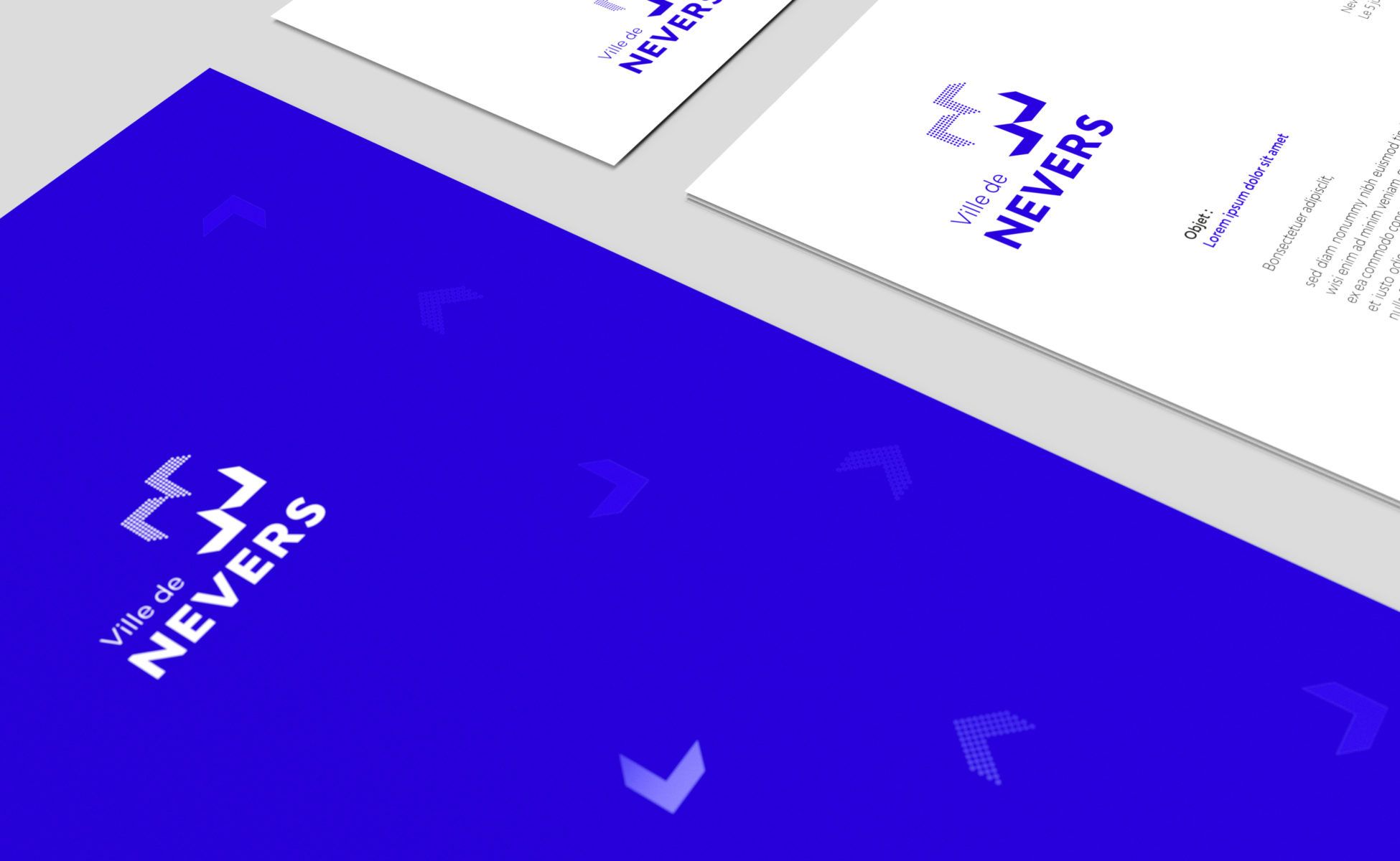
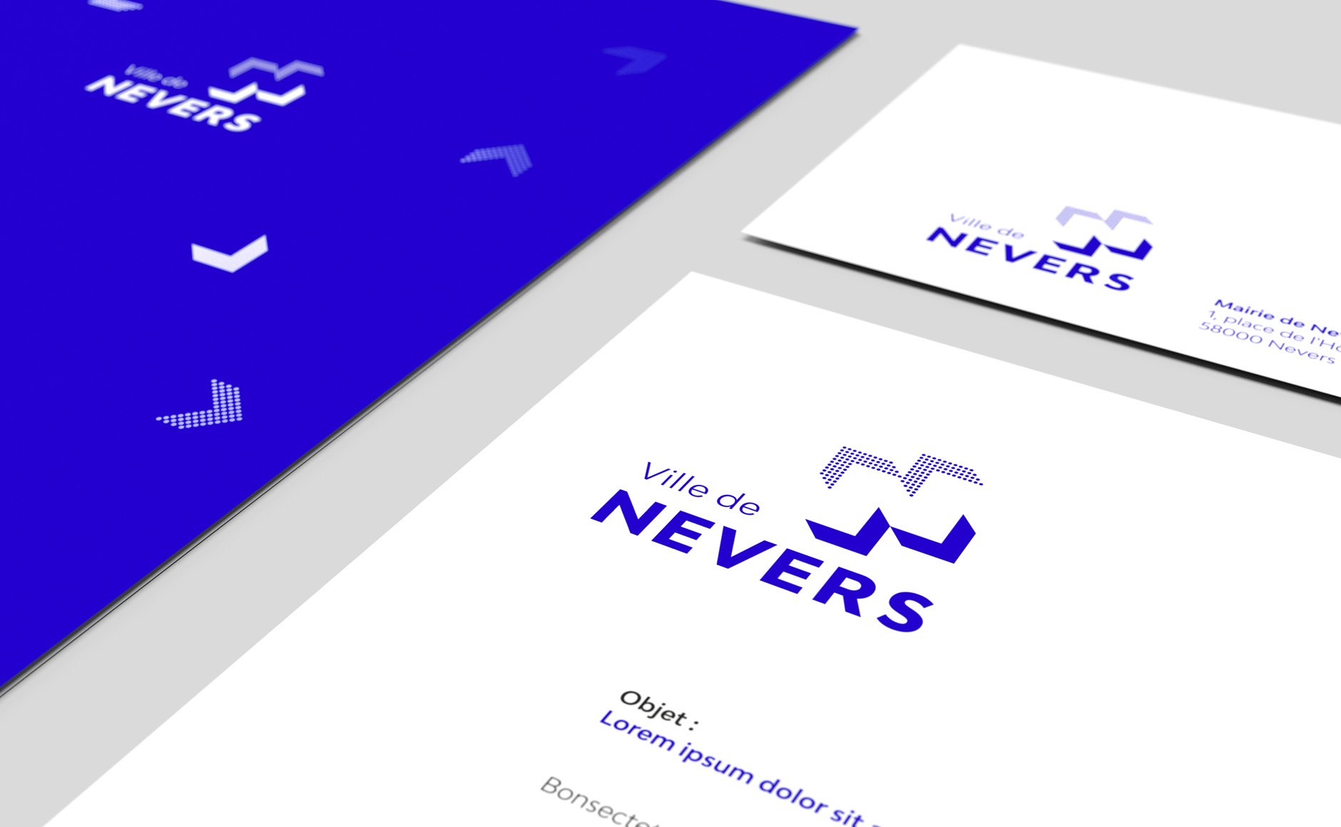
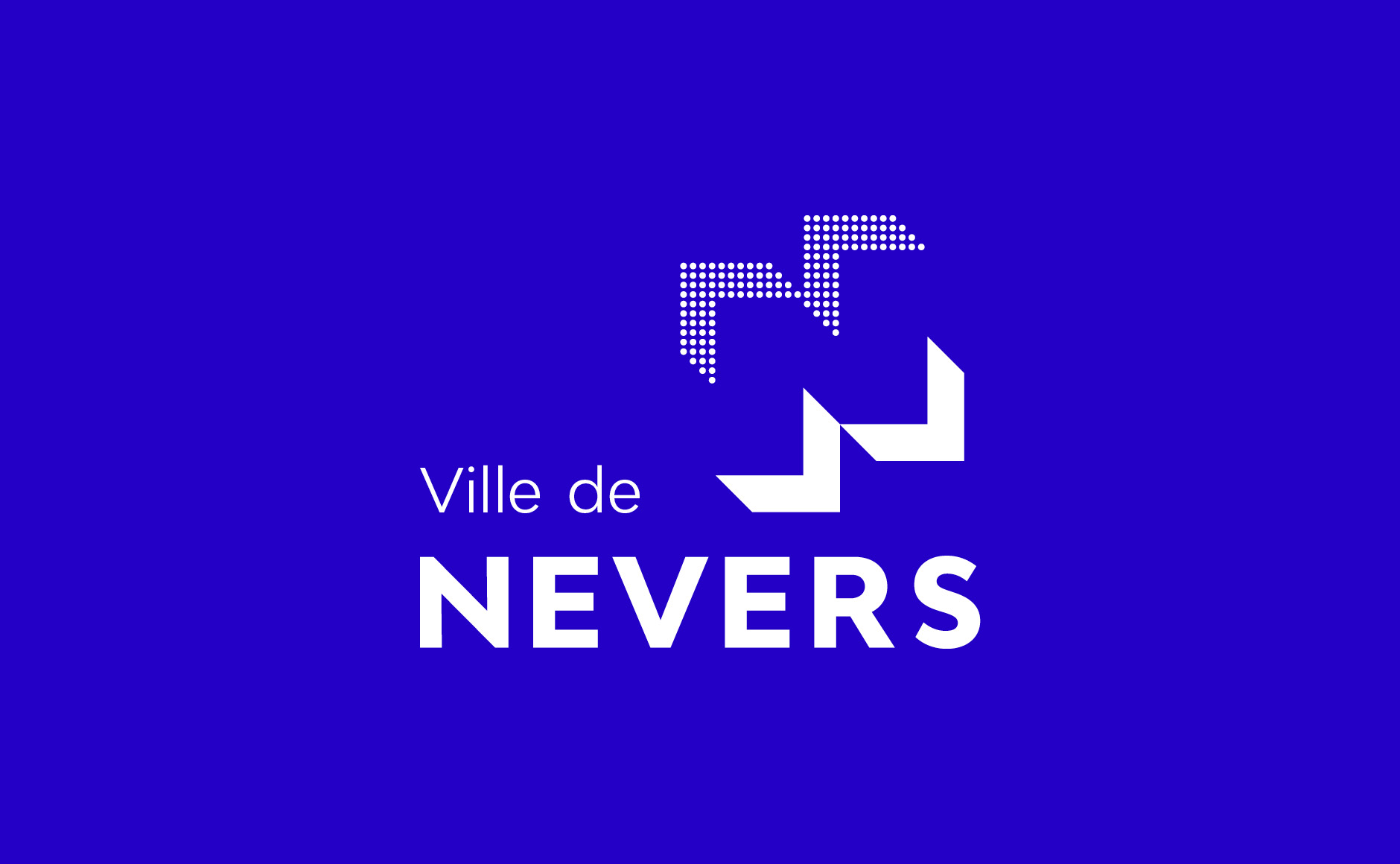
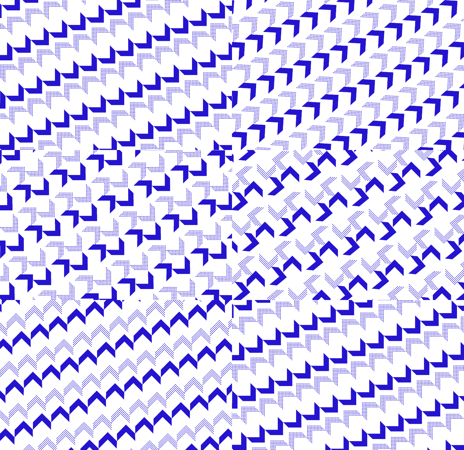
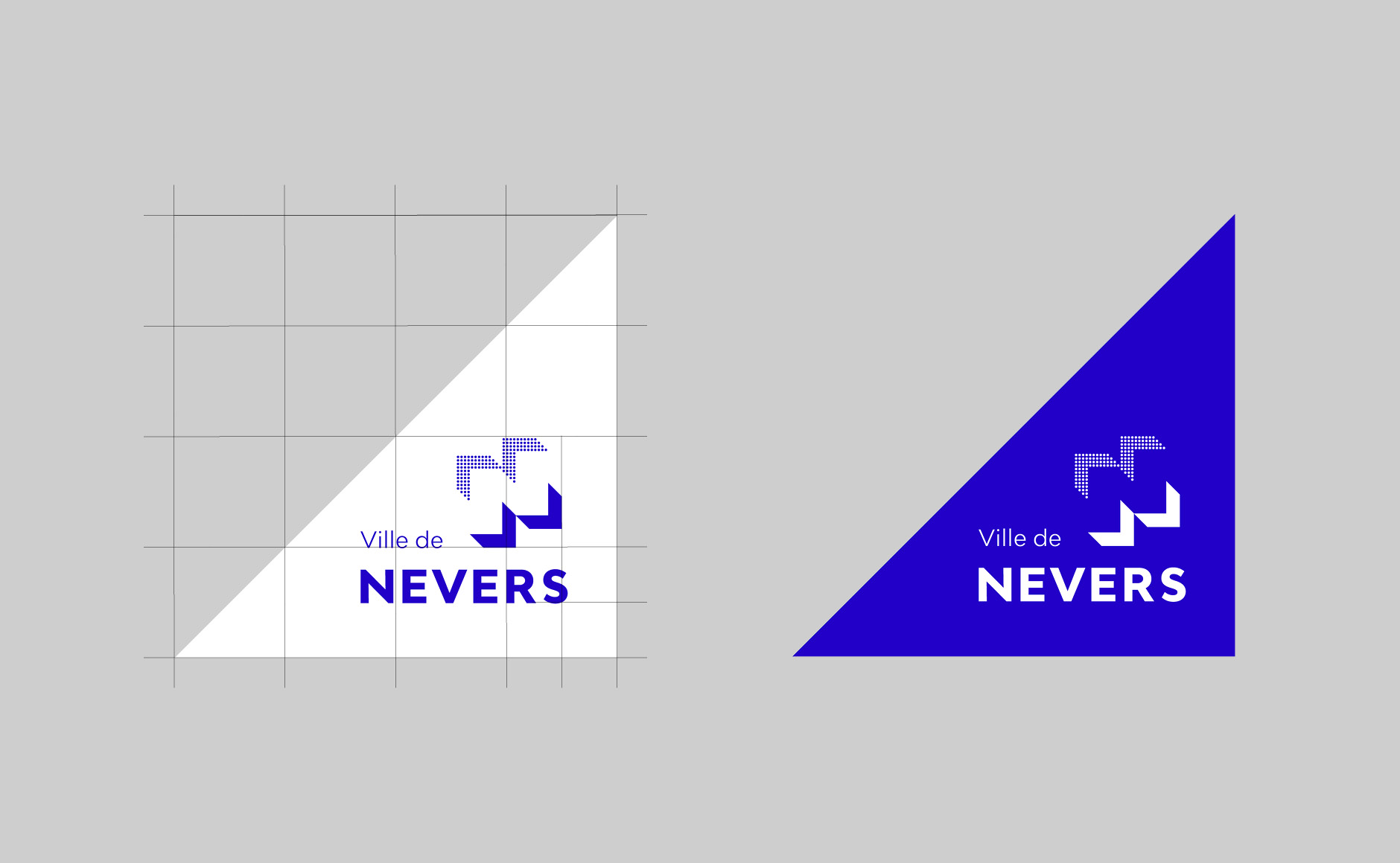
The logo is designed in a modular way. In its initial configuration it draws the letter "N", but it can be recomposed in a thousand ways...
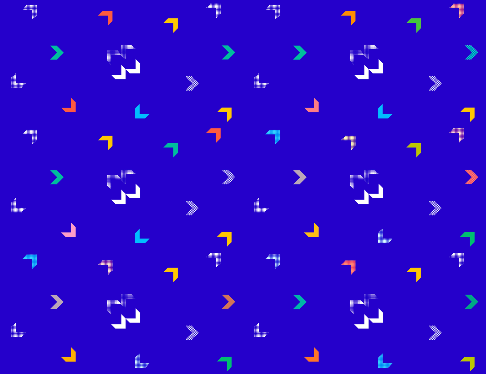
The idea of movement is written into his DNA. These arrows seem to open up as if to unfold the city's potential.
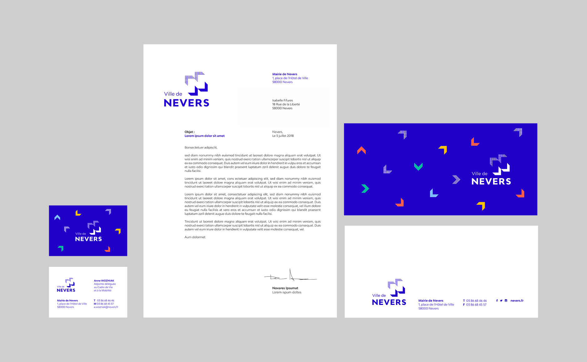
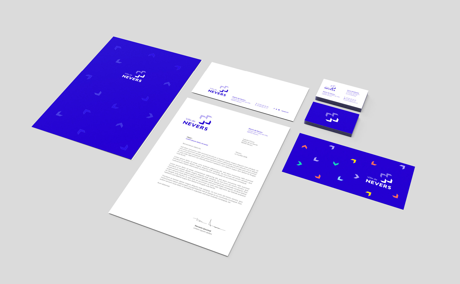
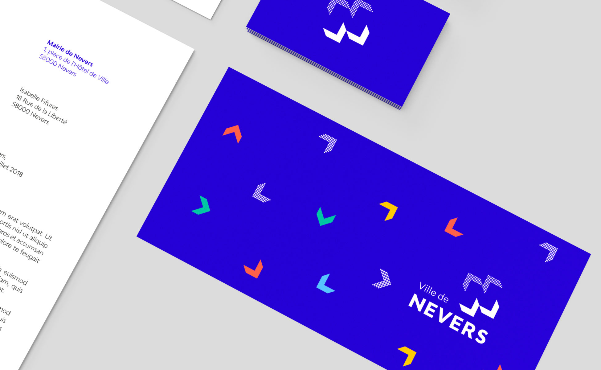
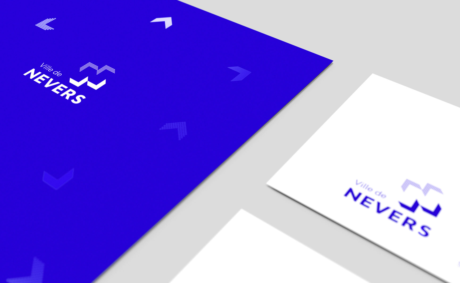
Stationery: simple, sober and functional. The chevrons, as the main ingredients of the identity, are used in a lively and colourful way.
The blue of Nevers
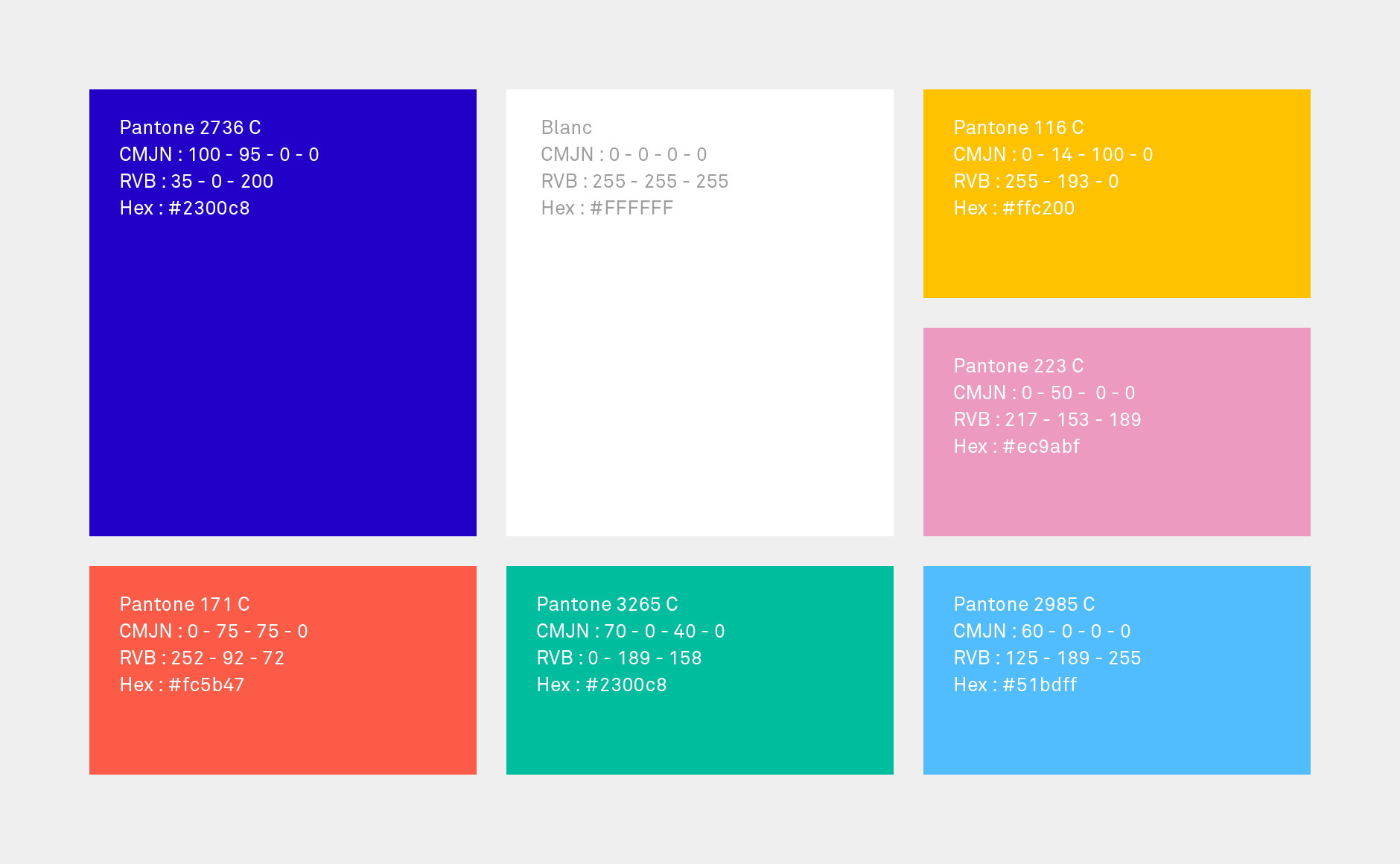
When it came to colour choices, the famous "Nevers blue" was chosen naturally. This cobalt blue obtained by firing manganese has been used to glaze Nevers earthenware for over 3 centuries. In addition, a more open range of colours enriches the system.
The posters
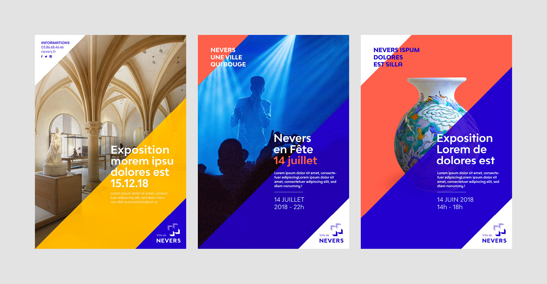
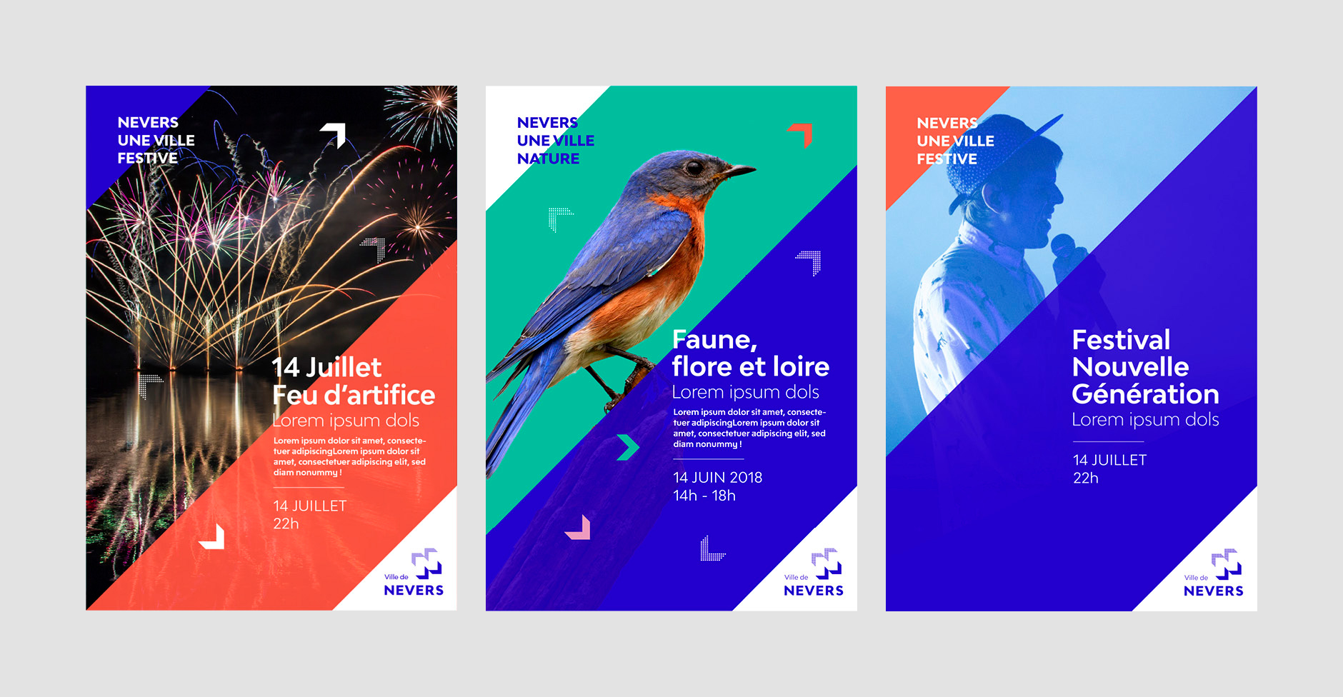
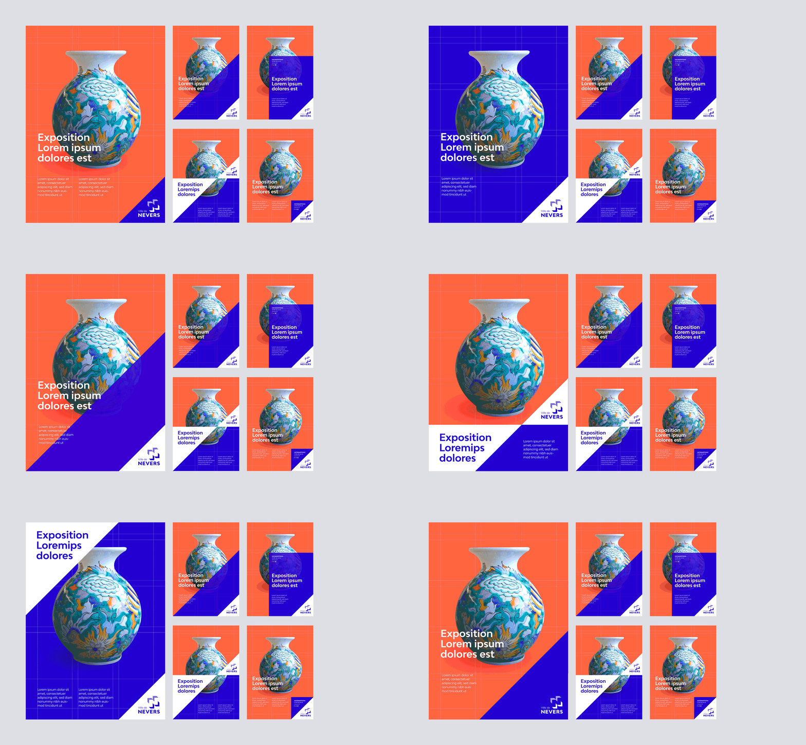
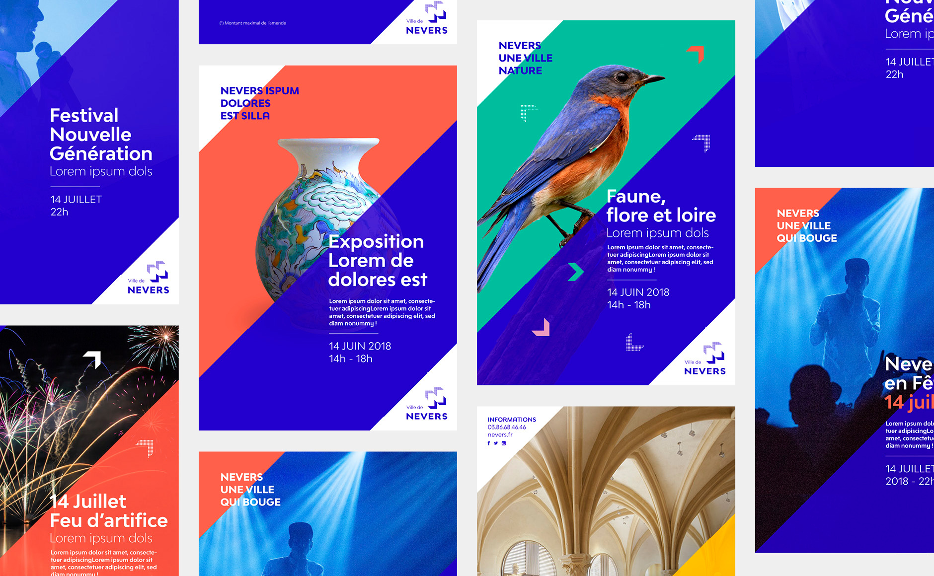
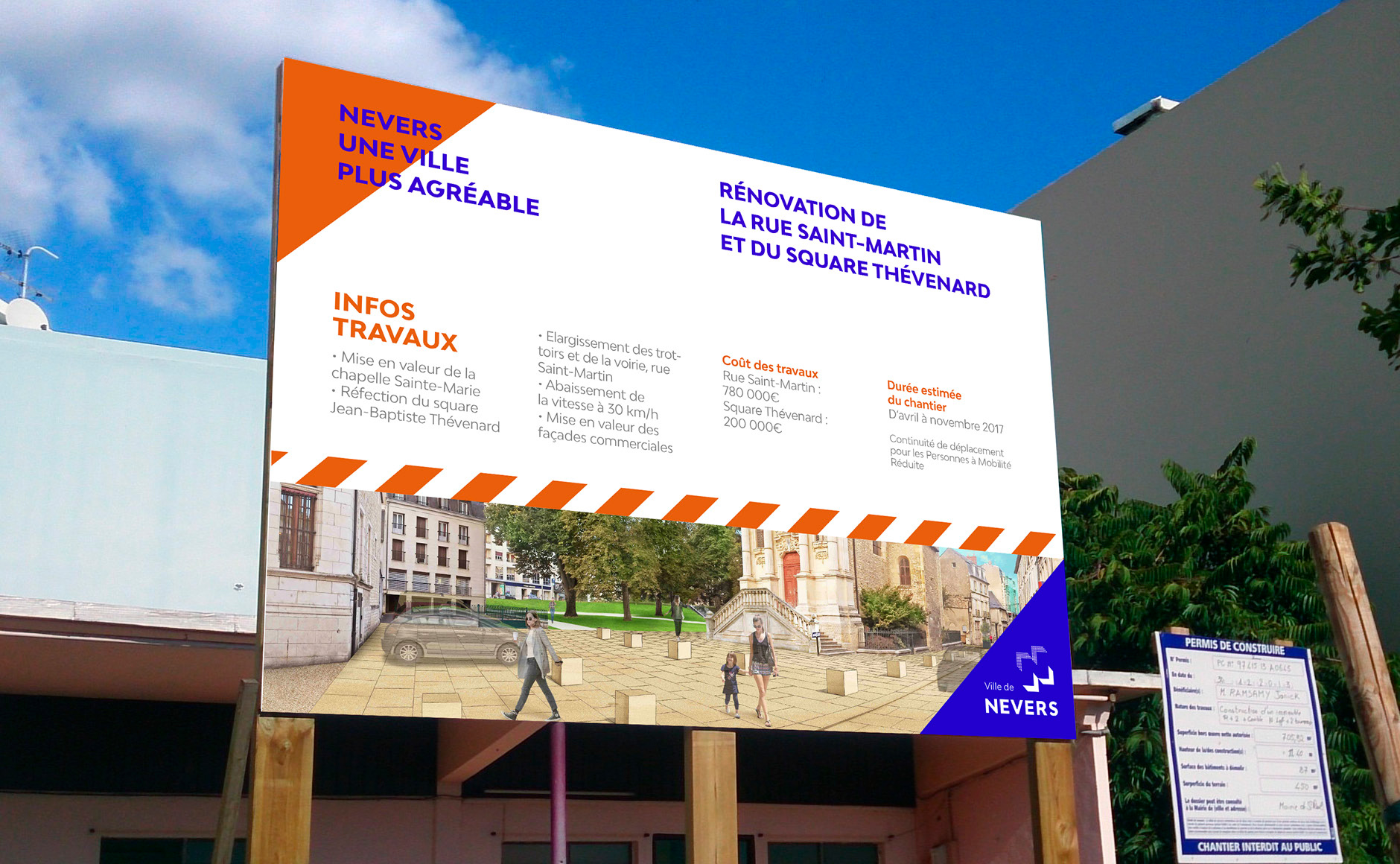
The angle of the logo is the starting point of the composition of the posters. Large diagonals cross the format to draw rhythms through the posters. Colours, texts and images produce structured and moving compositions. The system can be put in minor to give prominence to the visual, or express itself fully when the iconography is deficient.
Publishing
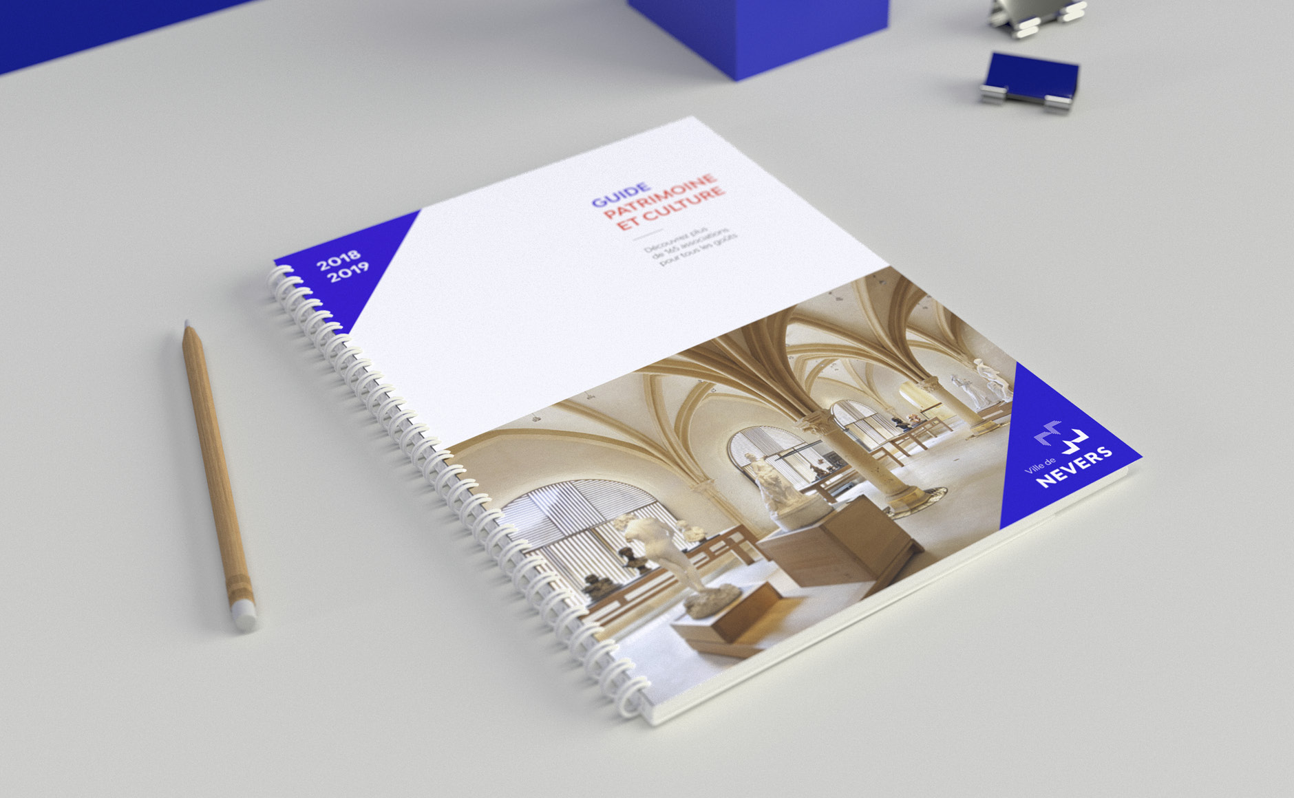
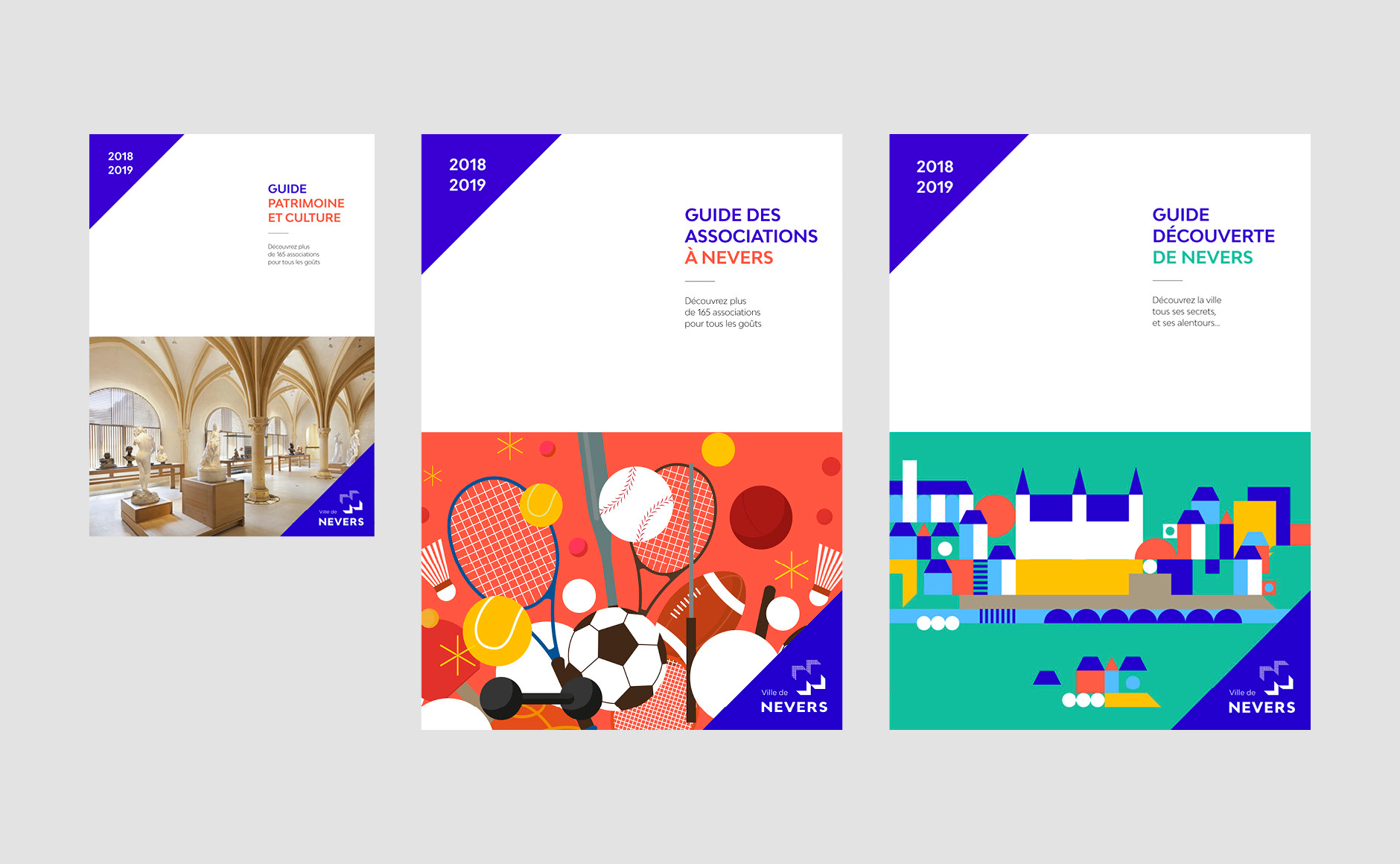
For publishing documents, the composition is more classic than for posters. The page is divided in two parts (text/image).
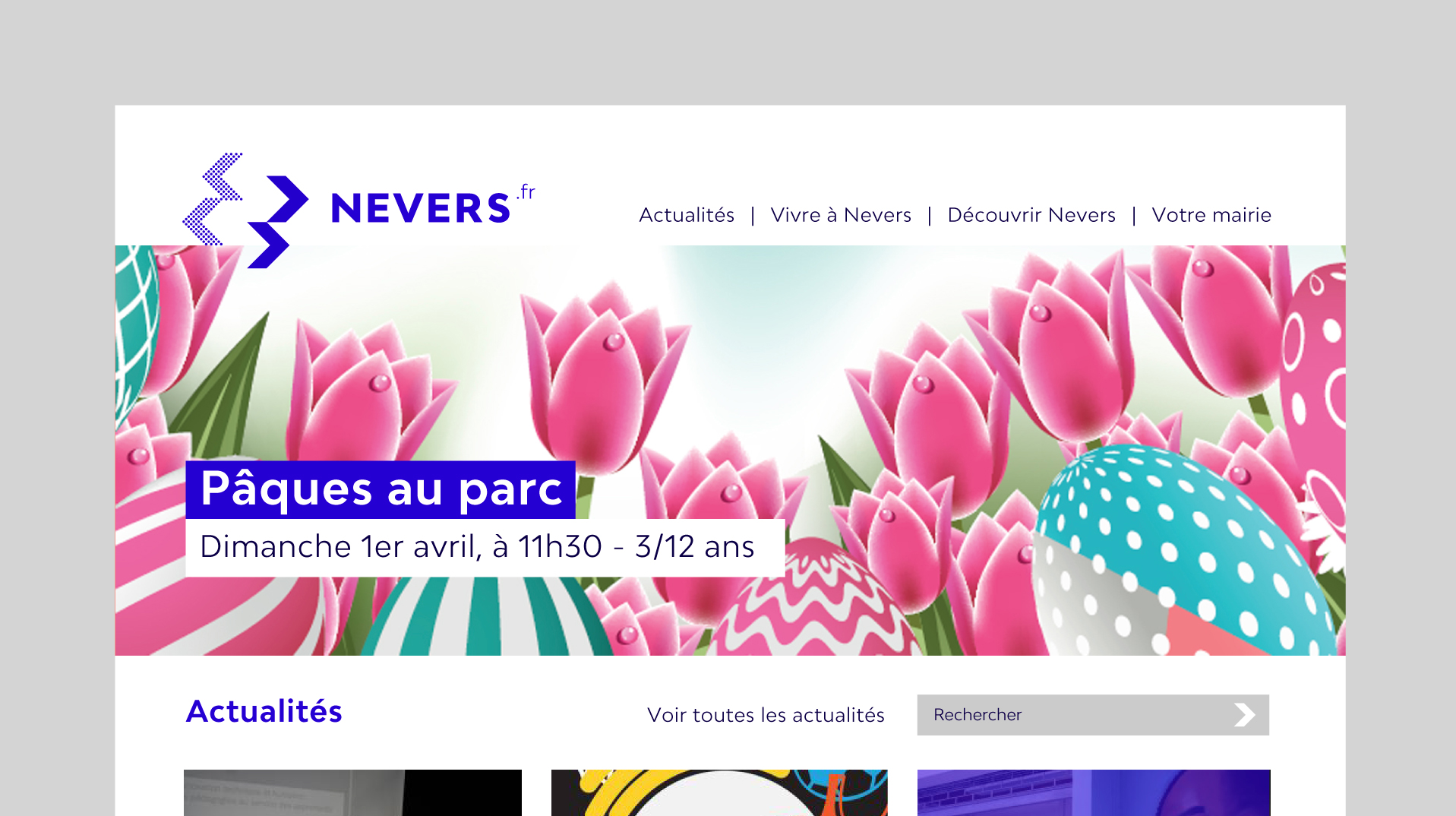
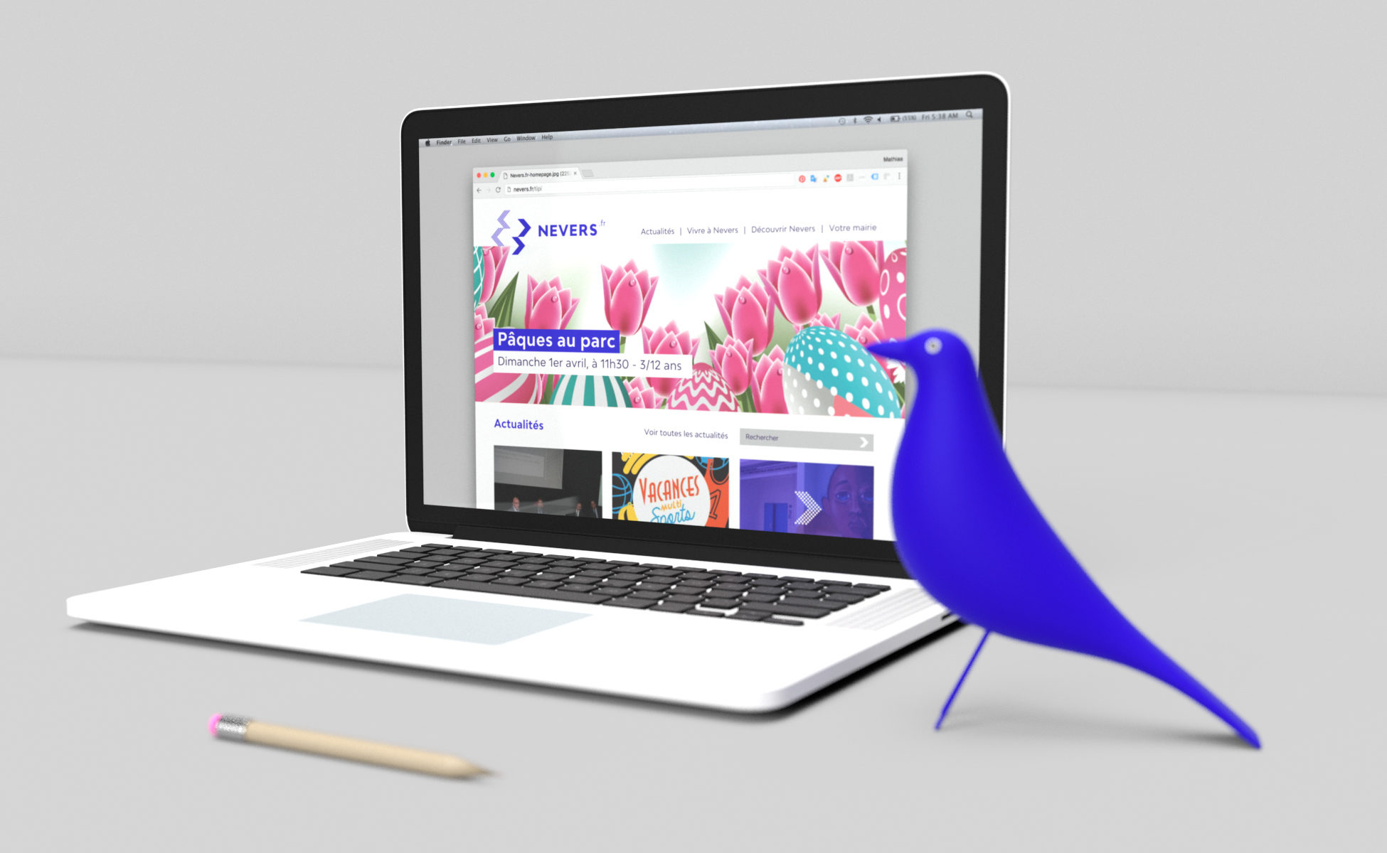
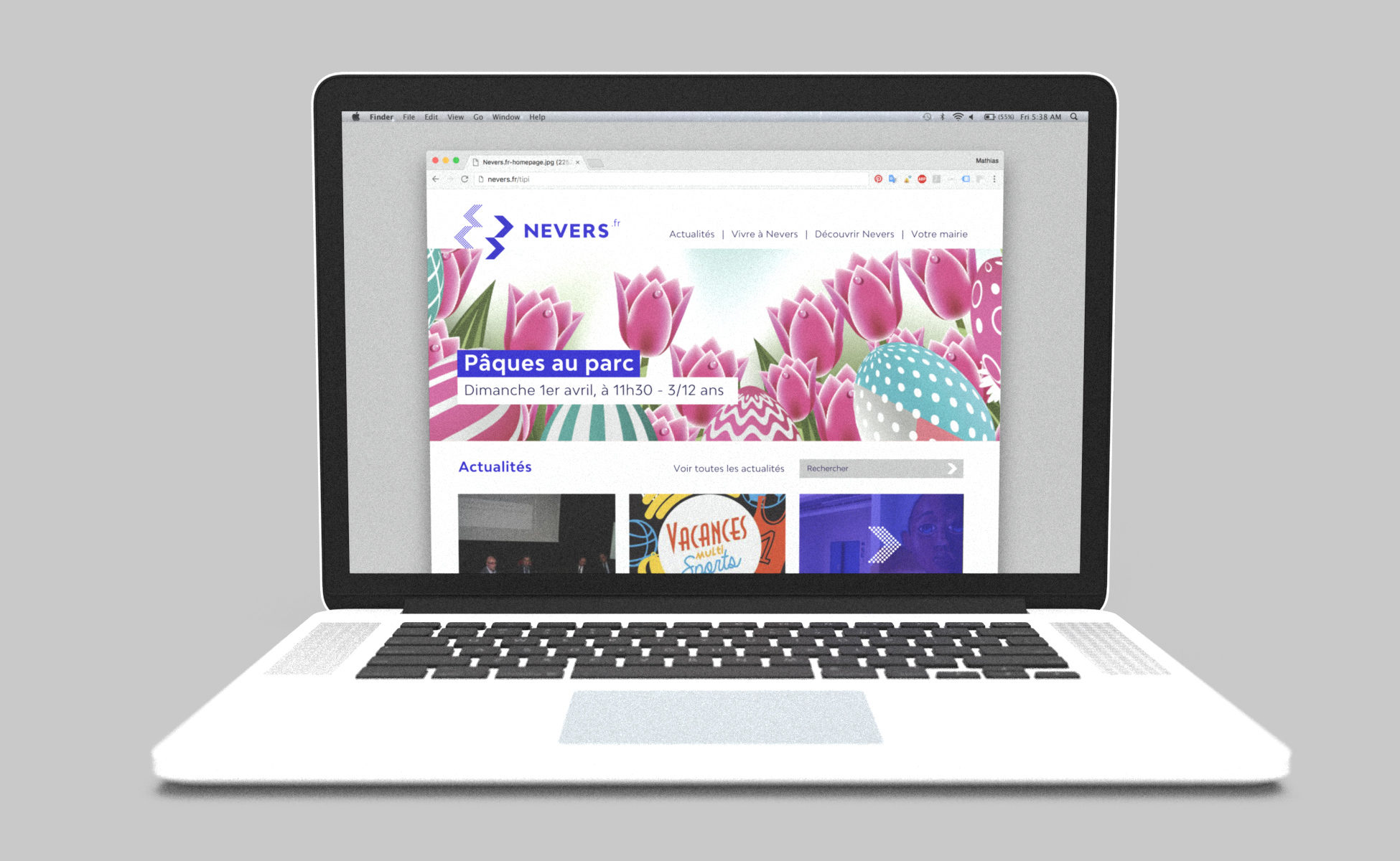
Homepage template for the city's website. The logo takes another configuration.
The context :
Nevers is a town of 37000 inhabitants, prefecture of Nièvre located in the heart of France. The town is the centre of Nevers Agglomération (an inter-municipal area with 13 municipalities and more than 65,000 inhabitants). Between 2018 and 2020, new municipalities should join this entity to bring the total to 18.
Nevers, is leaning against the Loire on its southern part. The river is a major asset of the city, ignored for too many years. The Loire is wild here, it does not cross the city as it can do in Tours, Orléans or Blois. It gives Nevers a "rebellious" character.
It is a city of proximity where life is good, animated by a rich cultural and event season and a dynamic associative fabric.
The objectives
In March 2014, the city of Nevers changed its municipality. The elected "no label" list carried the ambition to change and awaken the city. Nevers is often described as "sleepy beauty" and it is today, this image that we must change. This image is unfortunately, and too often - conveyed by the Neversois themselves, who do not perceive the assets and wealth of their city. We see that the best ambassadors are those who came by choice or those who travelled and returned. The Neversois must therefore be given back their city's pride and made true flag bearers.
Credit:
Thanks to Clément Gadoin for the motion design done on the new logo introducing video.
Special thanks:
Thanks to Denis Thuriot, Mayor of Nevers, Gildas Bizeul and the team of the city's communication department for their trust and the quality of the exchanges.
Publishing design, creation of magazine and brochure layouts. Logo creation, visual identity and graphic guidelines. Graphic design of posters, flyers, letterhead and business cards.
Institutional communication agency, public communication for cities and territories, government institutions, social partners and public administrations.

