The new BlaBlaCar logo wishes you a safe journey
BlaBlaCar, the european carpool start-up bringing drivers and passengers together, is adorned with a new logo. Actulogo is pleased to study this new branding!
Bringing people together, an idea made in France
Designed in 2003 in France by its founder Frédéric Mazzella, the Comuto project first grew up within the INSEAD (International Business School) community and exploded in 2007 thanks to… a train strike and a good press release. The genesis of BlaBlaCar is well told on their site (conversation obliges !). Today, the SME makes it a point of honour to bring us as close as possible to the places we love, in the simplest way possible.
To celebrate the more than 10 years of existence of the french start-up, the agency Koto gave a second youth, or rather a certain maturity to BlaBlaCar by rethinking its logo and brand identity. BlaBlaCar also re-specifies its raison d’être in the video presenting their new logo “human beings who come together through the magic of a conversation and go further, because they are together.”
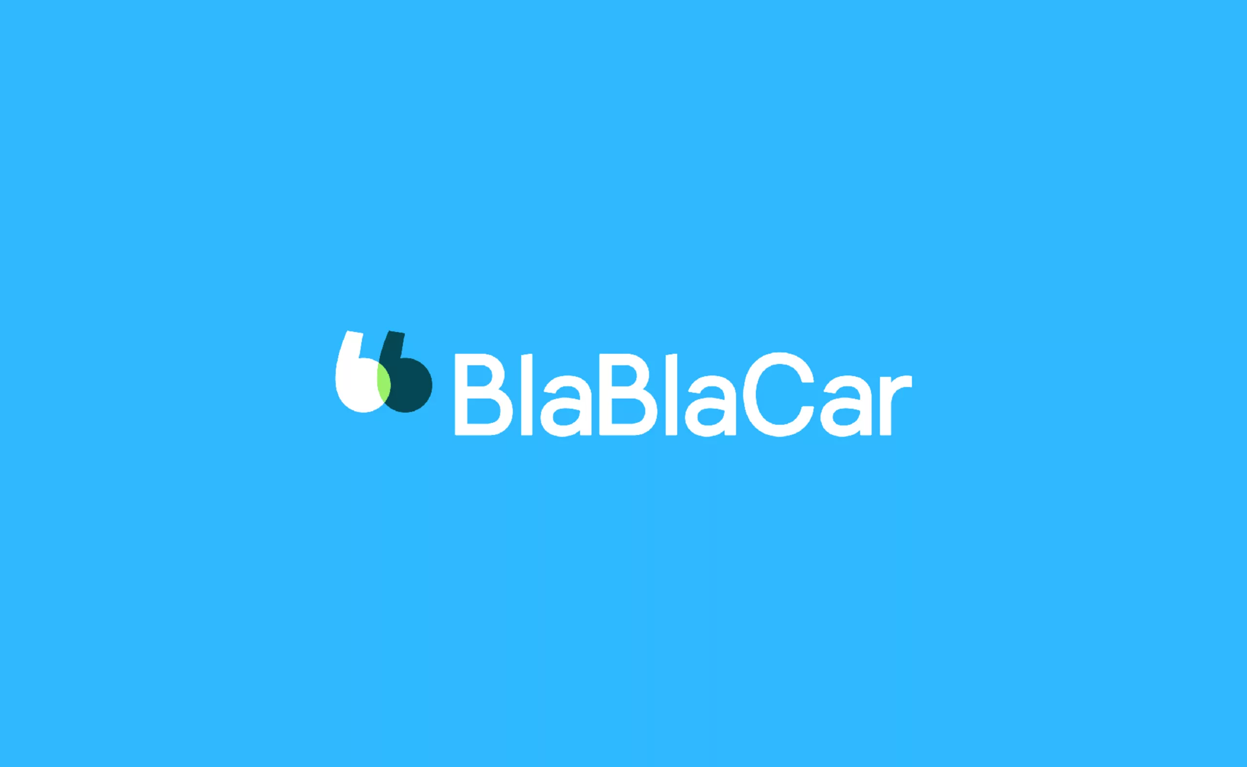
BlaBlaCar logo emphasizes conversation
As the agency explains on its website, “BlaBlaCar’s two B’s were worked like quotation marks, a universal abbreviation that expresses social interaction. The overlap of the two signs illustrates the connection that is created during the journey and between the passenger and the driver.” The brand adds “we now look like we really are“.
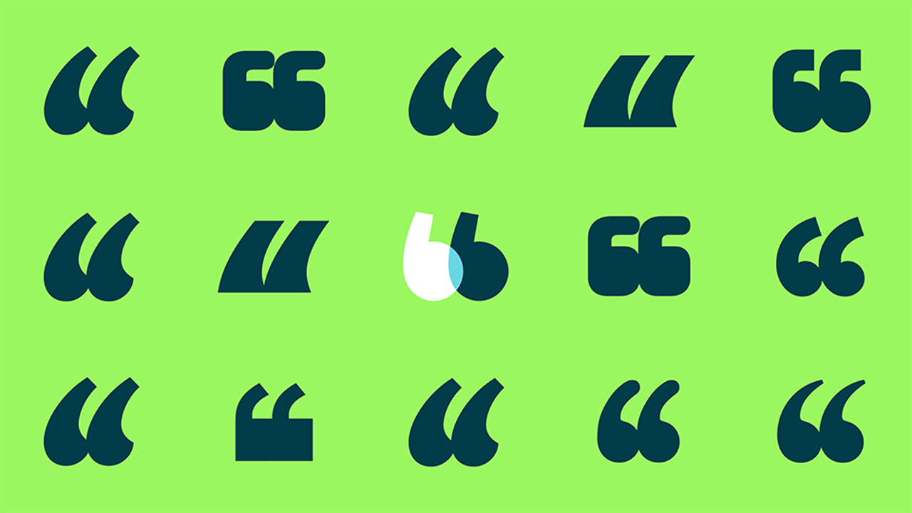
It must be said that the logo is as simple as it is effective, since in one sign it combines the two letters “b” of BlaBlaCar, announces a conversation and… draws two car seats (well, we, that’s what we see). Clever!
One can regret the neutrality of the typographical choice, a geometrical lineal designed to measure by Grilli Type. In reality, it is an adaptation of the GT Eesti font.
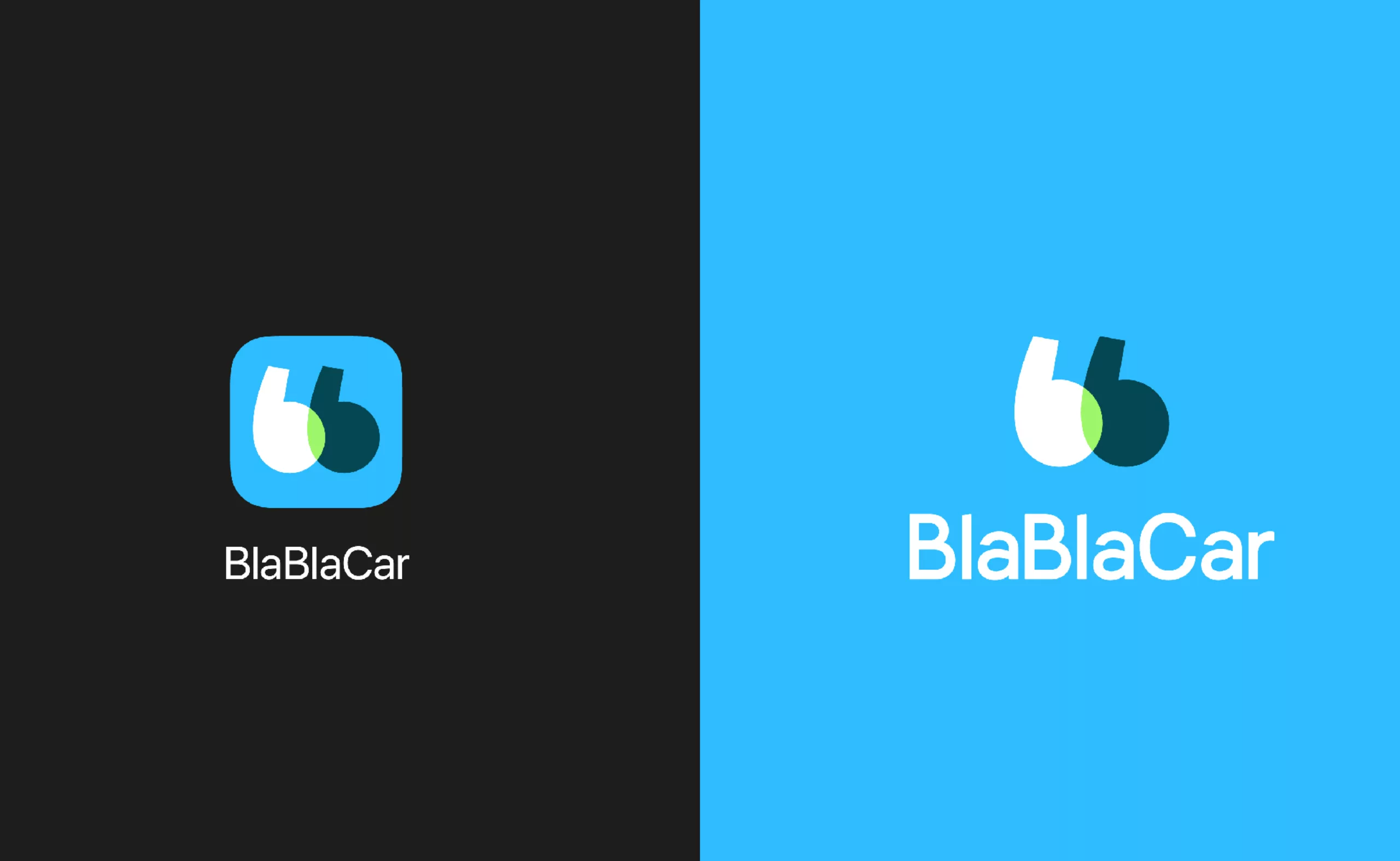
Note the generosity of the letter “a” with its big belly… Moreover we can note that the design of the “a” is not the same in the version icon on black background above… probably to avoid a problem of hazardous crenelling when the logo is small…
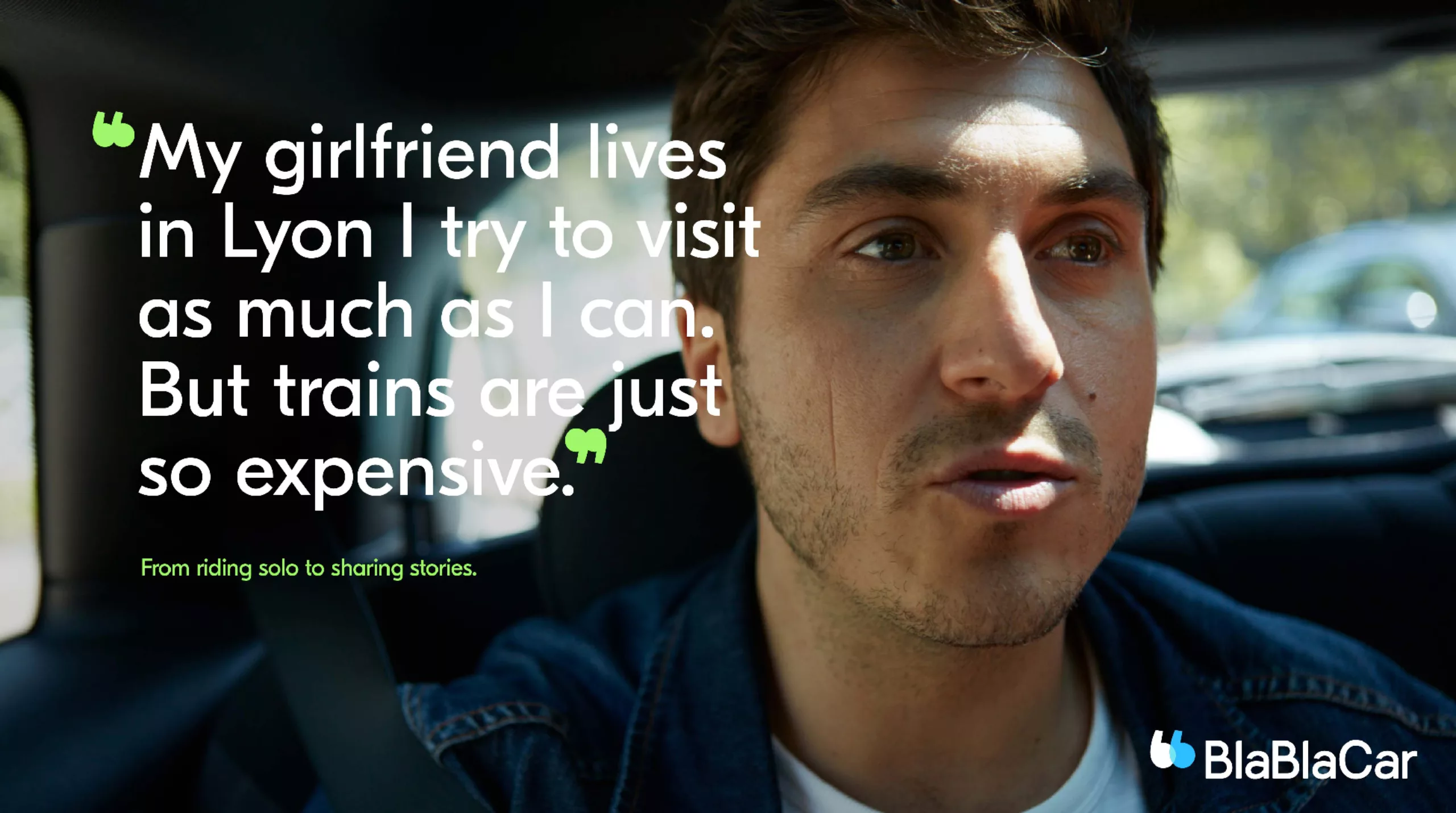
And since conversation and rapprochement are in the spotlight, the campaigns are supported by photographs, moments of life taken from car trips. People’s lips are open, caught up in conversation. An excerpt of these exchanges of words are placed roughly on the image, between the famous quotation marks BlaBlaCar.
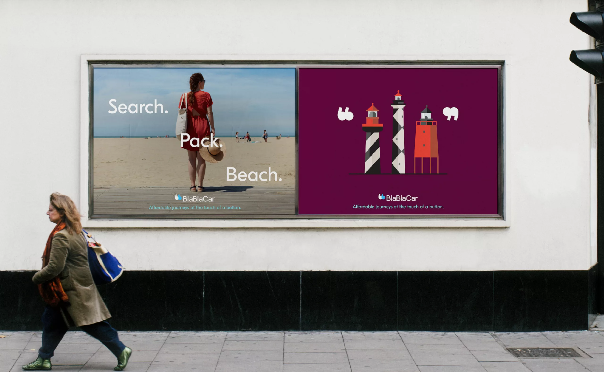
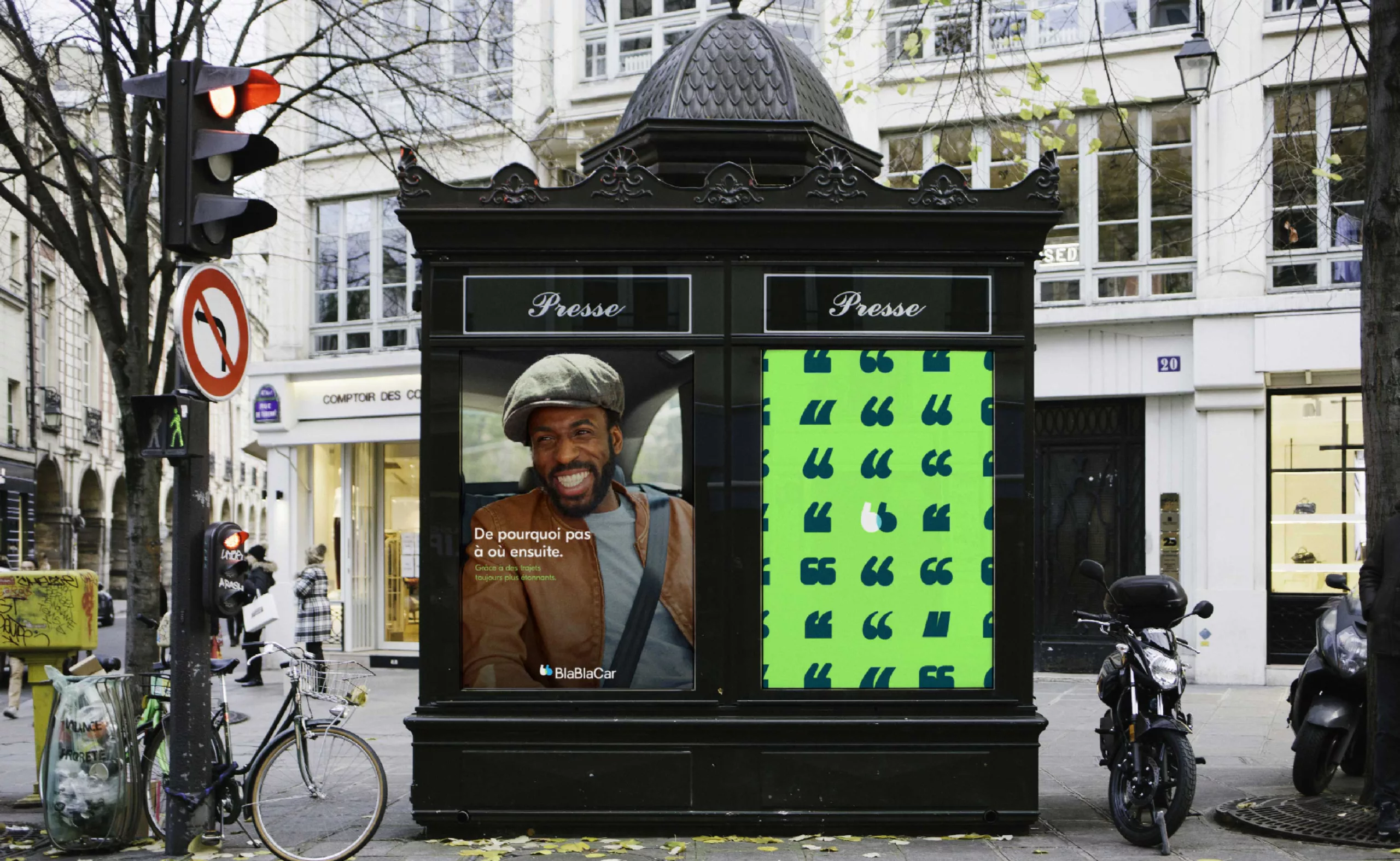
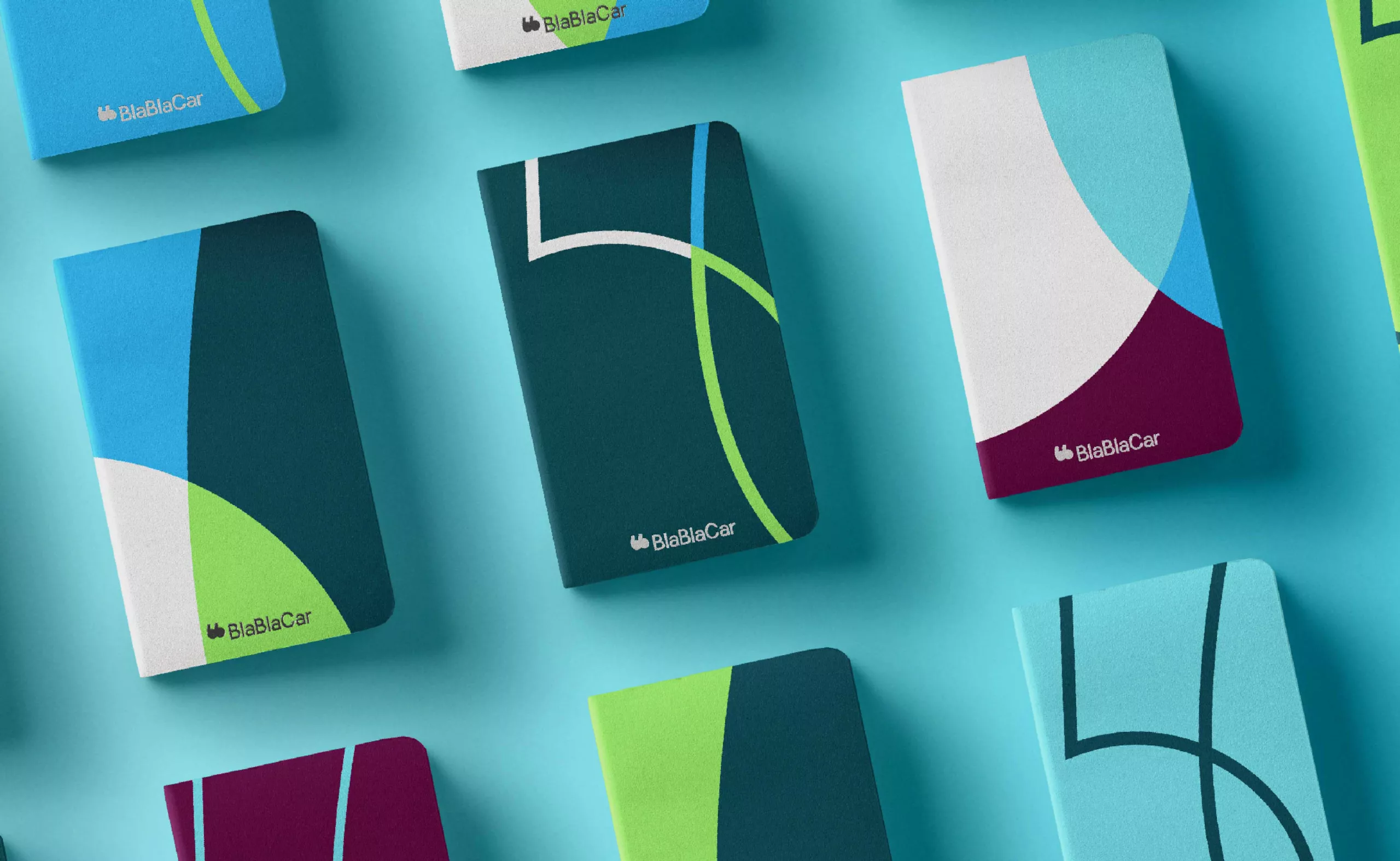
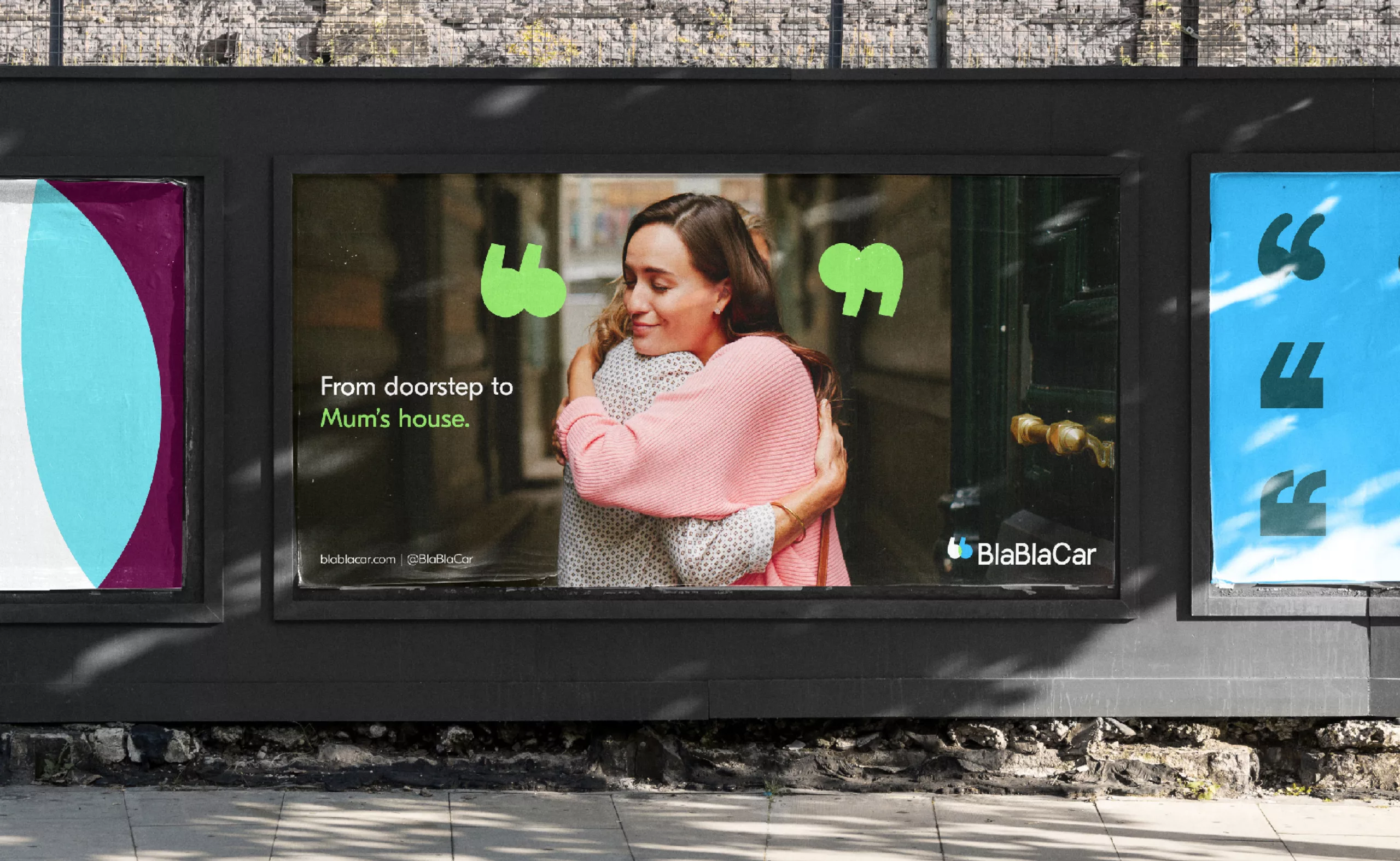
As for the choice of colors, we unfortunately find these fresh tones and very in the air of time that remind the flat universe of Ebay / Spotify / Deliveroo… Concerning the green touch that appears in the middle, it probably adds an unconscious reference to the ecological benefit of carpooling.
Finally, it is the photos that bring the identity to life, more than just solid colors and a logo lost in the middle, which allows you to feel the emotion that the brand wants to convey (if you pass me the pun).
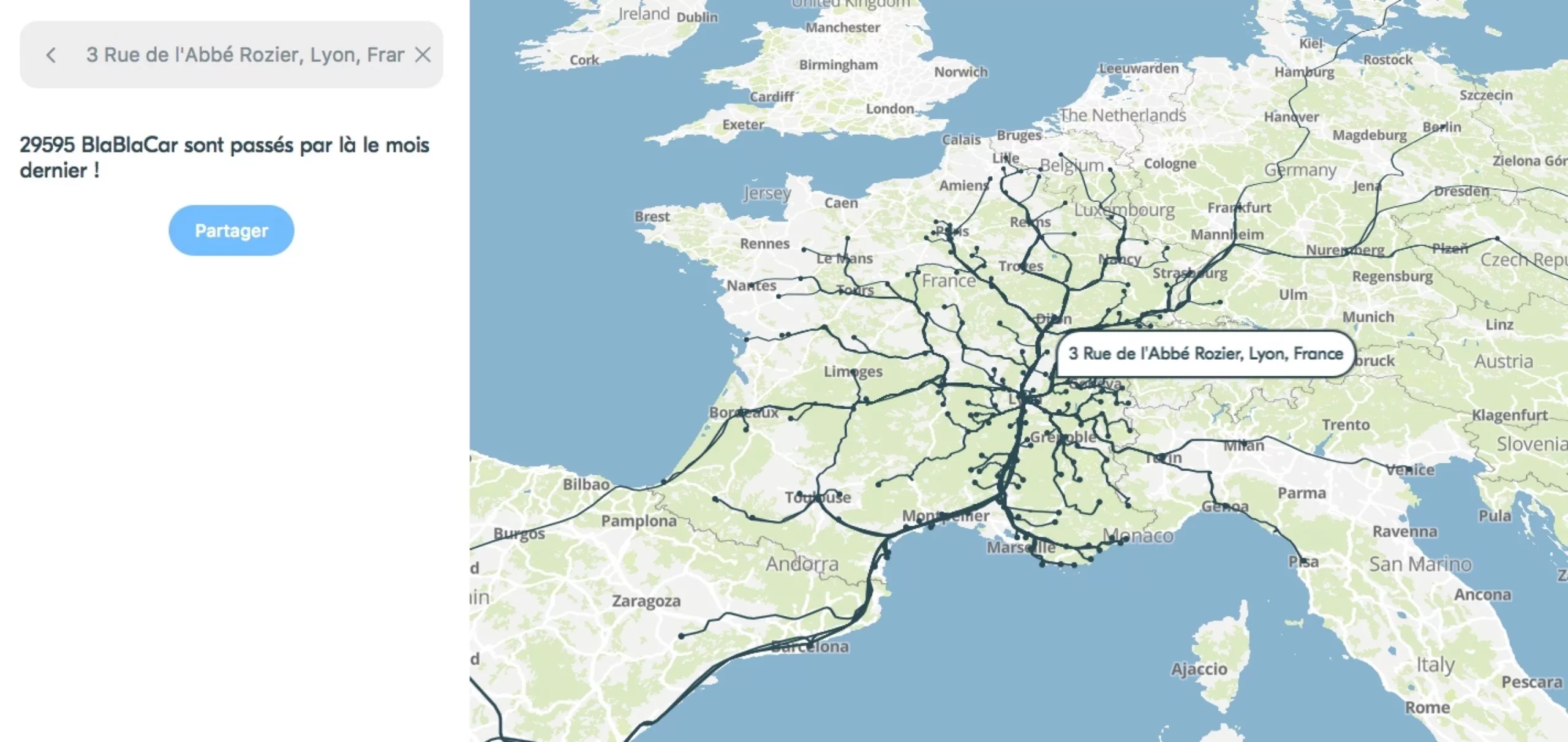
On the web, BlaBlaCar took the opportunity to unveil its new carpool search engine with an improved algorithm, which looks like a purely mobile interface, which makes a lot of sense. A little bit more, we now know who’s carpooling over to our place.
So of course, we wish this new identity a safe journey!
On the subject
-

Groupama’s new visual identity, a logo in the open countryside
Groupama has just unveiled a new logo that updates its graphic design by abandoning its campaign in favor of a “startup” aesthetic.
-
From surnames to acronyms: creating a brand name from letters
From founders’ surnames to initials and acronyms, brand names have always oscillated between abstraction and familiarity.
-

The UN logo takes on water during COP28
For COP28, two designers have come up with a new UN logo showing the rising sea levels and the future disappearance of much land and coastline.