Don’t be tender with the tinder logo!
Let me start with a “very professional” alibi to prevent gossip. I was doing a visual identity benchmark for a match brand when I came across the Tinder logo… Better: I was looking for the translation of the “tender map” when I clumsily wrote “Tinder map”… Anyway, I won’t apologize for taking interest in Tinder’s logo on a blog dedicated to logos!
Logo game with 8 errors
So, let’s have a look at the logo used on Tinder’s homepage… Eight errors are hidden in the logo! Can you find them? You’re allowed to click on the image to see it in high resolution…
[ Scroll down to see the answers ]
The answers are…
It’s quite surprising that a brand like Tinder didn’t really pay attention to the finalization of its logo! The graphic designer was probably distracted… busy swipping instead of being focused on work!
Well, the errors are so gross that we can’t imagine anything other than a bug at compression or saving. However it does stain, especially when you know that it is the file that is widely used as for example on Wikipedia.
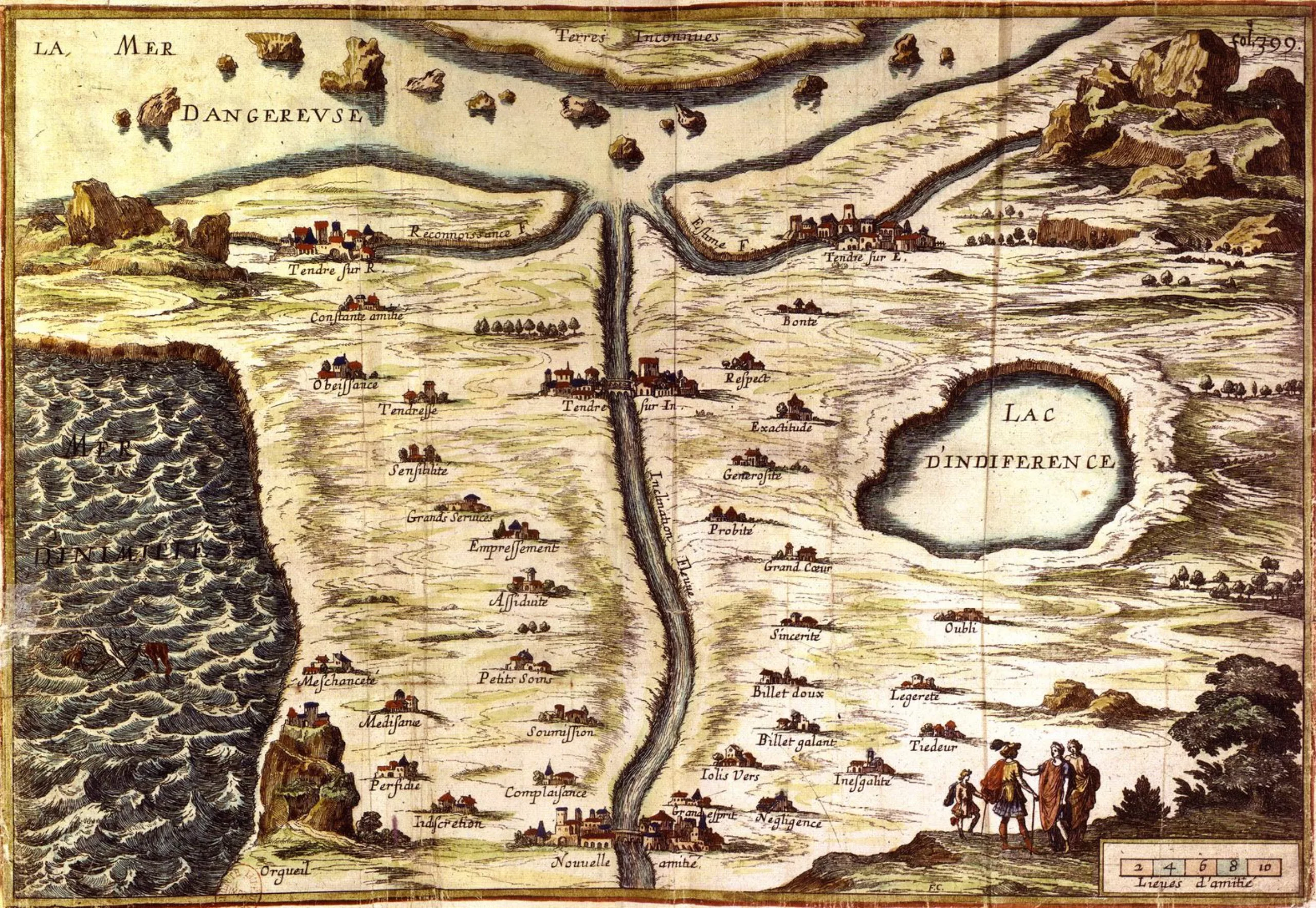
The Carte de Tendre
Since we don’t like writing articles without trying to teach you something interesting, let’s come back for a moment on the “map of the tender”…
The Carte de Tendre, often mistakenly named Carte du Tendre, is the map of an imaginary country called Tendre, imagined by Madeleine de Scudéry in her novel Clélie, histoire romaine, published in 10 volumes from 1654 to 1660. This work is an example of the allegorical cards of love, “a genre advocating sentiment, its analysis and its discourse. He has a baroque literary style, a high vocabulary, a refinement of feeling and an importance of interiority” (source Wikipedia)
A video is better than a long speech…