Duperré School changes of visual identity
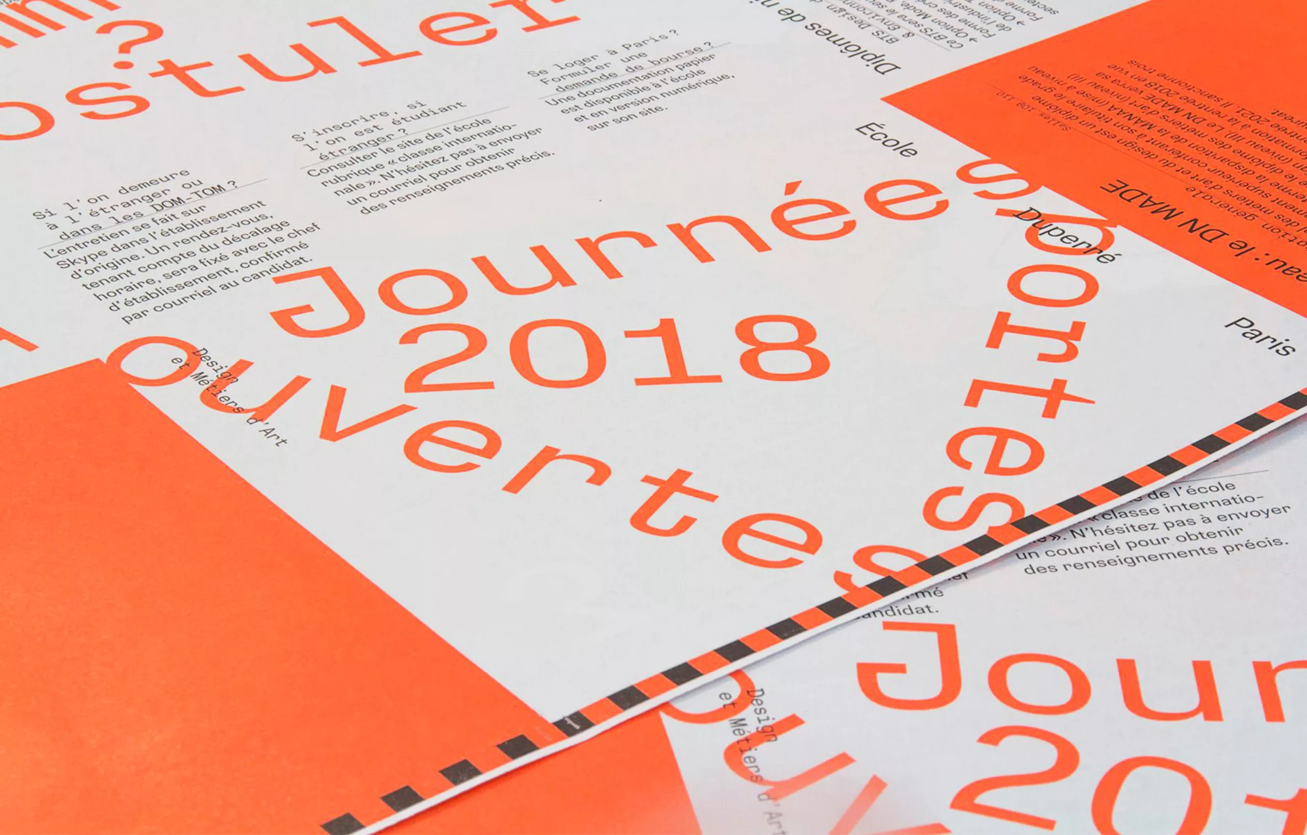
The new visual identity of the Duperré school was unveiled at the beginning of February at the 2018 open house. Atelier Ouf ! in collaboration with the foundry Production Type created the new visual identity.
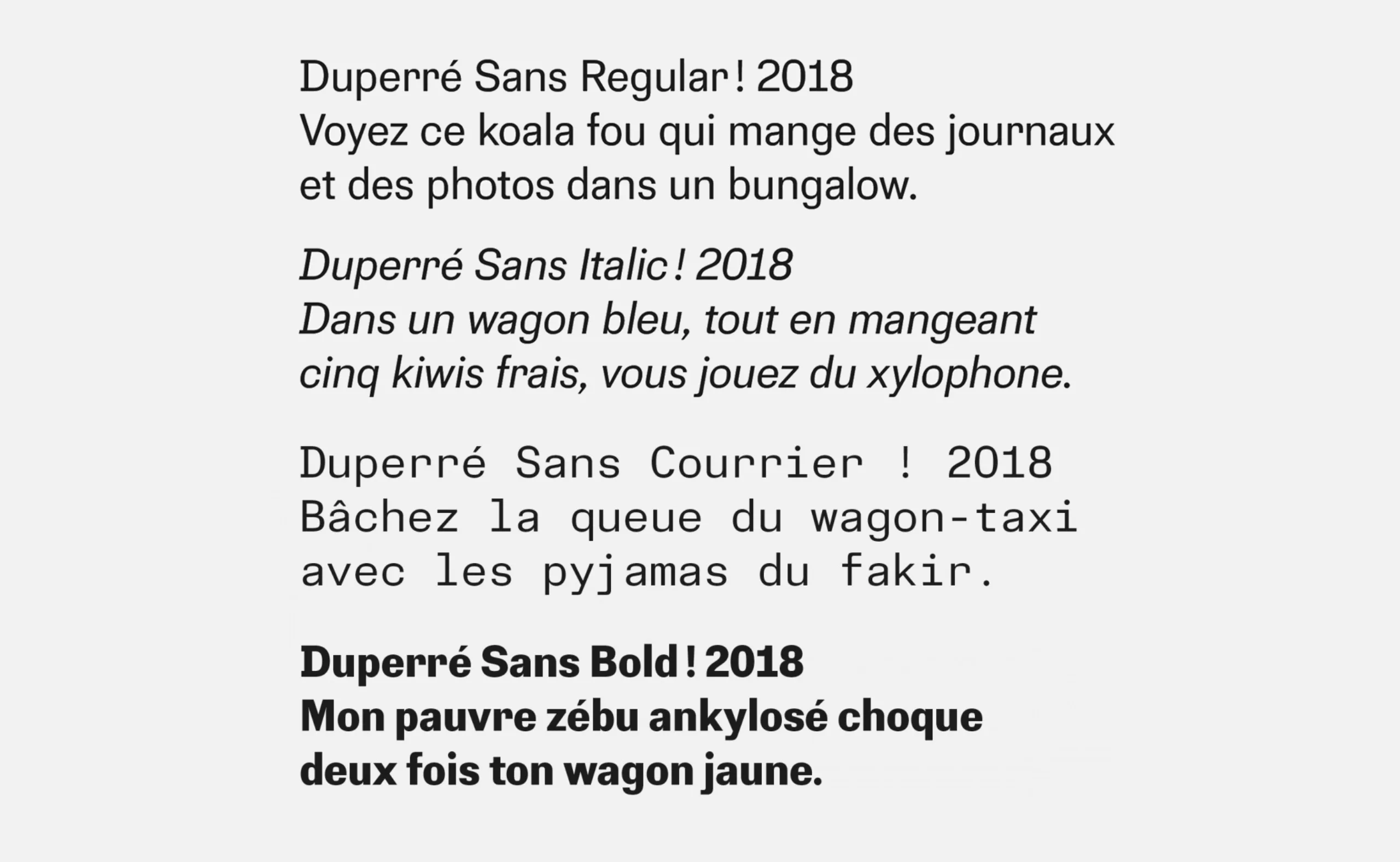
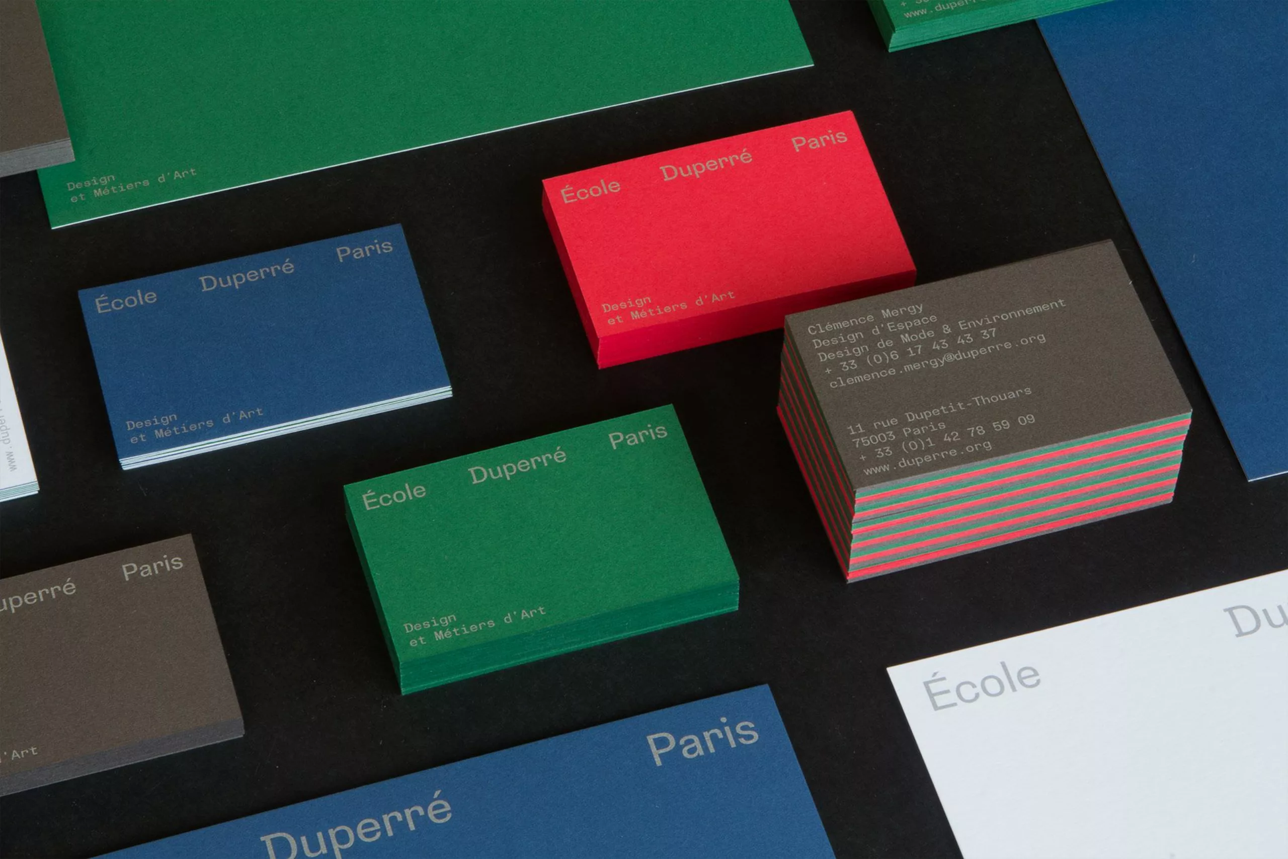
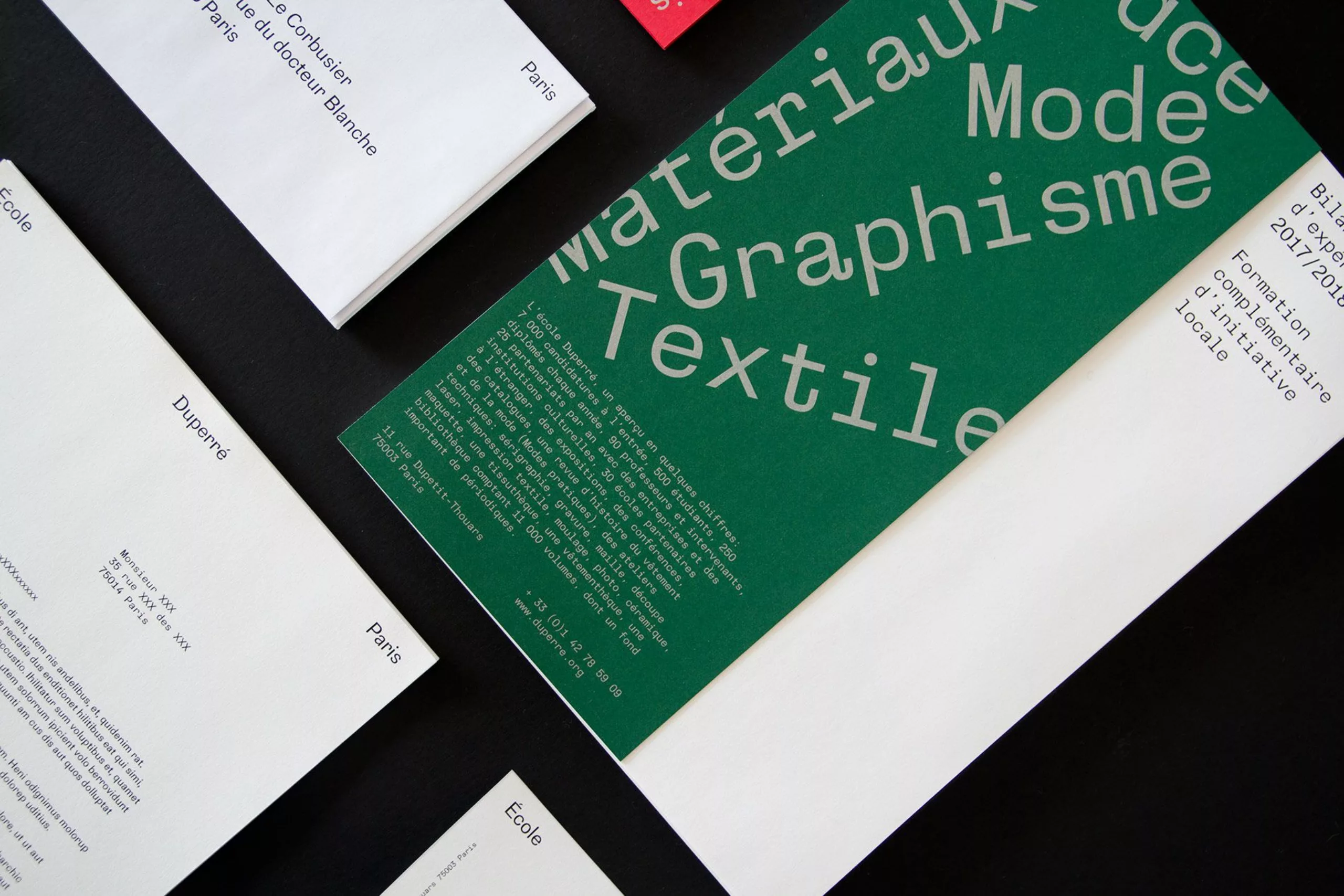
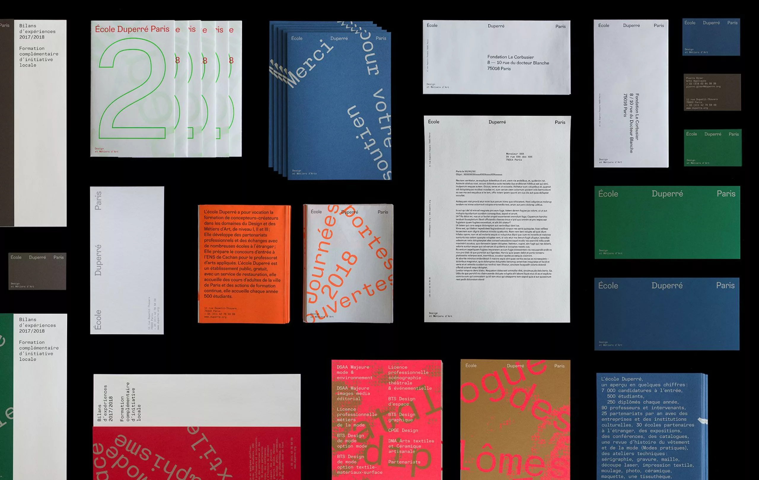
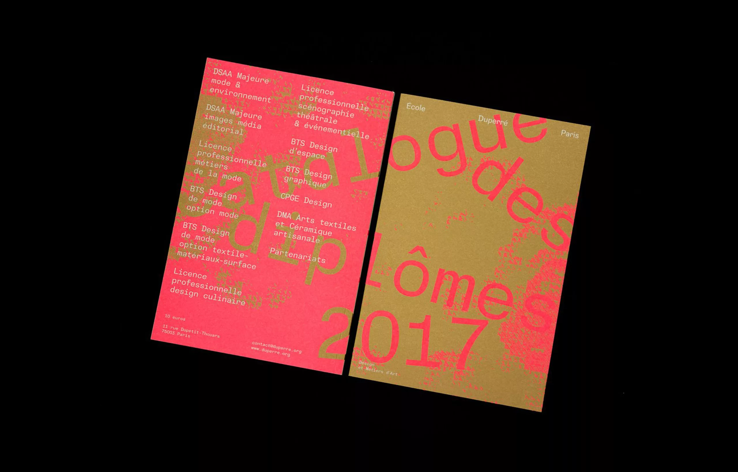
The graphic and typographical principles are based on the use of a dedicated character: the Duperré Sans. Identity is built around a principle of signature and the exclusive use of 4 bodies of text. It has no identity colour or associated iconographic register. The first published materials unveiled highlight the new typeface. Future materials should emphasize pictorial, abstract, poetic, provocative, calm or stilted direction depending on subjects, contexts and editorial choices.


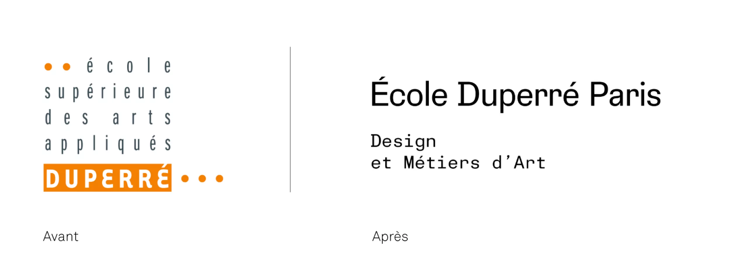
A few words about the old Duperré logo
The new visual system of the Duperré school no longer has an identity colour as was the case with the old logo whose orange cartouche now appears too “playful” and more elegant and timeless enough for the school’s “fashion and design” image. This orange had perhaps initially been retained in reference to the brick architecture of the building. The typography of the “Duperré brand” block now appears too dated. The title “Duperré” was until then composed with the Tarzana character designed by Zuzana Licko in 1998.
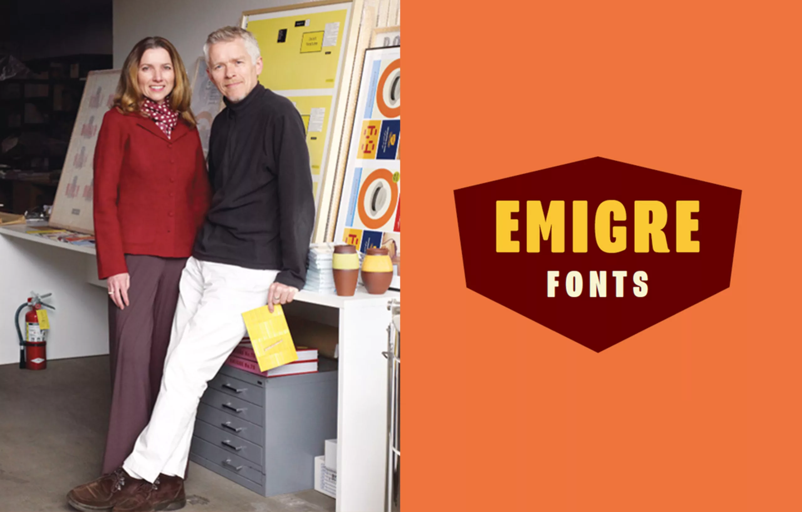
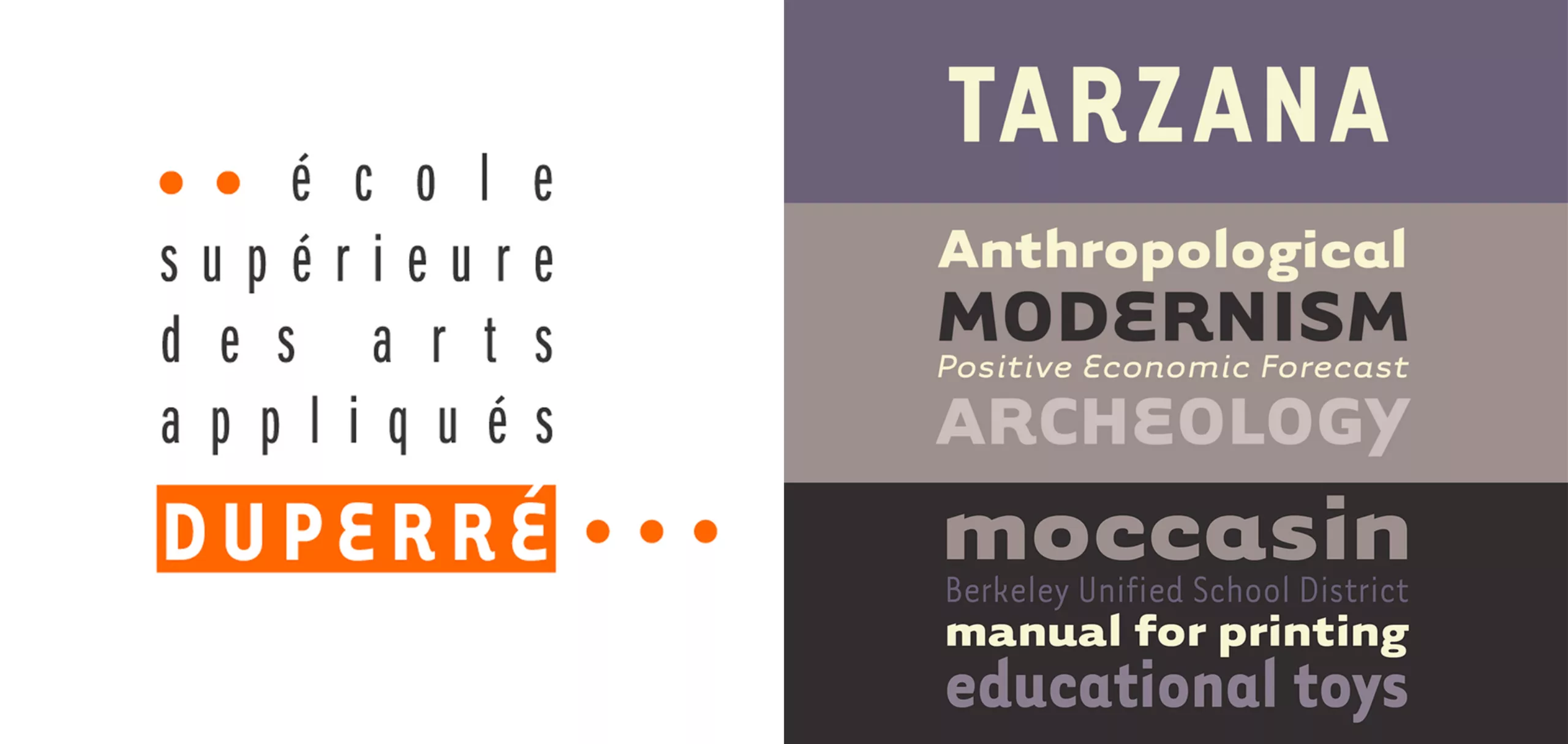
The Tarzana font evokes the early 2000s, and the golden age of the Emigré foundry founded in 1984 by Rudy VanderLans and Zuzana Licko. Only Frutiger’s condensed universe used for the “Ecole Supérieure des Arts Appliquées” is a typographical choice that still has the merit today of remaining both timeless and elegant. For the anecdote, as an agency founded by two former students of the school, Graphéine’s logo makes a nod to this “E” in Tarzanna Epsilon.
The new visual identity of the Duperré school
The new visual identity of Duperré takes part of the creation of a proprietary typography rather than the design of a new “dry” logo which would be the choice of a more authoritarian communication. A true bias to design a flexible and modest visual system, so dear to Ruedi Baur’s design vision. Its function as an open system allows it to be appropriated by all staff, teaching staff and students.
The typeface created by Atelier Ouf and Production Type is not without wink at the monospaces characters inherited from the typewriter and undeniably evokes an independent graphic design, a fanzine atmosphere of the 70s and 80s. A chic and punk spirit falsely “to the snatch”. This aesthetic, both technical and “Do it Yourself” that the typographic block evokes, is totally in phase with the teaching of the Duperré school, which encourages experimentation in all directions, as well as the transversality of knowledge and disciplines.
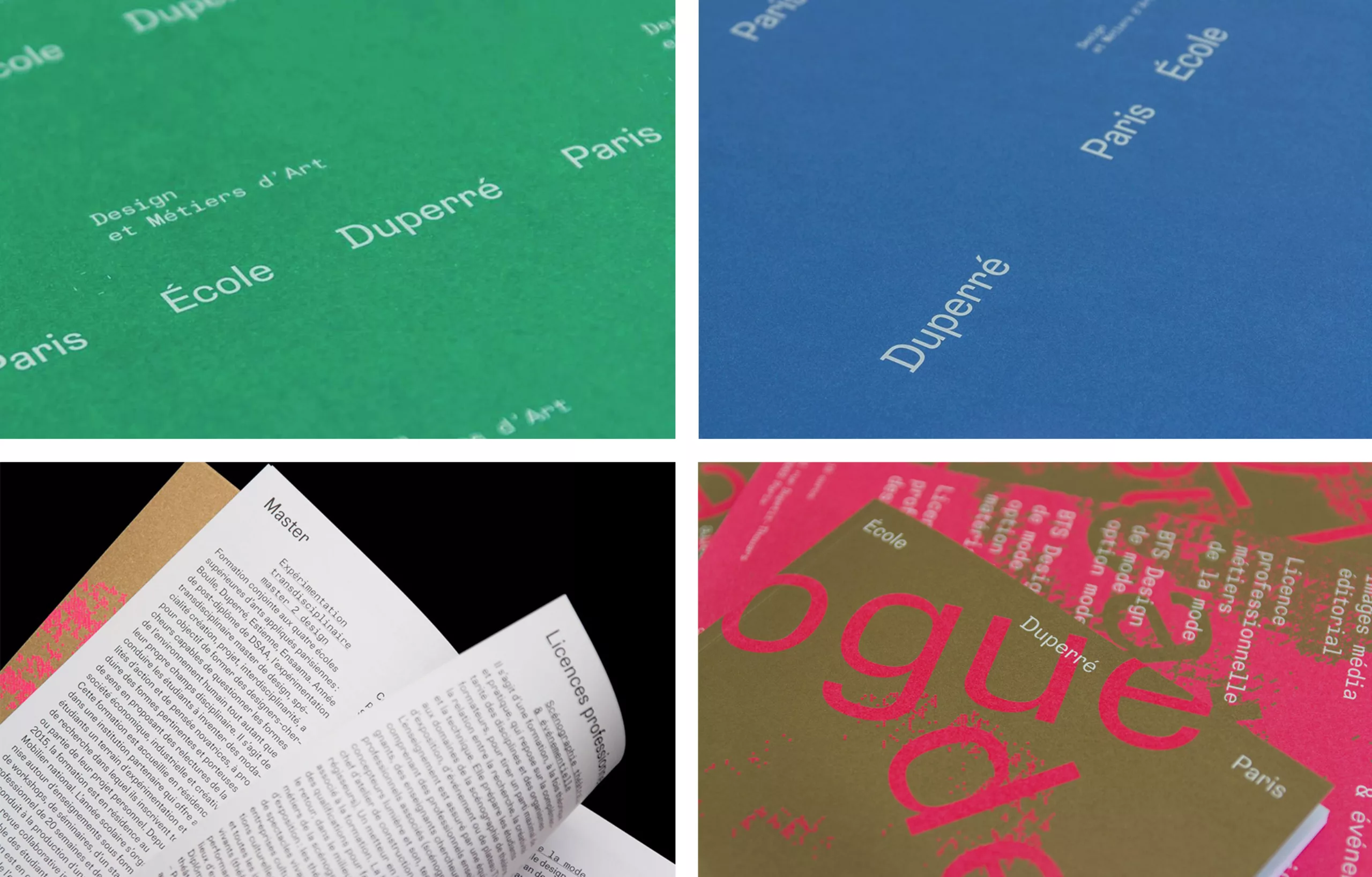
Another notable and significant change is the name of the school. Previously called “École Supérieure des Arts Appliqués Duperré”, the school became “École Duperré Paris”. A choice that reinforces the luxurious and prestigious image of training. A training which is precisely not any more to qualify since its fame and that of its school even makes it possible to position it firmly in mark signature.
Should a public school’s image respond to a communication strategy and marketing issues?
This project to redesign Duperré’s visual identity leads us to question the communication of public schools. To the question, should the image of a public school respond to a communication strategy and marketing issues? Our response is in the affirmative.
In the absence of commercial objectives, a public school is still confronted with a competitive training offer context that motivates a need for distinction, as well as promotion objectives to recruit future talent, which, with the teaching team in place, are the guarantors of the school’s good reputation and excellence.
The public design schools, and particularly the Duperré design school, have every interest in enhancing their history while remaining in step with modernity. This, to continue to be references in their “Design and Fashion” training on the national and international level. Duperré, “Maison” de Design et de Mode de l’enseignement public supérieur is located in a district which is itself the epicentre of Parisian culture, creation and fashion design (Cf :Le Marais).
The question arises as to whether the design school should assume the “Hype” or maintain the seriousness and modesty of a free public establishment. It seems to us that Duperré and the design schools must remain ambassadors of French creativity, in the fields of design in general, and fashion in particular, while preserving their welcoming and accessible character, far from any form of elitism.
In this sense, Atelier Ouf’s response seems to us to be very accurate. The Duperré Sans character manages to achieve this perilous balance between fashion branding and discreet visual system.
On the subject
-
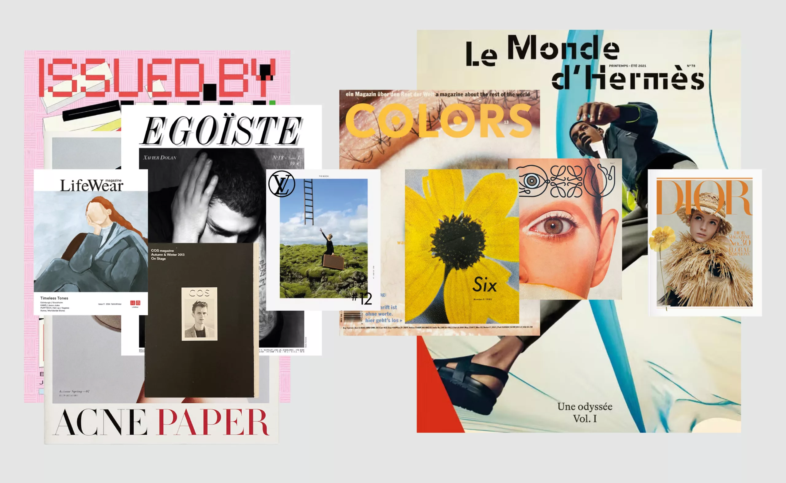
Luxury brand magazines are putting up a fight
An overview of luxury brand magazines seeking to stand out and resist the accelerating pace of current events.
-
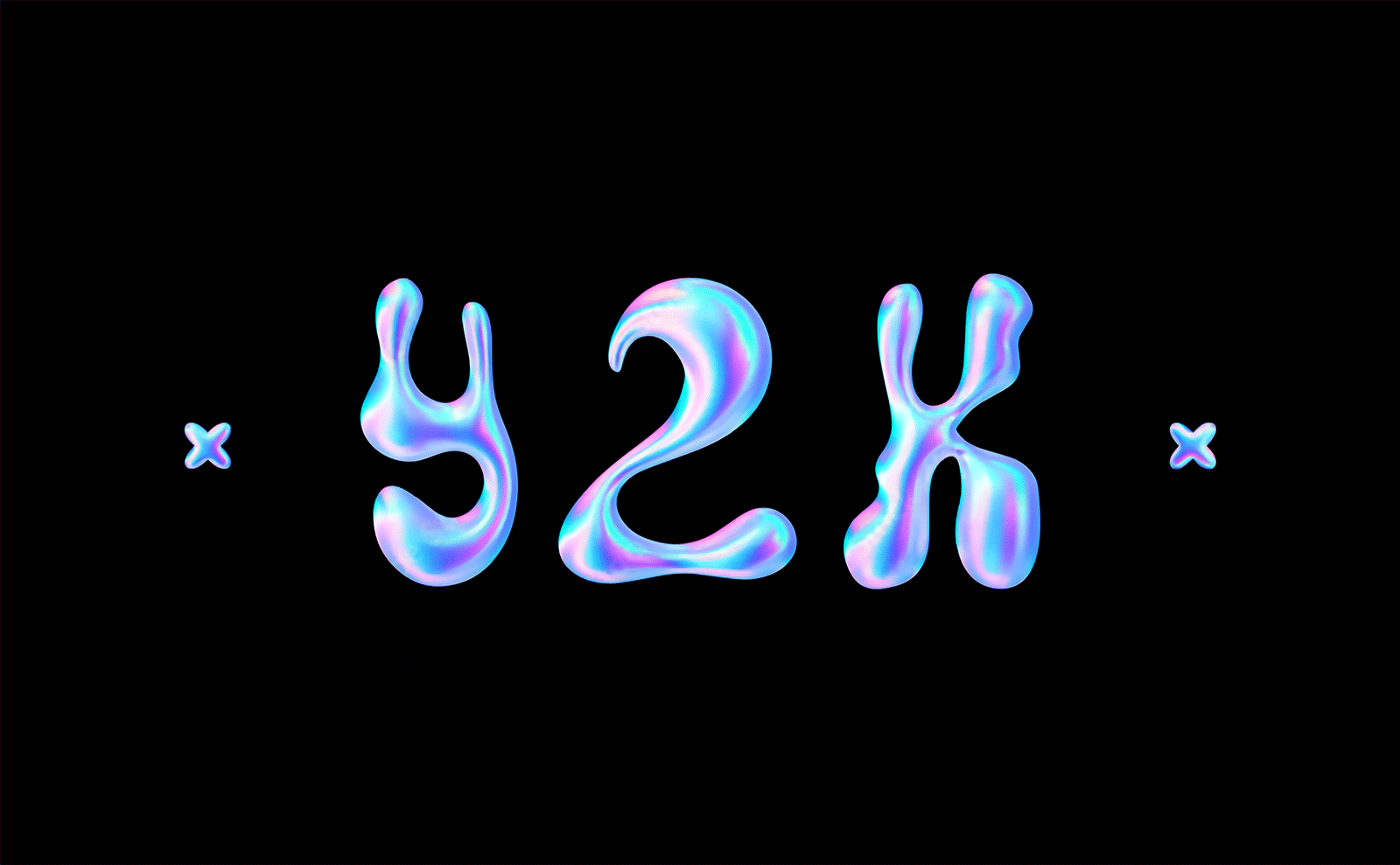
Y2K trend, the 2000’s style is back
Y2K, the trend of the 2000s, is back. Embodying an already retro future, its iridescent reflections shake up digital codes.
-
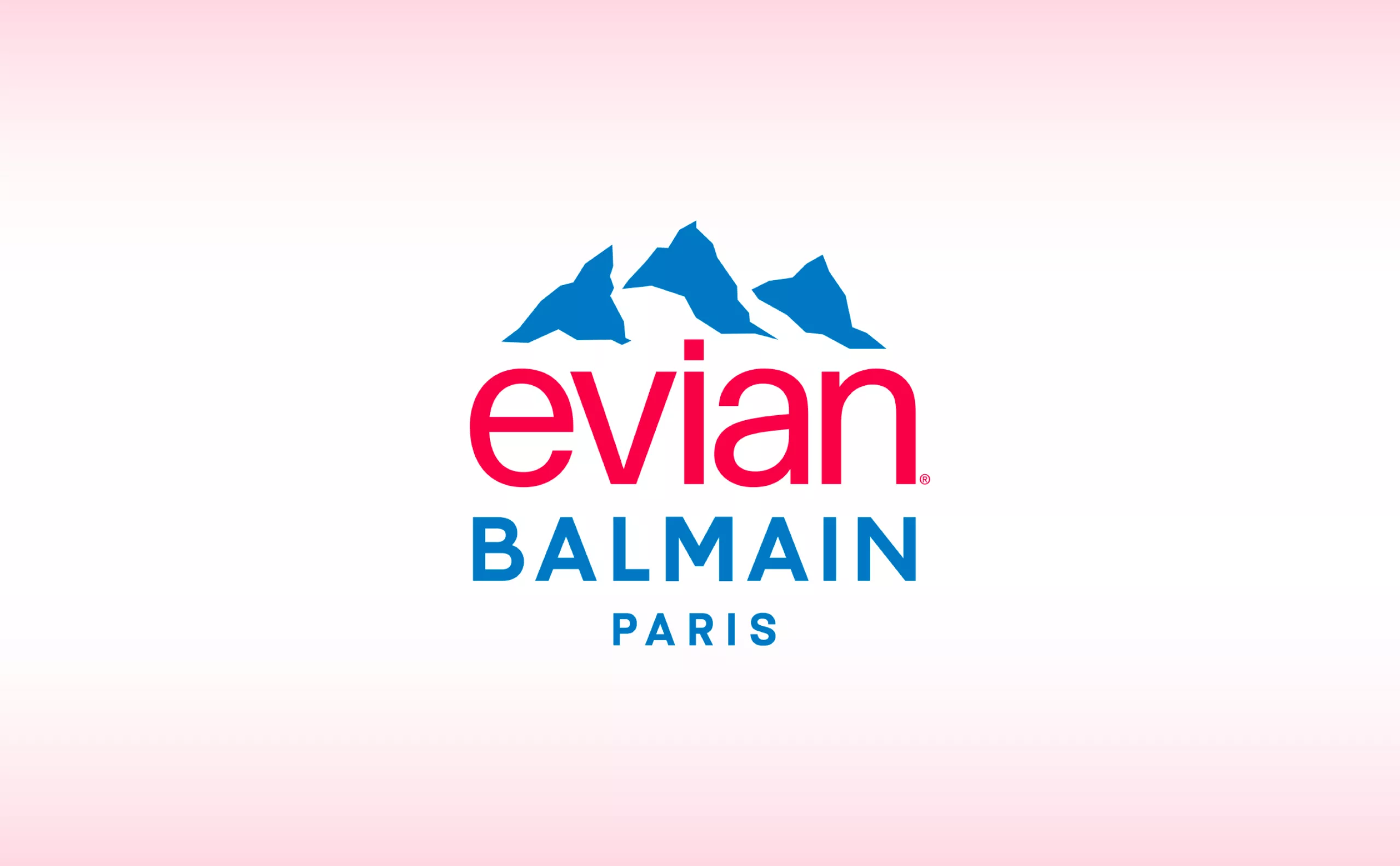
Evian x Balmain, a deep water co-branding strategy
This surprising co-branding gives us the opportunity to look back at the history of evian and to decipher the stakes of this strategy of luxification, greenwashing and the issue of plastic waste.