Louvre Abu Dhabi’s new visual identity
While the titanic Louvre Abu Dhabi project designed by Jean Nouvel should be off the ground in 2015, DesignBoom offers a unique opportunity to look at the visual identity part of Philippe Apeloig’s project. Here is an overview of this work.
Las Vegas of the sands
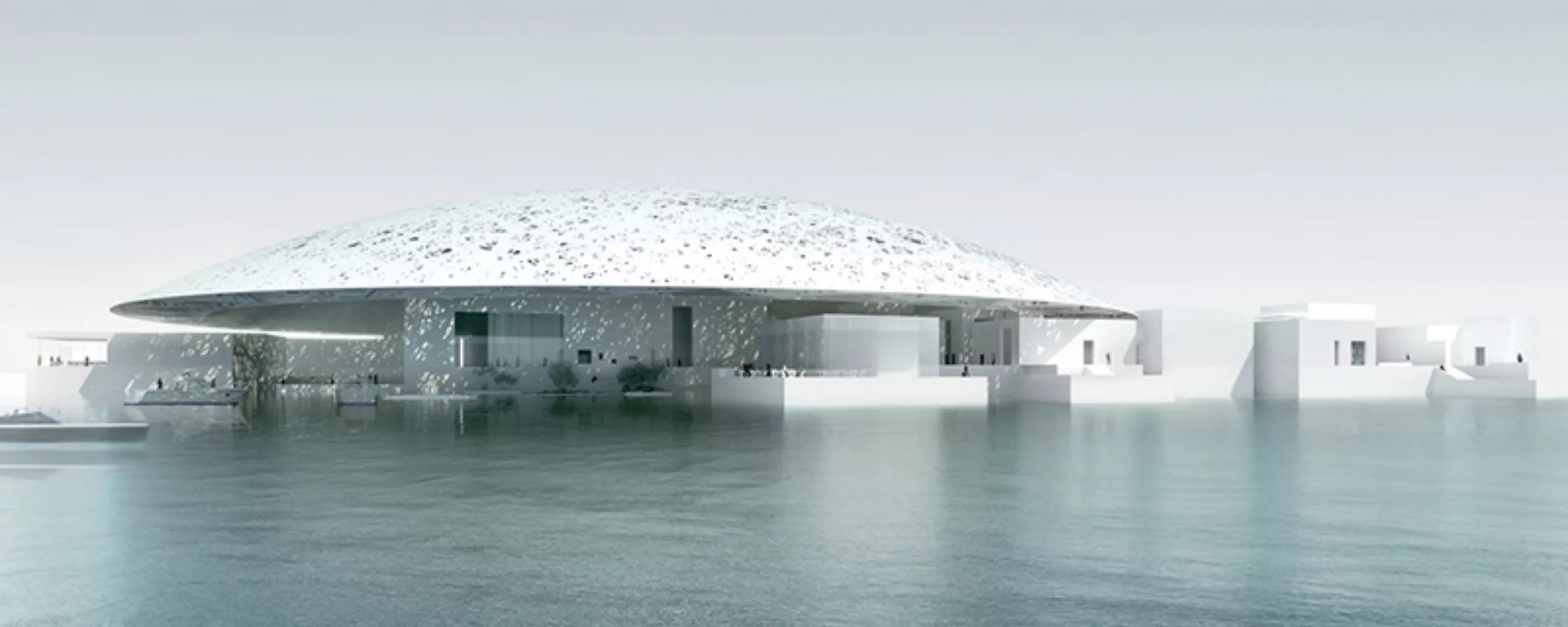
The Abu Dhabi Louvre is a gigantic project endowed with pharaonic means: 5,300 workers are currently working on the island of Saadiyat, on the edge of Abu Dhabi, so that this Louvre des Sables can be inaugurated in December 2015. A 64,000 square metre building, built by Jean Nouvel, the star of architects, in the heart of a museum and tourist city in the United Arab Emirates. Behind these astronomical figures are necessarily hidden some polemics…
Indeed, the cultural cooperation agreement (for 30 years) signed in 2007 between France and the Emirate sparked a controversy led by the former director of the Musée d’Orsay Françoise Cachin. She is the co-signer, with Jean Clair and Roland Recht of an article published on 13 December 2006 in the newspaper Le Monde, which opposes and strongly criticises this project. This forum was quickly relayed by a petition signed by over 5,000 people, including many art historians, academics and curators. For her, the Louvre’s participation in this “Las Vegas des sables” is a “terrible drift of museum work ethics”. In response to this polemic, Jack Lang had taken a stand in favour of a project that testifies to the recognition, he says, of “French talent” in Arab countries.
The Louvre was a reference, it became a “brand” which will collect very important royalties in exchange for its heritage and its know-how. If cultural commodification offends certain minds, our leaders are not philanthropists in this globalized world and if Paris had not been charmed by the sirens of the petrodollars, there is a good chance that a Guggenheim would have willingly engulfed himself there. The challenge is therefore France’s place in the world. Nevertheless, it is a France of heritage, more recognized for its collections of ancient art than for its modernity or its creation.
Fortunately, Jean-Nouvel and Philippe Apeloig save the honor! 🙂
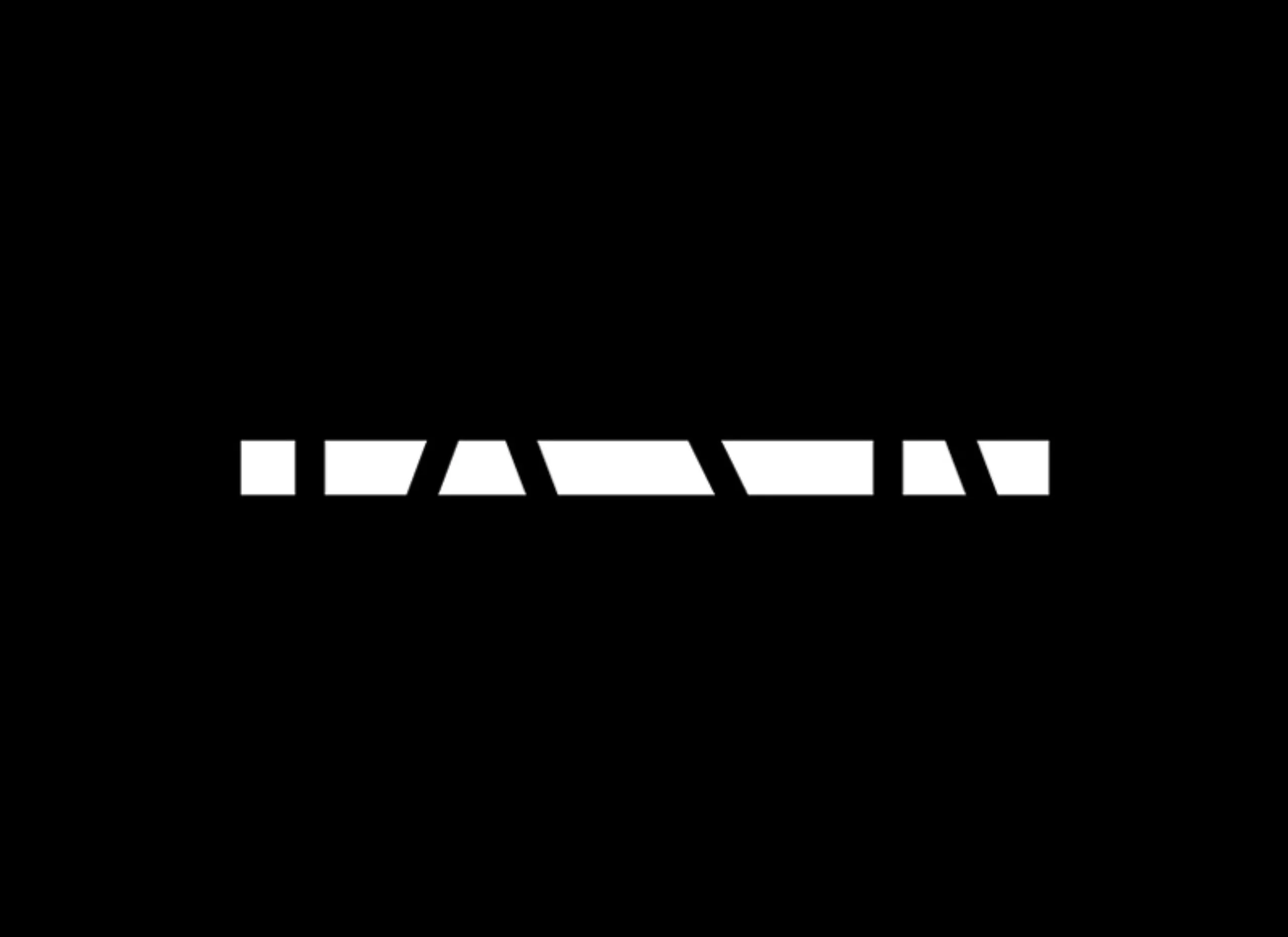
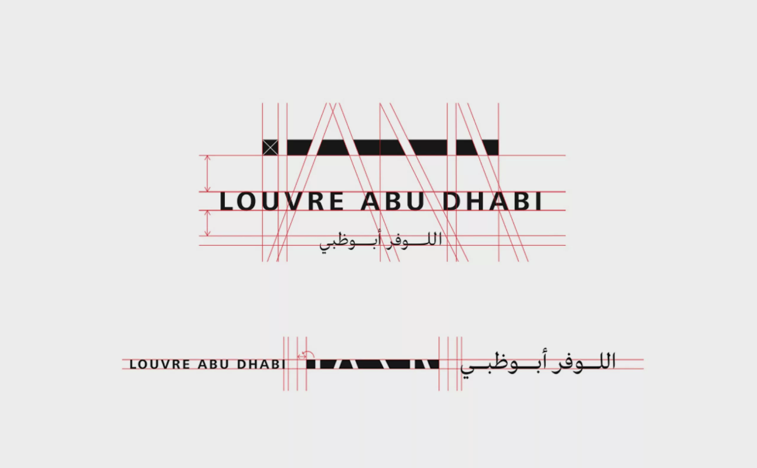
A hyphen of union and light
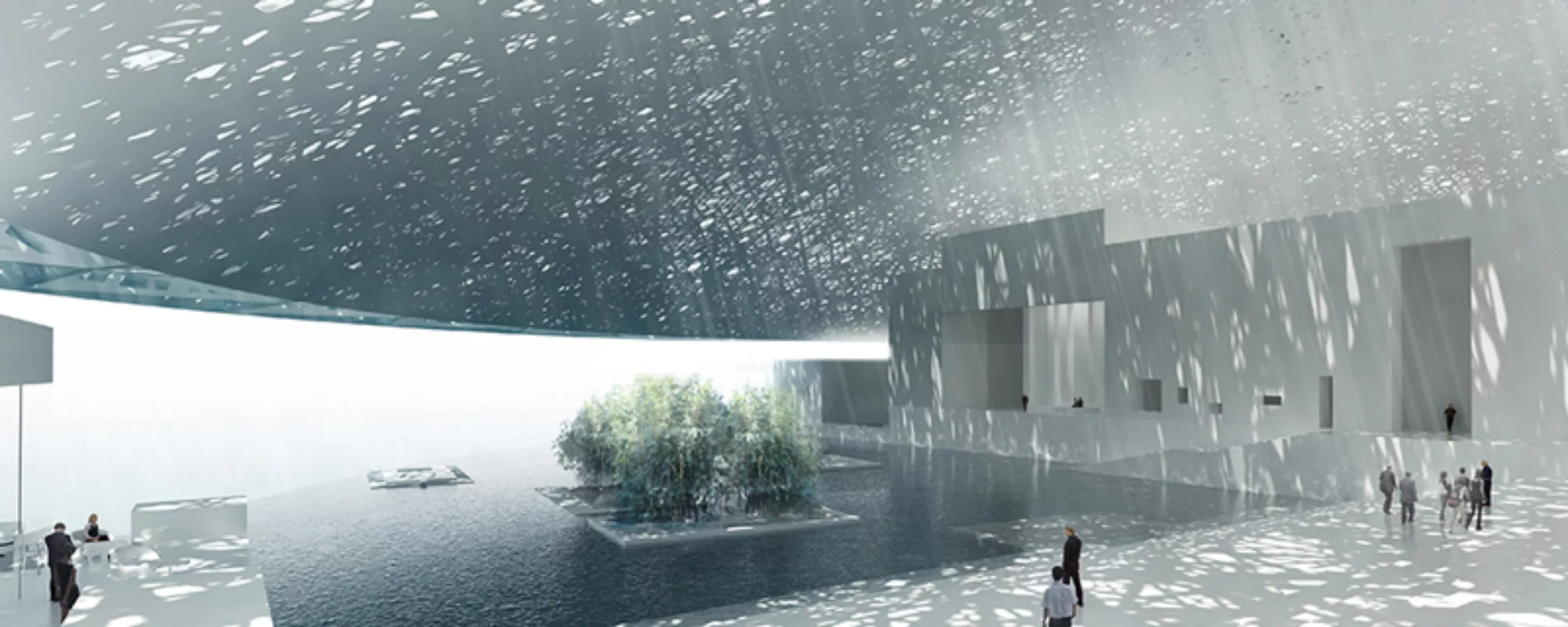
This logo, minimalist as we like them, symbolizes the spiritual dimension of the building and visually transcribes the very particular climate that stands out from the building. The challenge was probably to evoke the whiteness and lightness that emerge from this exceptional space, while preserving the harsh contrasts of warmth and luminosity of this region of the Gulf. The light enters the sign, like rays through moucharabiehs. Jean Nouvel imagined the museum as an assembly of structural elements that are both connected and separated, so the logo is part of this continuity too.
This line refers, in an abstract way, to the horizontal nature of the building, which is accentuated by its proximity to the sea. Symbolically, this thick line may seem to act as a link between two cultures.
In the images above, we see how the apparent simplicity hides a subtle construction game, where the lines of force of the letters come to be projected in the drawing of the sign.
Then, the sign is associated with two typographies. Frutiger for the western version of the logo, and a typography creation by young Lebanese designer Kristyan Sarkis.
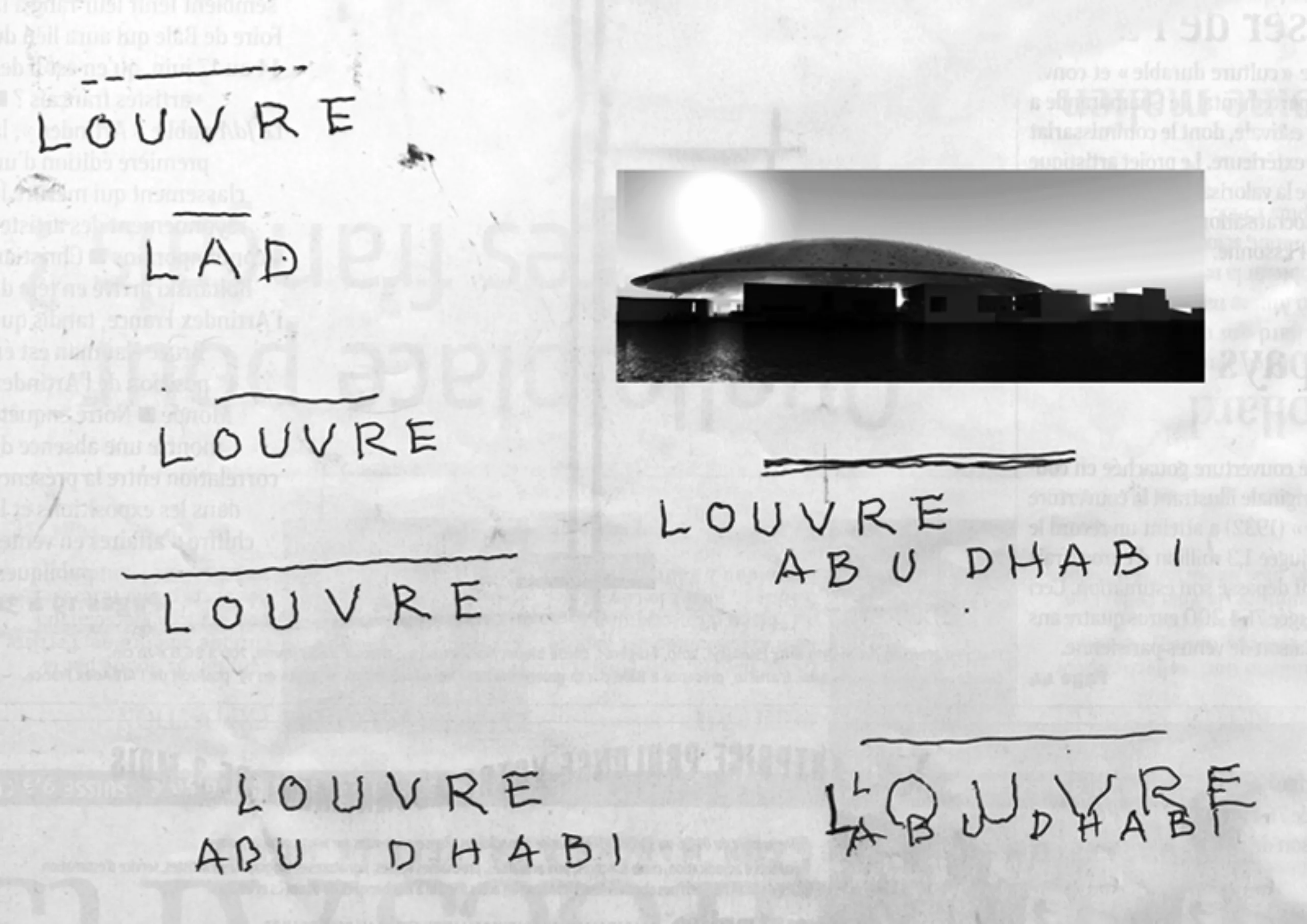
First sketches