A constructivist logo for Russian tourism
A competition to represent Russia
Russia is one of the 10 most visited countries in the world. In order to promote the territory on the international scene, the Russian federal agency decided to launch a visual identity competition in 2015 to create the new Russian tourism logo.
A national call for proposals, 480 logos and 600 slogans later, the proposals – open to all – were hand-picked and selected by a panel of specialists. Among them, the Secretary General of the World Tourism Organization (WTO), a member of the Russian Academy of Advertising, the head of the Department of Regional Security and Anti-Corruption of the City of Moscow, the Vice President of the Government of the Russian Federation of Sports, Tourism and Youth Policy… in short, rather normal people.
Organized by Rostourism, with the support of the Russian Ministry of Culture and the Association of Branding Companies of Russia (ABCR), about thirty professional graphic designers also participated in the research for this new identity.
Ten avenues have thus been put forward. Each project had to present a concept, a slogan, and a visual variation.
Obviously, the “Crowd sourcing” approach should be criticized, but this is not the subject of this article. Let’s take this opportunity to immerse ourselves in the eyes of these Russian designers, and discover what makes their work so special.
Without being able to understand the graphic concepts (if someone speaks Russian, that he does not hesitate), here are some not retained tracks which pleased us.
As we are in Russia, the people could vote online for their 3 favorite proposals, and the jury took over to select the big winner. A beautiful popular and participative idea with some tracks more wobbly than others, but which has led to a resolutely Russian identity, which is easily declined to tell the wonders of this country.
“La place rouge était vide, devant moi marchait Nathalie…”
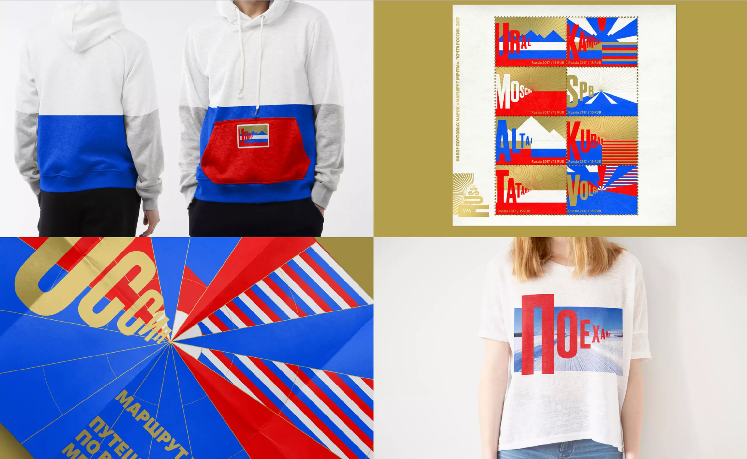
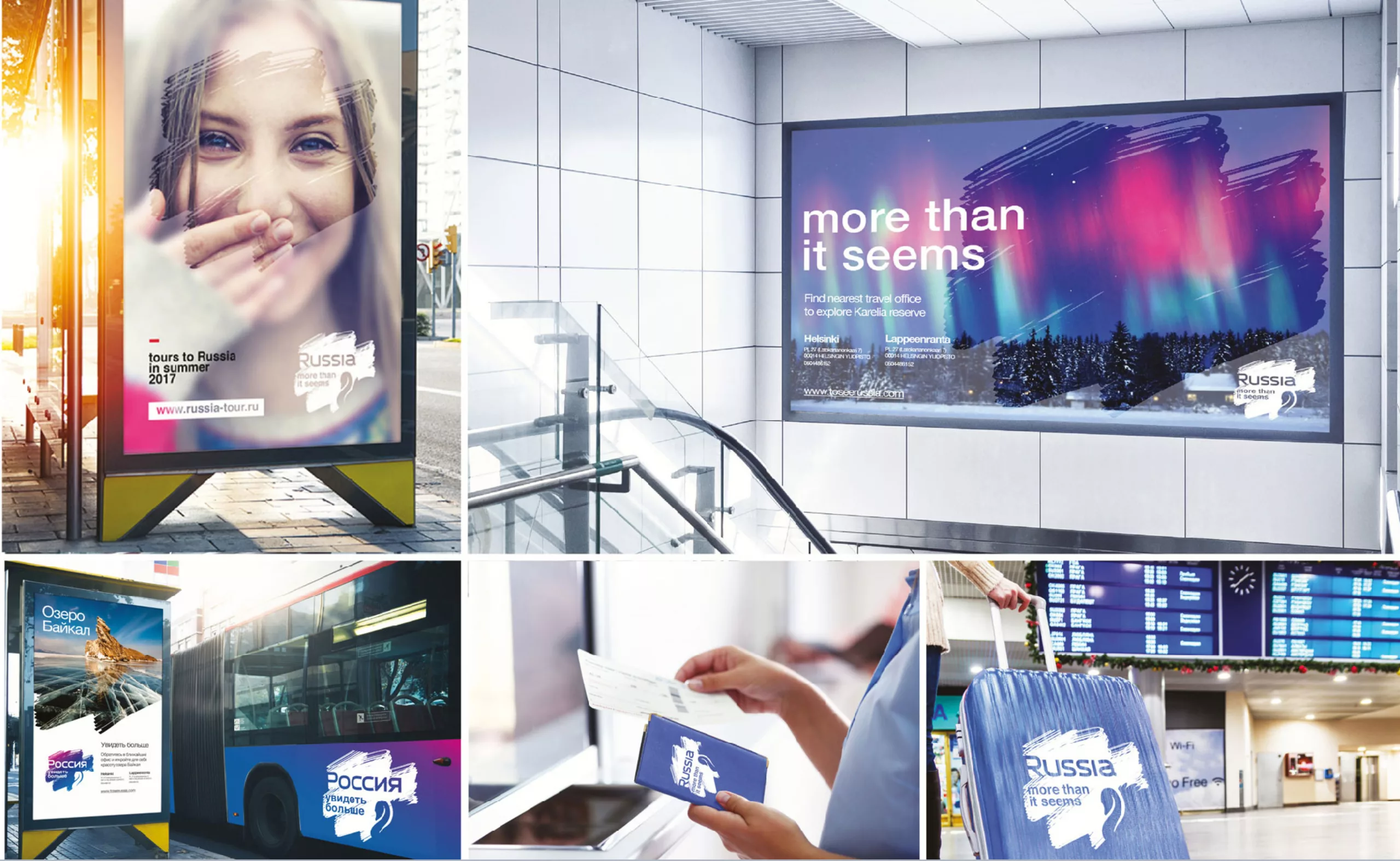
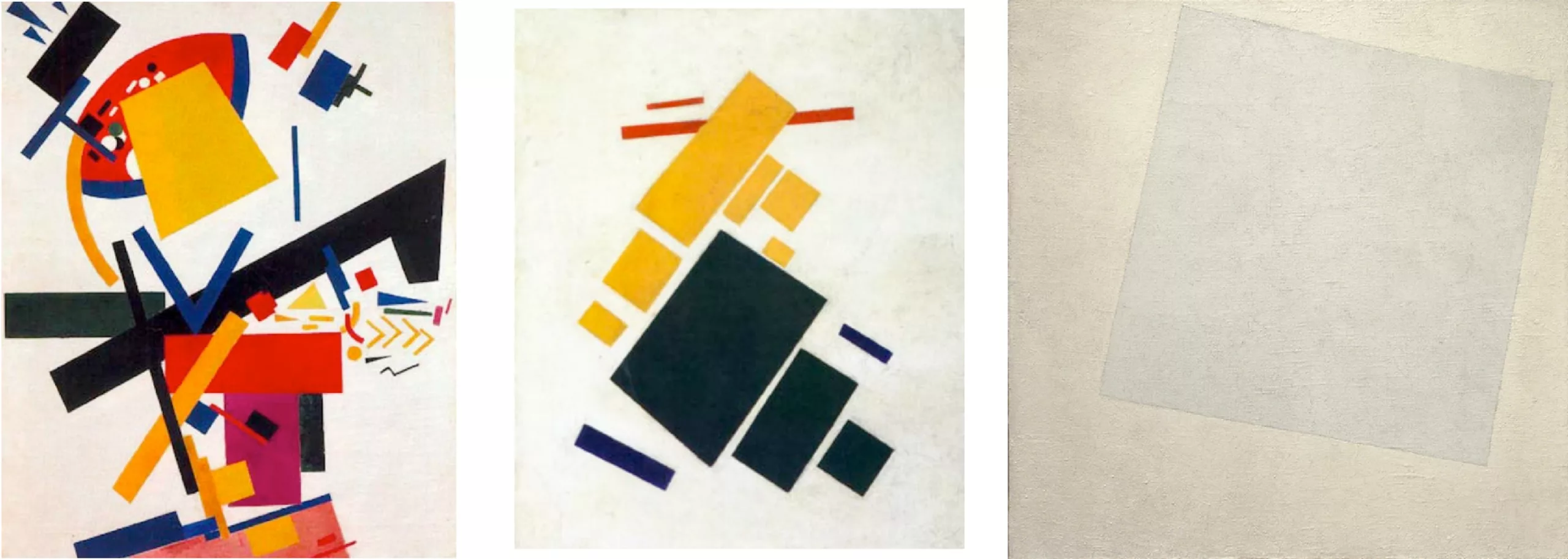
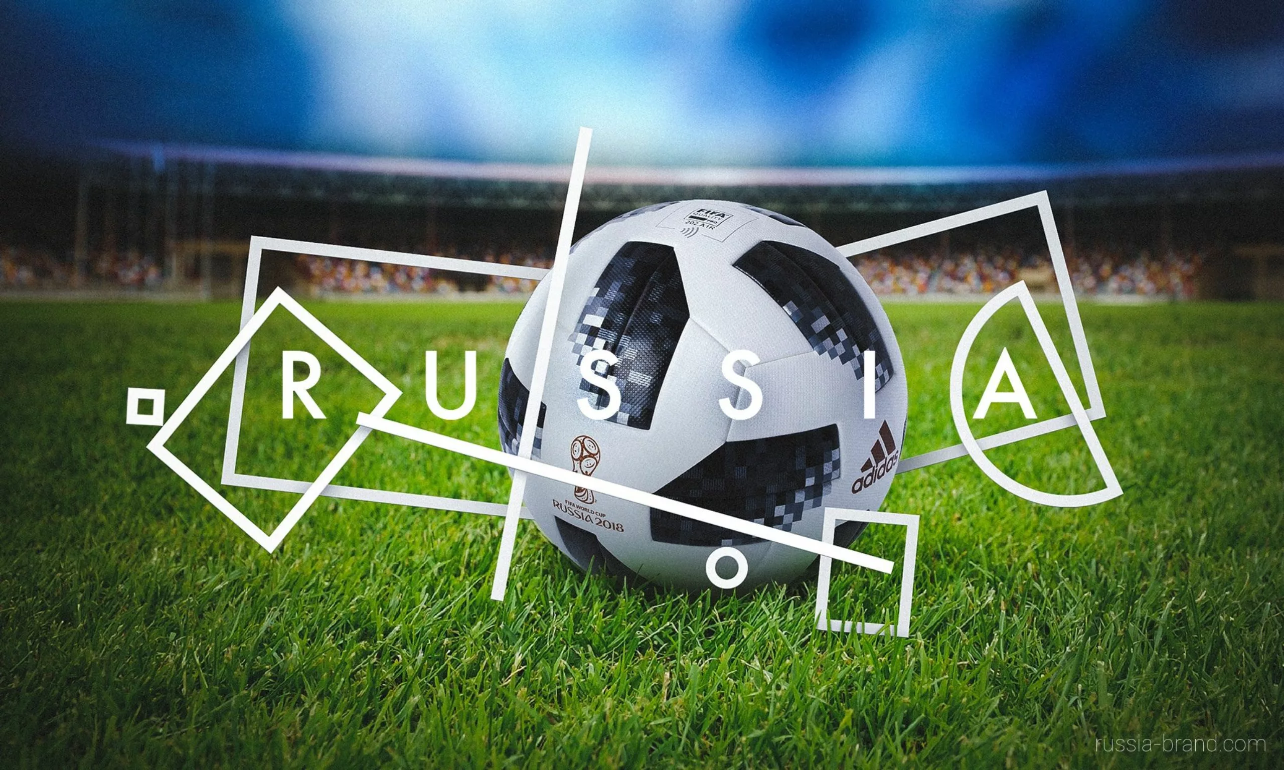
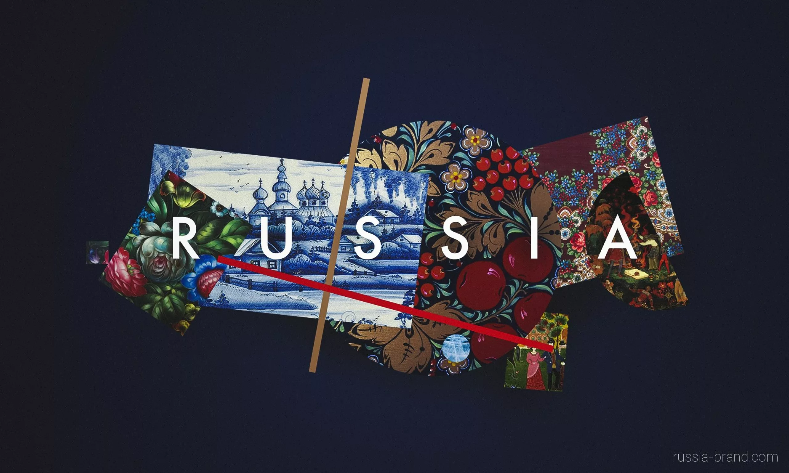
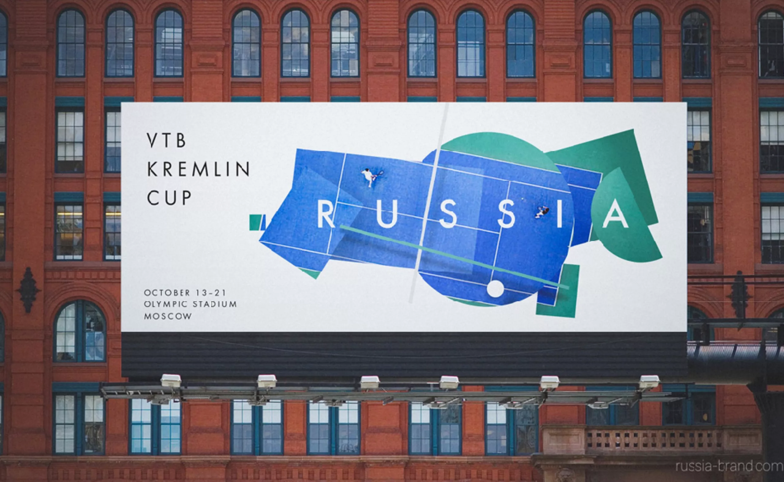
The selected project is a stylized and avant-garde map of Russia, in a supremacist style, an artistic movement launched by the painter Kasimir Malevich at the beginning of the 20th century, celebrating pure geometric forms and primary colours. We owe him the famous “white square on white background”, on the right in the image below. Attention, it does not confuse this artistic movement with the racist movement of white suprematism. It must be said that with these stories of white squares on a white background, there is a way to mix brushes!
In general, we are rather familiar with constructivism, which stems from suprematism. But in both cases, this kind of visual instinctively recalls the Russian style, and brings the necessary and detached gap to speak of a “product” (here the country as a whole) without directly illustrating it. The supremacist logo transforms the country into a land of possibilities, a land of variations and contrasts with a strong heritage, both modern and turned towards discovery.
It is a bit difficult to find the great regions, but without being an ace of geography we can clearly recognize the shape of the country.
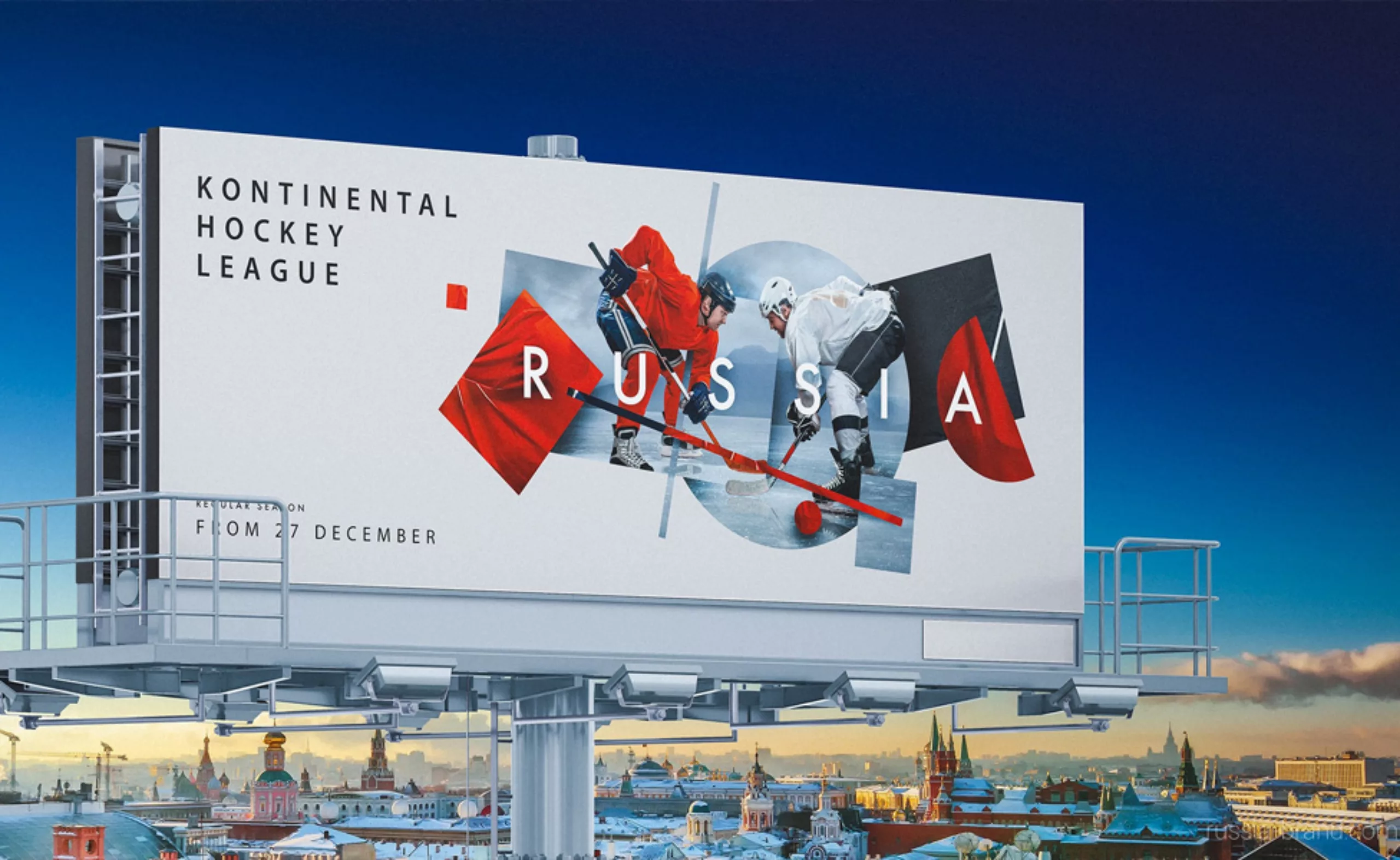
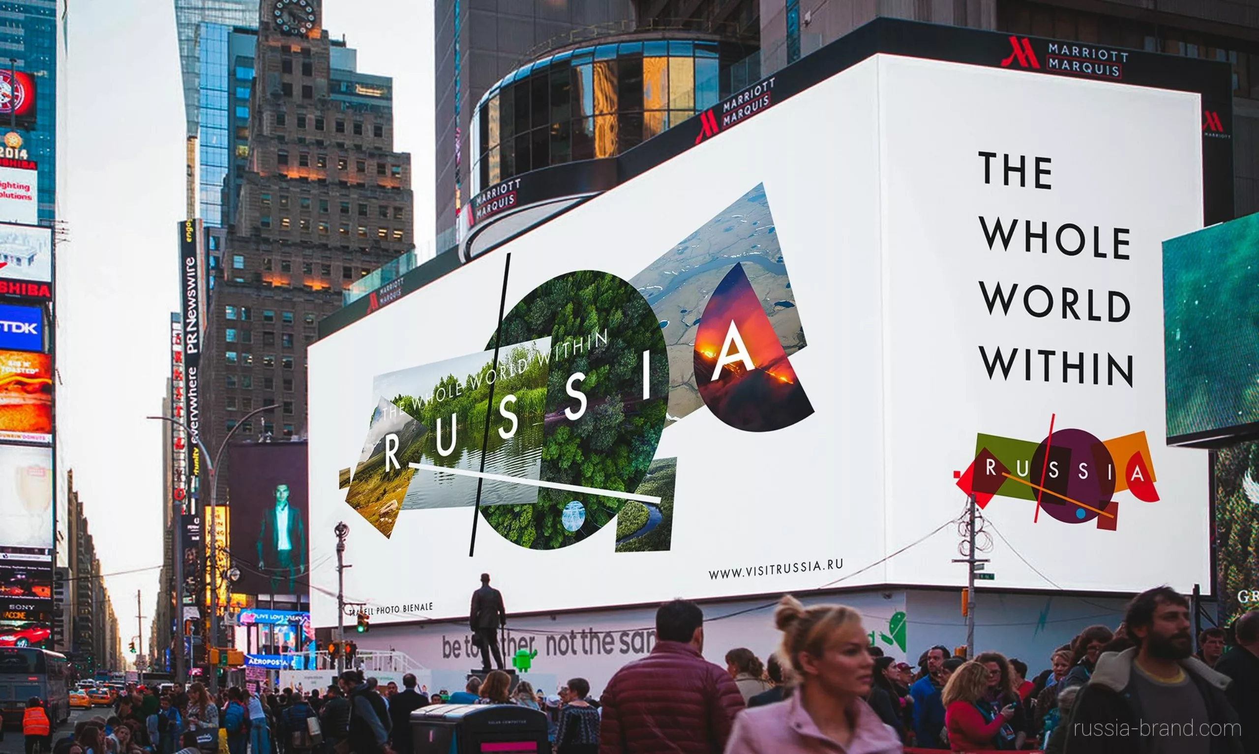
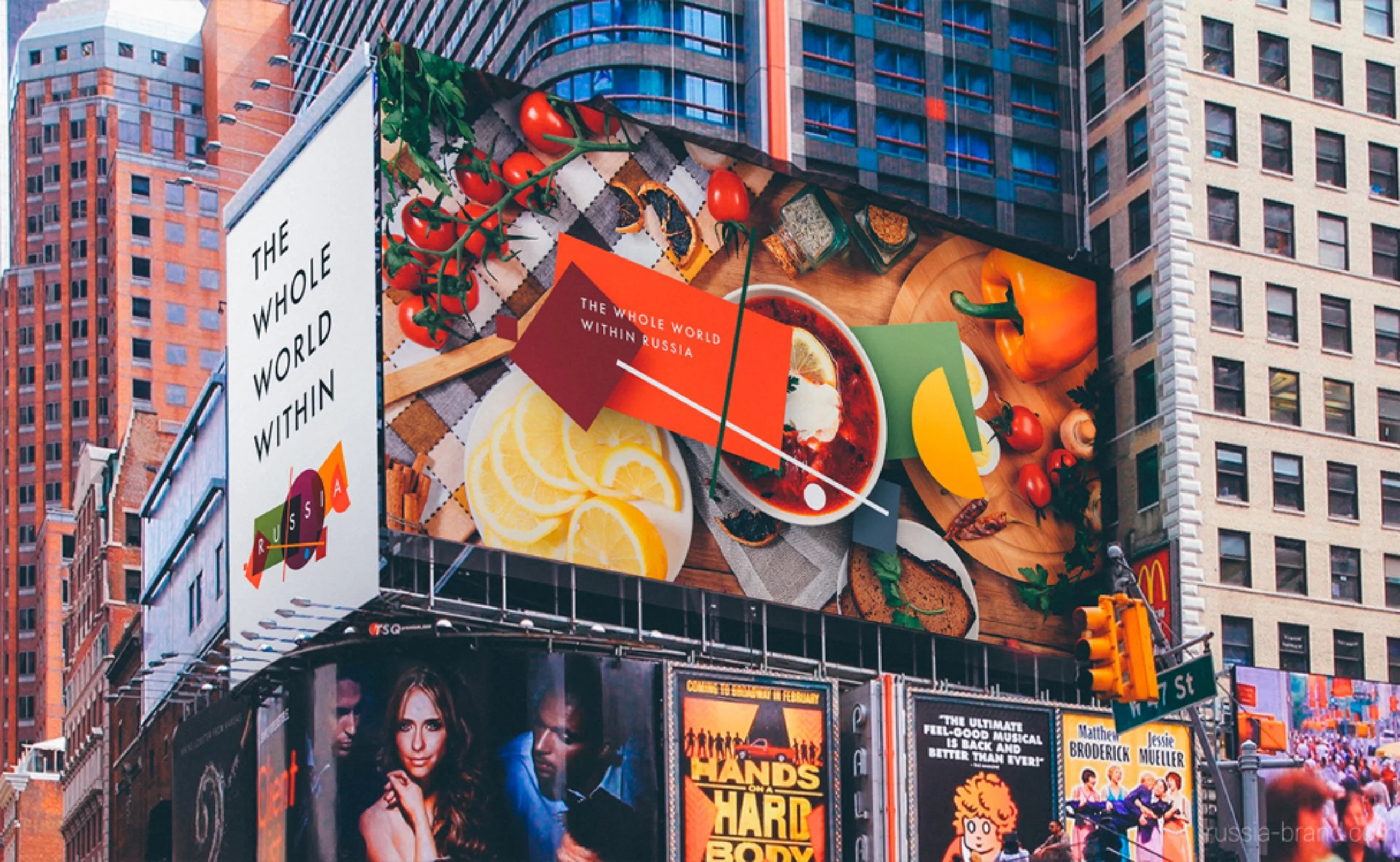
The identity is declined to highlight the greatness of the country: its gastronomy, its culture, its artists… and FIFA (Russia will host in 2018). Yeah, all right.
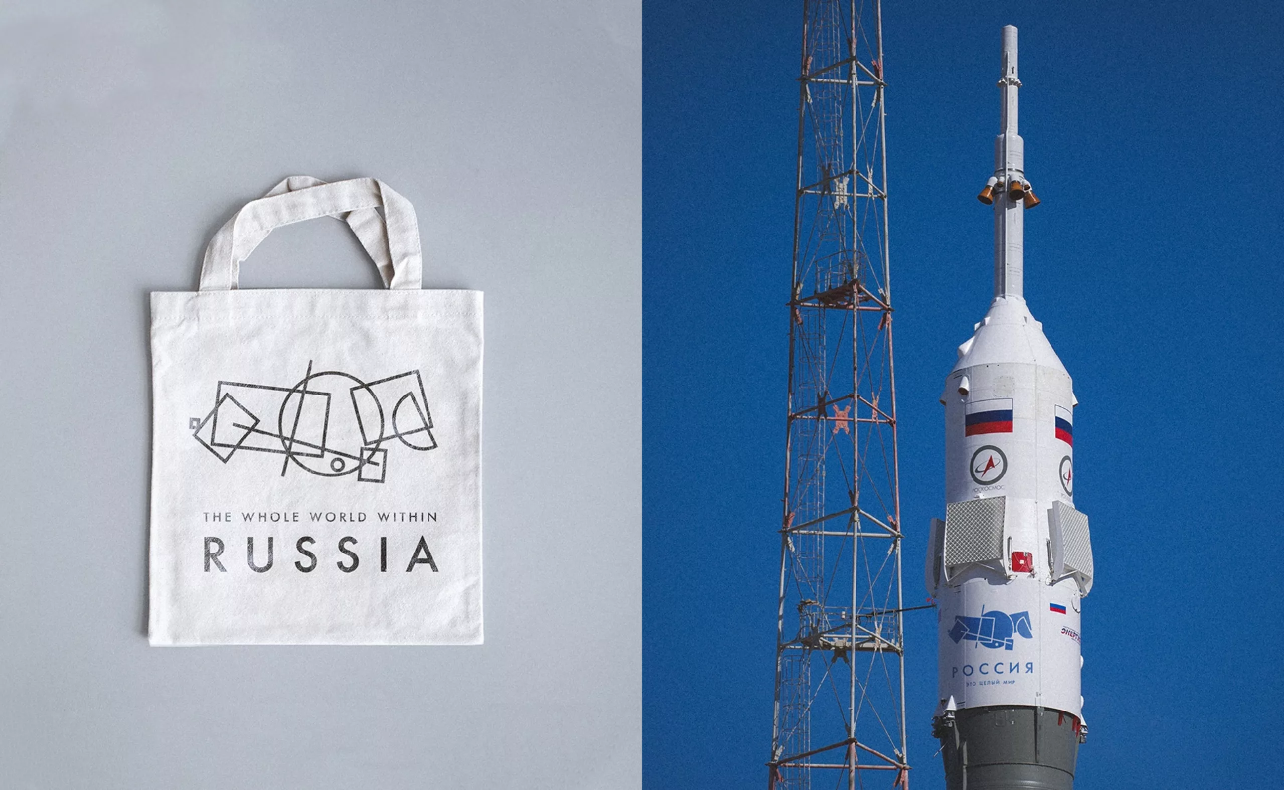
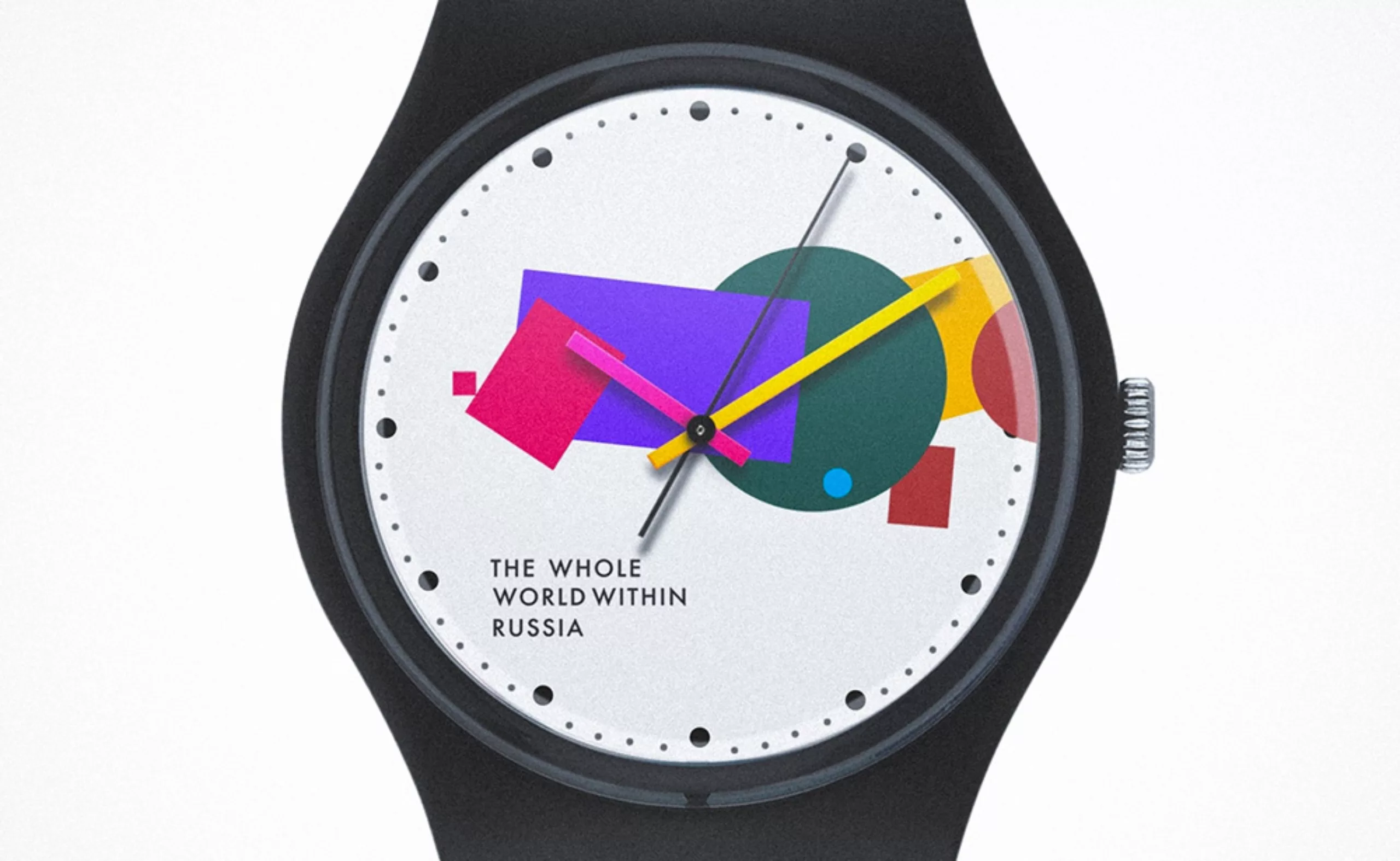
If the supremacist logo is not very exciting with its colours a little old-fashioned, its strength lies in its power of declination which is very modern, a little like what had been done for the MAD of New York. The flexibility of the logo allows to create a full window on textures and visuals and to build scenes with real pieces inside (like that of gastronomy). It also unfolds very well in lines, offering a more graphic result that recalls the new identity of the World Chess Championship.
On this we leave you with the pictures, and we will toast to Russian tourism: zdorov’ye!
Text:
Tiphaine Guillermou
Sources:
Russia Brand
The official website of the competition
On the subject
-
Minimalism: aesthetics of sobriety
Both a visual or life discipline, minimalism has become a questionable trend and consists in simplifying to keep only the essential.
-
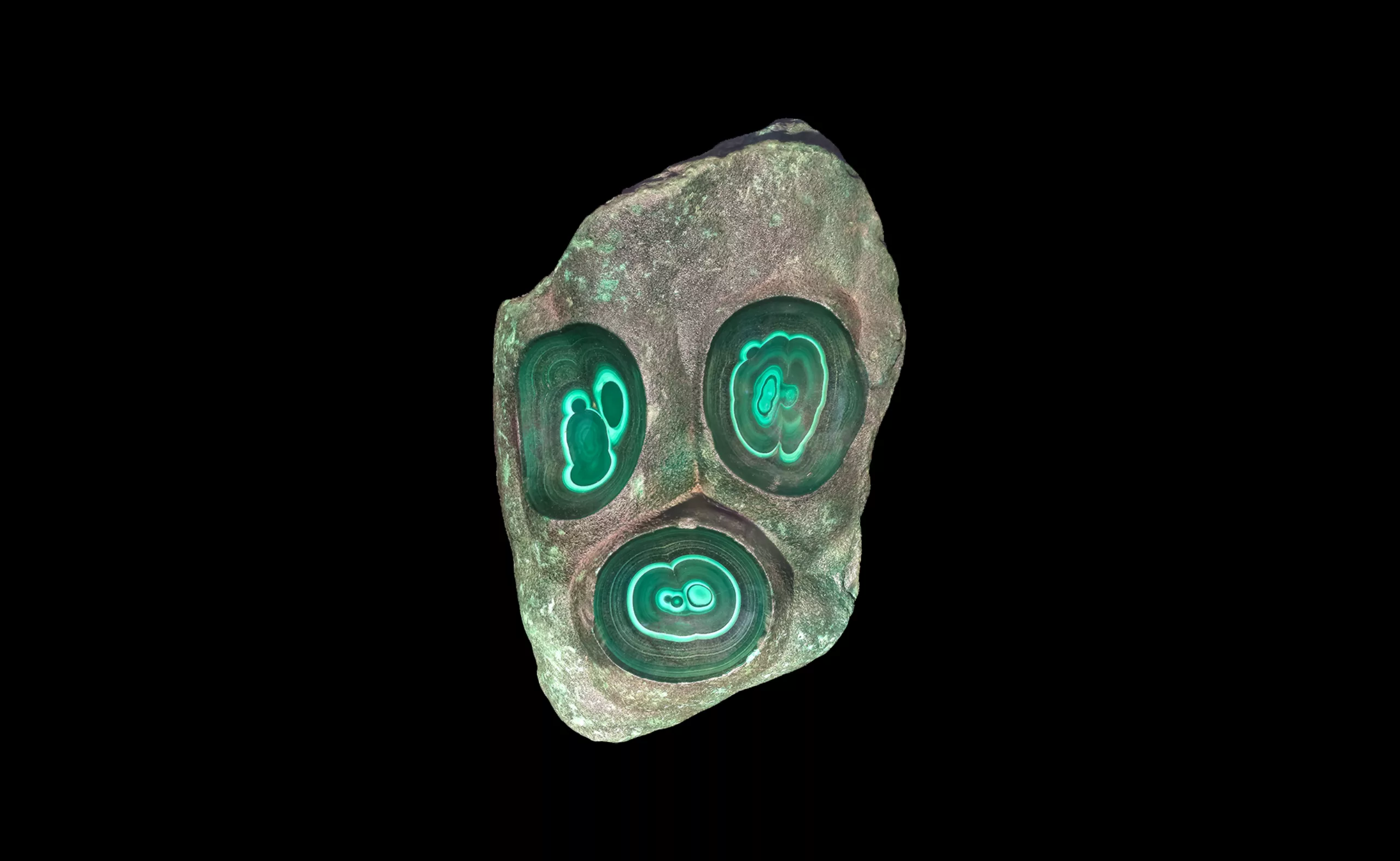
Picture stones, fascinating natural wonders
The stones of the French Museum of Natural History design patterns and natural landscapes, fascinating mineral creations of millions of years.
-
Black and blue: registered and exclusive colors?
When artists are the users of an exclusive color, one may wonder if it is the color or its symbolism that unleashes the passions.