A new visual identity for Romans-sur-Isère

07 September 2016  |   0 Comments   |    |  

identite-visuelle-ville-de-romans

Romans-sur-Isère

Last December we took part in a public consultation to design the new visual identity of the city of Romans-sur-Isère. Romans-sur-Isère is located on the right bank of the Isère river, not far from the city of Valence (Drôme). With its city neighbor Bourg-de-Péage, located on the other side of the river, it represents an agglomeration of 50 000 inhabitants.
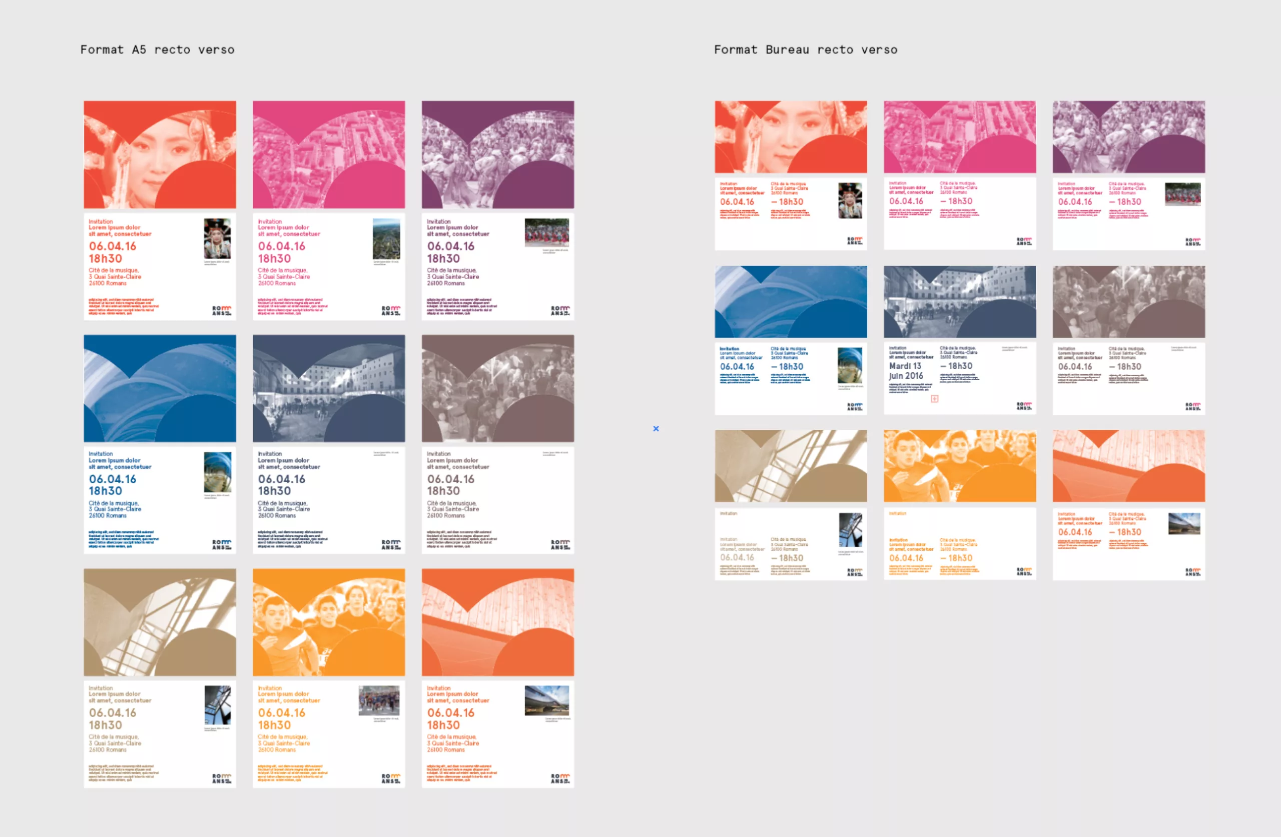
avant-apres-romans

art-roman-branding-ville-histoire

Romanesque Art in Romans

From its medieval origin (the city was founded in 838) the city has kept on many buildings this arc pattern, so typical of Romanesque art. Whether on the pediment of the Collegiate St. Bernard, on the facades of old neighborhoods or in the cloister of the Convent of the Visitation which now houses the International Shoe Museum.
Today, the Romanesque Art refers to a form of simplicity and authenticity that perfectly fits with the identity of the city.
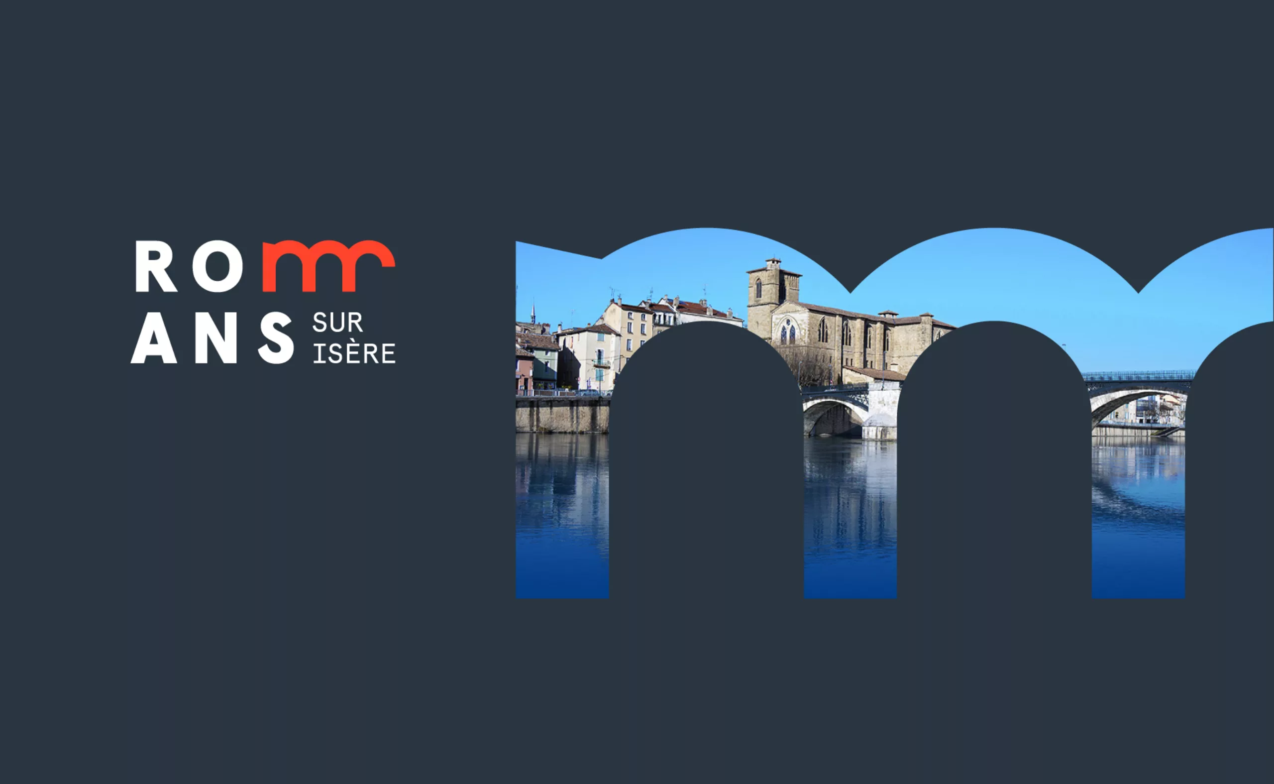
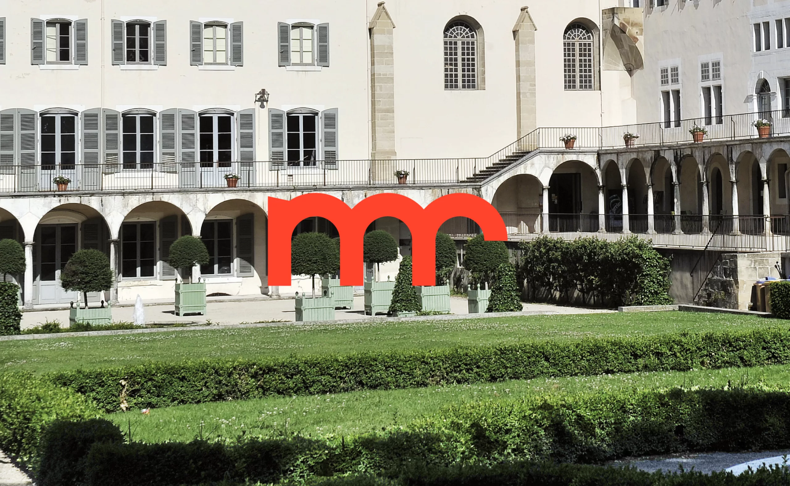
fronton-art-roman-logo-cite-medievale

The bridge

The bridge over the Isère river is a place of passage and exchange. Symbolically, it is a link that connects us to others, a promise of travel and meetings. More prosaically, it's kind of "Champ-Élysées" of the city, an historical road where events and festivals take place throughout the year. It also offers a perfect view of the Cathedral Saint-Bernard.

logo-pont-romans-isere

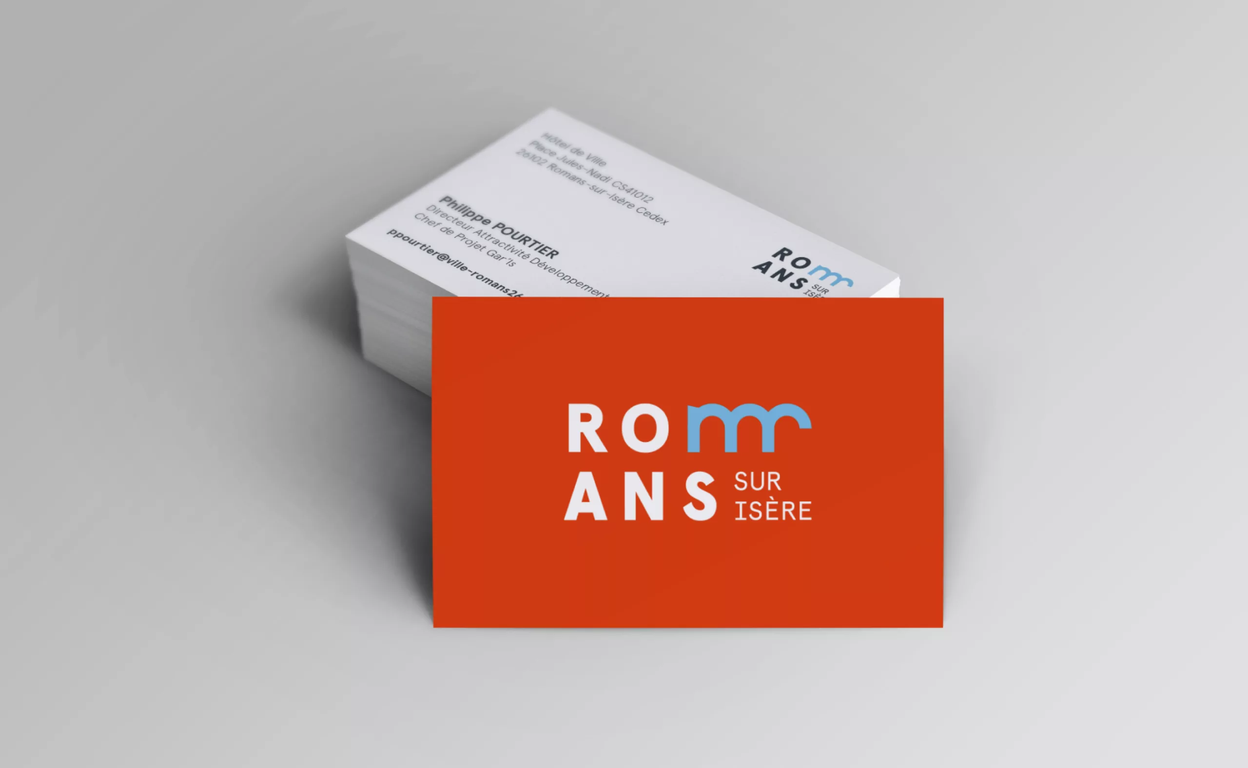
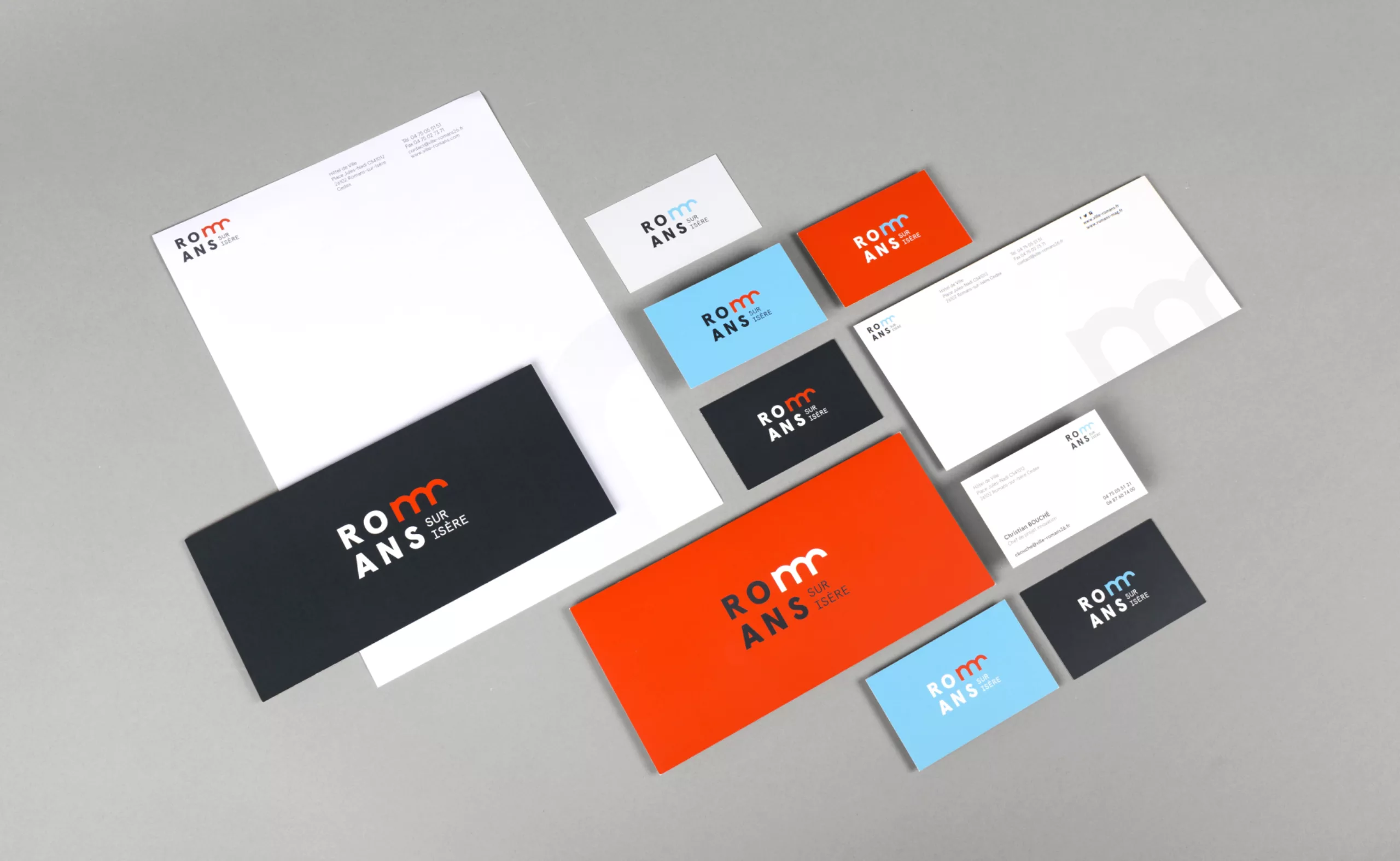
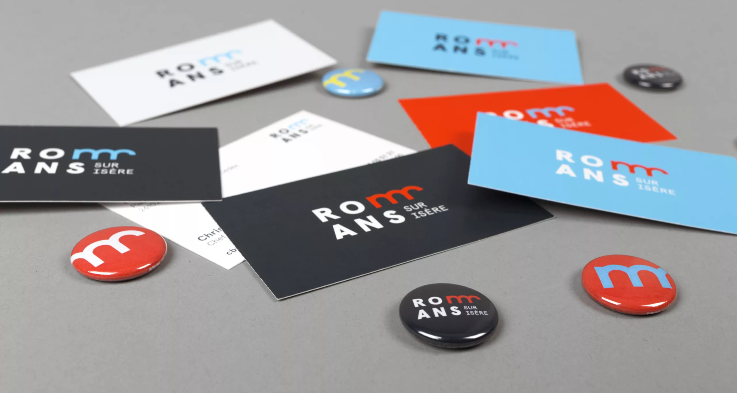
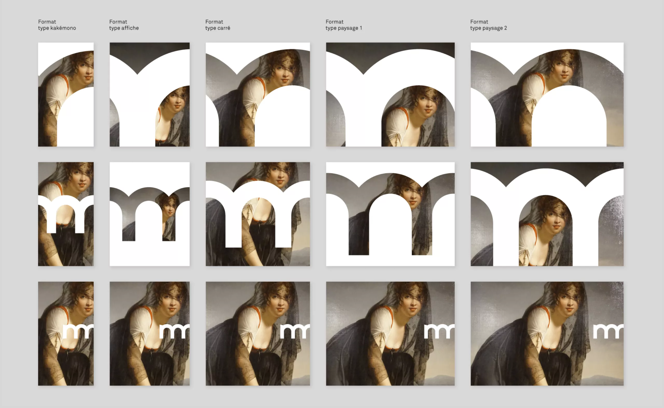
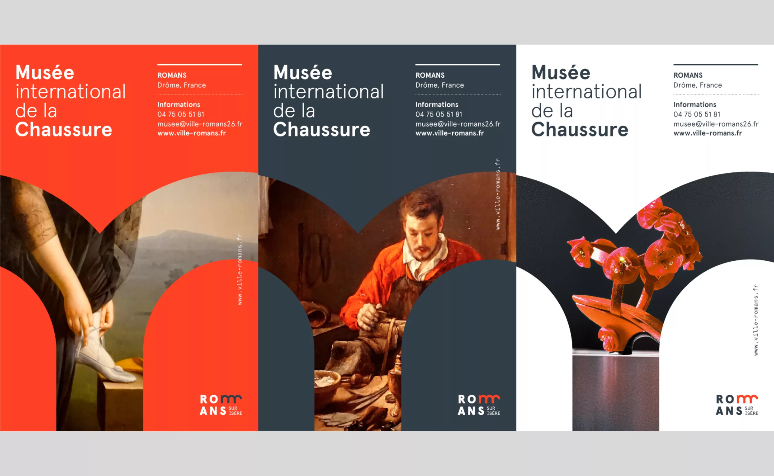
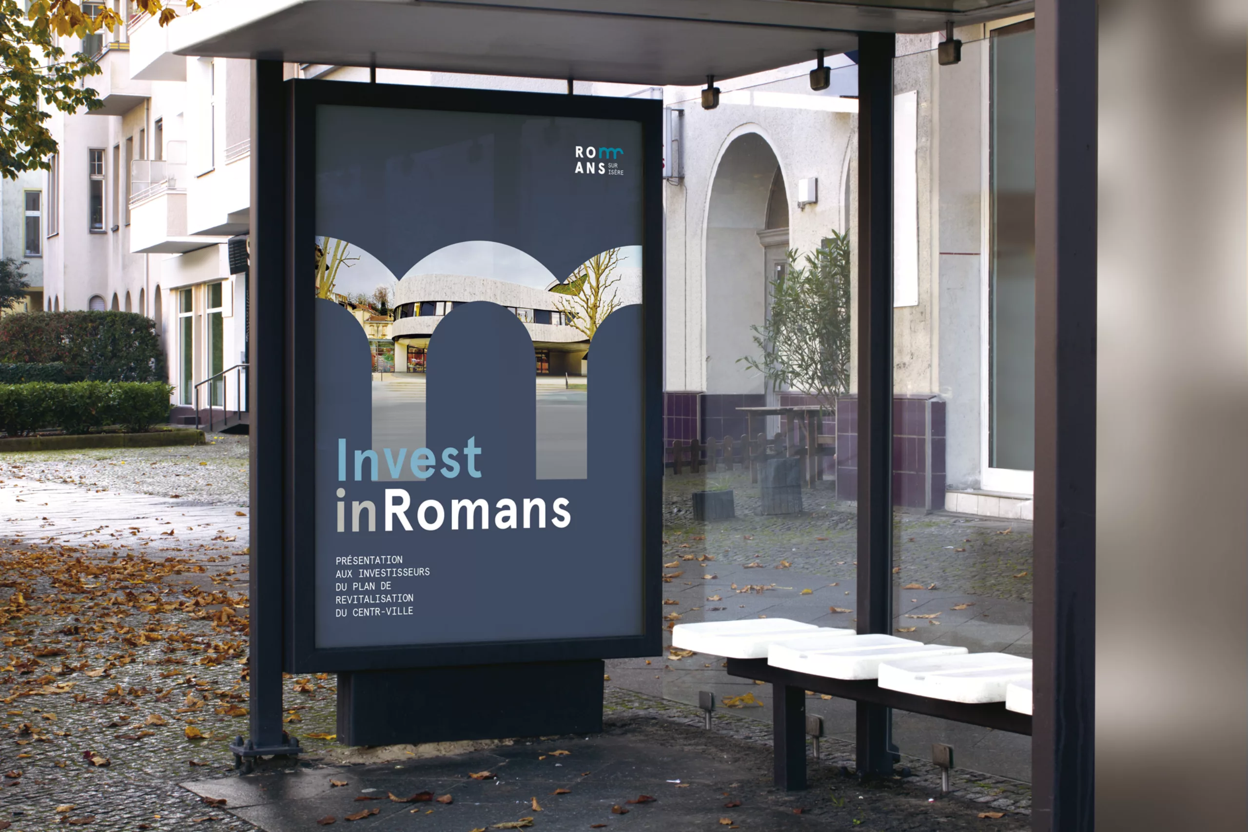
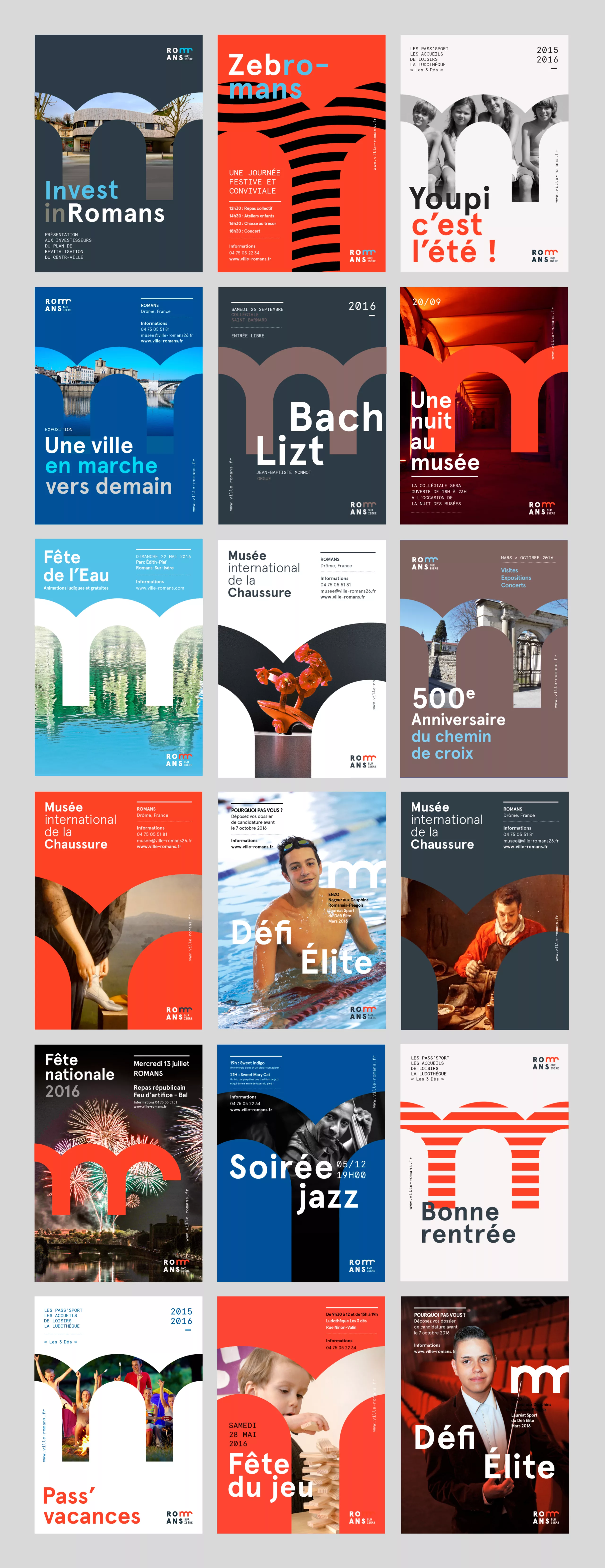
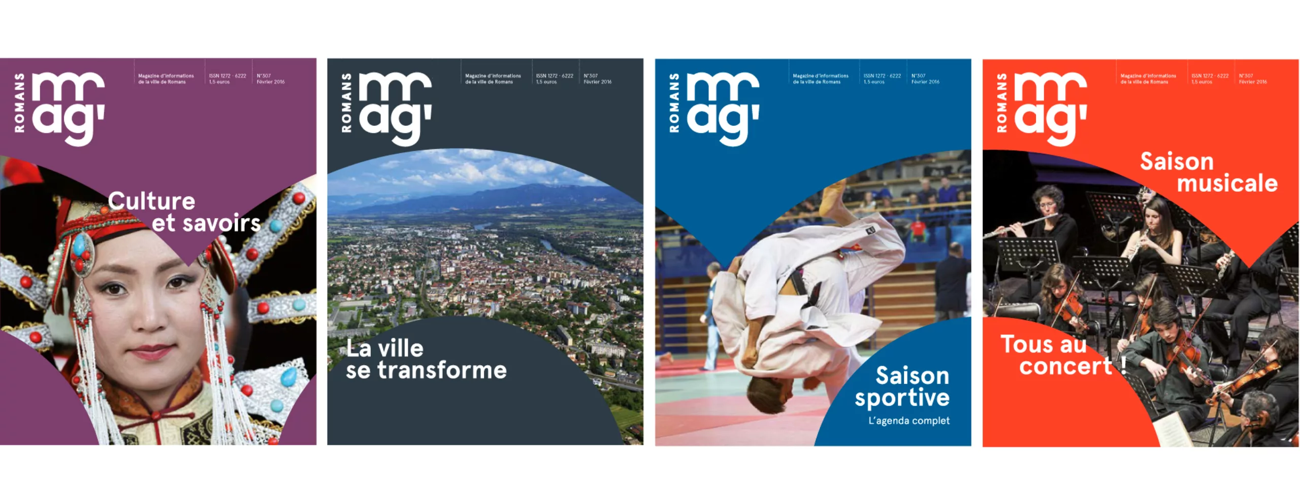
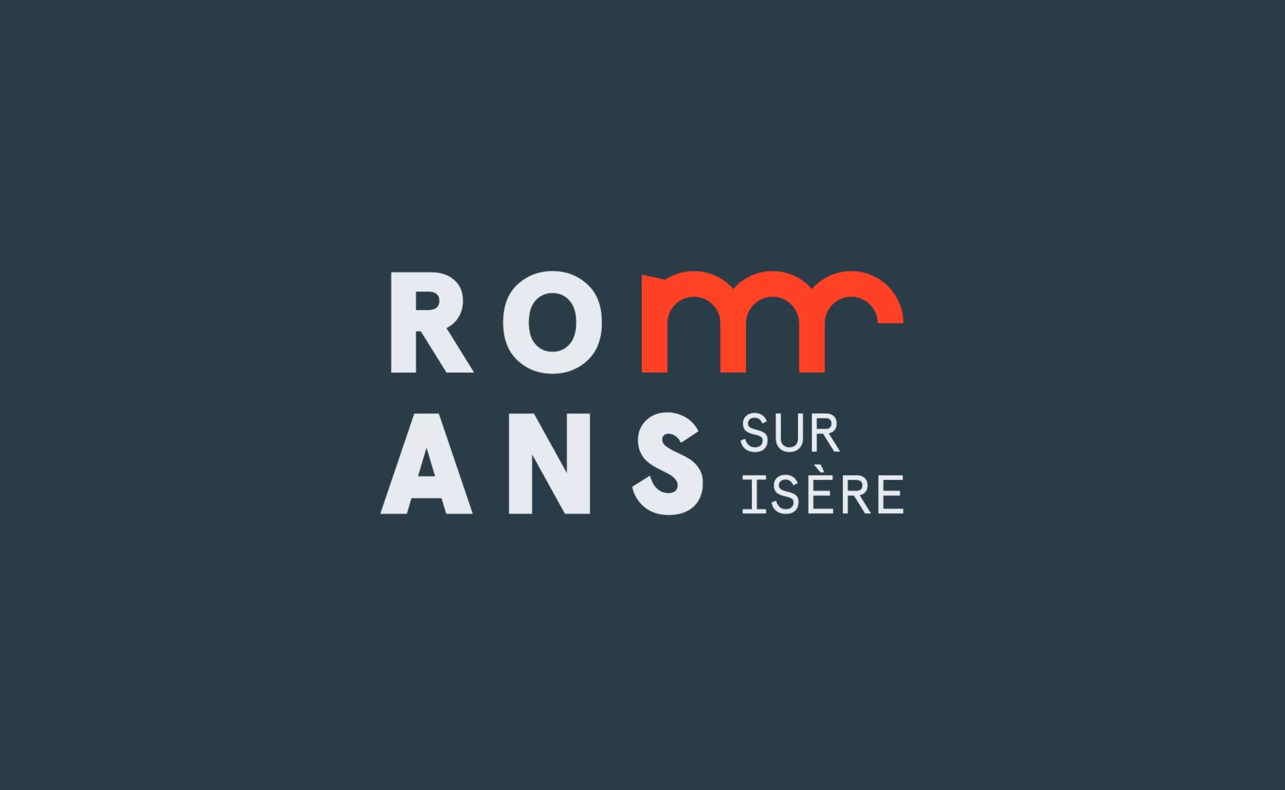
When the word becomes a bridge

The design of the word "Romans" refers to the geography of the city. The "m" stands for the bridge, stepping over the Isère river, while a line break takes Romans back on the right bank.
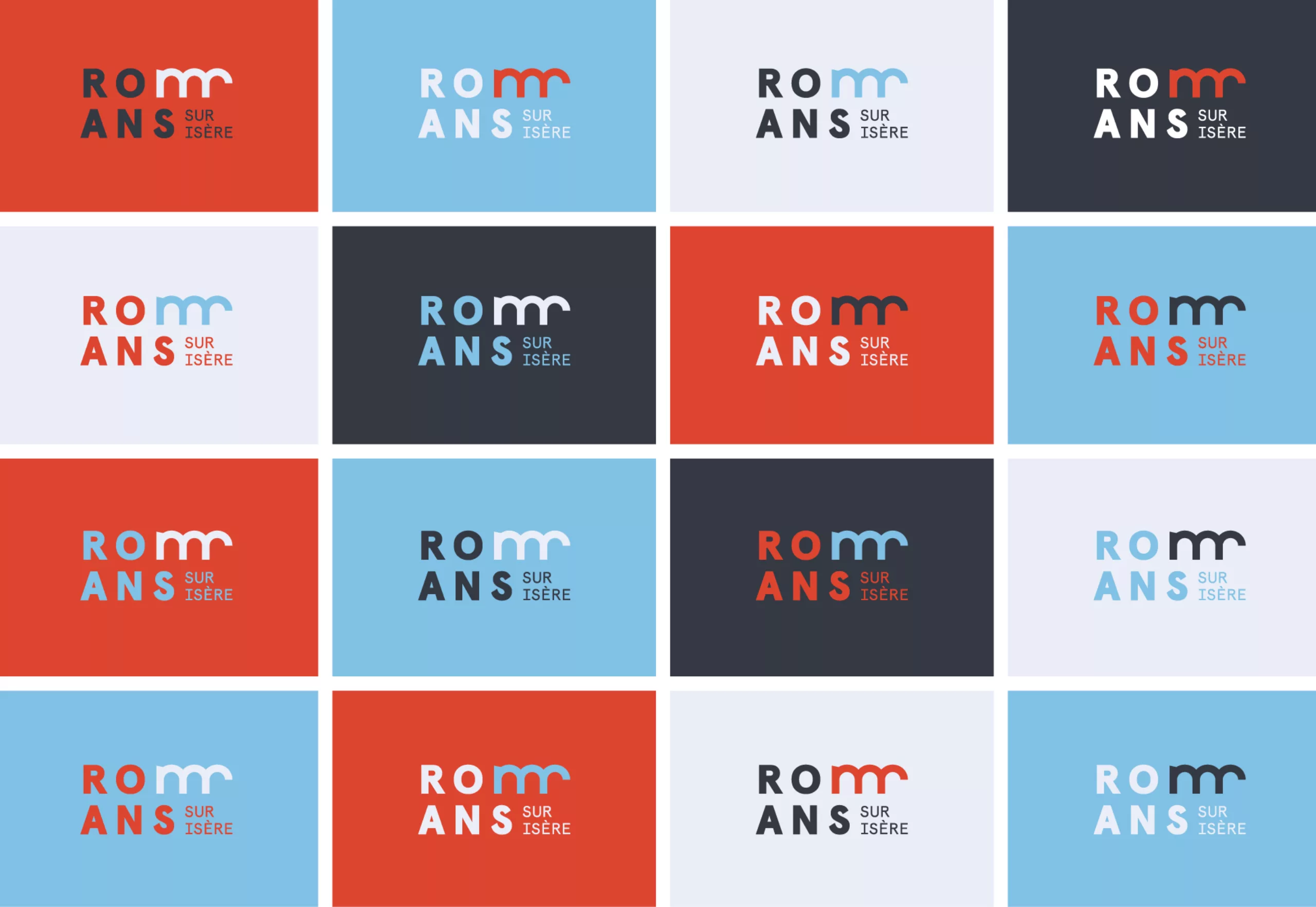
A4-plan-romans-sur-isere-logo

Tomorrow's tempo

The beginning of an extra leg to the "m", gives some originality to the letter. The letter becomes a sign. The word becomes a logo. It gives life to the logo, provides the tempo and push forward the image of the city.

A5-dessin-du-M-romans-sur-isere

A6-monogramme-ville-romans-sur-isere

Humanistic values: more bridges and fewer walls

This logo is somehow "a bridge that moves forward". It proves wrong Newton who said: "Humans build too many walls and not enough bridges".

A7-logo-ville-romans-sur-isere

charte-graphique-ville-romans

Color and movement

Constantly in motion, the color changes. It is vibrant, bright, cheerful, exuberant, exciting, improvident, provocative, sparkling and always elegant. We proposed 3 main corporate colors and a secondary range for all other thematics.

charte-graphique-papeterie-romans

couluer-full-size

carte-de-visite-ville-romans

pochette-A4-branding-romans

branding-flat-design-ville-romans

card-badges-city-branding-pop-design

city-branding-design-ville-romans copie

Poster design principles

grille-composition-identite-visuelle-romans

grille-composition-identite-visuelle-romans-copie

Affiches-design-branding-romans-isere

affiche-rue-romans-isere-invest

Romans Magazineromans-mag-full-sizemise-en-page-magazine-municipal-romans-ville

couverture-magazine-romans

magazine-romans-sur-isere-mise-en-page

invitations-romans-sur-isere

sexe-revioles-rock-n-roll-romans

Special thanks & credits

Thanks to Mrs Thoraval (City Mayor), Mr De Menou (Head of Communications), Mr Giroud (in-house Graphic Designer) and their teams for their trust throughout the development of the project.

- - - - -

Creative direction: Mathias Rabiot

Art direction:  Adrienn Nagy & Gaspard Ollagnon

Motion Design: Arnaud Laffond

Project management: Céline Boursin

PS: Feel free to like the project on Behance!
www.behance.net/gallery/42434007/Romans-Sur-Isere-Brand-Design


Share this post:


Leave a Reply


Newsletter
Leave us your email and receive your monthly dose of Graphéine in your mailbox.