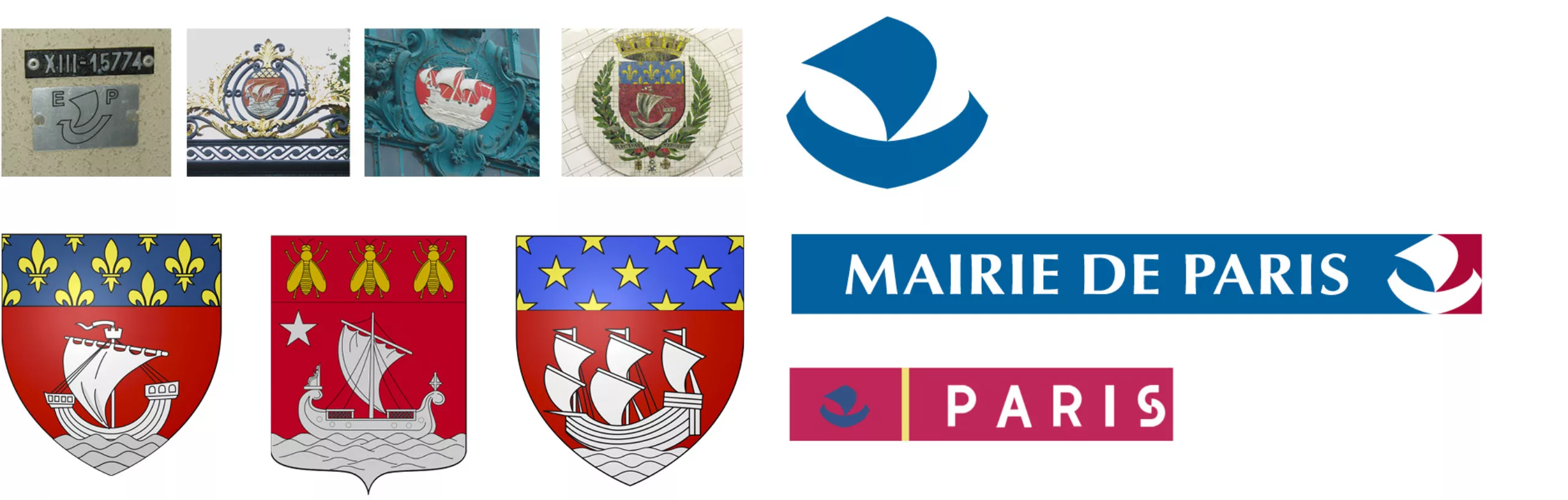
A few months ago, we participated in the call for tenders launched by the City of Paris to redesign its visual identity. This is the unsuccessful project we presented. A project far from perfect, conceived on a very simple intuition in a limited time, but which deserved to be presented on this blog.
To give some background information, the specifications were very clear on the fact that it was necessary to preserve but develop the “Nave”, the historical symbol of the city. So our work focused first on this symbol.
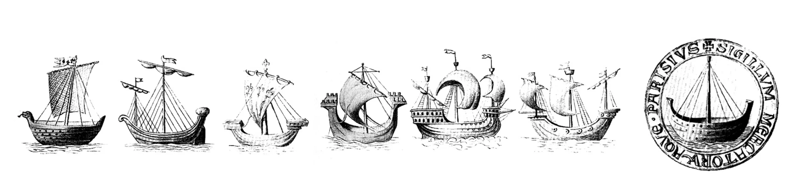
Fluctuat “Nave” Mergitur
The nave is originally the symbol of the corporation of water merchants, which gave birth to the municipality of Paris. This symbol could be traced back to the Lutetia nautes of the Gallo-Roman era. The nautes were the basis of trade and exchanges between the city of Lutetia and the rest of the ancient world. They were therefore at the origin of the city’s wealth. The motto of the city since 1358 was “Fluctuat Nec Mergitur” a Latin phrase, roughly meaning “(It) is tossed by the waves but doesn’t sink”.