
Paris Convention and Visitors Bureau rebranding
Paris Convention and Visitors Bureau
The Paris Convention and Visitors Bureau was created in 1971 following the joint initiative of the Paris City Council and the Paris Chamber of Commerce and Industry. It has three specific missions: welcoming visitors, informing the general public, and promoting the destination within France and abroad.
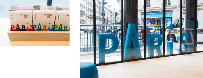
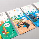
Paris in capitals
Our first question, of course, was whether or not to use the symbol of the Eiffel Tower. Without ever referring to the Great Lady, it’s difficult to communicate effectively about the destination ‘Paris’ to an international audience. However, we were well aware of the overused visual territory, bordering on the kitsch.
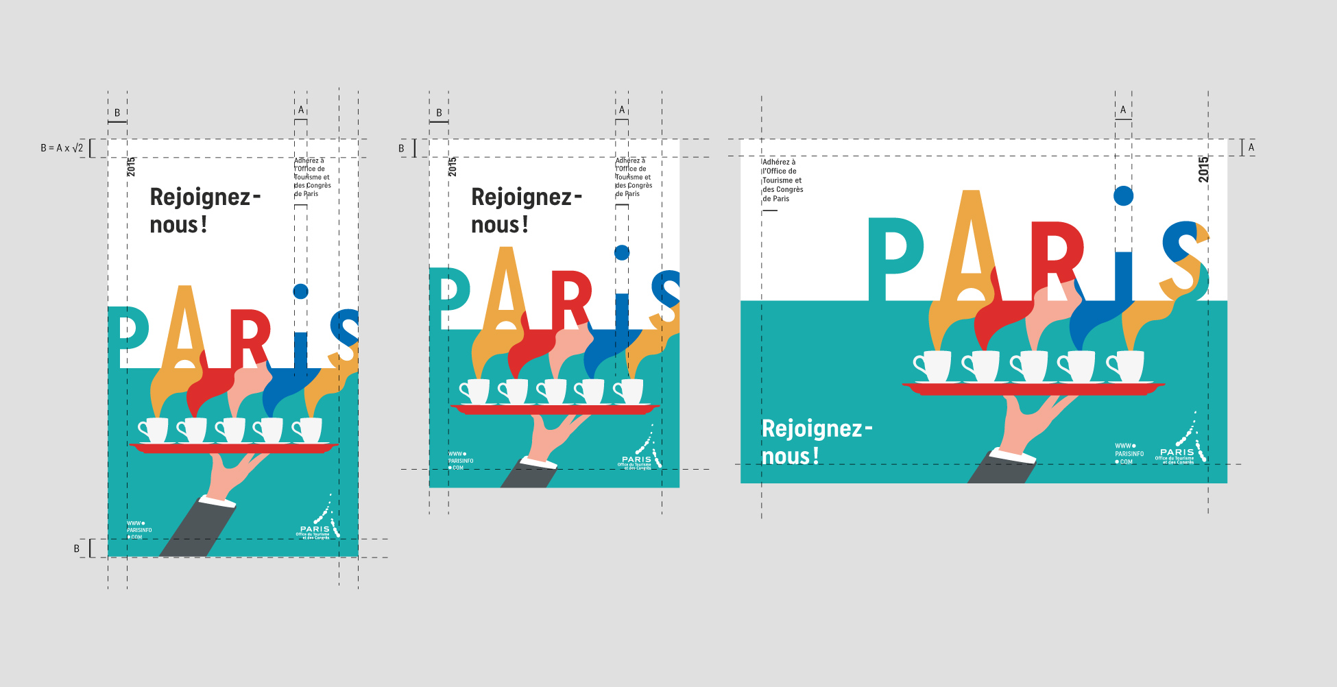
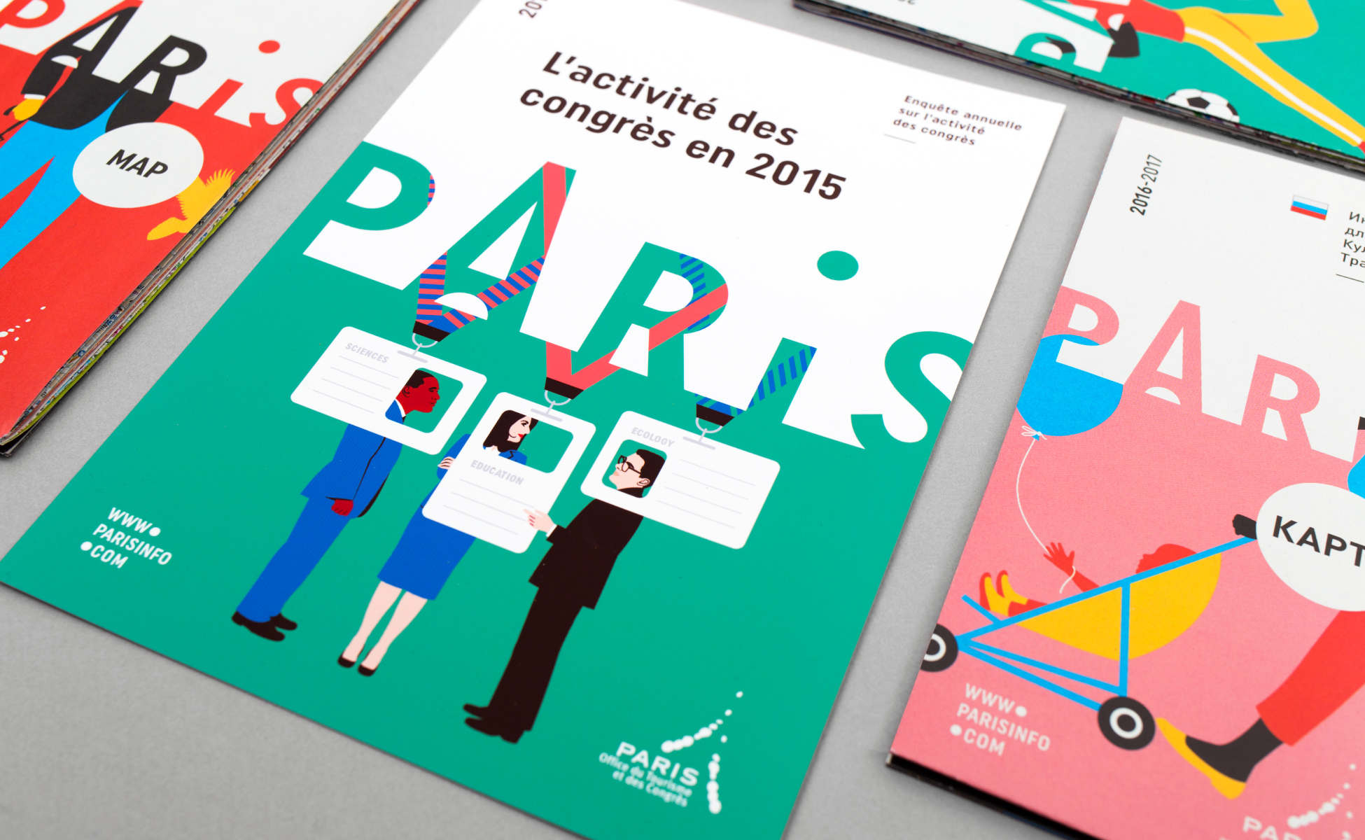
We opted, therefore, for simplicity and concentrated on a typographic design that suggests a Parisian skyline: the drawing of the "A" directly evoking the Eiffel Tower. The result is a minimalist logotype.

![]()
![]()
![]()
![]()
![]()
![]()
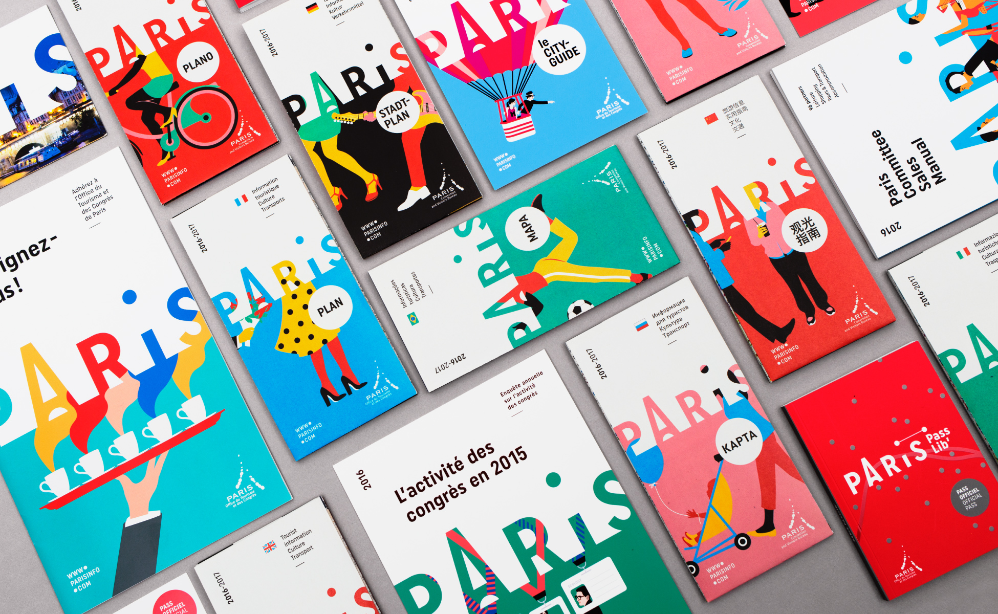
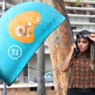
Paris Passlib'
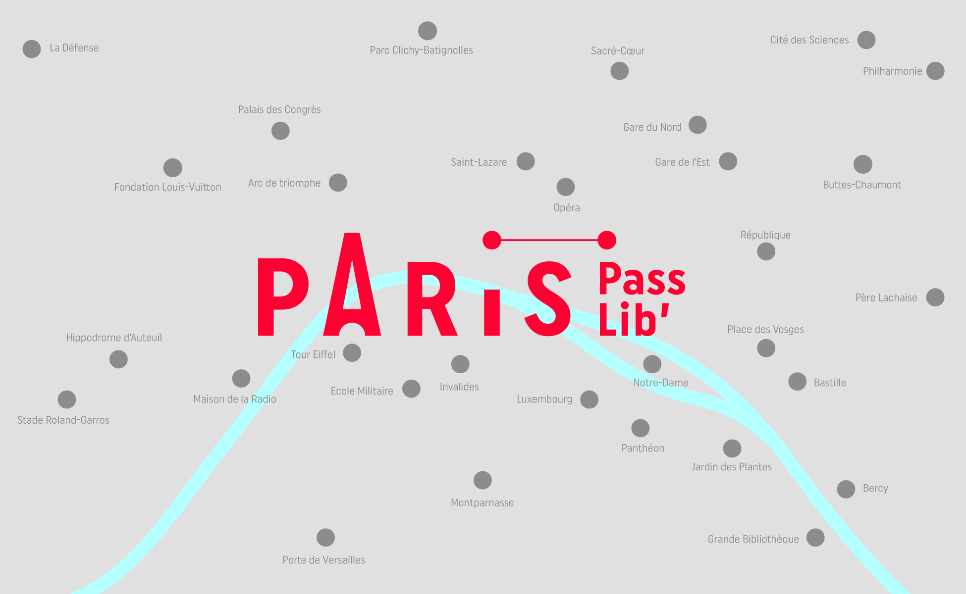
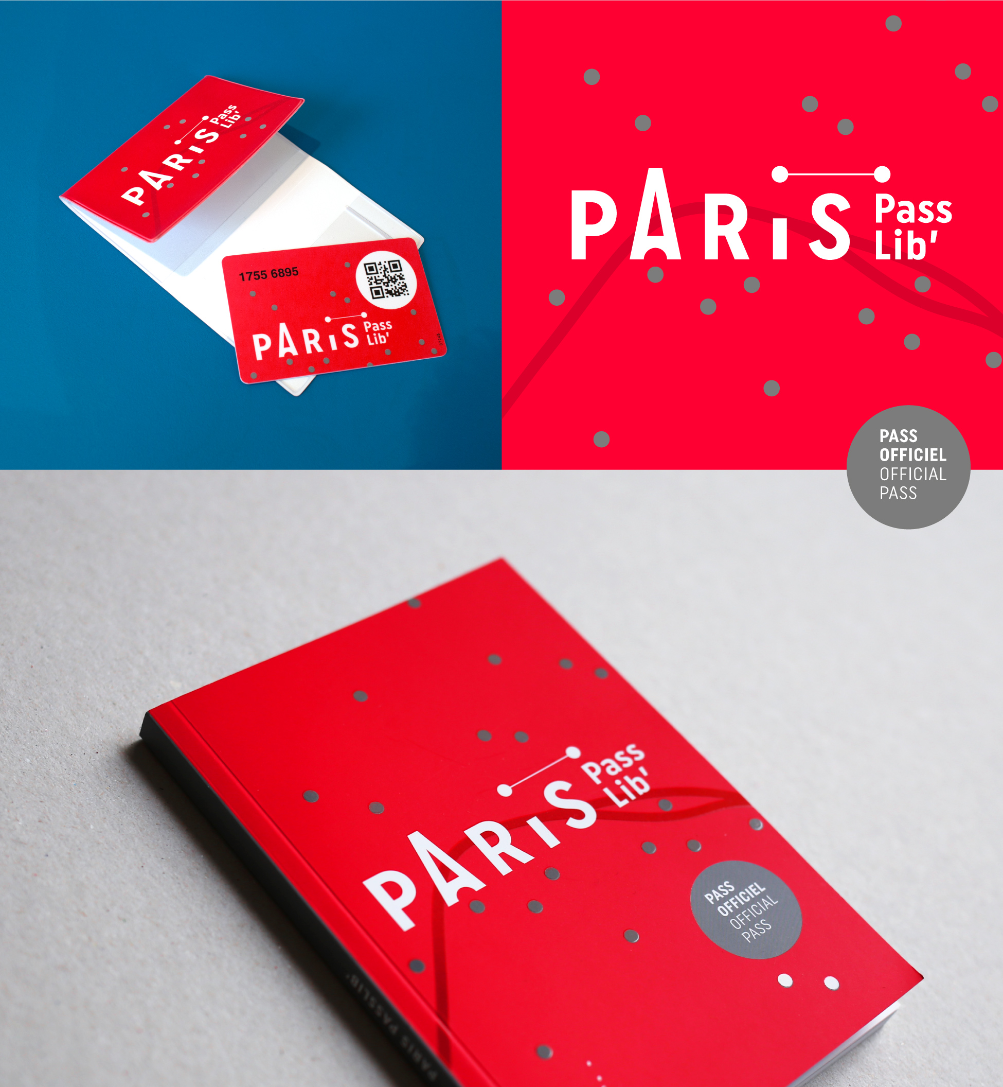
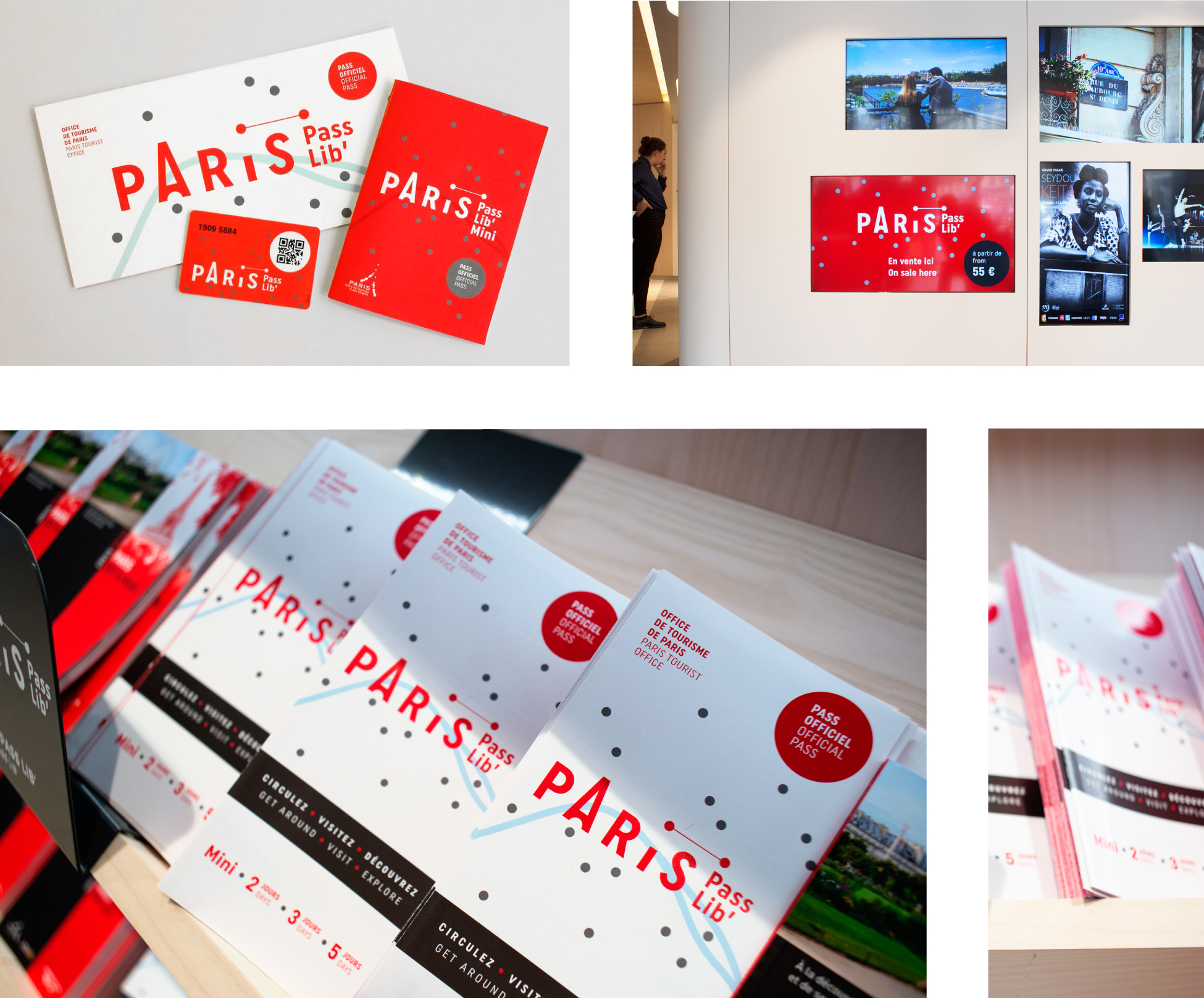
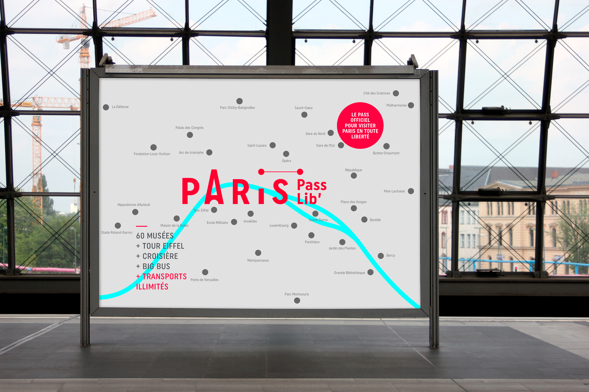
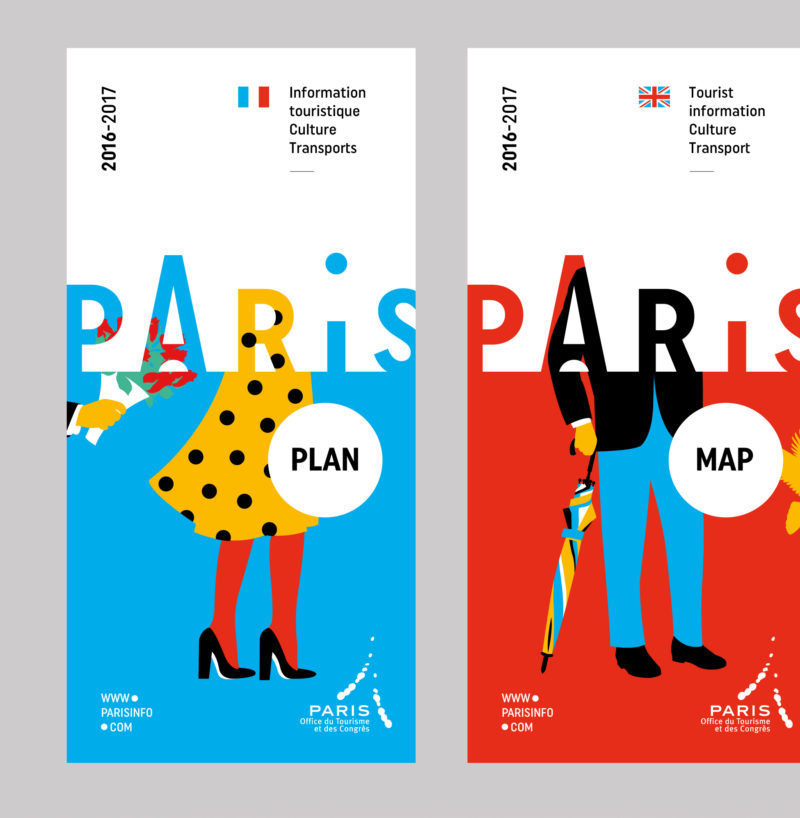
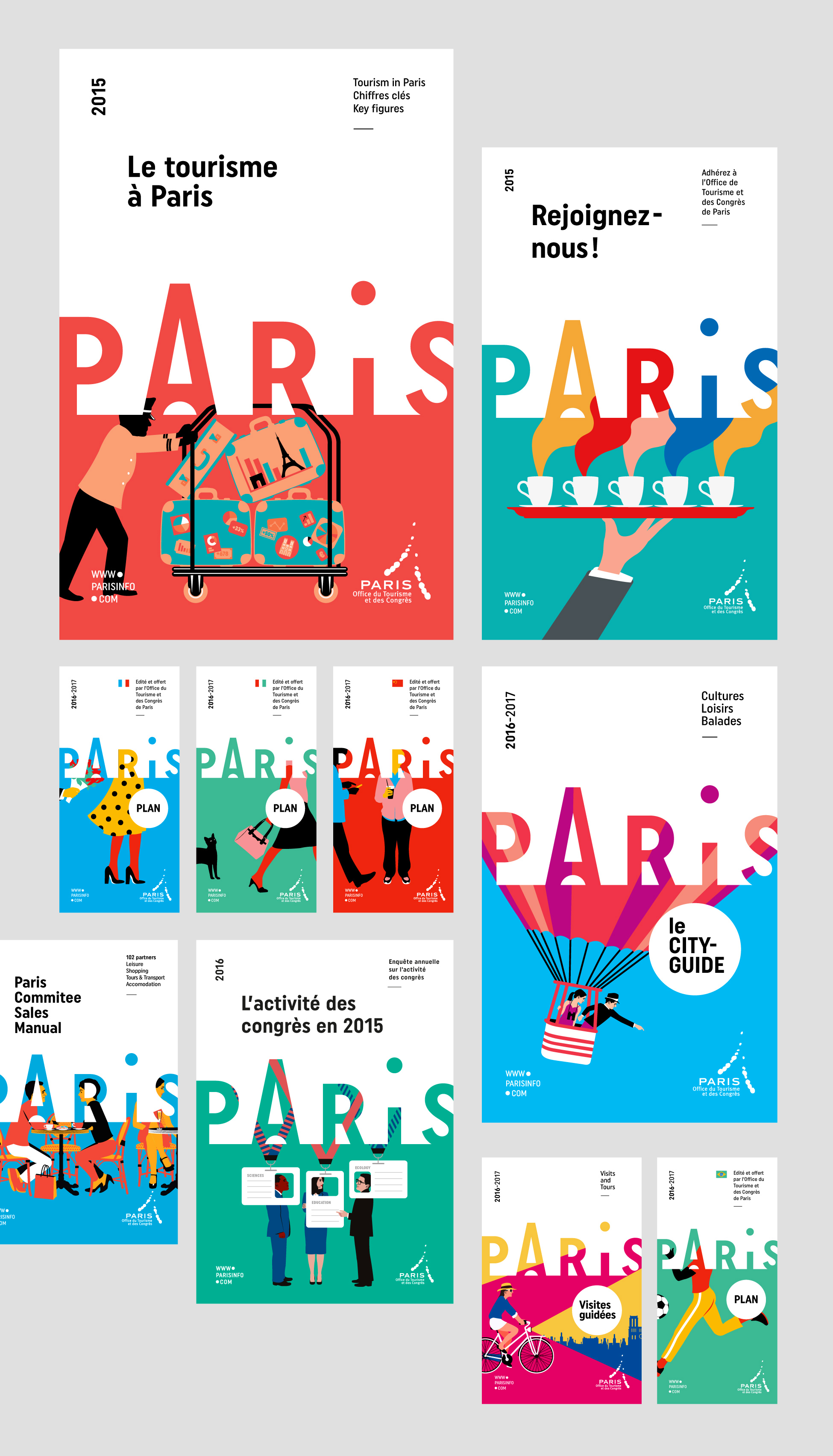
The first application of this new graphic design was the "Paris Passlib", the official tourist pass of the capital. This packaged product provides access to over 50 museums and monuments in Paris and Île-de-France, and allows visitors to travel freely with an unlimited ticket. It comes with a pocket book that contains all the useful information you need to know.
This logo variation stands for the idea of traveling between several locations, from one key point to another. This sober and simple design allowed us to draw a tourist map of Paris.
![]()
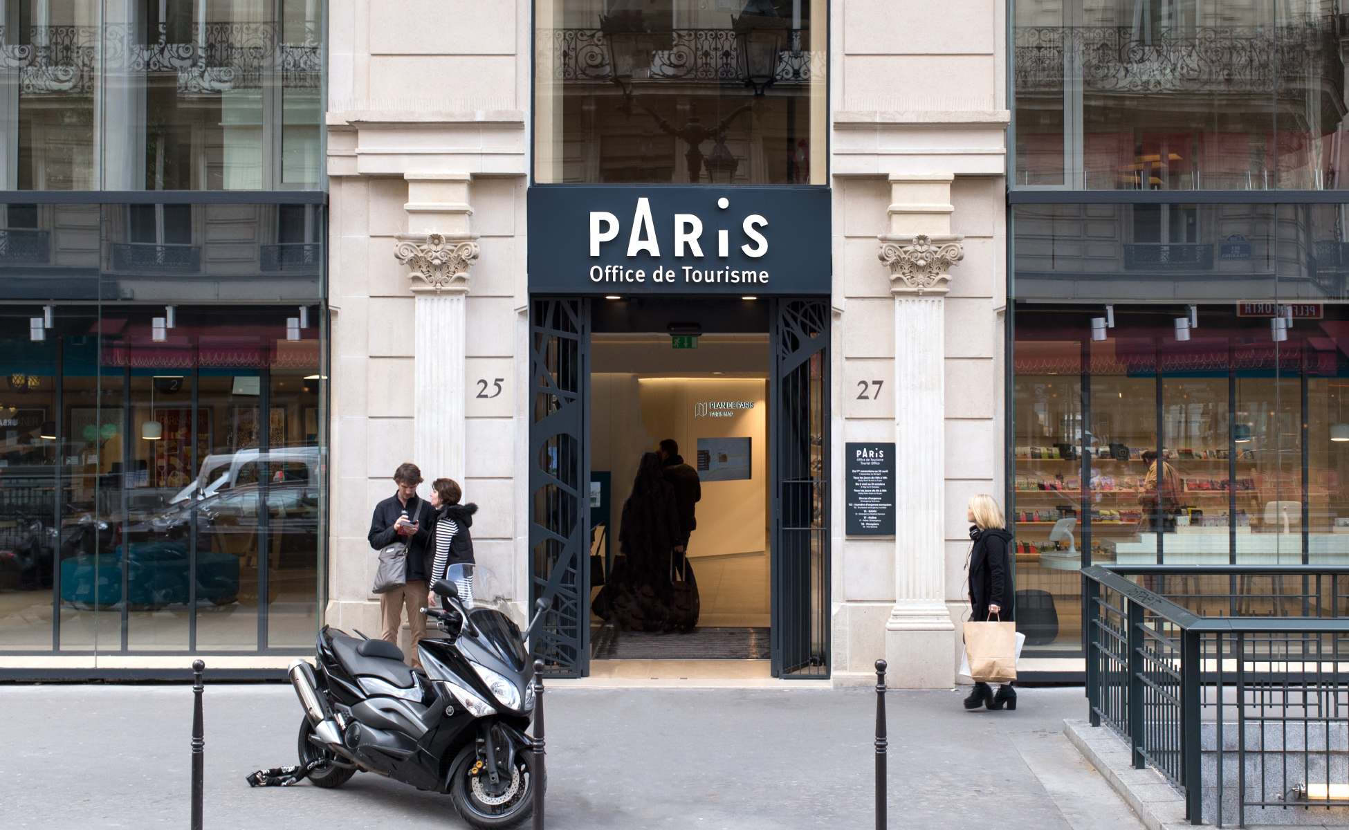
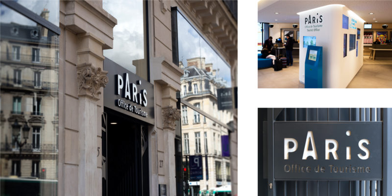
Information points
The Tourist Office has 5 information points. The main office, located at 25 rue des Pyramides, has been completely renovated and now displays the new logotype. The interior design has been carried out by french agency Intangibles.
Colorful layouts
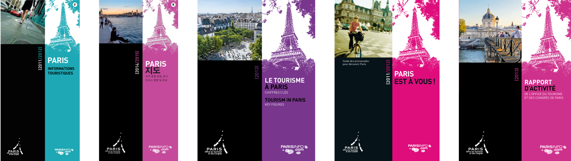
The previous graphic layout was based on the combination of a picture of the Eiffel Tower and a photo of Paris, making color the main differentiating element.
In our proposal, the logotype is the central element of the graphic charter. It contains the iconography and becomes a window on "Paris". This frame invites the eye to travel between letters, titles and images, creating curiosity.
We also wanted to invite an illustrator to work with us on iconography. It was the perfect opportunity to collaborate with Séverin Millet, Lyon-based illustrator, whose simple and colourful work perfectly matches our vision of the project.
Opting for illustration allowed us to step aside from the usual postcard pictures of Paris, and offer a fresh, colourful and poetic look on the capital.
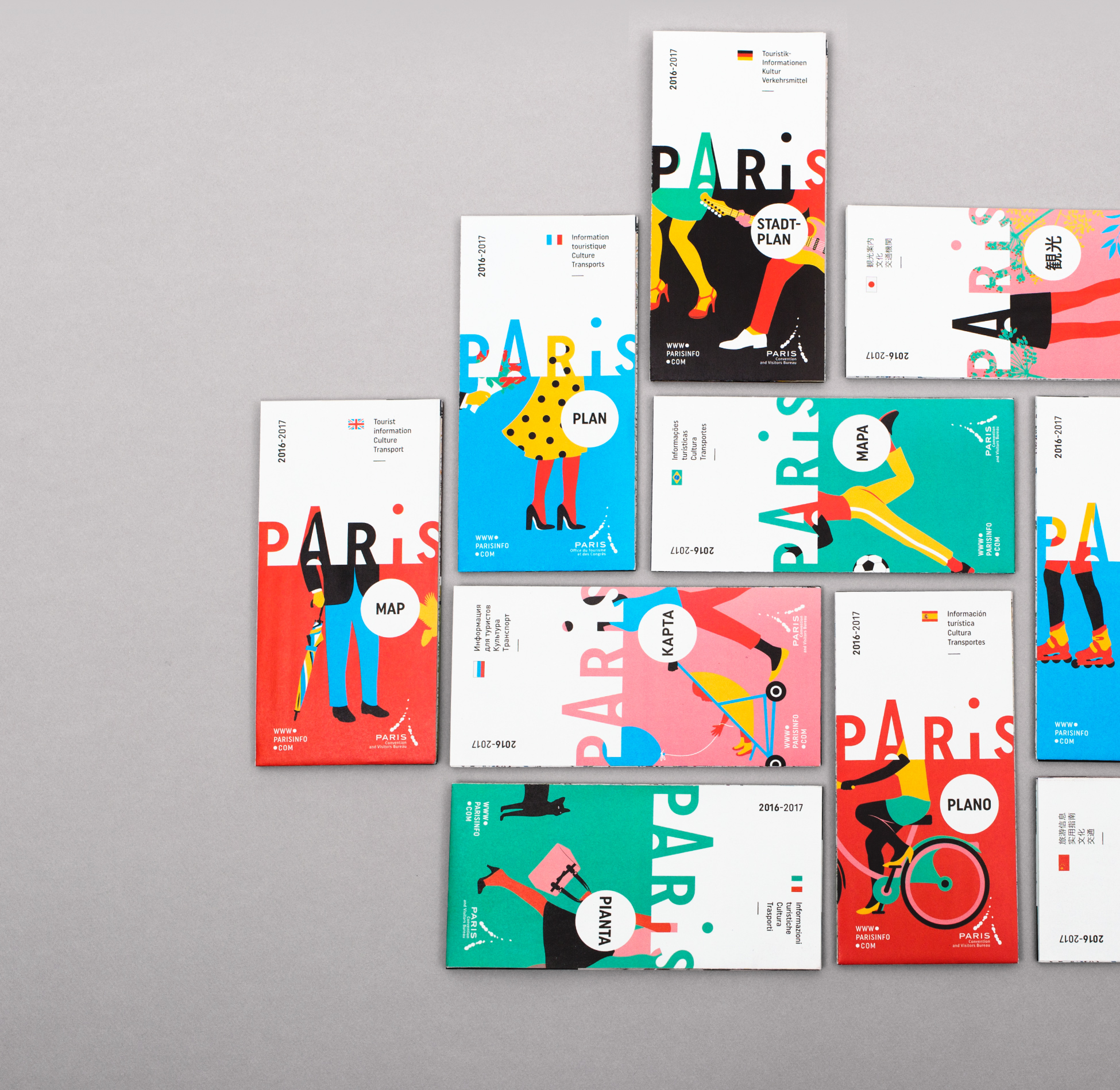
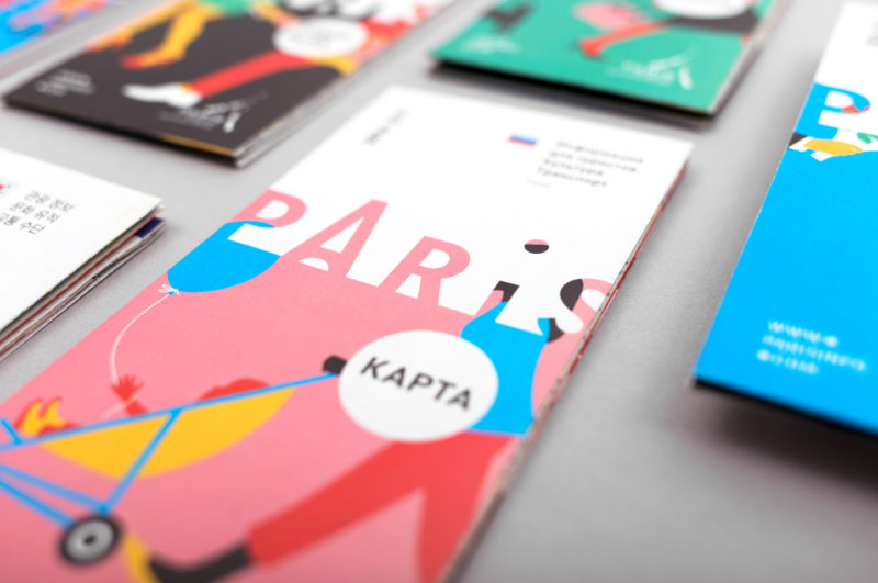
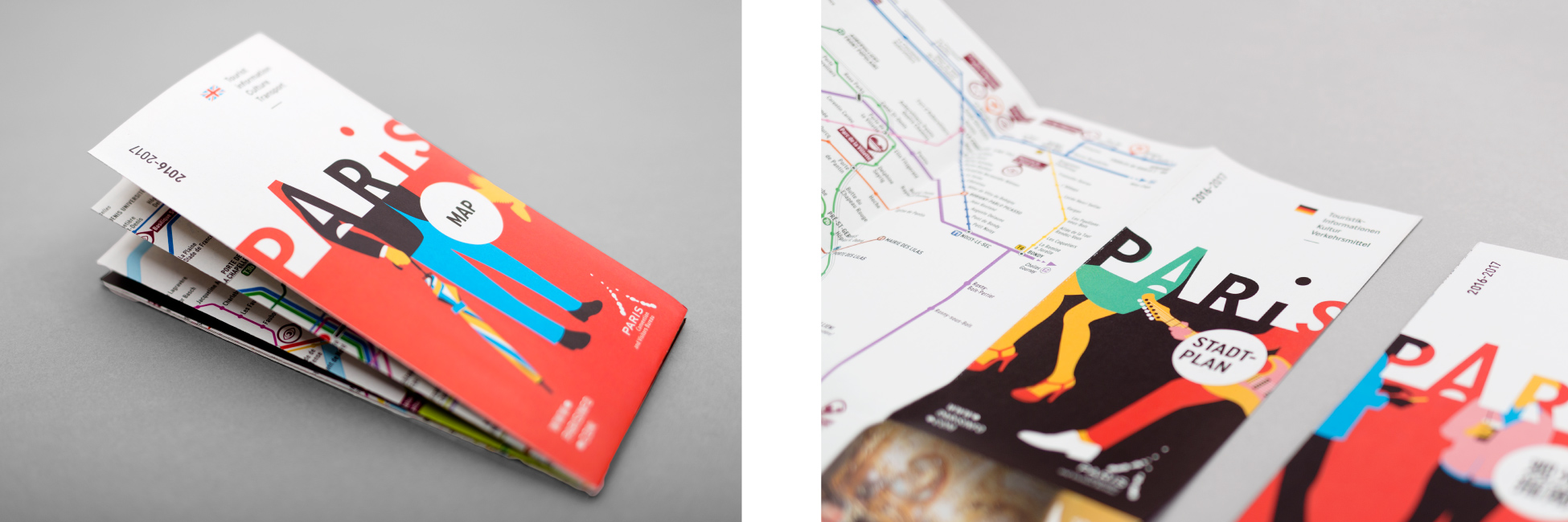
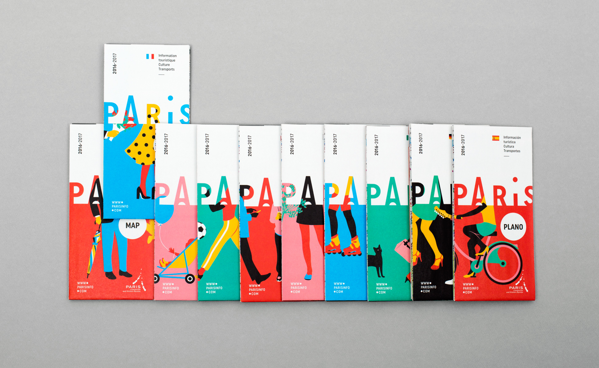
Maps of Paris
With 1.2 million printed copies, the map of the capital is the main document offered to visitors for free. It is available in 10 languages. Séverin Millet has created a colourful and lively character frieze, where only legs are visible: a true invitation to stroll around the city!
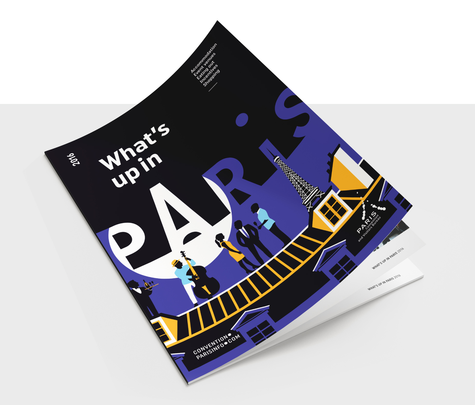
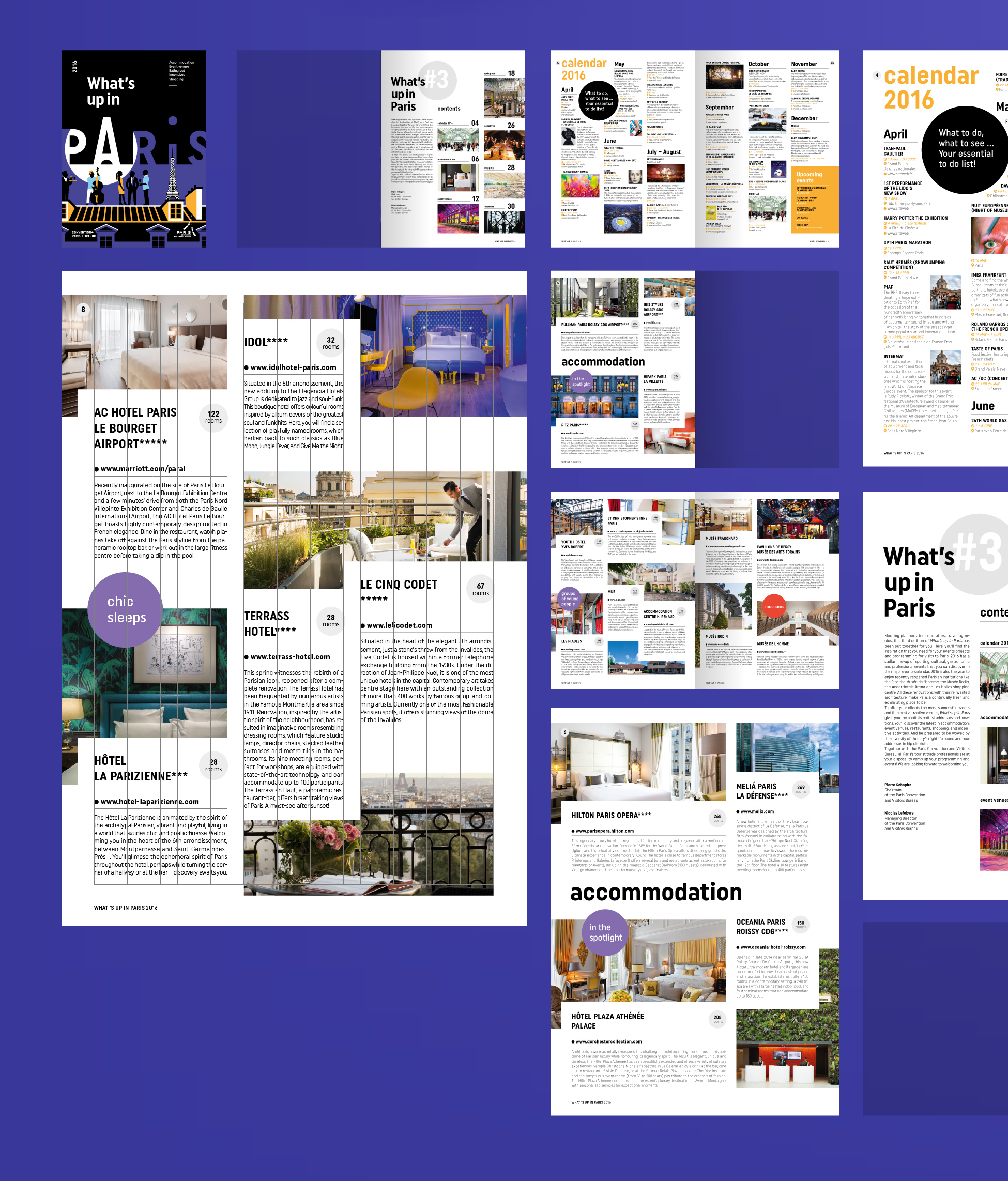
What's up in Paris
What's Up in Paris is a trend magazine for events and stays in the capital. It presents throughout its 32 pages the latest openings and renovations in terms of hotels, event venues, restaurants and shopping in Paris. We went for a "dark" cover to foster the image of a city that lives by night.
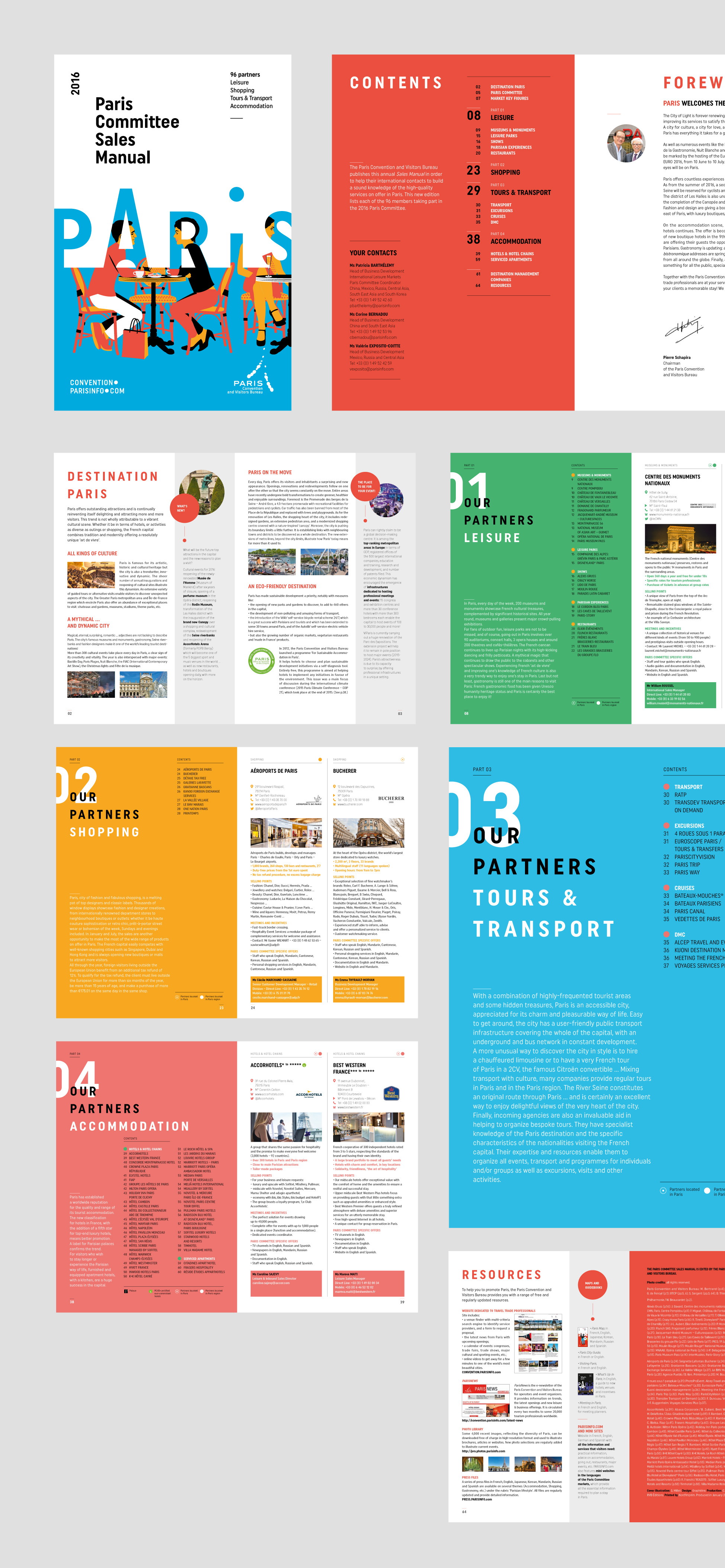
Sales Manual
Special thanks
Special thanks to the team of the Directorate's Office of Tourism and Congress of Paris as well as the publishing service in charge of the project. The whole project has been carried out with great serenity and seriousness, in a climate of mutual trust. Choosing illustration over photography was not an easy decision, but was strongly supported by the team. Thanks again!
A huge thank you to Séverin Millet for the quality and simplicity of his illustrations on not-that-easy topics.
Share this post:
 Y2K trend, the 2000’s style is back
 From surnames to acronyms: creating a brand name from letters
 The smart set of ambigrams, graphic symmetry and word reflections
 Maurits Escher’s impossible reality
 Directorate for Education of Chalon-sur-Saône – Visual identity
 MC2: Grenoble
 Speaking English with Rosbeef in Lyon – illustrated by Graphéine
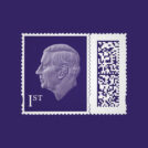 A king-size stamp for Charles III
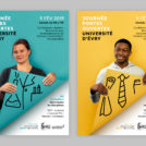 Évry University open day: reveal your professional future!
 Californian vibes for the 2019 Printemps de Pérouges festival
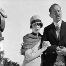 The Noailles “A Life of philanthropy”
This is spectacular. It captures an insouciant aspect of Paris life. The dot over the i is a lovely wink. Well done!