France Télévisions’ new visual identity. Period.
Update : January 31, 2018
A new visual identity for France Télévisions!
That’s all we talk about these days: France Télévisions and all its channels are changing their visual identity!
It is the blog of the Lenodal.com site, specialist in television identities, which revealed the case after a tweet of @ana3ig, which discovered the pot-aux-roses in the list of the last registrations of marks with the INPI, thus confirming an information given by the Satellifax site last April.
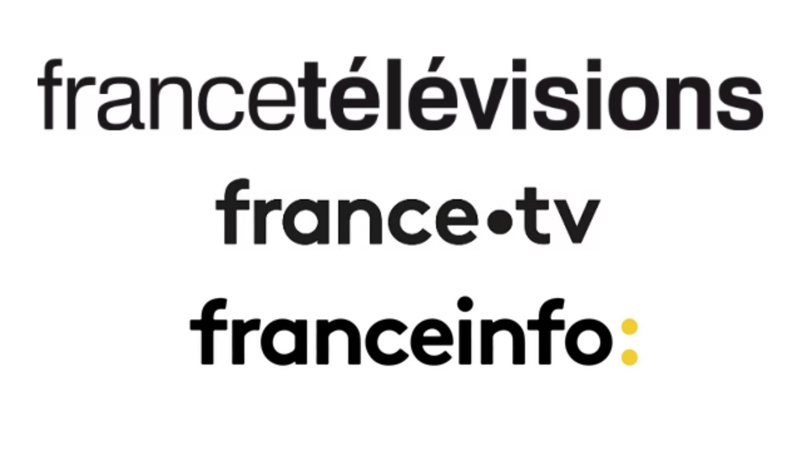
France Télévision has since unveiled its new logo, which declines each channel according to its identity, france.2, france.3, france.4, france.5 and france.Ô :
Here are the new visual names of the public service channels that were installed on your screens on Monday 29 January. This harmonisation is in line with the spirit of the france.tv group’s website, whose logo was revealed in May 2017 instead of the Francetv Pluzz replay service, and which also recalls that of the new franceinfo channel: (which has two points), co-ownership of the group.
The leitmotif of this change is the evolution of television:
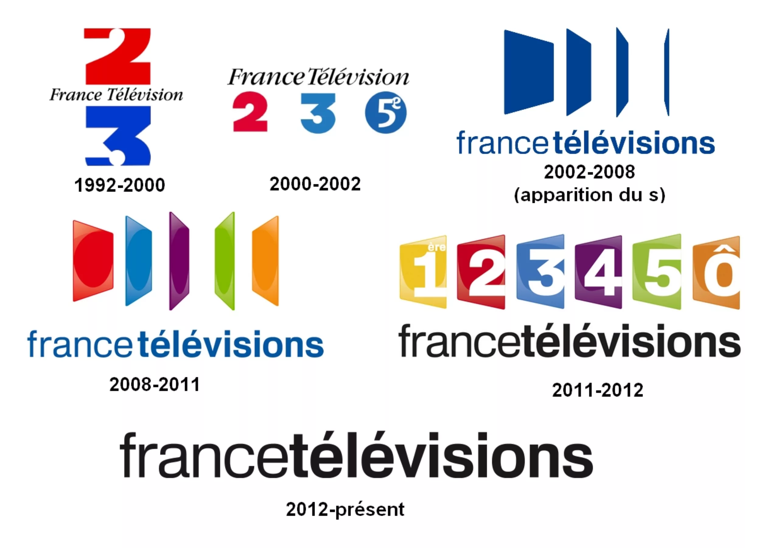
We also advise you to read Valentin Socha’s twitter news feed, which retraced on its wall the evolution of France Télévision’s visual identity since its creation. Fun and effective!
A dot story
Let’s start by observing carefully. The first thing that strikes is the dot. This dot which seems to become the leitmotiv of the channels of the group was at the origin, for france.tv in any case, and without admitting it openly, a much more practical way to make memorize the domain name of its replay service, many Net surfers having difficulty remembering the spelling or the name of Pluzz. We are clearly in the domain name model, in the complete digitization of TV. However, orally it won’t change anything, we won’t say “france dot two” or “france dot three”.
This dot retains the original color of each channel to maintain consistency with previous identities. Red for france.2, blue for france.3, violet for france.4, green for france5. Only France is changing to yellow, the colour already used for local overseas dropouts. Our colleagues from Lenodal also notice that the latter lose the “first” mention that these locals had since 2010, following a lawsuit lost against the Paris Première channel.
These dots would thus be the only contribution of colors and the only link with the graphic history of the group. More discreet in a corner of the screen, of course, but won’t that reduce their readability, unlike the predecessor trapeze?
All eyes are on the new world…
Behind this change of identity, we feel the end of a world, that of television in the middle of the living room. Netflix and others have gone through this, revolutionizing the global audiovisual landscape. Let us therefore hope that the introduction of this “dot” in the visual identity is not just a simple “digital gri-gri” to convince oneself of its conversion to new digital uses. Because the clock is ticking, and every day, our Californian neighbors impose themselves on our screens… of tablets!
Typography
For the typography, wanting to remain in the spirit of franceinfo:, we do not change a winning team and we resume the use of the Brown (in Bold version for the logos) designed by the Swiss Aurèle Sack for the Lineto foundry, with however some adjustments at the level of the kerning and an extension of the curve of the number 2.
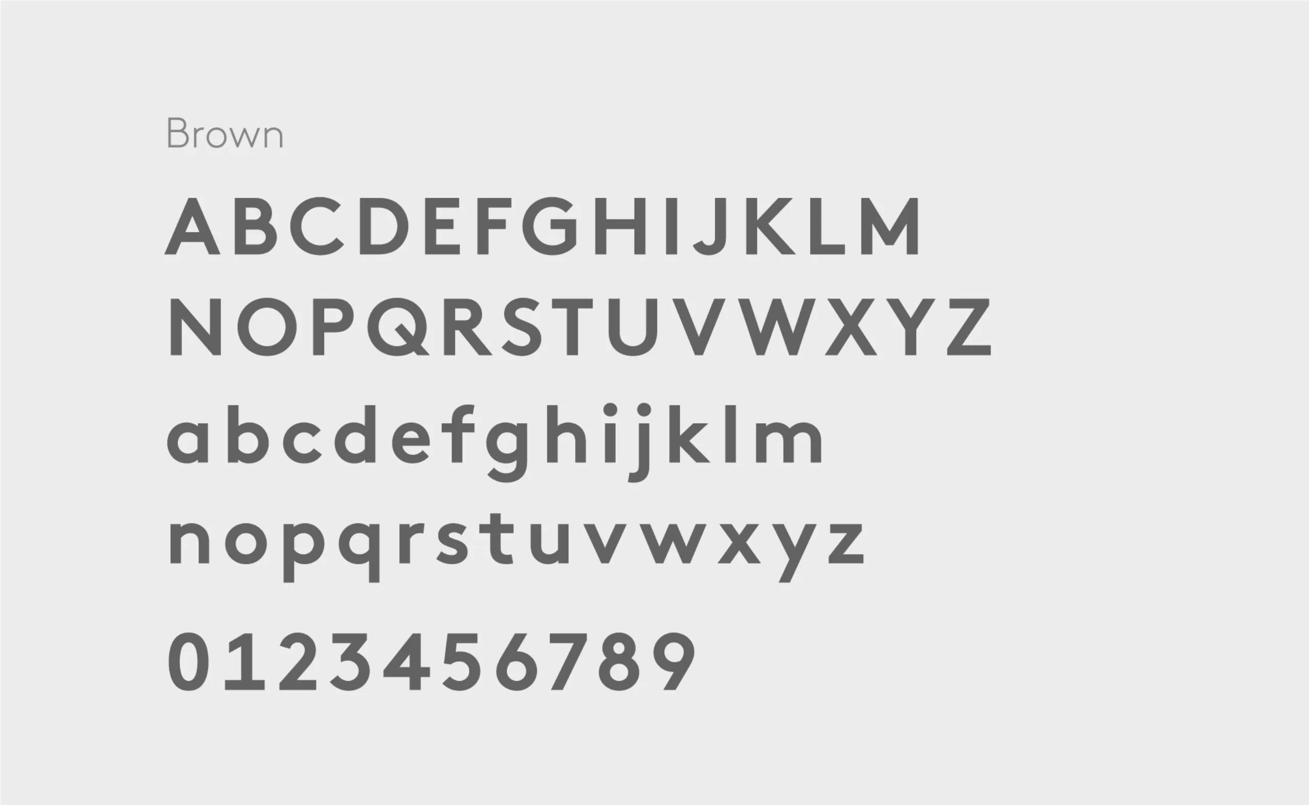
Much less well known than the “Silver Micro School”, the “a humanist” school is generally practiced by myopic character designers. Because of their visual handicap, they tend to favour humanist “a’s” over geometric “a’s” ( you know these forms of round “a’s as “o’s”). In our case of France-Tv, we can be sure that we will have to frown to avoid reading “frown-tv”!
The digital gesture
We feel a huge desire to begin a shift towards digital, as the band announced on its twitter account by unveiling the video of its new look: “#NotreTélé” (#OurTV) is evolving: our visual identity too ! Today, the identities of our TV antennas and digital offerings are converging.”
We can see it in the TV casing, the dot acts as a “loading wheel”, well known on our screens. The presentation of the group’s channel programme scrolls up as it would on a mobile, with this dot also reminiscent here of tapping a finger on a screen.
The digital shift is also one of the reasons for the france.tv site and its spring redesign, since this site was to offer a SVoD service from autumn 2017 on the same model as Netflix et al, but at a much lower cost and with much more French programming, for which the group received a budget extension in order to produce original creations. Unfortunately for the moment this service is still not active.
It was not until 29 January that the group took the floor via their press kit on francetvpro.fr to learn more, because silence and caution were required before the announcement of this new identity. It must be said that France Télévisions was mistreated by the press during the revelations of Le Canard Enchaîné and Satellifax in spring after the launch of france.tv, and finds itself in an unprecedented turmoil, between budget cuts, motion of no confidence and loss of audience.
As the price always makes polemic…
The amount of €240.000 announced by the Canard Enchaîné before the official announcement did not seem really founded and especially not detailed. Today we know more: the work will have cost €90 000, and €50 000 for the rights of use (€140 000 in all). Not to mention that all of this includes of course creation, advice, audits, rights… but perhaps also communication media, stationery, signage, clothing, studio dressing, etc. A sum covering both the works for the public channels and for franceinfo: and the site france.tv.
Finally to silence those who would say “a kindergarten child could have done it” we invited you to read this article that feels good, let’s admit it:
The figure of 240.000 euros announced by the Duck before the official announcement did not seem really founded and especially not detailed. Today we know more: the work will have cost 90 000 €, and 50 000 € for the rights of use (140 000 € in all). Not to mention that all of this includes of course creation, advice, audits, rights, design of dressings, but perhaps also communication media, stationery, signs, clothing, studio dressing, etc…. A sum covering both the works for the public channels and for franceinfo: and the site france.tv.
Finally to silence those who would say “a kindergarten child could have done it” we invite you to read this article: www.stpo.fr/blog/haha-un-logo-a-240-000-e/
In terms of task sharing, the agency Joosnabhan was in charge of the audit and brand reflection, while the agency Movement was in charge of the visual identity. The two agencies had to work together with the management of France Télévisions to arrive at a viable and reliable project.
If we did not finally pass far from the “dancing dots” of Google, but France Télévisions is “ready” to celebrate its 25 years.

On the subject
-

Groupama’s new visual identity, a logo in the open countryside
Groupama has just unveiled a new logo that updates its graphic design by abandoning its campaign in favor of a “startup” aesthetic.
-
From surnames to acronyms: creating a brand name from letters
From founders’ surnames to initials and acronyms, brand names have always oscillated between abstraction and familiarity.
-

The UN logo takes on water during COP28
For COP28, two designers have come up with a new UN logo showing the rising sea levels and the future disappearance of much land and coastline.