2014
AMUE's visual identity
When universities pool their efforts
Redesign of the global visual identity of Amue - Agency for the Mutualisation of Universities and Institutions. Amue is a French public interest grouping that contributes to the development of the information system of its 169 members and provides them with a plural software offer that meets their diversity. It also supports the changes and modernization of institutions in terms of steering and management.
Redesign of the logo, creation of a typography designed in collaboration with Matthieu Cortat, development of a range of pictograms to identify the different themes, revision of the global brand architecture, signage...

Concept
The logo is based on two very strong values. First of all, the idea of dialogue, two apostrophes that open a discussion between the different universities. The other notion is the idea of mutualization, the small apostrophe seems to be able to fit into the large apostrophe, as if to form a larger whole. From this effect of volume is born a feeling of movement, a dynamic of unity and mutual reinforcement.


Graphic universe
To facilitate the deployment of the brand architecture, we designed a collection of pictograms illustrating the different themes. A custom typography was also developed. It allows the Amue to have its "own voice", its own "writing".


Project expertise:
Publishing design, creation of magazine and brochure layouts. Logo creation, visual identity and graphic guidelines.
Publishing design, creation of magazine and brochure layouts. Logo creation, visual identity and graphic guidelines.
Type of client:
Communication in the education, higher education and health sector. An indispensable partner in the transformation of the health and wellness industry through the alchemy of creativity and technology.
Communication in the education, higher education and health sector. An indispensable partner in the transformation of the health and wellness industry through the alchemy of creativity and technology.
Related projects:
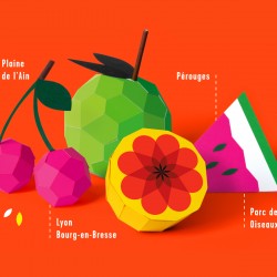
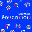 Directorate for Education of Chalon-sur-Saône – Visual identity
 French National Research Institute for Sustainable Development – Visual identity
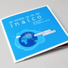 Brochure for the National Institute for Oriental Languages and Civilizations
 Conférence des Présidents d’Université – Visual identity