2012
The Metropolis of Paris
A branding for united territories
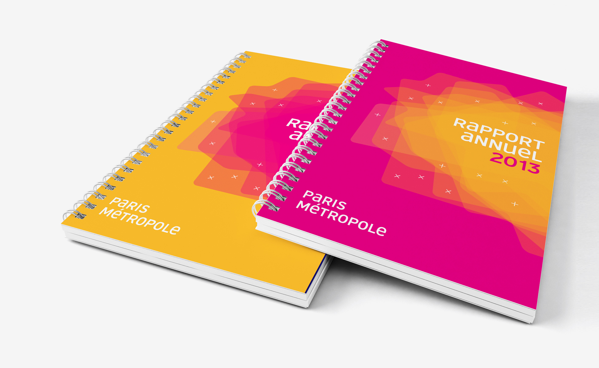
In 2009, we were approached to create the new brand identity of Paris Métropole.
Paris Métropole represents a hundred of communities, municipalities, Departments, Regions, that have gathered together to find answers to social, economic, environmental issues of their shared territory.
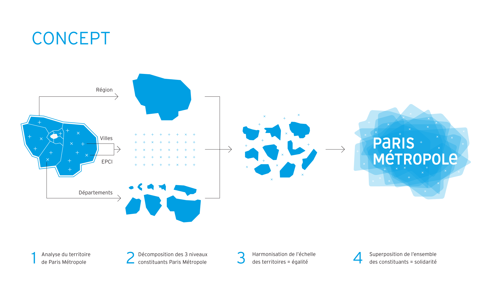
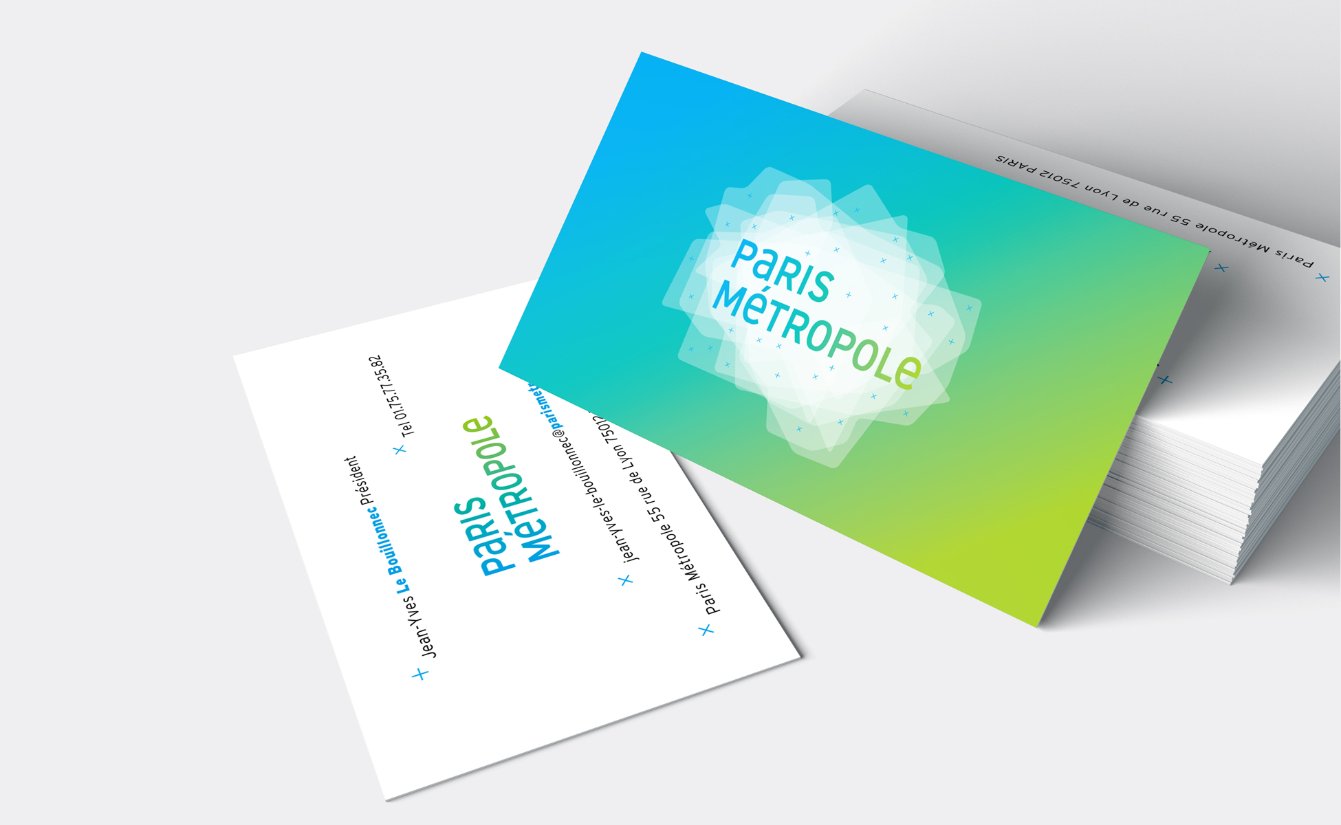
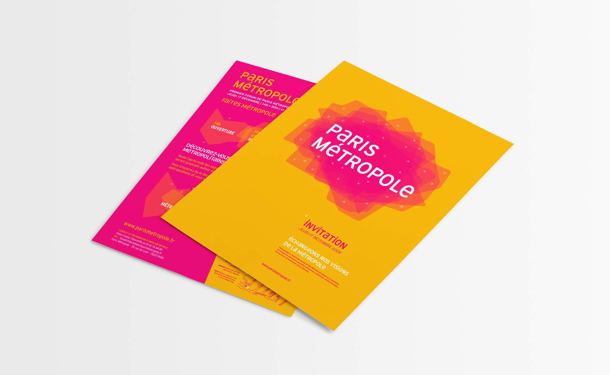
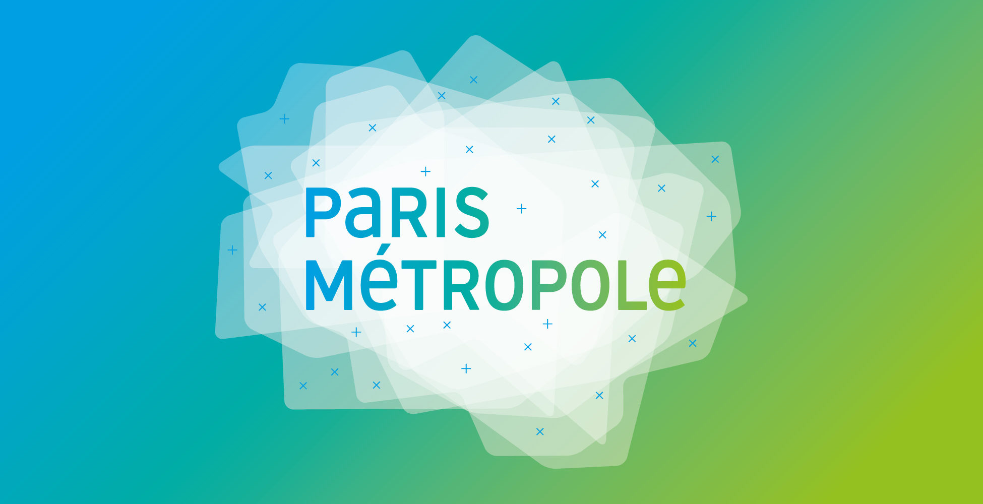
This visual identity stands for the addition of all the gathered territories, the overlay evoking the pooling of skills and interests.
Each territory has been used as an equal motif to compose the background of the logo. They interlace as they are joined together, to reflect the solidarity and union of this territory.
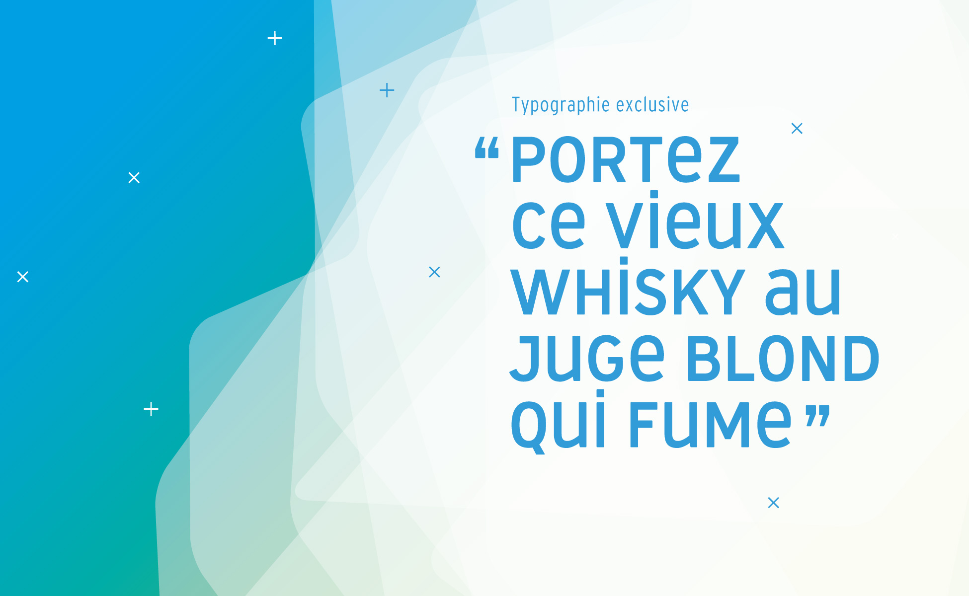
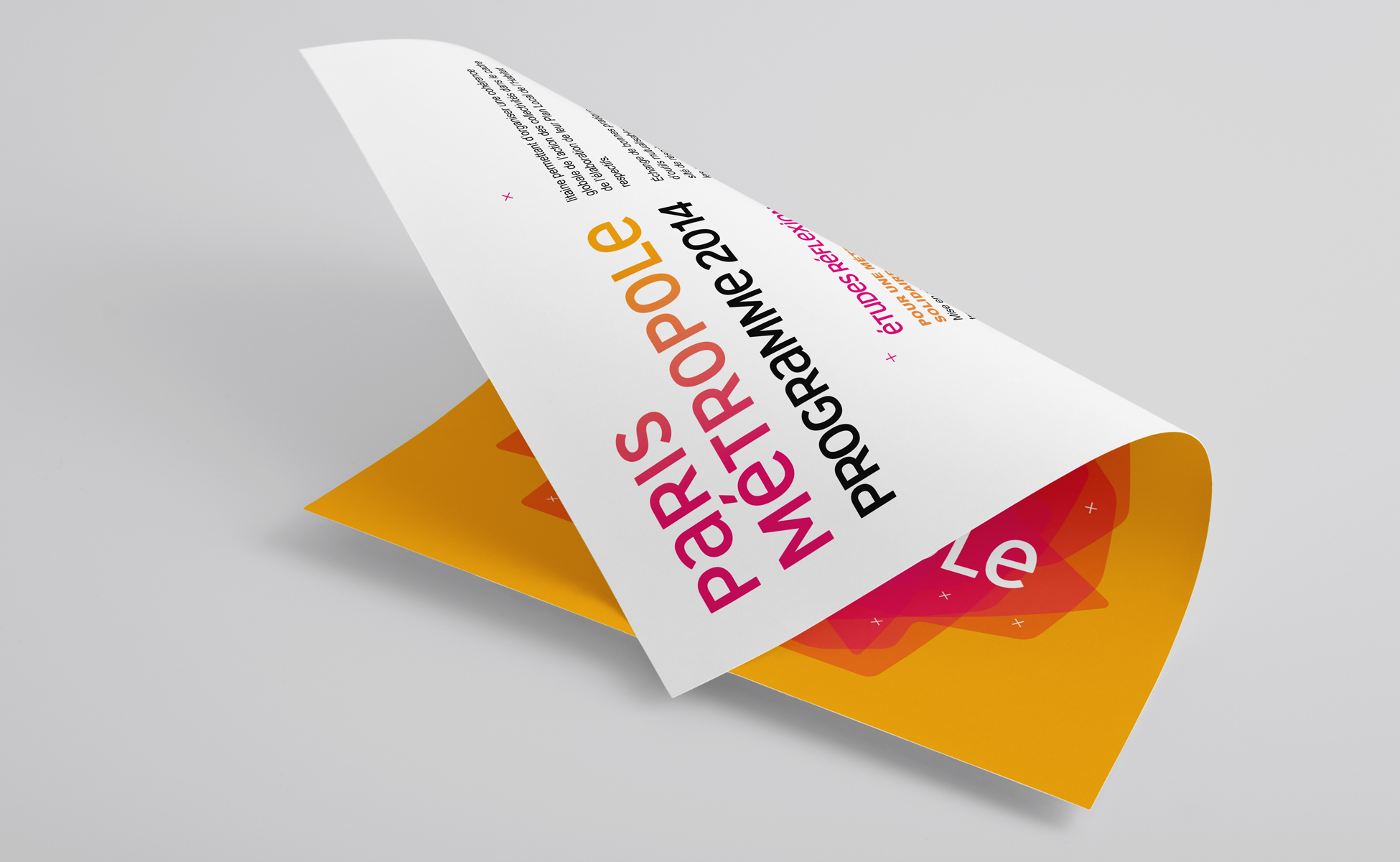
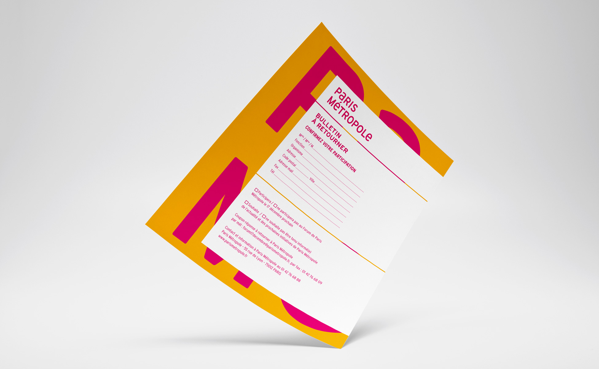
The Paris Métropole typography (link in French) has been created solely for this project. Capital and lower case letters are joined to illustrate the various scales of the métropole, from local to international. Both words have been emphasized equally in order to avoid Paris standing out.
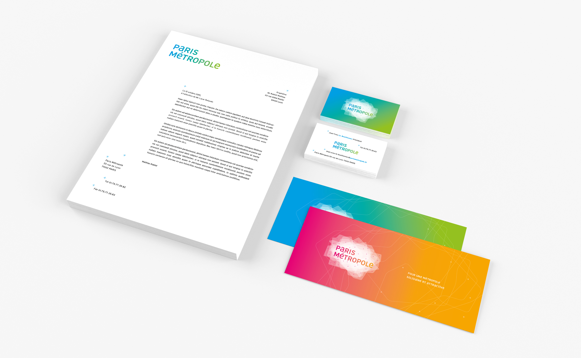
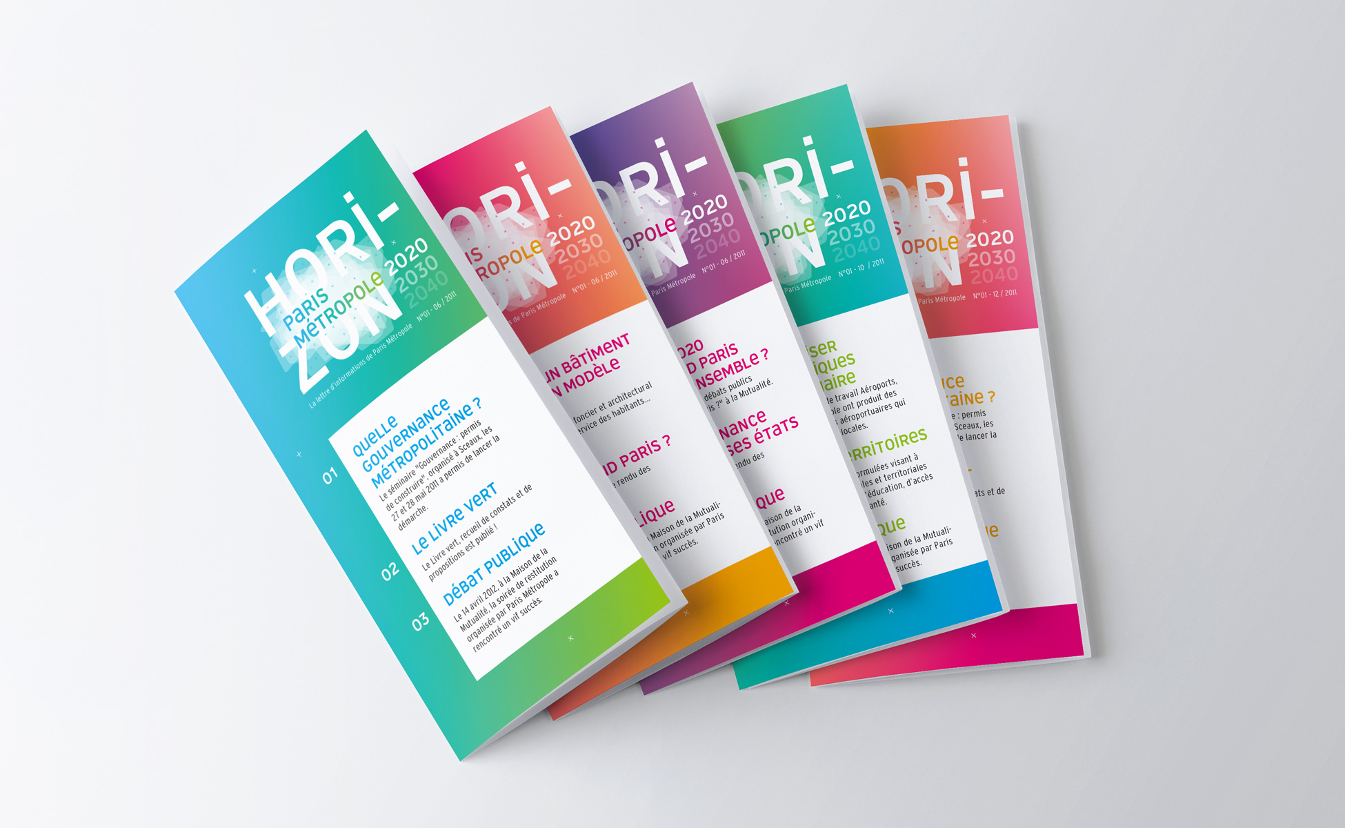
Logo creation, visual identity and graphic guidelines. Graphic design of posters, flyers, letterhead and business cards.
Institutional communication agency, public communication for cities and territories, government institutions, social partners and public administrations.

