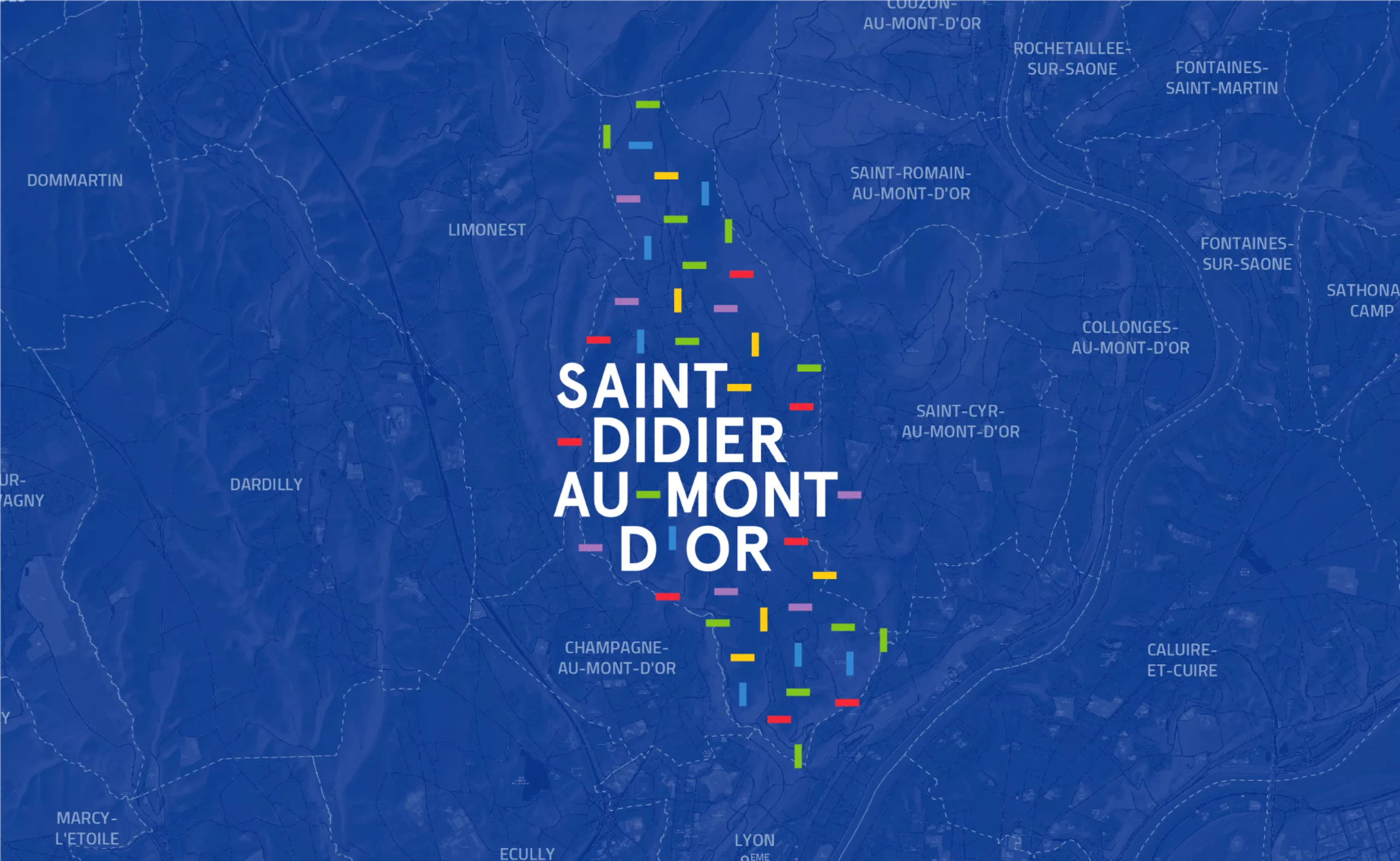
Saint-Didier-au-Mont-d’Or is located on the ridges forming the southern foothills of the small Mont d’Or, next to the 9th district of the city of Lyon. This location gives it a unique living environment, close to the major economic centers of Vaise or Écully. It is therefore an area between city and countryside.
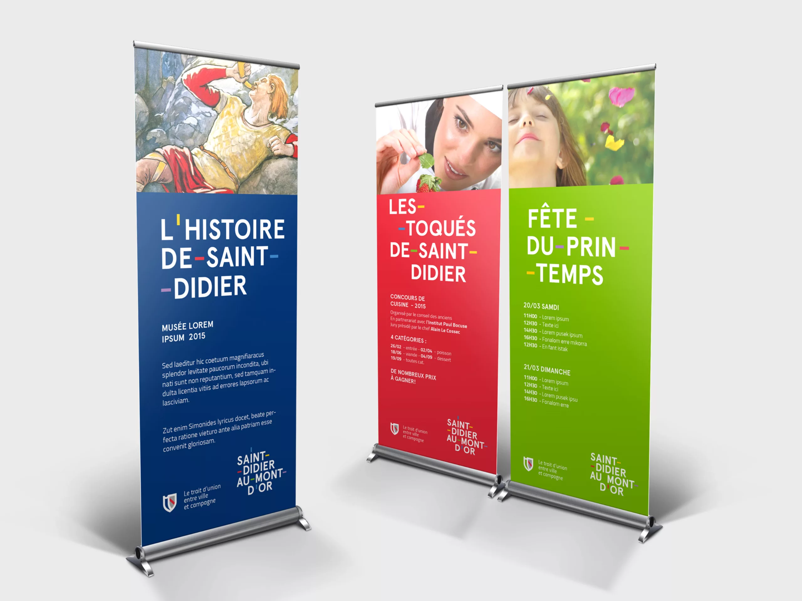
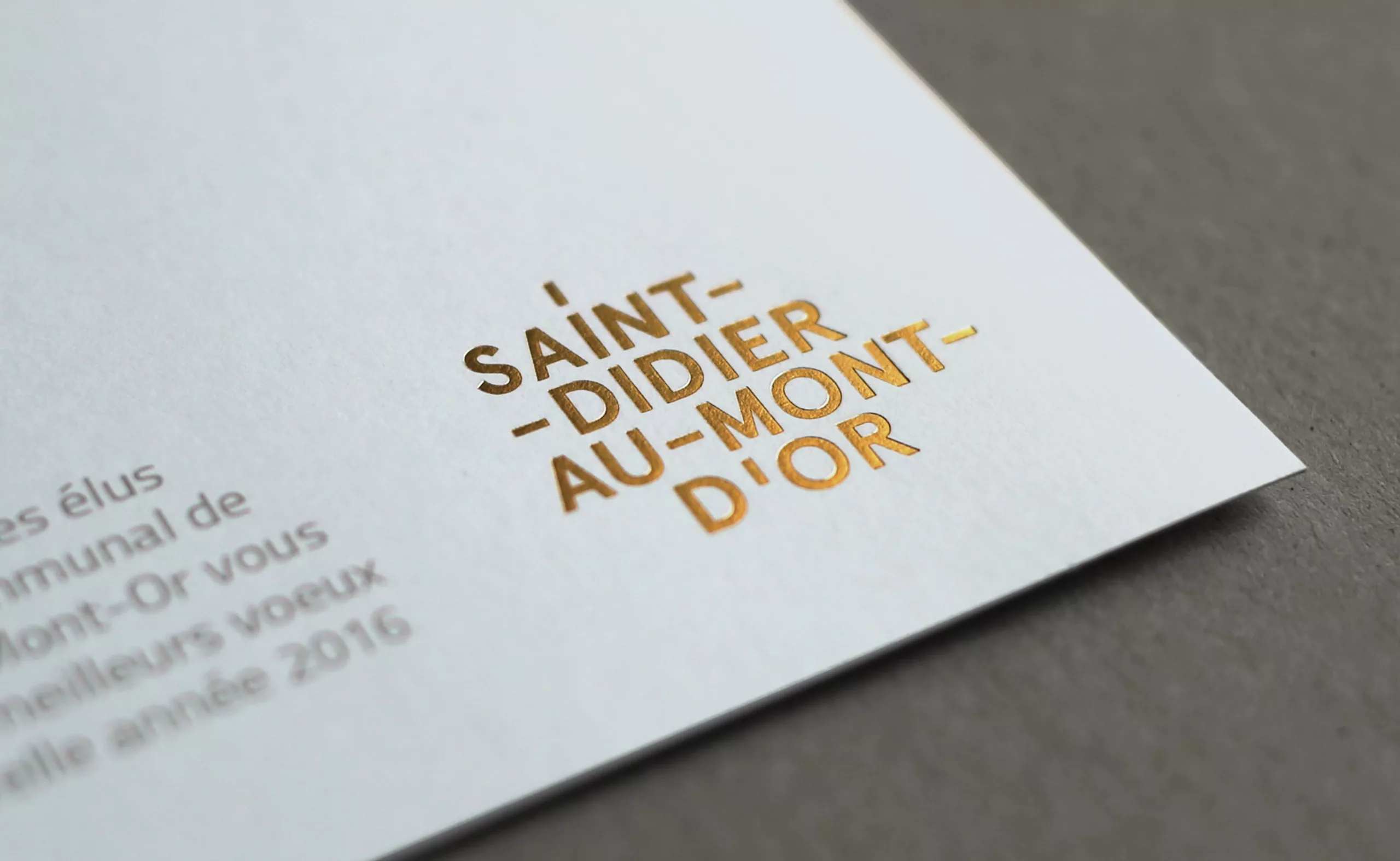
The name “Saint-Didier-au-Mont-d’Or” is particularly long. Its uniqueness lies in the fact that five words are linked together by four hyphens.
Here, the hyphens stand for encounters and generate meaning. Choosing this typographical sign as the main element of the identity of the city is also about making promises of creating links. A vital link between the habitants from all generations ; a dynamic link between the associative environment and the municipal team ; and obviously a link between city and countryside.