2016
Heyraud regains its nobility
Brand design
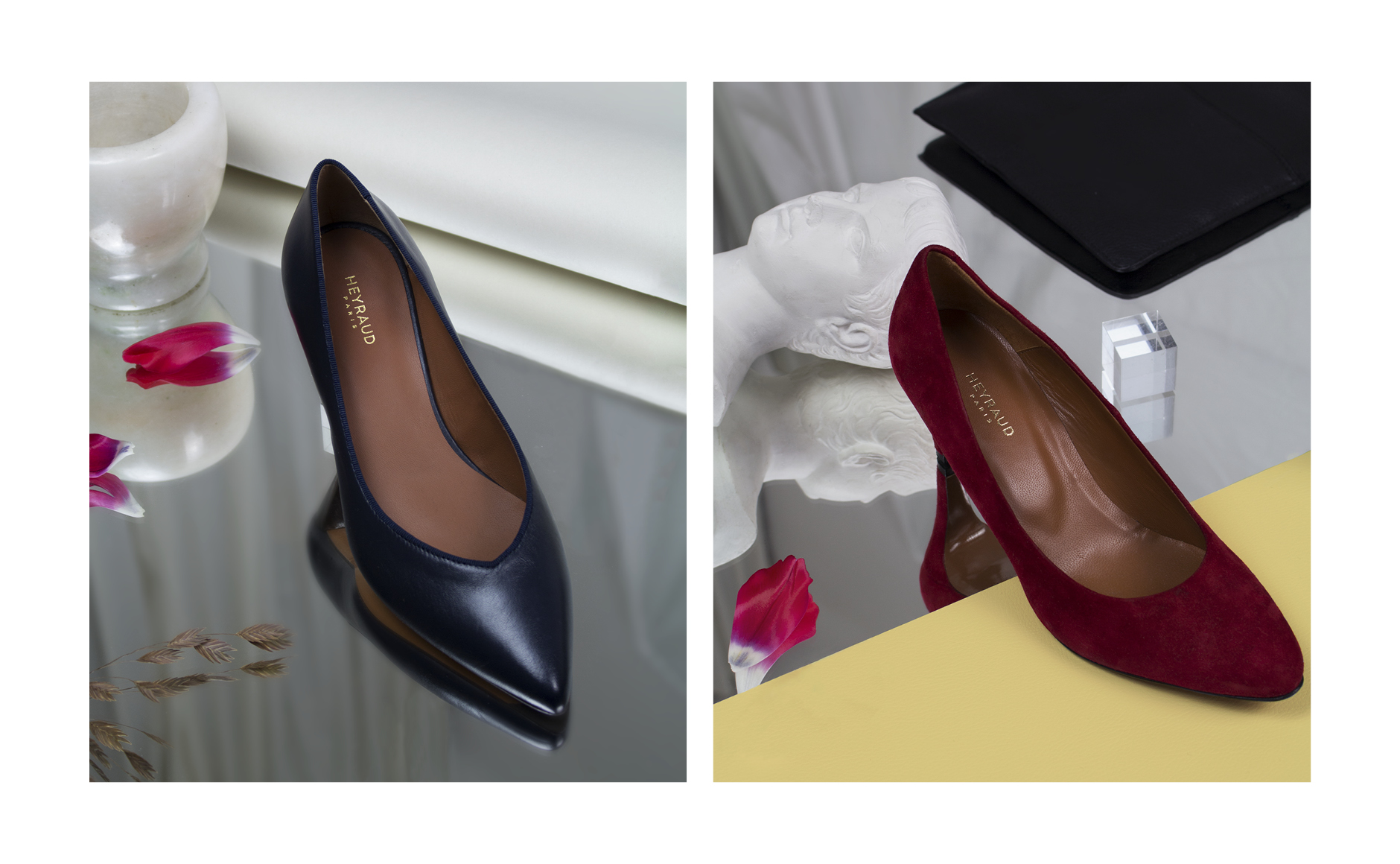
Founded in 1913, la Maison Heyraud House embodies the timeless chic emblematic of french elegance. La Maison Heyraud is today one of the only French brands of shoes to have such a longevity. Since 1995, Heyraud has been part of the Éram Group.
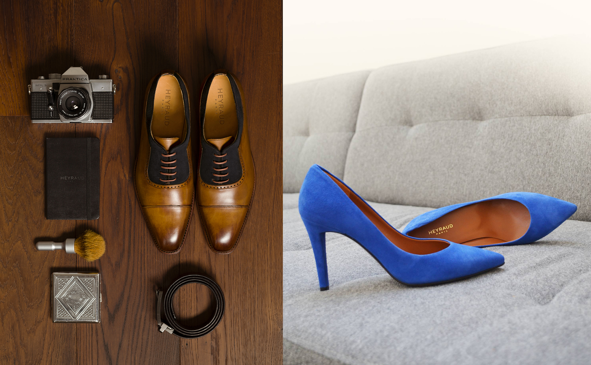
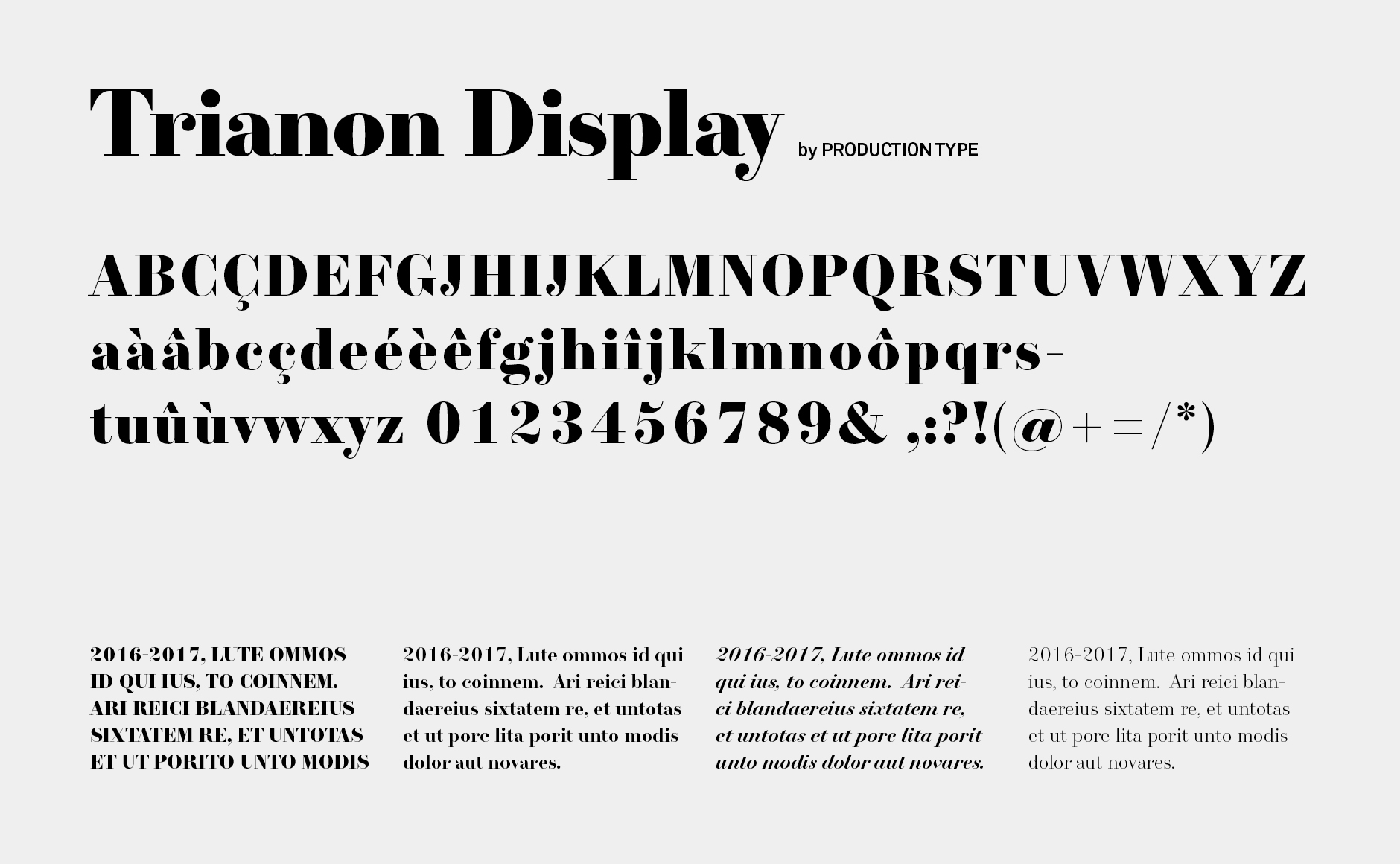
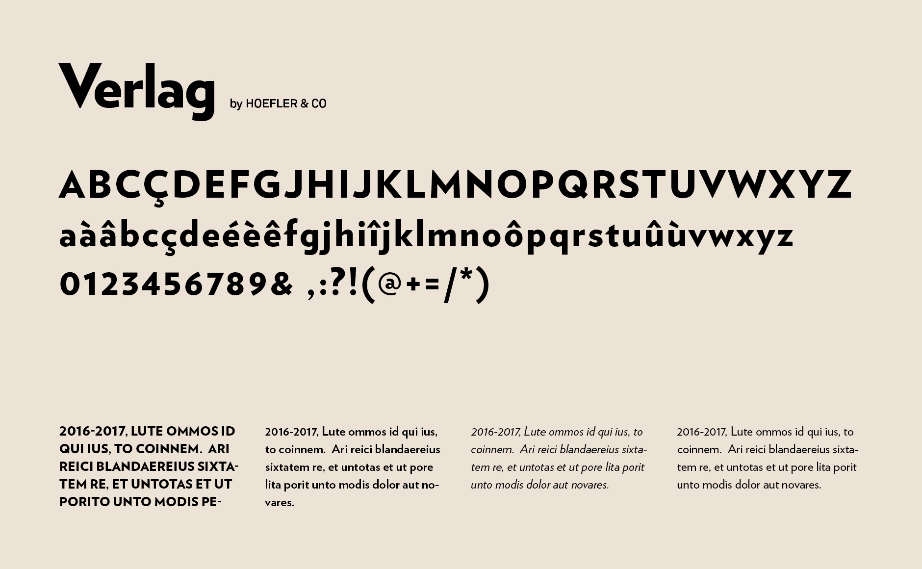
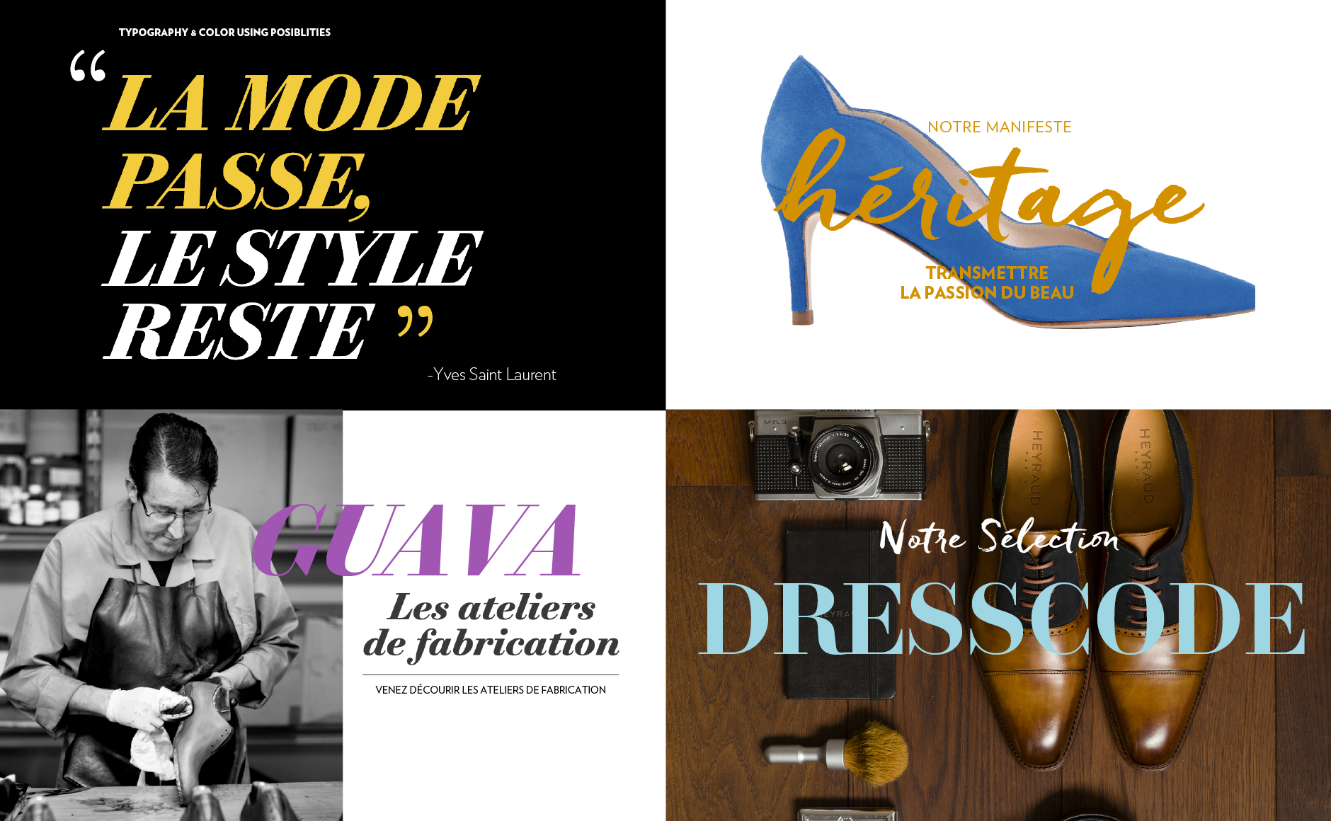
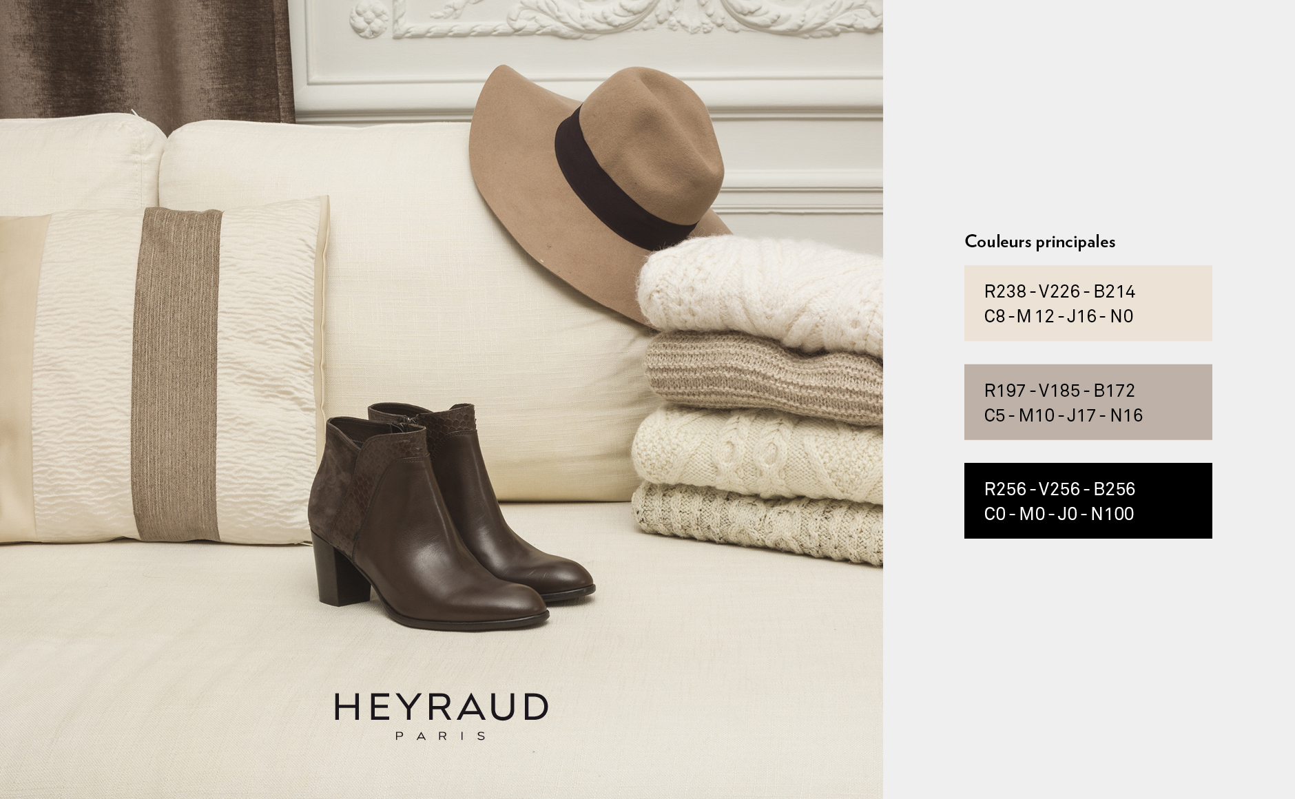
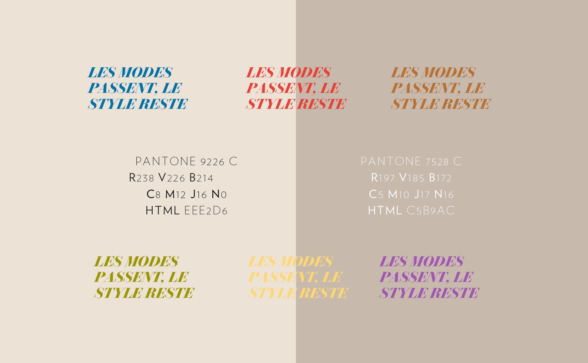
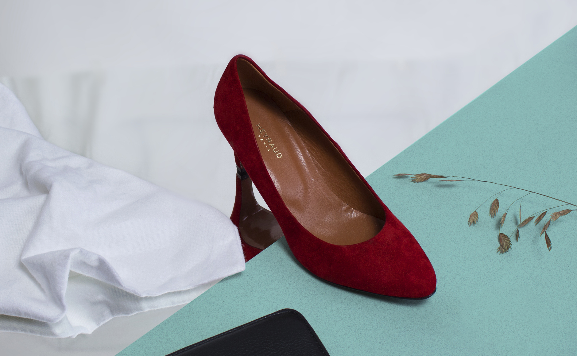
The goal was to change the Heyraud visual identity by reviving the DNA of the century-old brand: "elegance is not a luxury" and set the timeless codes of a brand that is inspired by Haute Couture, in a less ornamental style, preferring elegance to the excessive, the accessible to the exclusive.
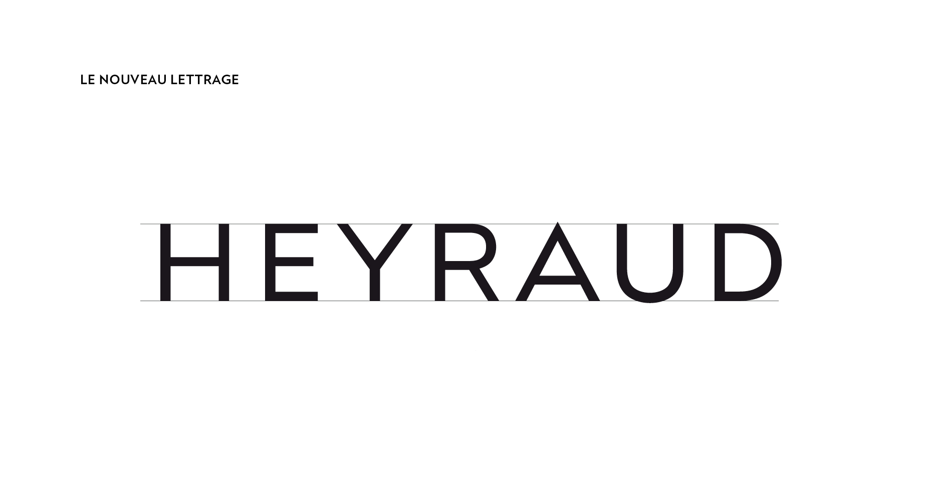
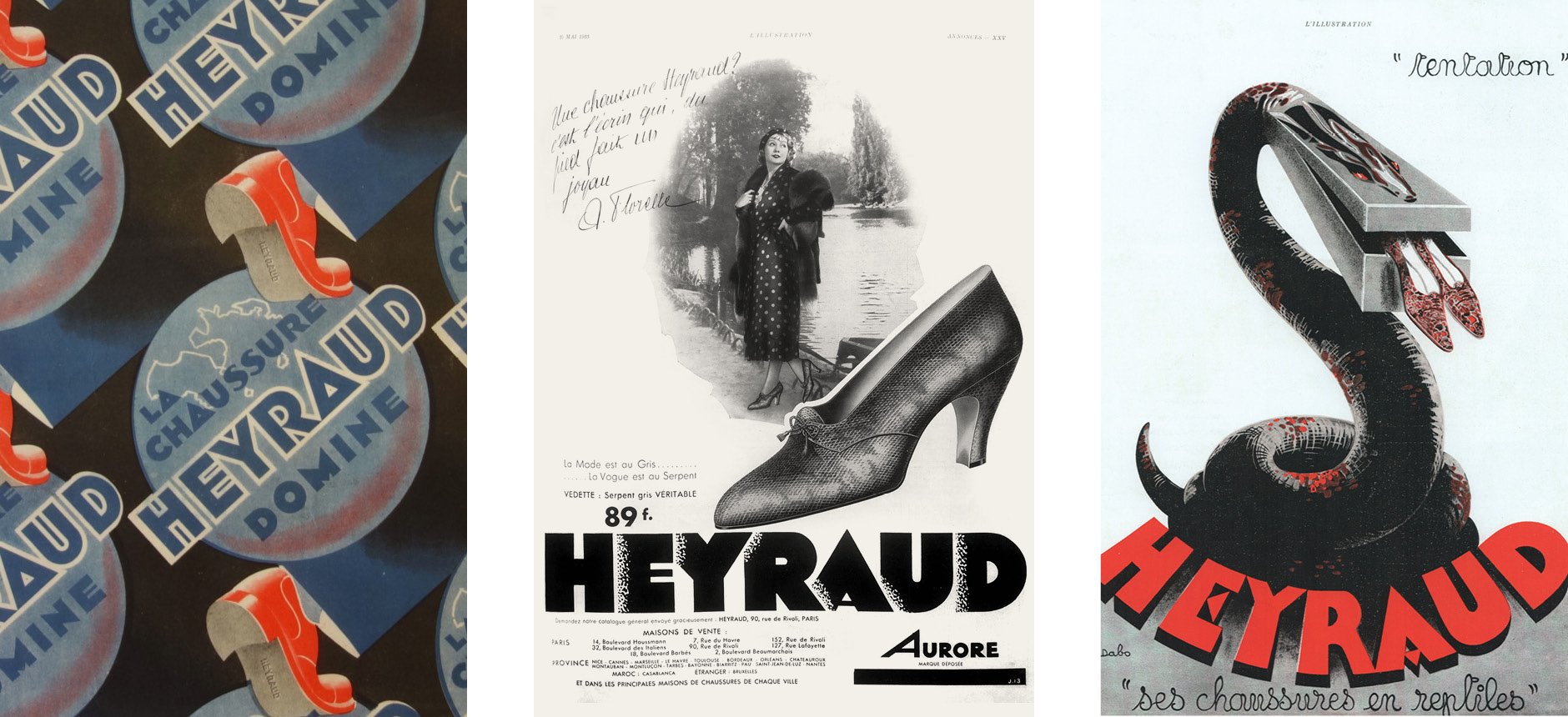
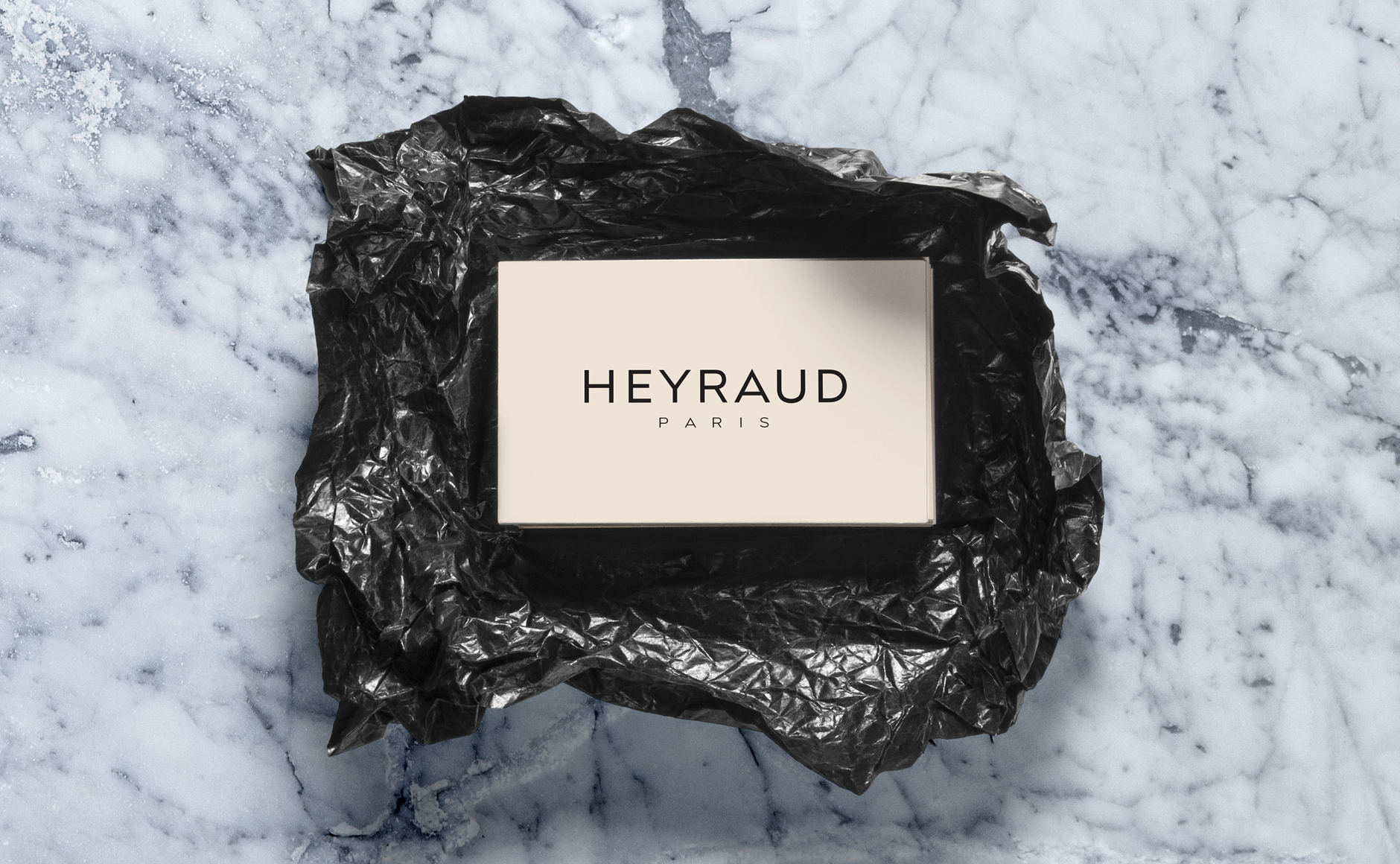
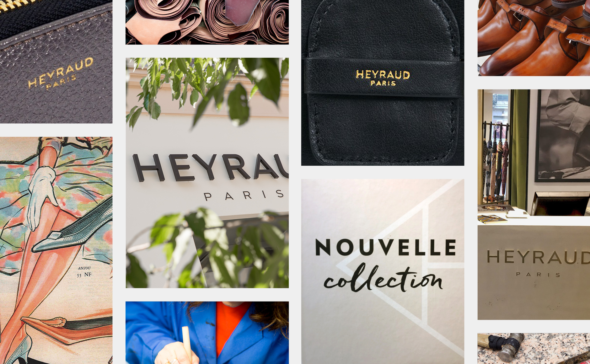
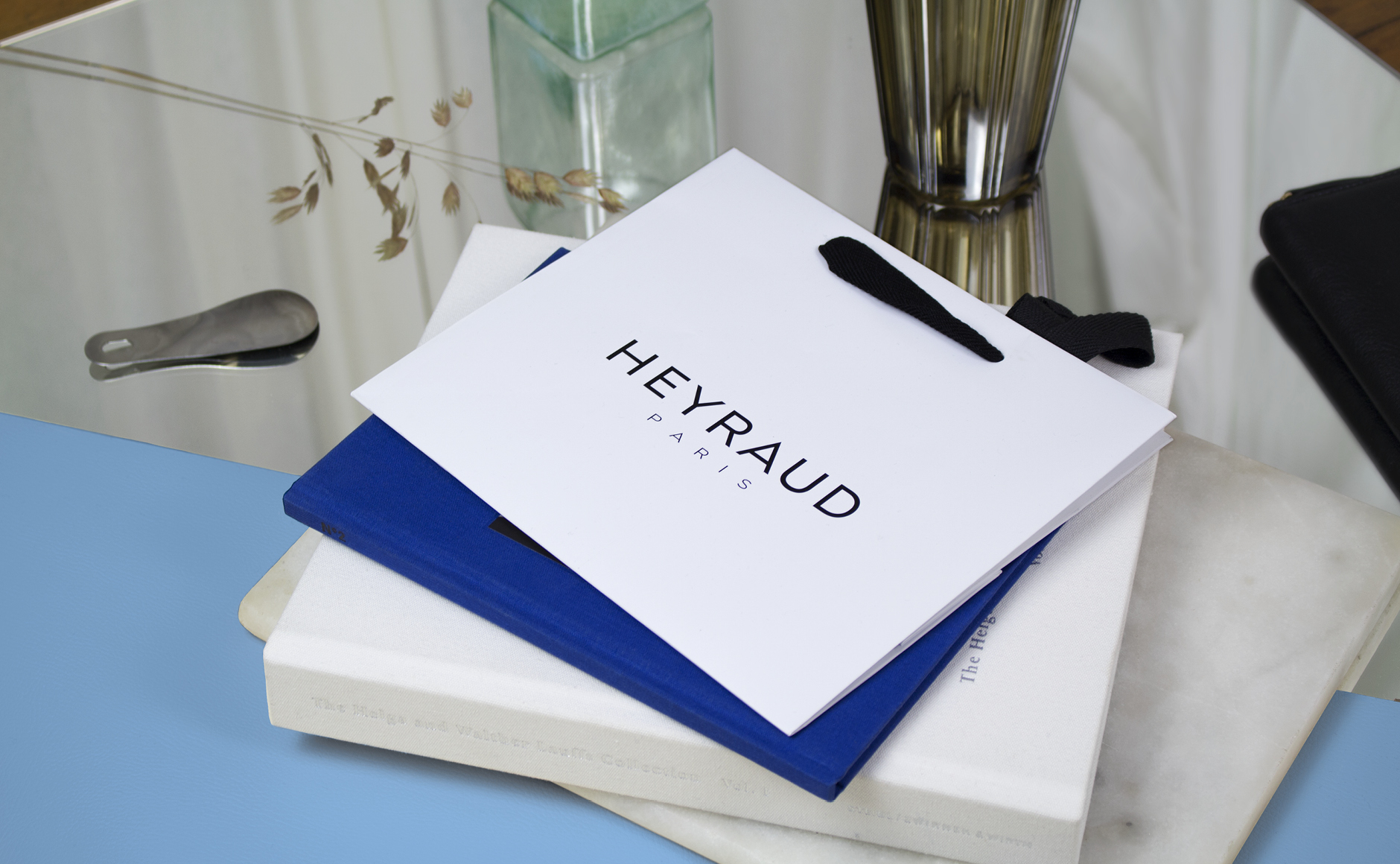
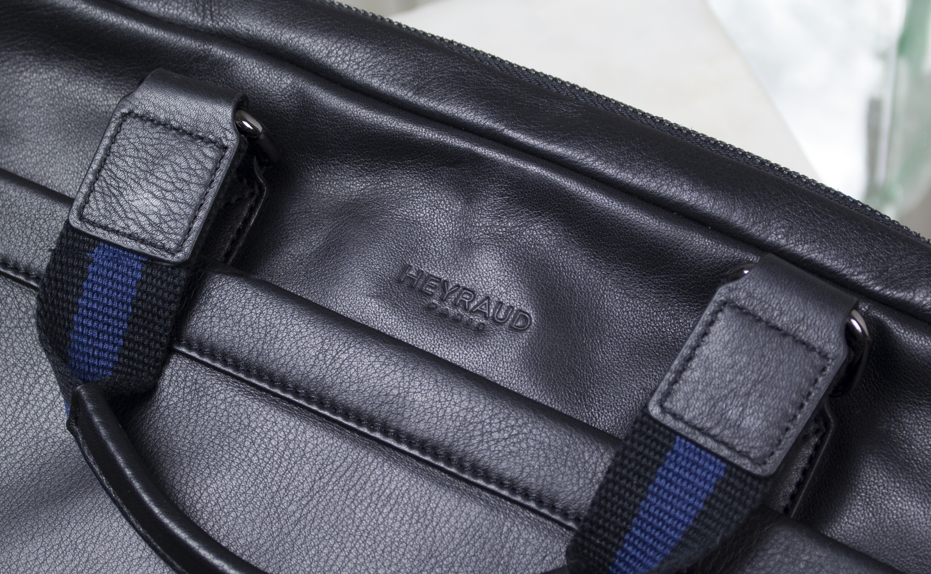
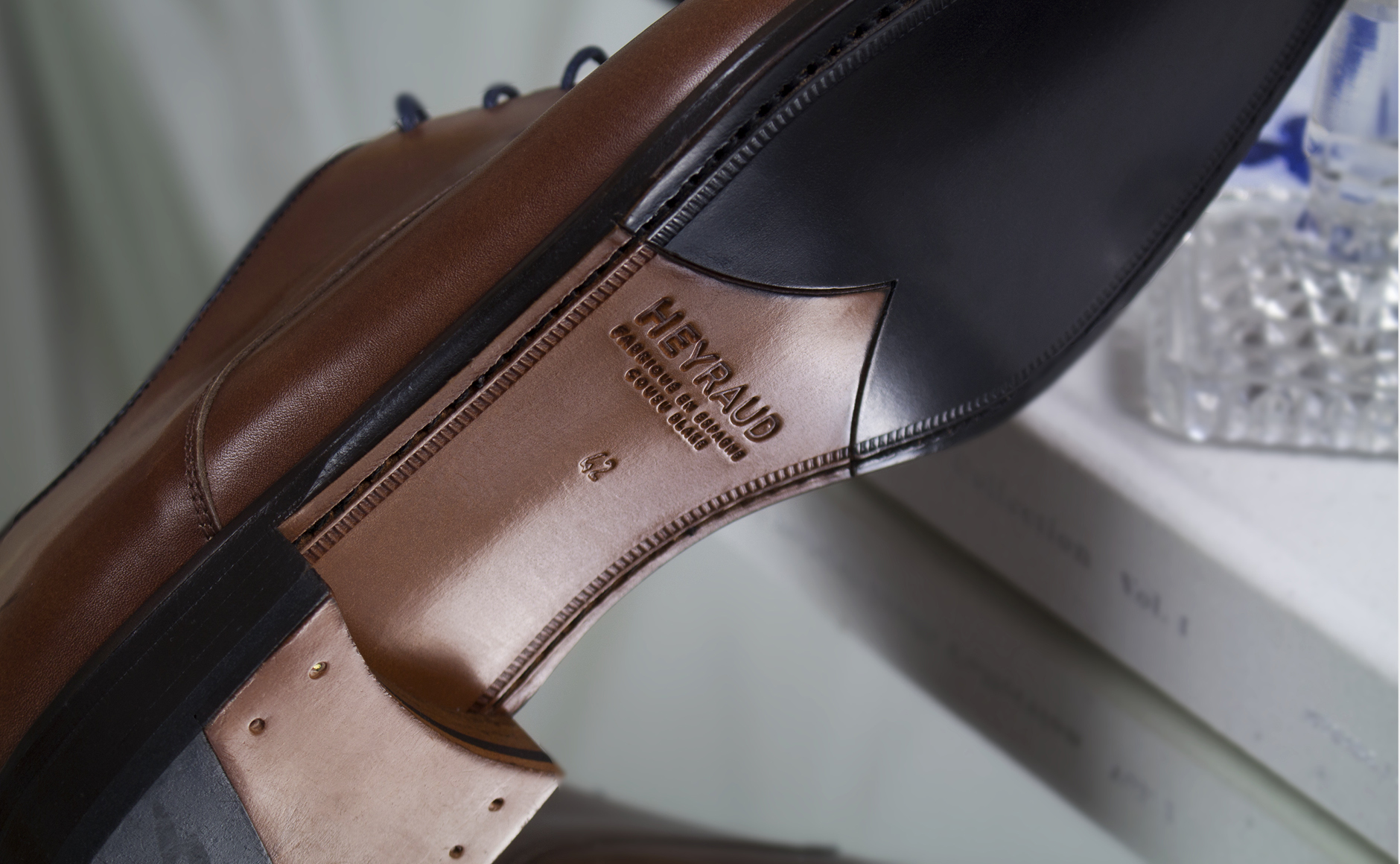
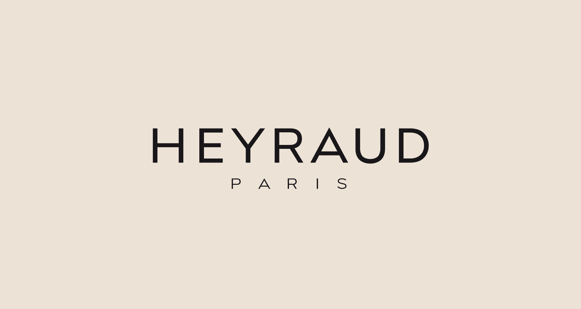
The new logotype we made draws on the brand's "Art Deco" heritage. The old logotype was set in lower cases with Paul Renner’s Futura. The very rounded appearance of this typographical choice no longer corresponded to Heyraud whose desire was to find a more statutory image.

The return to capitals letters made it possible to embody this new positioning. This esthetic is inspired by artistic movements that gave birth to design in the early twentieth century. « Arts and crafts » movement in England, « Bauhaus » in Germany and « Art Deco » in France, these new artistic trends are born when the notion of beauty and elegance is modernized to be the meeting point of art and industry. Art must make it possible to democratize elegance in all everyday objects. The geometric lines replace the floral aesthetics of the nineteenth century, symbol of a search for simplicity and functionalism.
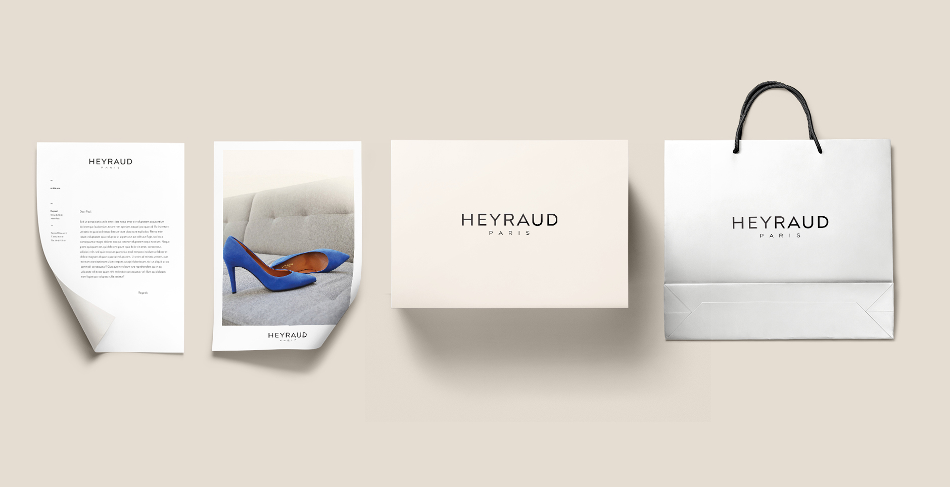
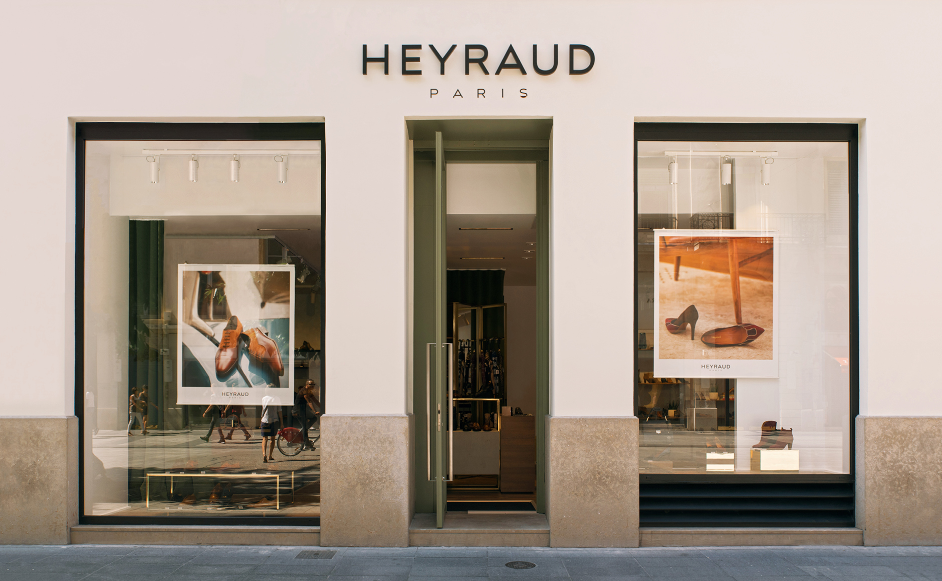
Logo creation, visual identity and graphic guidelines.
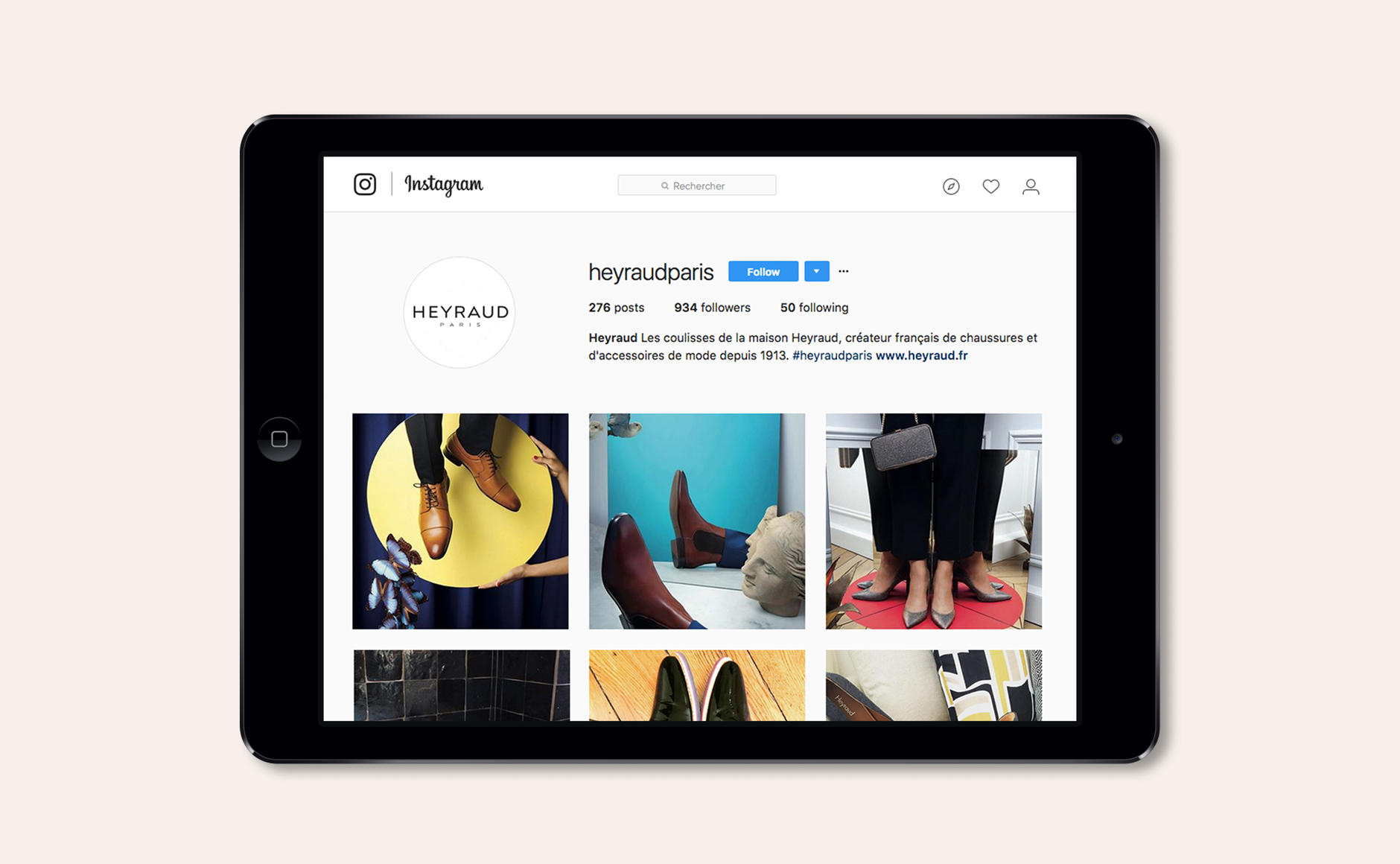
Communication in the Fashion industry.

