MNFCT-Case-Study-20250505

2025

MNFCT
A territorial ribbon that protects and supports civil servants

For 90 years, the Mutuelle Nationale des Fonctionnaires des Collectivités Territoriales has been committed to the health, protection and support of local authority employees.

In 2012, MNFCT became a contract of MACIF, a French mutual insurance group. With a view to bringing its two entities closer together, MNFCT called on Graphéine to develop its graphic charter.

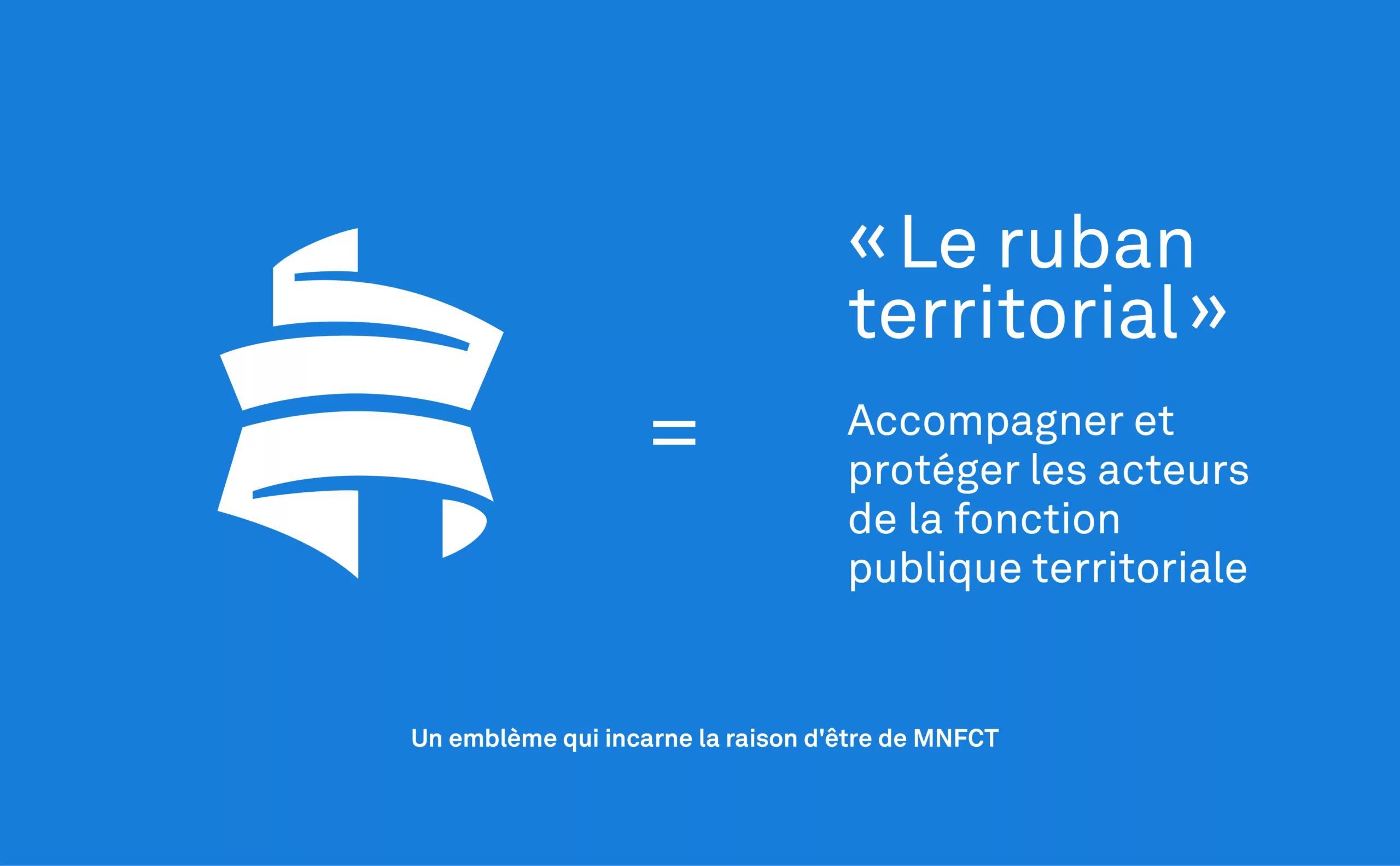
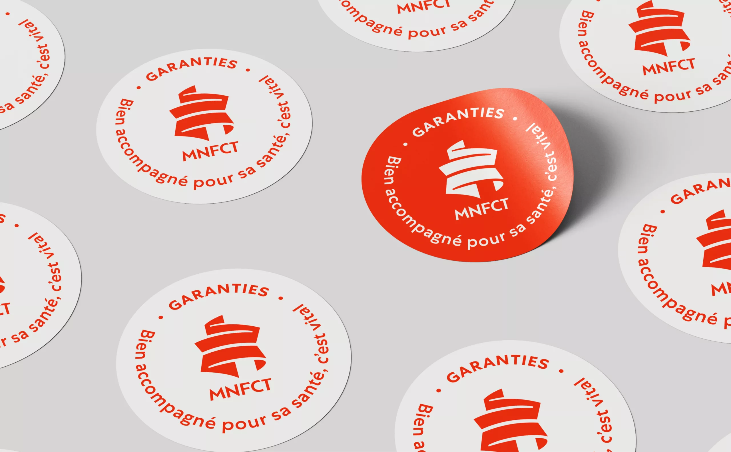
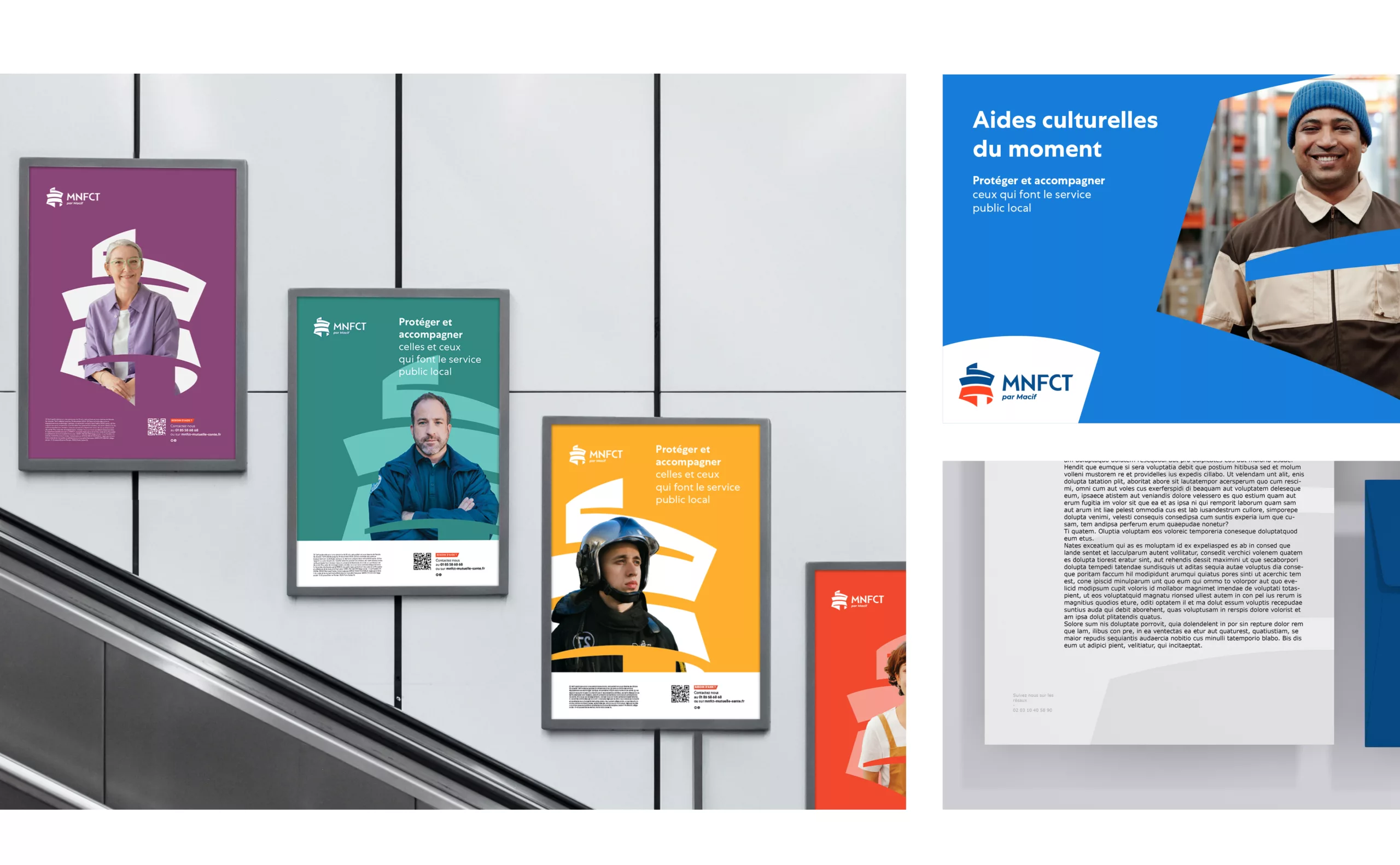
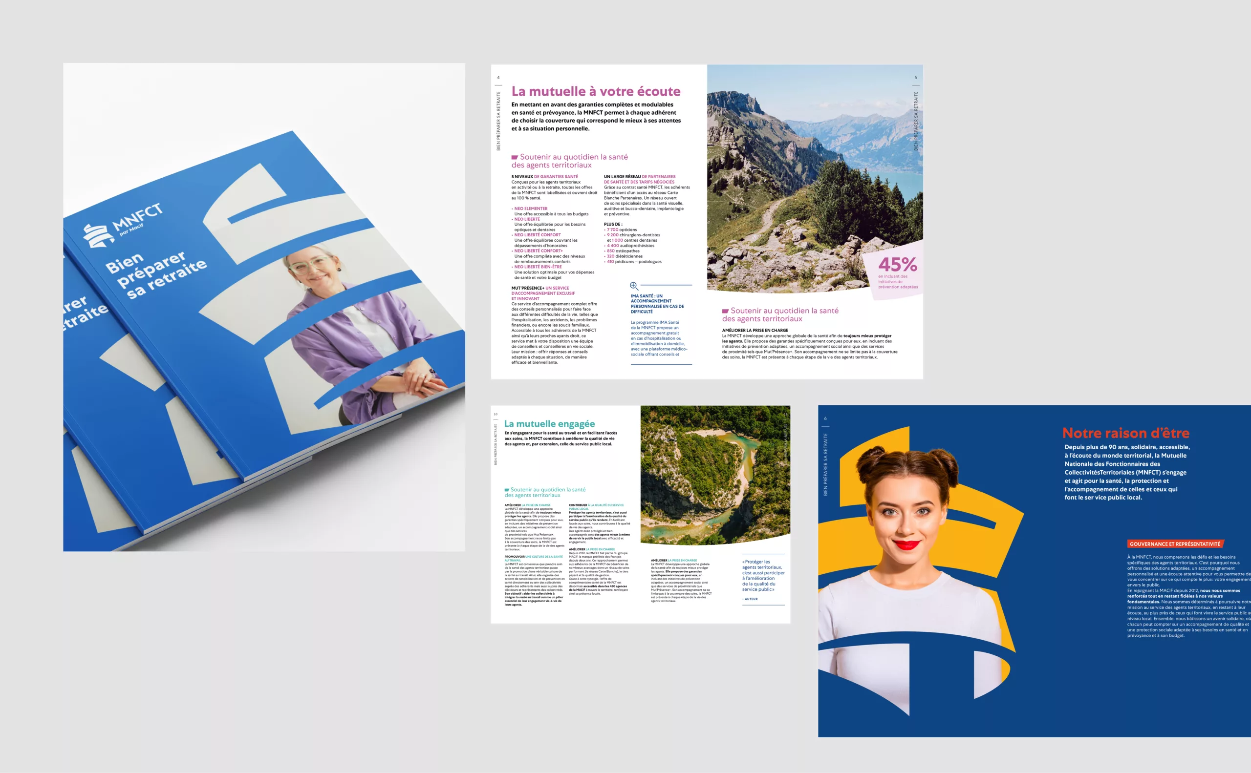
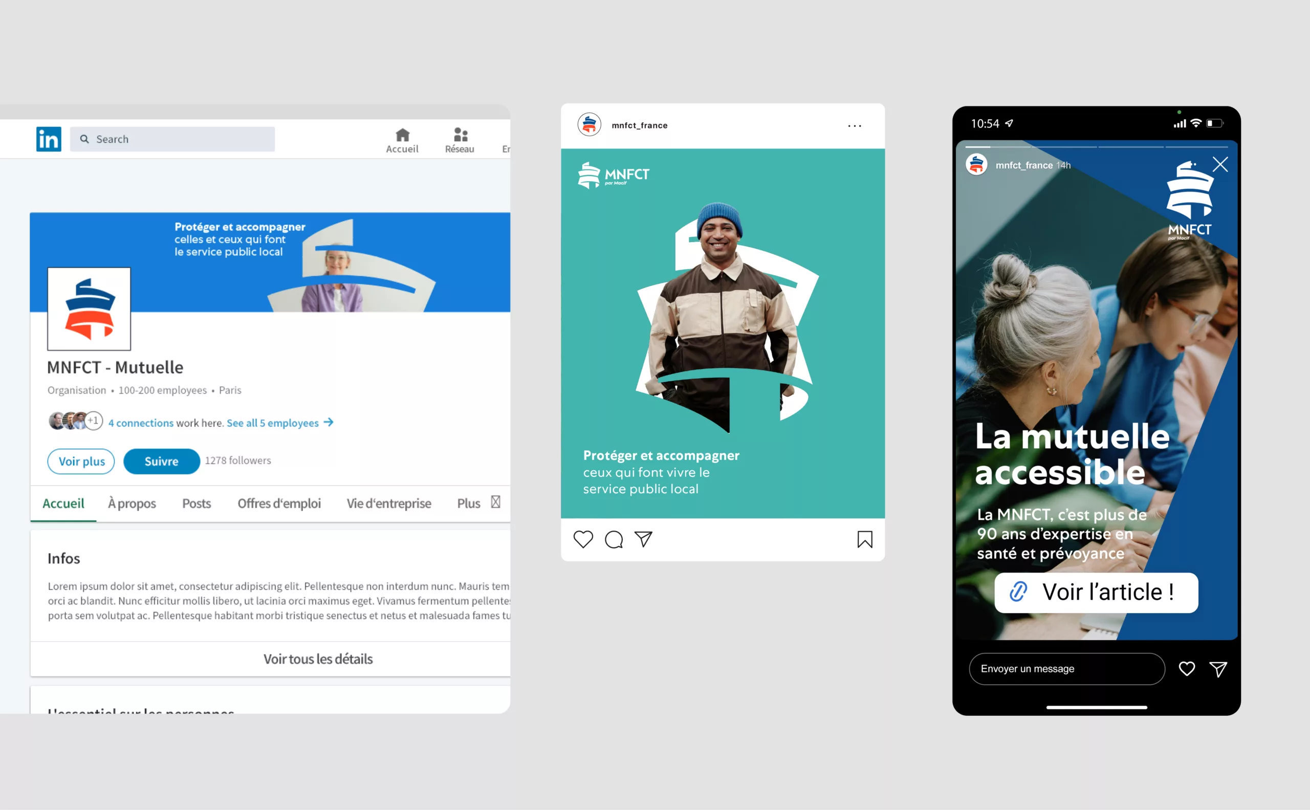
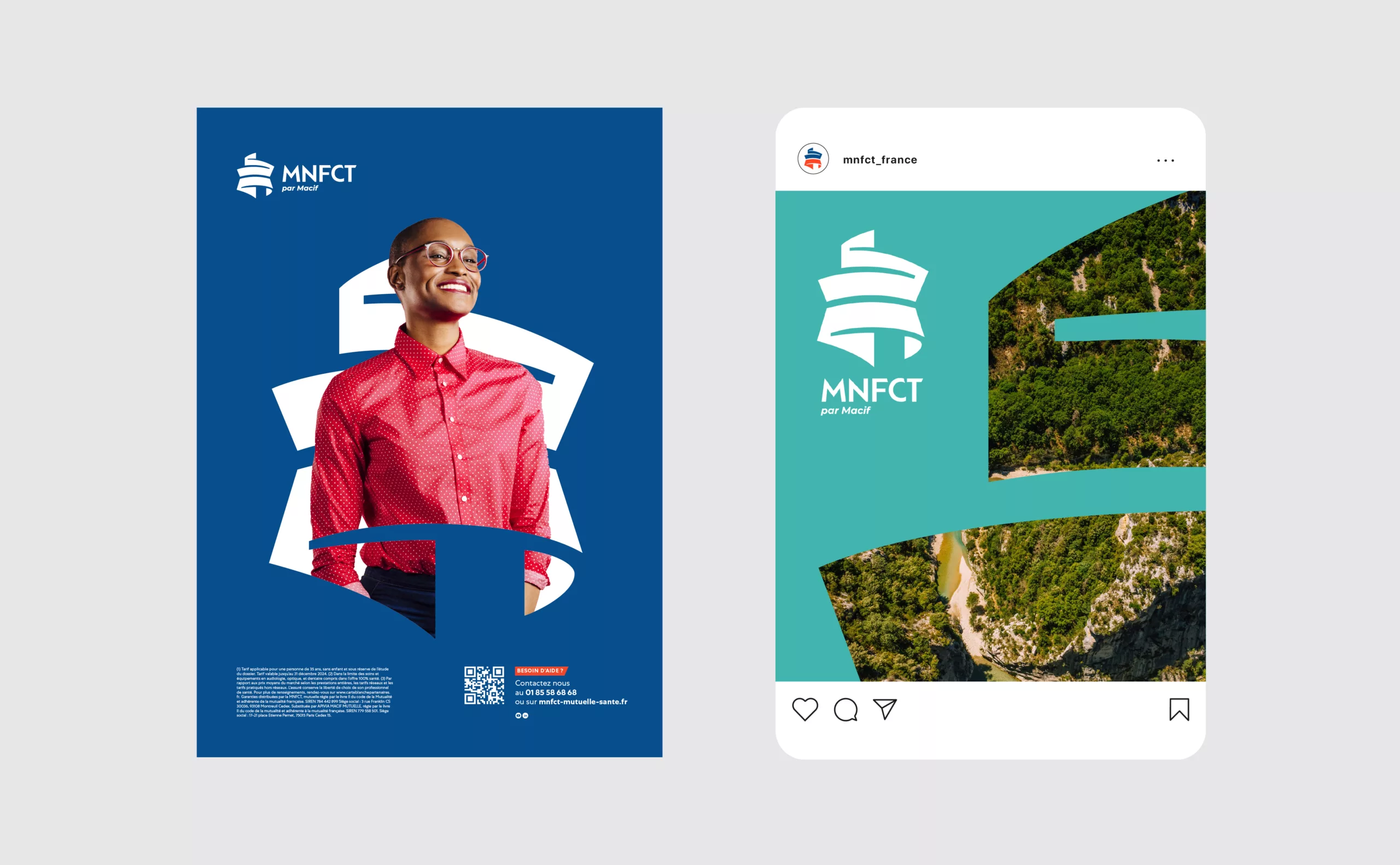
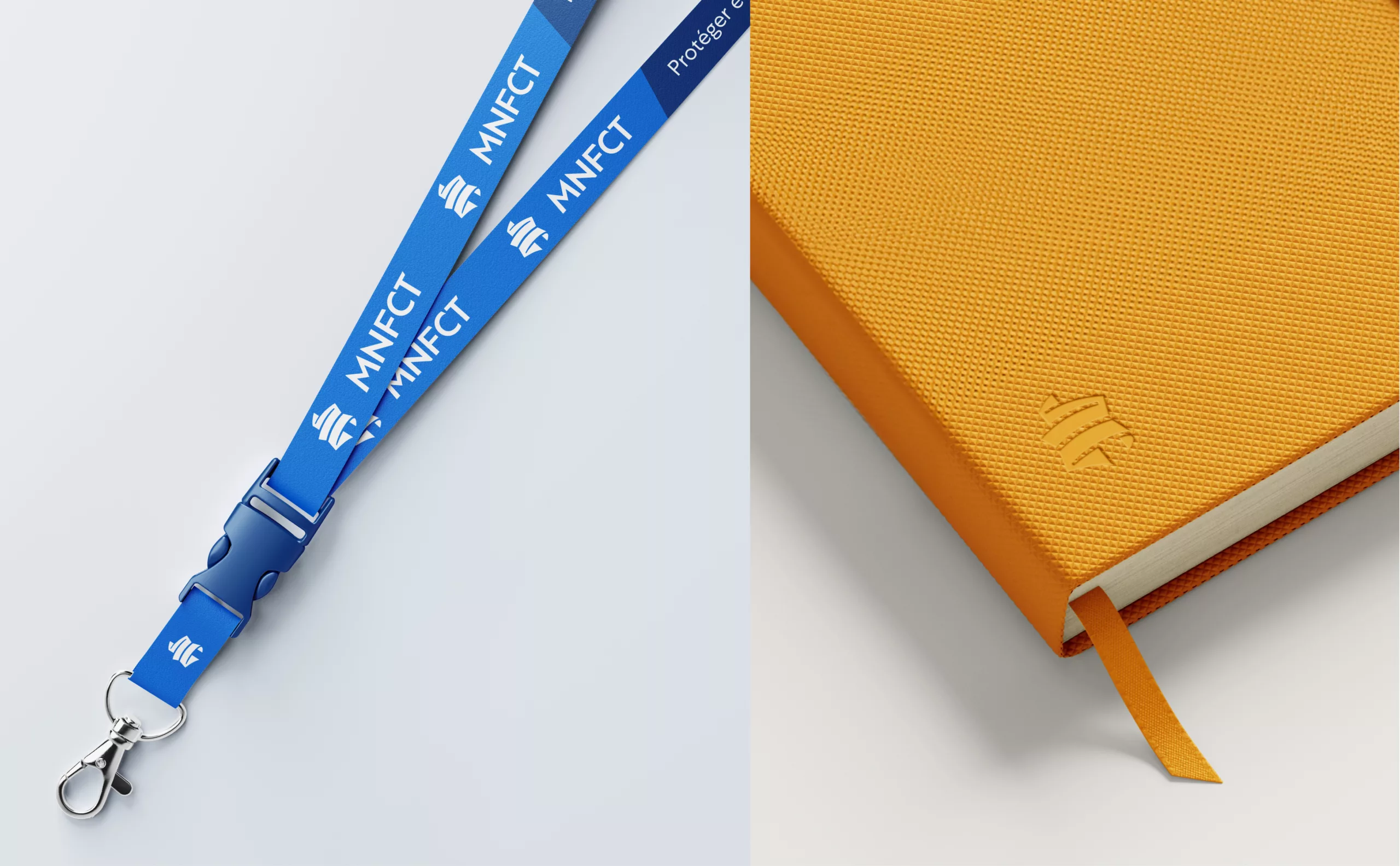
A territorial ribbon that fully embodies the MNFCT's mission

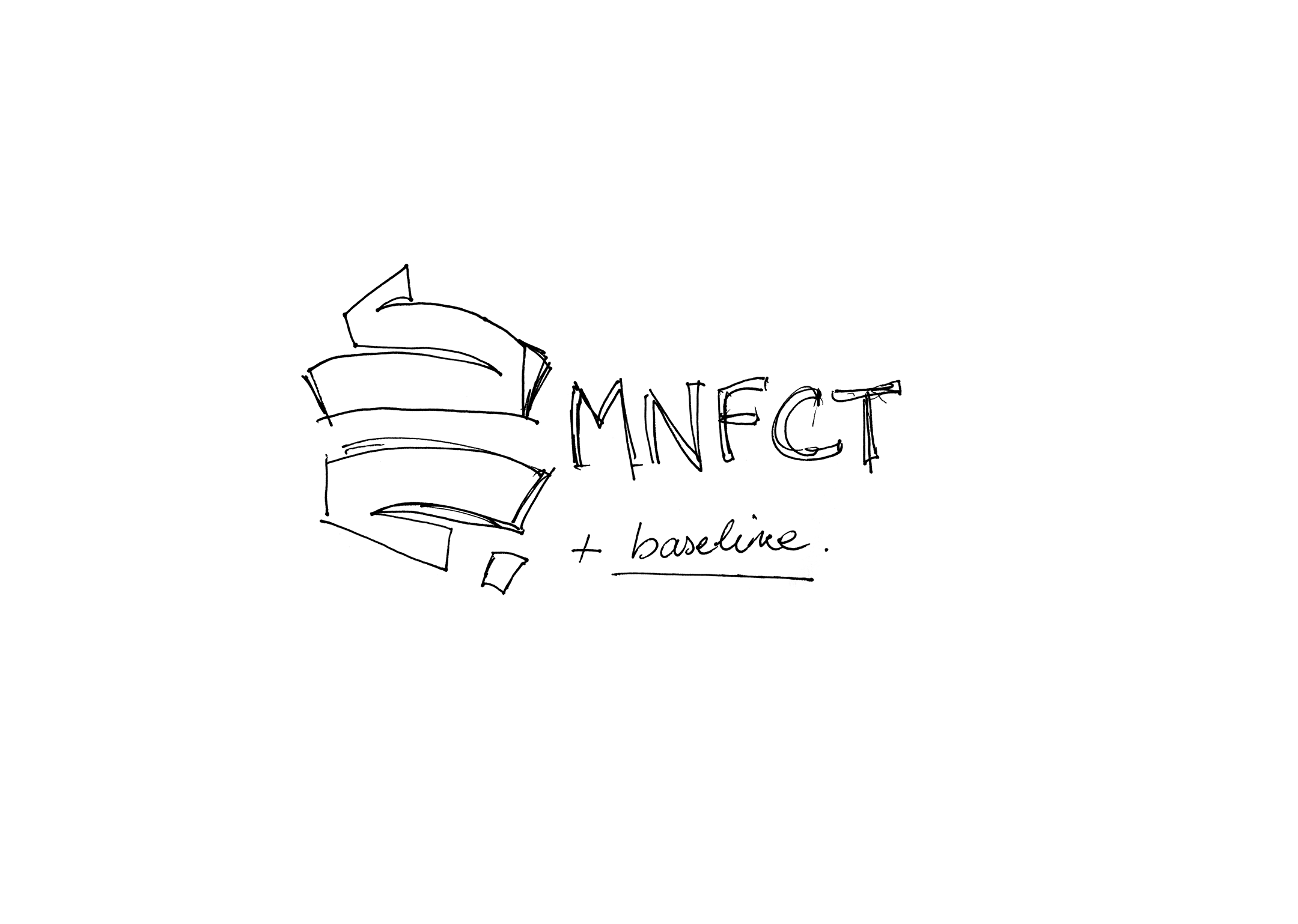
A strategic audit led us to recommend changing the logo, which had initially not been identified by the client. The visual concept of the logotype - the territorial ribbon - is remarkable. However, its external silhouette seemed unstable. The MNFCT typogram, inside the hexagonal ribbon, made it impossible to create a flexible visual identity, or to have a memorable emblem that could stand alone. In particular as a profile photo on social networks, or as an identity marker on omnichannel communication media.

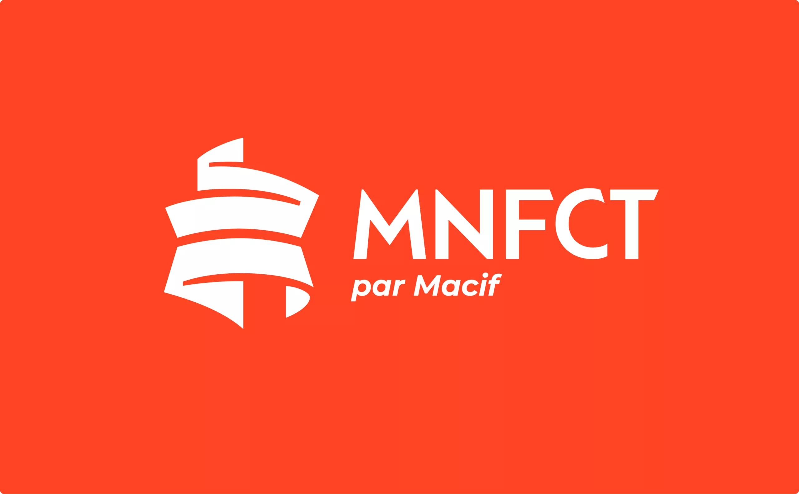
For this reason, we recommended an evolution of the logotype, retaining its symbolism and uniqueness, while dissociating its graphic symbolic component from its typographic block.

Each element has been redesigned to enhance its legibility and impact. We have tightened and streamlined the shapes to improve the perception of the hexagon and strengthen its overall silhouette. The design and integration of Corsica has been reviewed to better integrate it into the territory.

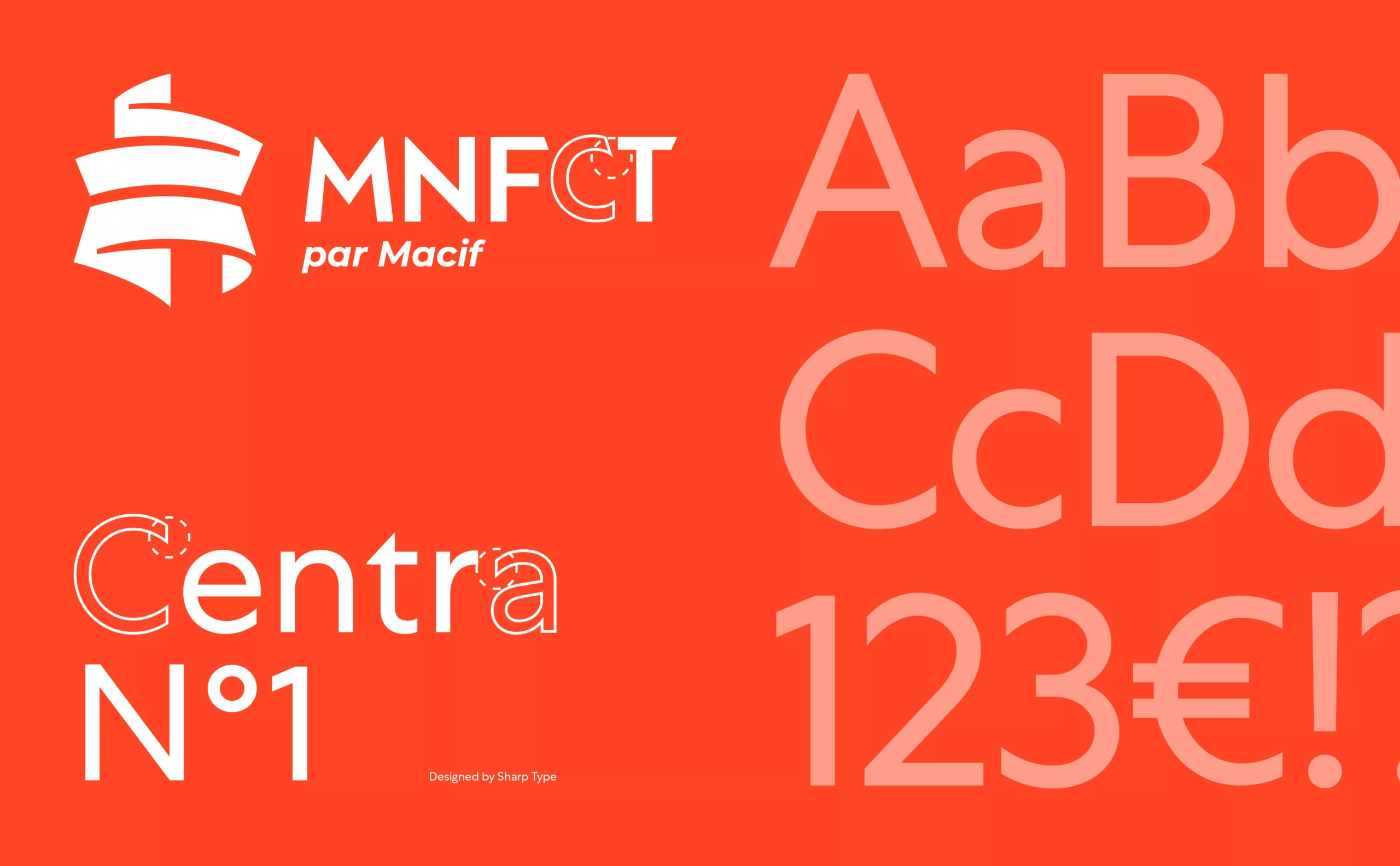
The typographic block has also been modified. This was done to increase its impact and bring it closer to the MACIF identity scheme. The design of the letters has been harmonised, while retaining and reinforcing its distinctive details.

The reworked territorial ribbon fully embodies the MNFCT's raison d'être: to support and protect those working in the local civil service. The motion design perfectly embodies this mission.

A growing identity

We've given our colours a facelift. The corporate colours, taken from the logo, are more suited to the digital world. The blue is brighter and the red is more orangey and calmer.

To break away from the national tricolour, we have chosen a secondary range of bright colours to enhance the expressiveness and optimism of the brand.

The Centra typeface was chosen for its vocabulary of shapes similar to that of the emblem. It is used in two distinct weights: for running text and headlines.

A varied, colourful and dynamic graphics system

We carried out iconographic research to design a gallery of portraits and photographs of the French landscape. The aim was to illustrate the diversity of the professions and territories in which local government employees work.

The emblem, which can now be detached from the typographic block, takes centre stage in the new graphic system. It is developed through an interplay of cropping and insetting.

We have defined a corporate communication principle that incorporates inlays of portraits, cut out of the emblem.

For everyday communication, two principles co-exist. The first is the insertion of visuals of professionals in their workplace or of French landscapes within the cropped emblem. The second is the use of the emblem as a watermark on documentation documents.

With this new brand territory, the MNFCT is adopting a more demanding, strong and diversified visual identity.

Context

Since its merger with MACIF in 2012, MNFCT - a mutual insurance company dedicated to local authority employees - has been looking to revamp its visual identity to better embody its mission of protection and support.

Objectives

The mission of this project is to modernize MNFCT's visual identity while preserving its symbolism. The aim is to improve the legibility, graphic stability and adaptability of the logotype to digital uses. This evolution also aims to assert the MNFCT's mission among territorial agents.


Share this project:
Project expertise:
Logo creation, visual identity and graphic guidelines. Motion design and video creation.
Type of client:
Communication agency in the consulting and services sector. Strategy or management consulting, operational consulting, digital services companies (ESN) formerly SSII or SS2I, but also all services to companies, or "B to B services" (for business to business).

Related projects: