Logotype identité visuelle conservatoire de musique culture enseignement

2024

Lyon National Conservatory
of Music and Dance
Shaping the future of performing arts.

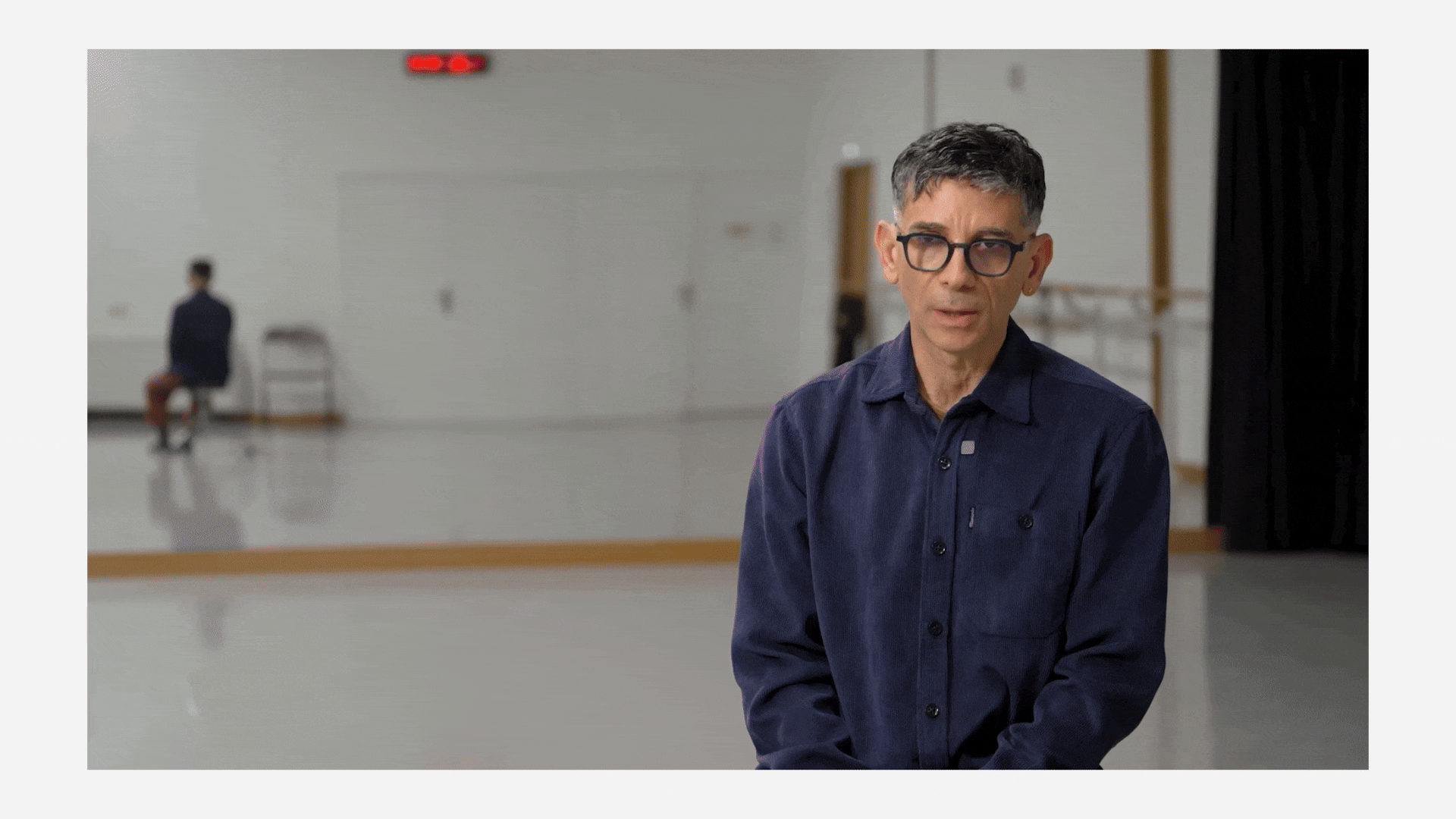
Located in the heart of Lyon, the Conservatoire National Supérieur Musique et Danse de Lyon (CNSMDL) enjoys an international reputation thanks to its artistic and educational excellence. A true hub of innovation and transmission, it offers an exceptional learning environment where tradition and modernity come together to allow emerging talents to fully express their potential.

Under the direction of Mathieu Ferey, the CNSMDL has undertaken a complete overhaul of its visual identity and brand territory. Driven by a spirit of renewal, it now more than ever asserts its role as a "conservatory in motion," attuned to artistic developments and contemporary challenges. As part of this process, the agency Graphéine supported the conservatory’s teams through a collaborative co-construction of the brand platform, followed by the creation of a visual identity aligned with its ambitions and influence.

One conservatory, two banks.

Situated on both sides of the Saône River, the CNSMD of Lyon thrives across two exceptional sites, each rich in history and perfectly complementary. Music and dance each have their own dedicated spaces, asserting their unique identities while fostering an ongoing dialogue. Separated by the river but connected by a bridge, these locations embody a vision: that of a conservatory in motion, where the diversity of disciplines comes together within a strong and unifying identity.

A Co-Constructed Strategy

Positioning strategy workshops were conducted with the Conservatory’s teams to collectively define the institution’s current image and outline its vision for the future. The goal: to identify a clear and unifying positioning, one that reflects the leadership’s ambitions while staying aligned with students’ expectations.

Un logo simple, vivant et inspirant

Nous avons imaginé un logo épuré et dynamique, qui unit harmonieusement la musique et la danse. Les cinq lignes rappellent la portée musicale, structure essentielle de la musique. La ligne ondulée symbolise la danse, apportant mouvement, fluidité et émotion à l’ensemble.  Ce signe graphique évoque aussi les lignes de vitesse (comme en BD), traduisant immédiatement énergie et enthousiasme. Accessible et chaleureux, il reflète aussi l’esprit ouvert et créatif du conservatoire.

Extending the Identity

Thanks to its unique character, this typeface acts as a visual marker, instilling a distinct identity across communication materials and various graphic elements. Even when the CNSMDL logo is not present, the use of the typeface maintains stylistic continuity and strengthens the institution’s recognition among its audience. This typographic approach subtly yet effectively extends the CNSMDL’s identity, ensuring visual coherence across all communication platforms.

Motion design

Thank you to the CNSMDL teams for their work and trust.
Motion design credit: Sébastien Vincent.

A Visual Identity at the Crossroads of Music and Dance

Through this logo and the visual identity of the CNSMDL, Graphéine sought to create a harmonious link between music and dance. This identity, both sonic and dynamic, unfolds with fluidity and elegance, capturing the essence of movement and rhythm.

Designed to be lively and adaptable, it adjusts seamlessly across a wide range of formats—from print to animated media—offering an immersive and consistent visual experience. More than just a design, this identity embodies the soul of the CNSMDL, a place where music and dance intertwine in perfect symbiosis.


Share this project:
Project expertise:
Logo creation, visual identity and graphic guidelines.
Type of client:
Cultural communication agency for theaters, concert halls, festivals, dramatic and choreographic companies.

Related projects: