2017
Brand architecture
Auvergne-Rhône-Alpes Region
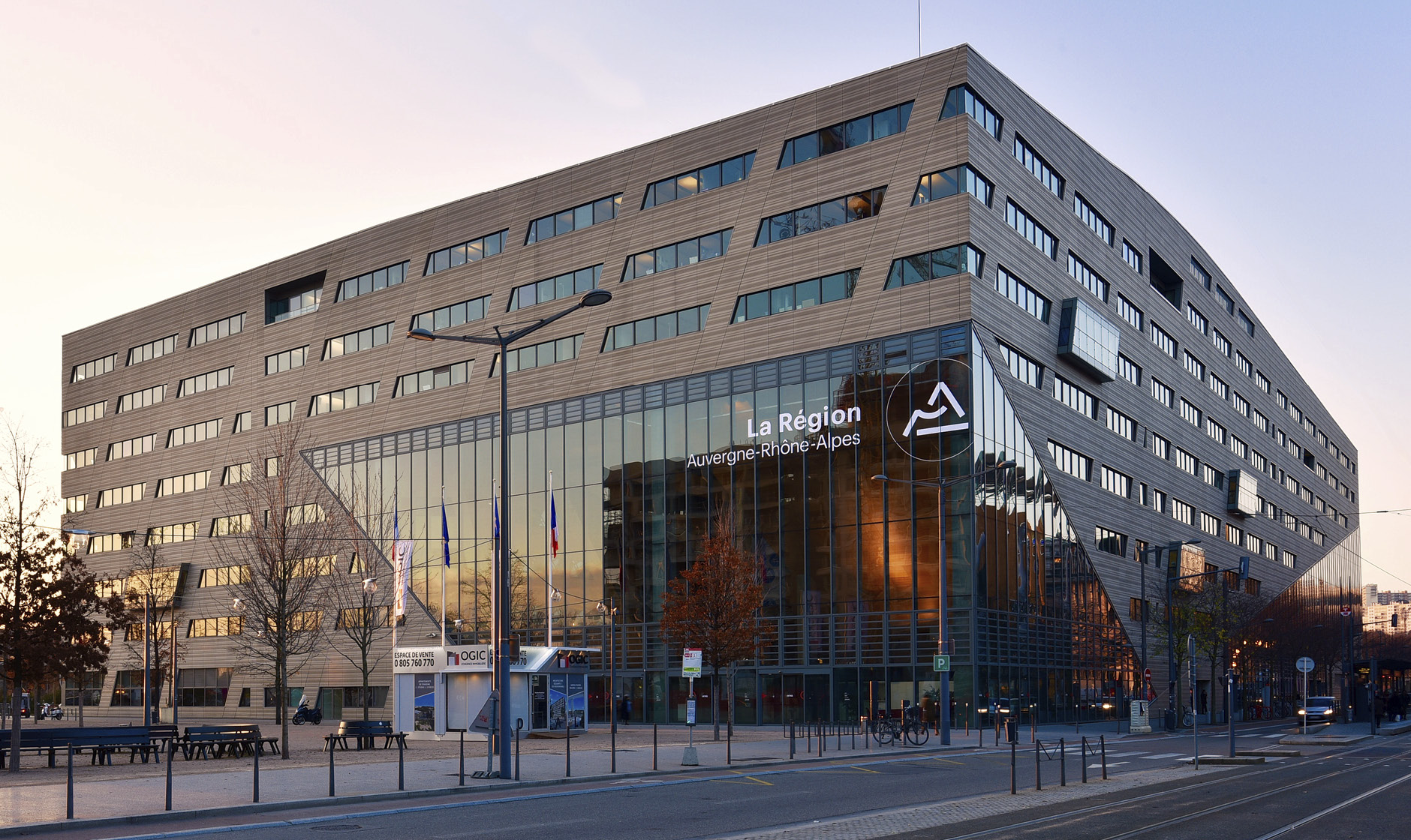
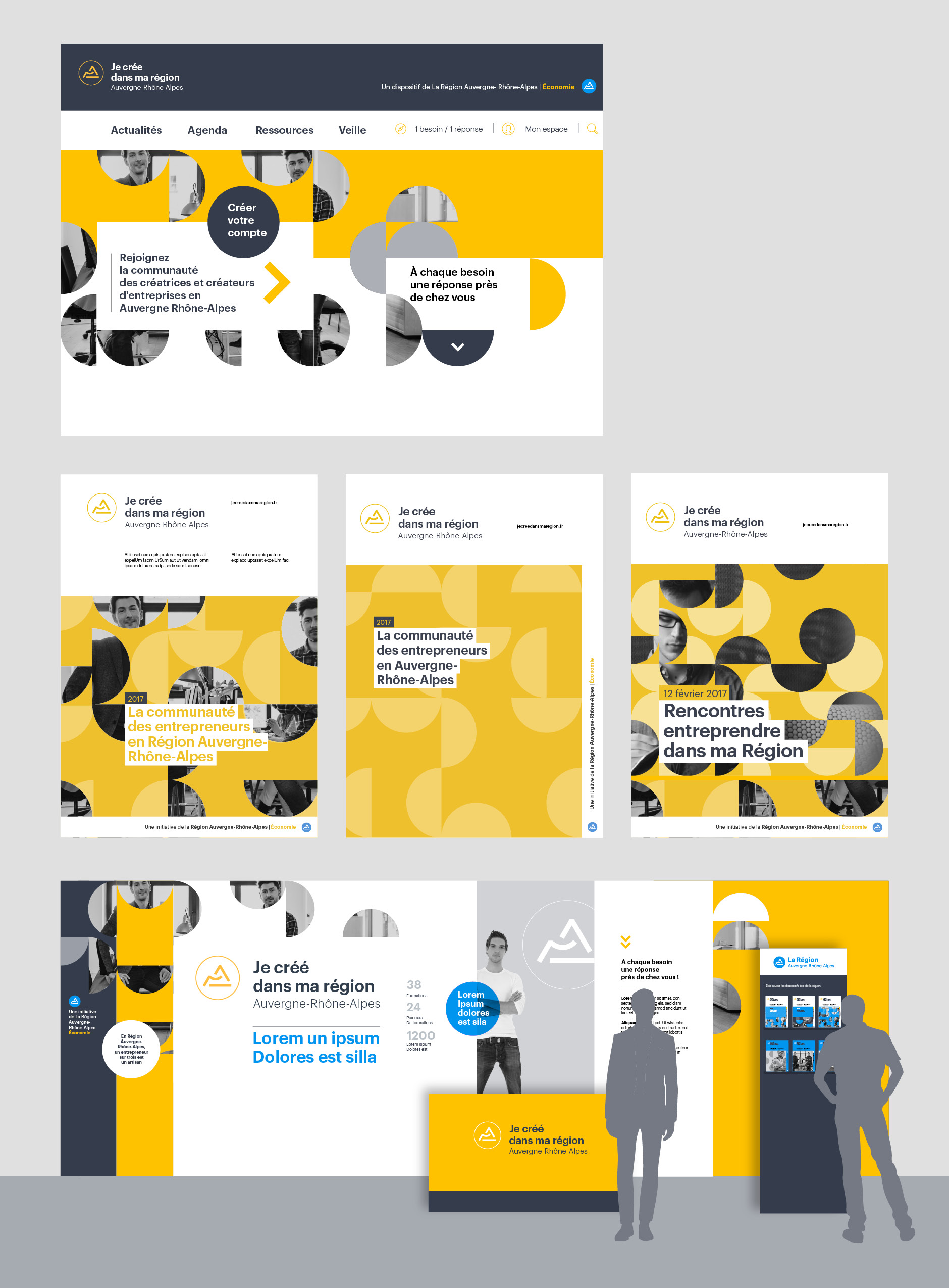
At the beginning of 2017, the Auvergne region merged with the Rhône-Alpes region, to create the Auvergne-Rhône-Alpes region. Graphéine is entrusted with the task of designing the new regional brand architecture.
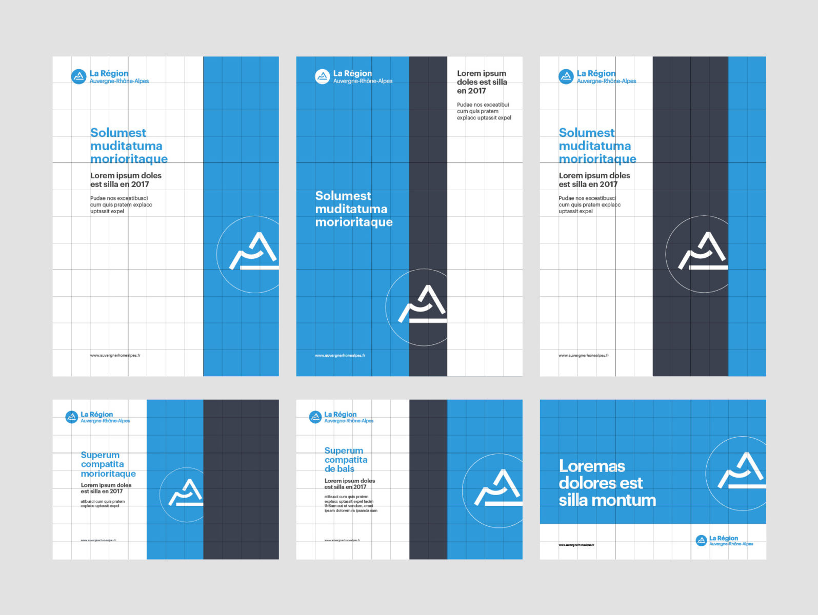
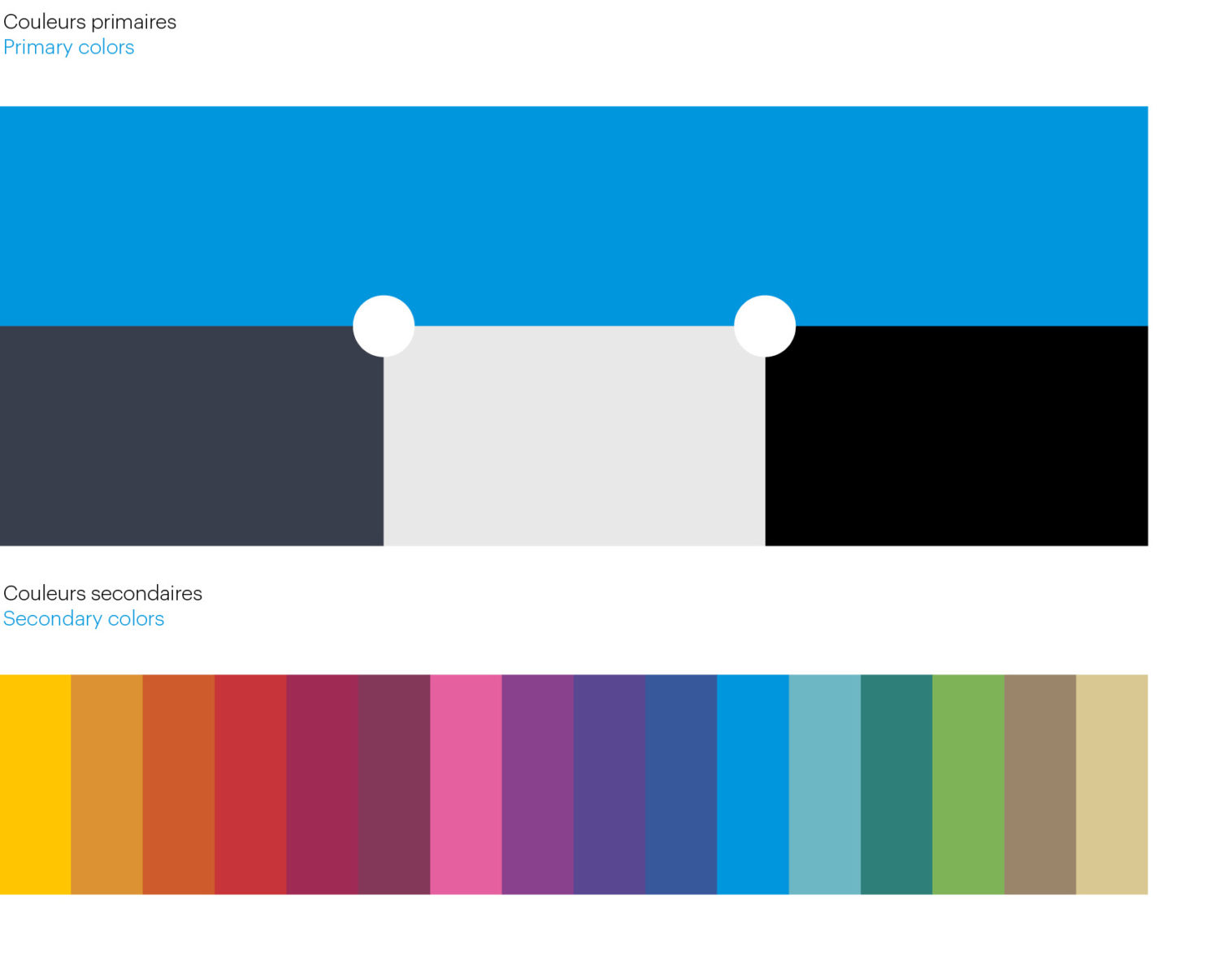
Our work is based on a simple, strong and accessible logo in its form, a sign that synthesizes the three strong symbols of the territory (the summits of the Alps, the volcanoes of Auvergne and the Rhone river). This logo is a way of telling the story of this shared and complementary geography, where territories rely on each other to build a solid whole.
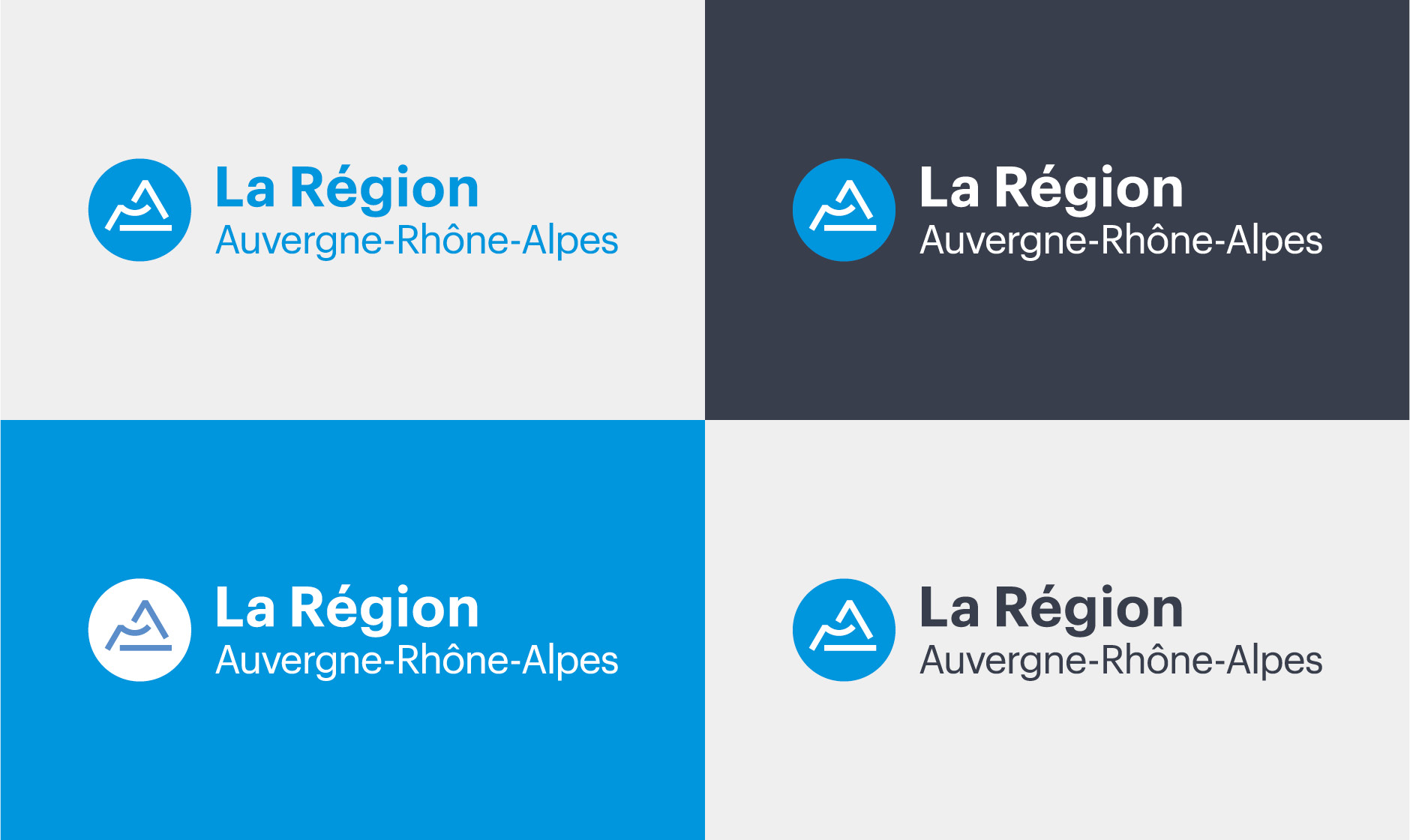
Six months of close work with the Region's communication department were necessary to establish all the rules of use of this brand architecture.
A brand architecture
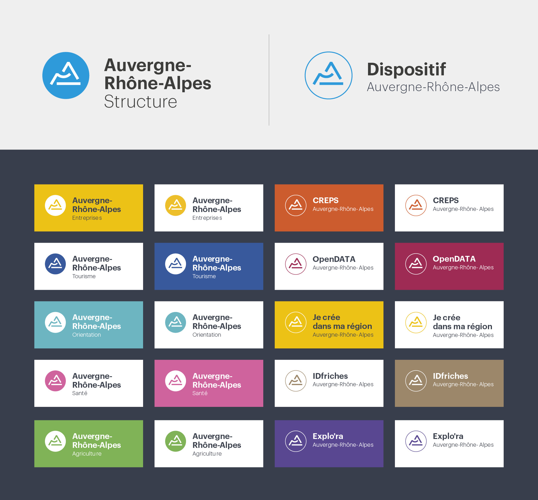
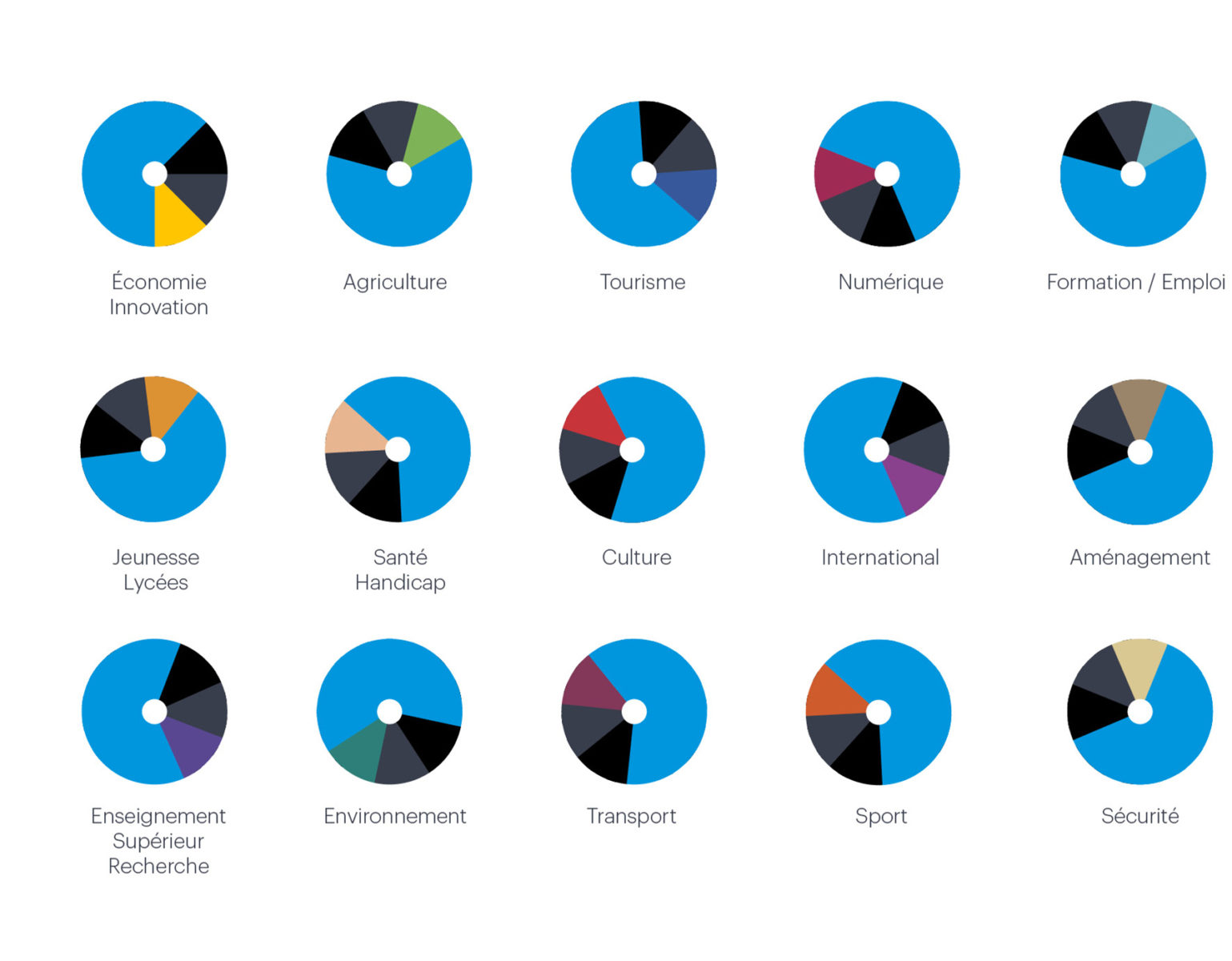
composed of 4 levels
Level 01
Auvergne-Rhône-Alpes The Region
Institutional communication
.
Level 02
The Region works to…
(areas of expertise, mechanisms, events, etc.)
Level 03
The Region works with…
(structures and projects with other partners)
Level 04
The Region supports partners,
events and infrastructures...
Level 01
Institutional communication
Level 02
The Region works to…
(areas of expertise, mechanisms, events, etc.)
Level 03
The Région works with…
(structures and projects with other partners)
Level 04
The Region supports...
(partners, events and infrastructures...)
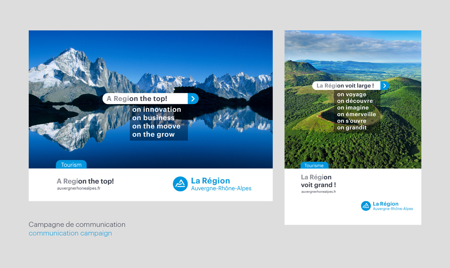
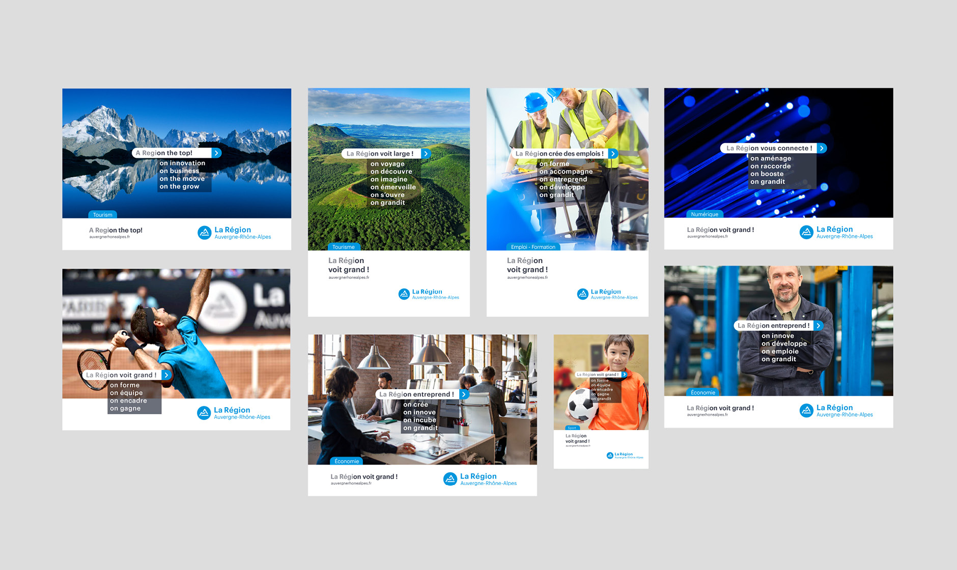
The Region the top!
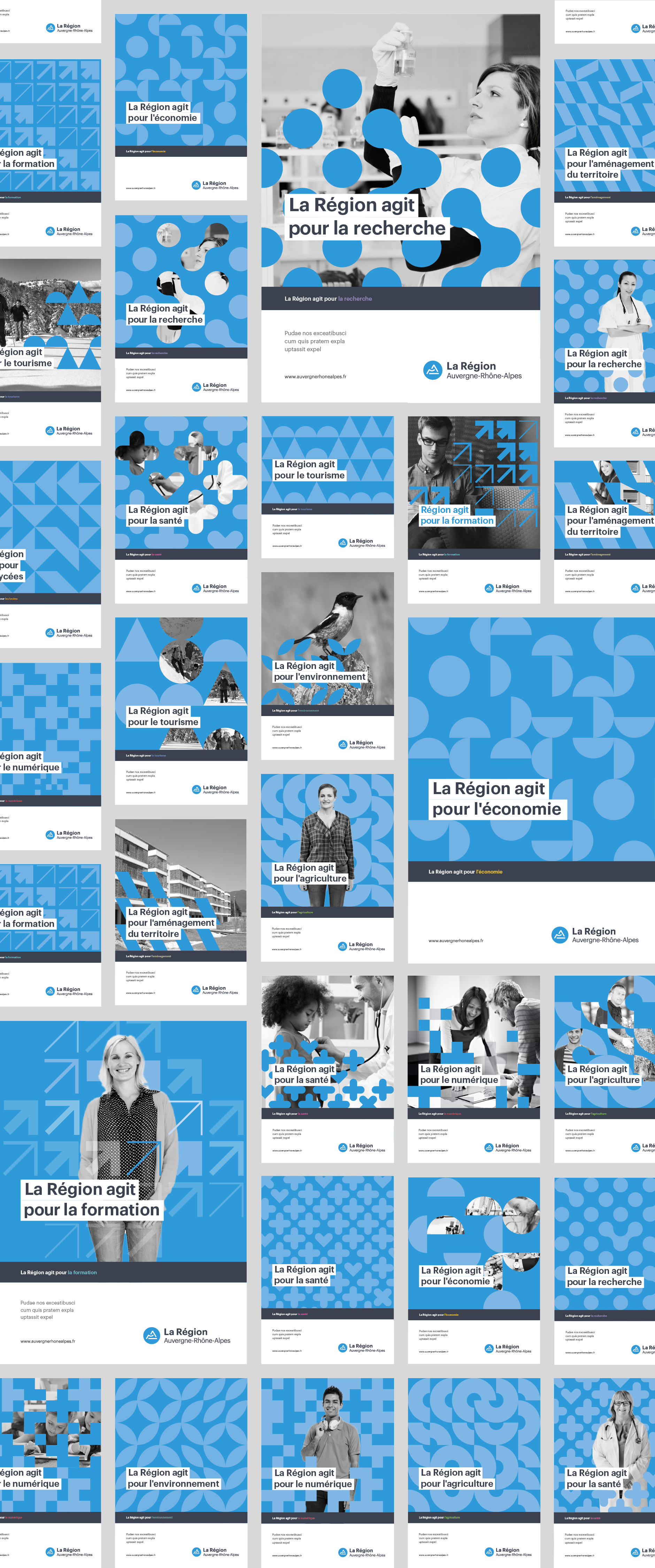
Institutional campaign
More images...
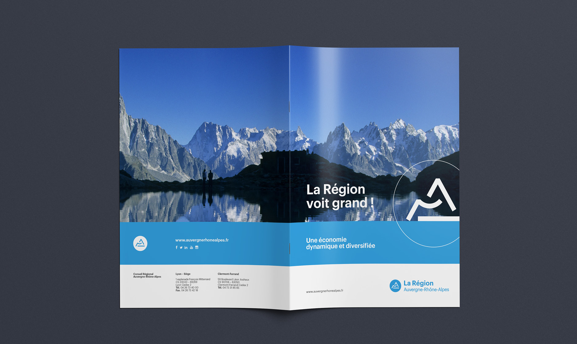
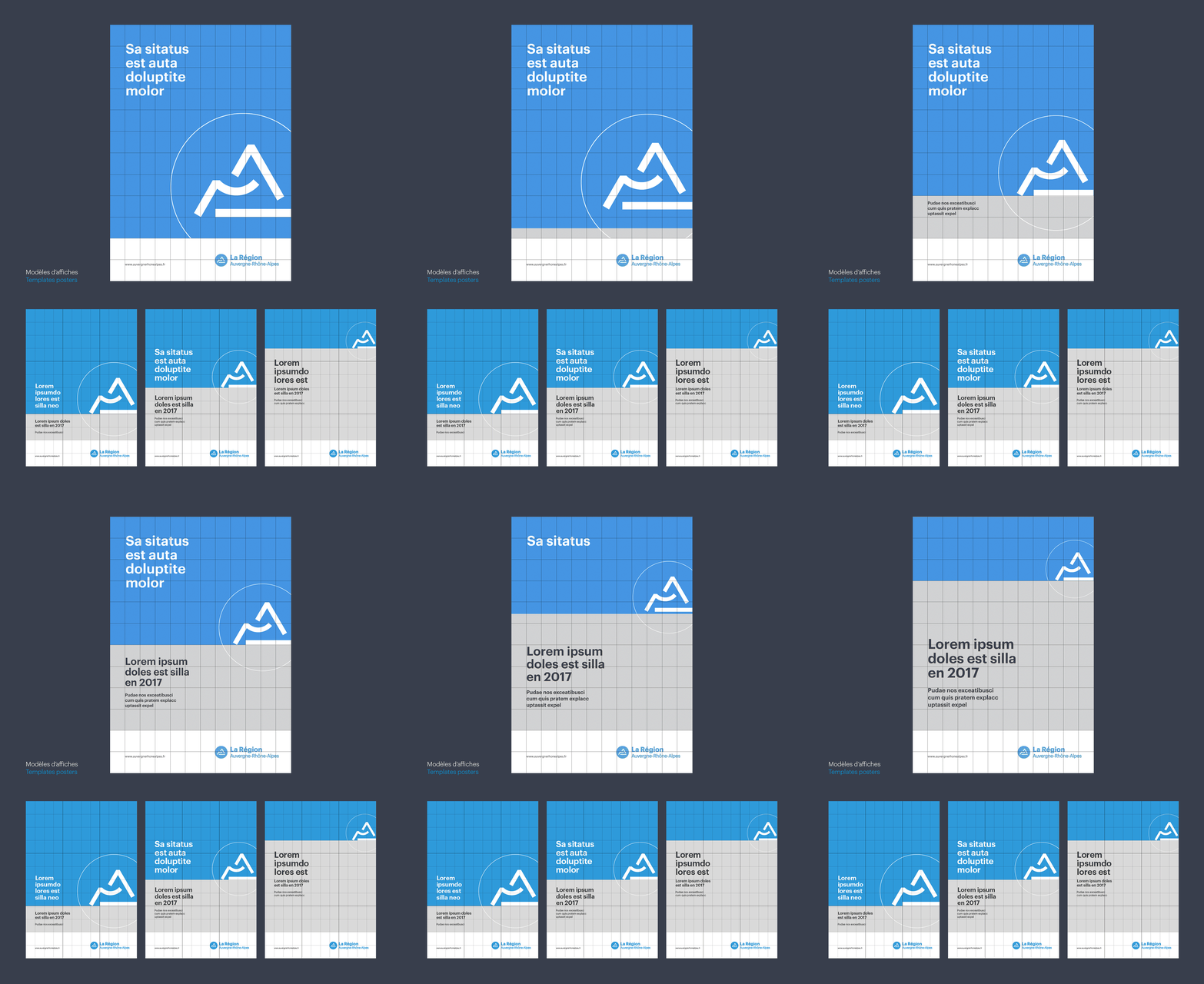
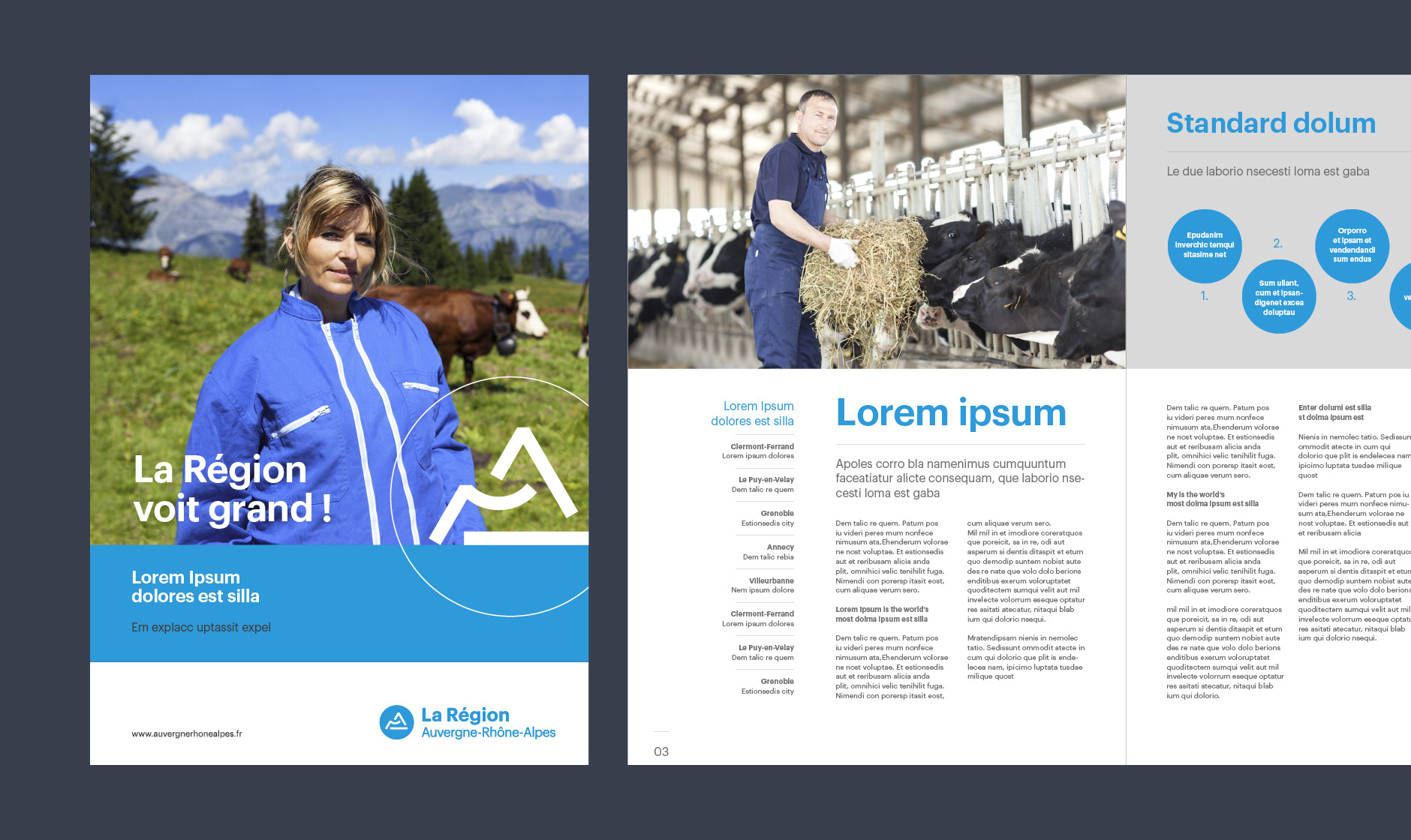
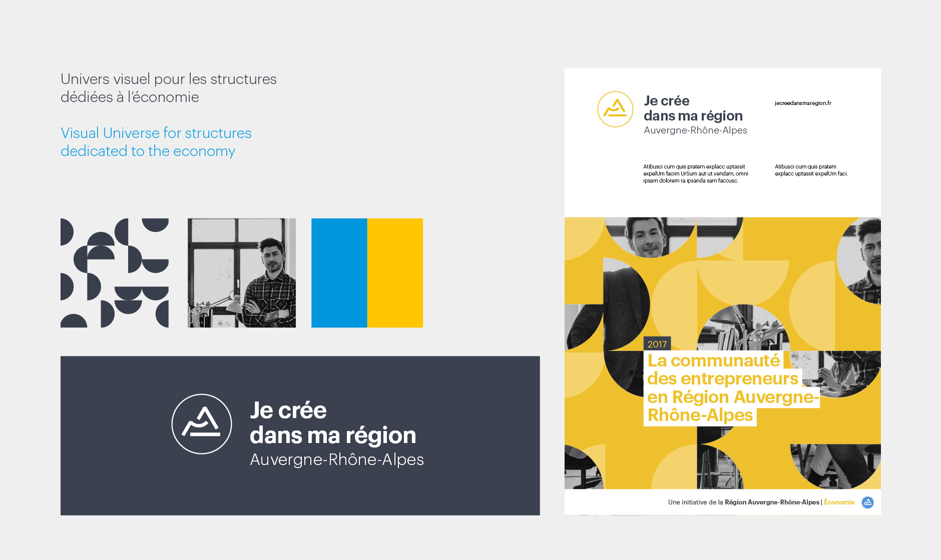
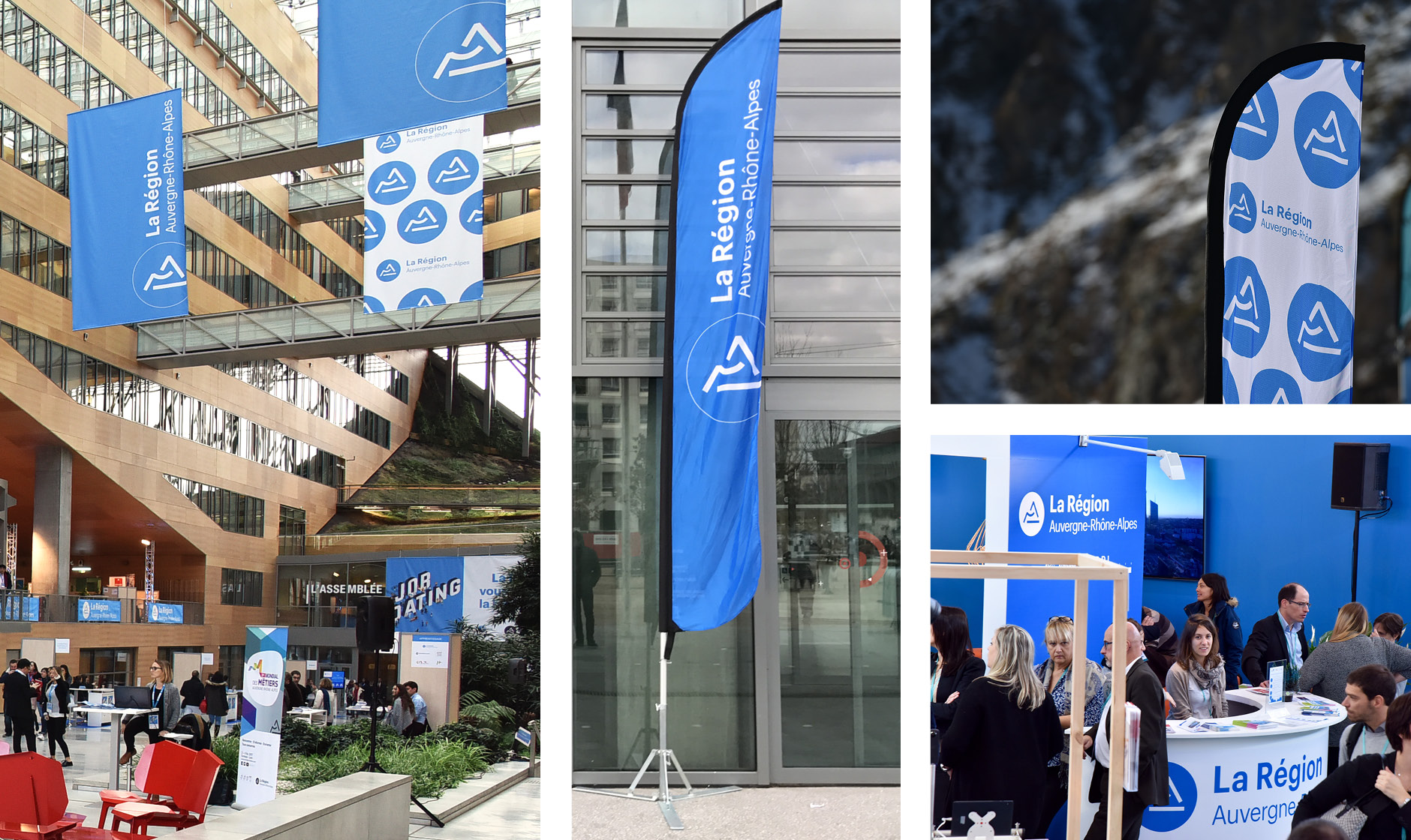
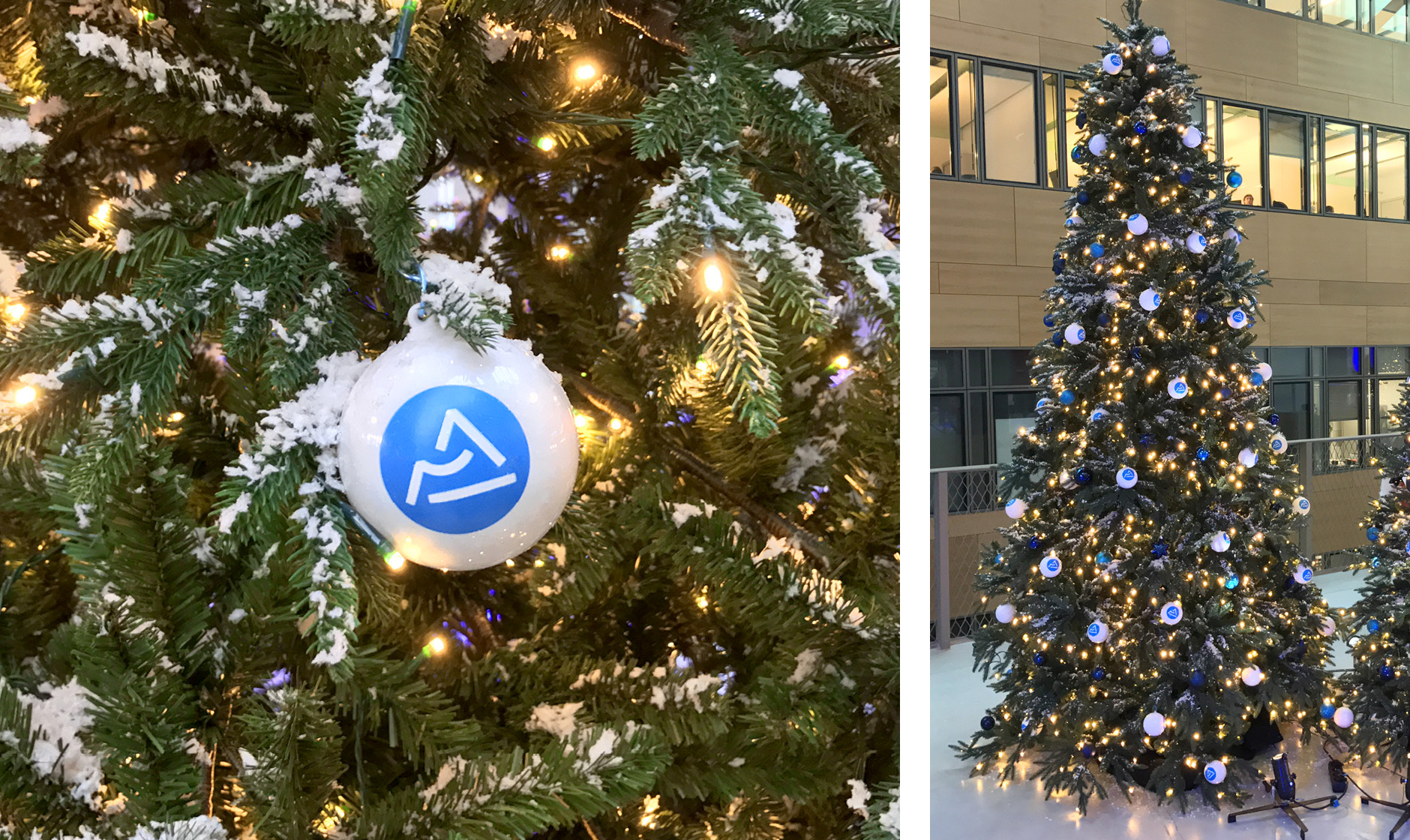
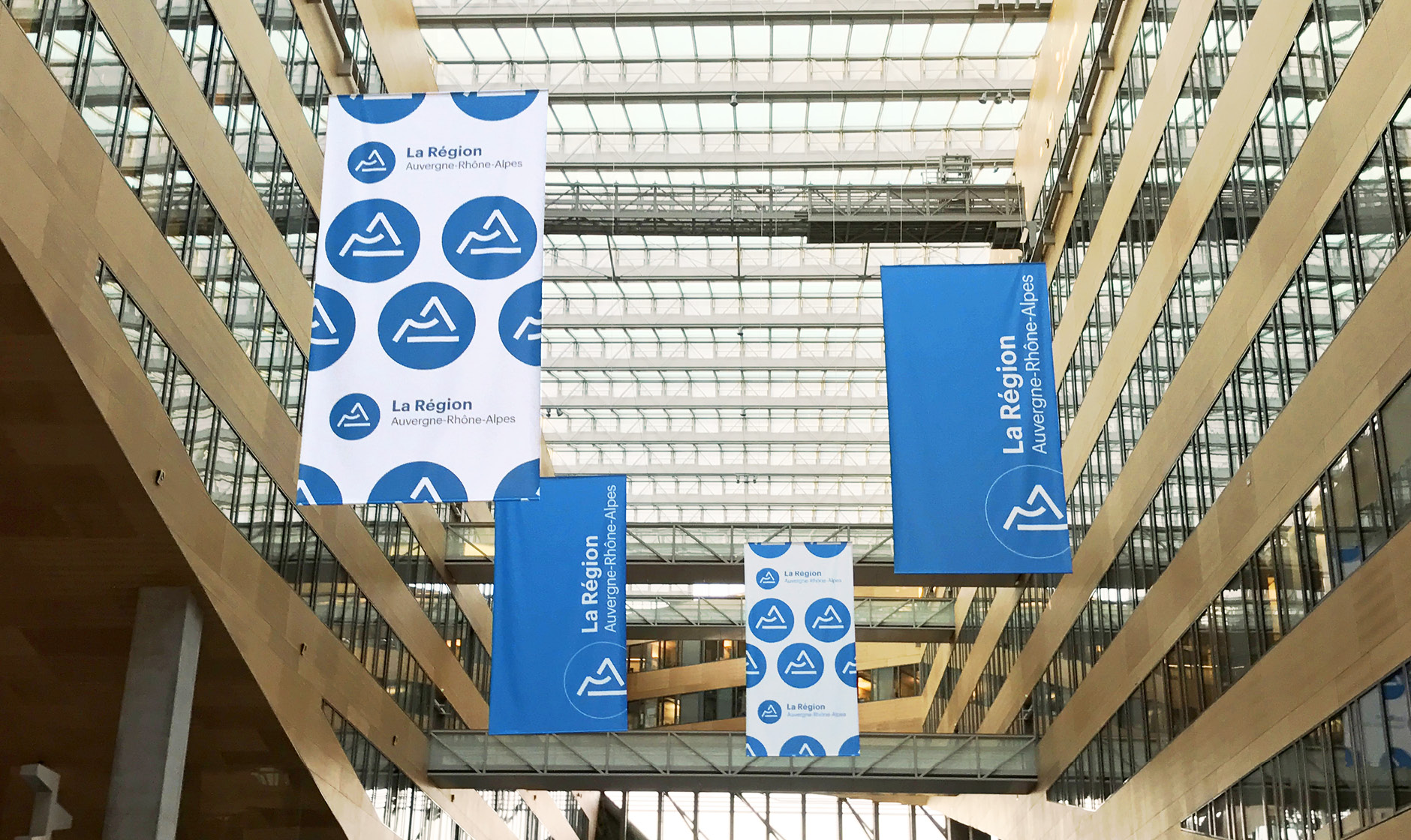
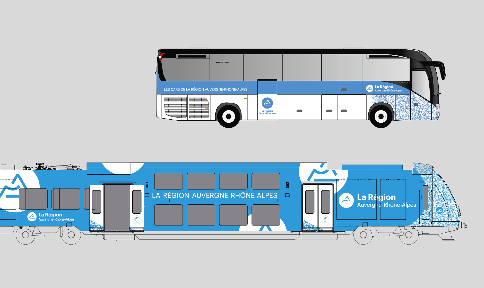
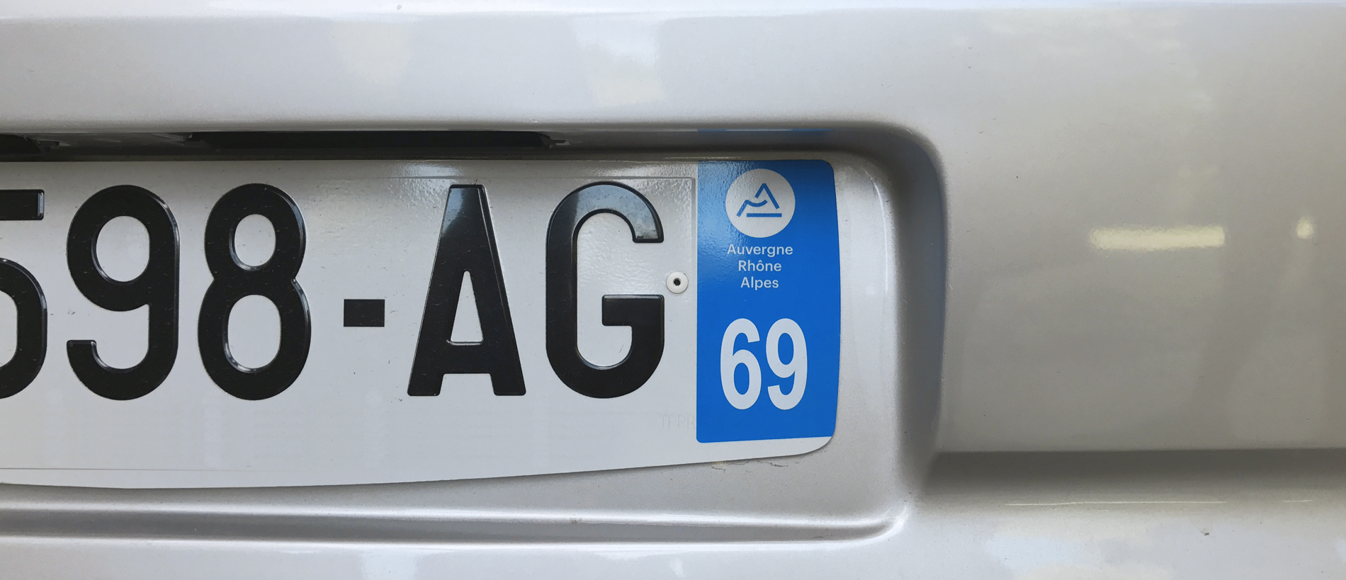
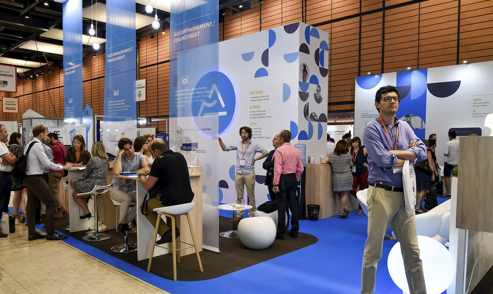
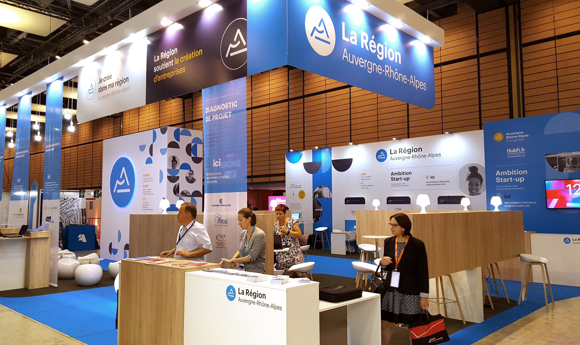
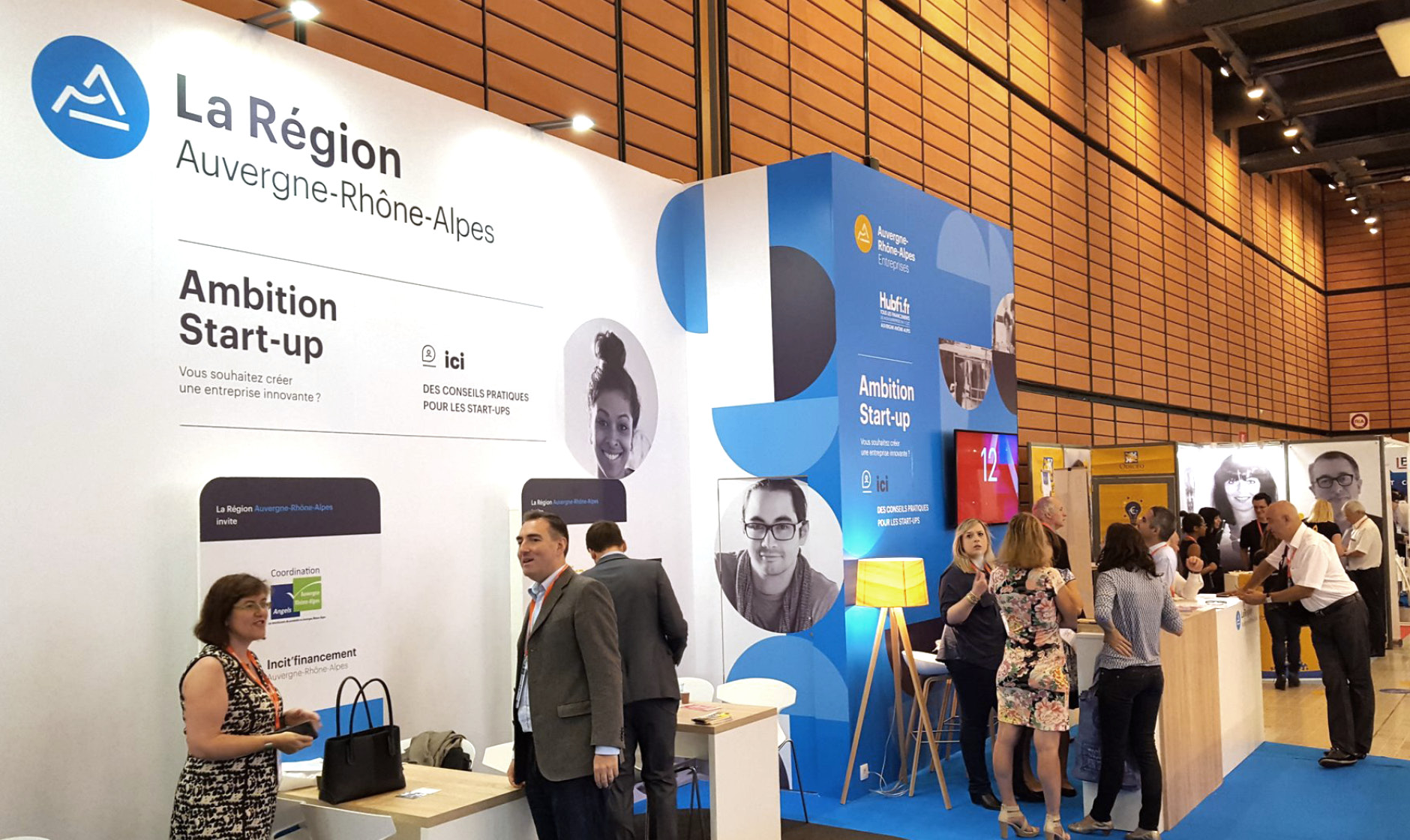
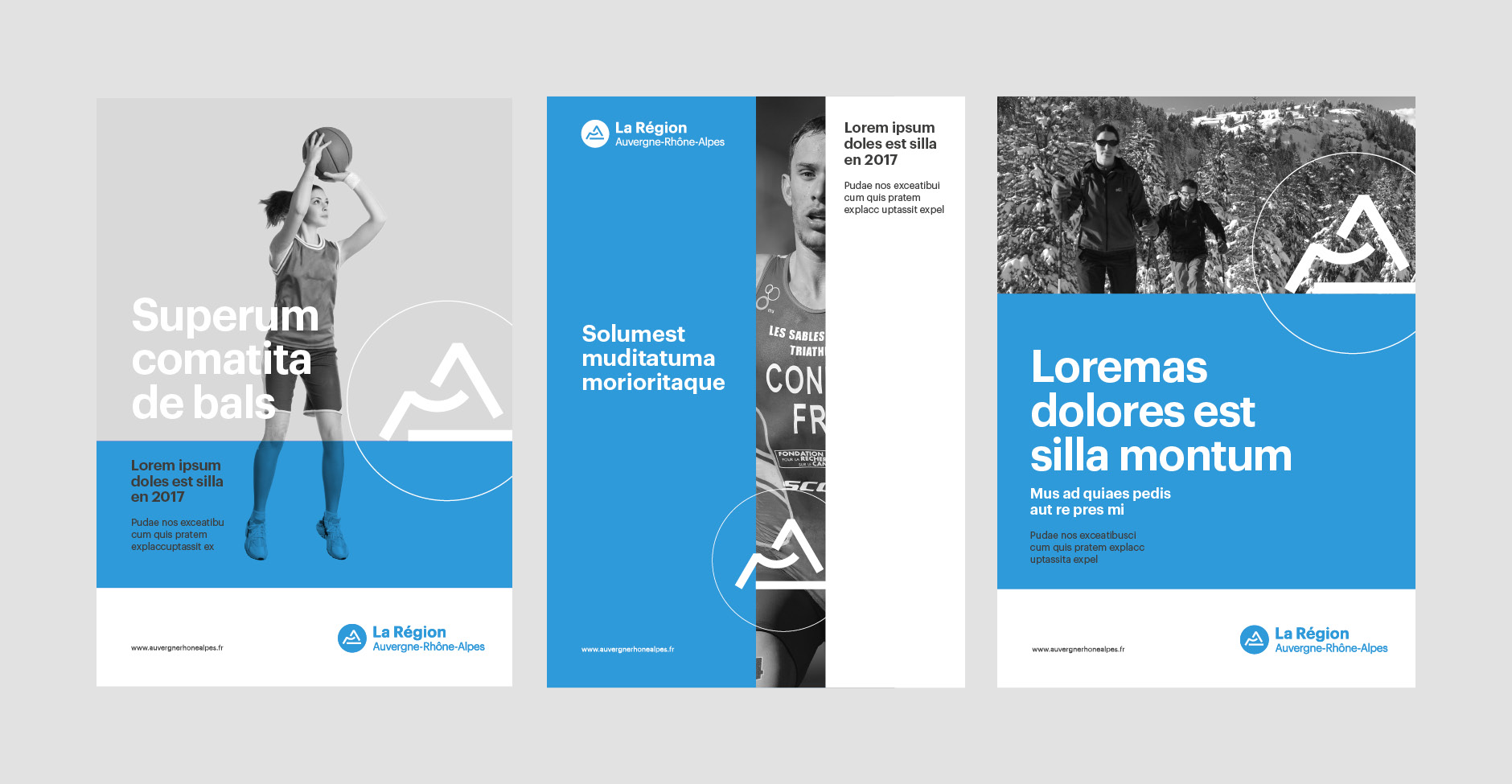
Here are some examples of applications based on this brand architecture, developed by the Region's communications department.
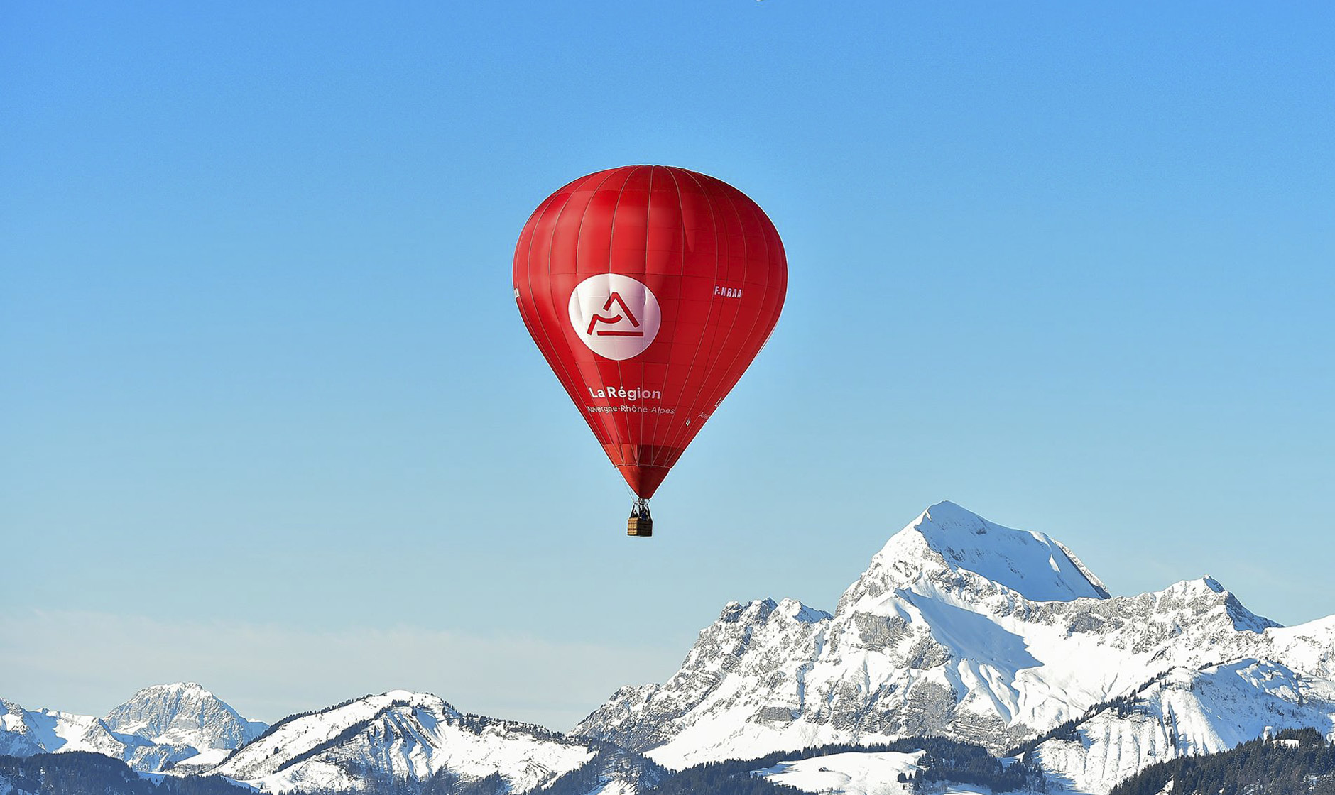
Note that this real balloon does not respect the color chart. But who would see a blue balloon in the blue sky?
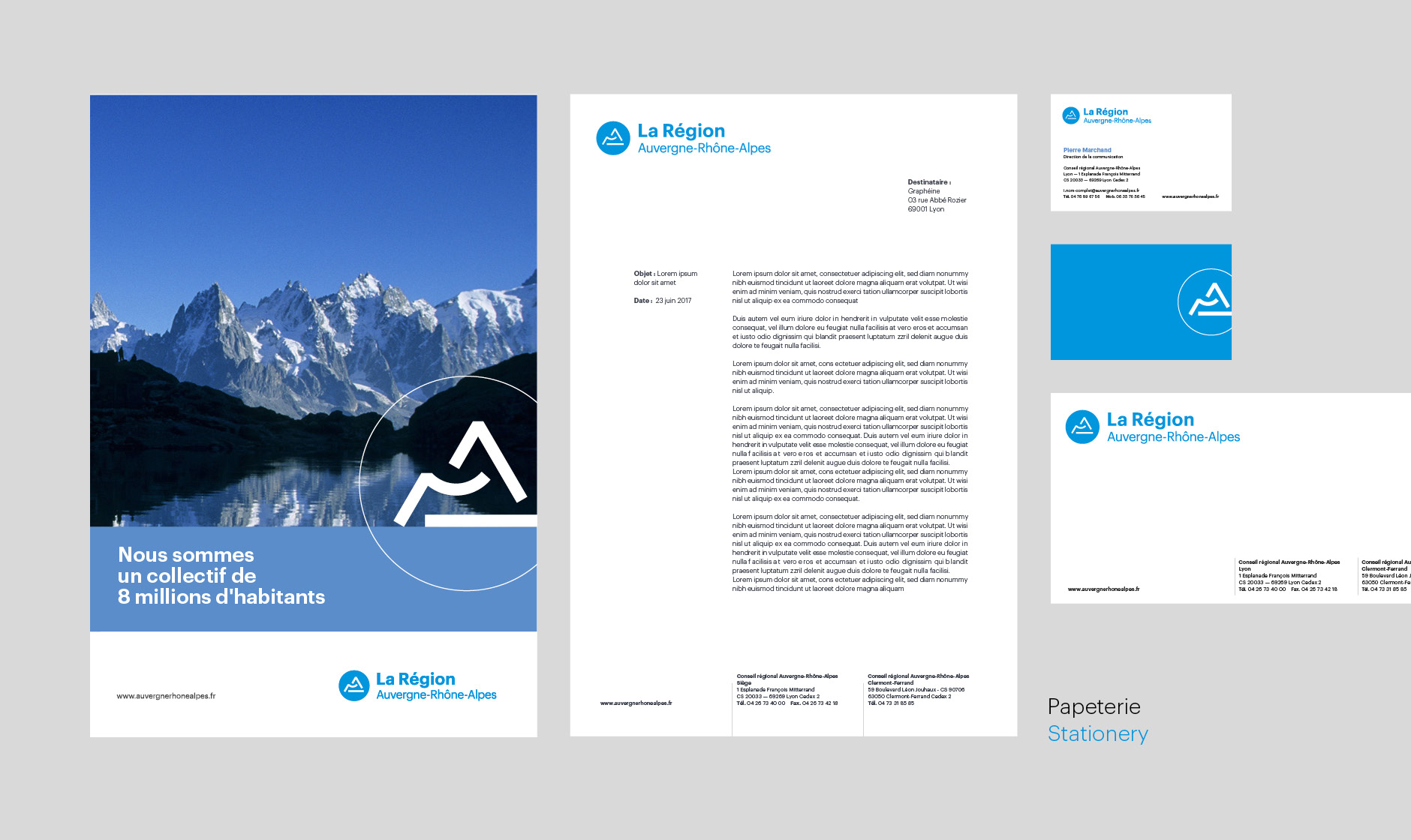
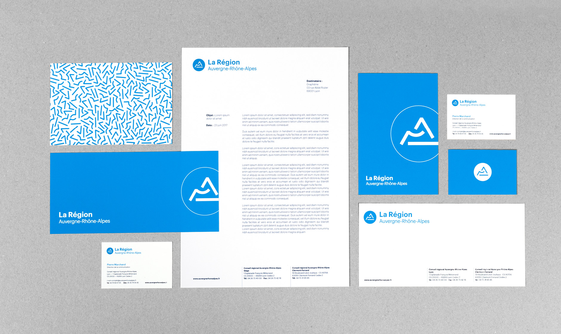
Publishing design, creation of magazine and brochure layouts. Logo creation, visual identity and graphic guidelines. Graphic design of posters, flyers, letterhead and business cards.
Institutional communication agency, public communication for cities and territories, government institutions, social partners and public administrations.

