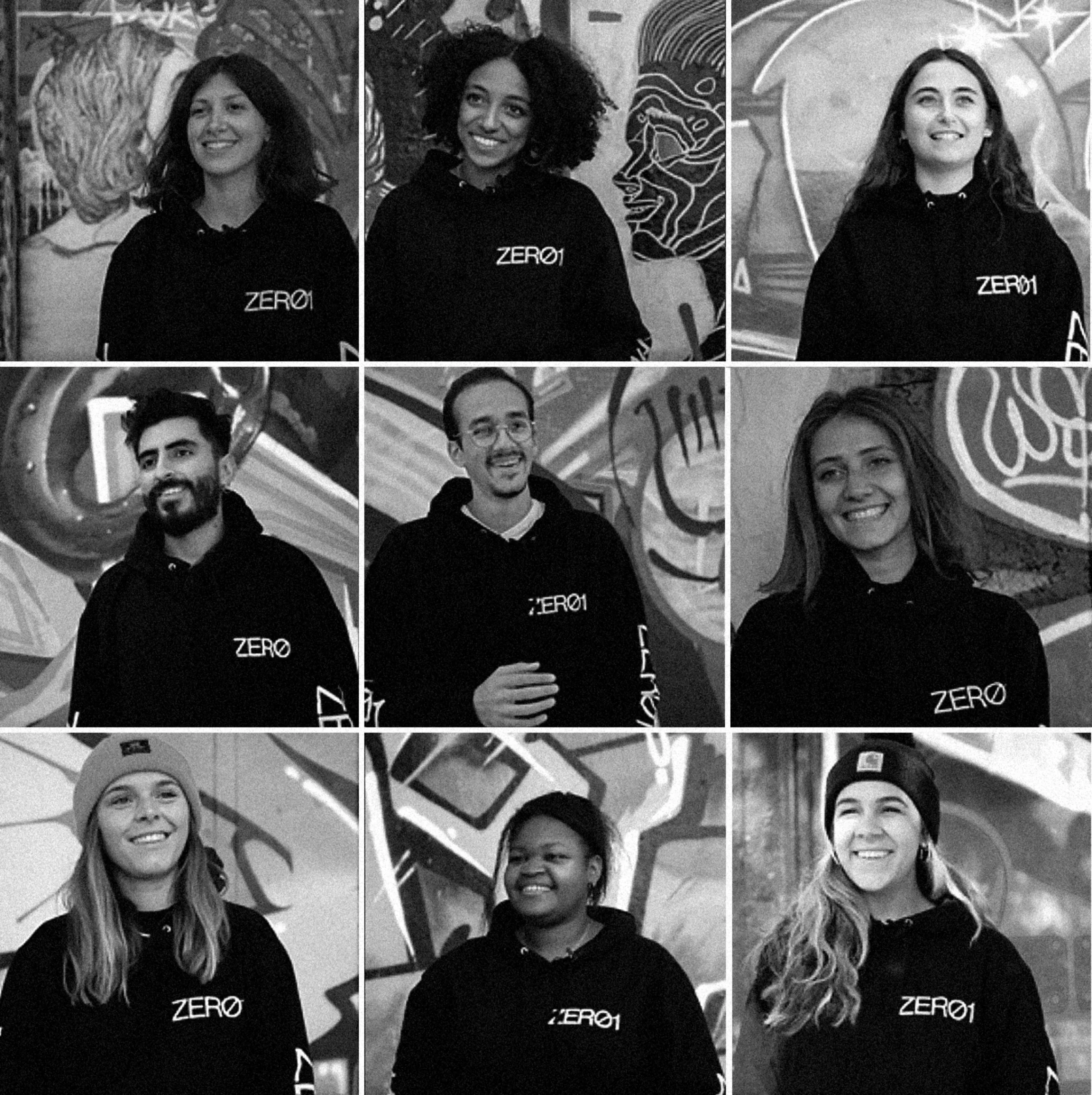
The Zero1 Festival, organized by the students of La Rochelle University, combines digital arts and the heritage of La Rochelle. For the past 6 years, the festival has offered exhibitions, conferences, workshops and digital experiences in the service of art in the most important places of La Rochelle. Open to all and free of charge, this event has become an annual event and offers a diverse range of views on the visual and digital culture. In 2019 the Zero1 festival contacted us and proposed to work on the graphic identity of the event as well as on the visual of the 2020 edition.
Festival ZERO1
ZERO1, Festival of hybrid arts and digital cultures
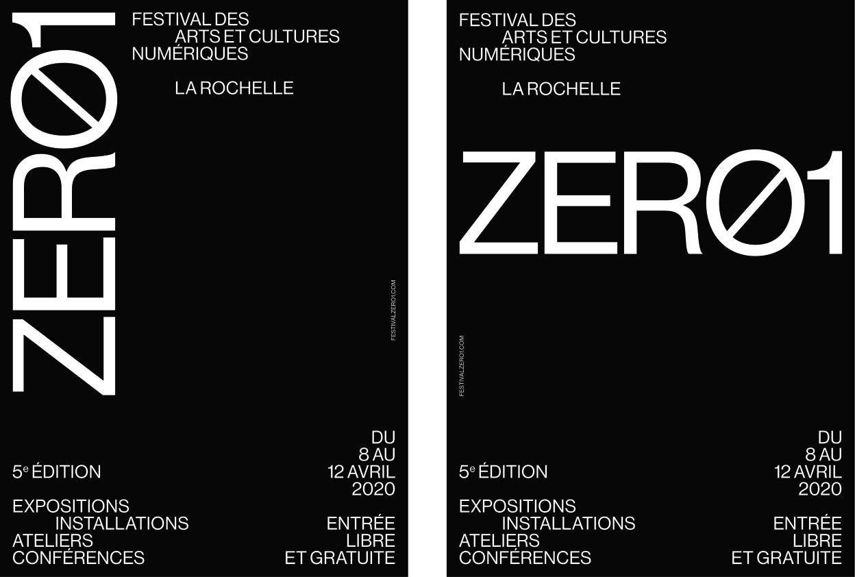
Logotype
The logo is based on a contraction between letters and numbers. It is composed in Neue Haas Grotesk. Ancestor of the Helvetica, this linear typeface was originally designed in 1957 by Max Medinger and is used here in the 2210 restored version by Christian Schwartz (Commercial Type). The elegant neutrality of its design and its formal qualities allows, depending on the composition, to fade into the background or to be very visually present.
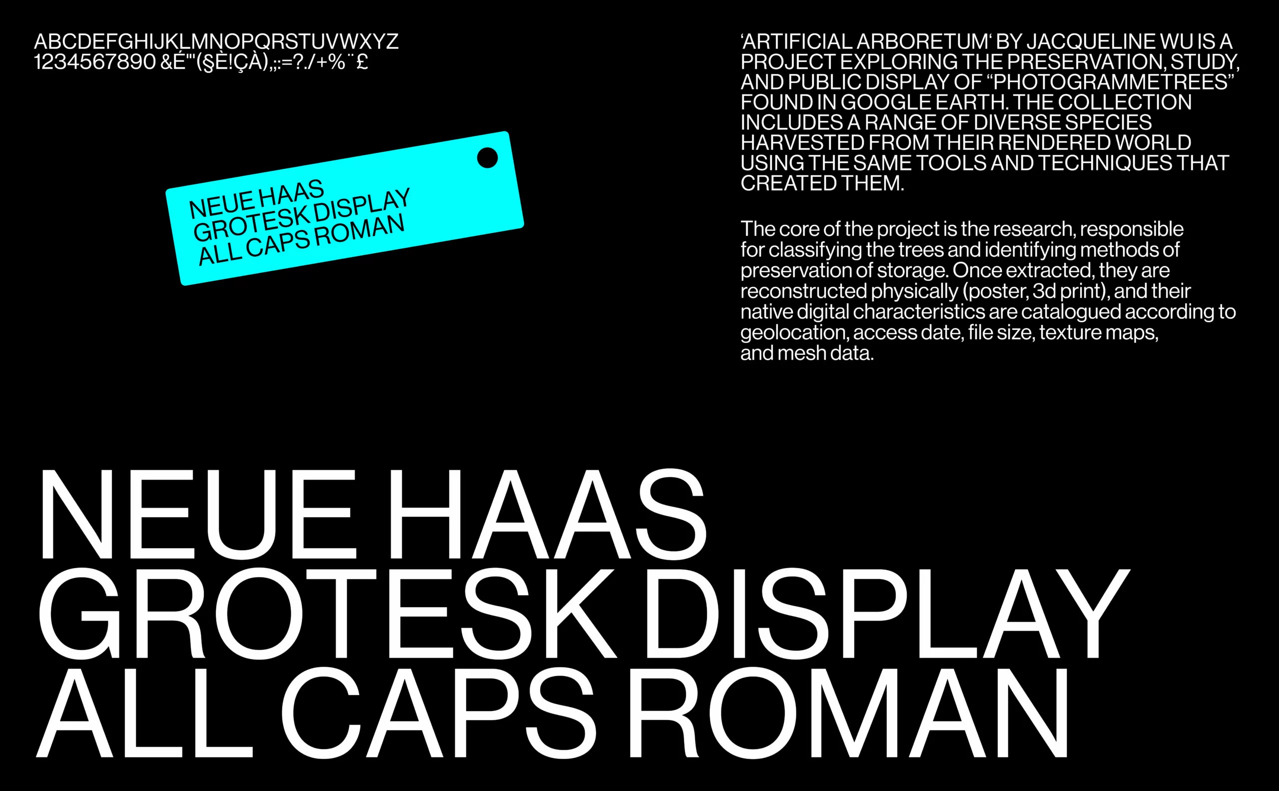
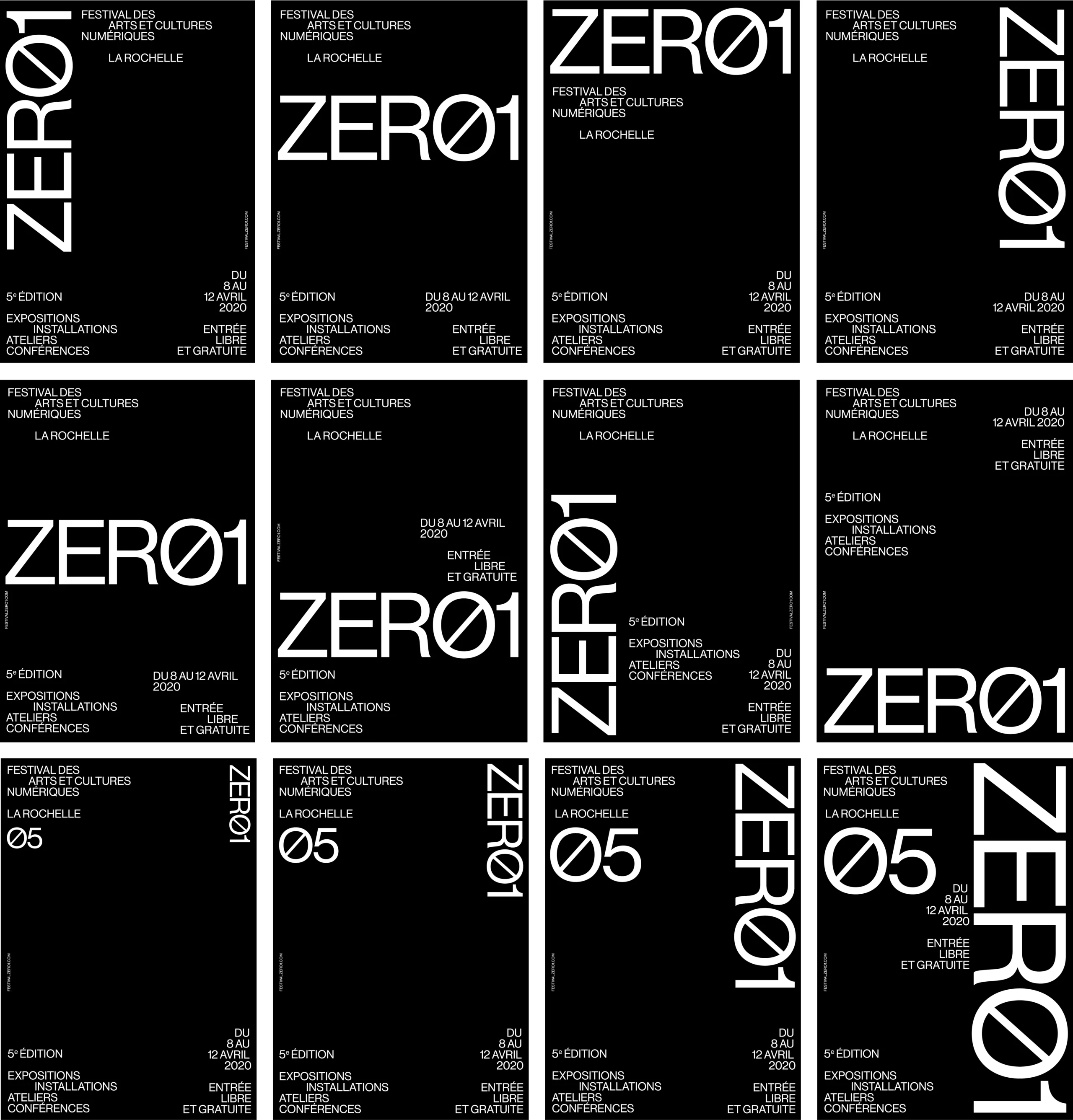
A unique font and case
In order to highlight the events and invited artists while preserving the coherence of the festival’s communication, all the text content is composed in capital letters, with a single font.
The logo can be used as an icon, adaptable on all shapes and sizes.
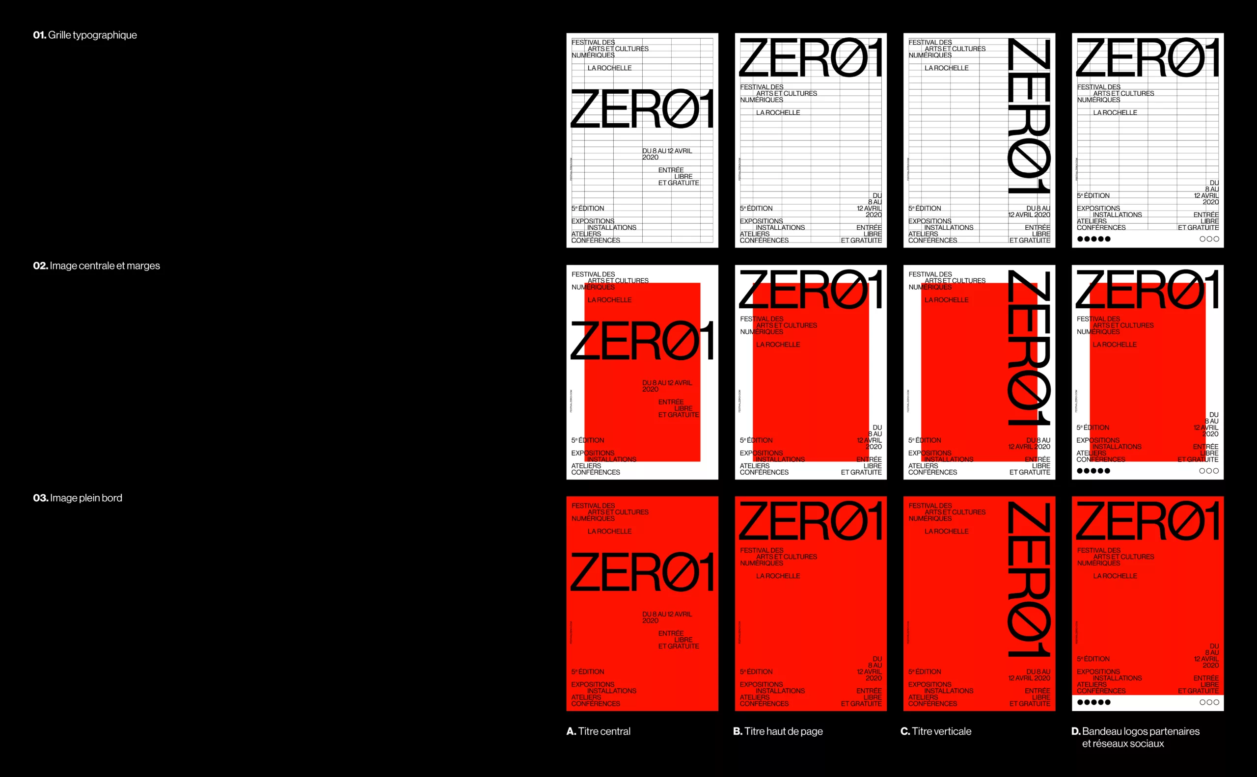
Layout principles
The layout grid is modular and adapts to any format. Although structured, the space is invested in an organic way. The text information are composed without a fixed reference point, with a minimum variety of styles.
This sobriety allows to highlight the work or the visual presented while making visible the identity of the Festival, at a good distance from the subject.
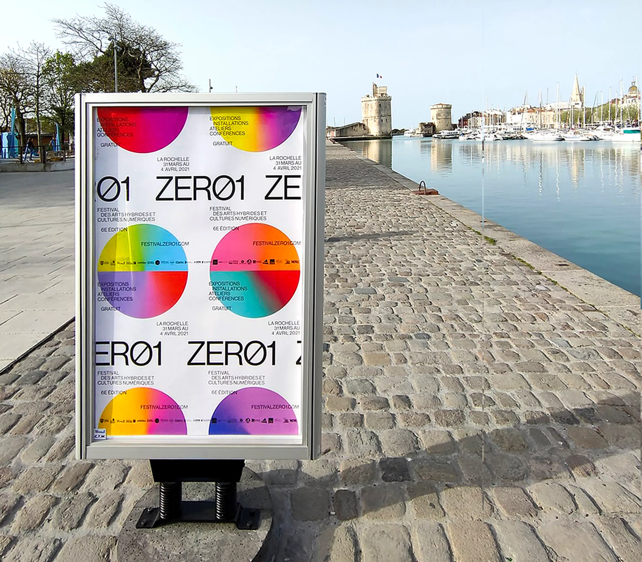
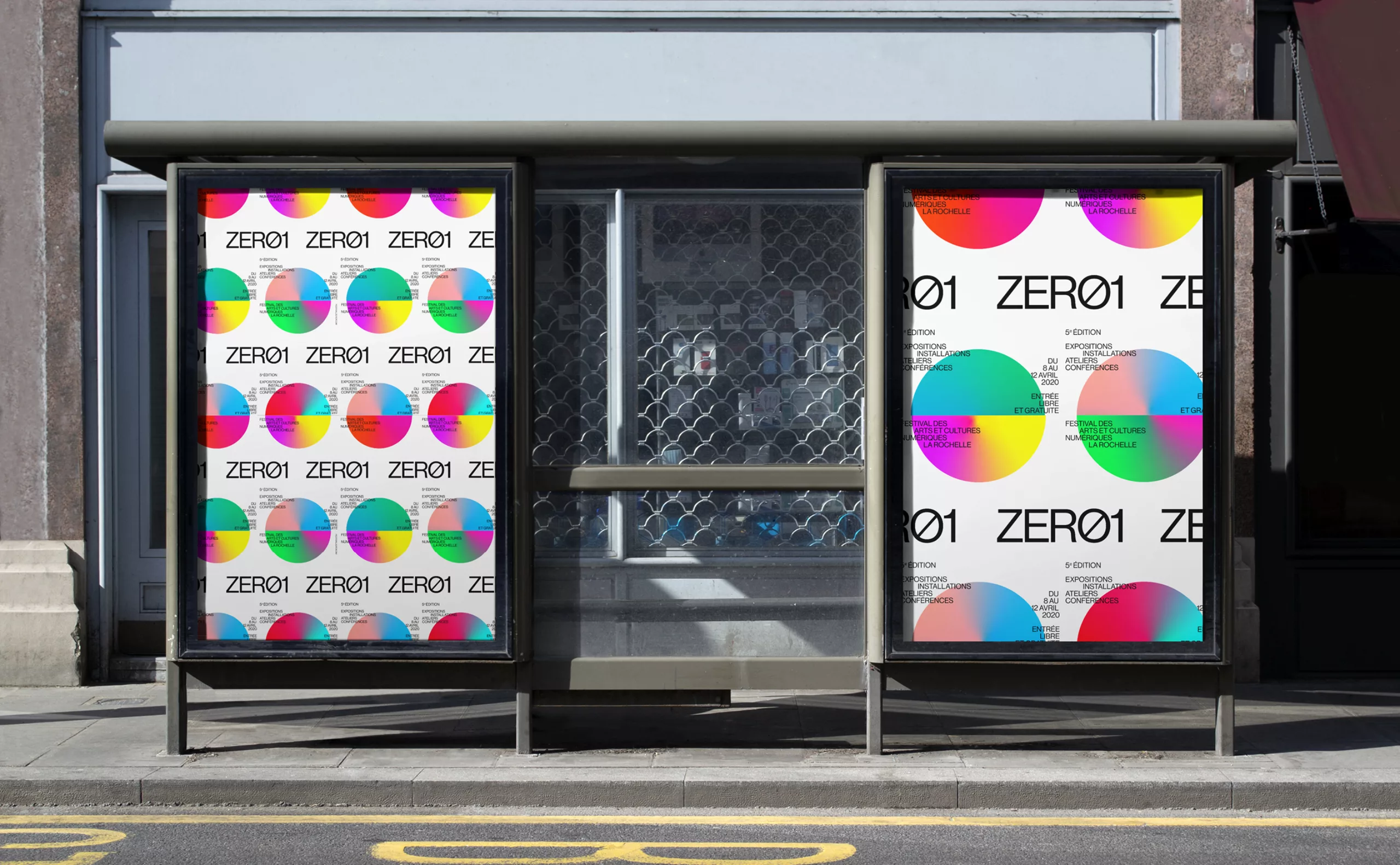
Visual of the edition
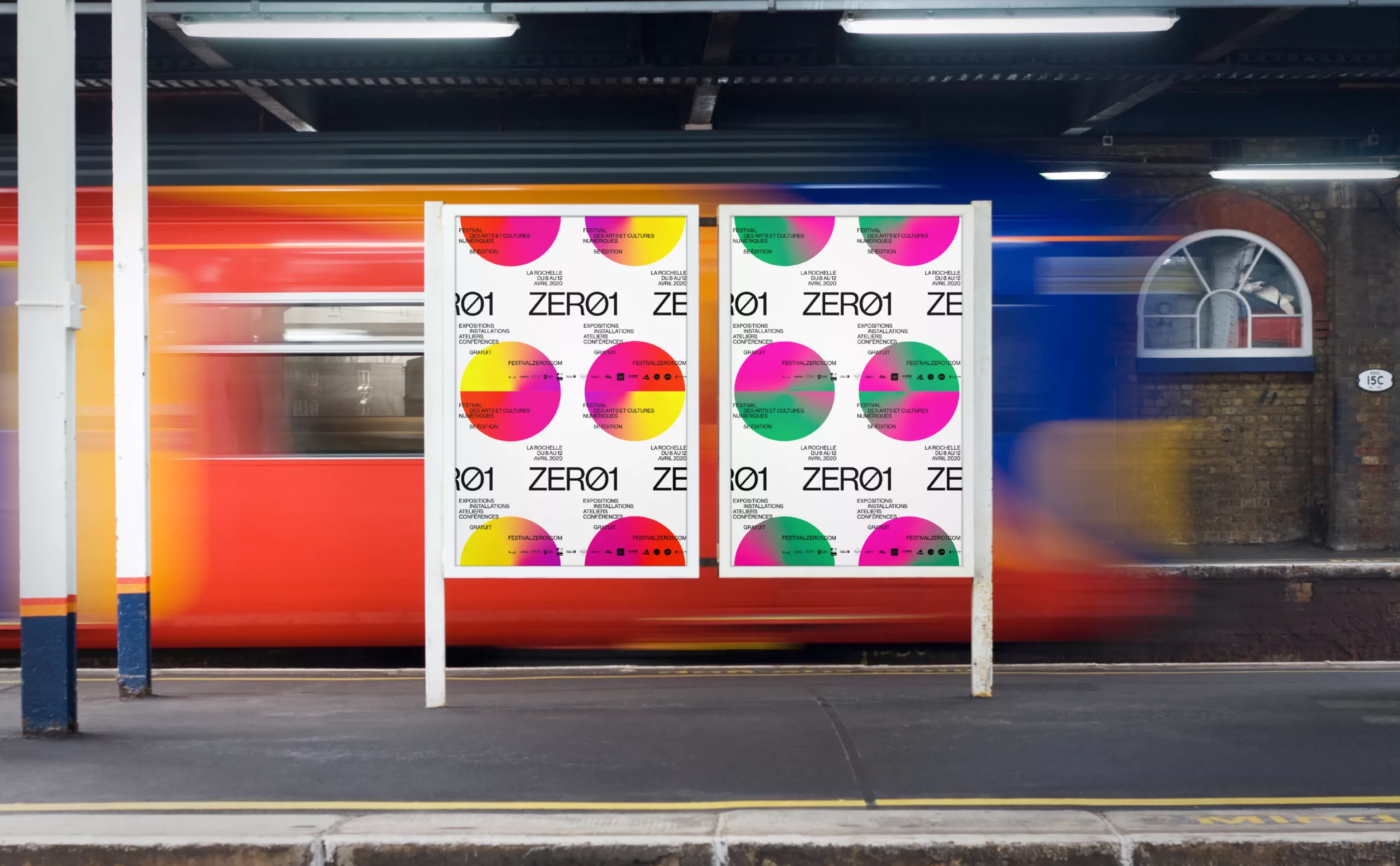
The visual, created with the precious help of Jean-Baptiste Joatton, is based on a generative system. It echoes the theme of the festival and uses half circles of gradient colors created in a random way.
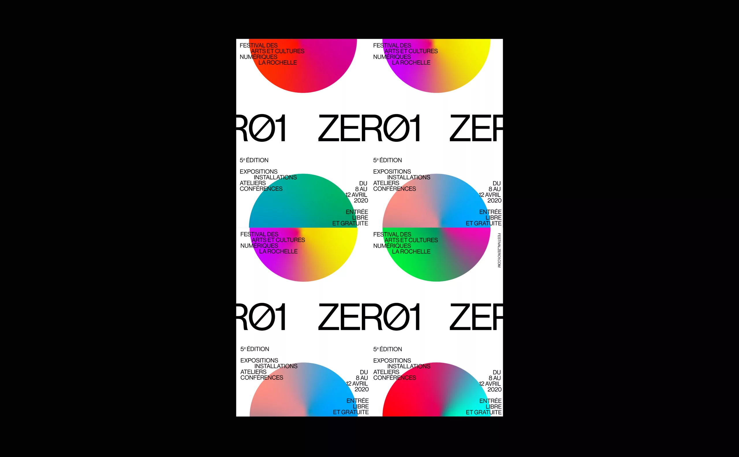
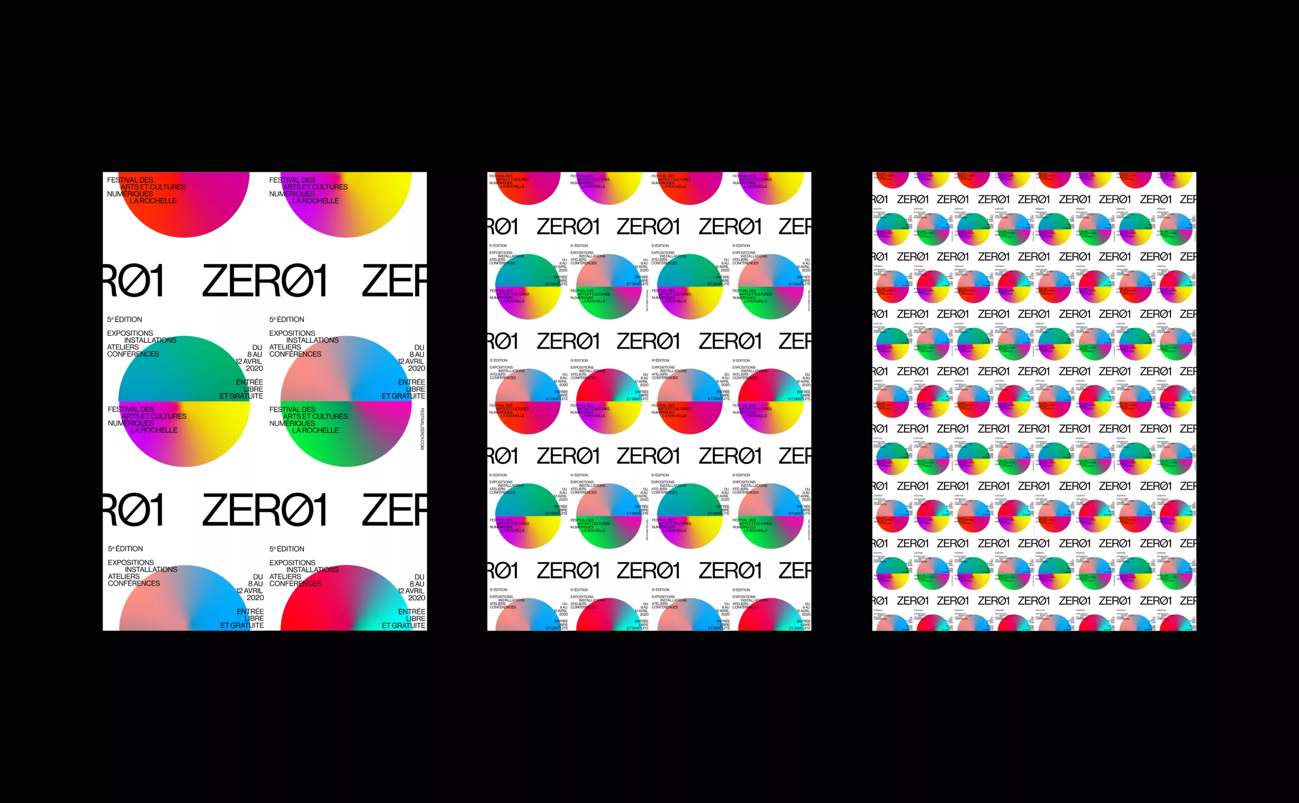
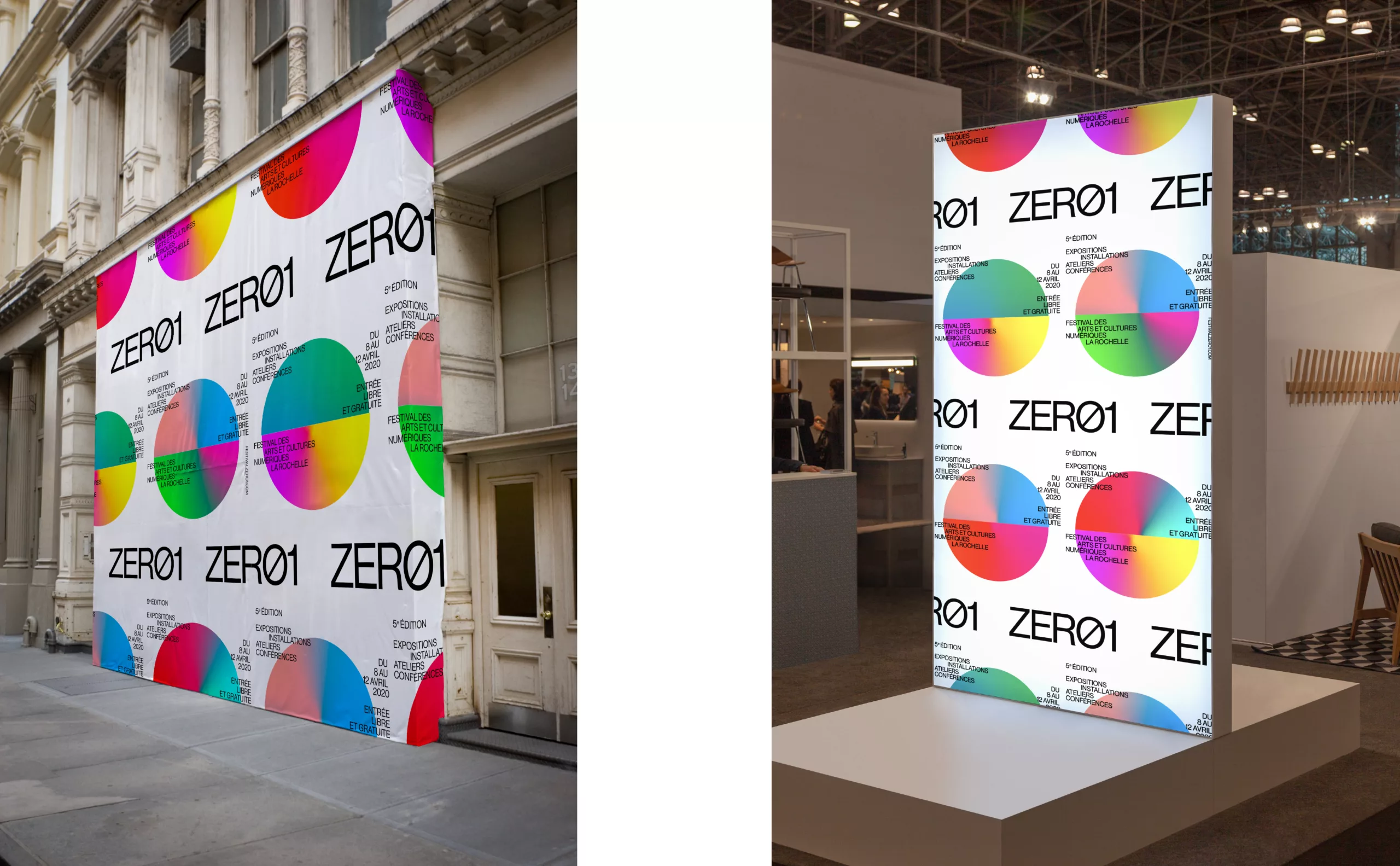
The seasonal visual is composed as a pattern. The basic unit can be extended and multiplied to cover large formats.
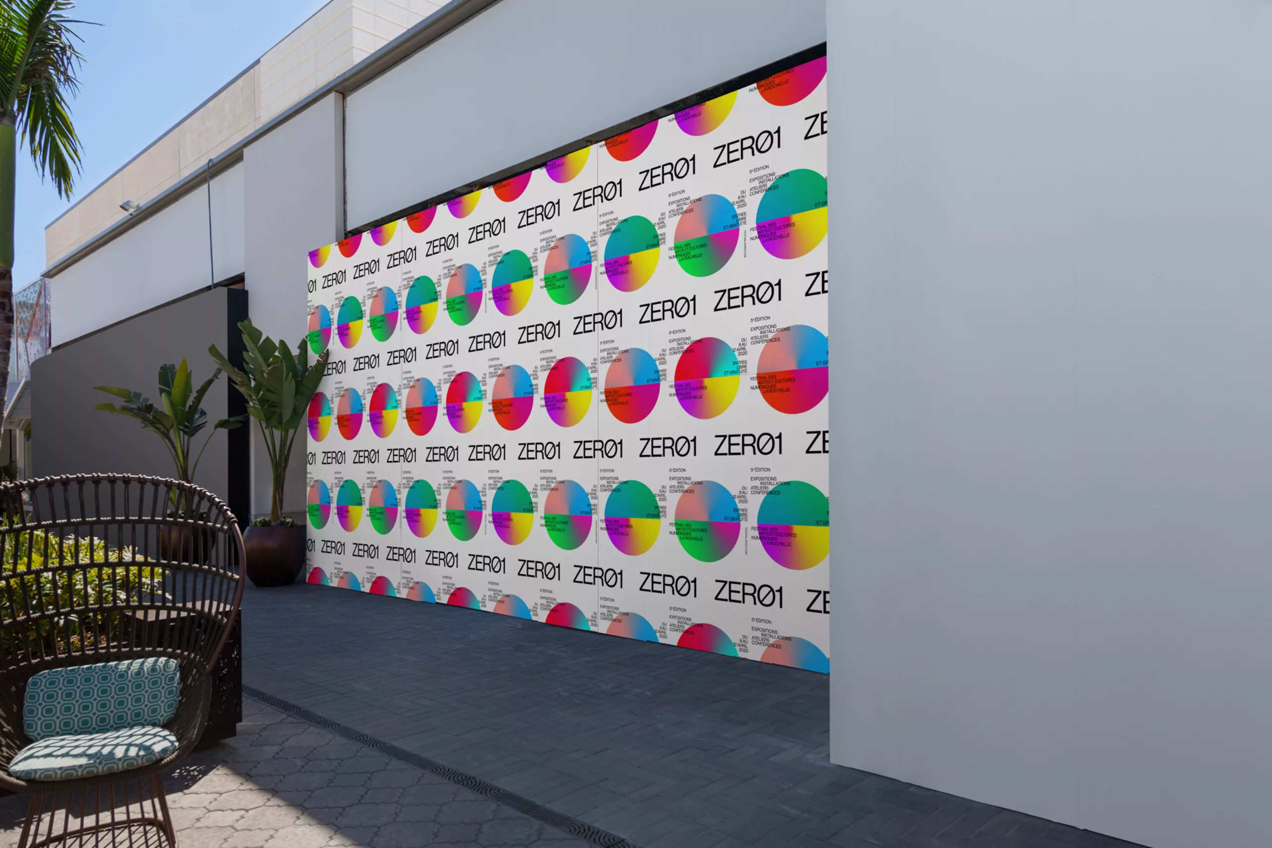
In addition to the reference to the digital culture of graphic design, the produced images also have a signage role: the posters and banners contrast with the architecture of La Rochelle and thus clearly indicate the places invested by the festival.