
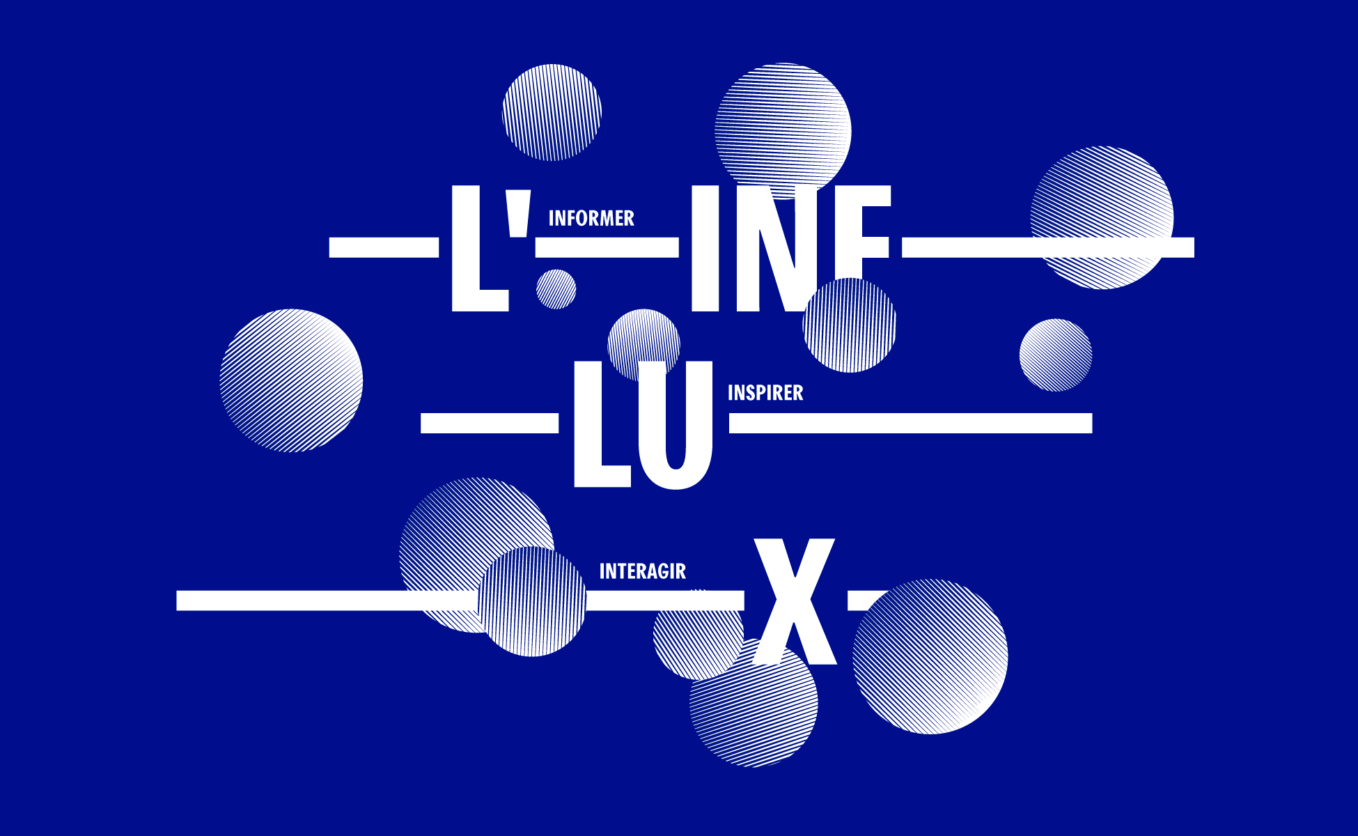
A webzine that wakes up neurons
An influx is an electrical signal carried along neurons’ membrane, and also now the name of the new webzine of the municipal library of the city of Lyon, France.
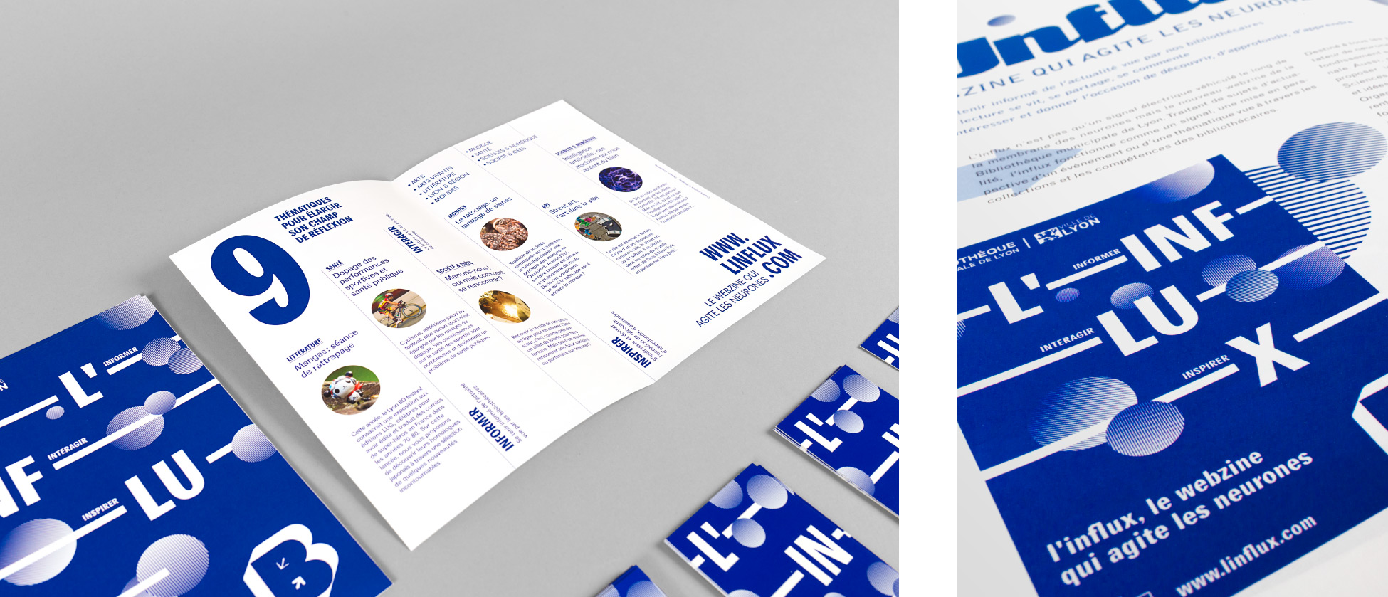
Dealing with current issues, L’influx puts into perspective an event or a theme through the library collections and the expertise of librarians. Intended to all audiences, L’influx stands as a neurons agitator that sheds light and brings depth on local, national and international news.
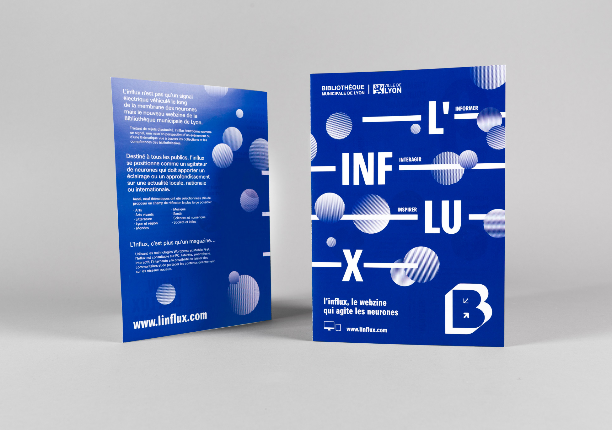
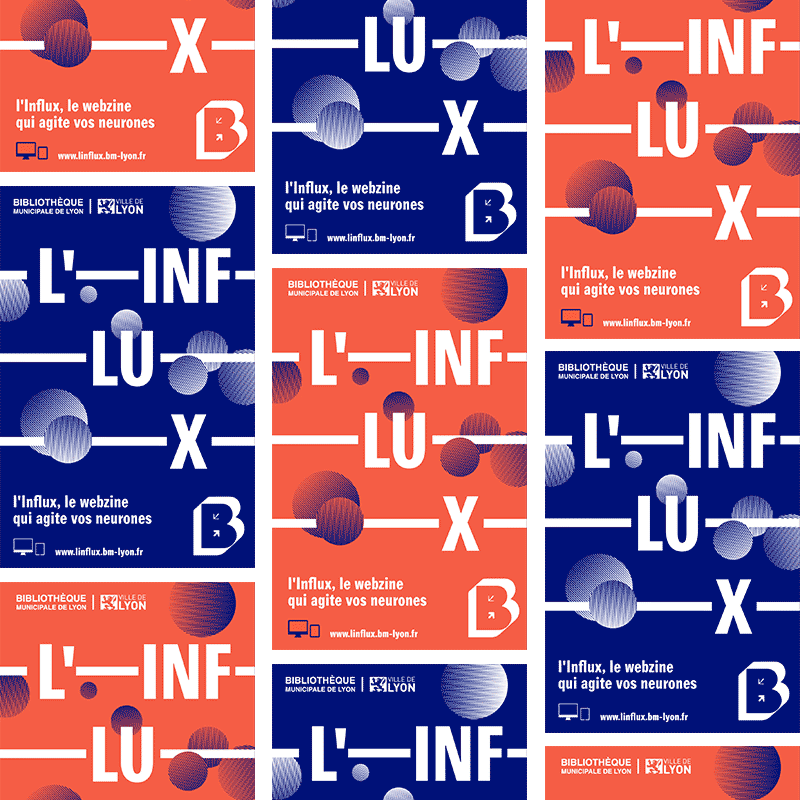
Our job was to design the identity and the communication tools of the webzine. We aimed at designing a simple graphic system, relevant and recognizable, that would be easily adaptable on various media. We went for a lively visual identity, that mirrors the changing news posted on the site.
![]()
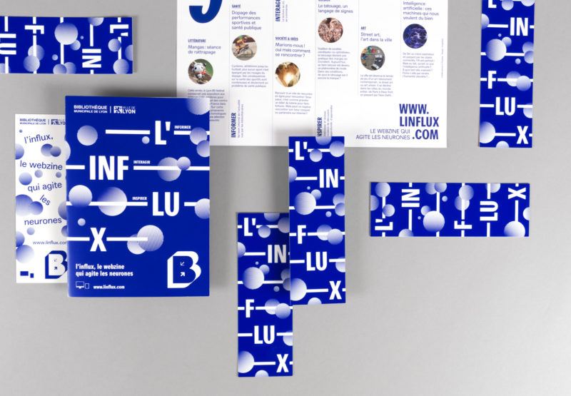
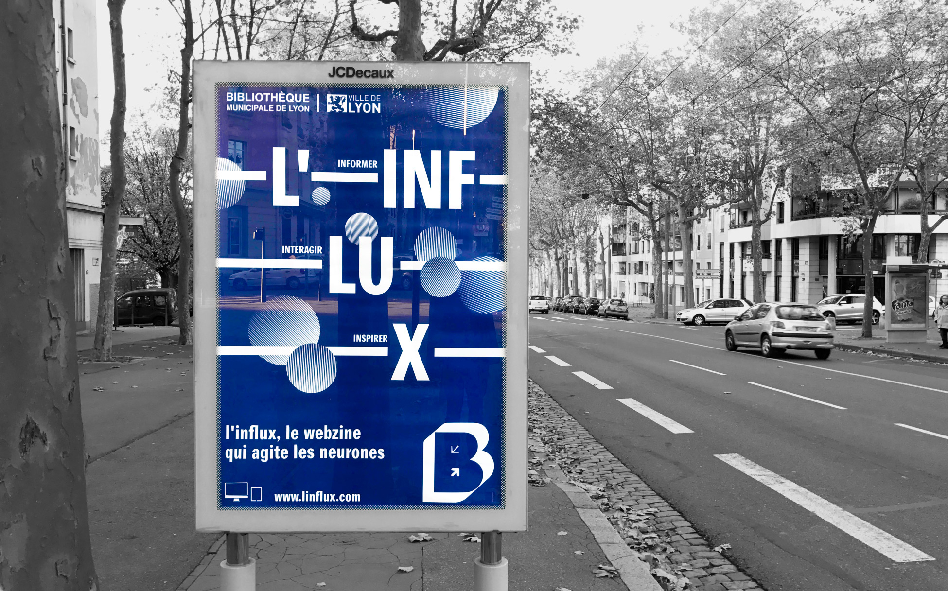
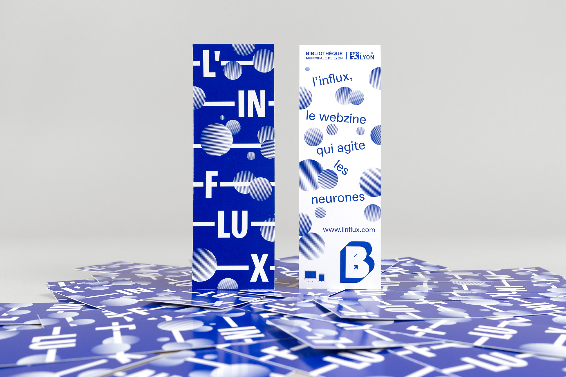
The logo is made of letters connected within a line, that represents the stream. This logo is modular, it can take different forms (definitely «motion design friendly»!). As long as the rules governing its design are met, the logo can evolve without losing its readability and identity. It can live on one, two or three lines according to the media.
As long as the rules governing its design are met, the logo can evolve without losing its readability and identity. It can live on one, two or three lines according to the media.
![]()
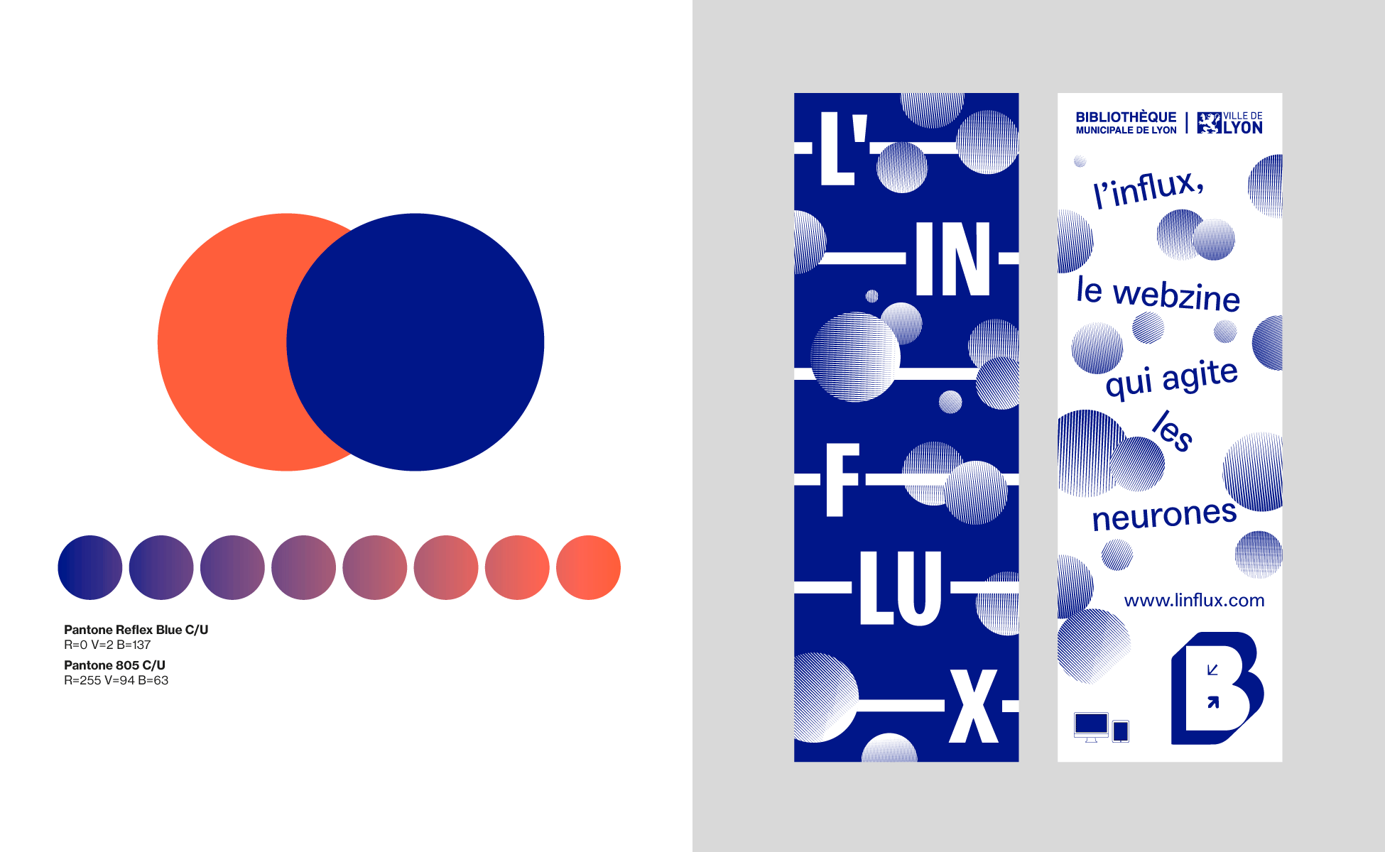
For consistency purposes and to reinforce identification, the color palette is based on reflex blue, color that is used in all the communications of the municipal library of Lyon. A contrast color is added to expand the palette of shades of the visual identity and allow more combinations in application.

Credits:
Art direction: Gaspard Ollagnon
Motion: Jean-Baptiste Brisson