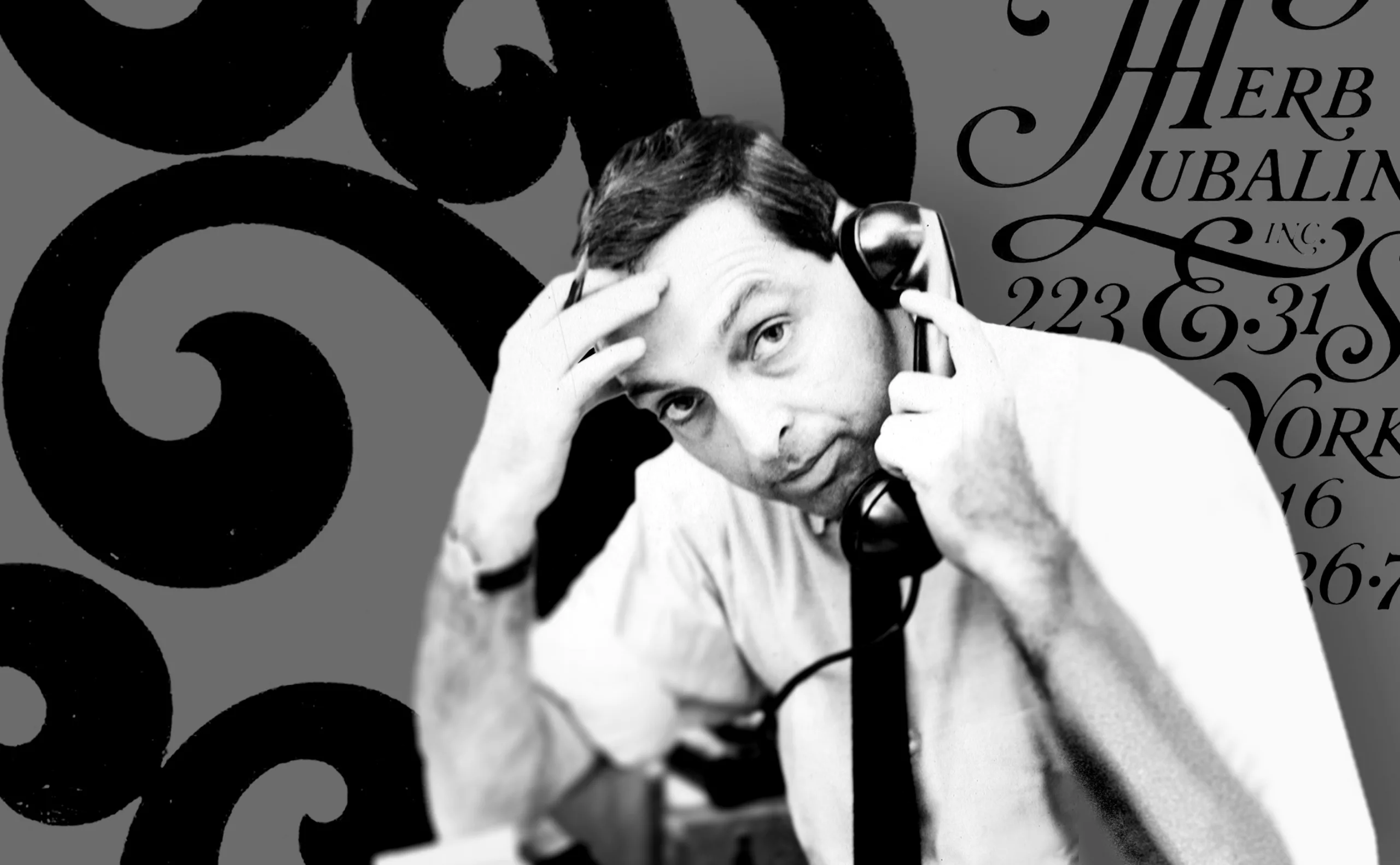
-
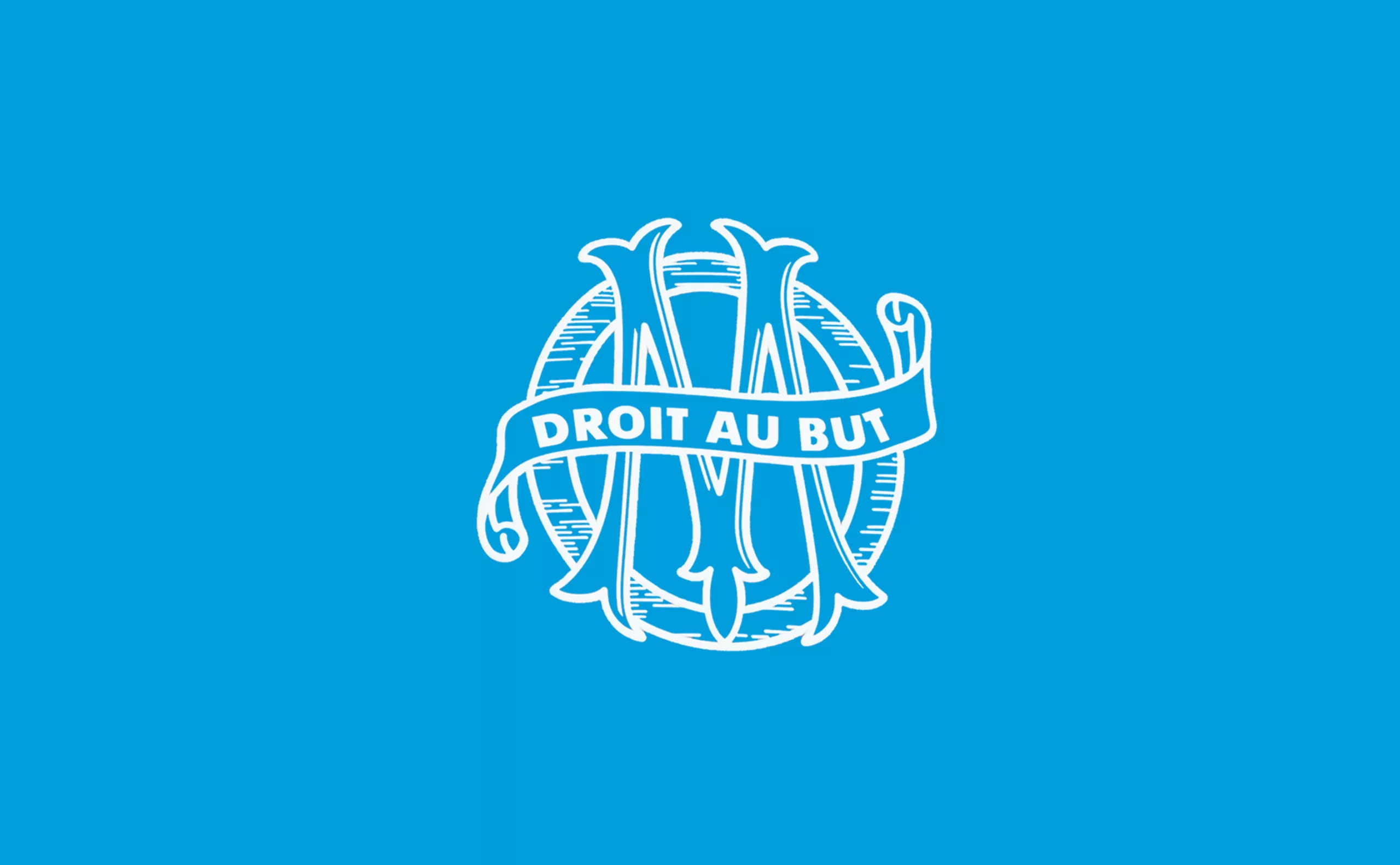
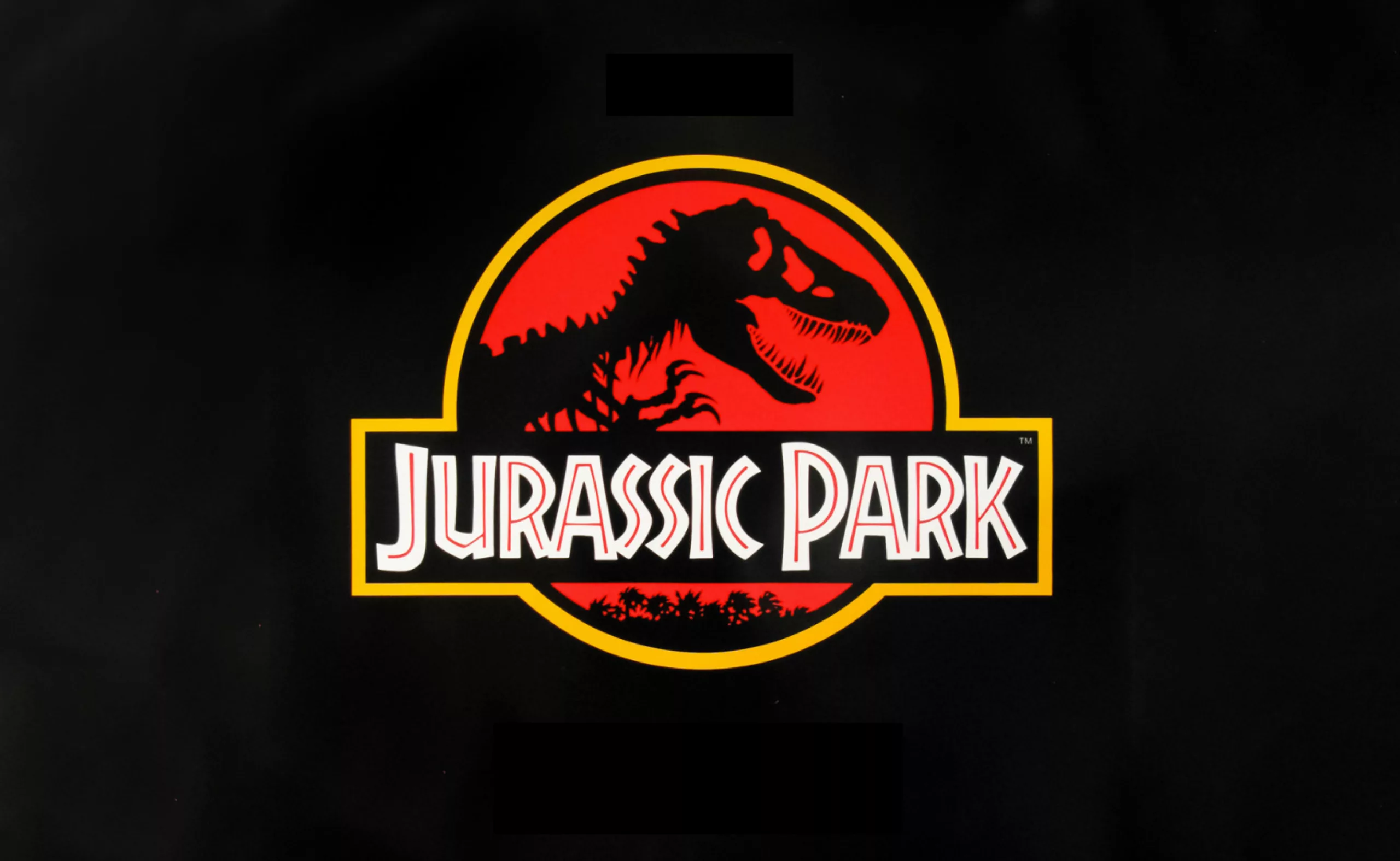
New logo for OM: analyzing a sports crest
OM will soon be changing its logo. This is an opportunity to delve into 125 years of heritage to understand the challenges of the future.
-

Erecting the image of the penis: anatomy of an iconic symbol
Two testicles, a shaft, sometimes a few hairs, rarely any talent. The penis is a universal icon, but no one dares talking about it. Except us.
Graphic perspectives
-
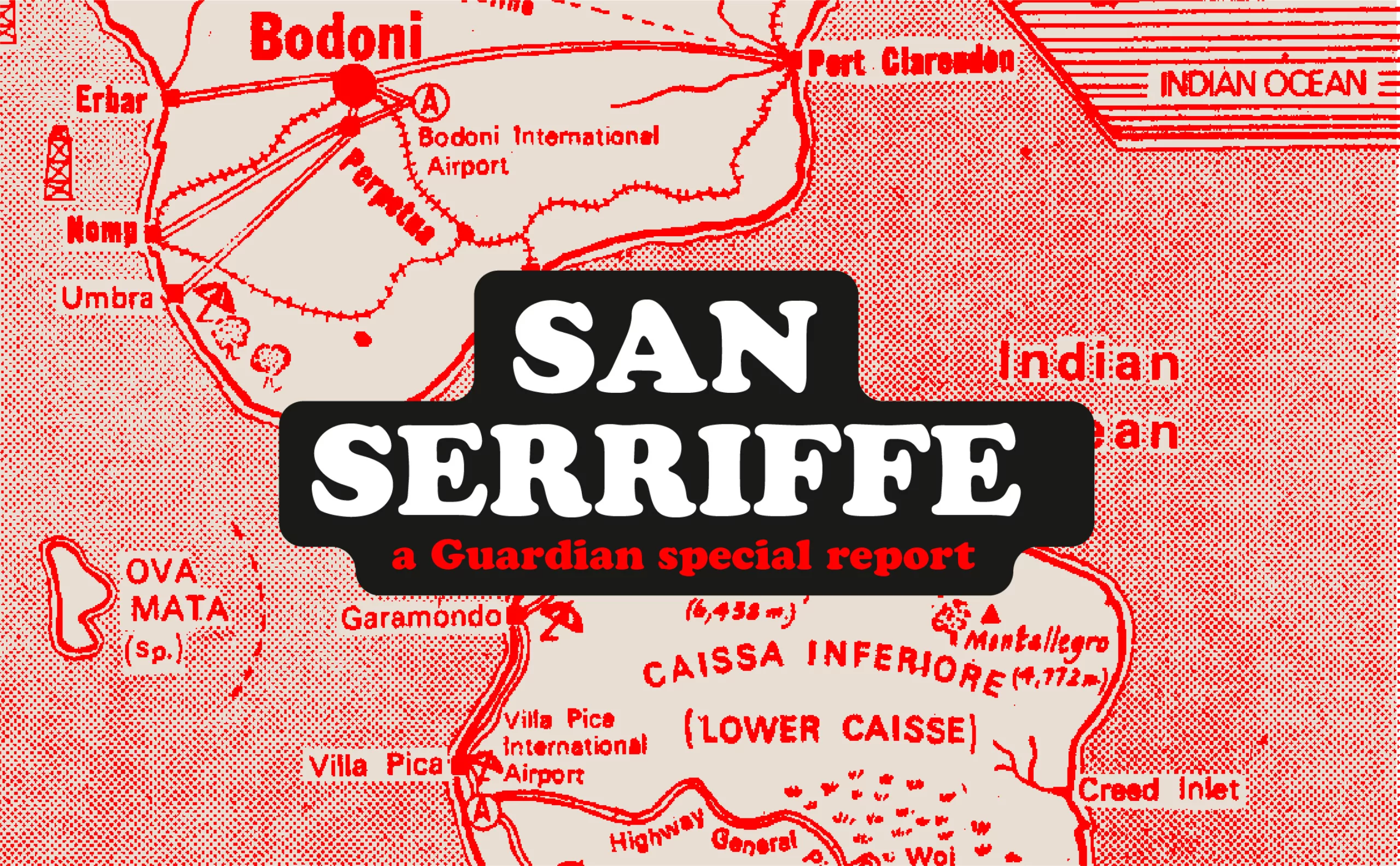
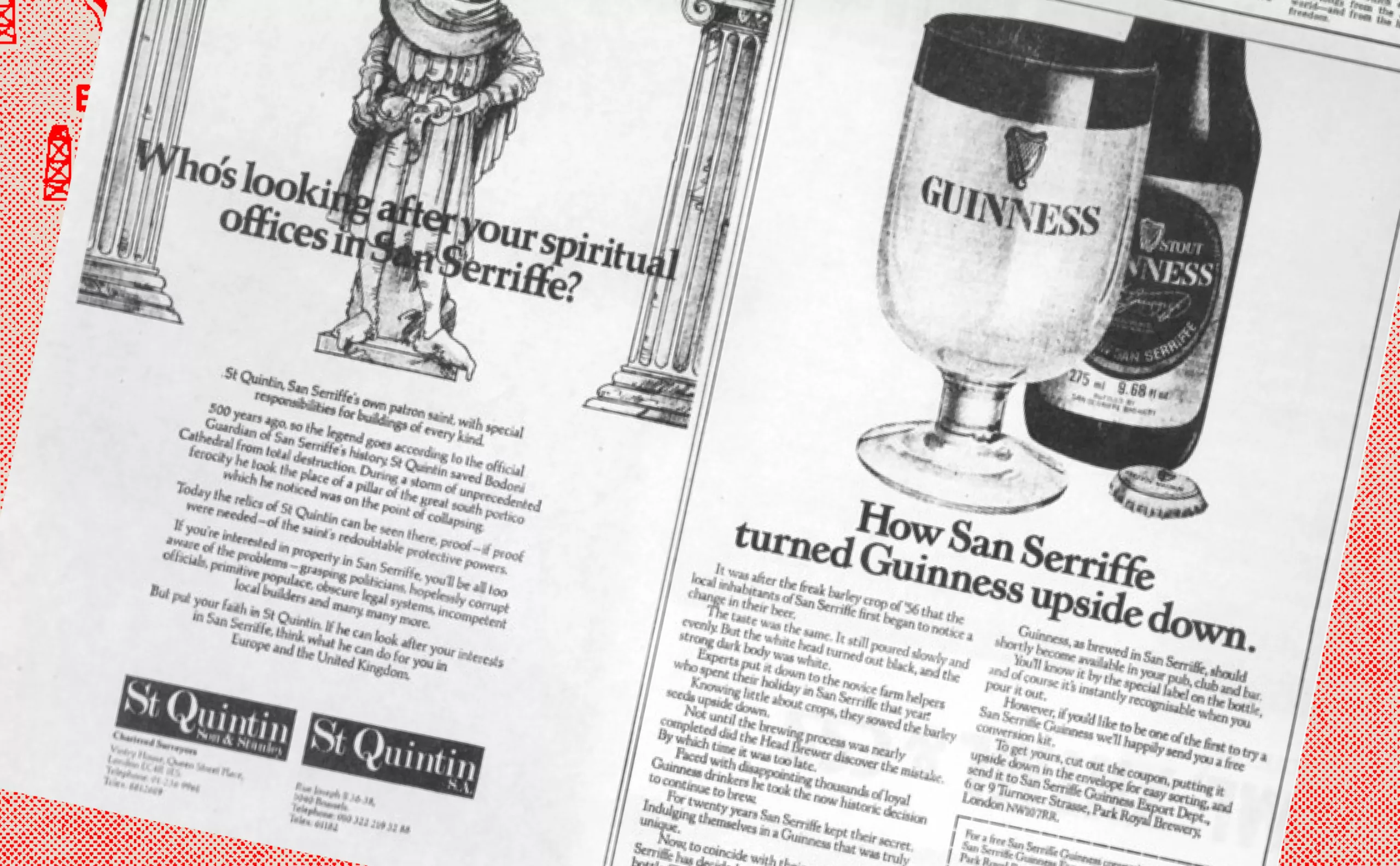
San Serriffe typographic Island
Discover how The Guardian tricked its readers into inventing the island of San Serriffe, a fictional republic born of a typographic April Fool’s joke that has become cult status. Between subtle satire and typographic wordplay, immerse yourself in one of the most brilliant journalistic hoaxes of the XXᵉ century.
-
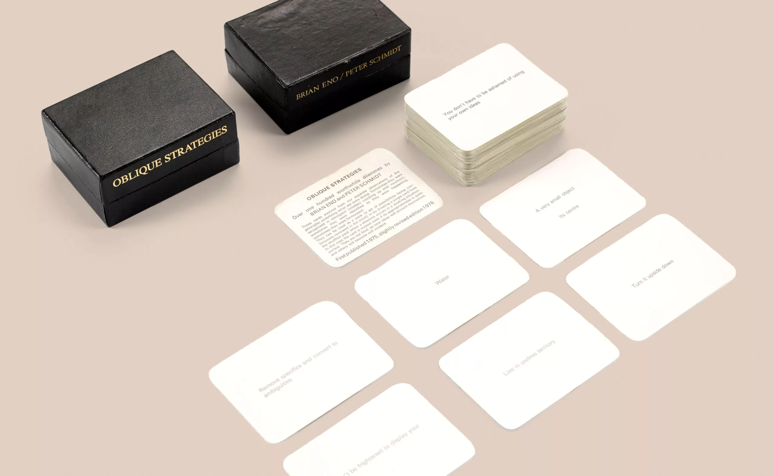
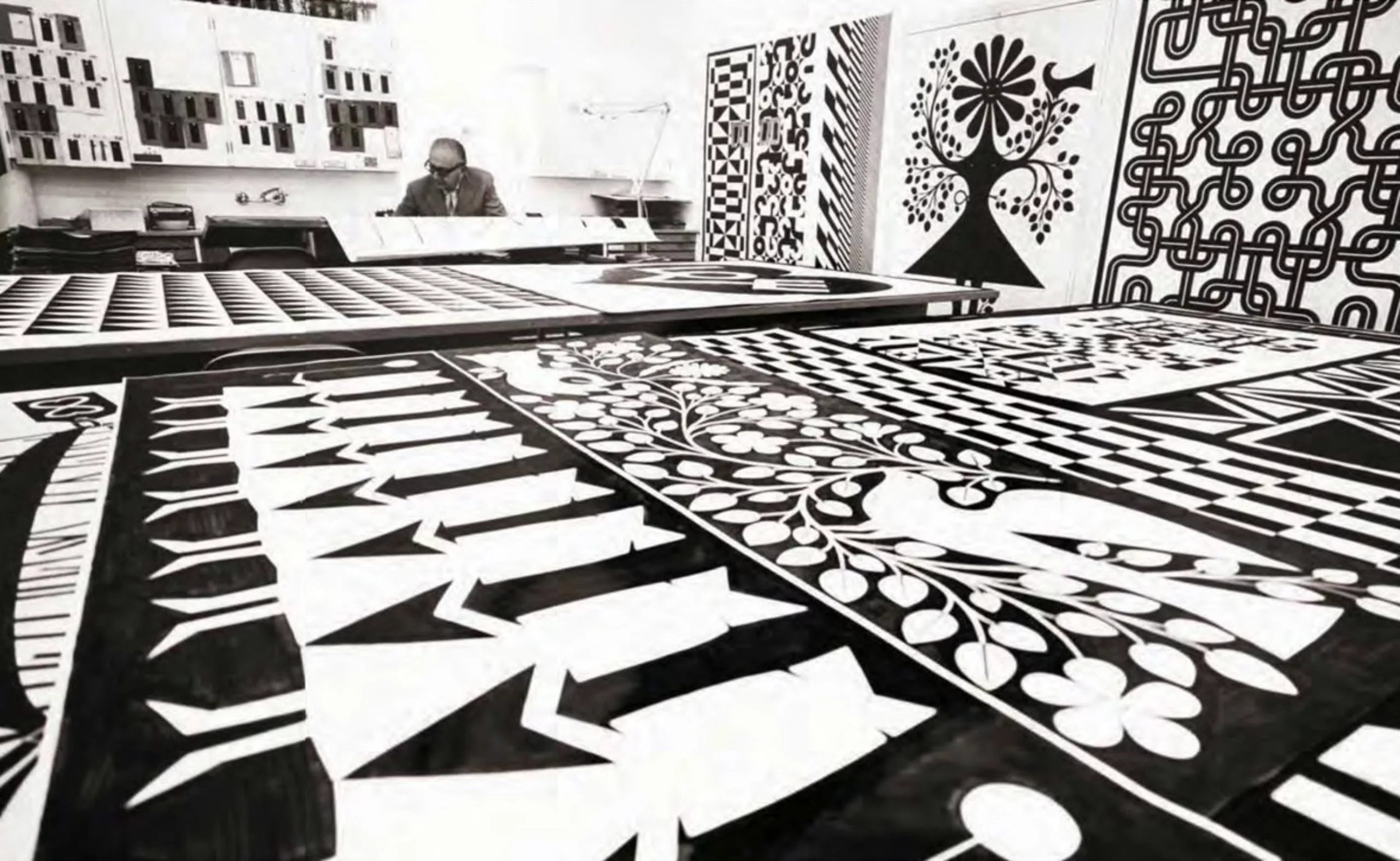
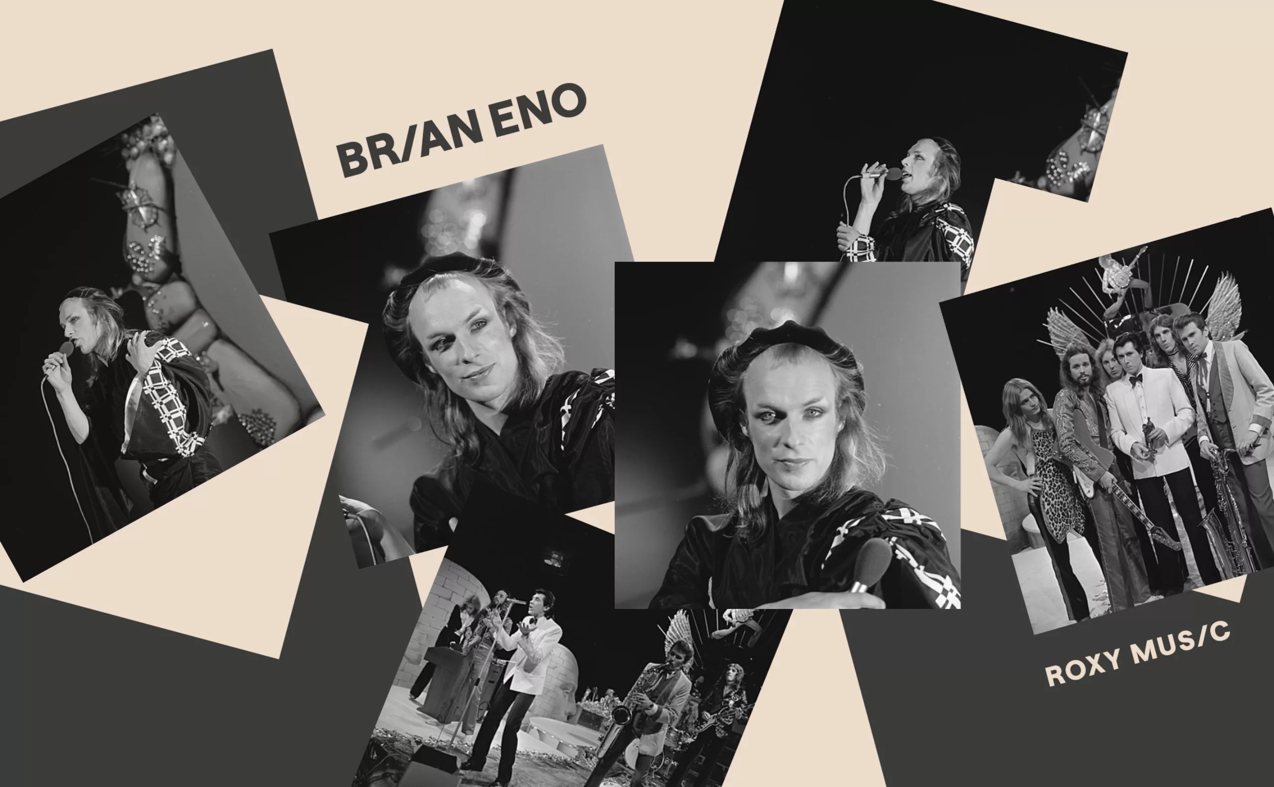
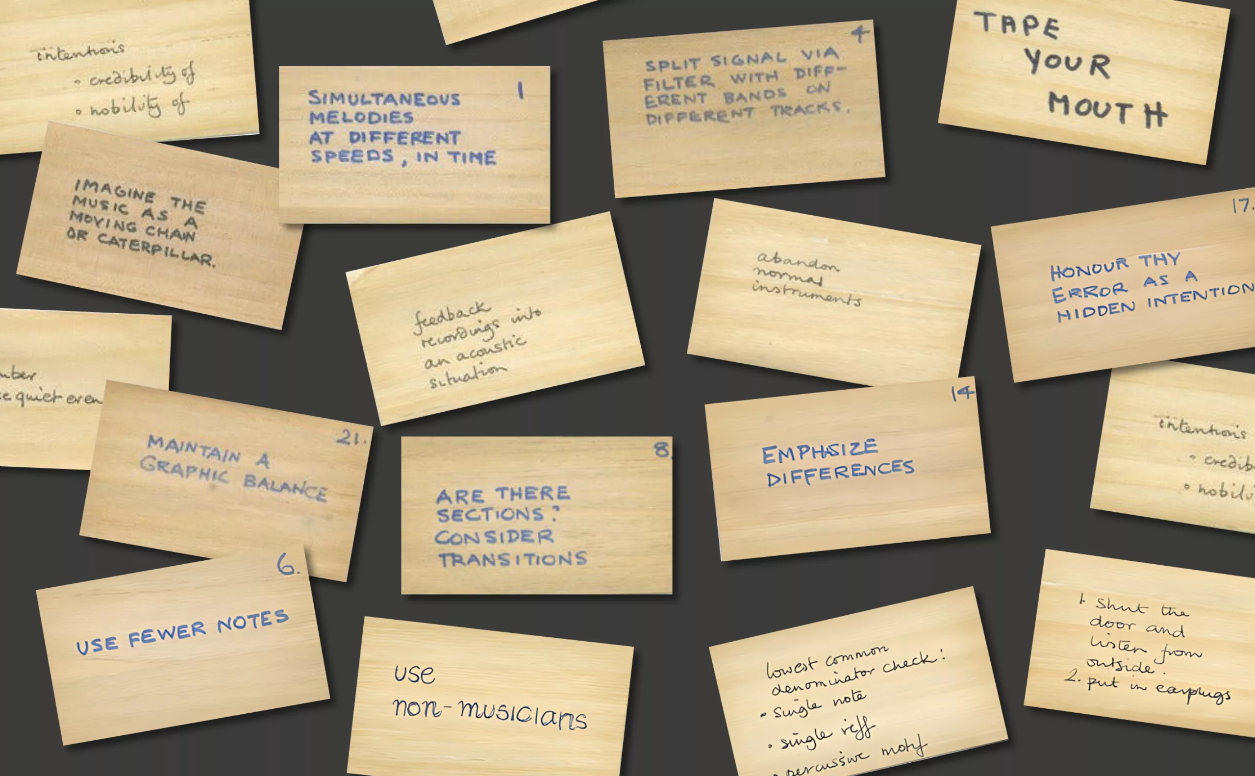
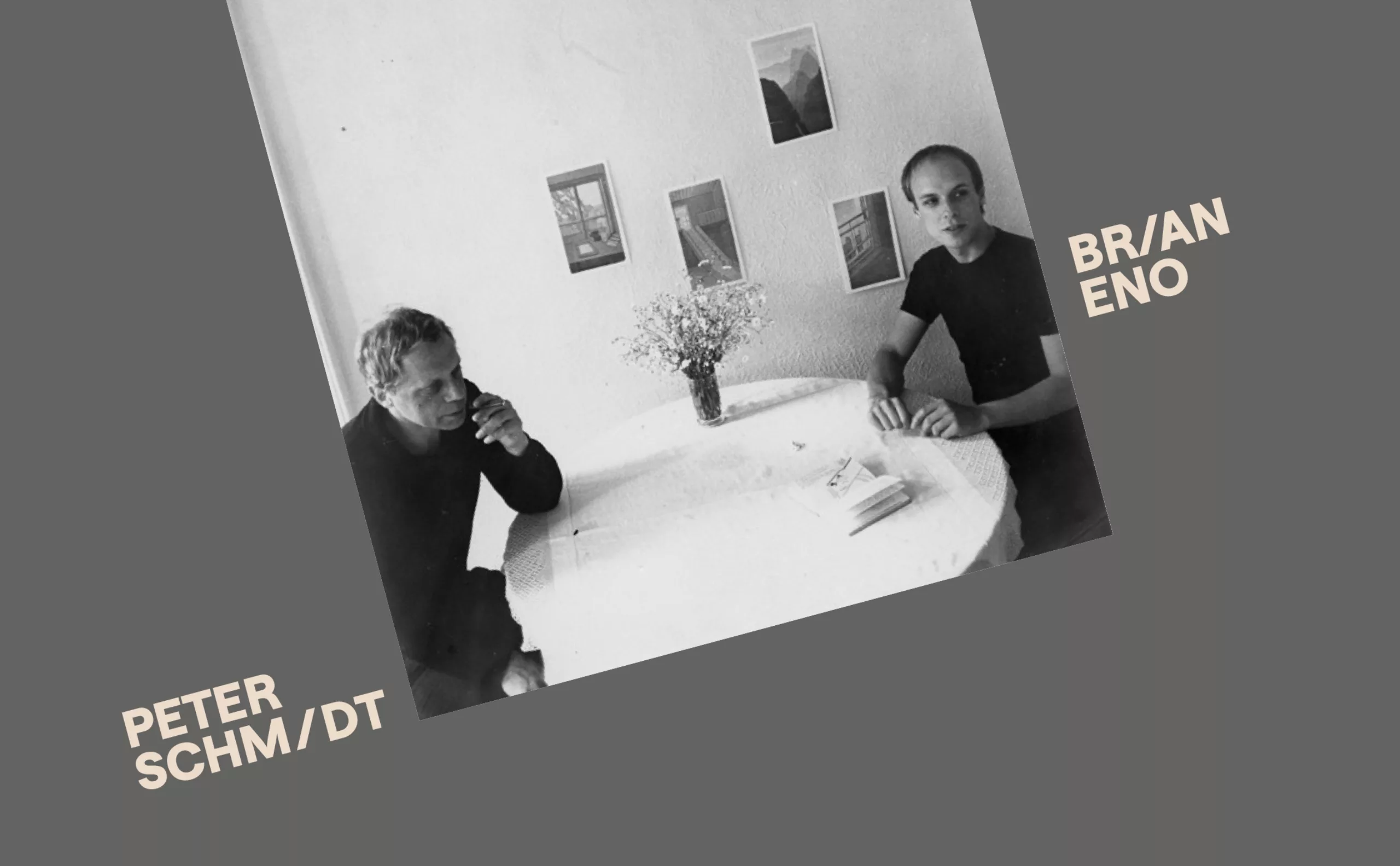
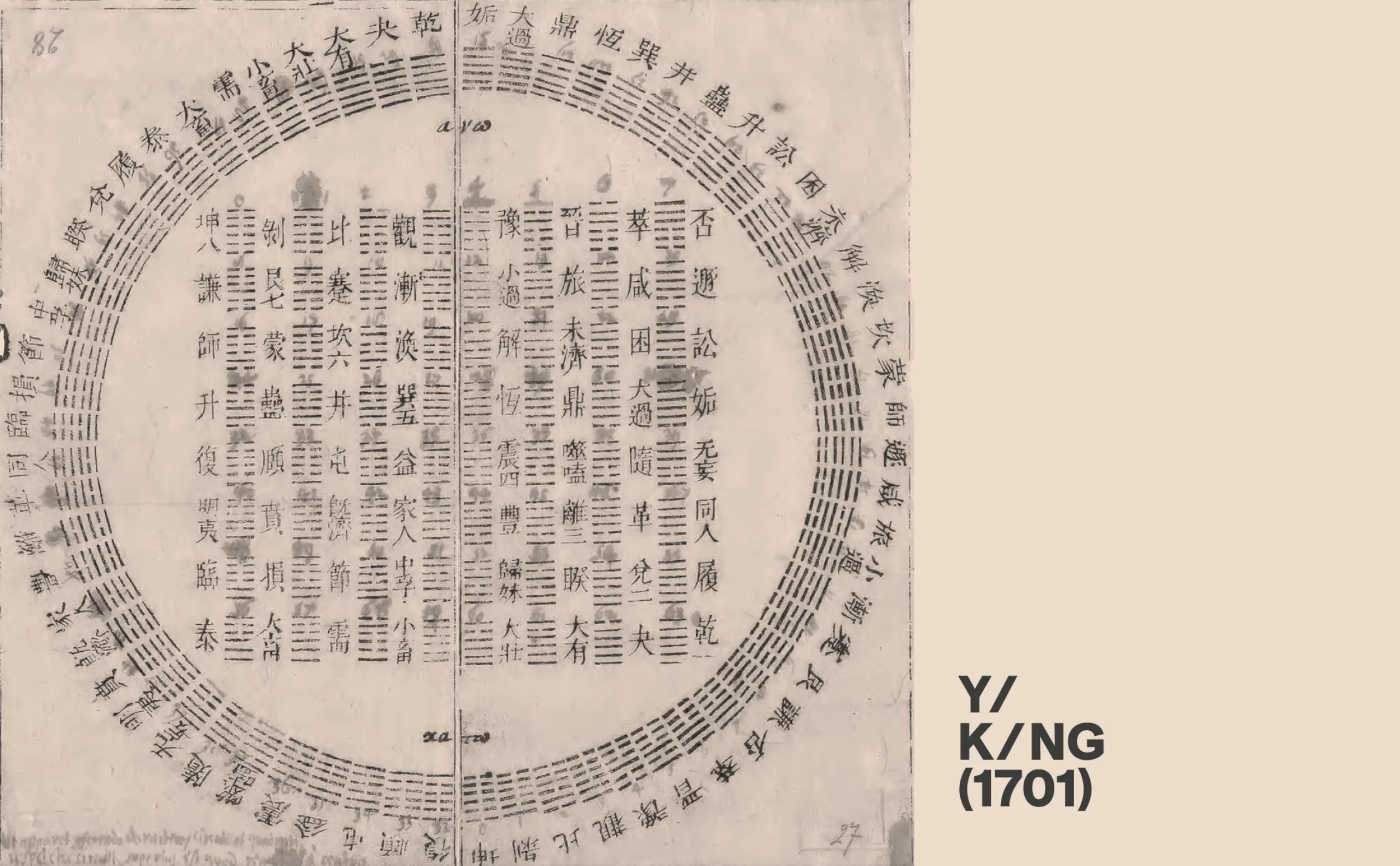
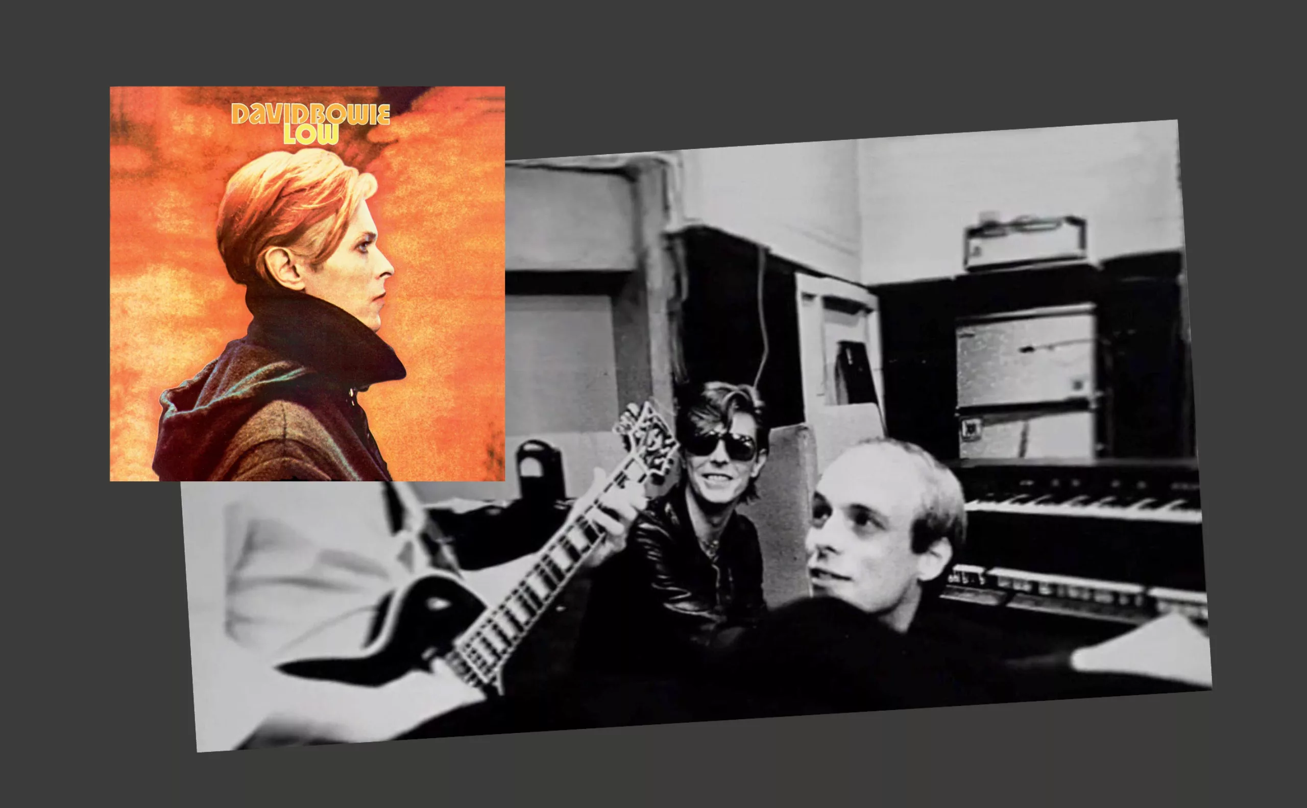
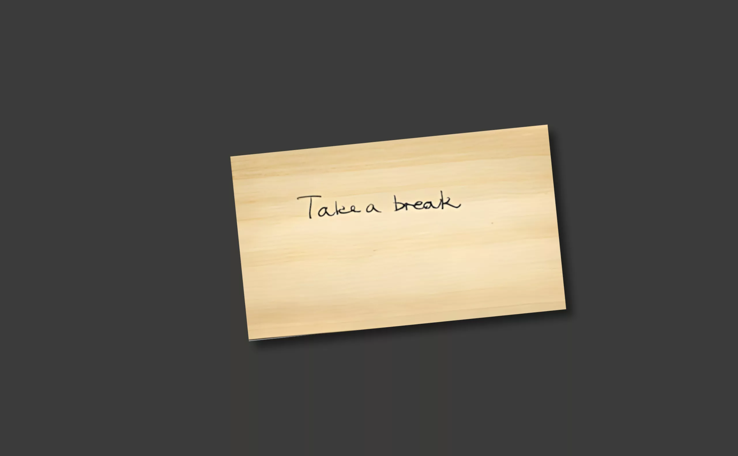
Design, creativity and oblique strategies!
Discover how Brian Eno, genius musician and producer (David Bowie, Iggy Pop, U2…), pushed back the limits of creation thanks to a simple card game: “Oblique Strategies”.
-
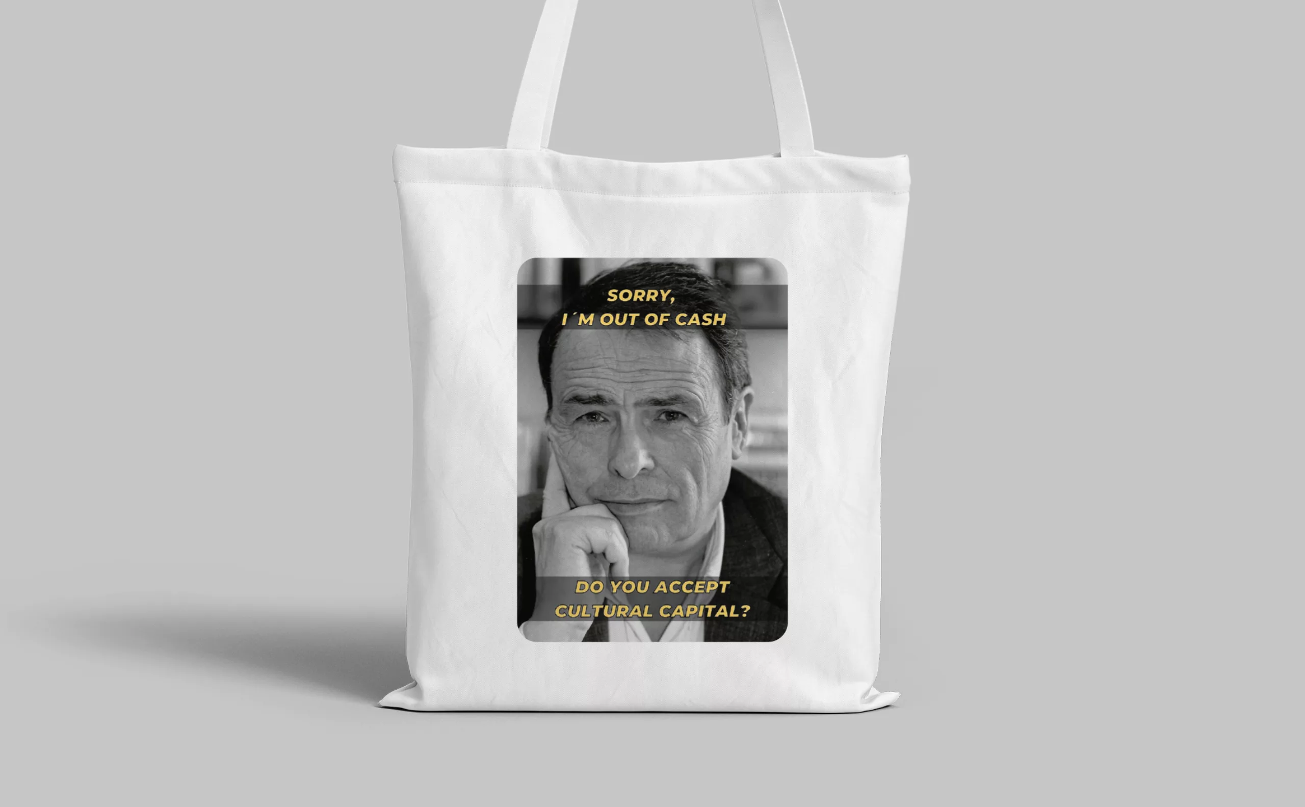
Tote bag, a new social totem?
The tote bag has become an essential part of our everyday urban lives.
What does it say about our society, our times, our habits and our behaviour? -
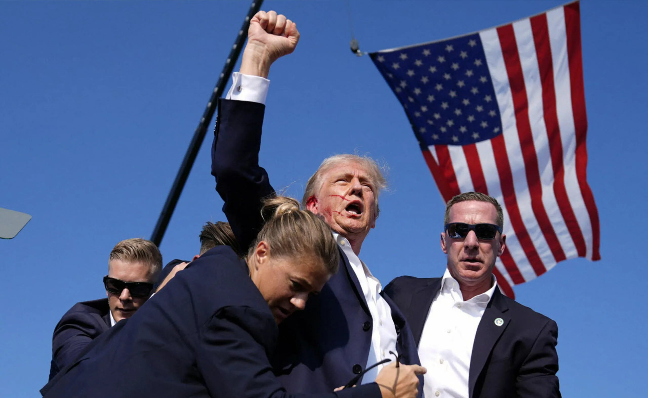
Donald Trump, the martyr who makes history
Donald Trump, his face bloodied, raises his fist and seems to proclaim “I’m alive, fight!”.
Let’s decipher an image that has gone down in history at the speed of a shotgun blast.
History of Graphic Design


Discover
the portfolio
Graphéine supports brands that want to make design a driver of social and economic transformation, helping them meet the challenges of tomorrow. We believe that a brand is a powerful tool for creating fresh narratives, uniting imaginations and shaping desirable futures.
Brand culture
-
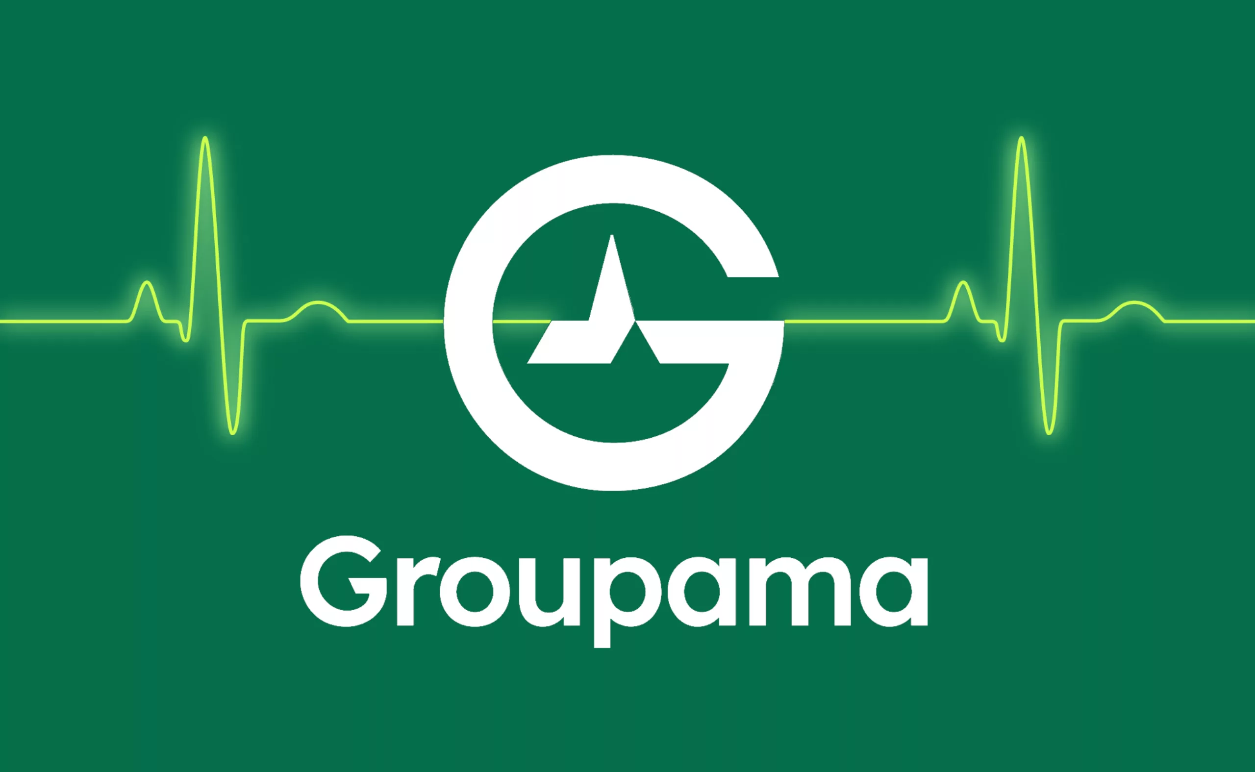
Groupama’s new visual identity, a logo in the open countryside
Groupama has just unveiled a new logo that updates its graphic design by abandoning its campaign in favor of a “startup” aesthetic.
-
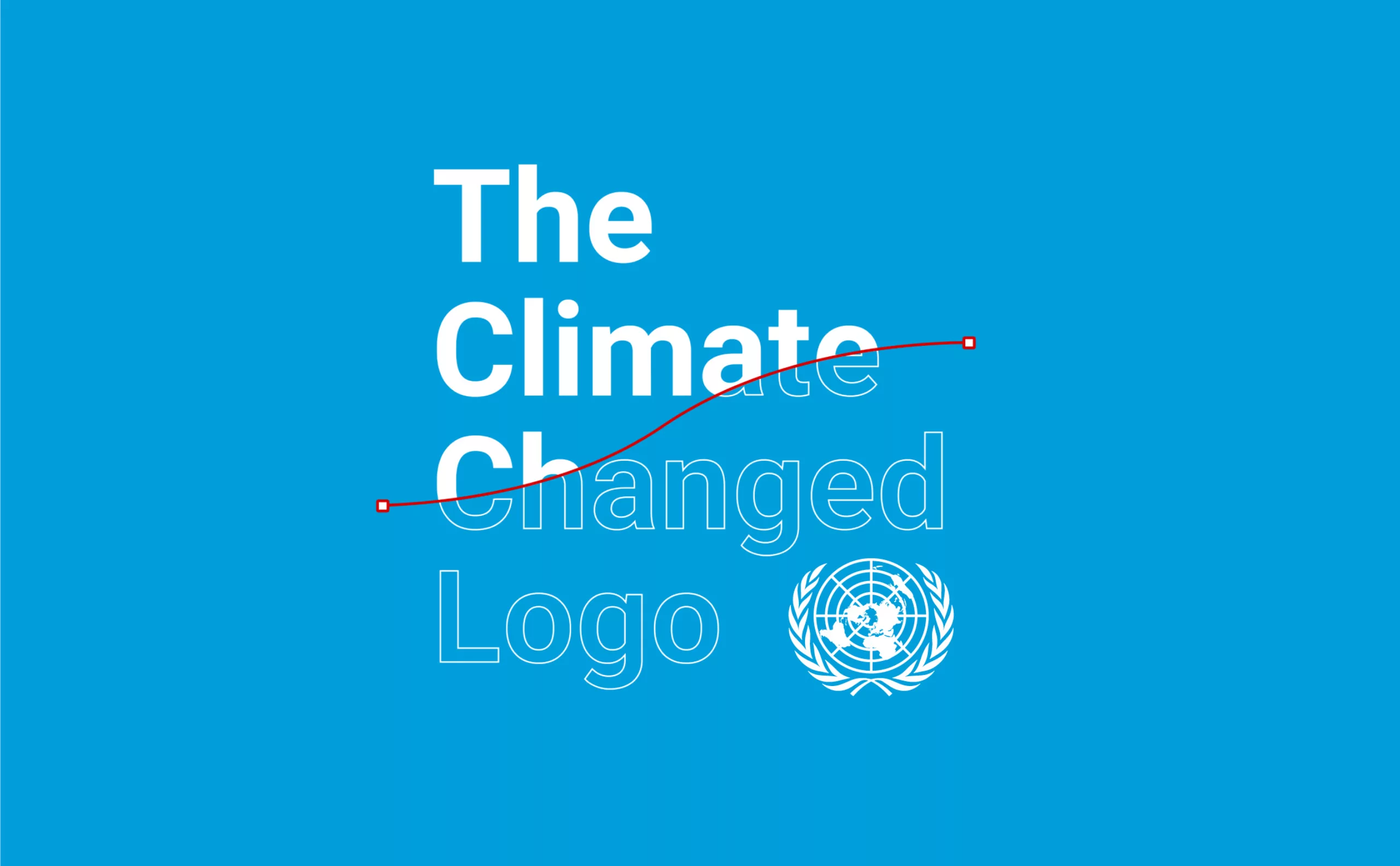
The UN logo takes on water during COP28
For COP28, two designers have come up with a new UN logo showing the rising sea levels and the future disappearance of much land and coastline.
-
Evian x Balmain, a deep water co-branding strategy
This surprising co-branding gives us the opportunity to look back at the history of evian and to decipher the stakes of this strategy of luxification, greenwashing and the issue of plastic waste.
-
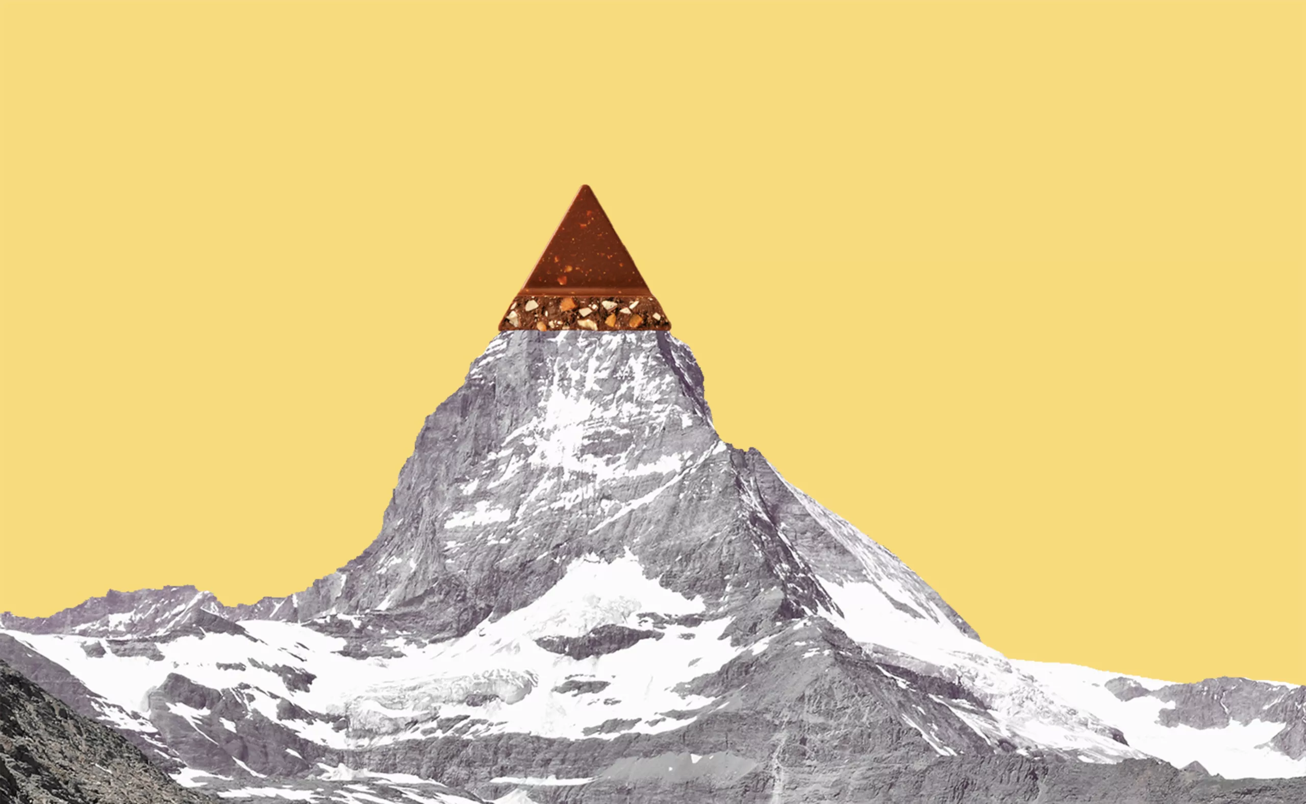
Toblerone’s new mountain: when packaging brands a territory
From Toblerone to Milka to feta cheese, brands mark their territory on their packaging and are sometimes caught up in the globalization game.
