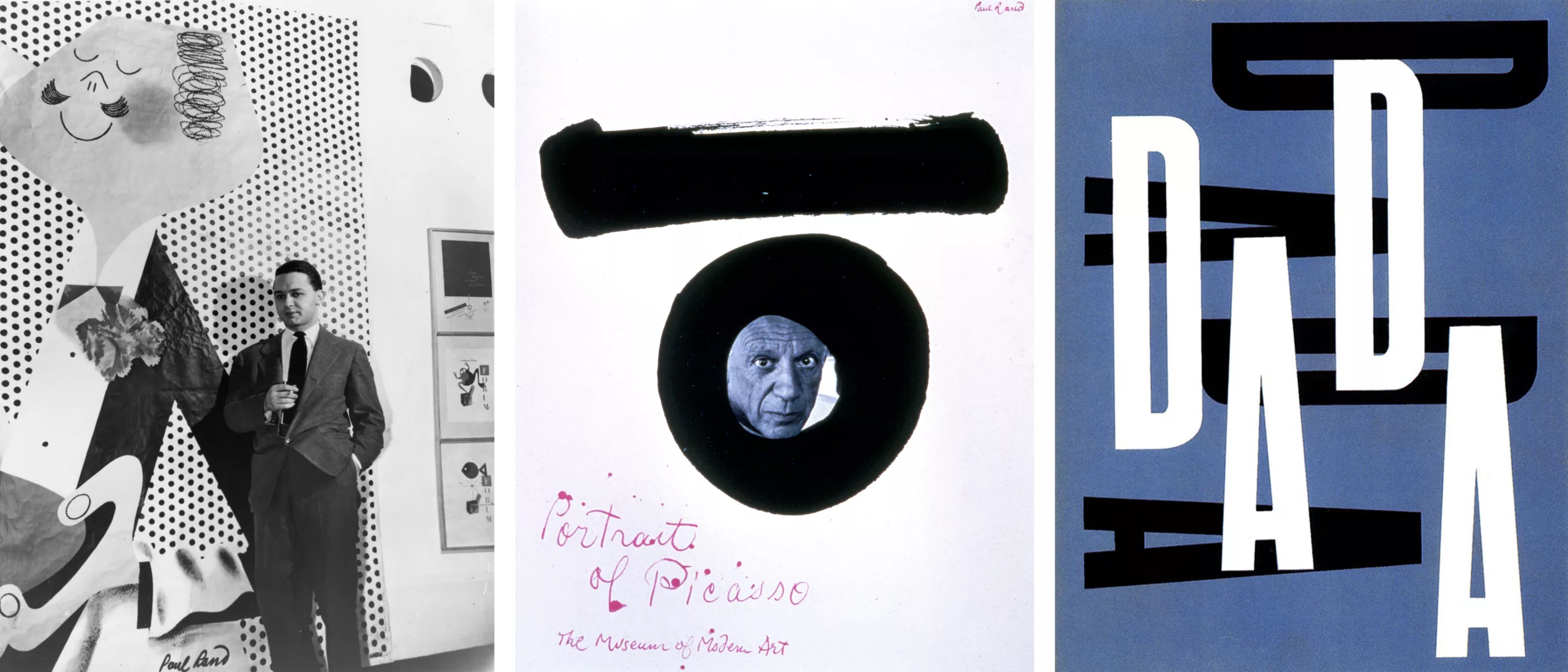
Paul Rand, everything is design!
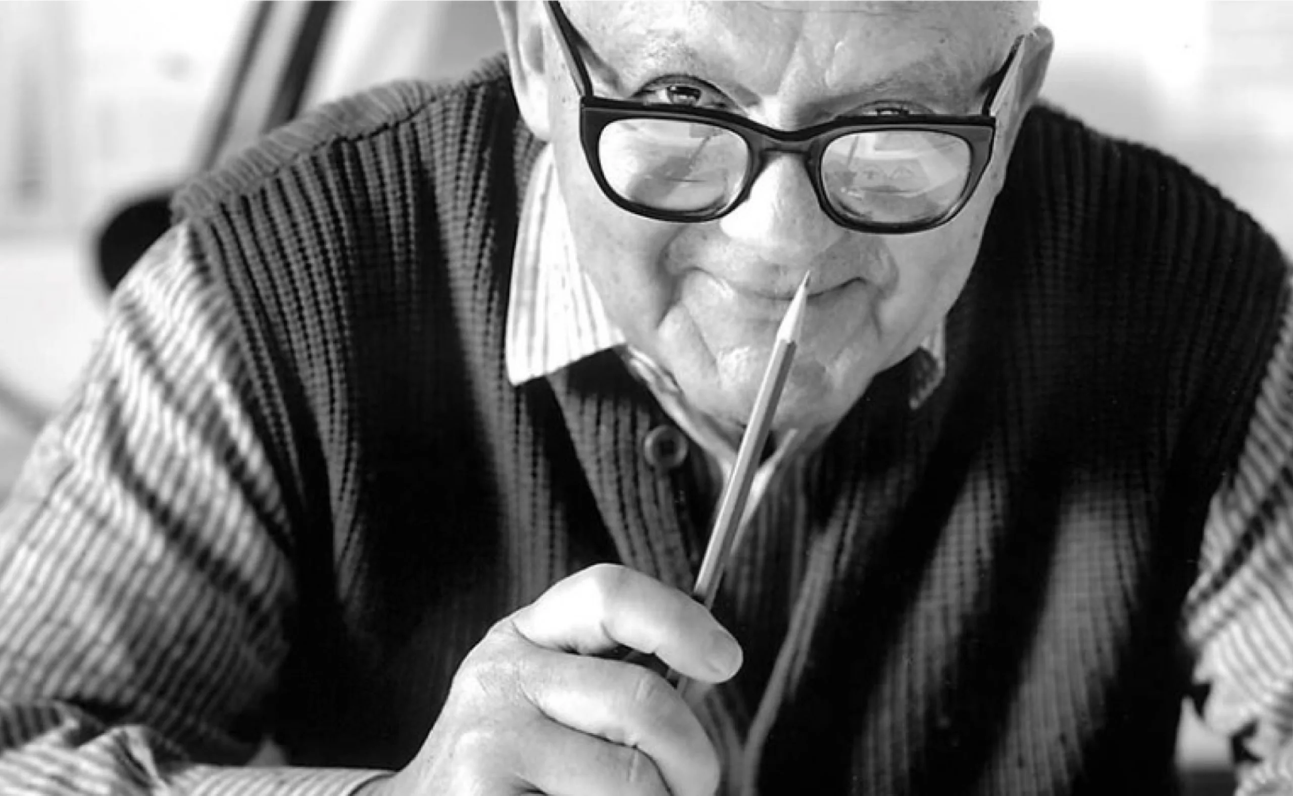
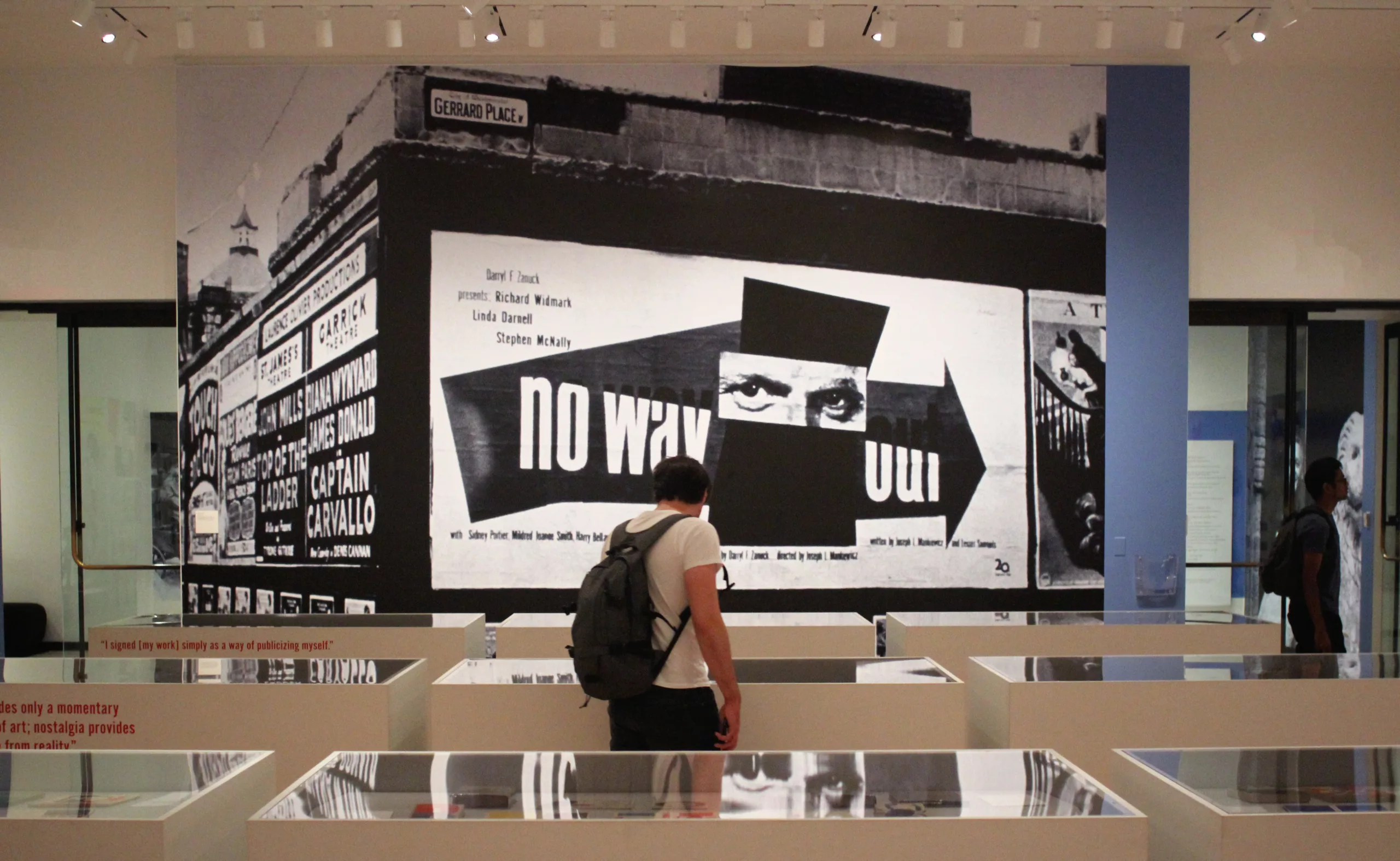
In the series of articles by the big names in graphic design, here is Paul Rand‘s portrait. While in New York for the Brand New Conference in 2015, we took the opportunity to visit the exhibition dedicated to his work, and rediscover the work of the designer who will change the face of the United States, and whose influence is still felt today, starting with ourselves at Graphéine. We love Paul Rand. We hope you will like it too!
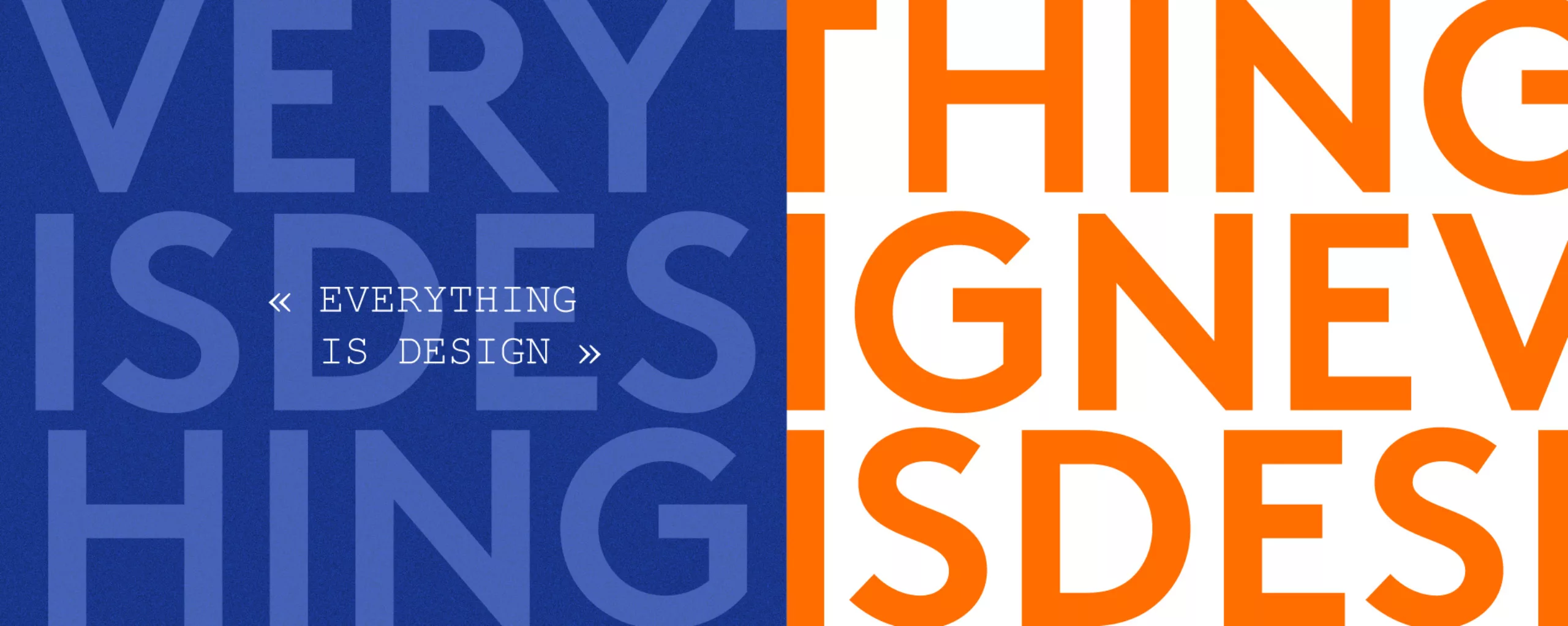
Everything is design!
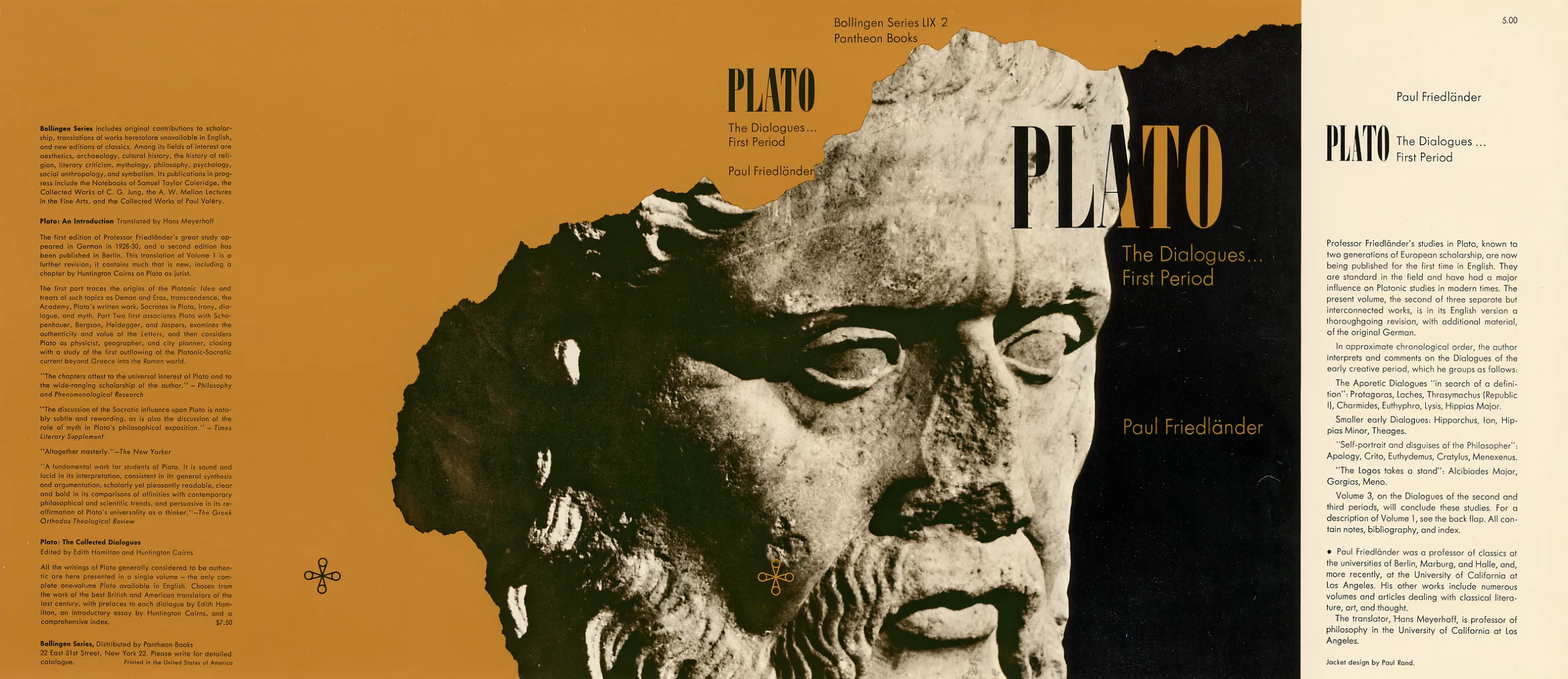
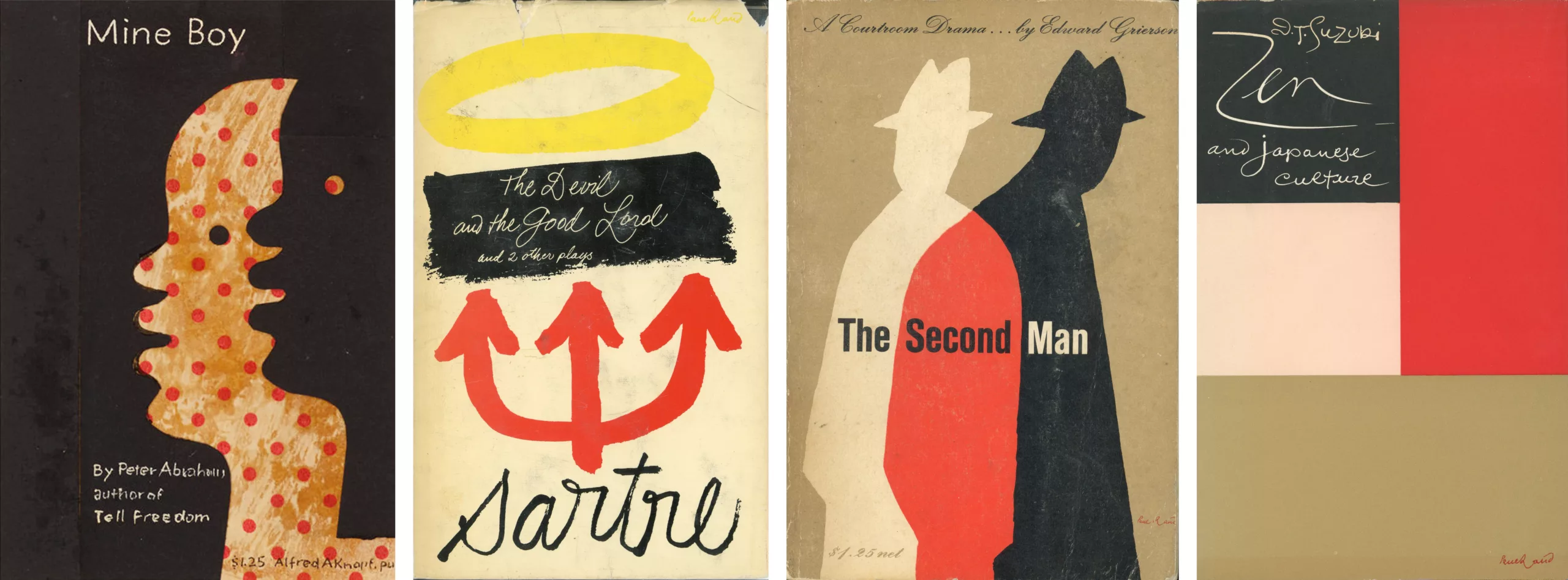
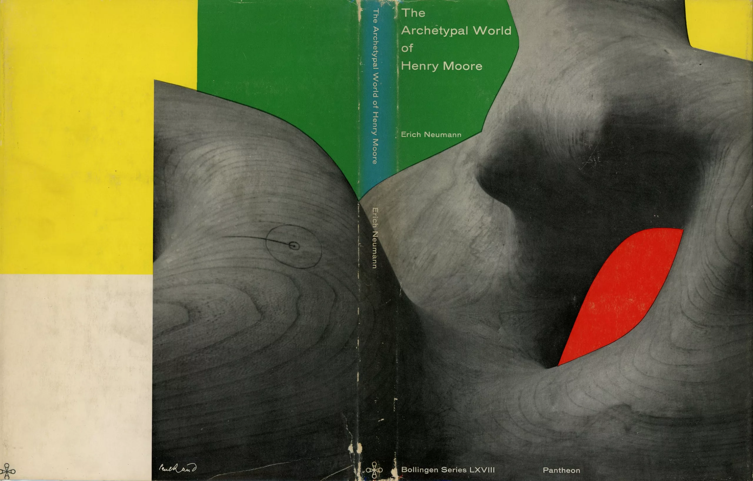
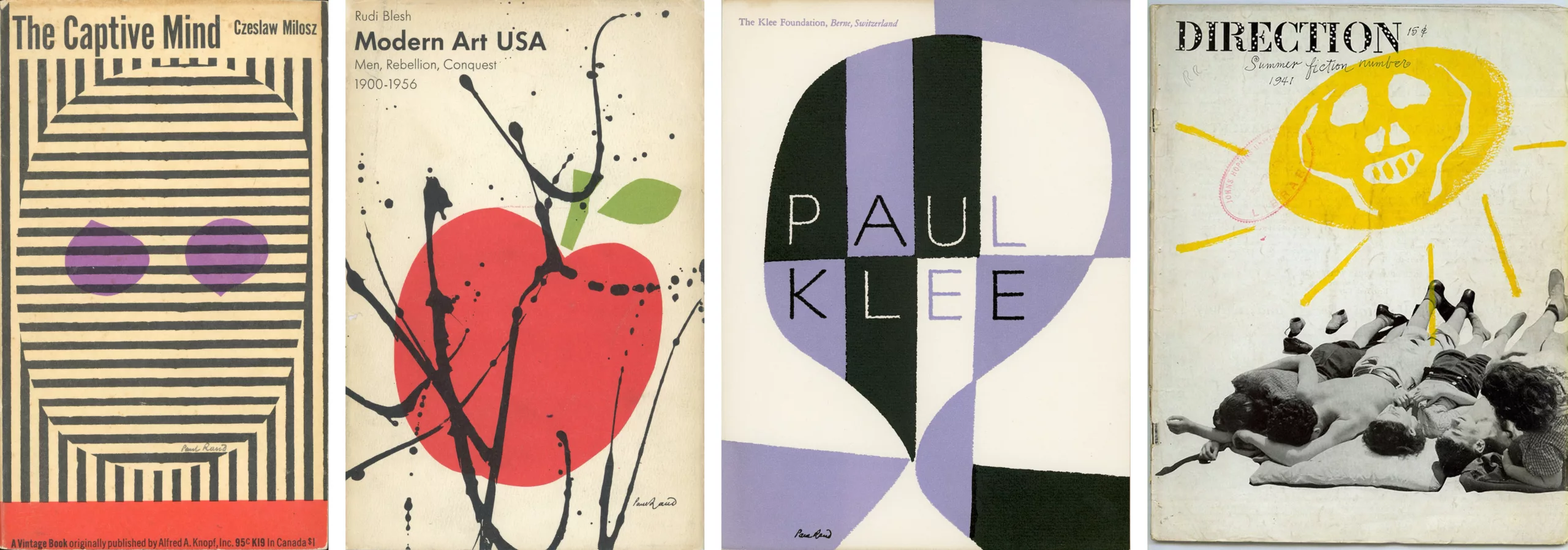
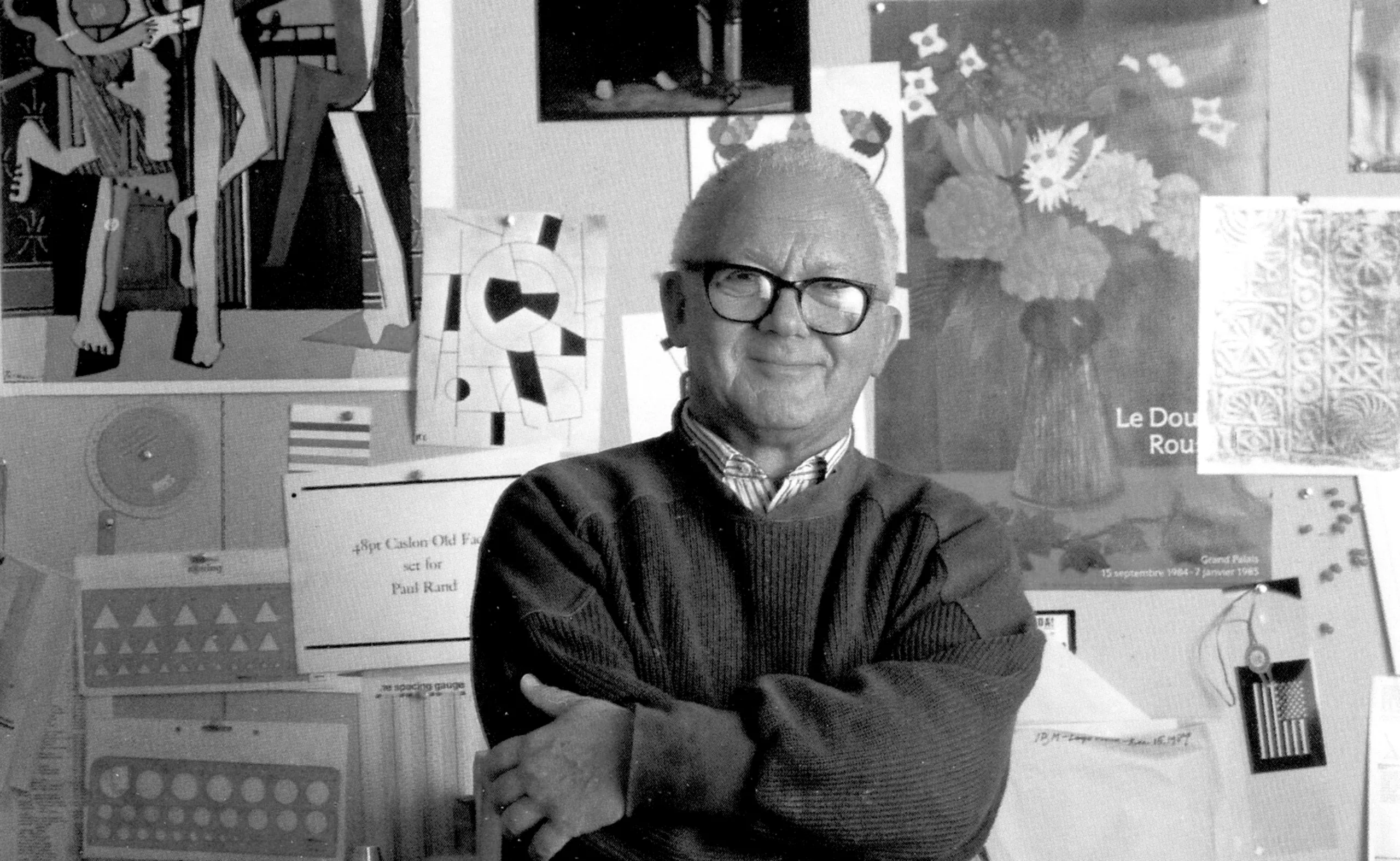
Born Peretz Rosenbaum in 1914 and deceased in 1996, Paul Rand is a graphic design legend. Throughout his 60-years long career, he changed America’s opinion on visual communication. With his editorial designs, advertisements, and visual identity works, Rand brought avant-garde European ideas to the United-States, mixing visual arts and commercial design. His colourful combinations, approach of typography and use of media translate his desire to “defamiliarize the ordinary“. His style consequently still have an impact on graphic design today.
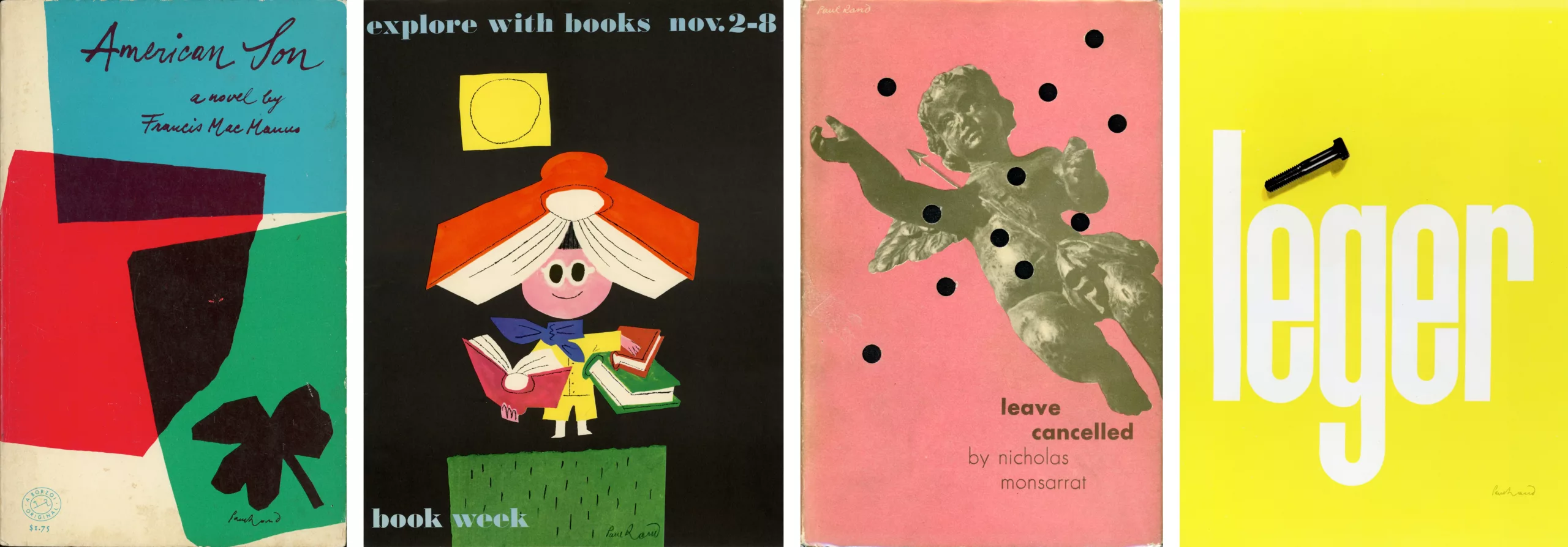
Rand first made his mark in the 1930s with a bold and modernist style, designing magazine and book covers a few years later. He brought winds of change to Madison Avenue by creating advertisements inspired by the famous German Bauhaus school, or by movements such as De Stijl or Russian constructivism. Rand was convinced that the strength of graphic design lies in its ability to be a universal language, through the simplicity and geometry of its forms. He thus said: “one quickly realizes that simplicity and geometry are the language of timelessness and universality“.
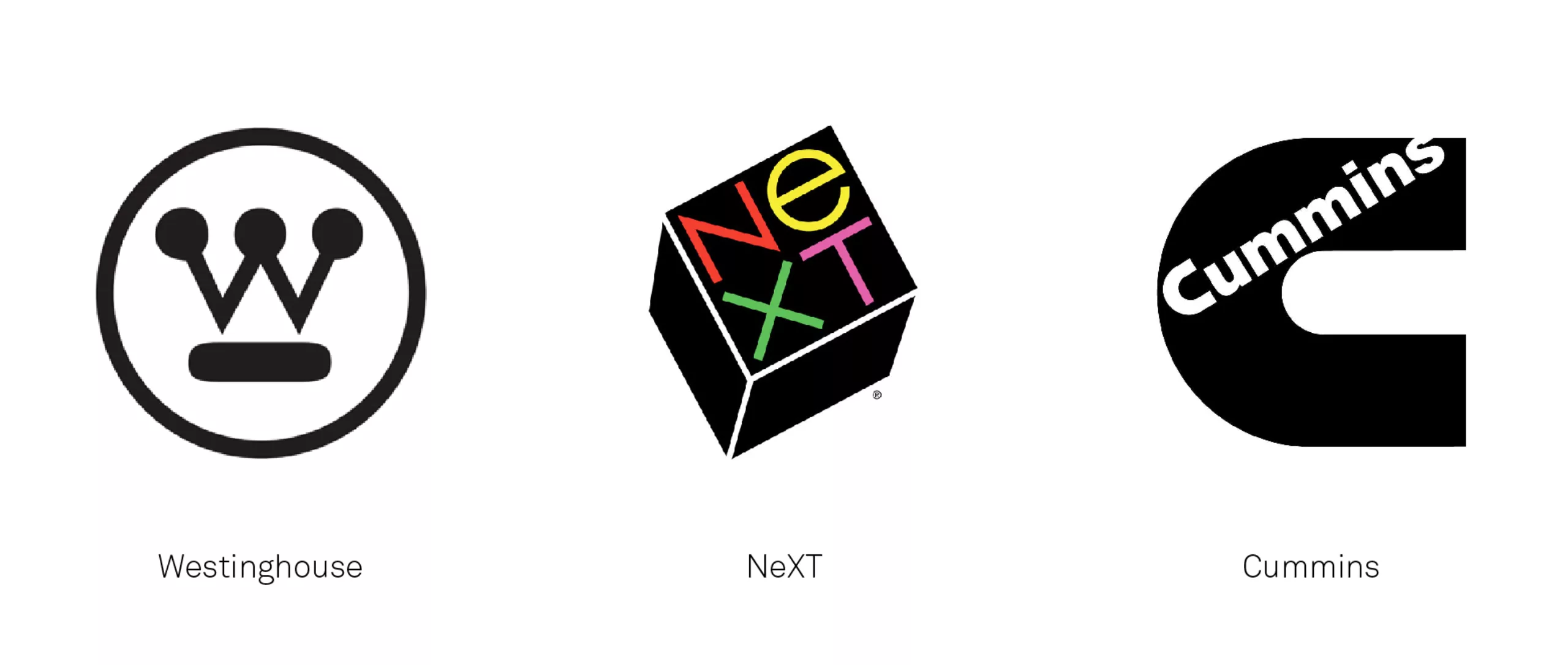
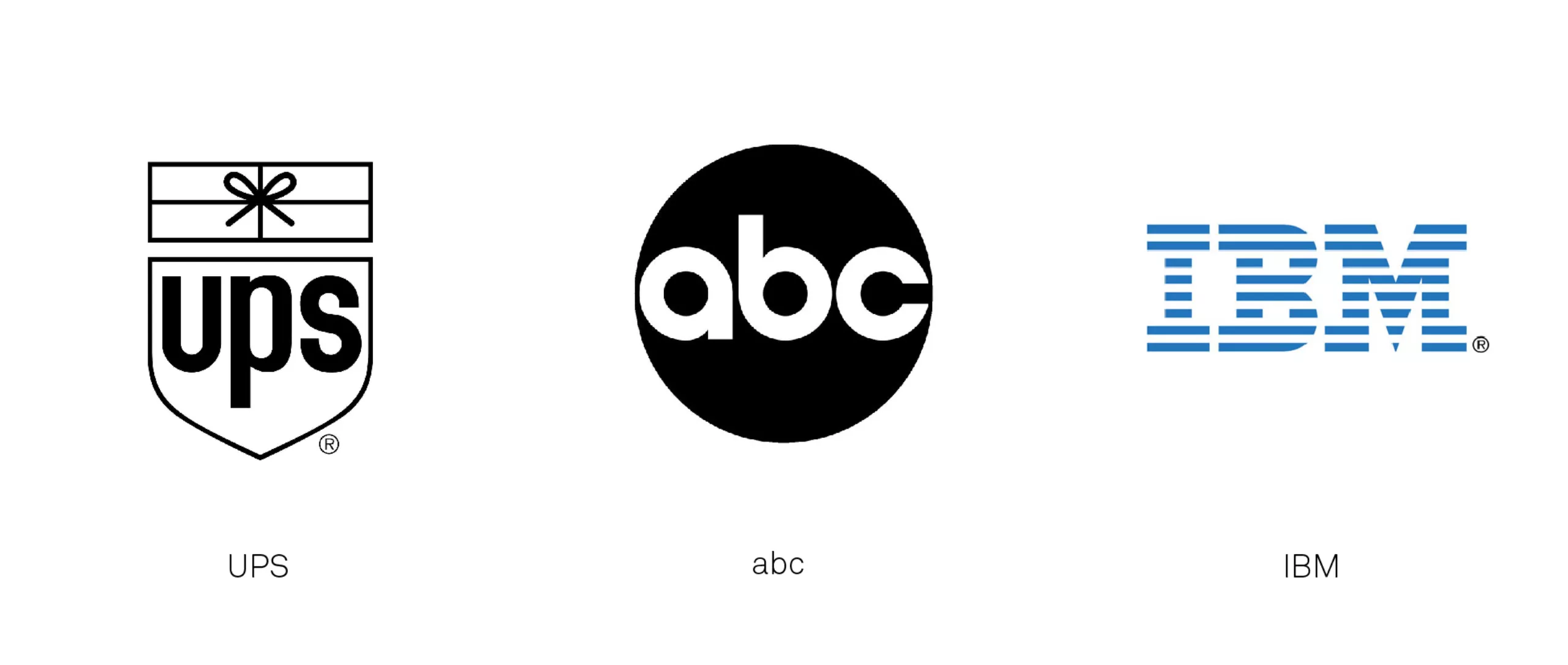
After the war, from 1955 onwards, he distinguished himself with progressive graphic identities that served companies’ interests. As an artistic director, he helped to transform the advertising industry by emphasizing the importance of graphic design and visuals over writing. He produced logos for large companies such as IBM, ABC, UPS, or Steve Jobs’ NeXT, still legendary and almost unchanged to this day (except UPS).
By creating complete brand identities, Paul Rand transformed corporate communication in North America. According to his colleague Lou Danziger, he managed to persuade companies, almost on his own, that design can be a powerful business tool. As an author, teacher and designer, Rand confirmed the idea that good design is good business as Thomas J. Watson Jr., IBM’s CEO, stated. Paul Rand invites his clients, students and ourselves to look at the world with a fresh eye, because: “everything is design! »
Poet and businessman
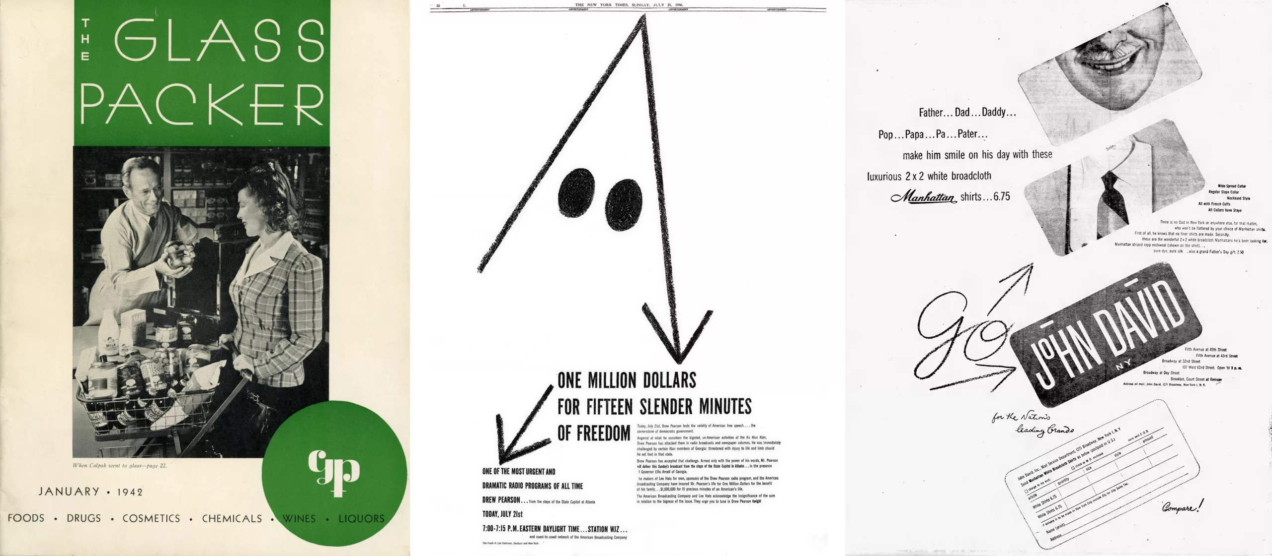
Born in Brooklyn from Orthodox Jewish parents, Paul Rand started practicing his art as early as 3 when he recopied commercials in his parents’ shop. Well not exactly recopying, because the Jewish religion represses figurative representation. This is probably where his interest in abstraction began. In 1934, after taking lessons at New York’s Pratt Institute and the Art Students League, Rand began his career by making illustrations for a union that sold them to newspapers and magazines for advertising and articles. The following year, yearning for more control over his work, Rand went solo, creating layouts and ads for a small group of clients. He was 21 years old.
During this period, concerned that his Jewish identity might hinder his progression in the professional world, especially in advertising, he changed his name from Peretz Rosenbaum to Paul Rand – a name that since became iconic, foreshadowing his genius in brand identity
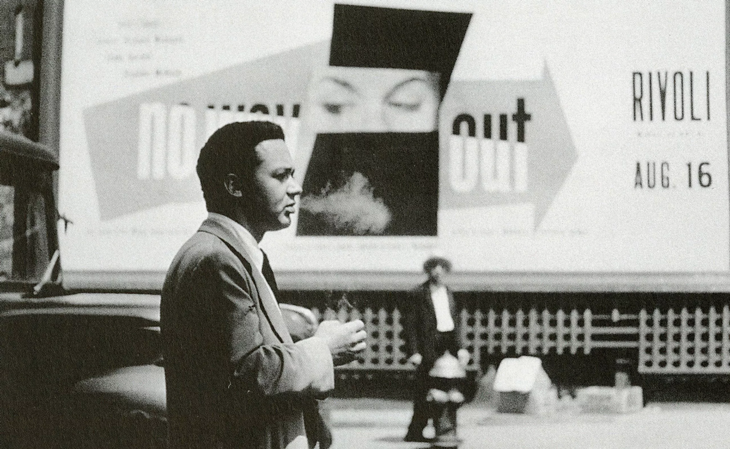
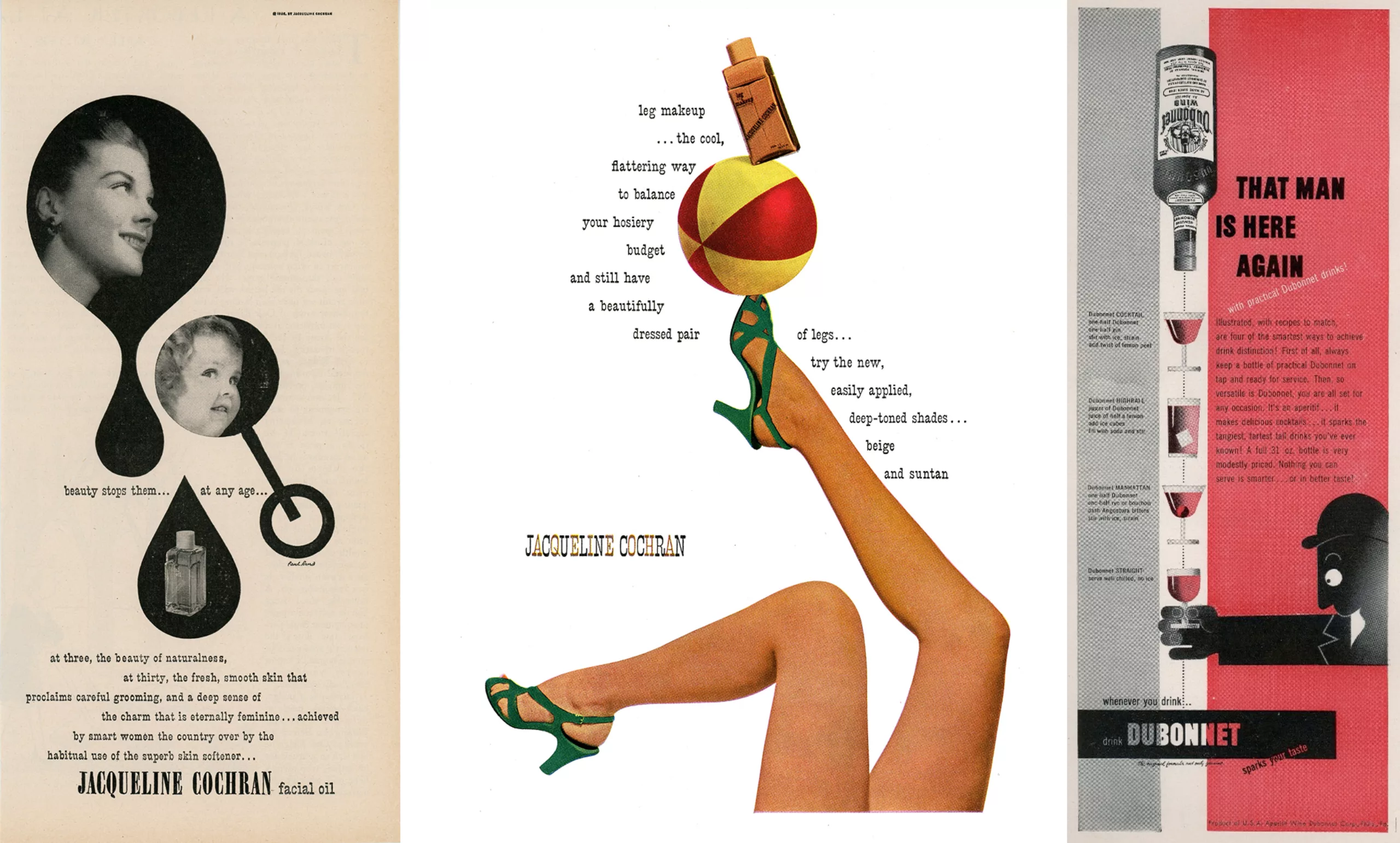
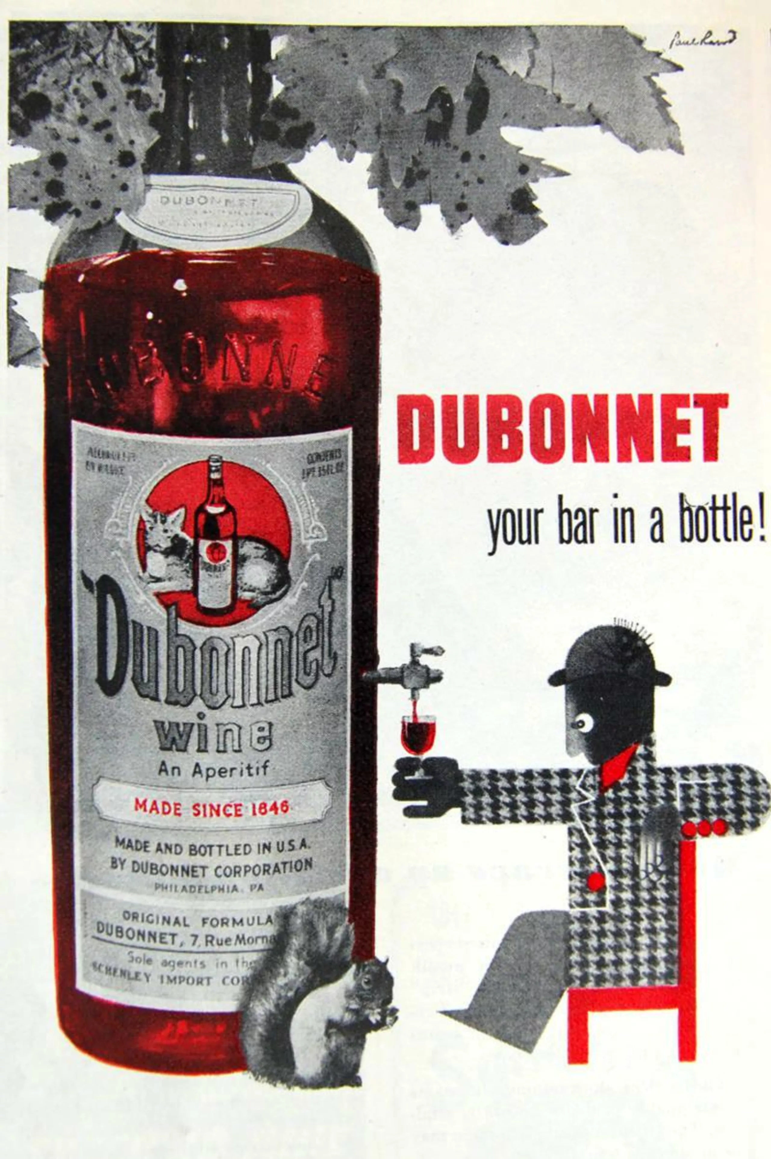
In his magazine covers, since the late 1930s, Rand adopted both European modernism and American spirit and functionalism in his graphic style. His distinctive signature was praised by László Moholy-Nagy, a master of the Bauhaus and one of Europe’s most famous modernist designers, who had recently immigrated to Chicago. “Among all these young Americans, he writes, it seems that Paul Rand is one of the best and most competent. He is an idealist and a realist, who uses the language of the poet and the businessman.” Rand’s work was regularly featured in the daily lives of Americans in advertising posters and logos for consumption brands, from alcohol to make-up.
The modern American man
Rand’s art achieved its full maturity in the 1950s, which coincided with a dynamism in the New York art scene, inspired by European abstract art. Indeed, European modernism – embracing abstraction, asymmetry, and dynamism in typographical and pictorial composition – attracted considerable attention since the Second World War, as many artists had left Nazi Germany for America. Rand embraced these new trends with open arms, already touched by German and British modernist design in his teenage years. His inspirations are Cassandre, Miró, Klee, or Léger… He once stated: “It is integrity, honesty, absence of sentimentality and absence of nostalgia, it is simplicity, clarity. That’s what modernism means to me…”
One must underline that at that time, in the middle of the Cold War, abstract artists (like Pollock) were promoted by the American government via the Congress for Cultural Freedom, a propaganda organization. In contrast with the figurative communist art, the red enemy, abstract art was praised by large fortunes and institutions such as the MoMA, Rockefeller, or IBM. Because it was new and exhilarating, or simply to avoid the wrath of the government that blacklisted “communist witches” or anyone with sympathizing ideas, artists embarked on this art which also guarenteed political immunity.
Paul Rand is one of the lucky fews to be both a modernist and an American. Other artists are often refugees and can be accused at any time of being Reds. Rand is therefore in a very good position to be the man of the moment.
Rand and Eye-Bee-M
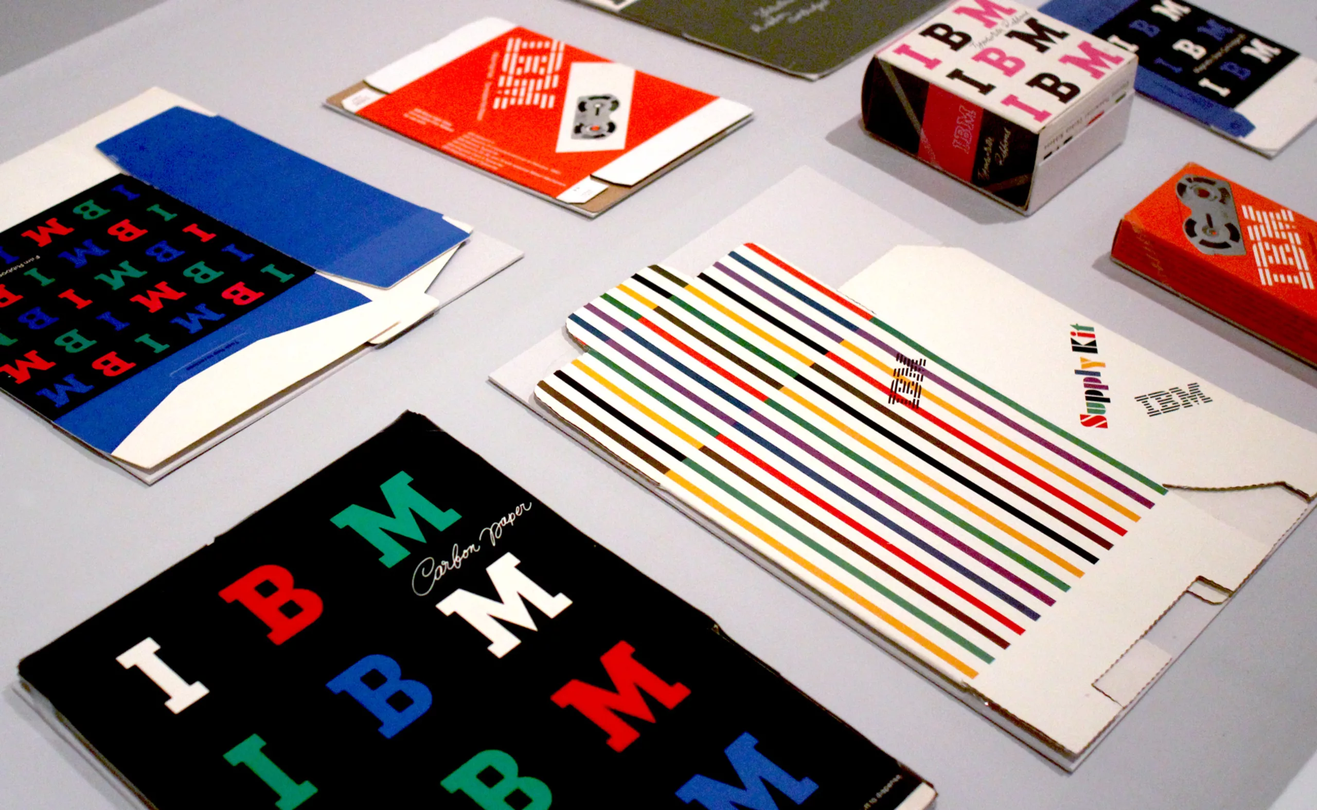
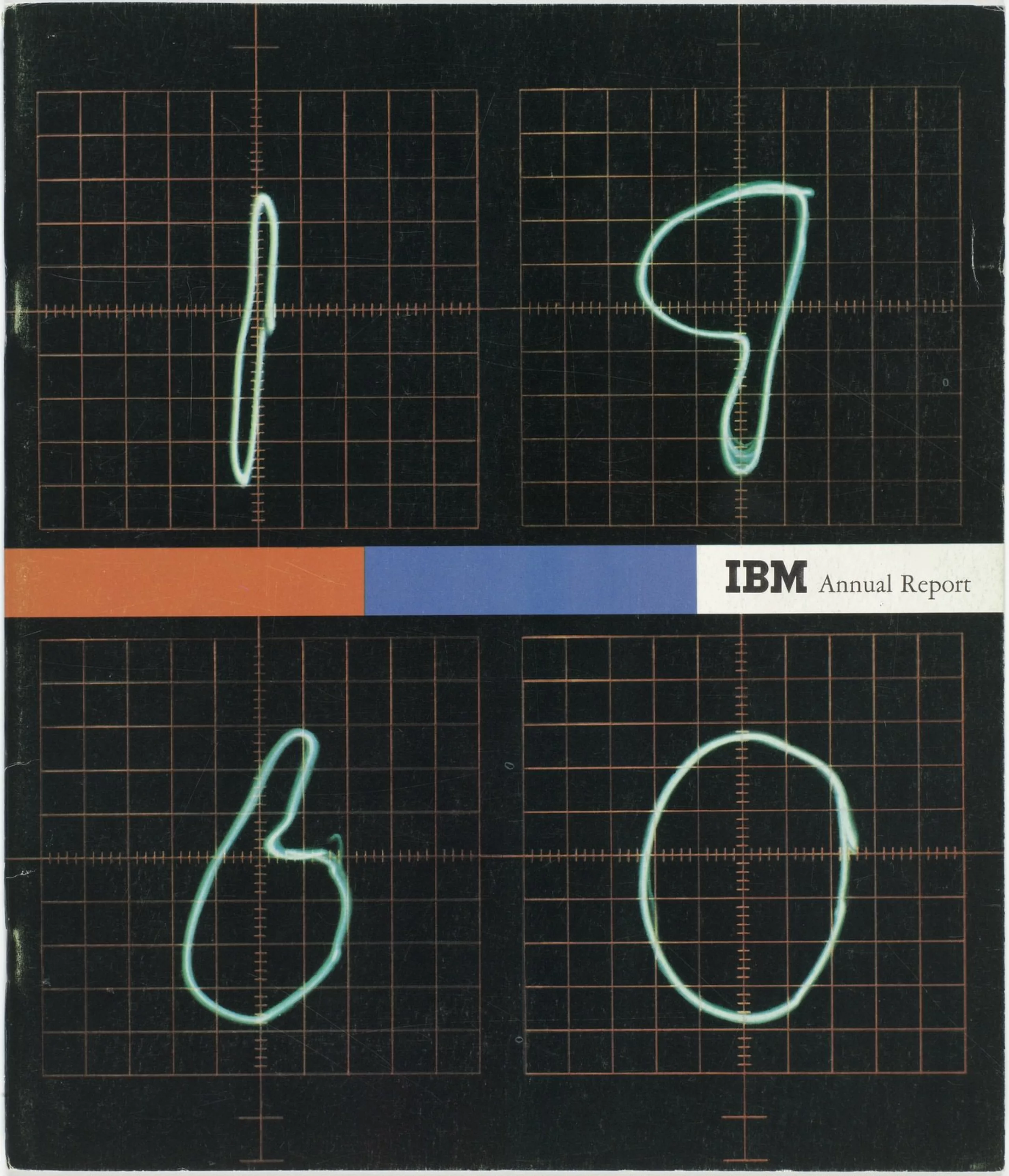
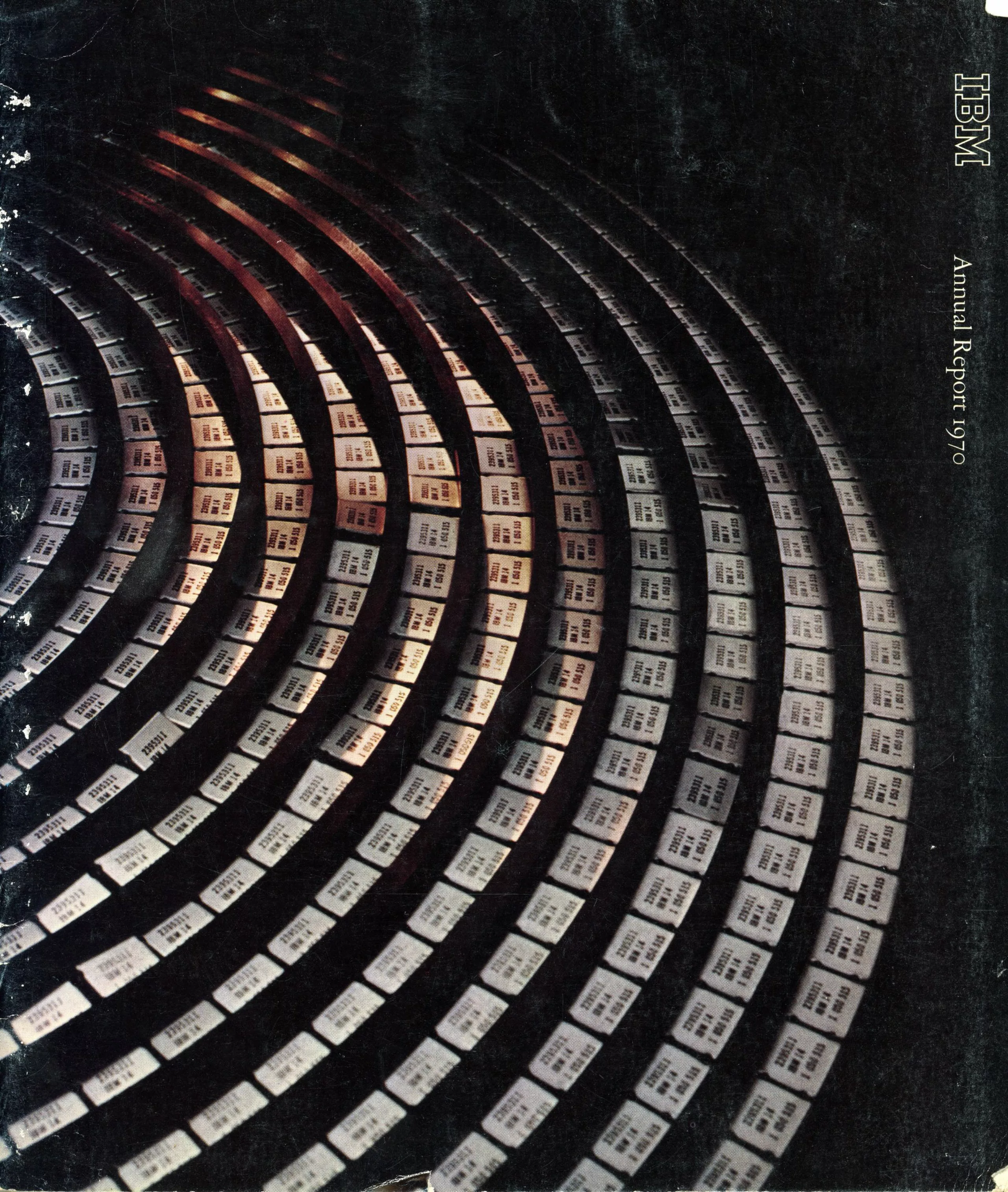
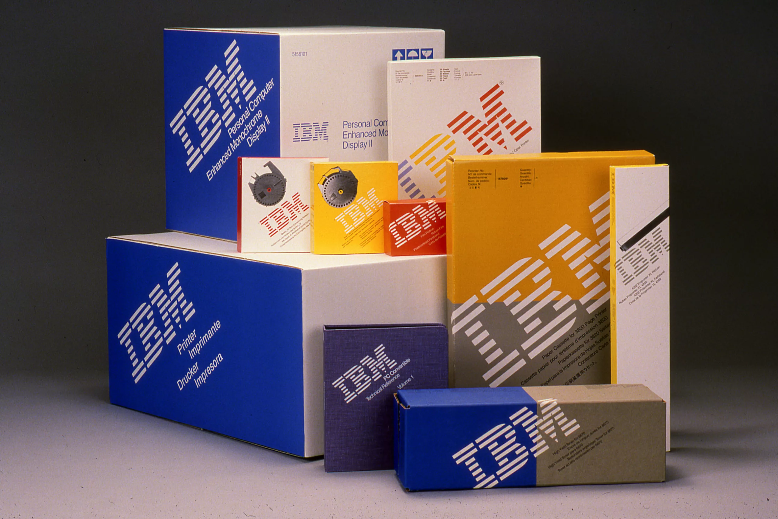
From 1956 to 1991, Paul Rand signed the identity of one of the largest corporate design projects in North American history: IBM (International Business Machines Corporation). This is the very beginning of corporate graphic identities. Before, all visual media was conveyed by advertising, but companies quickly understood that to survive in this jungle of images you have to stand out, and not only through advertising. Above all, it was crucial to set distance with the communists; presenting a modernist and innovative image was an obvious solution!

IBM’s new design mission – supported by Thomas Watson Jr., the son of the company’s founder – visually transformed every aspect of the company, from electric typewriters to computers, advertising and architecture. The idea was to break with a conservative image and look towards the future, to illustrate IBM’s renewed growth. It was completely new at the time. Watson called on Eliot Noyes, a former colleague and architect who worked on curative design of the MoMa, among other things, to set up a team composed of Paul Rand (for graphics), Eero Saarinen (architecture) and Charles and Ray Eames (scenography, publications, videos).
IBM’s new identity is thus conceived as a global, moving, immediately recognizable work of art delivering a strong message. With design as the main driving force. Charles Eames pointed out, “design is a plan for arranging elements in such a way as best to accomplish a particular purpose.”.
Rand designed a modern logo with bright colours coming to life on stationery, brochures, packaging and buildings. It was a major break with the graphics that IBM had been displaying since its origins, post-World War I, and the repeated inconsistencies of their communication campaigns. Paul Rand unified IBM’s visual identity, helping it to be recognized by the public as a great company at the forefront of technology (and anything but communist, that goes without saying).

American branding
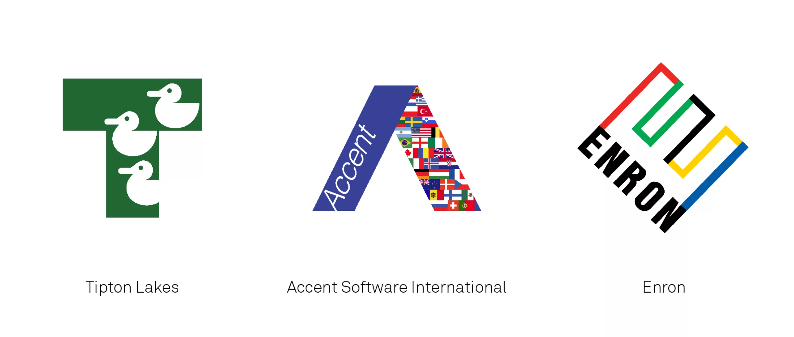
IBM is the first company for which he conceives a brand identity and all visual communication campaigns. While this is only a fraction of his work, his achievements for ABC, UPS, Westinghouse, Cummins or Enron become visible and ubiquitous in the United States and abroad. They are the symbol of a post-war global culture crowning the political, military and commercial success of the United States. His work is available on his website.
Rand, period.
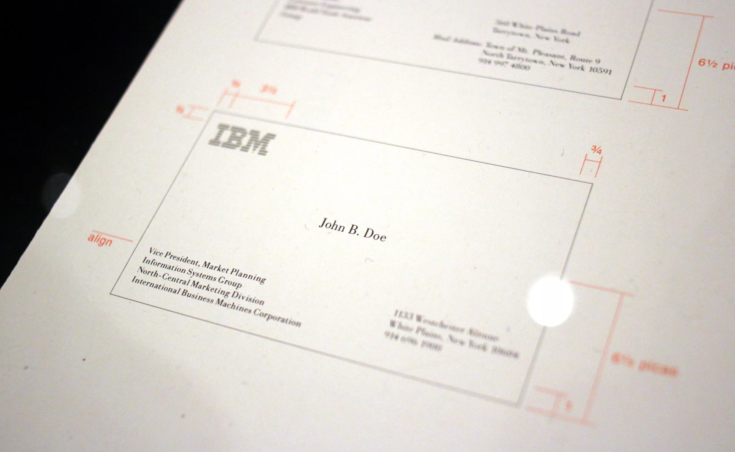
Rand’s multiple renderings illustrate the versatility of its logos on various platforms, from advertising to packaging, stationery or signage. When he presented his creative idea, Rand presented only one concept to his clients in brochures he had designed and written himself. He developed it well beyond the demand, to point out the quality and potential of the proposed design, and anticipate any customer request. For control purposes, Paul Rand could sometimes go so far as to negotiate a lower remuneration, in order to be sure to remain in control of his work. Uncompromising on THE solution he offered on paper, he was supported by Noyes who rounded off the angles orally, and finished persuading the reticent bosses. The eye-bee-M logo, created internally, was actually banned at first, before becoming the icon we know today !
For some companies, Rand continued to monitor the evolution of his creations for several decades, to adjust them to changes and trends.
His tenacity gave the world of graphic design more credibility: Rand proposed an abstract and universal language aimed at supporting a company’s growth, restoring a bad image, or deterring anti-communist detractors. But many of the leaders he addressed did not always see this in a positive light, or thought that a new logo alone would be enough to make people change their minds about a company. As he then pointed out, “the trademark is created by the graphic designer, but it is the company that makes it”. A good brand image does not stand alone, do not judge a book by its cover…. ! Véronique Vienne explains it: “To stand up to these authoritarian leaders, he had only one stone in his bag: the certainty that the graphic principles he applied were the right ones, that visual language was universal, that rigour did not exclude poetry, that simplicity did not mean nudity, that freedom was not synonymous with anarchy, and that abstraction was a wonderful means of communication.” Stubborn, but rightly so.
NeXT !
In 1986, for example, he worked for Steve Jobs who commissioned him to create a visual identity for his computer company, for the coquettish sum of $100,000. Since the designer had a very specific methodology, he proposed Jobs a 100-page booklet that described the creative process step by step to the reader, up to the final (and unique) proposal. Giving the client a written argument was part of Rand’s usual process, who avoided any oral presentation. Later, when Steve Jobs was asked how it was to work with Rand, he replied, ” I asked him if he would come up with a few options, and he said,’No, I will solve your problem for you and you will pay me. You don’t have to use the solution. If you want options go talk to other people. »
In his explanatory guide for the client, Paul Rand explained the origin of the change from Next to NeXT: it sounded too much like “Exit”. By including an “e” in lower-case, close to upper-case characters, the word gains a new rhythm and requires another form of concentration from the reader, who then reads the word as it is really written. It should be noted that even today, NeXT is still written in common text, as if it was an acronym: Rand’s concept has gone beyond graphics.
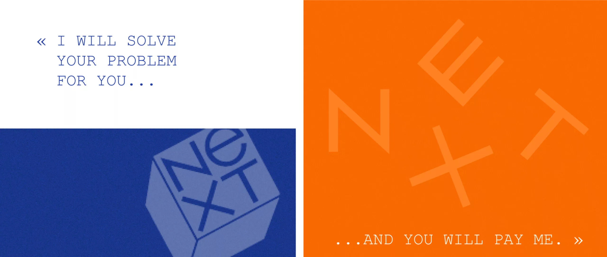

For the short story, the cube of the logo was first placed straight on the surface, without an oblique axis. In his file, Rand had added what would now look like an envelope mock-up, with a sticker of the logo placed at an angle. During the printing of the report, someone asked him “Why don’t you make them all like the one on the envelope?” This simple modification is the key element that convinced Steve Jobs, so admiring of Rand’s work that he reprinted the booklet for distribution.
An unparalleled signature
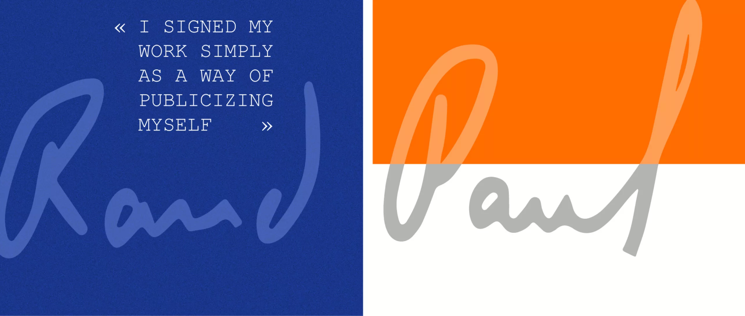
Paul Rand succeeded in changing the American business landscape through his work, being a key player in this economic transition. He still is one of the few designers who signed all his creations, posters or magazine covers, as early as 1936. A way to elevate them as works of art and to display his artistic authority and creative decision-making to the client. A hell of a dare, we wish we could do the same today!
Rand was undoubtedly an pioneer, both in style and in vision. By changing others’ look upon brand identity, he shook up the whole history of graphic design. But no one should hope to reach his level by taking inspiration directly from his work, because according to his friend and colleague Louis Danziger, a graphic designer: “If you want to be as good as Rand, don’t look at what he does, look at what he looks at. »
To go further and find daily inspiration, here’s a pdf with quotations by Mr Rand.
On the subject
-

Groupama’s new visual identity, a logo in the open countryside
Groupama has just unveiled a new logo that updates its graphic design by abandoning its campaign in favor of a “startup” aesthetic.
-
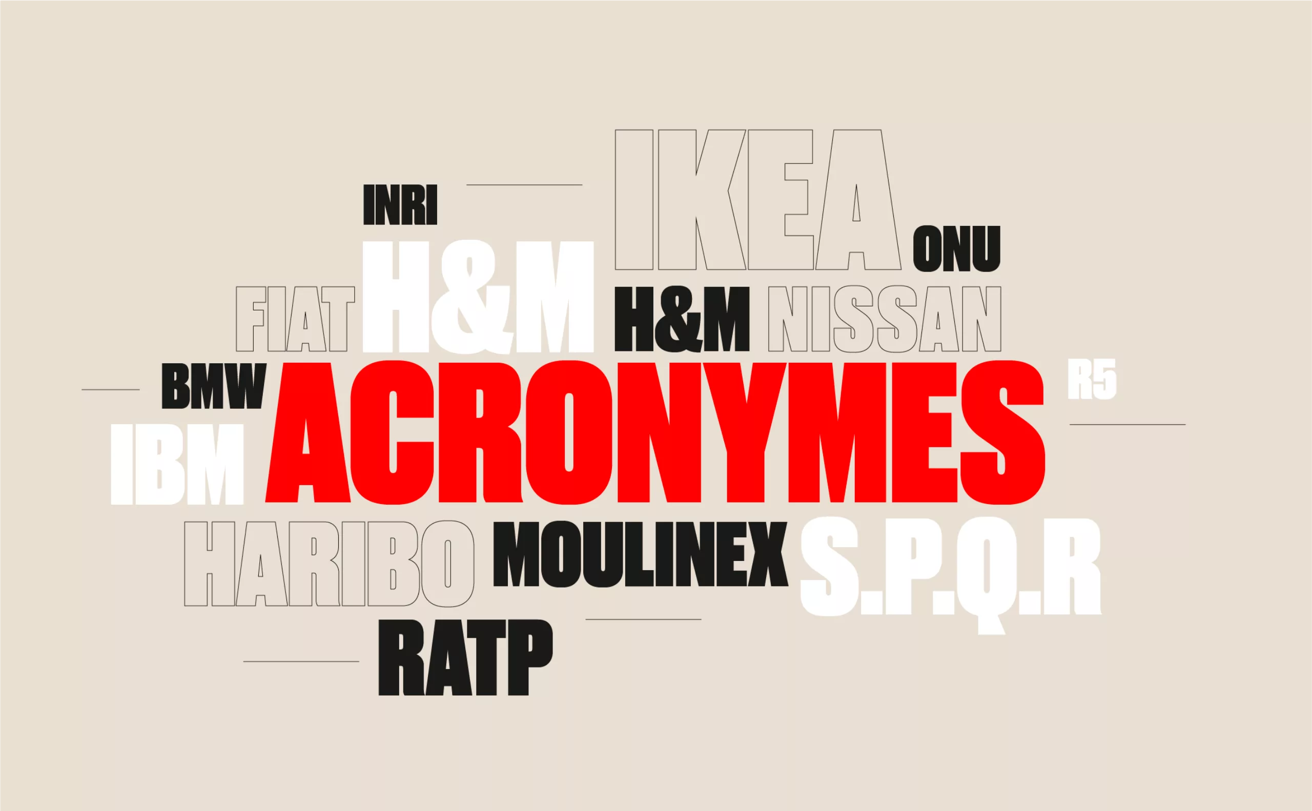
From surnames to acronyms: creating a brand name from letters
From founders’ surnames to initials and acronyms, brand names have always oscillated between abstraction and familiarity.
-

The UN logo takes on water during COP28
For COP28, two designers have come up with a new UN logo showing the rising sea levels and the future disappearance of much land and coastline.