Ferney-branding-city2

2019

New visual identity for the city of Ferney-Voltaire
A brand new visual guidelines for a city steeped in history in full evolution

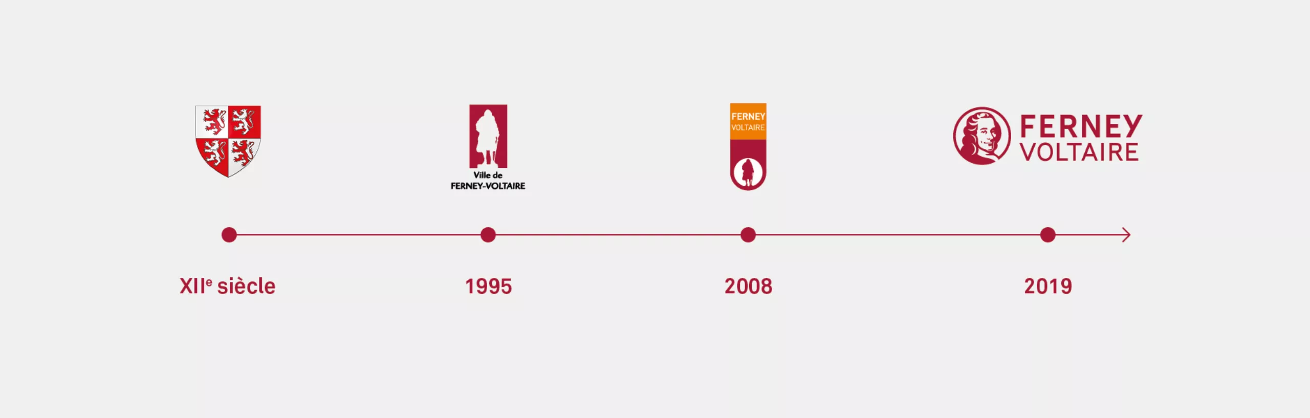
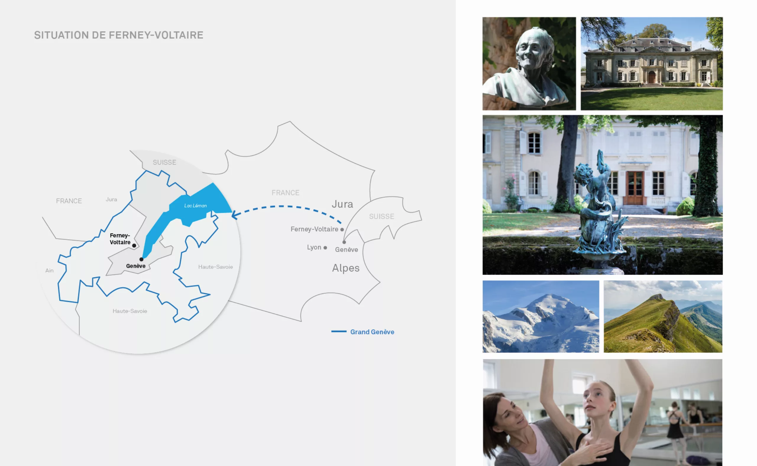
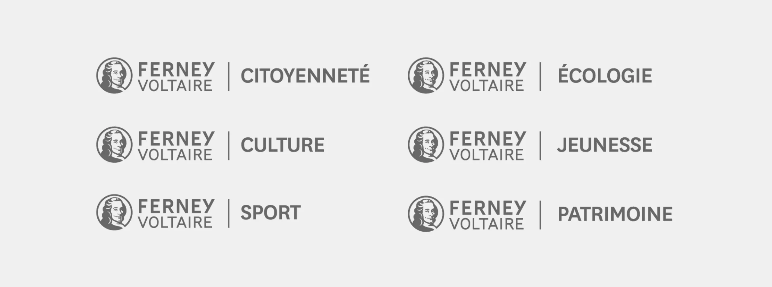
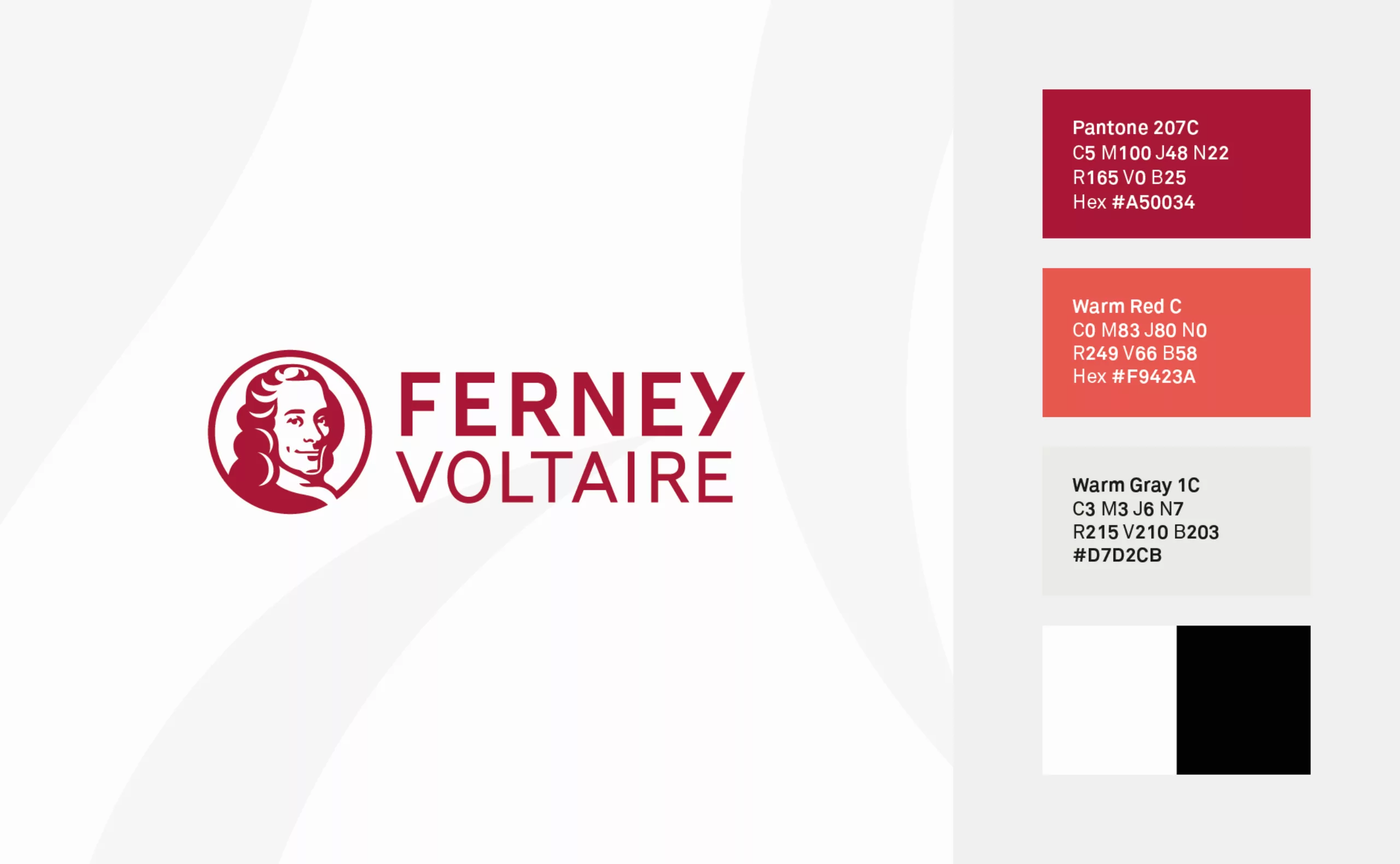
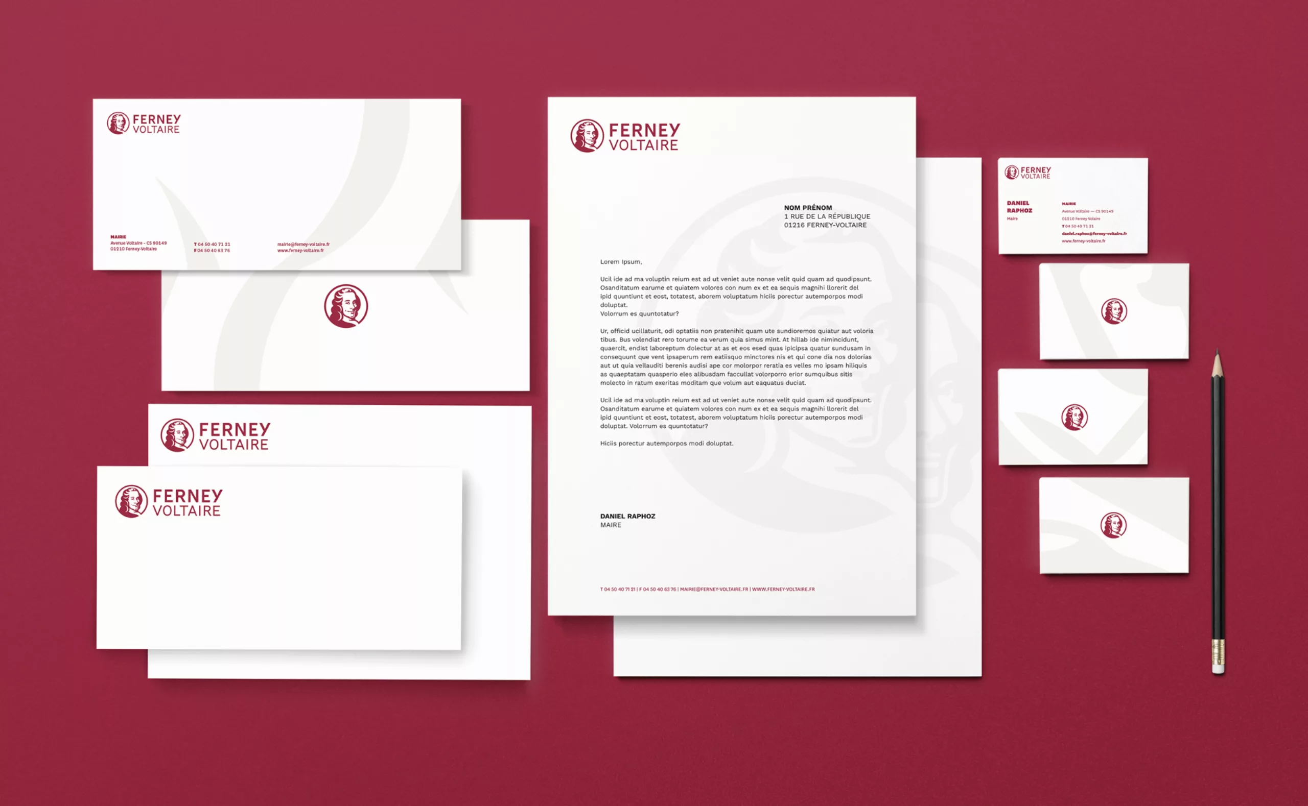
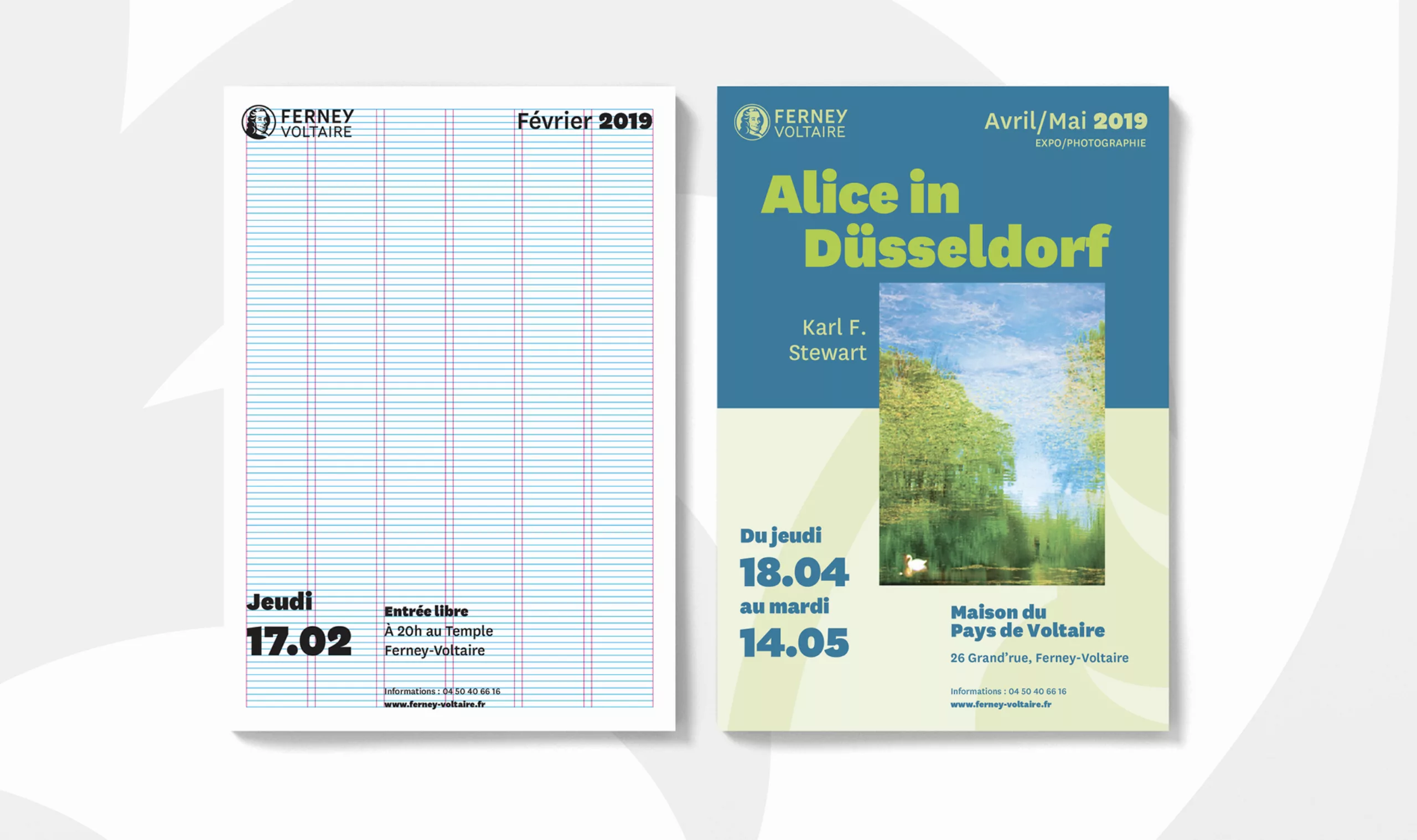
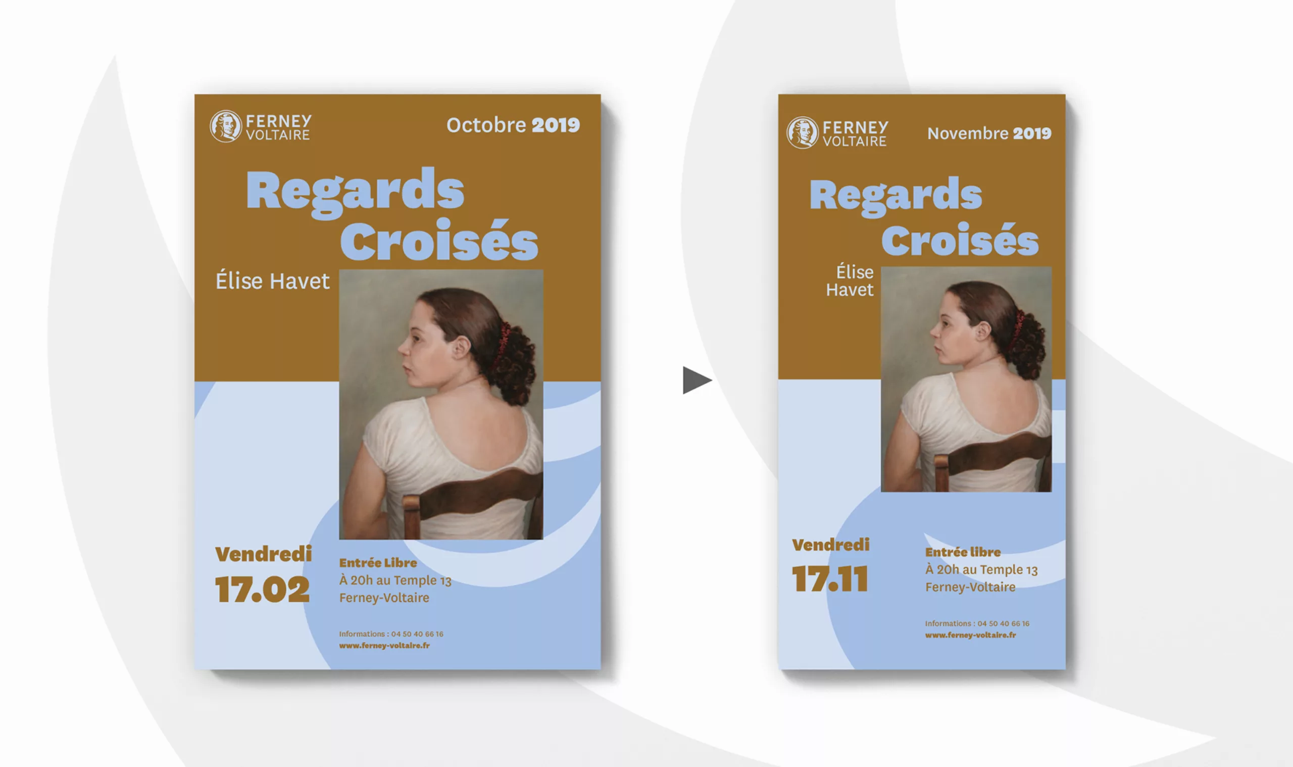
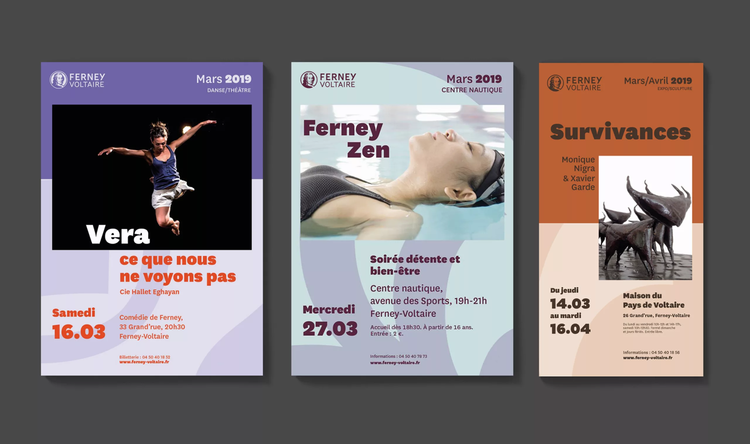
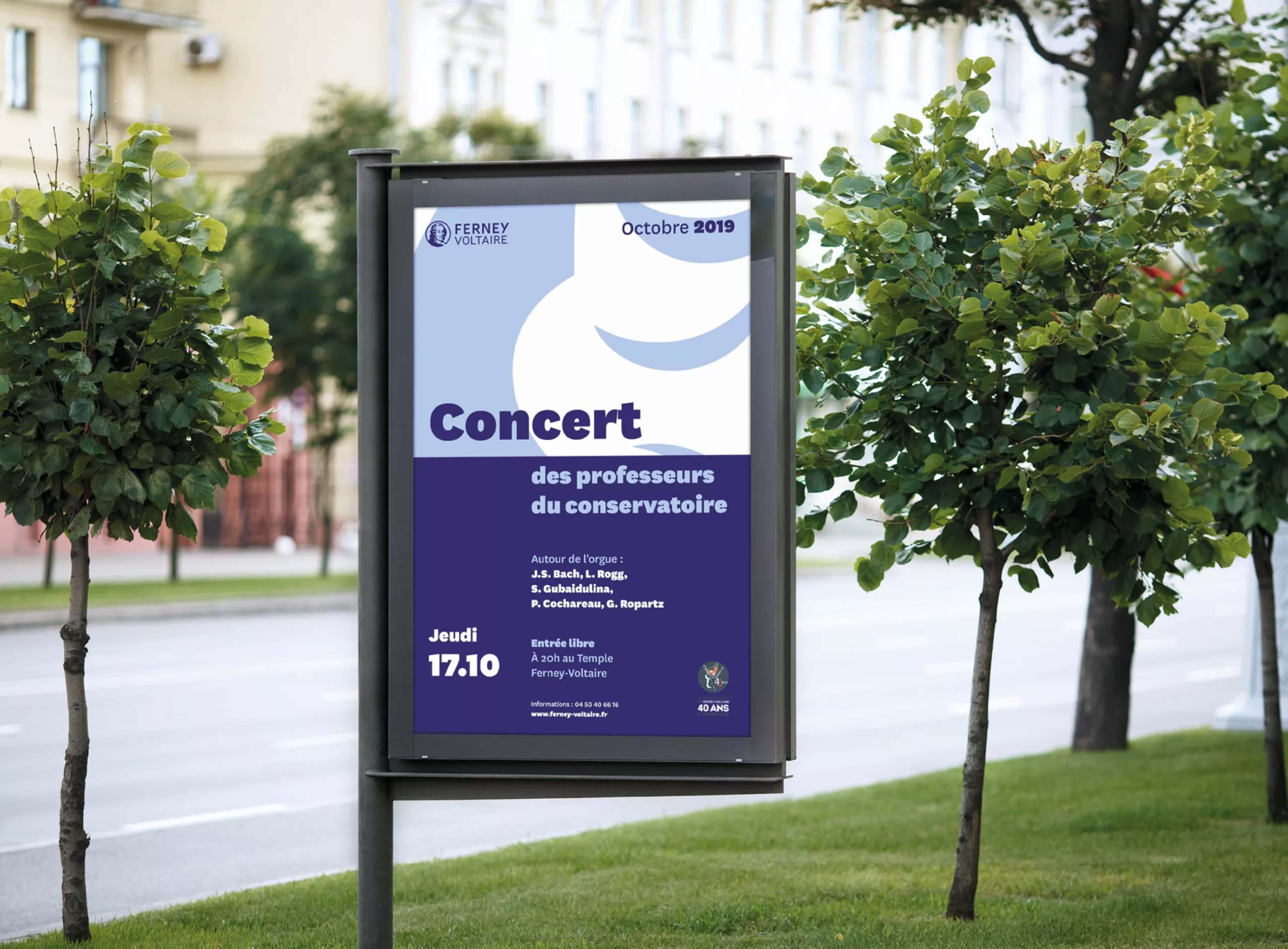
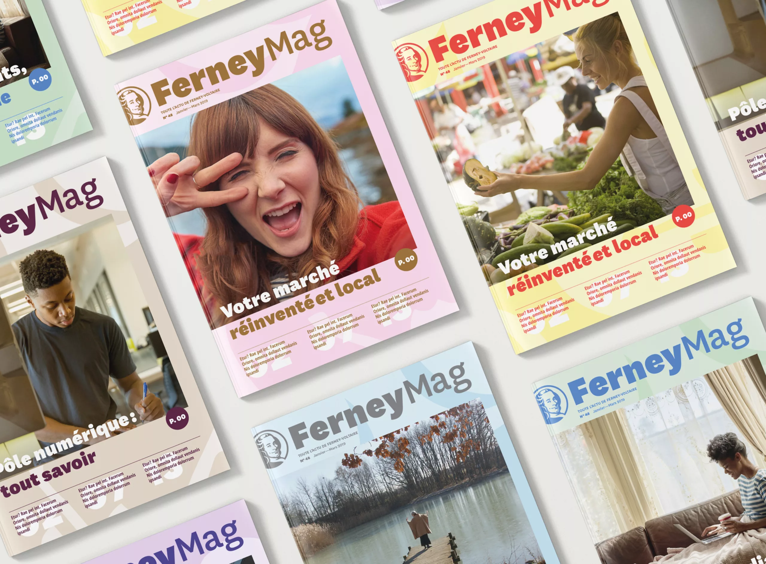
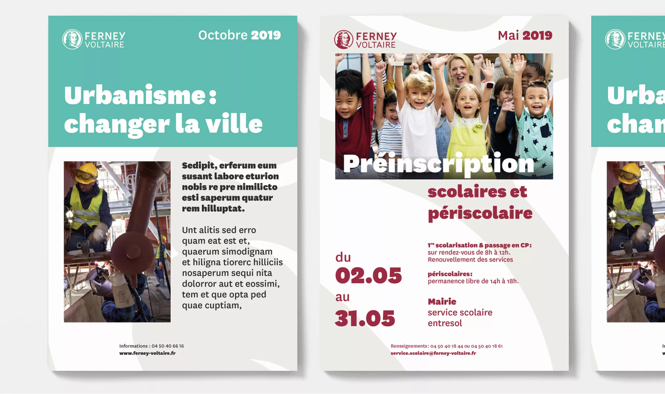
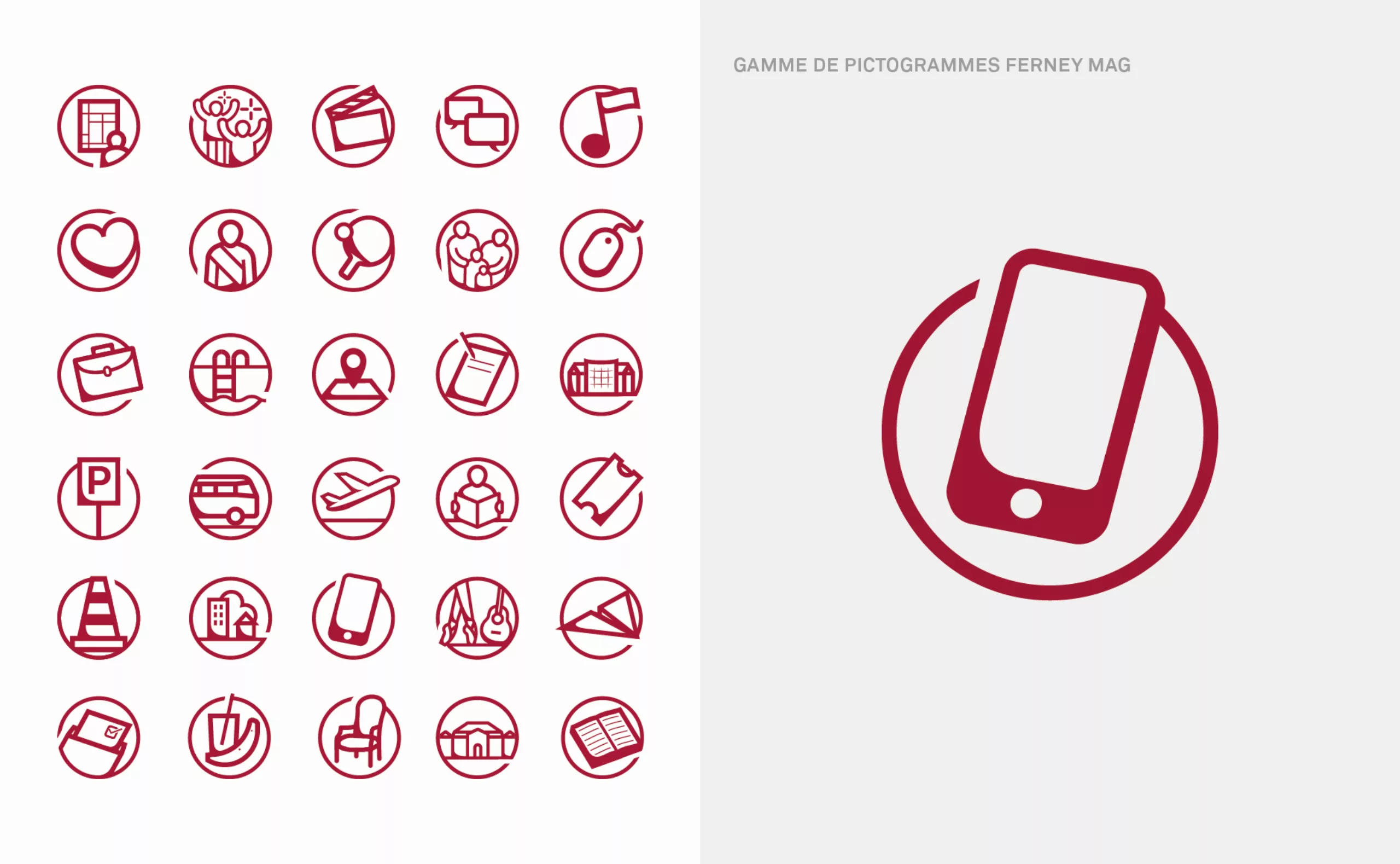
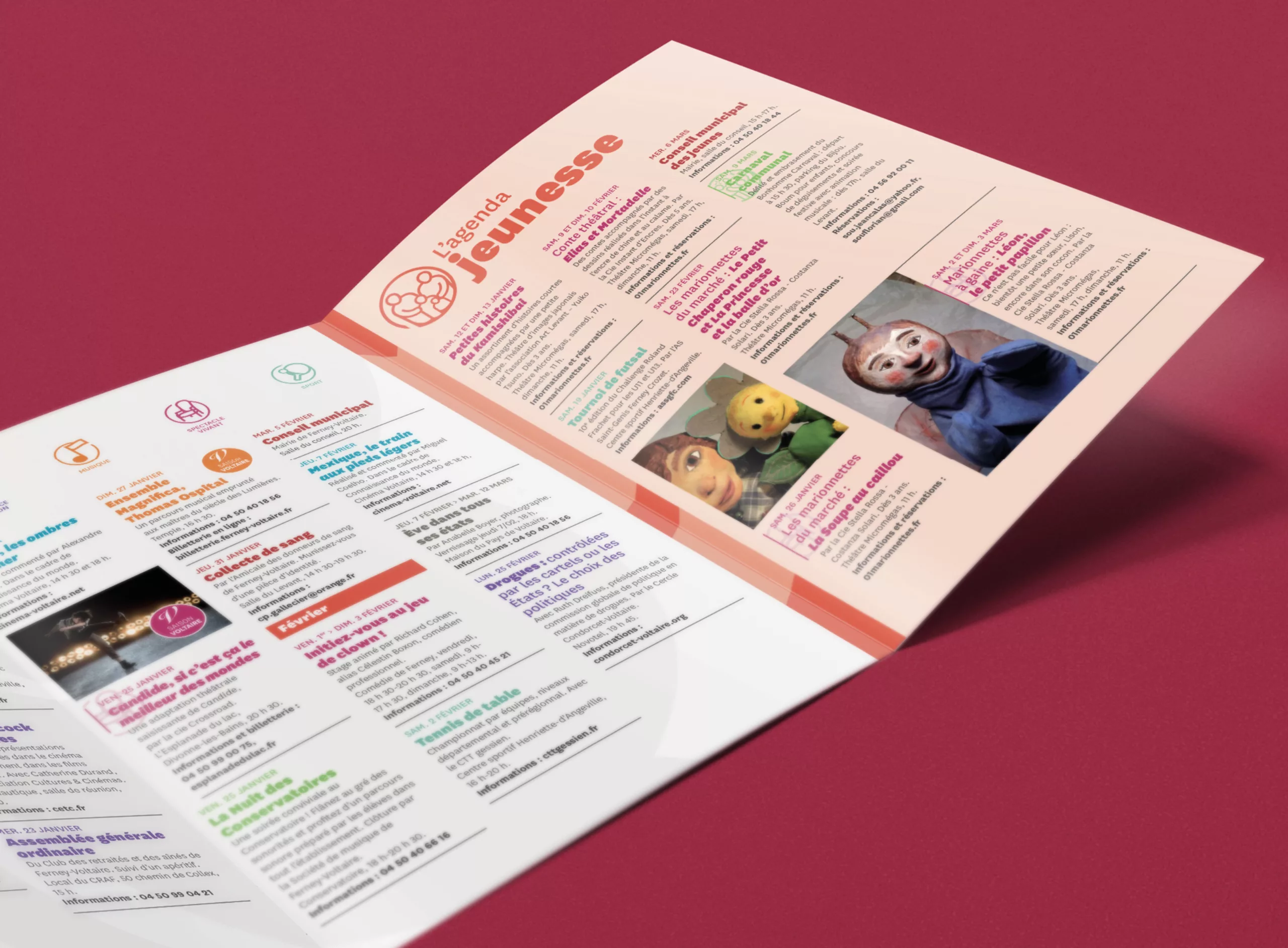
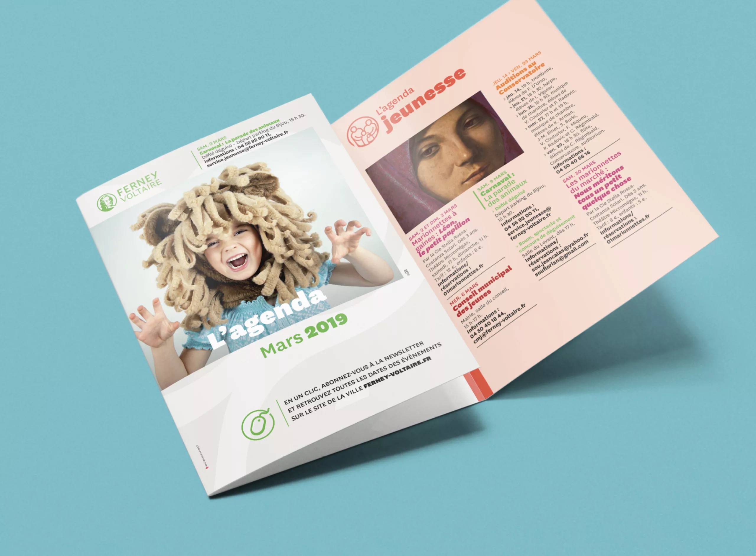
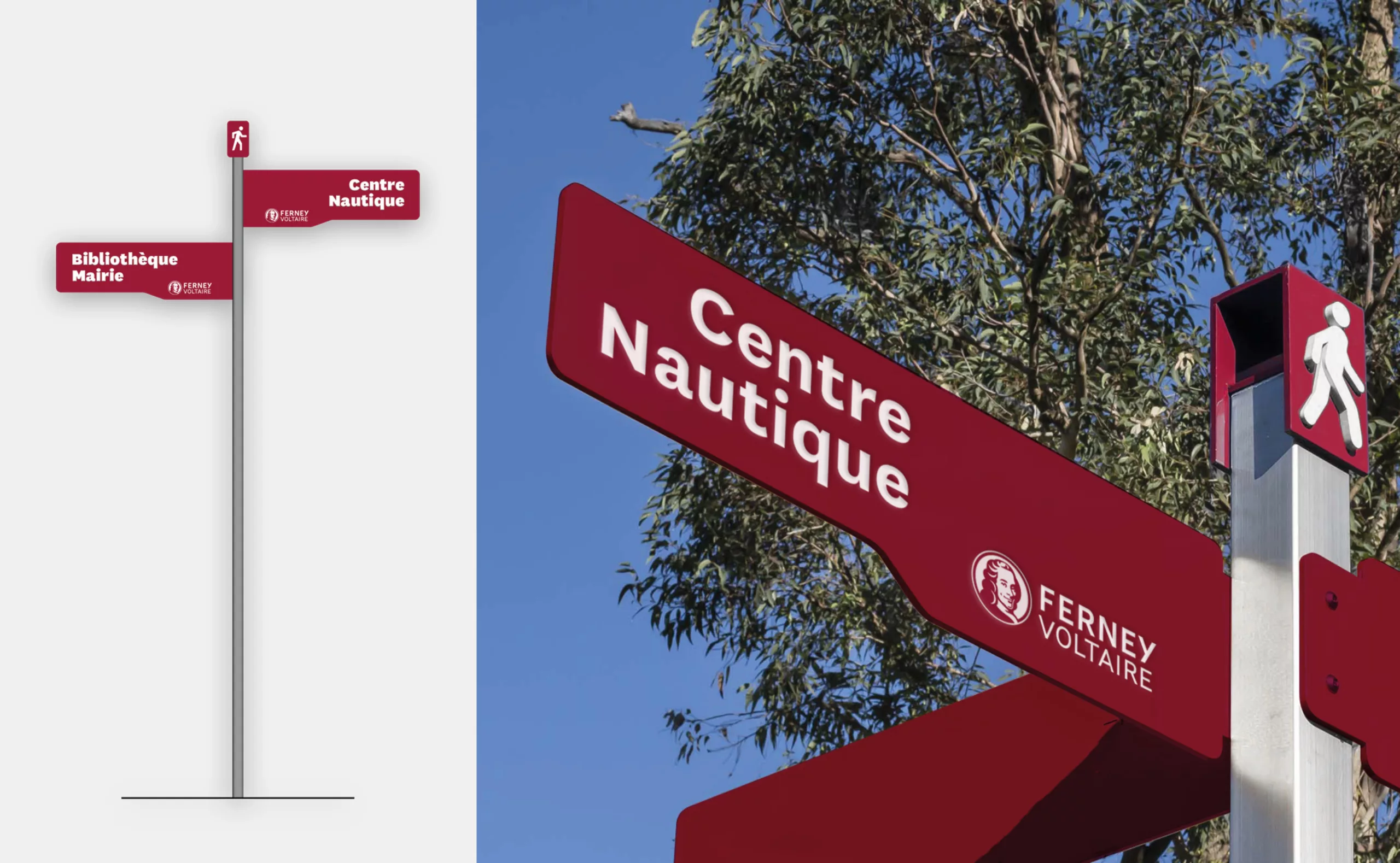
The city of Ferney-Voltaire approached Graphéine for the redesign of its visual identity. The old graphic charter, had existed for 11 years and no longer reflected the dynamism of the city, located at the gates of Switzerland. The entire graphic charter and communication media have also been revised to make them easier to read.

The first challenge was to build a contemporary identity, in line with Ferney-Voltaire's demographic, economic and cultural growth. The Ferneysians are very attached to the history of the city, which was already depicted in the previous logo. They wanted to redesign their logo while preserving its heritage value.

In 1758, the renowned Enlightenment philosopher, Voltaire moved to Ferney where he spent his last few years. During these years, the author contributed greatly to the improvement of the population's living conditions, transformed the city and developed its cultural dynamism. As a tribute to Voltaire's commitment, the city of Ferney was renamed Ferney-Voltaire

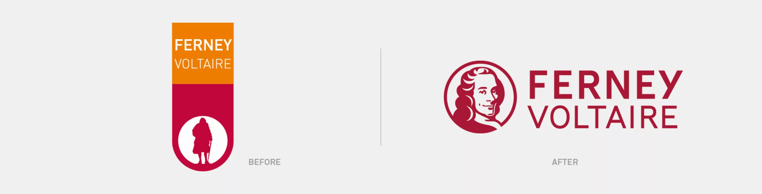
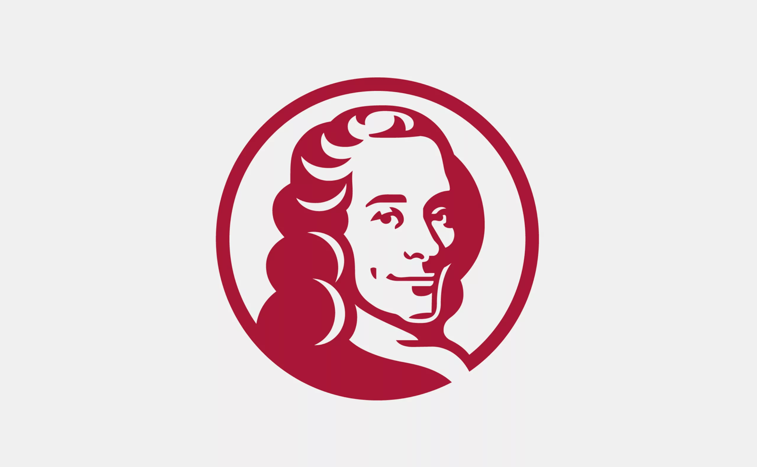
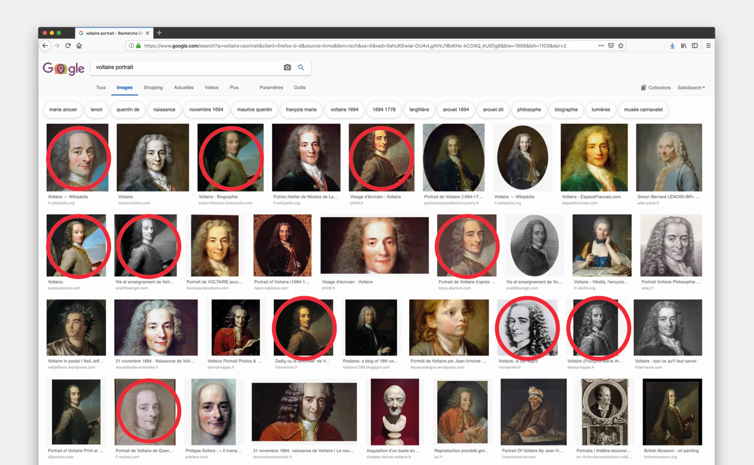
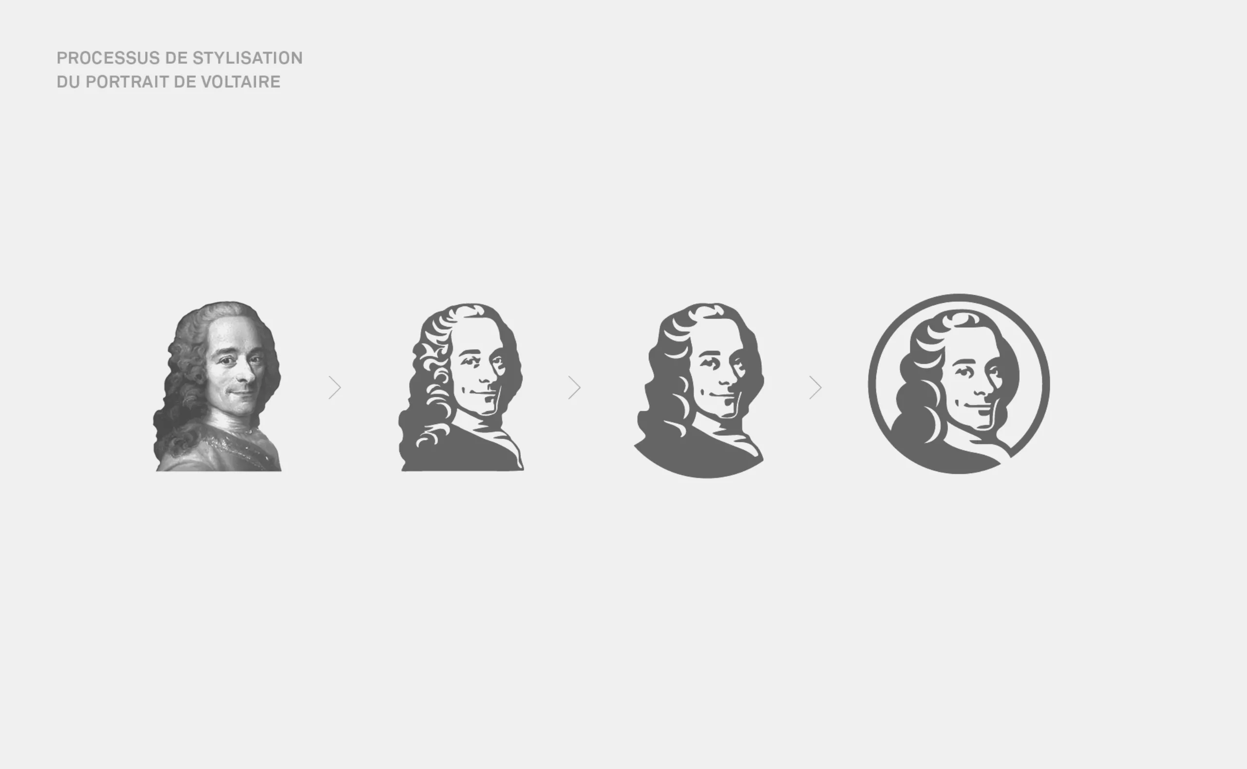
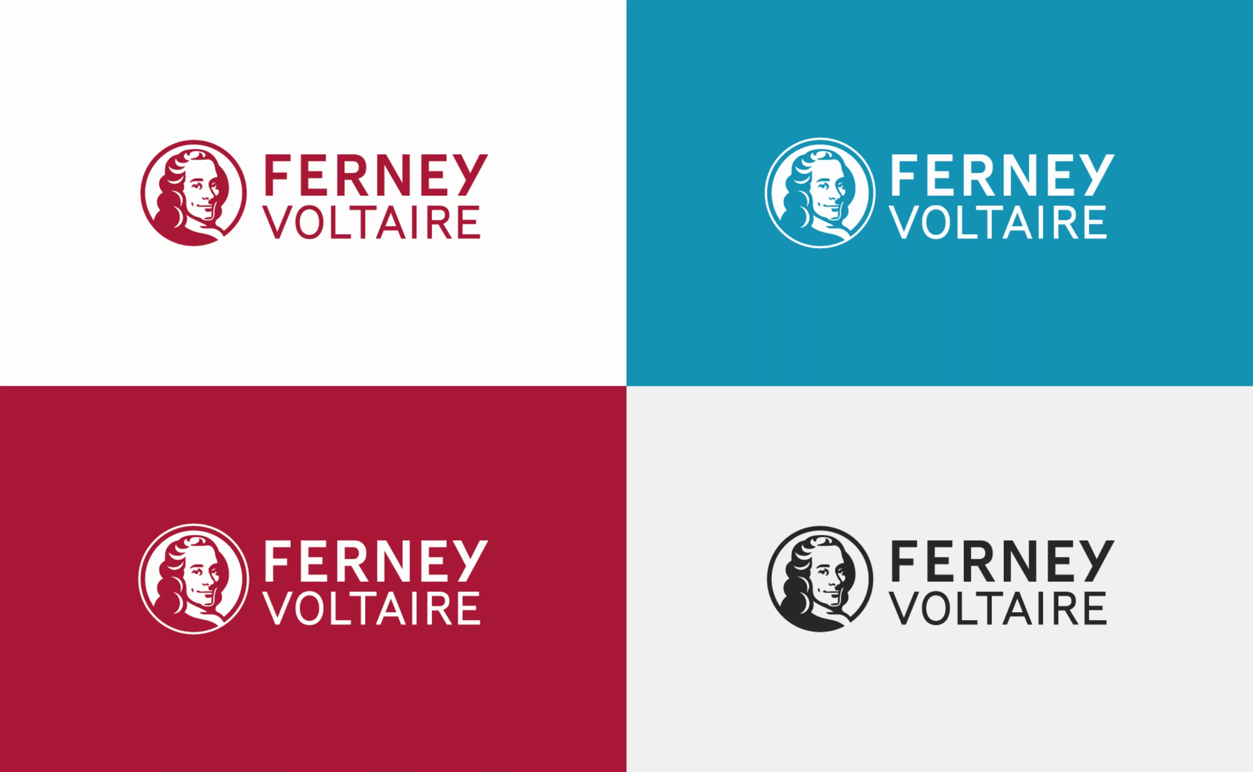
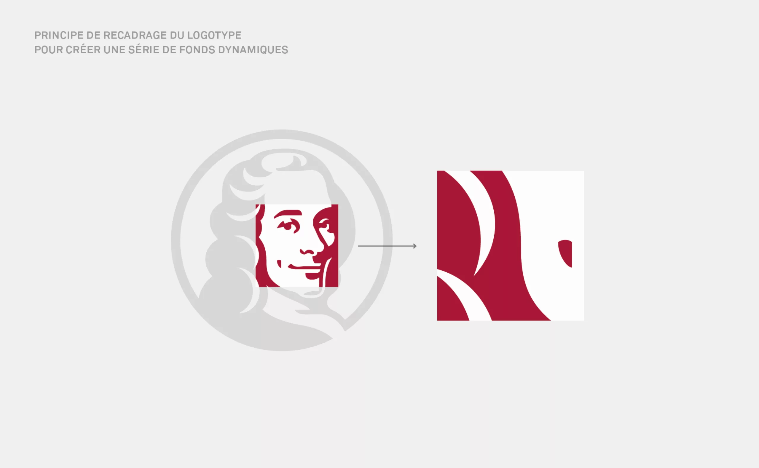
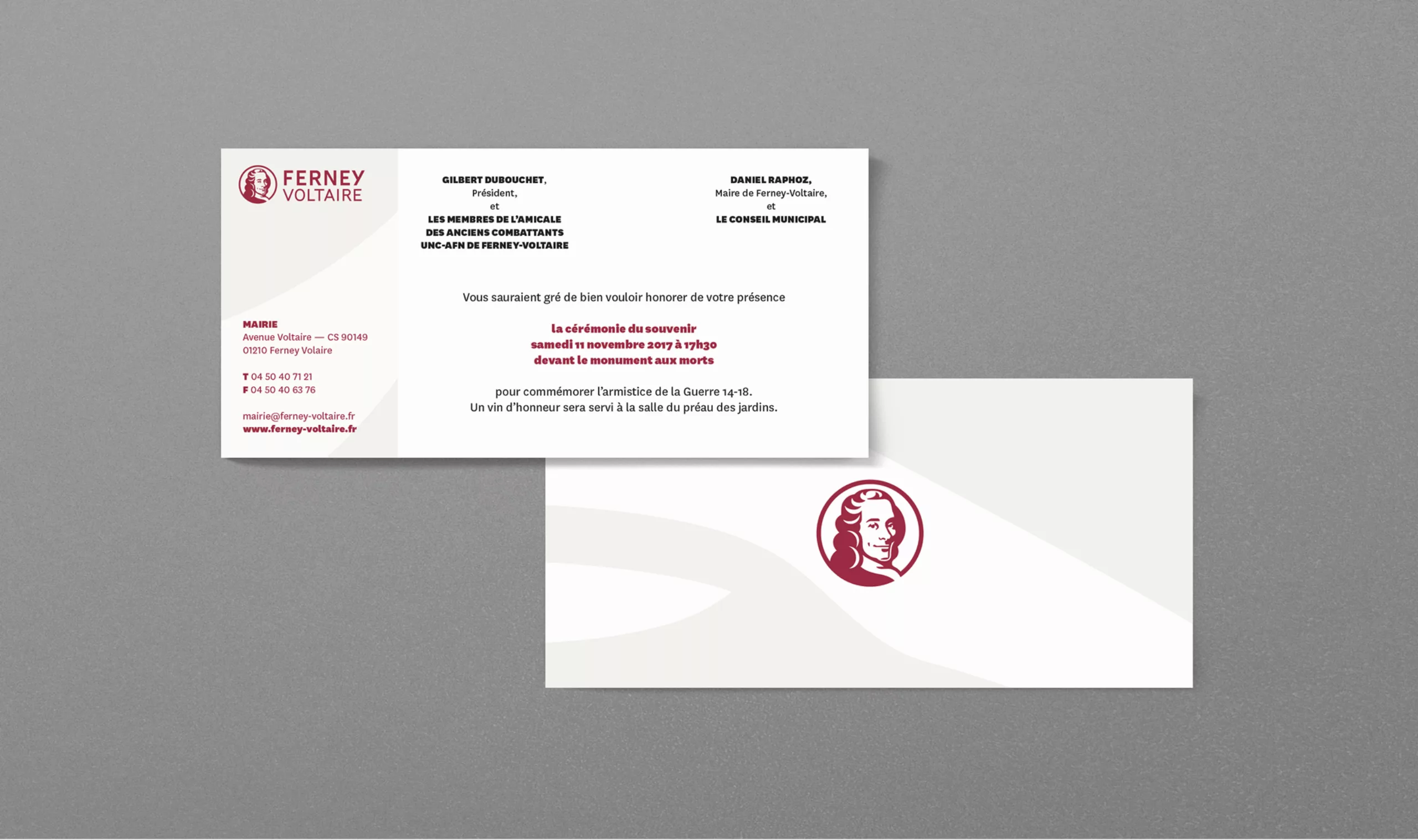
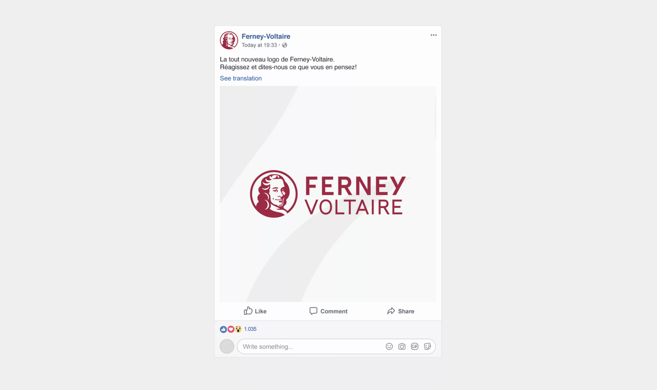
The old logo incorporated the benefactor's silhouette inspired by a statue of him located in the heart of the city. However, the back posture, bent and resting on a cane, showed an aging Voltaire, far from the desired modern image.
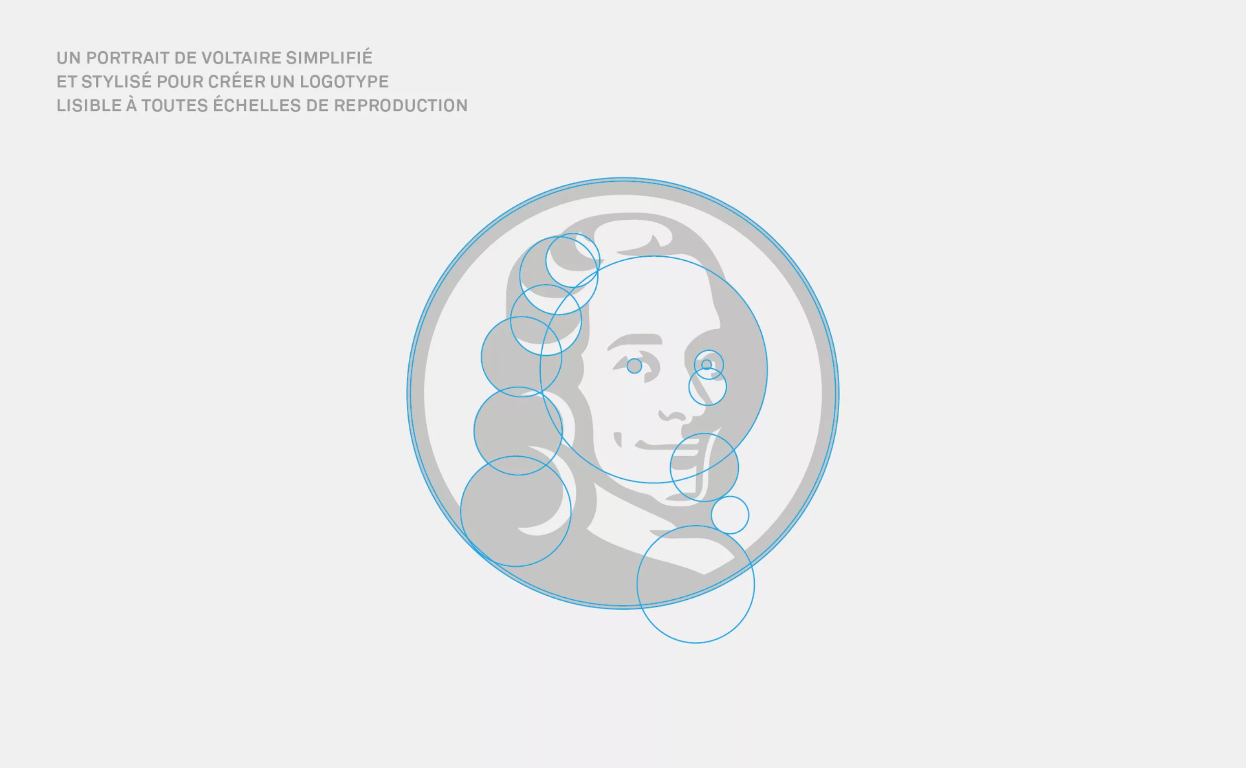
Our redesign work was built around the idea of representing this emblematic figure in such a way that it would be easily recognizable, even by people not aware of the statue. But also, to give a more dynamic image, in accordance with the major projects of the territory.

A logo that rejuvenates Patriarch Voltaire's image

A portrait framing was chosen. A famous painting of the young Voltaire, served as a model for the creation of the new emblem. A meticulous drawing work followed, which gradually simplified the portrait without compromising its recognizability. This emblem, inscribed in an open circle, gives the feeling of a seal marking the city. The opening of the circle, deliberately placed to line up with Voltaire's clothing, draws a path, symbolizing access to the character, to the city. A tribute reflecting the open-mindedness of the Age of Enlightenment.

The logo keeps its red tint, a reminder of the natural colour of the clay extracted from the Ferneysian soil. The whole graphic charter is intended to be cheerful and colourful.
As a city bordering Switzerland, the image attributed to Ferney-Voltaire is sometimes that of a dormitory city far from the richness of its heritage, its culture and activity.

This new visual identity also solves the problems of adapting to digital media. The old version, placed in a rigid lockup, prevented a good readability across different communication channels. The creation of a horizontal version of the logo also makes it possible to extract the emblem and resolves the display challenges of all media.

The design of the FerneyMag, the city's magazine, was also entrusted to us. This was the opportunity to propose a layout principle that plays on the reframing of the emblem and provides a rich and sparkling chromatic palette. This flexible palette adapts to the chromatic ambience of the front page photographs.

The contexte

Ferney-Voltaire is a town of 9,337 inhabitants located in the department of Ain, adjoining two French communes and four Swiss communes. This geographical location makes Ferney-Voltaire particularly attractive, firstly due to its proximity to Geneva and its living environment with remarkable views of the Jura and Mont Blanc.

The contact with the Swiss metropolis is highlighted by a major facility: Geneva International Airport. The proximity of the international organisations, CERN and Geneva city centre means that it plays an essential economic and commercial role.

In 1758, Voltaire's arrival marks a change for the village and its inhabitants. In turn town planner, entrepreneur and patron of the arts, he rebuilt the castle entirely, drained the marshes, built more than a hundred houses, financed the construction of a church, a school, a hospital, a theatre, a water tank and a fountain and renovated several farms. The town of Ferney became the seat of an intense social and literary life.

The objectives

11 years after its creation, the City's logo and graphic charter no longer met the needs in terms of communication, use by municipal services and by institutional or associative partners. The Town of Ferney-Voltaire wanted to renew its visual identity in order to bring more legibility to its communication to better dialogue with citizens and allow them to identify their institution more clearly.

This visual change was also intended to respond to the new challenges of a city proud of its history and undergoing profound change:
Demographic evolution, economic growth, development of events, new public facilities...

In addition to keeping Voltaire's image at the core of the visual identity, the new graphic charter had to offer variants of decorative motifs or borders; offer an alternative to the rigidity of title cartridges in the layout of communication media; integrate a library of customised pictograms.


Share this project:
Project expertise:
Logo creation, visual identity and graphic guidelines.
Type of client:
Cultural communication agency for theaters, concert halls, festivals, dramatic and choreographic companies. Institutional communication agency, public communication for cities and territories, government institutions, social partners and public administrations. Communication in travel & tourism.

Related projects: