-

The Unicorn, from mythical fantasy to emoji 🦄
The unicorn, that legendary animal which never existed and yet never ceased to fascinate humanity, brings everyone together from the Bible to the LGBT+ community.
-

Has branding become an amusement park?
Playful, entertaining and festive styles are emerging as the new trends in graphic design for communication.
In recent years, brand identities and branding have seemed to be on a high, constantly evolving, with bouncy typefaces and bright, vibrant colours.
Can branding do without widespread gamification? Nothing could be further from the truth… -

The futuristic world of Brantonne
In September 1951, René Brantonne began a collaboration with the publishing house Fleuve Noir that was to last more than 20 years (from 1951 to 1965), working on the legendary “Anticipation” series, for which he created 273 original covers.
-
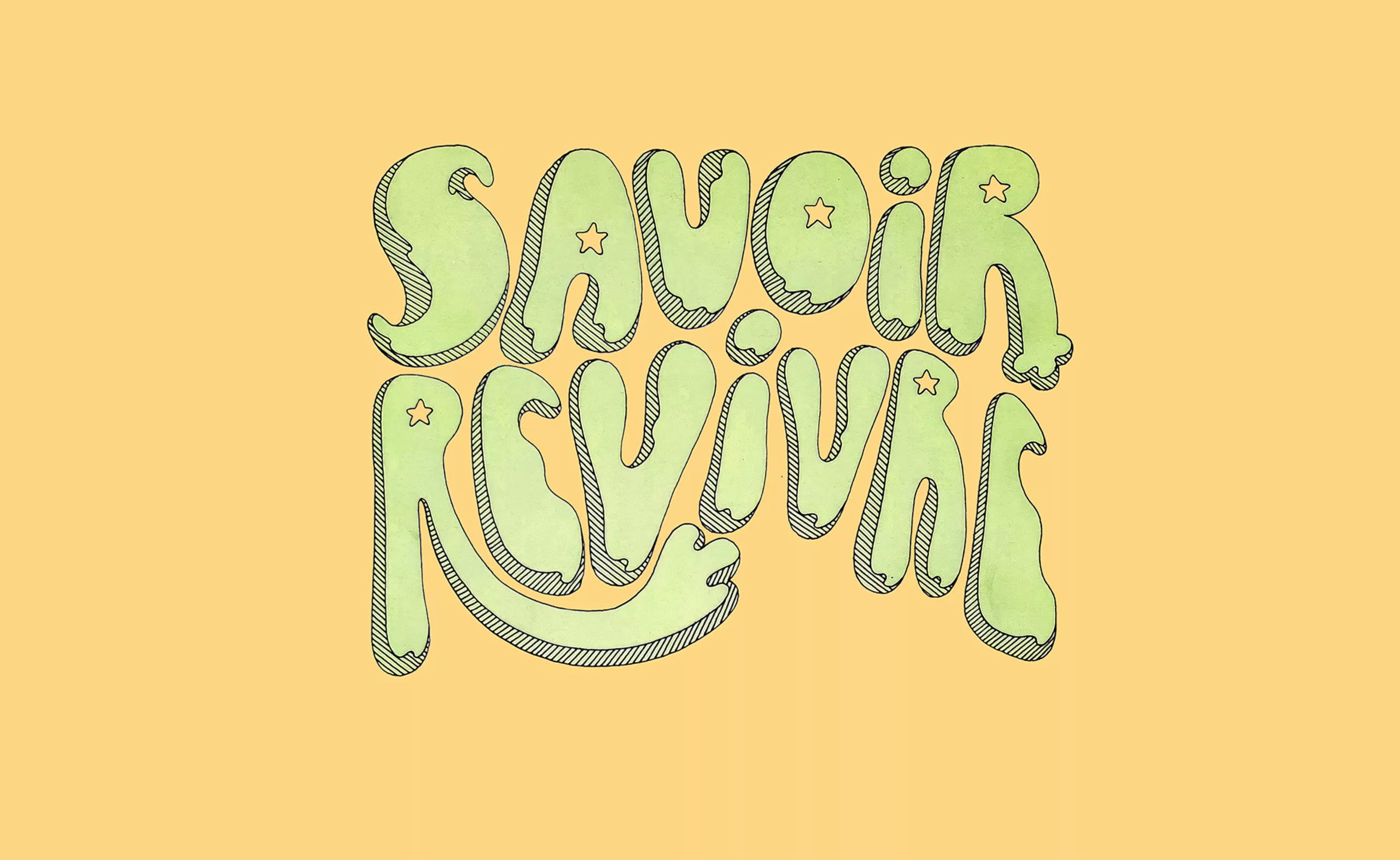
Jacques Massacrier’s “Savoir Revivre”
It is a cult classic, ahead of its time. For some, Jacques Massacrier’s “Savoir Revivre” was nothing short of a ‘bible’.
The first edition, published in 1973, was a literary phenomenon, selling over 500,000 copies and being translated into twelve languages. It was a book that captivated an entire generation. -

3 Questions for Paul Vacca About the Brand
Paul Vacca analyzes the evolution of brands: the disappearance of the claim, new strategies, fluid identities, and the concept of a “habitable world.”
Graphic perspectives
-

3 questions to Joe La Pompe
Joe La Pompe analyzes the impact of digital and AI on creativity: more images, but no more originality. A lucid look to discover.
-

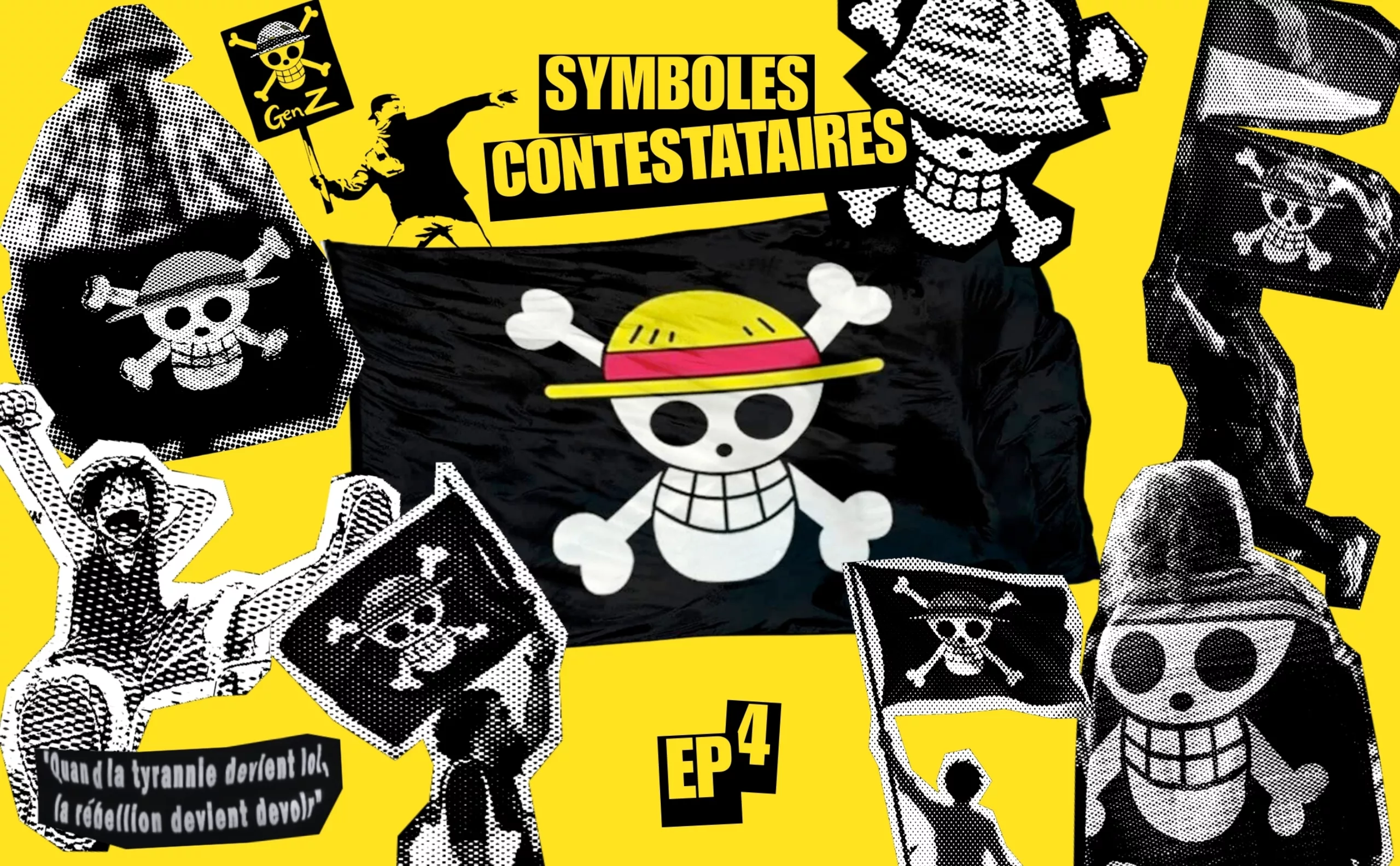
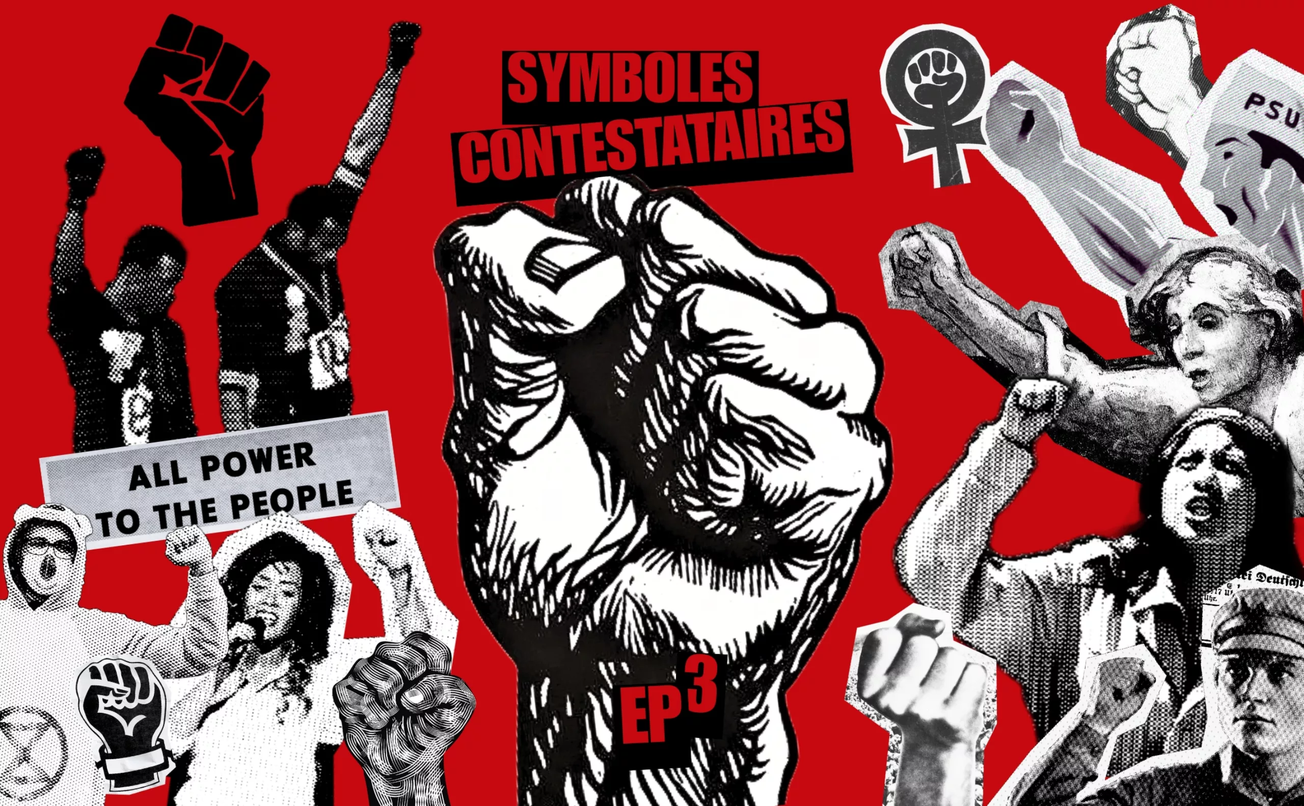
Extinction Rebellion, committed to the living
The 1960s fought for peace; our generation is raising the symbol of Extinction Rebellion, committed to ending the extinction of the living.
History of Graphic Design
-

When the Anatome gallery was the place to be for graphic design in Paris
For a long time, Paris did not have a specific space for exhibiting graphic design. It was not until the turn of the 20th century, in 1999, that Marie-Anne Couvreu and Henri Meynadier opened the Anatome gallery. For more than 12 years, they have taken up the challenge of promoting and bringing to life the diversity of graphic design. For a long time, Paris did not have a specific space for exhibiting graphic design. It was not until the turn of the 20th century, in 1999, that Marie-Anne Couvreu and Henri Meynadier opened the Anatome gallery. For more than 12 years, they have taken up the challenge of promoting and bringing to life the diversity of graphic design.


Discover
the portfolio
Graphéine supports brands that want to make design a driver of social and economic transformation, helping them meet the challenges of tomorrow. We believe that a brand is a powerful tool for creating fresh narratives, uniting imaginations and shaping desirable futures.
Most popular
-

Josef Müller-Brockmann “swiss style”
Müller-Brockmann is one of the most influential graphic designers in the history. His work is always taught, studied and published. It is certainly the figurehead of Swiss graphic design (which also takes the name of international style). His work is influenced by Bauhaus and constructivism. Typography and geometry are predominant.
-
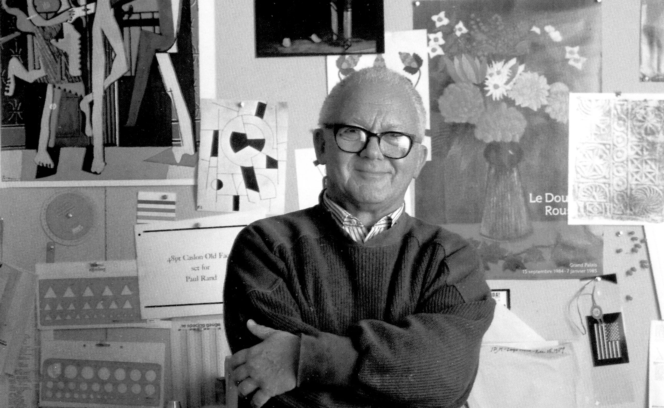
Paul Rand, everything is design!
In the 1950s, in the midst of the Cold War, Paul Rand transformed the use of graphic design and the face of American companies.
-
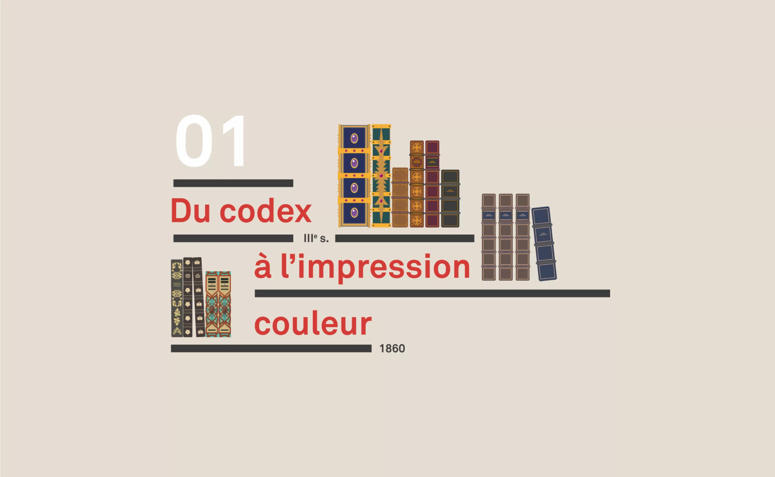
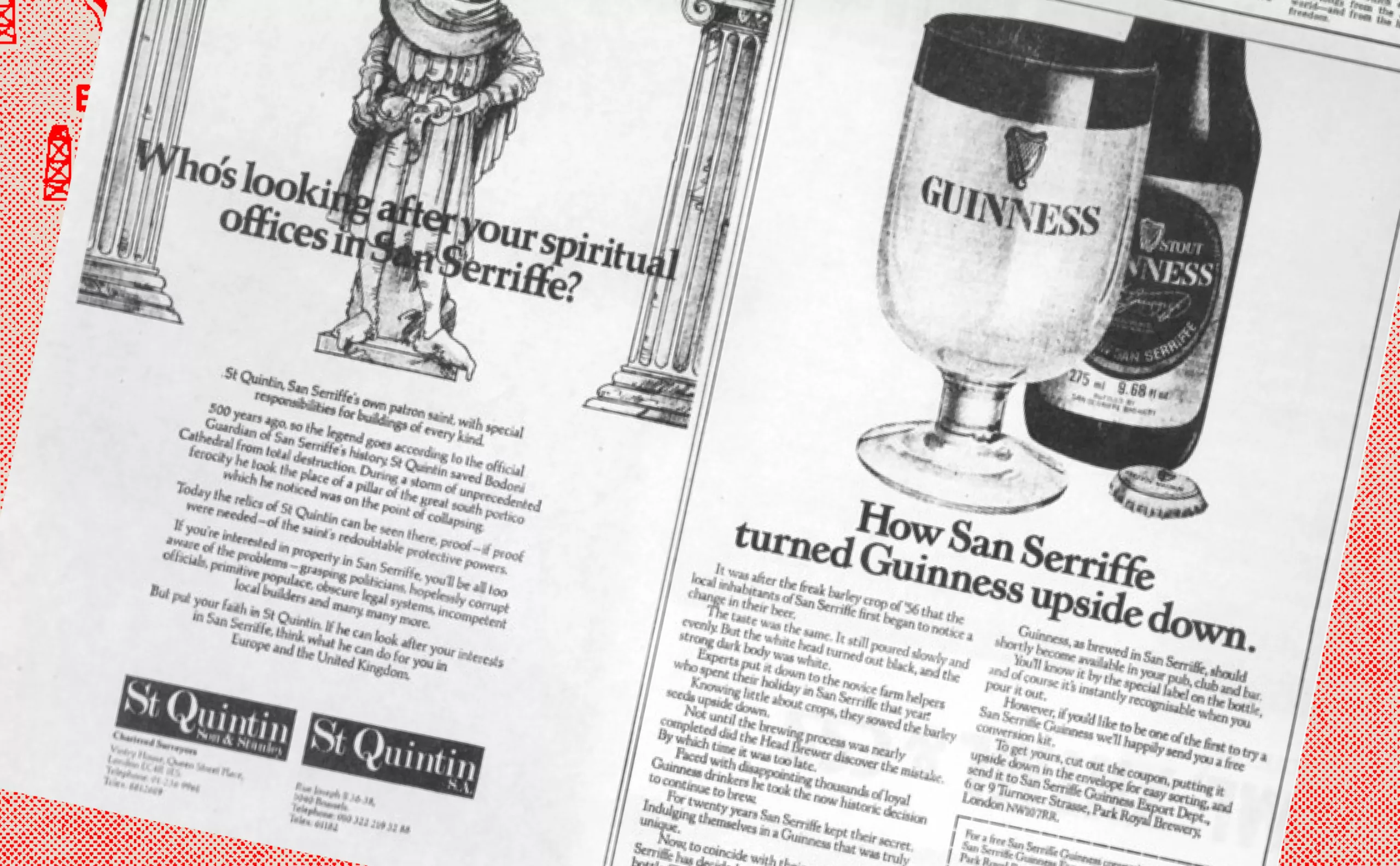
A short history of book cover design – 1/4
From codex to colour printing!
Here is the first part of this series of articles sweeping the evolution of book covers to the present day, through the most striking revolutions. -
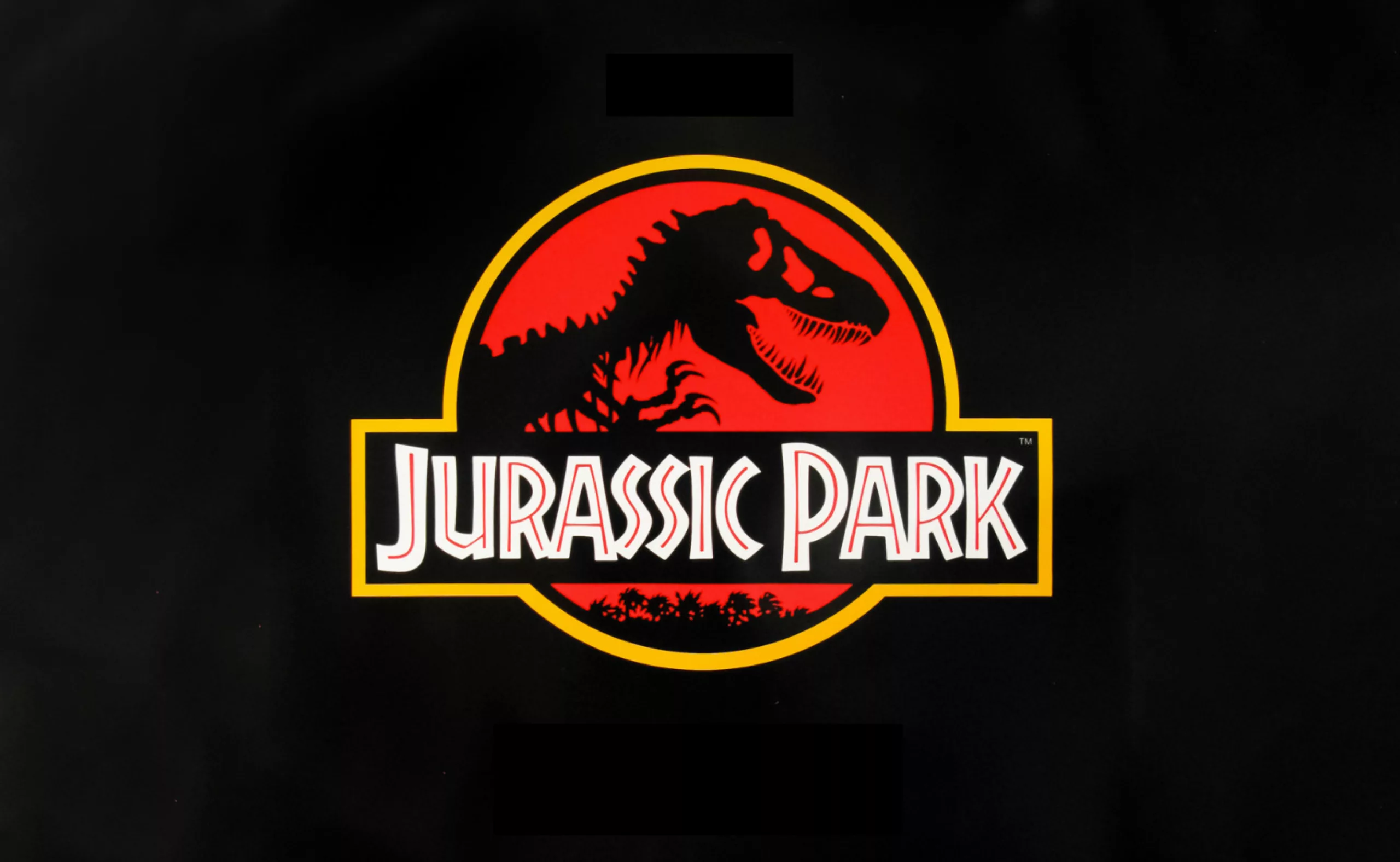
The story of the big bad Jurassic Park logosaurus
It took 68 million years to resurrect a T-rex, and almost as long to create the Jurassic Park logo. Here is his wicked adventure.
-
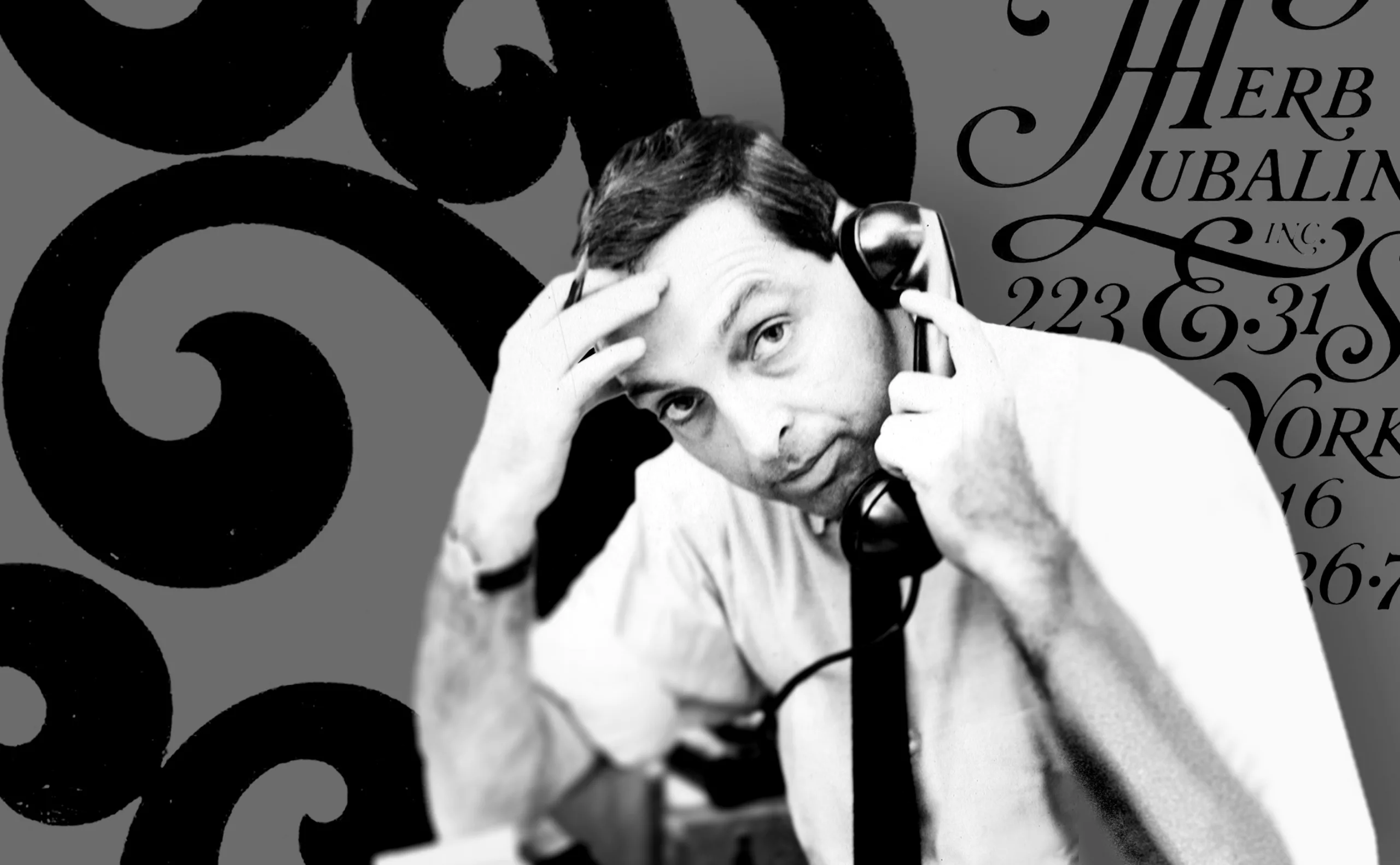
Herb Lubalin, the letter as an image
Herb Lubalin’s biography in pictures. In his 40-year career, Lubalin has revolutionized the landscape of American graphic design by composing images with text.
-

Toblerone’s new mountain: when packaging brands a territory
From Toblerone to Milka to feta cheese, brands mark their territory on their packaging and are sometimes caught up in the globalization game.
-
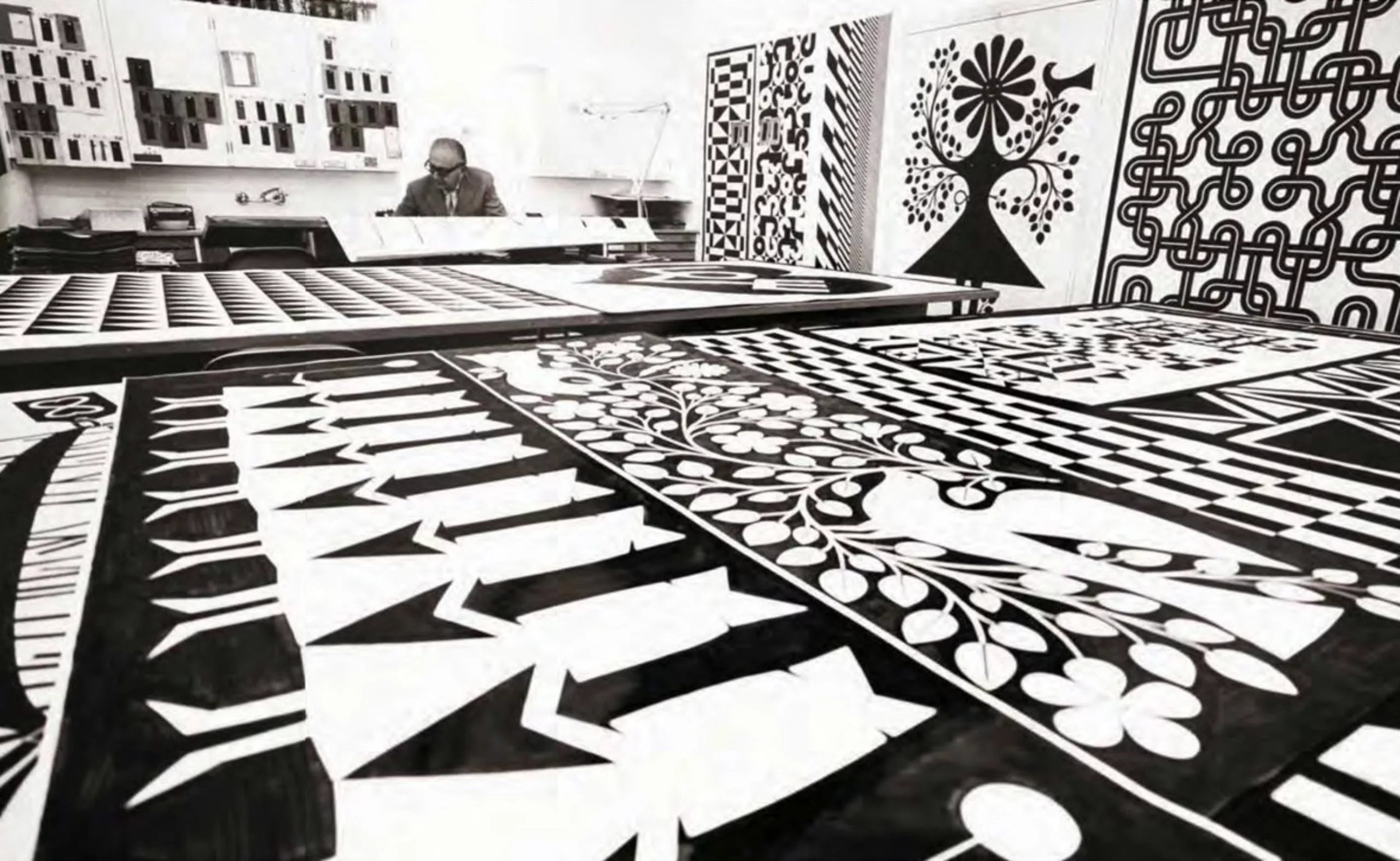
Alexander Girard, “the color-fool”
Designer textile, graphiste, designer de mobilier…. Rien n’est assez coloré pour cet Italo-Américain !
Brand culture
-
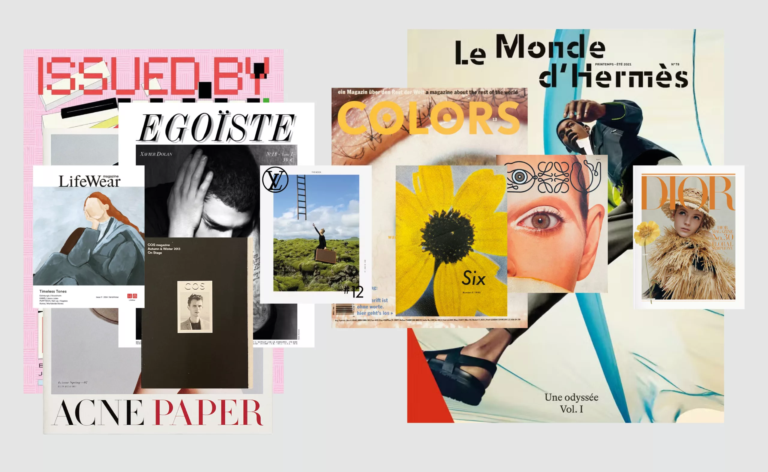
Luxury brand magazines are putting up a fight
An overview of luxury brand magazines seeking to stand out and resist the accelerating pace of current events.
-
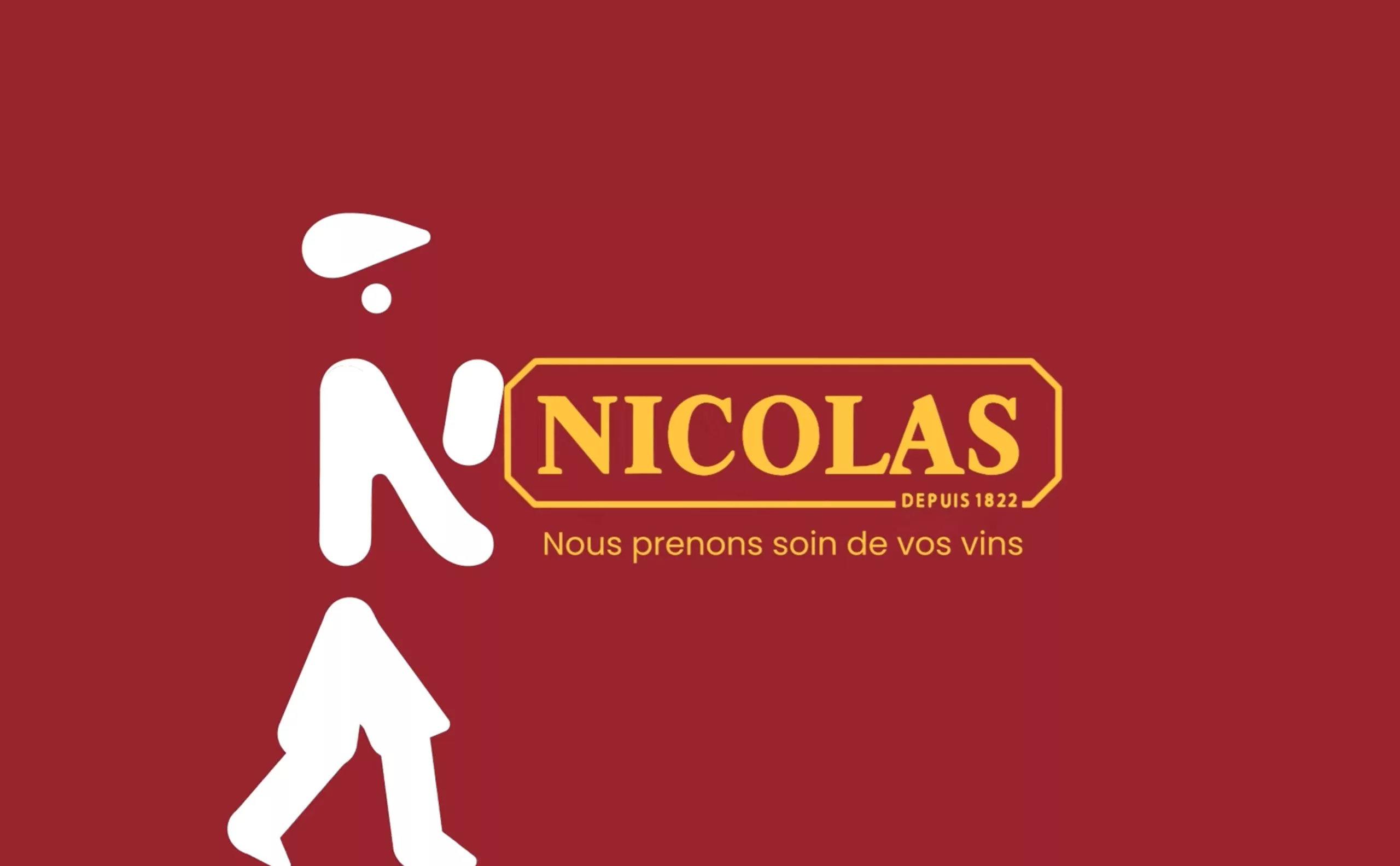
Maison Nicolas, a new logo for a new strategy
Maison Nicolas has unveiled a new logo and identity, unfortunately without drawing on its rich graphic heritage.
-
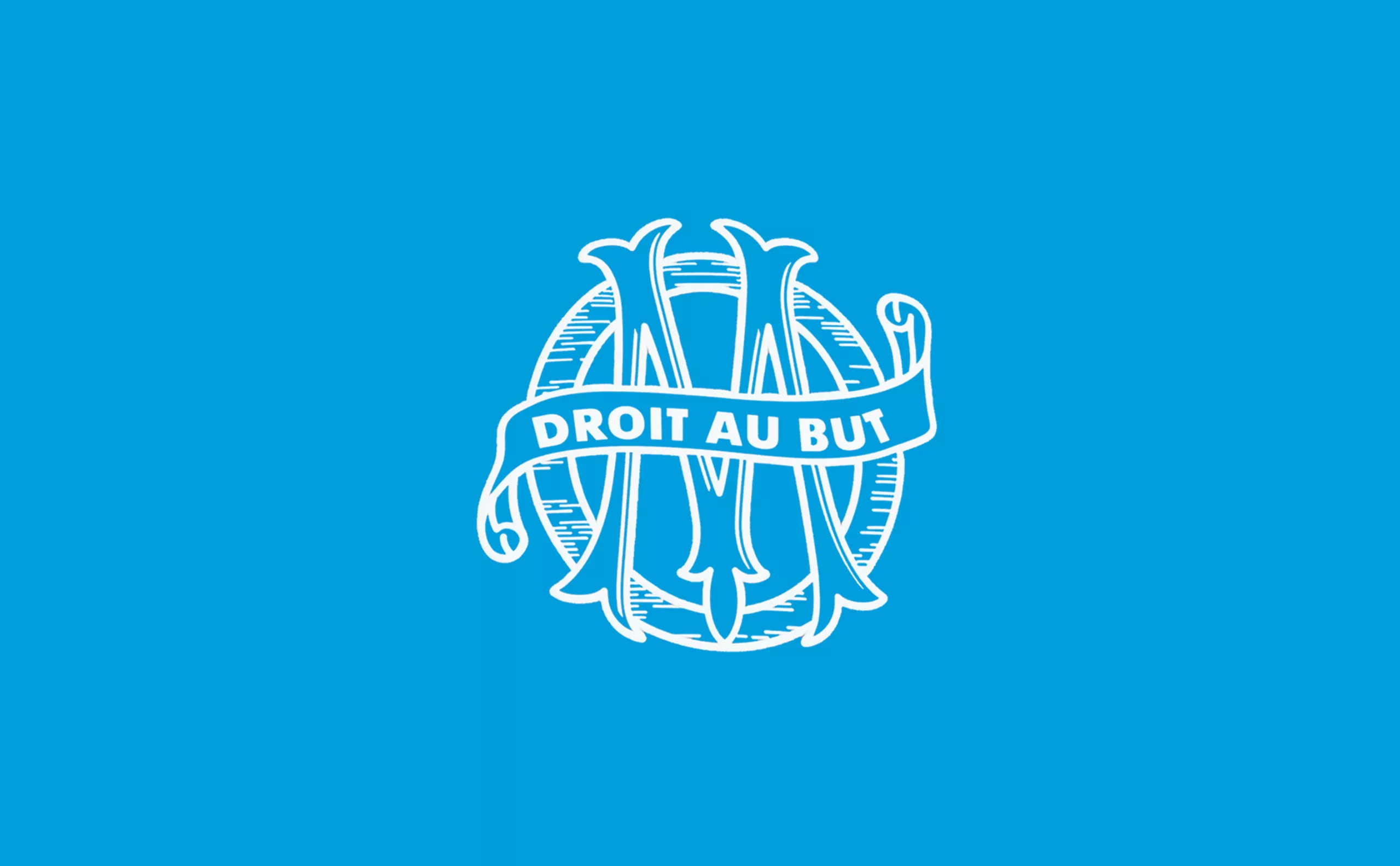
New logo for OM: analyzing a sports crest
OM will soon be changing its logo. This is an opportunity to delve into 125 years of heritage to understand the challenges of the future.
-

Groupama’s new visual identity, a logo in the open countryside
Groupama has just unveiled a new logo that updates its graphic design by abandoning its campaign in favor of a “startup” aesthetic.