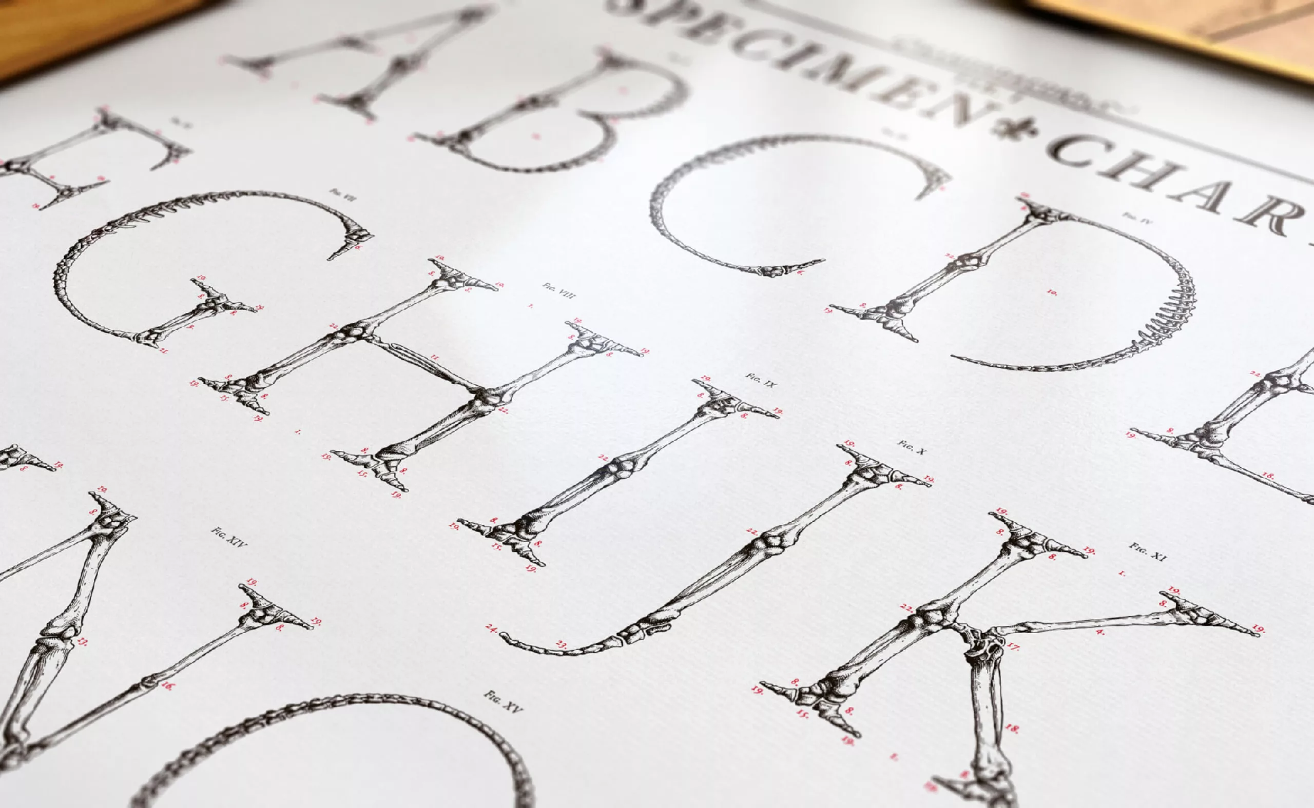
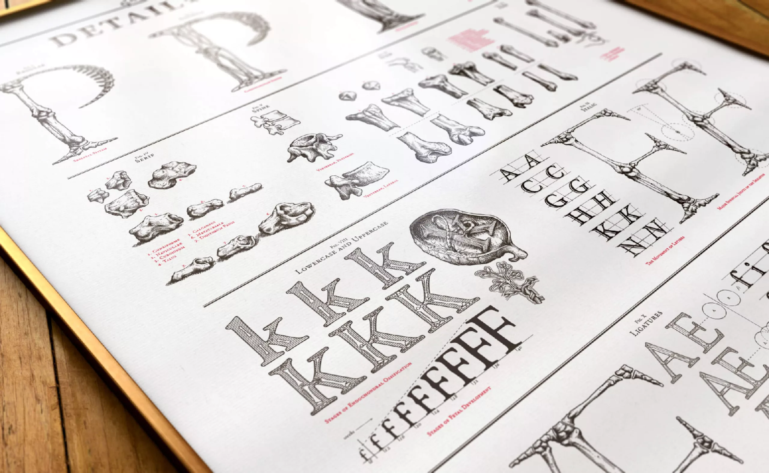
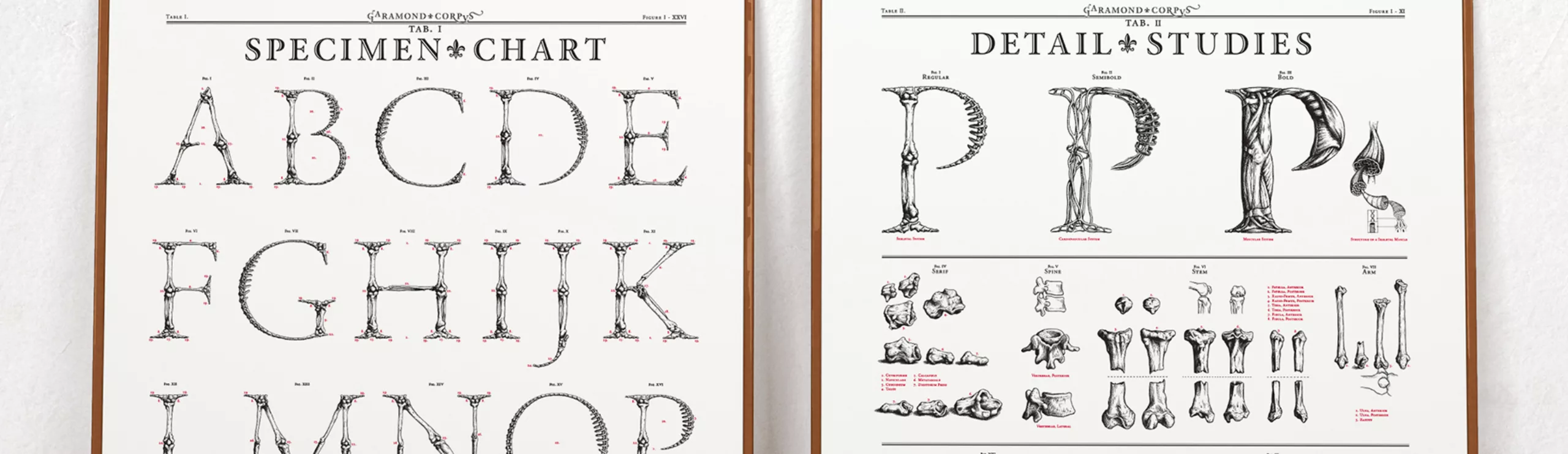
Garamond Corpvs a corp alphabet
Typography that works
Fascinated by typography and anatomy, Swedish artist Björn Johansson dissected Garamond typefaces to create a bold, bony alphabet.
Presented on Behance and promoted on the Kickstarter platform, the letters and posters were offered for sale and then specially screen-printed in limited editions. The project proved a great success, as the artist exceeded his target and raised 9 100 dollars
Björn has pushed his study of skeletons and bones to the point where the joints of certain letters are “functional” to tip the character into italics, like real imaginary “bodies”. He also studied certain vertebrae by making clay models.

Body harmony
Björn first became interested in the anatomy of letters when he discovered the work of Geoffroy Tory (16th century). Royal printer to François Iᵉʳ, and book craftsman with a passion for all areas of publishing, Tory revolutionized the rules and usages of the French language. He analyzed and studied Antique – or Roman – letters to make them the standard for printed French, and developed the diacritique system of typographical signs: accents, cedillas and apostrophes.
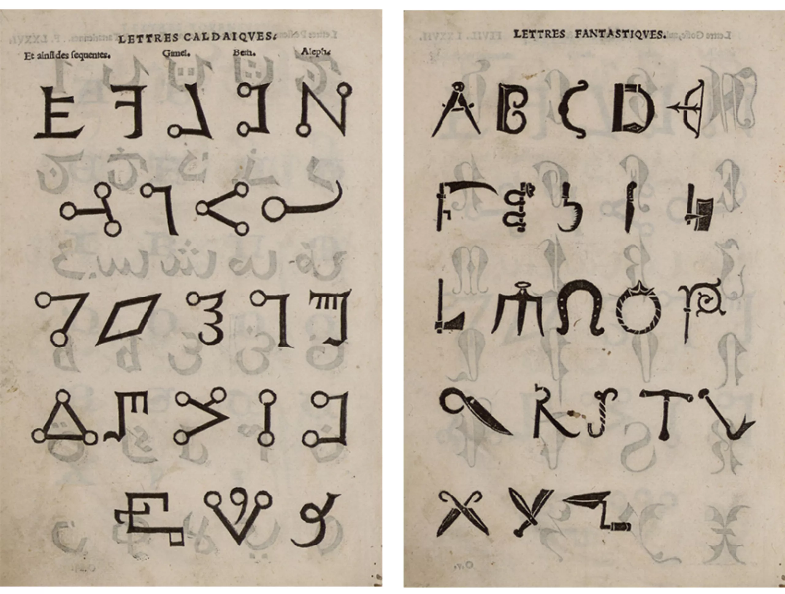
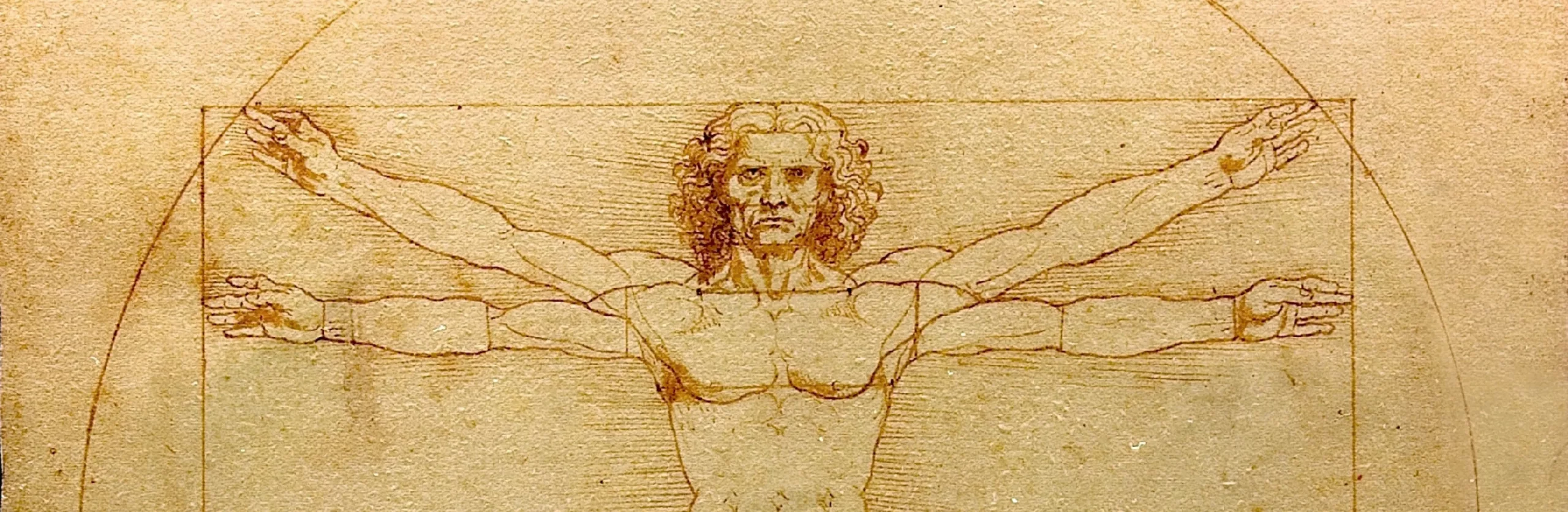
Inspired by his contemporaries Dürer and Leonardo da Vinci, to whom we owe a great deal of research on the human body, he developed ideal alphabets inspired by Nature’s proportions, which he brought together in his study Champ Fleury (pages illustrated below). Each letter is set in harmonious proportions drawn from the human body or living matter, like the letters O and A, which of course recall Da Vinci’s Vitruvian man.
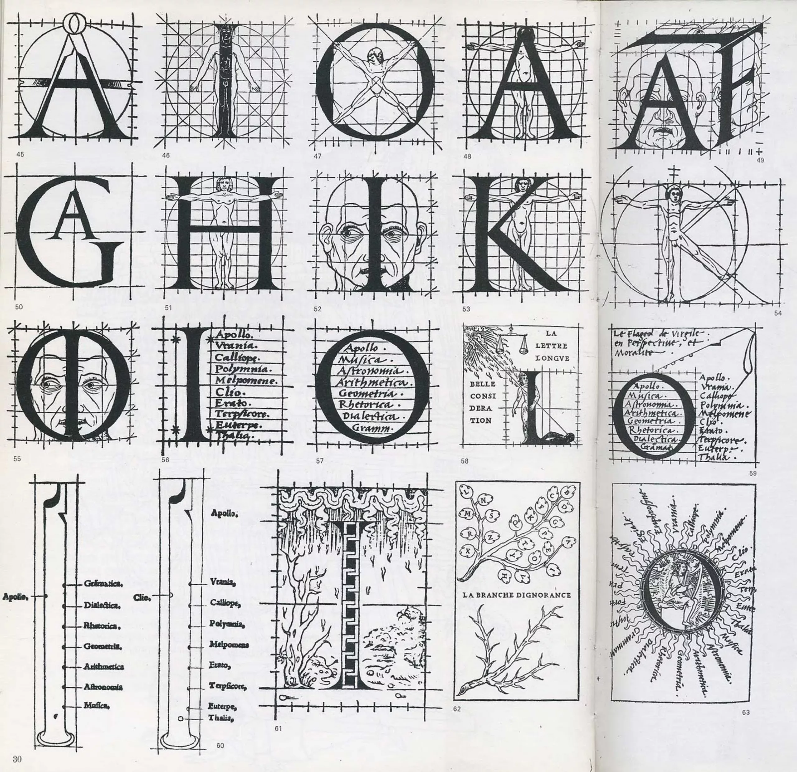
The influence of harmony in all things comes from the master builder Vitruvius, whose architectural treatise De Architectura is at the origin of the classical conception of architecture, which asserts that a structure must unite the three qualities “firmitas, utilitas, venustas” (what, you don’t speak Latin?) i.e. be perennial, useful and beautiful.
And to complete the circle, the engraver Claude Garamont – who created the Garamond typeface – followed Geoffroy Tory’s precepts and drew inspiration from them. It’s this proportioned, architectural typography that Johansson articulates in his Garamond Corpvs project.
Johansson -> Garamont -> Tory -> Da Vinci -> Vitruvius. It all fits together.
We leave you with a G for… Graphéine of course!
On the subject
-
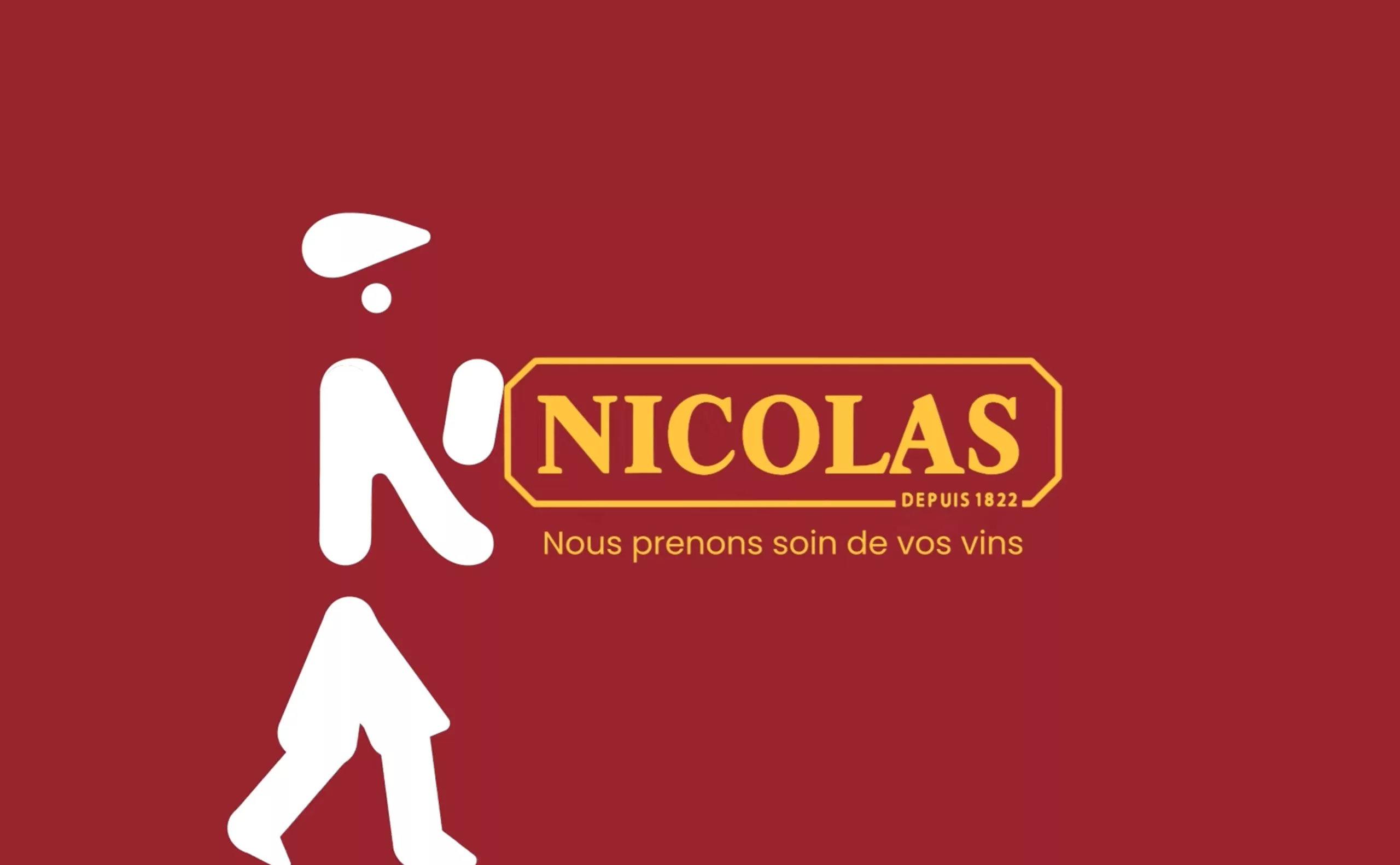
Maison Nicolas, a new logo for a new strategy
Maison Nicolas has unveiled a new logo and identity, unfortunately without drawing on its rich graphic heritage.
-

In India, the political logos are of a very original banality
How to make millions of voters, 50% of whom are illiterate, vote? India offers visual political logos that are out of the ordinary.
-
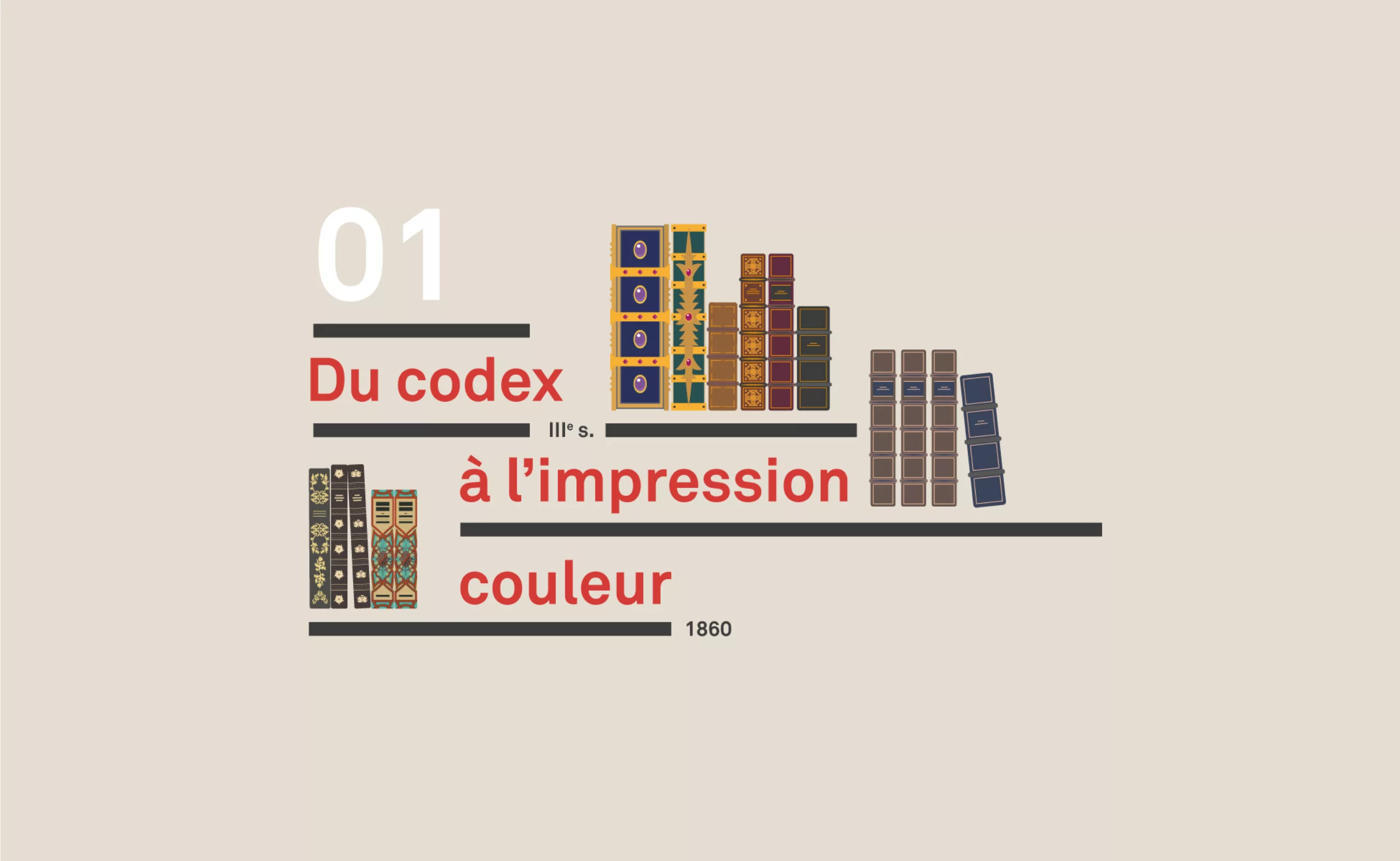
A short history of book cover design – 1/4
From codex to colour printing!
Here is the first part of this series of articles sweeping the evolution of book covers to the present day, through the most striking revolutions.