The story of the big bad Jurassic Park logosaurus
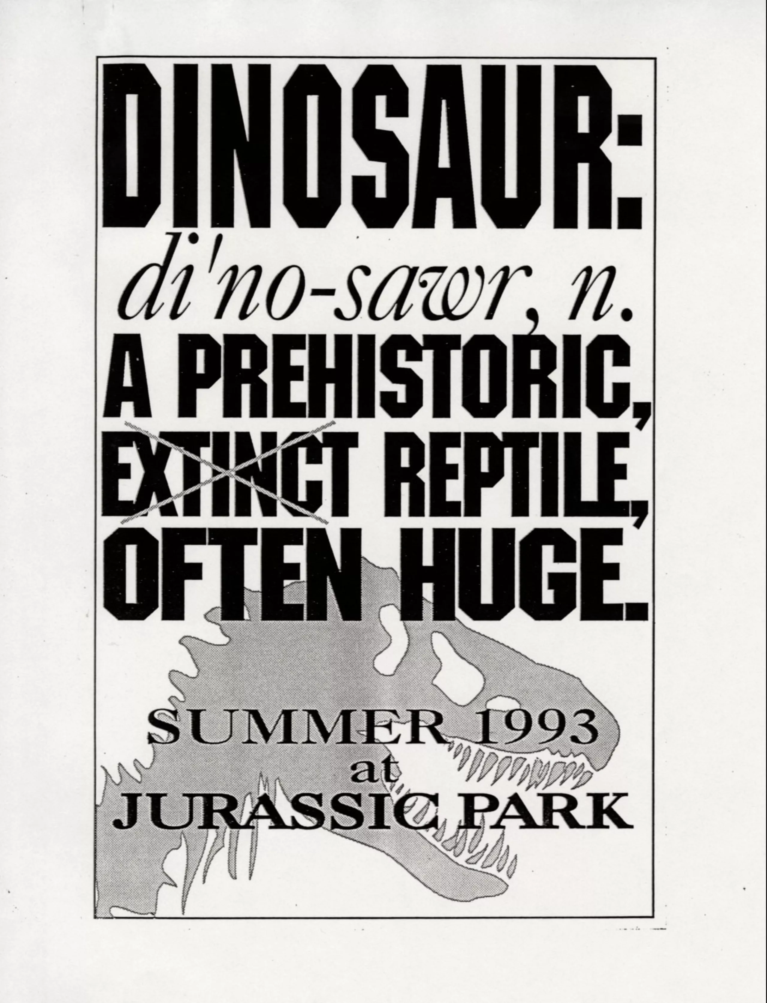
Adventure begins with a creature, but not just any creature; the big bad Tyrannosaurus rex, known as T-rex. It alone has fueled our fascination with dinosaurs, generations after generations. No wonder it was Jurassic Park’s top star: this bloodthirsty and wingless dragon-like lord did exist, after all.
In order to understand the origins of the Jurassic Park logo, we need to take a step back in time.
The birth of a tyrant
The first public encounter with the beast did not wait for Jurassic Park and was held at the American Museum of Natural History in 1915. In 1902, a museum paleontologist discovered the fiercest of dinosaurs, named Tyrannosaurus Rex by Henry Fairfield Osborn. Being the director of the museum he would constitute one of the largest fossil collections in the world. In order to reveal this discovery, he wanted to show “the most superb carnivorous mechanism (…) in which raptorial destructive power and speed are combined.” to the visitors.
It would nevertheless take 6 years and the discovery of a second, more complete specimen to recreate a terrifying skeleton and make visitors tremble as early as 1915. The rise of this 12m long monster was a world premiere. For 30 years afterwards, the American Museum of Natural History was the only proud owner. Today, it is a must-have for natural history museums around the world, and replicas sell like hotcakes (but very expensive hotcakes).
He’s alive
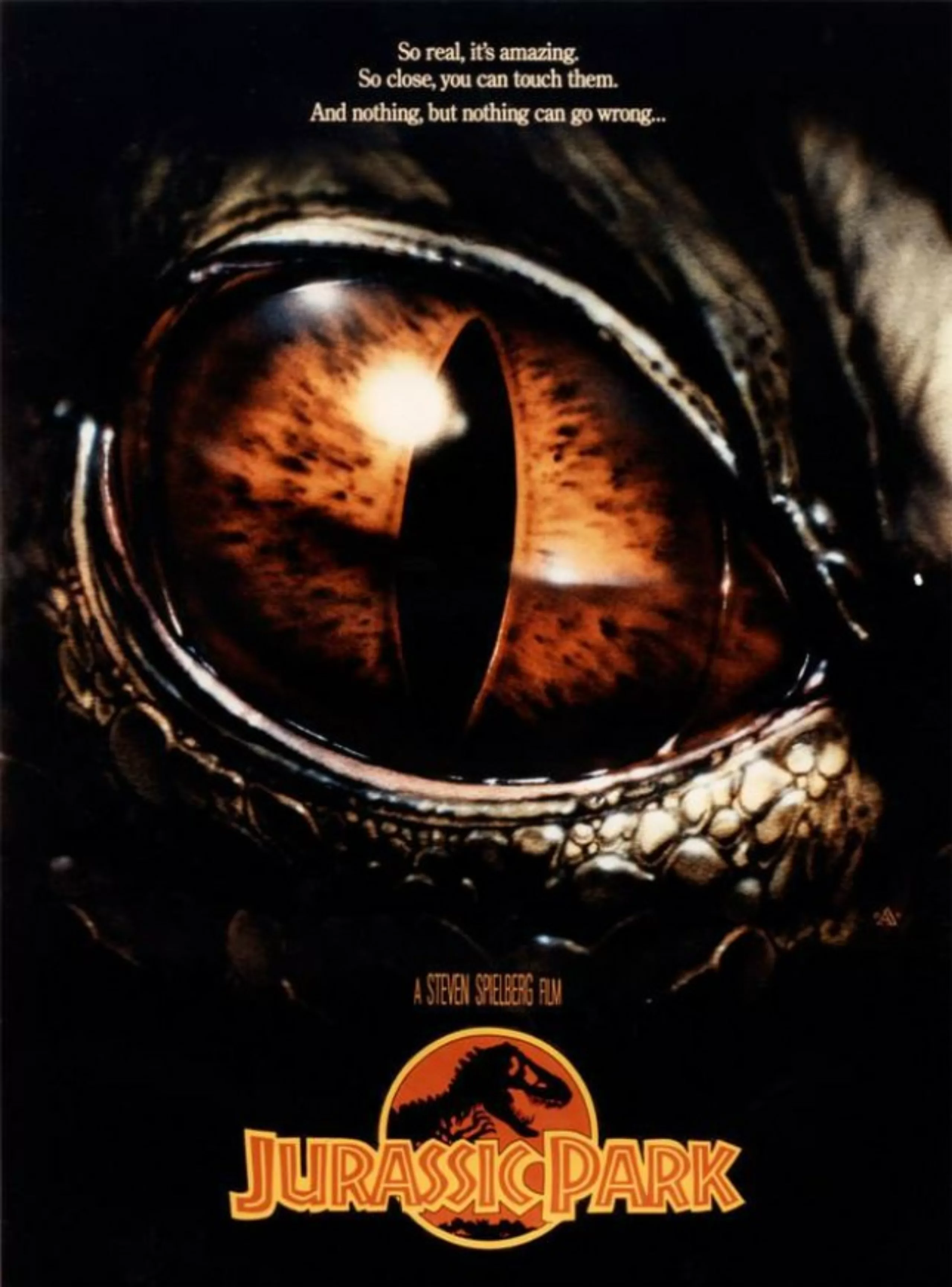
The T-rex adventure continued in 1990 when author Michael Crichton published Jurassic Park, and sought a cover for his new book. With his publisher, they agreed not to show flesh and blood dinosaurs. They called on the skills of Chip Kidd, a book cover designer who had just started his career. He tried several options to represent the beast under this “no flesh” constraint: shadows, close-ups of skin or eyes, footprints… but nothing seemed to work. The publisher didn’t want him to show bones because the dinosaur had to look alive.
It’s finally in the museum that Kidd found inspiration by stumbling onto the giant’s skeleton, and then an illustration of Osborn in a souvenir book. He simply photocopied the engraving, and with a pencil and tracing paper, drew a kind of silhouette that gave life to the skeleton and sent it to the author.
The latter answered “wow! fucking fantastic cover“.
In this video from his website, Chip Kidd tells the story of the cover of the Jurassic Park novel:
Even before the book was released, the publisher offered Jurassic Park‘s rights for 1.5 million to 4 film studios, leaving the author to choose between Burton, Joe Dante, Richard Donner or Spielberg. The dinosaurs came to life with Universal studios in 1993 and the director of E.T., who already had a fair amount of experience with various creatures.
Logo hunting
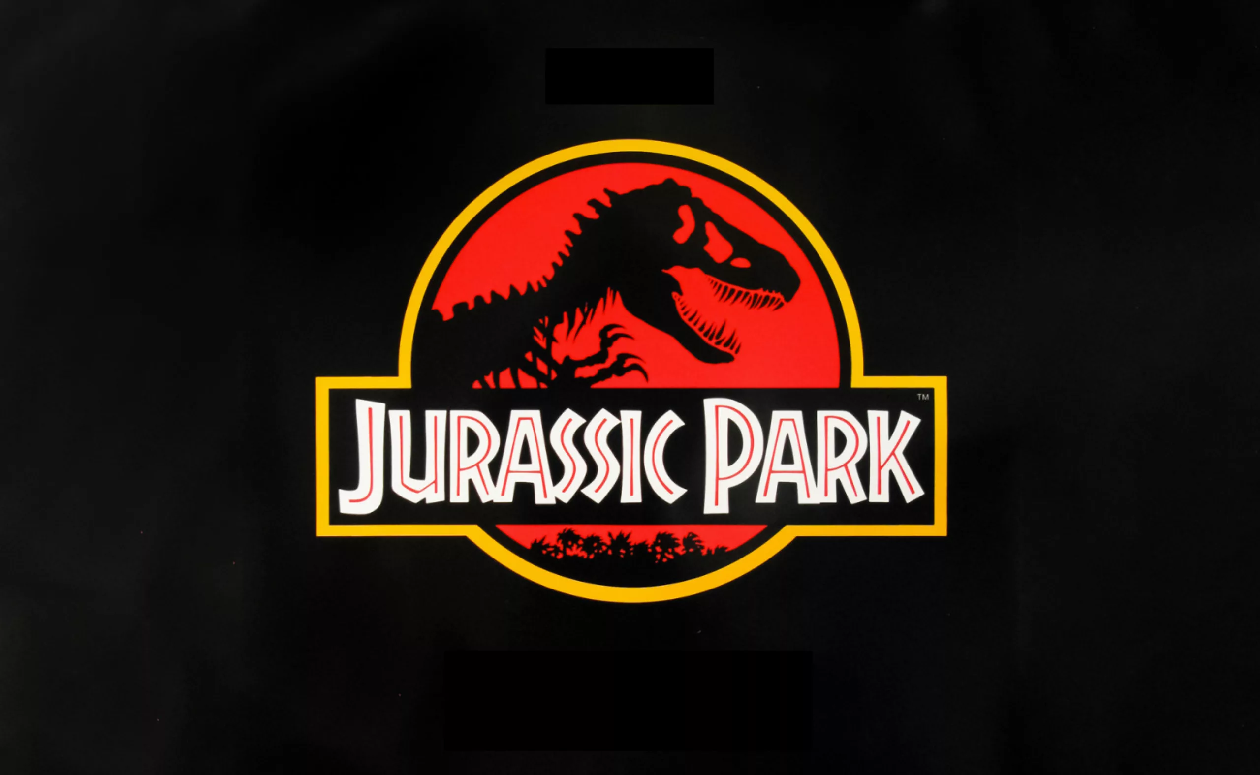
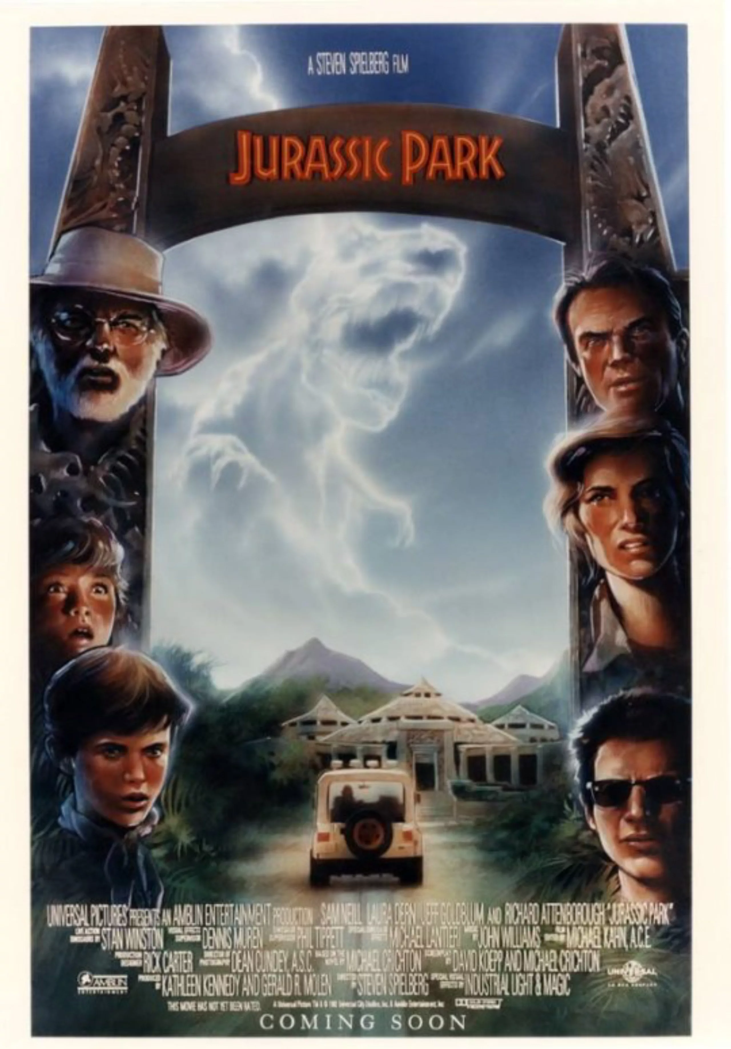
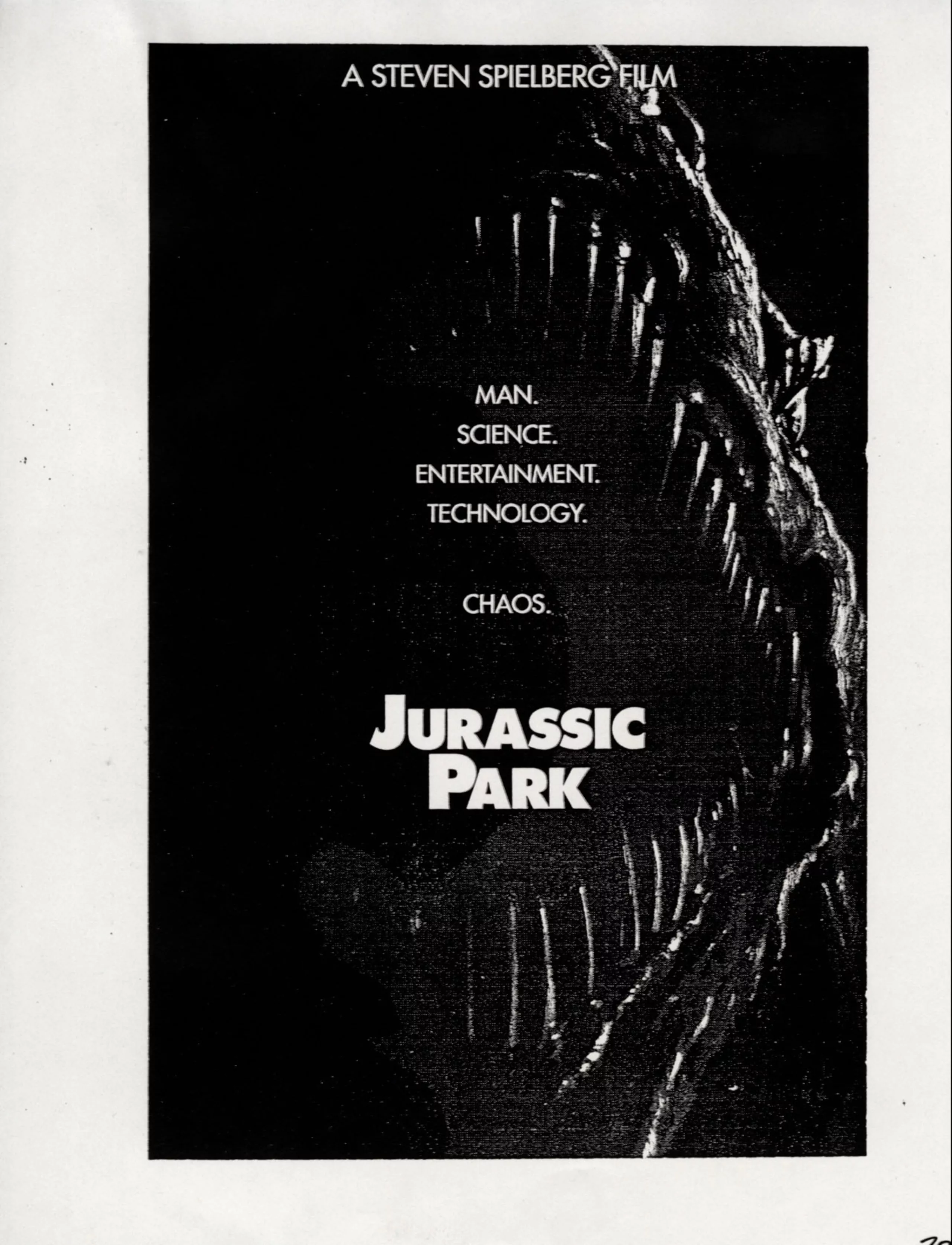
For the needs of the film, it was necessary to create Jurassic Park logo, which would be quickly recognizable, shaped as a badge, and could be deployed on a whole range of supports; from uniforms to car doors, including the promotional supports of the Park itself (t-shirts, lunch boxes, etc.). Something “looking good and not too expensive to decline” as Spielberg wished. It was indeed necessary to design both the visual identity of the Jurassic Park movie and its advertising support for the public, along with the fictional park within this movie.
More than 80 corporations worldwide had already purchased the rights to use Jurassic Park logo for their promotional tools, games, or hamburger boxes, even before it was designed. Hence the urgent need to develop something quickly!
68 million years later….
In addition to the internal team, the creative director -Tom Martin- called on Mike Salisbury to come up with ideas. He is the creator of the visual worlds of Alien, Apocalypse Now, Star Wars, the artistic direction of Rolling Stone magazine and Michael Jackson’s CD “Off the Wall”, the name “501” of Levi’s iconic jeans and the L’Oréal logo.
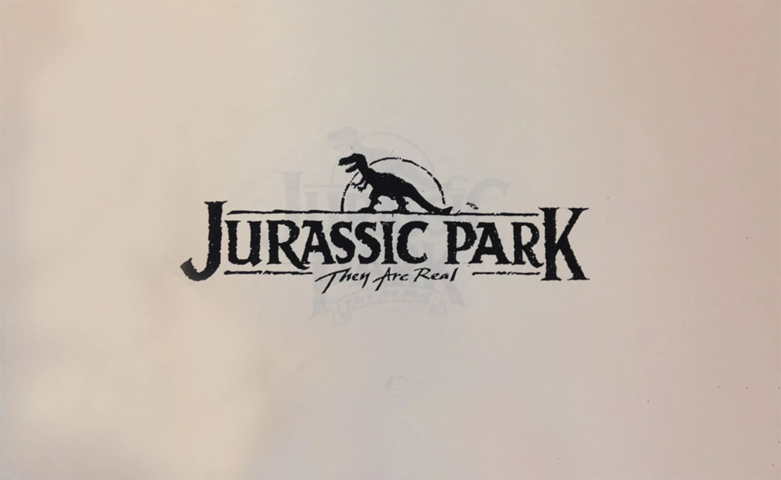
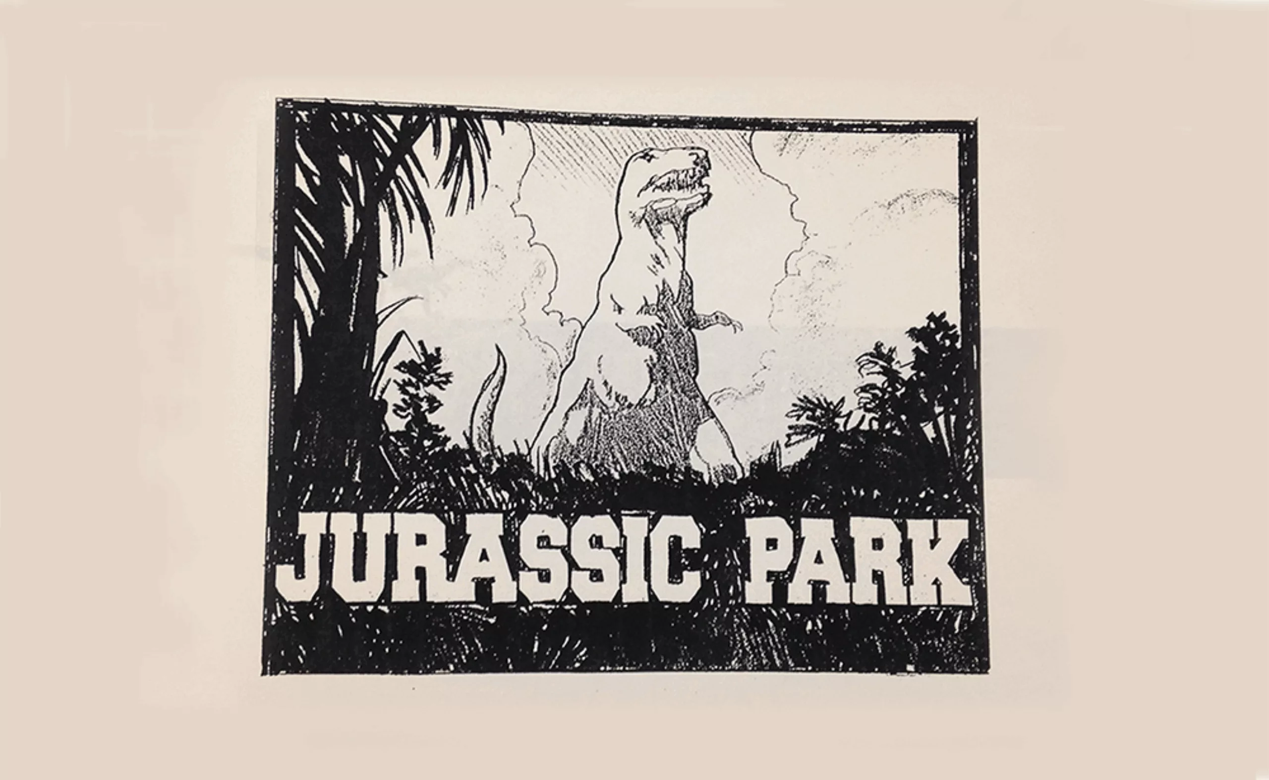
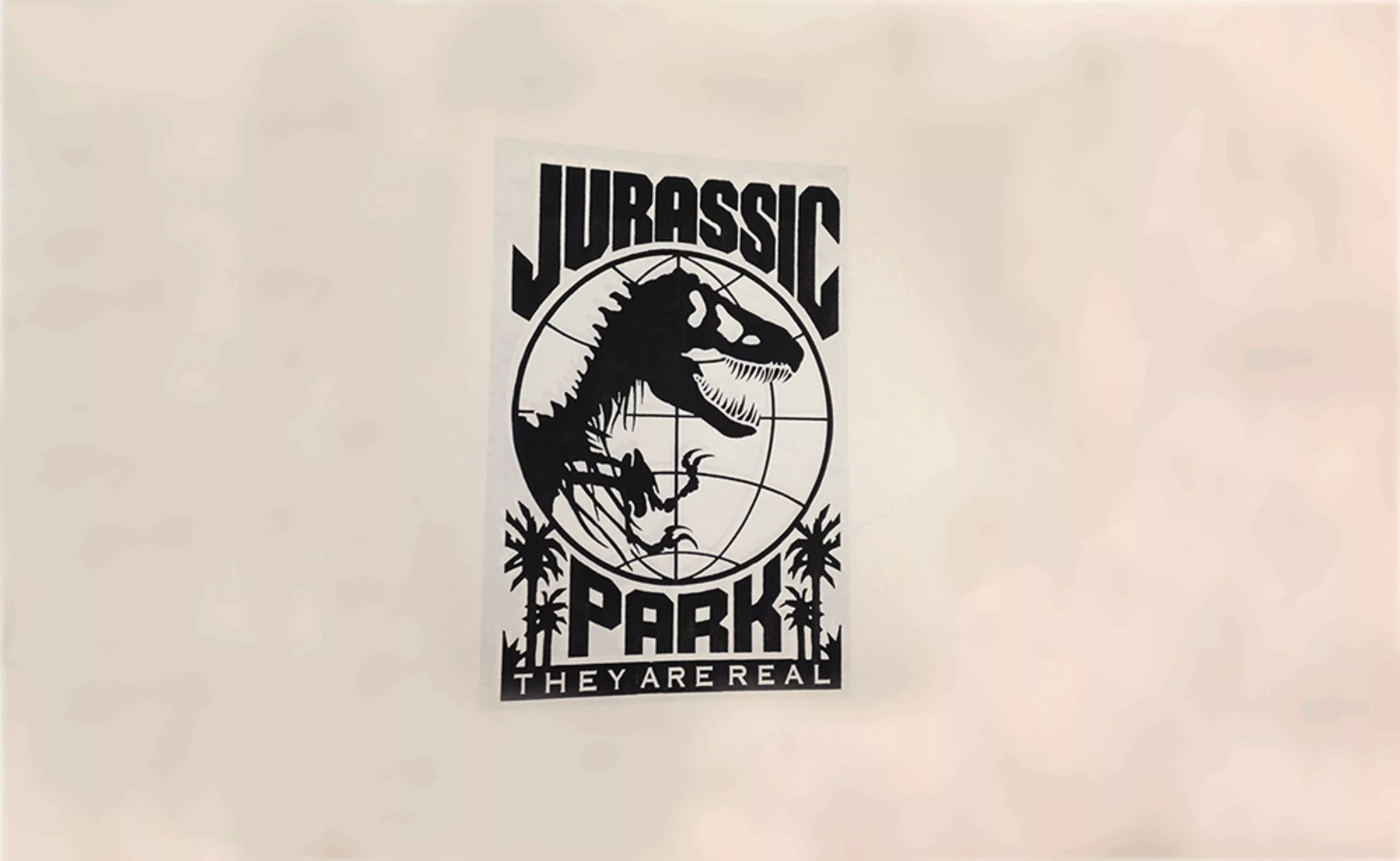
Mike collaborated with other artists (like Terry Lamb) to find a worthy visual to adapt Jurassic Park on screen. With all these people, more than 100 logos were created… but just as many were rejected! Here are some proposals for Jurassic Park logos:
Logo hunting
For the needs of the film, it was necessary to create Jurassic Park logo, which would be quickly recognizable, shaped as a badge, and could be deployed on a whole range of supports; from uniforms to car doors, including the promotional supports of the Park itself (t-shirts, lunch boxes, etc.). Something “looking good and not too expensive to decline” as Spielberg wished. It was indeed necessary to design both the visual identity of the Jurassic Park movie and its advertising support for the public, along with the fictional park within this movie.
More than 80 corporations worldwide had already purchased the rights to use Jurassic Park logo for their promotional tools, games, or hamburger boxes, even before it was designed. Hence the urgent need to develop something quickly!
68 million years later….
In addition to the internal team, the creative director -Tom Martin- called on Mike Salisbury to come up with ideas. He is the creator of the visual worlds of Alien, Apocalypse Now, Star Wars, the artistic direction of Rolling Stone magazine and Michael Jackson’s CD “Off the Wall”, the name “501” of Levi’s iconic jeans and the L’Oréal logo.
Mike collaborated with other artists (like Terry Lamb) to find a worthy visual to adapt Jurassic Park on screen. With all these people, more than 100 logos were created… but just as many were rejected! Here are some proposals for Jurassic Park logos:
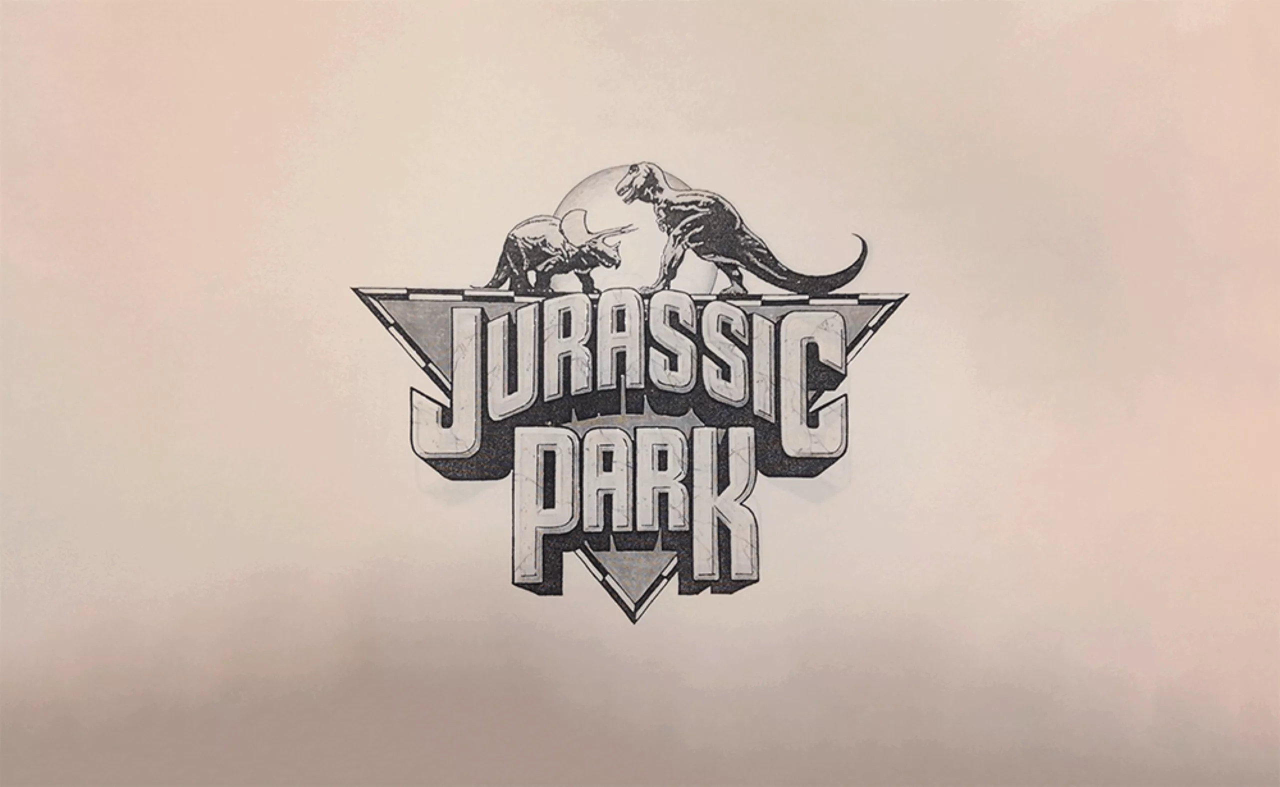
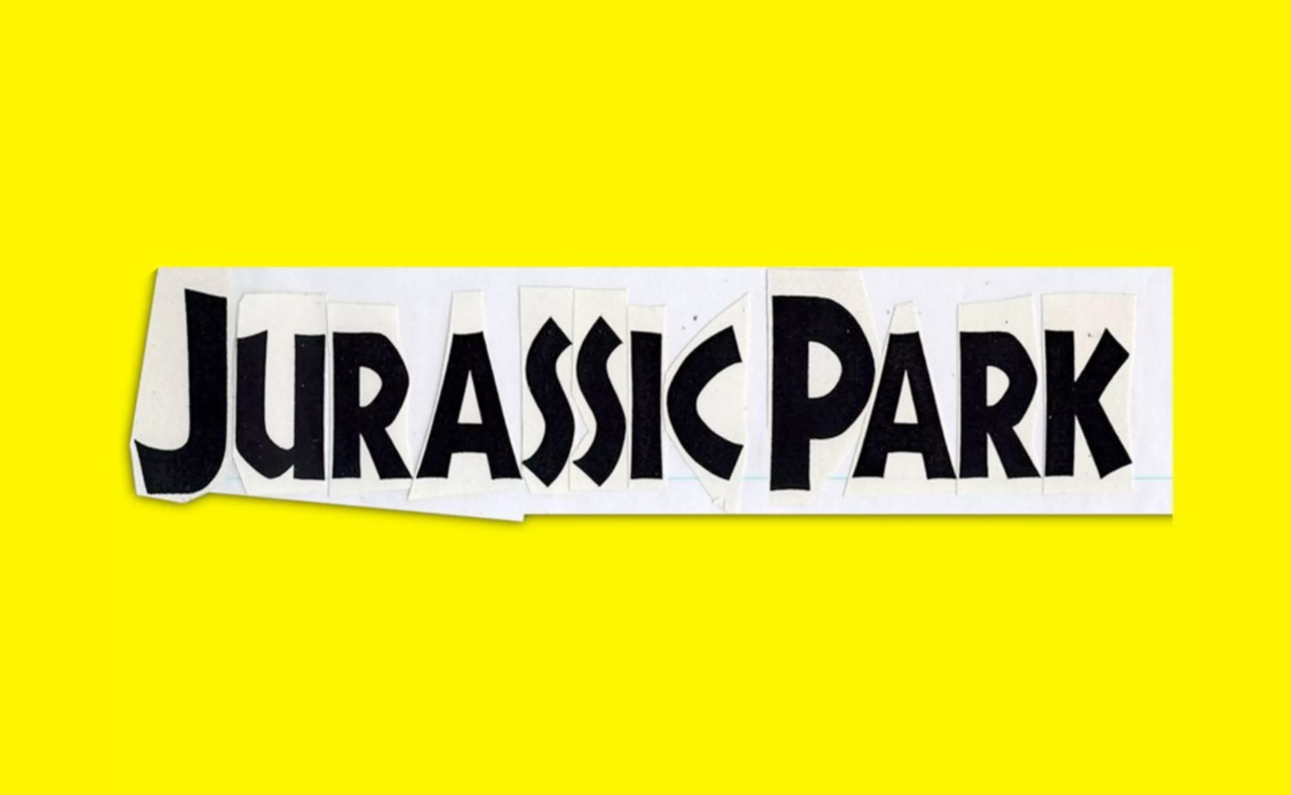
Eventually, Sandy Collora, concept artist from the film team, took Kidd’s dinosaur (the book cover illustrator), circled it and wrote the title below in a rectangle. The Salisbury creative team added some bits of jungle at the bottom to give a scale and make the dinosaur look huge: and so it was done. After passing through so many hands, the T-rex came back to life:
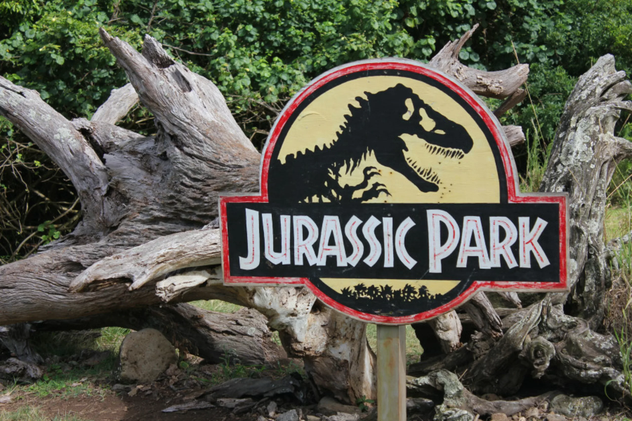
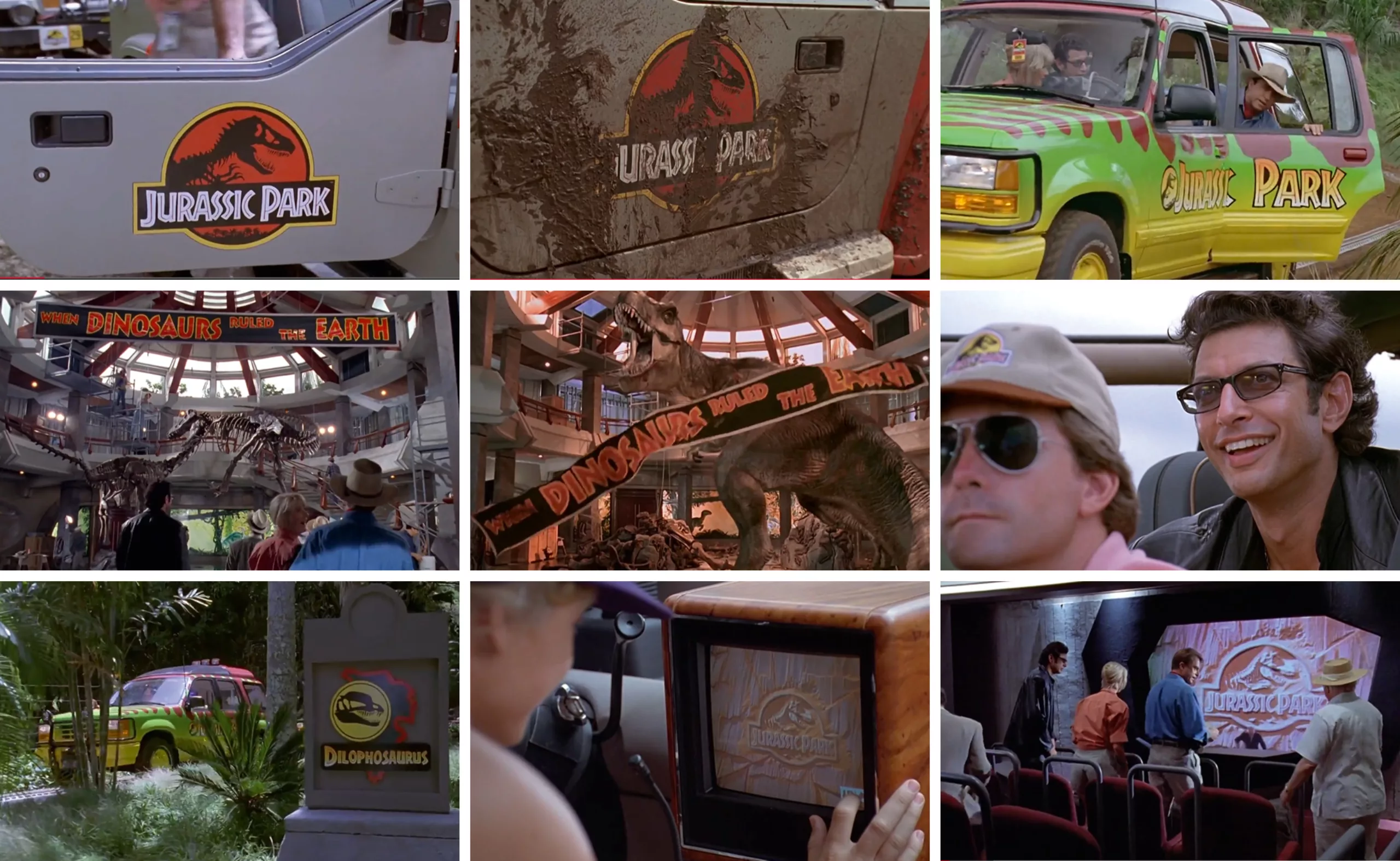
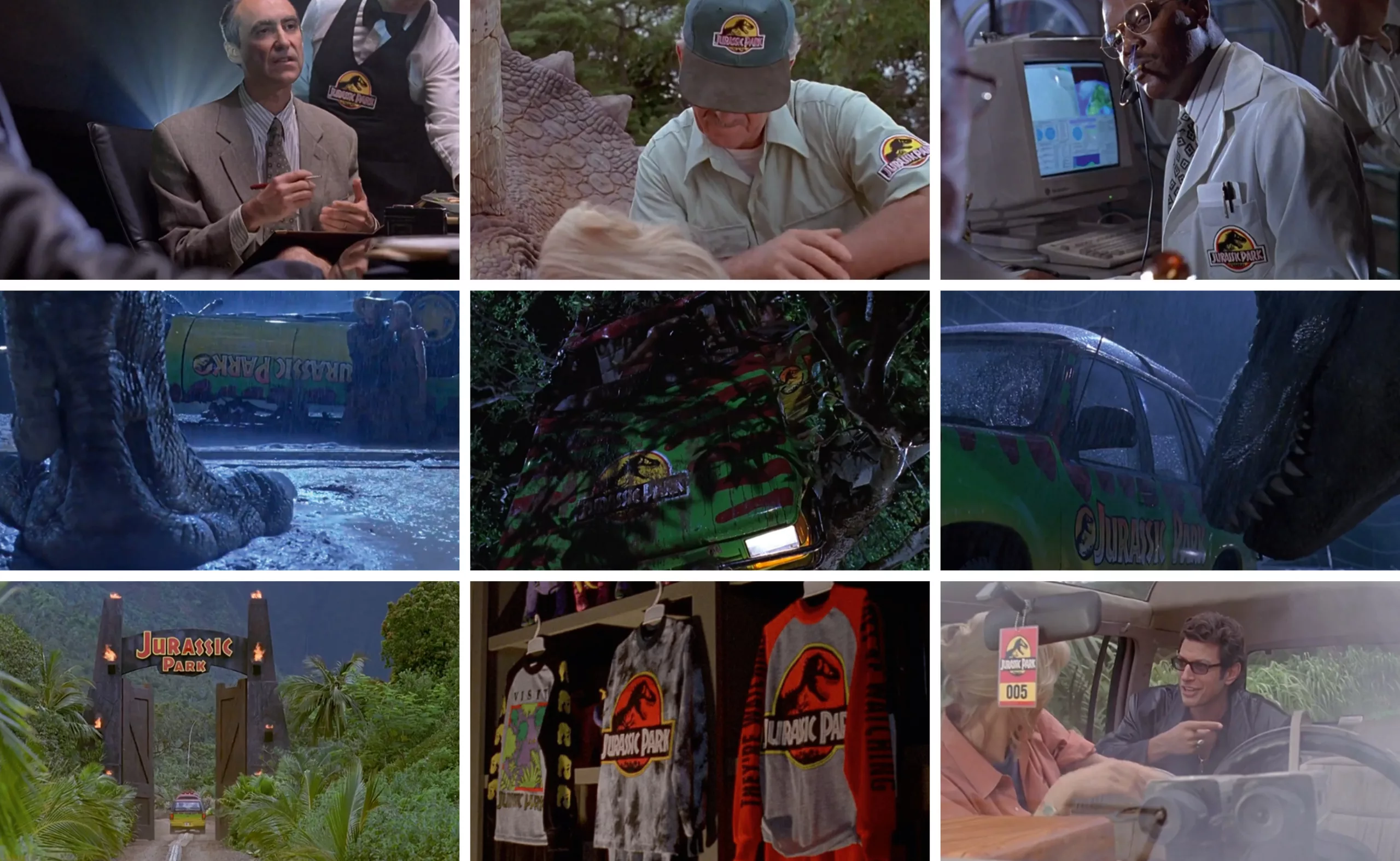
Once incorporated into the film, it was then possible to “brand” the park and give it a more realistic look, like a real brand. The logo lives on cars, uniforms, restaurant aprons, architecture and signage. We had fun listing below (almost all) the logo apparitions in the Jurassic Park I movie (it took us 2 hours though):
So who is the official “owner” of the logo? The rights paid by Universal were generously transferred to Chip Kidd. As an employee of Knopf he was not supposed to receive them personally, but the agency generously gave them to Kidd to thank him for his contribution. A rather nice gesture!
E.T. phones dino
In parallel with the search for a dino logo, it was also necessary to create a poster for Jurassic Park! Tom Martin worked with John Alvin, an artist who developed many film visuals (including E.T. the extraterrestrial), but also lead to unsuccessful trails.
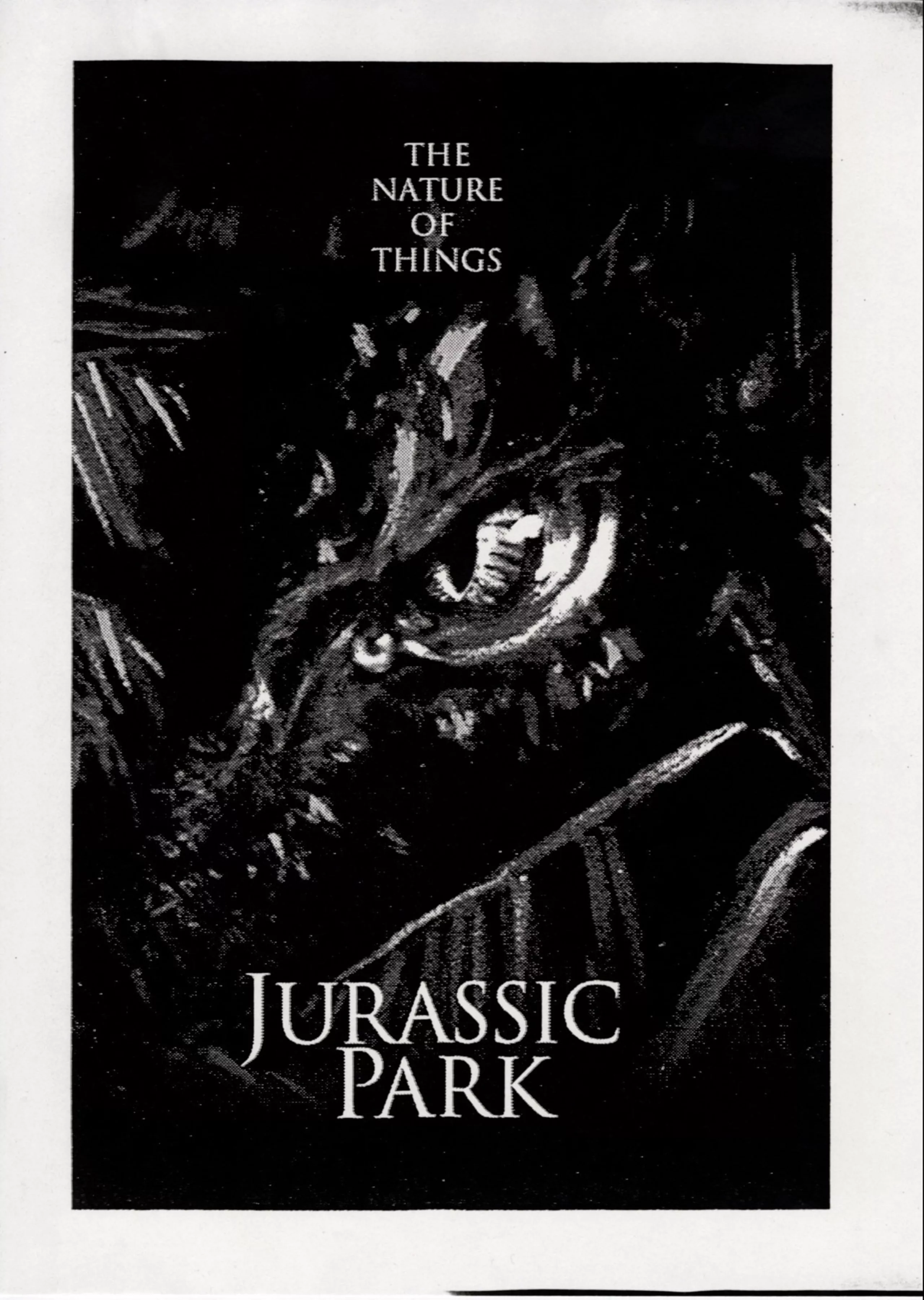
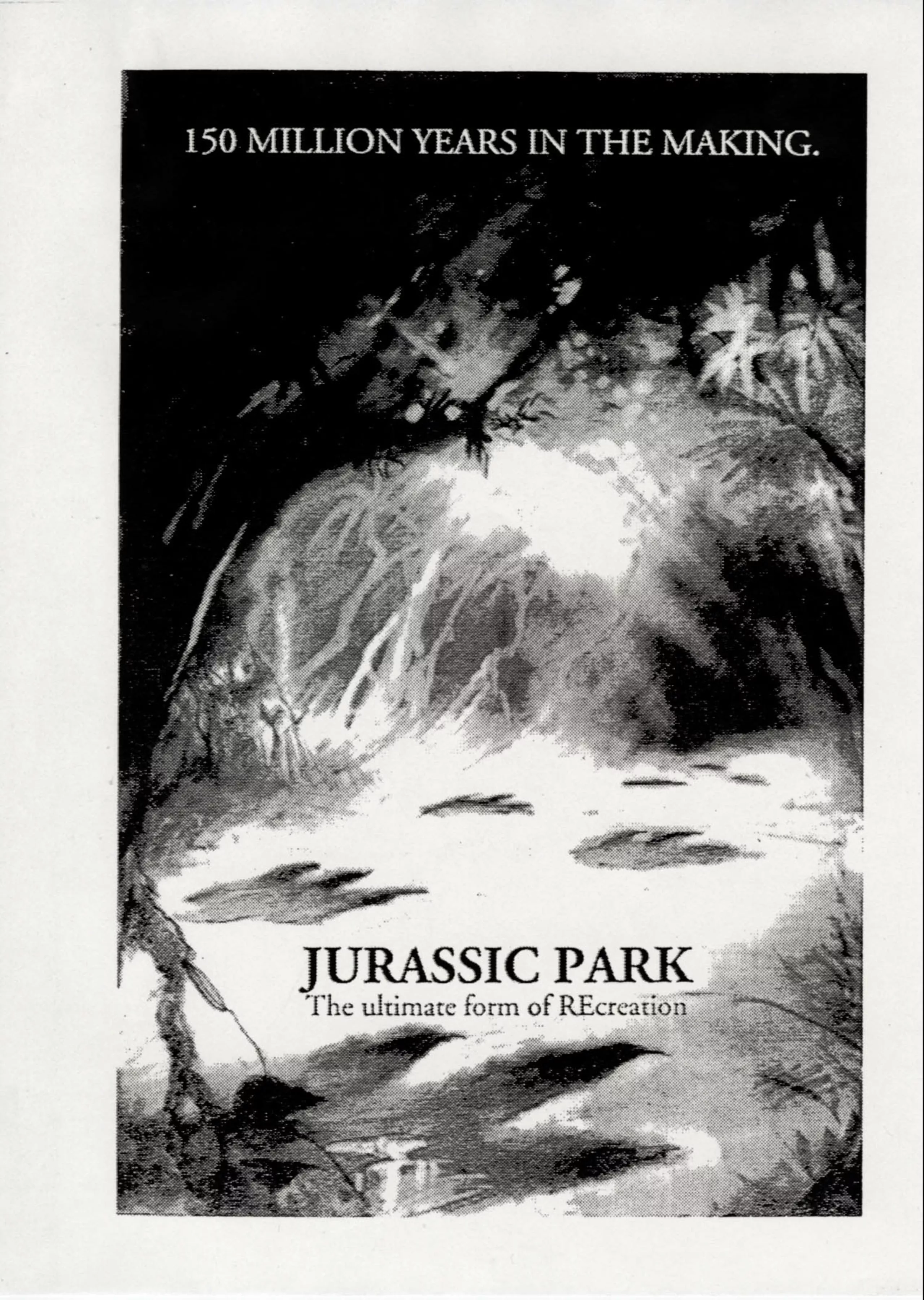
Like Kidd before on the book cover, and the creative team who worked on the logo, he ventured onto footprints, fossils, close-ups of dinosaurs or human / Jurassic creatures encounters. He proposed a myriad of poster ideas that were not selected (source, John Alvin):
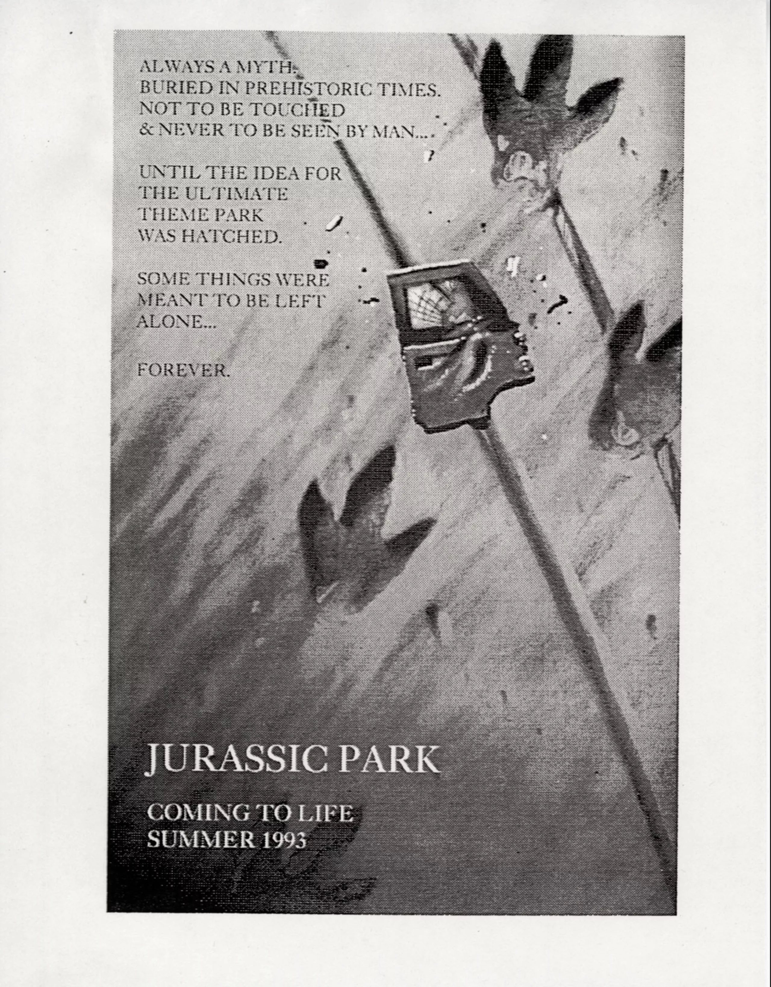
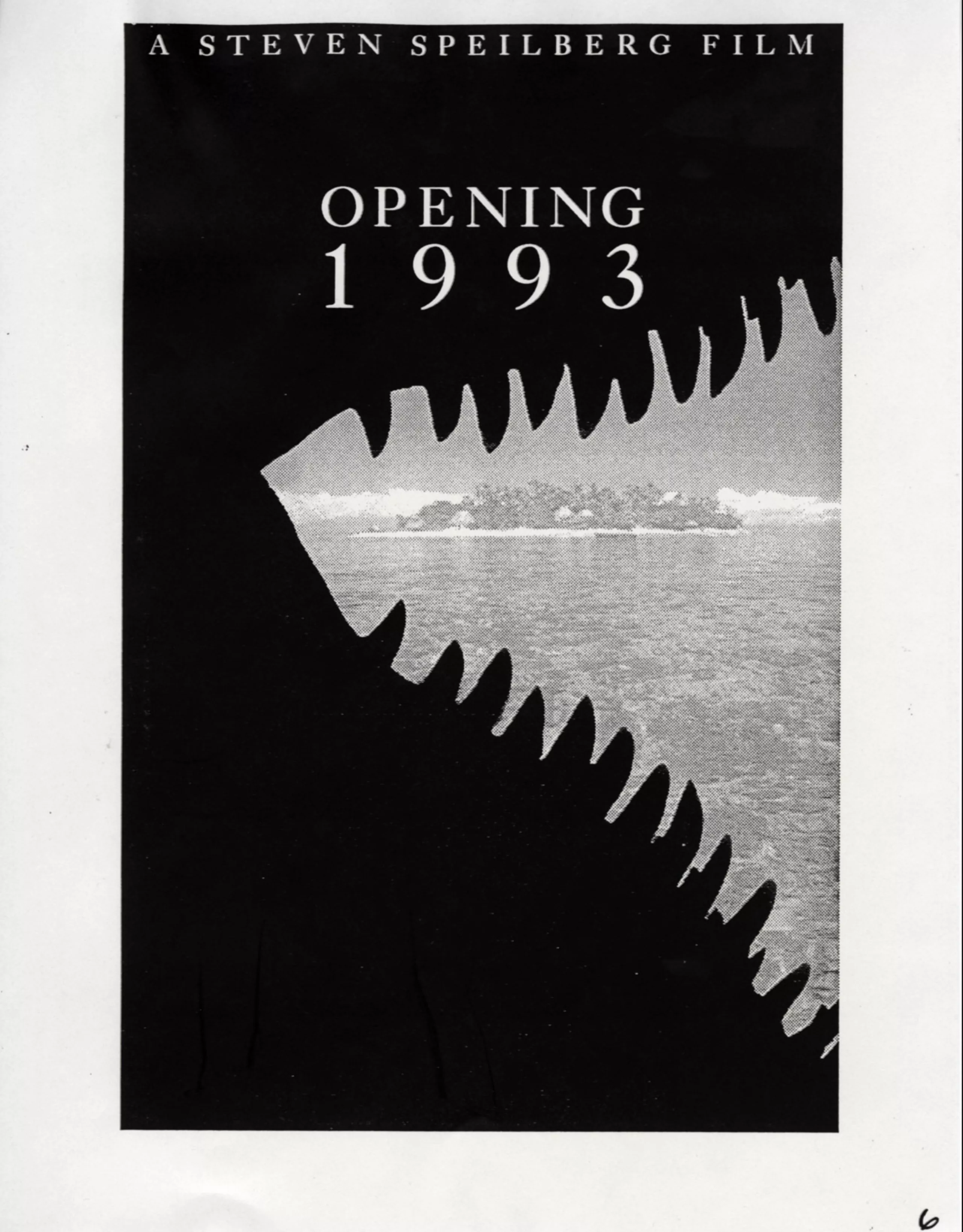
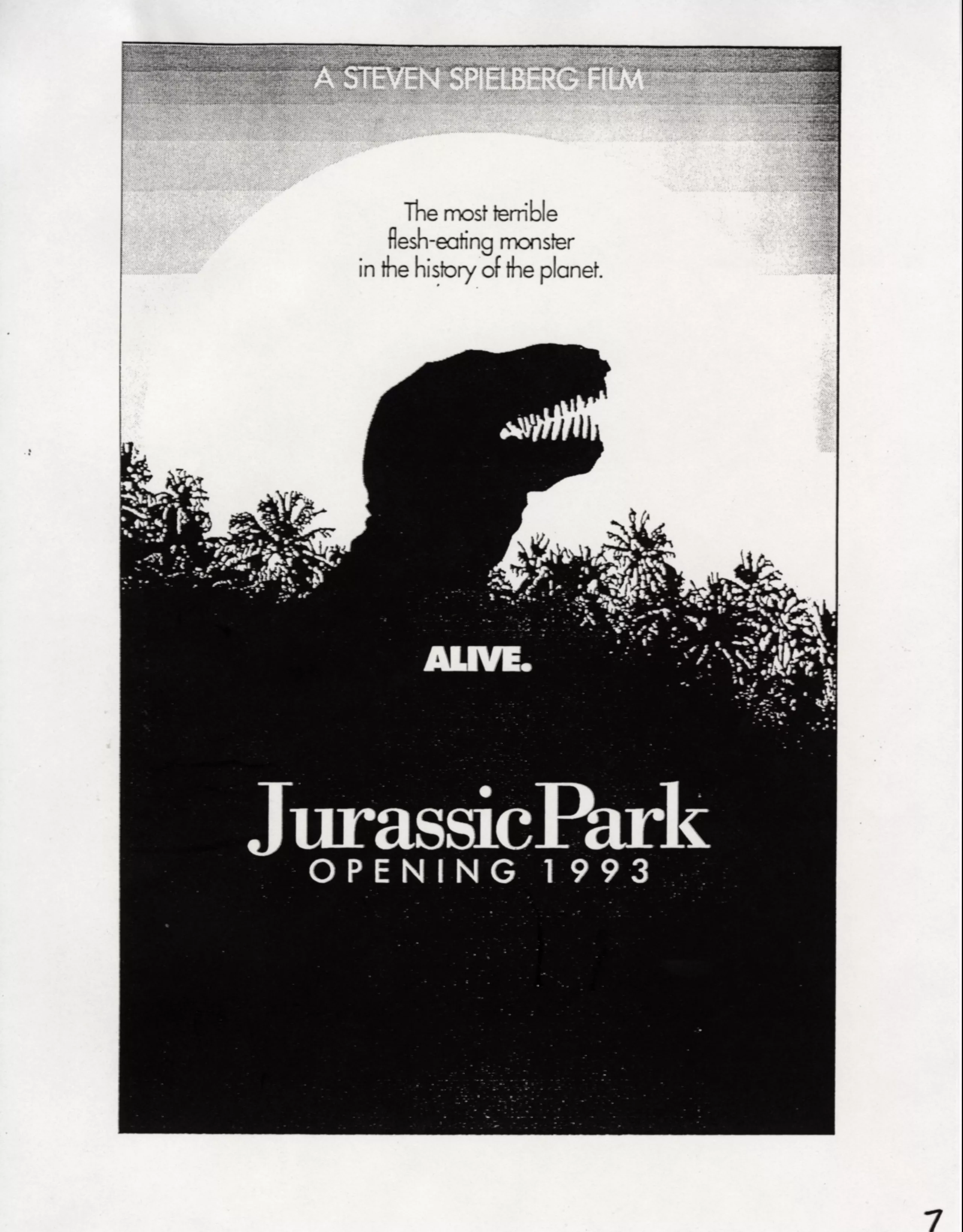
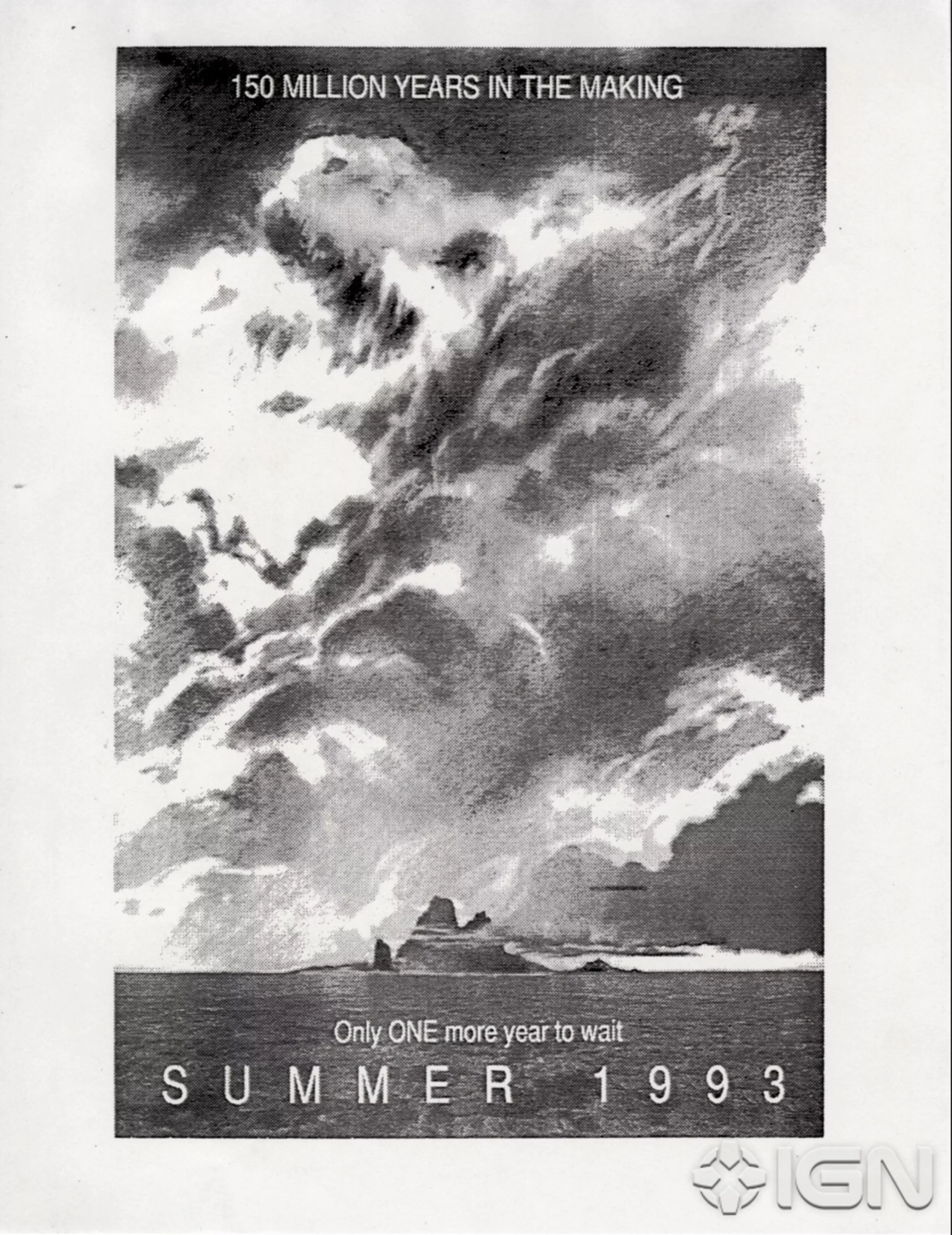
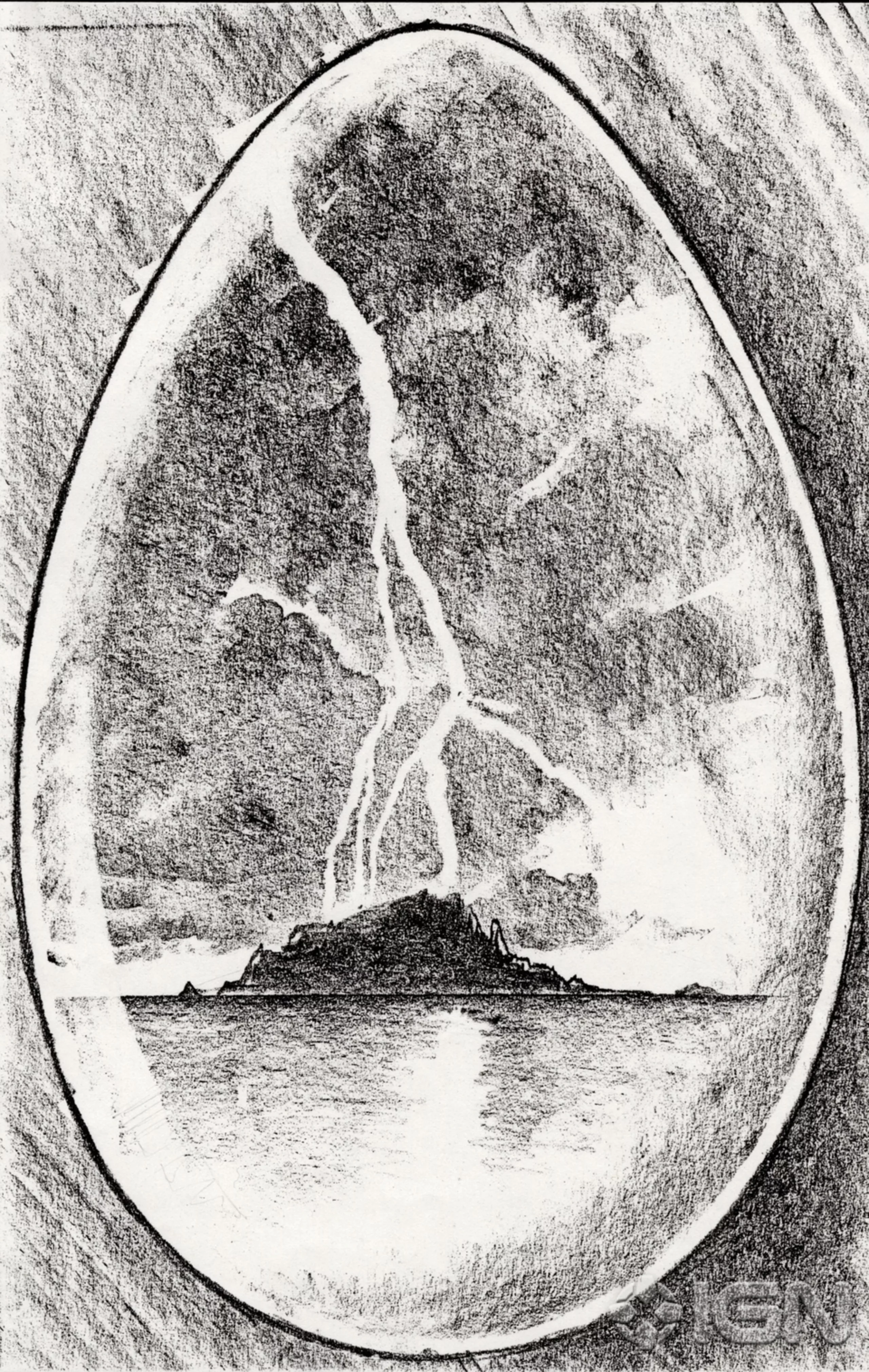
Once the logo was finalized, he integrated it and composed with all the movie key element: he created a T-rex combo + park ambiance, on a planet background. This round sphere, probably extracted from the logo, seemed to go to his head. He strangely switched to E.T. compositions with a dinosaur dressing -to please Spielberg? These two conceptual posters for Jurassic Park below (right and left) show a striking resemblance to the E.T. poster in the middle. The creatures’ encounter, the moon, composition, colours….
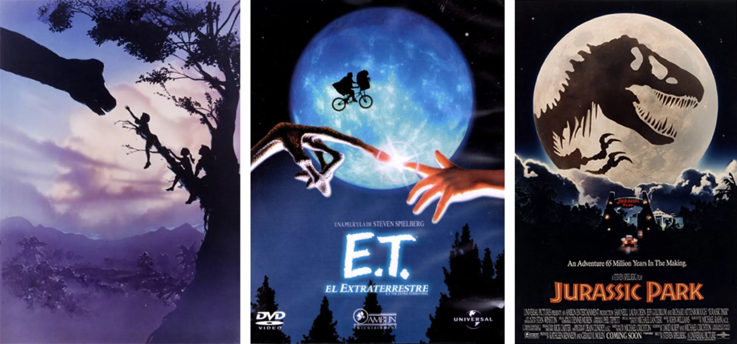
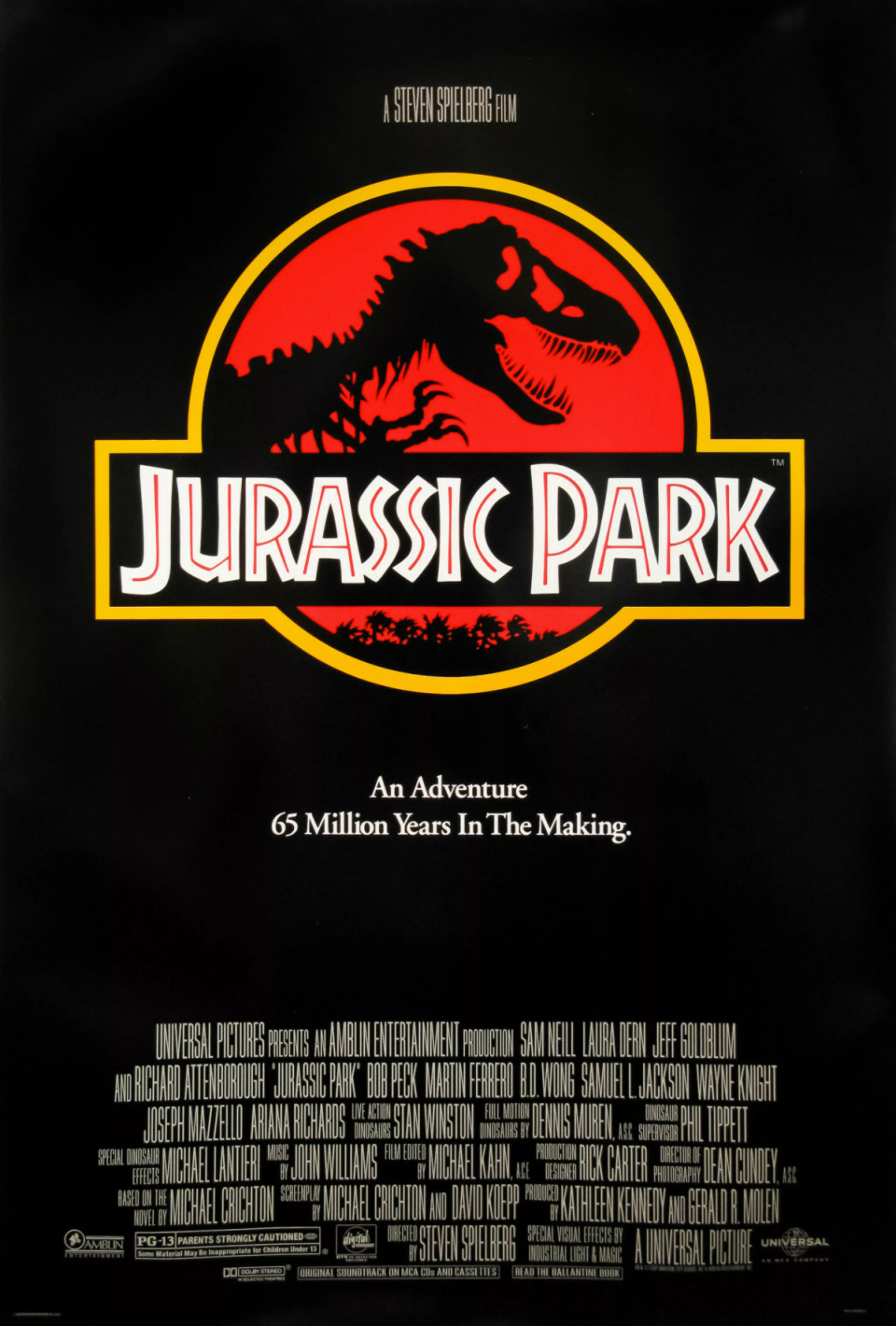
As he almost completed his final version of the Jurassic Park poster, representing the park door ajar and dinosaur tracks coming out of it (the E.T. remake was close!), Universal stopped him: the logo would be used as it is on the poster.
Another project nipped in the bud!
For Americans, an African typography from Germany
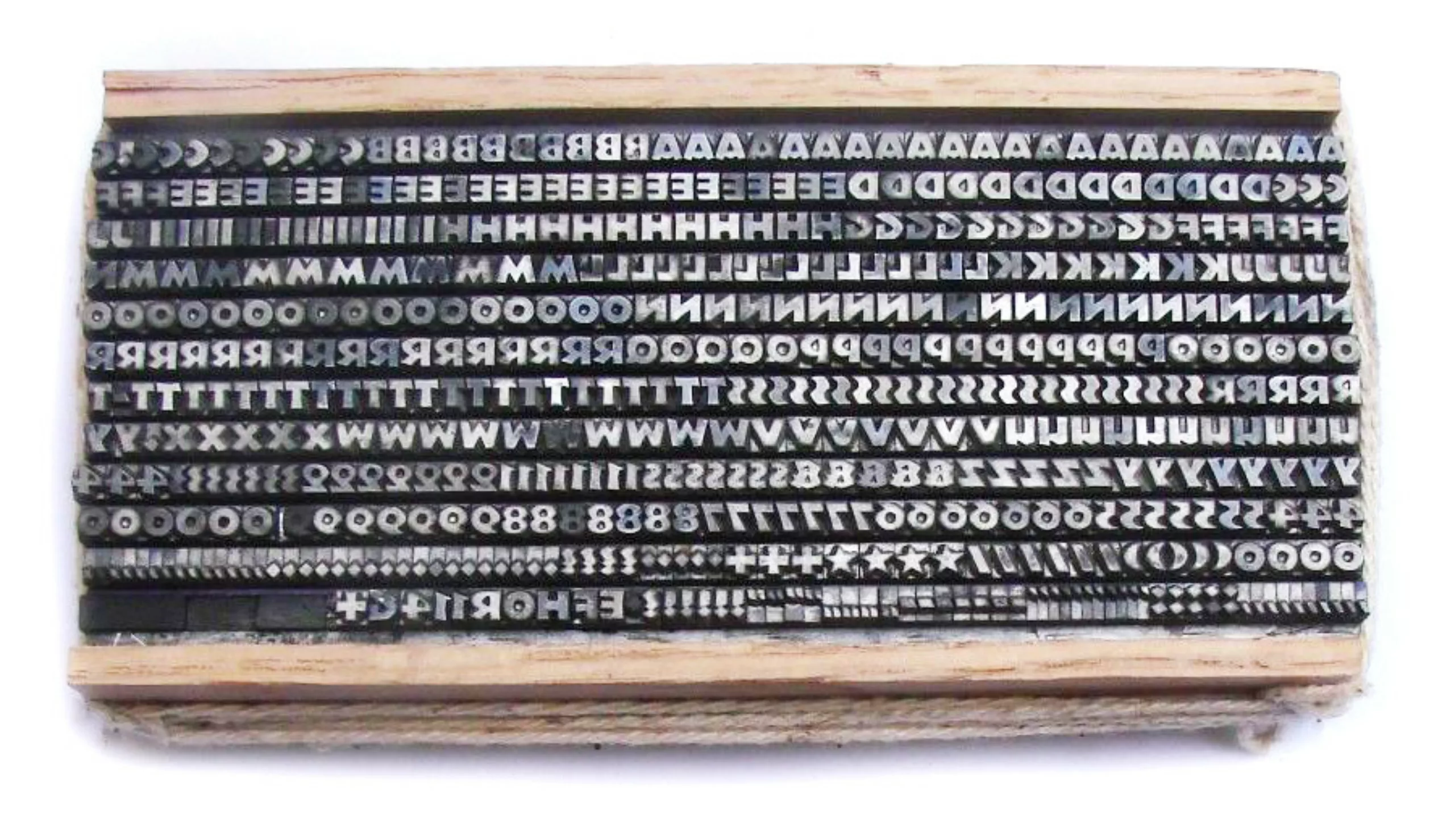
For the record, Salisbury used Neuland font for the Jurassic Park title, which he redesigned in his own way. Originally created in Germany by Rudolf Koch – in 1923 – it was designed as a Blackletter but with a Roman style, in order to make Gothic letters easier to read. For those I lost with this typographical jargon: it uses a Gothic construction – large packed handwritten letters that occupy the entire area of the printing block – but in a Roman way, i.e. with straight capital letters (a style inherited from the Romans). On the left; an example of Gothic letters, on the right the Neuland. Below, the letterpress blocks.
One should know that back then Gothic letters were complicated to print and increasingly rare except in Germanic countries. Surfing on a modern wave, in the early 1920s, German designers developed “new typographies“, such as the Neuland.
When the Neuland arrived in the United States in the 1930s, the Gothic-style letterpress was unknown as an old dusty fossil from another continent. The Neuland thus totally lost its original meaning! It was branded as “primitive” and was used despite its creator to illustrate “jungle”, “adventure” or “safari” (or more clumsily, African…) content. It is now qualified with Papyrus and Chop Suey as stereotyped typography, “stereotypography”, or even racist. We’ll talk about it in another article.
The story does not say whether the (wrong) choice of the Neuman was deliberate to illustrate a parallel with this catastrophic and unsafe park, or whether it was a stylistic decision to communicate on the park’s primitive state. In both cases, Jurassic Park contributed to renew the popularity of this typography, by continuing to promote its “tropical” look.
Branding dinosaurs
As Mike Salisbury explains, “You have to communicate with the right visual clues. (…) Most important to a fictional prop brand is that it must communicate immediately since it has no history and so no associations for the viewer.” In this case, the use of a jungle-like typography to describe a Jurassic park seems relevant, and very easy. But how can one succeed in telling the story of something that has no origins?
Regarding movies with many merchandise bearing logos, such as Jurassic Park, Harry Potter or Star Wars; each character, object, planet, ship or dinosaur appears on the screen in a theatrical way with its own style, colours, voices or sounds, accessories… Thought in advance, this type of scenographic details makes it easy to develop branded merchandising (figurines, logos, toys…). A complete work that switches the work of the designer into identity creation, like marketing. It is all about storytelling, and visually communicating through these sets.
But since there are only a few seconds to tell a story on screen and communicate with the right elements, shortcuts are sometimes too obvious and the risk to fall into caricature may rise (wicked = fierce look, at night time, dramatic music / nice = soft, during the day, light colours and soft music). Remember, the first appearance of T-rex is at night during a storm. It would have been hard to imagine the beast standing by a lake in the middle of a radiant afternoon!
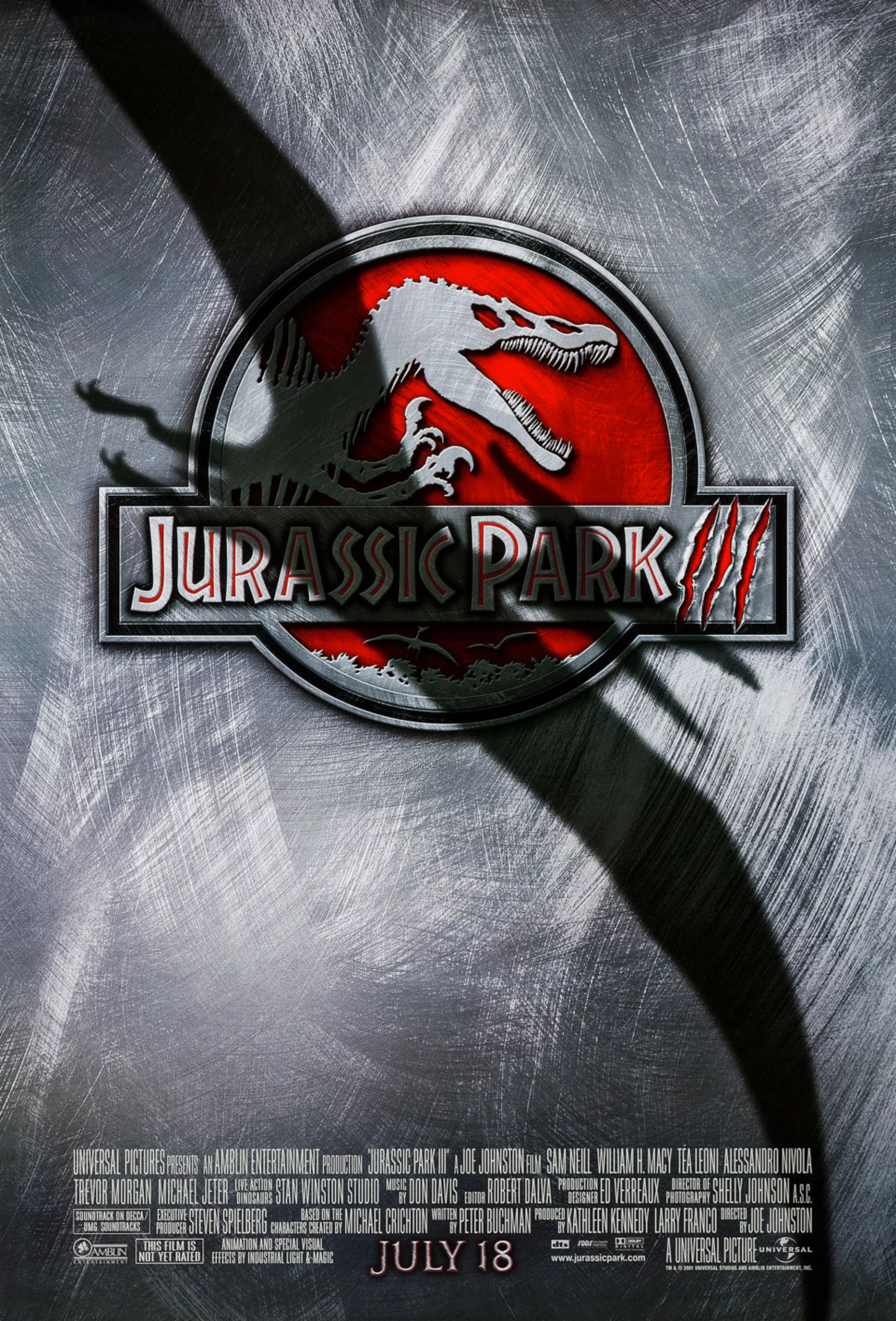
An even more cruel logo
For Jurassic Park III’s release in 2018, the Spinosaurus stole T-rex’s thunder. On this occasion, Universal created a “new logo” featuring its new star, even more cruel than the T-rex. This logo creation was not too difficult this time since the story is already all known and the branding is well established. Never (almost never) change a winning team: the new skeletal profile of the hooked-toothed Spinosaurus fiercely replaces our good old tyrannised tyrannosaurus.

Rediscovered in 2014, the Spinosaurus outperforms its cousin in size with 3 or even 4 more (counting) meters, and an ability to swim. According to Wikipedia, it is “the largest carnivore the earth has ever carried”. That’s enough to freeze out T-rex! In “real life”, with all due respect to Spielberg, the Spinosaurus ate fish 30 million years appart from the T-rex and could never have bitten the tyrant (oops, spoiler alert) because of its too small jaw.
But hey, the big bad guy always wins!
This article is an adapation based on the article “the Hidden History of the Jurassic Park Logo“
On the subject
-
Typorama #06 : Futura by Paul Renner
From the Nazis to the moon, Futura is probably the most used typeface in the world, and yet it’s not new!
-
Brands and movies: a history of product placement
Product placement in movies is sometimes irritating, funny or totally fictitious. Brands from movies sometimes even come to life.
-
Hans Hillman, “poster art without fuss”!
Hans Hillman, German graphic designer, illustrator and designer (1925-2014).
He was a pioneer who, as early as the 1950s, re-invented the art of film posters in Germany, designing German versions of posters by Godard, Bunuel, Eisenstein, Kurosawa and Bergman.