A serious logo for the Cité des sciences

We had opened 2017 with a decryption of the new and "nice" Gaité Lyrique logo. We close it with the new "not funny"Cité des sciences logo!
Science is the new cool
Bye bye to the red inclined square from the Cité des sciences, and glory to you for having rendered service to science and the graphic nation. You weren't always the most subtle, or the most elegant. No, good taste was never your concern. You could even be downright heavy with your bold coated Gill lettering and photoshoped beveled embossing. You were curling the red graphic card. With time, you knew how to impose yourself and win our friendship. Like a good friend who was a little too party-going, you were always ready to be noticed, to have the right word on the most varied subjects: genetics, ecology, video games, architecture, history... Everything went through there, and you had to say that you knew how to teach. You were generous, always, never vulgar. You were part of the decor in the most beautiful of ways: popular.
Don't push me 'cause I'm close to the edge...
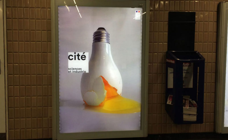
Some said that you were trying to reinvent yourself, in the age of digital everything, startups and "disruption". Indeed, I must say that when I saw you earlier this week in the subway corridors, I almost didn't recognize you. What line, what elegance! You really amazed me with your sober and refined style: black suit and white shirt, impeccably dressed. No more science and good-natured industry, make way for serious business as a young entrepreneur.
And then we talked for two seconds and I quickly understood that behind the impeccable form, there was really no background. Just a hollow idea of modernity 2.0, like one crosses at scroll length on LinkedIn. You were just in line, both corporate & trendy. I understand, and at the same time, I'm gonna miss your straight face.
We promised each other we'd have an exhibit one of her four. I admit, I hate myself for judging you so quickly. Who knows, behind the well-cut pants, maybe you're wearing colorful underwear...
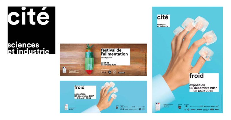
New graphic charter for the Cité des Sciences et de l'Industrie created by l'atelier Doc Levin:
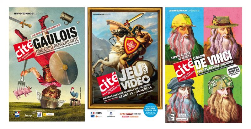
Former graphic charter of the Cité des sciences et de l'industrie:
Eureka falls flat
When the old logo of the Cité des sciences et de l'industrie was coloured, tilted and its type was out of the frame with its excessive size (typeface "bigger than life"!), the new logo is black and white, straight and measured: nothing protrudes any more! These graphic biases suppress what was playful in the old visual identity. This grain of madness so deeply human and source of creativity, gave an accessible image to science.
It is now another image of science and industry that is being proposed to us. The passage from a vision inherited from the twentieth century with the figure of the mad and exuberant scientist of which Einstein was the archetype, to that of the twenty-first century where this figure leaves room for the megalomaniac entrepreneur of which Elon Musk is one of the icons. Artificial intelligence, autonomous cars, rockets, nanotechnologies, the digital revolution is already far away and the GAFA is investing more than ever the "Deep Techs", constantly reshaping the possible futures and what it will leave tomorrow of their laboratories. Result: impossible to say what our daily life will look like tomorrow, anxiety!
Think inside the box
And as your very "chic culture" look was no stranger to me, I went through my library to bring out a catalogue of Arles 2016 photography encounters (post Michel Bouvet period which passes the torch to ABM studio). White cartridge principle with typographic paving composed in black lineal typos glued in edge of blocks, the whole posed on a visual photo in full page. We play with the codes of a graphic design both very contemporary and falsely "no design". 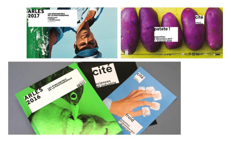
Share this post:




 San Serriffe typographic Island
 Design, creativity and oblique strategies!
 Tote bag, a new social totem?
 Sister Corita Kent, the Pop Art nun
 Donald Trump, the martyr who makes history
 Klara energy, proud to be responsible
 Be API – Visual identity
 Sankéo, Perpignan public transport
 France Universités – Naming & visual identity
 Sixtine
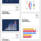 Vectorial illustrations for the World Economic Forum (WEF)
 Californian vibes for the 2019 Printemps de Pérouges festival
 Visual identity for Auditorium – National Orchestra of Lyon
 Who is the PoPA of the MoMA logo?
  Paul Rand, everything is design!
Leave a Reply