The CIA gets a new identity!
On 4 January, the CIA unveiled a new logo and a new identity to mark the transition to 2021.
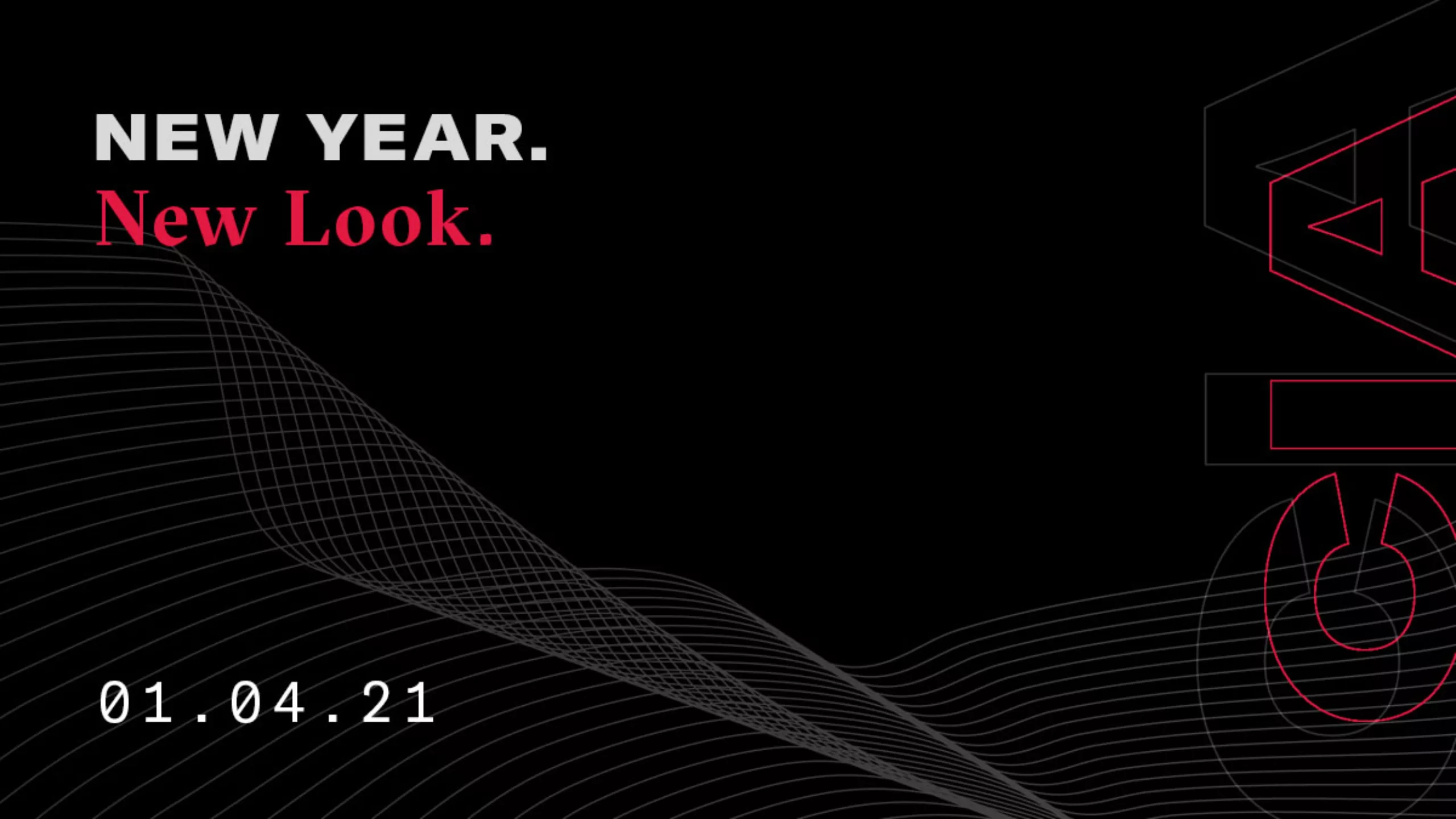
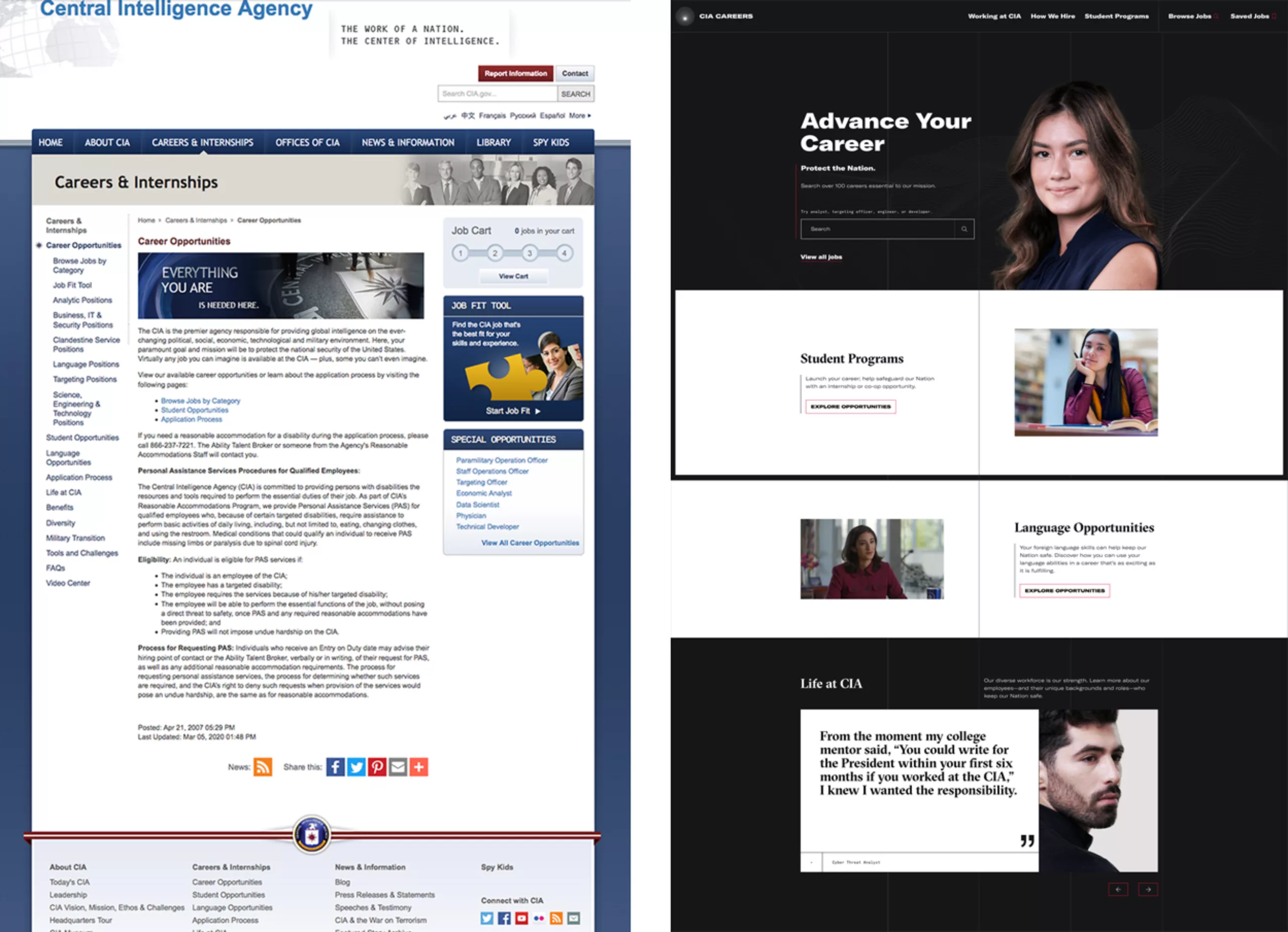
It was time to dust off the old office, institutional and boring, blocked in the 2000s. The old CIA website was in classic (very Windows) colours, full of text, and was not really adapted to smart phones.
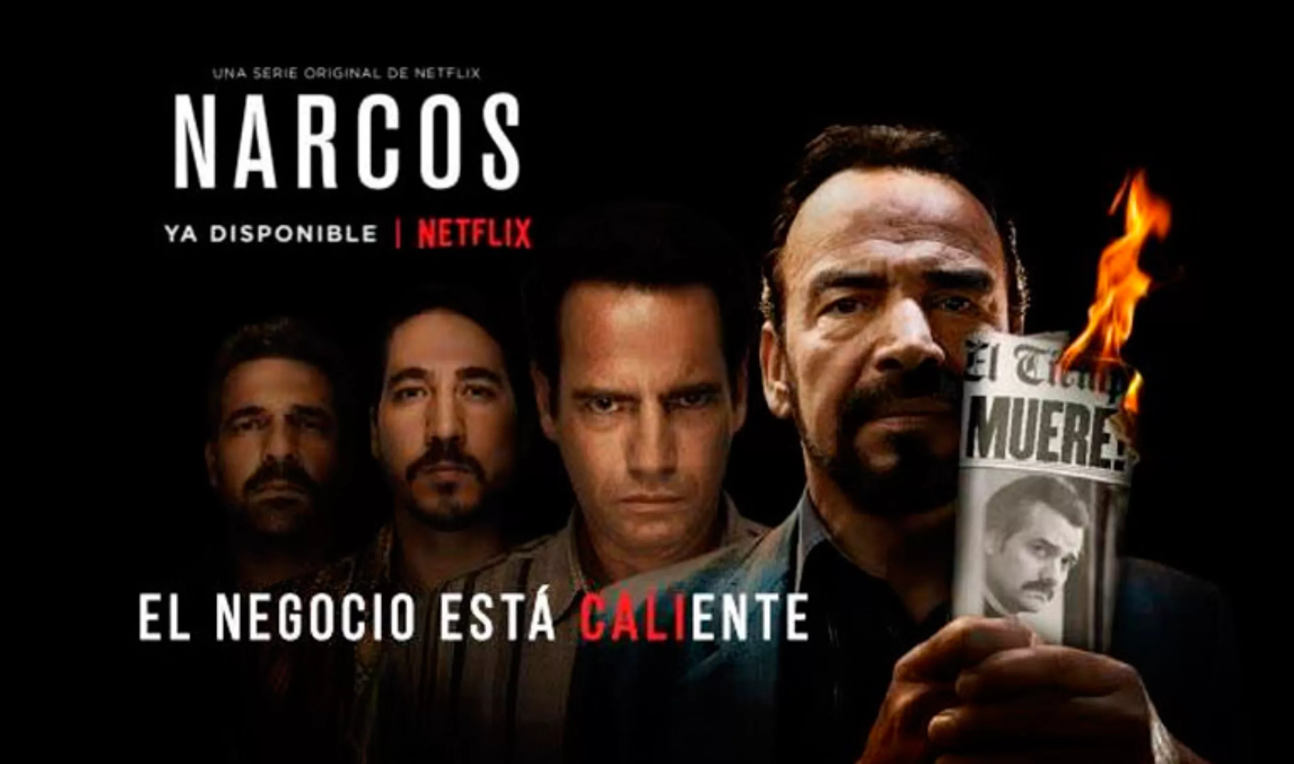
It’s done, but critics now reproach the central American intelligence agency for having the look of a Berlin underground techno festival, or Netflix series… This may be more fun and more “2021”, but it doesn’t quite fit in with what one would expect from the secret service. But hey, between us, who would you apply to between these two versions of the site? If you are 20 or 30 years old, probably on the right, on the new version. We can say that the mission is a success. In terms of information distribution, it’s simple and efficient.
Minority Report
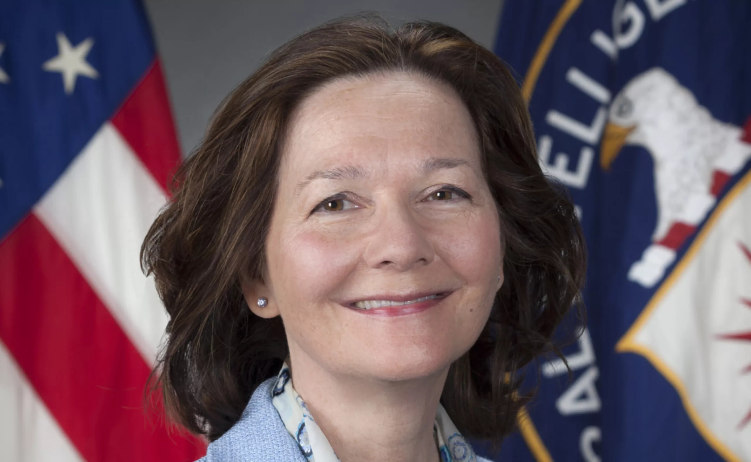
This decision was made by a woman. But not just any decision. Gina Haspel has been director of the CIA since 2018. In 2019, a report showed that the agency employed only 26.5% minority (non-white) employees. The first woman to head the CIA, Haspel says she wants to move forward: “We must learn from the past, but we cannot dwell on the past”. The current American context, with the Black Lives Matter movements, among others, questioning white privilege and the social inequalities that stem from it (which we have discussed in this article), may also have a lot to do with it.
In any case, the overhaul of the CIA website is the result of a commitment launched a few months ago, initiated by the creation of an instagram account on 25 April 2019 (which already has 358k subscribers) and a series of advertisements on streaming platforms. The aim of this campaign is to attract and recruit young people and people from all cultures and backgrounds.
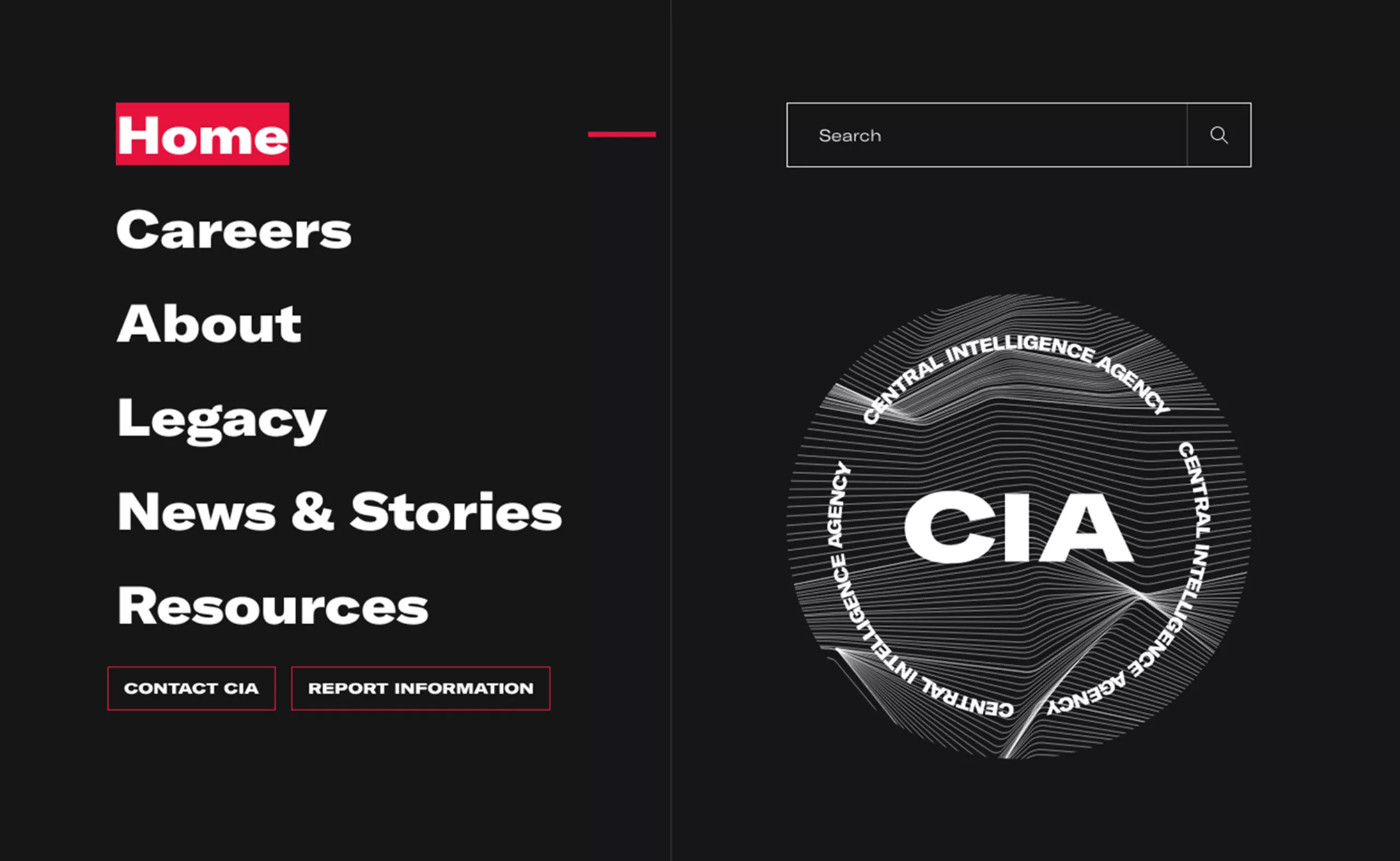
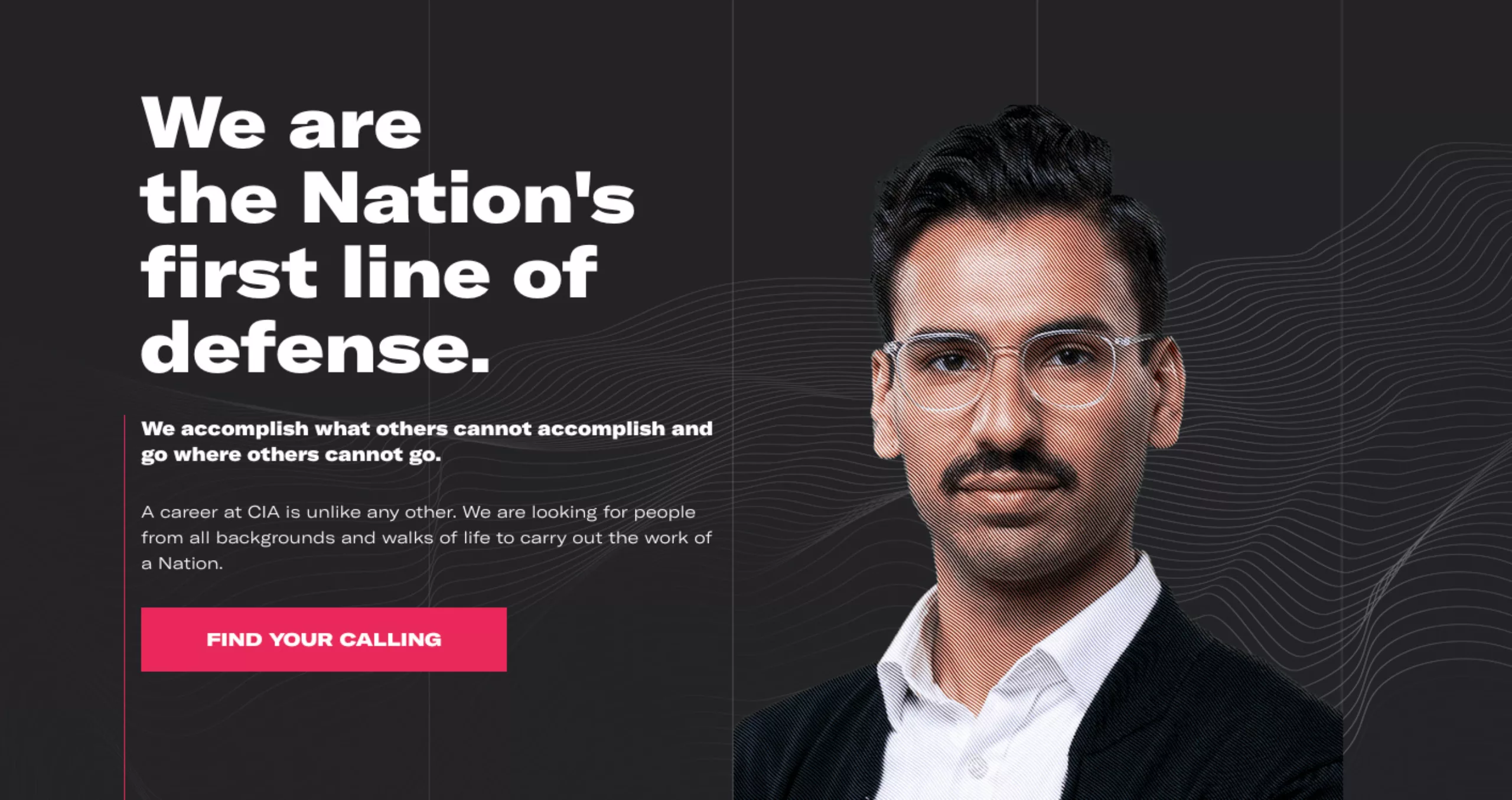
On the new website, in white on a black background, portraits of women and men, the “heroes”, stand out. Despite the desire to reach a very wide audience, the result – as always – is a bit like a B series. With a very bold casting.
Oh no, sorry, we made a mistake. There you are.


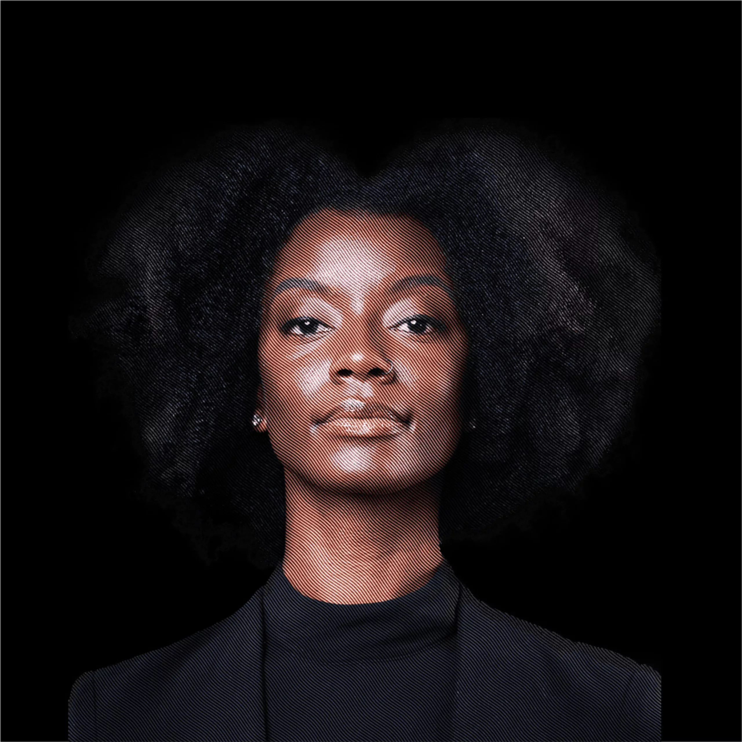


The effort to achieve parity and cultural representation is noteworthy.
Joy Reunion
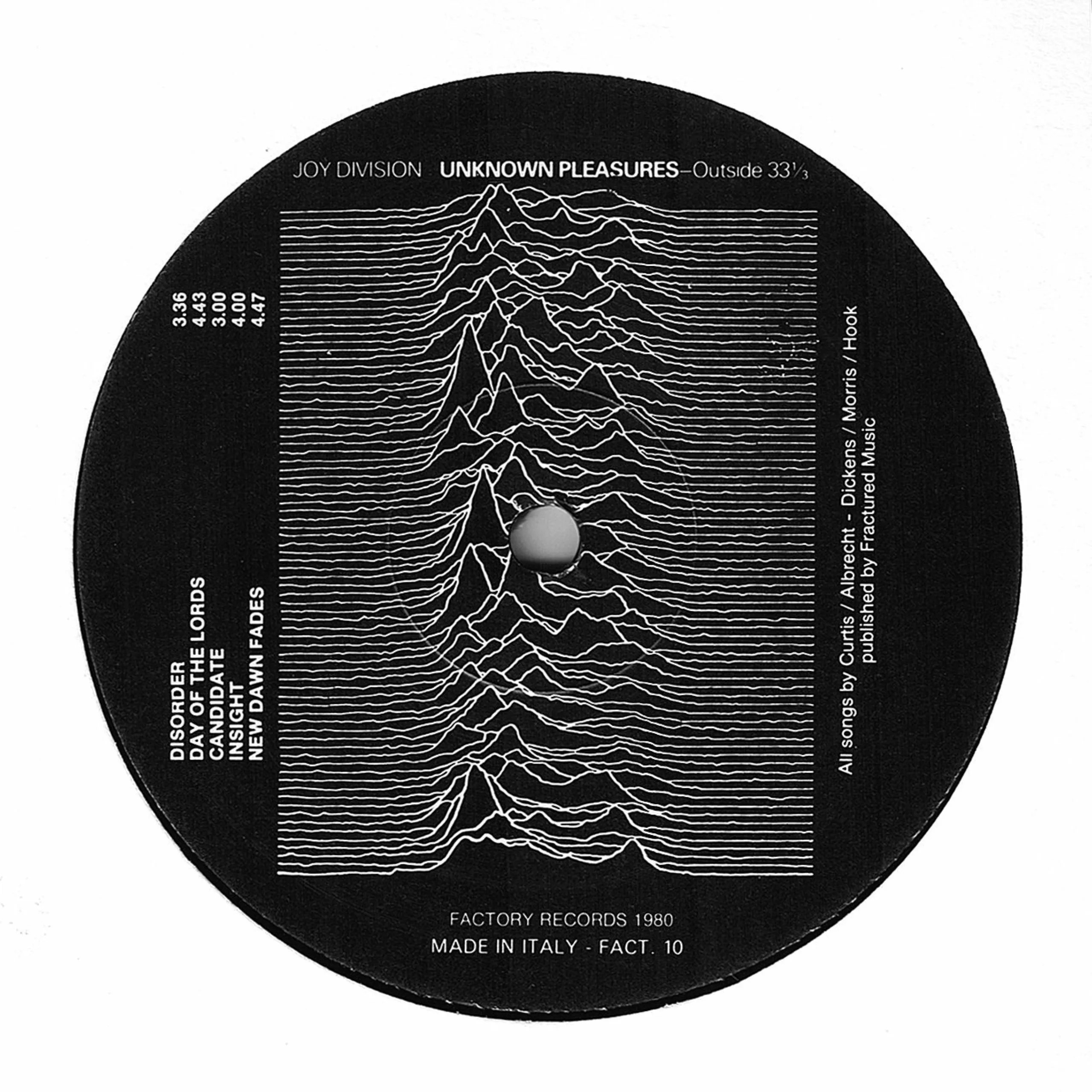
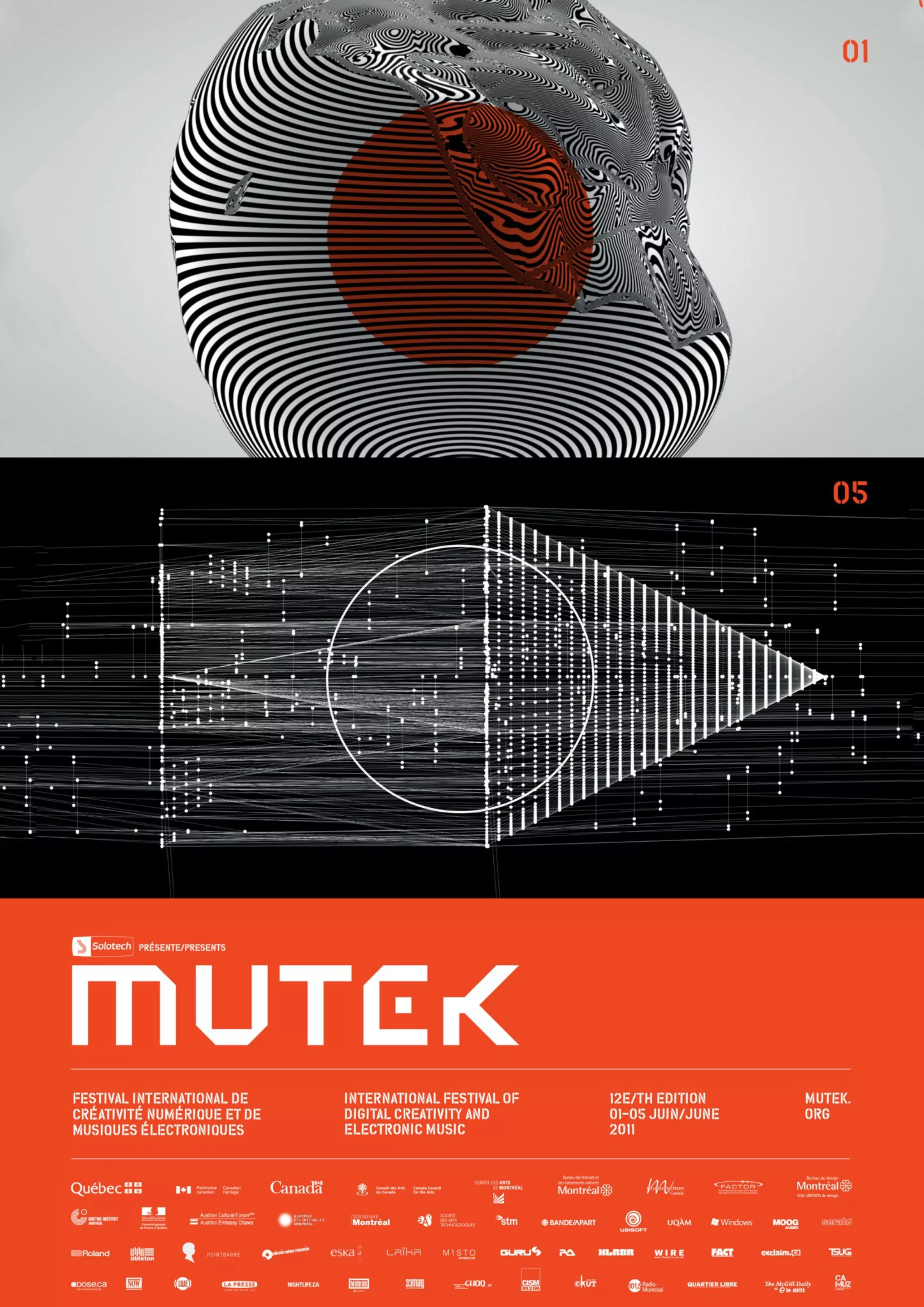
In the background on their faces and in the background, micro-lines that remind us of topographic maps, but also of the graphic codes of electro music festivals like Mutek in Canada. One thinks above all of the Joy Division album directed by Peter Saville. Except that here it’s more reunion than division (we’re still as good at phony puns, yes yes).
Technology and electro music go hand in hand. But at the CIA? Never mind. In any case, again, it’s young, so maybe it will be effective in recruiting good people.
Actually, the real logo used by the CIA is the same as before, but in black and white. We regret a small facelift which would have been, for the moment, welcome.
As far as typography is concerned, the GT America from Grilli Type was used, a typeface that breathes America, of course.
Who would have bet that the CIA could have been inspired by an underground electro series and cowboy sausages? Not us, but we bet it will be a hit on Netflix.
PS: If you want to apply, it’s this way > ww.cia.gov
A short history of the CIA logo
The CIA was created in 1947. It replaced the OSS, which was dissolved in 1945. It is responsible for intelligence acquisition (particularly through espionage) and most clandestine operations outside US soil. It has the legal status of an independent agency of the US government.
President Truman was in such a hurry to reorganise his intelligence services at the end of the war that they forgot to create a logo. In view of the strategic stakes involved, the creation of a logo might be considered an incidental detail. But the new agency’s young recruits quickly realised their lack of credibility, and regularly see their authority called into question. “Show us your official card” they were told. They were missing an “official” seal. That’s why in July 1949, the CIA leaders launched an internal call for proposals. Originality and relevance, rather than artistic talent, were the judging criteria. Employees had only two weeks to submit their drawings.
Here are some archives of the logos proposed at the time.
After examining a dozen proposals, the CIA leadership decided to cancel the competition. None of them seemed to be suitable. At the same time, if the secret agents were graphic designers it would be known! So they decide to turn to professionals. They therefore contacted the heraldic institute of the American army.
In December 1949, the Institute of Heraldry presented the project below, accompanied by a few colour variations. It was the director of the CIA at the time, Roscoe Hillenkoetter, who chose the project, and it was President Truman who definitively validated the logo.
The proposals of the employees are not uninteresting, and certain ingredients can be found in the final logo. The archives report that the Heraldic Institute had taken note of the employees’ proposals and reused certain ingredients in the final logo. The compass rose, the eagle, the shield and certain fonts for example.
For the symbolism: Eagle = vigilance, shield = defence and the compass rose = global intelligence gathering. Simple. Basic.
There are still the little red and white knots under the eagle… the story doesn’t tell us what they’re doing there!