Le Slip français puts on a new logo

It was necessary to make a pun… Joking aside, the Slip français revealed recently its new logo, which emphasizes the “love of the local”. If it stings the eyes and creates confusion among customers, its symbolism and the timing are rather judicious.
On a misunderstanding it can work
In 2011, the Slip français was born. At the time, it was necessary to put the package to make 100% made in France and produce briefs less than 250 km from those who wear them. It was a gamble, a bet. In ten years, the brand, which started as a joke between business school friends (the HEC friends of Guillaume Gibault, its founder, who suggested launching a brand of briefs), has succeeded in becoming a model of made-in-France textiles.
We remember the campaign “the change of underwear, it’s now” which took up the words of François Hollande, and “the surprise of the chief” in which a pair of eggs was sublimated under a French brief. Today, the challenge of Made in France is taken up with flying colors: the brand now wants to emphasize “its love of local” and its commitment to the French textile industry to “make things happen” as its website emphasizes.
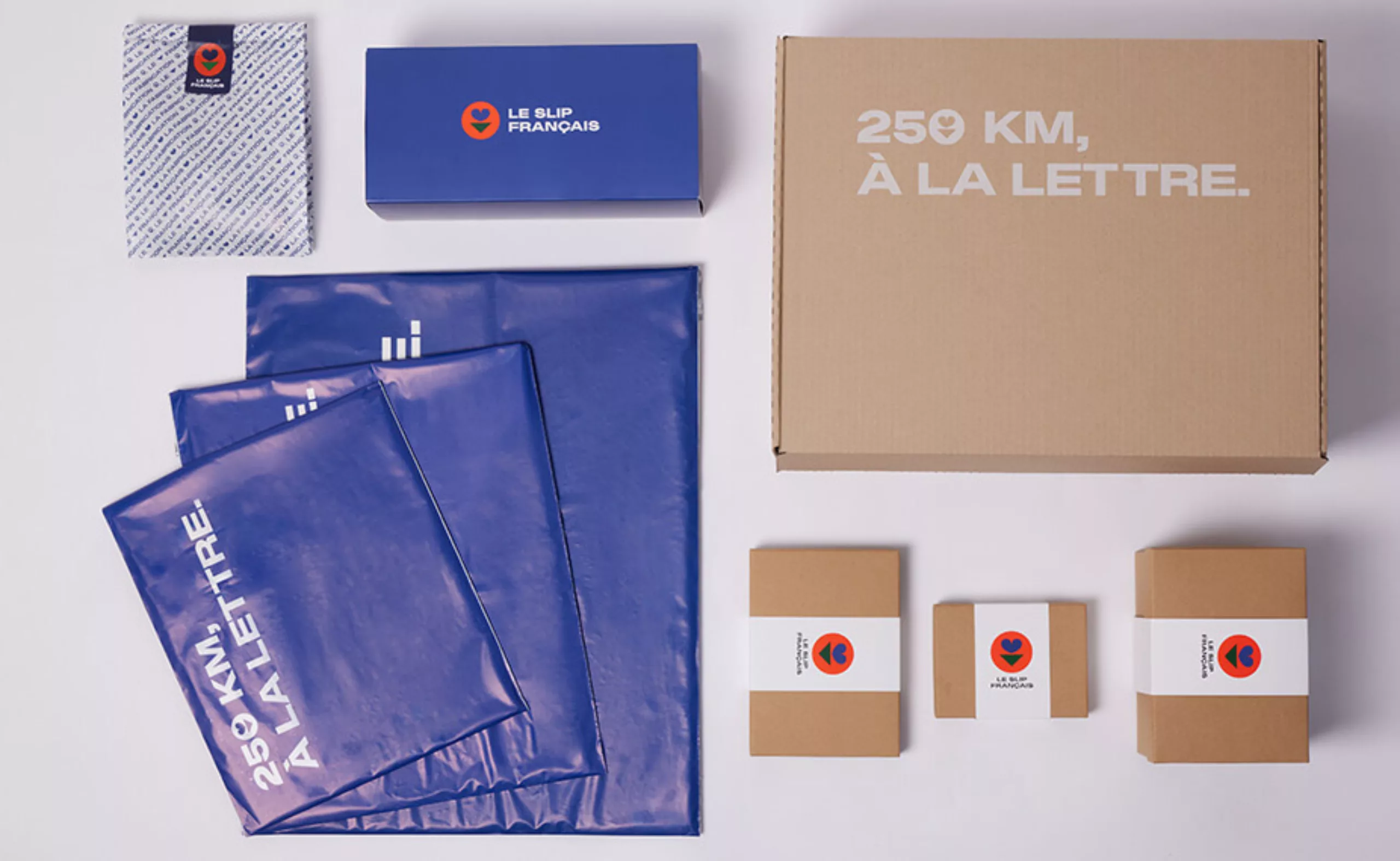
If the briefs logically represented 100% of the sales at the beginning (the brand offering only briefs) Le Slip Français has now diversified by offering clothing and accessories for men and women: the sales of briefs now represent only 40% of its turnover. Faced with this observation, with this past decade and its new societal aspirations, the Le Slip Français puts on a new logo. It was also necessary to clean up an ugly mess linked to the old image and to be more inclusive. Not only because society has evolved in the right direction in recent years, but also because it is wise to question ourselves.
The logo of the French underwear: of the revolutionary ardor…
At the beginning, and for the last ten years, the logo of Le Slip Français displayed a briefs in a blue-white-red cockade, in the manner of the one worn by the revolutionaries of 1789 (rather worn on the pants) which inspired our tricolour flag. The link Slip français = revolution was made of itself in the minds. Especially since the brands proudly displaying the blue-white-red were few at the time.
For the small history of the cockade, the red and the blue were at the time the colors of the city of Paris, the white symbolized as for him the Royalty. It is said that at the approach of the Revolution, Bailly (Mayor of Paris) would have given the blue and red cockade (rallying sign of the Parisian bourgeois militia) to the king, who was already wearing the white cockade. The affixing of the two created the famous tricolor cockade which was used a few days later as a rallying sign for the revolutionaries. About 100 years later, it was used as a sign to commemorate the memory of the dead for France in the association “Le Souvenir français”, before giving glory to the French underwear.
The order and composition of the interlocking circles, the colors and the typography were the same in both logos, except that the text was inscribed not on the inside as for the Souvenir français, but on the outside of the roundel (probably for reasons of legibility and space, necessary to inscribe the long text).
…to the maturity
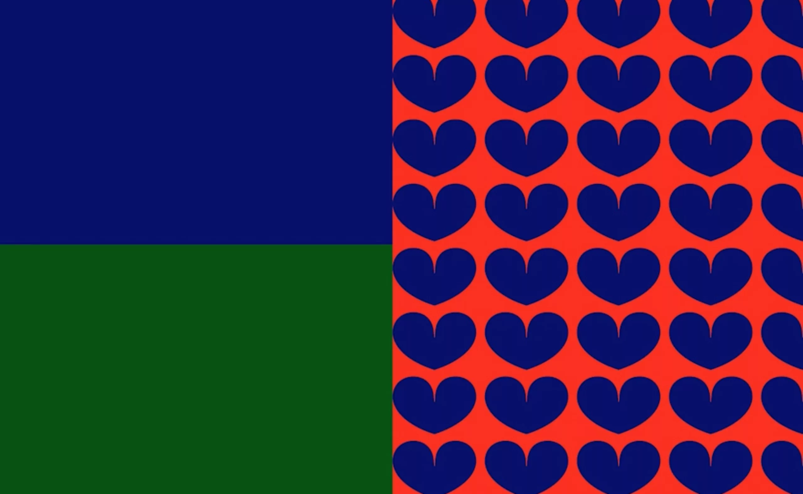
A heart and a triangle surrounded by a circle. Simple, basic; a bit like a panty. The new logo of the Slip français does not put neither the Revolution nor France in the honor, because the mark affirms to want to differentiate itself from the others which also adopted the colors of the tricolour flag. If the Slip français keeps the red and blue -red for the background and blue for the heart- it now integrates a green triangle “symbol of commitment to responsible channels and materials” (as we can read on their Facebook page) which “indicates the way, to bring more clarity to our identity” and show the direction to take.
On textiles, however, the new logo of le slip français is embroidered in two colors, white on a blue background or the reverse, for more discretion. And fortunately! We wonder why the brand wanted to keep this red for packaging or digital media, because the mixture of red / green and blue brings an intense chromatic vibration that really hurts the eyes, and the green / blue colors are totally lost when you look at the symbol from a distance. Maybe because of the fear of radically changing everything? Customer (or should I say, fan) comments are quite alarmist and dramatic on the subject, which is causing a lot of discussion.
Betraying, then knowing how to reconcile
Moreover, it should be noted that for this kind of company (a “love brand”) that weaves a real link with its customers by including them in some strategic decisions, by making them laugh or by answering them in all transparency (we often see the founder of the brand answering from his account to the comments on the networks), launching a new logo without consulting its “fans” can be experienced as a betrayal. The brand has hidden this redesign from its customers, without including or consulting them in the process as it usually does. A normal method practiced by the majority of companies, but which should surely have been adapted to this particular target. It would be judicious then that the Slip français listens to its customers not to disappoint them too much nor to lose them, by adopting the logo in bichromy for example, which pleases more.
An identity that is bold
The creation of this new visual identity took two years. The new logo of Le Slip français and its new charter were co-created by the agency Abmo for the design, Datagif for the strategy, and by “a french studio” for the typography. Bold and in capital letters, the typeface is reminiscent of manifestos that shout loud and clear their values : audacity and brazen. A new and coherent way to assert one’s convictions and audacity.
Côté symbole, le cœur représente l’amour du local et « la démarche collaborative » qui leur est chère, avec deux symboles de géolocalisation qui s’unissent en un ♥. Les symboles se lisent de différentes manières. Est-ce un cœur, un maillot, une poitrine, une fleur ? D’autant plus que le sigle est placé au-dessus du slip, stylisé en triangle vert. Est-ce un slip, un triangle pubien, un bas de bikini, une flèche vers le bas ? Peu importe, et probablement un peu tout cela à la fois. C’est justement cette polysémie qui rends ce signe intéressant et vient élargir l’imaginaire de la marque.
Élargir l’imaginaire du slip !
This change of logo has obviously a strategic objective. The brand was probably locked in a very restricted imaginary: “the underwear! From then on, it seems delicate to widen the range of products to other things than underwear. Changing the name being forbidden, it remained to find a clever way to make forget, at least visually, the universe of the underwear. This sign provides a good answer to this positioning problem. “Now they can sell flowers!”
On the other hand, the logo is more reminiscent of female attributes, moving away from the underwear of the early days. A strategy to be more inclusive? Surely, and it’s a smart choice, but the image conveyed by the campaigns does not (yet) follow the movement nor is it in line with the modernity it displays. Today, we expect a company to show a diversity of bodies and origins, and the models of le Slip français are still too close to the standards of perfection…. and too white!
If the new identity of the Slip français is rather symbolically feminine, basic, playful and efficient, it makes sense and is in line with the company’s mission. On the other hand, it would be good for le Slip français to reconcile with its loyal customers, by proposing a slightly watered-down version of the logo.
Time will then do its work and will come to smooth the anger of “it was better before” caused by the change. Very French, that too!
On the subject
-

Groupama’s new visual identity, a logo in the open countryside
Groupama has just unveiled a new logo that updates its graphic design by abandoning its campaign in favor of a “startup” aesthetic.
-
From surnames to acronyms: creating a brand name from letters
From founders’ surnames to initials and acronyms, brand names have always oscillated between abstraction and familiarity.
-

The UN logo takes on water during COP28
For COP28, two designers have come up with a new UN logo showing the rising sea levels and the future disappearance of much land and coastline.