Aube_champagne_case_study0

2019

New visual identity for Aube en Champagne

A dynamic district, pioneer and actor of the economic and social renewal of the Aube region

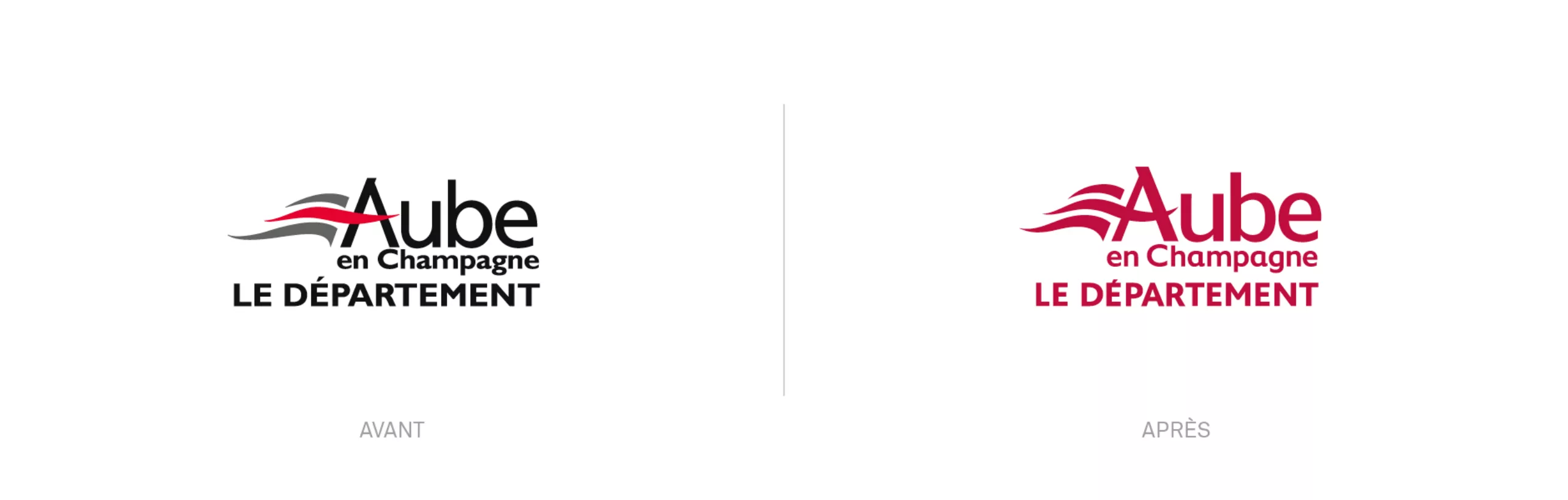
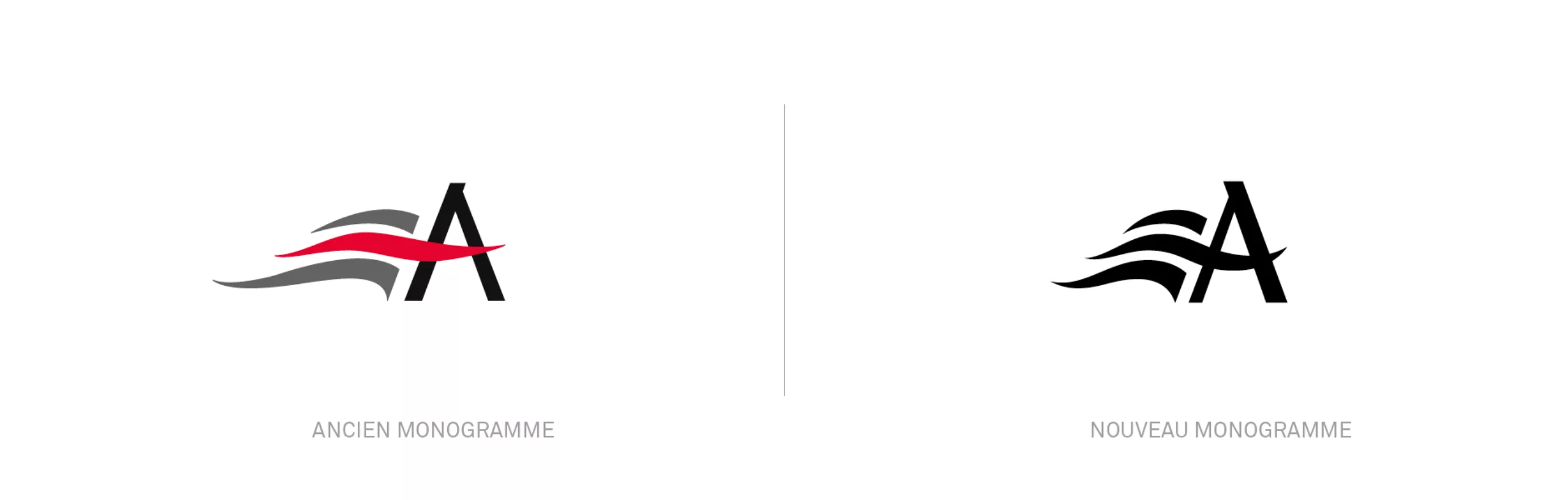
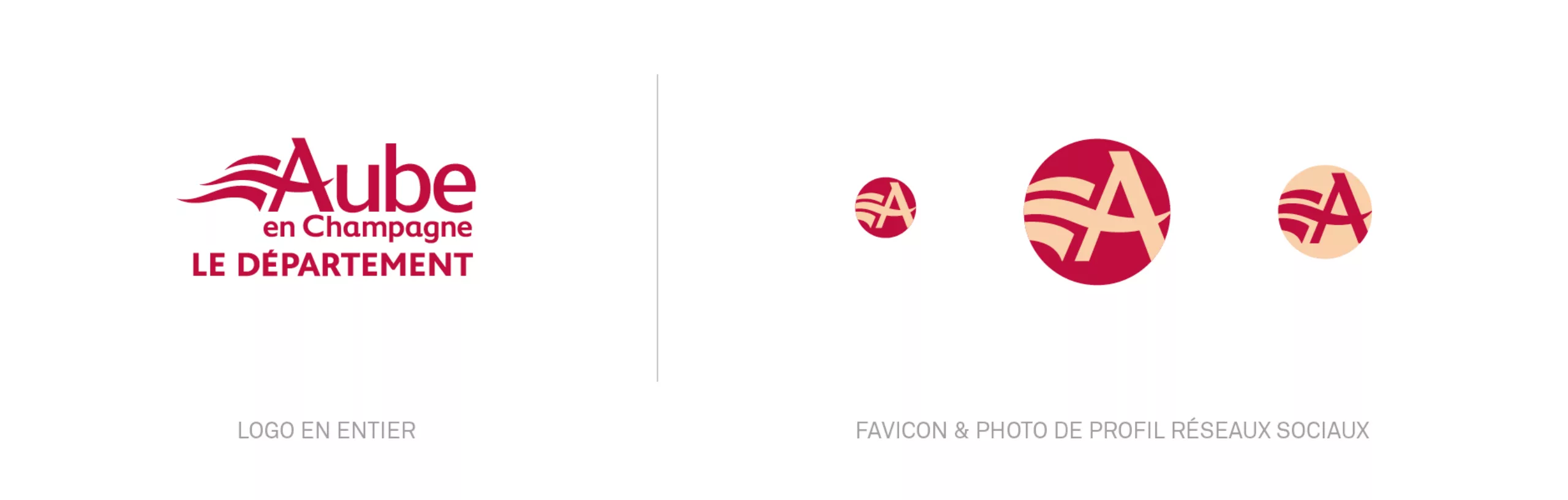
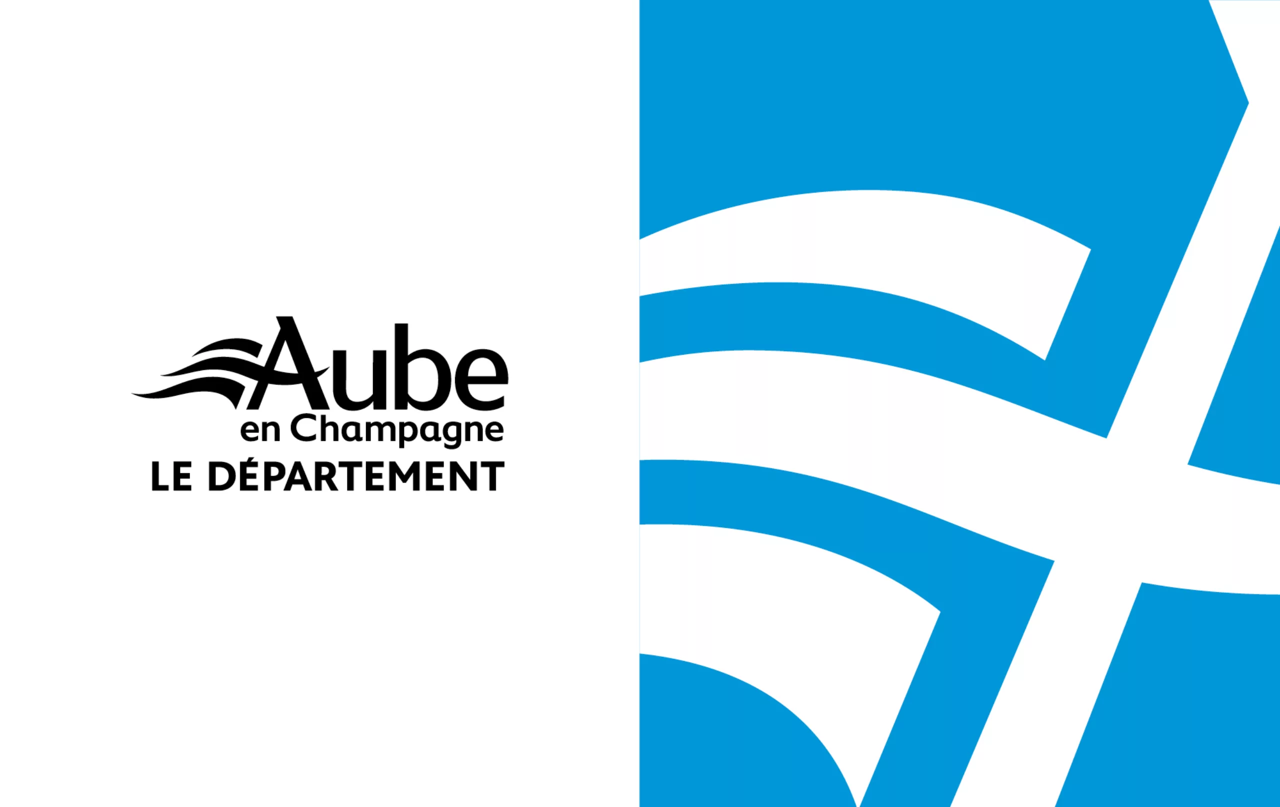
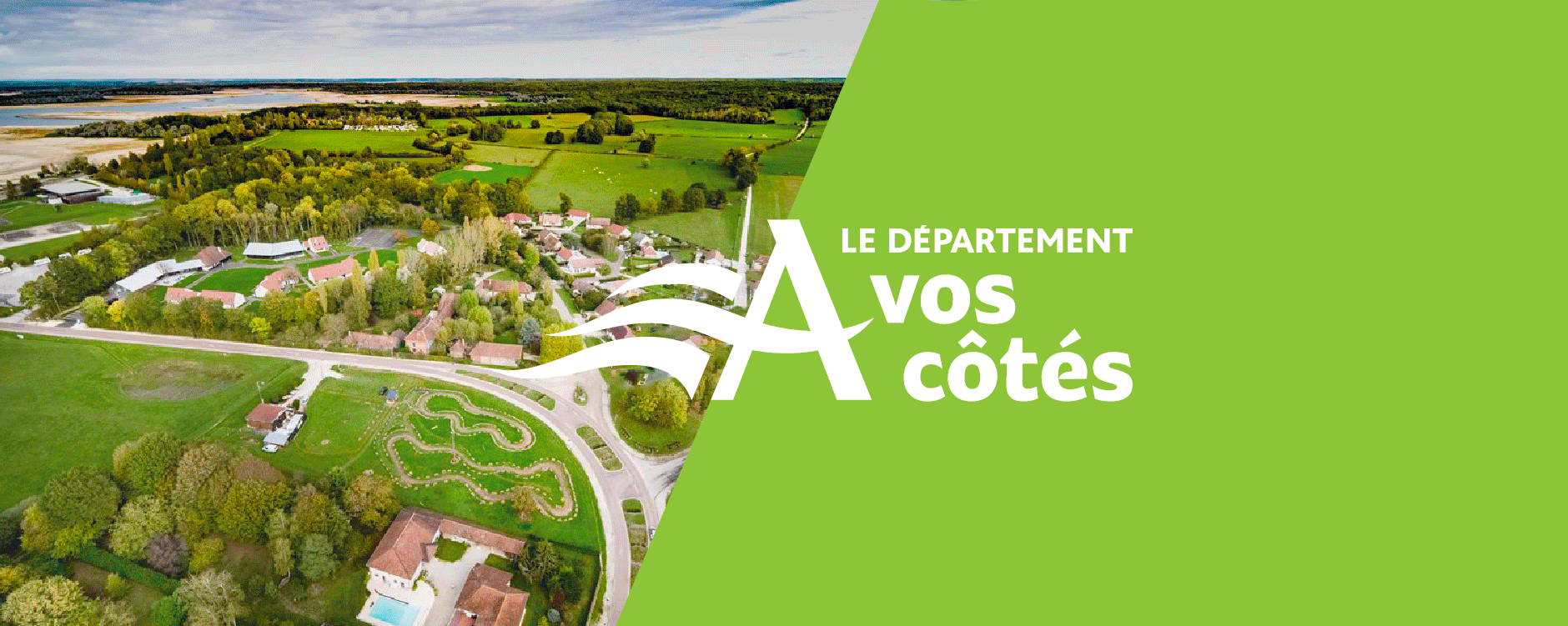
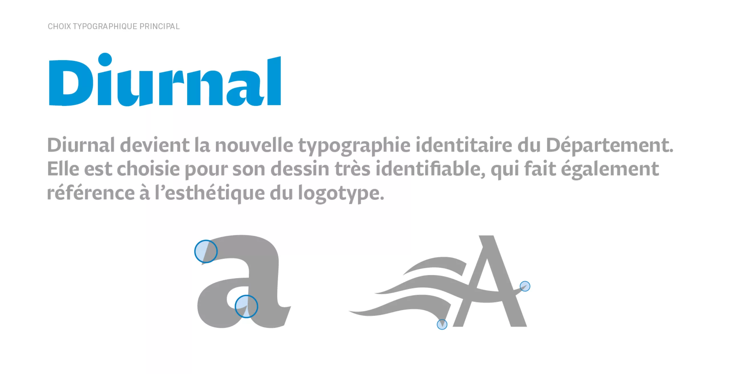
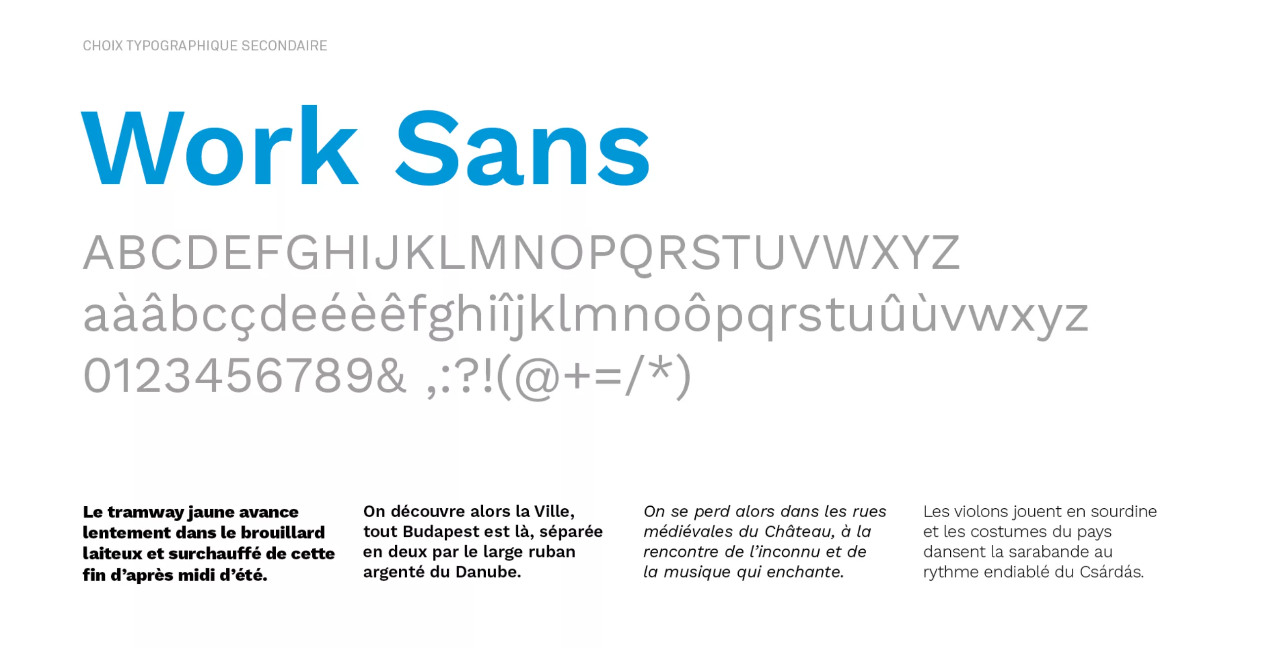
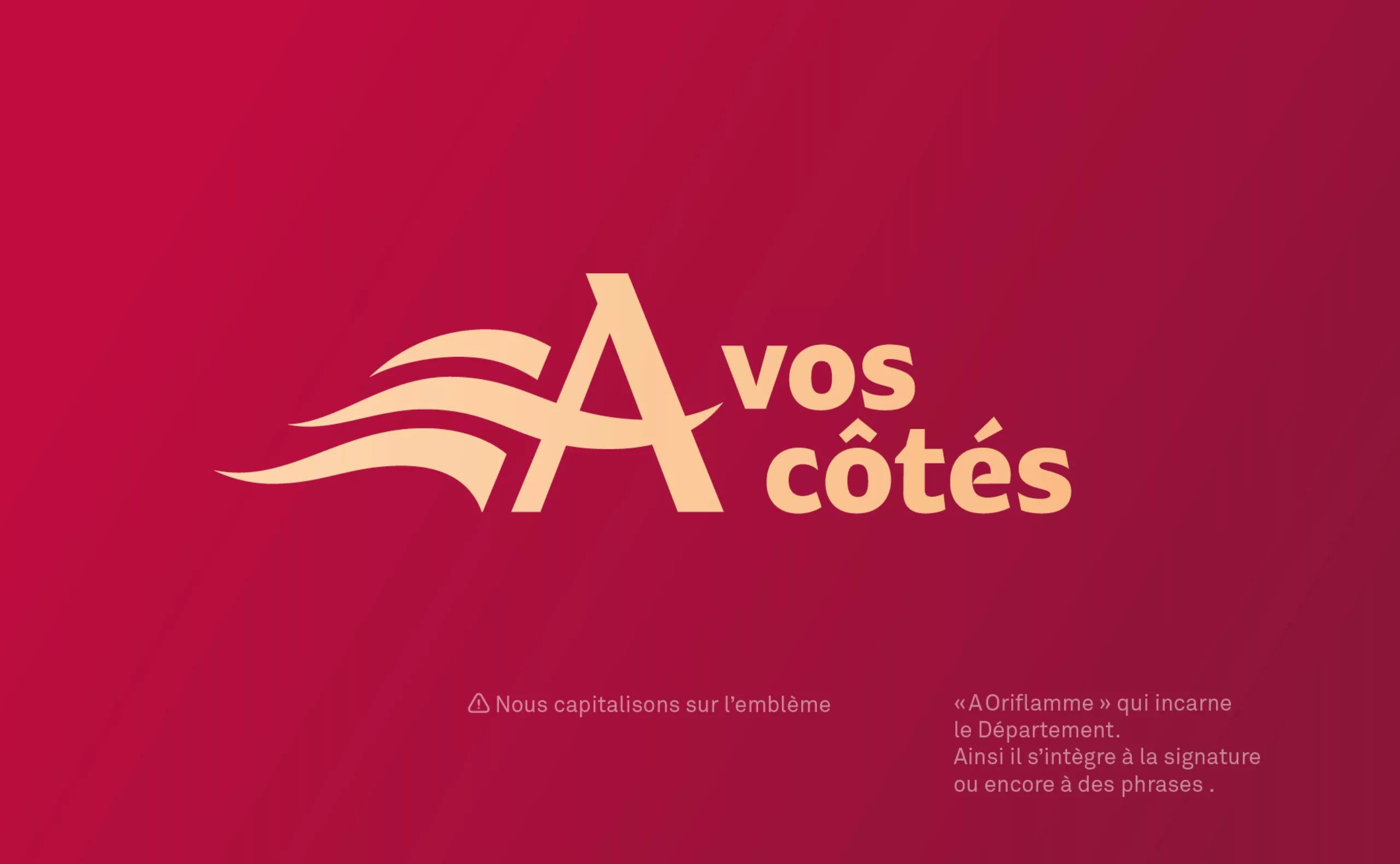
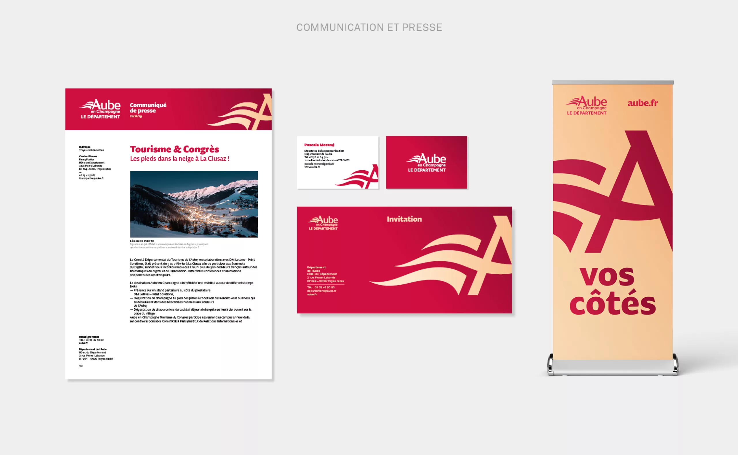
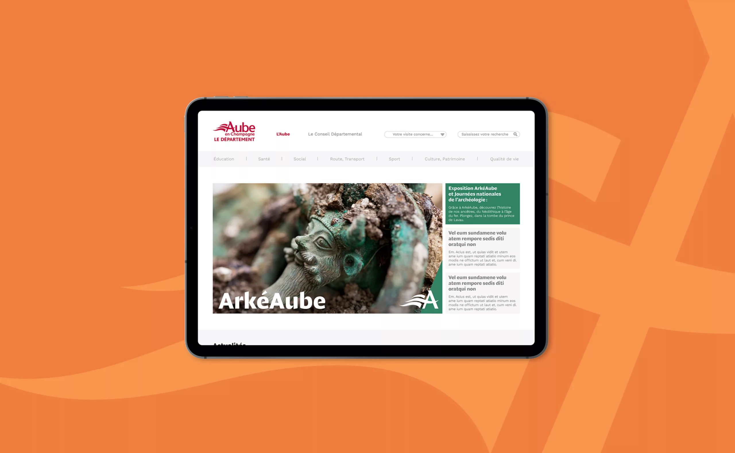
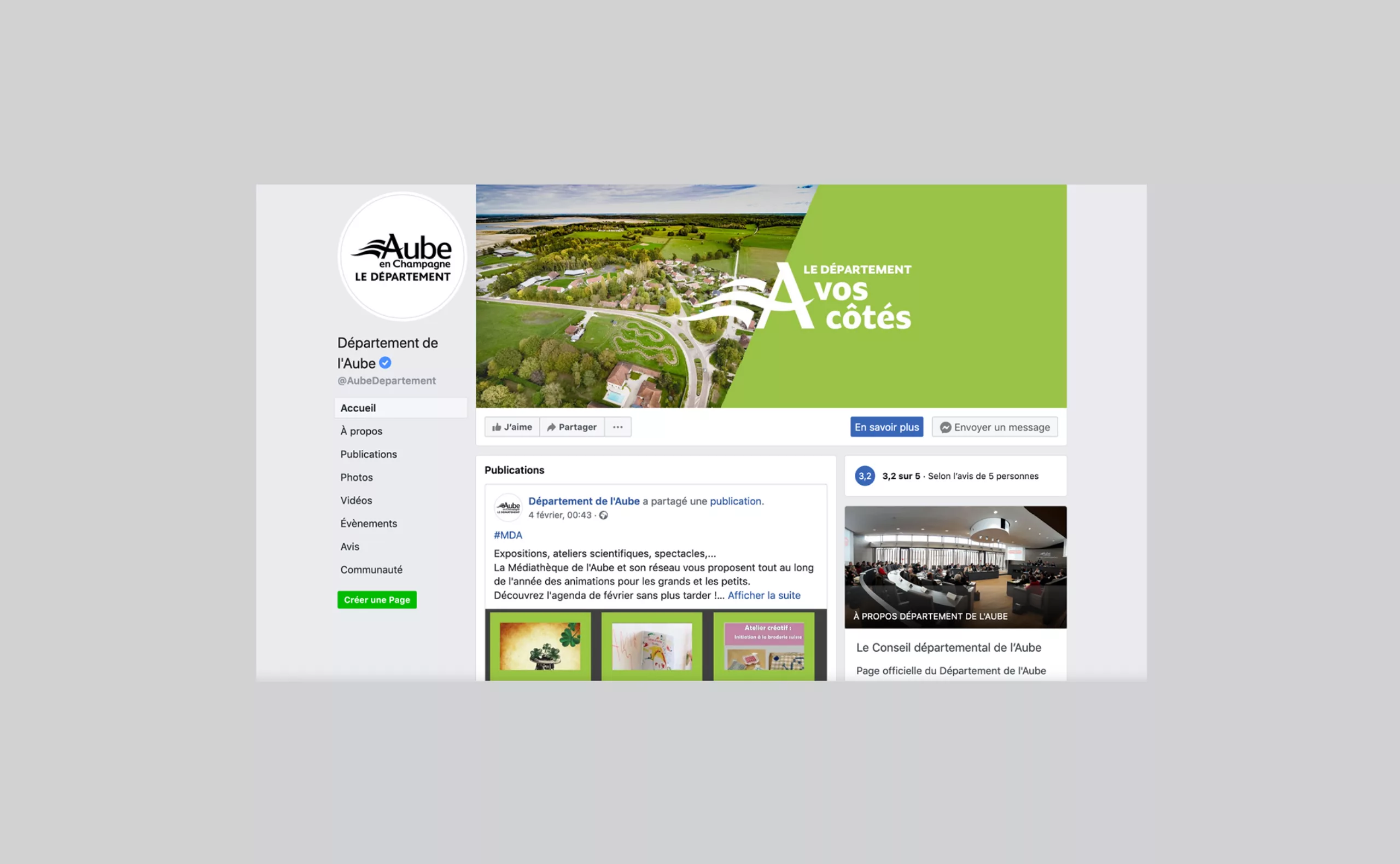
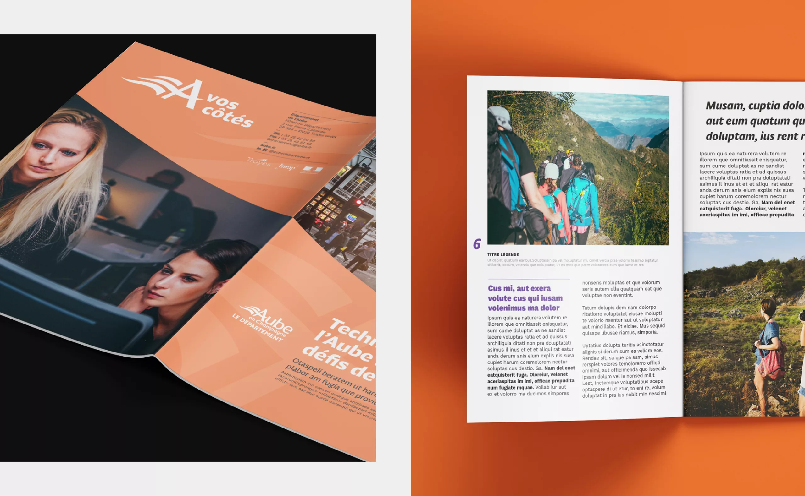
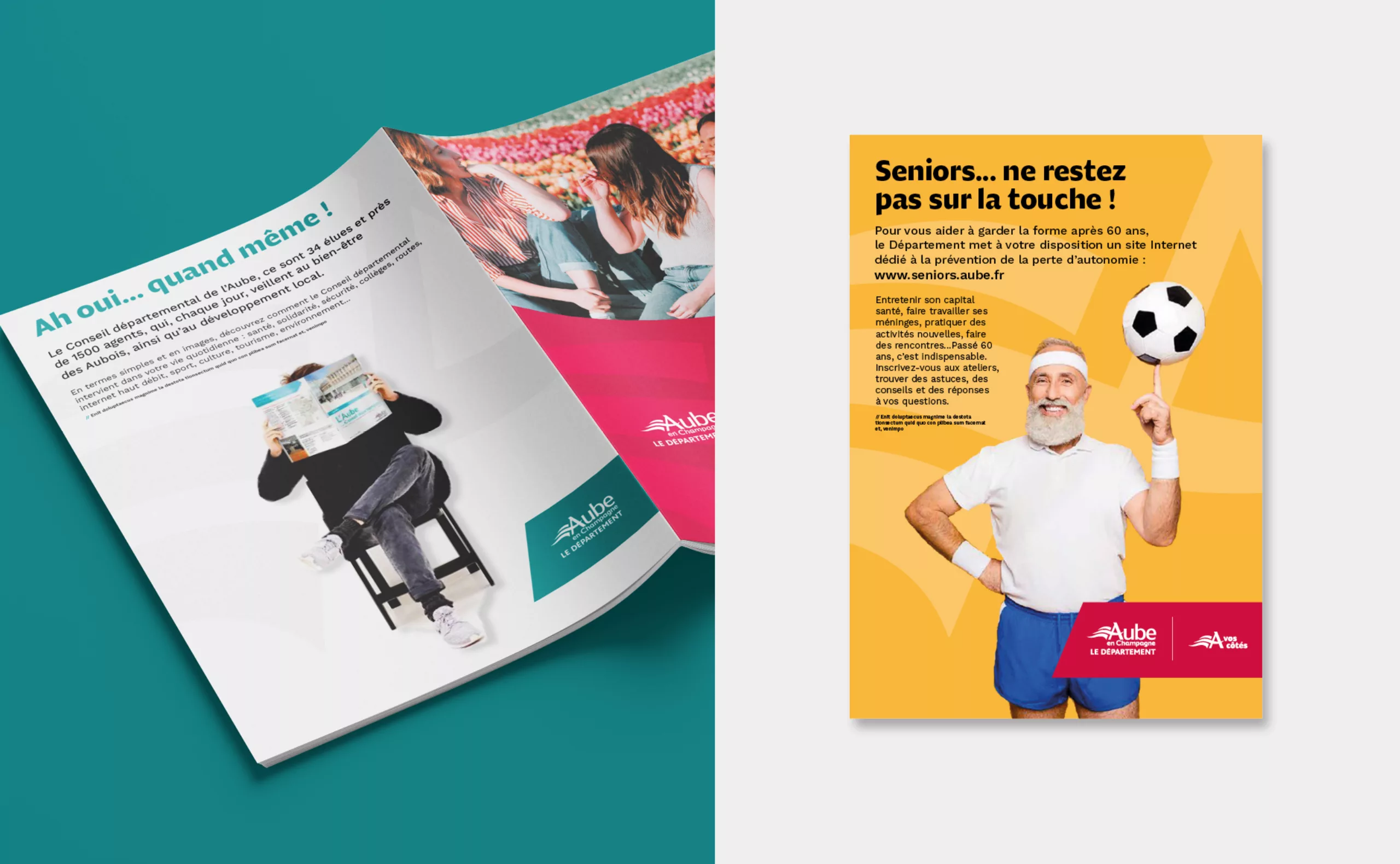
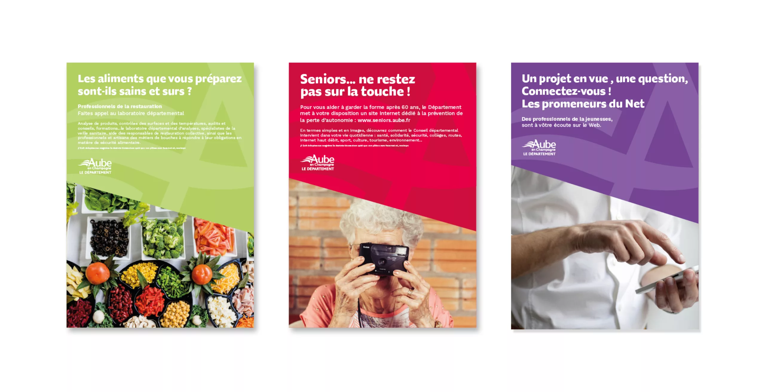
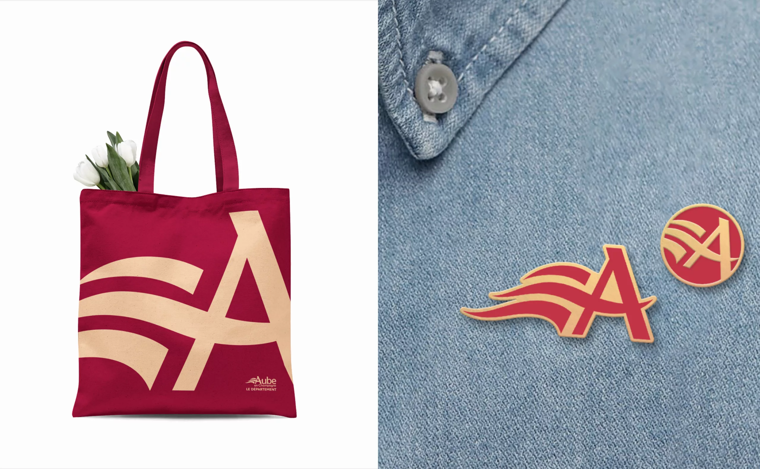
In 2019, Graphéine won the competition for the creation of the new graphic charter for Aube en Champagne french Department. The challenge was to give a new look to the visual identity and to rigorously define its rules in line with the Department's values. The department wanted to create a "label", a specific graphic style to identify all their communication supports.

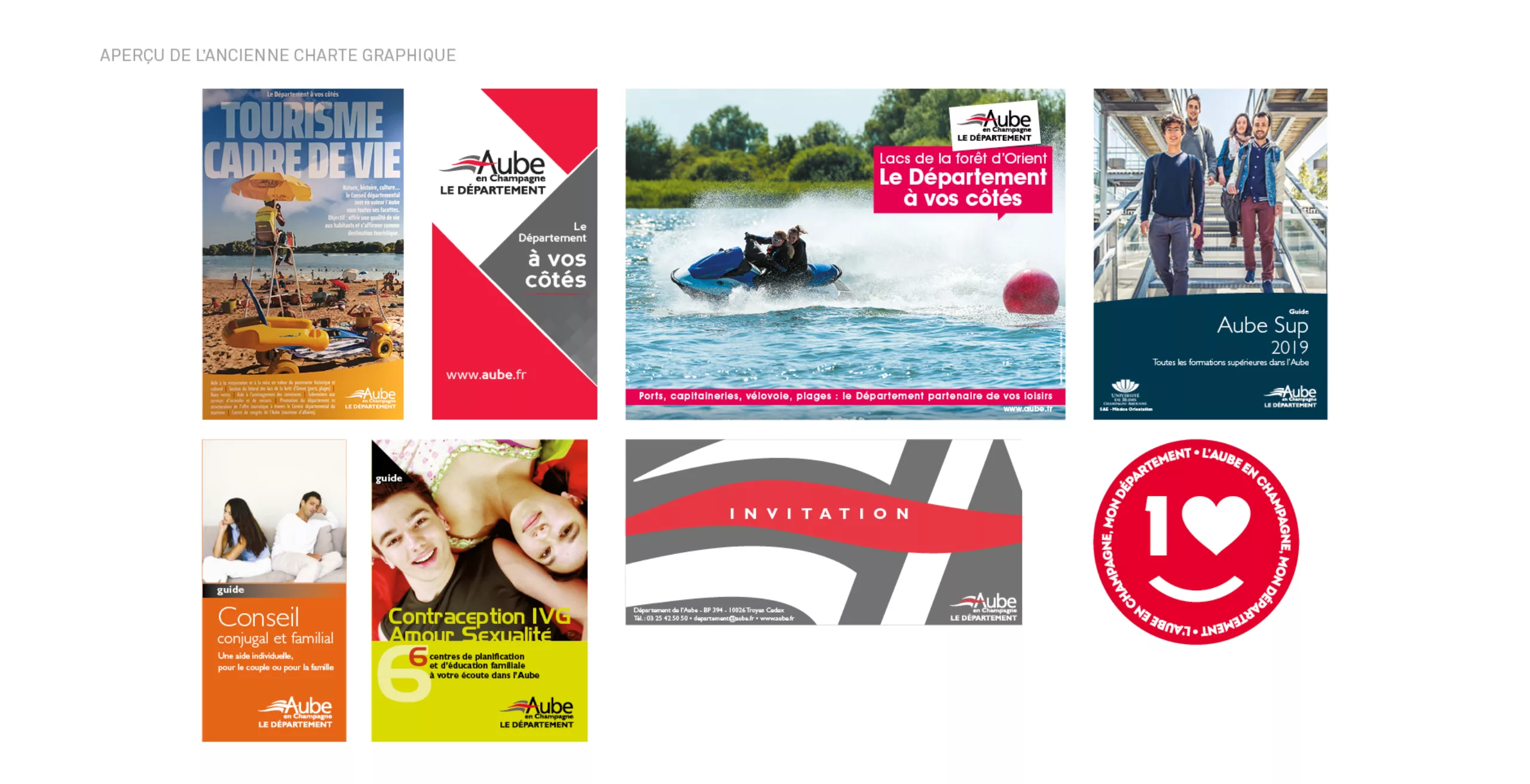
The graphic charter had aged and no longer conveyed the values of the brand: accessibility, modernity, humanity. From now on, the Department has principles for publishing, press relations, its digital communication, stationery and signage that assert its position.

A more supportive and efficient Department than ever. It acts and remains at the forefront thanks to its recognisable emblem

The department's logo was created in 1988 by Michel Rohmer, at the same time as the one for Troyes city, the department's capital. These two identities have a strong similarity: a typographic block composed of a red and silver A-flag. The two logos display the same "federating flag". A flagpole and a banner of three waving flames - symbol of the cohesion of the two communities. This common identity has known a great success and was declined by many actors, institutions, organizations and associations on the territory.

We wanted to give a central place to this "A - banner" emblem in the new graphic charter. Our first task was to correct the design of the logotype. It’s quality deserved some adjustments. First, we streamlined the design of the "A" which was previously oriented upside down. The banner has been re-proportioned to give more impact to the word « Aube ». In order to allow a transversal and simplified use on all formats, the block has been composed in a more compact way.

An institutional and dynamic colour range that perpetuates the values of the Aube department

The colour range has also evolved. Previously silver and red, we have warmed up the institutional colours by evoking the local qualities with a "Champagne colour" and a "Ruby Red". Less cold and less industrial, these colours give a more human dimension to the departmental brand. This institutional range is complemented by a dynamic palette to adapt to the variety of communication media. The "A oriflamme" can be emancipate from the logo block. By becoming more functional and mobile, its role is to become the emblem of the territory.

A visual identity for all supports

With its now central position in the graphic charter, the emblem allows a series of frames and a variety of illustrations adapted to digital and printed objects. The strong presence of the emblem is a strong signature and legibly identify the communications from the department.

The Diurnal typography from Typothèque foundry is chosen as secondary typeface. It is selected for its design which refers directly to the aesthetics of the logotype. Designed by Nikola Djurek, it is one of the rare sans serif humanists type designed for long and continuous reading. Which is perfectly adapted to the richness and density of the contents offered by the department.

The "A - banner " emblem, a key element in the composition

The emblem also makes it possible to define a fixed oblique angle of 67° which charts the layouts and defines integration zones for the iconography. This slant is also a strong identification element for all communication media.

The signature "Le département à vos côtés" (Department by your side) is now more present. A signature that affirms the values of proximity and solidarity dear to the Department. The integration of the emblem in place of the "A" marks the baseline.
Now it carries the "A - banner", it can communicate independently while allowing the identification of the Department.

The new graphic charter for Aube en Champagne is revitalised. It has a consolidated logotype that can be adapted to all media and deploys sets of models to mark all the communication. The visibility and legibility of the department are reaffirmed in an institutional and accessible register. The Department has its own distinctive visual "label".

Context

Since its creation, the logo has undergone various evolutions that have never been accompanied by a complete graphic charter, which can be used on all of the community's communication tools. Diluted over time and by the various service providers, the visual identity of the department is weakened, has aged, and lacks coherence.

Goal

Without sinking into the trendy effects, the Departmental Council of Aube wished to acquire a more contemporary visual identity, immediately identifiable and understandable to all and in phase with its values and ambitions. The new communication had to be in its image: serious but also "warm", elegant but not elitist.


Share this project:
Project expertise:
Logo creation, visual identity and graphic guidelines.
Type of client:
Institutional communication agency, public communication for cities and territories, government institutions, social partners and public administrations.

Related projects: