Brand culture
-

3 Questions for Paul Vacca About the Brand
Paul Vacca analyzes the evolution of brands: the disappearance of the claim, new strategies, fluid identities, and the concept of a “habitable world.”
-
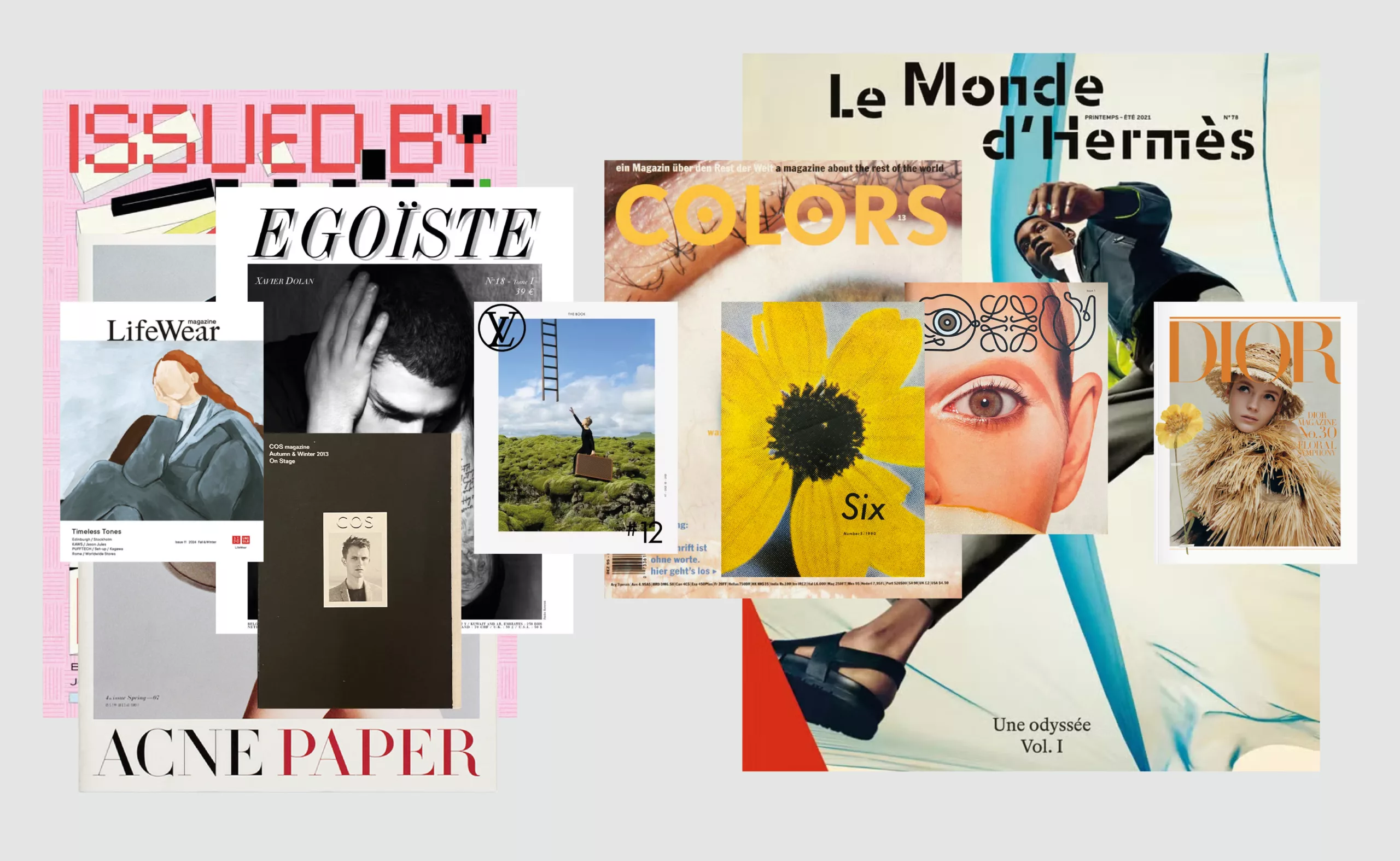
Luxury brand magazines are putting up a fight
An overview of luxury brand magazines seeking to stand out and resist the accelerating pace of current events.
-
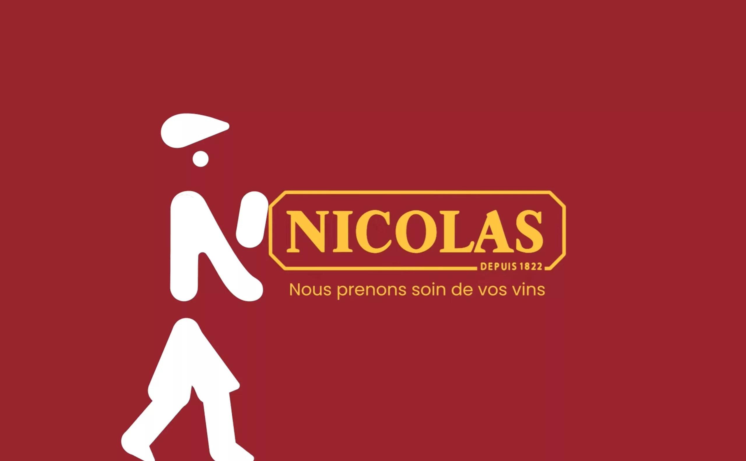
Maison Nicolas, a new logo for a new strategy
Maison Nicolas has unveiled a new logo and identity, unfortunately without drawing on its rich graphic heritage.
-
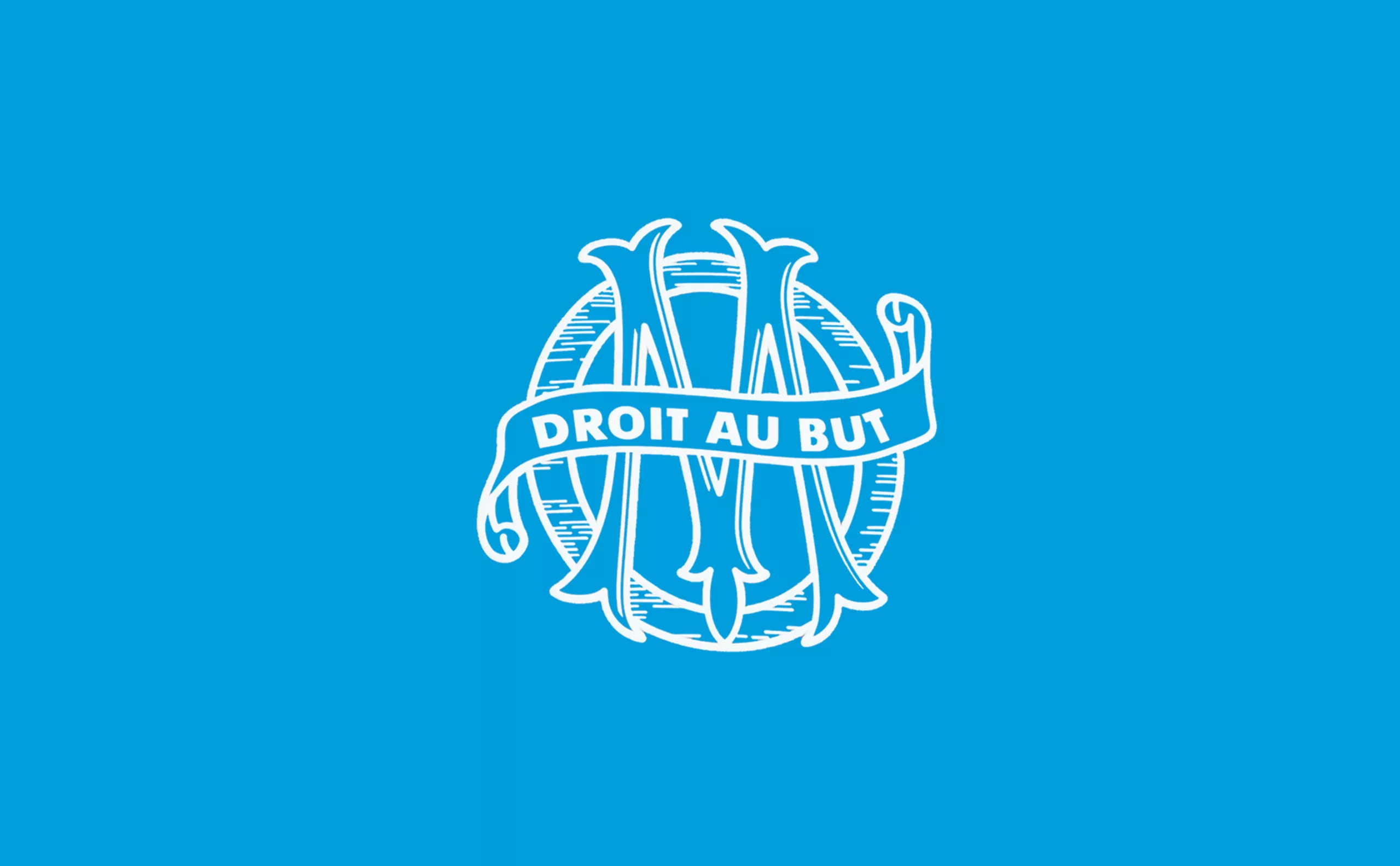
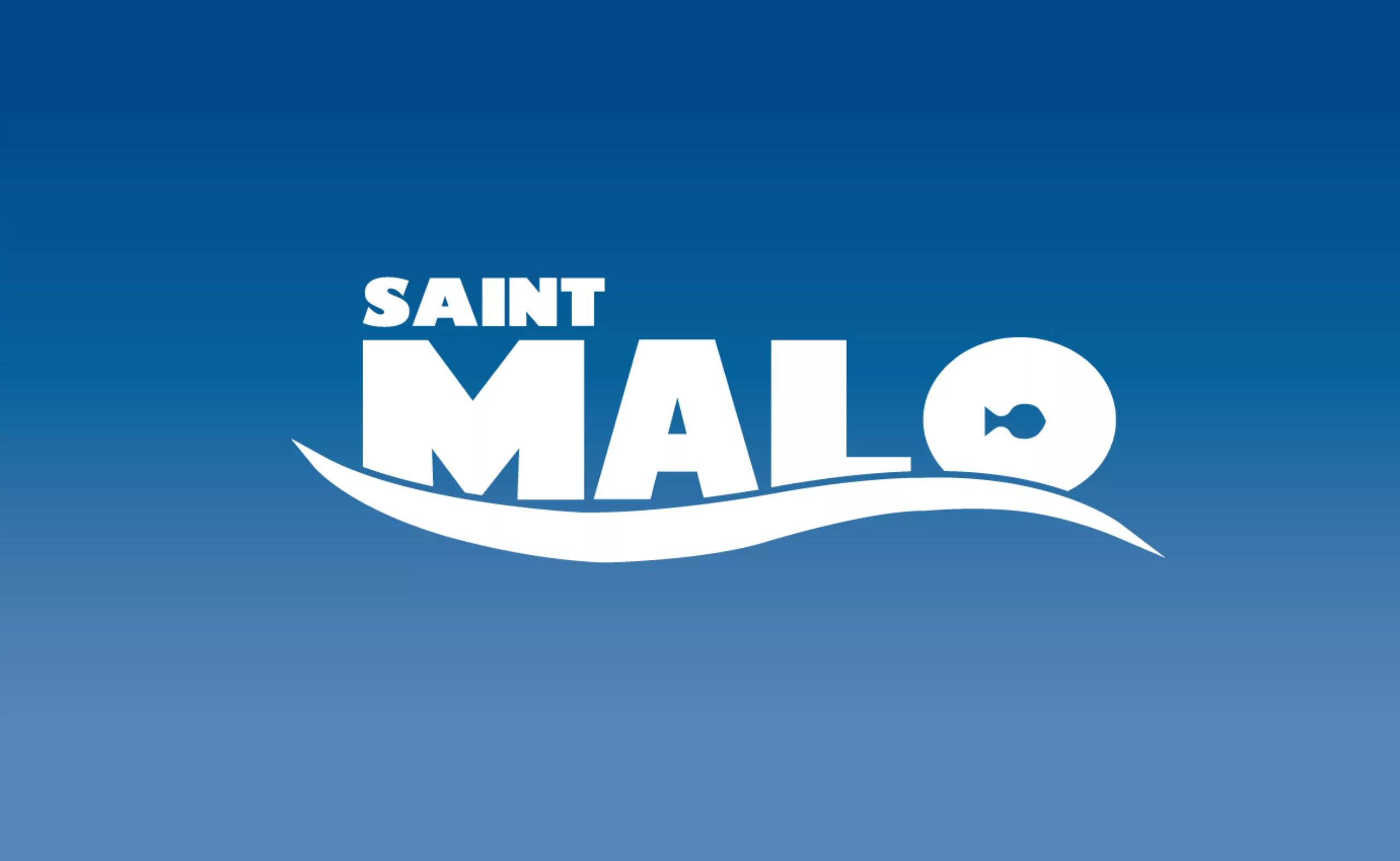
New logo for OM: analyzing a sports crest
OM will soon be changing its logo. This is an opportunity to delve into 125 years of heritage to understand the challenges of the future.
-

Groupama’s new visual identity, a logo in the open countryside
Groupama has just unveiled a new logo that updates its graphic design by abandoning its campaign in favor of a “startup” aesthetic.
-

The UN logo takes on water during COP28
For COP28, two designers have come up with a new UN logo showing the rising sea levels and the future disappearance of much land and coastline.
-
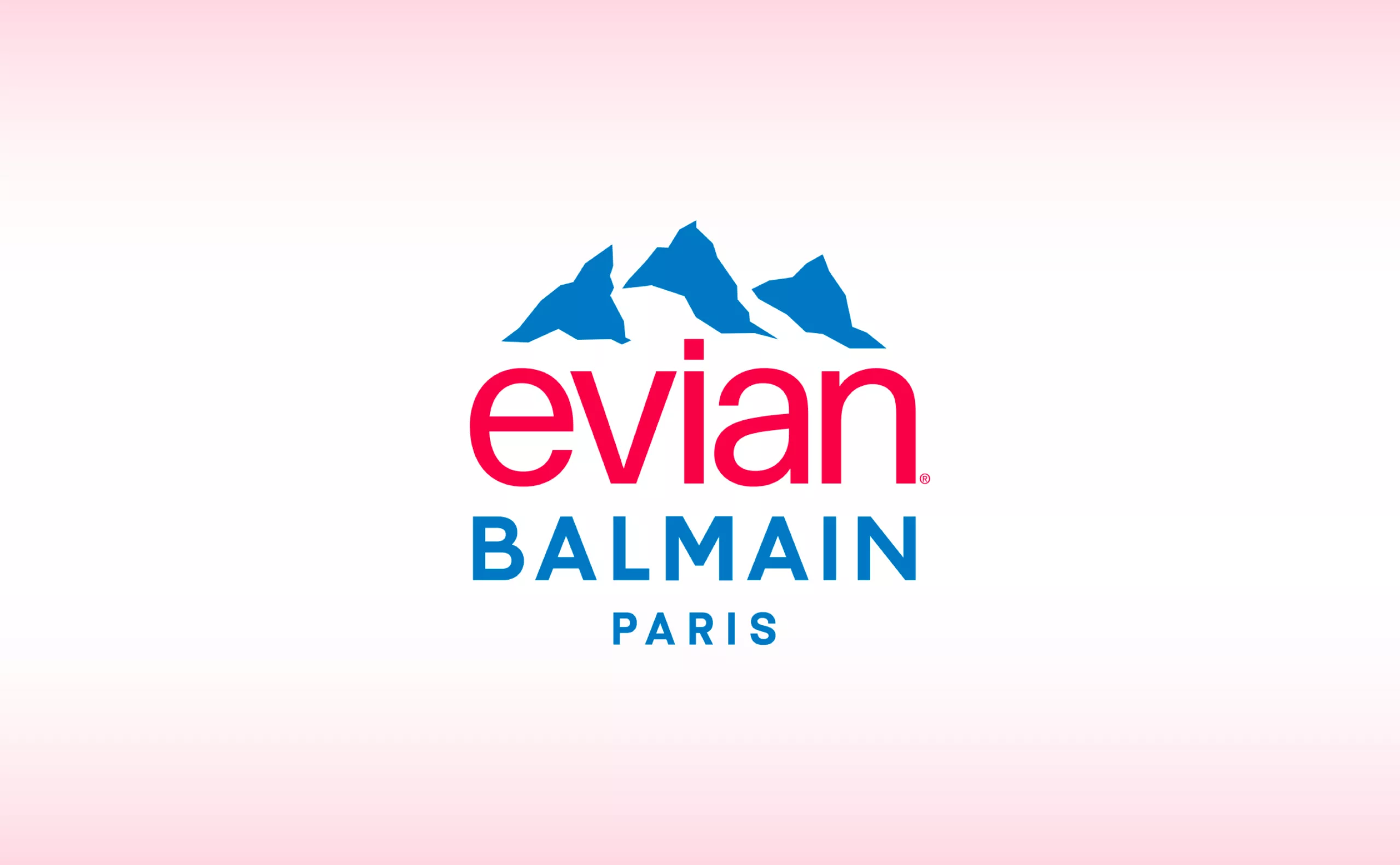
Evian x Balmain, a deep water co-branding strategy
This surprising co-branding gives us the opportunity to look back at the history of evian and to decipher the stakes of this strategy of luxification, greenwashing and the issue of plastic waste.
-
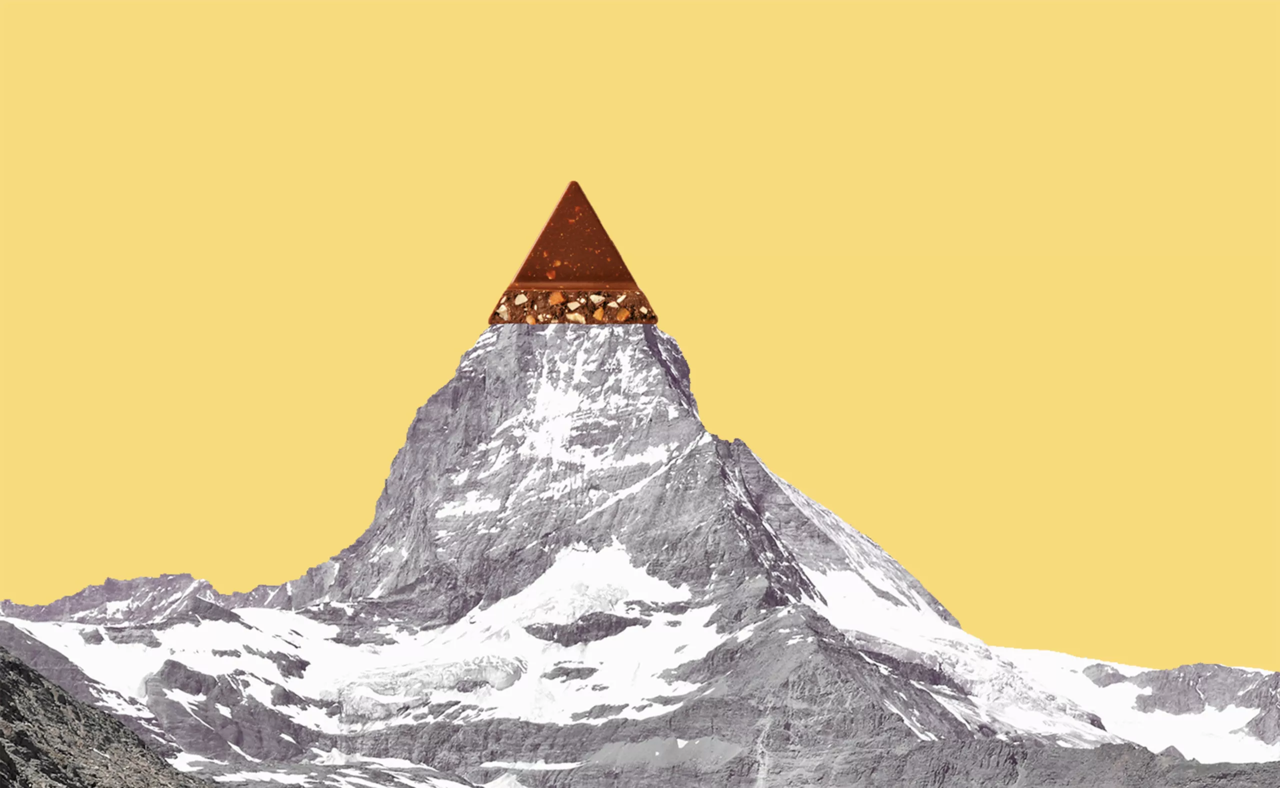
Toblerone’s new mountain: when packaging brands a territory
From Toblerone to Milka to feta cheese, brands mark their territory on their packaging and are sometimes caught up in the globalization game.
-
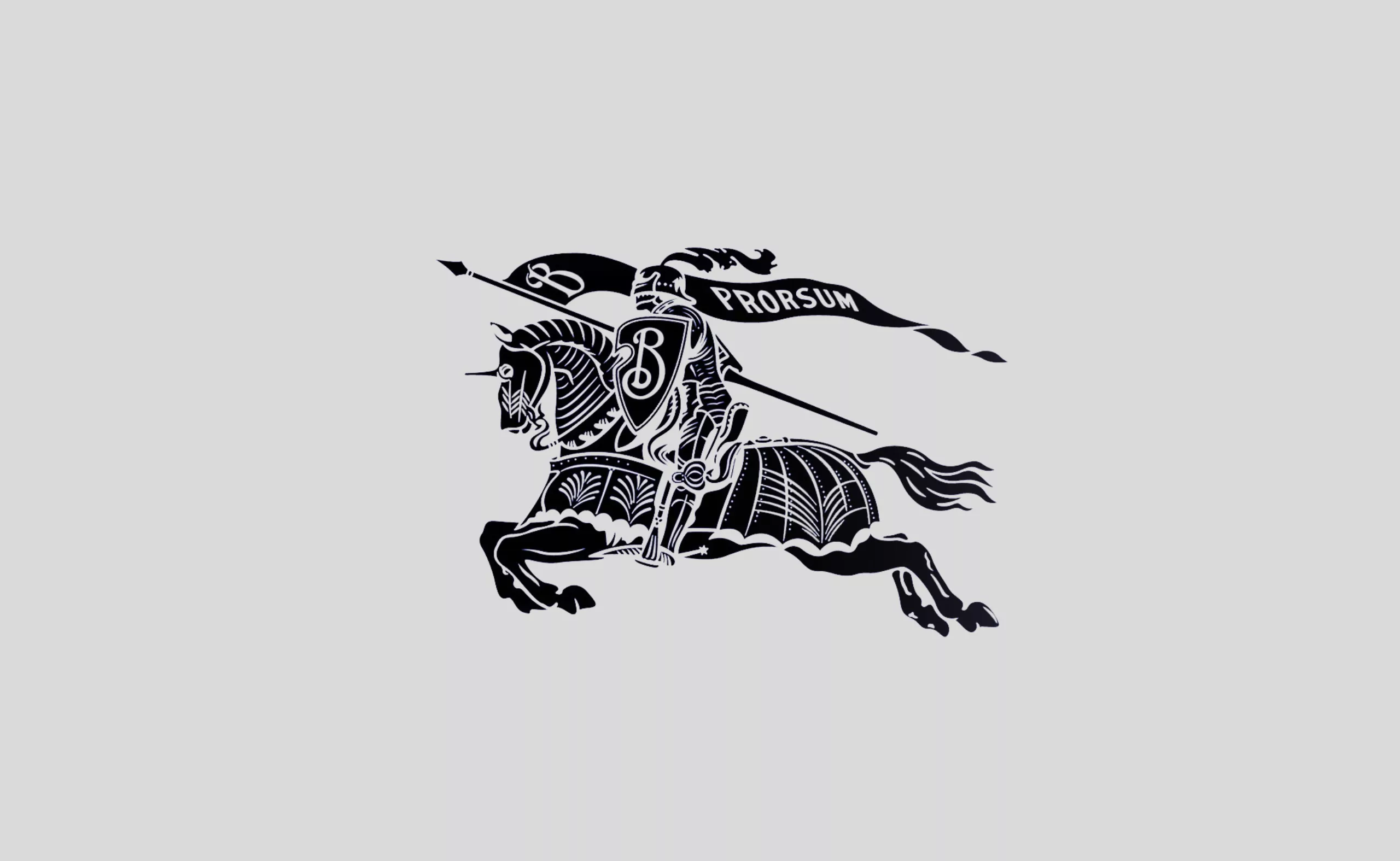
Burberry regains prestige with a new antique logo
Burberry’s new logo revives the brand’s coat of arms by adopting an antique typography and recovering its knight.
-
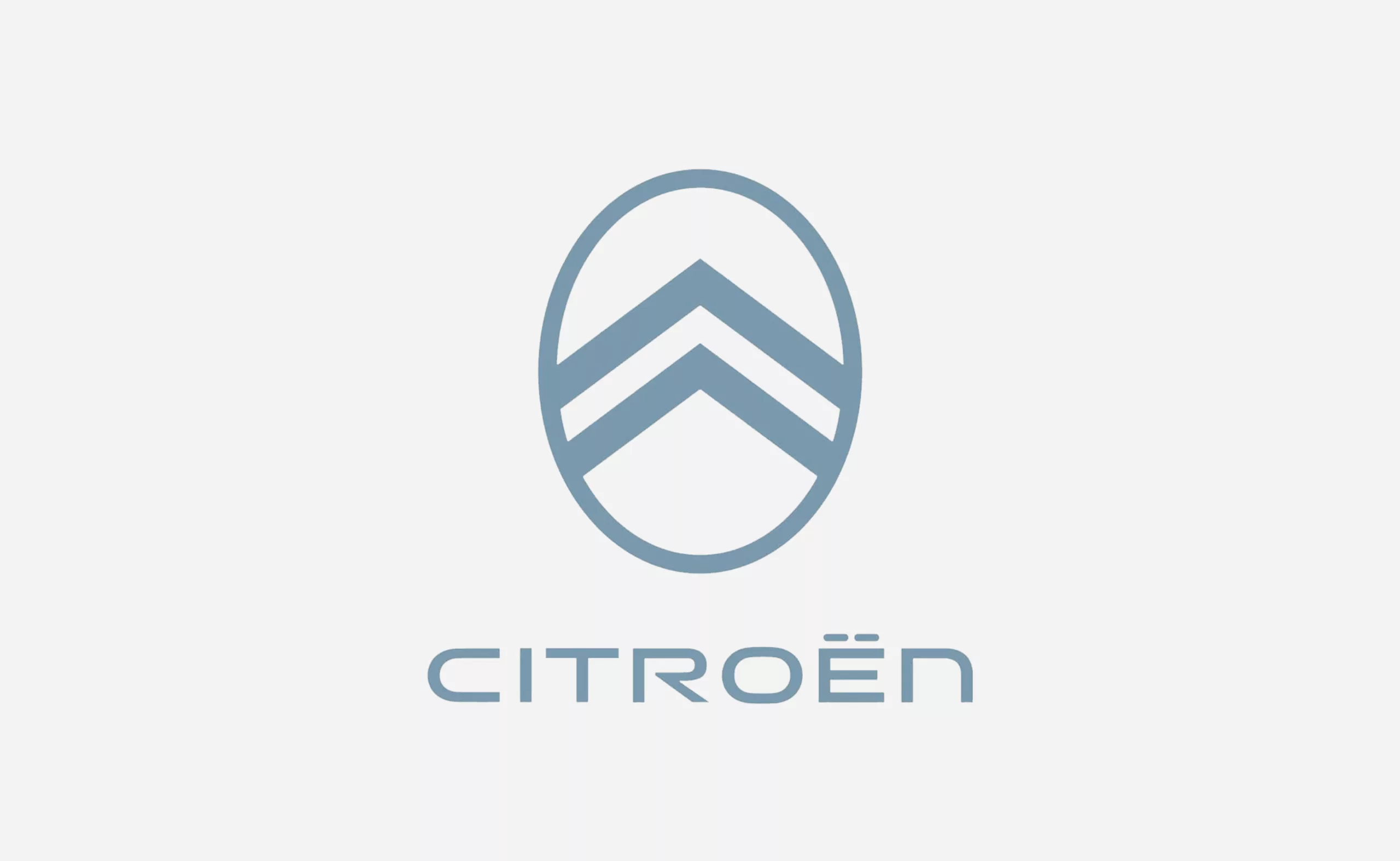
Back to the future for the new Citroën logo
Back to the future for Citroën which reveals a new logo inspired by the past. Nothing surprising for this necessary yet futuristic strategy.
-
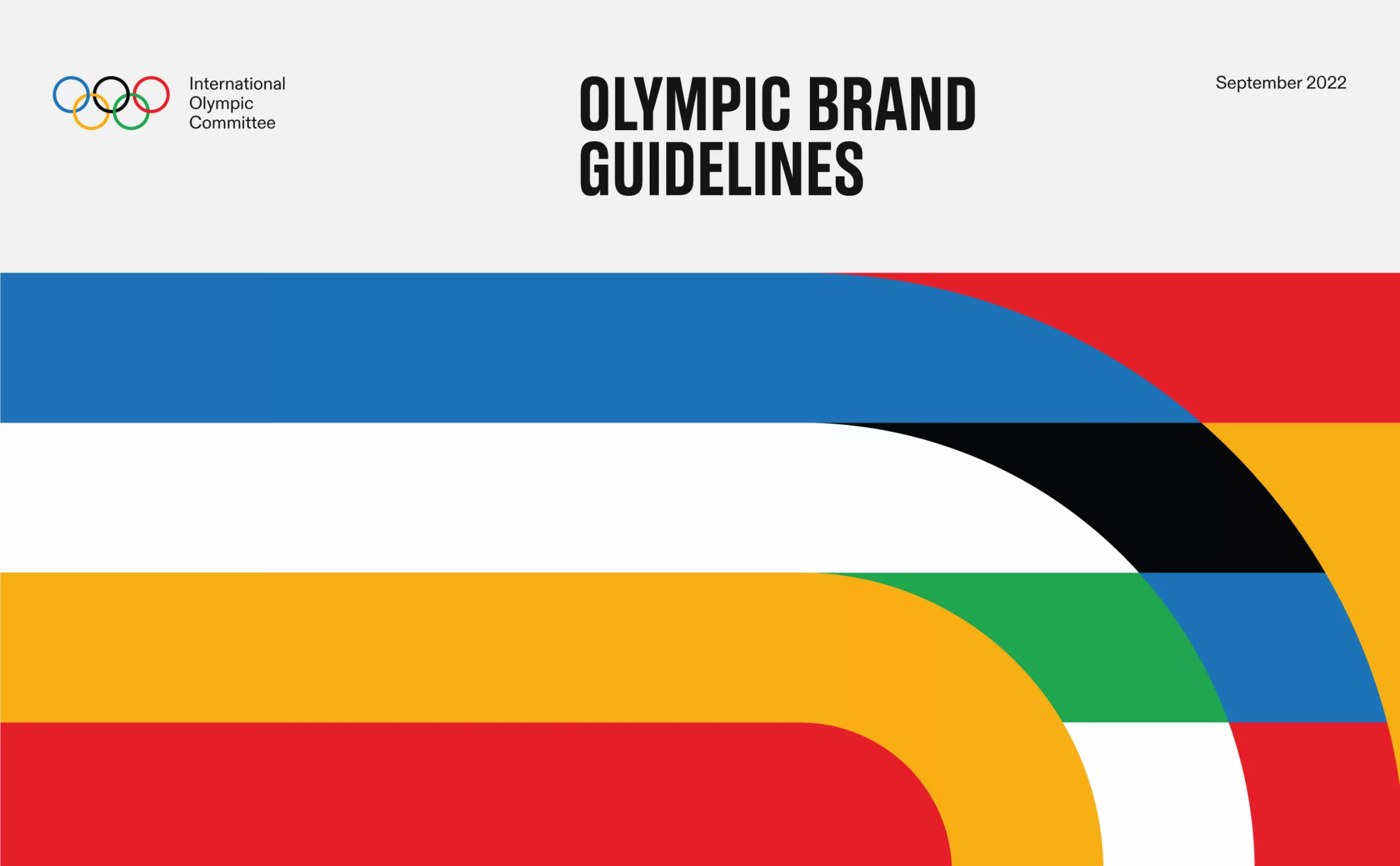
The new graphic charter of the Olympic Games
The Olympic Games are redesigning their identity to harmonize their visibility in all countries and on all communication media.
-

Le Slip français puts on a new logo
After 10 years of existence, le Slip français washes its image and puts on a new logo. Simple, basic, more inclusive, but is it enough?
-
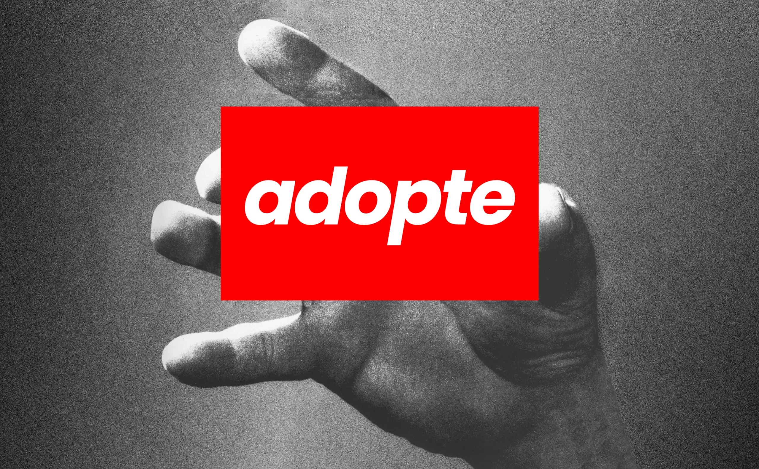
adopte un mec: a new logo for the dating app
“Adopte un mec” abandons its shopping cart and unveils its new logo: if women consume more, they devour! A look back at sexist ads.
-
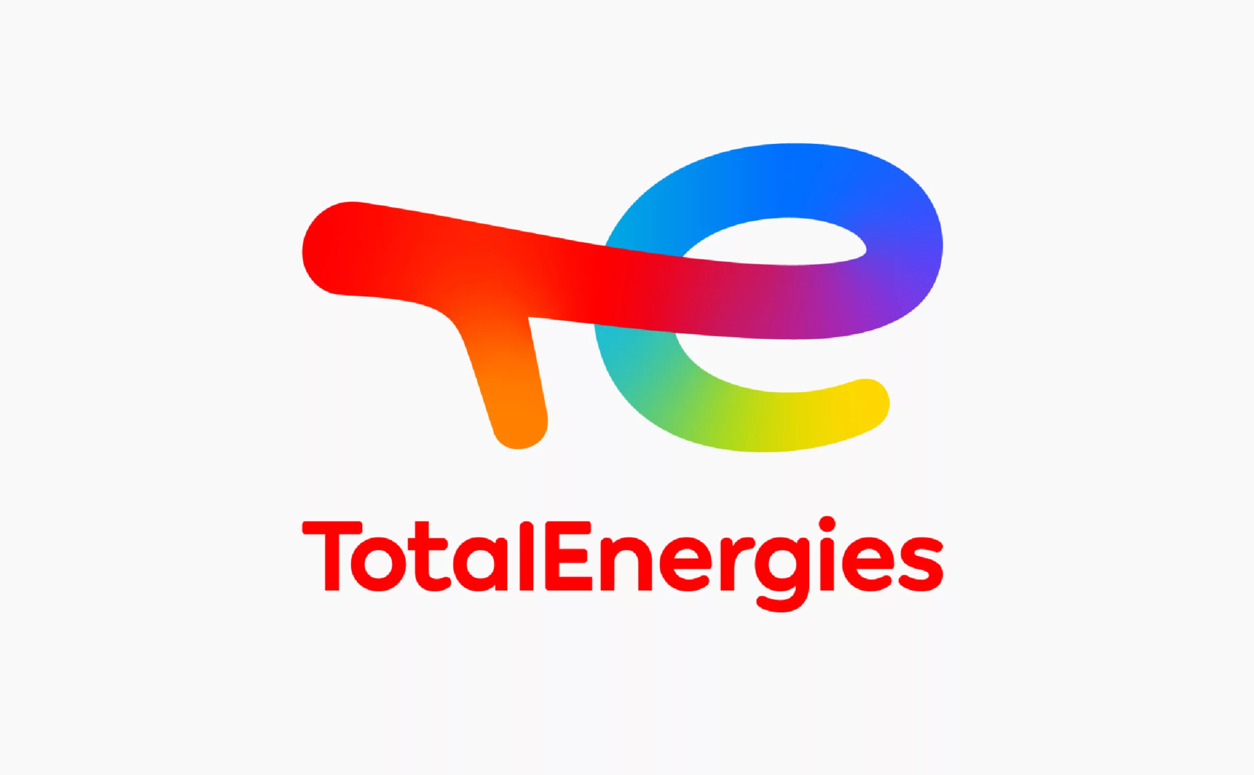
Deciphering Total’s new faded logo, becoming TotalEnergies
Total has changed its name, with a new logo and a new identity: TotalEnergies. Is this a faded strategy to go green without denying its past?
-
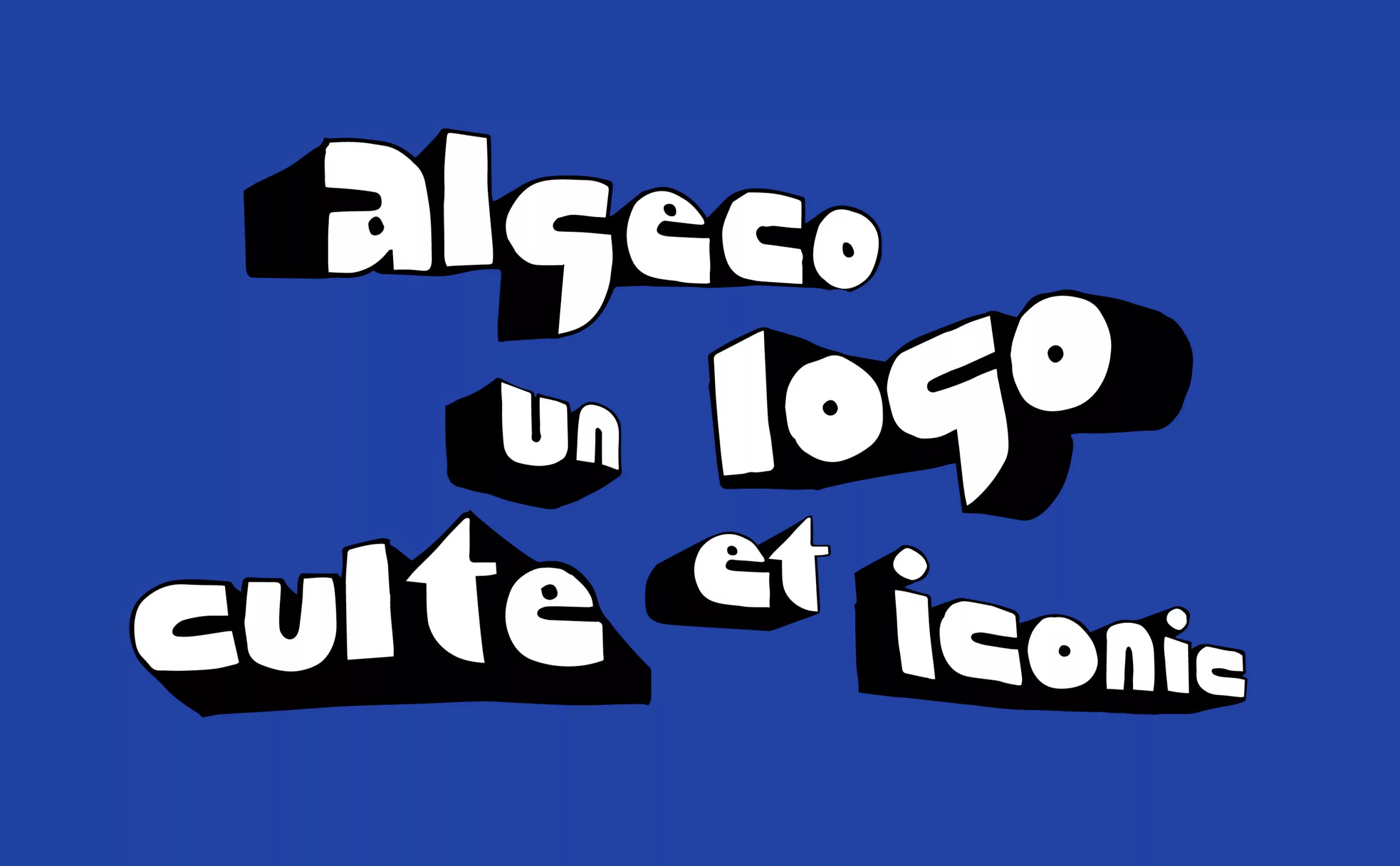
Algeco®, an iconic logo and the quest of timeless brand identities
What is a cult and timeless logo? We take advantage of an invitation to decipher the Algeco logo to look at the case of “iconic” logos.
-
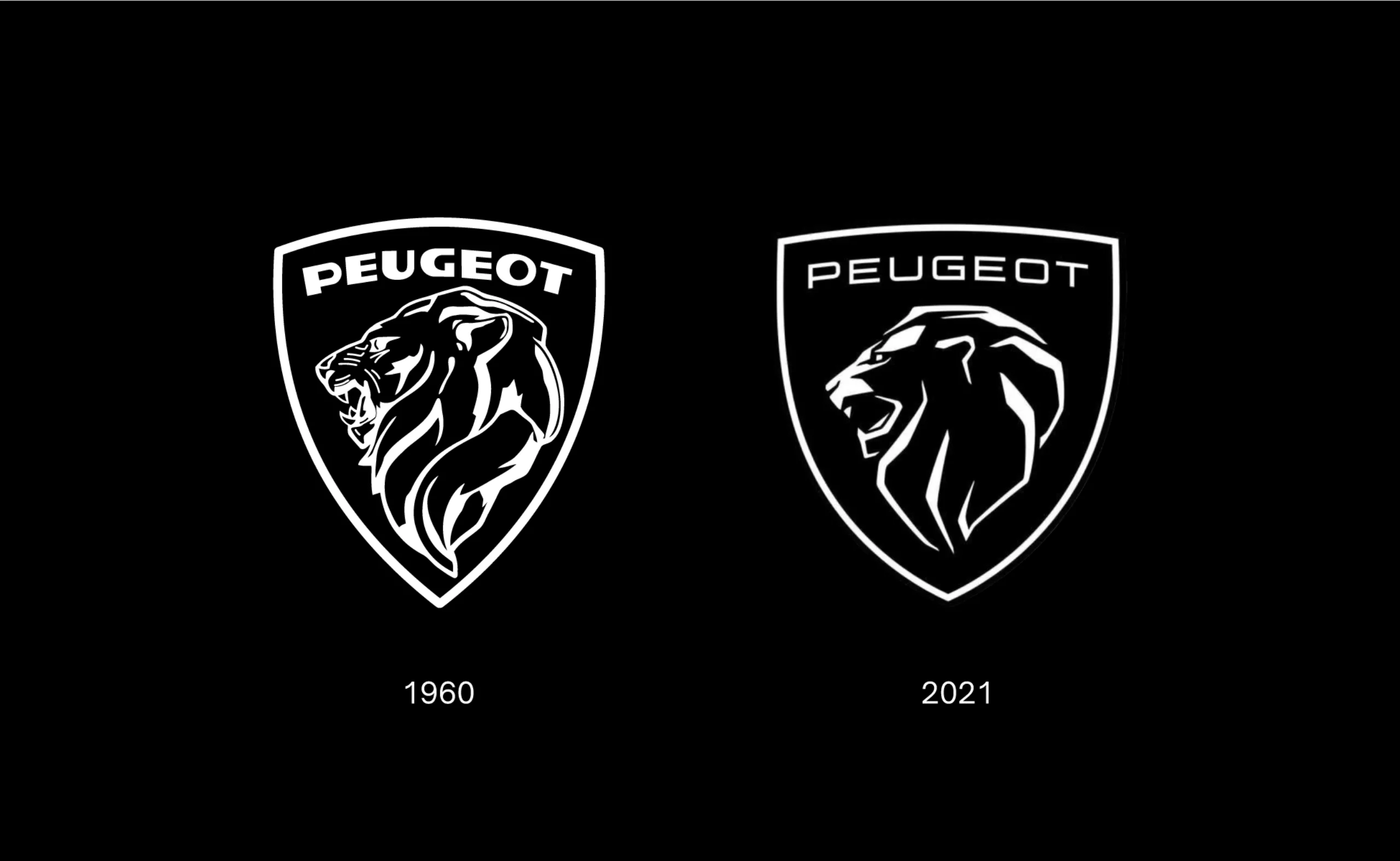
New Peugeot logo and car rebranding, it smells musky!
Peugeot reveals its new logo, a revival of the 1960 logo.
An astonishing or worrying positioning? Here are a few insights. -
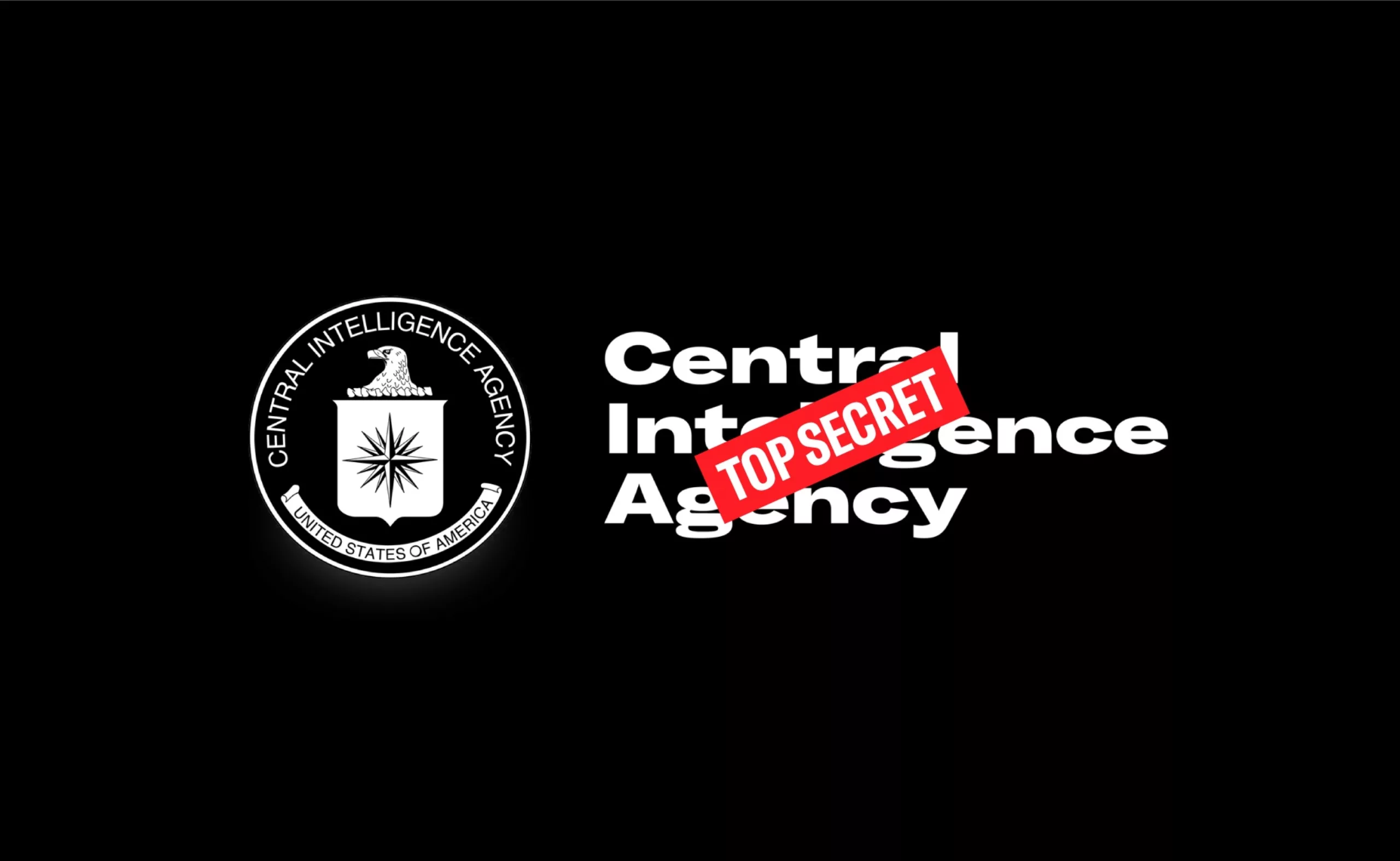
The CIA gets a new identity!
Nouvelle identité visuelle de la CIA, avec un petit look de festival electro ou de série Netflix !
-

Helvetica brands, for those who are fond of typography
Helvetica, as an icon, has become a brand: you can now drink, wear or even smell Helvetica.
-
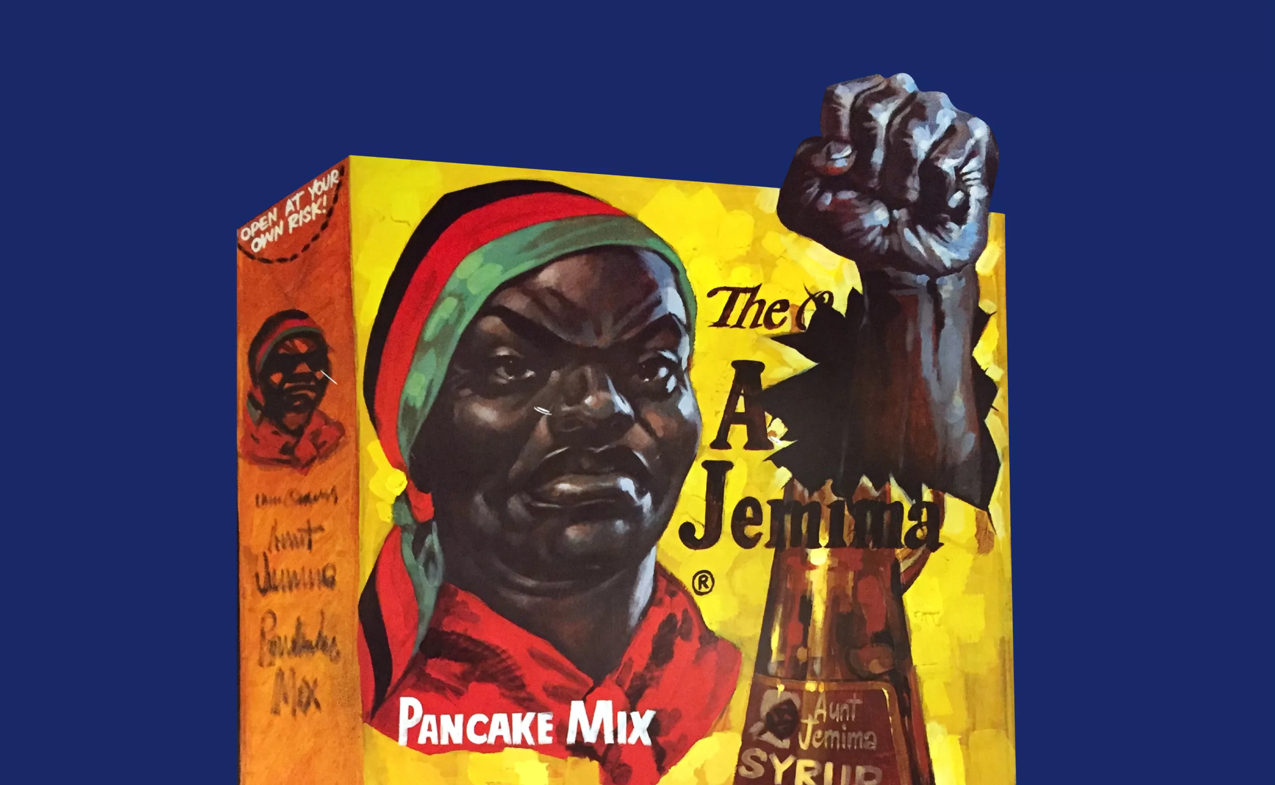
Uncle Bens’, Aunt Jemima… racist packaging rises up
From Uncle Ben’s or Aunt Jemima’s brand name history to Mammy’s syrup, the racist packaging are sitting on a (pancake) powder keg.
-
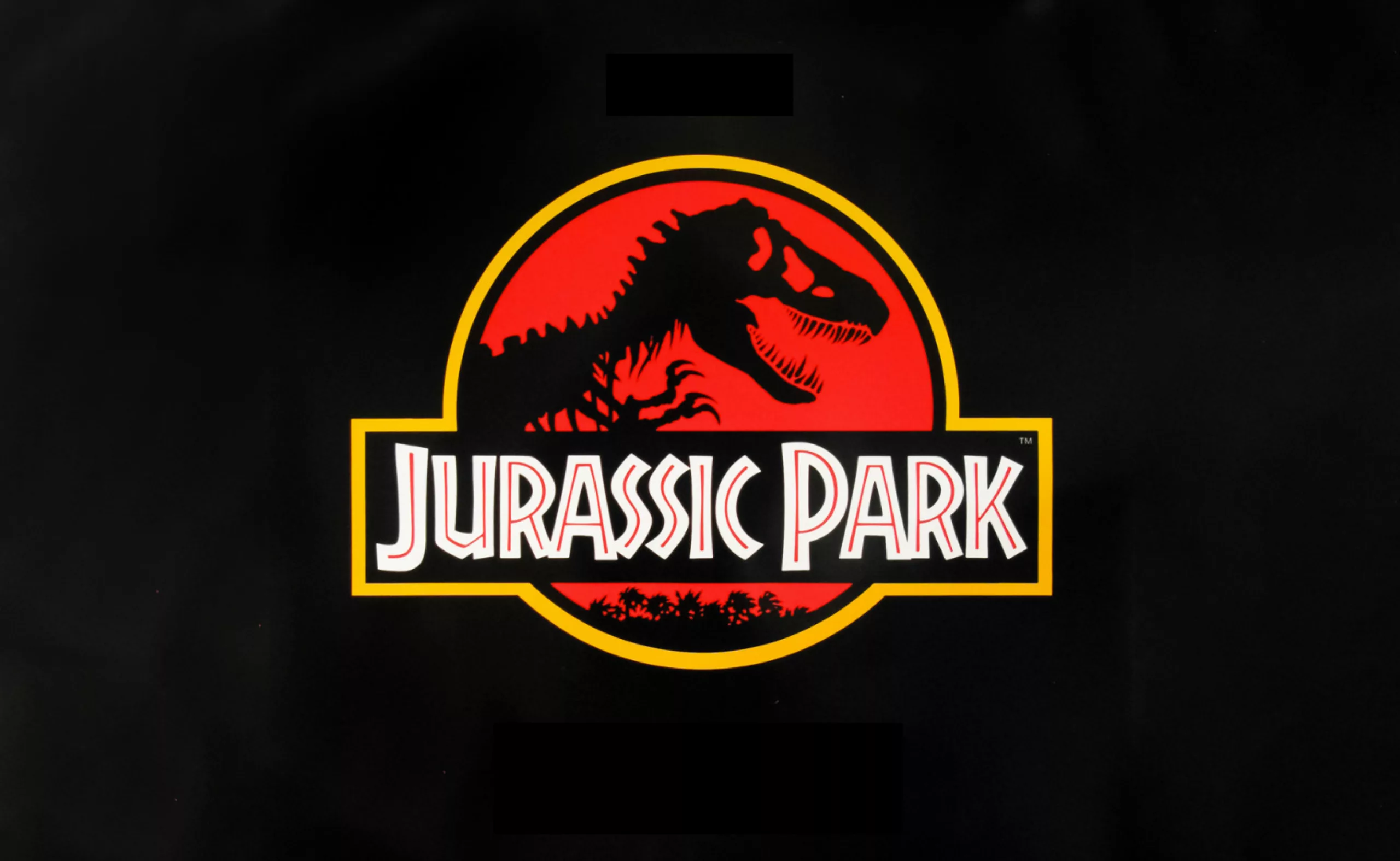
The story of the big bad Jurassic Park logosaurus
It took 68 million years to resurrect a T-rex, and almost as long to create the Jurassic Park logo. Here is his wicked adventure.
-
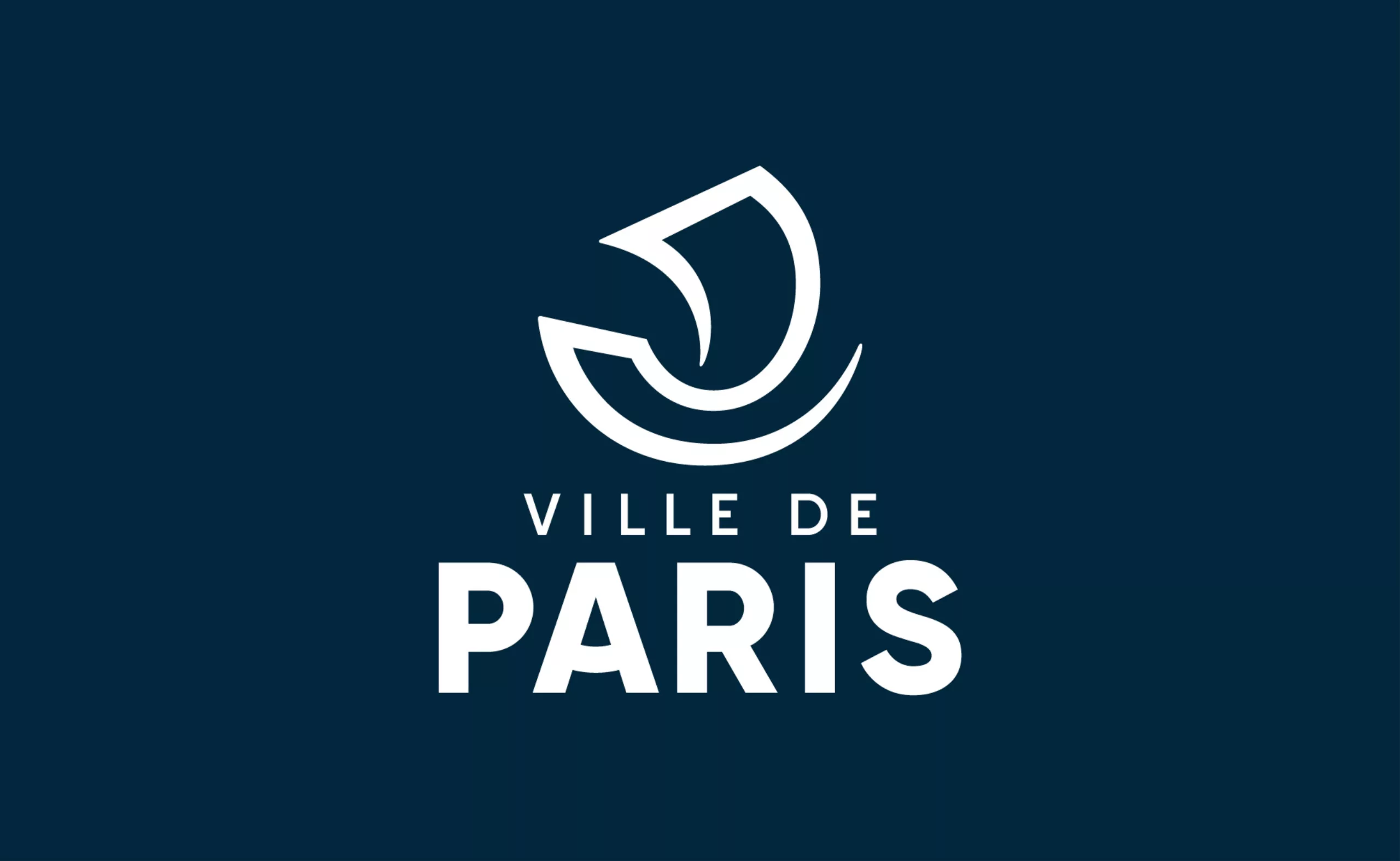
The city of Paris revises its visual identity
At the beginning of January, the city and the department of Paris merged, the opportunity for the capital city to review its visual identity.
Here is the analysis of this logo made by Carré Noir. -
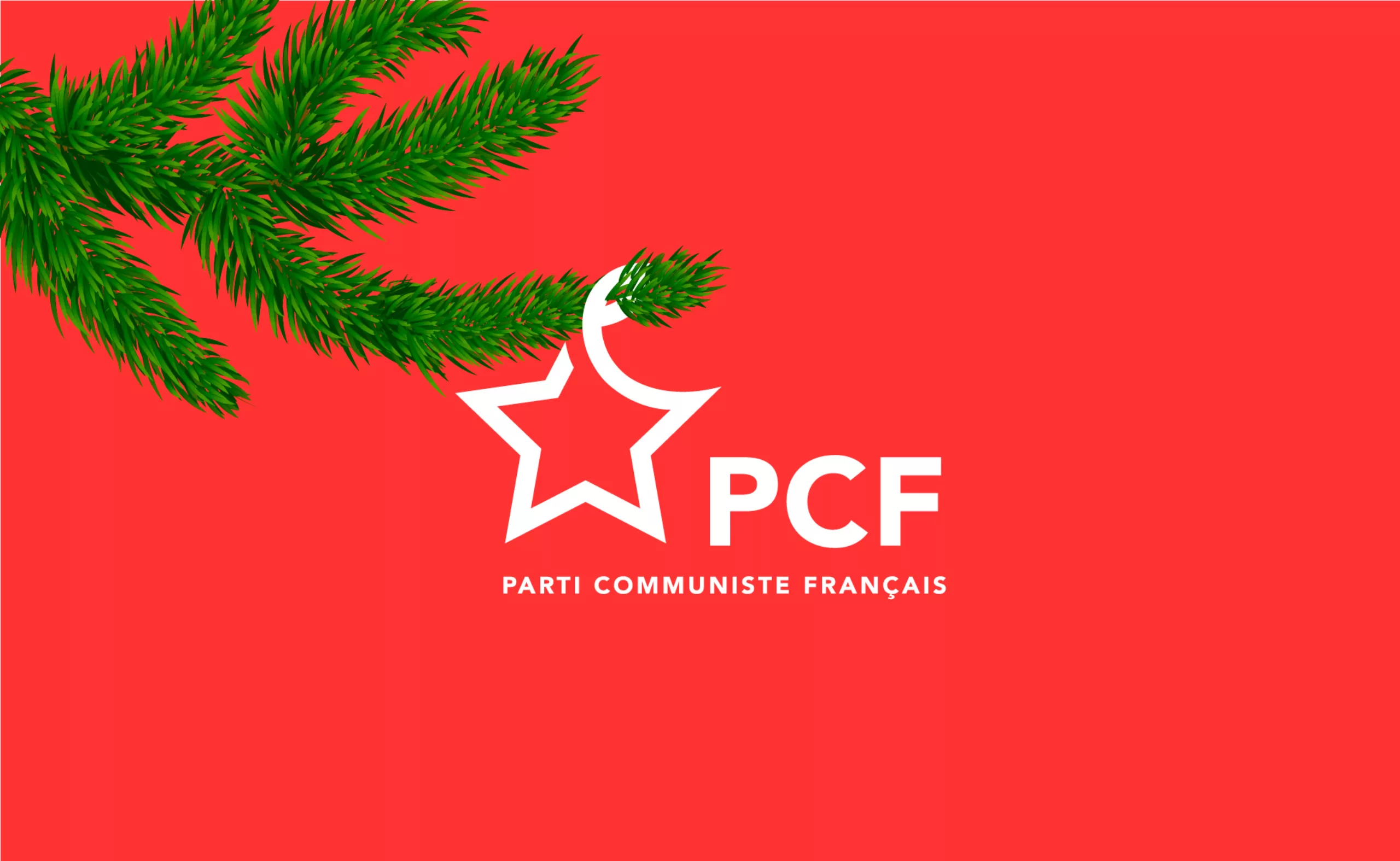
C’est Noël ! Le Parti Communiste change de logo !
On the occasion of its annual congress, the French Communist Party (PCF) has just given itself a little present: “A new logo!”
This is an event, since the previous logo dated from 1990. Let’s decipher this logo. -
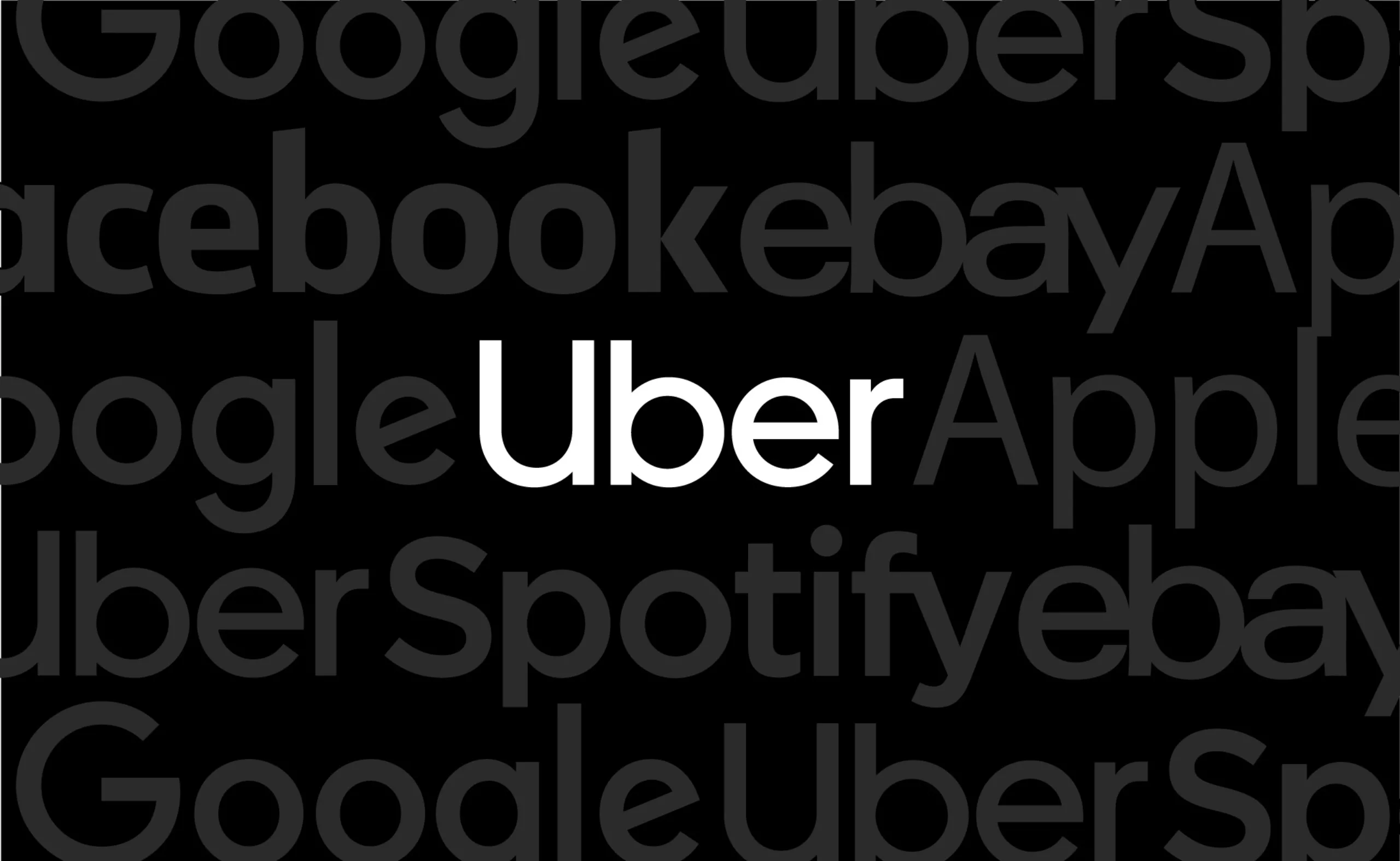
Uber’s new visual identity doesn’t transport anyone!
Uber has chosen to go for a logo that doesn’t make waves, is neutral and anything but singular. In short, a visual identity that transports no one!
-
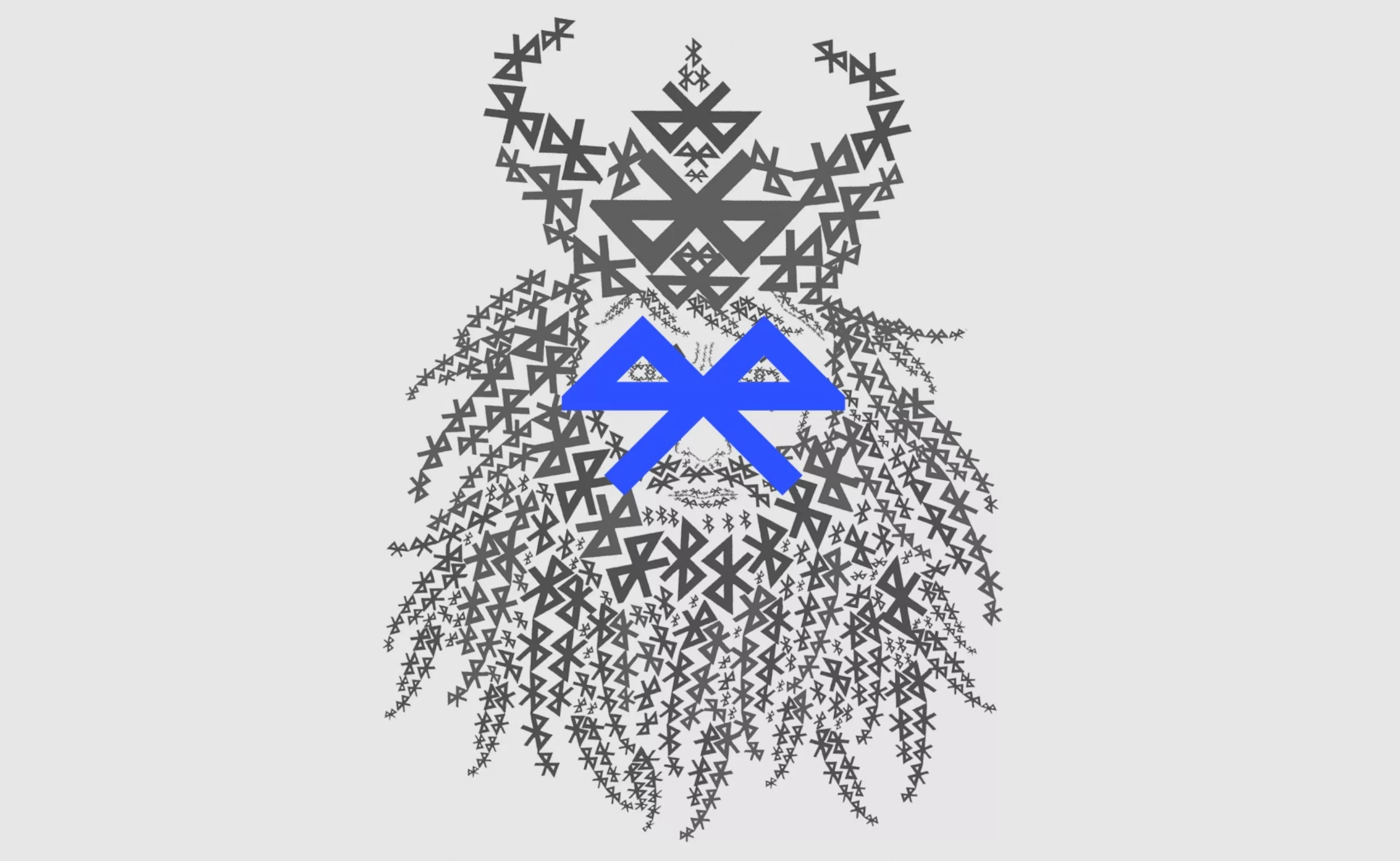
The story of Harald with blue teeth!
Discover how Harald with blue teeth, a Danish king of the 9th century, inspired the name and logo of Bluetooth.
-
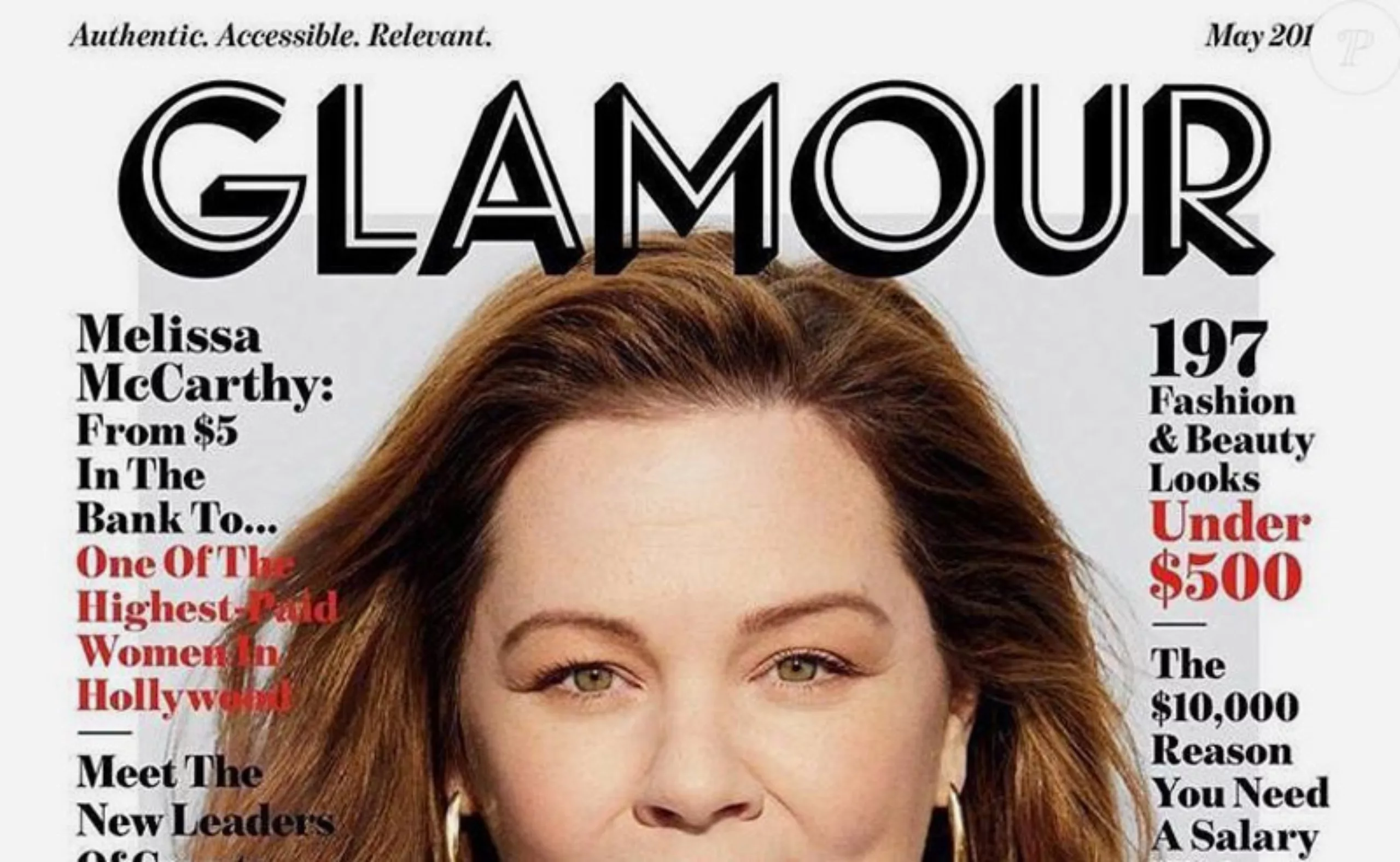
From glam to filter-free, Glamour’s new look
The women’s magazine Glamour changed its logo and layout several times before taking a radical turn in early May. Glamour displays a new logo in the United States, a new model in France, and a promise of less “girly” content.
-
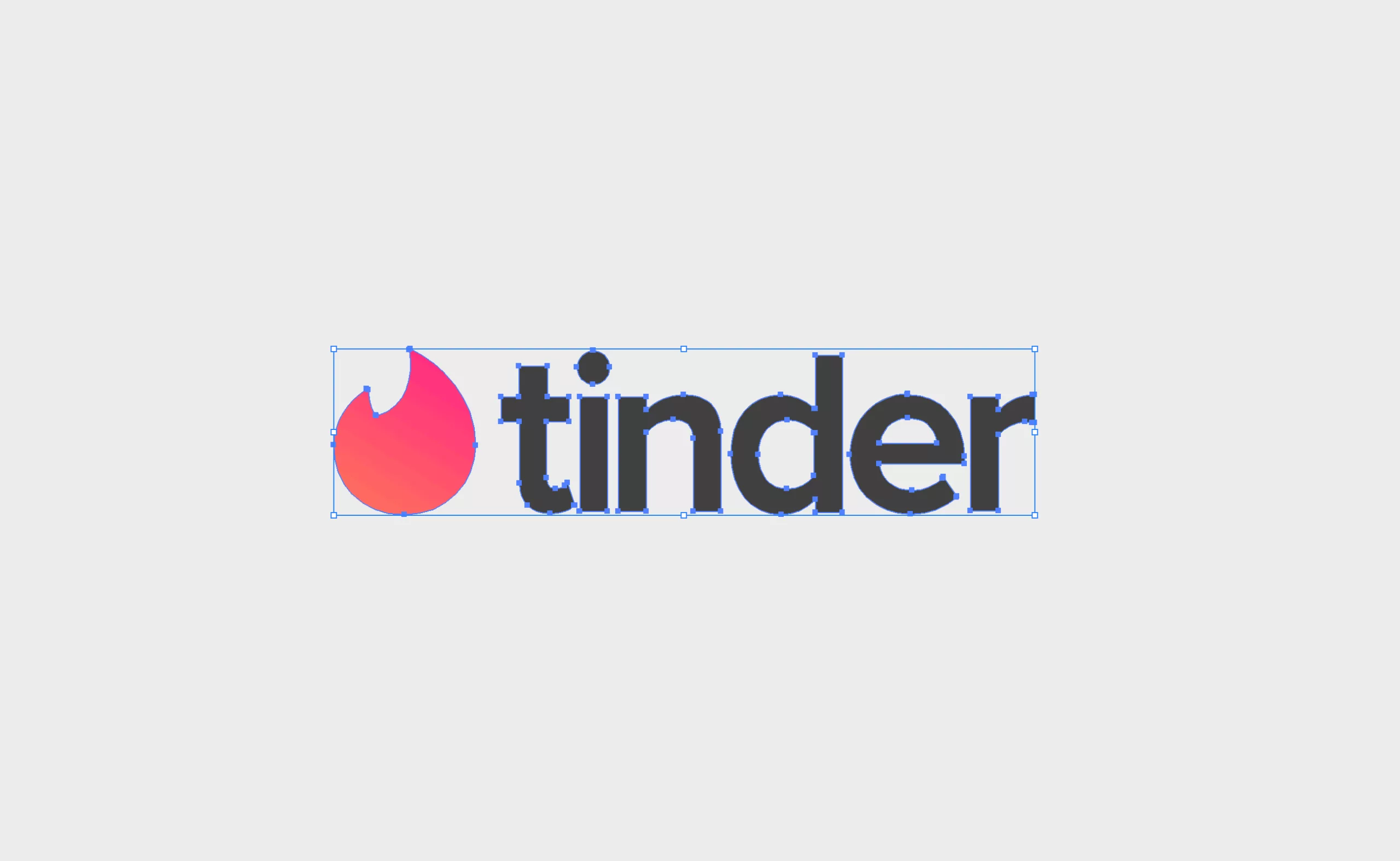
Don’t be tender with the tinder logo!
8 errors are hidden in the Tinder logo! Can you find them?
Here’s a short and fun presentation of the tinder logo, where we’ll not be tender. -
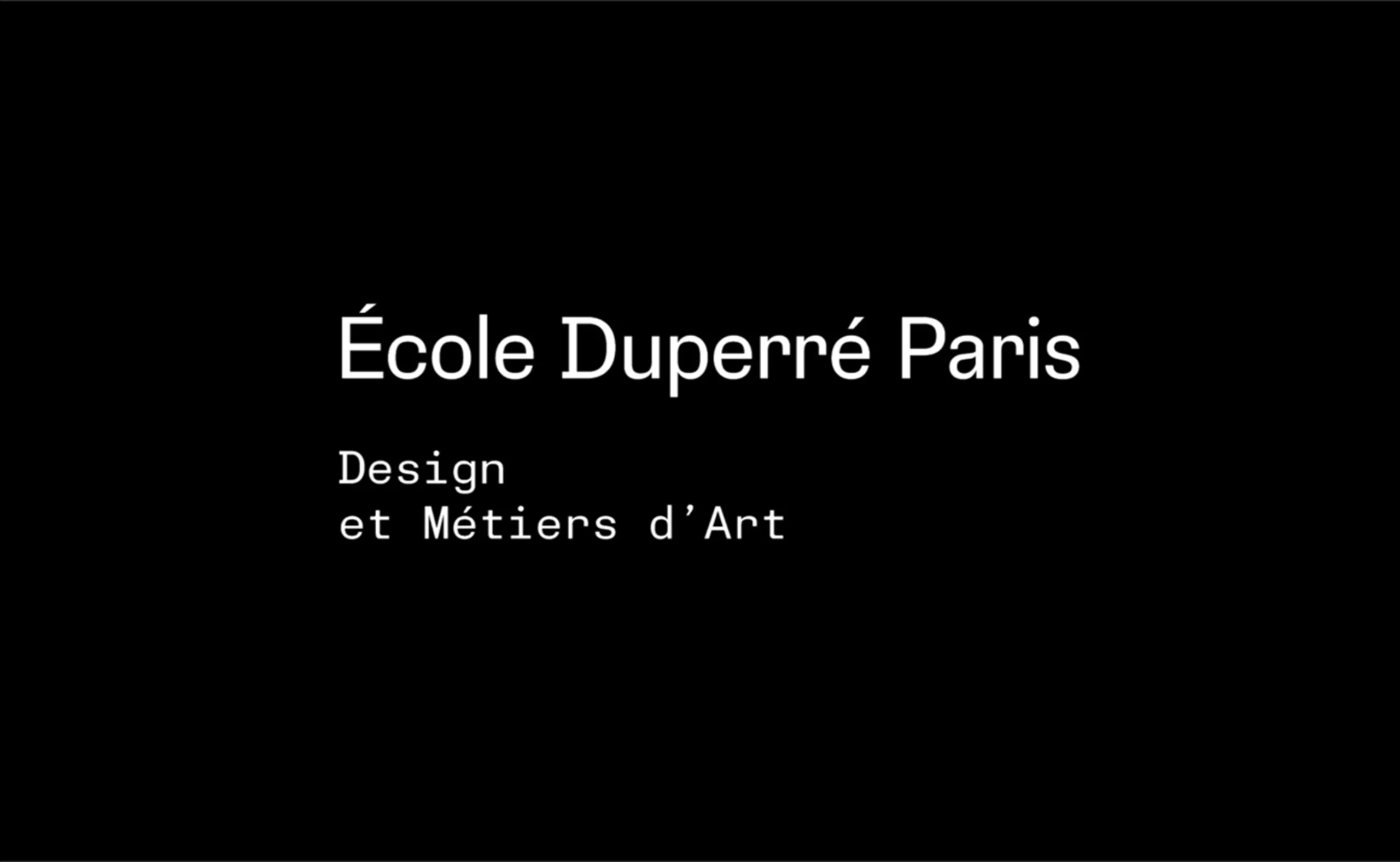
Duperré School changes of visual identity
The Duperré School changes its visual identity.
A project designed by L’atelier Ouf ! and the Production Type foundry. -
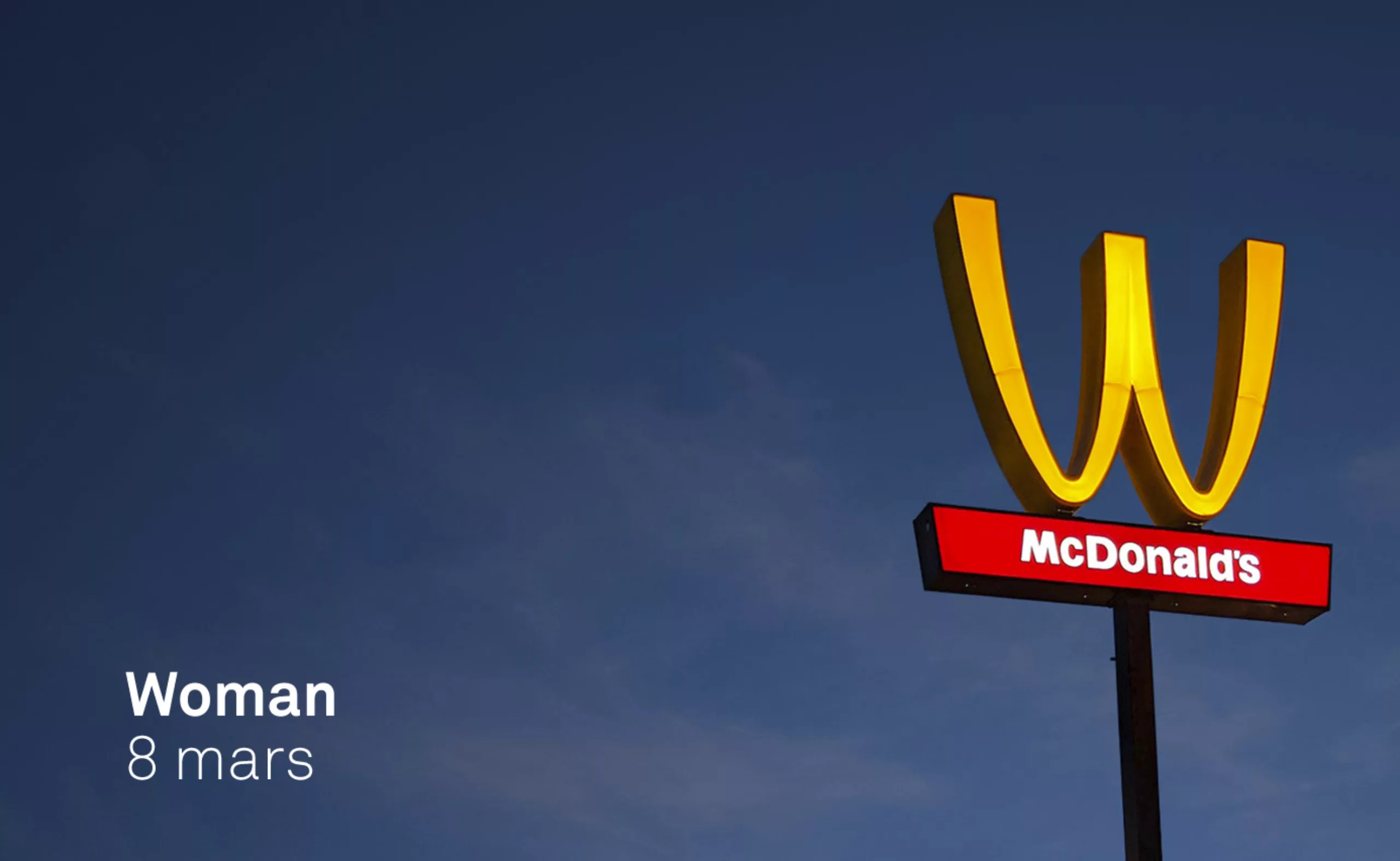
McDonlads turns over its logo for International Women’s Rights Day…
McDonlads turns over its logo for International Women’s Rights Day… not sure it’s really a feminist act!
-
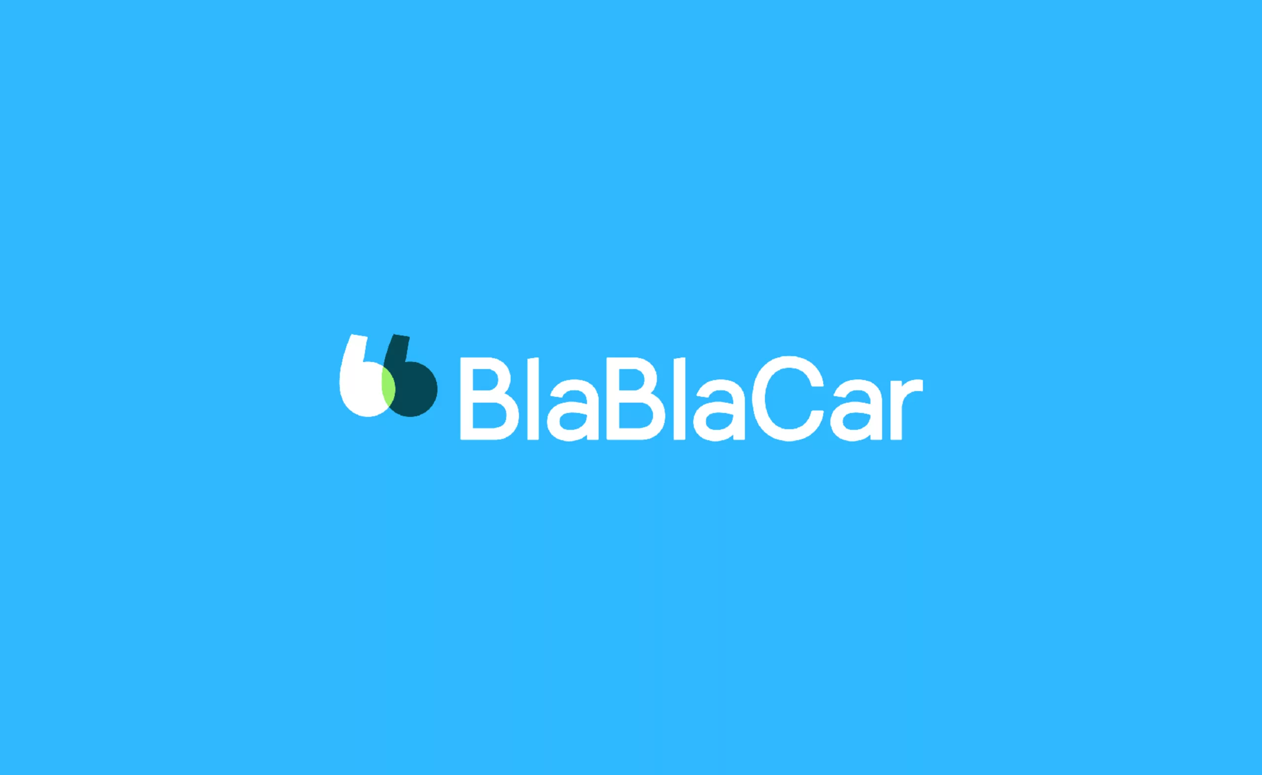
The new BlaBlaCar logo wishes you a safe journey
BlaBlaCar, the European carpooling start-up bringing drivers and passengers together, is adorned with a new talking logo.
-
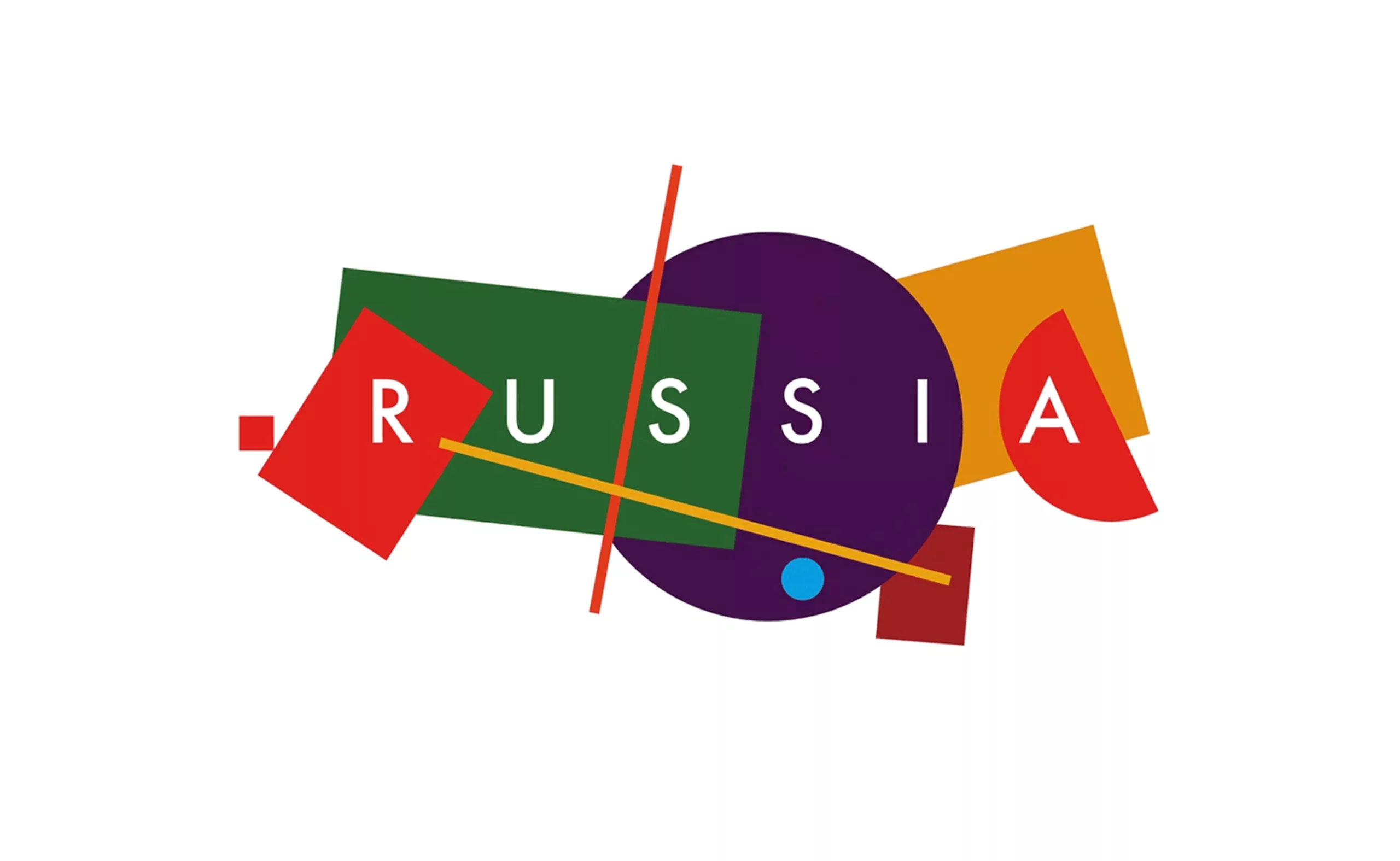
A constructivist logo for Russian tourism
After 2 years of public competition, Russia unveils its new tourist logo to illustrate the country internationally. An identity with supremacist accents that tells the story of Russia.
-
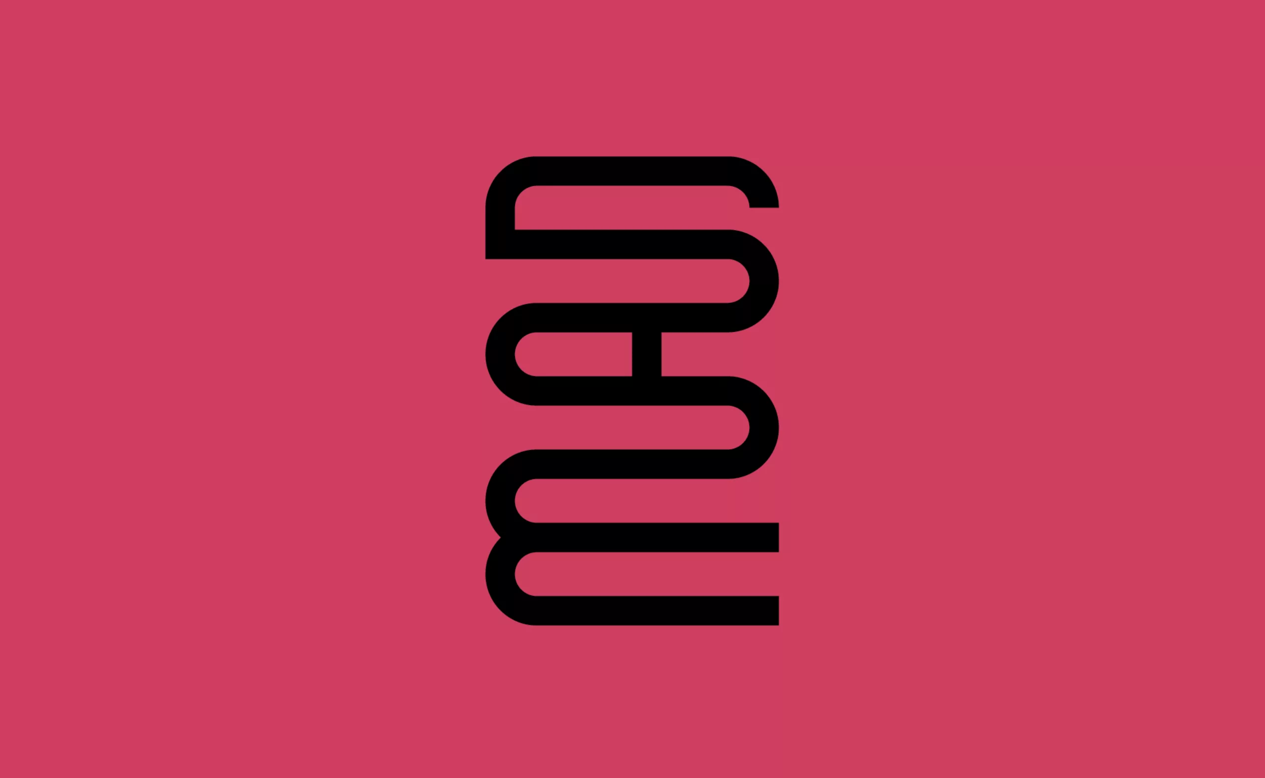
A mad logo for the “Musée des Arts Déco”
A new visual identity for the Musée des Arts Décoratifs that becomes “MAD”… Fashion, Arts, Design!
-
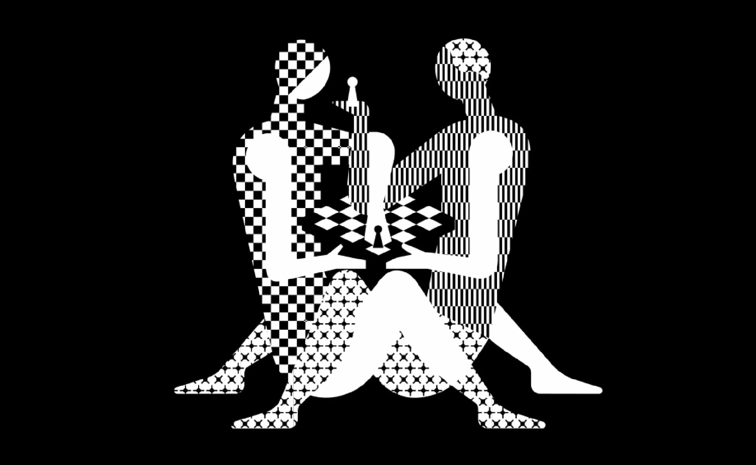
World Chess Championship: a poster that plays footsie
The next World Chess Championship should please chess players… and Kamasutra fans. Here is the new identity of the World Chess, with a “hot” poster.
-
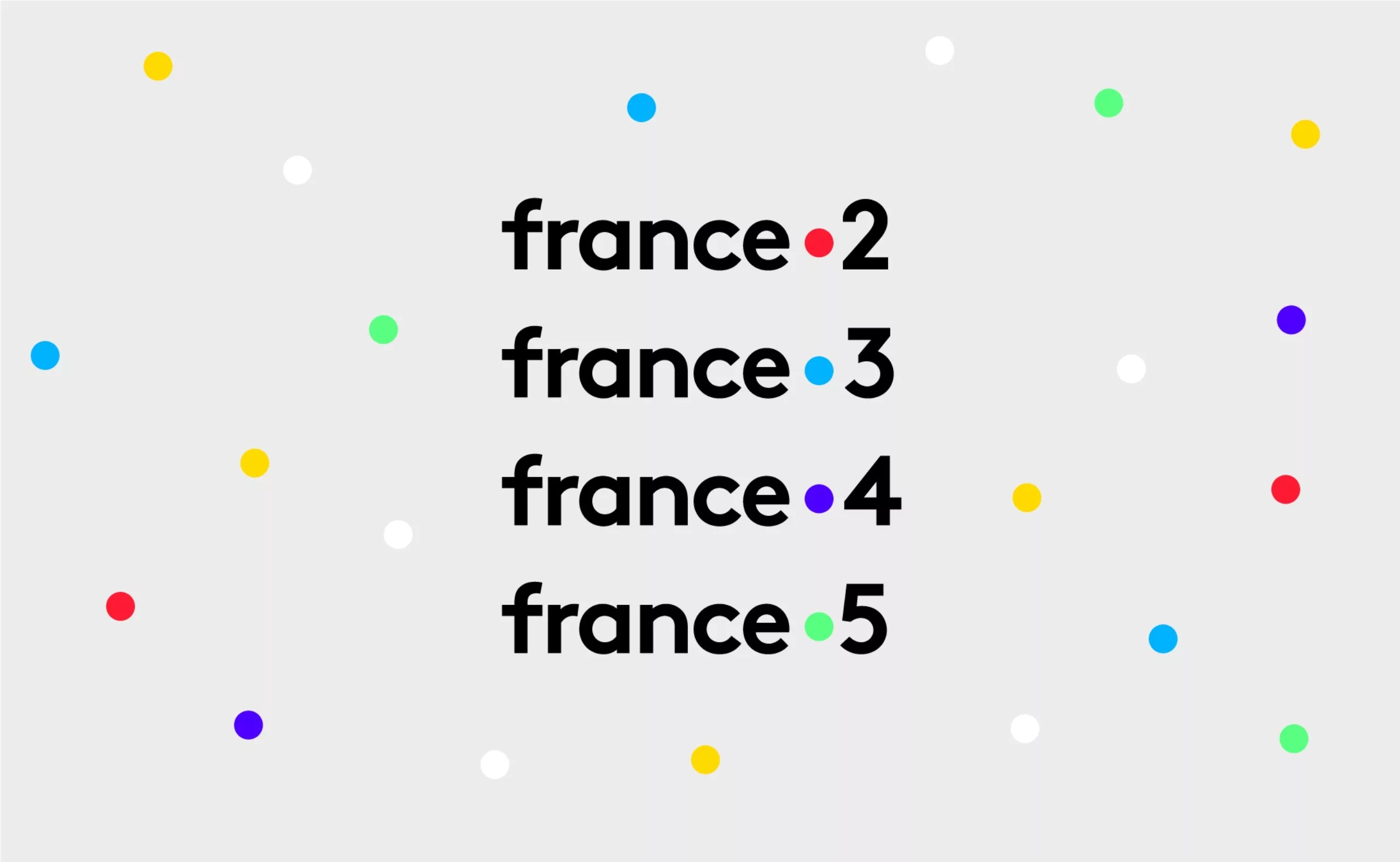
France Télévisions’ new visual identity. Period.
France Télévisions and all its channels are about to change their visual identity!
A story of a dot. Period. -
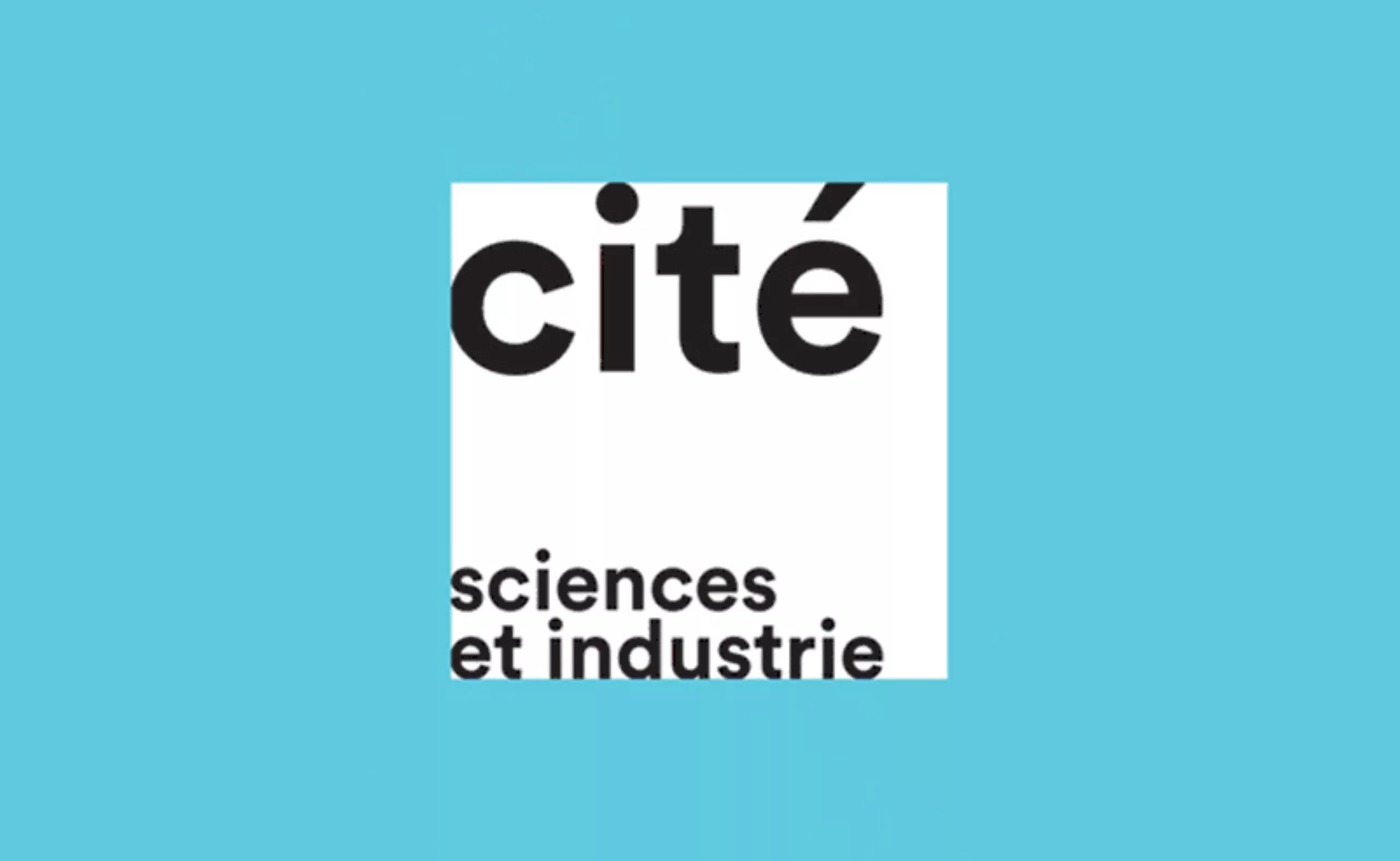
A serious logo for the Cité des sciences
Bye bye red square from the Cité des sciences, glory to you for having rendered service to science and the graphic nation.
Welcome to serious business…