Helvetica brands, for those who are fond of typography
We talked about it on Typorama, and on the occasion of the 60th anniversary of this Swiss typeface : Helvetica needs no introduction. Its efficiency, its neutrality, its rigorous forms make it THE typeface par excellence, even though it shares opinions among designers.
The cult has spread far beyond its native land. It is seen everywhere on the world’s biggest logos (Nestlé, Muji, Toyota, Lufthansa…), in the New York subway, on city signs… Helvetica, although neutral, does not make everyone agree.
Neutral or Nazi, the Helvetica?
At the end of the 1960s, the rigor of Helvetica put an end to the rush of psychedelic typography – and helped to standardize the face of society at the same time, despite the hippies’ displeasure.
It was also a hit at a time when color photography was just beginning to be used in advertising. It’s just that it’s perfect for not having a voice; Helvetica fades away without taking up space, at the service of the visual that surrounds it. Mac, Google, Youtube, Netflix or AirBnb have chosen it to enhance their communication supports. But is Helvetica so harmless?
The great typographer Erik Spiekermann, to whom we owe several of the top 100 most beautiful typefaces and the creation of the agency United Designers Networks, says: “I have suffered from Typomania all my life, an incurable but not fatal disease”. Typomania, but also Helvetico-allergic, because he says he doesn’t like the typefaces that everyone uses, “Helvetica is boring : it’s not a typeface, it’s an attitude, or rather a lack of attitude. Swiss neutrality… ? He compares typography to an army of Nazi soldiers marching in close ranks. No doubt to illustrate its overwhelming power in the world of design, which comes to sweep everything away, almost like an automatism. “Helvetica was designed to be characterless, and it is beautiful in that sense. But it doesn’t work for the majority of messages that need an attitude, a voice. And it doesn’t work in small print either, so it’s not suitable for mobile.
Neutrality is too expensive
If Helvetica can do beautiful things, it also has an exorbitant cost. This is probably why, in addition to the constraints linked to its (small) size, all those big digital companies have decided to get rid of it and create their own version inspired by Helvetica, in-house.
To keep a neutral, clean and Swiss tone, while adapting to the constraints of small typefaces – on cell phones for example – and avoiding spending astronomical amounts of money. It must be said that IBM used to spend more than $1 million per year to pay for its license to use Helvetica before creating its own typeface, IBM plex !
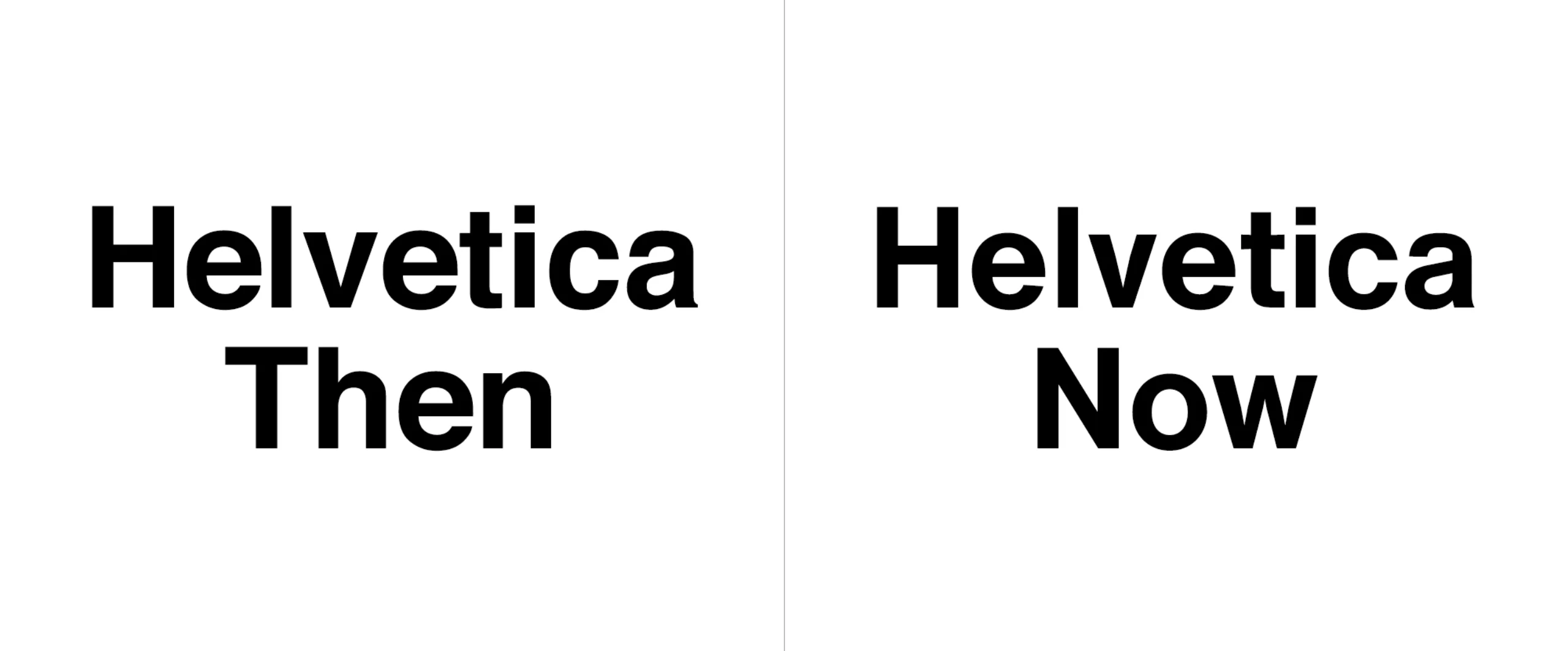
To rebound and face this threat, the Monotype foundry, owner of Helvetica, has released a new version (what do I say, new versionS) in 2019 with Helvetica Now. For a half-wary eye like mine I can tell you that I see almost no difference, but no doubt they have adapted the typeface to the rigors of the web, to get their customers back. Still, on the Monotype website, they announce that “This is not a return. It’s not a restoration. It’s a statement.” Who can compete with such audacity?
From the Brand New site, here is the new Helvetica (right), for those who want to play 7 differences. Look (really) closely, there are things happening with the t, the a, the c :
Helvetica® the brand
If used too mechanically, Helvetica can go from neutrality to Nazism, which is not a small character trait! So you might as well know how to use it. Because if Helvetica is more than just a monumental typeface and a must-have, it’s also a trip for designers who are fond of typography. Helvetica, as an icon, has become a brand: we can now drink, wear or even smell Helvetica. Several brands have surfed on its values: cult, Swiss, design and neutrality, to create timeless products.
1. Helvetica® my love
The first category of brands celebrating Helvetica is the one that devotes a quasi-religious cult to it. Helvetica is enthroned as a muse on a pedestal, in all its splendor, and in red, black and white of course.
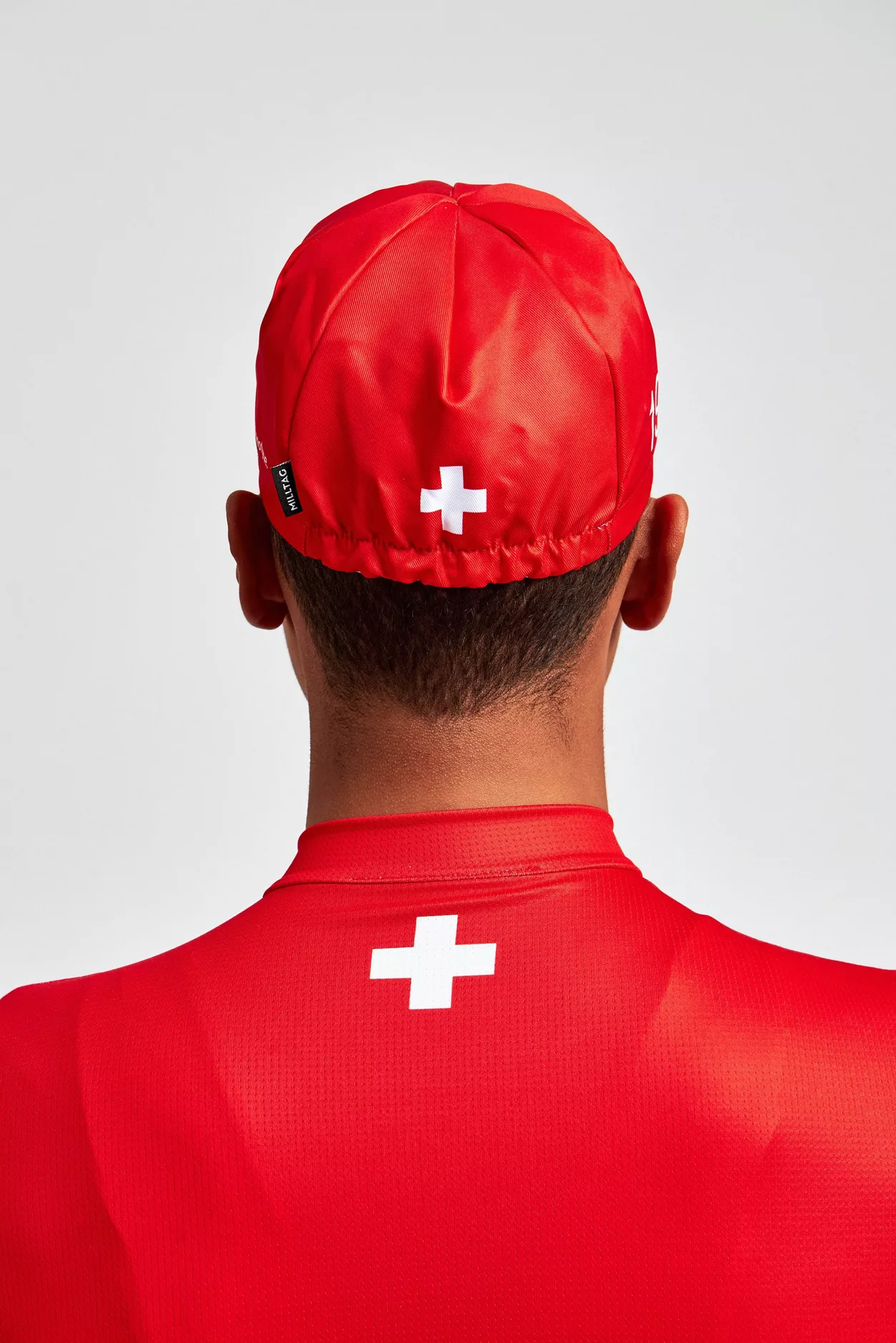
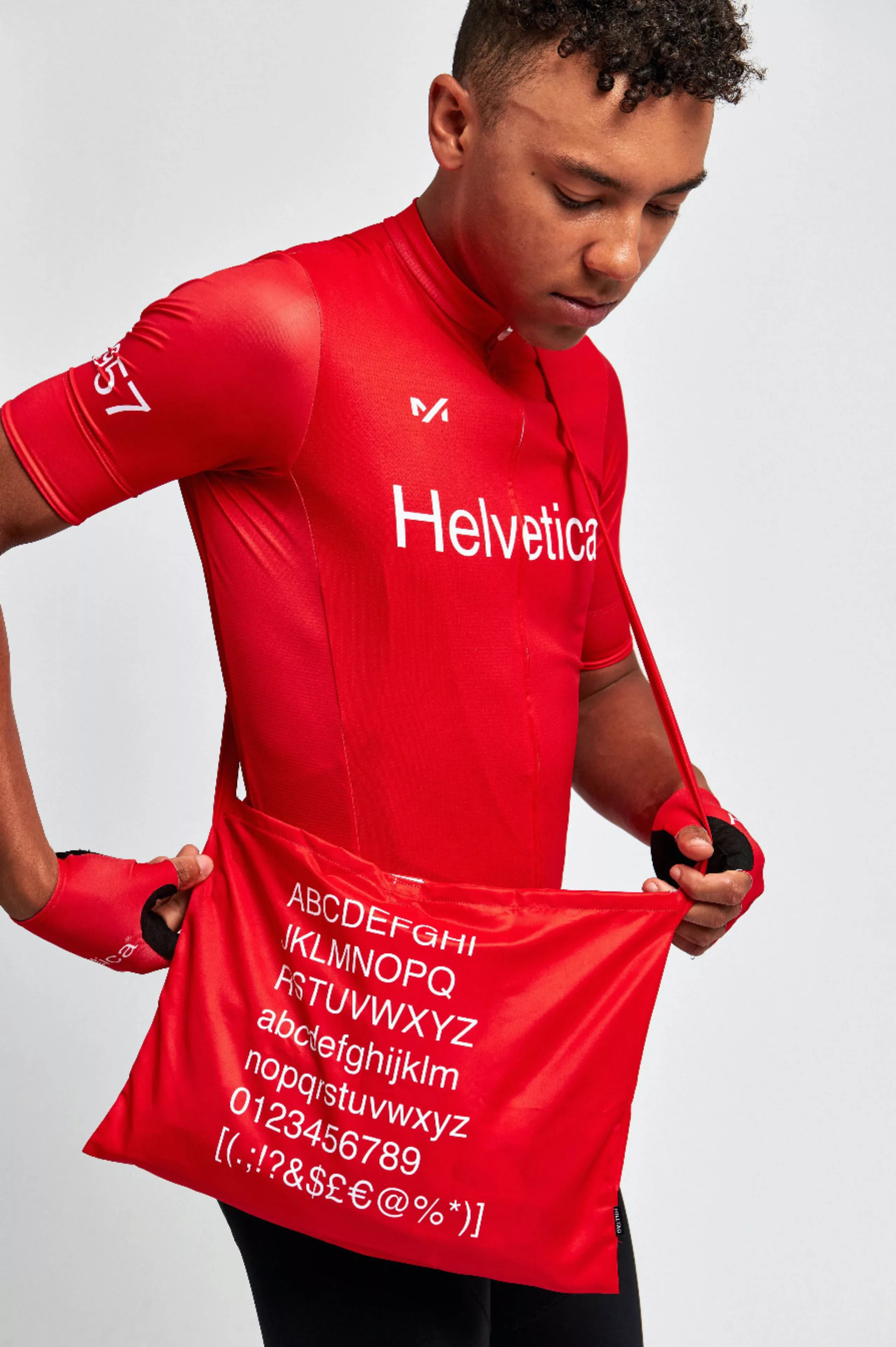
Helvetica that rolls doesn’t gather foam
To celebrate the new Helvetica, the Monotype foundry launched a capsule collection of technical clothing in collaboration with the British cycling brand Milltag. Pre-sales were available until October 25, 2020. A true ode to typography, it featured Helvetica (the name, inscribed in the typeface) in white on a red background with a ®, creating a brand of this typography “to which designers are emotionally attached” as Ed Cowburn, founder of Miltag, explains. We also find the inscription 1957, date of its creation. A sharp collection, for cyclists-graphic designers, or vice versa :
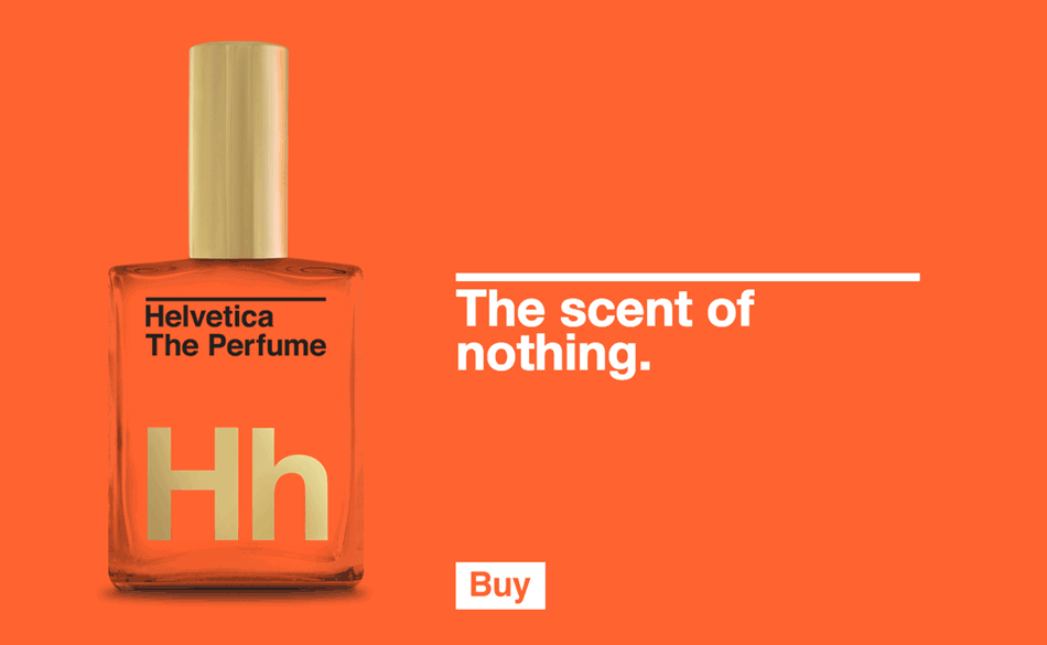
The scent of nothingness
For those who swear by Helvetica, there is also the Helvetica perfume, a “distilled modernity” that smells of “nothing”. An “exquisite timelessness”. Meg Paradise & Faun Chapin, the creators of this “world’s least provocative celebrity” and head of a design agency, don’t hesitate to point out the absurdity of the thing: “Yes, it’s real. Yes, it’s just distilled water. Yes, it’s an object designed by experts for design fetishists, collectors, absurd people with a sense of humor.” You can get this bottle for a mere $28 (but the link no longer works). So it’s all about the packaging.
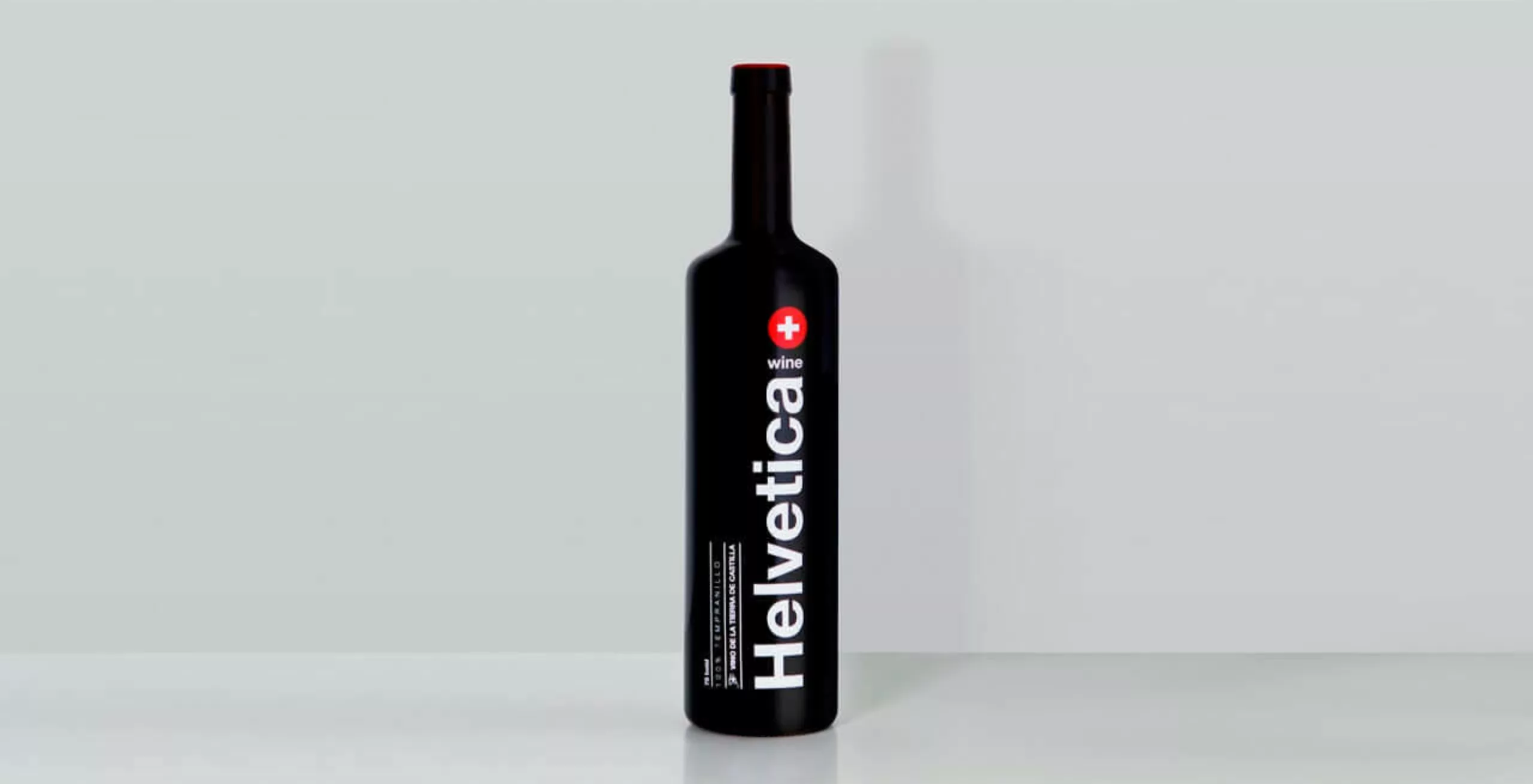
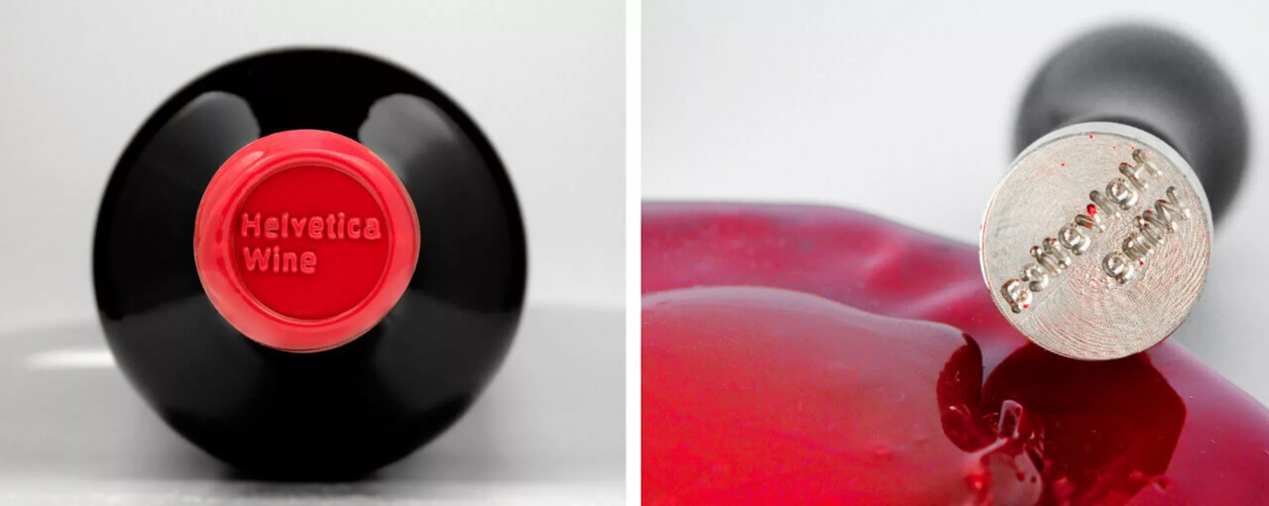
White on red, nothing moves
And finally, to amuse everyone, Helvetica also comes in red (obviously). The Madrid-based agency Wild Wild Web wanted to “pay homage to the queen of typography” with a bottle of red wine in the colors of Helvetica. The wine without serif, young with barrel accents and aromas of red and black fruits, is “easy, fun, to drink anywhere” and for everyone, according to the oenologist Marc Gómez. Of course, we had to find a wine that would make everyone agree.
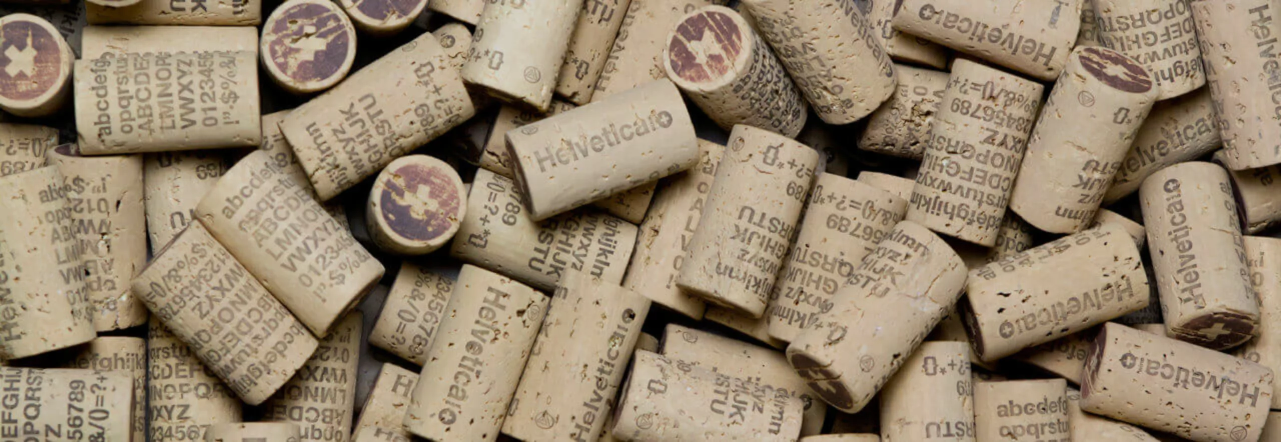
Saddled with a Swiss wax seal, the typography can be found even on the cork. You can buy it on the Vinorama website, if there are still some left.
2. Design + Switzerland = Helvetica
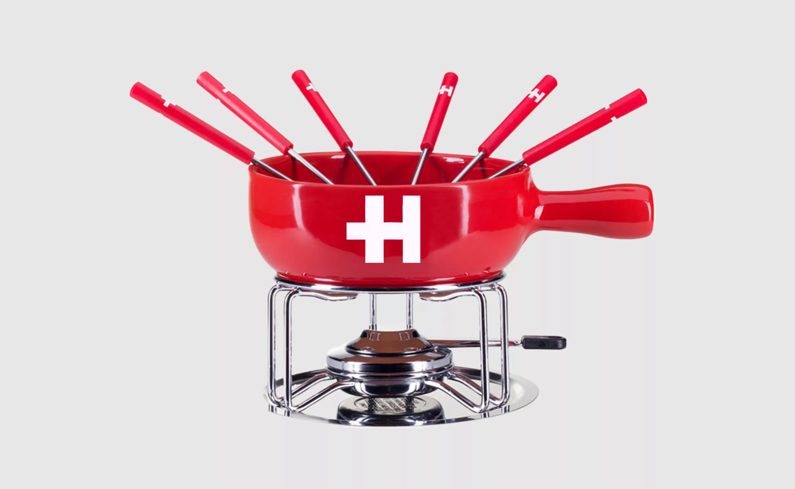
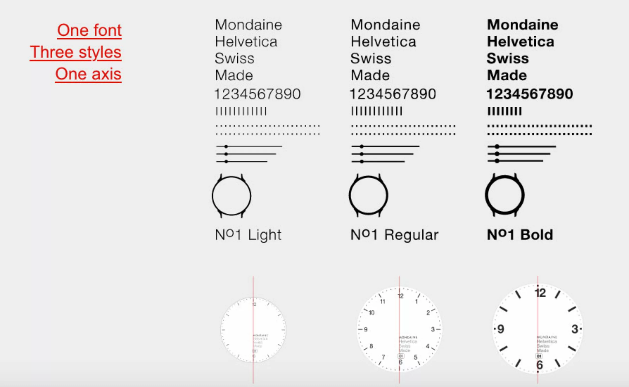
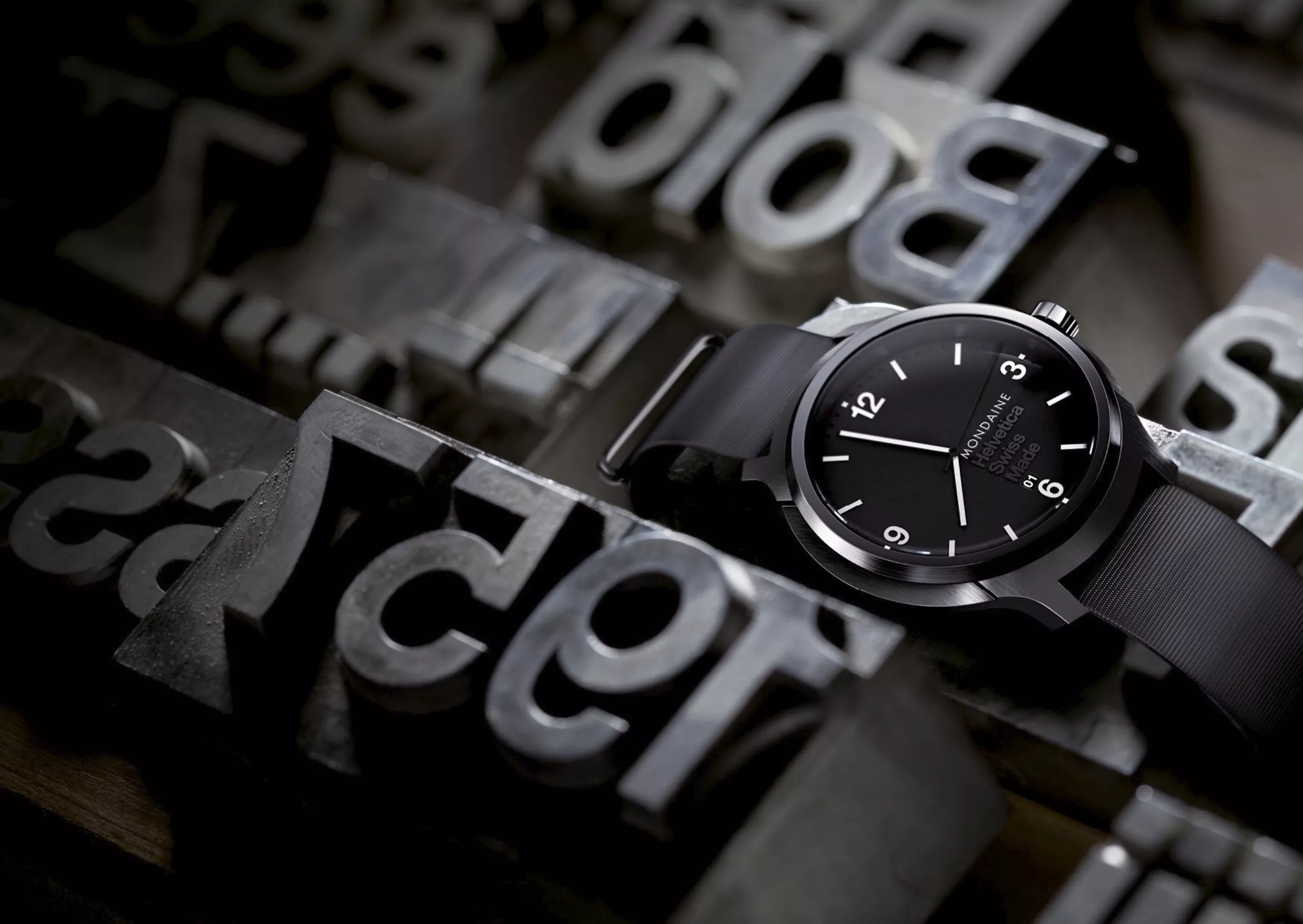
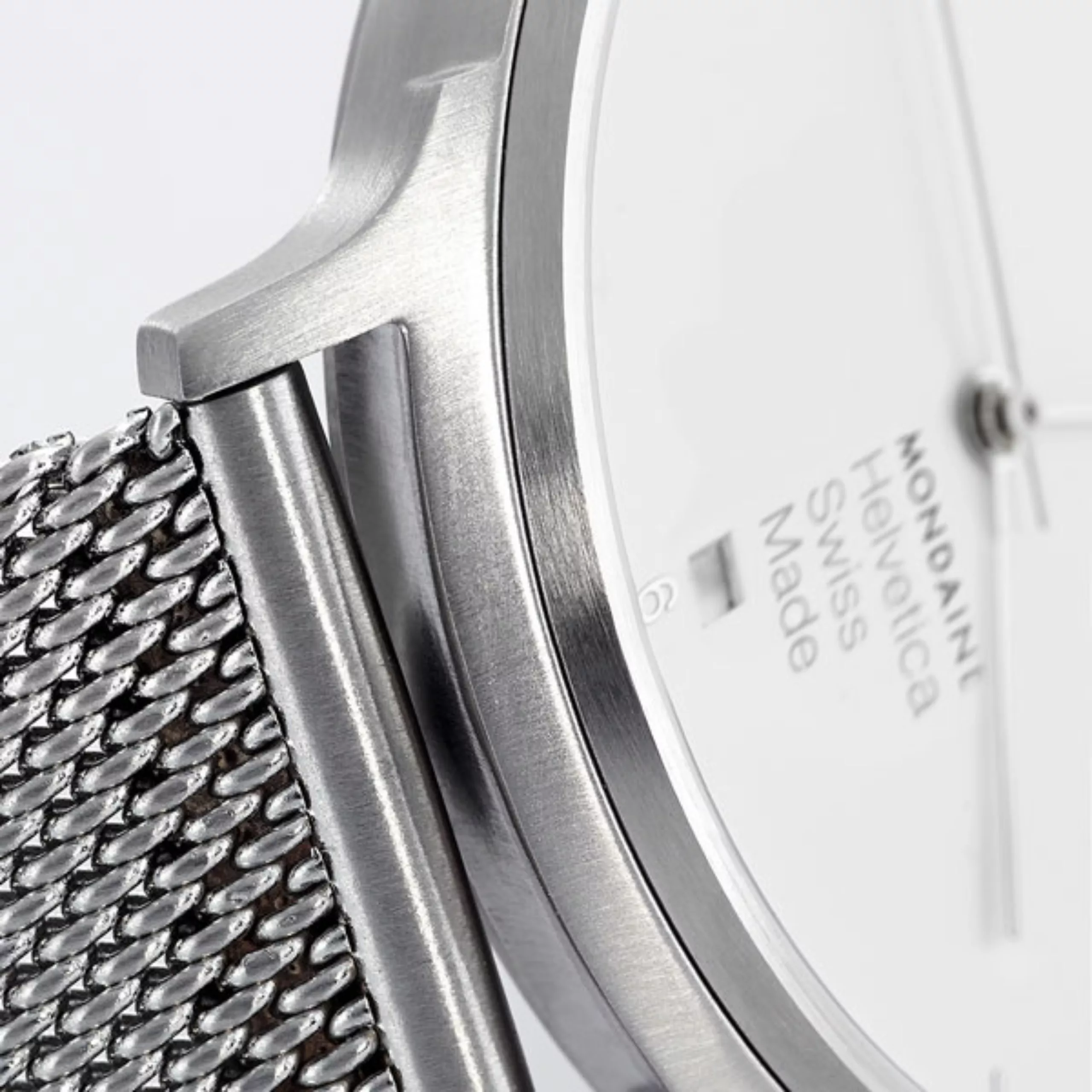
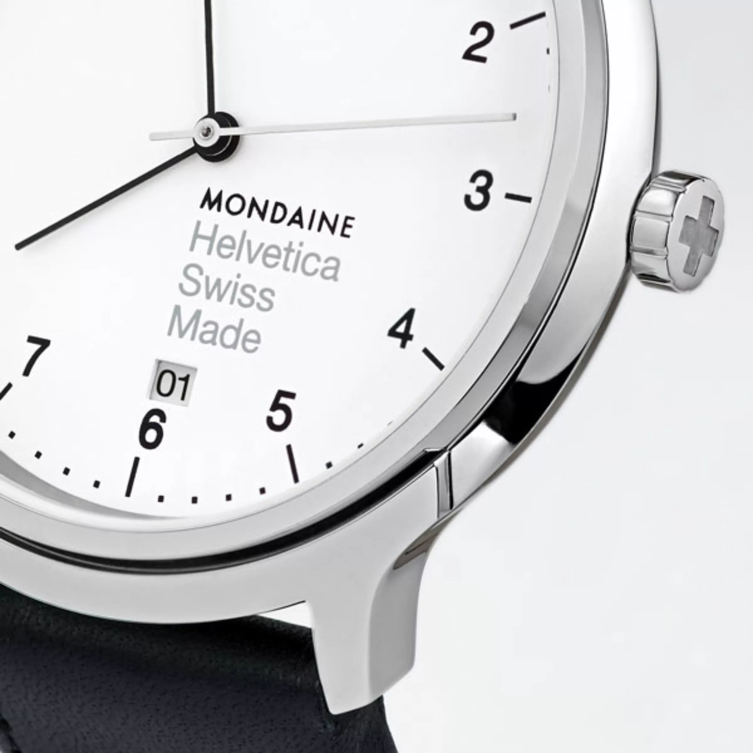
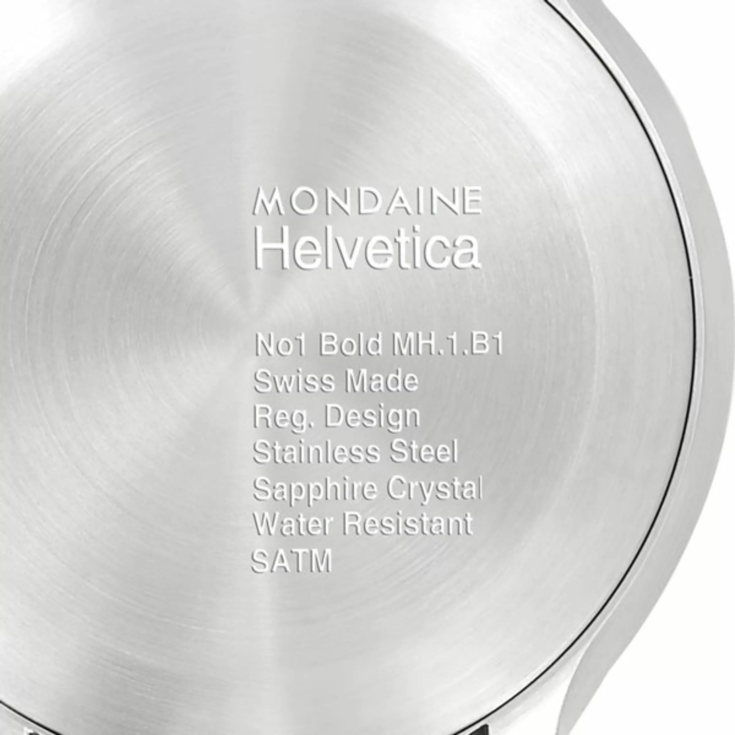
In another register, we can mention the successful alliance of design and Swiss know-how. No, we are not talking about fondue machines, but rather… watches of course! The Swiss watch brand Mondaine (which uses the Futura typeface for its logo, haaaan) has launched a collection of Helvetica watches, with the designer Erik Spiekermann (the one who said it was a catch-all typeface, remember?).
The brand spells it out, the typography and the watch brand share common values: “a Swiss icon, tradition, timelessness, easy to read, known worldwide, recognizable among all”. The watches are available in 3 models: light, regular and bold on the website mondaine-helvetica. The number 1 is used as a detail for the strap, for the connoisseurs, and the inscription of the numbers of the dial changes of fat according to the models.

3. Helvetica at the Helvetians: Switzerland forever
Finally, we saw other brands flourish on the web that advocate the glory and heritage of Switzerland, using Helvetica at all costs. Their credo? Made in Switzerland! And who says Switzerland saaaaays : Helvetica of course. Because let’s not forget that Helvetica means Switzerland in Latin.
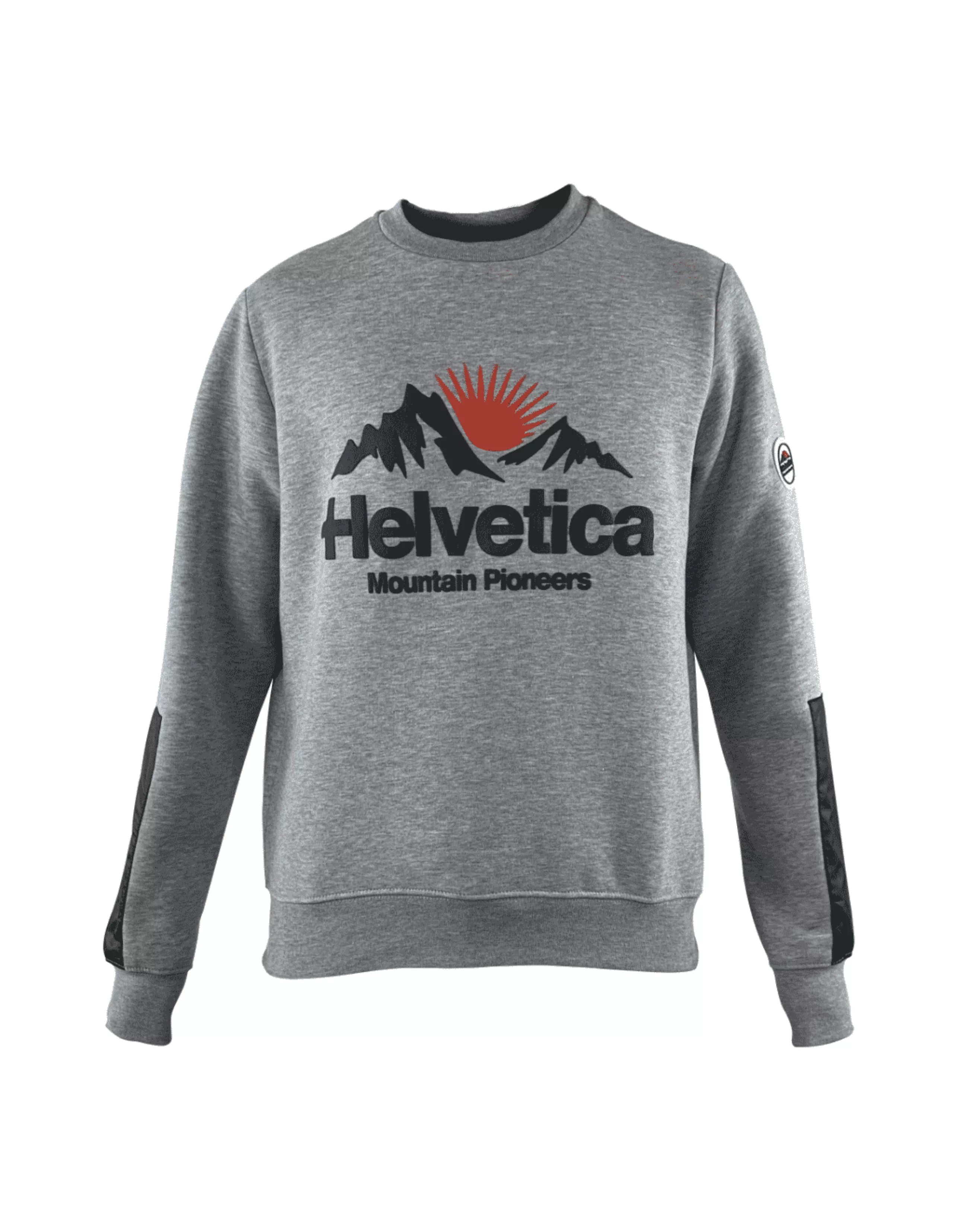
Mountain pioneers, but only half
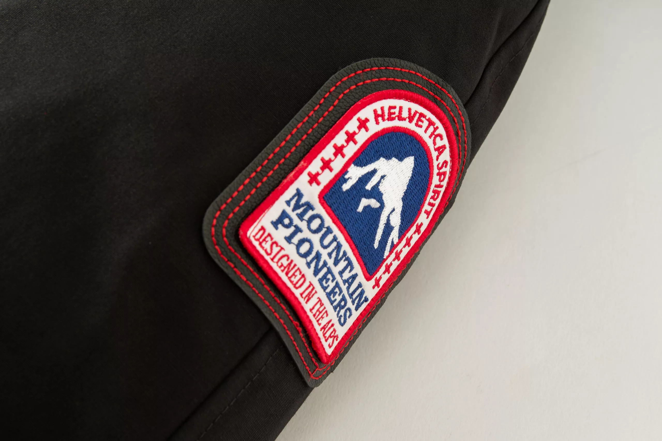
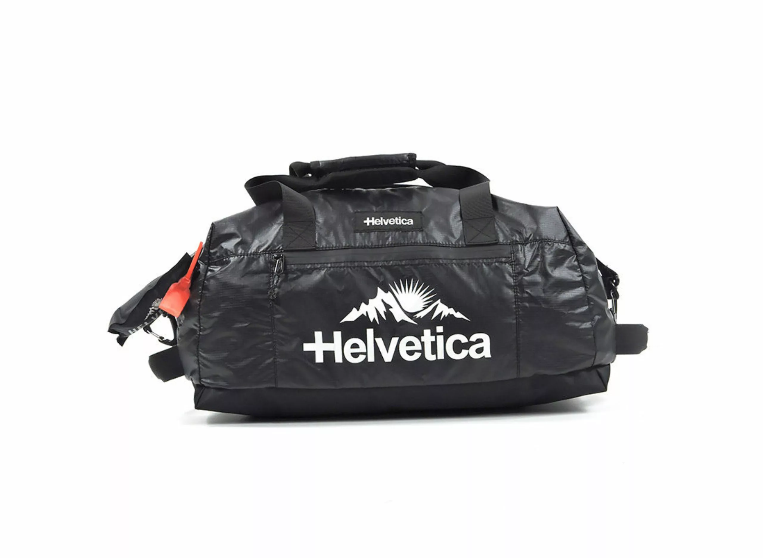
The brand caught our eye while we were walking in the local shopping center in Lyon. Helvetica Mountain Pioneers. A rather vague brand offering heated and expensive parkas, which seems both very technical, and created according to us by wealthy students (who make spelling mistakes, but it happens to everyone). The brand would be “designed in the Alps” for professionals or cold weather enthusiasts (sponsors of the biggest sled dog race), but promoted by French rappers (Heuss l’enfoiré, Naps, Jul…). We don’t really understand the positioning.
Still, their name, Helvetica Mountain Pioneers, titillated us. The clothes, with Japanese technology, would be designed in the Swiss Alps (and French). So much for the brand story. Is it enough to call yourself Swiss to use the name and typeface Helvetica? It’s not a very pioneering approach, after all. Especially since their old logo on Facebook (the one with the bearded man in the cap below) was only Swiss in name. It’s a bit of a smoke and mirrors approach.
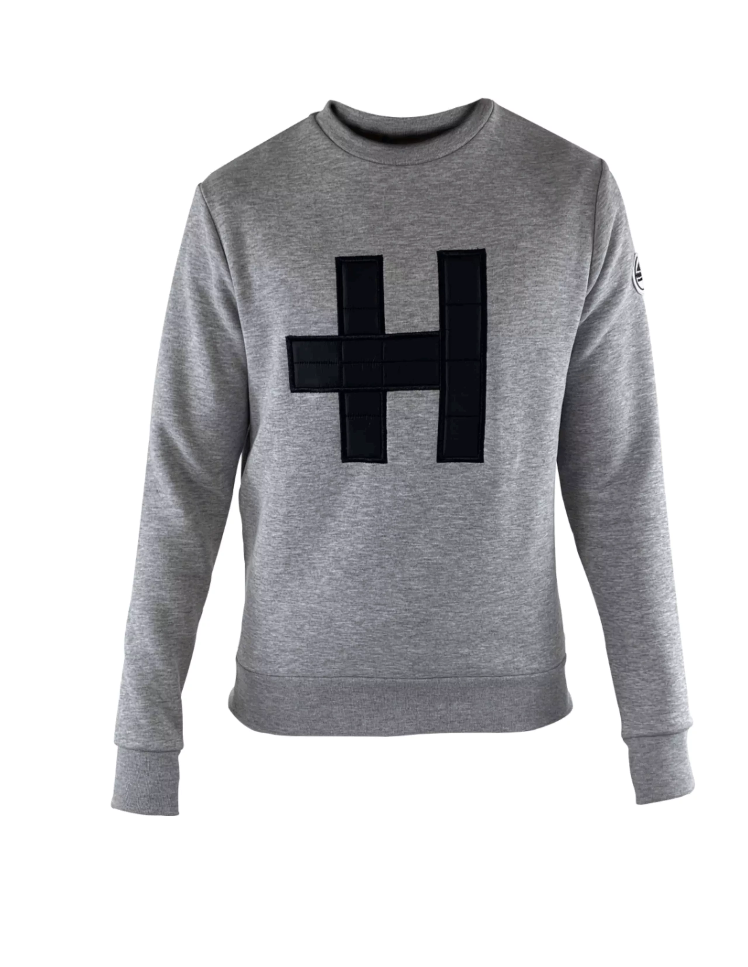
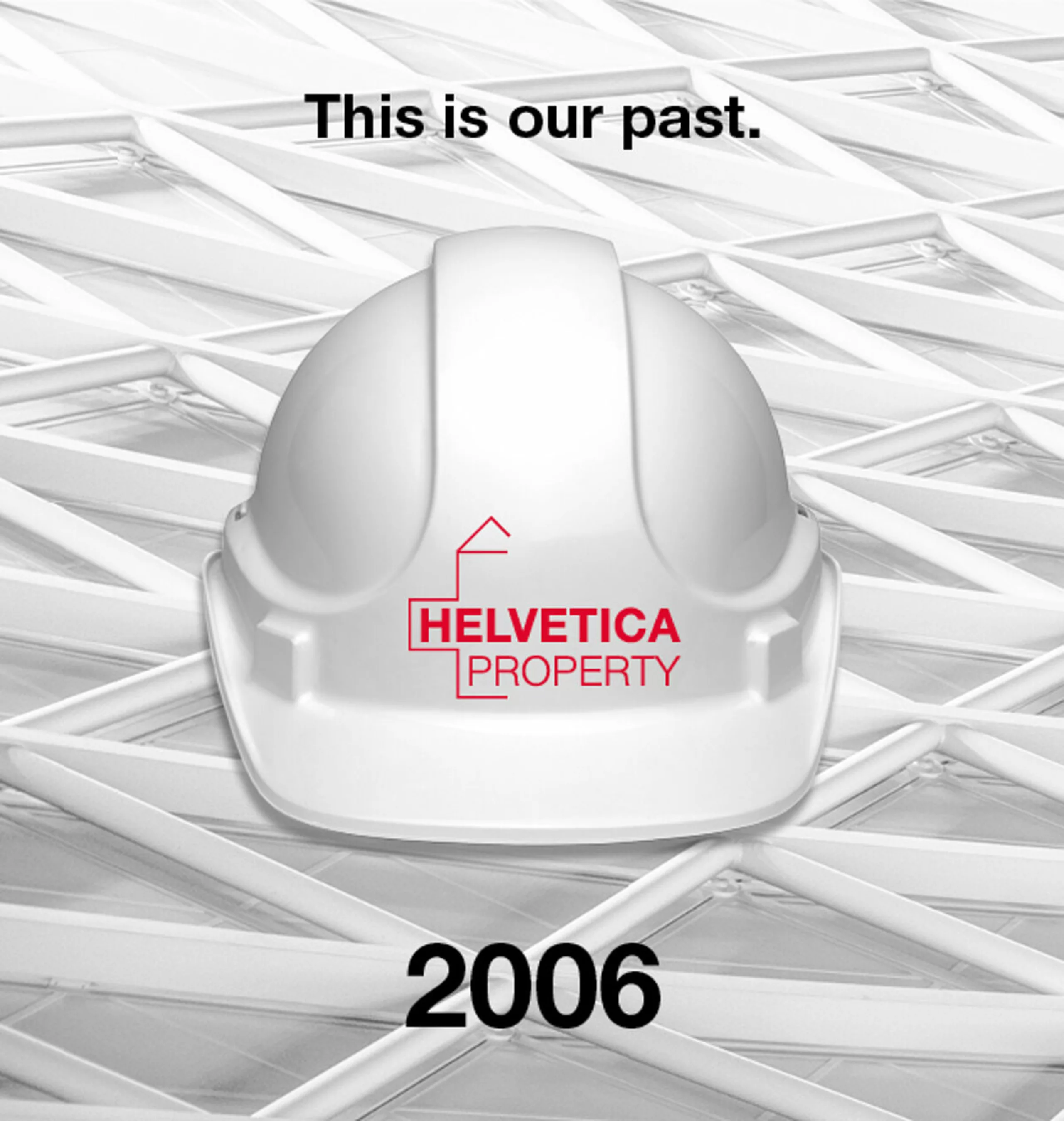
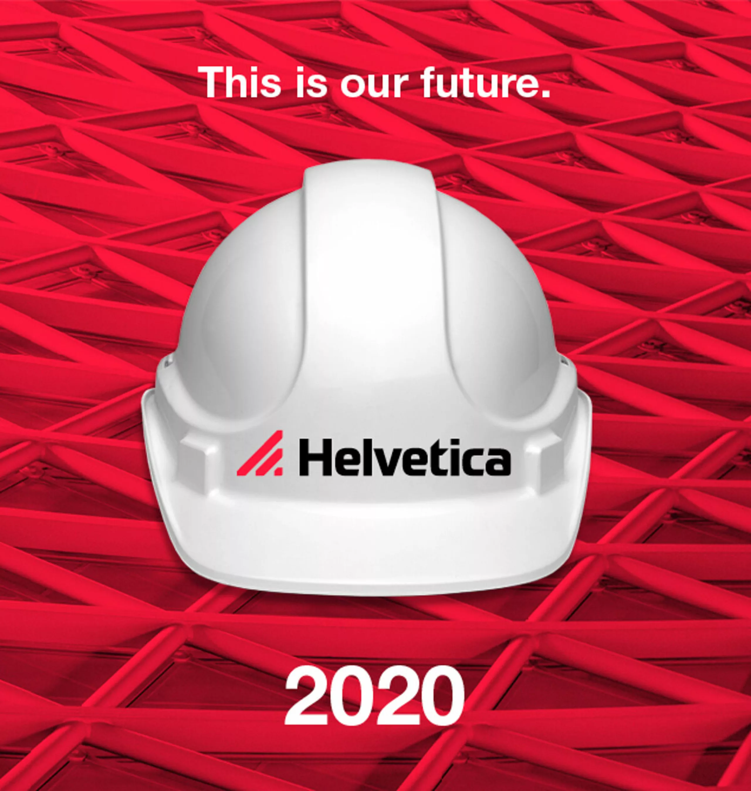
Helvetica, the safe bet
Still on the Swiss side (the real ones this time), we find the Helvetica brand which is involved in real estate asset management. Their first original logo, designed by a Norwegian graphic designer, highlighted the typography, associated with the cross and the color red, Swiss symbols par excellence. Their new logo reworks the typography and moves away from the original Helvetica, giving it dynamism.
3. Helvetica normcore, neutral for a neutral brand
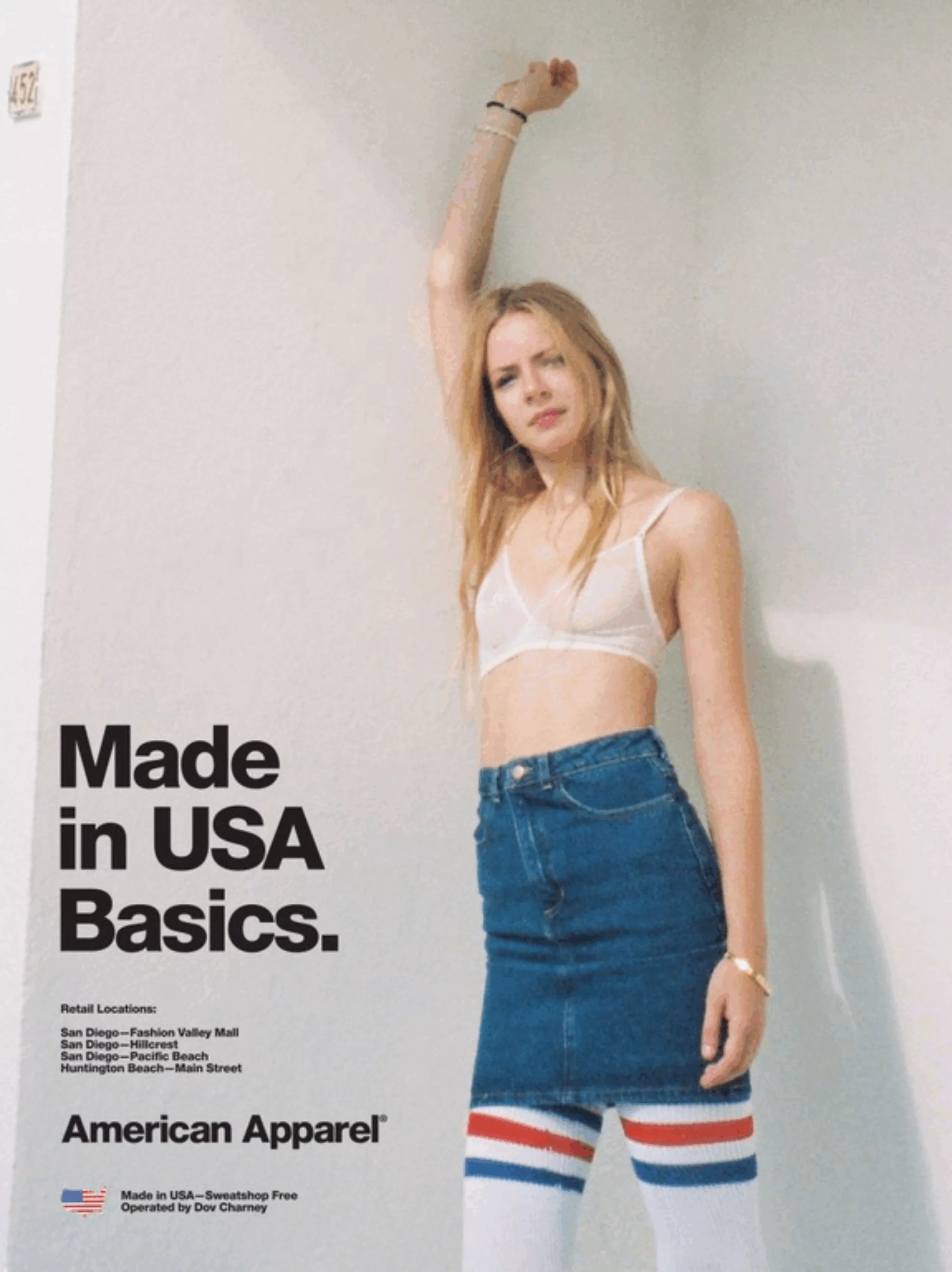
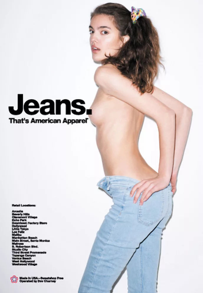
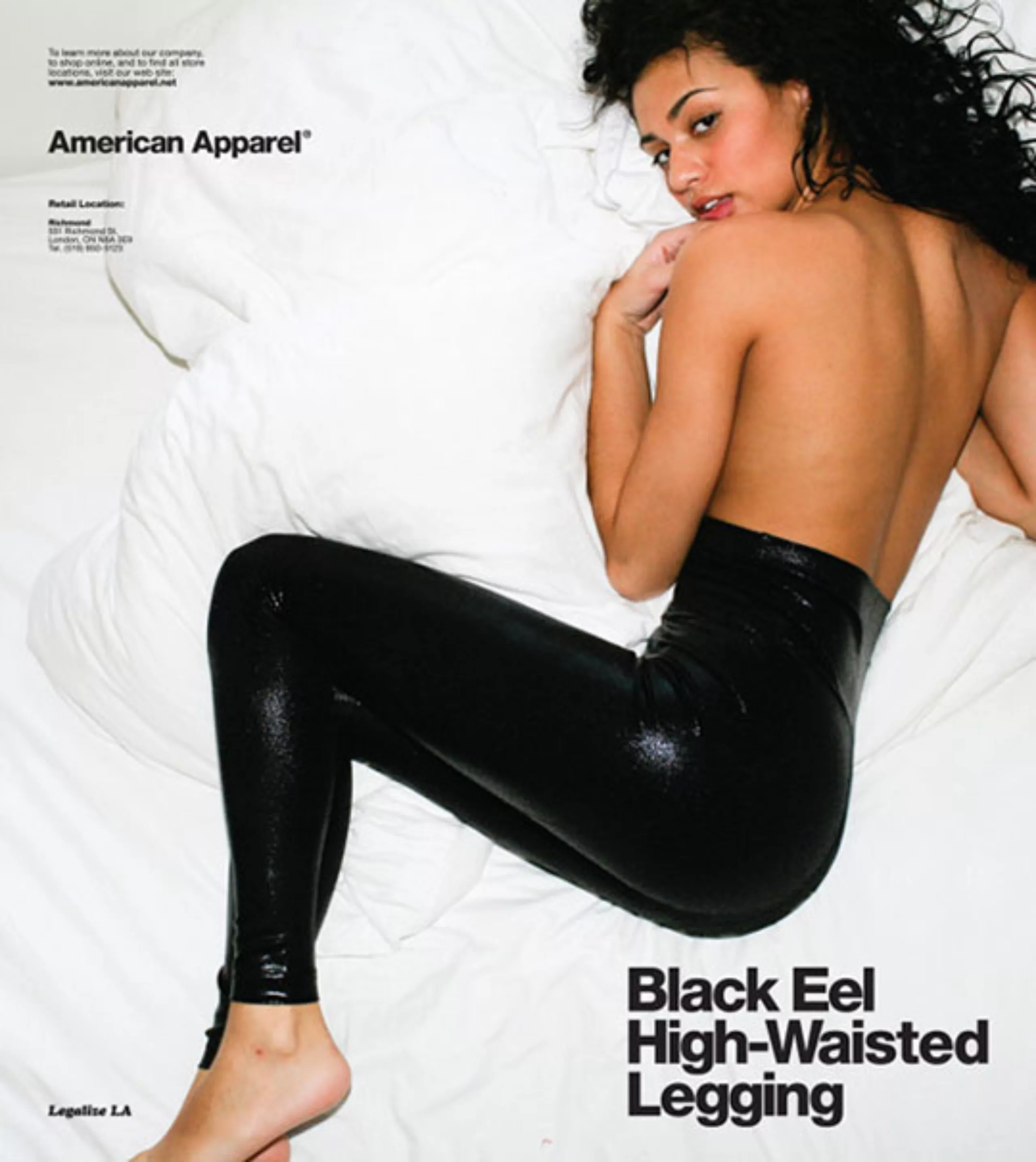
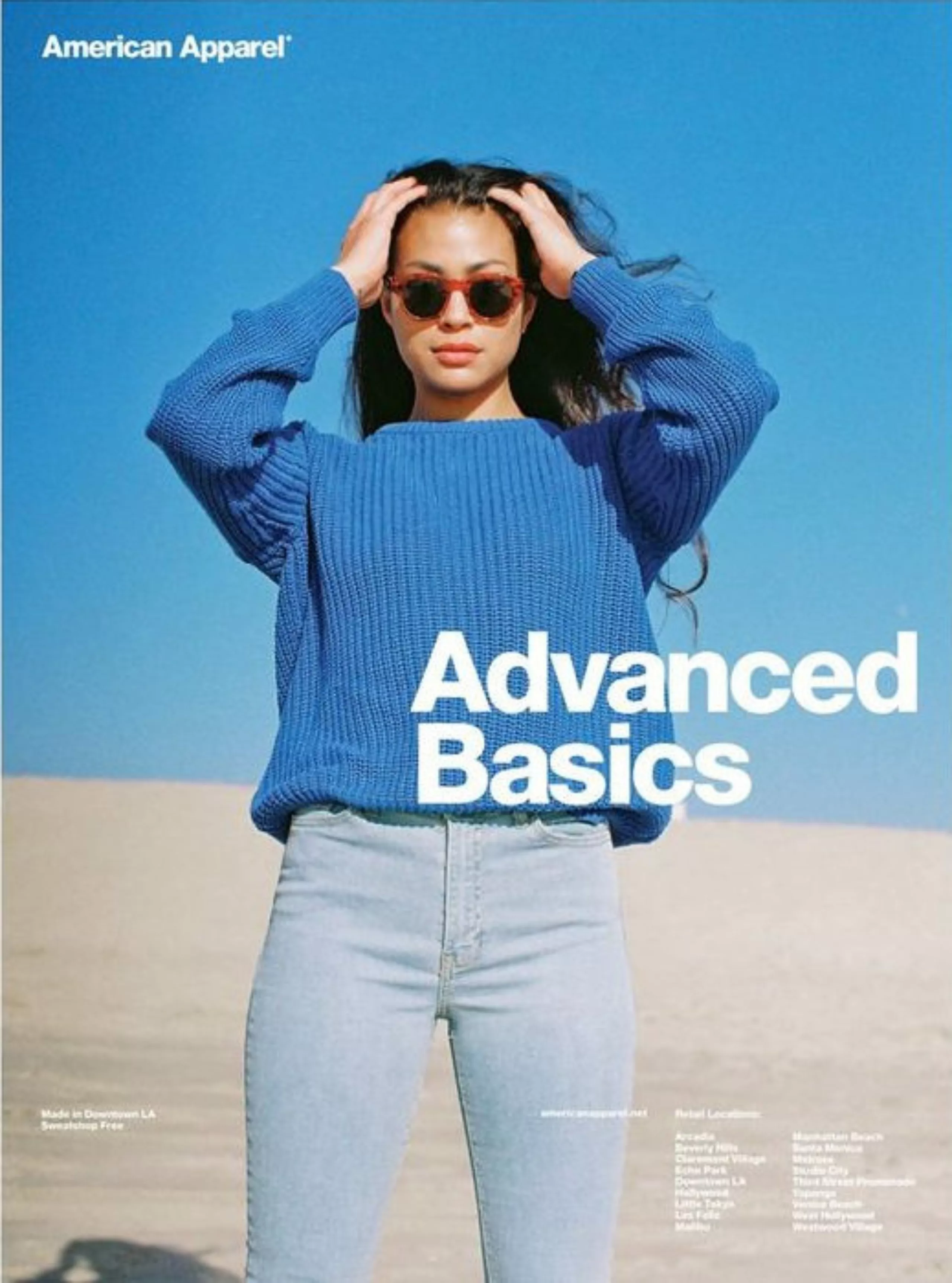
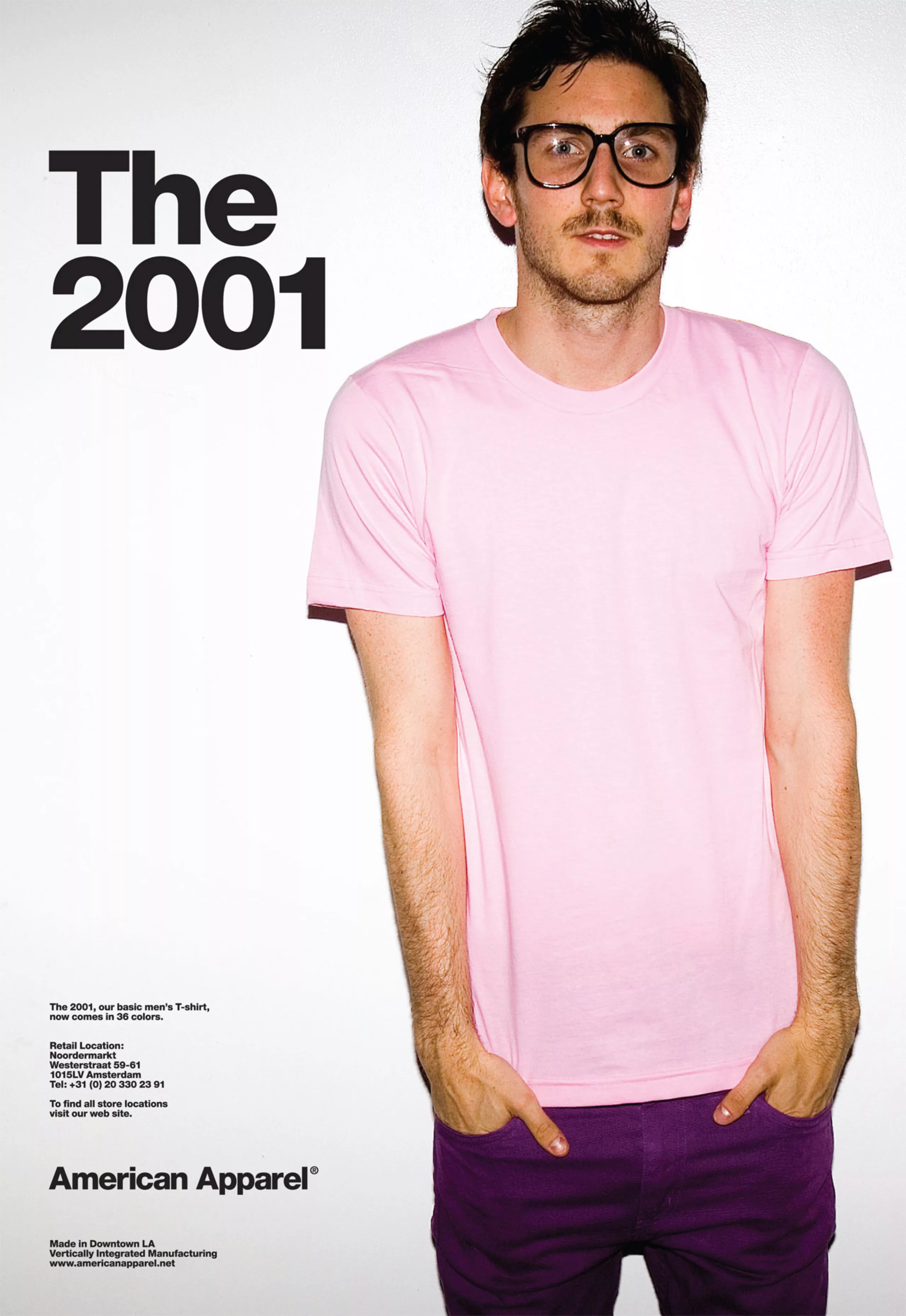
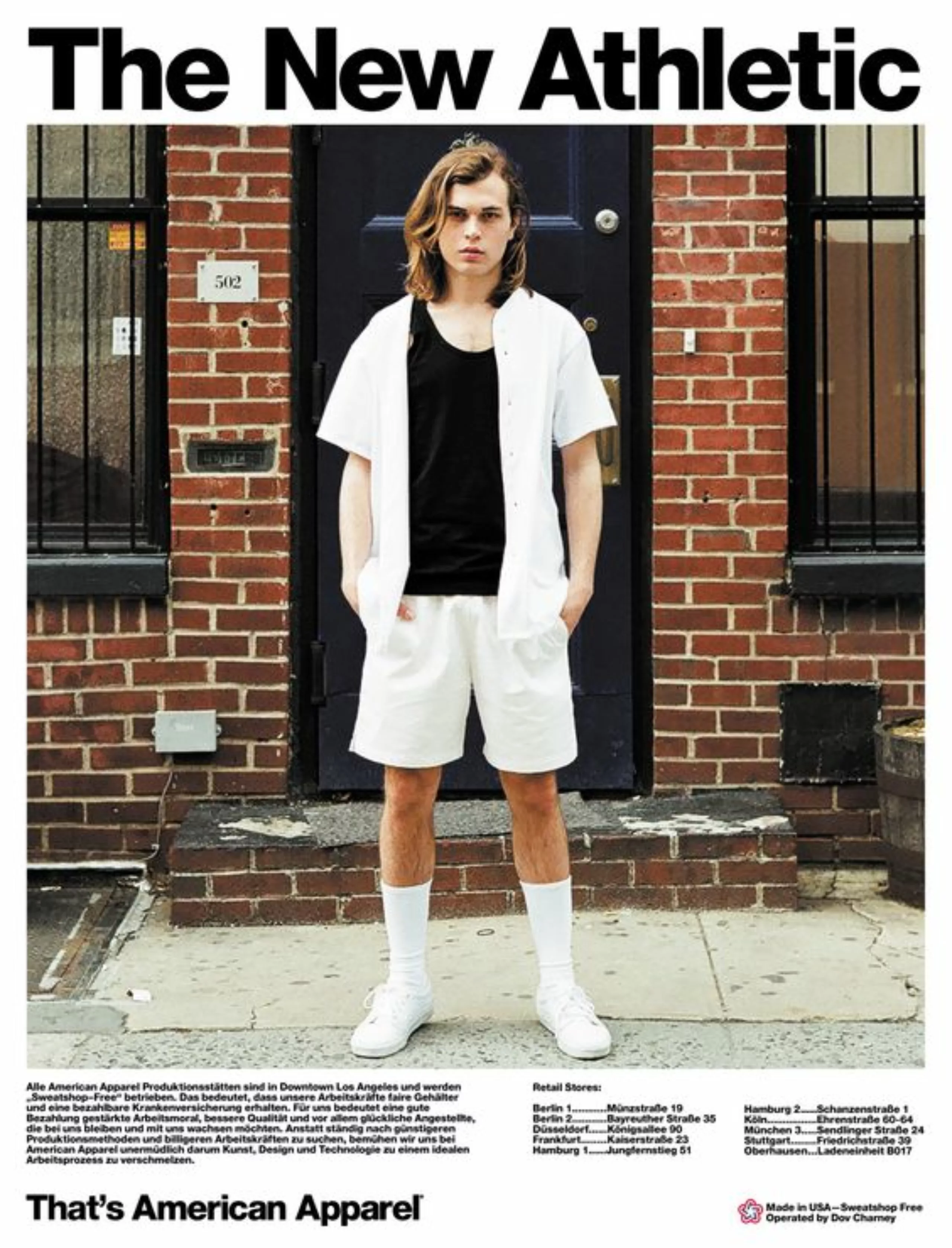
American Apparel advocates non-branding with Helvetica
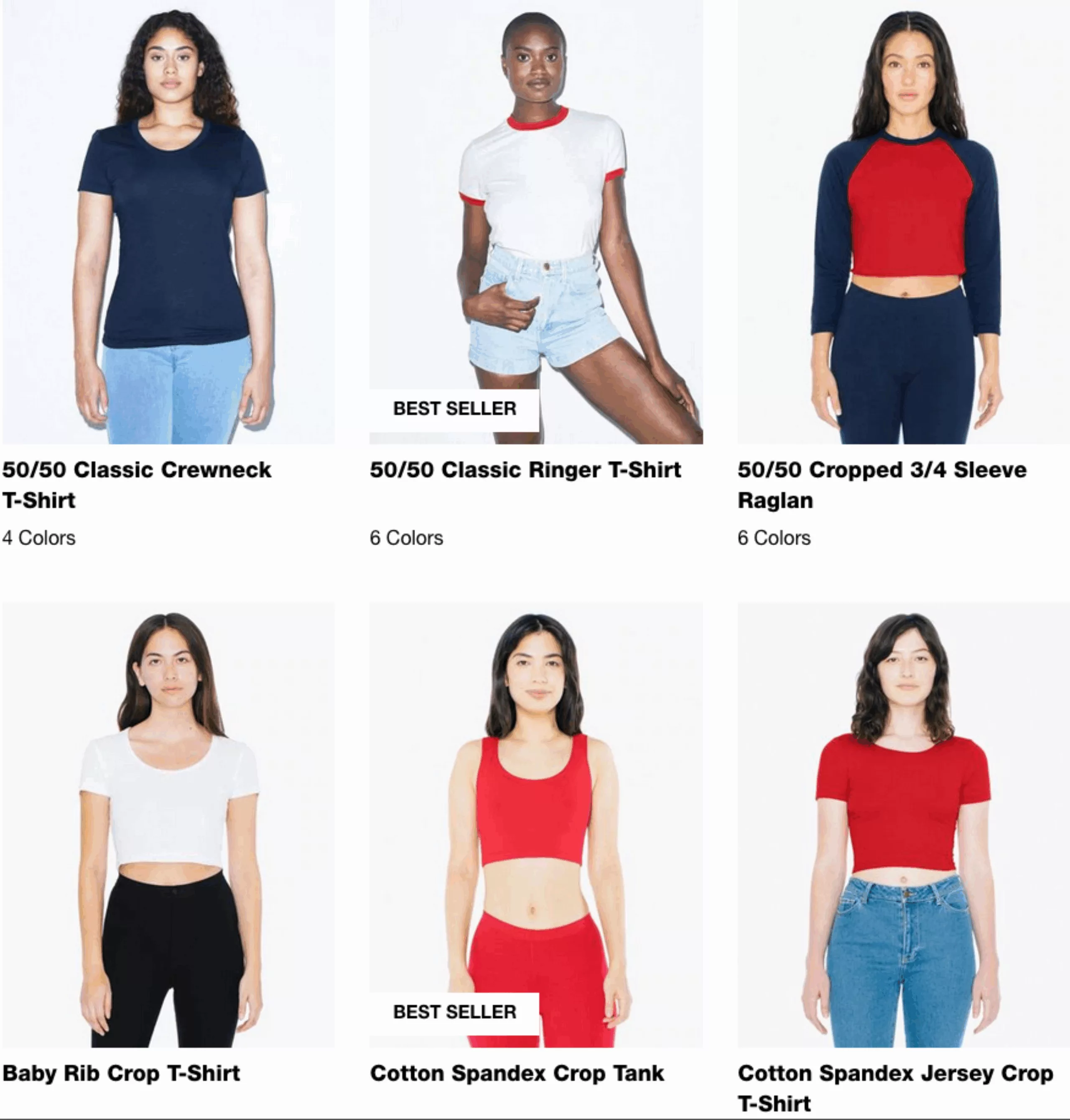
Still on the apparel side but with a reversed approach, American Apparel has taken advantage of Helvetica. Where Milltag chose to use the typeface to glorify its character and notoriety, and Helvetica Mountain Pioneers to use its name to claim roots, the American brand uses Helvetica to celebrate neutrality.
While it’s customary to use this typeface to erase text in favor of everything else, American Apparel couldn’t have chosen a better way to illustrate its brand image and create its logo. Normcore par excellence, the American brand conveys the values of the no logo, the unbranded, the neutral. It’s Helvetica incarnate ! Basics, simple cuts, color variations of the same model. Less but better?
We don’t need to comment on the pronounced sexism of the ads and the image of the brand, which has been accused and sued many times – not to mention the controversy surrounding Dov Charney, its creator. We have put here some rather “soft” ads.

Swiss but not as neutral as we would like to think, the use of Helvetica in the world of graphic design must be thought through, because its name and its design are heavy with meaning. Because no matter what anyone says, being neutral is already affirming a character. So, neutral or not neutral, that is the question !
+ To go further :
An article about the neutrality of Helvetica
All Helvetica fonts on downloadhelvetica
On the subject
-
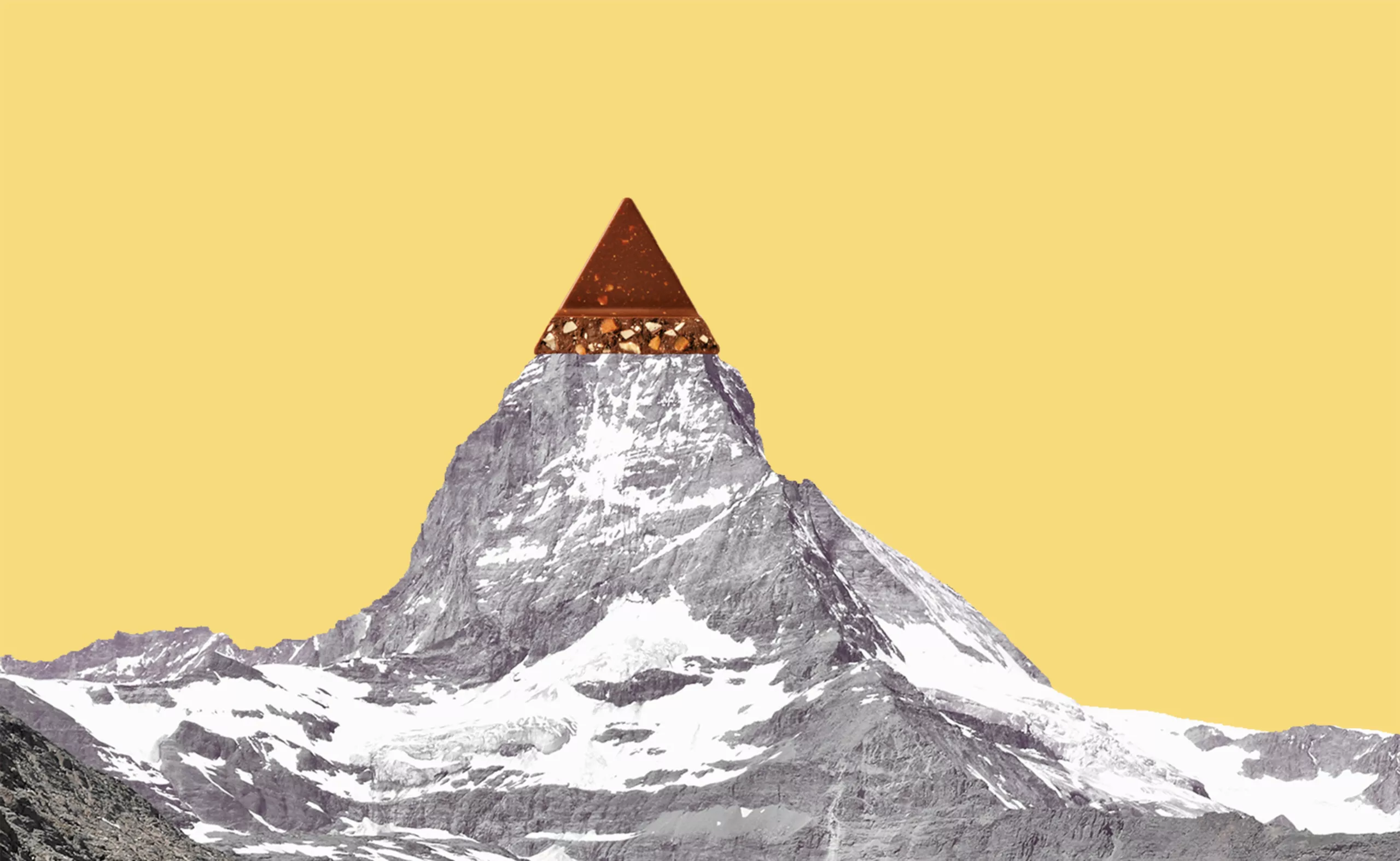
Toblerone’s new mountain: when packaging brands a territory
From Toblerone to Milka to feta cheese, brands mark their territory on their packaging and are sometimes caught up in the globalization game.
-
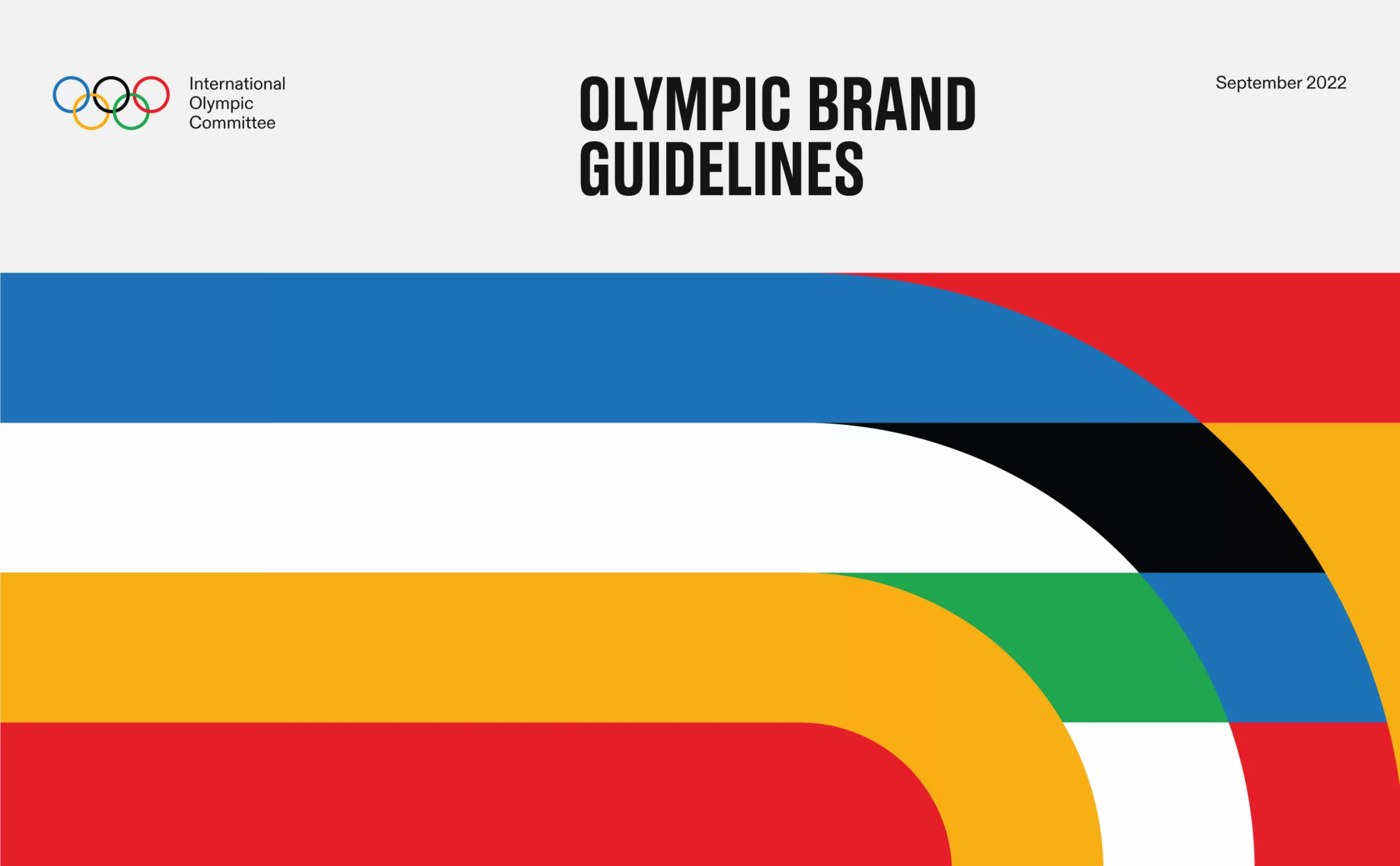
The new graphic charter of the Olympic Games
The Olympic Games are redesigning their identity to harmonize their visibility in all countries and on all communication media.
-
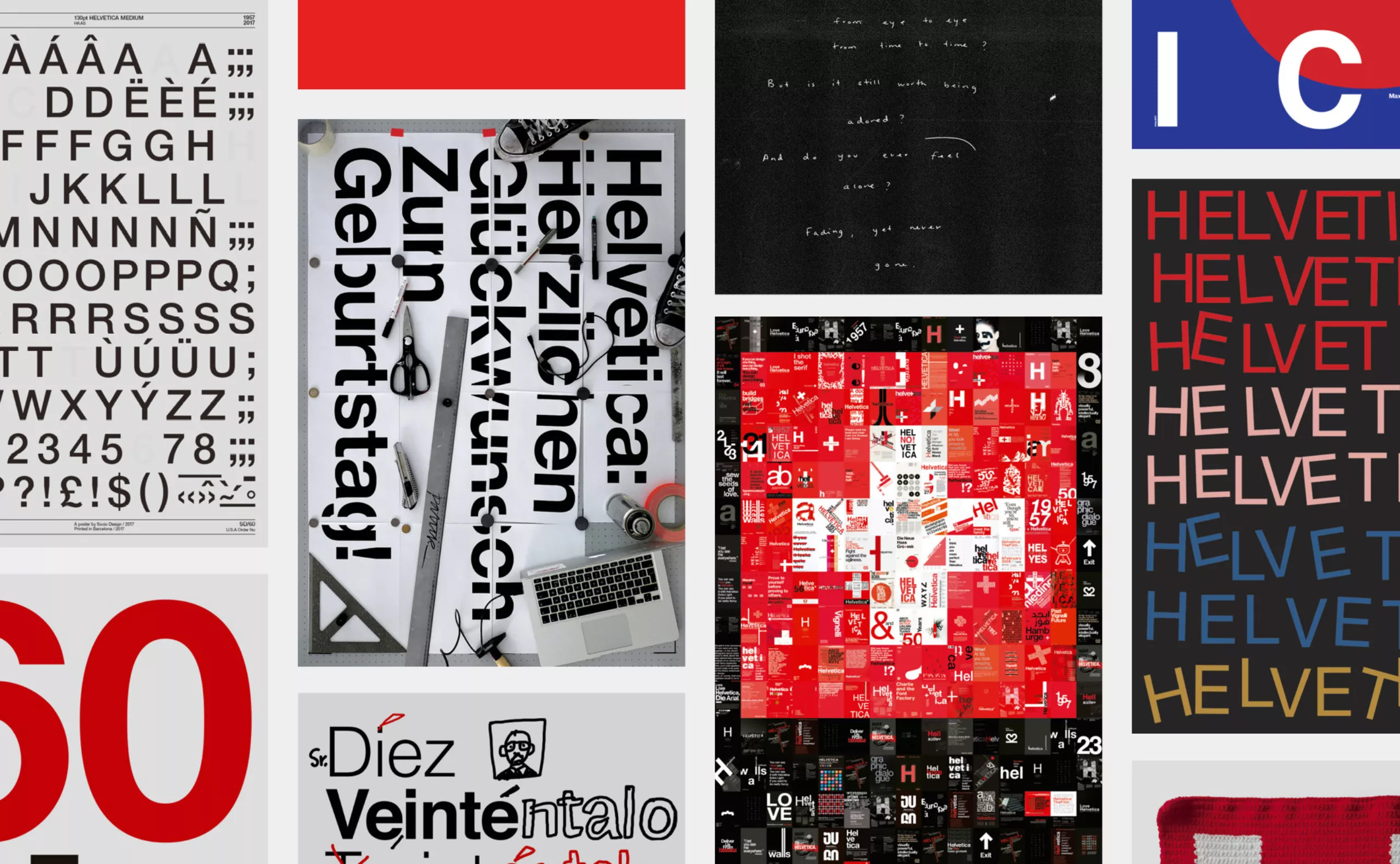
Happy Helvetica to you!
Happy birthday Helvetica! The spanish studio Husmee has invited a selection of international studios to create a tribute poster to celebrate the 60 years of the creation of the famous typography.