Herb Leupin “A great swissman“
To continue our series of articles on the great names in graphic design, after having taken a look at Great Britain with Edward Bawden a few weeks ago, we are going back to Switzerland to rediscover Herb Leupin’s work.
Moreover, we had already presented a Baloise in this section, Rolf Rappaz… to believe that this city is a mine of talented graphic designers!
The swiss period
Herbert Leupin was born in Beinwil (Switzerland) in 1916. He spent most of his childhood in Augst, a village near Basel. His passion for drawing began very early, and following the advice of his teacher, he entered the Gewerbeschule (vocational school) in Basel in 1931. His talent is recognized and encouraged by Paul Kammüller (poster artist) and Theo Eble (the founding artist of Gruppe 33, a group of artists from Basel). The young man’s talent was also recognised by Hermann Eidenbenz, in whose studio he began working as a graphic designer. There he gained valuable experience in advertising and photography.
Between 1935 and 1936, Leupin continued his studies in France, taking courses with the famous poster designer Paul Colin. Despite this French influence, Leupin remained faithful to the Swiss style.
In 1937, Herbert Leupin returned to Switzerland and worked briefly for Donald Brun – whose graphic studio was one of the best known of its time. At the end of 1937, he became independent.
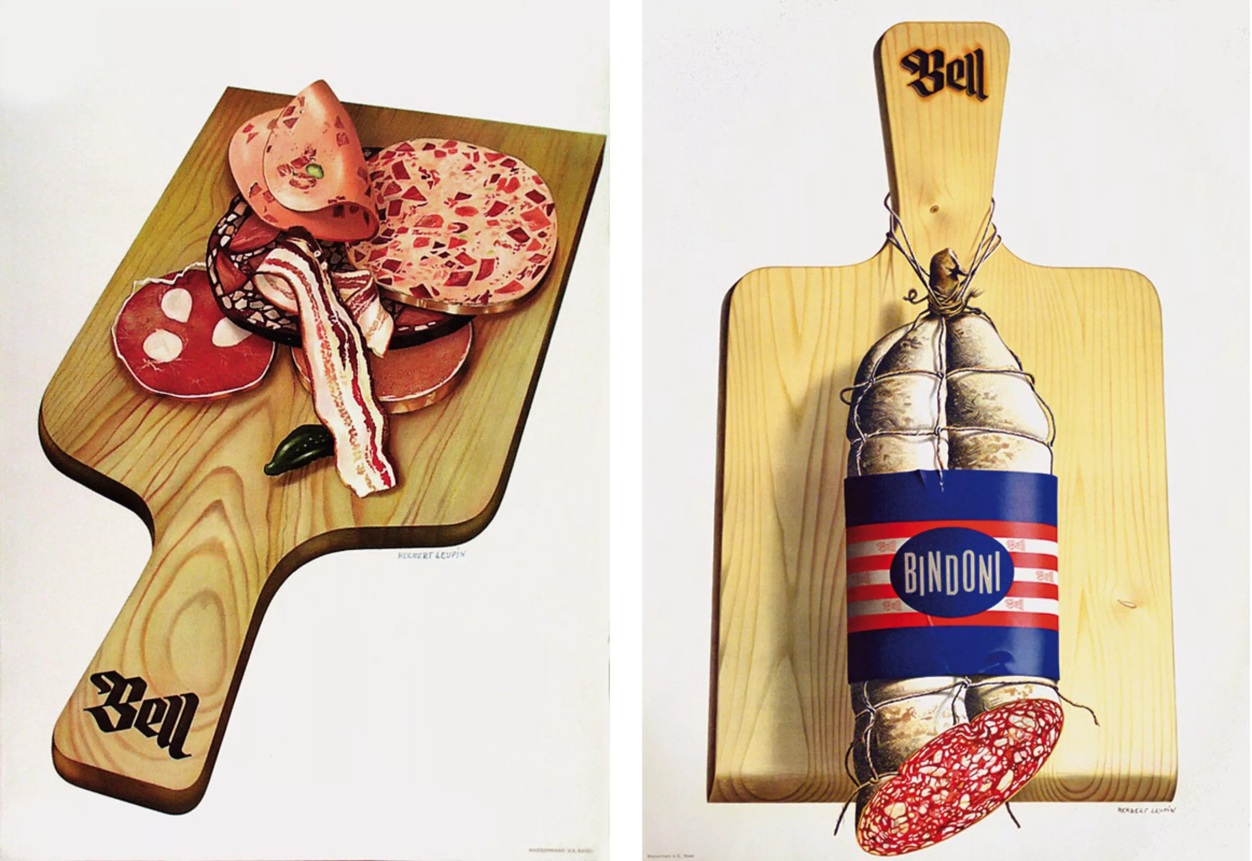
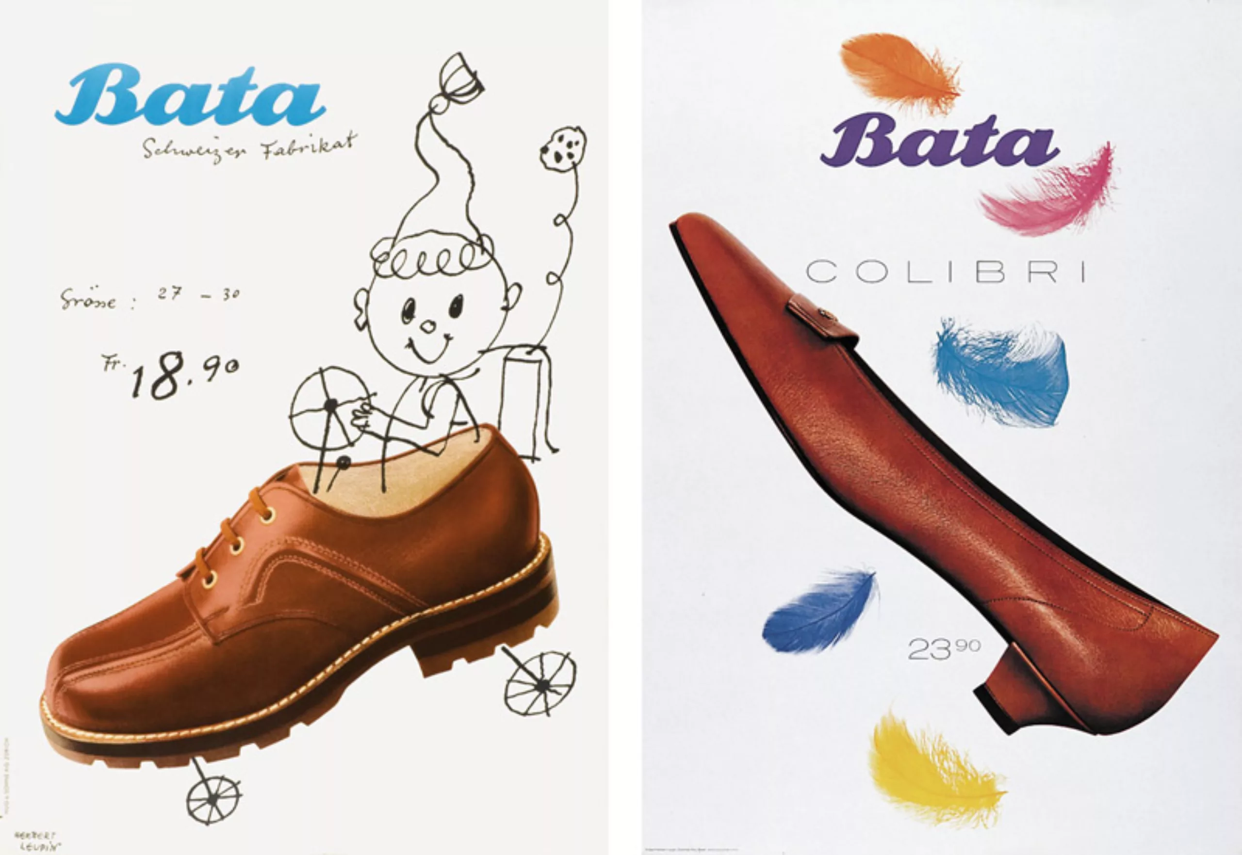
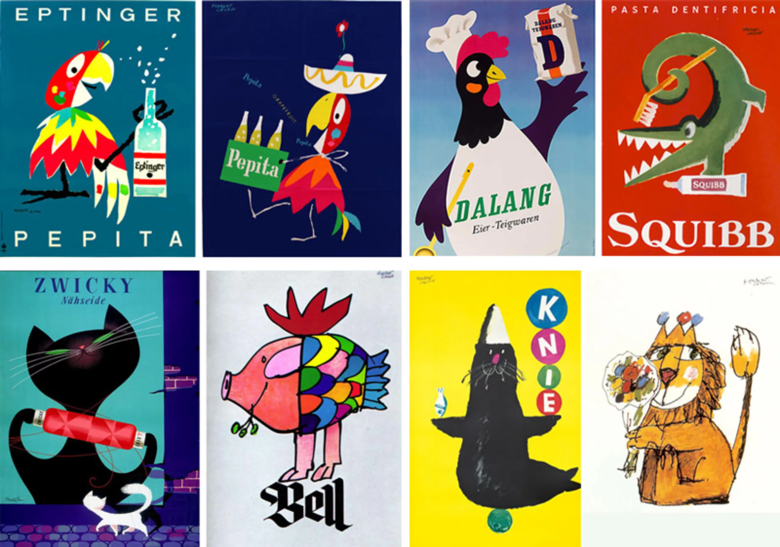
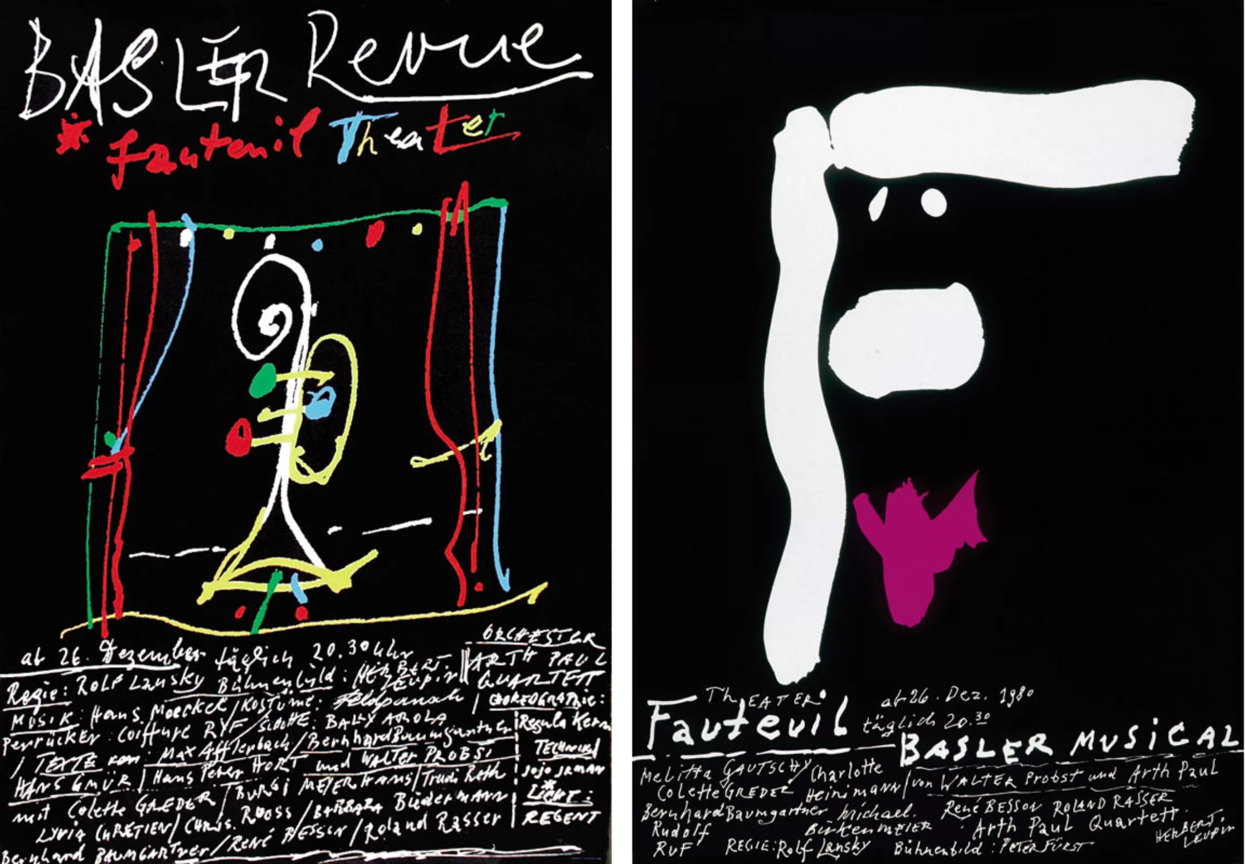
In 1939, Leupin received his first major order from the Basel butcher Bell. The brief of the time was in two lines, the brand name had to be combined with a charcuterie image. Leupin proposes to put the Bell logo on a deli board, thus simplistically illustrating the “advice and choice” of Bell butcher shops. The success is resounding. The butchers are tearing up the poster and all want a cutting board signed Bell. Leupin’s career is launched.
The new objectivity
In this pre-war period, Leupin was strongly influenced by the artistic current prevailing in Germany at the time, the “Neue Sachlichkeit” (New Objectivity). This current follows the expressionism from which it derives in many ways.
Objectivity developed in several large German cities and brought together many great artists and intellectuals who, often from the Dada movement, had become strongly aware of their political responsibility and of their “dissenting duty”.
The New Objectivity has neither program nor manifest, contrary to the surrealism which develops at the same time in France. It is characterized by a will to represent reality without shadow.” Between judgment and observation”, she depicts the unhealthy and corrupt society of the time, it is a cold mirror. This current ignites all fields of art and design, passing through architecture. The best known names are Otto Dix and George Grosz. In architecture Walter Gropius (founder of the Bauhaus) can also be associated with this movement.
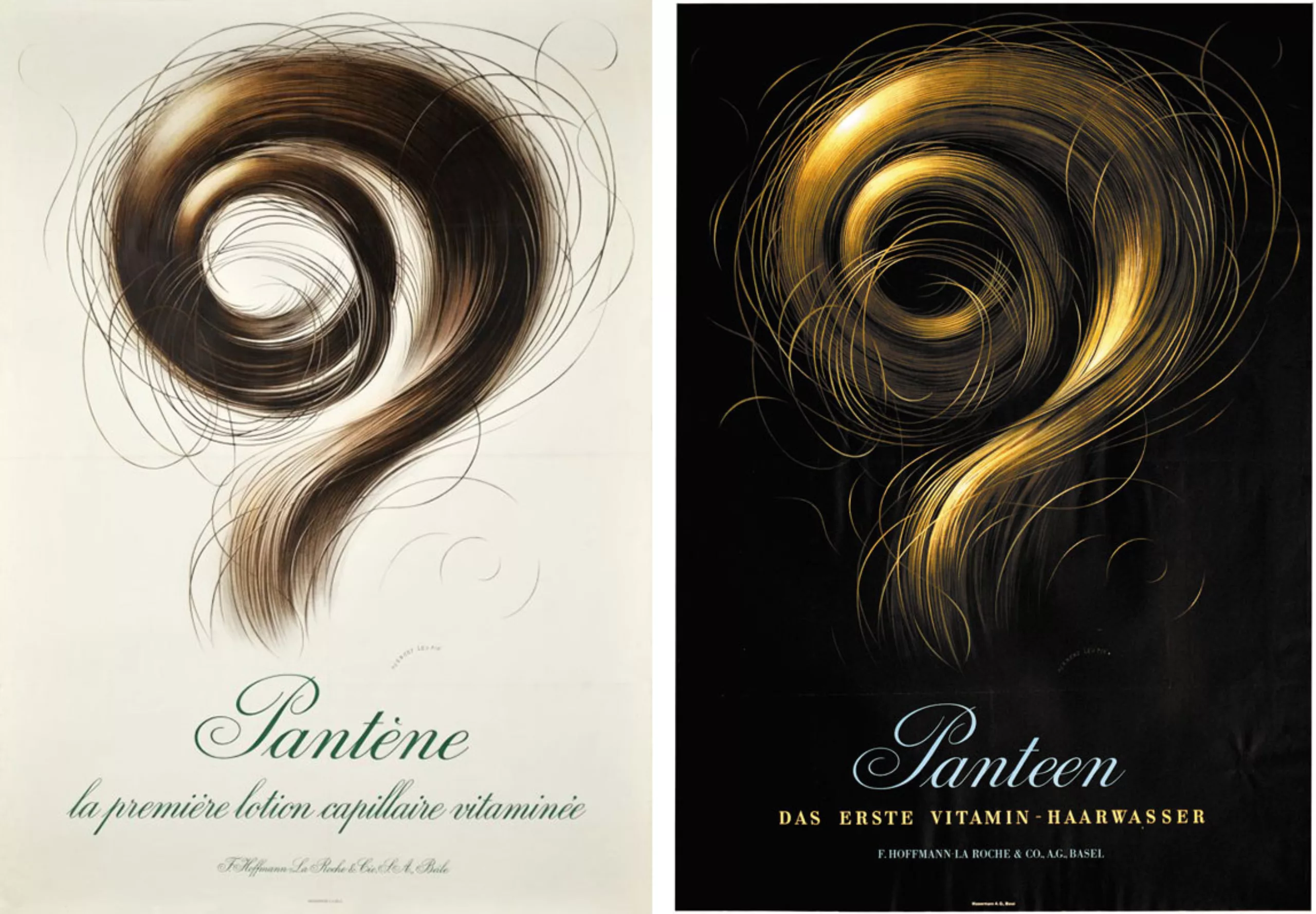
Herb Leupin’s work, presenting oversized products in an almost photographic manner, is more particularly in keeping with a subcurrent of the new objectivity, the “Magischer Realismus” style (Magic Realism). A style that met with enormous success in the Basel advertising agencies of the time.
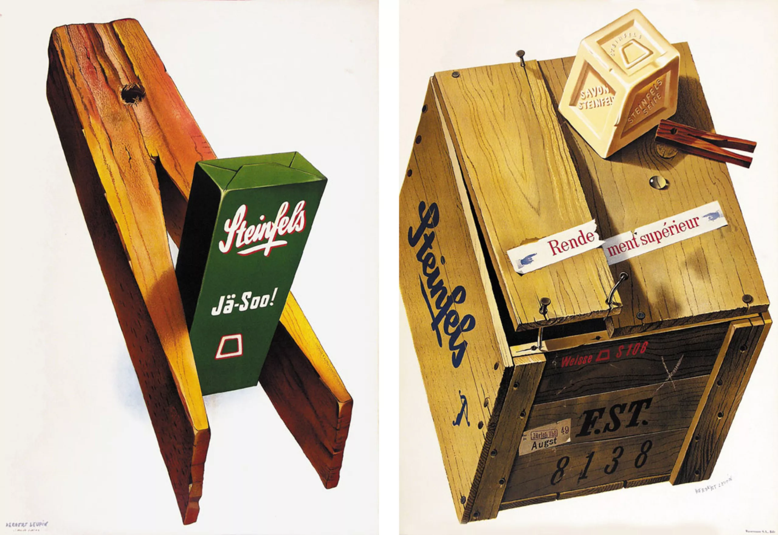
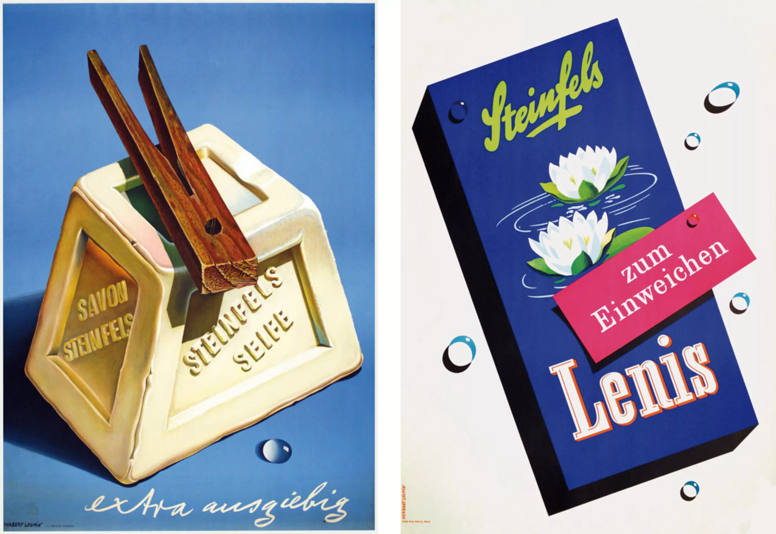
Emblematic examples of this style are advertisements for Steinfels soap or Pantène shampoo. No colour photography, but a hyper-realistic work of illustration! The background is often black or white. No fuss. It’s swiss!
Long live the children
In 1945, Herbert Leupin married Elsa Schaumberger. They will soon have two children.
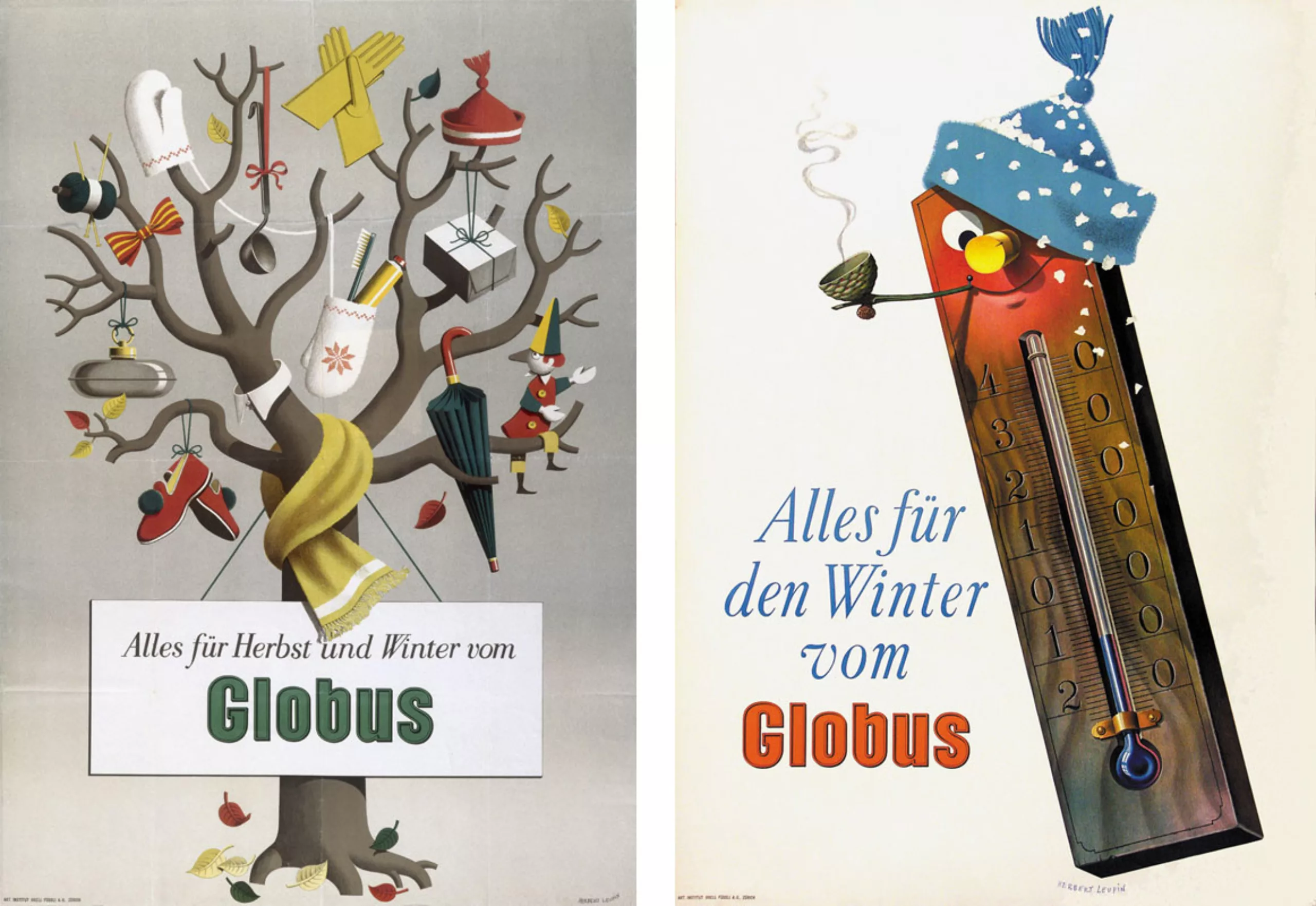
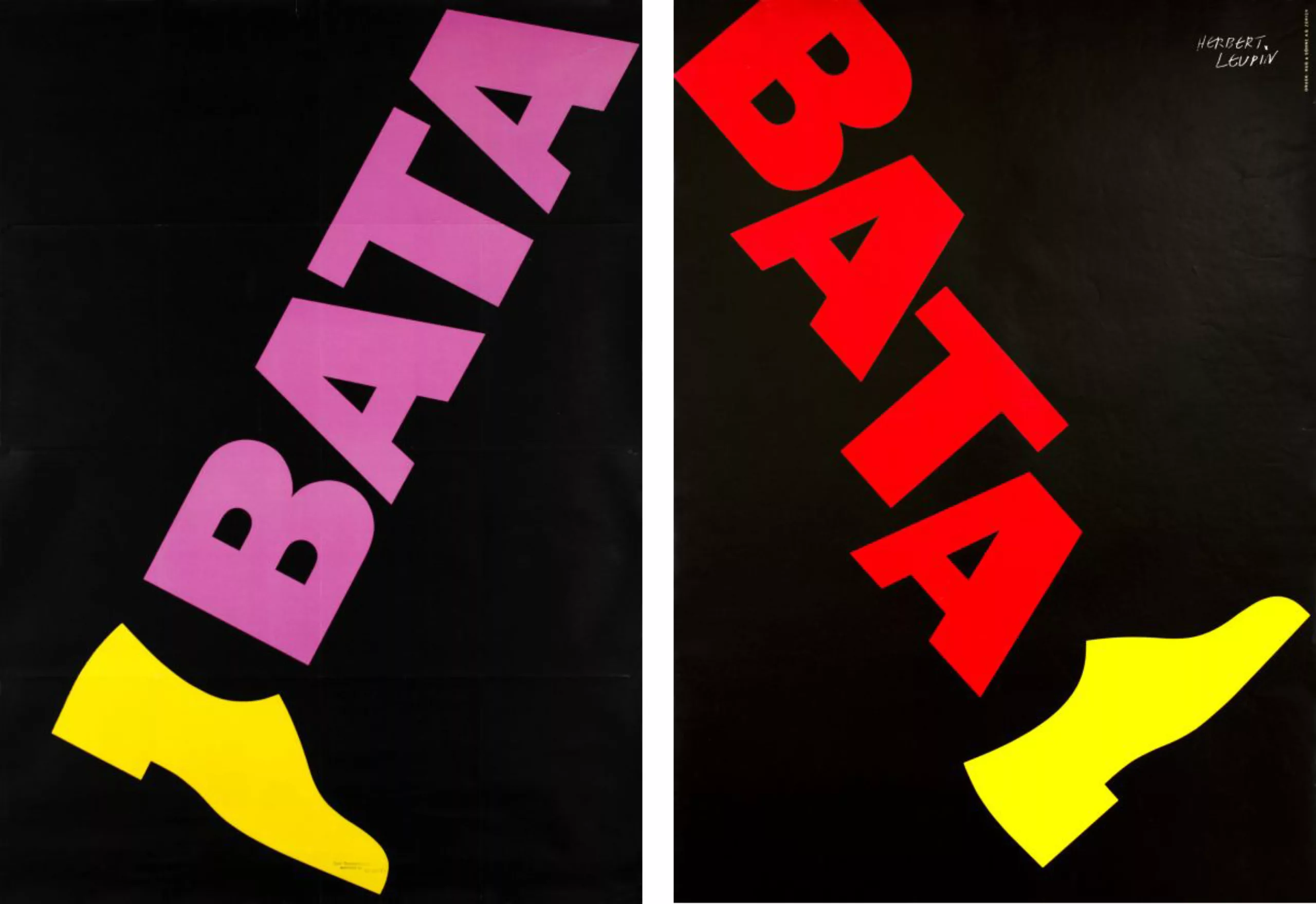
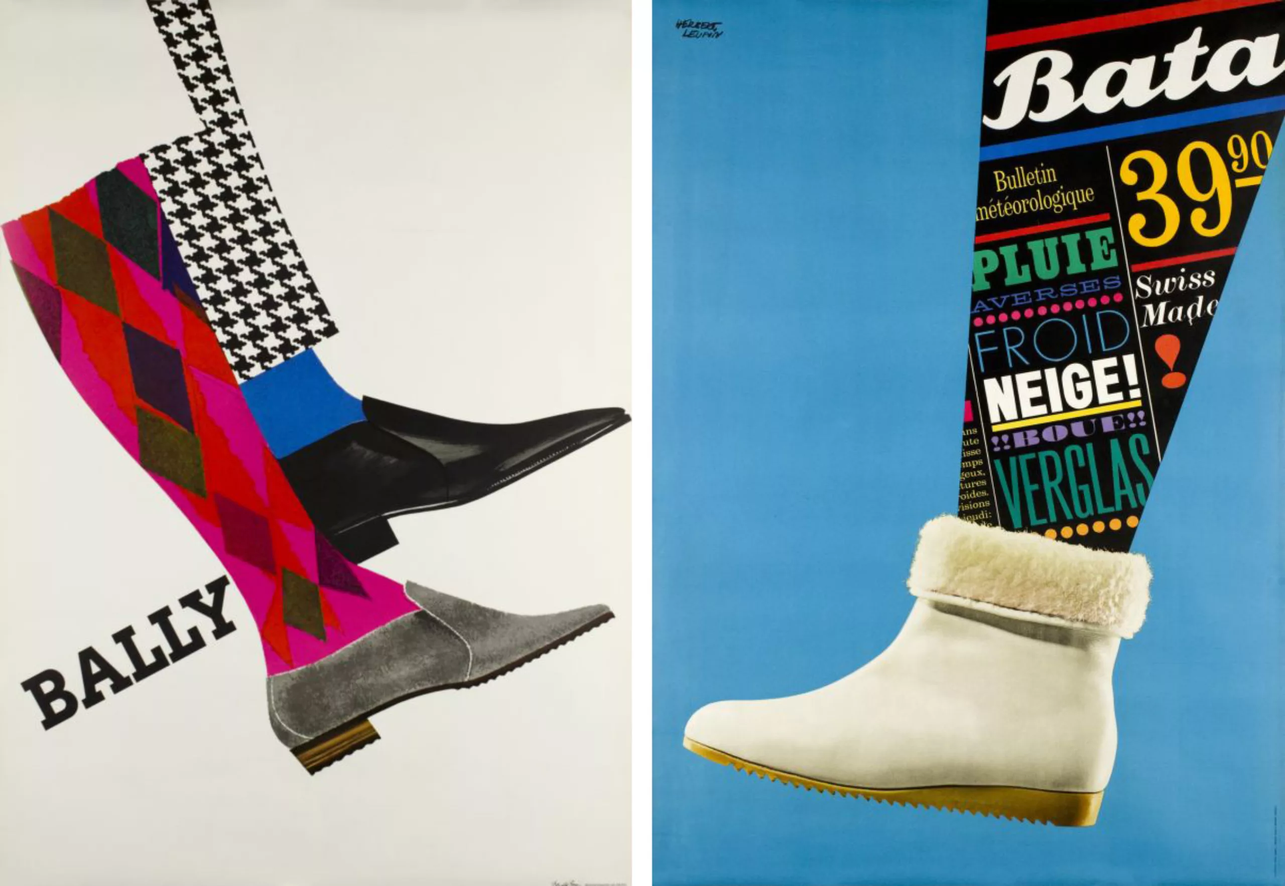
Leupin’s style then takes a turn, it will then be more playful and colorful!
He will also recognize the influence that his children will have on his work, this desire for life and colour.
Indeed, at the end of the 1940s, Herbert Leupin began to detach himself from “Magic Realism” and sought new forms of expression. This is a time of artistic crisis. He sought to work more freely, and began to use photographs, collages or typographic compositions. After the war, in the spring.
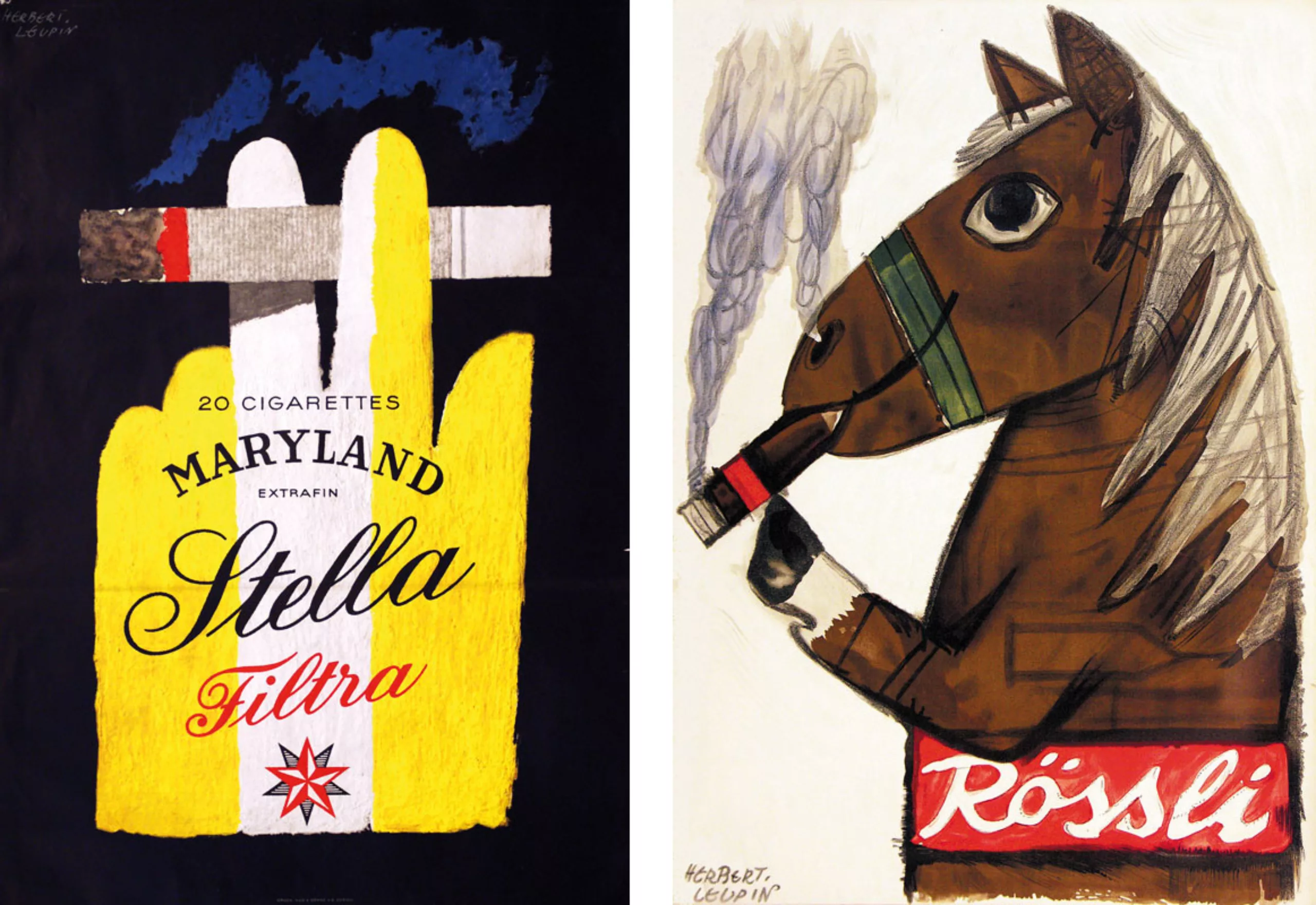
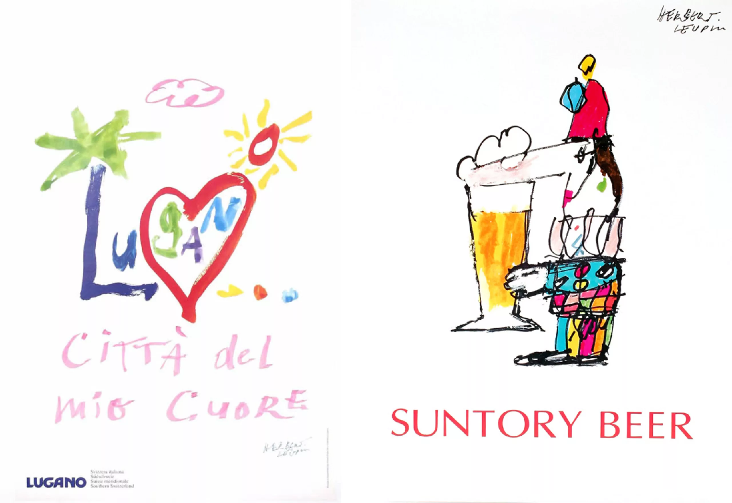
Animals will be an inexhaustible source of inspiration. He will also have some problems with the animal protection league when he smokes a horse for Rössli cigars. It is actually a pun on “Rössli”, which means “little horse” in German Switzerland.
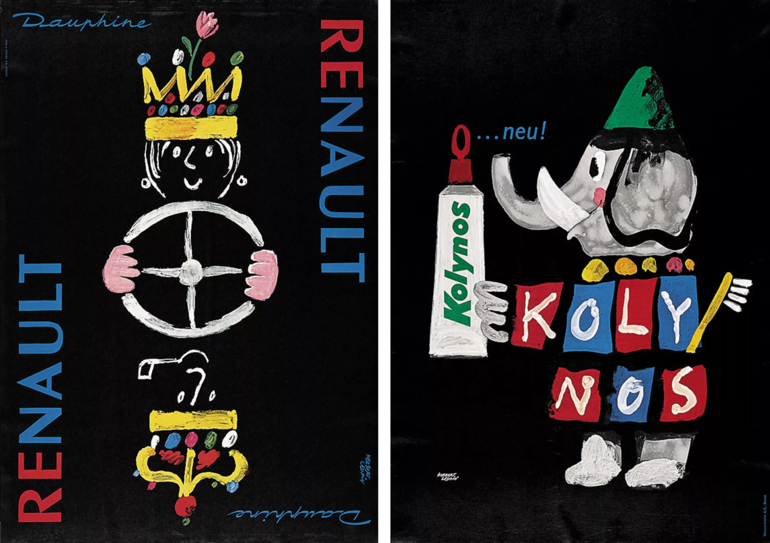
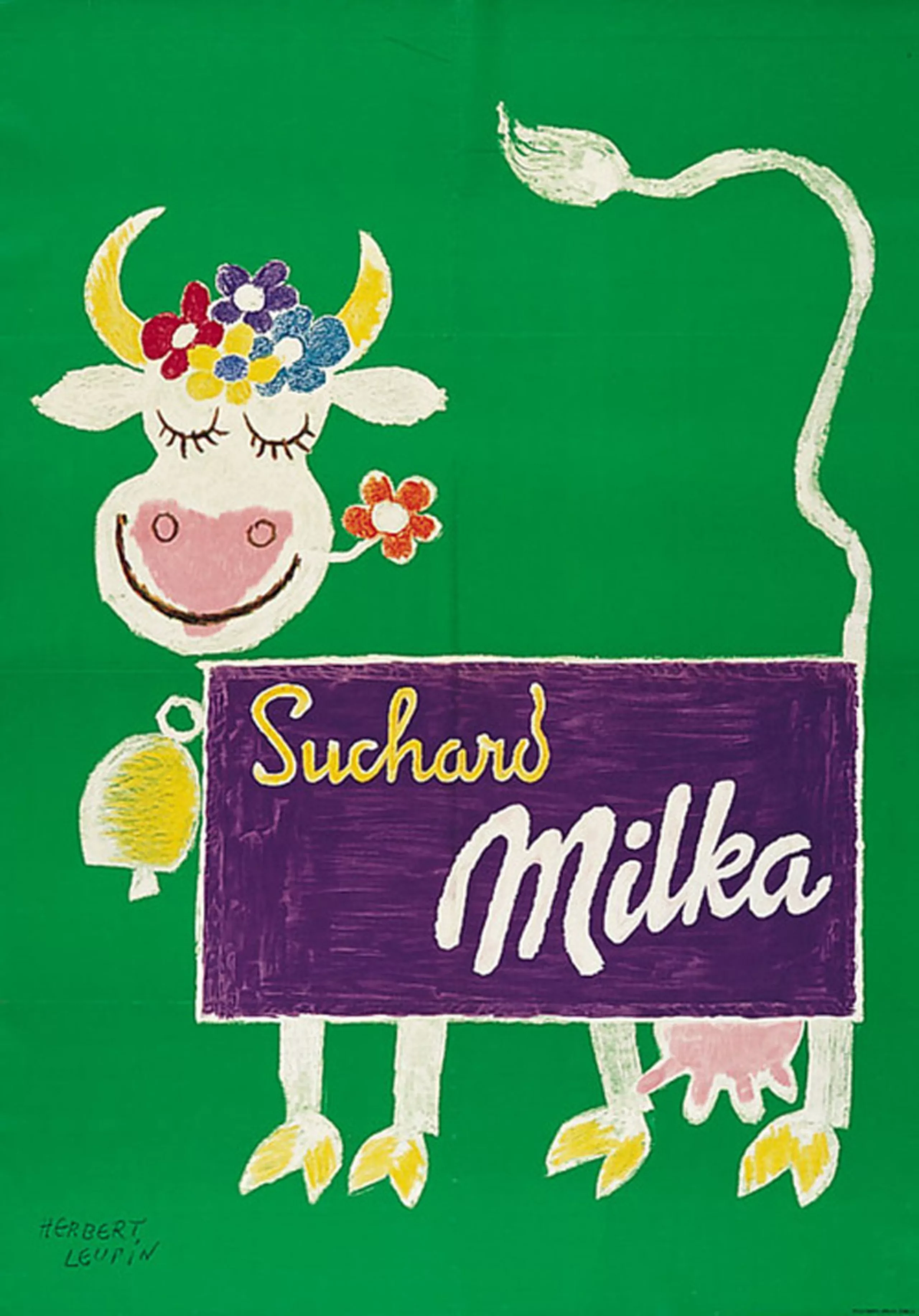
The inventor of the Milka cow
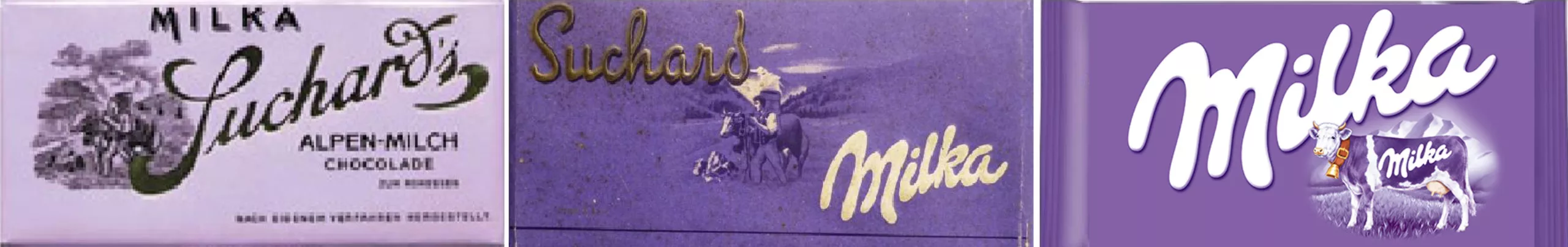
Herb invented the first lilac coloured cow for Milka chocolate. The wrapping paper has been purple for over a century, and the cow is reproduced in black and white. By transforming this purple packaging into a cow, he will certainly influence Young & Rubicam‘s creatives who in 1972 will use a real lilac cow in their advertising.
From then on, the success story of the violet cow took off, to such an extent that in 1995, a drawing competition organized in Germany after 40 000 children will make it possible to calculate that one child out of three draws cows in violet!
By the way, the name of this brand is judiciously formed of “Milk” and “kakao”… milk chocolate… for milk, I suspected, but for “cocoa” I did not know…
The artist
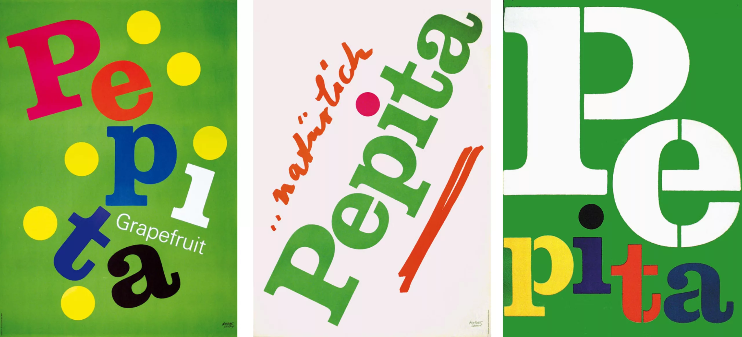
From the 60s and 70s, Leupin began working as an artist. The boundaries were often blurred between her advertisements and her more artistic posters.
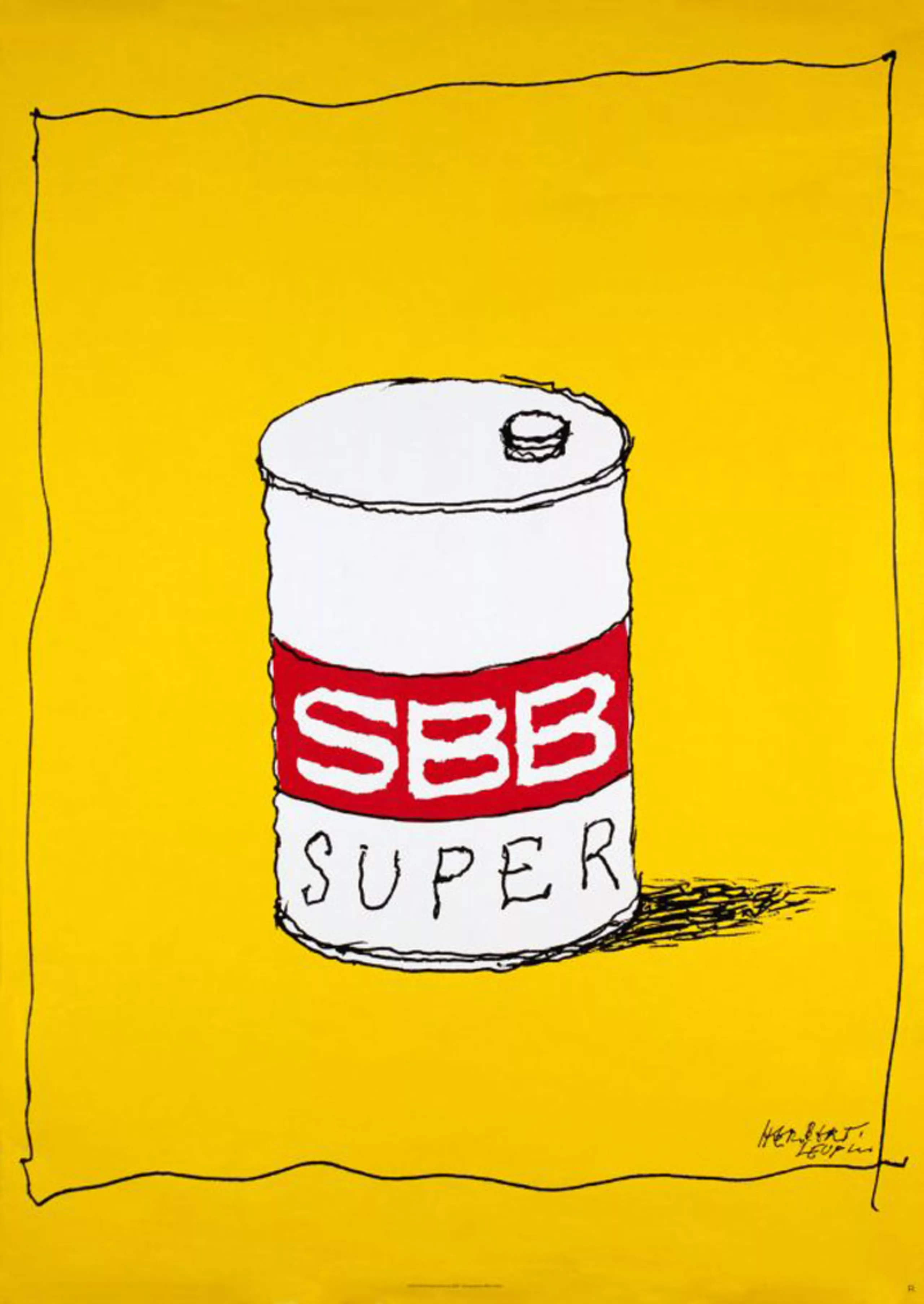
The poster for the Swiss Federal Railways (SBB) was created in response to the oil crisis in 1978 and caused much unease among car lobbies. The poster was only posted for two weeks before it was removed.
His style takes more and more freedom. It evolves towards a certain abstraction.
Herb Leupin was awarded numerous international prizes throughout his career.
He died in 1999 in Basel.
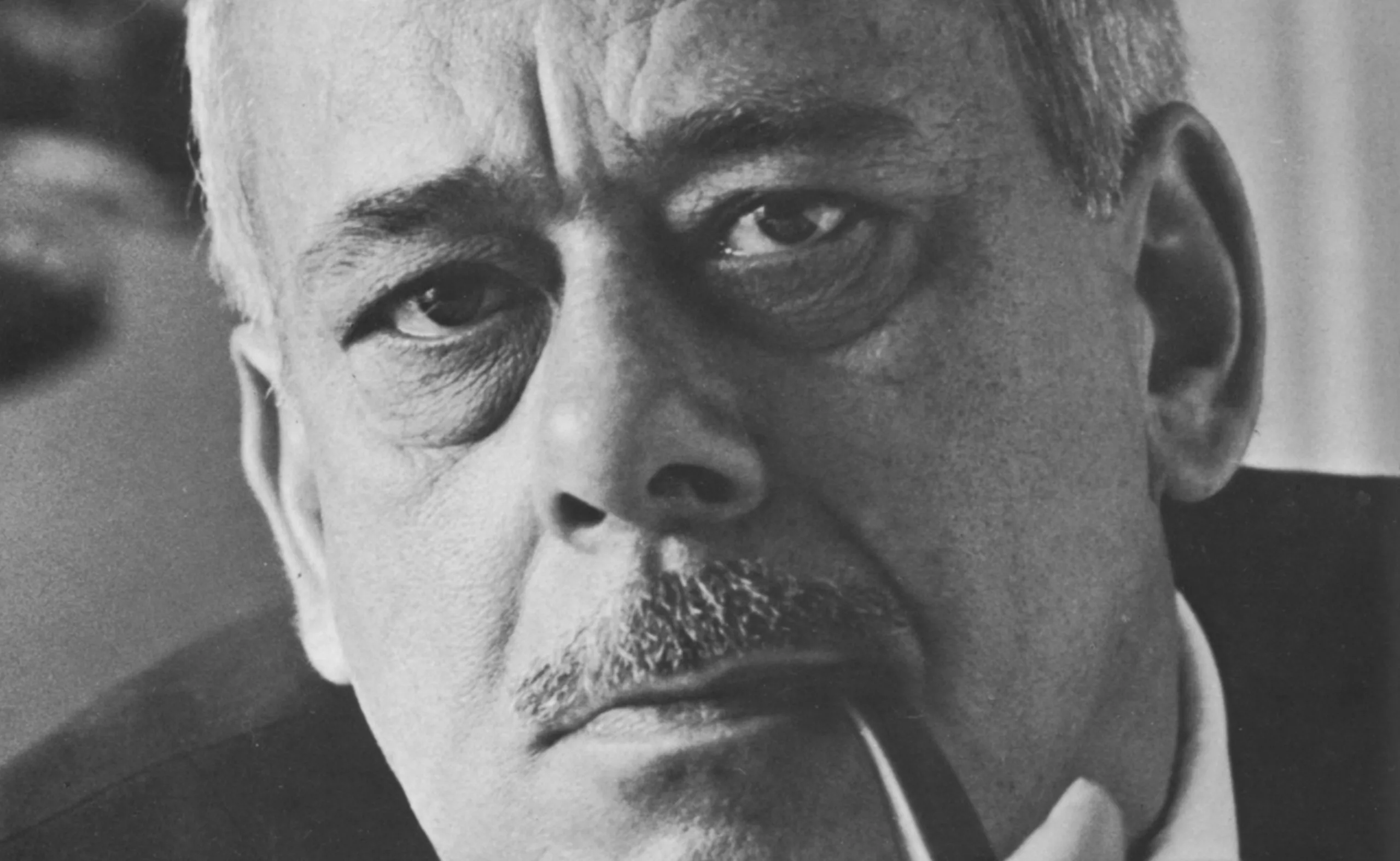
Portrait of Herb Leupin in 1972
The text below presents Herb Leupin’s work in one of the rare works published during his lifetime. This is the collection “graphic designer Europe n°2”. It is interesting to discover the look we had 50 years ago on his work, and indirectly on the art of advertising posters.
What is the attraction of Herbert Leupin’s posters?
Originally, they were considered as works of printing intended to be exposed during fifteen days, even one month against the facades, then to disappear under other posters. They were numerous in thirty years: several hundred. Do we remember any of them accurately?
To establish a choice of Herbert Leupin’s works is to follow a very particular process, whether in one of the many exhibitions, poster collections, or more modestly among the reproductions, even if the latter are simply in black and white and of reduced format.
What they still express today through images and text – Buy!… Smoke!… Use!… Come on!… can only rarely be taken in an imperative sense. We arrive too late, the years have passed… The essential quality of his posters resided in his talent for expression, powerful phrases, which now read like the invitation card of our own baptism found in the forgotten disorder of a drawer background. It is quite obvious that some slogans are still topical, the examples having generally been drawn from everyday life, but their insertion in the whole poster appears outdated, outdated. Today, we are neither the “objective” nor the “victim” of such posters, the roles are reversed: we analyze, we judge. Are we really doing it?
First and foremost, we must consider that the standards of appreciation in 1969 or 1971 are no longer those that prevailed in 1959 or 1949. This does not come from the fact that the new generation judges Herbert Leupin’s works with a critical eye, a new wave. (Nobody doubts the mastery of his art, the exceptional place he occupies among the artists of his generation, nor the power and extraordinary quality of his advertising achievements. The phenomenon can be explained by the appearance of a new word of foreign consonance, which has penetrated the jargon of young people and, like corrosive etching attacks style, color, paper, up to the wall of the billboard.
Swiss poster: our poster art enjoys a worldwide reputation, it owes this esteem to its DIN A ZERO format, called universal format. And, the crucial point of this universal format name is known: Switzerland is the only country in the world that uses it”… typical!”. Certainly, the order and display requirements are typical, a demonstration of democracy spread out in the eyes of all foreign tourists: equal opportunities for everyone. (What is hidden is the monopoly of the corporation, the closed dealer market, the repressive measures that hit the “self-employed”. That may be what explains our honest and provincial billboards so devoid of gesture, without heartbeat and without urban nerves.
Herbert Leupin was one of the first to break the imposed width standards by combining two or three posters. As a result, the Société d’Affichage (like the SBB, for the unlucky skier wearing a cast) doubles or triples the price of the place. Recently, however, there have also been giant formats in Swiss cities, against the blind walls and palisades that surround the construction sites, in the realistic and colourful style of film or cigarette advertising that can be found everywhere in the world: immense cries of joy that dominate the murmur of the city and have so far never been rewarded by a Swiss Jury.
“Poster”?
The corrosive neologism we mentioned earlier is “poster”.
According to the lexicon, it is the English expression for poster, but as a word in the wind, “poster” means much more. There is a world between “posters” and posters. What illusions, what promises, what emotions and what realistic revelation of the brutal and vulgar forces that govern the universe are contained in this term. The “posters” are now on posters, what were, a hundred years ago and more, the artistic works of the Louis-Philippe era for the Liberals of 1848 or for the Communards of 1871.
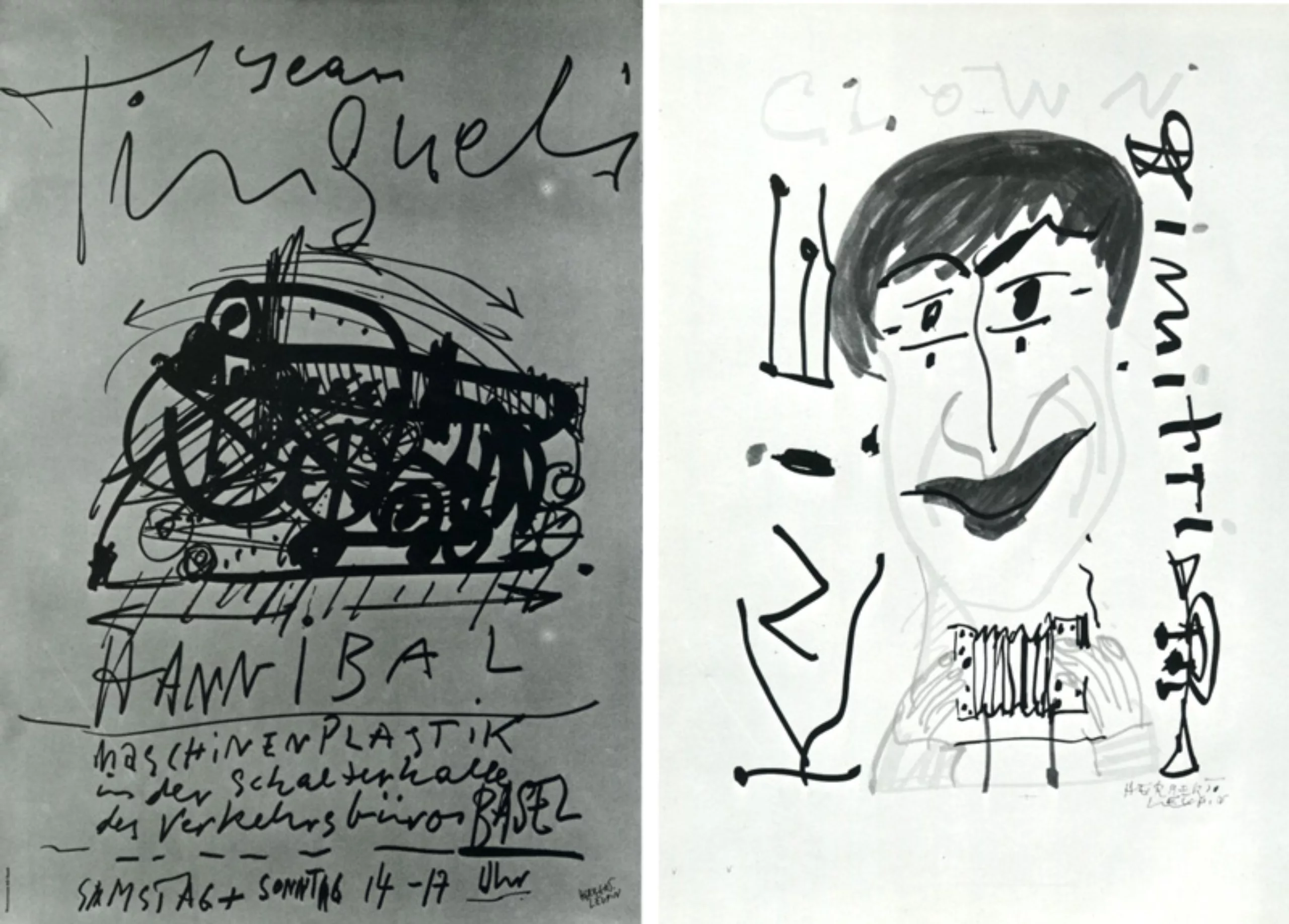
One of Herbert Leupin’s most recent and best posters, a single-jet production, is used to advertise Jean Tinguely’s “Hannibal” mobile ironwork. To tell the truth, no one has ever doubted that Tinguely’s hectic machines are a survival of the purring, winding automata of centuries past. (On the other hand, we have to admit that after the storm of emotions caused by the “posters” and the “buttons”, another form of similar thinking will impose itself, just as after 1848 and 1871 the pseudo bourgeoisie was born. This time, it will probably be a pseudo-social order and industrial supremacy. All in all, in all simplicity, we raise the question: did Herbert Leupin make posters?
The answer will be a matter of conscience for us. We are accomplices, how many! in this undecided question. When we praise the director of so many successful posters, we praise ourselves.
The Basel school occupies a very special place in the conceptions of modern graphic arts, by the very fact that in an inconsiderate way it follows two absolutely opposite tendencies, on the one hand, illusionists like Stocklin, Brun, Leupin and Birk hauser, on the other hand, concrete ones like Hofmann and Ruder. And then we talk about a Swiss poster art! During the decades that followed the war, this art was the subject of numerous travelling exhibitions that toured the world and raised so many flattering echoes that our newspapers could proudly announce that abroad, three great Swiss names were in the mouths of each Osaka in Ottawa: Henri Pestalozzi, Ferdinand (not Hodler)… Kübler (not Arnold : Ferdi Kübler) and Herbert Leupin. We are accomplices.
Now, when we want to sort the Leupin posters, despite the normal decantation that takes place over thirty years, we are immediately struck by the observation that all of them are still known, each individually.
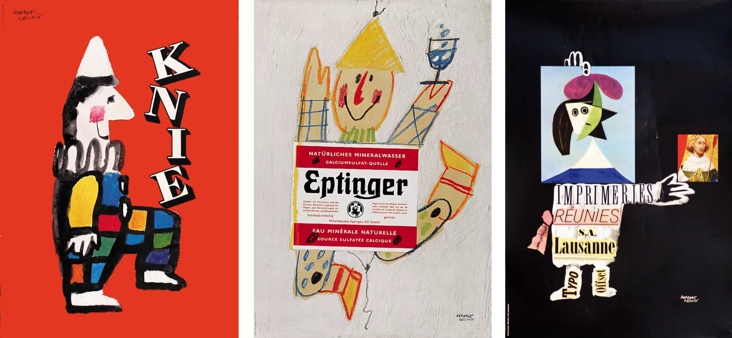
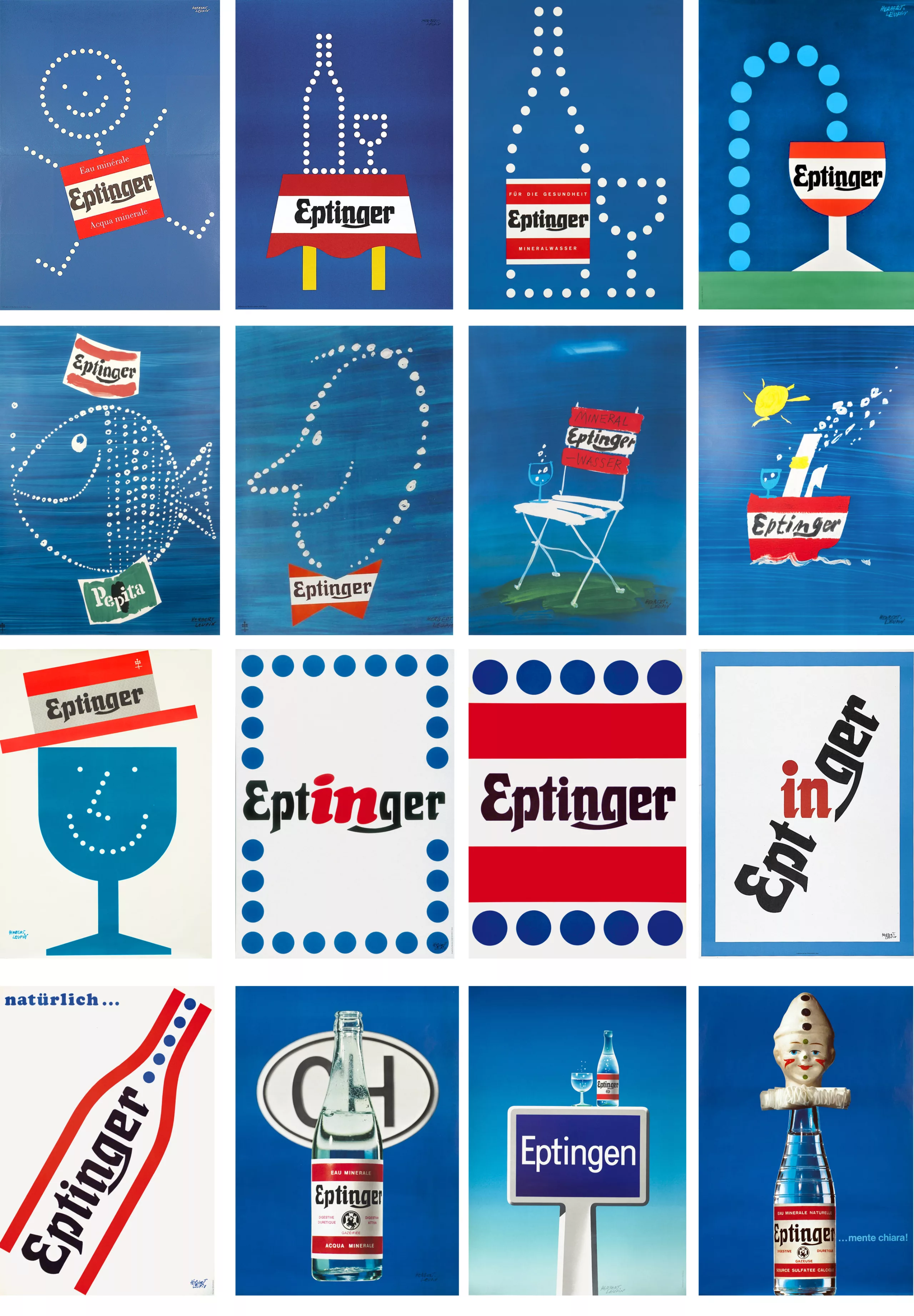
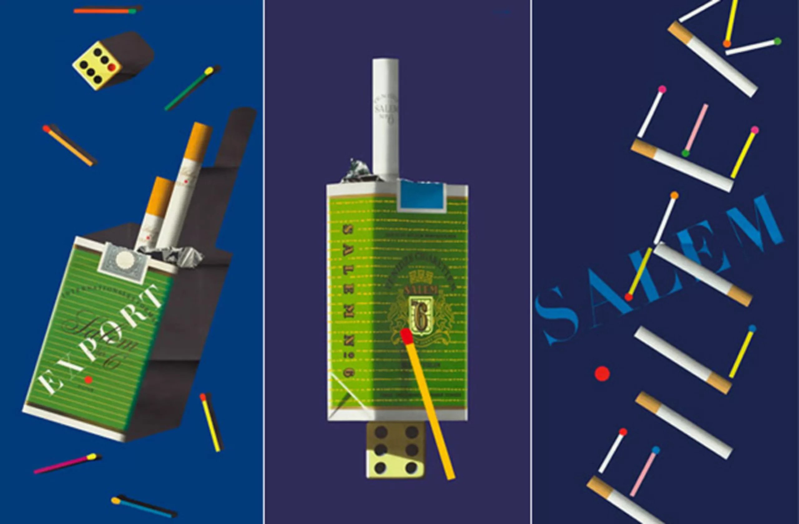
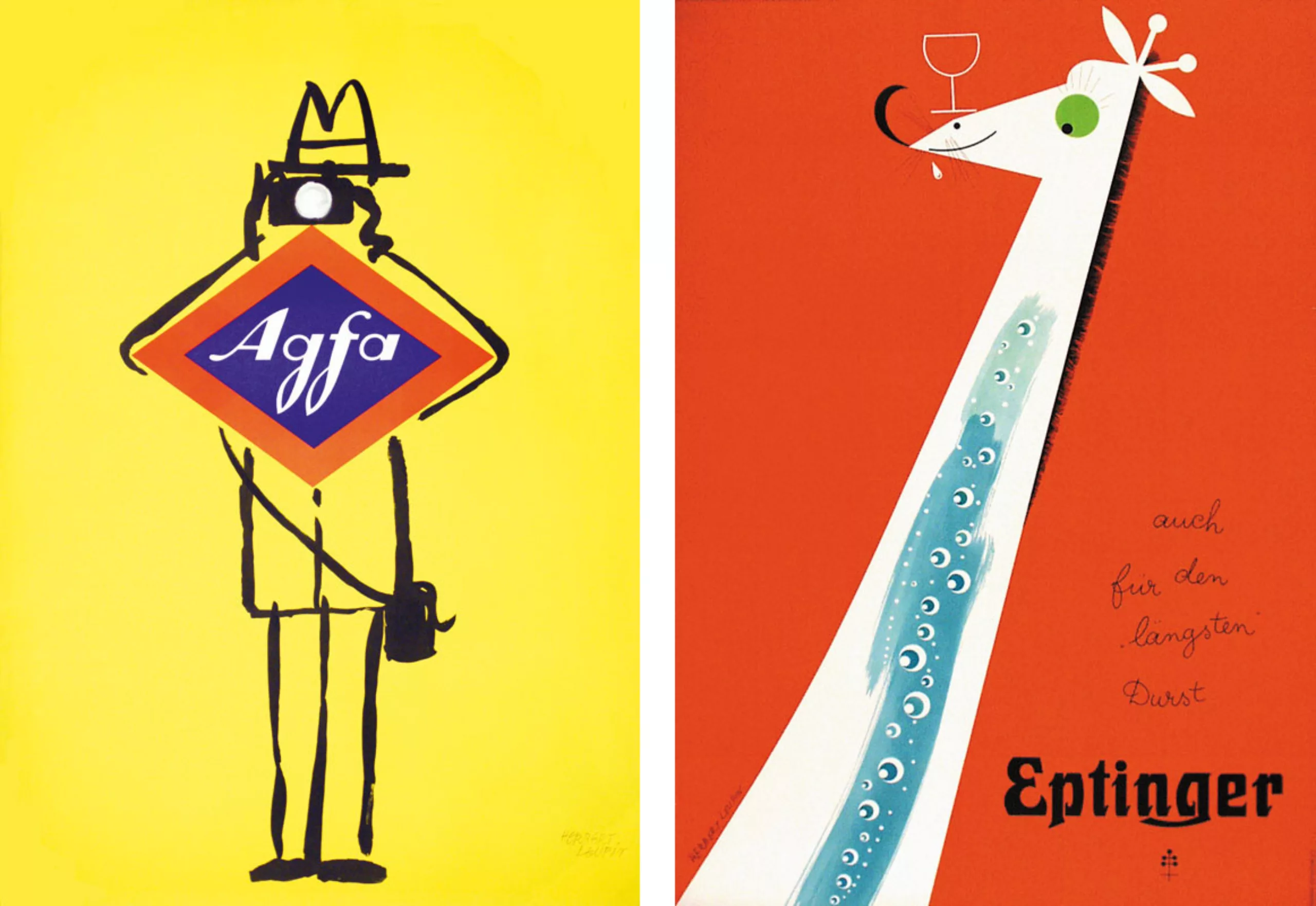
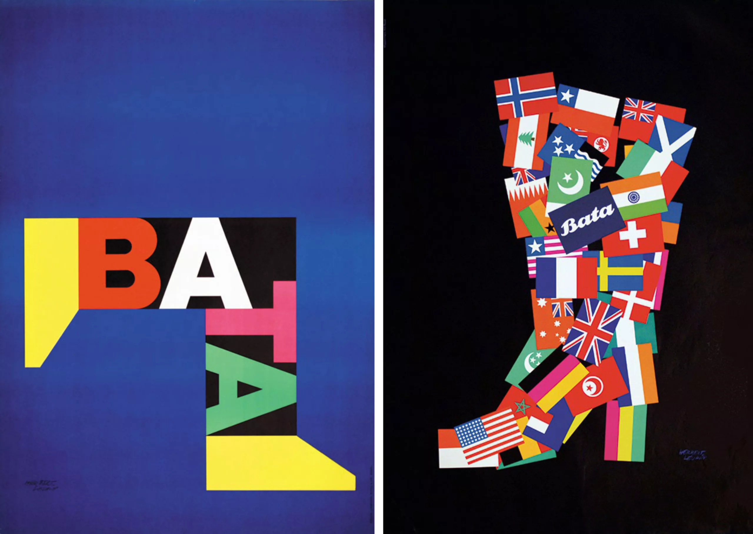
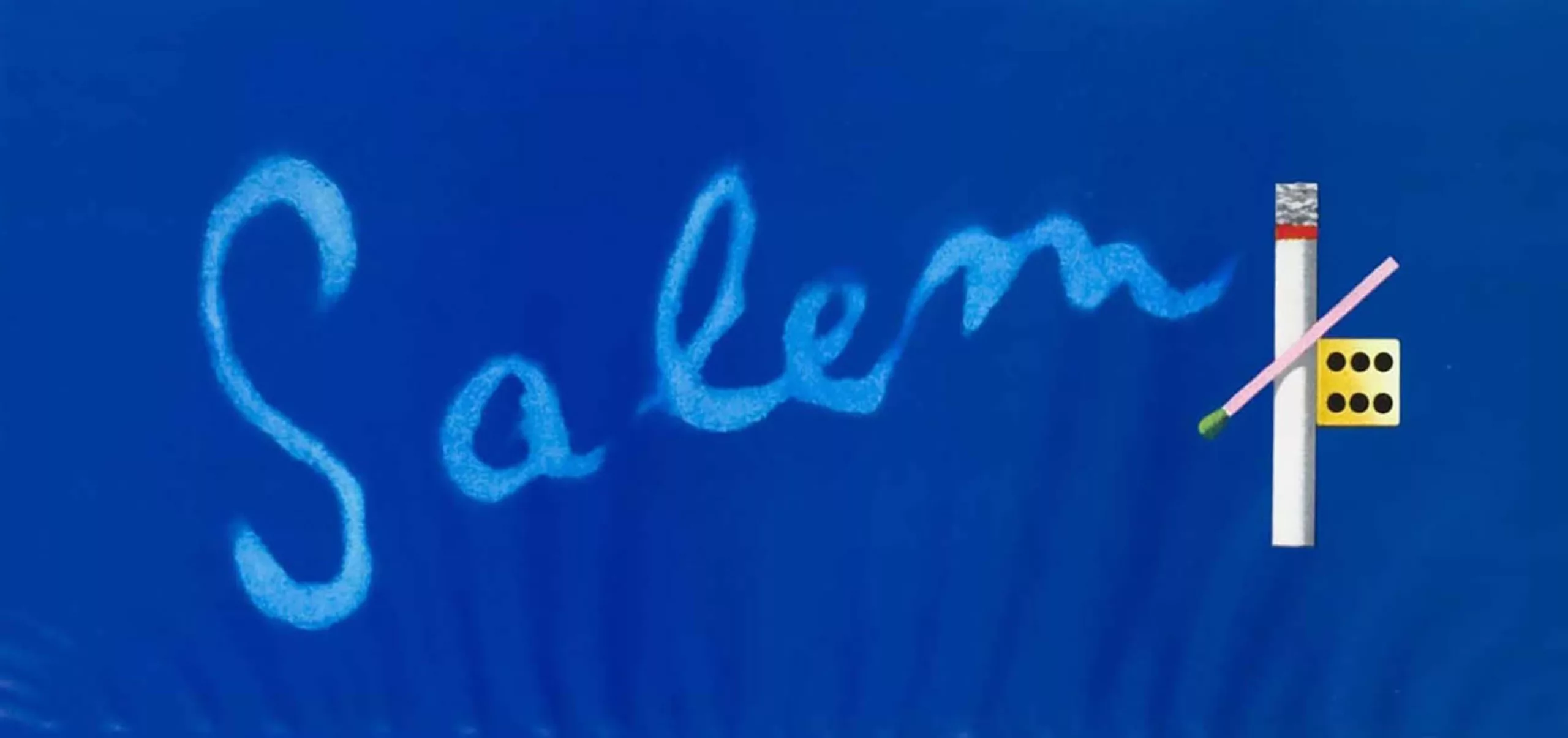
Perhaps there is a copy in the “Eptinger” series that was neglected in its time, or one of the posters made for foreigners was omitted (“Eminence” or “Roth-Händle”); their kinship is established at first glance. At most (possibly at “Salem”) one can be surprised: What? Another Leupin!
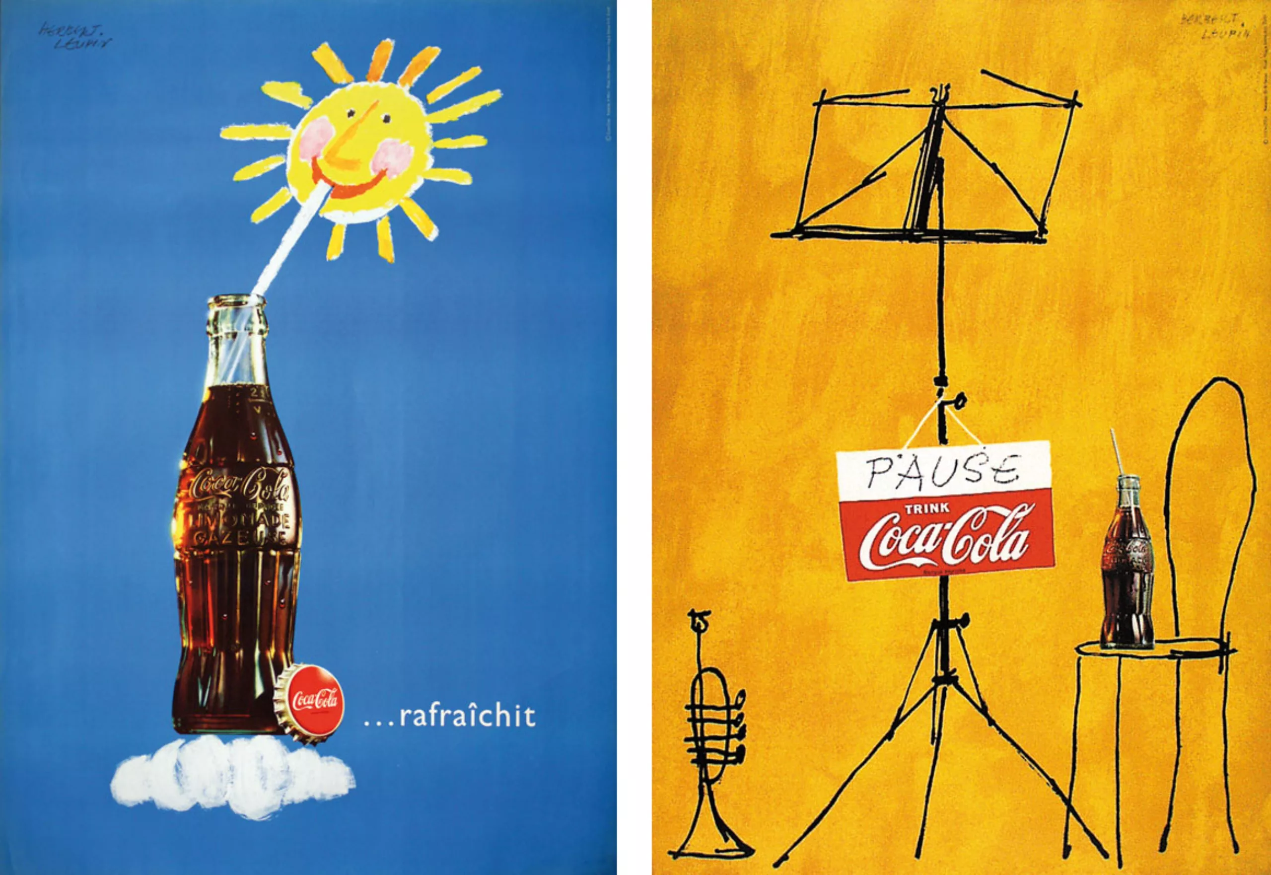
Then, even more surprising: one finds oneself as, when for the first time one noticed a poster by Herbert Leupin. We remember very exactly, perhaps not the year, but the time, a certain display column located at a crossroads, where, under the falling rain we got off our bikes (at that time we went to work by bicycle). We remember the life of yesteryear, which is probably still ours today, although now more tormented: homework and worries, the rush on the tram, the gallop from Monday to Friday, the Saturday routine and the Sunday ritual. The holiday period is still far away, an endless depression reigns between the Azores and the southern foot of the Alps… but we keep the pace, because in the most ordered of all possible worlds, everything is based on this axiom: we must maintain the pace. The radio begins the day with frenzied rhythms, television ends the week with the Sunday message, the Monday press with its sports supplements picks up the information already distributed at the auction the day before at 6 p.m. and again we are caught up in the double round trip daily. But all in all, all this is not so terrible: here in the street, someone who entertains us with pleasant words. He reports various facts (sometimes snippets of which are seized through the closed window of a tram), he relates that the jazz trumpet player played in duet with the violinist, that they made a “break” and that they drank a Coca Cola together… then, as an experienced prestidigitator, he explains how one pours a coffee powder into a cup and… ecco! The Ecco café is ready… it happens that the child’s heart wakes up in man listening to the story of this kid from the banks of the Rhine who, visiting the Zoological Garden, sees the neck of the giraffe as long as the arrow of the cathedral and as wide as the market square of the city of Basel… We became accomplices.
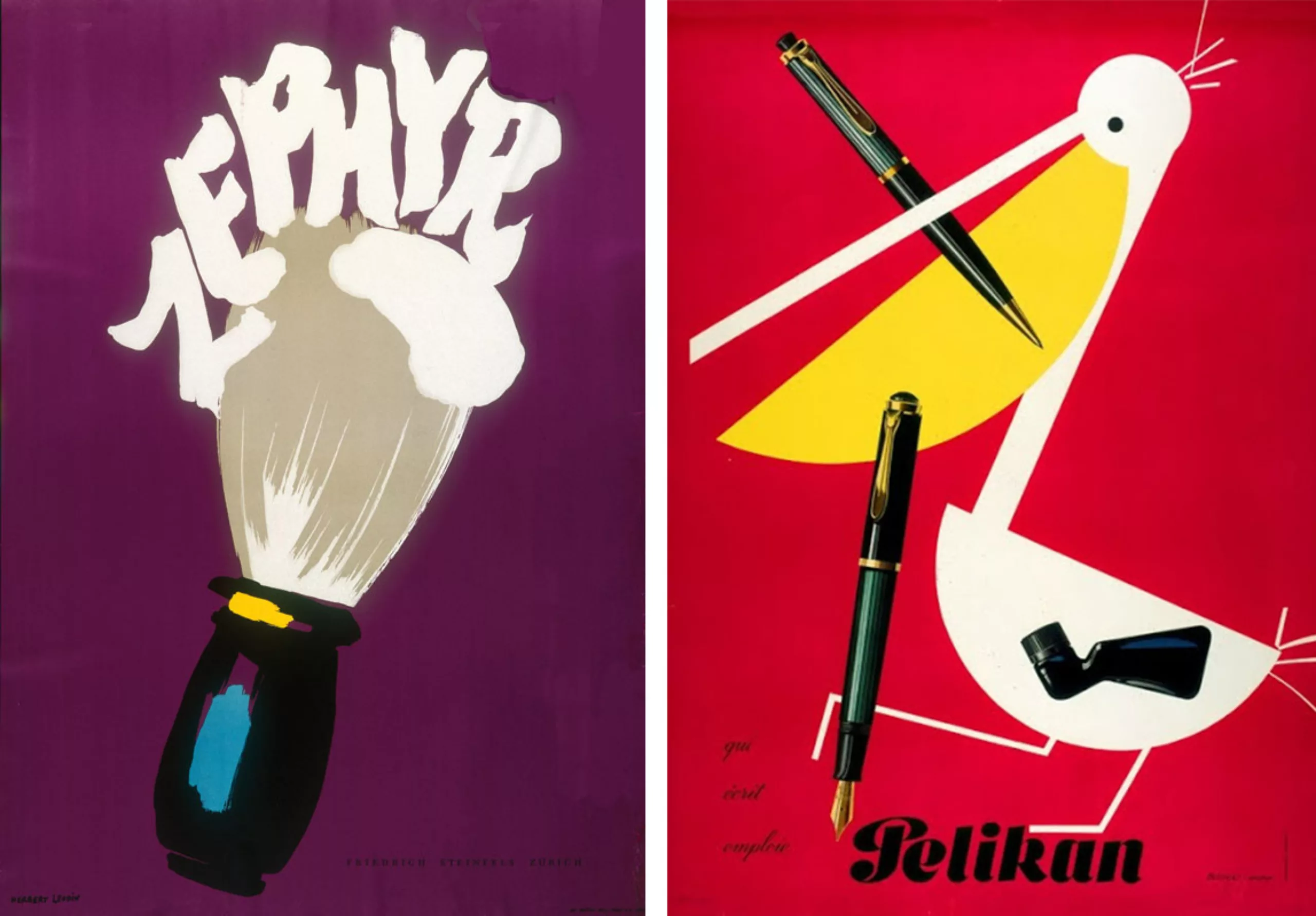
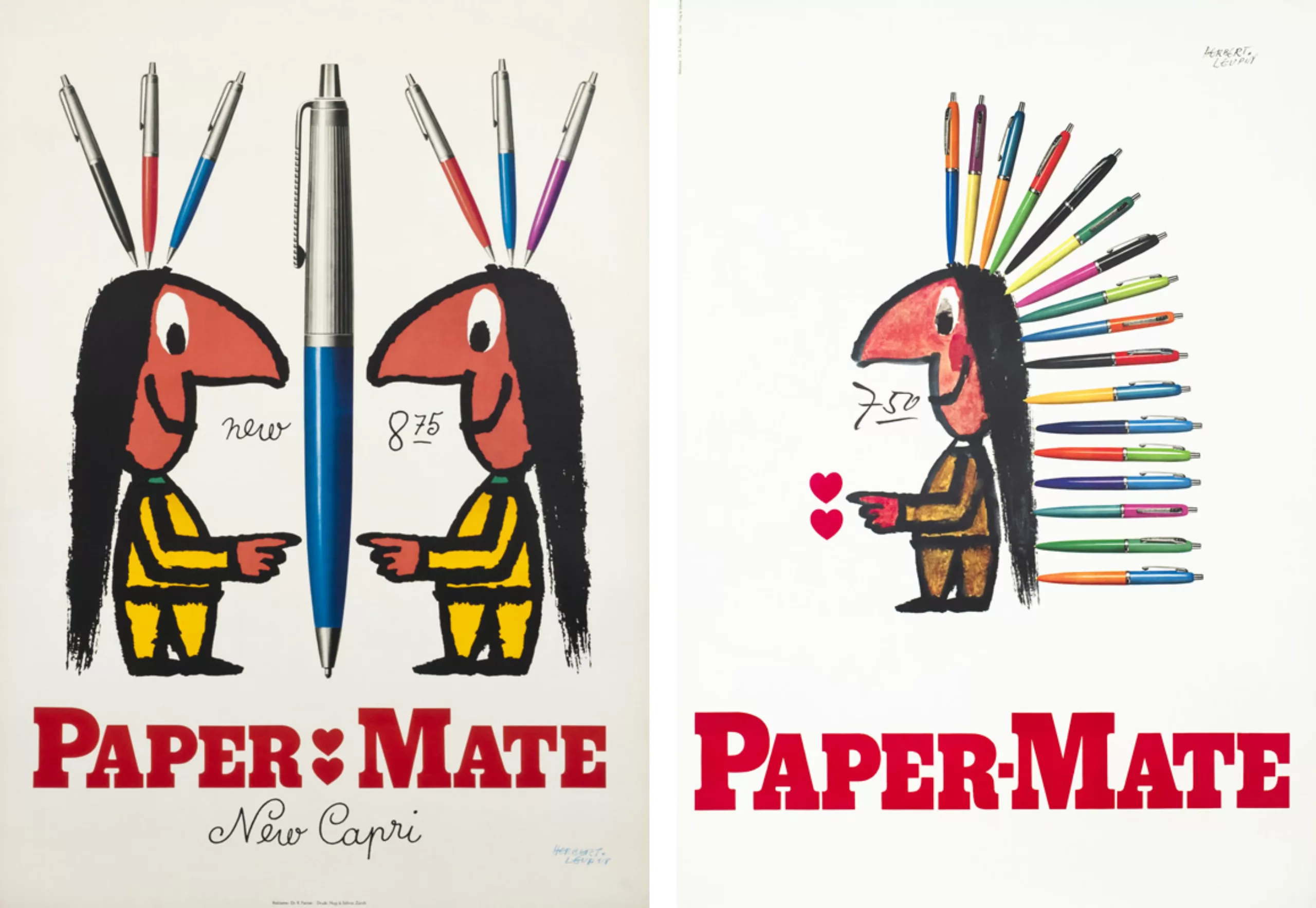
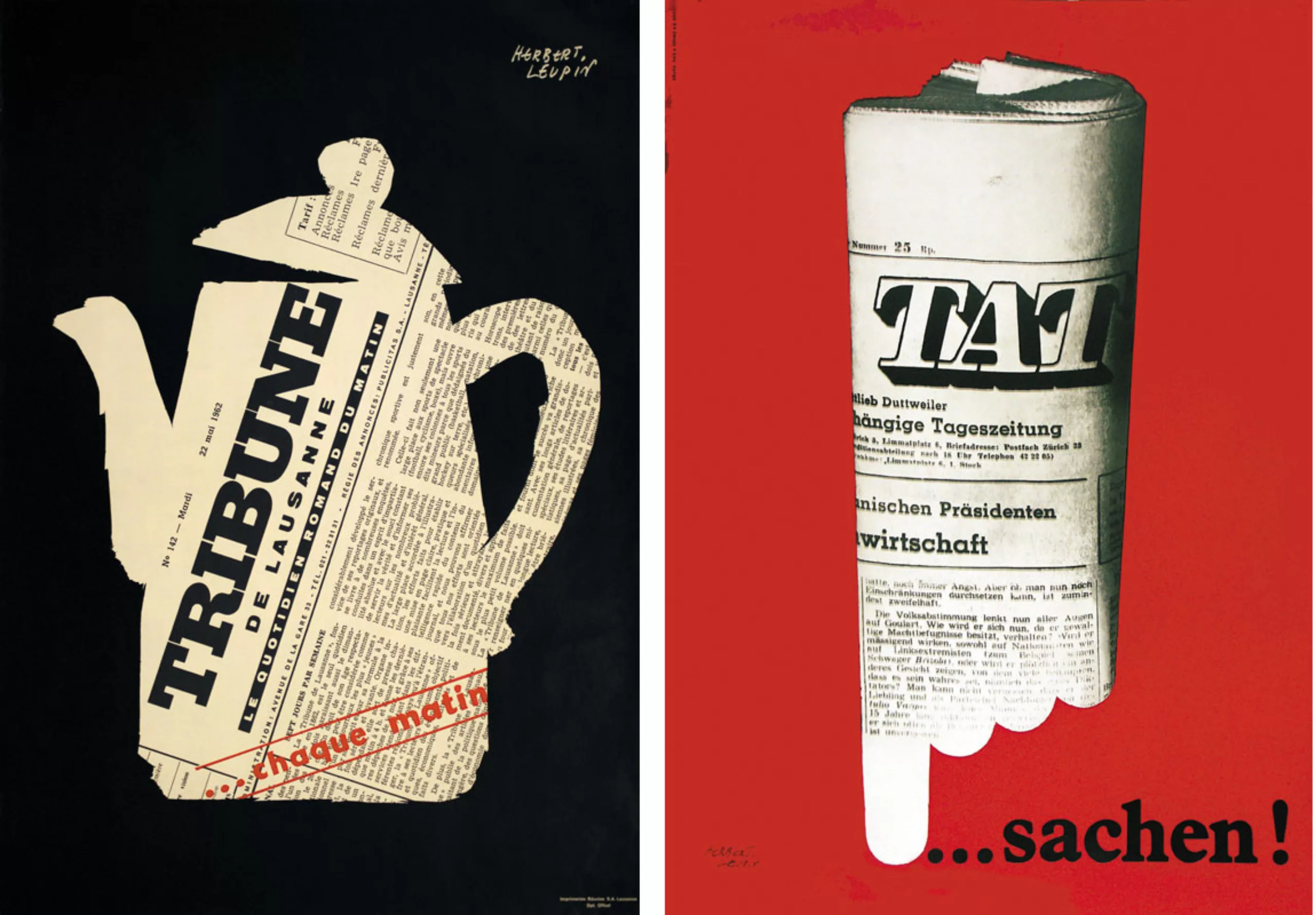
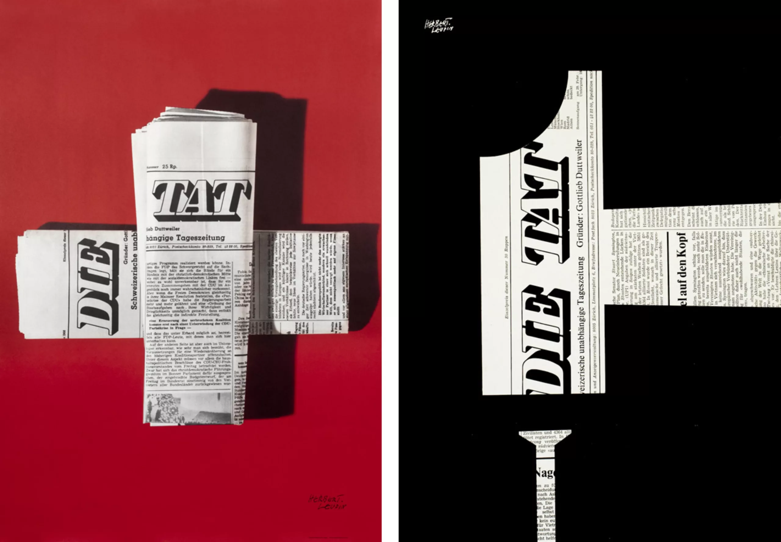
We have all read and enjoyed either the stories or the funny stories that graze the pun: “Ross” like the cigars “Rössli”, “E” like the water of “Eptingen”. We’ve solved riddles, deciphered riddles, pulled some vanities from our trick. Who would not have understood instantly by seeing the wool glove with holes showing a finger showing “Trix”, or the coffee maker cut out in a “Tribune de Lausanne”, and, even more striking this twisted sign indicating “Danger” (… “it would have been better to drink it” Eptinger”…).
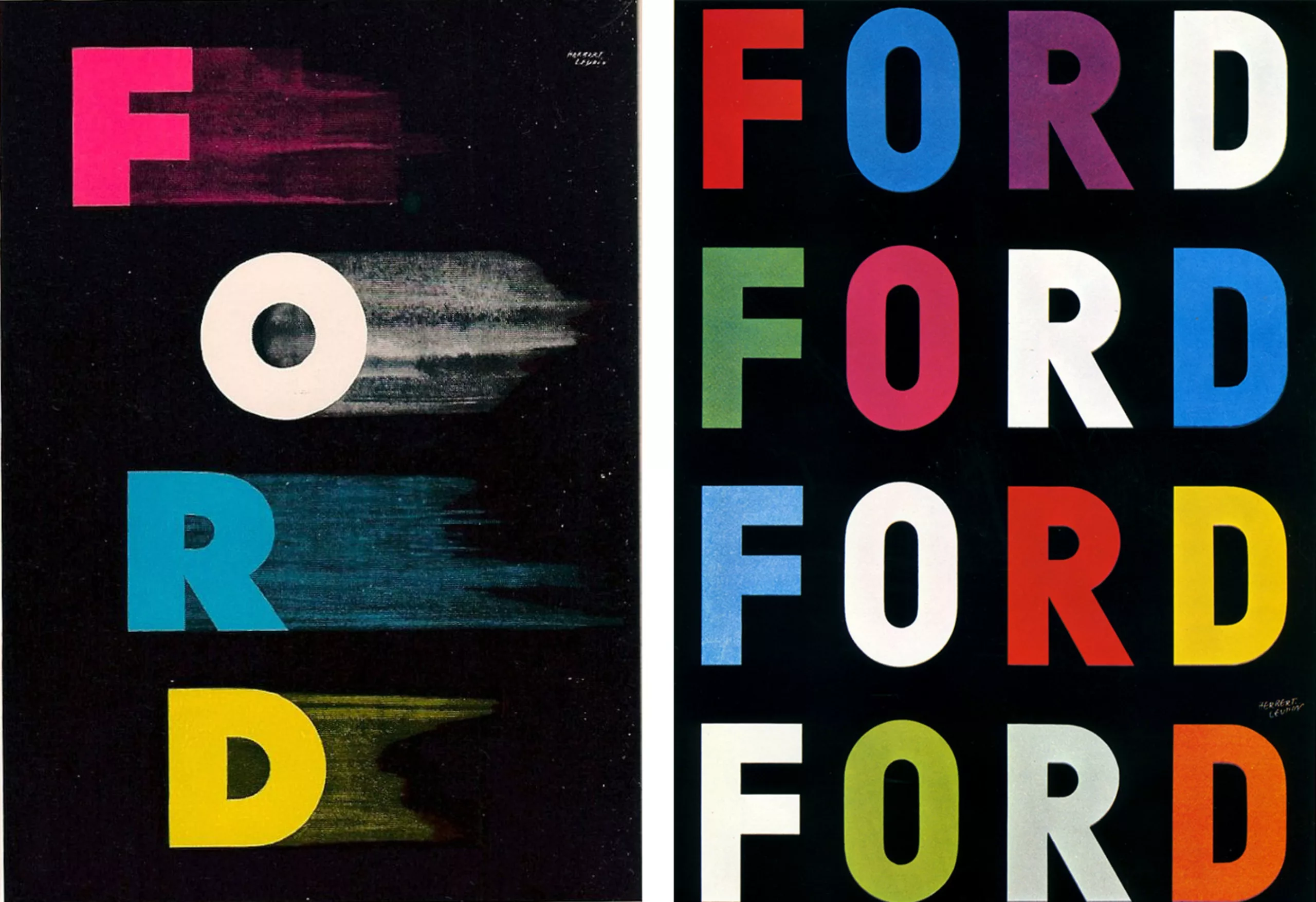
In the meantime, we have turned into motorists, experts in the field, we understand the specifically graphic expression: “F.O.R.D.” (in the text, the advertising effect should imply a whistle after each letter to give the impression of speed : F -pst ! 0 -pst ! R -pst ! D -pst ! A prolonged hiss that splits the air like a “Ford”). And, it is with complacency that we tried, while waiting for the red light to pass, to count on another advertising panel how often we could form the name “Ford” in coloured letters, vertically, horizontally or diagonally… We were accomplices.
Everywhere, in the most uncertain of worlds, on this racecourse that we call a shopping centre, in the no man’s land of underground passages, in the solitude of the suburbs where forsythia flowers, each time we let ourselves be distracted and impressed by Herbert Leupin. Behind the wave of “posters”, there is a feeling that refuses to continue to be complicit. At the same time, this feeling is shared by the artist. While the generation of “posters” tries to fight against this complicity imposed in hue and dia from Monday morning to Sunday evening in a frenzied commitment, Herbert Leupin always turns more and more to his Pierrot, who therefore appears to be disengaging.
The careful examination of the posters of the last fifteen years shows how much the character of clown, to whom he has been called, has gradually changed character: he is less and less silly clown and more and more Pierrot mute. Herbert Leupin took his Pierrot as his theme for the propaganda for his solo exhibition at the Museum of Decorative Arts in Basel, in a calm attitude, the most immobile represented so far.
In the tumult of the crowd, at the entrance, we heard: “Will all the posters in this exhibition present the same reading difficulty?” On the other hand, the colleagues of the concrete tendency congratulated him (it was perhaps the first sincere praise) for the happy integration of the text and the image in the poster.
The clients who entrust Herbert Leupin’s posters with the advertising of their products and who are the most satisfied are first and foremost those who desire the artist’s personal expression.
“Personal expression is undoubtedly the highest degree to which a director in graphic art can claim. I explain myself: for an artist, in a general way, success is to remain faithful to oneself.”
For more information: www.herbert-leupin.ch
Sources: The images in this article are presented for educational purposes.
On the subject
-
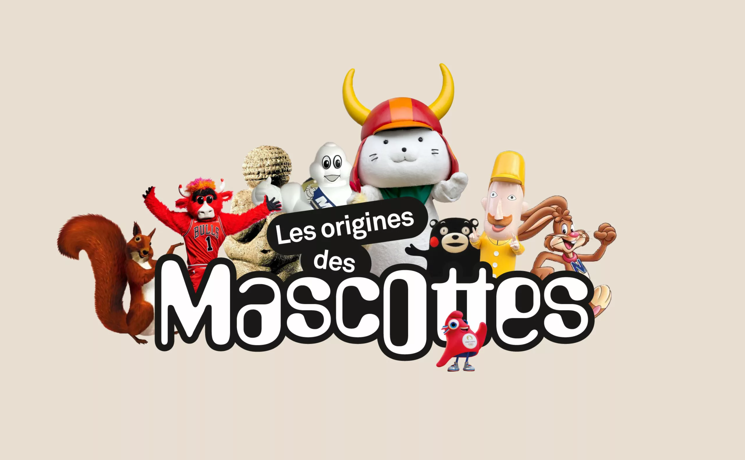
A history of mascots
Mascots, those soft, slightly silly characters, are nothing new. Here’s a look at their origins, from Antiquity to Japan.
-
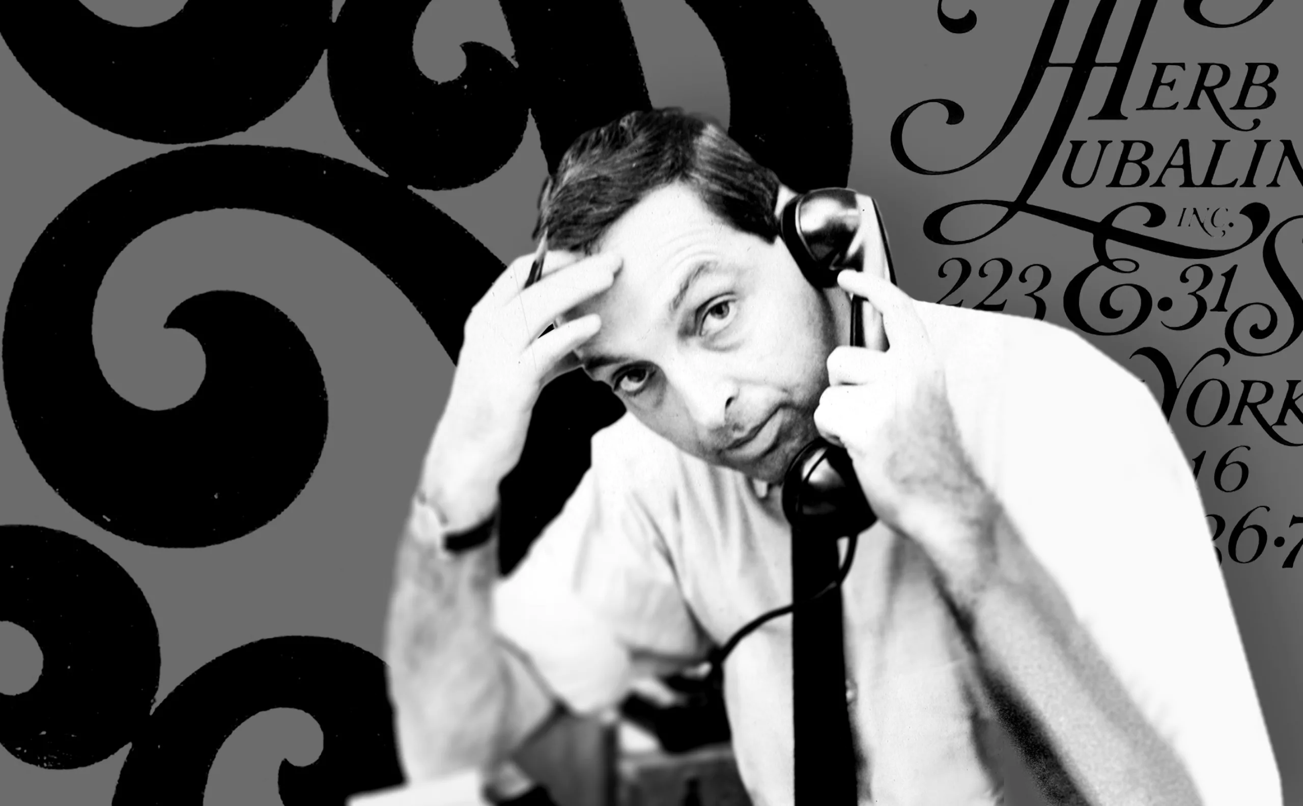
Herb Lubalin, the letter as an image
Herb Lubalin’s biography in pictures. In his 40-year career, Lubalin has revolutionized the landscape of American graphic design by composing images with text.
-
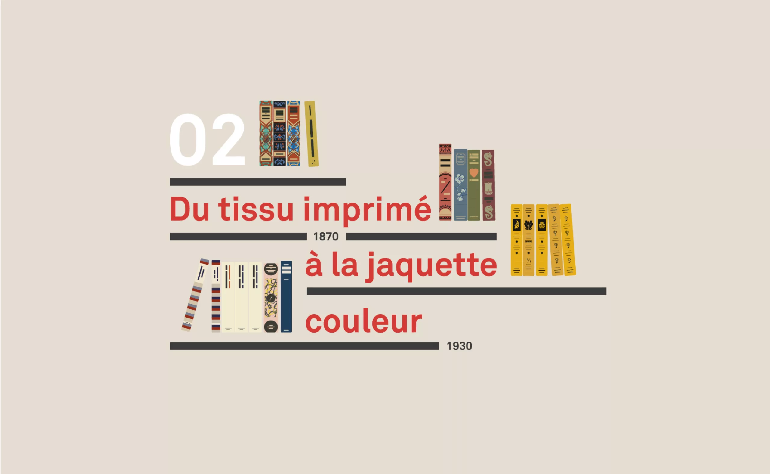
A short history of book cover design – 2/4
Under the influence of Japan, France or Russia, book covers are constantly evolving with technical progress and crises.