Design Biennial 2013
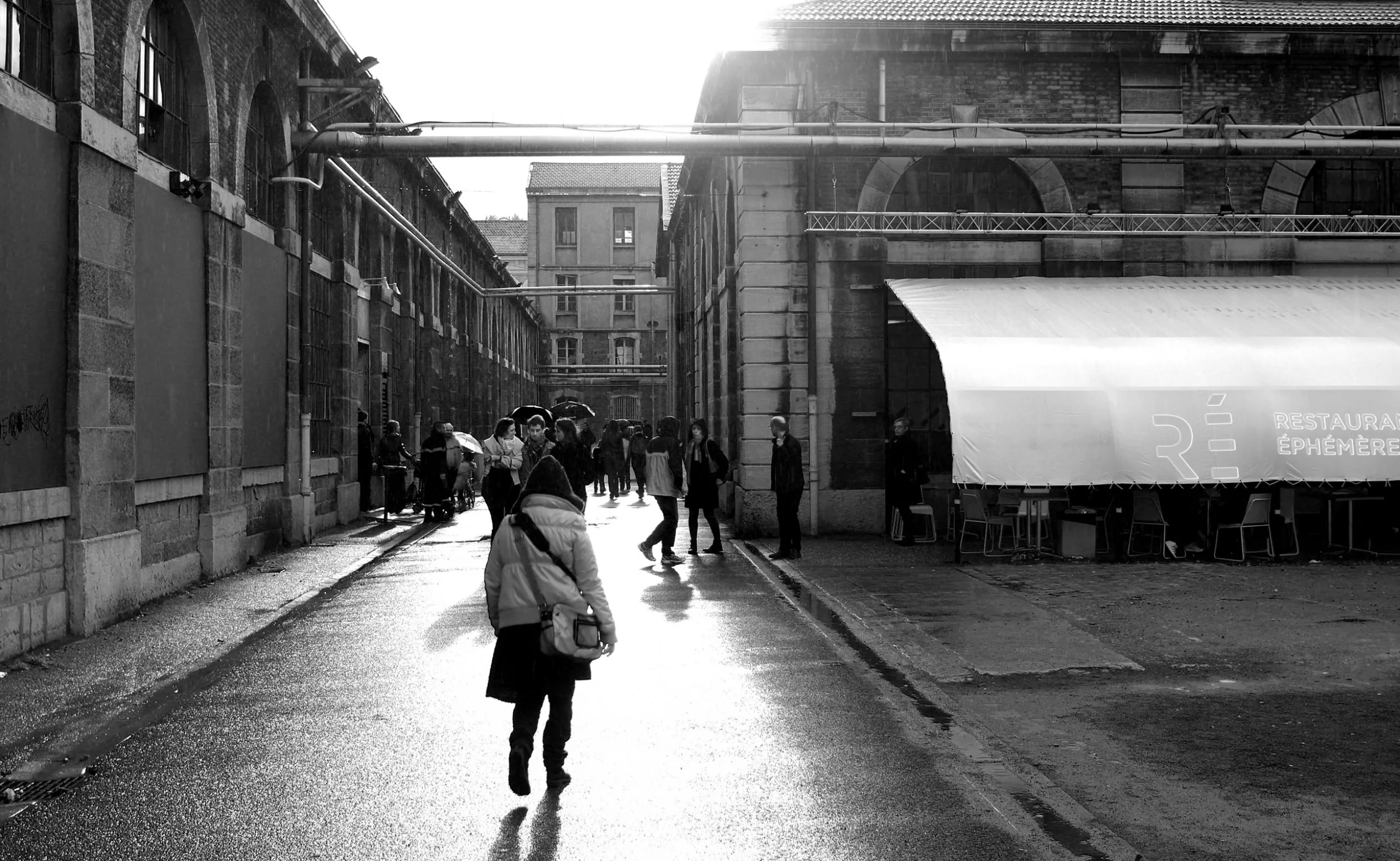
In a previous article, we told you about the work we did for the Saint-Étienne Design Biennial, so it was a must to take a look and bring you back some images !

Obviously, it’s difficult to give you an exhaustive account of this event, which brings together several hundred exhibits all around Saint-Étienne, let alone when visiting it with two little girls aged 3 and 5! In this context, I can already announce the 2013 design prize awarded by them: the Barbie-Foot ! (“baby-foot” is French for table football)
Le Barbie foot
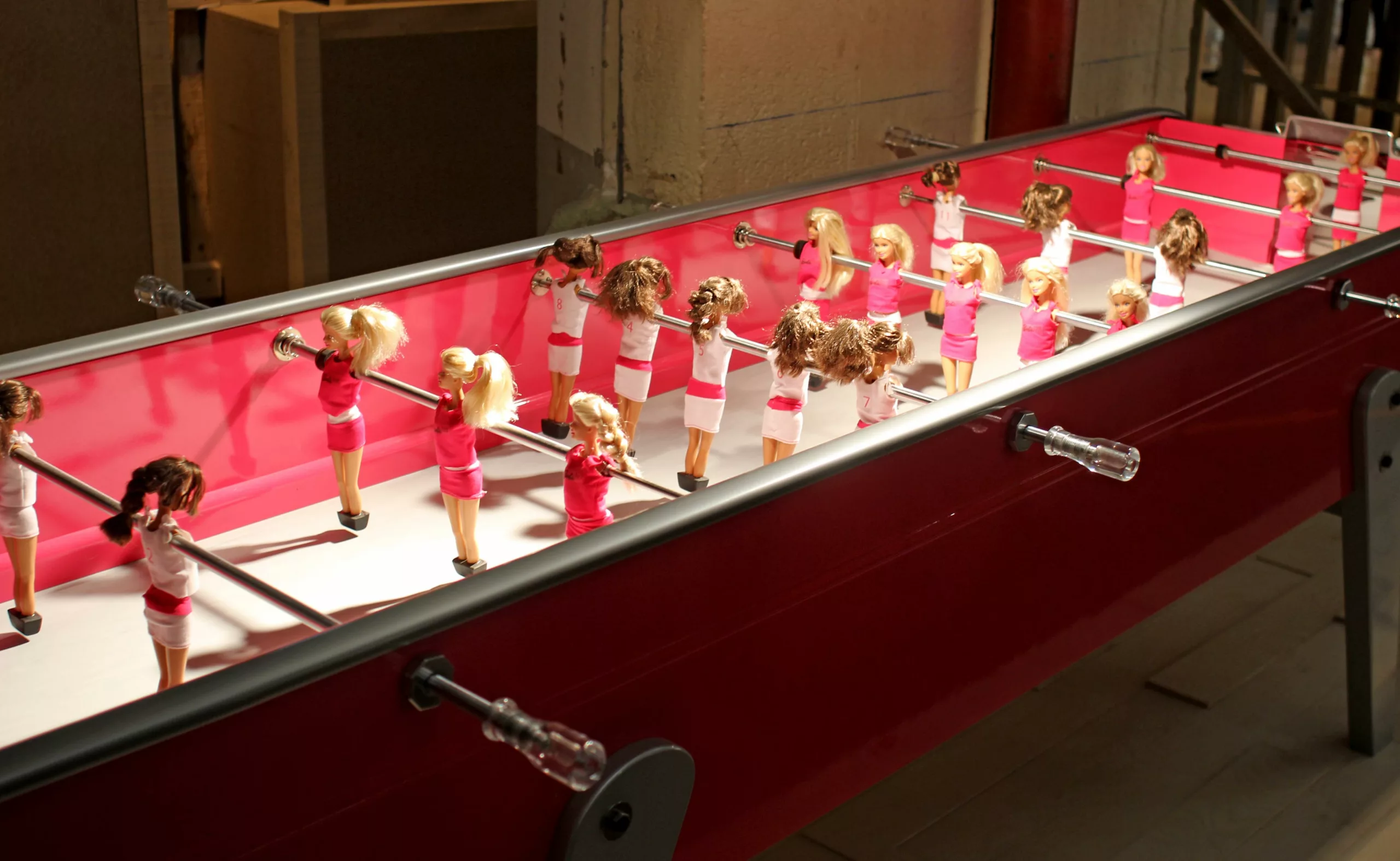
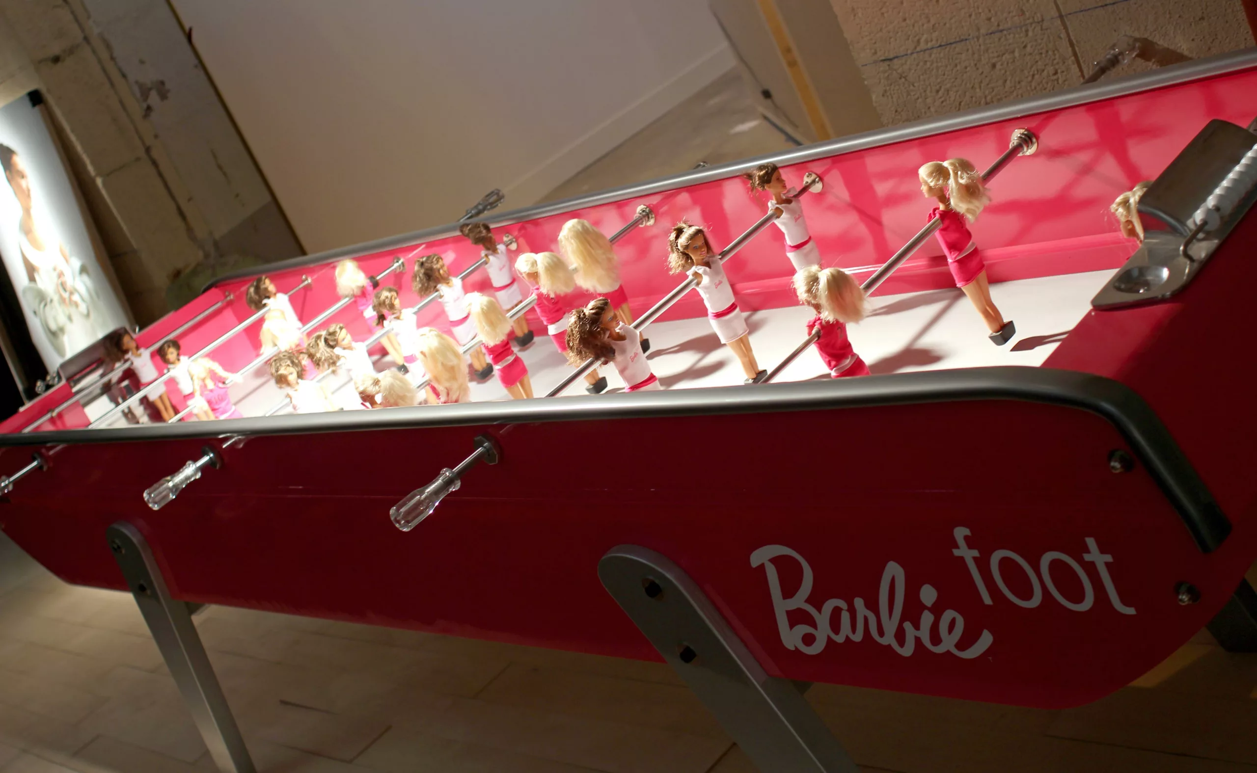
Barbie Foot is a foosball table in which the soccer figurines have been replaced by Barbie soccer players. This object unites two universes in a single object. On the one hand, the pink world of Barbie, a little girl’s game but also a world of seduction and ultra-femininity, and on the other, the virile world of sport. Behind this play on words, there’s an object to reflect on our mentalities and the codes of our society. ( http://www.chloeruchon.com/barbie-foot )
Zapping design
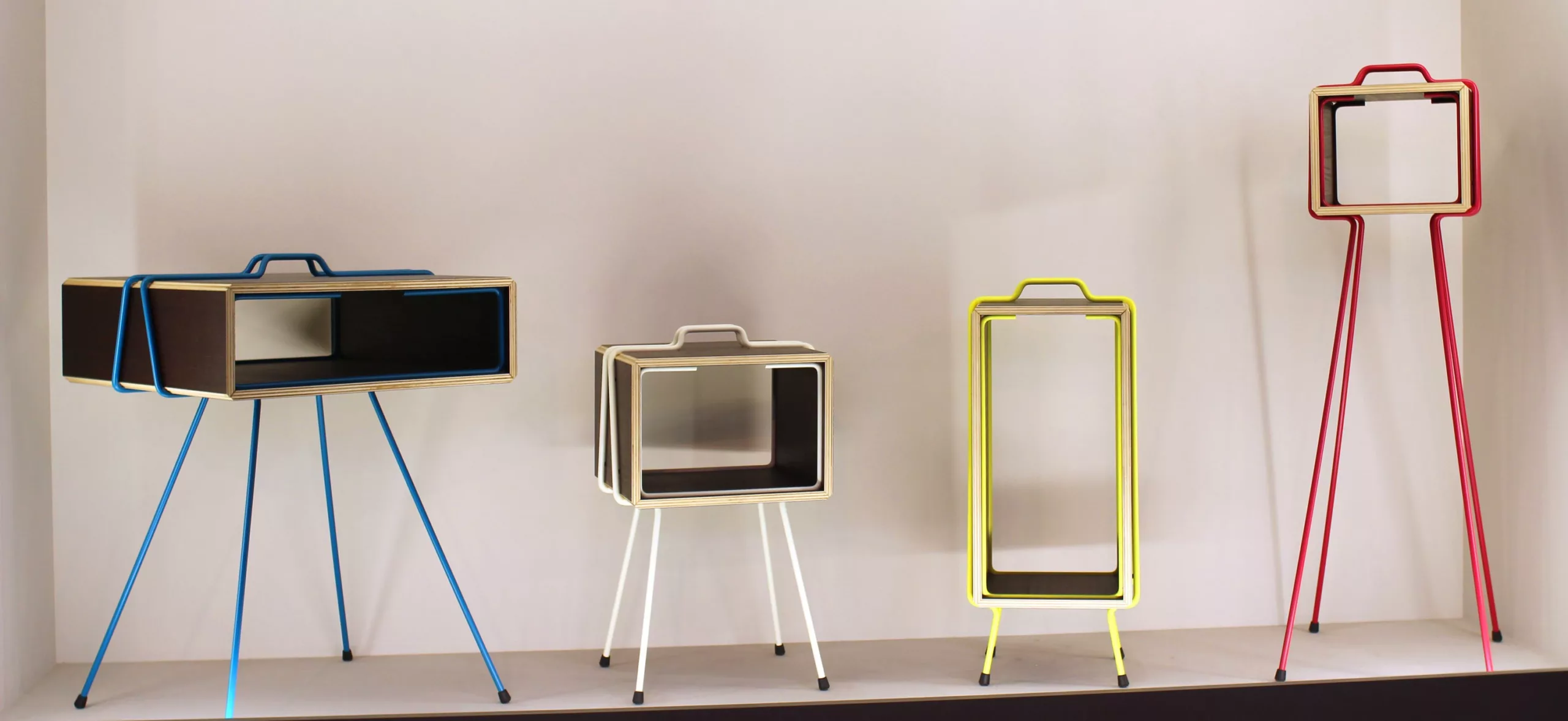
This series of furniture is called Les frères Plo. They were conceived by Gaspard Graulich as a family of companion furniture. A simple interlocking system, bright colors and friendly proportions, to bring a little lightness and personality to our interiors.
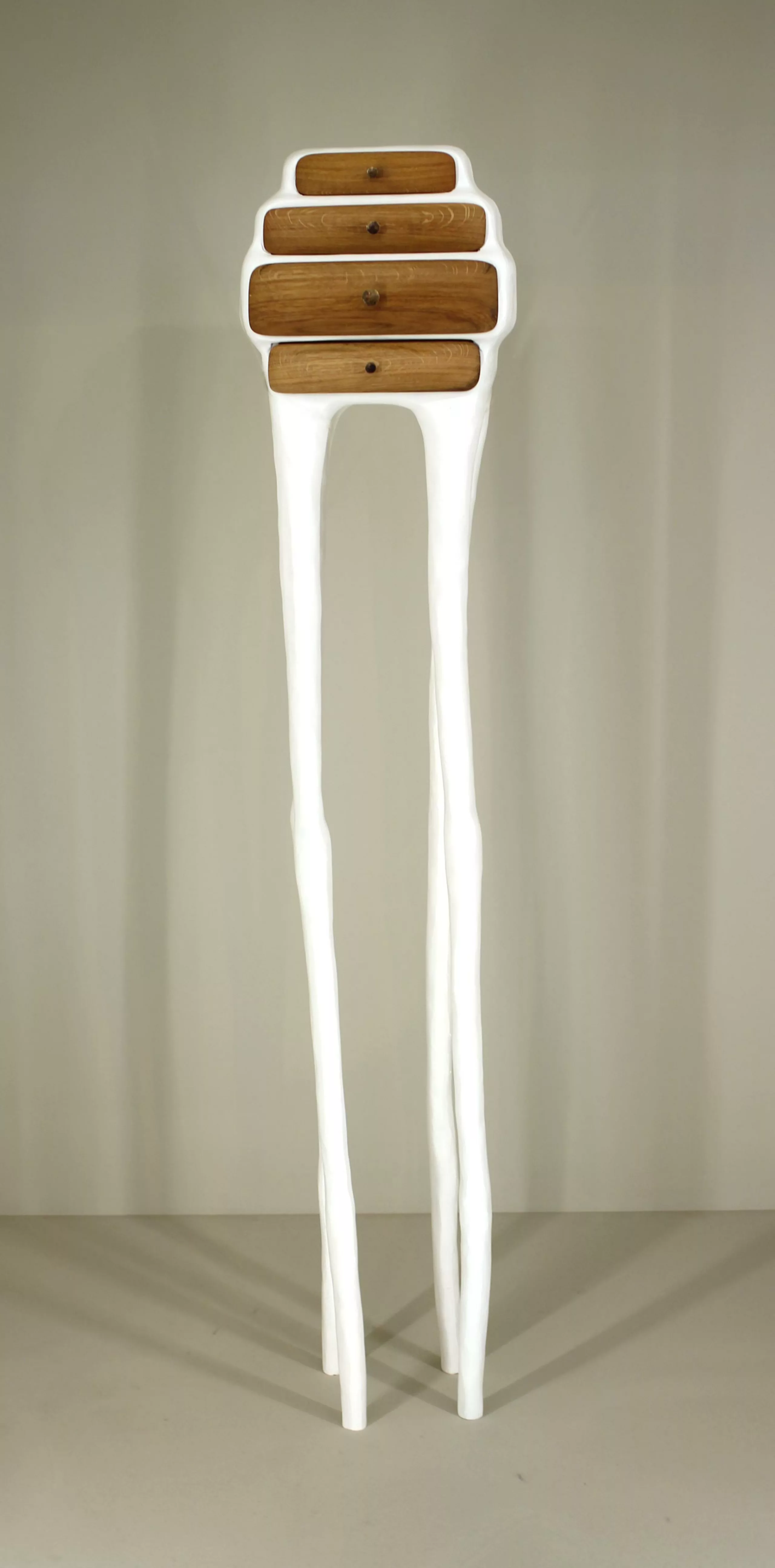
With his fluid lines and spontaneous shapes, young German designer Valentin Loellmann creates furniture like living organisms. The pieces are handmade from ancient bankirai wood reinforced with a polyester skin.
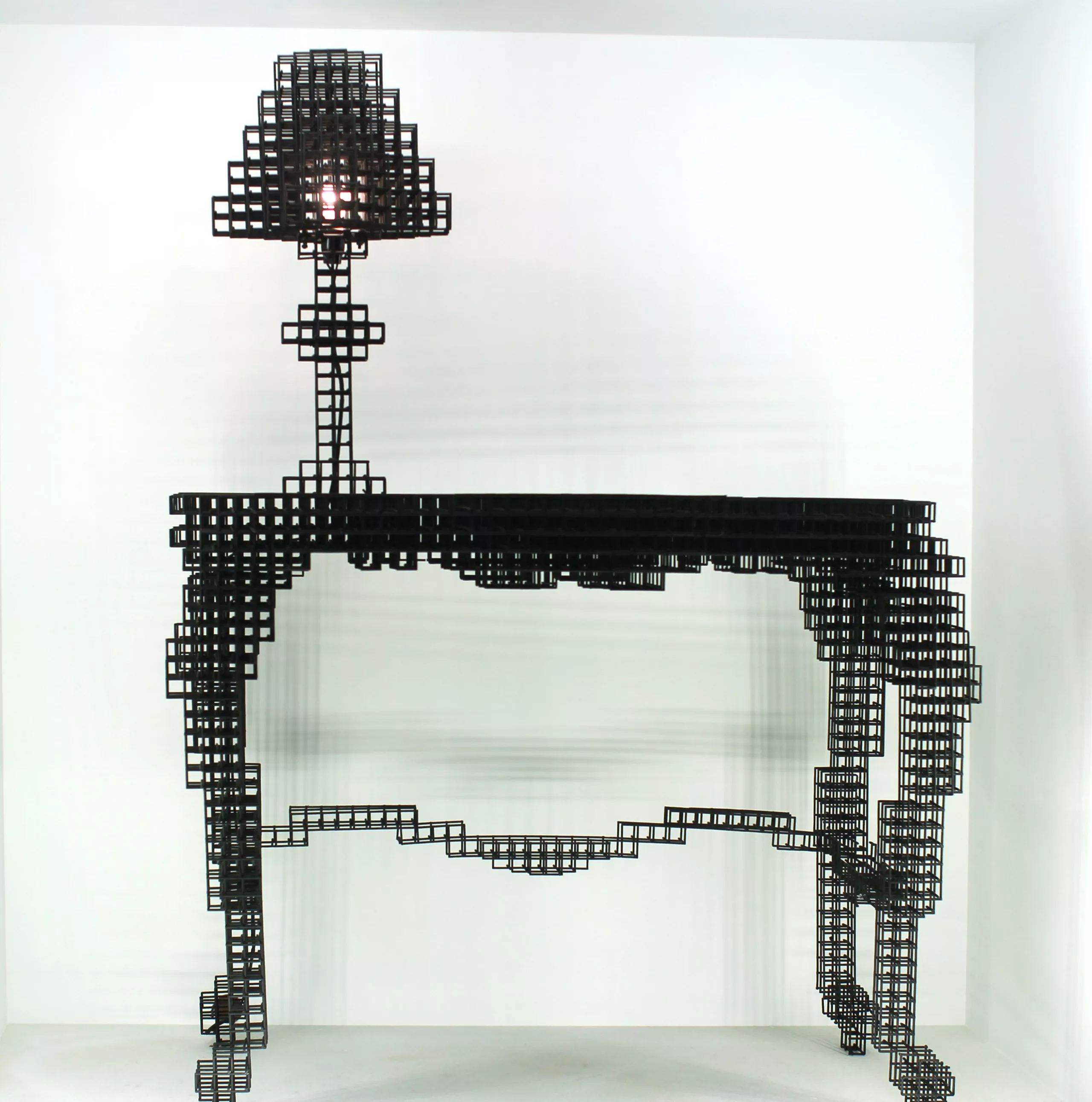
Korean designer Bomi Park has created a collection of furniture entitled “Afterimage furniture”. His work refers to optical illusions and pixel art. His objects change and transform depending on the viewing angle. A design that would be right at home in Minecraft !
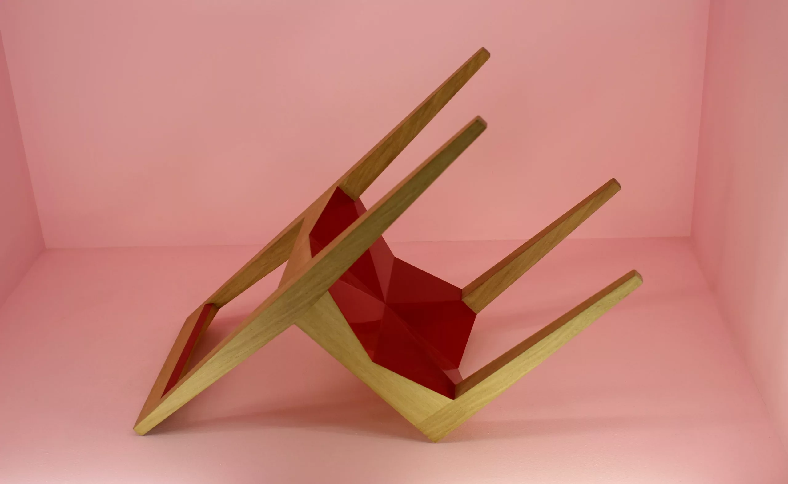
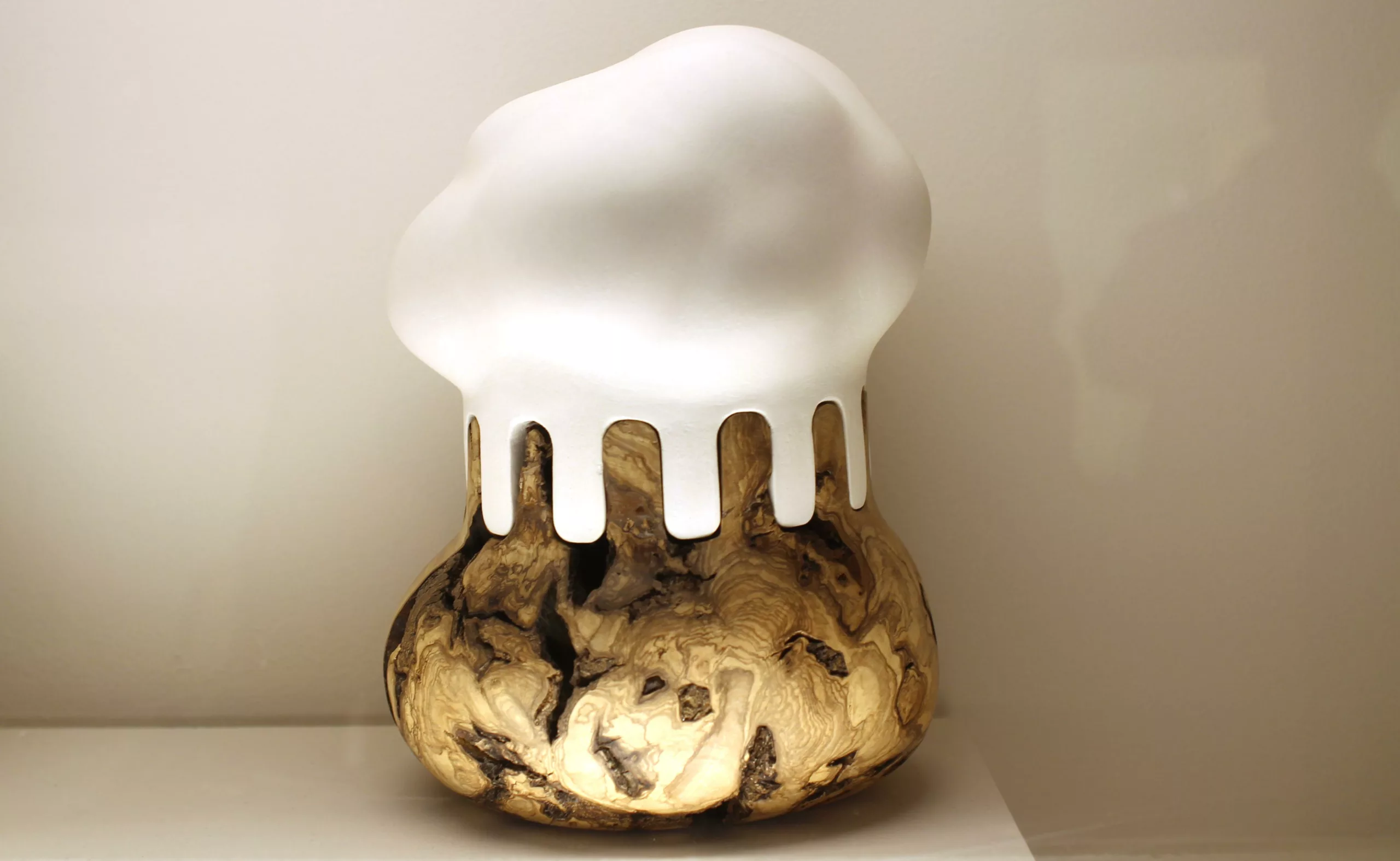
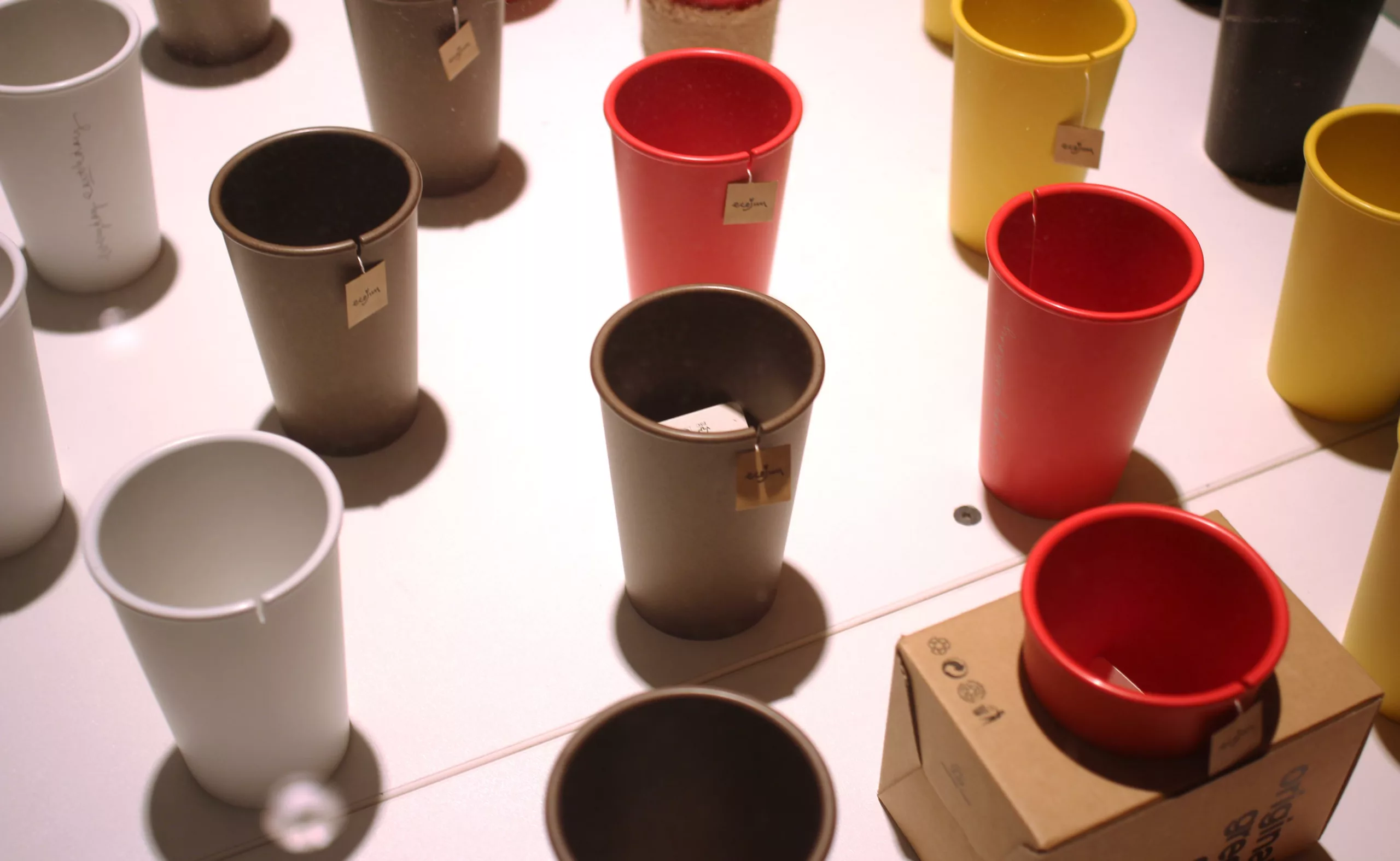
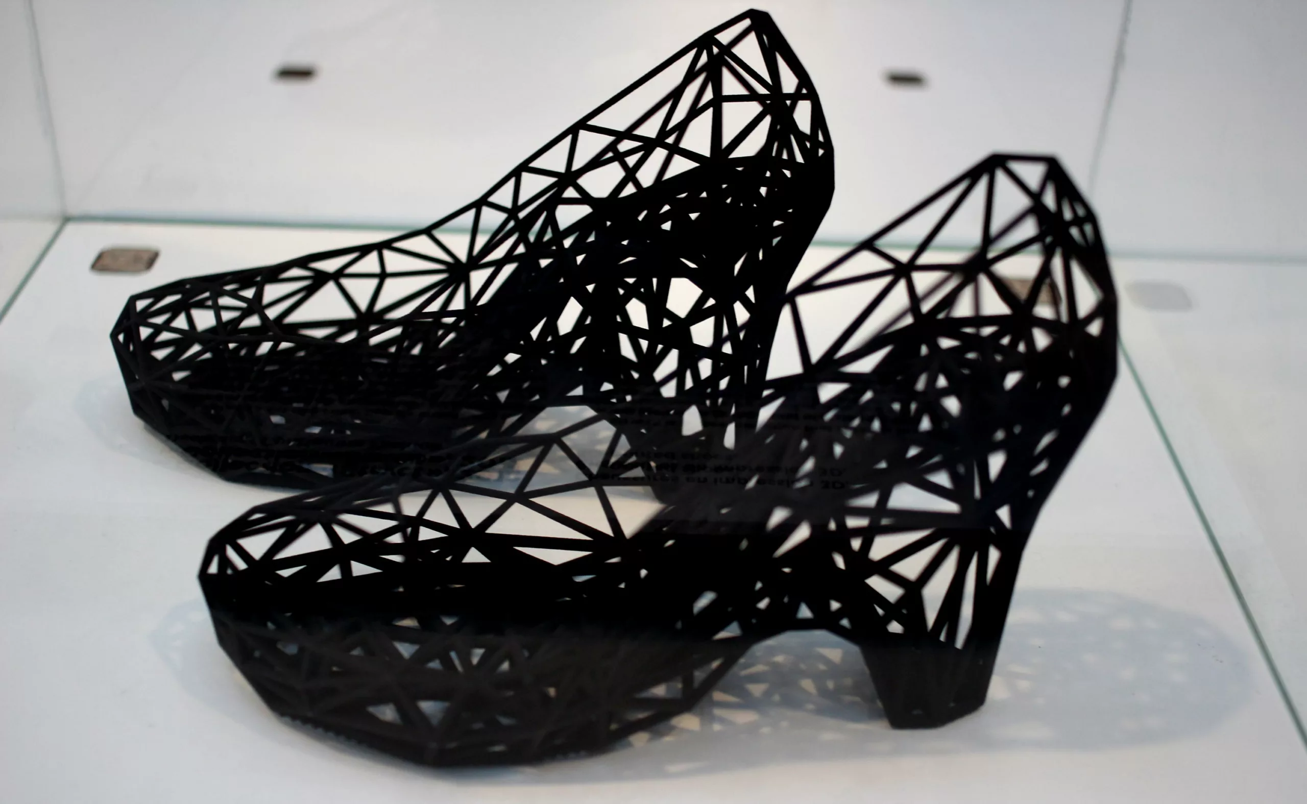
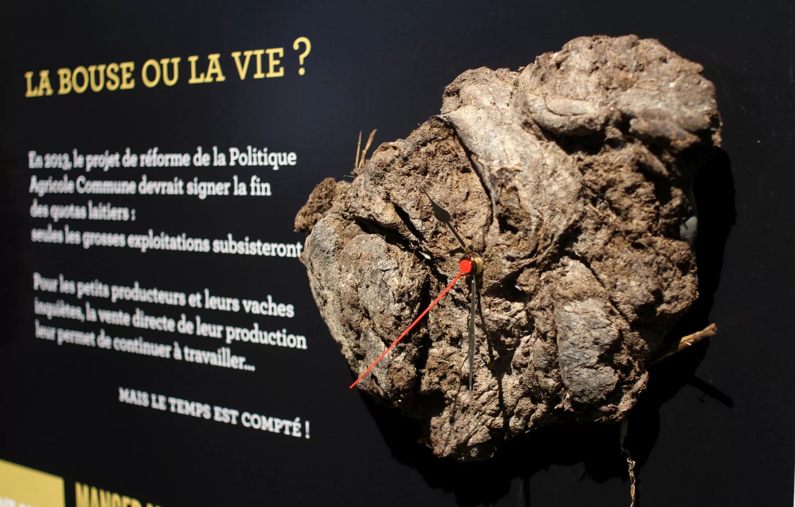
Dung or life : A dung clock concocted by designer Guilhem Chéron, founder of La Ruche qui dit Oui, a satirical project denouncing the reform of the Common Agricultural Policy… because there’s not a second to lose !

Of course, in another genre, there are a few concept cars… cars of the future… always chrome-plated and gleaming… But why does automotive design have to be flashy? … This is confirmed by the fact that car brand logos are all chromed from head to toe !
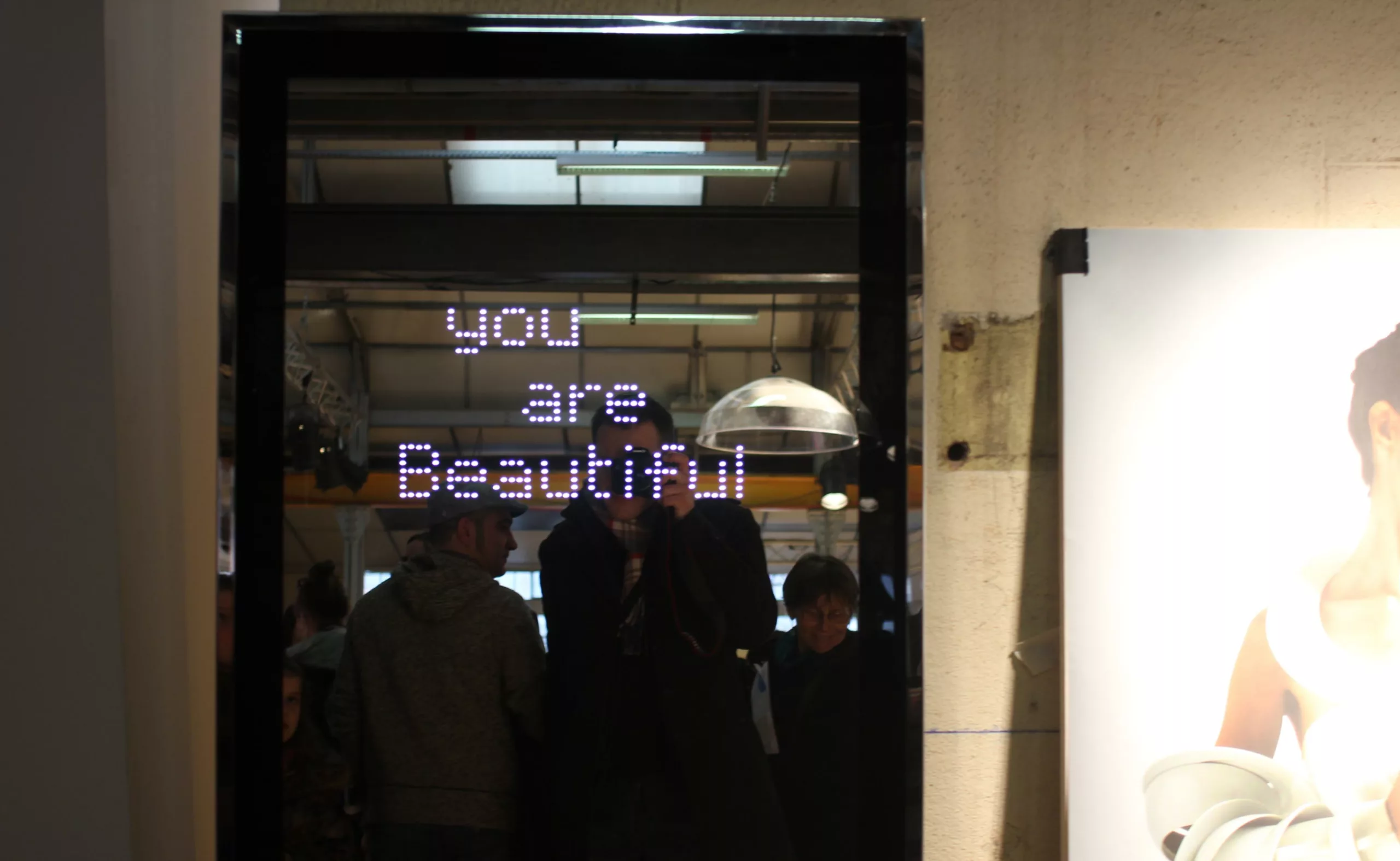
More poetic is the mirror used by Snow White’s Evil Queen to tell you whether you’re beautiful or not !
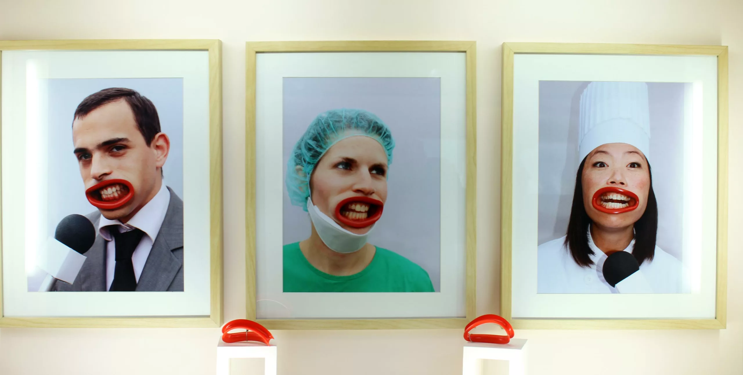
A former student at the École supérieure d’art et de design in Reims, Sascha Nordmeyer still lives and works in the Cité des Sacres. His prosthesis is placed in the mouth, forming a single face, or almost, for all those who wear it. “It’s something conceptual that evokes human nature, where everyone is preoccupied with appearance, explains Sascha Nordmeyer. It’s an opportunity to denounce, in a humorous way, hypocrisy and waffle” through this object, which is like a mask, a grimace.”
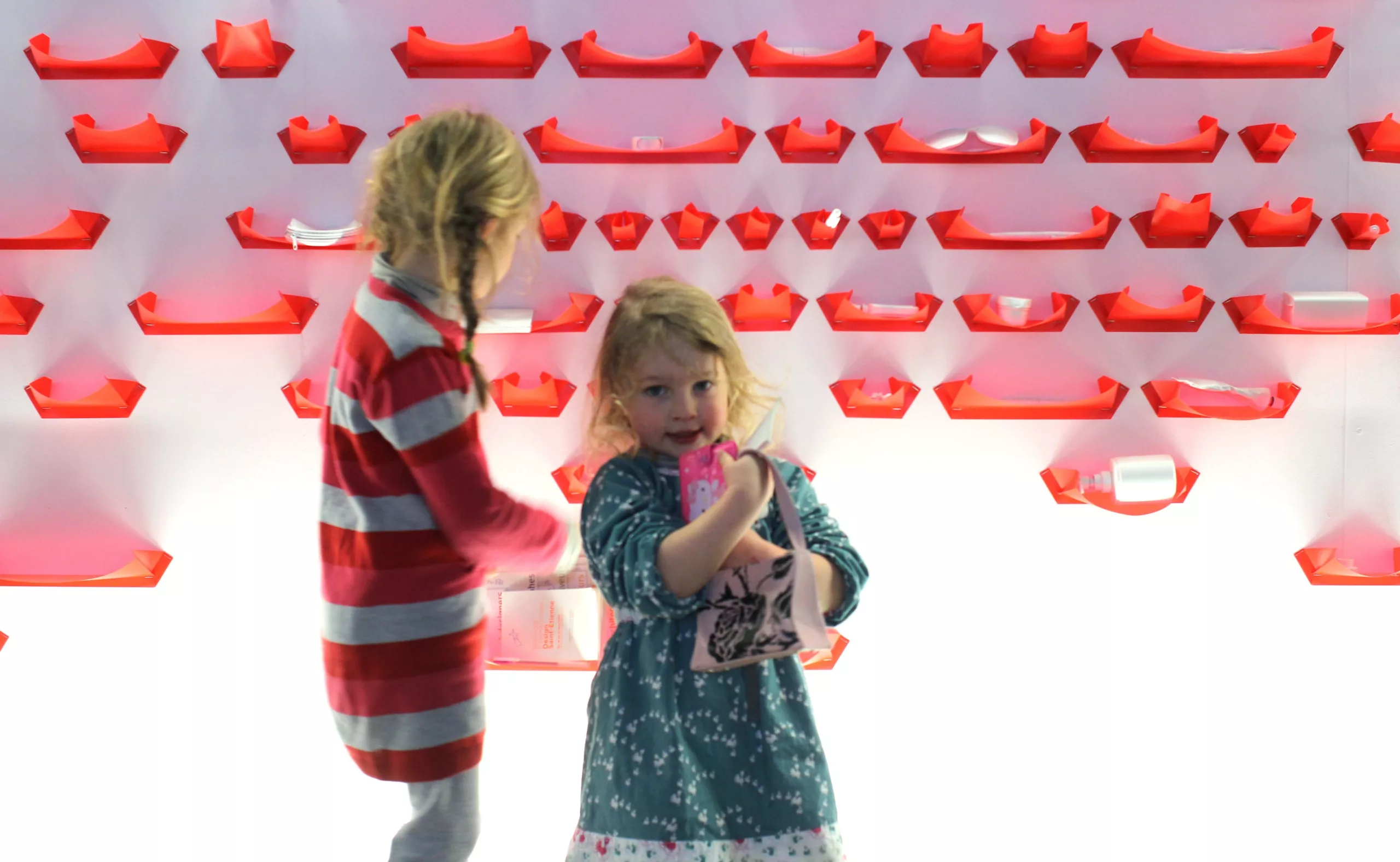
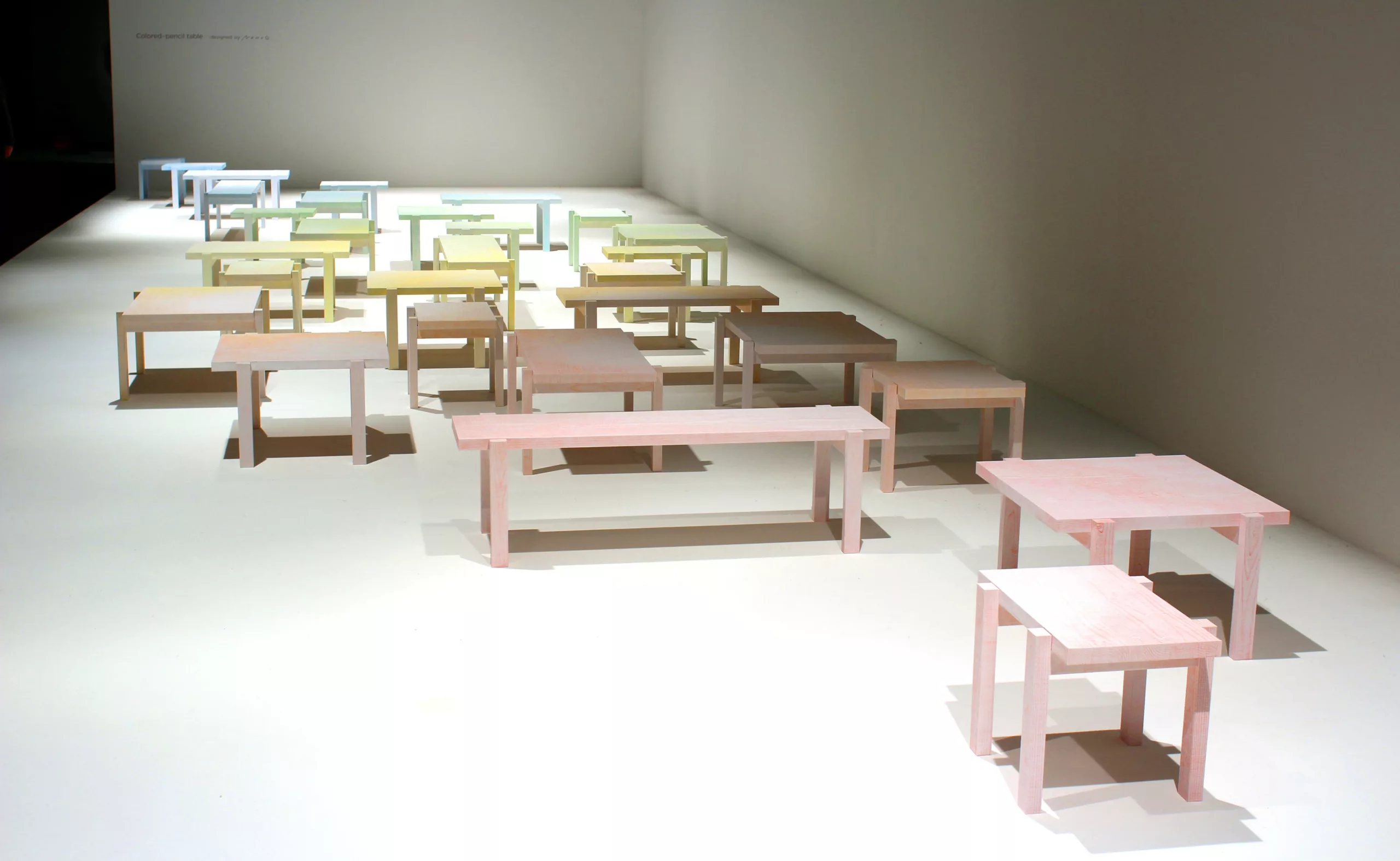

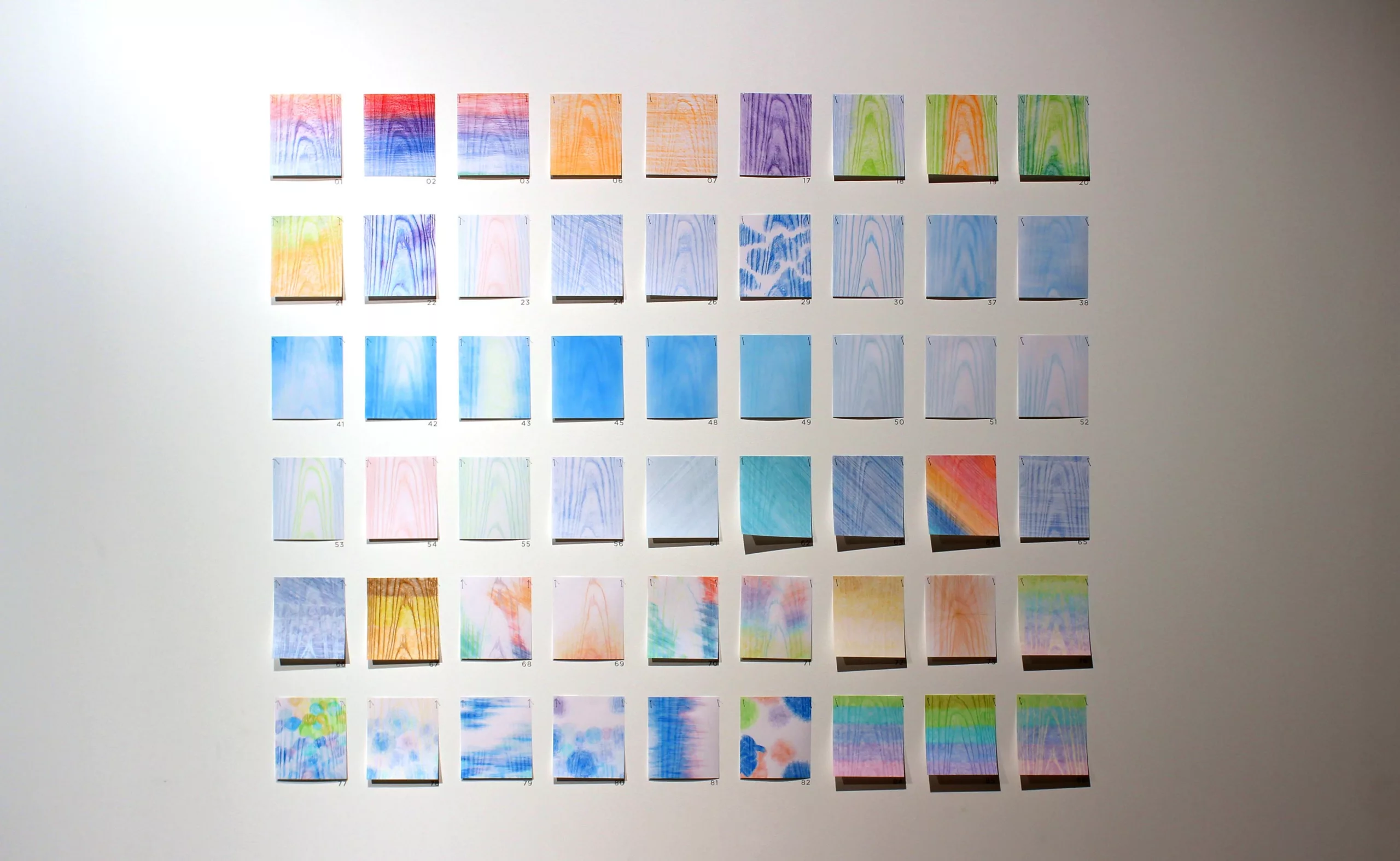
As part of its carte blanche program, Japanese studio Nendo has created a project that resembles a contemporary art installation. It comprises some thirty tables arranged in a gradation of colors, diagonally across the exhibition space. The furniture is made using a technique we call “udukuri”, which involves hollowing out the cypress tops of the tables to bring out the wood grain. The relief of the tops is then transferred in pencil to the paper covering them. This creates a surprising juxtaposition between the color of the pencils and the wood grain, which is highlighted. It is, according to Nendo, a glimpse of the furniture of the future through the manipulation of a surface texture.
Type in process
The poor relation of this Design Biennial is unquestionably graphic design ! In my opinion, all forms of design should have their place in this Biennial, but instead we come across almost exclusively product design. So it’s hardly surprising that, for the average person, the word Design has the narrow meaning of “pretty, useful objects” !
Design can be information design, service design, interface design, product design, textile design, graphic design, space design…
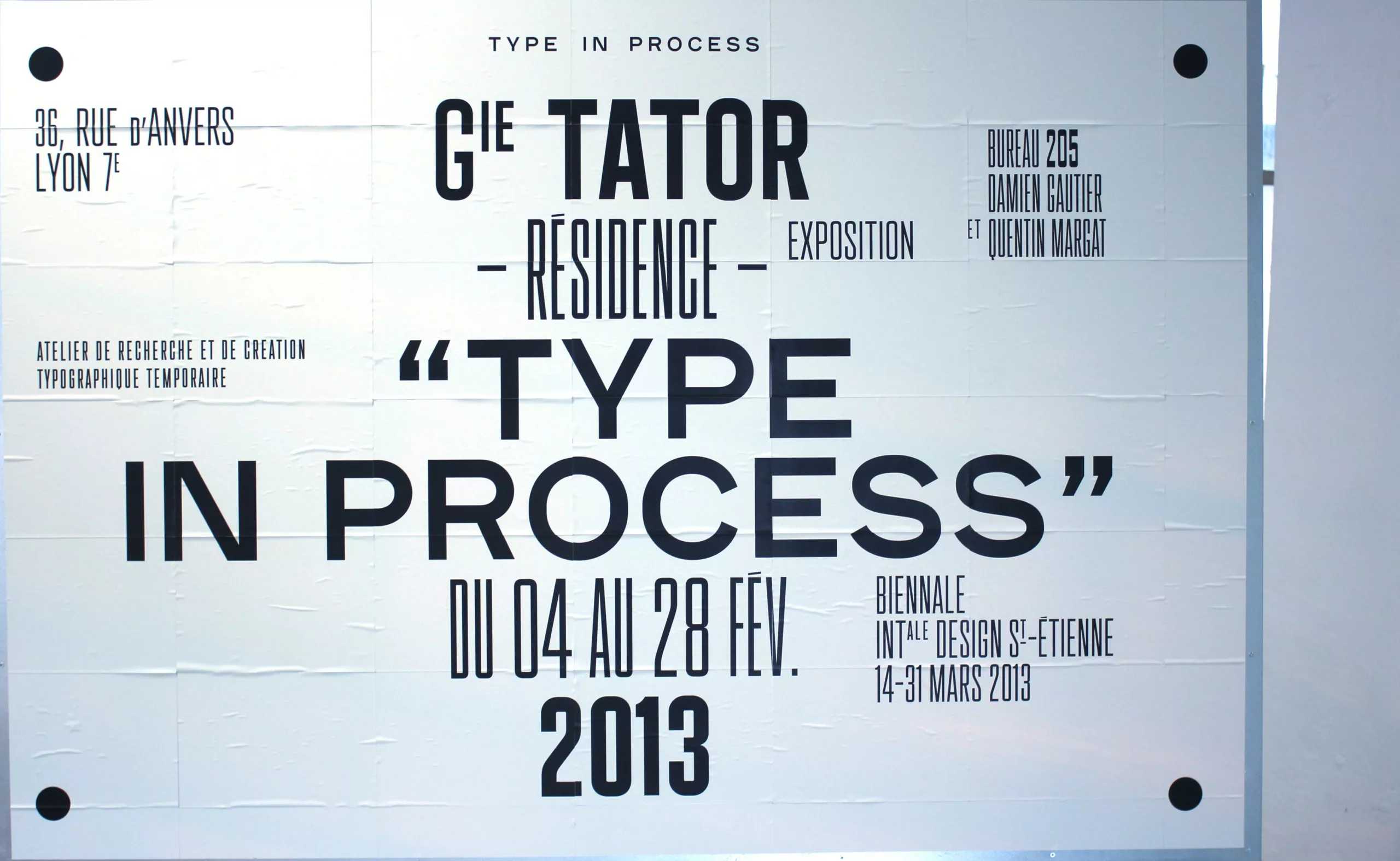
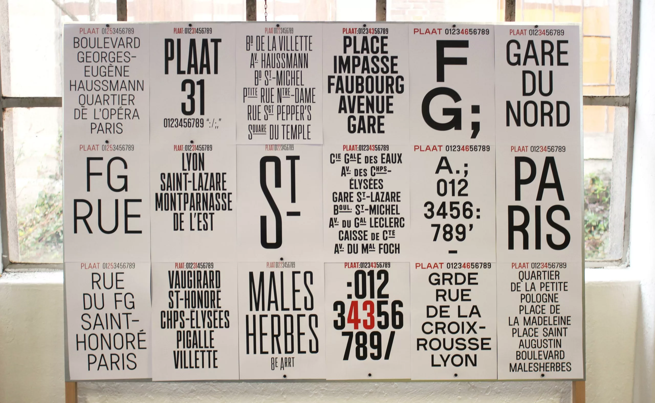
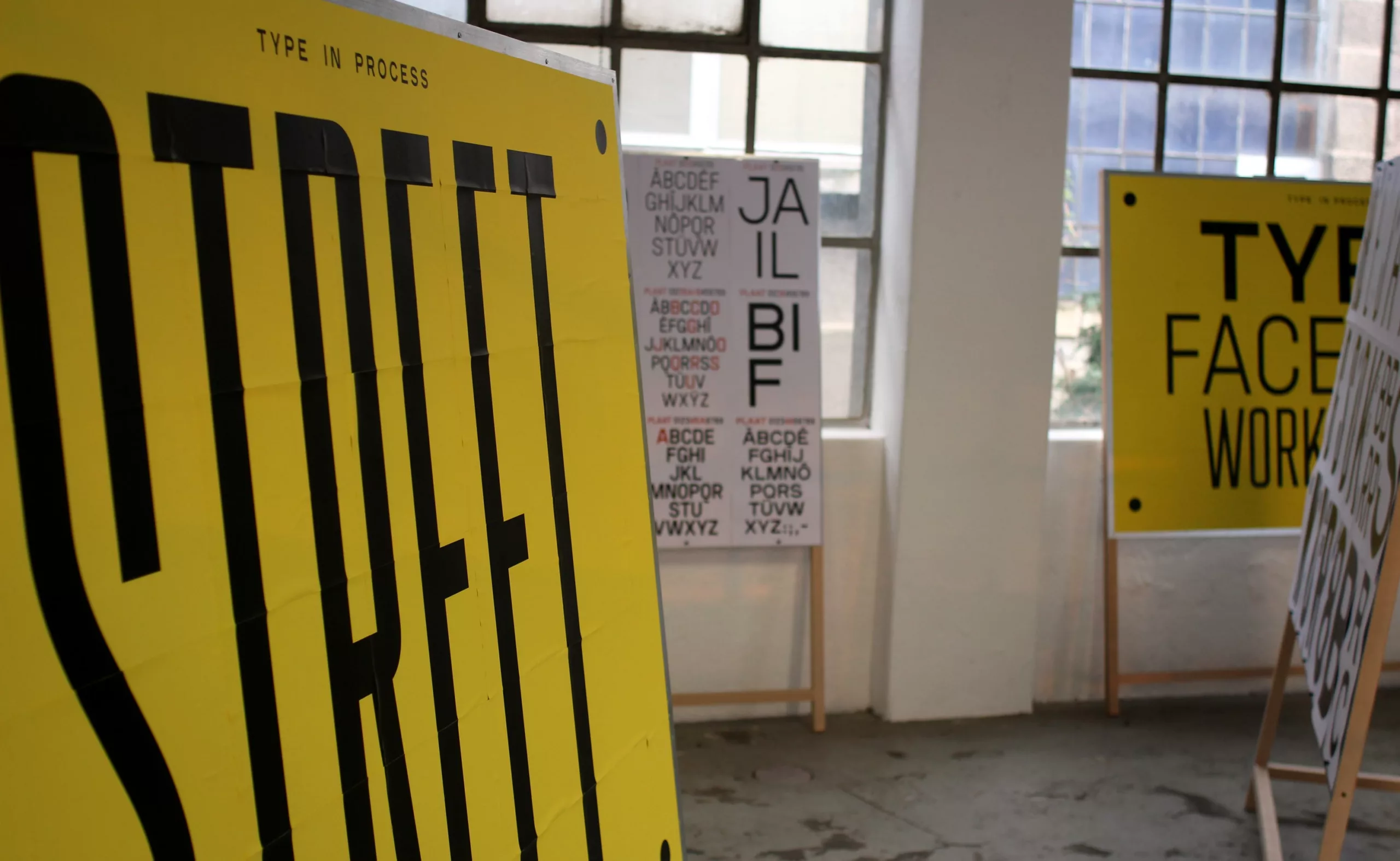
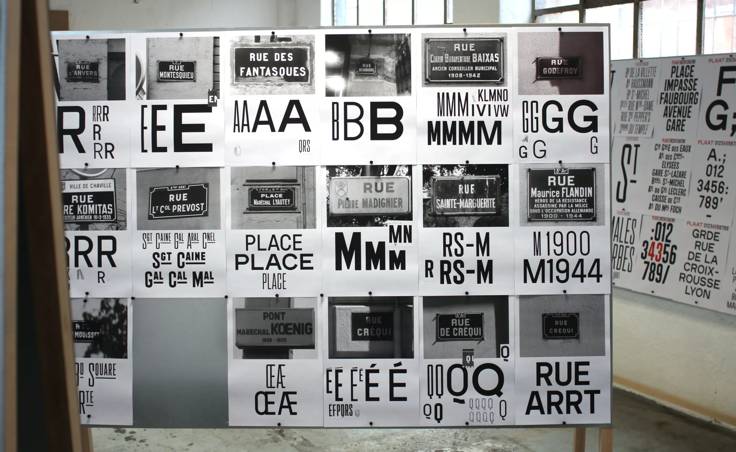
Fortunately, the “Type in Process” exhibition was there to save the day. This exhibition presents the work of Damien Gautier and Quentin Margat, who have developed a typeface based on their observation of the characters found on French street signs. These plaques represent a real typographic heritage that can disappear if we stick to the unmarked plaques installed in new districts, or when urban renewal sees brand-new plaques, with a typography devoid of history, judiciously substituted for the previous ones.
Their ambition was to reveal the typographic specificities of vernacular plaques and to develop a typographic program that questions, on the one hand, the relationship between heritage and the need for inscription in the present, and on the other, the relationship between typography, architecture and urban planning.
Empathy on prescription !
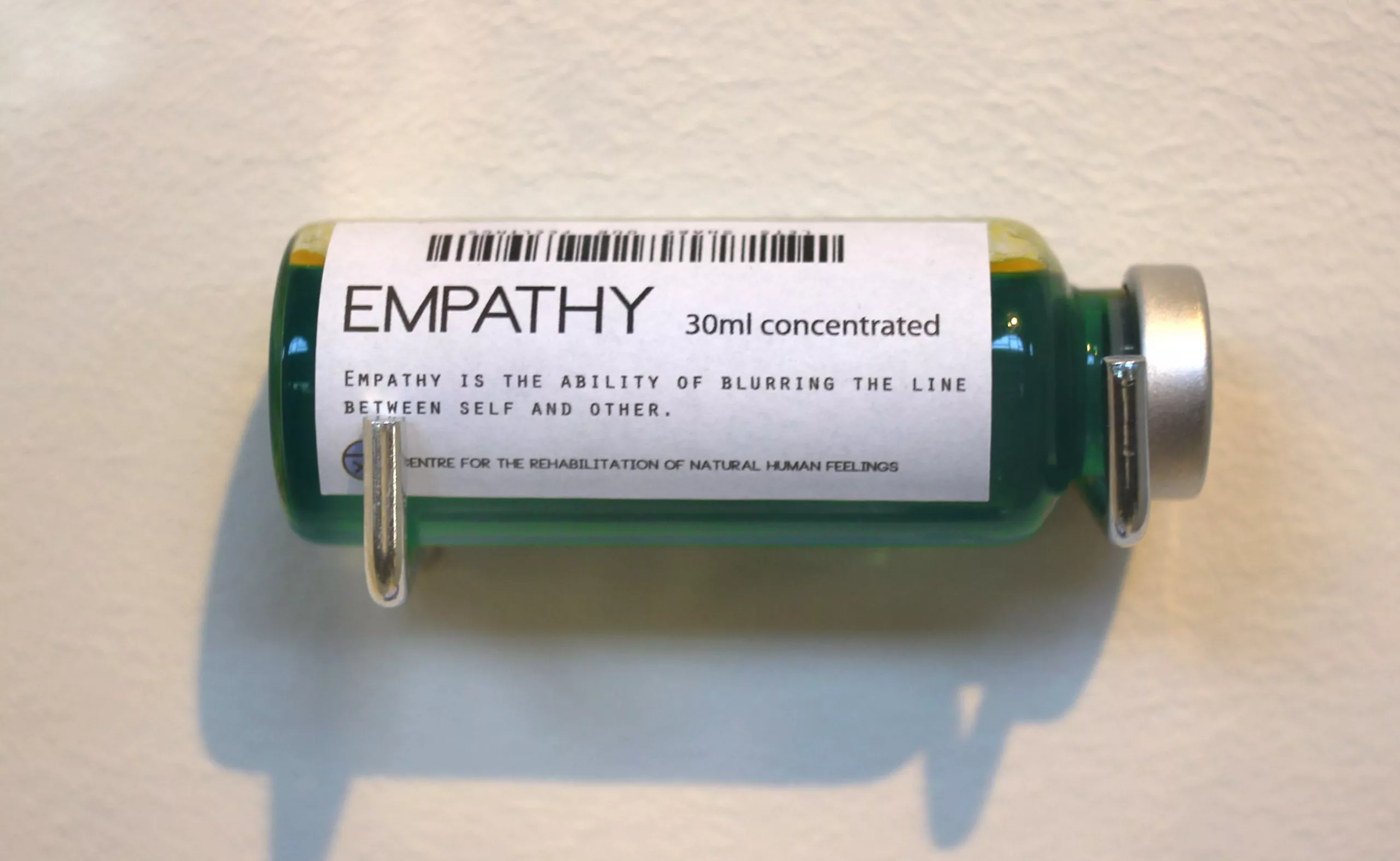
After researching the theme of empathy (the theme of this biennial event!) we finally have the answer: empathy can be dispensed by prescription. Contact us for more information !
We tried to keep track of the designers’ names, but it’s not easy in the busy Saturday afternoon… sorry for any designers whose credits we may have forgotten…
