The smart set of ambigrams, graphic symmetry and word reflections

What is the connection between day and night, GOD and NOTHING, angels & demons? Apart from their seemingly opposite meanings, they are also ambigrams: words that can be read symmetrically. Stay tuned, we’ll explain everything.
In this article, we’ll explain:
- what an ambigram is,
- how to create them,
- where to find them among graphic designers and artists,
- their mysterious origins, and
- which brands have used them to create their logos.
Words with various shapes and meanings
Ambigrams are visual puns in which the letters are written in such a way that they can be read through one or more axes of symmetry. Either the word is an ambigram as it is, like the words CODE (horizontal symmetry) or inoui (rotational axis), which could be called “natural” ambigrams, or, and this is what interests us most, it is created from scratch thanks to the talent of a calligrapher who plays with the letters as symbols of written language.
The term “ambigram” comes from the Latin prefix “ambi” (both) and the Greek suffix “gram” (written). This dual writing can actually be triple or more depending on the graphic talents of the artist; it can be read through horizontal, vertical, or rotational symmetry, offering an original and ambiguous reading experience depending on perspective.
Some ambigrams mean the same thing when inverted (homograms), such as “inoui”, “nu” or “SOS” (which is also an ambigram in Morse code … – – – – …), while others change meaning and are transformed into a new word (heterograms). In Paris, for example, passengers at the Gare du Nord can read “entrée” or “sortie” depending on their direction of travel, thanks to the heterogram created by artist Patrice Hamel in a single inscription (below). The letters, skilfully manipulated, offer two readings from a single word: here, o becomes é, s an e, nt a ti…

To add another layer, hold on tight: homograms can also be palindromes (often confused with them), meaning they are symmetrical and readable from left to right and right to left while retaining their meaning. Some ambigrams are also readable in a mirror (mirror writing).
The variations in symmetry allow calligraphers, graphic designers, and artists to play with the shapes and meanings of words, creating visually intriguing works.
How to create ambigrams
The interest in creating an ambigram indeed comes from the graphic challenge it presents. To create one, you need to consider not only symmetry but also the shape of the letters and the readability of the word in its different orientations. Ambigrams can be constructed with symmetrical letters, relying solely on the options offered by uppercase or lowercase letters, or by playing with the variations offered by typographic families.
B, C, D, E, H, I, K, O, and X are, for example, naturally symmetrical as they are, and b/q, d/p, m/w, n/u, h/y, and a/e become symmetrical by rotation. French words like COCHE, CODE, DECEDE, DECIDE, CE CHOIX can be read through horizontal symmetry or reflected in a lake. AnIME or MAXIMUM can be read vertically, and “antoine,” “un,” or “nounou” are rotational ambigrams that can be read without changing direction after rotation.
The longest known ambigram, “suissesse,” becomes “assassins” with a good choice of typography (here, the Co Headline) where “e” and “a” resemble each other, and after removing the dots on the “i.”

People who create ambigrams often prefer the flexibility of calligraphy, which allows the creation of free forms. Ambigrams allow playing with shapes, colors, and textures, offering a new dimension to writing that can be read as if “in motion,” in one direction or another. Ambigrams can be used to convey hidden messages or create optical illusions.
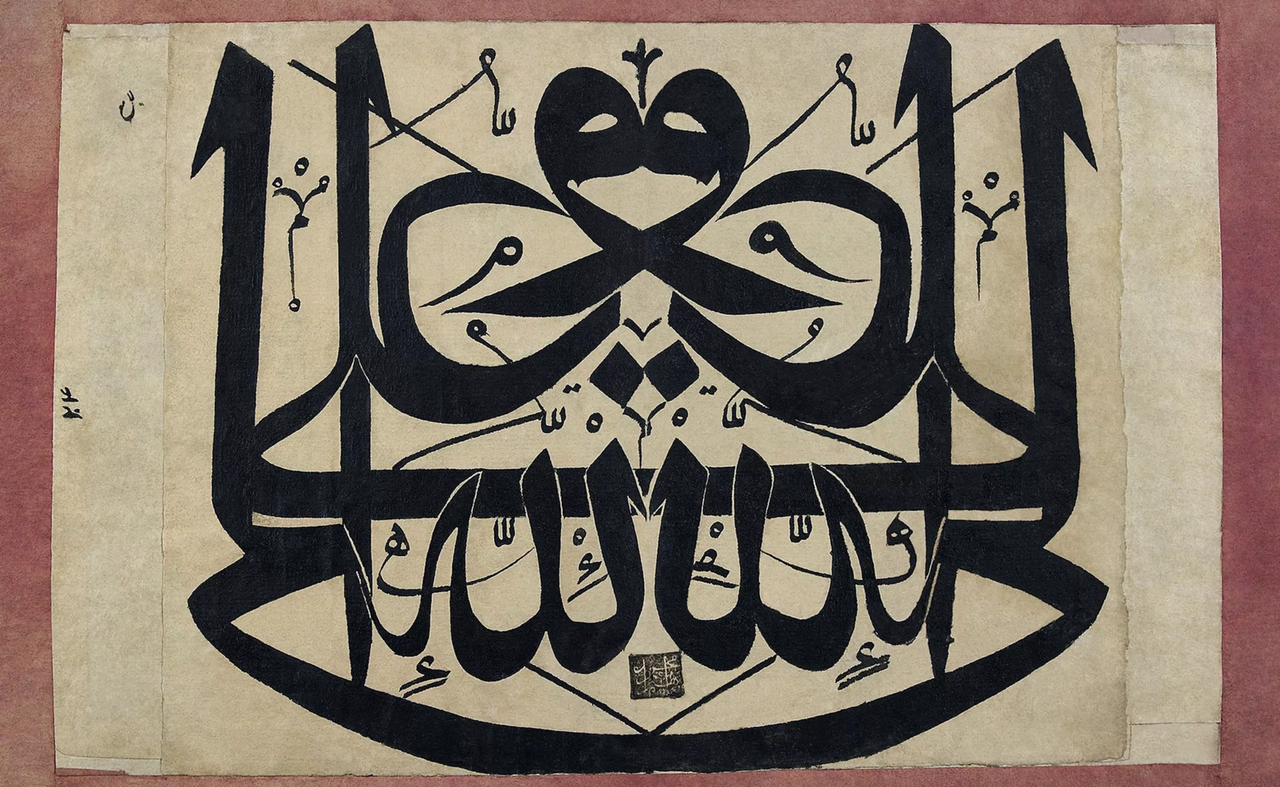
Ambigrams are found in different languages and cultures, including Arabic calligraphy, as seen in this example dating back to 1720.
Wordplay for graphic designers
On his YouTube page @The Ambigram Artist, Mark Palmer, for example, shares his calligraphy specialized in this art, skillfully combining two words or names to create one. He is credited with ambigrams like family/forever, Disney/Magic, and The Batman/Vengeance. Ligatures and ornaments help emphasize certain letters and promote a sense of reading. If the drawings are done correctly, and that’s the challenge, our brains decipher the graphemes and then make sense of them.

It’s quite fascinating to watch him draw the letters, anticipating the rotation and, therefore, the double reading as if he were writing both right-side up and upside down, thanks to ligature or ornamentation tricks:
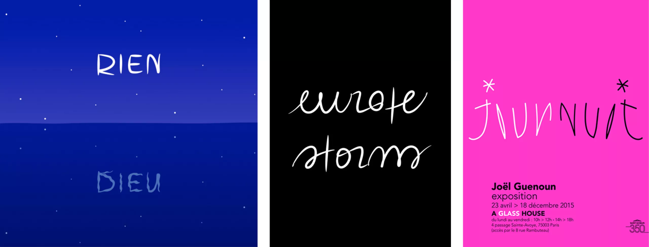
In France, graphic designer Joël Guenoun, who created the Tour de France and Musée Grévin logos, enjoys inventing ambigram words with dual meanings, such as DIEU/RIEN, mirrored; europe/storm, by rotation; or jour/nuit, by inversion.
John Langdon is another example of a designer who regularly plays with letters and words to turn them into symmetrical symbols. He illustrated, among other things, the calligraphic cover of Dan Brown’s “Angels & Demons” book, as well as the Illuminati ambigrams and the “illuminati tile” consisting of the 4 elements: earth, air, fire, water, created for the TV versions.


Ambigrams in art
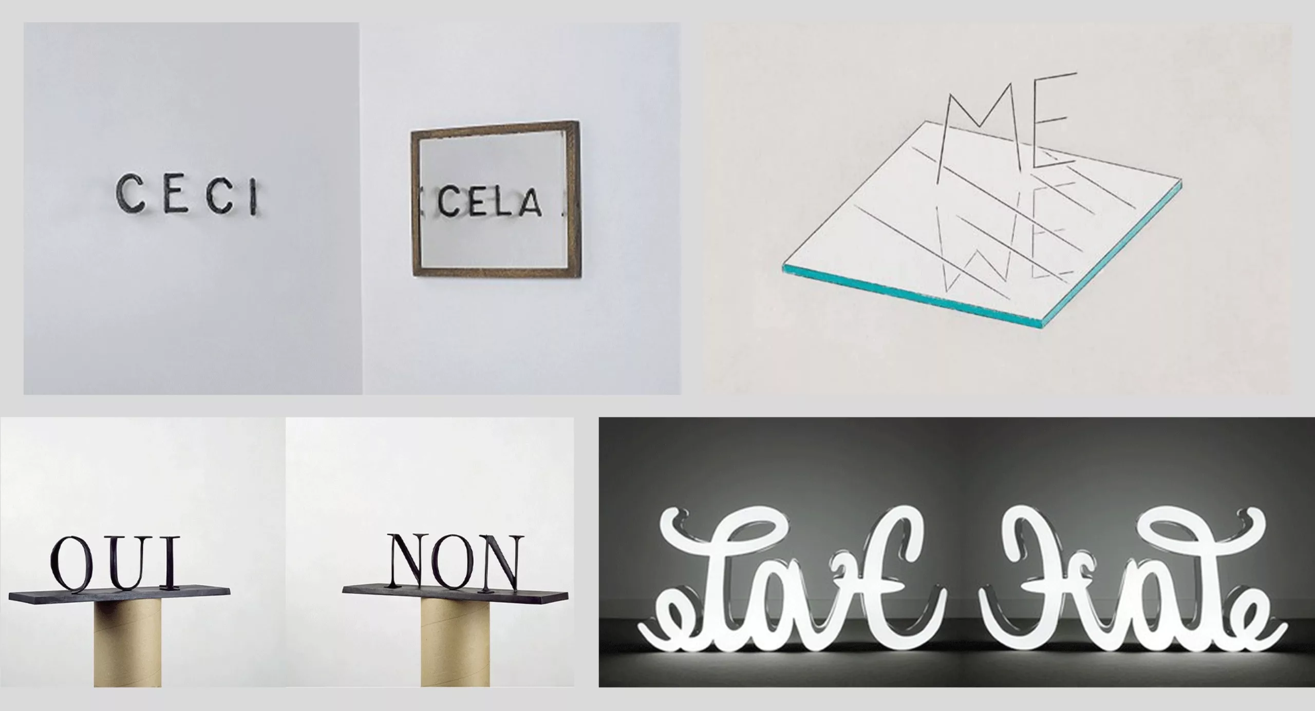
Because they allow playing with letters, ambigrams are also found in art. Artists like Markus Raetz, Mia Florentine Weiss (love – hate) have fun playing with three-dimensional characters to create others. Raetz, a visual artist, distorts letters in space or plays with reflections to reveal a “yes” in a “no,” a “we” in a “me,” or “this” reflected in “that.”
Ancient and mysterious origins, the importance of capitals
But where do ambigrams come from? The American cognitive scientist Douglas Hofstadter is known for coining the term “ambigram” and popularizing it with the cover of his book “Gödel, Escher, Bach: An Eternal Golden Braid” published in 1979, which won the Pulitzer Prize. The cover features two 3D forms whose shadows each project the letters and initials of the book: G, E, and B. In his book, Hofstadter highlights the connections between mathematics, music, and art. Although he did not invent the concept of ambigram, he contributed to their recognition and appreciation in art, mathematics, and literature, even though it was only in 2011 that the Oxford dictionary added this term to its definitions.
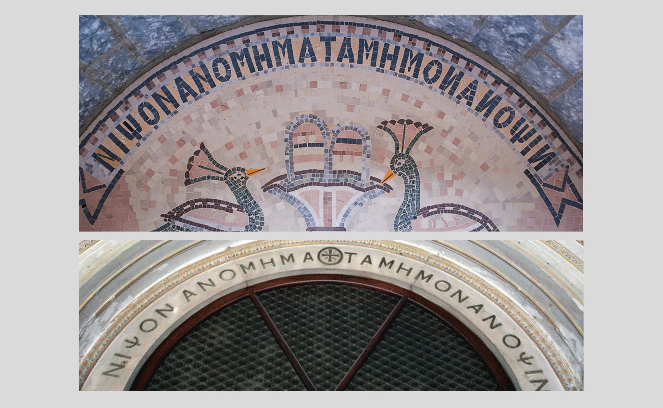
The origin of ambigrams, while still unknown, dates back well before Hofstadter’s time. Examples of ambigram writings are found in antiquity, such as the phrase “ΝΙΨΟΝ ΑΝΟΜΗΜΑ ΤΑΜΗΜΟΝΑΝ ΟΨΙΝ” (Wash your sins, not just your face) in ancient Greek found in the Church of Constantinople. The subtlety here is that the phrase is not just a “simple” palindrome readable from left to right and right to left; it also forms a mirror ambigram. The inscription is written in capitals with inverted Ns (Ͷ) so that it are readable by a symmetry axis around the central T. In lowercase, the ambigram would not work: “Νίψον ἀνομήματα, μὴ μόναν ὄψιν.”
The Sator square, the oldest known ambigram
The most famous and oldest known ambigram is probably the “Sator” square, engraved worldwide from Syria to Italy, passing through France, Hungary, England, or Portugal.
The Sator square (or “anacyclic phrasomorphous construction with quadruple entrance,” bless you) is palindromic, around a word that is also palindromic, “tenet”: the words can all be read from left to right and top to bottom. Sator becomes rotas, arepo opera… A feat, it is also readable alternately in both directions (boustrophedon), as well as in a mirror… all forming a square of 25 letters and 8 different characters reminiscent of magic squares composed of numbers.
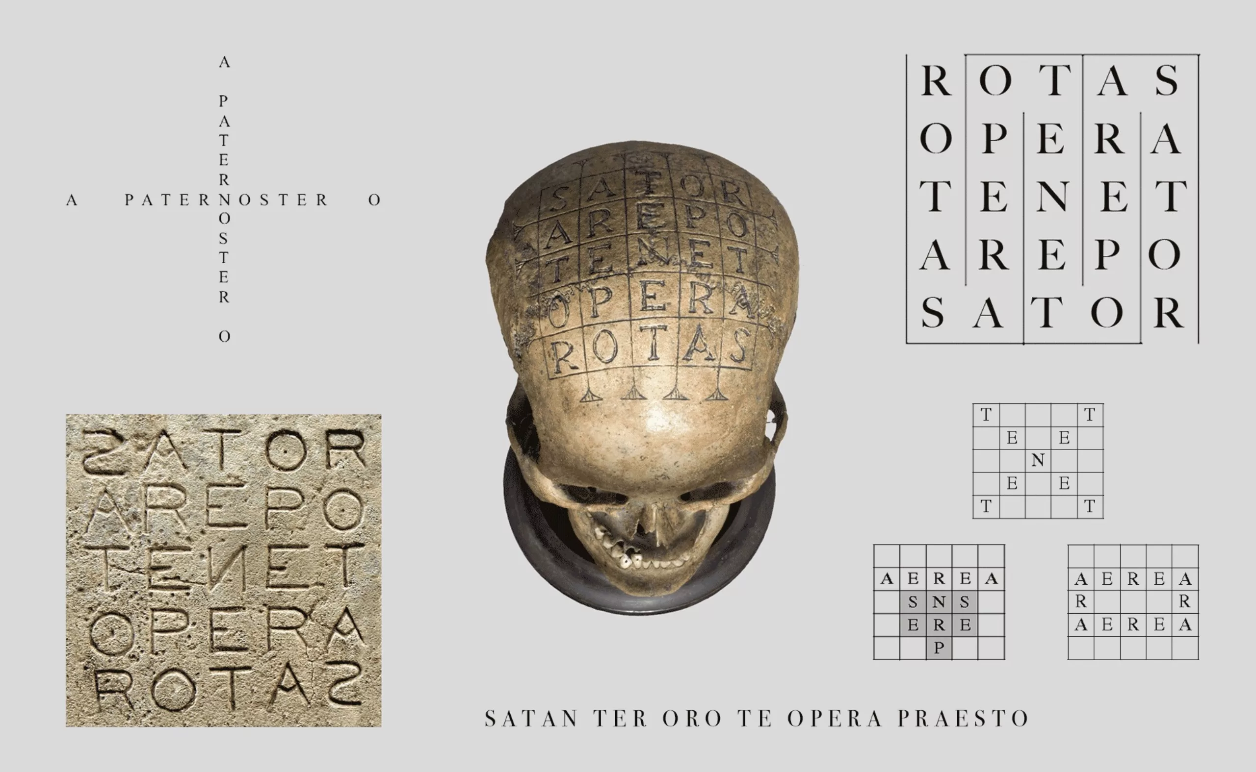
This square has been found in medieval manuscripts, protective amulets, and also in graffiti or churches since the 2nd century. Its meaning is shrouded by mysteries, although some have tried to unravel it.
Mysteries and Pythagoras
Some in the Middle Ages would have found in the Sator square the unappealing anagram “SATAN TER ORO TE OPERA PRAESTO,” “Satan, I beg you three times, act immediately.” German priest Felix Grosser imagined in the 1920s that the Sator square is related to Christianity and would be a double anagram (the same letters used to create new words) in the form of a cross of PATER NOSTER with the letters A and O separated to represent alpha and omega. But the discovery of the Sator square in Pompeii upsets this hypothesis since it proves that its existence dates back before 79 AD, the year of the city’s destruction by the eruption of Vesuvius. Christians were not supposed to be in Italy at that time.
For the record, if the discovery of a Christian meaning falls through, it is known that Jews were present. The article by Nicolas Vinel, “The hidden Judaism of the Sator Square in Pompeii,” carefully decrypts several elements that seem more likely to elucidate the mystery: the correspondence between letters and numbers (gematria, or isopséphie) in Hebrew, which was also practiced in Pompeii, the snake game that offered readable writings from top to bottom and left to right, and the multiple similarities with the “Adonaï magic square.” The sator arepo tenet opera rotas would then be a cryptic symbol of the “bronze altar,” a Jewish recognition sign, a witness combining science and religion, Pythagorean with Hebrew?
Ambigram logos
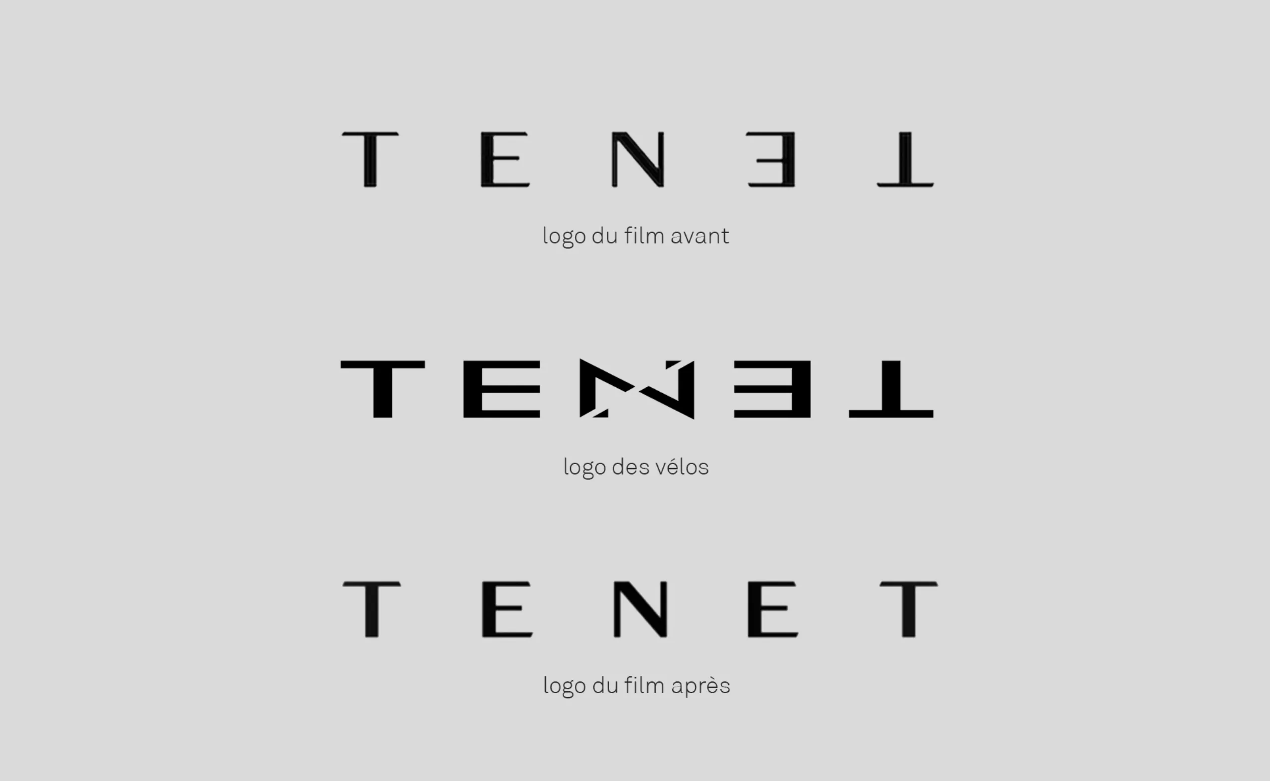
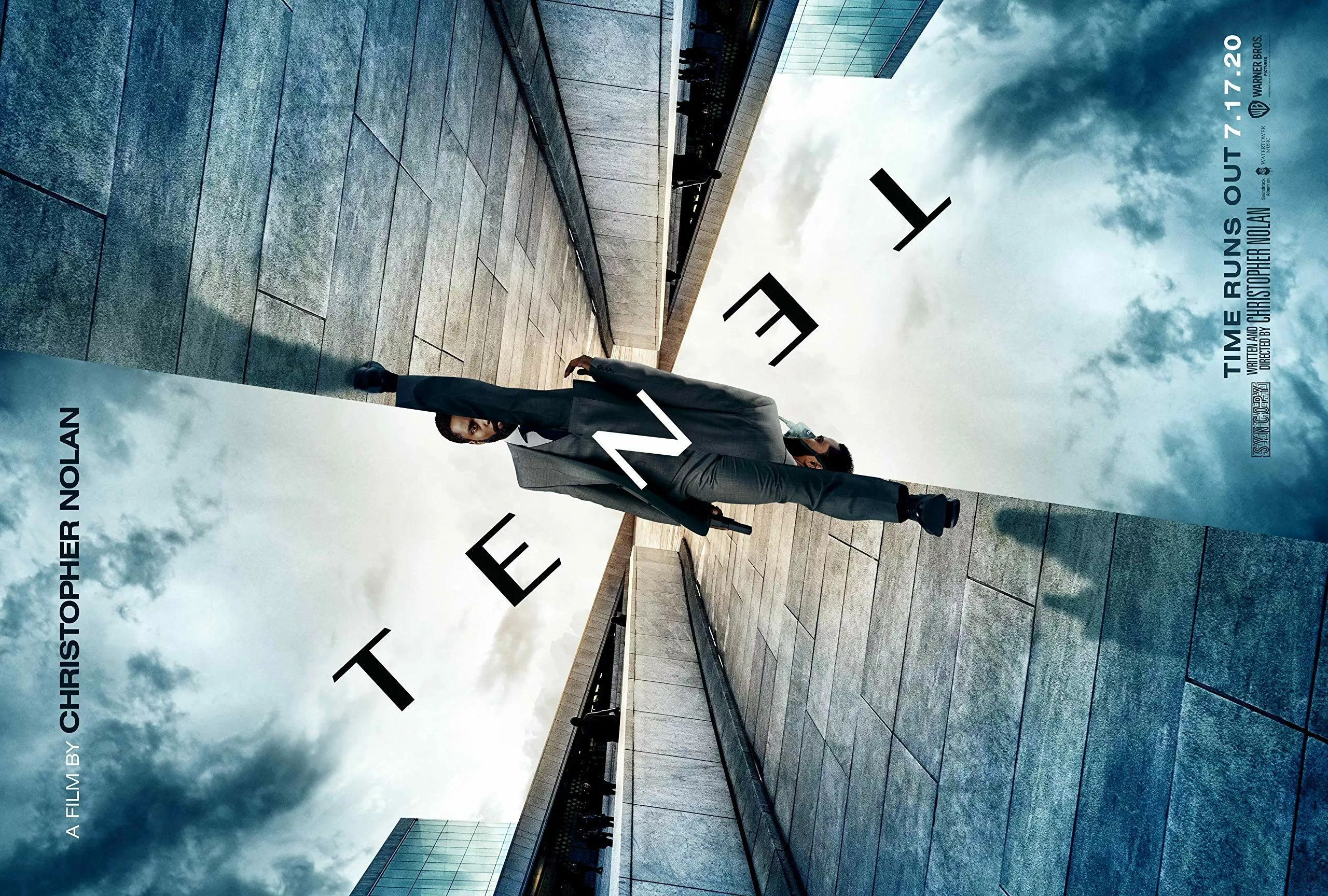
For all these mysteries, Christopher Nolan probably chose to be inspired by the Sator square in his movie “Tenet,” incorporating, among other things, a character, Sator, and a scene at the Opera. He originally composed an ambigram logo for Tenet by reversing the N, E, and T to suggest the inversion and tipping of time, but a pre-existing bike brand of the same name pushed Nolan to modify his composition, amicably. Nice. Some teaser posters are still online with the old Tenet logo.
Ambigram logos have the specificity of creating a symbol that is both text and drawing. While the text provides a primary meaning, basic reading, symmetry and specific arrangement add a second, more abstract meaning, transforming letters into a symbol. If a letter is a more or less standardized and recognizable graphic sign representing a sound, as soon as it is modified to become something else, a drawing, it then becomes, associated with others, an ideogram, a kind of seal.
In Latin, the words “seal,” “symbol,” or “signature” all fit into one word; charactere, meaning an ideogram difficult or even impossible to read aloud but understood and used to communicate, and which contains, confers, or conveys power. The logo, as a symbol conveying the brand image, also possesses a certain prestige.
Ambigram logos by rotation and symmetry
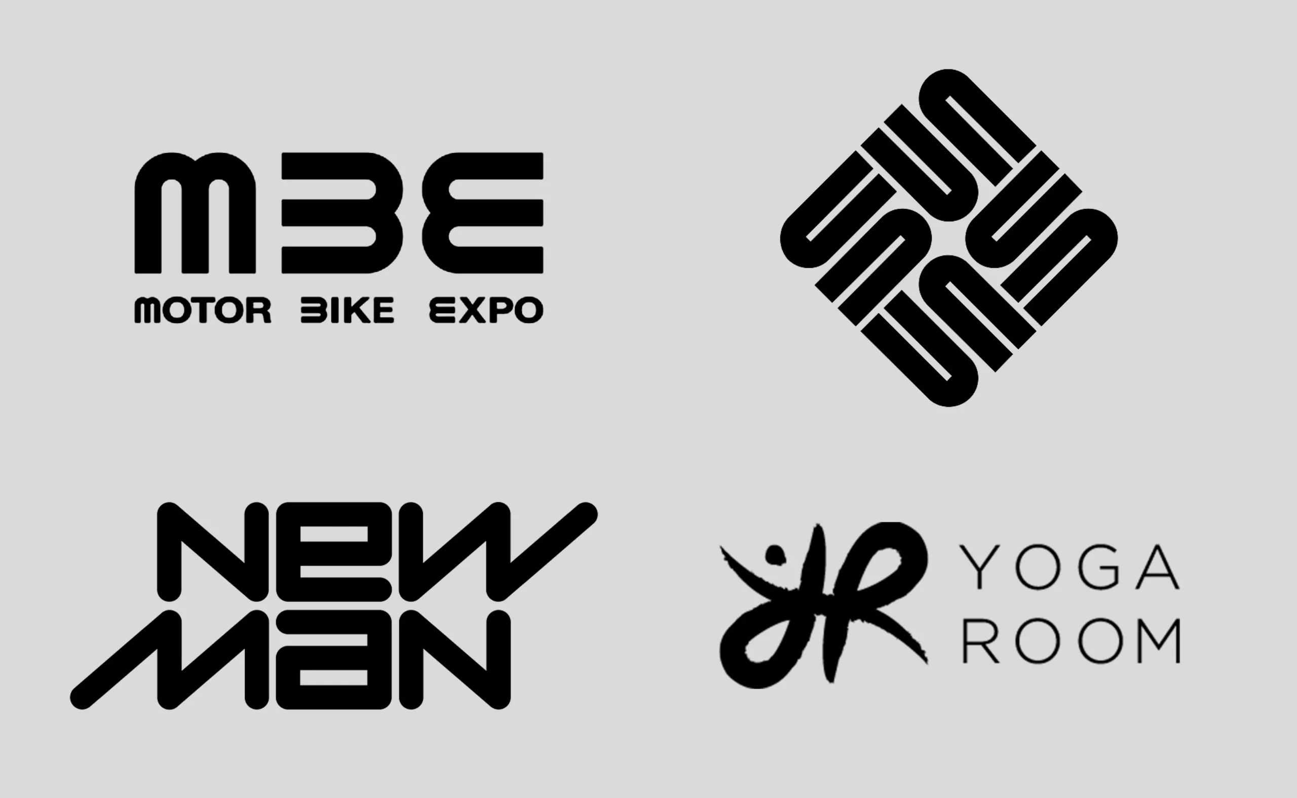
Here, these ambigram logos are readable by rotating one or all of the letters and also by symmetry. The letters become symbols that create others by associating or turning them, as in the logos for motor nike expo or sun. In the New Man logo (Raymond Loewy, 1968), the “w” becomes an “m,” and the “a” becomes an “e,” allowing reading even after rotating the logo. The “y” transforms into an “R” (and a character with raised arms) in the Yoga Room logo.
Ambigram rotative logos
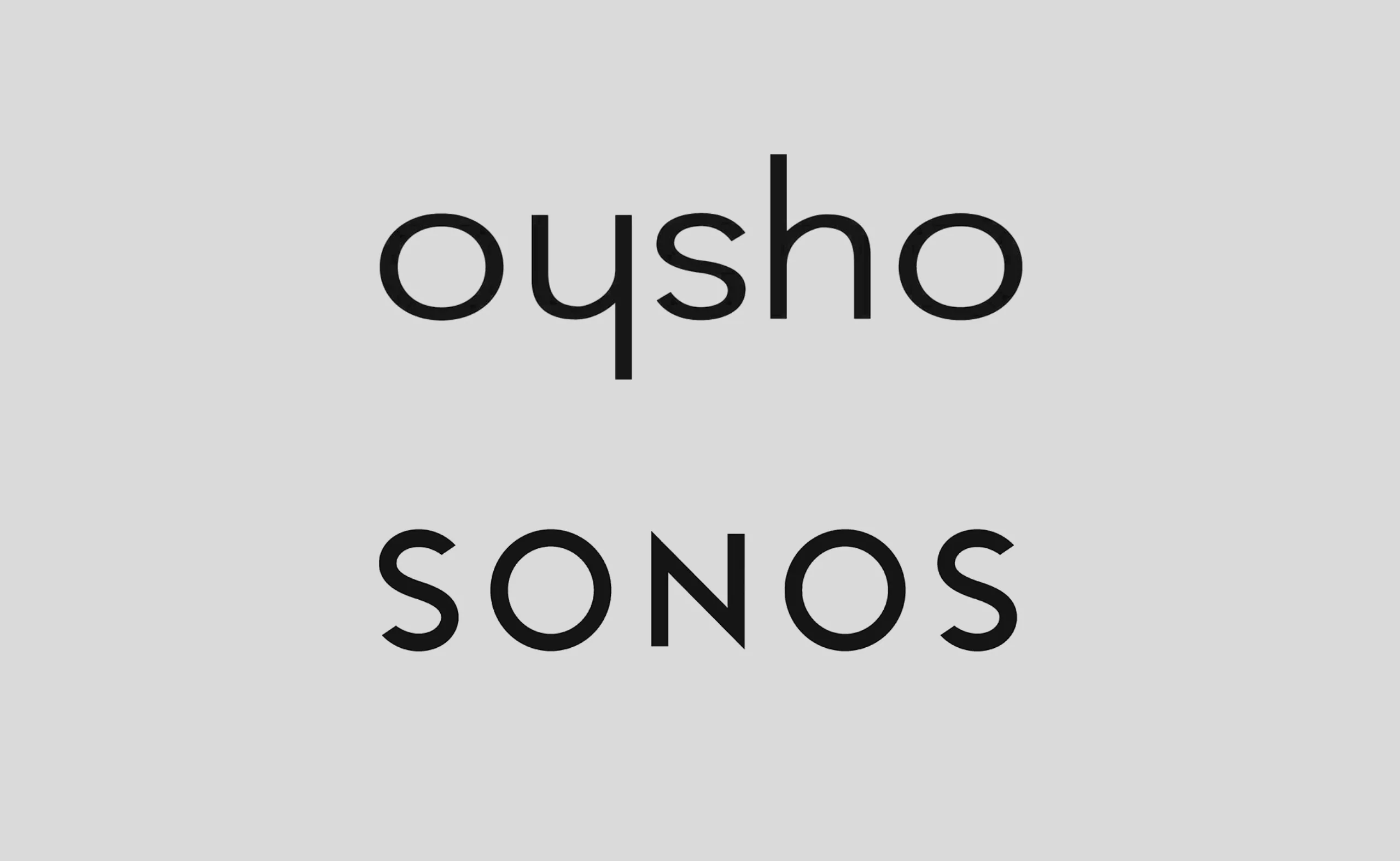
These two “natural” ambigram logos above offer a dual reading through a rotational axis around the central letter, s or n. Without the need for typographic manipulation, the letters are readable in both directions. Sonos is also a palindrome.
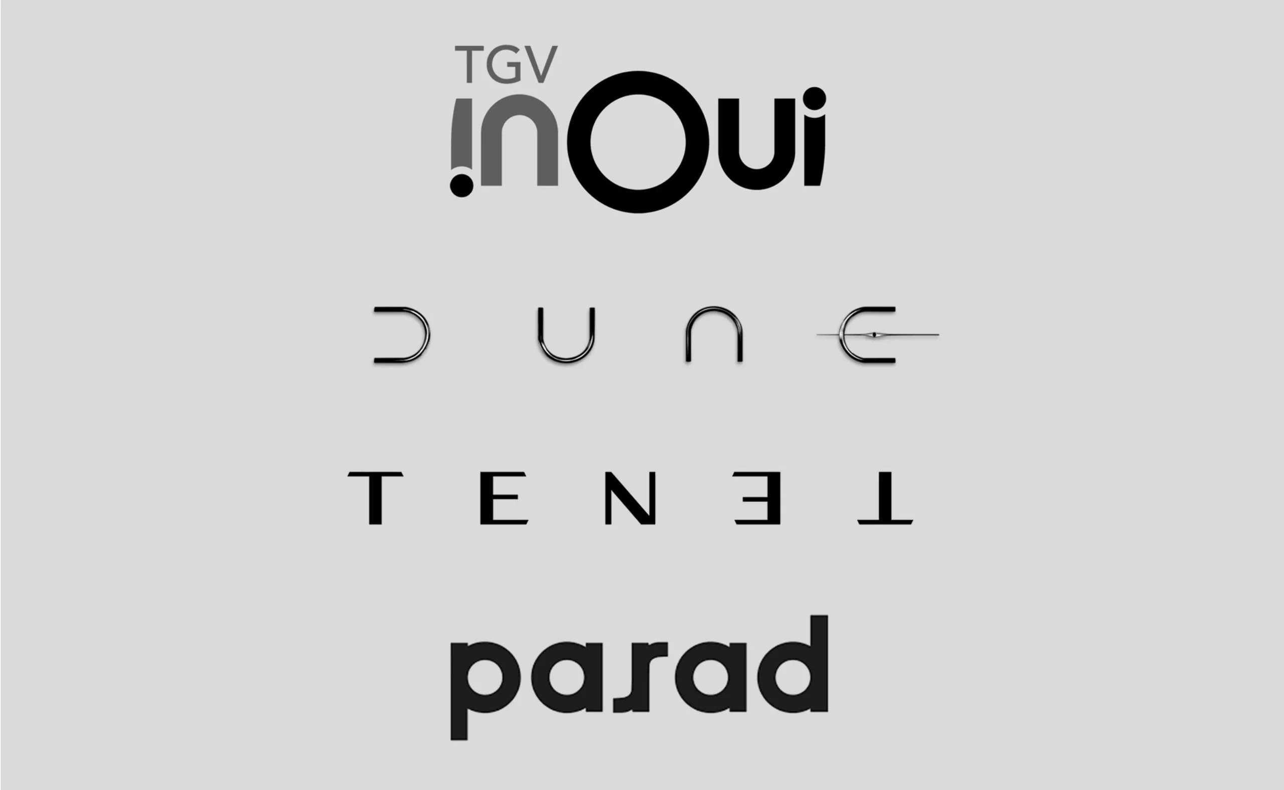
These logos have a rotational axis of symmetry, with a typographic specificity that facilitates reading or movement. For example, the word and, therefore, the inoui logo is a “natural” ambigram, as mentioned earlier. By adding a dot below the first i, the reader is encouraged to turn their head, imagining a back-and-forth movement, reminiscent of train journeys. In the Dune logo, which uses a single arched form to compose the entire word, a bright planet was added inside the e to create the bar and avoid reading “dunc.” The r in parad has a double bar that promotes double reading, driven by the p/d symmetry and possibly creating a face.
Ambigram and Palindromic Logos with Vertical Symmetry
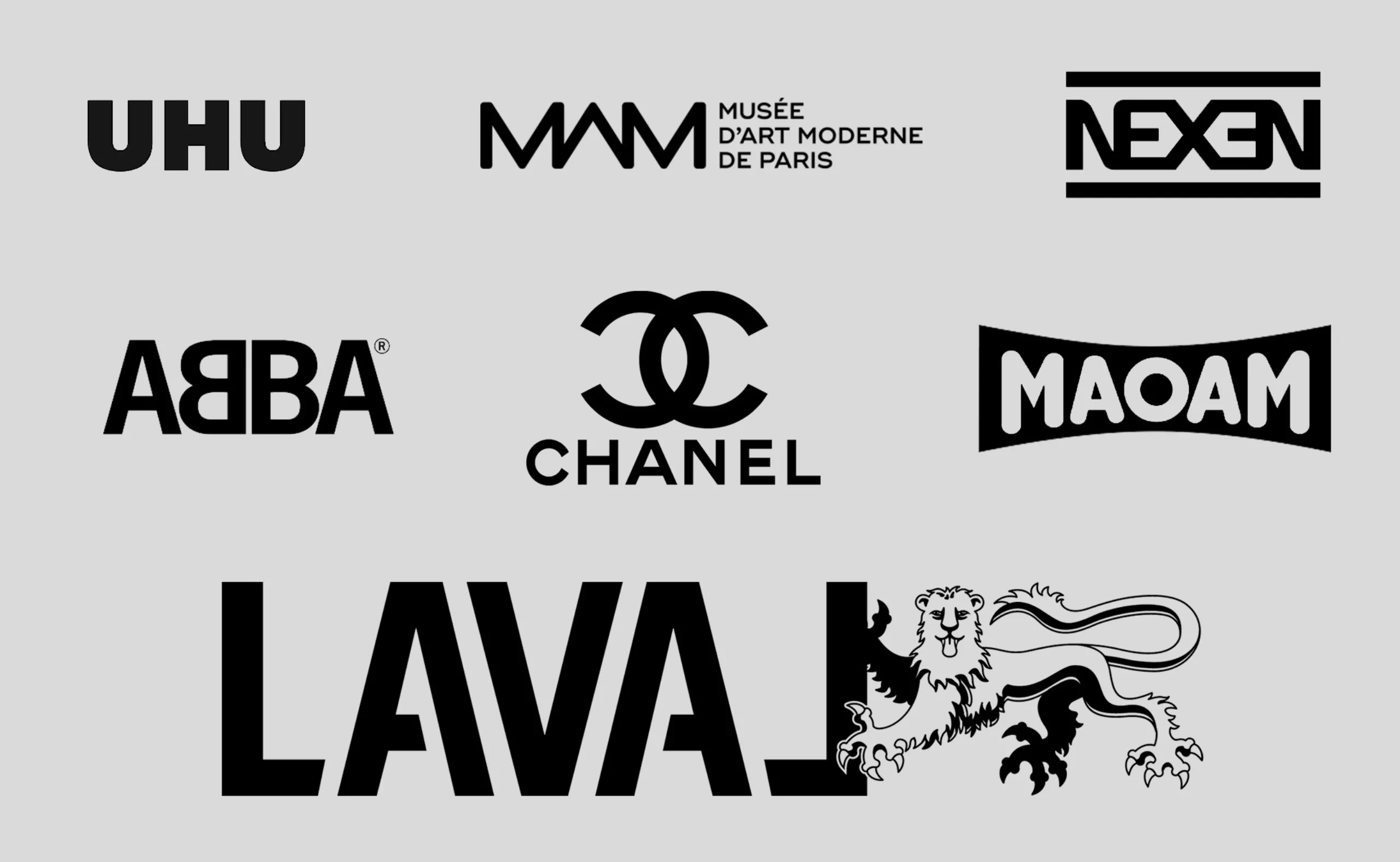
These ambigram and palindromic logos (except Chanel) have vertical symmetry in which letters are sometimes modified to maintain symmetry. Examples include the ∃, ᗺ, and inverted L in NEX∃N, AᗺBA, and LAVAL (if someone knows how to make an inverted L, please share it in the comments!). The double C in Chanel also creates new forms. One can imagine butterfly wings in the two ᗺB or see two houses between the E and the X of Nexen. This might not necessarily have a specific meaning, but it can add value in logo creation. What’s interesting is that the brain retains the peculiarity better because the rendering differs from standard spelling, akin to logos like Carrefour or FedEx.
Through ligature play, the N and E of NEXEN combine to be readable by rotation, offering two reading directions (the tire brand benefits from a logo that can be read in a loop). UHU is a “natural” ambigram due to its symmetrical letters. The A in the Musée d’Art Moderne de Paris loses its bar and visually becomes an inverted M, creating a playful and graphic repetition of repetitive shapes.
Some Ambigram Logos home made by Graphéine
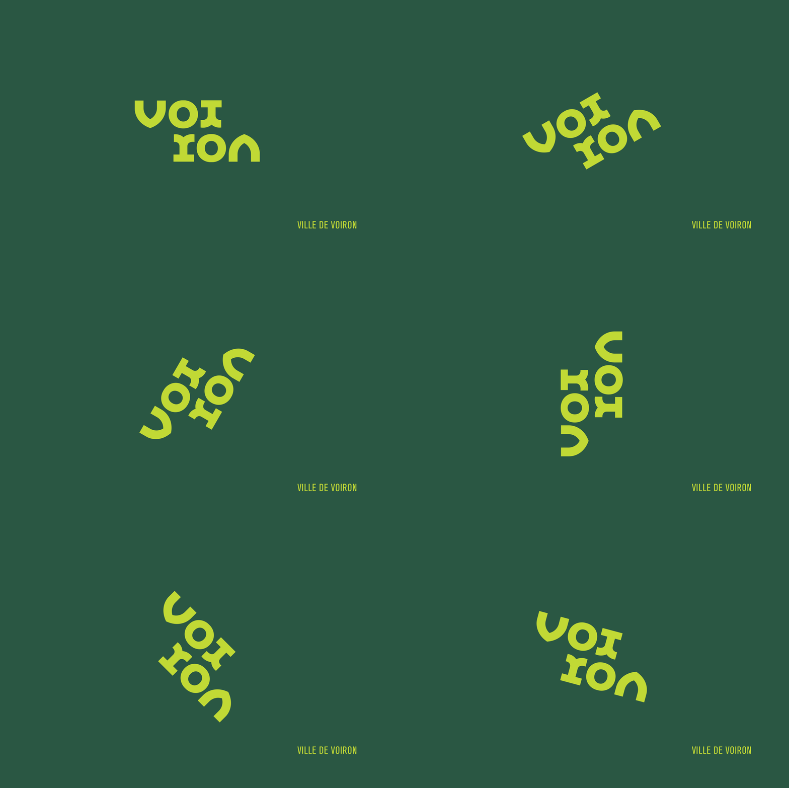
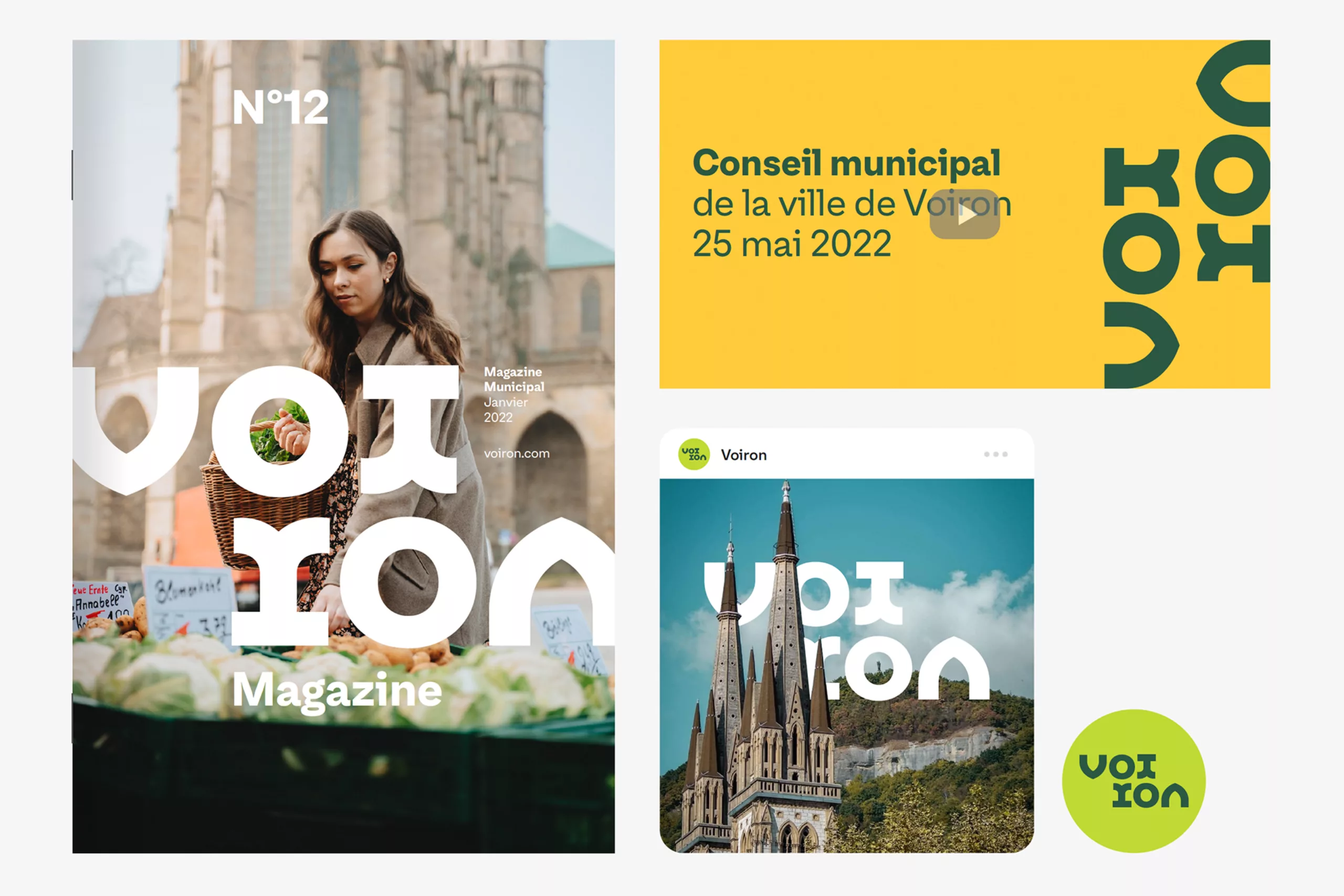
At Graphéine, we also enjoy playing with letters to create ambigram logos that can be read in both directions. For the logo of the city of Voiron, we envisioned typographic characters inspired by Romanesque architecture, drawing an i that also corresponds to r. Orally, Voiron sounds like “voir rond” (see around): we played on the two syllables voi/ron and the visual symmetries of the letters v/n and oi/ro to create a surprising, playful, animated identity that we envisioned in rotation.
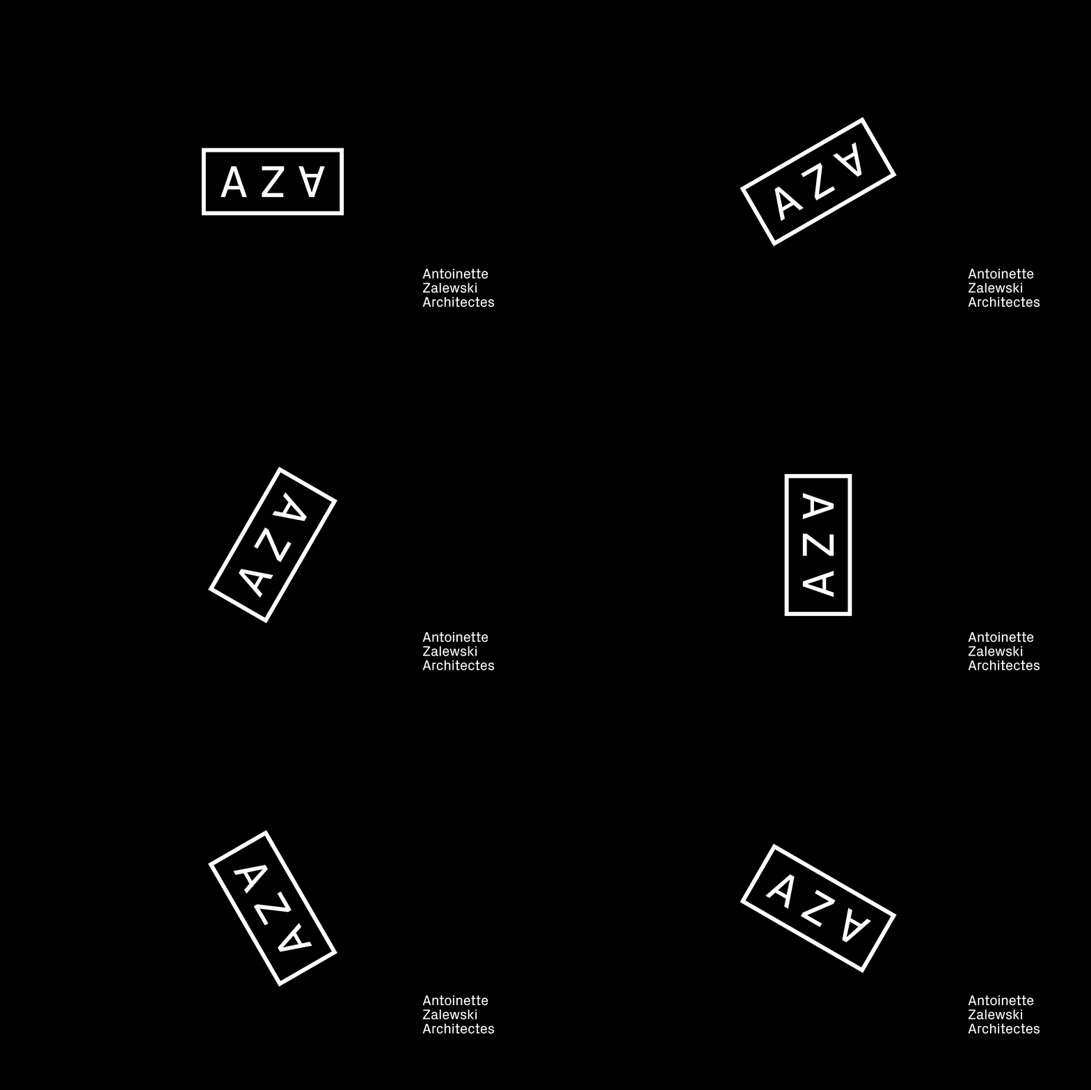
The ambigram logo created for Antoinette Zalewski Architectes in 2022, realized by us, also has a distinctive feature with a flipped A that encourages rotation during reading. The three letters come together to form the AZA symbol, readable horizontally or vertically, like a construction game. The vertical and horizontal aspects of the logo are an inherent nod to the architecture profession.
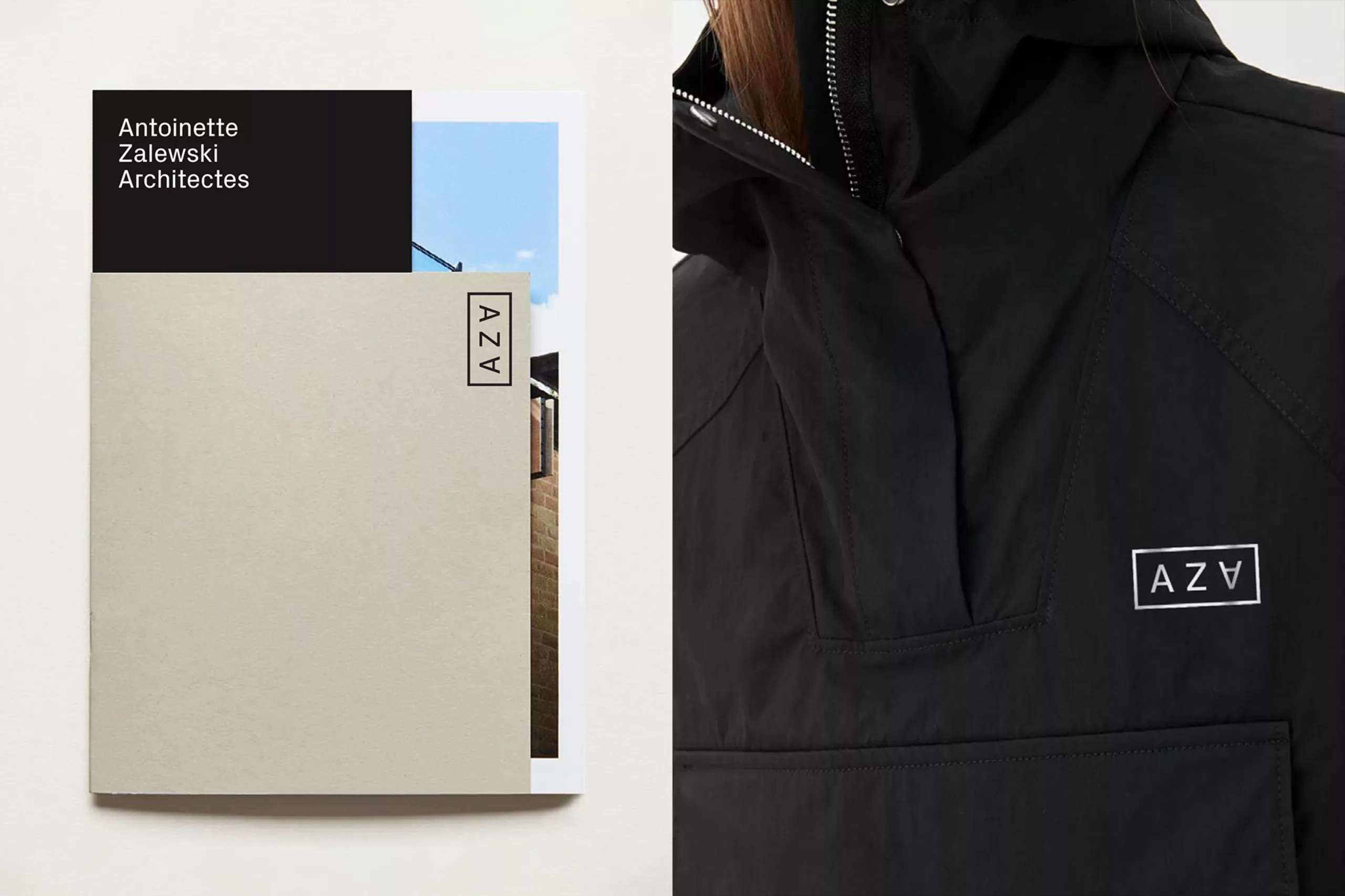
Visual wordplay, ambigrams allow creative graphic designers to play with letters, imparting a sense of movement. Do you have other ideas for memorable ambigram logos? If you’re a graphic designer, do you use them? We’d love to hear your thoughts!