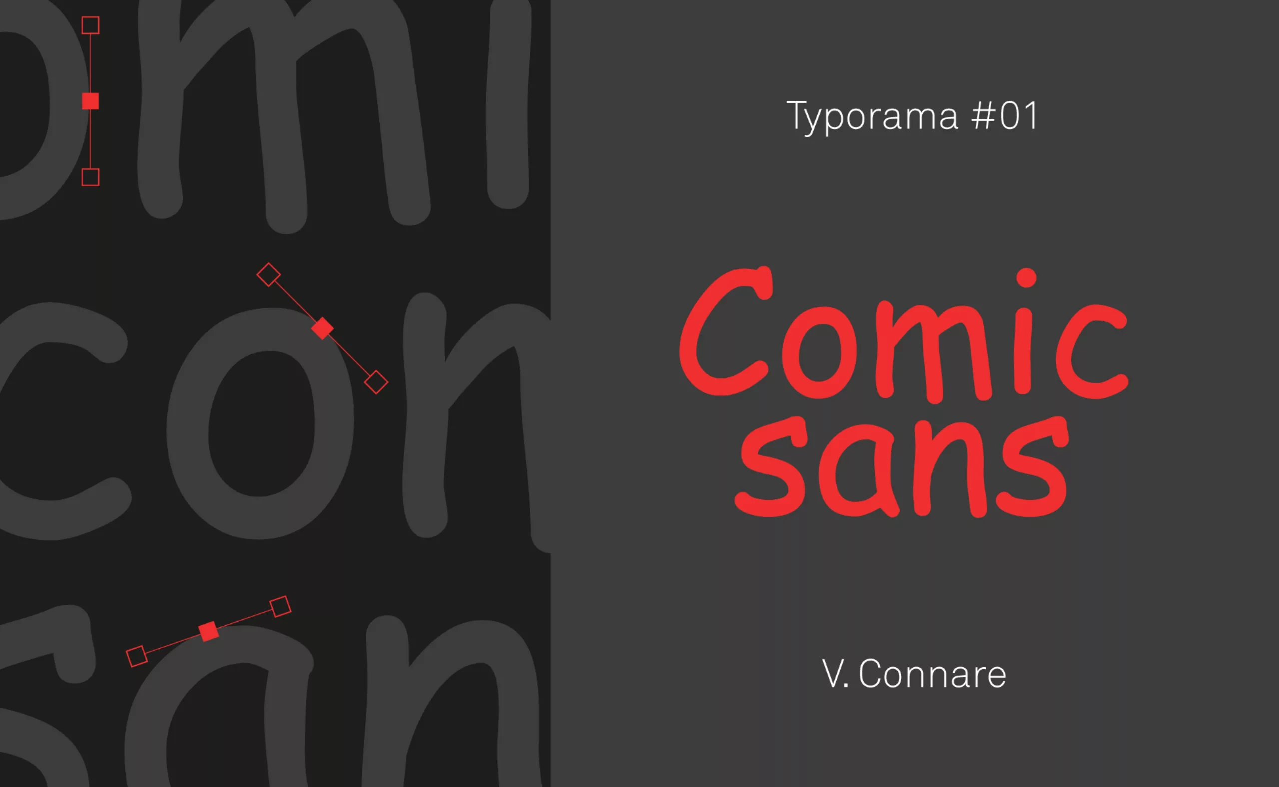
Typorama #01 : The Comic Sans MS
As well as our series on the great names of graphic design, we start here a new series on the typographies that have made their mark in the world of graphic design. Here is Typorama, the typographic panorama to explore the world of typography.
The story of Comic Sans… It all started with a dog!
Nothing predicted the Comic Sans MS to become what it is today: a font hated by graphic designers and yet very popular with the general public.
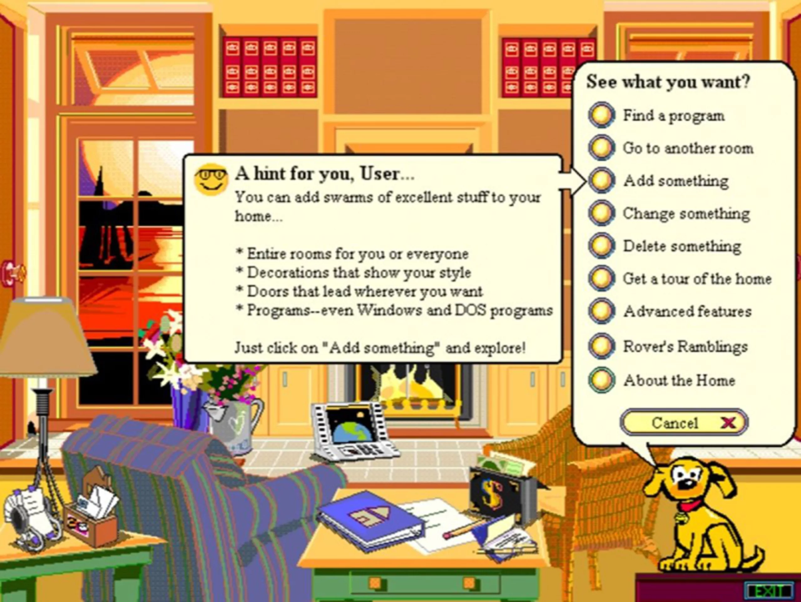
The turbulent history of this typography began in 1994 when Microsoft decided to create an intuitive, fun and illustrative interface to help users use a desktop computer. This future failure was called Microsoft Bob.
This interface allowed us to see our computer as the interior of a house with its different rooms, and it was by this analogy that the user had to become familiar with all the functions of the machine. This made it easier to learn how to store folders, find a program or delete files. And all this, supported by a small yellow dog named Rover, who acted as a mascot and told us how to do it.
American comics as an inspiration
It is because this dog originally communicated in Times New Roman that our story becomes interesting. A typographer passing by found this font cold and unsuitable for this purpose. He then decided to draw a new one. He was inspired by the lettering of American comic strips, in an attempt to mimic handwriting through round, clumsy and irregular forms. He wanted a warm typography that visually emanated a certain orality.
It was therefore in 1995 that this typographer named Vincent Connare created the famous Comic Sans MS. The particle “Sans” underlines its lack of wheelbases while the “MS” refers to its parent company: Microsoft.
The Microsoft Bob software will quickly fail and be abandoned. However, Rover, the little yellow dog, will not take the Comic Sans with him since Microsoft will integrate it as a default typography in its operating system, thus offering it a worldwide reach.
One of the 50 worst inventions of all time!
But what did Comic Sans do to have the privilege of being among the 50 worst inventions of all time according to Time magazine in 2010? Could this be because it has neither italics nor bold, because it has an irregular approach (the approach is the spacing between characters), or because many graphic designers consider it clumsy and childish? Probably.
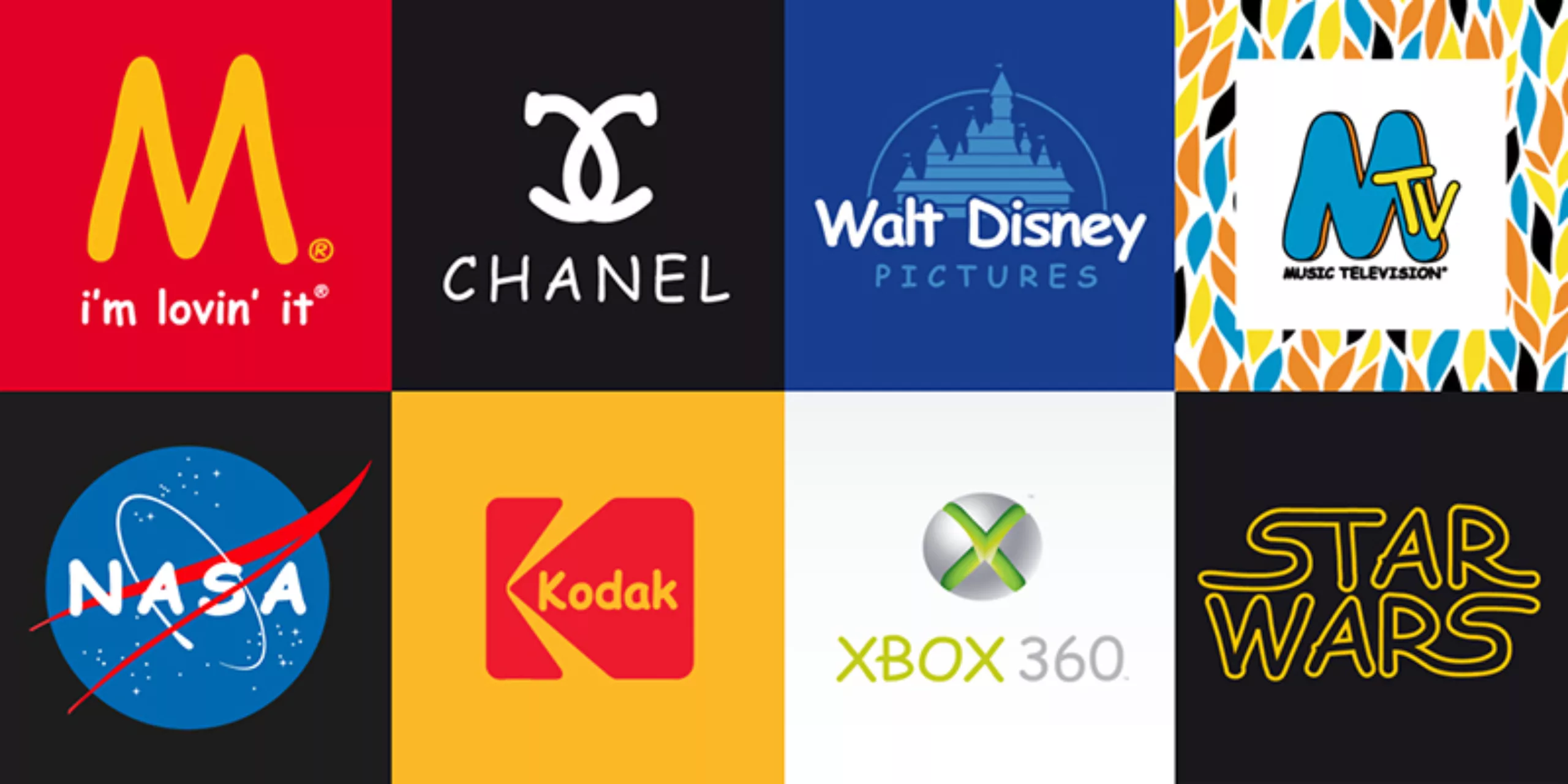
But that’s mainly because it was used in any way for anything. Her immediate popularity made her a star. It has been used everywhere, for everything and often in an inappropriate way: shop windows, e-mails, signs, books or documents of all kinds. Its overexploitation and overly general use has been mocked many times, as is the case, for example, with the site “The Comic Sans Project“, which uses well-known logos by replacing their font with the much-loved typography in question.
The paradox of the Comic Sans MS comes from its misuse. The one that was originally designed for a popular computer interface has been propelled to the forefront to become the star of the general public.
It has been taken out of its initial context to become a default typography full of flaws, borrowed from a certain comic.
The Comic Neue
Let us note the existence of a new version of the Comic Sans, but without defect… the Comic Neue. The crushed and strange lines of the Comic Sans have been reviewed and corrected while keeping this simple and childish spirit. Its creator, Australian graphic designer Craig Rozynski, explains that he started this project “as a joke” but ended up taking it seriously as it progressed.
A cleaner, more professional and contemporary font while keeping its childish side. It has been declined in 2 versions with a Comic Neue and a Comic Neue Angular. The result remains anecdotal… a handwritten typography that is ideal for making a birthday invitation on Google-doc this time!
The typography is available for free on the website comicneue.com.
On the subject
-
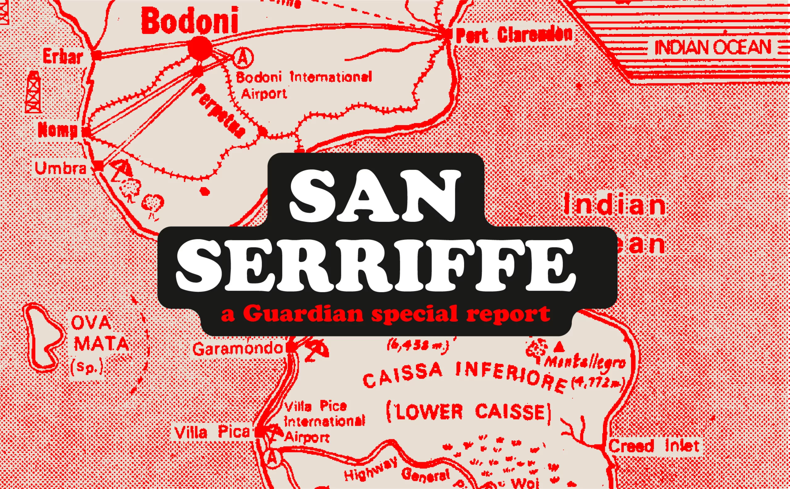
San Serriffe typographic Island
Discover how The Guardian tricked its readers into inventing the island of San Serriffe, a fictional republic born of a typographic April Fool’s joke that has become cult status. Between subtle satire and typographic wordplay, immerse yourself in one of the most brilliant journalistic hoaxes of the XXᵉ century.
-

Typorama #06 : Futura by Paul Renner
From the Nazis to the moon, Futura is probably the most used typeface in the world, and yet it’s not new!