Roger Excoffon, a master of French graphic design
We continue to explore the series of great names in graphic design with Roger Excoffon.
A famous stranger
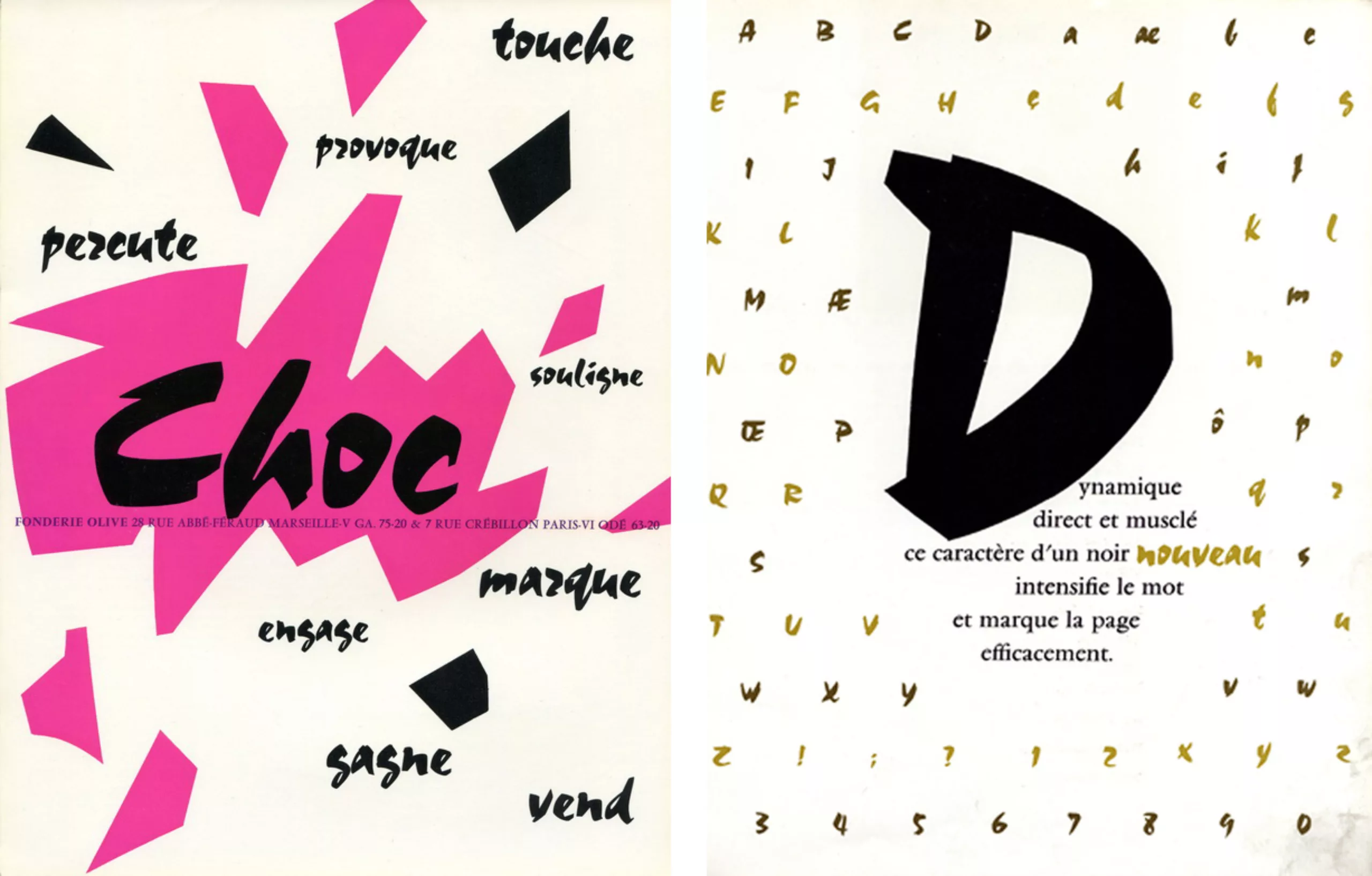
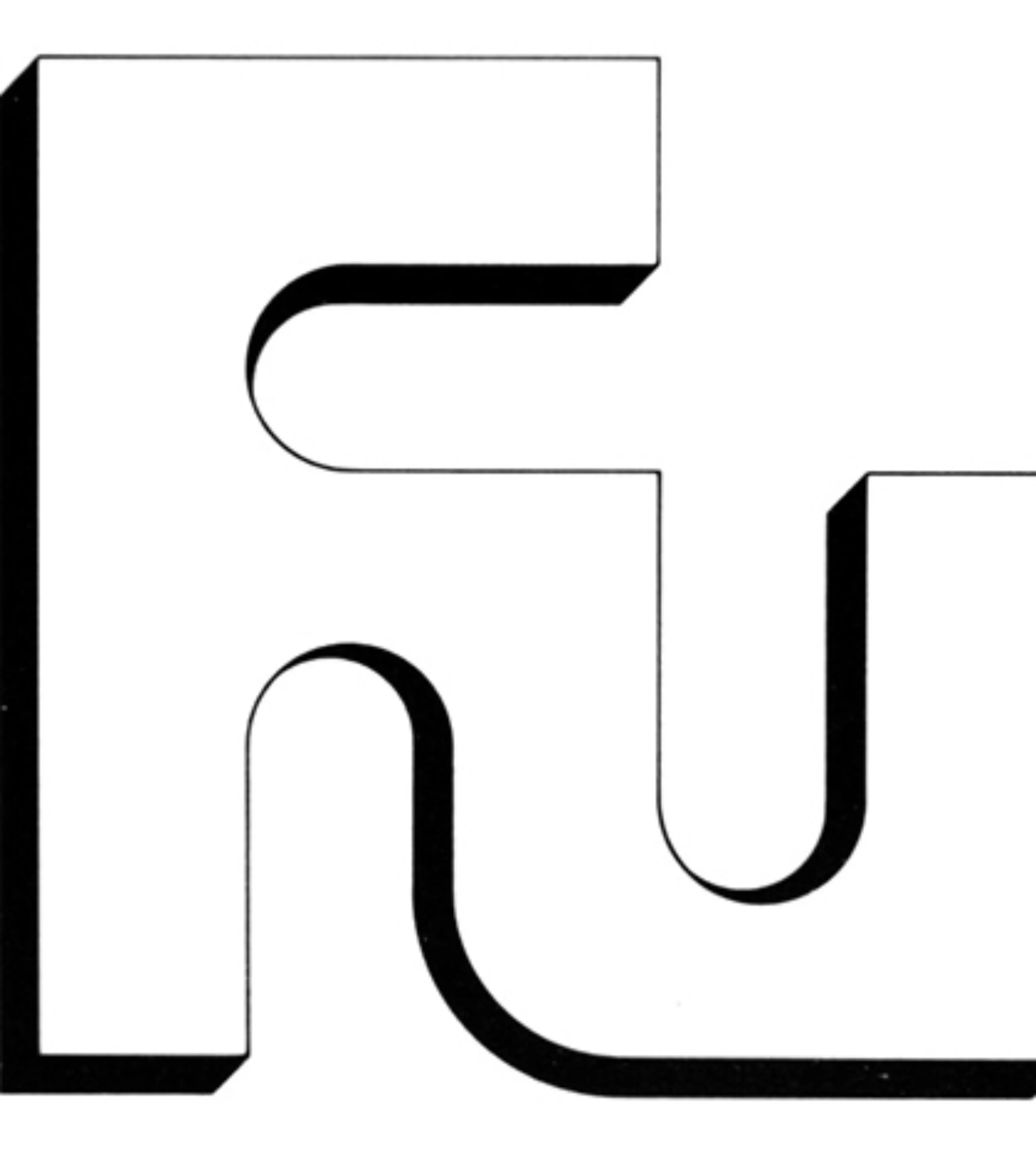
Roger Excoffon (1910-1983) is one of the most influential figures in French graphic design and typography. And yet if his name remains little known to the general public, his work is certainly known to the greatest number. A talented graphic designer and advertiser, he has produced hundreds of posters and logos. But it was as a typographer that he marked the French graphic landscape with only 7 typographies to his credit: Vendôme, Banco, Mistral, Choc, Diane, Calypso and Antique Olive. One can especially remember the innumerable signs of bar-tabac, hair salons and other bakery which used ( and abused?) these last ones.
Who is Roger Excoffon?
His career as a character designer is atypical. Indeed, he served only 14 years in this trade, from 1945 to 1959. Before this period, he wanted to become a painter. In 1930, he missed his entrance exam to the Beaux-Arts and Arts Déco. He then does many odd jobs to feed his family, but spends his free time drawing.
“At thirty, I was a failure, a dry fruit, I had done nothing. I spent my time observing, drawing, painting…”
The war caught up with him and he was mobilized in the south of France. And it is by drawing the portrait of each member of his battalion that he will be spotted by the staff. He will be entrusted with the task of drawing the graphs of adjustment of the barrels of his company. He will thus be initiated to logarithmic calculations, which is a bit the ancestor of the bézier curve. From this experience he will retain the sense of responsibility, it was suddenly those individuals who directly or indirectly could find themselves responsible for the death of another.
His first steps…
After the war, he found a job as a cartoonist in Robert Alexandre’s advertising agency. The experience was short since one year after the economic crisis forced his employer to fire him. It is there that Marcel Olive (his brother-in-law) crosses the road and proposes to him to take the direction of the Parisian agency of his typographic foundry.
It was to counter the success of the competing foundry Derby & Peignot. Excoffon is therefore working on the development of the “Chambord” character.
“At the time, I had to admit that I knew nothing rigorously about typography. I was young; I wanted to do something different, and I did with this character, the Chambord, of the sub-Peignot “.
Banco!
Its second character, the Banco, is the result of industrial espionage! At that time, he learns through an article in a professional magazine that the Derby & Peignot Foundry is working on a new character, he then takes his magnifying glass and carefully scrutinizes the photo illustrating the article, where we see the character designer Marcel Jacno working ( ps: We will try to come back on his work, it is he who drew among other things the famous package of cigarettes “Gauloises”). Despite the mediocre quality of photography, Roger Excoffon nevertheless has a sufficiently precise idea of the work in progress, and submits to his boss some pencils inspired by what he has seen. “Banco” says the latter! 2 months later, the character comes out and makes a hit!
This character is then very innovative, it seems drawn with a brush by an energetic hand. Very quickly all the French delicatessens, grocery stores, and bakeries will seize this character, for the joy and the misfortune of its creator. Like all fashions, this character will fall into disuse from the 70s and 80s… even becoming synonymous with old-fashioned. Fortunately, in recent years, this character has regained its letters of nobility and is of increasing interest to younger generations. A blog is even dedicated to him: ilovebanco.blogspot.fr.
Then, he will participate in the drawing of the Vendôme (designed by François Ganeau). It’s an elegant serif alphabet designed to compete with the Garamond.
The nose in the wind
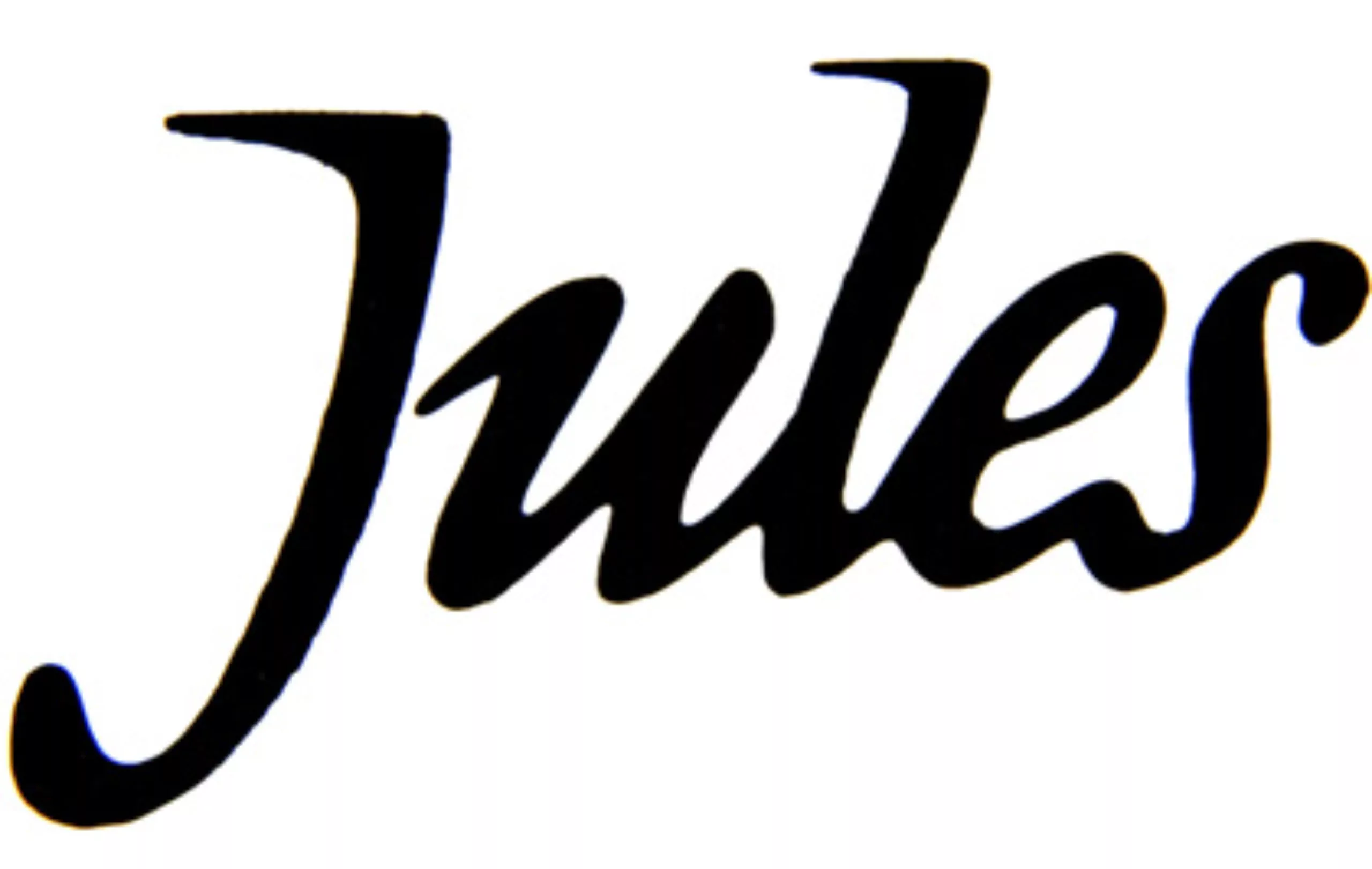
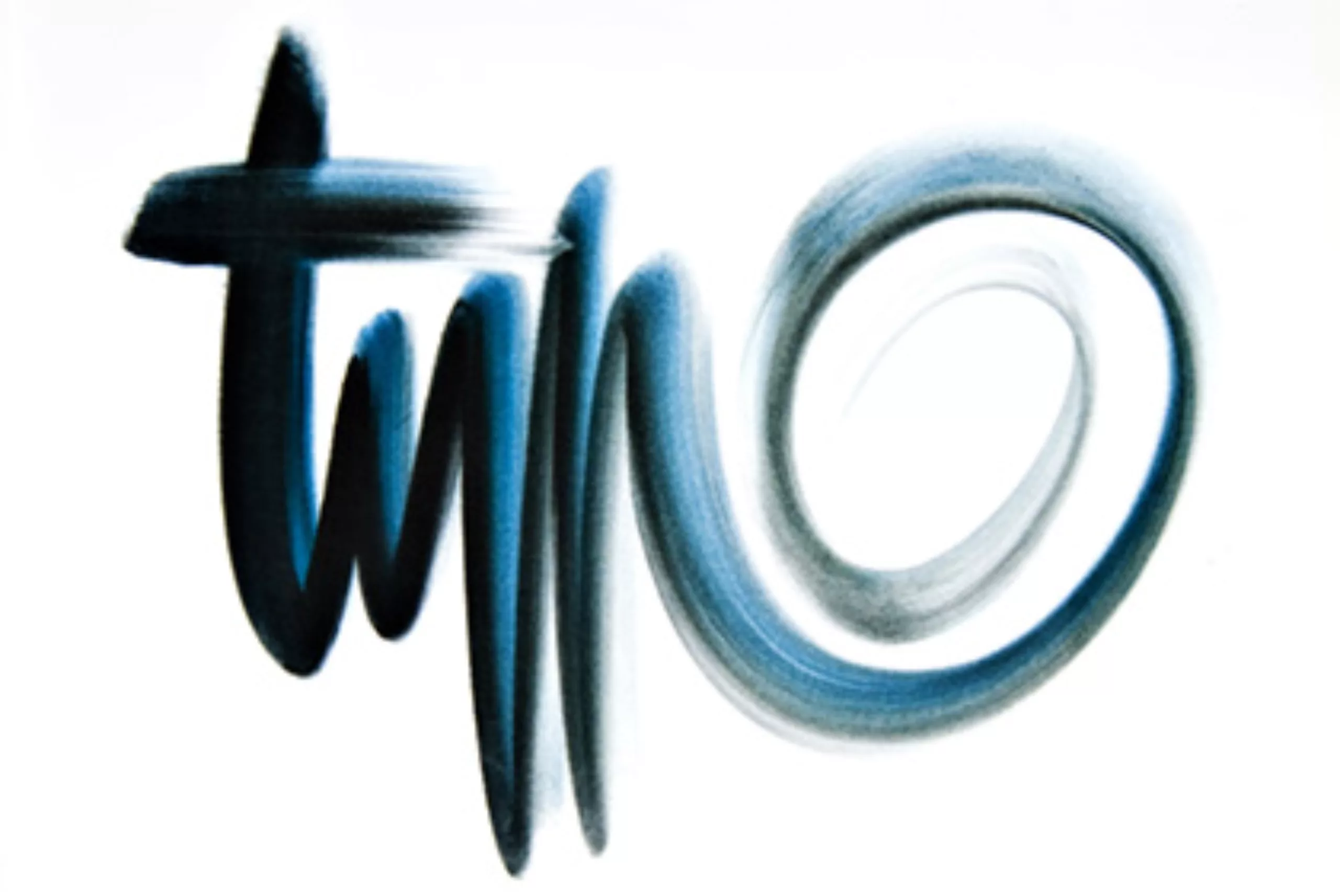
Starting in 1952, Excoffon began drawing a script character: the Mistral.
He began by gathering all the documentation on the handwritings of great men, before realizing that his own writing was his best foundation. He then works to thwart the problems inherent in typographic composition techniques: “how to normalize manual letters while preserving their life, their imbalance, with for example letter attachments of different heights? “
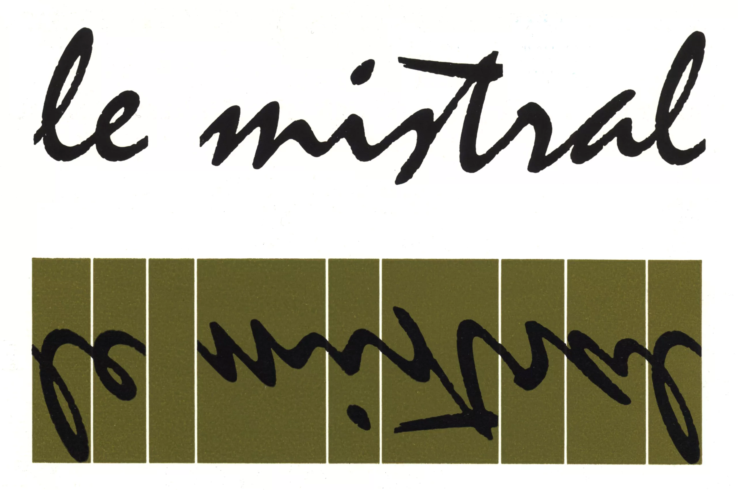
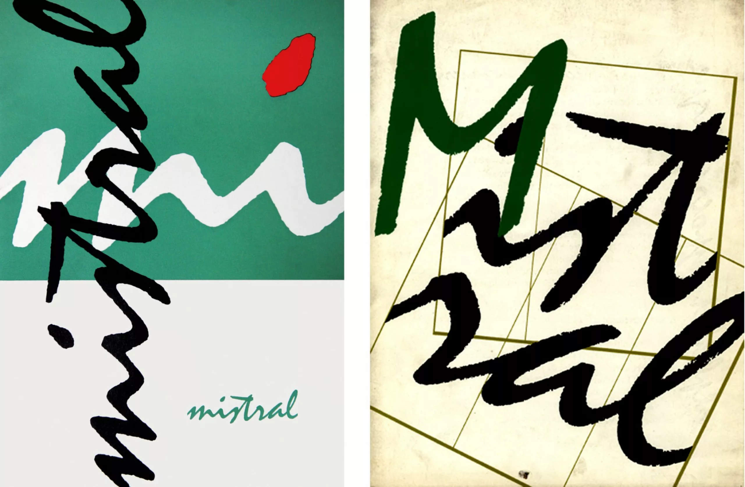
Once again this character will be a great success, and if the Banco seemed drawn with a brush, the Mistral seems to be drawn with a ballpoint pen. Butcher shops, bakeries and other shopfronts will soon use and abuse the Mistral. The top of the roof being this sign in Colorado of a shop named “Mistral” and… guess what… it is composed in Mistral!
After some research, it seems the case is not rare!
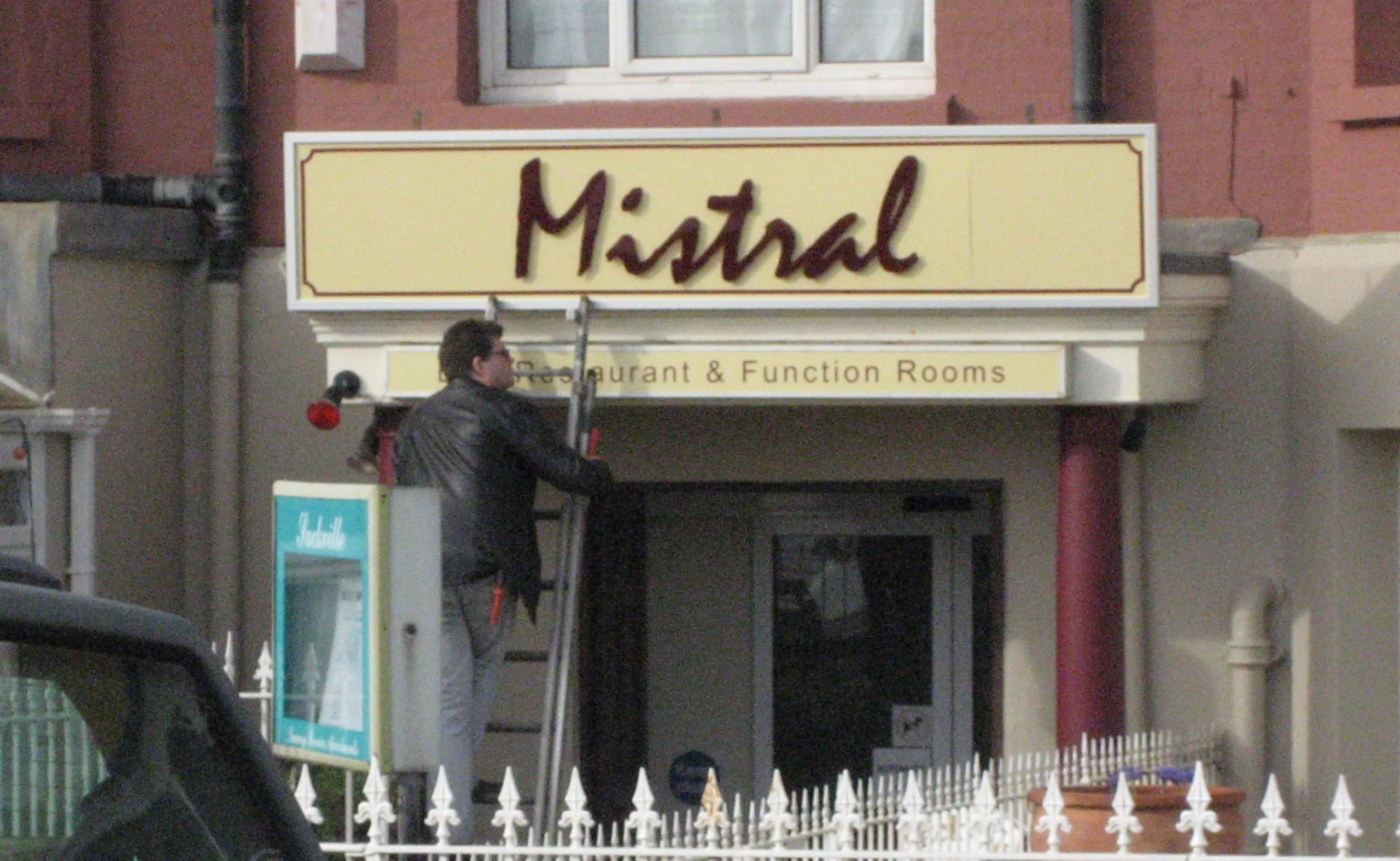
In fact, many sites are having a good time listing shopfronts using the Mistral, for example here or here (an article published in 2004 by Matt Soar, professor at Concordia University in Montreal is also available here).
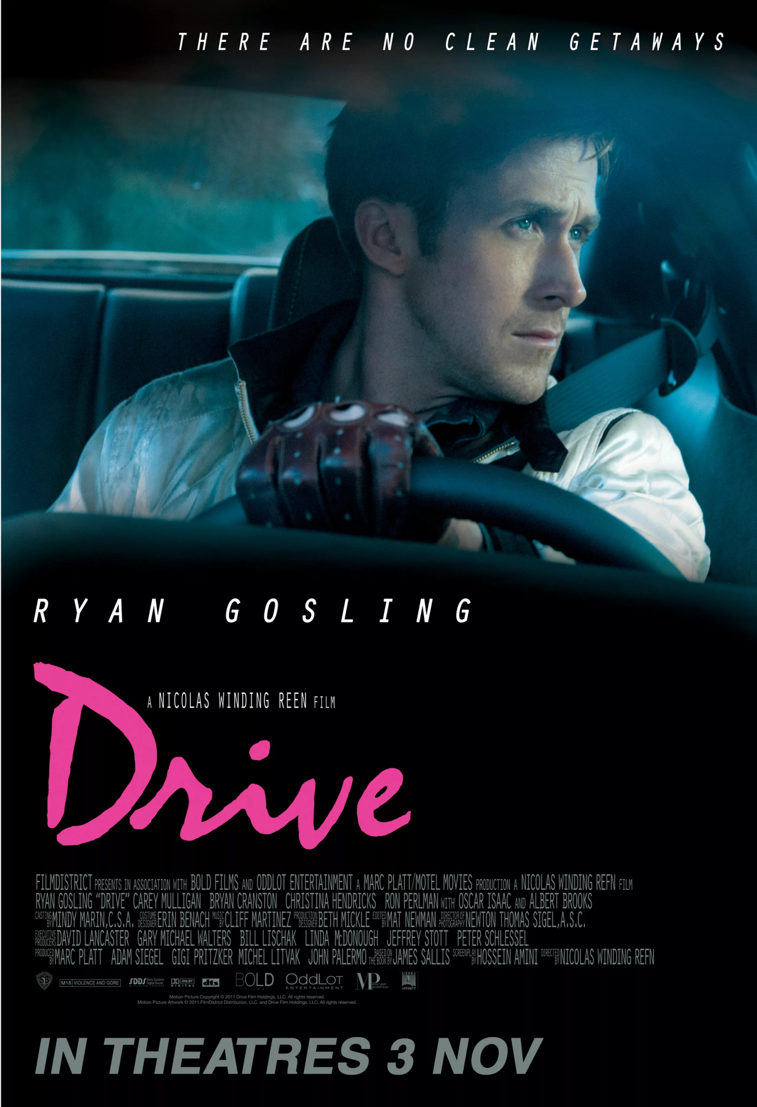
Once again, fashion will pass, and this typography will long be synonymous with bad taste. Fortunately, his very expressive drawing finds thanks to the current graphic designers. It can thus be found regularly on posters; for example on the poster of the film “Drive”.
The weight of words, the clash of typos!
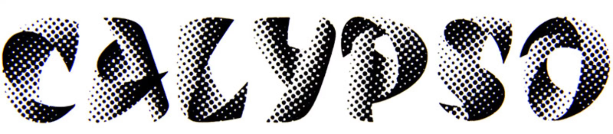
Would you like to dance Calyso?
alypso was born by chance,” says Excoffon, “I had fun drawing a character, a letter on a roll of paper, when Marcel Olive arrives and says to me, “What is this? I answer him with a laugh: “It’s the layer of a new character”, and he answers me: “I’ll take it”.
Behind this anecdote hides a real technical challenge for the time. Indeed, the progress of the photocomposition allows the use of characters that the traditional printing could not have reproduced, remains that it is necessary to draw with the hand all the characters ( and thus thousands of small points conscientiously aligned following curves carefully studied! No computers back then! ).
Diana, goddess of English women
After using the brush, the ballpoint pen, Excoffon takes his most beautiful nib to draw the Diana, an English girl with multiple curls. Once again, it is a technical challenge that he must face. Indeed, the fineness of English characters is not really suitable for lead characters, these characters are fragile and often break…
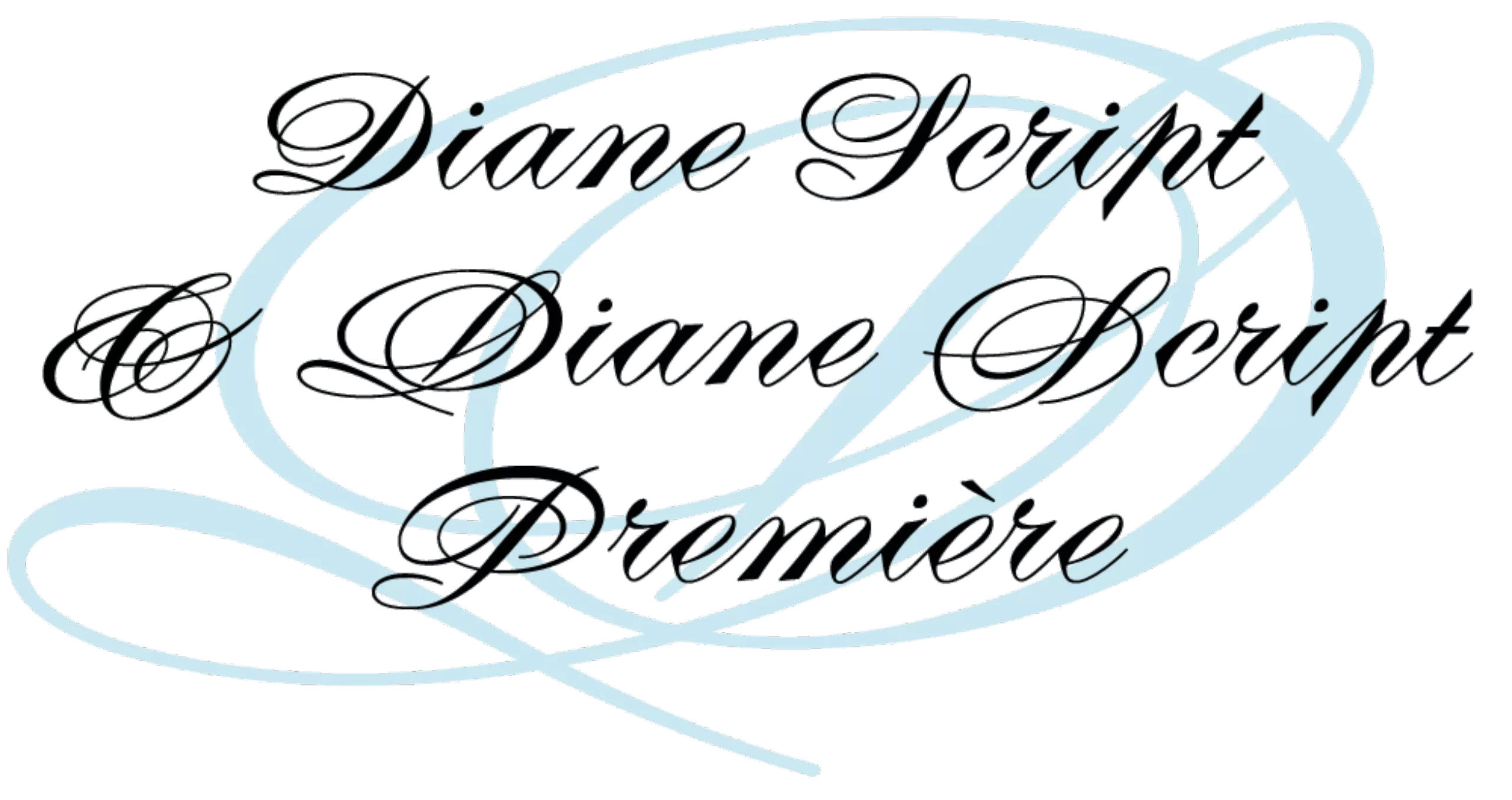
In 2008, Mark Simonson began to redesign the original version of Diane, with all the possibilities offered by digital.
Heading North
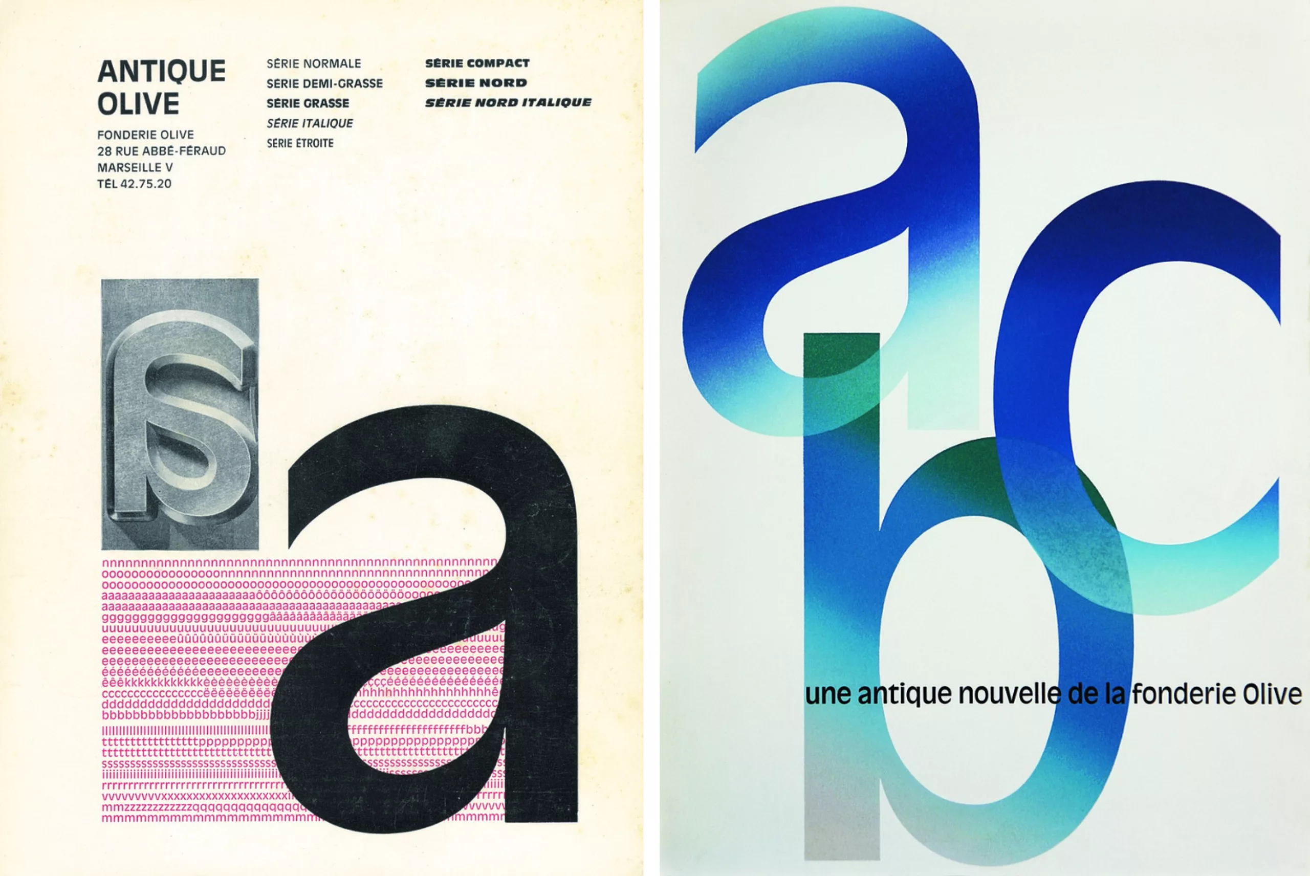
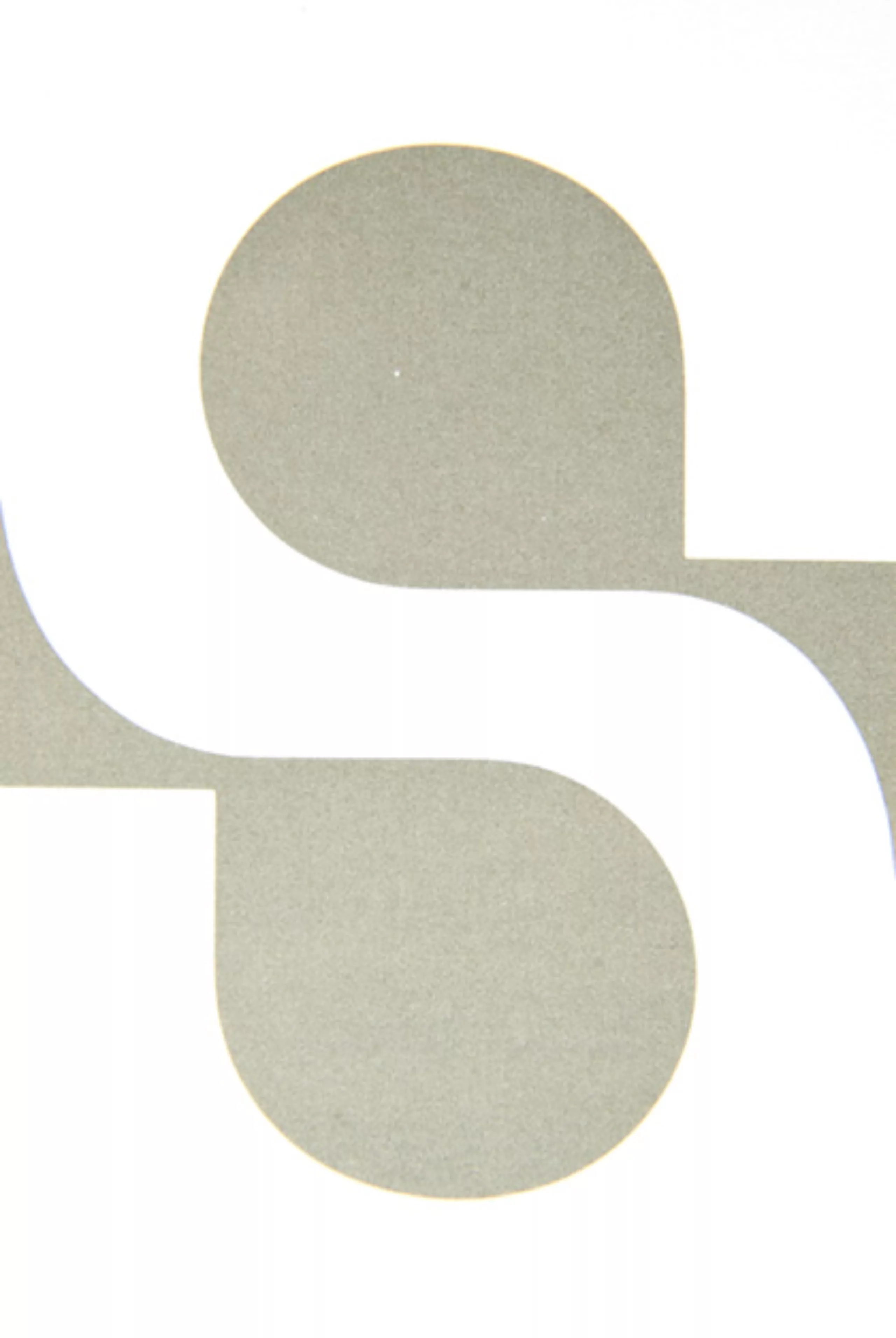
The years 1957-58 saw the emergence of a fashion for linear typography, which is called the Swiss style. Helvetica or Adrian Frutiger’s Universe became the standards of the time. The Olive foundry must react. Excoffon will do it brilliantly by designing the North, which will then be declined in eleven grease variants. The whole family will be called Antique Olive. The North being the name of the “black” version of Antique Olive.
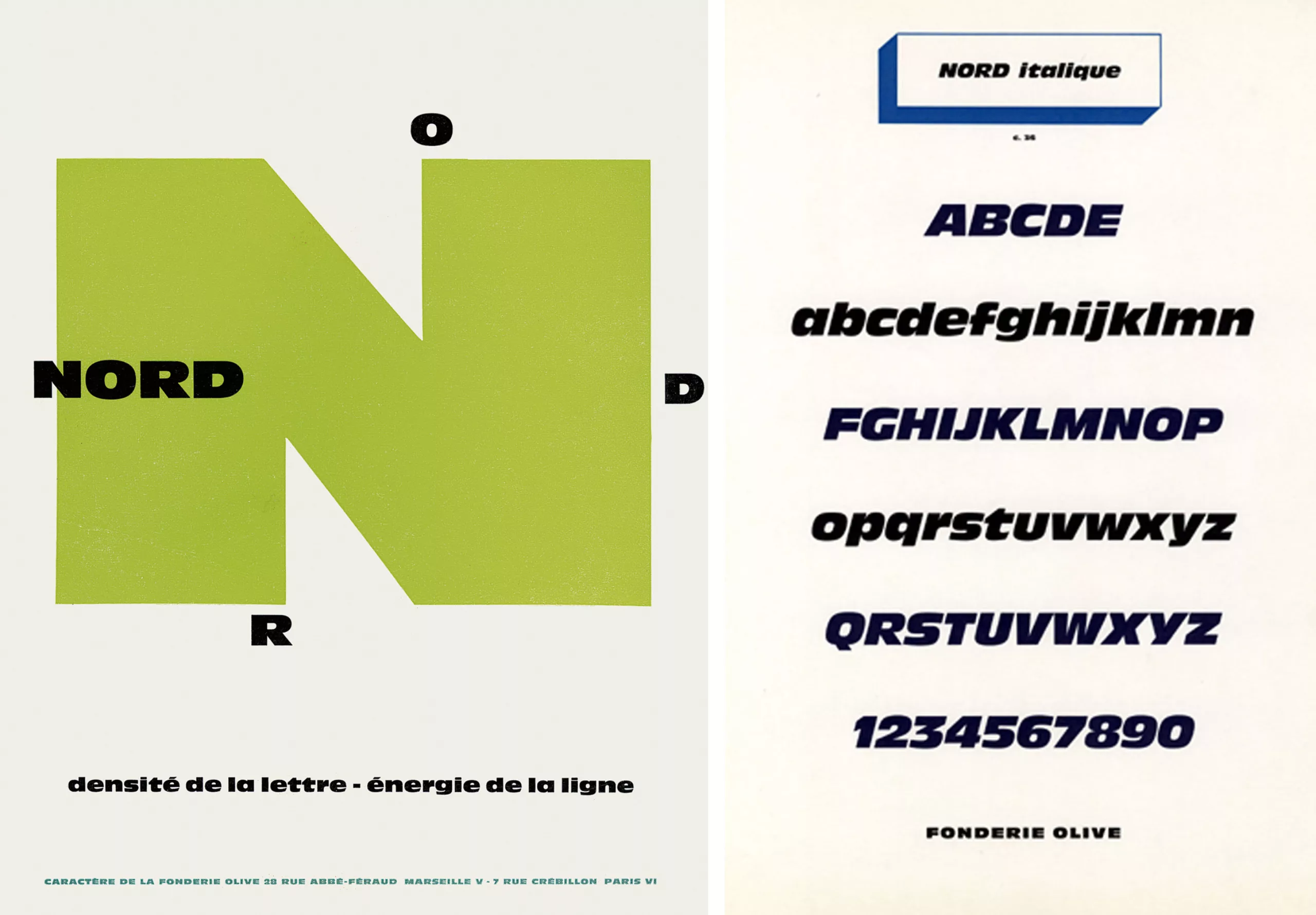
At the time, Roger Excoffon was interested in Louis-Émile Javal’s book Physiologie de la lecture et de l’écriture. In this study, it is stated for the first time that it is the upper part of the letter that is most important for readability. His work on the North and Antique Olive will be deeply marked by this study.
This is what Roger Excoffon says about this work. This text is from the magazine “Caractère de Noël 1960”.
The convention of the letter, from the moment it was born in a few abstract signs corresponding to sounds, has already largely evolved. All influences have thus manifested themselves successively, often due to techniques (such as wheelbases, for example) but also largely to aesthetic wills, themselves influenced by technique.
So far all the “a’s” of the world and times have been established according to a decorative notion. They were all also intended for a page of a certain “color”, strictly decorative design. Thus, here and there, we have been able to insist on the relationship between this decorative art and architecture. One could write quite logically: such and such a character is in the aesthetics of such and such an era, a point of view that seems to me totally independent of the one that can be applied to a typographic character.
In recent years it has become a commonplace to talk about global reading and the silhouette of the word. To construct this word, I cut it into letters. The immediate goal is to eliminate any ambiguity in reading between the letters of the same word. I will take as typical example of error in the drawing of the letter the “e” and the “c” Didot or Bodoni low case. These two letters are differentiated by the middle bar of the “e”. However, the latter is reduced to its minimum in the case of didones, whereas it is in this middle horizontal that the dominant characteristic of the “e” lies.
But let’s talk about the ancient. Our starting point is obviously the antique single fat. The goal: to make it live and, starting from it, to afford a valid game of fats. I used these greases for aesthetic and legibility purposes. Any aesthetic notion coming from the human body, the play of the feather manifested itself before the play of the physical and the aesthetic pleasure.
Until now, fat has never been used to mean. I used this displaced fat to emphasize the significant point of the letter, even though I did not use it in the traditional place, taking into account that this tradition of nuances is not very sensitive to the profane. I therefore relied on reading, this for a functional and effective purpose.
Each letter being thus characterized, the word constructed takes then a more significant architecture. Whenever possible, when a fat was asserted from above, I accentuated it by about 1/10th. When this fattening appeared at the bottom of the letter, I tended to decrease it by 1/10th because of reading from above.
From the moment a character is born in your hands, it normally begins to escape. I tried, after having redrawn my letters many times, to bring them to tolerable for the accustomed eye, at the same time as I affirmed my thesis on the functional reading of the letter.
To spare the eye’s habits, I minimized the effects opposed to tradition, bringing them back to the limit of what I thought allowed by the eye’s habit. Nothing proves, if typographic fashion plays normally, that I would not have drawn, on this occasion, a very timid ancestor.
Excoffon the publicist
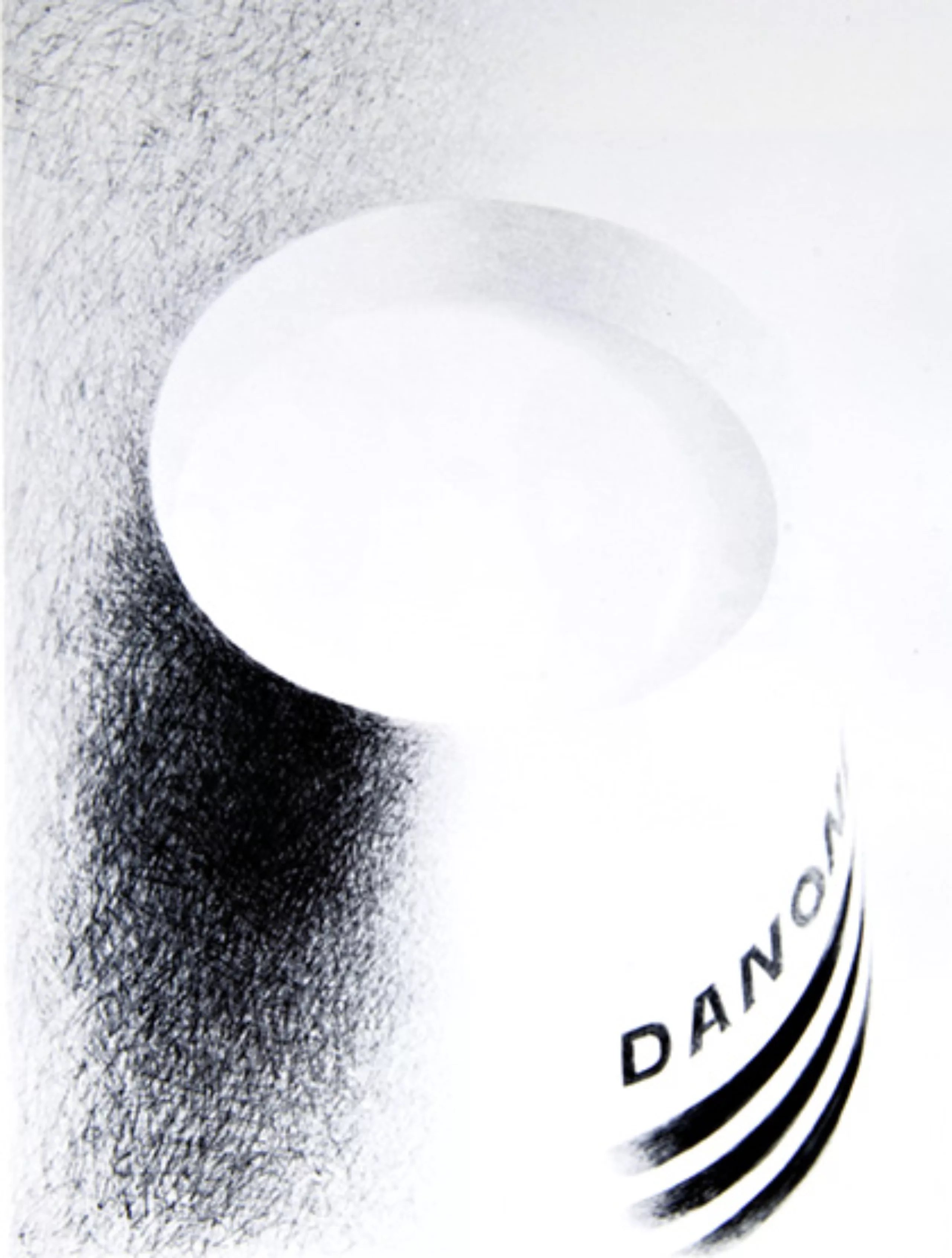
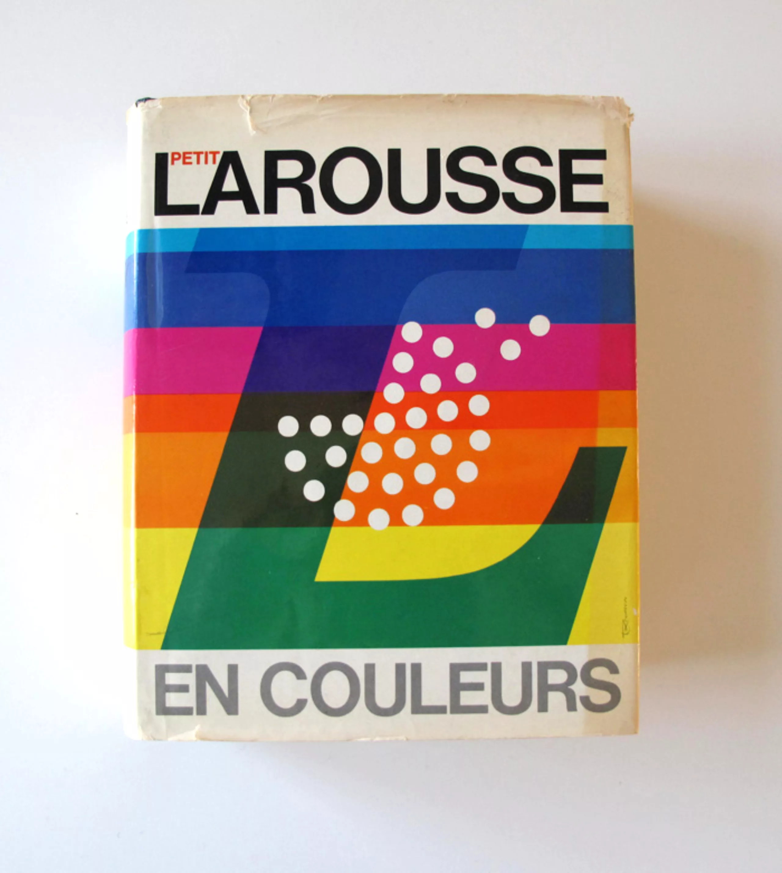
It is from 1959, date on which he stops drawing character, that he devotes all his time to his advertising agency which he founded a few years before. He signed numerous advertising campaigns for Air France, Reynolds, SNCF, Caisse d’Épargne, Larousse…
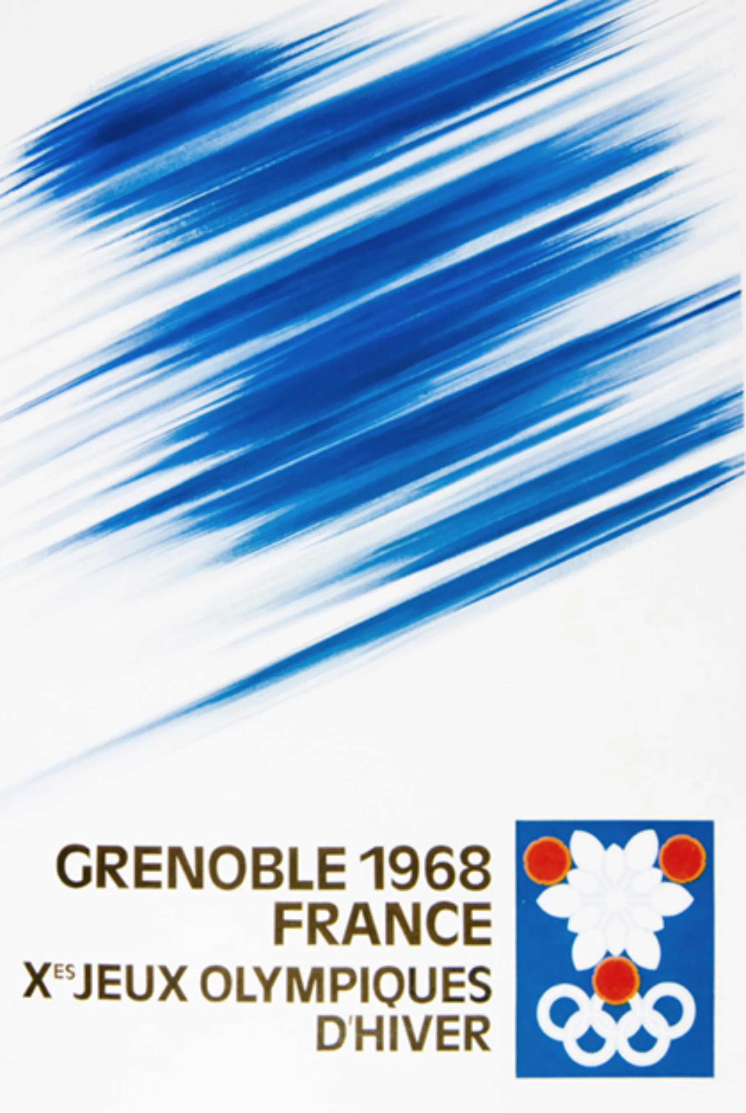
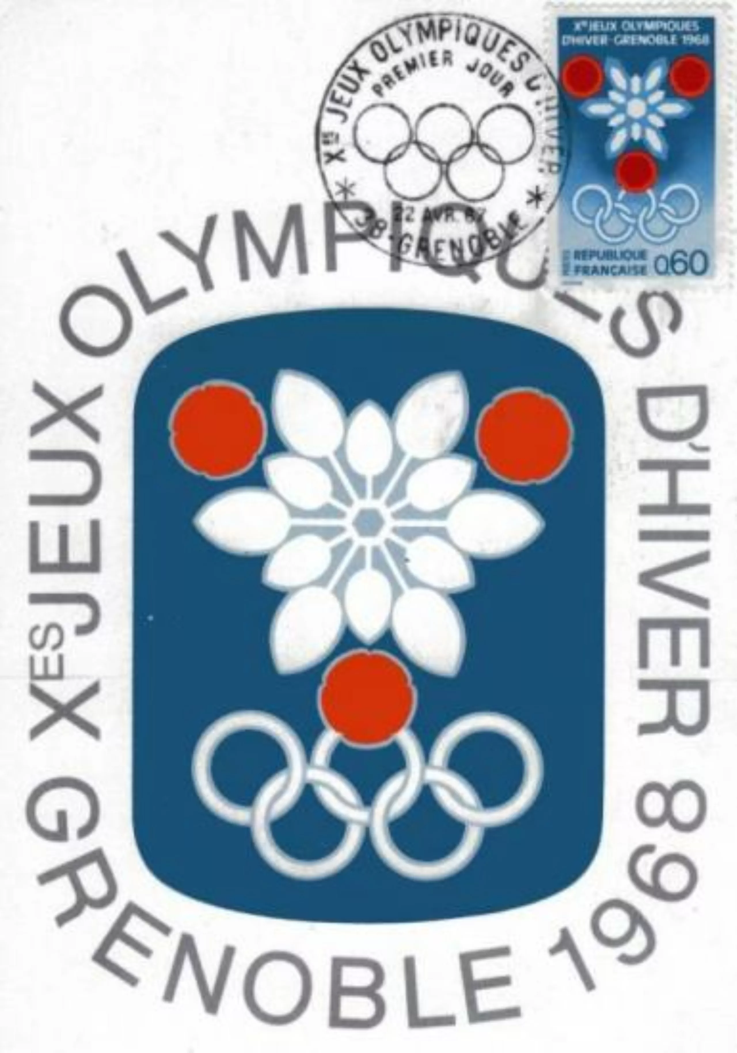
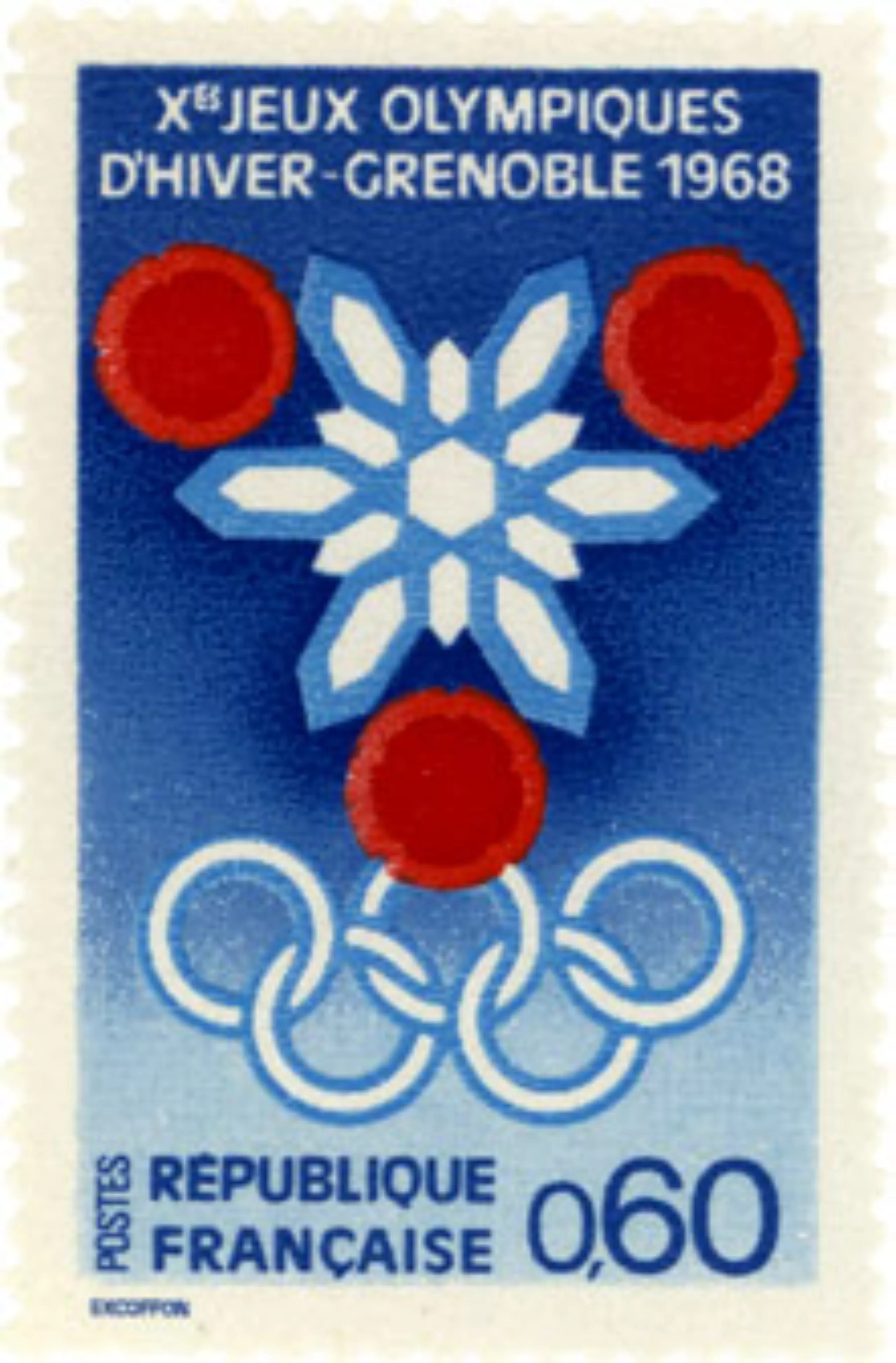
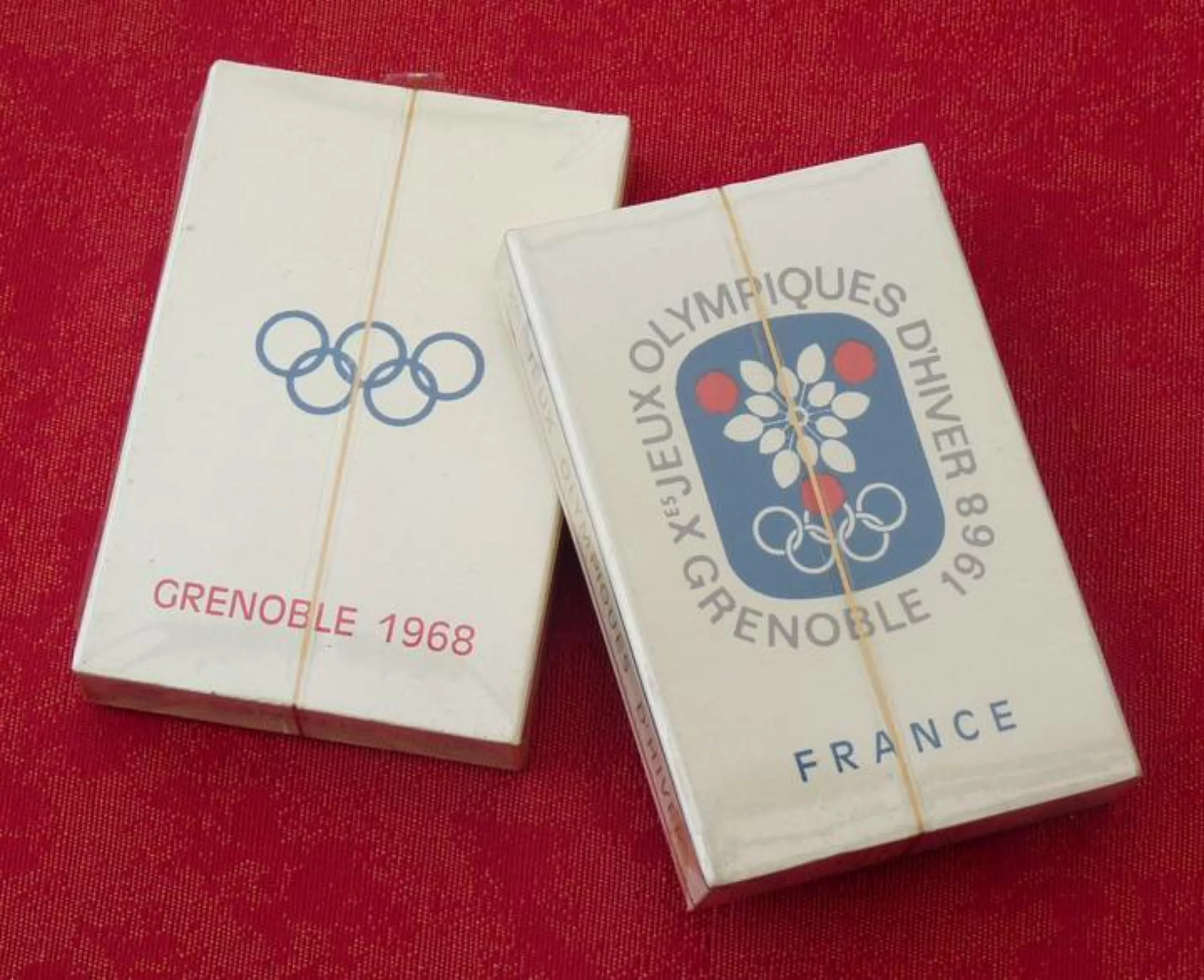
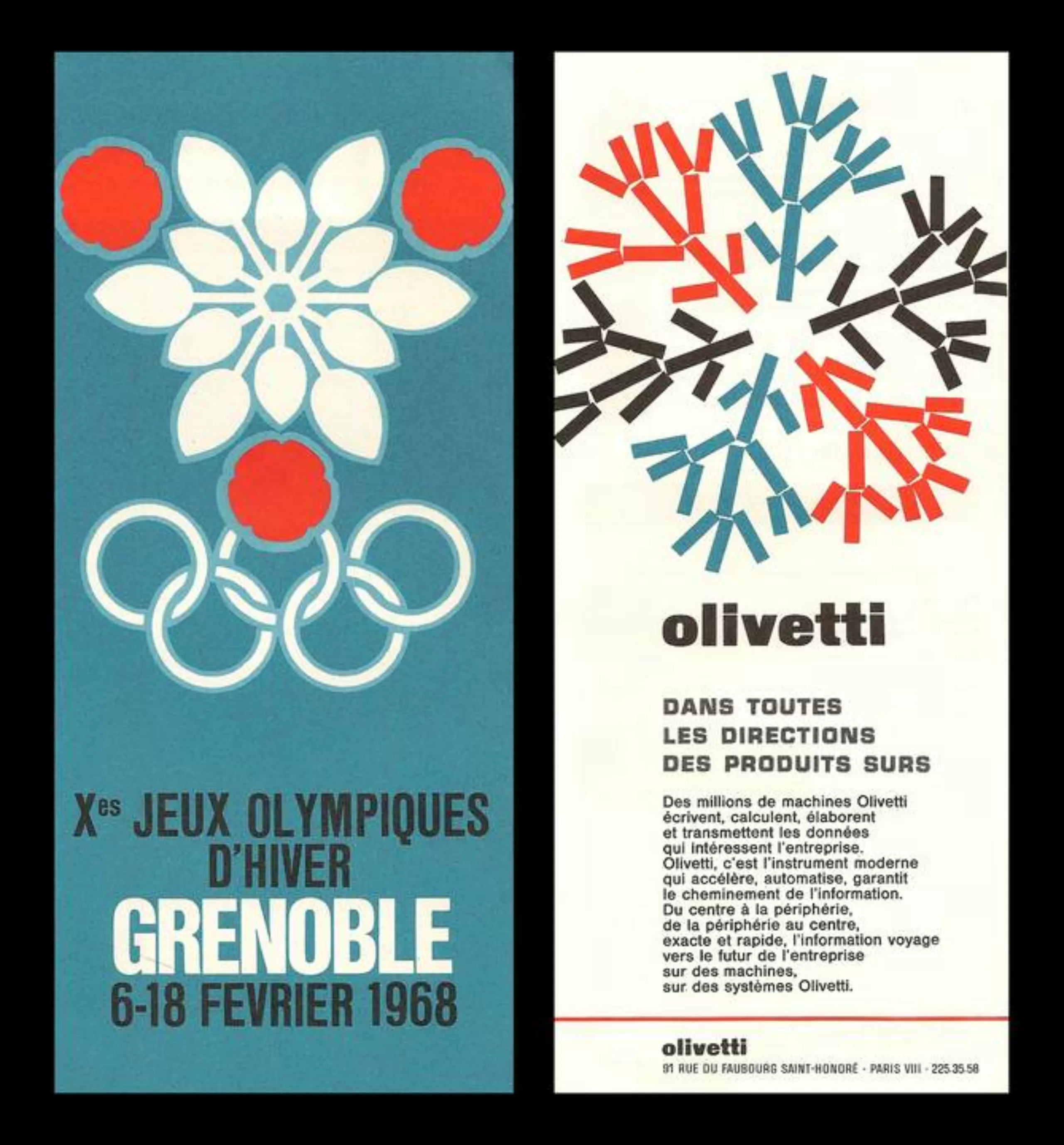
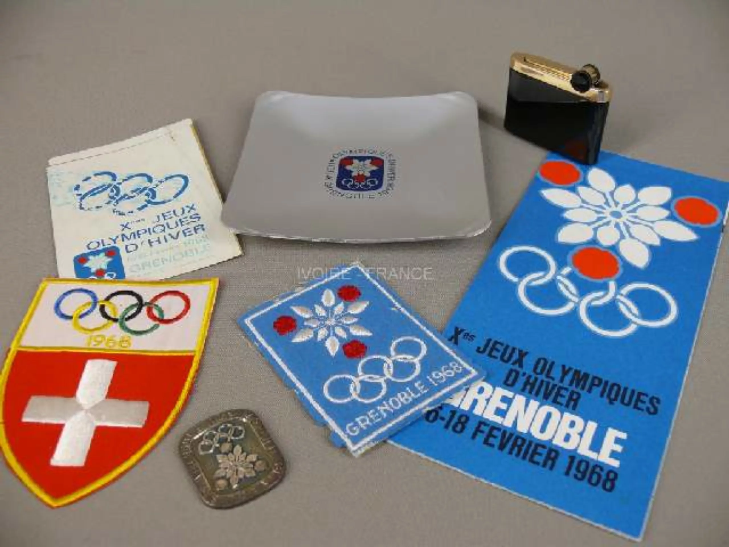
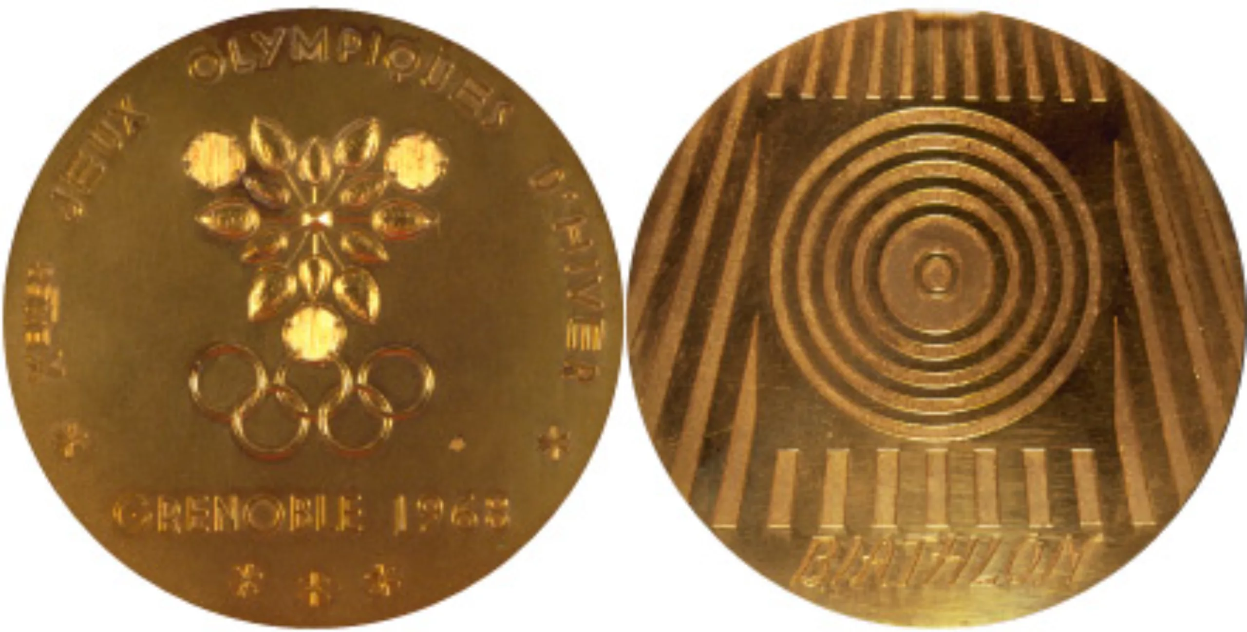
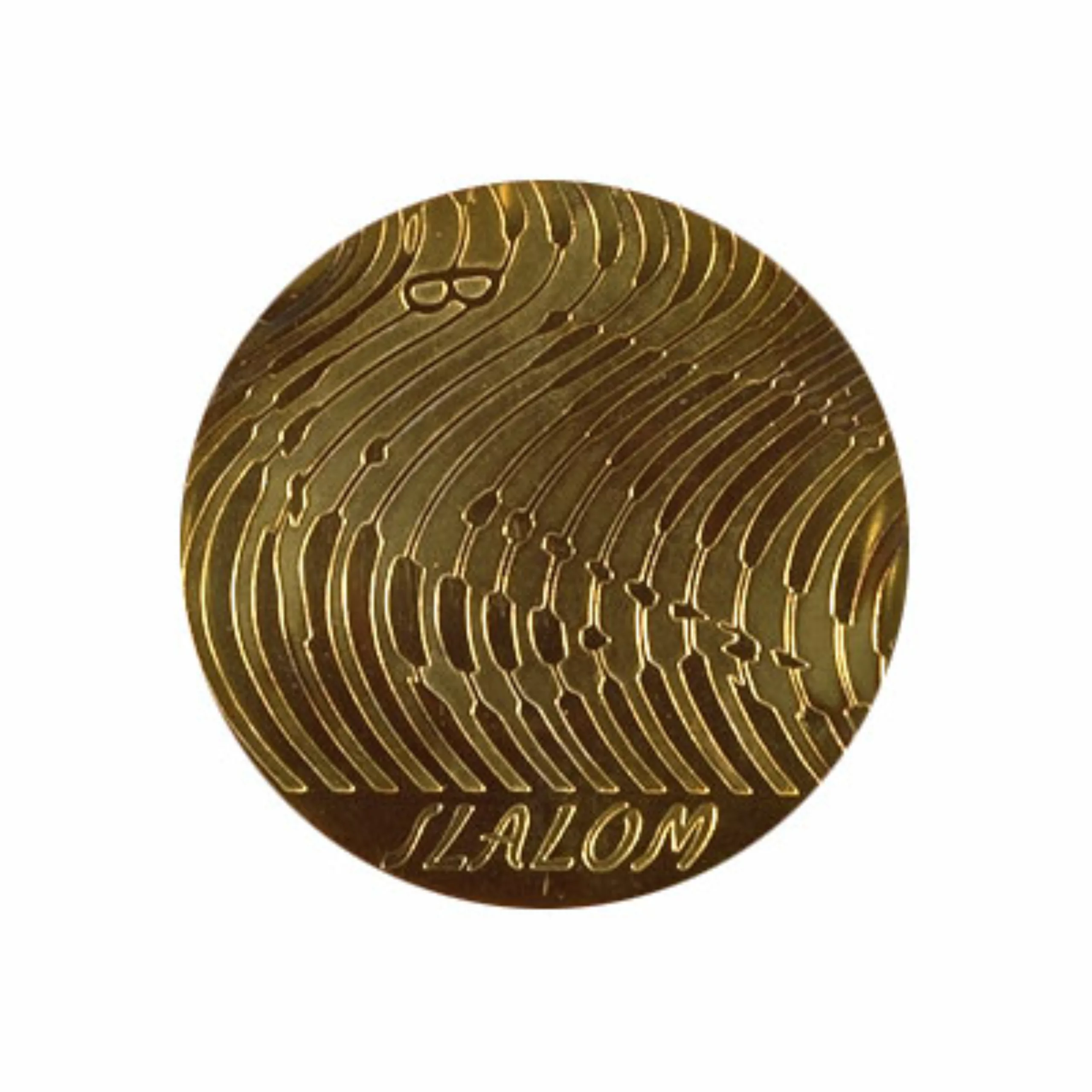
Grenoble Olympic Games in 1968
In 1968, he worked in particular on the visual identity of the Olympic Games in Grenoble, he designed the emblem and pictograms.
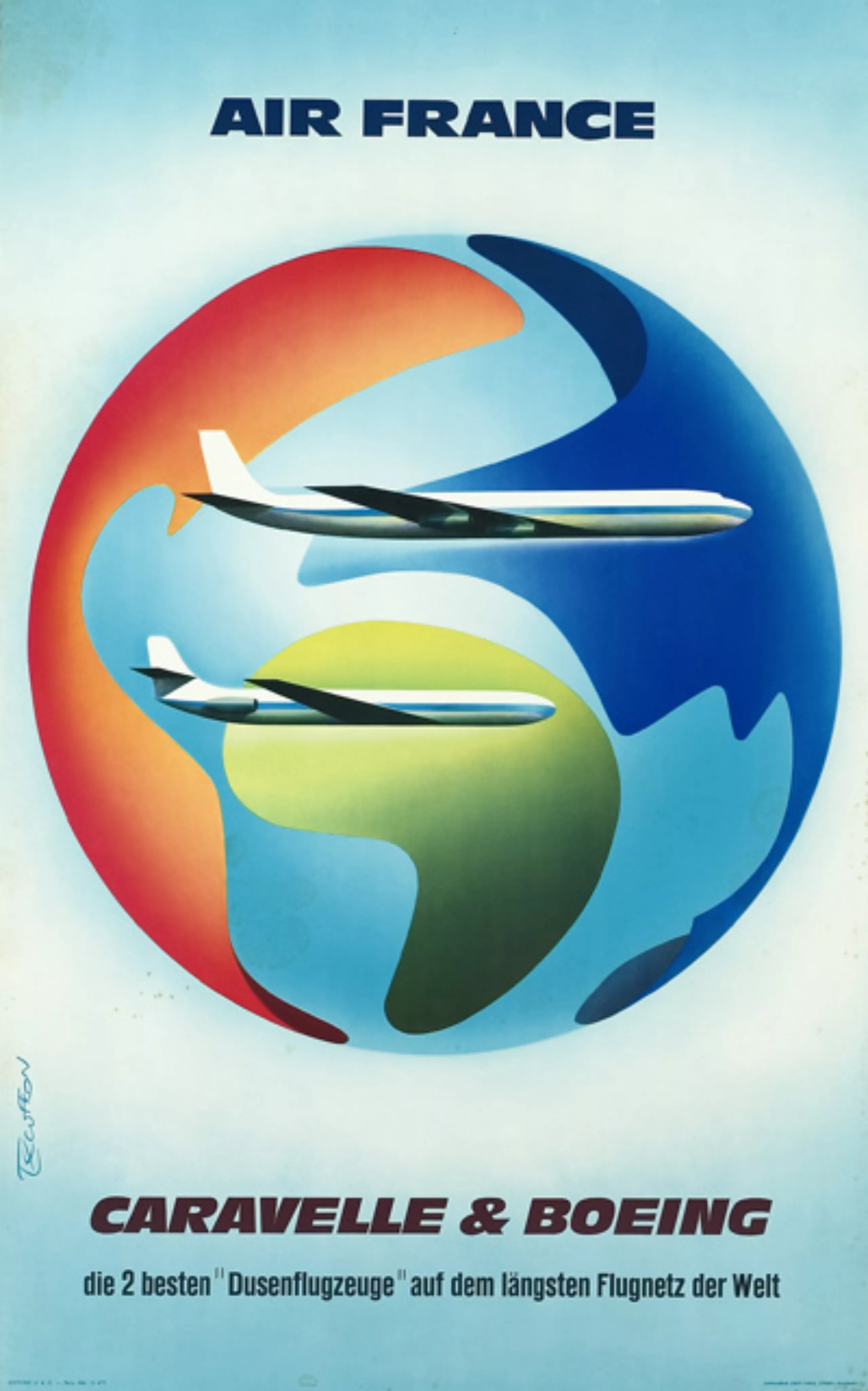
Air France
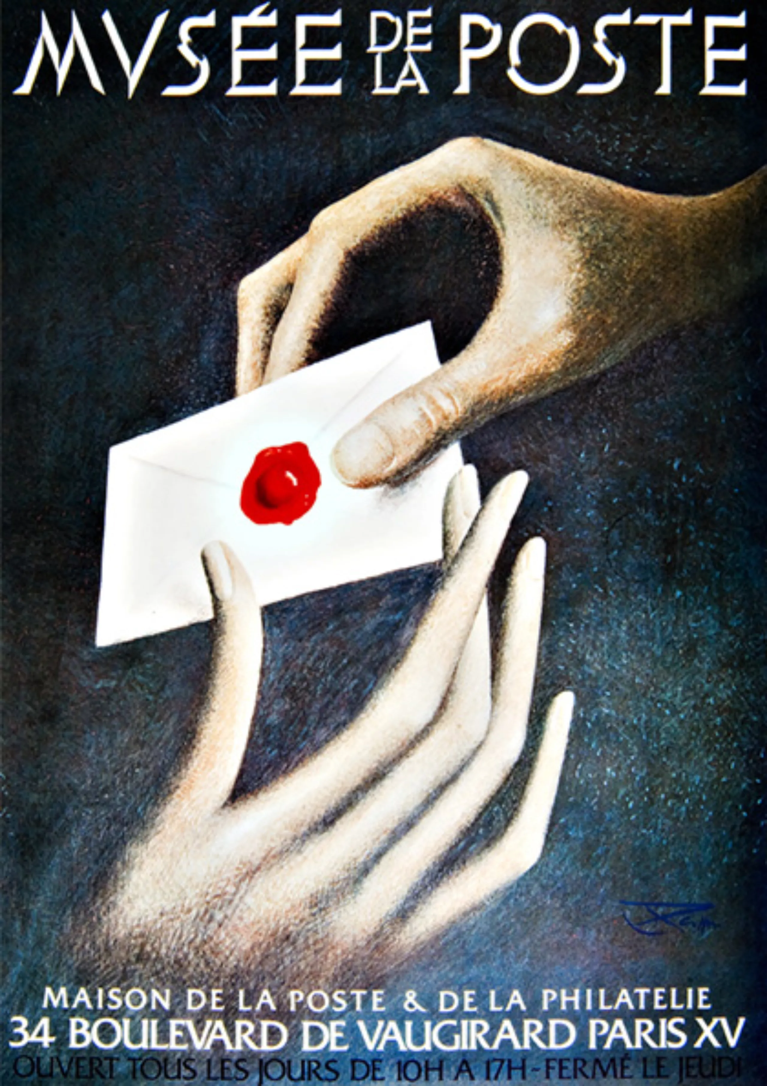
Finally, it is with Air France’s visual identity that he has certainly signed his most famous logo work.
For the record, on Friday 23 May 1958, around noon, while he was working on the beginnings of the North, Excoffon asked his colleague to compose the words Air France with the new Northern character for an appointment with his customer in the afternoon. José Mendoza starts work, 45 minutes later, he is finished. Excoffon took the project and presented it to the Air France managers, who immediately accepted it. This logo will remain unchanged for over 50 years. In 1968, Roger Excoffon will propose a project of redesign of this logo, but it will remain in its boxes…
Below, the Air France logo redesign in 2000 by Euro-RSCG and Jean-François Porchez.
Roger Excoffon seen by Maximilien Vox in 1960
In 1960, still in the magnificent magazine “Caractère de Noël”, Maximilien Vox published the first portrait of Roger Excoffon. Here is the transcript of this article:
Roger Excoffon is one of the great contemporary artists. Artist: because the prestigious graphic designer – also one of the first in his genre – only comes next.
And yet graphic design is so much its apparent raison d’être that one has become accustomed to not seeing it otherwise. Him…?
But let’s go back to basics. Between the school of 1925 – Cassandre, Vox, Jonquières, Salvat, Jacno – next to Paul Colin, Loupot and Jean Carlu… without forgetting the influence of Charles Peignot – and the “new waves” of the livre-club and of Helvétie-à-Paris: a name stands out and becomes a ball, as in the poster of Savignac :
EXCOFFON : sound name and singing – in muffled notes. The one of a Dauphinois born in Marseille. From a Marseillais who looks like an Englishman. A British man of appearance who would have Jansenist soul at the same time, and romantic.
He’s a painter. He loves his Provence. Graphic design was for him a late vocation, almost a duty of state. In less than fifteen years, Roger Excoffon’s conjunction with the Olive Foundry has given France what it had never known since the “belle époque” of Georges Auriol and Georges Peignot at the beginning of the century: an interpreter of the letter entirely, fundamentally, intensely French. Exclusively. Even more Gallo than Latin, which made its international success.
Others, through their heredity, their education, have enriched our inner music with Slavic, Hispanic, Central European, Belgian and Swiss accents. The spelling of Excoffon was Provençal before being French. Because vivacity does not mean facility: Roger Excoffon, the man of the claw and the initials (rather than the arabesque) is also the man of contained force; of the closed face, to the Roman; of improvisation, that is, but twenty times repeated…
A somersault in slow motion.
Excoffon has no learned rules, but a self-discipline in the monastic sense, heartbreaking – I was going to say, Calvinist. What allows him to be whole in his work, this mixture of welcome and refusal that solves itself (for the spectator) in a joy all the more delicious to have been difficult.
He did not take his themes, like most of us, in successive news, tasty old things, an excess of erudition, or a catchy radar of all snobbisms. To fully understand it, one would have to hate it a little; follow and surprise the path of very few motifs, but pushed and dug to the extreme depth, perhaps to the extreme repetition. Every morning, it seems, Excoffon, a scrupulous artist, reinvents himself according to the same standards, those which are sincere to him.
The least informed spectator will discover the major leitmotiv of the whirlwind; and the one (who hardly yields to him) of the music of the spheres. Then the battle of angles and lightning. Then scrool, baroque involution. The treatment of the colour by clever passages; of the drawing by magnified Japanese brushstrokes; of the surface by scissors or scalpel blows. A surrealist mental and pictorial arsenal, but in the manner of Henry Miller (to whom he makes think) who without having read a line of French preceded in his subconscious and in his writing the Manifesto of 1918. But instinctively, the author of Mistral, Calypso, North, preferred this absolute abstract, this non-figurative art by definition that is the creation and use of the letter printing.
Everything is a case of conscience. If he has given himself fully to the School of Lure, it is because he feels an imperative there; he has fruitful self-criticism. Despite his love of typography, he touches it with the distant courtesy, without tenderness or appetite, that would characterize a marriage of reason.
Besides, joy is coming to him. For four years, Roger Excoffon has “entered into advertising” as one enters a box: with the will – and also the power – to engage in a decisive and public action the fruits of a young maturity. It is a closed field of experience, a true champfleury, that the creation and dissemination of print characters.
From the first draft, without having passed through the channels, Excoffon found itself at the upper level of the advertising business: it entered from above, as wine enters bottles. He attacked the problem of big publicity by the head: not as a pretext for concessions, but as a means of expression. Overexpression.
Behind the confidences of the easel, the darkness of the galleries, the laboratory tournemains… In the harsh sun of advertising, far from fading away, the essential talent of an Excoffon exalts itself. What he would not dare for him, who would intimidate his canvas – advertising-wise, he dares. For the client, he has the audacity of boldness. Happy. And the audience, the man-of-the-street, who understands quickly and far, is happy with him.
Let us praise the gods for having drawn this painter-drawer (there are few of them!) from the cult of the self alone, to throw it all alive on the agile paper, between the fast rollers, diluted in the odoriferous ink… the material of our time.
The following pages are a reasonable and reasoned tribute – the first – of the French printing profession to the artist in whom it feels it is growing.
“I print, yes: but I express myself!”
MAXIMILIEN VOX – 1960
Here is the complete version of this article published in “Caractères Noël 1960”.
Roger Excoffon seen by his collaborators
In 1983, at the time of his death, Gérard Blanchard and José Mendoza, his former collaborators published an article in the form of a tribute in the magazine “Communication et langages N°57“.
Roger Excoffon left us in the last days of May. It is not yet possible to achieve this. I agreed to talk about it a little while I’m not writing. But having worked with him for five years at the Olive Foundry, having left him out of a desire for independence, with regret, maintaining frequent contacts and maintaining relations of sober friendship, what I can say of him will be my tribute of friendship. I wish he would perceive where he is the very sincere feelings and all my affection that he can guess. He knew the sincerity of my words and our constant connivance. His family and friends must also be willing to accept my very modest testimony.
My image and perception of Roger Excoffon
I will quickly recall his main titles and functions. The professional press has regularly published every important moment of his works. He was Marcel Olive’s brother-in-law and was the creator of the foundry’s alphabets at the Olive Foundry. At the same time he directed his own advertising studio where he acquired the reputation of the only great French poster designer, the one who could take up in a very personal style, and so eloquent, the torch that Cassandre had carried: between one and the other, nobody of comparable stature.
He was a member of Icograda and a member of ATYPI since its foundation in 1957. Charles Peignot held him in high esteem. He chaired the SNGP (Syndicat national des graphistes publicitaires) for several years, and after Maximilien Vox chaired the Association des compagnons de Lure before it became Rencontres Internationales de Lure. Then, more recently, he was a member of CERT (Centre d’études et recherches typographiques), led by Charles Peignot and Georges
Bonnin, director of the Imprimerie Nationale, later taken over by Mr Beaussang.
And then, and then… he had to have many other presidencies and many other functions. I probably do not know some of them, his discretion and modesty did not lead him to mention them. He had for several years founded his own advertising agency: Excoffon-Conseil. That’s a lot. It was a full, lively, dense, fruitful, multiple, exemplary life? I don’t know! Probably too intense, but so deep.
He was also on all the juries and was my godfather when SEAI (Société d’encouragement à l’art et à l’industrie) agreed to award me its medals three times; did he have them?
I think he didn’t care but deplored how much the official or national organizations ignored our profession, advertising but especially typography, by the snobbery which consists in often going abroad to look for what we can do, and do well, in France.
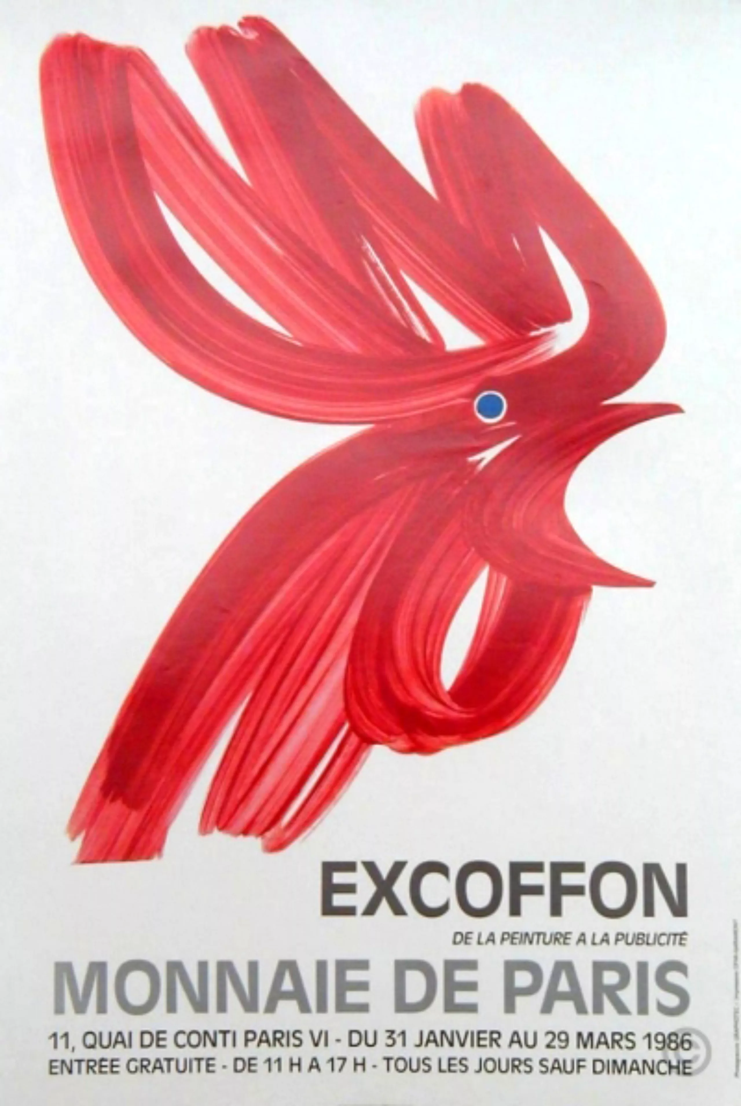
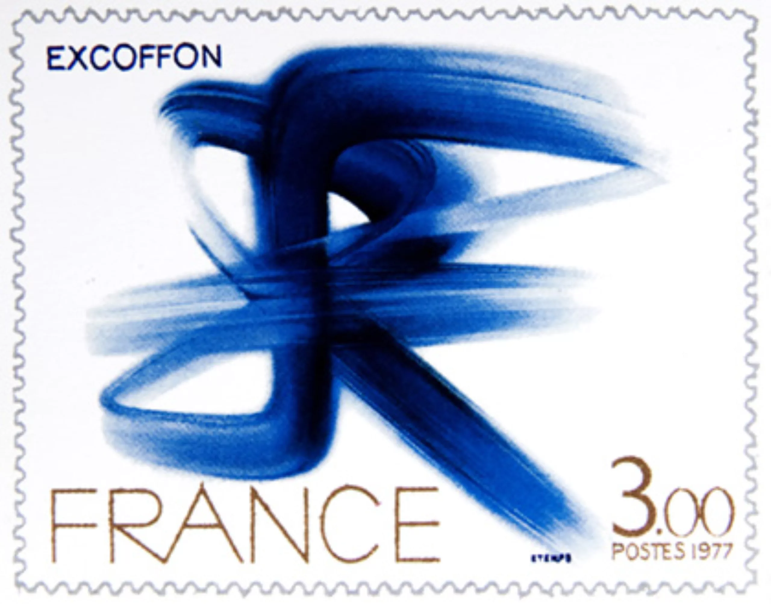
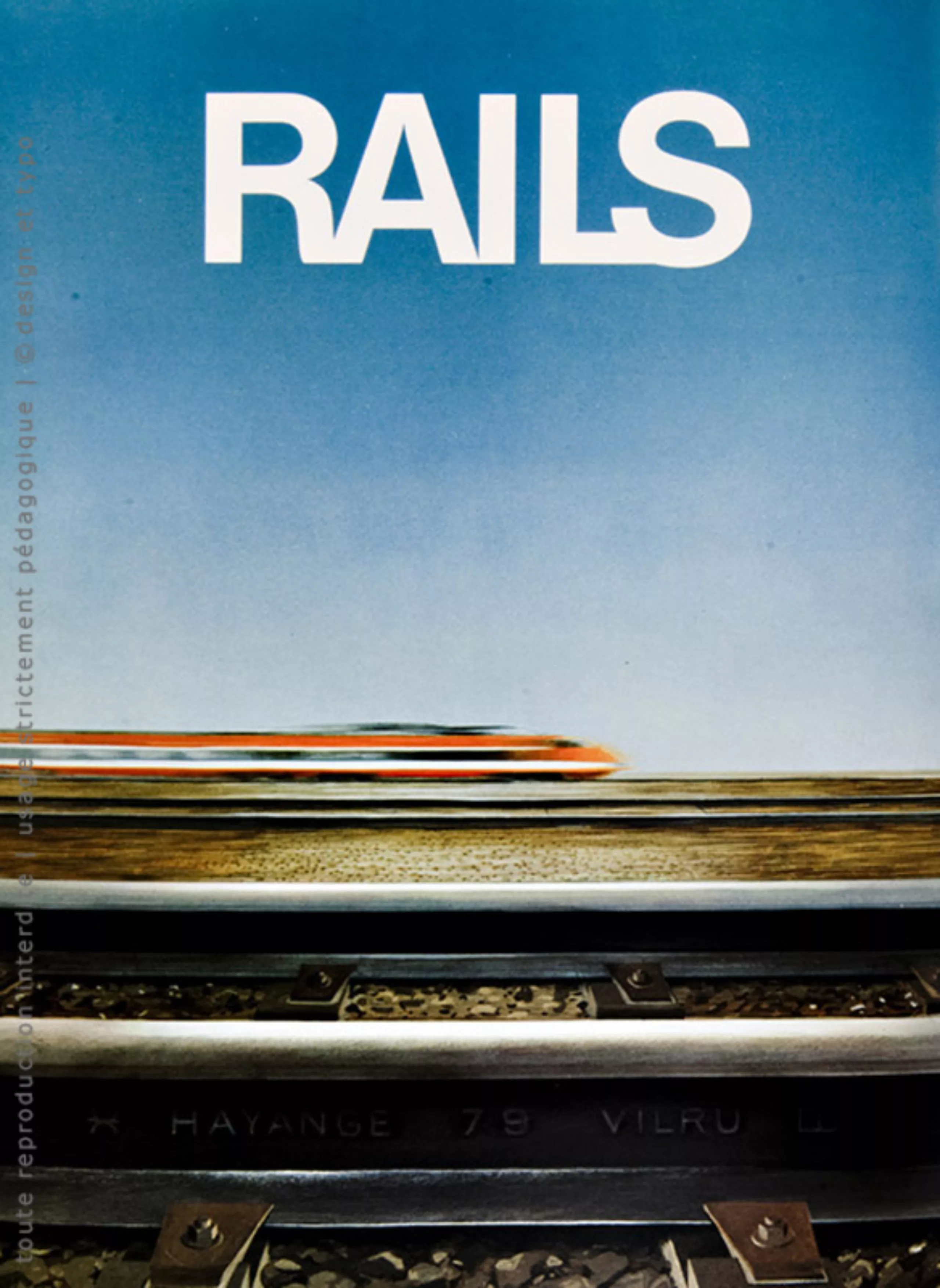
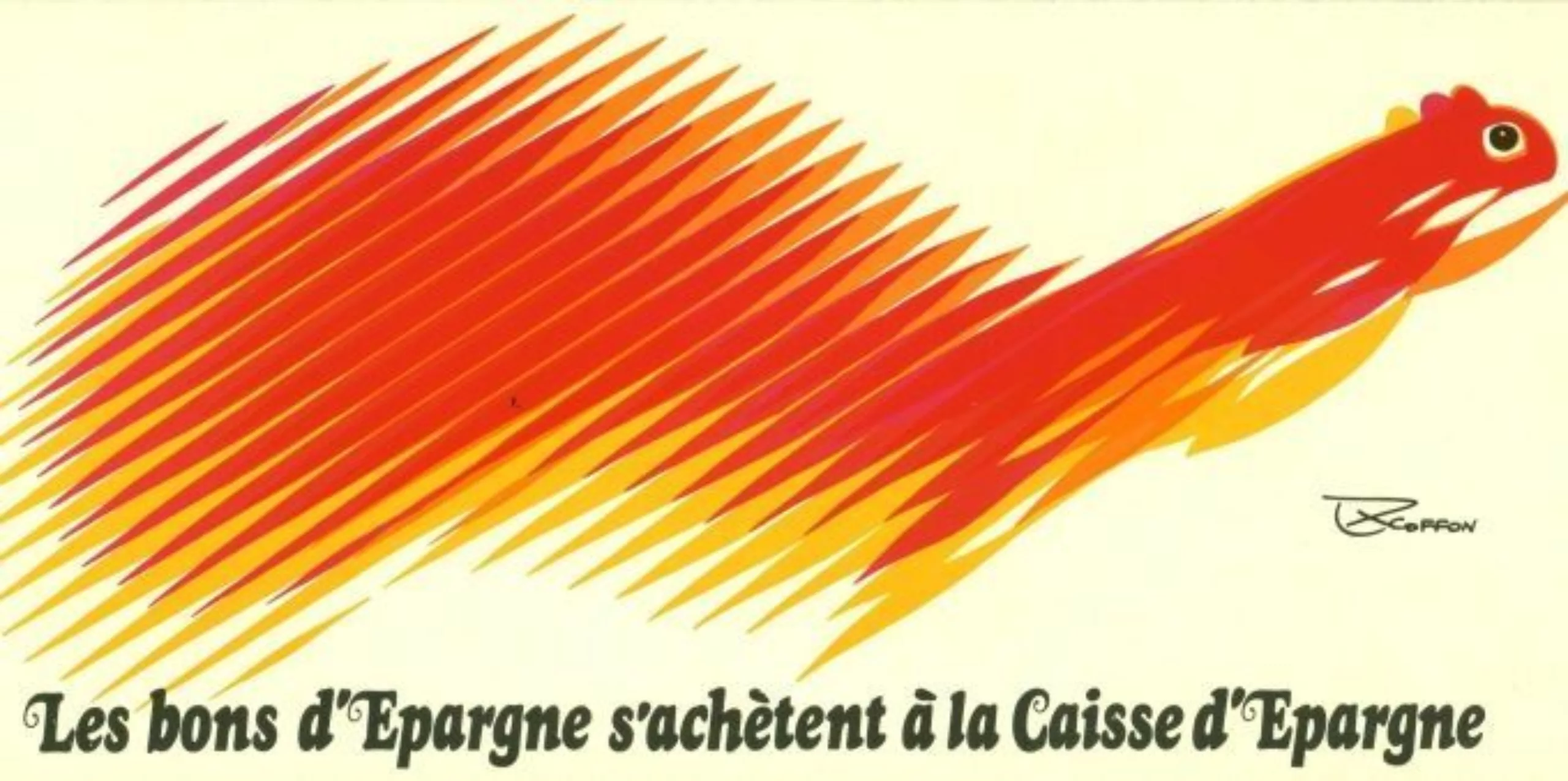
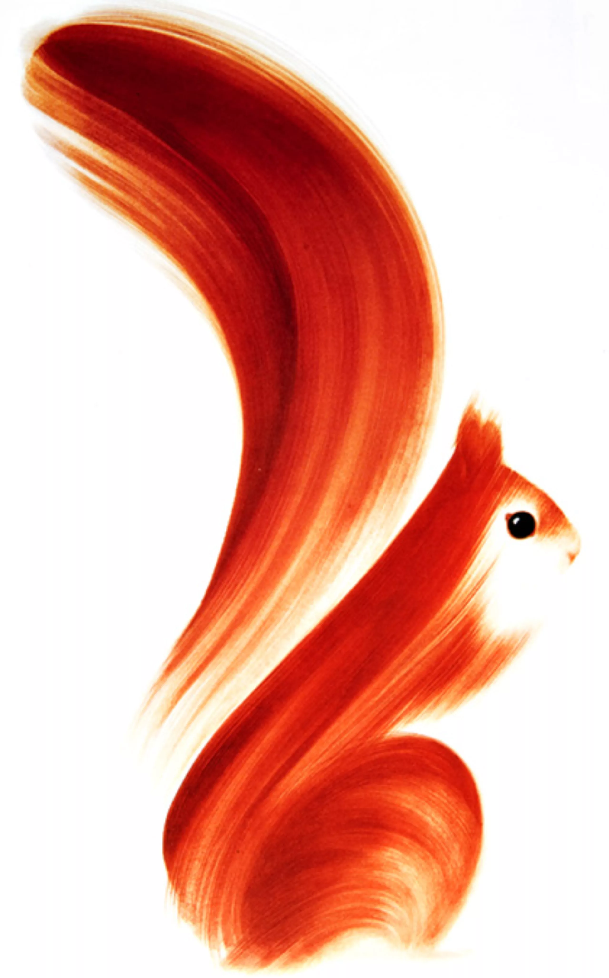
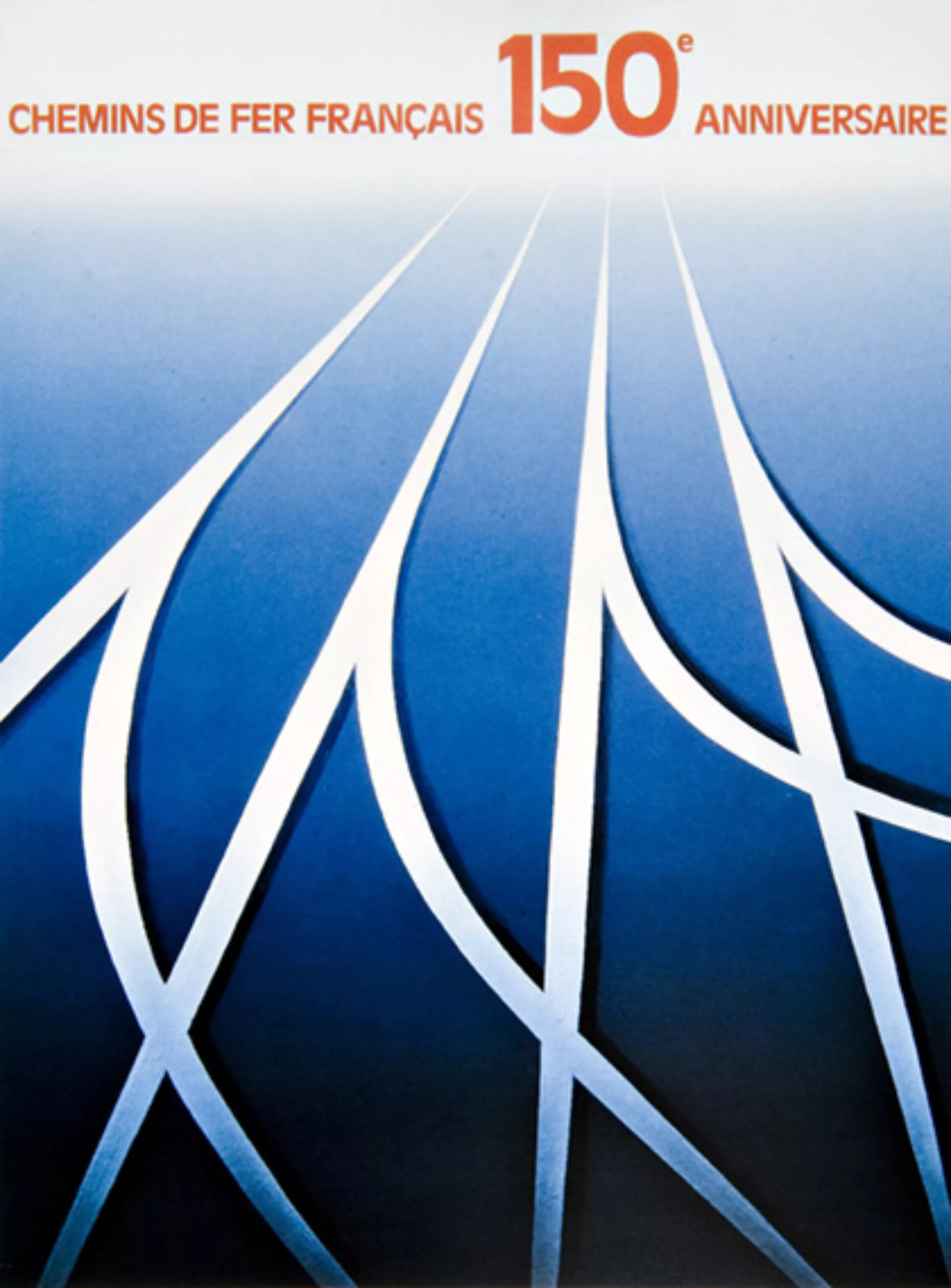
His conception of our nation was organic, vehement. The affirmation of the French gesture he embodied and deserved. His posters bear witness to this, the Coq de l’Expo internationale de Montréal was a national outcry the Ecureuil de la Caisse d’Epargne, Bally, l’Oie pour Delpeyrat I believe, la Poule, campagne nationale very recently, the commemoration of the 150″ anniversary of rail in France, very close to Cassandre’s style, with blues belonging only to him. Finally, the extraordinary sober, bare, energetic, indomitable monument of the Air France poster, an absolute symbol of Excoffon’s gesture. He also signed, in the artistic series, one of the most beautiful French stamps, his abbreviation RF is exemplary, concise, vigorous.
I probably forget many others, they do not appear in my memory, it has little importance each of his works was noticed and so much to him ! I would like to avoid an exact enumeration, it would not have suited him. Excoffon was not a man of accuracy but of spontaneity, of speed, of refinement, in constant search of perfection, of his perfection. Very complete, very complex, in continuous search of the ideal gesture, the first being almost always preferred, in spite of his repentance and the insistence he carried to modify, to perfect. It often translated, at the end of a gesture, of a form, by “And then m… it goes!”. For many, Excoffon was not who he really was.
A great personality
A full and complex individuality
I worked with him for a long time and believe that I knew him well, appreciated and esteemed him as he is (as he was!). All those who saw him for the first time were impressed, often disappointed by the first approach: many young and others, less young, saying him distant and icy, … even refrigerating! How unfamiliar it was. Excoffon is all at once.
A tall, slender silhouette, which he has always kept and which gave him what very few possess: distinction and unquestionable class. A kind of gentleman with the intonations of that Midi that suited him. Excoffon is something else. Casual and attentive, superficial and profound, he lived with intensity the multiple contradictions of his behaviour, his intentions, his gestures. Both secret and exuberant, its multiple and abundant image is the reflection of its truths.
I retained and preserved in me what I felt most essential: a great discretion, an exceptional tact, a modest warmth in feelings, an immense kindness. I felt him multiple and sincere, and always sincere in his choices. He often said that we are in the business of fishing… I think he pays tribute to us all. Deep passion inspired him and his deaf anger tormented him. I never heard him scream. His restraint calmed his outbursts. Everything ended with a knowing smile, a jest. His assurance concealed his hesitations, and his authority, indecision.
A childish, sometimes candid and spontaneously candid player, he marvelled at every discovery, like a child. I remember: at the workshop of the Olive Foundry, I used to whistle or sing a few bars of Bach, he tells me that he listened to me with this astonishment that you can recognize when a child discovers… music here (why not the building set?). On another occasion, I communicated some joke in Spanish, which he did not understand well, only the intonations that I wore there made him burst out laughing.” Tell her again José!”
A very discreet connivance between us. The atoms were circulating. A lot of modesty. We’ve always vouched for each other. He probably agreed with me that tutoiement is not necessarily the best distinction between friendship and friendship. It would be unfair, I think, to recognize in him only qualities. Some aspects of his work behaviour were often annoying (but when you love, you don’t count!). He was never there when his presence required it, always
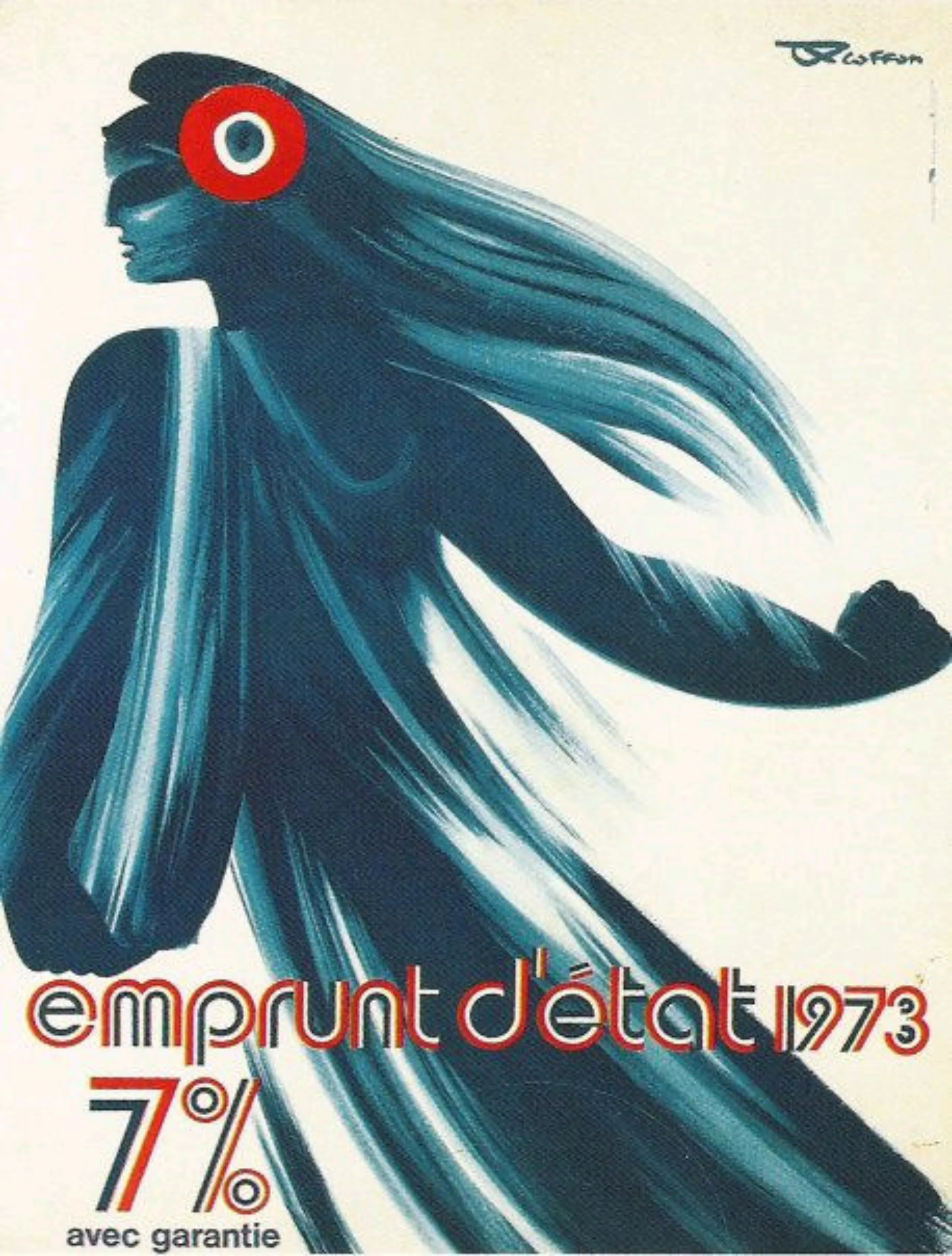
a race outside, a customer to see urgently or a package of Gypsies to buy! So, then, it was necessary to improvise, to know how to guess one’s intention, one’s wishes, whether they were shapes or colours. We knew his colours well: “RAF blue and mustard yellow”; a few others, too, whose most faithful approach we had to feel. More difficult the definition of a curve, he has his, I mine, very different. A great habit of his gesture, in the very way
and a respect for his movement made it possible to accommodate the steps and to remain “Excoffon”.
I cannot evoke his creations without mentioning the deep imprint that his belonging to painting and his training in painting left on him. I can’t talk about it, it didn’t inspire my beginnings, but I think he admired Paolo Ucello, Fra Angelico and their Italian contemporaries. Relief. Hartung and some others like Mathieu situated Excoffon in a contemporary, but structured, bare current, where the gesture supported by the color predominates.
His advertising activity allowed him to express himself totally, the abstract but significant forms illustrated for a long time his inserts for large pharmaceutical laboratories. He surprised me infinitely, bubbling with ideas, brilliant improviser, his acute sense of nuances and masses of harmonies and tones found in this type of illustrations the faculty, how much then health, to suggest.
Banco, Mistral, Vendôme: font characters of character!
But Excoffon is the exceptional inventor of the Olive typography forms. Let me draw a parallel between the Olive and Citroën creations. A succession of Olive-Excoffon characters has marked contemporary French typography of undeniable originality: Chambord, Banco, Vendôme, Mistral, etc., just as Citroën models have marked car aesthetics: the clover, the 11 and the 15 HP, the 2 HP, the DS, etc… both have been equally successful.
Excoffon knew with genius how to be different. After the war, the Olive Foundry was dominant, thanks to the great vitality and competence of its commercial agents, but above all to the exceptional originality of the characters created by Excoffon. He said to himself, in the profession, that his characters were and are fashion characters, attaching to them of course a notion of “ephemeral”. Today, however, there is not a single French village or town in the South, the Centre or elsewhere whose shop signs are not registered in Banco, Choc or Mistral. Ephemeral? Although he said he didn’t care, I think Excoffon could be proud of such a success, such durability! You can be indifferent to your own image, but not to the one you reveal in your creation! It’s sou
It is certainly a great satisfaction, serene and stimulating.
From the end of the war, the Chambord (double lineal) made the fame of Olive it was designed to compete with Deberny and Peignot’s Touraine which did not manage to spread widely. Why was the Chambord so successful? Probably a young, new and dynamic advertisement contributed to this. From this competition was born the ATYPI (Association typographique internationale) at the initiative of Charles Peignot.
Excoffon, which did not come directly from the typographic sector, undoubtedly innovated each time in very particular sectors: originality, advertising, novelty and a certain dynamism.
Excoffon was and remains a man listened to and discussed, challenged and admired, or envied. I’m sure that the extraordinary seduction he gave off was very embarrassing, but we all succumbed. Nothing mawkish, nor superficial and yet she was also a cicada, casual, sometimes having fun like a child, deep and obstinate, unstable but stubborn and subtle.
Vendôme
Perhaps the most famous character of the Olive Foundry was the Vendôme. Yet it is signed Fr. Ganeau. Indeed, it was François Ganeau who began the first test drawings of the character that was to be the Vendôme. li had to renew and rejuvenate Garamont by creating a classic but modern type.
I have seen the trials of Ganeau’s tests and I can testify that almost everything that made the Vendôme original, including an aggressiveness (excessive in my opinion) desired, is due to Excoffon’s paw, to the subtle play with shapes, patterns, habits, conventions. Very dynamic (too much) very new, new and relentless, the Vendôme is a fighting character more than calm, but what a success! We fly to the examination of the other series italic, bold, black,
all the intentions, better perceived in these series, which marked since the Roman the color of the prototype.
Excoffon did not draw everything himself, he entrusted his collaborators with the task of developing and executing. It took me many years to realize how much this man knew, without explaining, demonstrating or describing, transmitting to those to whom he was addressing, exactly what he wanted to appear: “You see? A little snap of the finger, and we understood, it was not obvious! But I think I understood it well, very well. A lot of finesse, subtlety, refinement and
of hesitation. How far can we go?… Often perfectionist, it delayed walking, but it worked well; not like a machine “from beyond Jura”, it was very Latin, sometimes trying for Cartesian minds, but never monotony or boredom.
Mistral
Genius again with the Mistral. Everyone wanted to see the transcription of their own writing, that of R. Excoffon. Certainly, Excoffon had a rather illegible writing that one did not imagine at the origin of Mistral. And yet! The multiple directions of the poles, some finales, the antisystem, the lively and spontaneous disorder, the vigour, the shortcuts of Excoffon’s writing can be detected in this character. Rejection or accentuation of the writer’s graphic intentions? Probably all at once! All character foundries have a “writing”, “writings”, none imagined so much realism, so natural.
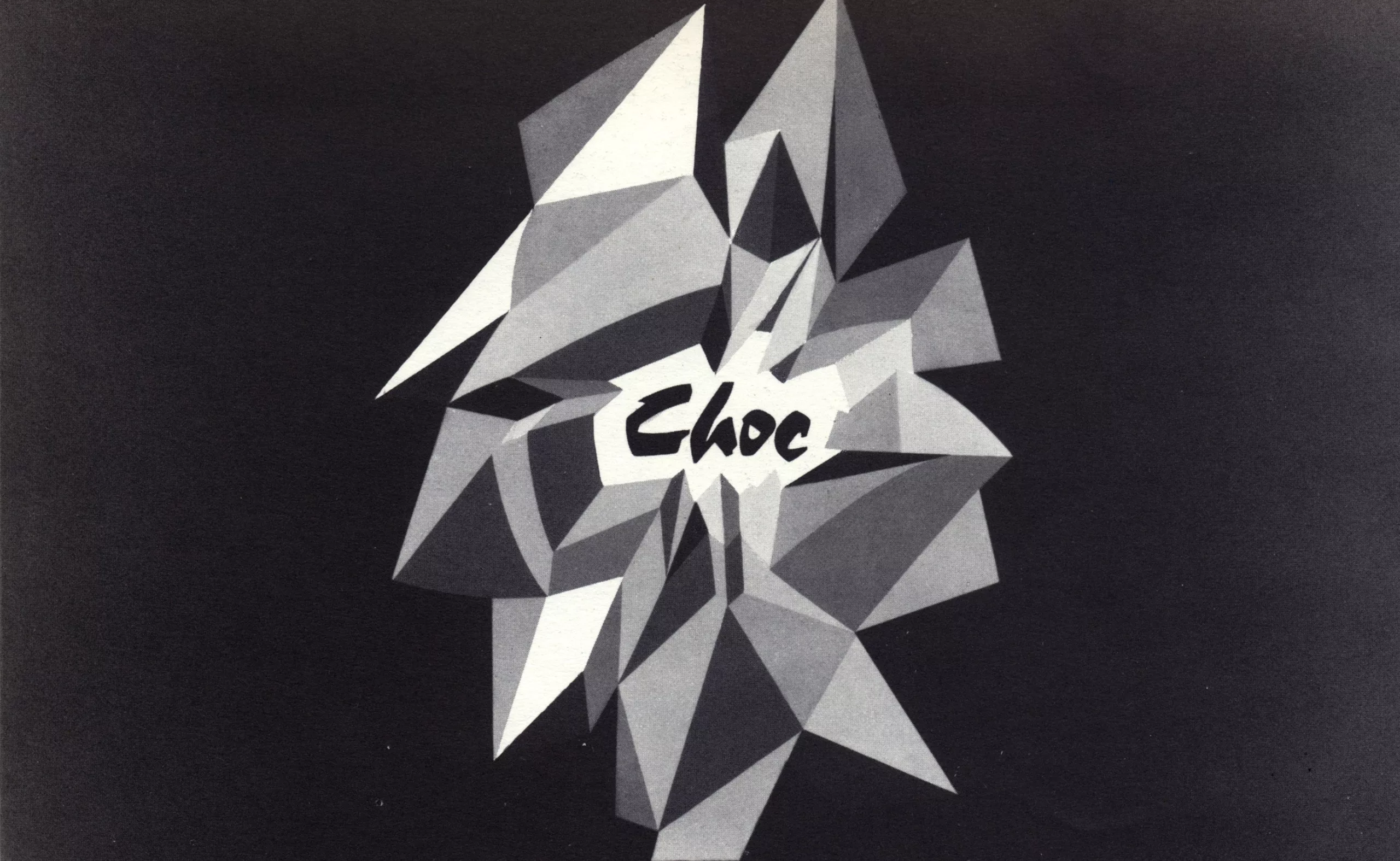
In the wake of the Mistral, the Olive Foundry, and therefore Excoffon, decided to add a series, the Choc, inspired by the previous one, but denser, untied, of a vigorous, very vigorous invoice, in the spirit of the brush writing. Character intended for advertisements, short titles, shock sentences, it carved itself in this market a very certain success. It was, moreover, haloed with the youthful prestige and vigour of the Olive Foundry.
Banco
I should have mentioned earlier the Banco that preceded the Shock and the Mistral. In the 1950s, it was the most popular fantasy type used everywhere, in all advertisements, throughout France, on all media. He decorated, and continues today, thirty years later, to illustrate the signs of bakeries, pastries, delicatessens. It is a considerable success, it is very surprising; some foreign imitations never managed to equal it. I think Excoffon wanted to do a more rigorous version one day. He was, long after, astonished by the image of this character to which he wished to add a bottom of cassia, he had entrusted it to me, when, sometimes, we spoke typography !
How I met him
In 1955 I was with Maximilien Vox “detached” from Cliché-Union and I drew letters, titles, future alphabets, very solitary. Vox was home to all the famous typography: Stanley Morison, Fernand Baudin, John Dreyfus, Frutiger and many others; Roger Excoffon was also there. One evening Vox introduced me to him who took a keen interest in my work. A few minutes of conversation, with that way of mumbling when he didn’t know his interlocutors, in short,
concise, very kind but not very noticeable.” If you want, you can come into my house tomorrow at the Olive Foundry.” (It was near Luxembourg, rue Crébillon, the only district of Paris that suited me!) Vox, after he left: “My little old man, there are opportunities in life that we are not allowed to miss. “The next day I was with Excoffon,
In 1955, he was the ideal person for me, the one to approach, he was the creator of the successes of the Olive Foundry, with a reasonable Latin typography. I was there for almost five years. The perfectionism of Excoffon would be defined as follows: the care he had to bring to perfection, his perfection; such and such a curve or such thick seur led us to remake, to repoint, to retouch letters all day long. Designed, they were displayed on the wall and aligned side by side to judge their weight, their size and the relationship between them. Long, annoying, never tedious work. You have to say what to do. the drawing of a letter and pushing it to its perfect shape is a captivating work punctuated with time of anguish.
From Diane to Antique Olive
It was then Diana, an unconventional English script whose forms, ties and poles were innovations. First it was necessary to solve the problem of the writings of this family: the kerning and the solid weights. The very high technicality of the Olive Foundry in Marseille solved the engraving problems. We had to adapt the drawings to this technique. Diana’s capitals were initially very ornate “with many counters” and so engraved, but part of the clientele, the printers, felt them too ornate. Others were drawn, engraved and offered to the market. Much more traditional in their principles. The printers returned to the first.
The drawing of the capitals of Diana was the object of my first divergences with Excoffon, the non calligraphic gesture was badly felt and the very type of curves was not that which my gesture had inspired me. Different, the Diana probably would not have had the great success that it obtained. Few letterpress printers, who still remain, do not have Excoffon’s Diane in their books. The color of a body 12 (3 eyes), even a 16 is excellent.
Meanwhile the adventure of Calypso. Baroque initials, play initials, gadgets, stemming from the spirit of Excoffon as an entertainment whose very particular use would not lead him to compose texts, only very short words, a lettertrine it was also the demonstration of the quality of engraving of the Foundry. Excoffon was looking for shapes on layers, in pencil.
The principle was that of a curved metal sheet, cut unique, whose folds and cuts produced the pattern of letters. An airbrush drawing was then translated into a double gradient, point by point, balustered and “entirely handmade”. No mechanical screen could have translated curved gradients: we made three separate “screen” tests. What a job!
Of course, Excoffon gave his whole being in his creations. As “completed” as they were, accompanied by the success that we know, he was well aware that their use would be entertainment, for city works, or even advertising (except the Vendôme). And for a long time he was looking for other forms for a basic character, intended for the text.
Frutiger had developed and designed the Universe for Deberny and Peignot and all the foundries created lineals, all of them.
The fashion was linear. Some fairly similar, others somewhat different, most followed a “methodized” architecture. Only the fats, the approaches, the color could differentiate them (in the eyes of the almost profane!).
Excoffon and Marcel Olive also decided to create a lineal. With Excoffon she could only be different. Curiously, the first series launched on the market was the Nord, very bold, very assertive character, intended for capital or low-case titration for advertising. It was to have seen and aimed very well. Advertising was indeed the best testing ground for a new type. As soon as it was available and sold to printers, the North was an immediate success. It is interesting to observe with attention the North, especially the lower cassia, wherever the structures allow it (the signs have a strong fat) it is already possible to perceive the multiple interventions, not usual, of reinforcement of the silhouettes announcing the much more advanced development of the future Antique Olive. Strong from the success, modifying the fat reinforcements, the Antique d’Excoffon was going to become clearer. It is a very exciting step (I must however say that I was never in agreement with these upheavals of structures which are at the opposite of the written gesture) which preceded and accompanied the genesis of the Antique of Excoffon. It was based on the principle that it is the upper part of the letters, therefore the words, which seems necessary and sufficient for the perception of the silhouettes.
Excoffon took hold of the argument by exaggerating the significant structures, reducing as much as possible the upper and lower poles. It was probably too much. The very big eye of the character forced to interline. But the process was a model of the choice of an aesthetic completed. For the few initiates of the then Excoffon studio, we had named this character at its very beginning the Catsilou (fortuitous meeting of the few determining letters arranged on the wall which were the first name of Antique Olive). The first drawings were caricatures to judge “where one can go top far”. Letters painted in gouache, grey and black, then executed and engraved in cast iron. Excoffon’s technique was to gradually remove a little of what had been brought too much (there are different approaches). This genesis was an adventure! What passion he brought to it, this almost technical artist, who “f… technique” and rightly affirmed that we were not artists. Opiniâtre, delicate, very sensitive, vigorous, sober, whole, honest, it is a being of passion !
The Ancient Olive, I believe his last character, had the immense merit of being the only one, the only one to be very different from all the others. It has a remarkable success, resumed in photocompo in Germany, in U.S.A.
My Dear Excoffon, this subject will seem to you not very coherent, not very ordered; I undoubtedly forgot much important because I wanted to note some small facts, sometimes insignificant, but that we know well and make us live again exciting moments. That was yesterday! I couldn’t make a perfect catalogue,
Excoffon : sound and singing name – in the muffled notes – of a Dauphinois born in Marseille – of a Marseillais who looks like an Englishman – of a Briton of appearance who would have a Jansenist and romantic soul… ” Maximilien Vox briefly portrayed Excoffon (in an issue of Caractère Noël that Christine Mazerand reprinted in her book Le graphisme en français devoted to the Rencontres Internationales de Lure, of which Excoffon was president from 1963 to 1968).
Excoffon and The Rencontre de Lure
Three remarkable facts regarding the action of the new president: the will to give more audience to what he now calls “Les Rencontres de Lure” rather than the Association des Compagnons de Lure and, to do this, to place the reflection at a higher level by calling upon speakers from
very high level.
This quality policy is resolutely under the sign of what he calls “visualism”. This notion tends to break up the too narrow limits of the graphic design or at least to widen its field. At the Rencontres de Lure, avant-garde architects like Parent and Virilio or Georges Patrix, graphic artists like Vasarely or Georges* Mathieu, “designers” like Inamura (the one who paints the Tokyo metro in “red kiss”), musicians using computers such as Pierre Barbaud, writers such as Ionesco (at the time when Excoffon 1 1Massin paginated his “Bald Cantatrice”) and many talented advertisers, be they the Pampuzac, Sautet, Palmade, Guérin, Savignac, Villemot, etc.
The opening to the Anglo-Saxon domain – undertaken by Vox – is continued. Above all, Excoffon tried to impose at the Rencontres a reflection on the sign with Jacques Bertin, whom he felt
Graphic Semiology essential to the visualism professions, and with Gilbert Cohen-Séat.
It was around this time that he met Roland Barthes in a working group on “airport signage”, of which Charles Peignot was the instigator and rapporteur. Excoffon has always had a taste for a certain paradoxical theorization. He leaves few articles written by him (written by others, but directly inspired and carefully controlled by him). He loved words, words in their rarity (which is why he appreciated his “writers”: René Thomas and then François Cali, at the time of the Olive Foundry), words in their graphics, words in all their dimensions; but he also appreciated, as a gourmet, words in the succulence of their transformations, of their lives… which often prevented him from putting an end to their perpetual wandering. The meticulous work on the texts of the Olive Foundry’s typeface “plates” was a significant dimension of Excoffon’s talent, another way of working “from the visual”. Apart from prestigious examples like those of Vox (in Les Divertissements typographiques de Peignot, which he dreamed of surpassing), and, through Valéry (which he admired), of Mallarmé in literature, there was not much yet – in the immediate post-war period in France – of this writing which is done according to its location in the page (or on a monument). I think of the inscriptions of the Palais de Chaillot, in Peignot for a text by Valéry.
Excoffon was, in a way, the prototype of a new breed of readers who apprehended the text through its materiality. I will evoke here a personal memory of Excoffon sending me
read for him at the Bibliothèque Nationale the book by Javal on the legibility of characters – the same one that François Richaudeau republished with Editions Retz. The aim was to locate the studies carried out by the famous French ophthalmologist on one of the ancient characters of the Olive Foundry, recognised as one of the most legible. I remember… every morning, for a few minutes, Excoffon brought together his collaborators (José Mendoza discusses this period later) to share some theoretical reflections that could help in the elabo ration of what we then called a sort of Provencal name “The Catsilou” and that would become the Ancient Olive.
Maximilien Vox defined the graphic quality of Excoffon (in the aforementioned article) : “Excoffon’s graphics were Provençal before being French. For vivacity does not mean ease: Roger Excoffon, the man of the claw and the initials (rather than the arabesque) is also the man of contained force; from the closed face to the Roman; improvisation, that is, but twenty times repeated… a slow perilous jump… Excoffon has no learned rules, but a self-discipline, in the monastic sense, heartbreaking – I was going to say Calvinist -, which allows him to be whole in his work, this mixture of welcome and refusal that solves itself (for the spectator) in a joy all the more delicious, to have been difficult…”.
I know nothing more fair to define the character of a man deeply reserved and secret in his art in a field that could be said eminently “esoteric”: typography, José Mendoza knows how to talk about it better than I do.
Claw and signature
The claw (aggressiveness) is evident in the reinforced wheelbases it imposes on the Vendôme de Ganeau in 1952 and in the “points” of the solid “Diane” in 1956. Aggressiveness retained in the “ex abrupto” endings of Antique Olive, lower case.
But let’s talk about “initialling”, since calligraphy – fortunately – is back in fashion and “gestural” is used as justification for too much botched work without mastery.
The Mistral, the Choc, the Diane, the Calypso all refer to the mastery of initialling which brings together the typographic “culture” looked at with new eyes and the painter’s mastered sensitivity.
Excoffon admires Western calligraphies like Mathieu, Soulage, Hartung (especially Hartung). What he admires is the work which, without destroying anything of the spontaneity of the gesture, twenty times (and more) returns to the craft to touch up, improve, repeat the performance if necessary, repeat the performance like a tennis player, like a Japanese archer (or calligrapher).
José Mendoza alludes to his well known posters, but it is necessary to evoke beforehand a long work of painter of which nothing remains (destroyed paintings) except this learning of the glance which for Excoffon was everything.
The observation, the sharpness of the personal gaze outside of any school training (he hated that!” Every formation is a distortion”, he liked to repeat), everything is there! instinct! self-taught but passionate training. This means: Fine Arts (by the way), philosophy courses at the Sorbonne (but as an amateur), drawing workshops (but without the procfessors), a little right (in the orientation of his family), a painter’s work never shown but which we can say is the basis of what we could have taken for great ease. We know Matisse’s anecdote saying that to make a drawing so easily, it took him forty and a few years and three minutes.
Before fashion brought lyrical abstraction to the forefront of the painting market, Excoffon admired Fra Angelico, Derain and especially Bonnard and his joie de vivre. He watches, he competes. When he started advertising the Olive Foundry, he opposed Peignot’s slogan, “Le coeur de l’imprimerie française”, his “Au service de l’imprimerie depuis cinq gén rations”. He rivals the best.
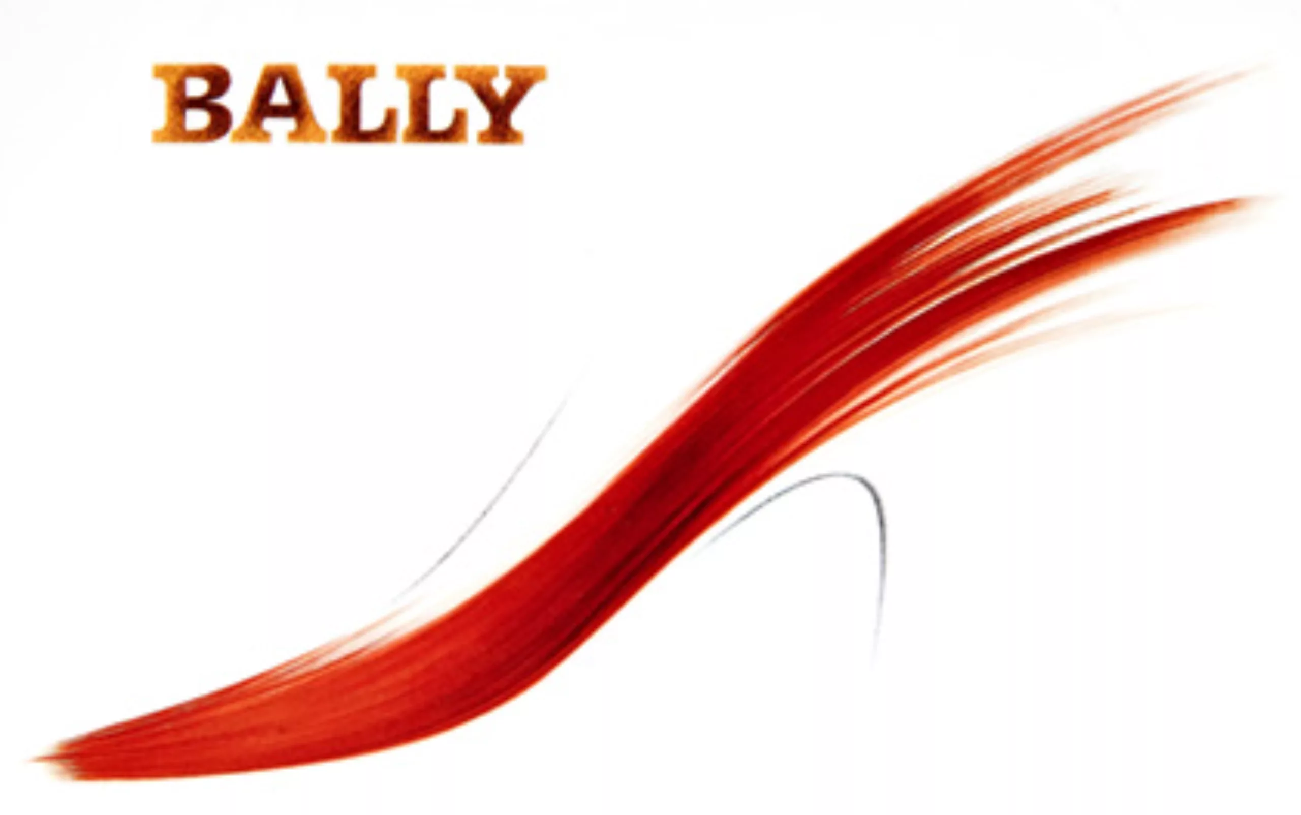
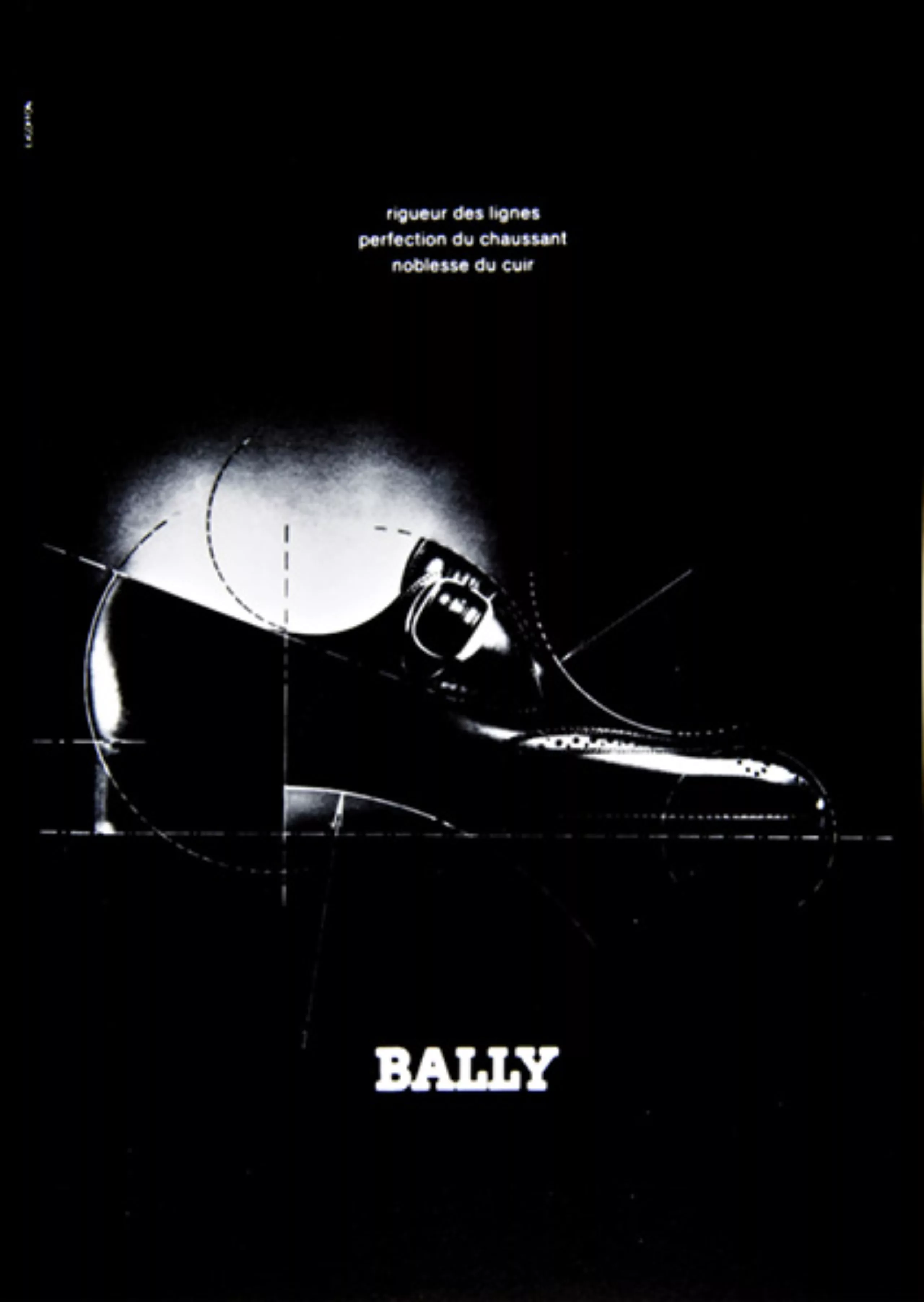
Advertising requires you to be “in the wind,” Excoffon tries to feel what needs to be done, then tries to do better. The understanding of the work done for Air-France, for Bally, for BP, for the Caisse d’Epargne Ecureuil goes through the character presentation brochures.
What characterizes Excoffon’s typography (in the broad sense) is his taste for matter. There is, one could say, on the one hand the dry matter: the balanced construction of a form, the “rigour” (word he liked). A precise execution like the drawing of a printing character; on the other hand: the accidents of matter, matter (all kinds of matter). Excoffon loves the effects of wefts (mechanical wefts between crossings, staggered wefts, magnified wefts, stitch or halftone wefts, handmade halftones). Calypso” is a weft effect. The idea comes from the enlargement element of decoration taken in a simile of the magazine Graphis and enlarged. He is also interested in wood engraving screens. He has Poilliot engrave some of these “dry brushstrokes” of which he has the secret.
The brushstroke, the initialling, belongs (on the smooth side) to the tradition of the typographic “fion”, to the translation by the punch engravers of the pen strokes, of the pen strokes of the calligraphy masters. But the initials also belong (granular material side) to the calligraphy of the oriental type brush. The “shock” was a “fat (granular) mistral” before becoming the character we know. There have been “test fonts”. On one side we have the initials that form the acronym “Tpg” (in 1952) and on the other side we have the brushstroke that forms the Air-France plane, the French rooster (and Pathé’s) or Bally’s shoe (enlarged to the size of the poster).
Excoffon, graphic artist
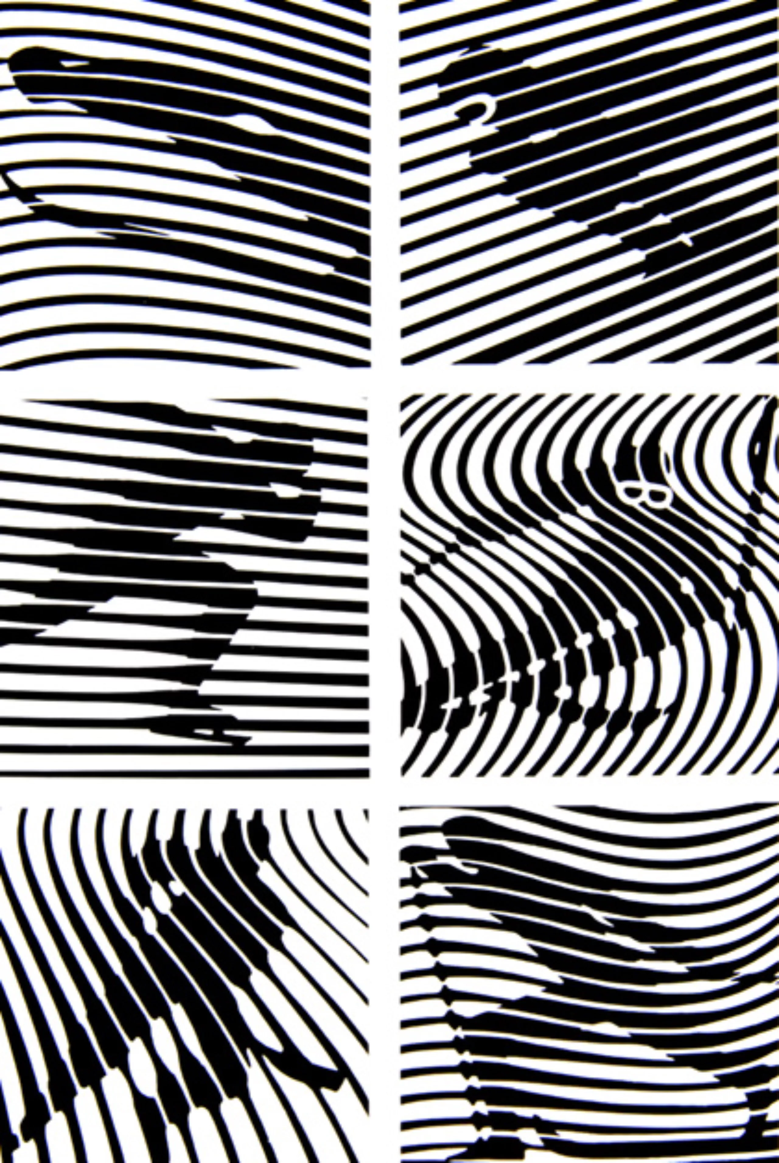
In this spirit of opposition between the “smooth” and the “rough” (which characterizes Excoffon’s art so well), we must also mention – as opposed to the effects of wefts – his taste for gradients – a colour machine – that the “Phoenician” printers of the “La Ruche” Printing House succeeded so well. It is an economic process that is still found, sometimes, in provincial typographic posters (especially for films). But these shades from red to black are not subtle like those that the luxury Modern’ Style print practiced and that I strongly suspect Excoffon had watched at length, as he knew so well how to do. His colors were “blue R.A.F.” and “mustard”.
Another contrast that Excoffon has been able to take advantage of is the brilliant (by superposition of tint) and matte opposition. The very enlarged letter is a magnificent “abstract” drawing, the objects (plane, rooster, shoe) simplified to the extreme, become graphic signs at the limit of the recognizable. The silhouette of the skiers of the Olympic Winter Games in Grenoble is as if obliterated by the grid that hides and reveals them at the same time. Such is Excoffon’s subtle (and ambiguous) art. Which makes it attractive and mysterious. Of course, brushstrokes are often the result of countless strokes and the composition of the best pieces (of the best movements) of each. This assembly, this collage is then meticulously reconstined. An apparent spontaneity, in its perfection, is the result of many repetitions. I remember very well Excoffon looking with interest at the imperceptible “connections” of Hartung’s paintings.
The zoom on the objective eye of the rooster Pathé (in the credits of “Actualités”) is, for me, the equivalent of Excoffon’s permanent use of the tailor’s son counter (handled like a magnifying glass). The look thus given – through the thread counter – to the printed material is revealing of the burrs which, in the old typographic printing (that of the Imprimerie “La Ruche”, for example) gave life to the too great rigidity of the “executed” line.
THE ACUITY OF THE GLANCE STARTING FROM A CURIOSITY WITHOUT LIMITS
Excoffon’s secret is here. At least that is what I learned from his daily contact for many years. I wanted to acknowledge this debt to him when I defended my thesis on the semiology of typography at the Ecole des hautes études. What I said then in front of a small number of friends of the trade and in front of him, I am happy to repeat here. We can never say enough about what we are losing with Excoffon, what French typography is losing.
Gérard Blanchard
Conference on Excoffon
Here is the video of a conference on Roger Excoffon by Tony Simões Relvas and Samuel Rambaud, curators of the exhibition “Tout le monde connaît Roger Excoffon”, which took place in 2011 at the Musée de l’Imprimerie in Lyon.
Sources: The images and texts in this article are presented for educational purposes. All rights reserved.
- The site of the library of Lyon, in particular the French Typographic Corpus of the Printing Museum
- The article about Excoffon on Peter Gabor’s blog
- The book “Roger Excoffon, le gentleman de la typographie” by David Rault.
- An article by Jean-François Porchez on Excoffon<.
On the subject
-
A history of mascots
Mascots, those soft, slightly silly characters, are nothing new. Here’s a look at their origins, from Antiquity to Japan.
-
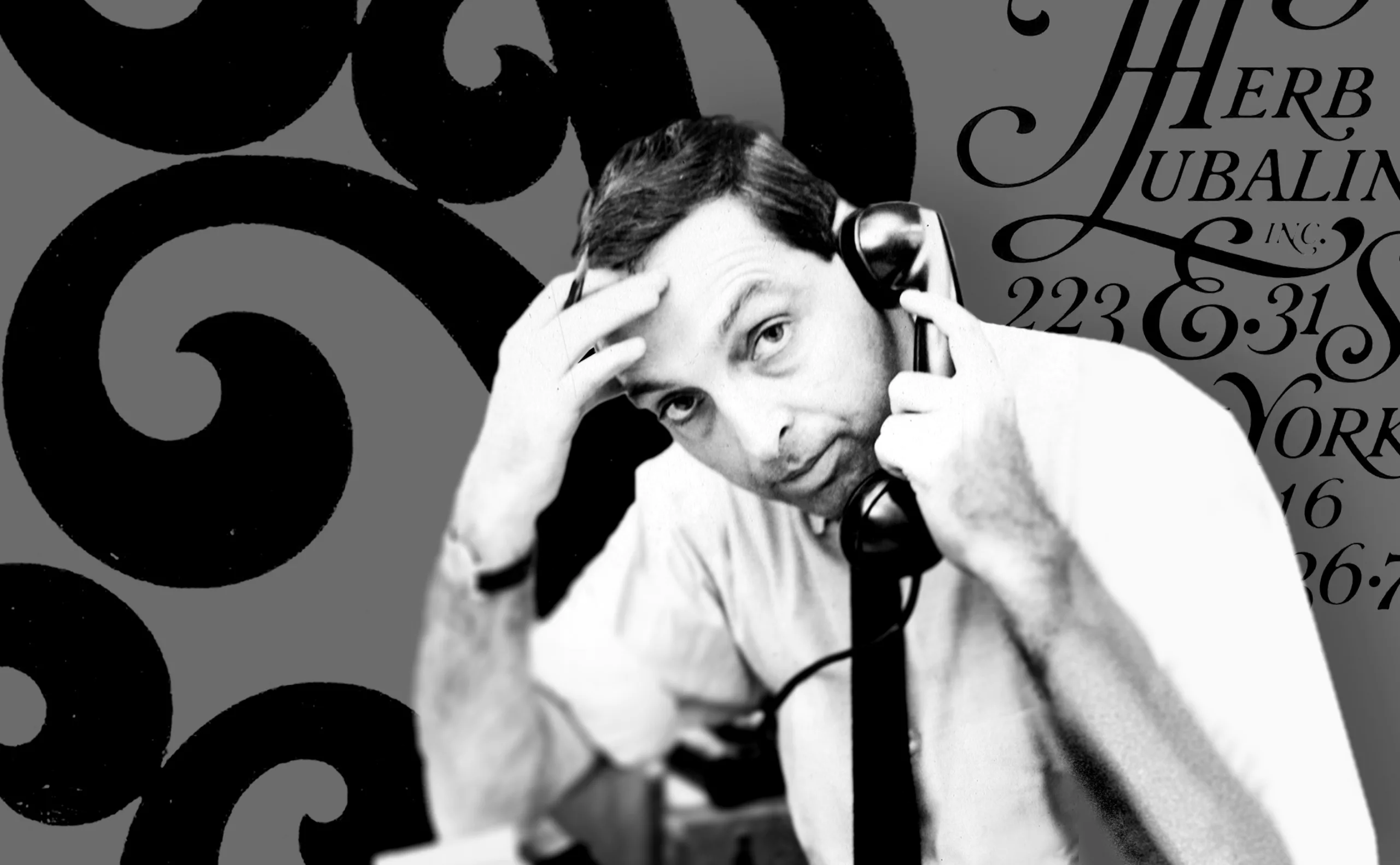
Herb Lubalin, the letter as an image
Herb Lubalin’s biography in pictures. In his 40-year career, Lubalin has revolutionized the landscape of American graphic design by composing images with text.
-
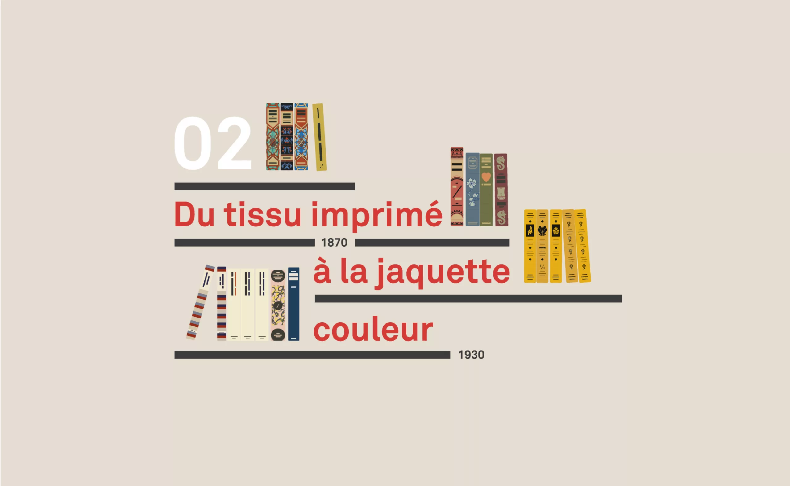
A short history of book cover design – 2/4
Under the influence of Japan, France or Russia, book covers are constantly evolving with technical progress and crises.