Evolution of the Paris metro map: from spaghetti dish to futuristic city
Subway map design is far from being a simple matter of geotagged color lines. being a real headache, it’s been making urban planners sweat for over a century. Here’s a concentrate of the evolution of the Paris metro map and beyond, including spaghetti, beer and futuristic cities.
45° spaghetti
In the family of subway map designers I would like the most famous of all: Harry Beck.
In 1933, Beck, an industrial designer, created a simplified London Underground map with colors and standardized distances between stations, following a grid with 45° angles. It was a revolution. Well, a revolution on a transport scale, but still, it was an immediate success.
To better understand the situation, take a look at the London Underground map of 1931, before Beck – a map known as the “spaghetti plate“. Not shocking in the least, it reminds us of our good old French subway maps.
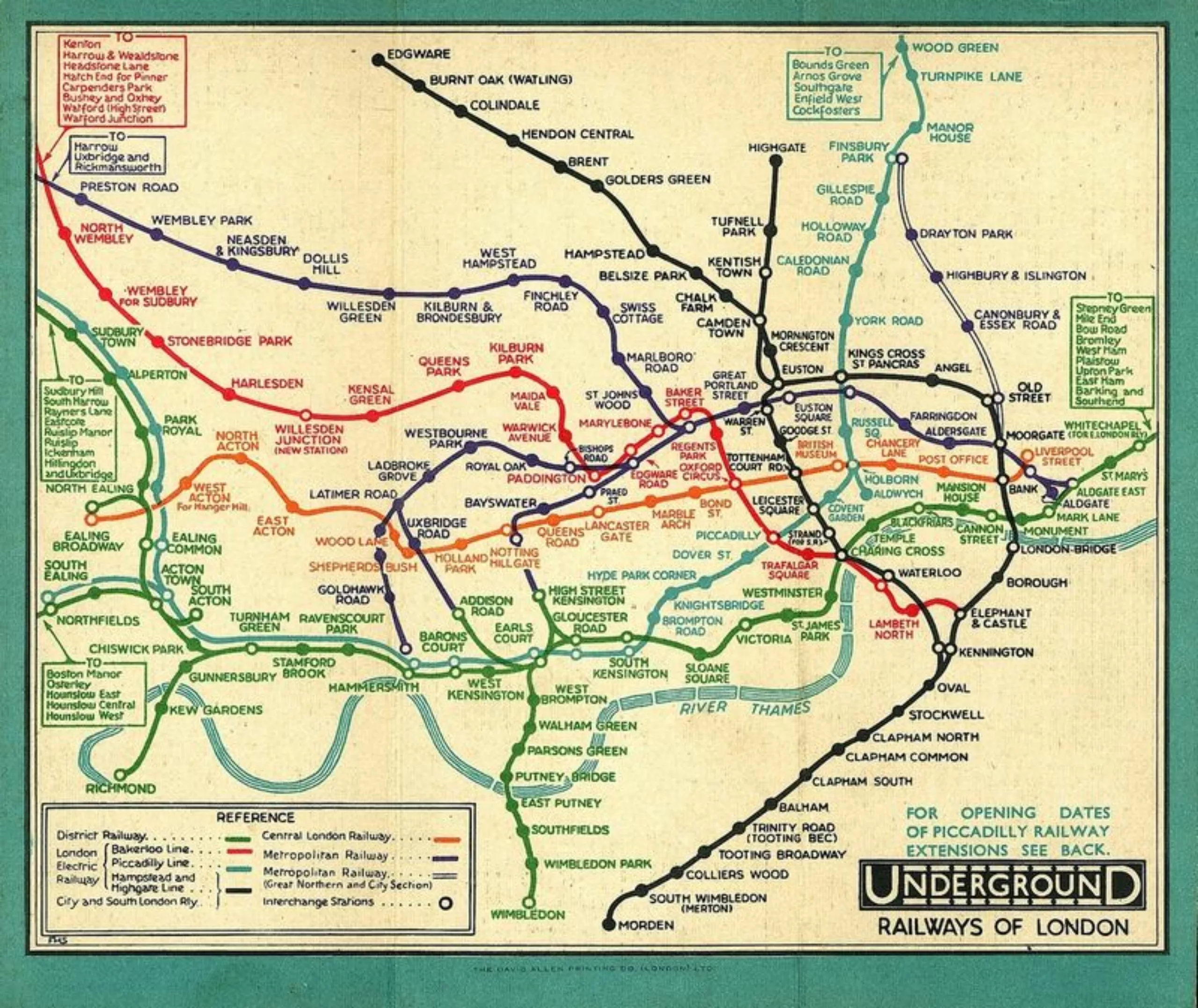
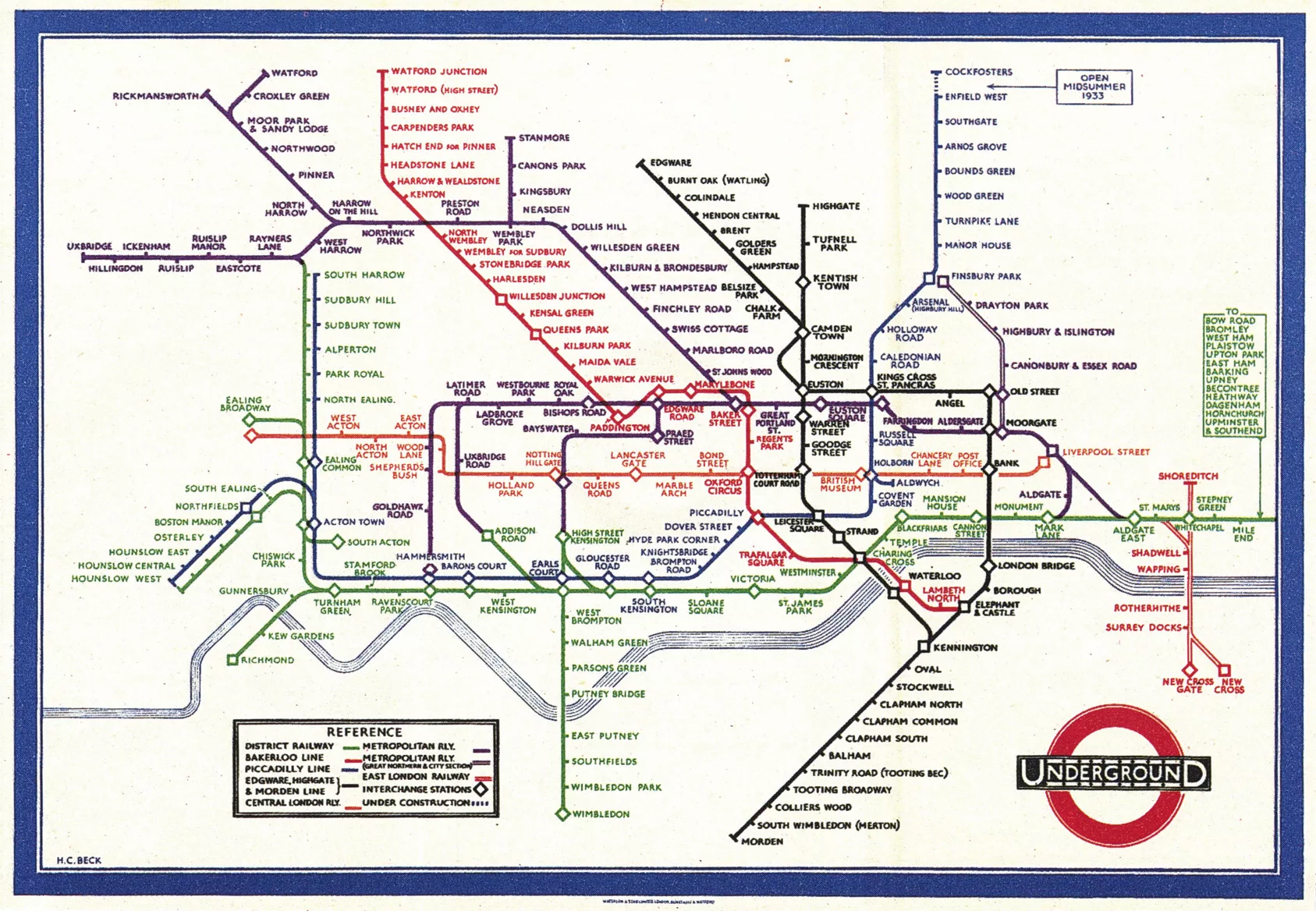
Straight lines, harmonized distances, 45° curves and, above all, reduced spacing between suburban stations. This system, known as the “schematic diagram“, proved so successful that it was adopted almost everywhere in the world: Sydney, Munich, Tokyo, New York, St Petersburg, Osaka, Montreal… and this as early as 1939. But there was one town that would always resist the invaders: Paris.
Parisian knots
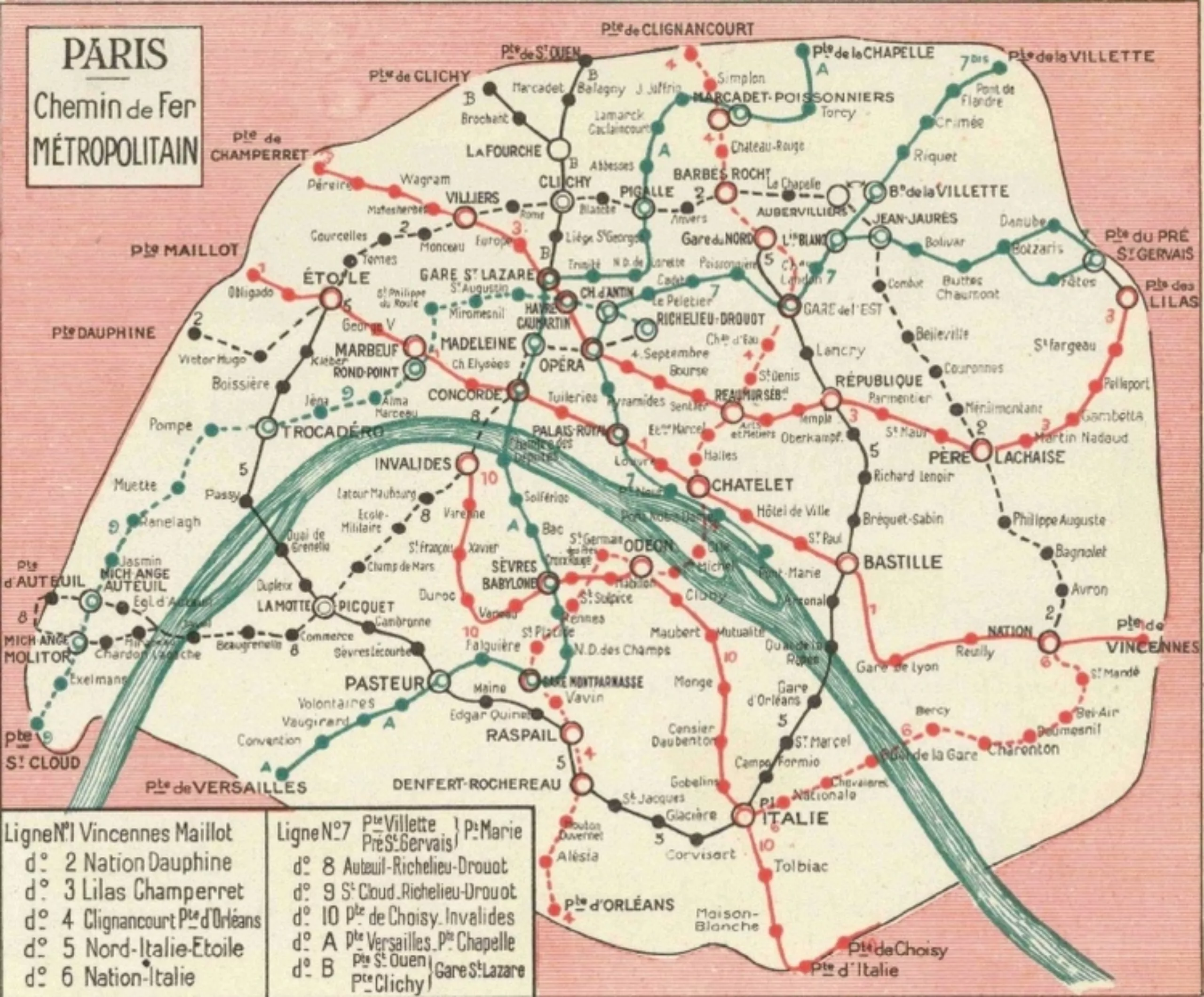
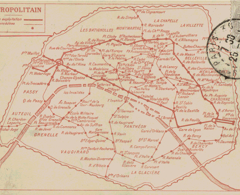
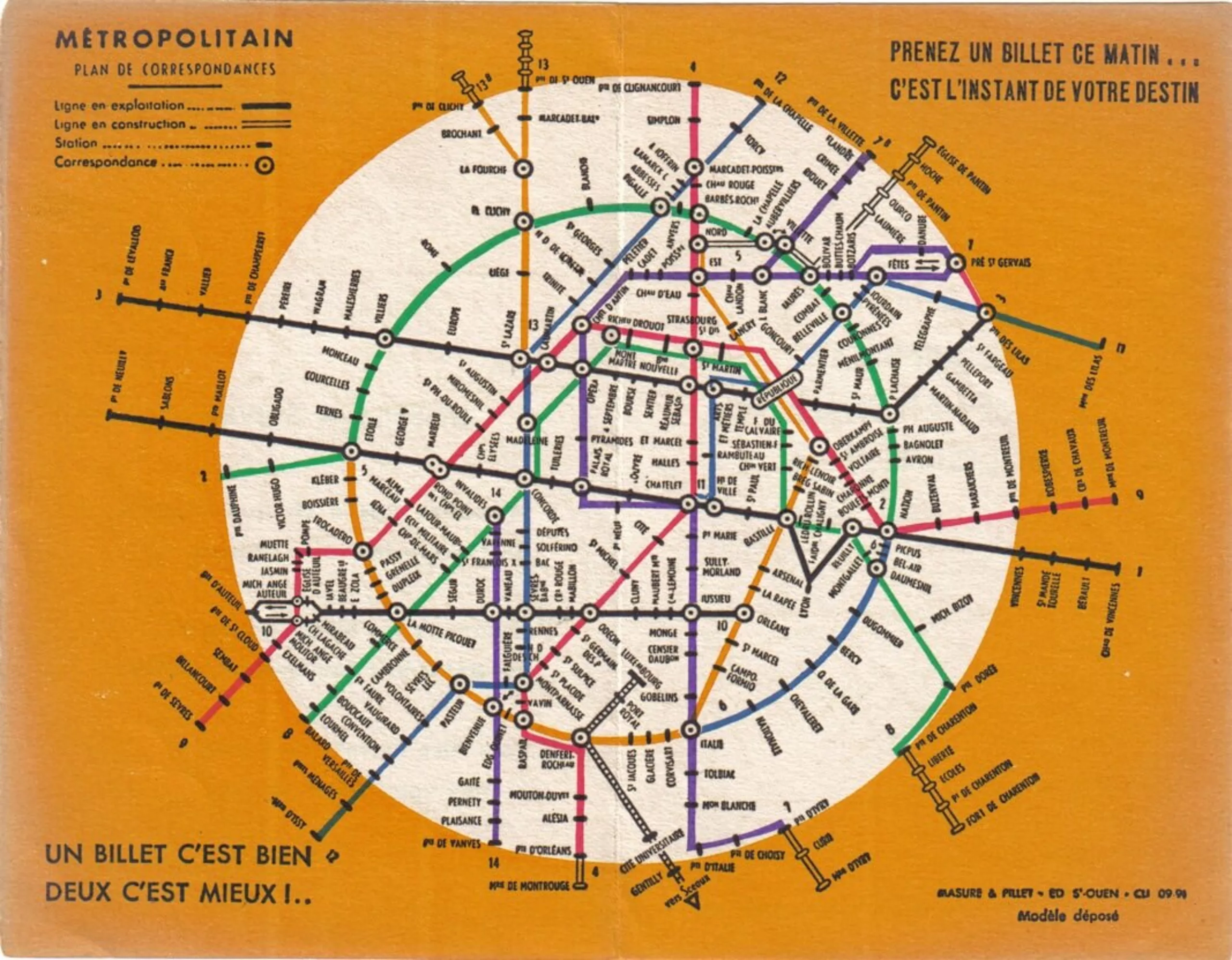
In 1930, this is what the Paris metro map looked like. A veritable plate of colored spaghetti.
Beck tried twice to schematize the Paris metro map in “straight lines”, but to no avail.
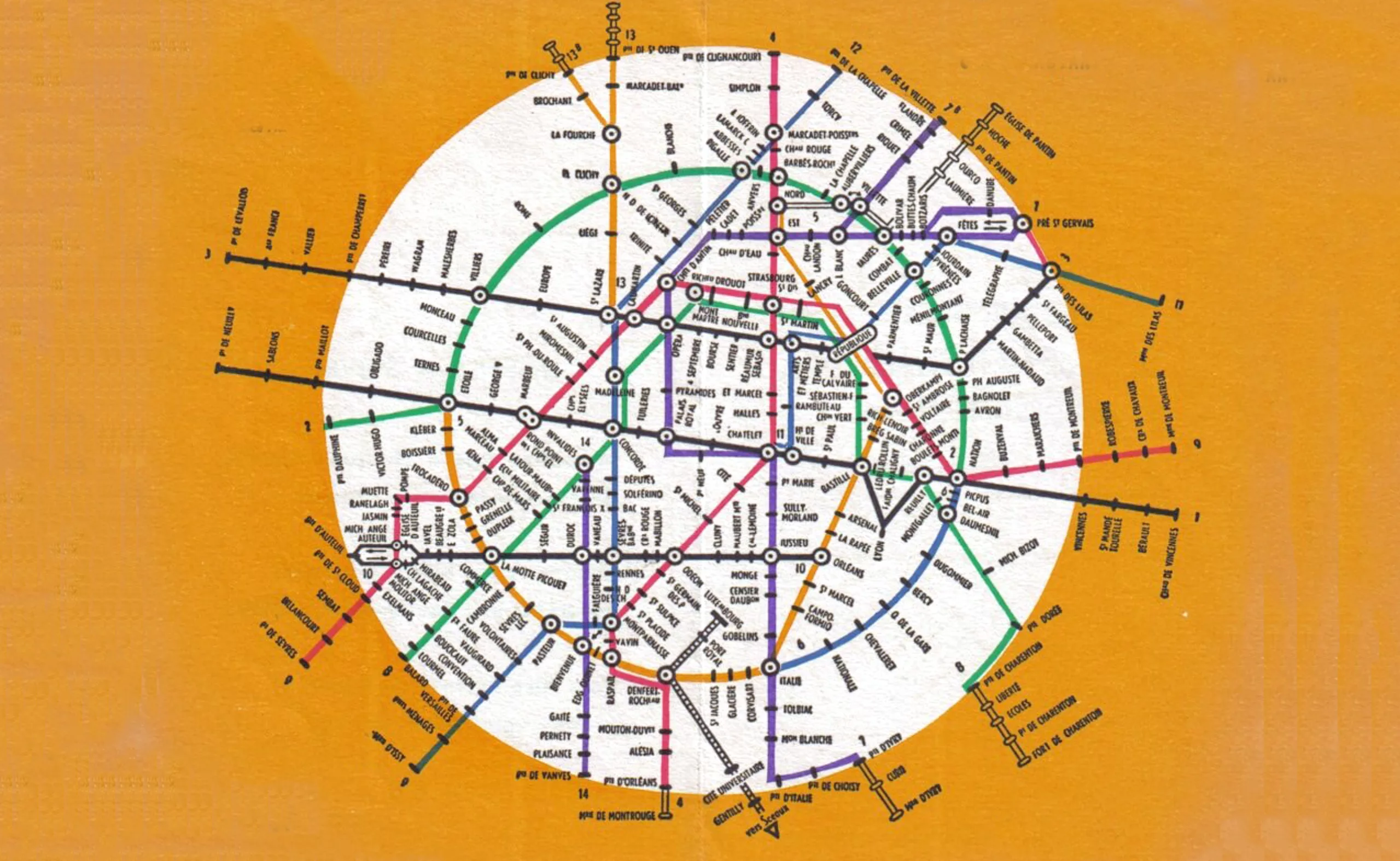
At the end of the Second World War, Beck proposed his first standardized Paris metro map to the French, who rejected it outright. It was a messy affair that was repeated in 1955 when Beck proposed a second version: the same thing happened again. At the same time, the famous double-deckers – London’s double-decker buses – were also politely refused access to Paris. I guess English fashion isn’t all the rage.
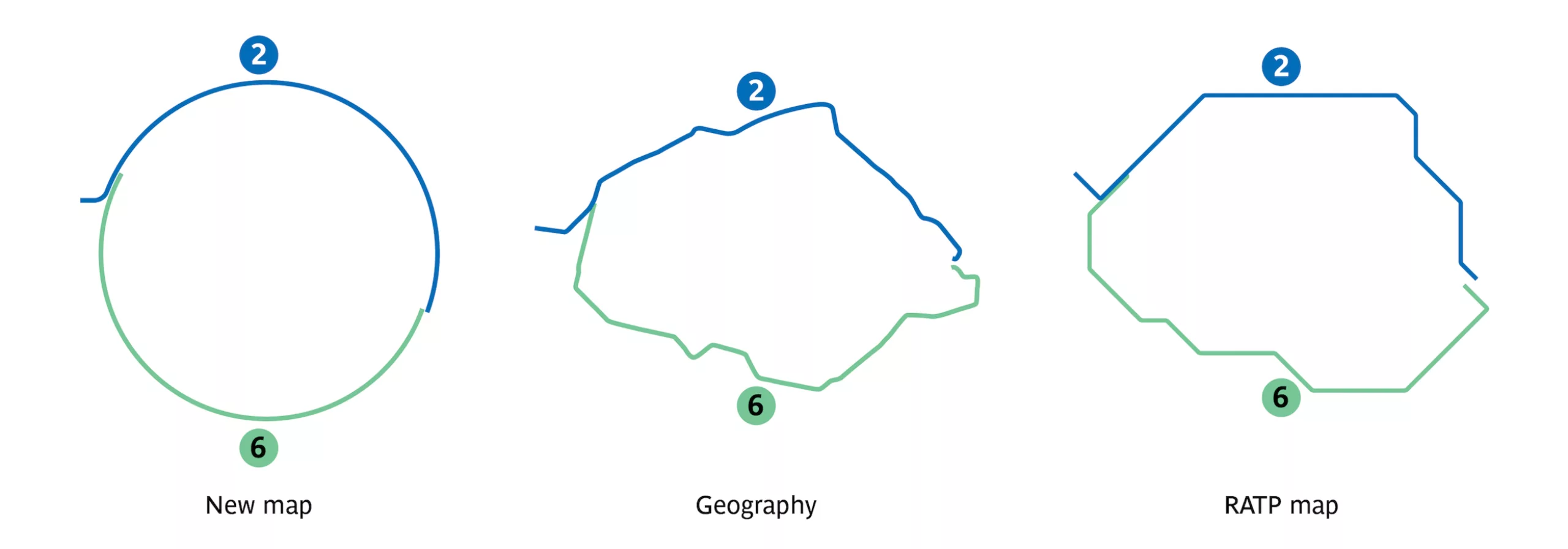
Below is Beck’s 1945 proposal for the Paris metro – compared to the current version:
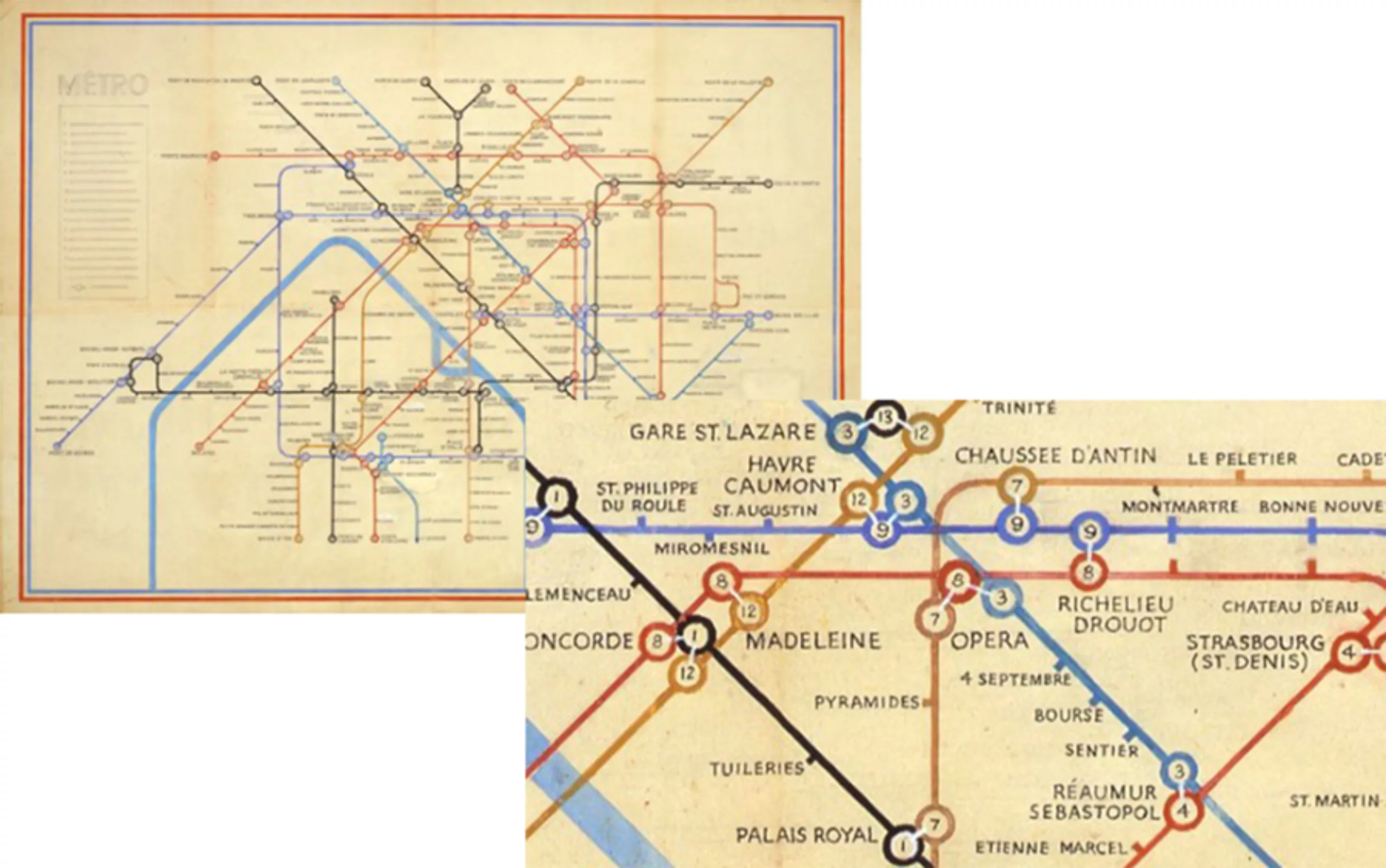
The beginnings of a simplified map were undeniably visible in Beck’s plans, but it would be many decades before Paris adopted this model.
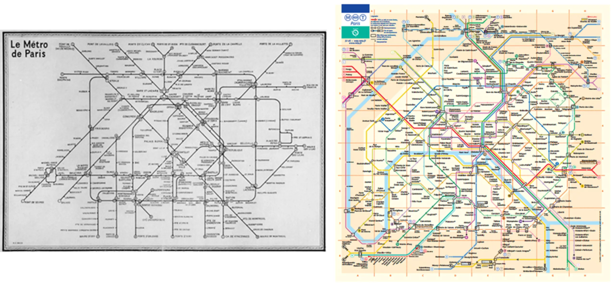
These images of the evolution of the Paris metro map (1903, 1930, 1939, 1967, 1970, 2012, then 2016 – unofficial) trace the passage from the spaghetti plate to the schematic diagram:
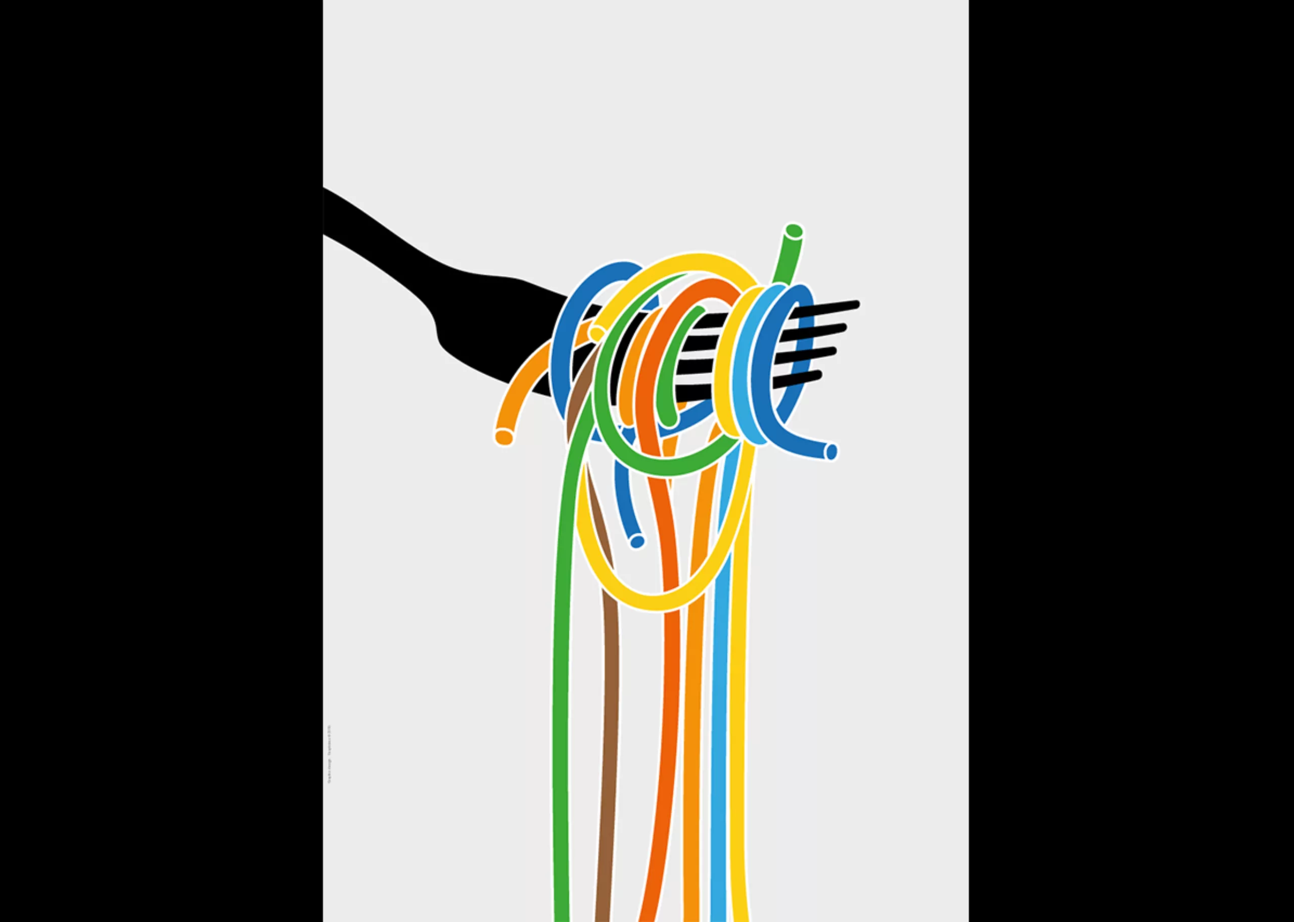
While we are on the subject of spaghetti…
A little digression…
Last year, we were invited to design a tribute poster to Italian designer Massimo Vignelli. Our creation was a humorous nod to the New York subway map he designed in 1972. According to the designer himself, his design was inspired by a plate of spaghetti! What could be more logical for an Italian designer?
Map and plan: the same battle
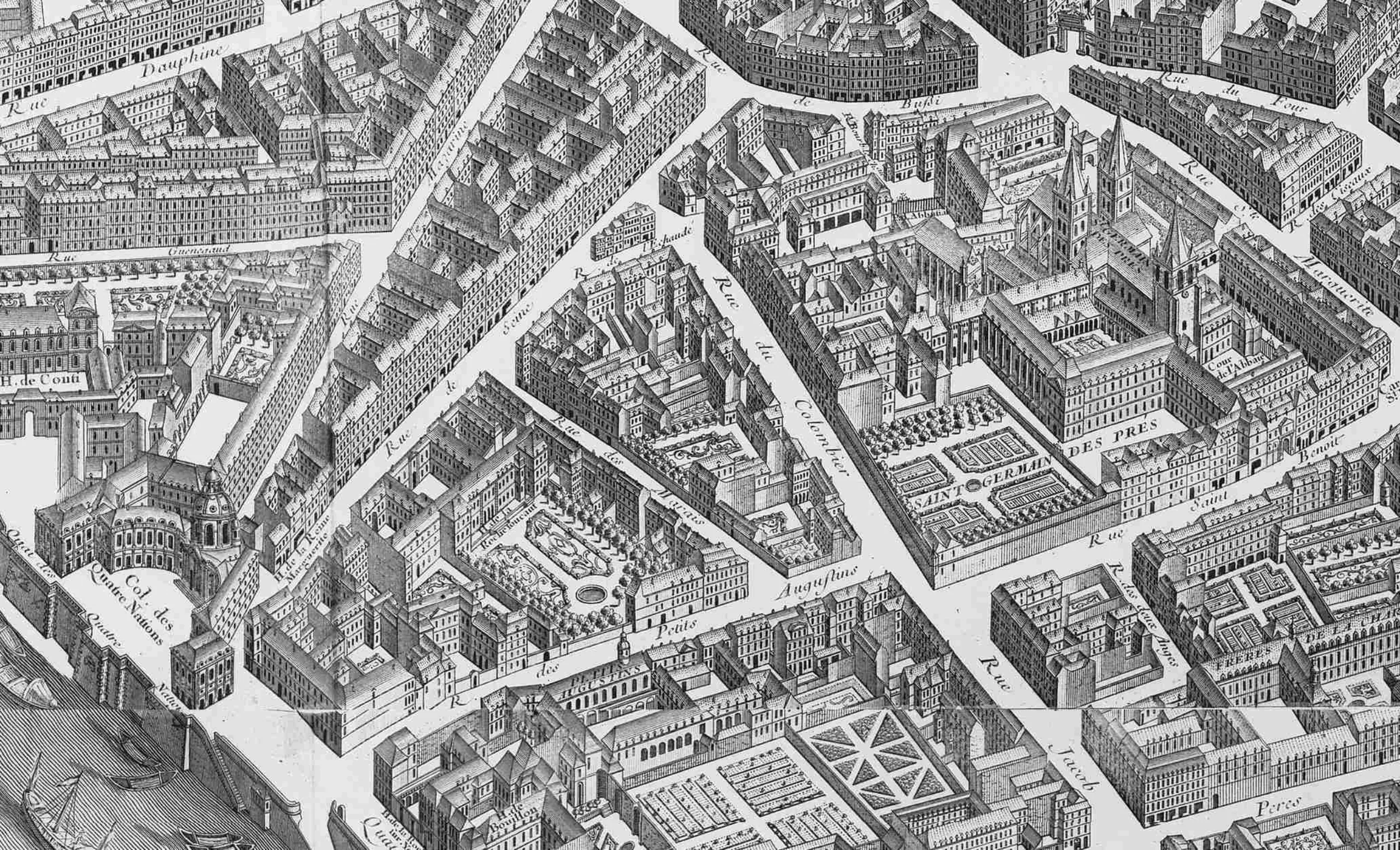
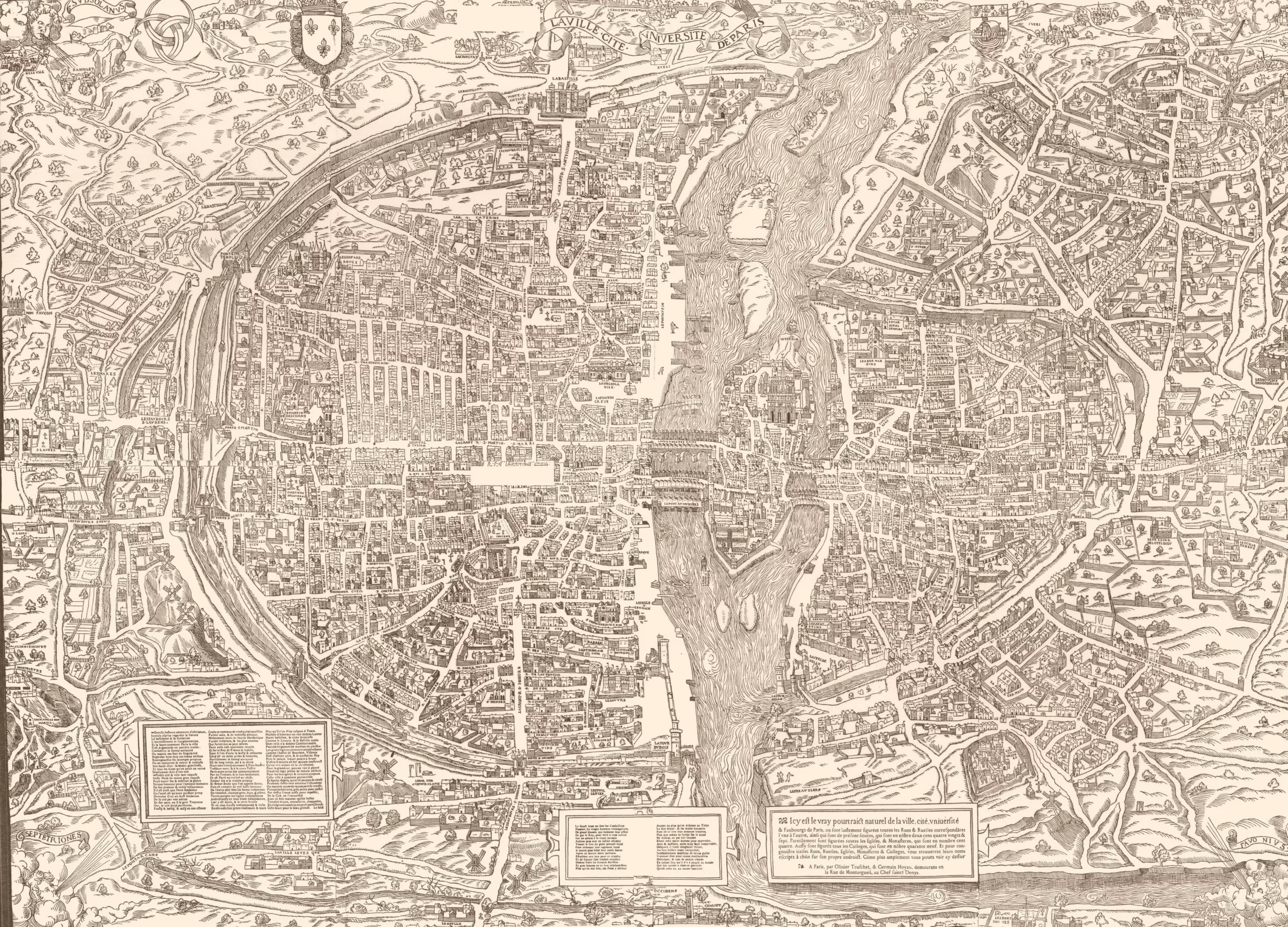
Is the British engineer a little too avant-garde for the French? Certainly not. The French have been attached to their maps for ages. The old plans of the city by Turgot in 1739 -see below- illustrate a 3D layout that was to serve as the basis for the capital’s public transport plans.
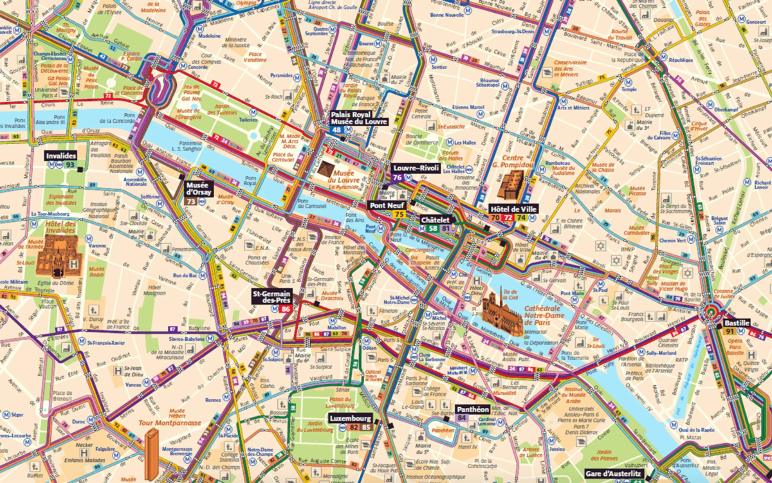
We are not telling you anything, but the Paris metro map has two functions: a plan and a map of the city. This is not the case in other cities, so it’s an important detail. With a metro stop every 200m or so, it’s hard to simplify maps and distort distances between 2 stations, especially when you know how precious time is for Parisians. Op-ti-mi-za-tion.
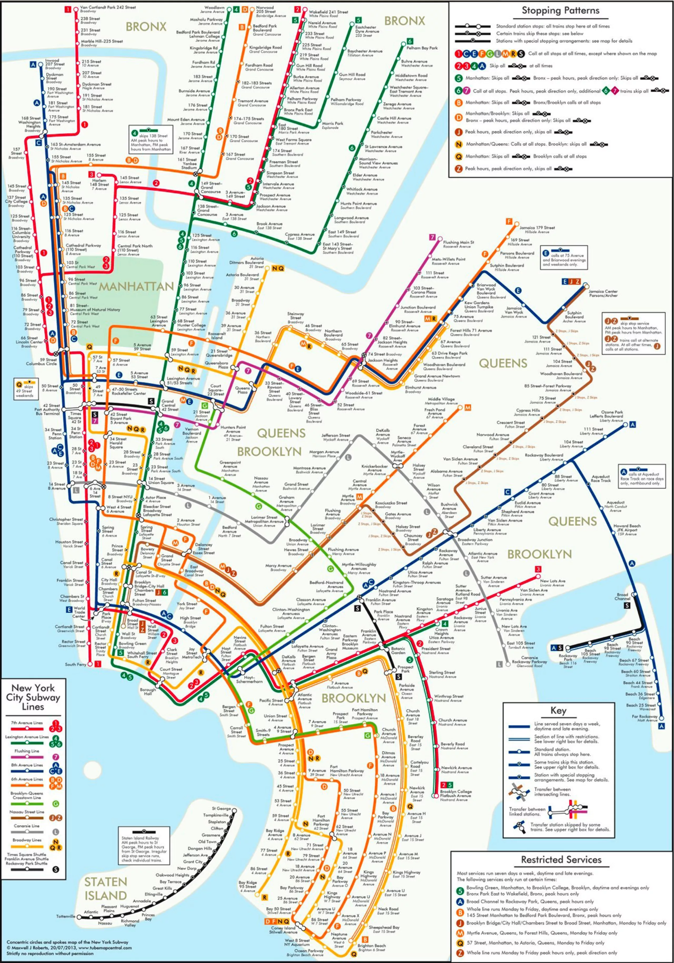
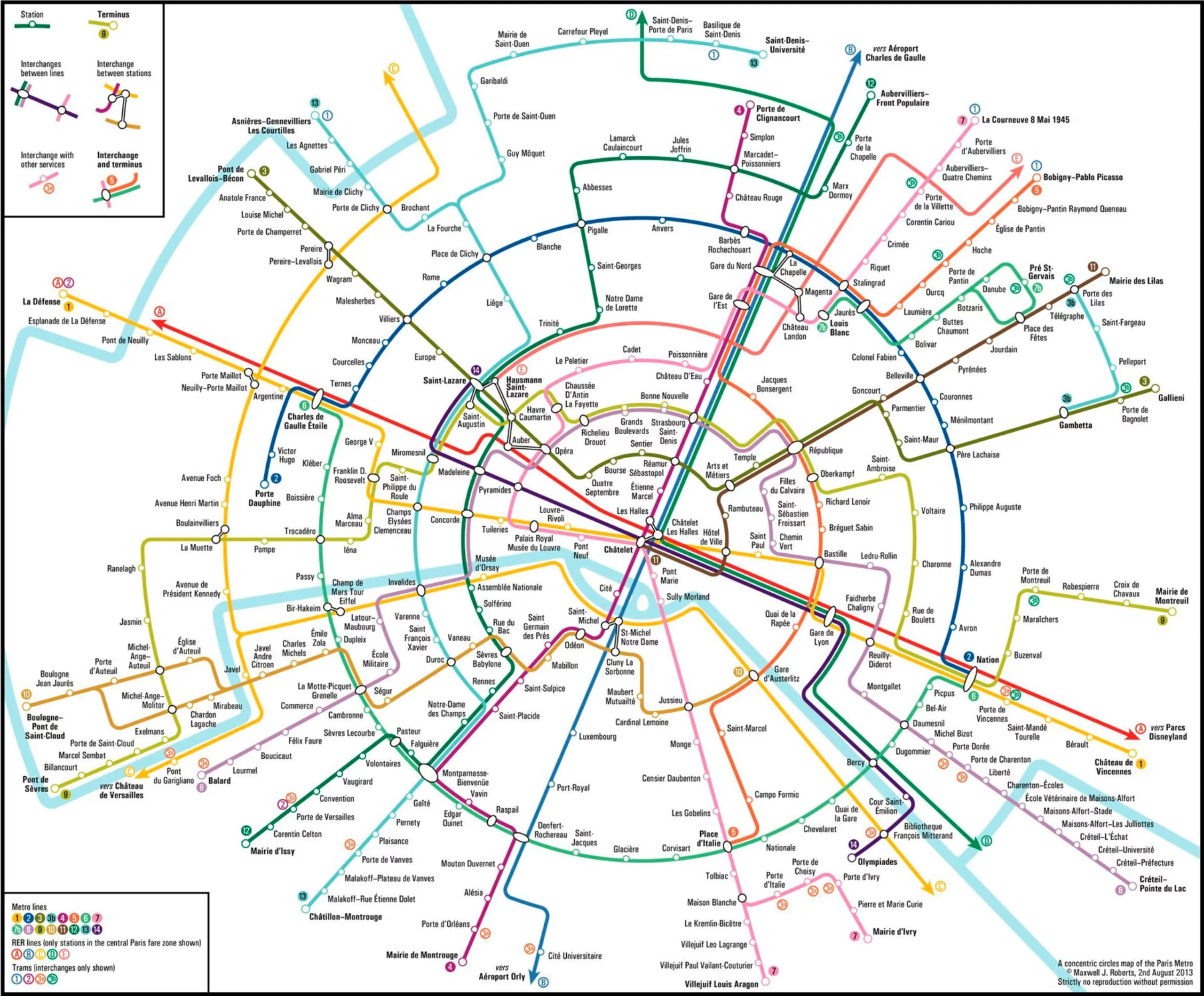
The futuristic city
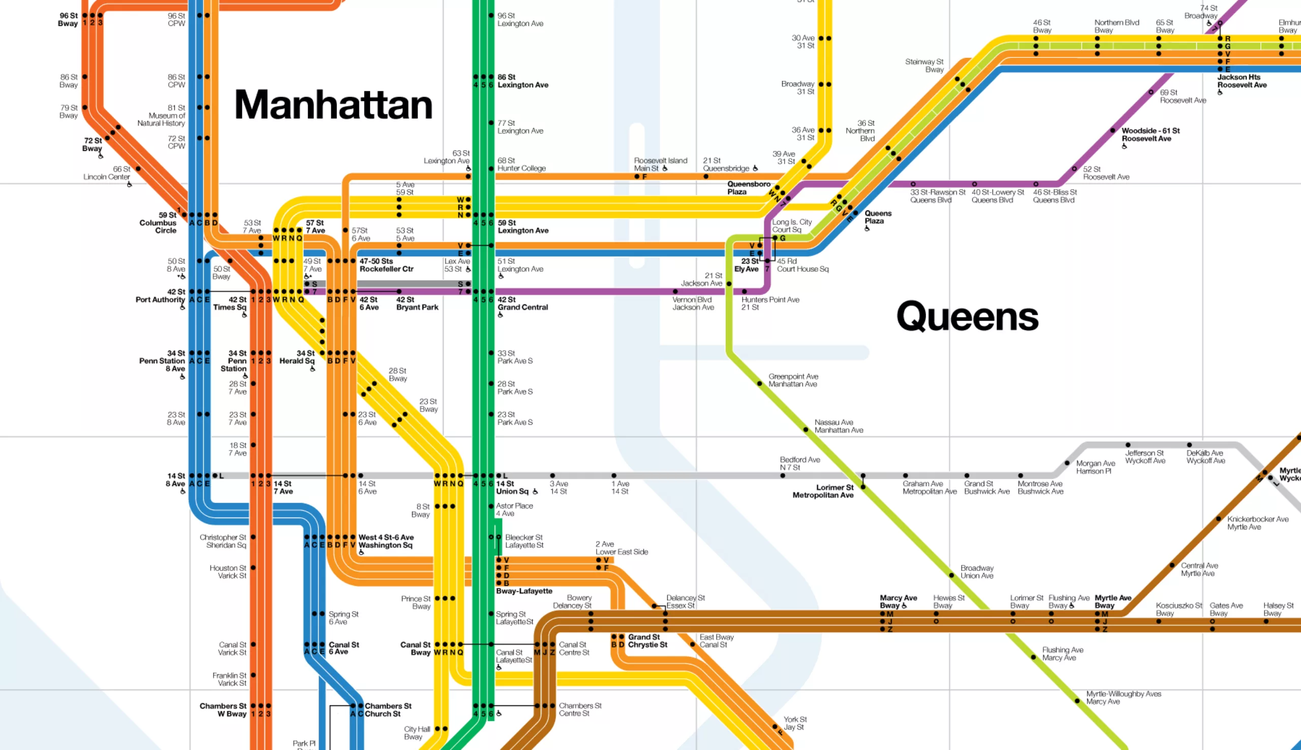
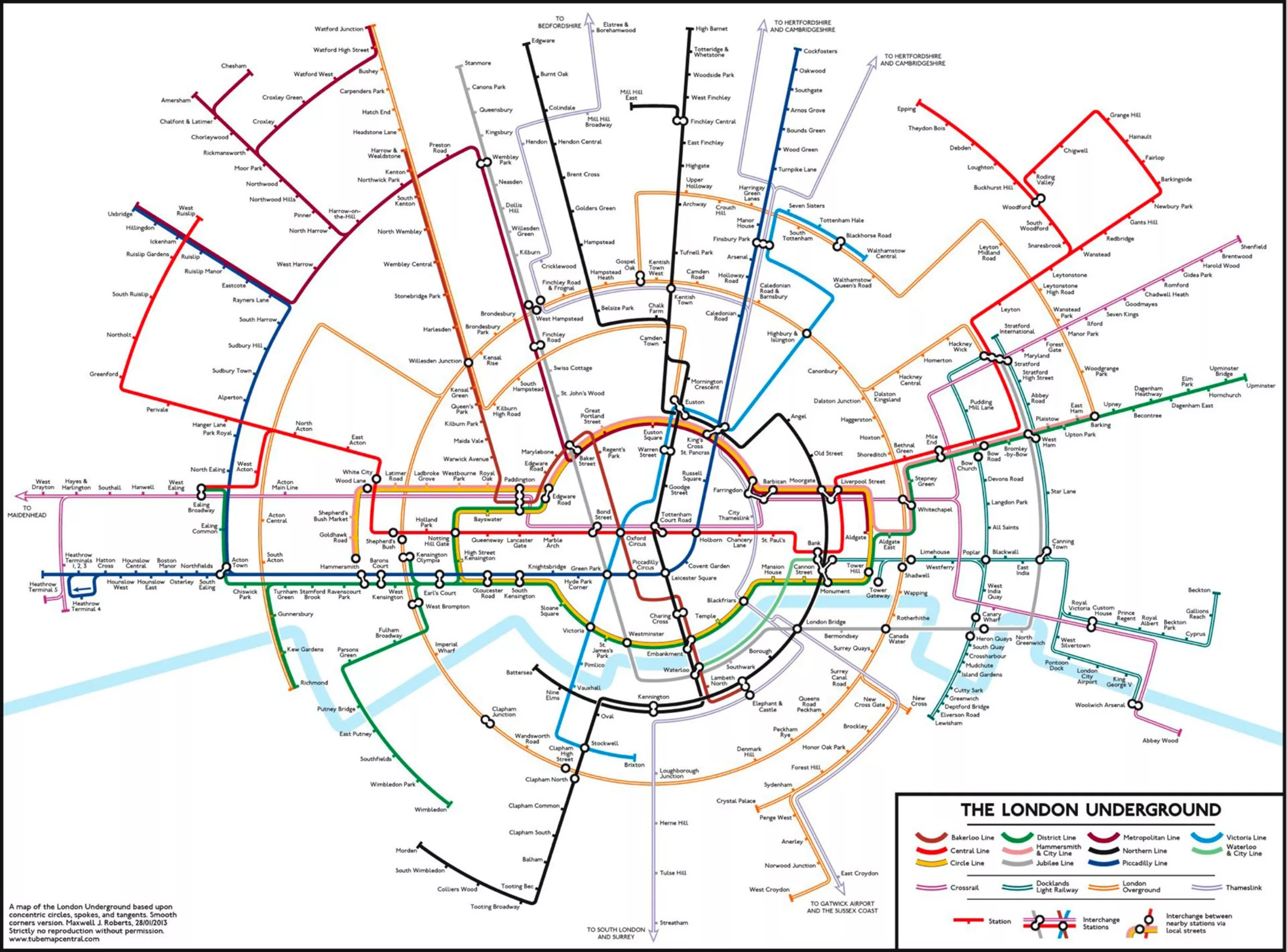
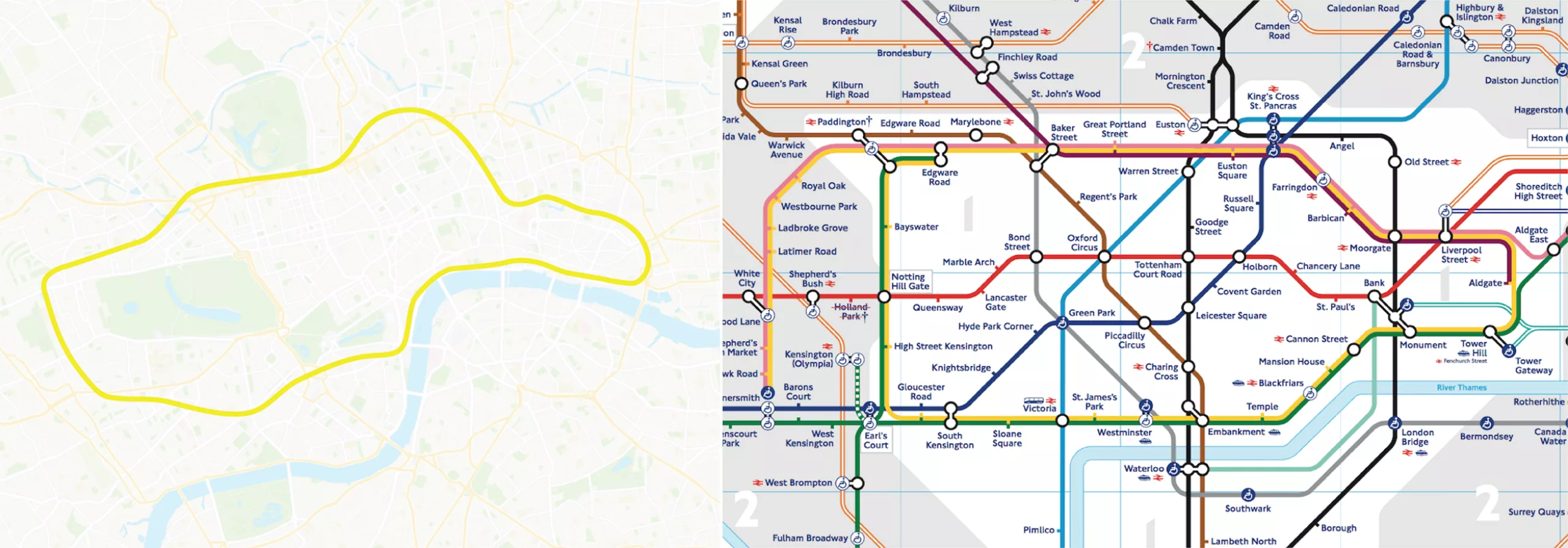
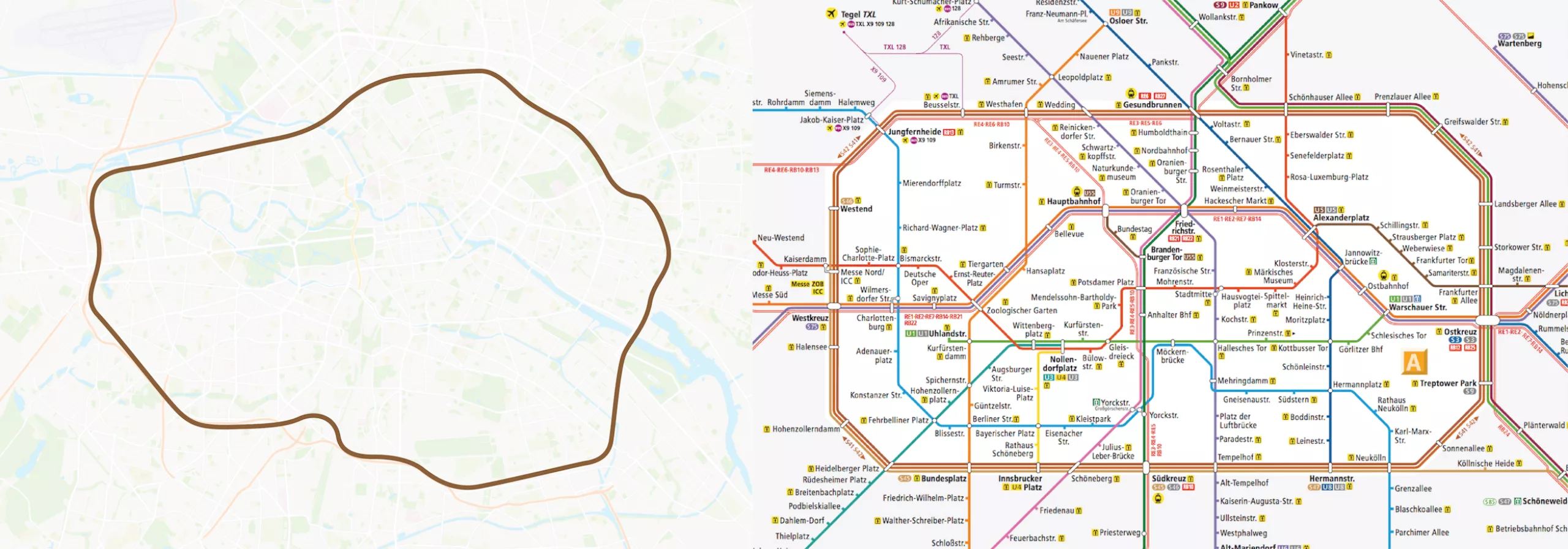
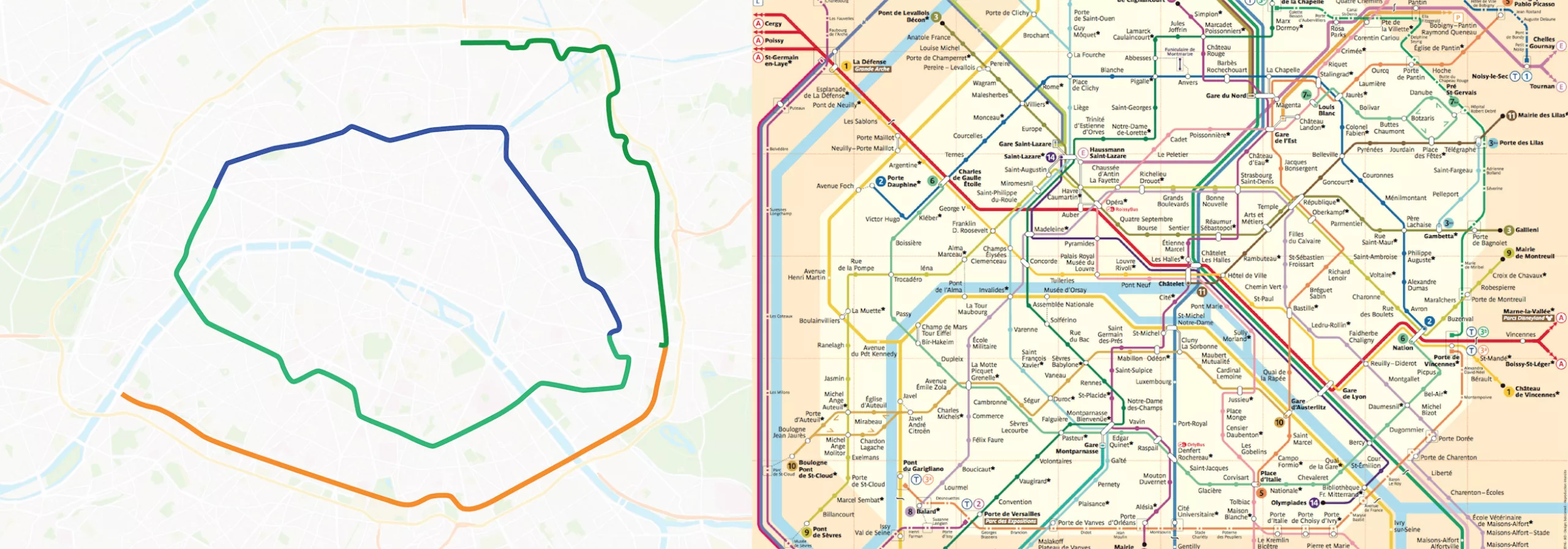
In 2012, Maxwell Roberts proposed a circular metro map, designed to facilitate understanding and reduce map reading time by 50%. Once again, this is without counting on the double use of the metro map / city map.
Below London, New York, Paris.
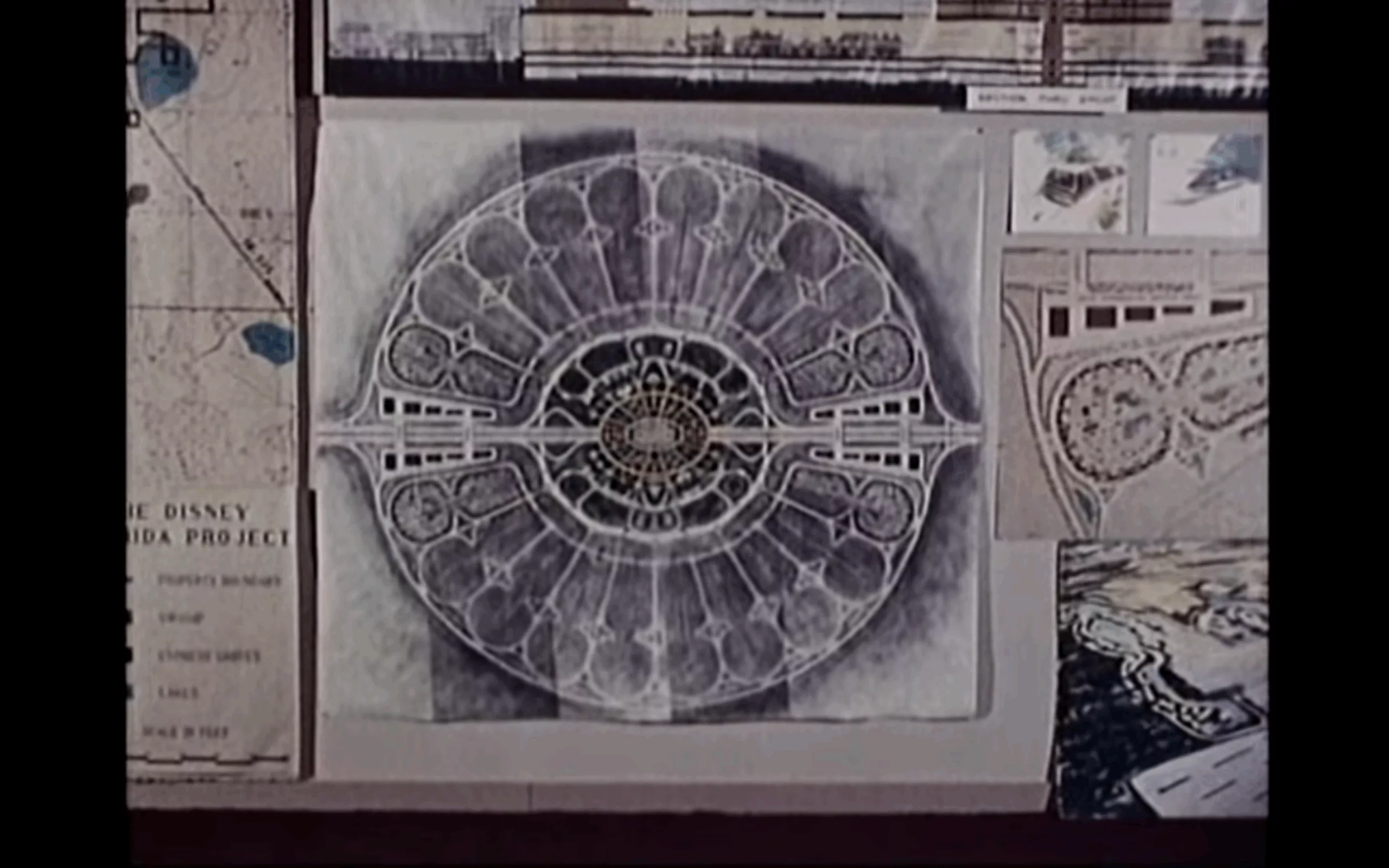
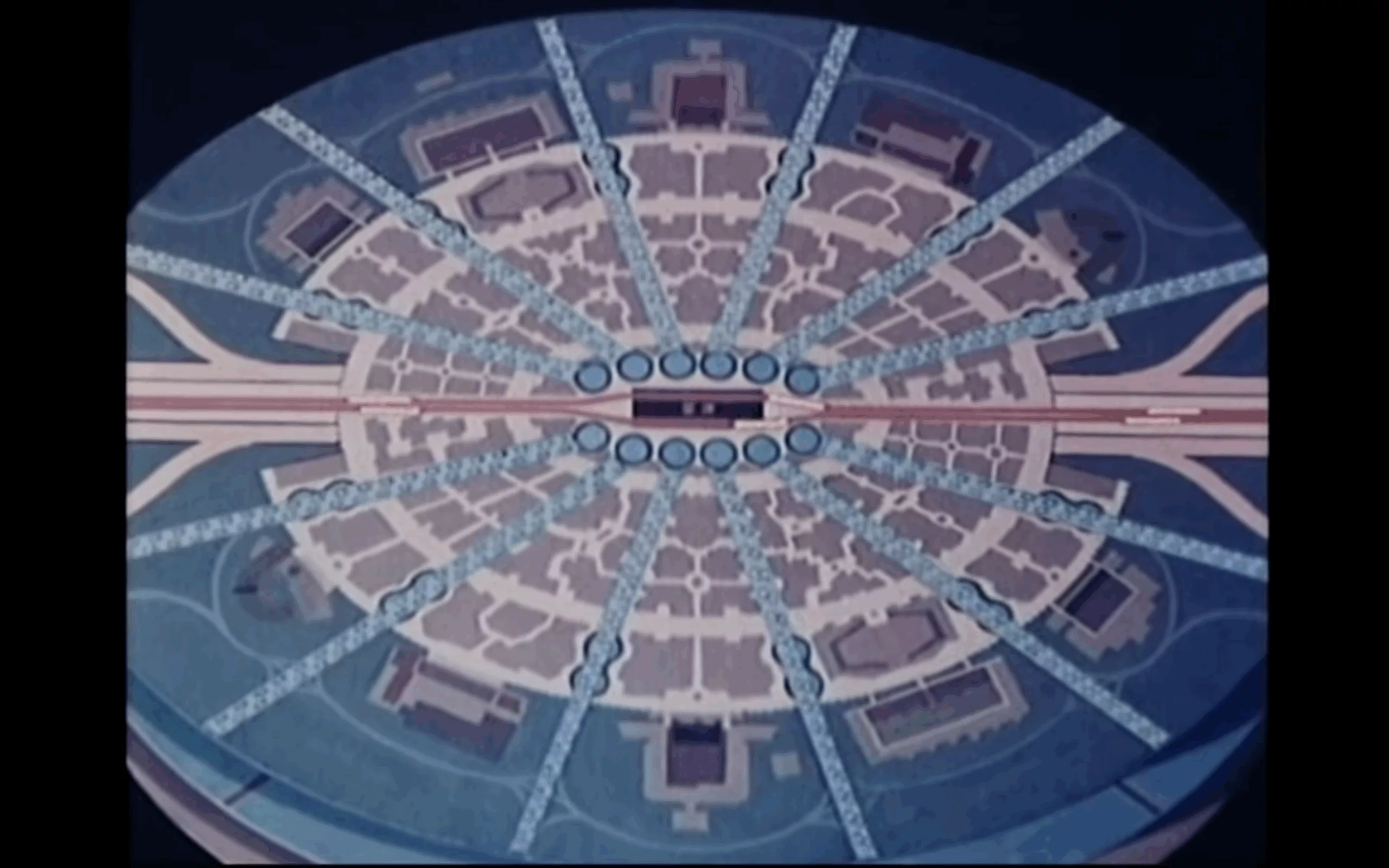
The futuristic result is reminiscent of utopian city plans, notably EPCOT, Walt Disney’s ideal city. Inspired by the American ideal of life, this project, abandoned on his death, combined work, life and entertainment. We see more of it in this film, starting at the 10-minute mark.
In the center: offices and shops, surrounded by posh housing and parks and restaurants from which trains radiate to the more modestly housed “suburbs”.
This ring plan is reminiscent of the Saline Royale d’Arc et Senans, the masterpiece of Claude-Nicolas Ledoux (1736-1806). Two centuries before Mr. Disney, this visionary and utopian architect imagined and built a factory town where almost the entire working community lived. Built in the shape of a circular arc, it housed living quarters and production facilities.
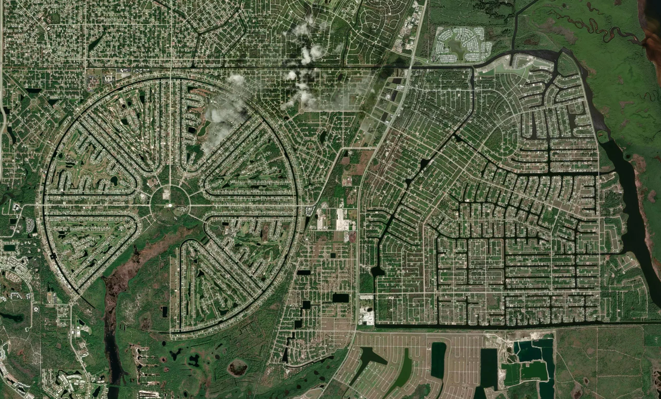
More recently, this ring plan is also reminiscent of a futuristic city that never really came to fruition back in the 60s. You can also discover it “in real life” on Google Maps.
La photo est tirée d’une série ultra graphique de paysages urbains vus du ciel, en Floride, qui vaut vraiment le détour.
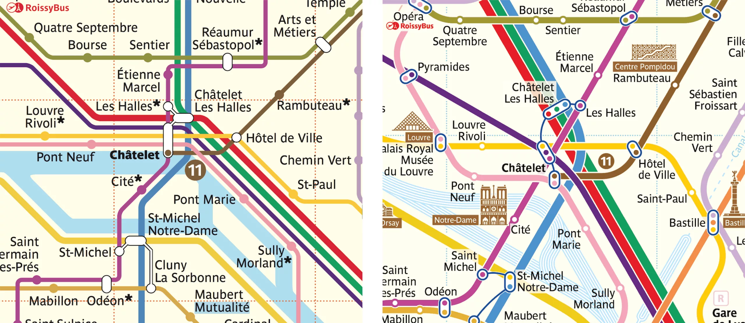
The Paris metro map from another angle
In 2016, Constantine Konovalov, a Russian spatial designer and transportation expert (whose work includes the “development of the navigation project for cyclists, pedestrians, public transit and the metro” in Moscow) proposed a revisited version of Roberts’ circular plan.
Based on the geography of several cities around the world, he notes that the plans generally follow a simplified form of the city’s shape. Bottle for London, rectangle with rounded corners for Berlin, and round for Paris.
It has to be said that the circular representation of Paris is not new (probably because it’s its geographical shape, clever). In 1552, Truchait drew an oval Paris with the Seine running through it.
A French designer from 1930 had already attempted a rounded card in the abstract art style, but we’re guessing he was no more successful than his English acolyte.
Released in 2016, Constantine Konovalov’s new circular Paris metro plan is a hit. So much so that when you Google “new Paris metro map”, his proposal appears on the first page. Quite a coup for an unofficial version. Above all, Konovalov has set up an entire website dedicated to the new Paris metro map, which could fool more than one tourist.
His particularity compared to Roberts’ work is that he followed a 30° angle without any eye-catching verticals. He has also simplified the map by creating pictograms for monuments, and a special treatment for stations with changes.
And the final result:
After 2 years and more than 800 research diagrams, he unveils his graphic process in an article for Smashing Magazine and a mini-video:
Tentacles and pints
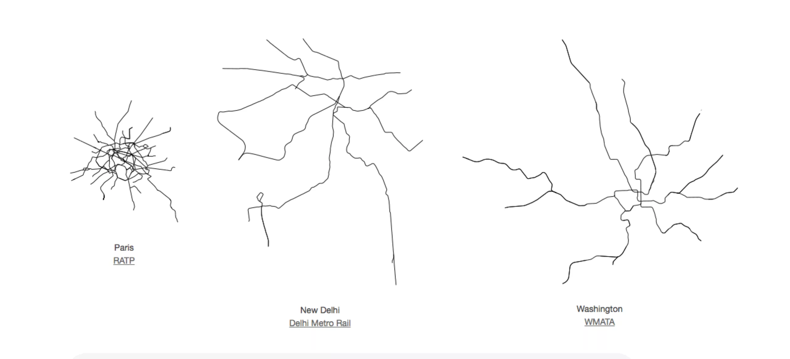
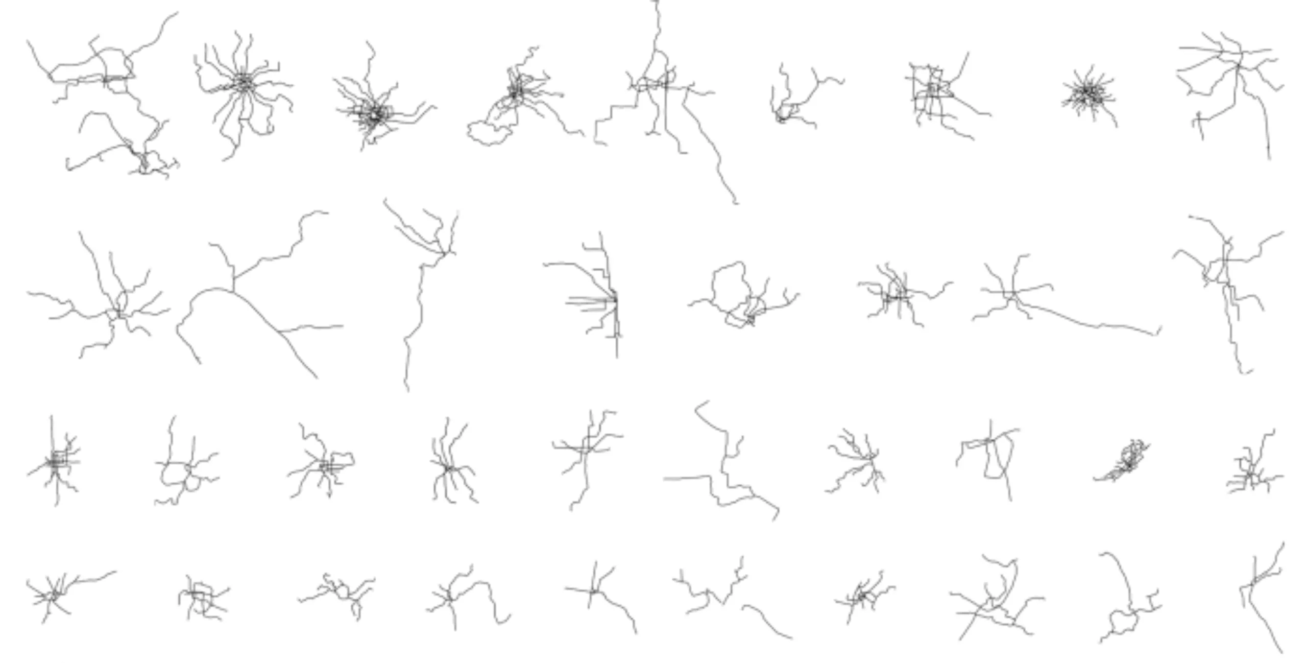
In another style, there are drawings of the world’s metro maps, scaled to the same scale. It’s easy to see how a Parisian walnut shell stands next to Shanghai’s tentacles.
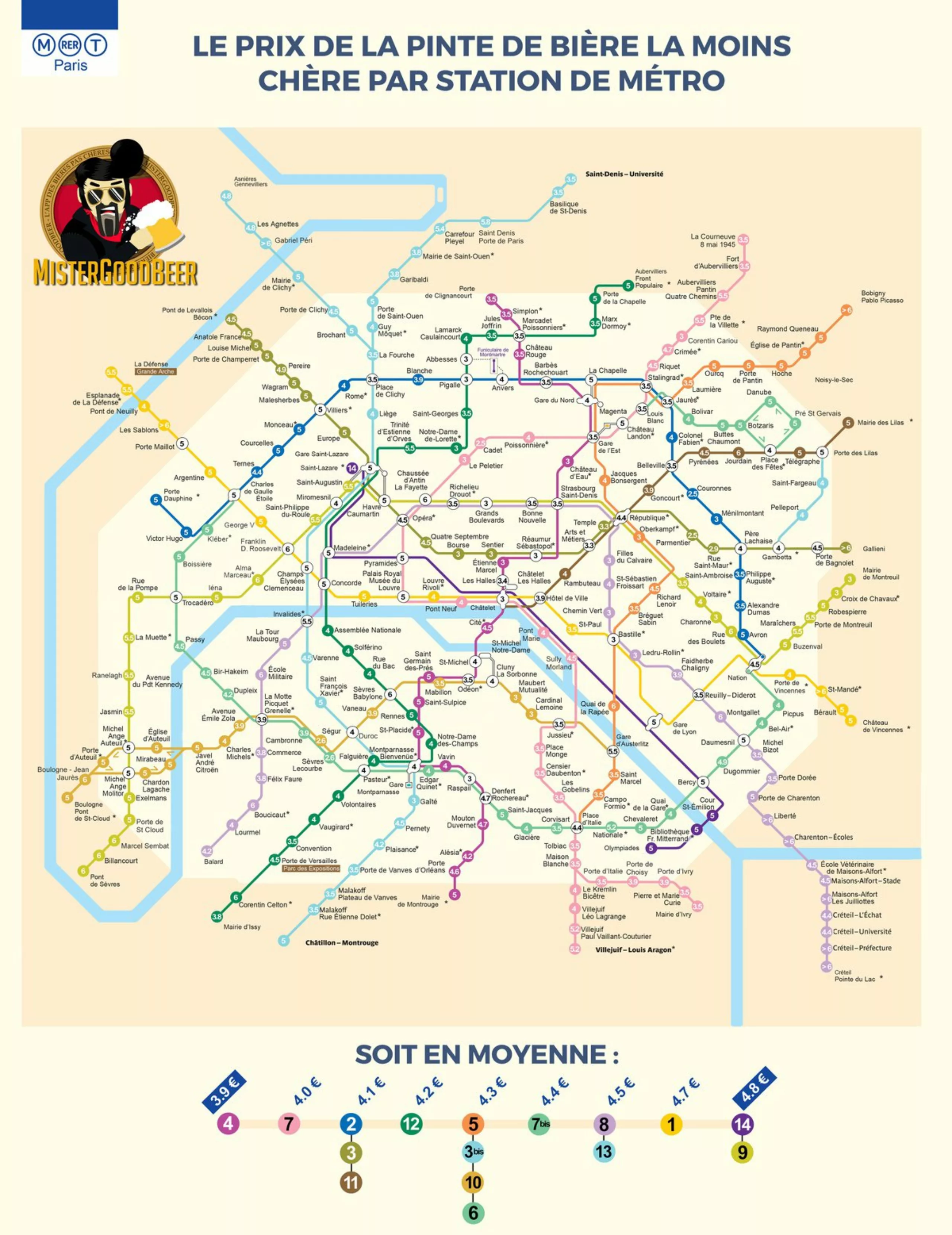
Finally, to end on a fresh note, the Mister Good Beer map of the Paris metro, showing the prices of the cheapest pints, by station.
Bonus gift:
A good plan for drawing a map!
Who in the industry hasn’t had to redraw a city map in Illustrator?
You usually receive a low-resolution scanned plan, with your customer’s indications handwritten on it. Your role as designer will be to simplify it, and make it compatible with your graphic charter. Depending on the size of the map to be redrawn, this can be a very laborious job!
A few years ago, we introduced you to a little trick…
Sources / to go further :
- http://www.theverge.com/2013/3/29/4160028/harry-beck-designer-of-iconic-london-underground-map
- http://ateliertally.com/harry-beck-the-paris-connection/
- https://www.creativereview.co.uk/harry-beck-the-paris-connection/
- http://paisaje.masterproyectos.com/2011/10/21/metro-paris/
- http://fakeisthenewreal.org/subway/
- http://www.tubemapcentral.com/circles/gallery/Circles_Maps.html
- https://www.smashingmagazine.com/2017/01/redesigning-the-paris-metro-map/
- http://metromap.fr/fr
On the subject
-
Where does modernism come from? 1 – Man propelled by Modernity
Episode #1. To understand modernism, we need to understand its relationship with modernity, and its meteoric rise at the end of the 19th century.
-
The branding of a social movement: Collages against feminicides
Why and how anti-feminicide collages, through their “graphic charter” as simple as it is powerful, have opened a wide breach in the public debate.
An opportunity to try to untangle how the “branding of a social movement” differs from the “classic branding of brands”. -
The city of Paris revises its visual identity
At the beginning of January, the city and the department of Paris merged, the opportunity for the capital city to review its visual identity.
Here is the analysis of this logo made by Carré Noir.