branding école design

2022

Villefontaine Design School
Studies from elsewhere!

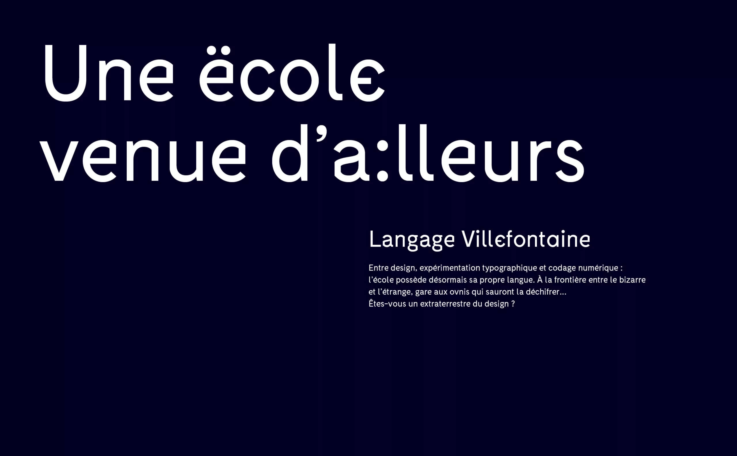
In 2012, we reported in our blog the creation of two DSAA courses (interactive design and product design) at the Lycée Léonard de Vinci in Villefontaine, specialising in audiovisual and design professions. At the time, this new training offer was accompanied by a new visual identity designed by Mahé Chemelle. Born of the desire to promote the design section, these notions were approached through typographic work evoking the creation of a new language, ahead of its time, whose deciphering requires an effort to access their universe. The offbeat universe, like an extraterrestrial section located on another planet, humorously evokes their geographical location (close to Lyon, but next to nothing). What may seem like a flaw can turn into a quality when you know the state of mind and the solidarity that can prevail among the students.

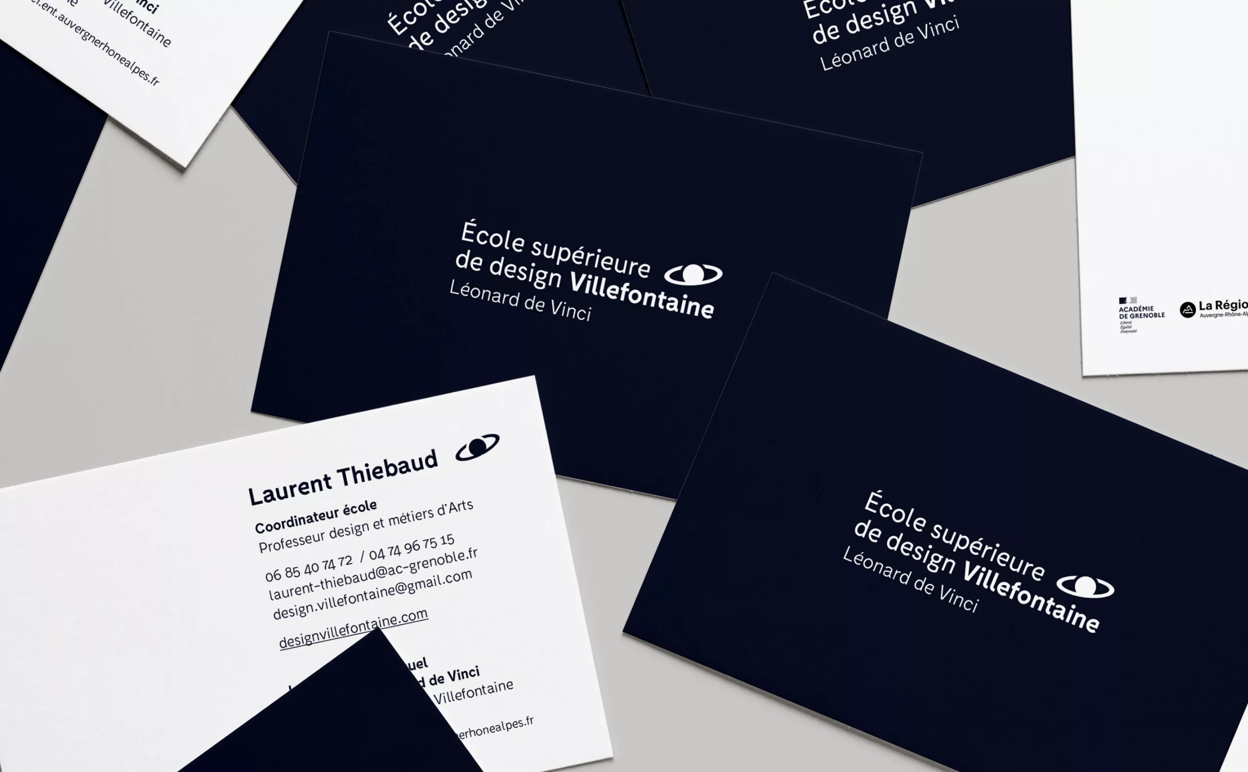
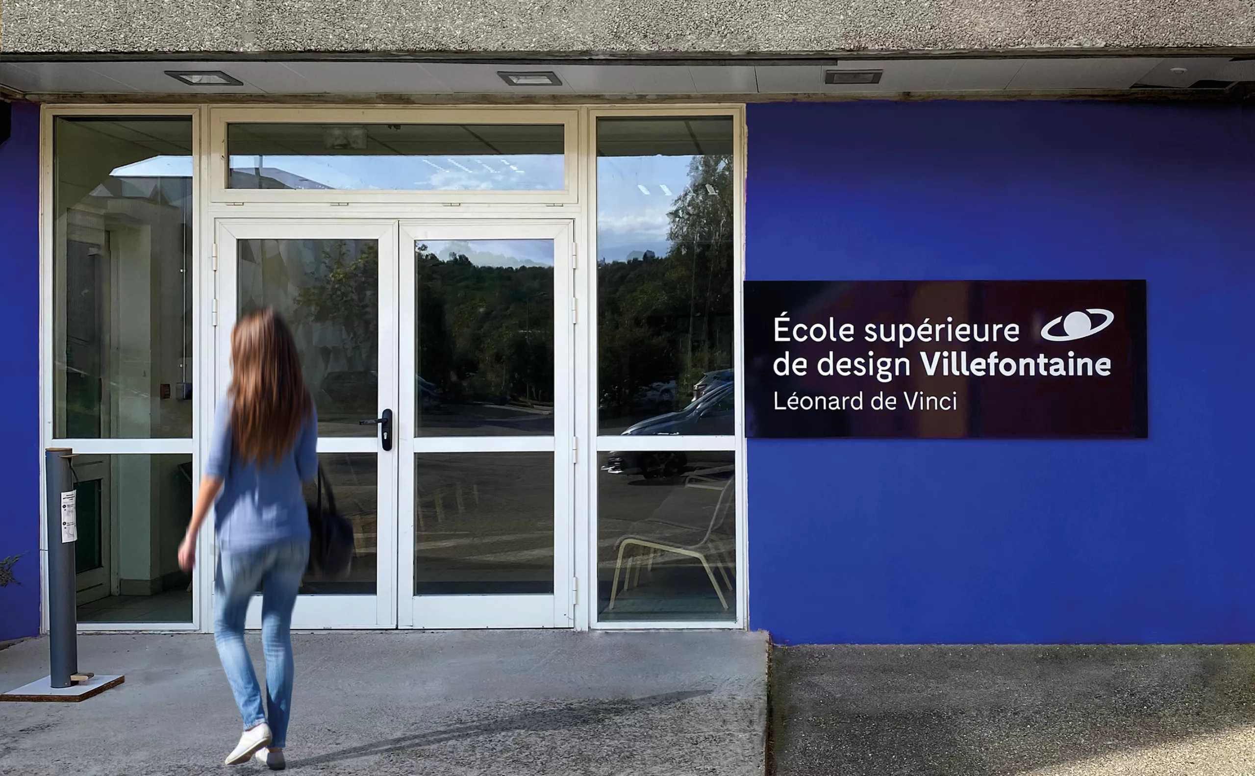
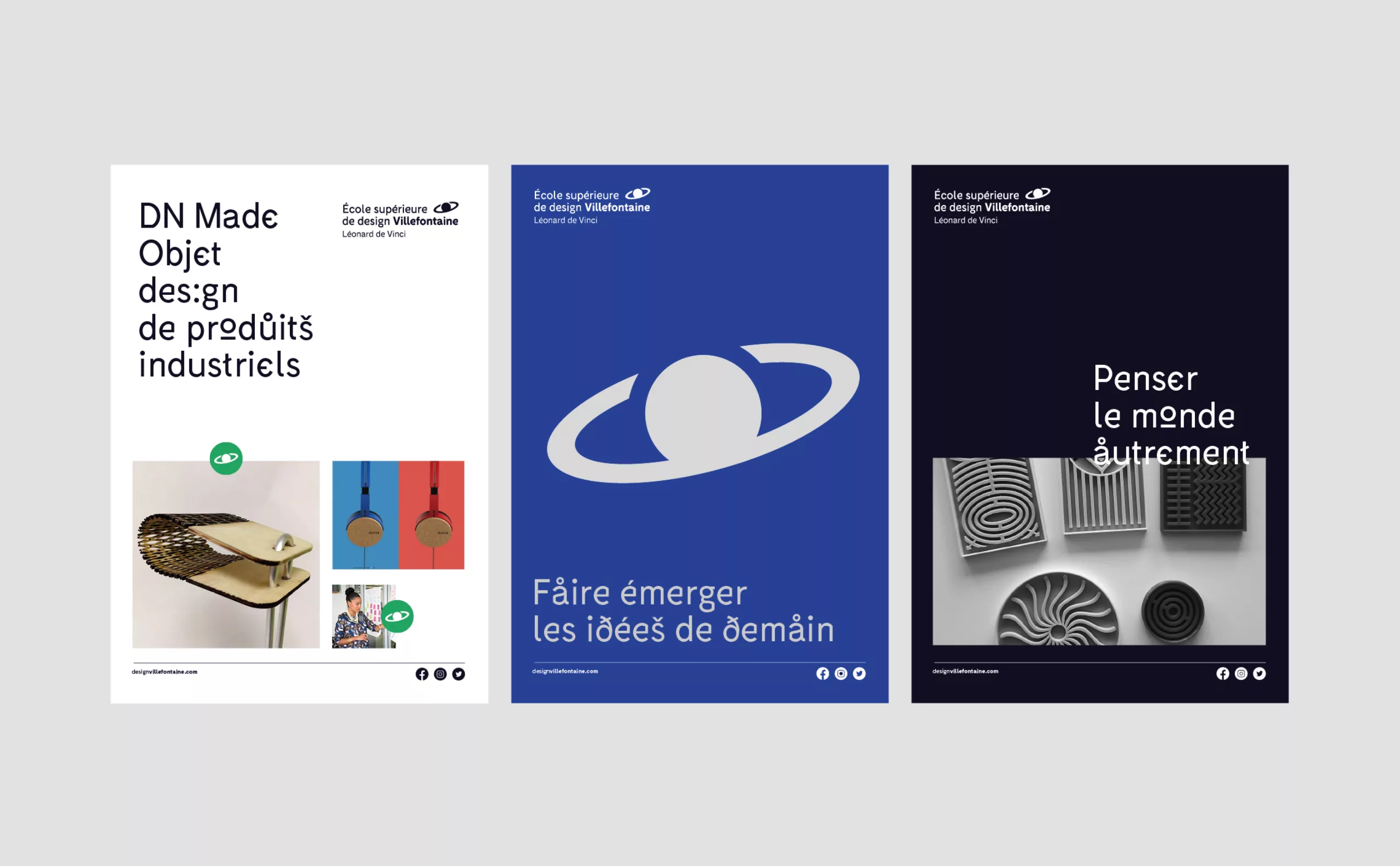
In 2022, the health context of the last few years and the competition between schools raise the question of the school's own distinctive character and identity. The "Pôle Supérieur de Design" then becomes "École Supérieure de Design Villefontaine": more legitimate, more competitive, more distinguishable. New strategic issues were taken into account: the course of study had to be more distinct from the other courses offered by the school, while remaining associated with them.  Graphically, the previous logo already met strong identification and demarcation needs. The arrow, whose sign has been removed from the circumflex accent of "pole", plays its role as a signpost to which everyone can refer. But beyond a message of progression, it did not tell much. A big miss when you know the strength of the storytelling built in 2012 and in particular of the baseline "A degree from elsewhere".

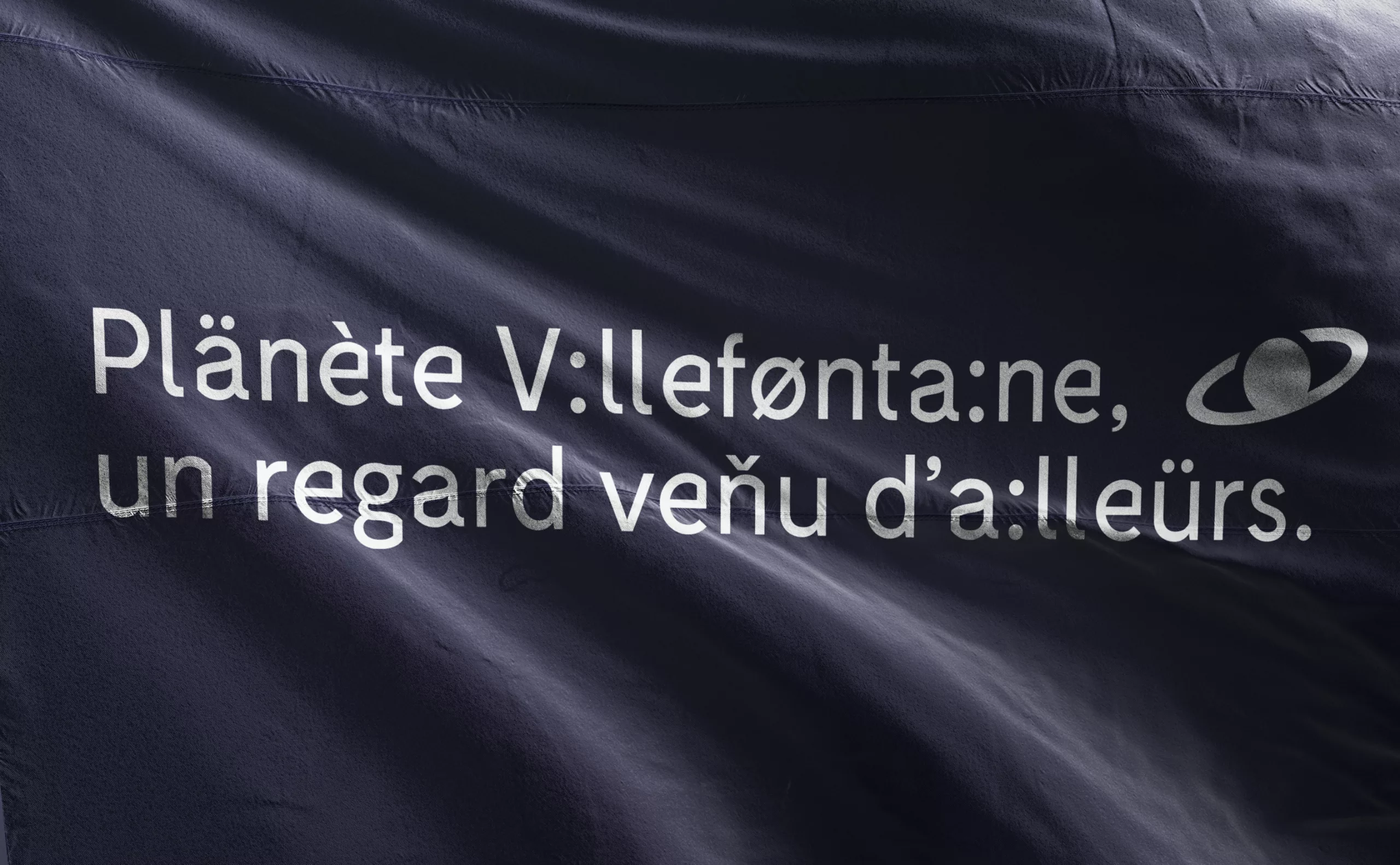
A small change in identity was necessary: a new name, a new logo, but the story remains the same. Villefontaine now proudly assumes its extraterrestrial origins. So here we are, facing an invasion of alien students landing on another planet: the planet Villefontaine!
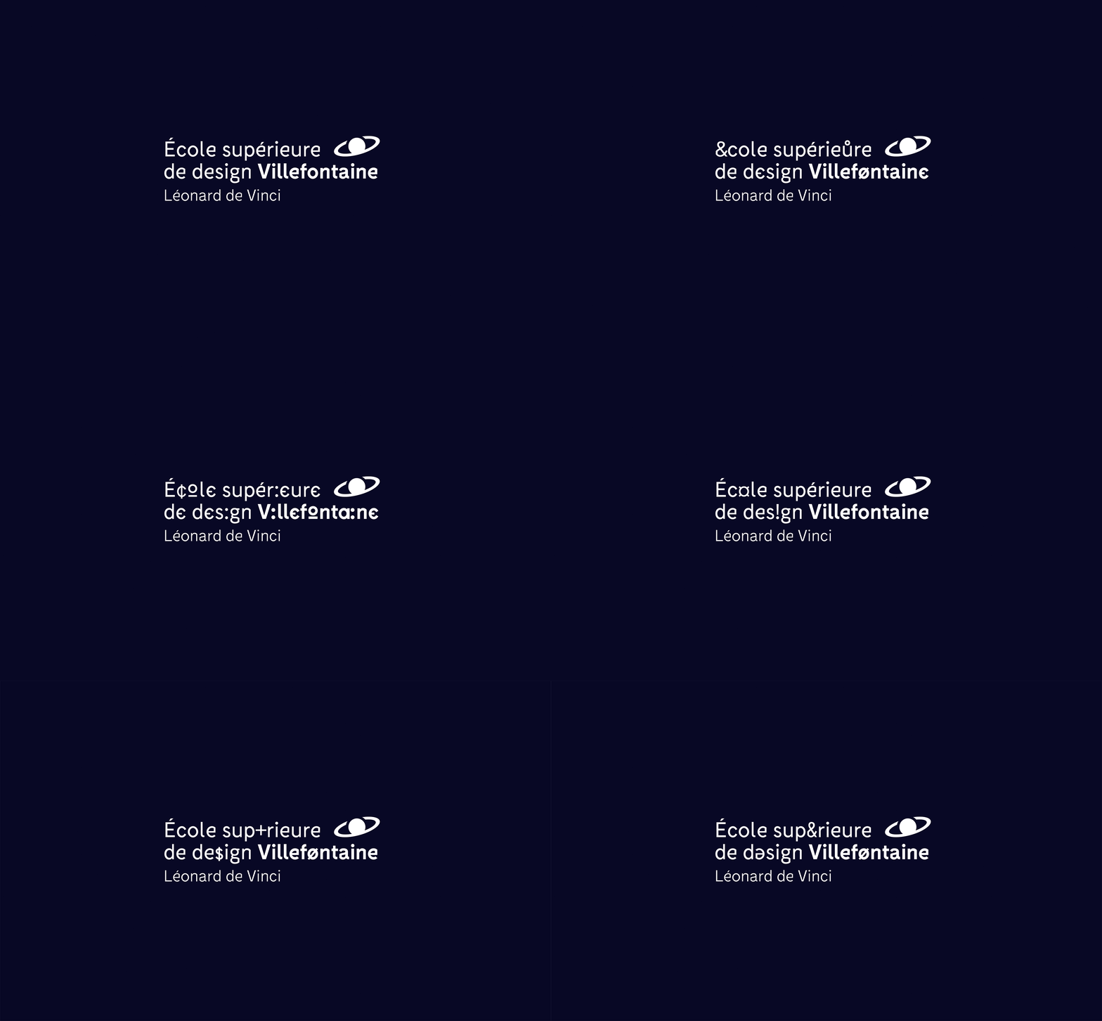
ecole-design-villefontaine-identite-visuelle-logotype-variable-font
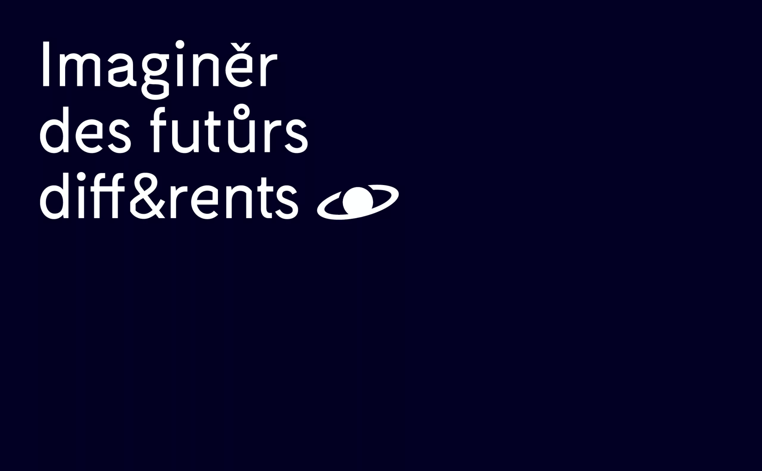
ecole-design-villefontaine-identite-visuelle-concept-imagination-futur
logo génératif mouvement

Eye or planet?

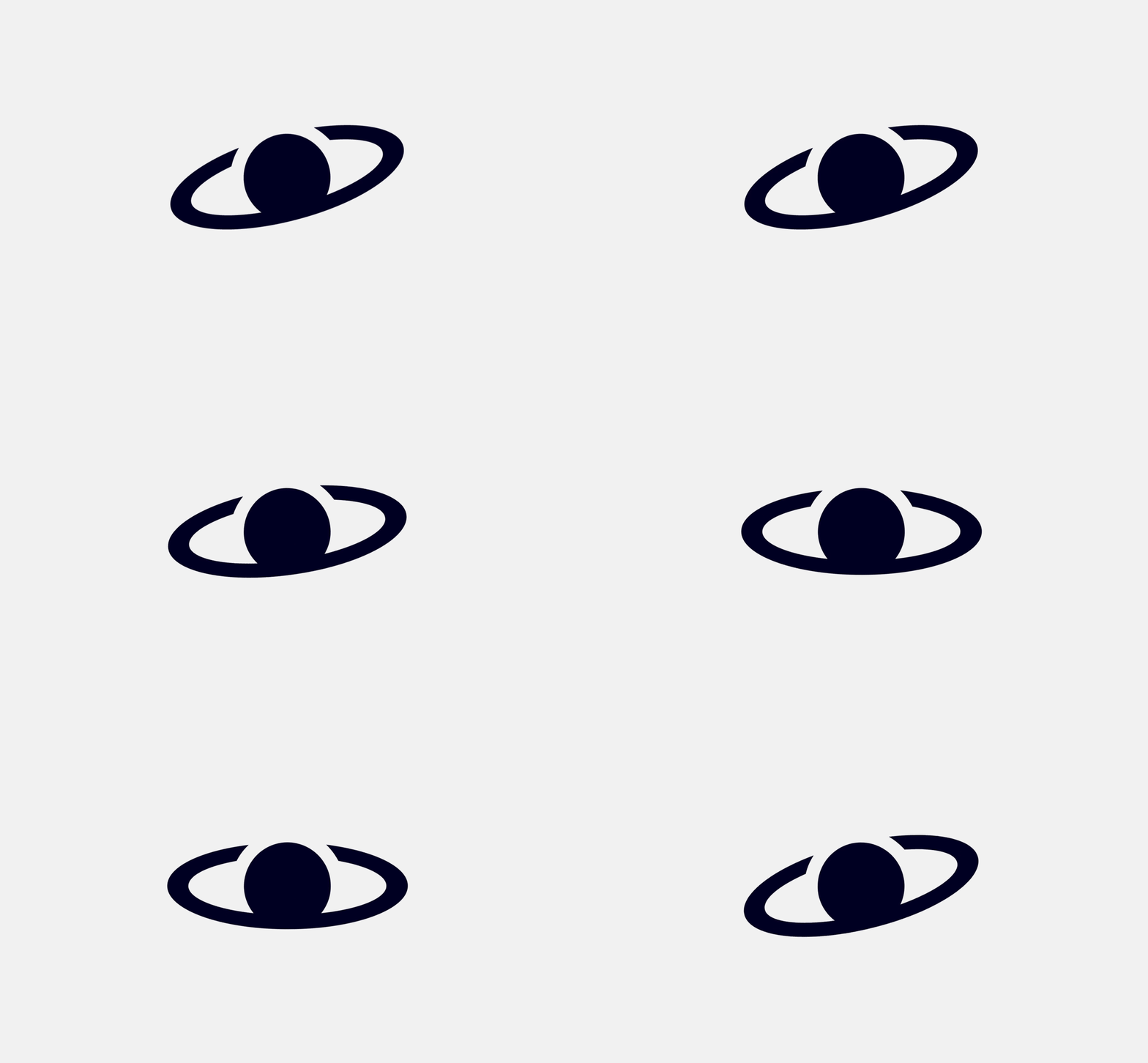
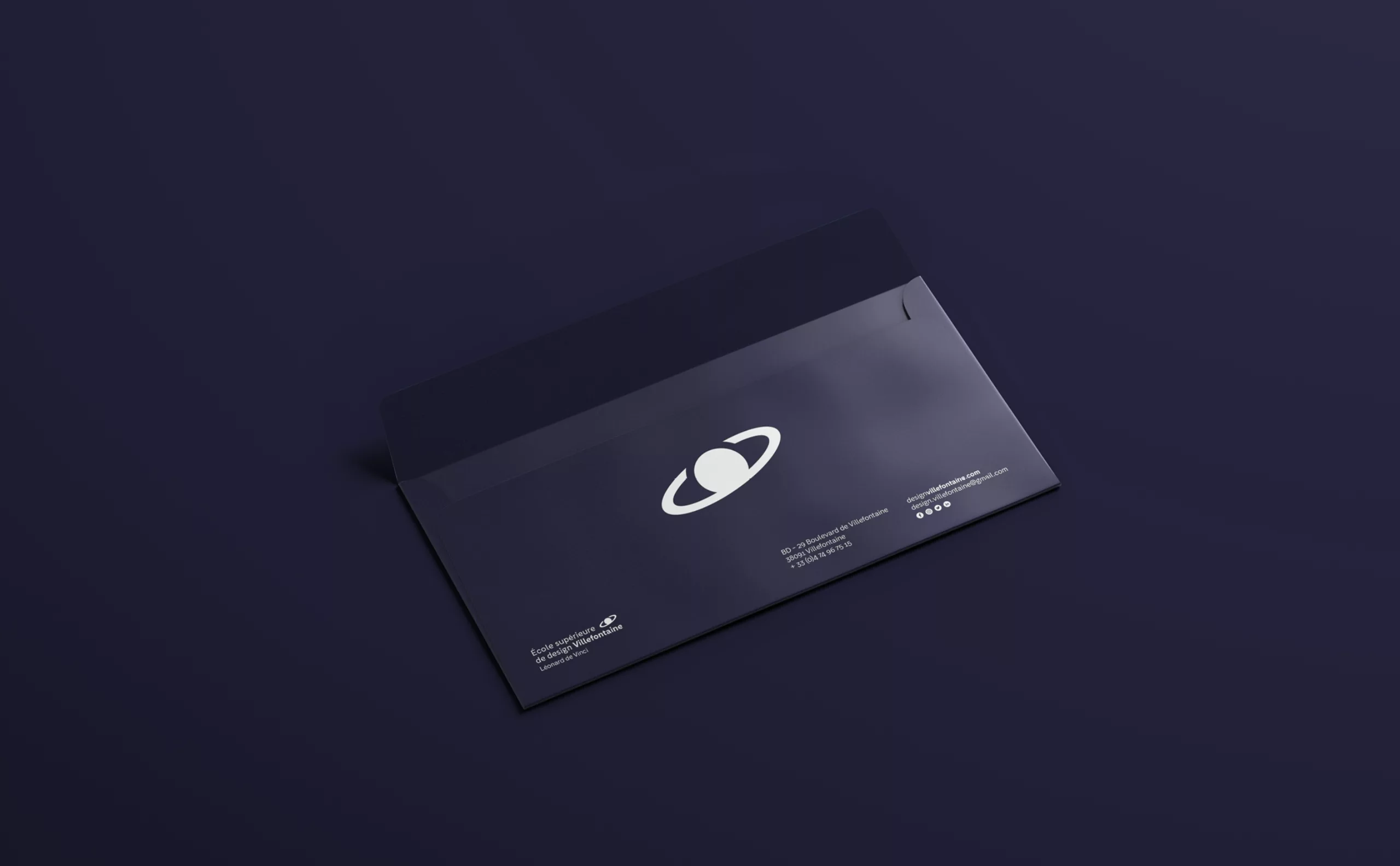
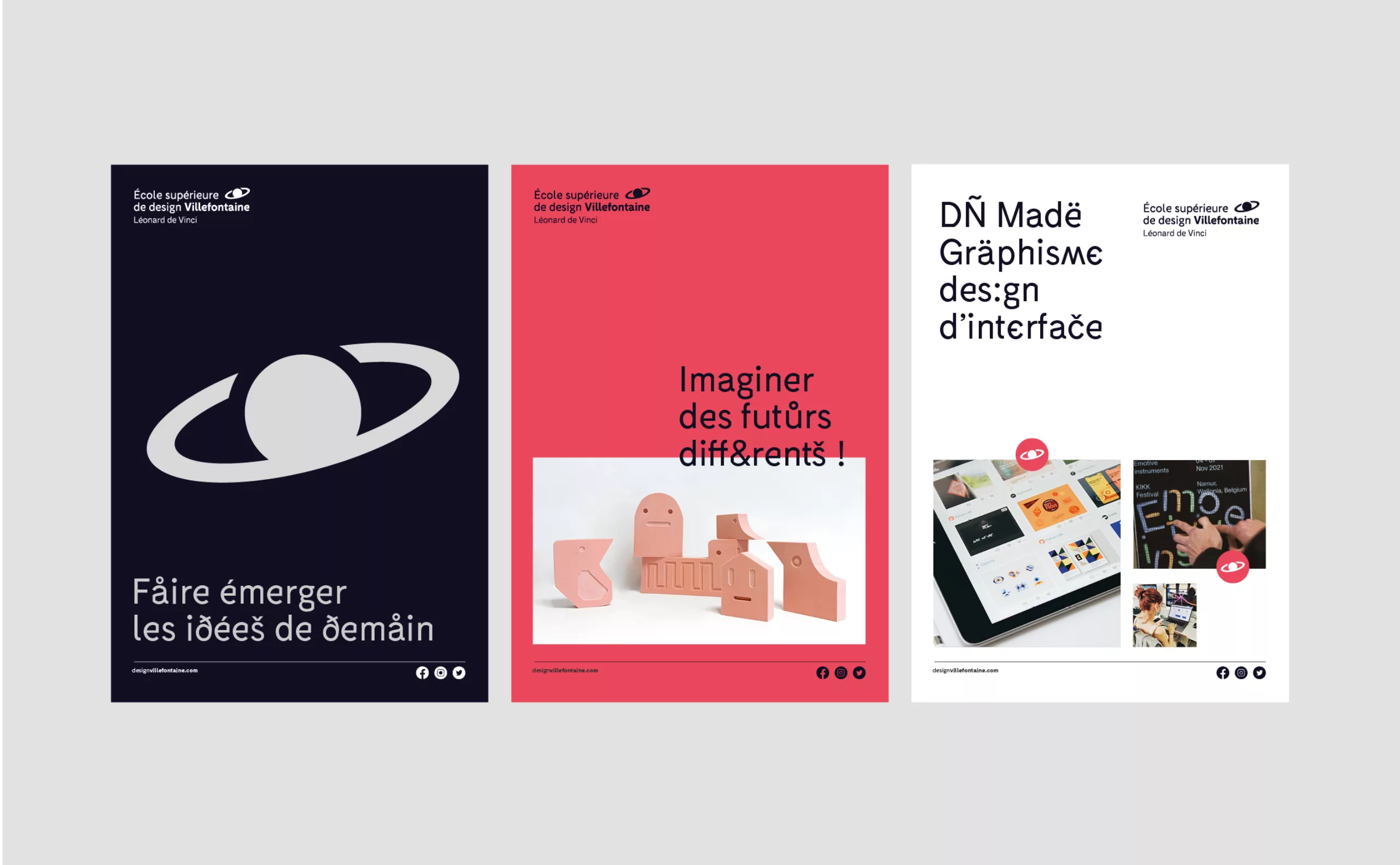
There are two hidden notions in this sign: a planet and an eye. The magic of shapes and our brain...

If Villefontaine is associated with this distant planet, design is associated with the notion of the eye. The mission of a design school is to cultivate the eye in such a way as to make it open, critical and citizen-like. Thinking about form and anticipating uses requires this sharp eye, this sensitive look at the world and at others.

In this sign, the student is at the heart of the matter. His gaze opens the doors to the planet Villefontaine. His years of study give him plenty of time to float in this extraterrestrial universe, to hone his eye, and perhaps one day to discover his own planet.

design-school-villefontaine-identity-look-planet
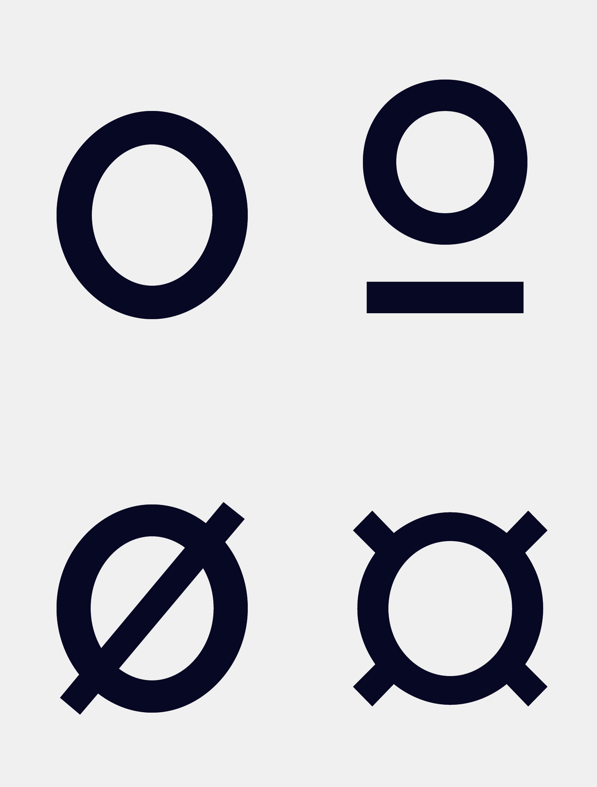
typography variable glyphes
ecole-design-villefontaine-visual-identity-concept-typography

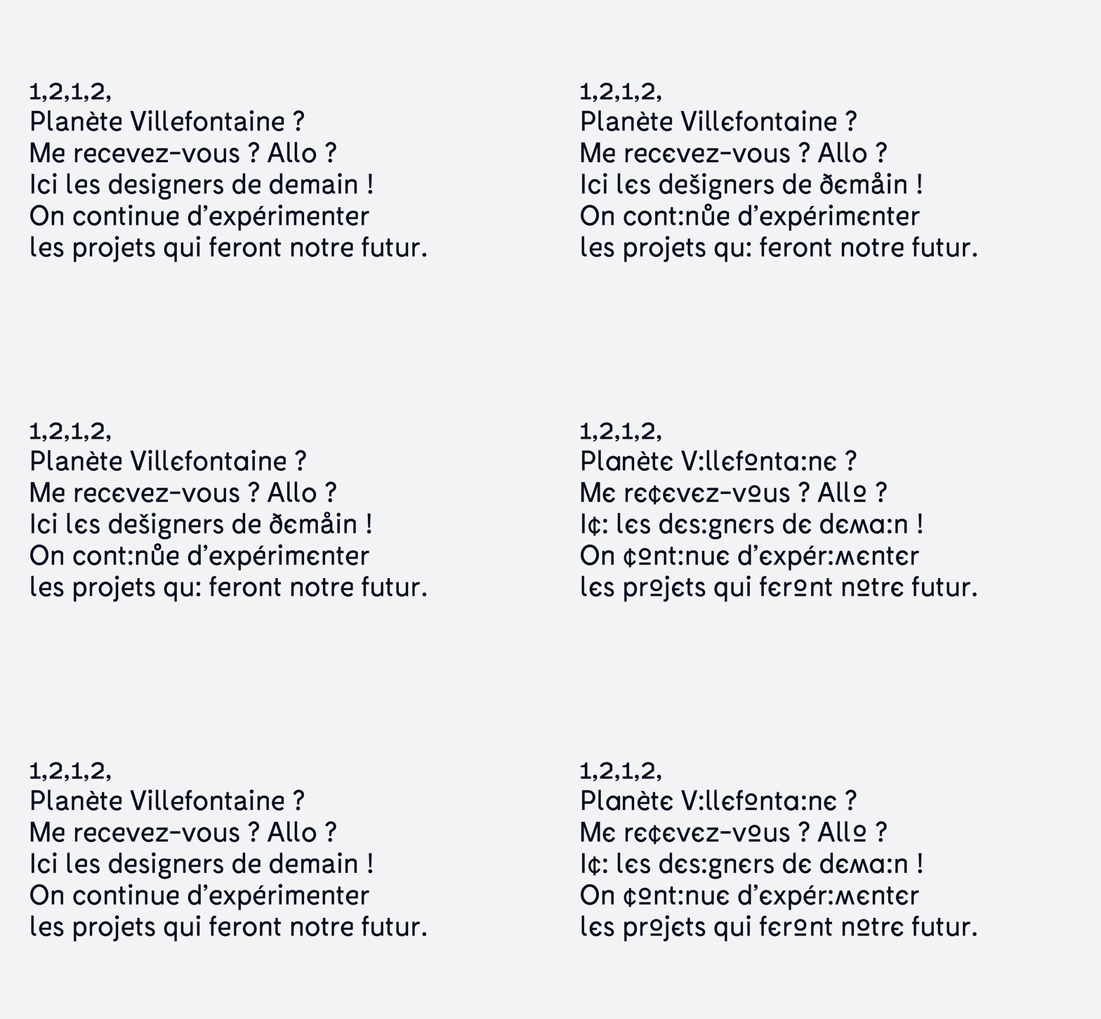
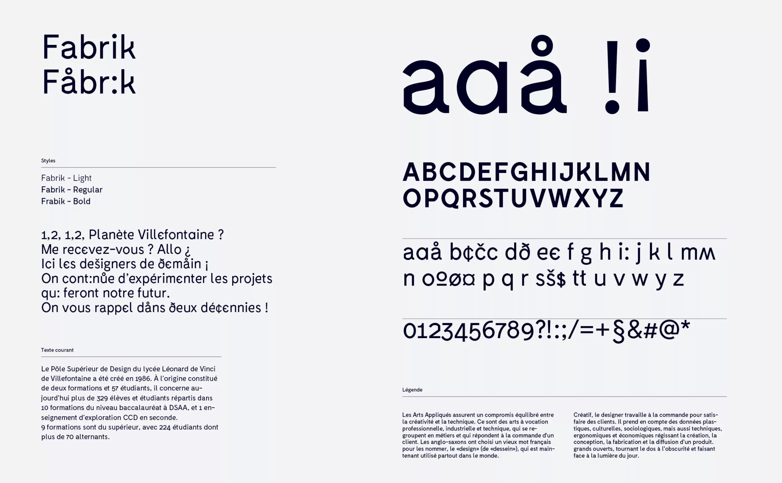
Typographic experimentation

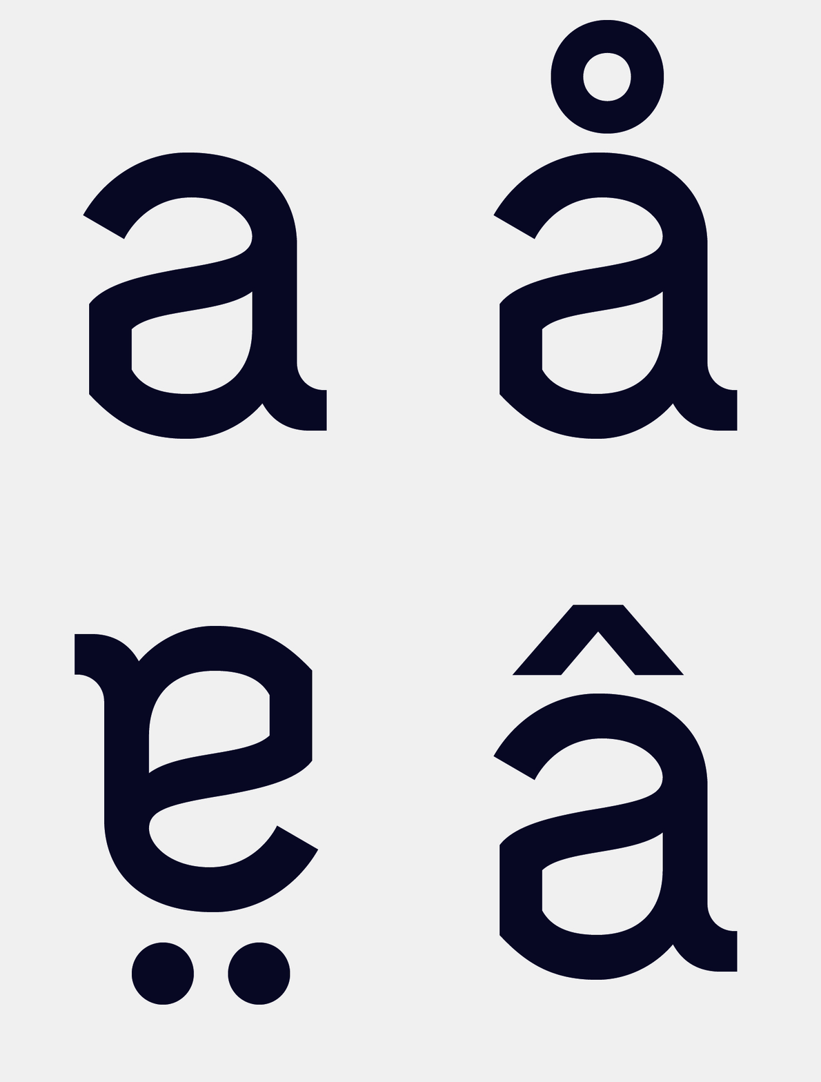
The typography was the object of a programming work in order to create different stylistic games for certain letters. On the animated supports as on the static supports, the characters are in constant change. The experimentation never stops, the typefaces flow, the ideas flow and Villefontaine becomes a place of creation in its own right.

Between design, typographic experimentation and digital coding, the school now has its own language. On the border between the bizarre and the strange, beware of UFOs that will tear it apart... If this is the case for you, you are certainly a design alien!

ecole-design-villefontaine-identite-visuelle-typography-variable
ecole-design-villefontaine-identite-visuelle-concept
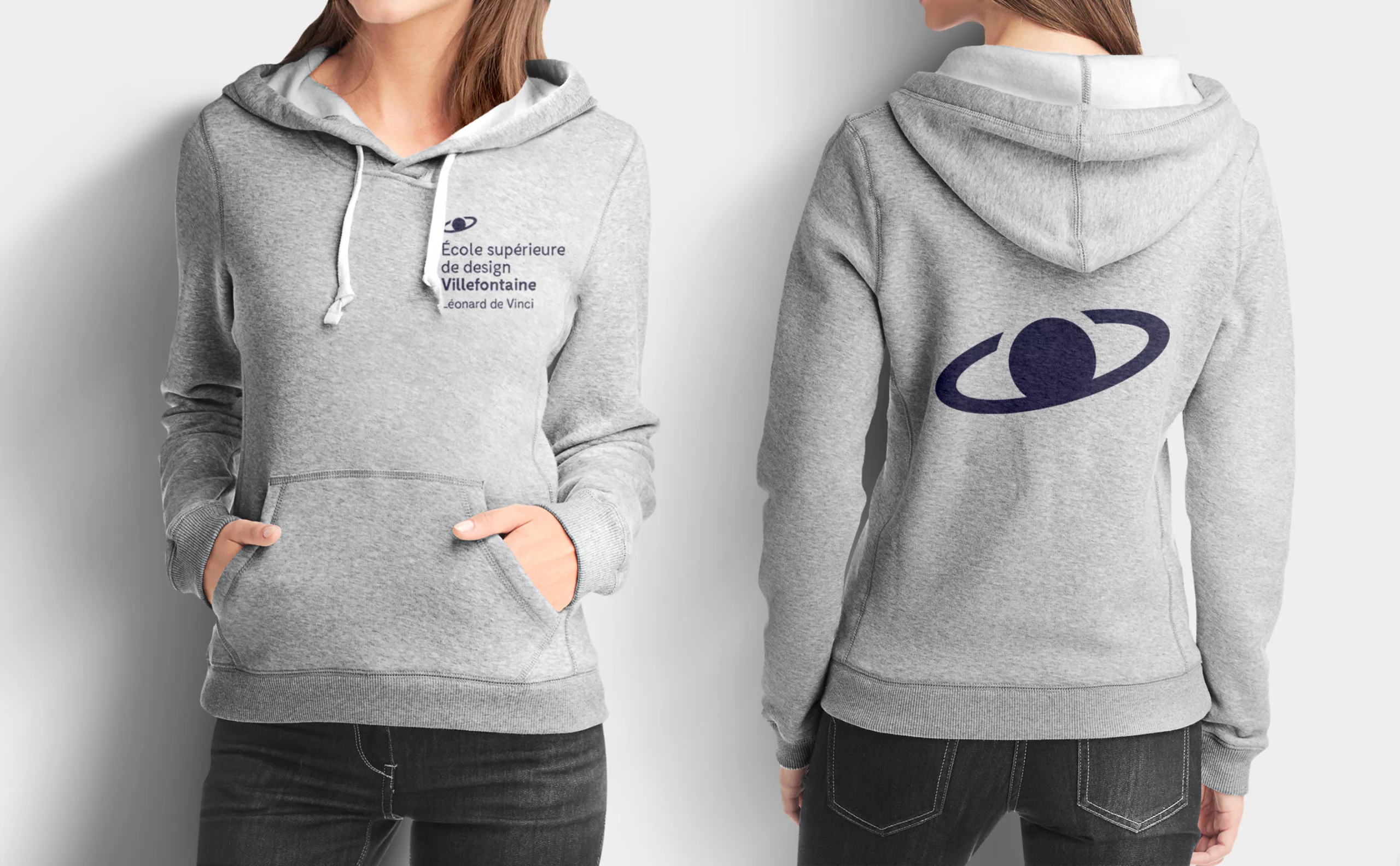
ecole-design-villefontaine-identite-visuelle-sweat
ecole-design-villefontaine-identite-visuelle-logotype-variable-illustrator

An evolving logotype

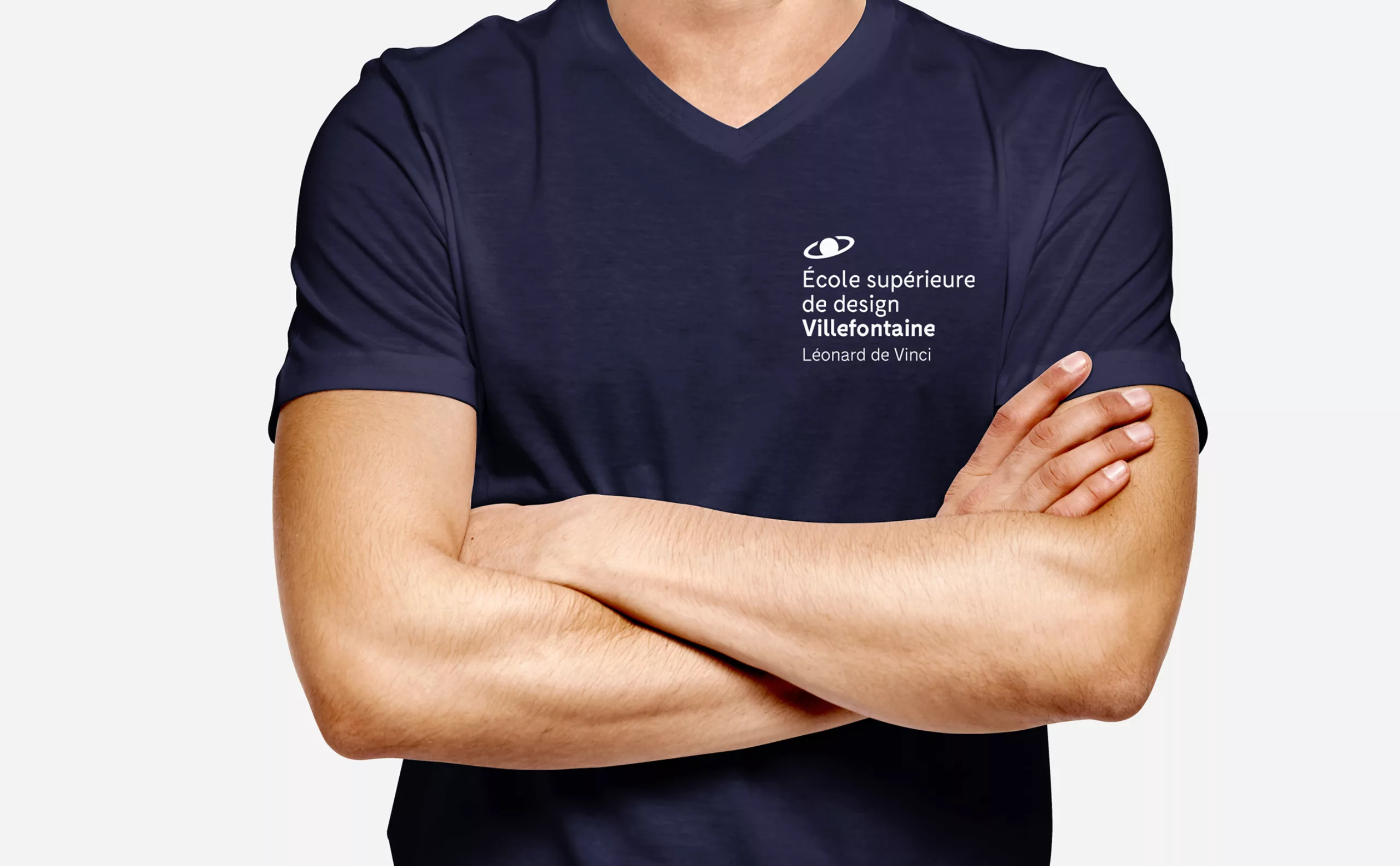
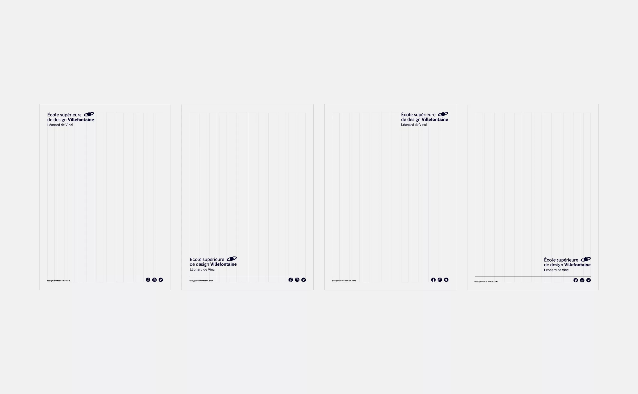
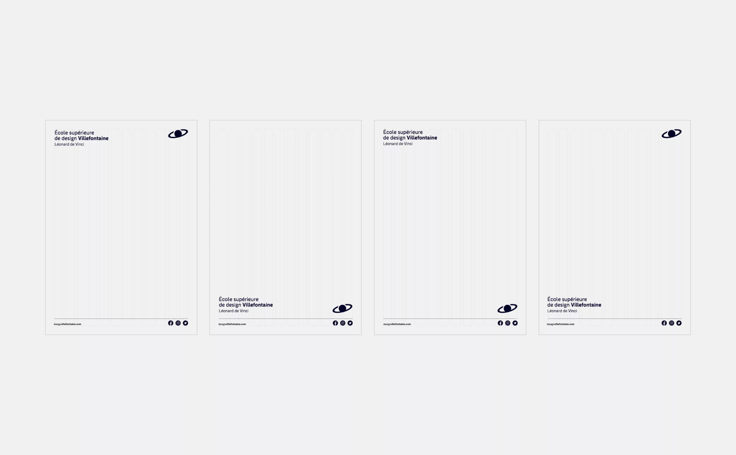
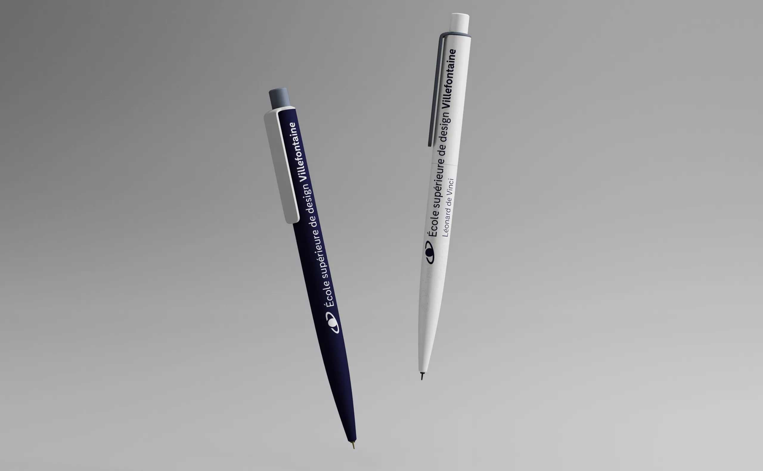
The sign being integrated as a character in its own right in the typographic block, it allows for easy creation of variations adapting to all uses and all media. Thus, its composition is entirely modular within the limits of the respect of the proportions and typographic styles of the logotype. Beyond being a technical advantage, Villefontaine's teams and students can now have fun placing their planet just about anywhere in their universe!

Make way for color!

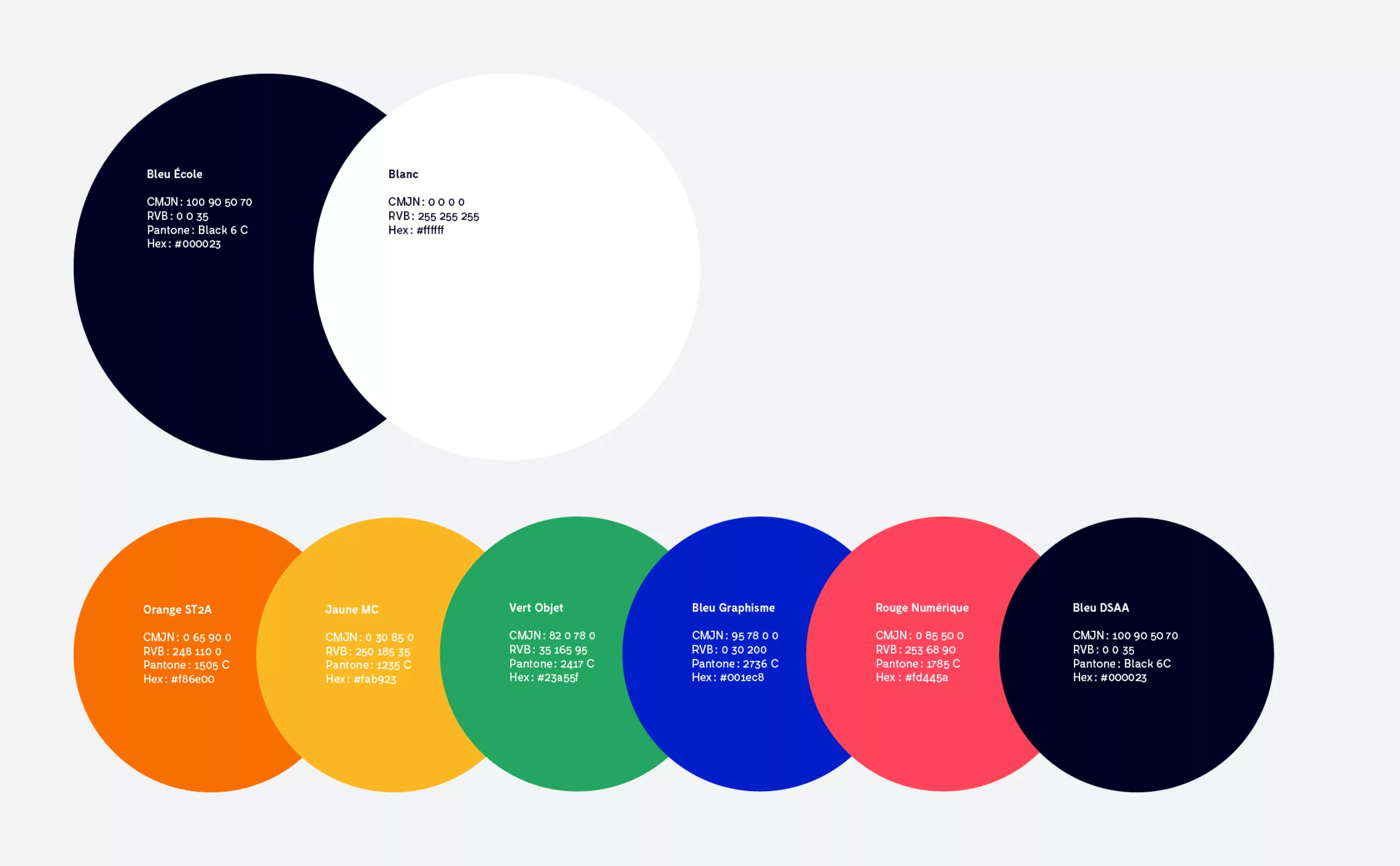
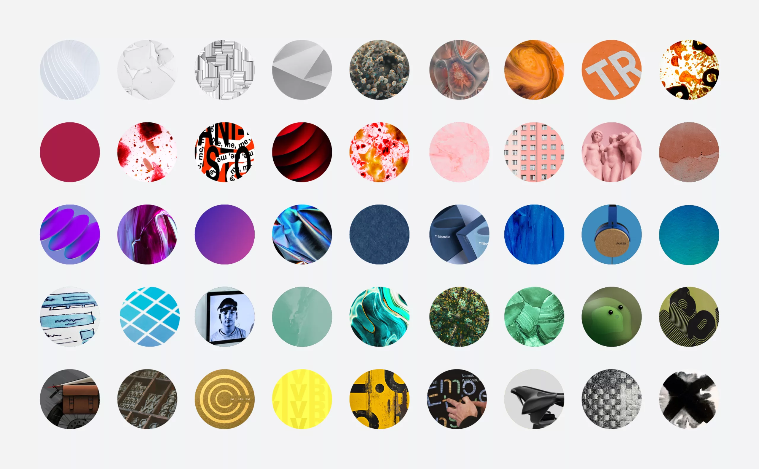
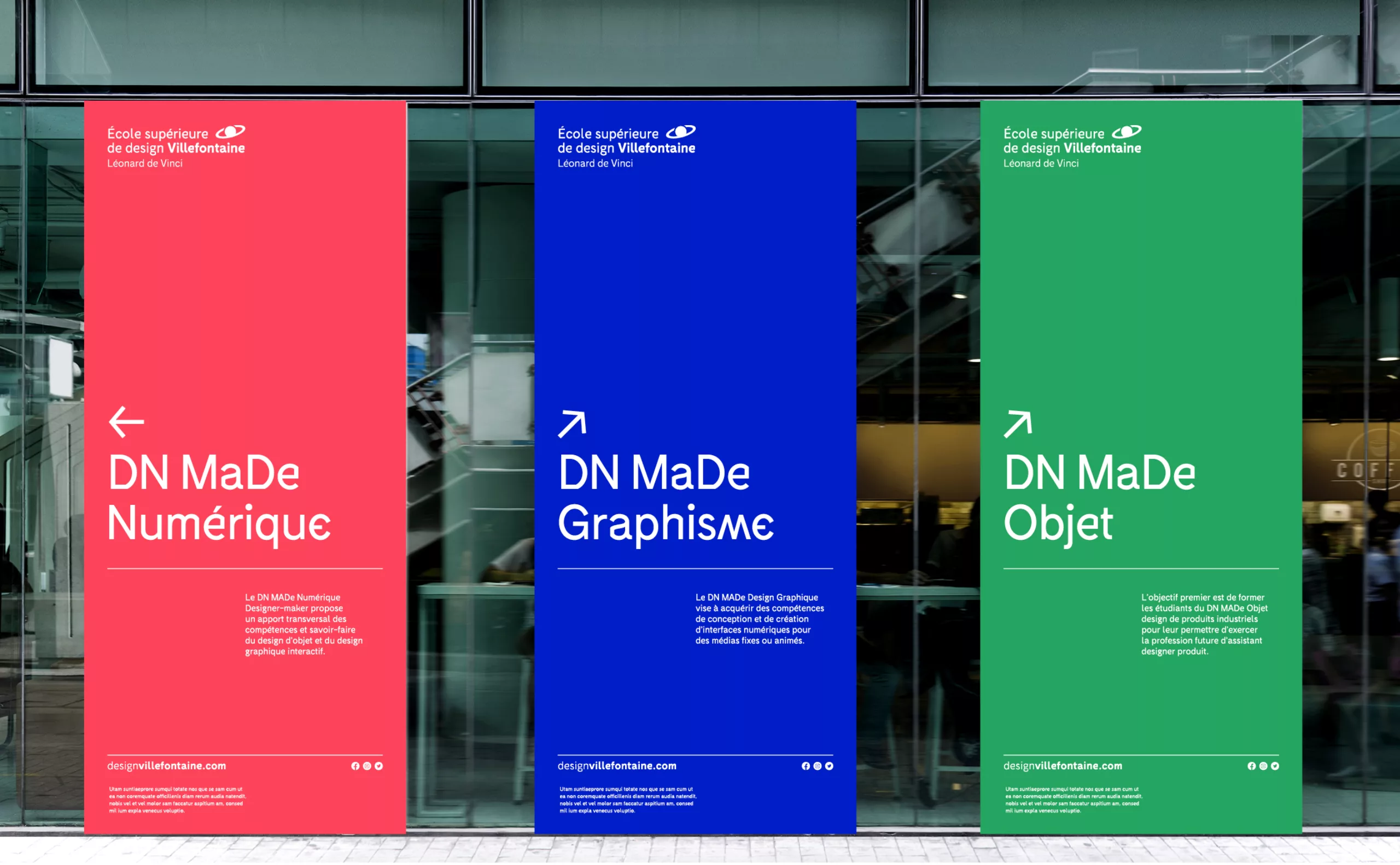
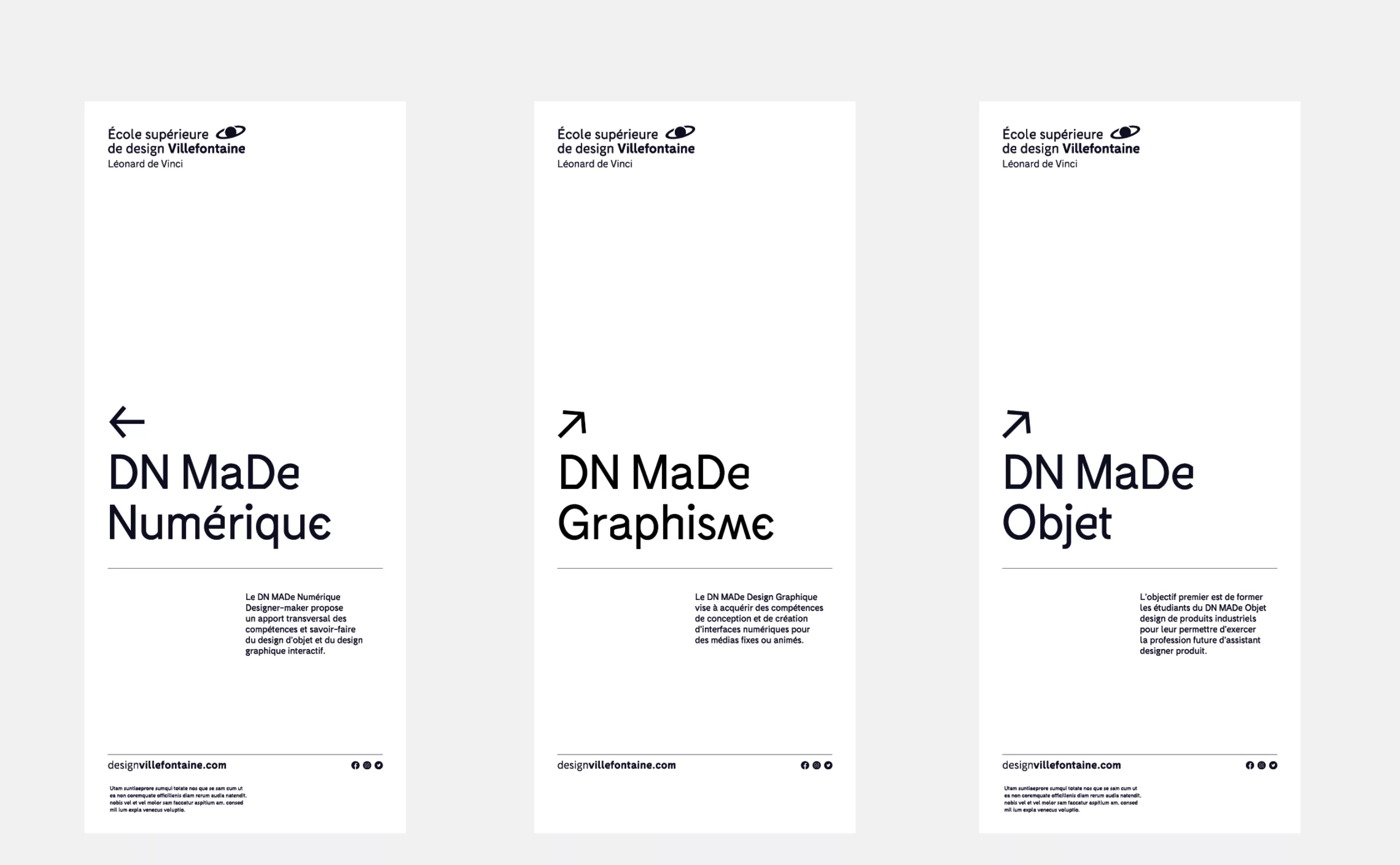
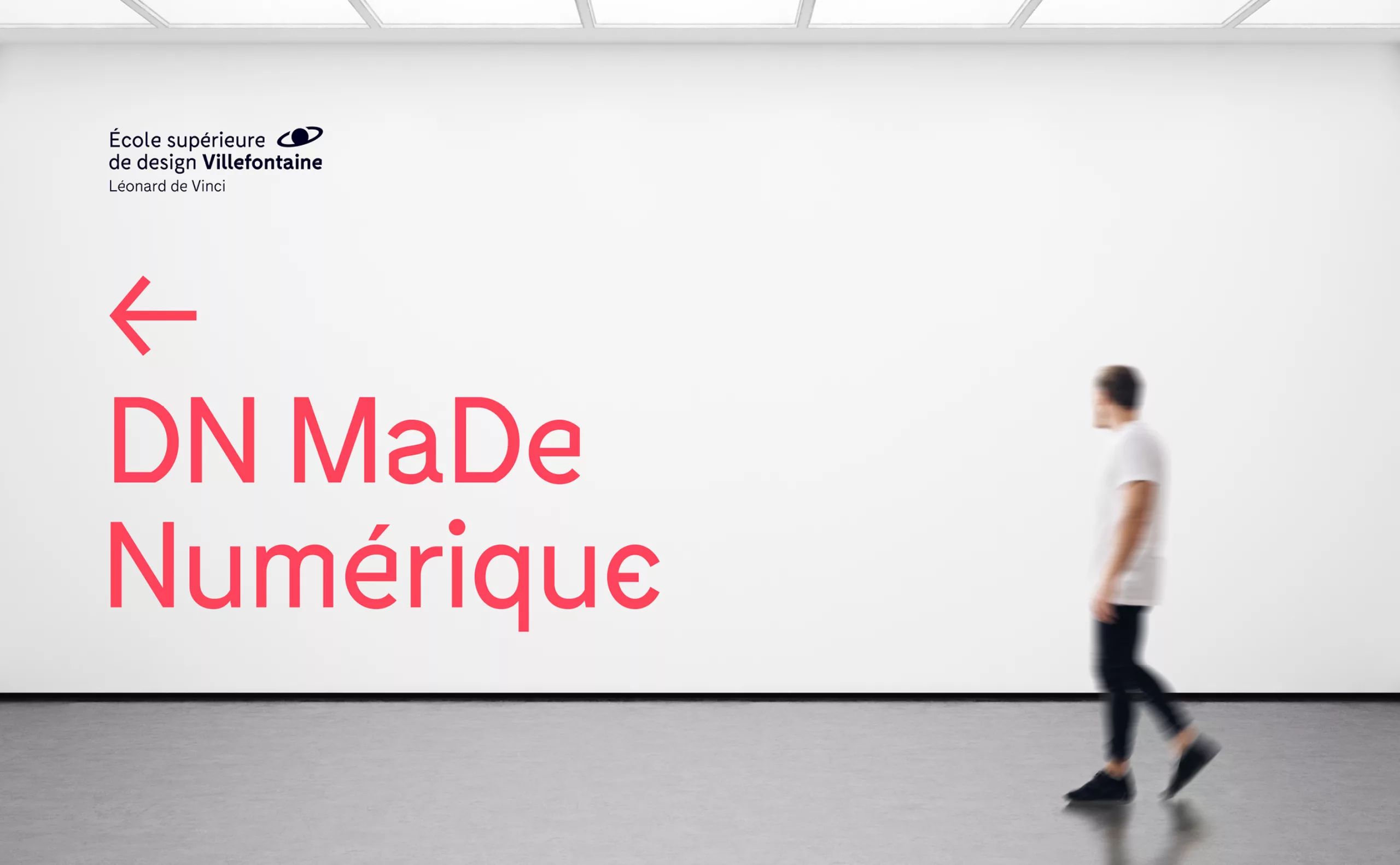
The school keeps only white and black as its main colors. This allows, in one case, to create an identity color chart for each training; in the other, to live with the creative universe of each student.

ecole-design-villefontaine-identite-visuelle-signaletique
ecole-design-villefontaine-identite-visuelle-affiche
school-design-villefontaine-visual-identity-urban-poster
ecole-design-villefontaine-identite-visuelle-pins
ecole-design-villefontaine-identite-visuelle-pen
ecole-design-villefontaine-identite-visuelle-facebook
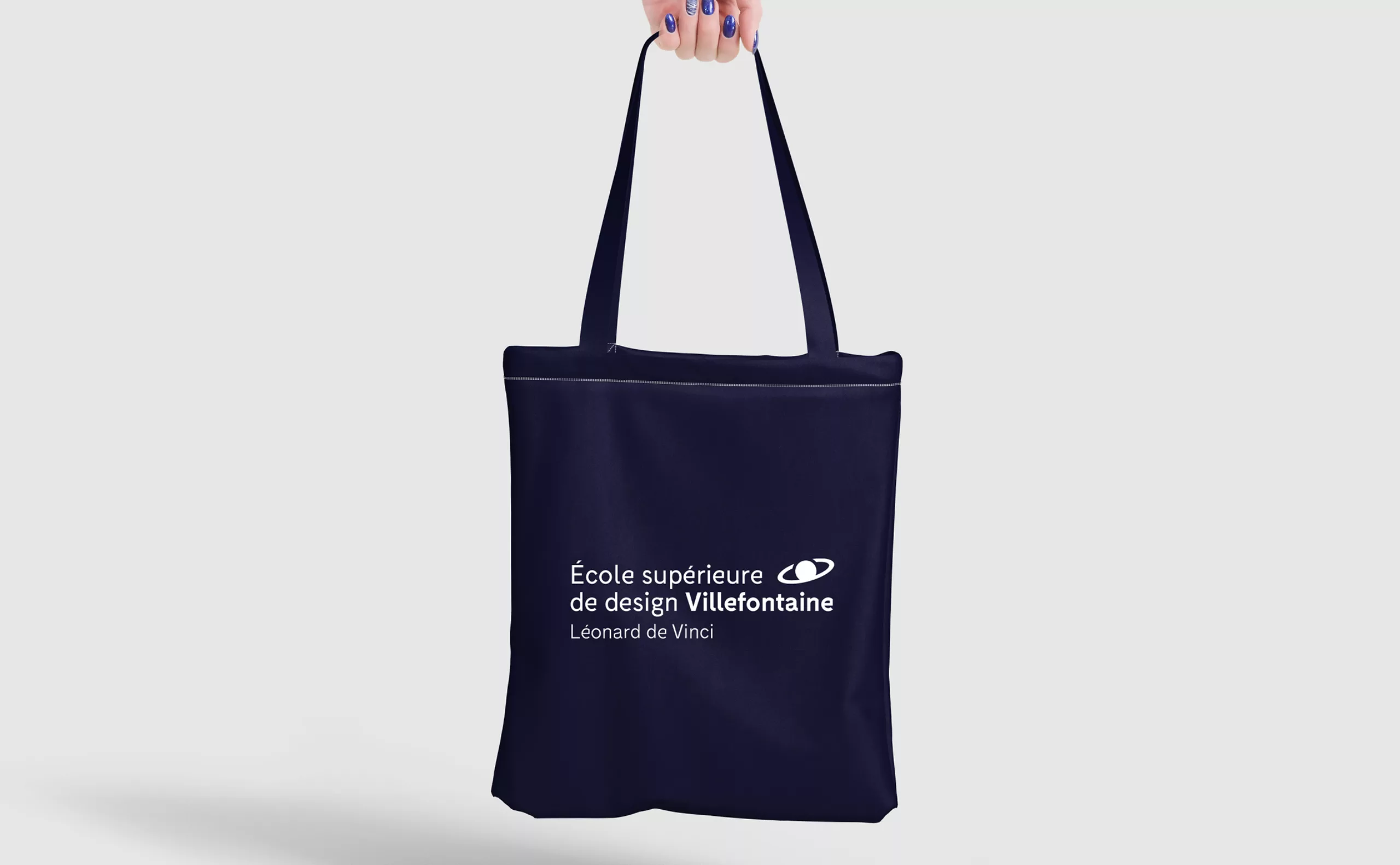
ecole-design-villefontaine-identite-visuelle-tot-bag

Thanks to Maryline Rochette (Head of School at Lycée Léonard de Vinci, Villefontaine), to Laurent Thiebaud (School Coordinator and Professor of Design and Arts and Crafts), to Jean-Baptiste Joatton (Professor of Design). Thanks to Kevin Vennitti (Developer and Professor of design) for his research and his investment.


Share this project:
Project expertise:
Logo creation, visual identity and graphic guidelines.
Type of client:
Communication in the education, higher education and health sector. An indispensable partner in the transformation of the health and wellness industry through the alchemy of creativity and technology.

Related projects: