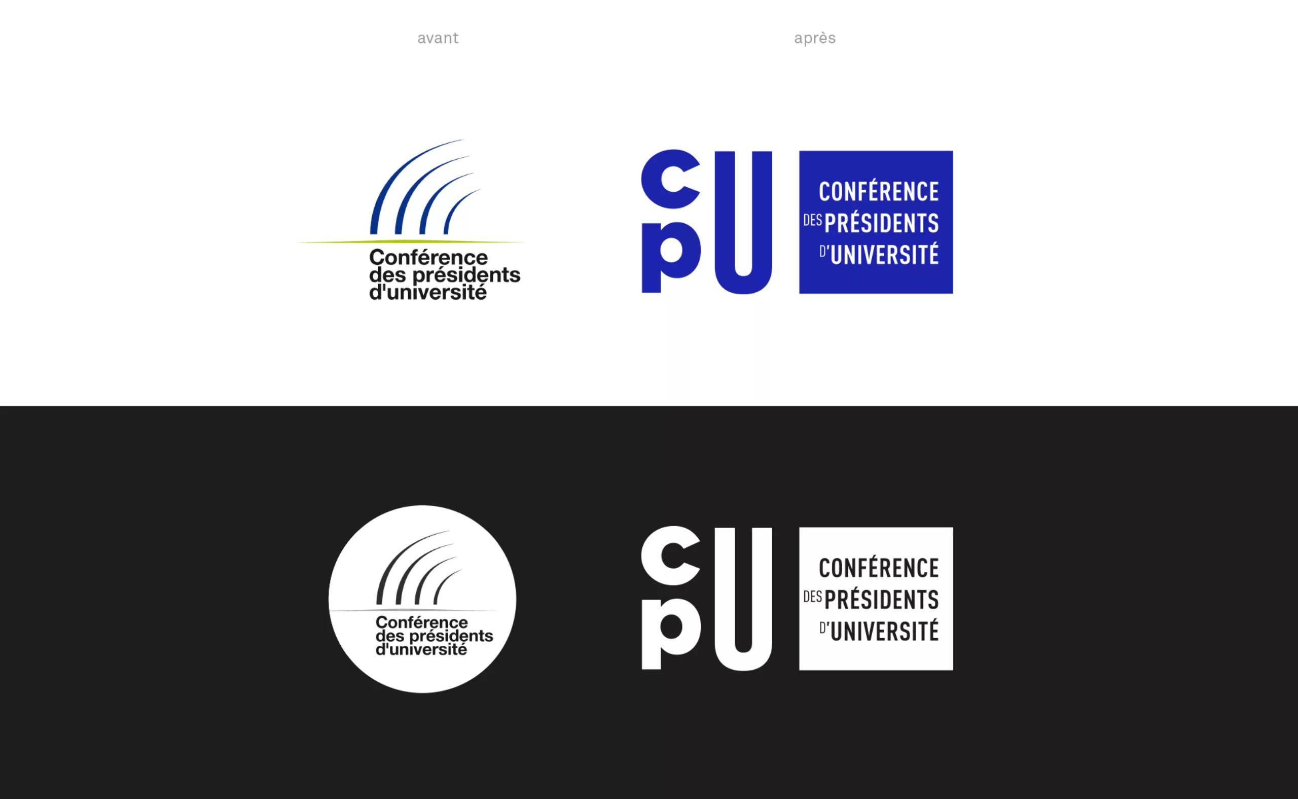
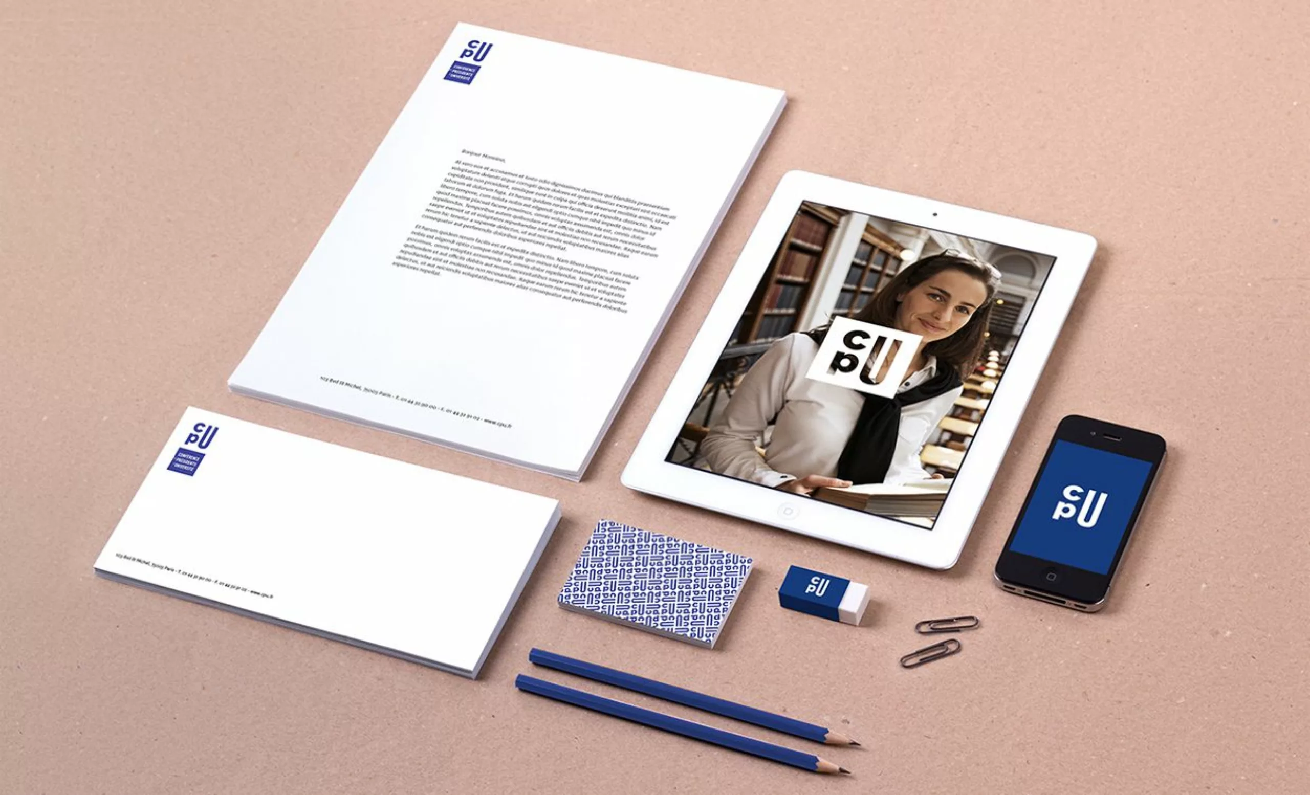
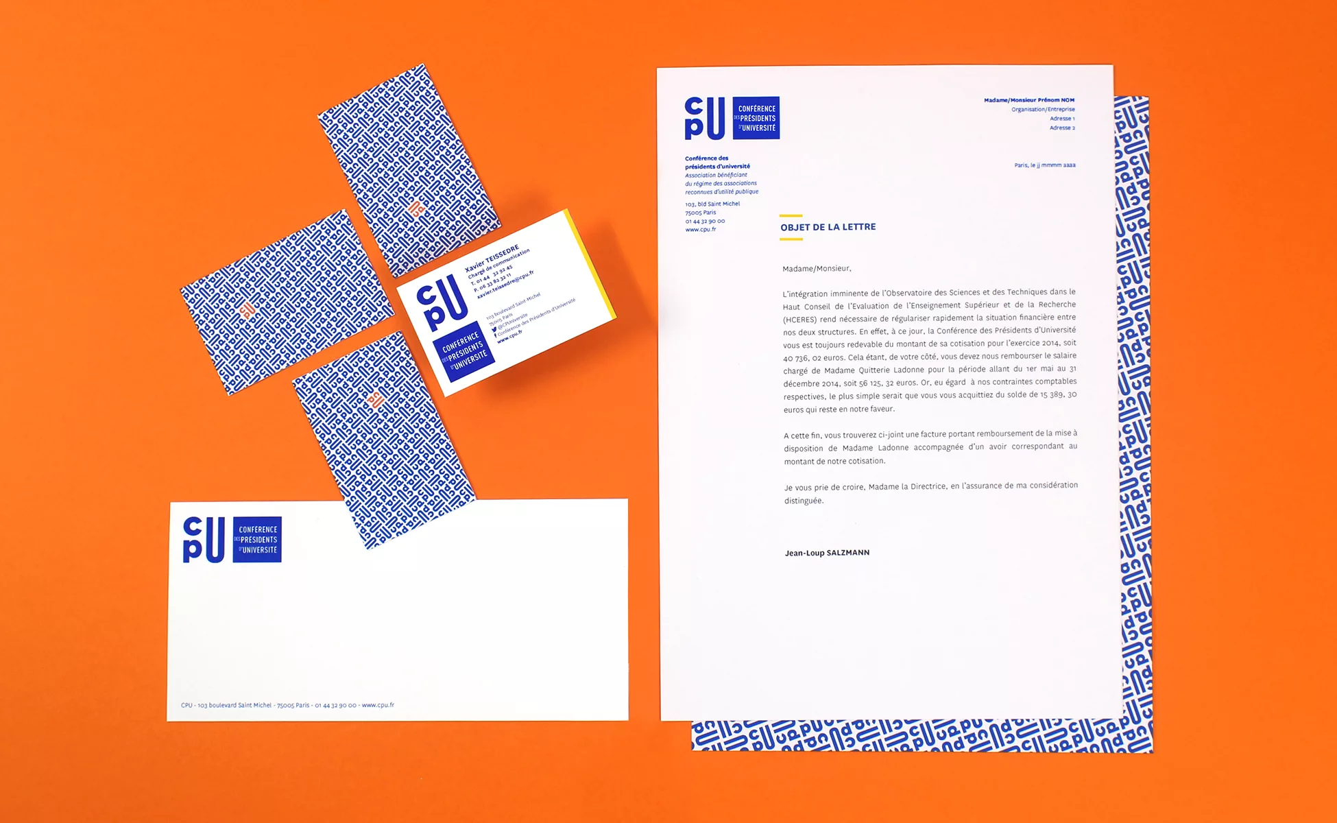
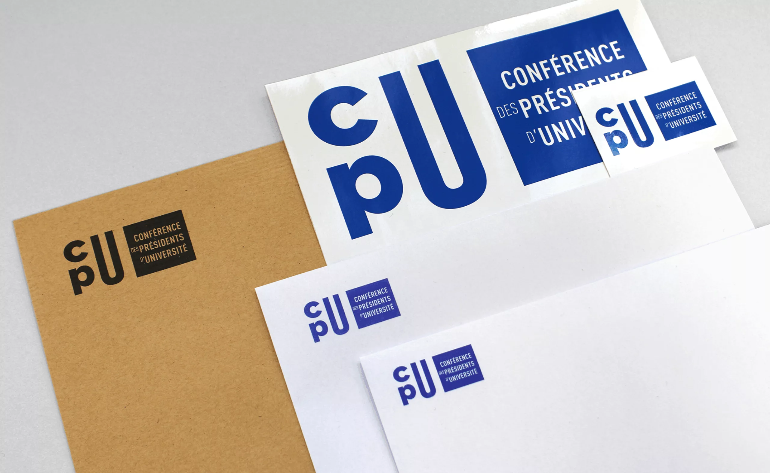
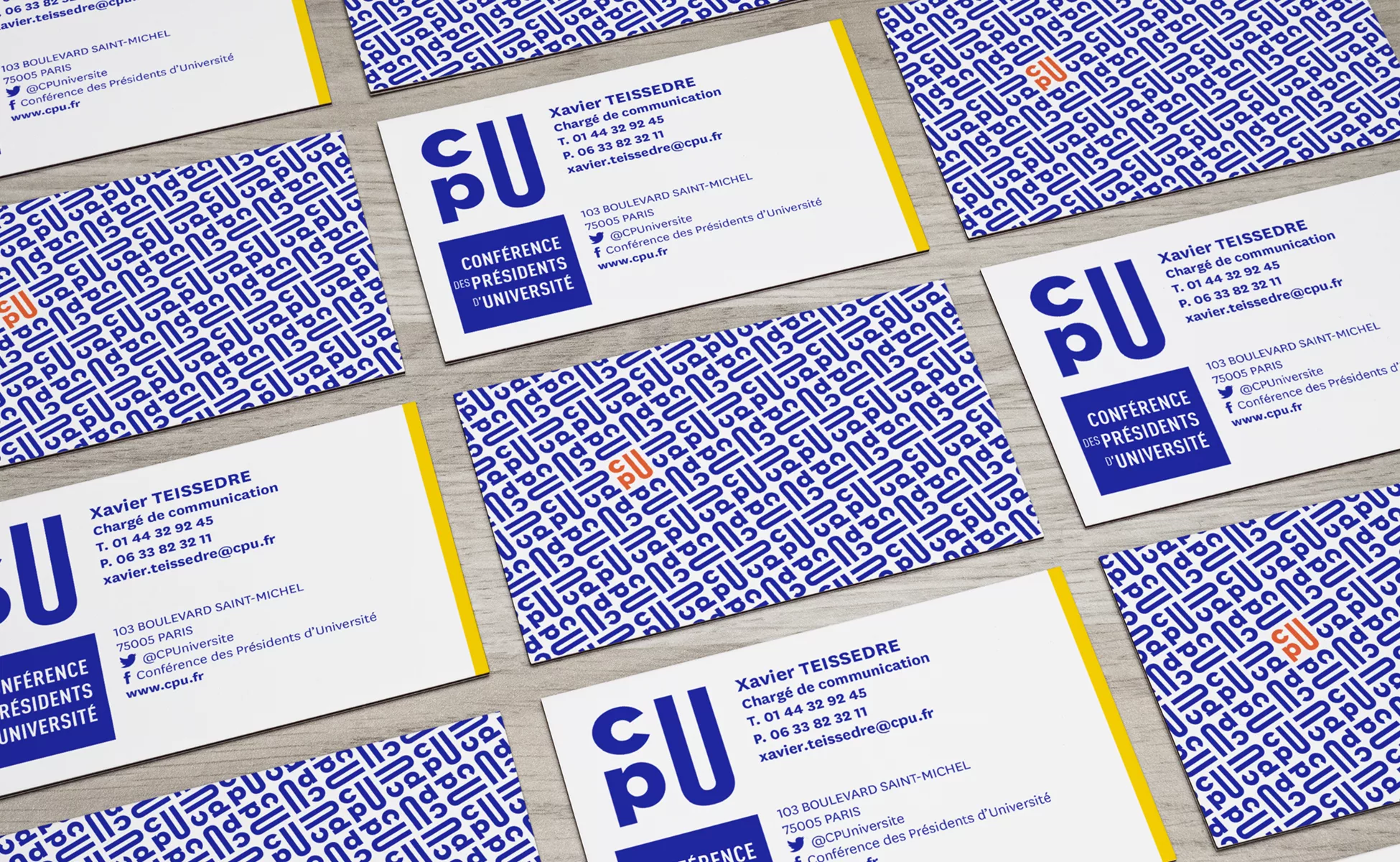
The CPU has chosen to make its three letters the heart of its new visual identity. The design and composition of these letters are intended to create an impacting symbol and adapted to today’s communication tools.
Why the need for a new identity? The old logo illustrated an amphitheater, symbol entirely justified, but its execution made the difficult readability small. More commonly known as “the claw” in-house, with fine features the logo face faded logos partners. It was therefore imperative to address this concern for visibility!
In the new logo, the “c” overlooks the “p”. To their right, the “U” in capital letter, has voluntarily stretched design that puts it forward. The visibility given to the “U” underlines the importance of the role of the University in our society and obviously the close link between the CPU and universities.
The result is a CPU acronym blue, chromatic nod to the old logo created in 1995. Graphically very rhythmic, this logo should mark the spirits and thus facilitate its memorization. This original emblem reflects the will of the CPU to innovate and reinvent itself.