fr
fr
Signe de la mutualisation apostrophes

AMUE University

AMUE's visual identity When universities pool their efforts

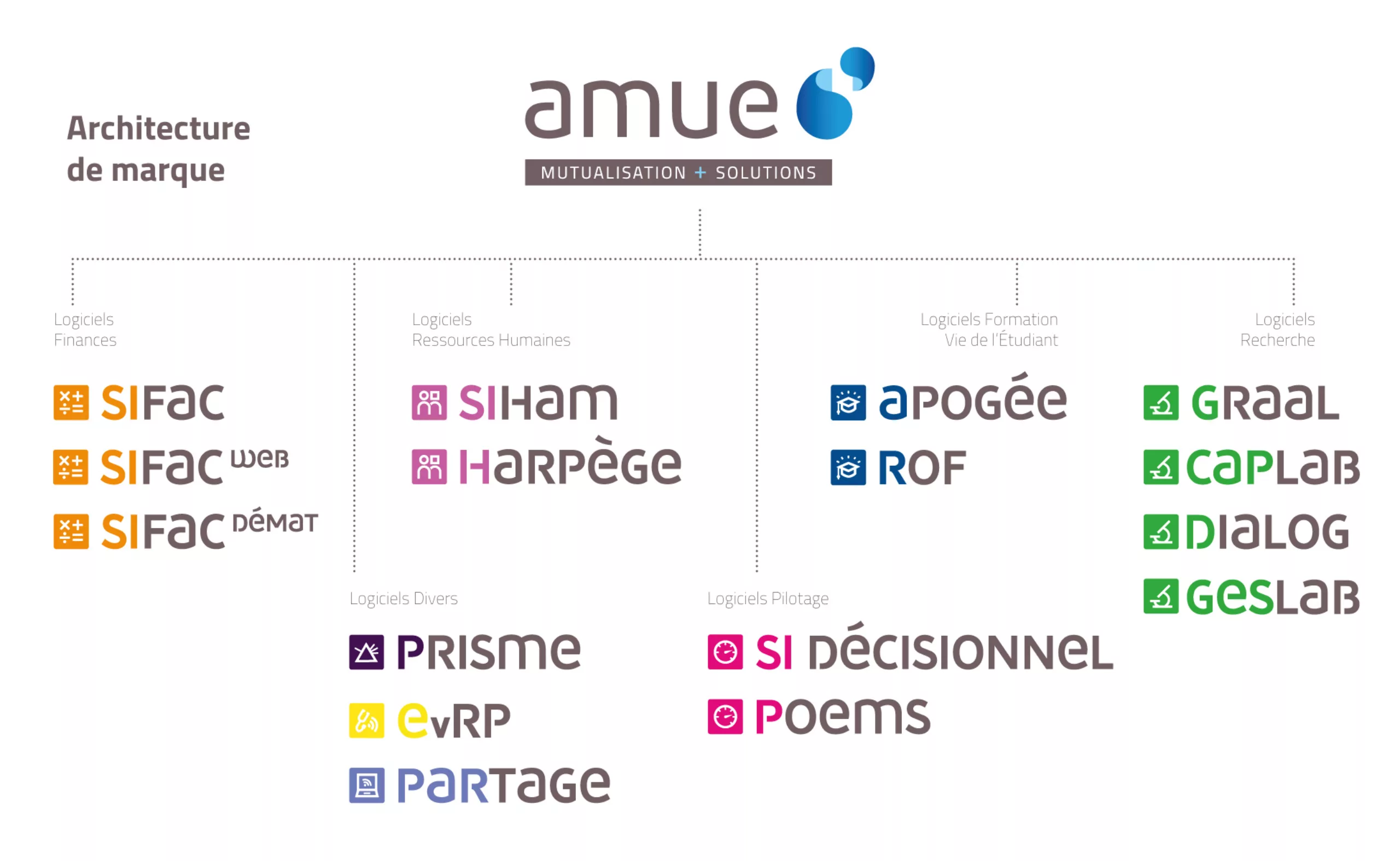
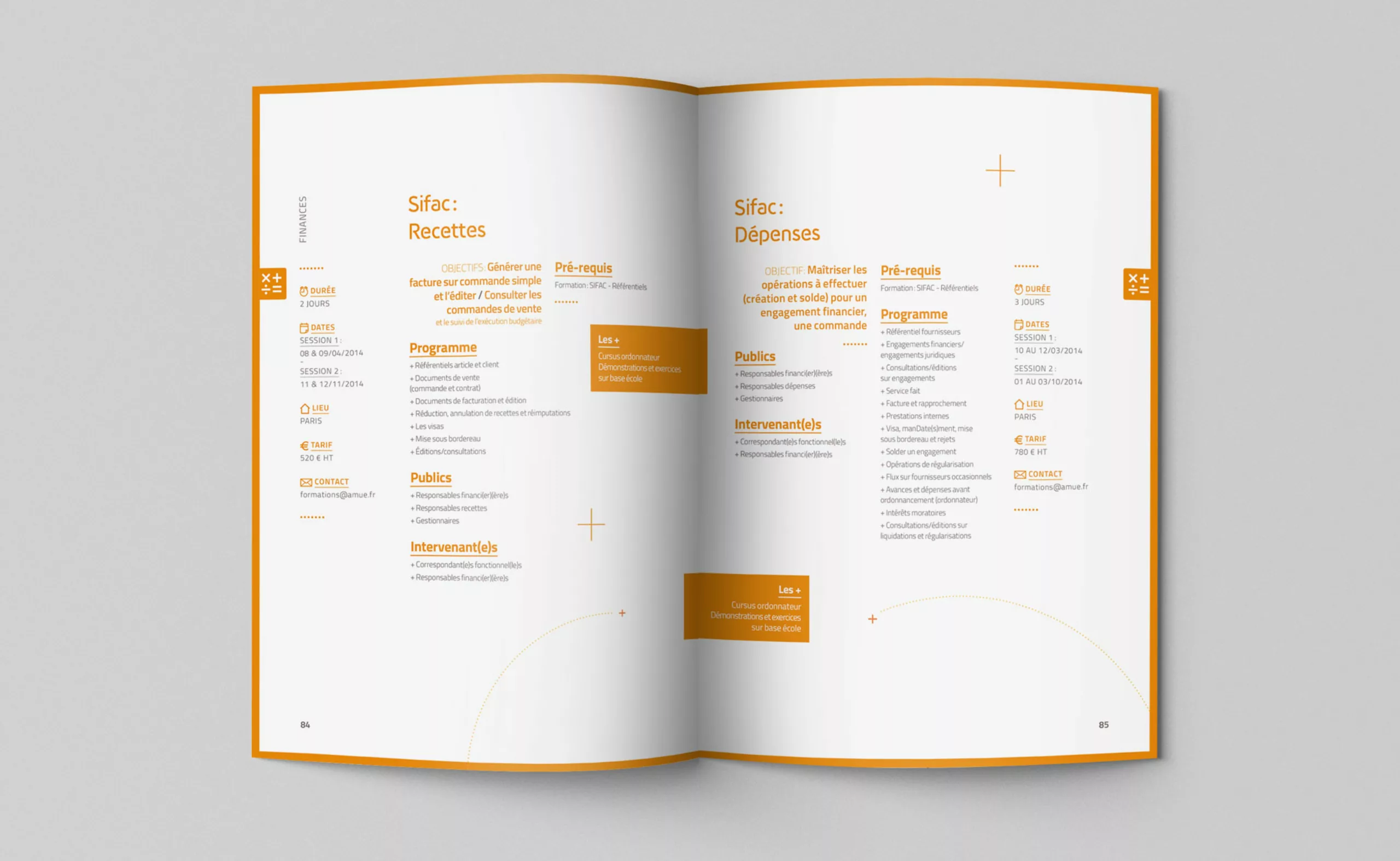
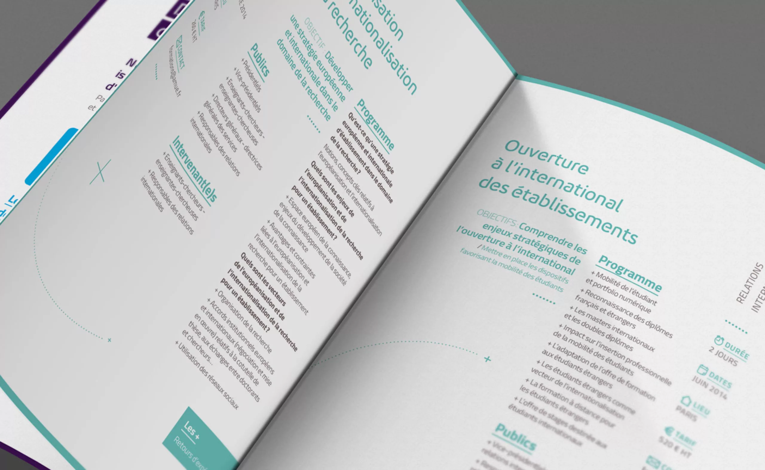
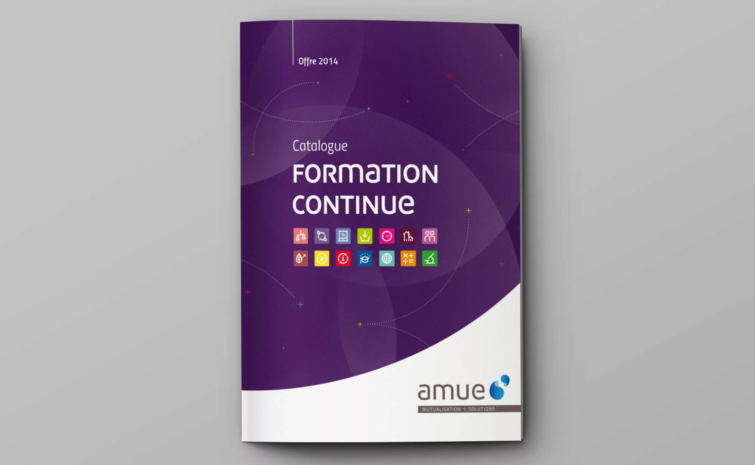
Redesign of the global visual identity of Amue – Agency for the Mutualisation of Universities and Institutions. Amue is a French public interest grouping that contributes to the development of the information system of its 169 members and provides them with a plural software offer that meets their diversity. It also supports the changes and modernization of institutions in terms of steering and management.

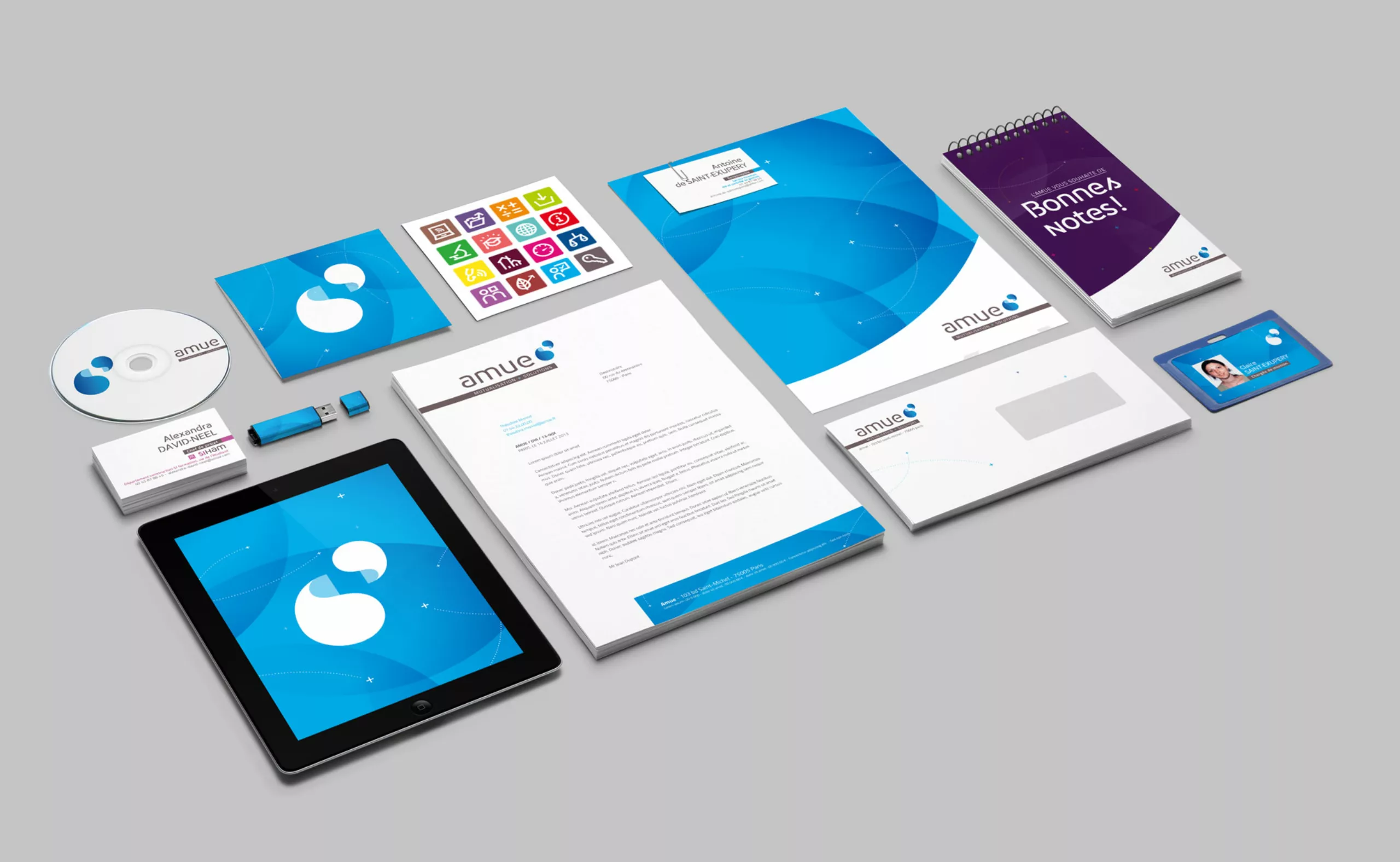
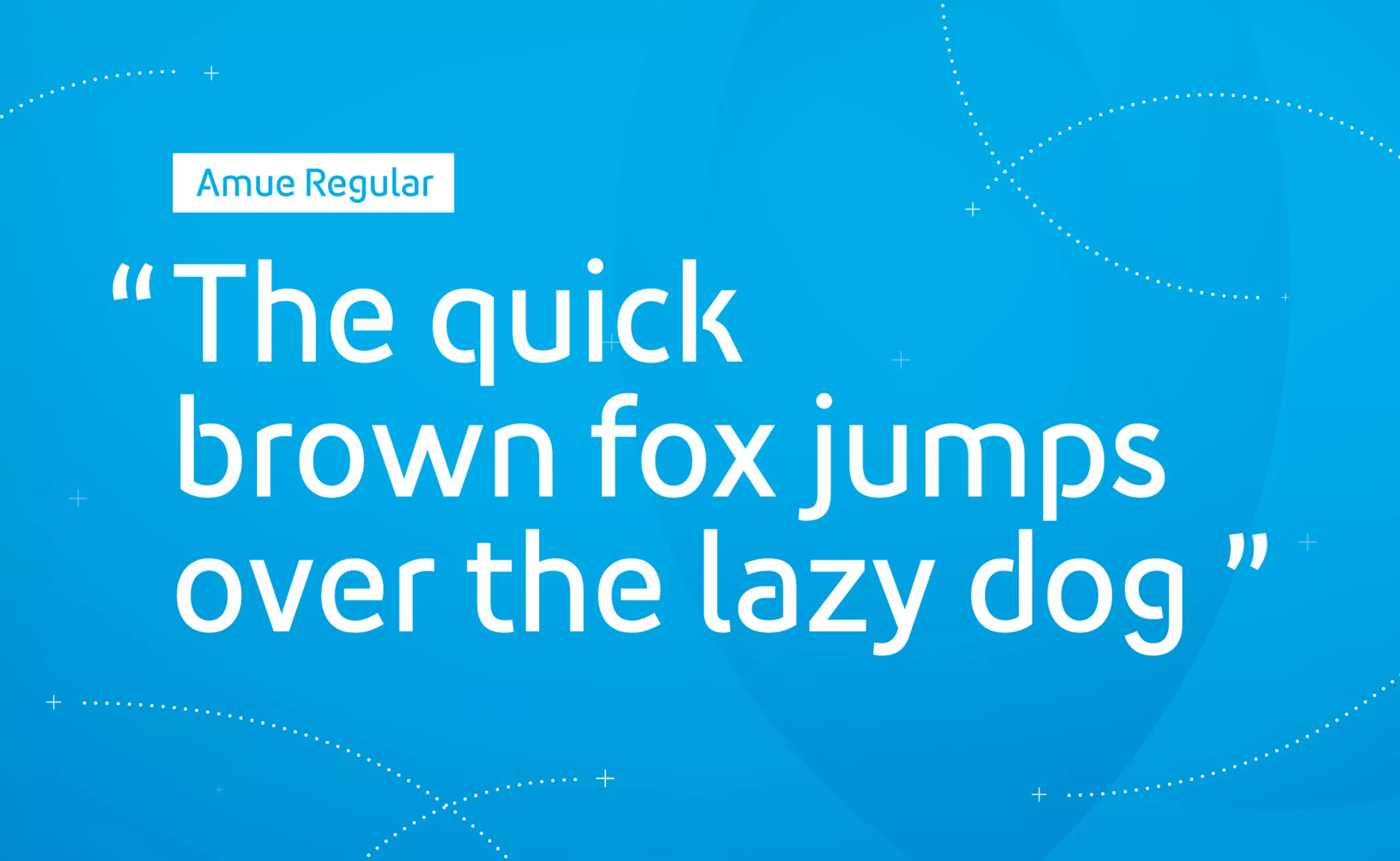
Redesign of the logo, creation of a typography designed in collaboration with Matthieu Cortat, development of a range of pictograms to identify the different themes, revision of the global brand architecture, signage…

Design du nouveau logo Amue

Concept

The logo is based on two very strong values. First of all, the idea of dialogue, two apostrophes that open a discussion between the different universities. The other notion is the idea of mutualization, the small apostrophe seems to be able to fit into the large apostrophe, as if to form a larger whole. From this effect of volume is born a feeling of movement, a dynamic of unity and mutual reinforcement.

Logo générique de l'Amue
Brand design globale
Design de pictogrammes, formation, fianance, ressources humaines, recherche, patrimoine, developpement durable, justice, droit, ...
Architecture de marque et logos de logiciels
Création Typographie Corporate
dessin de caractère pour charte graphique

Graphic universe

To facilitate the deployment of the brand architecture, we designed a collection of pictograms illustrating the different themes. A custom typography was also developed. It allows the Amue to have its “own voice”, its own “writing”.

en-tête de chapitre mise en page avec pictogramme
programme de formations design grapphique
Création d'un catalogue de formation pour l'Agence de Mutualisation des Universités