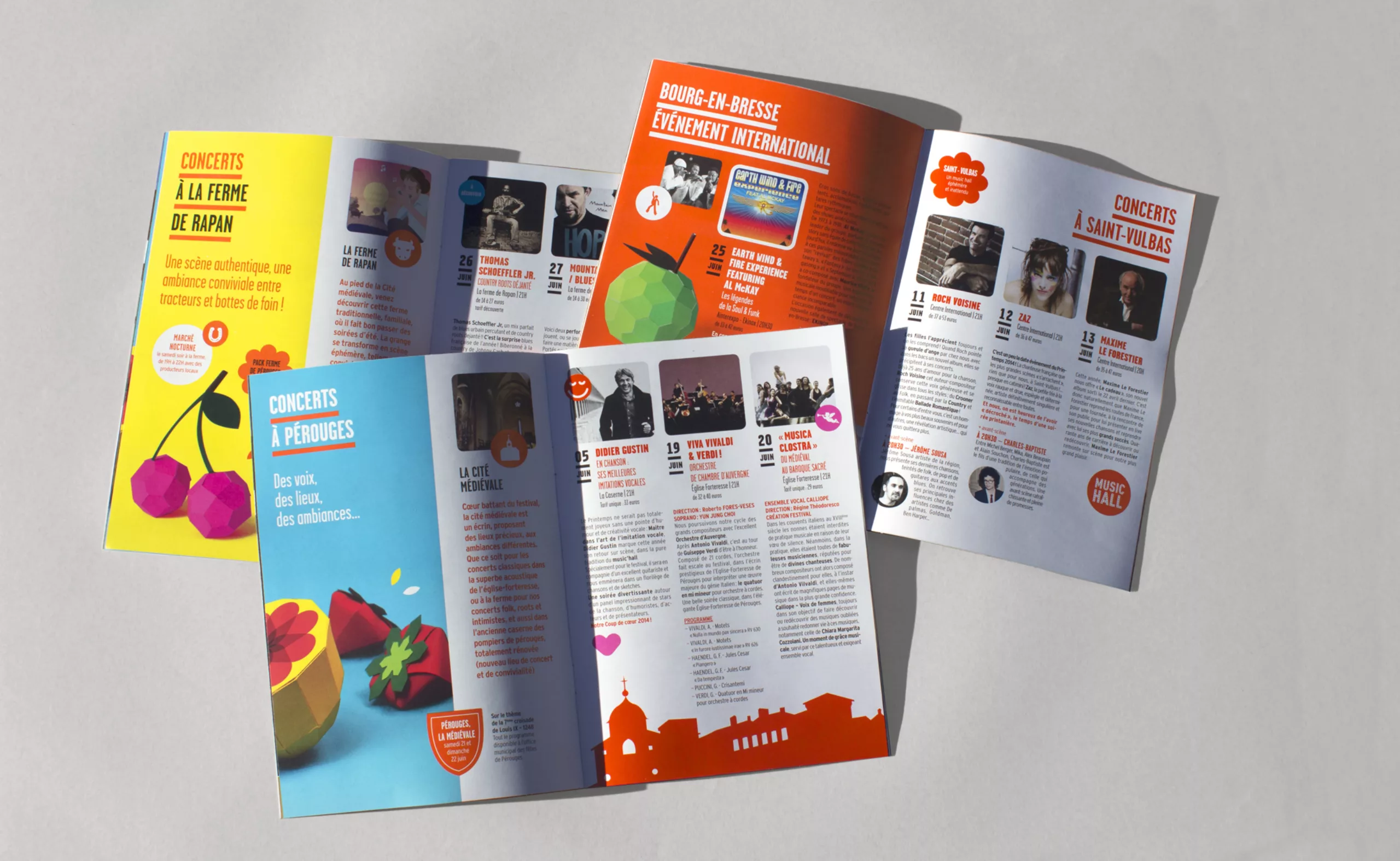
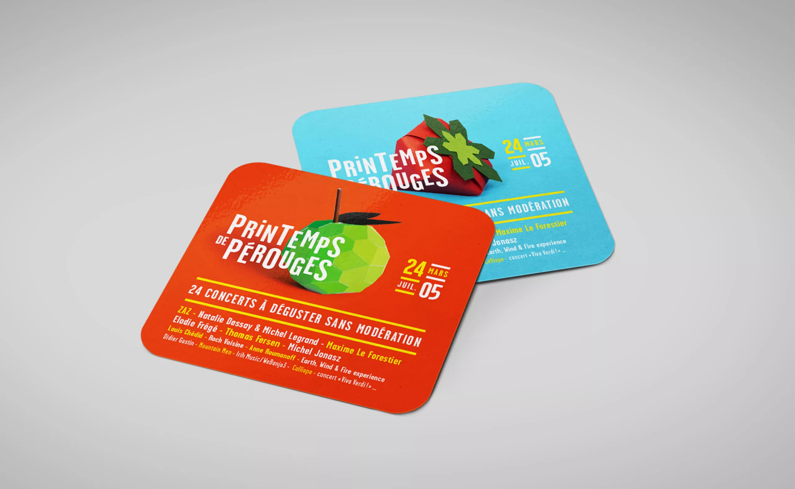
Since 2012, we take care of the communication of the Pérouges Spring Festival. For a long time, the poppy was a major ingredient of the festival’s communication, to the point that in 2012, we completely redesigned it to place it at the heart of the visual identity. It is associated with dancing letters to convey the festive spirit of the event.
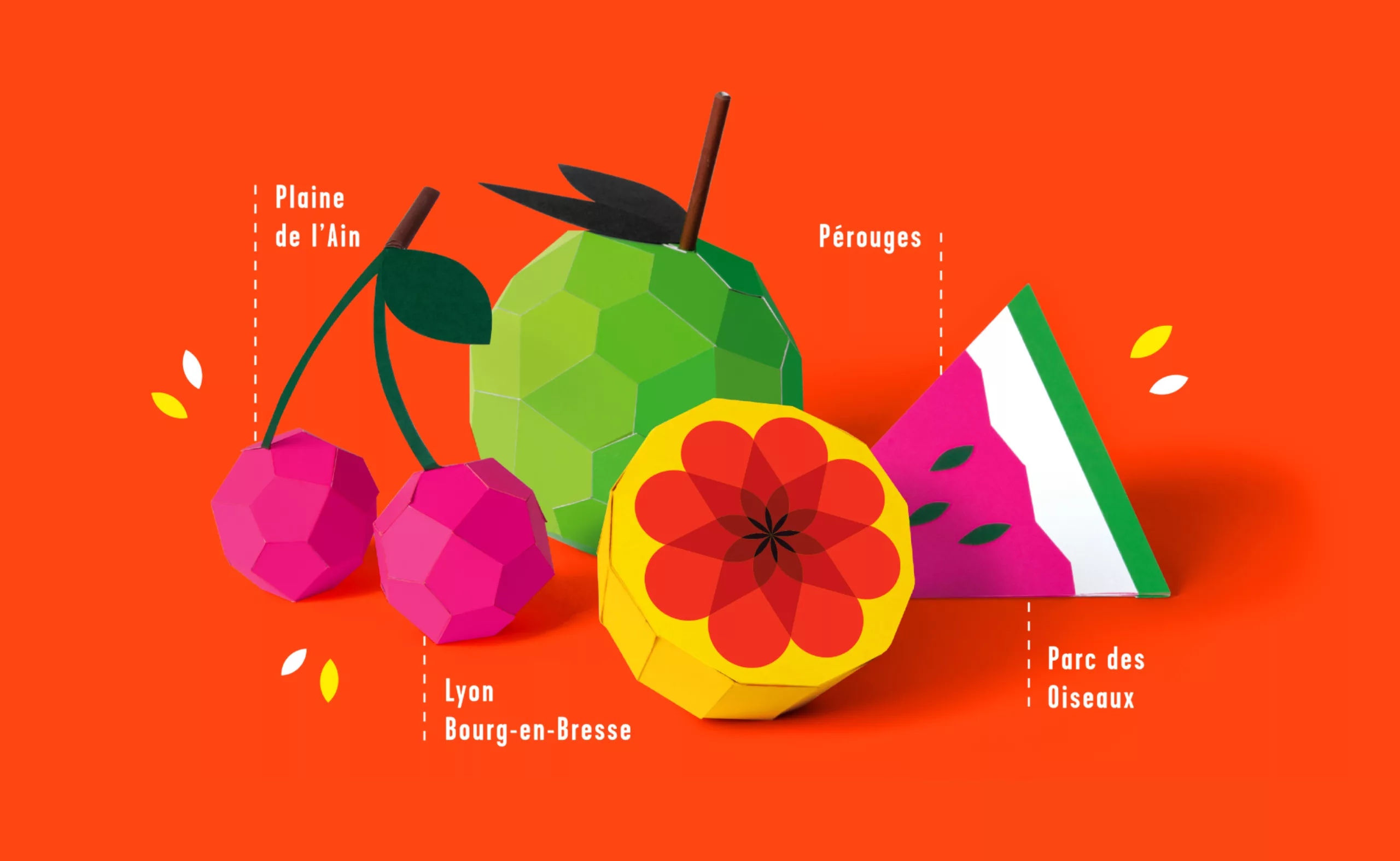
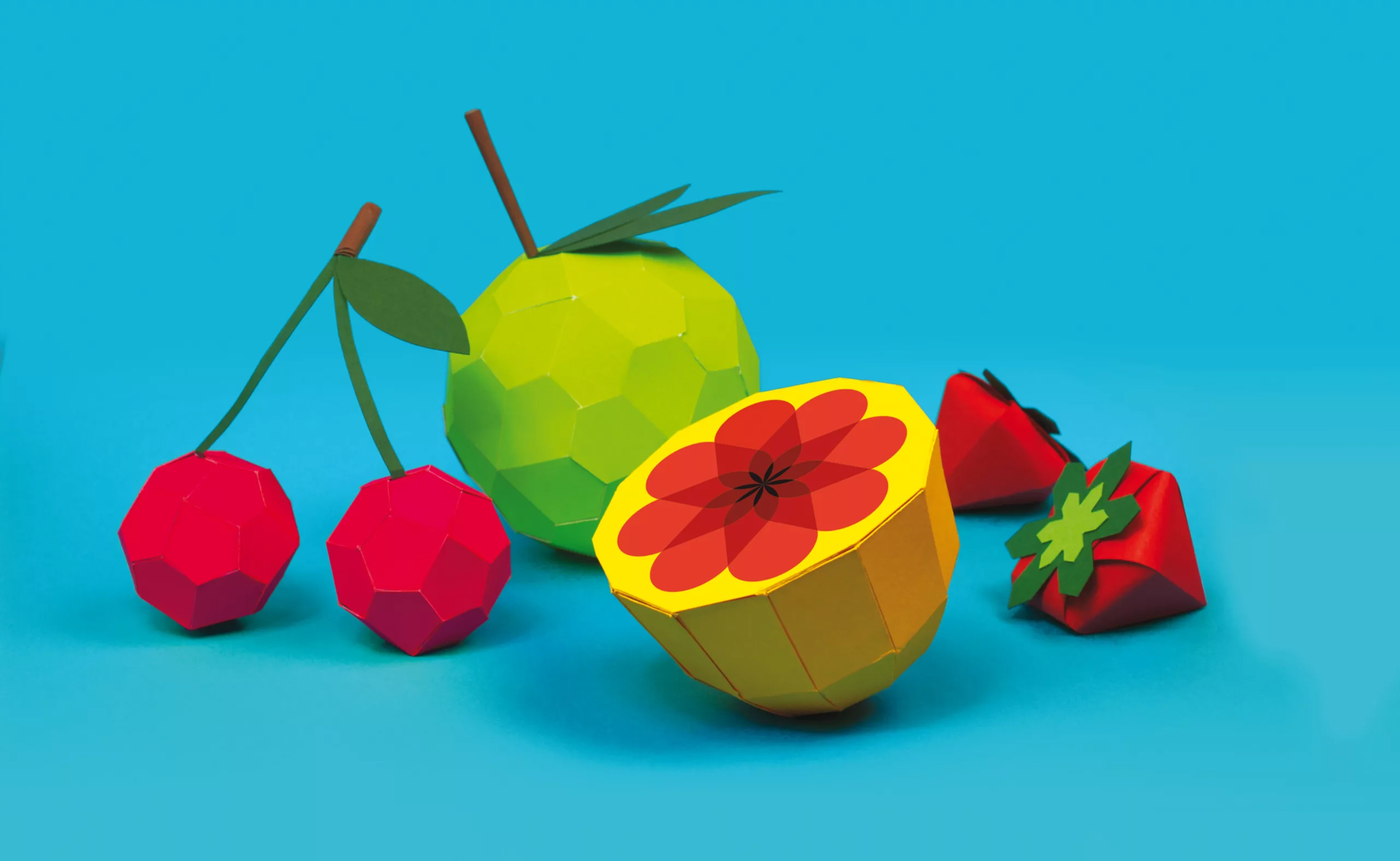
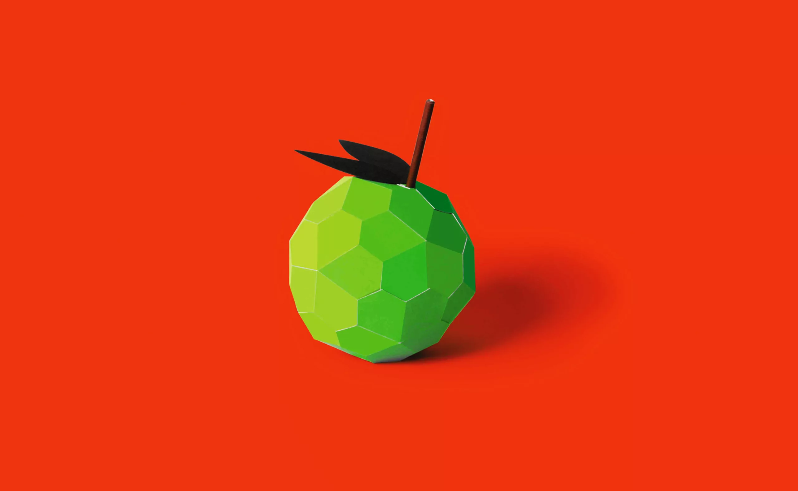
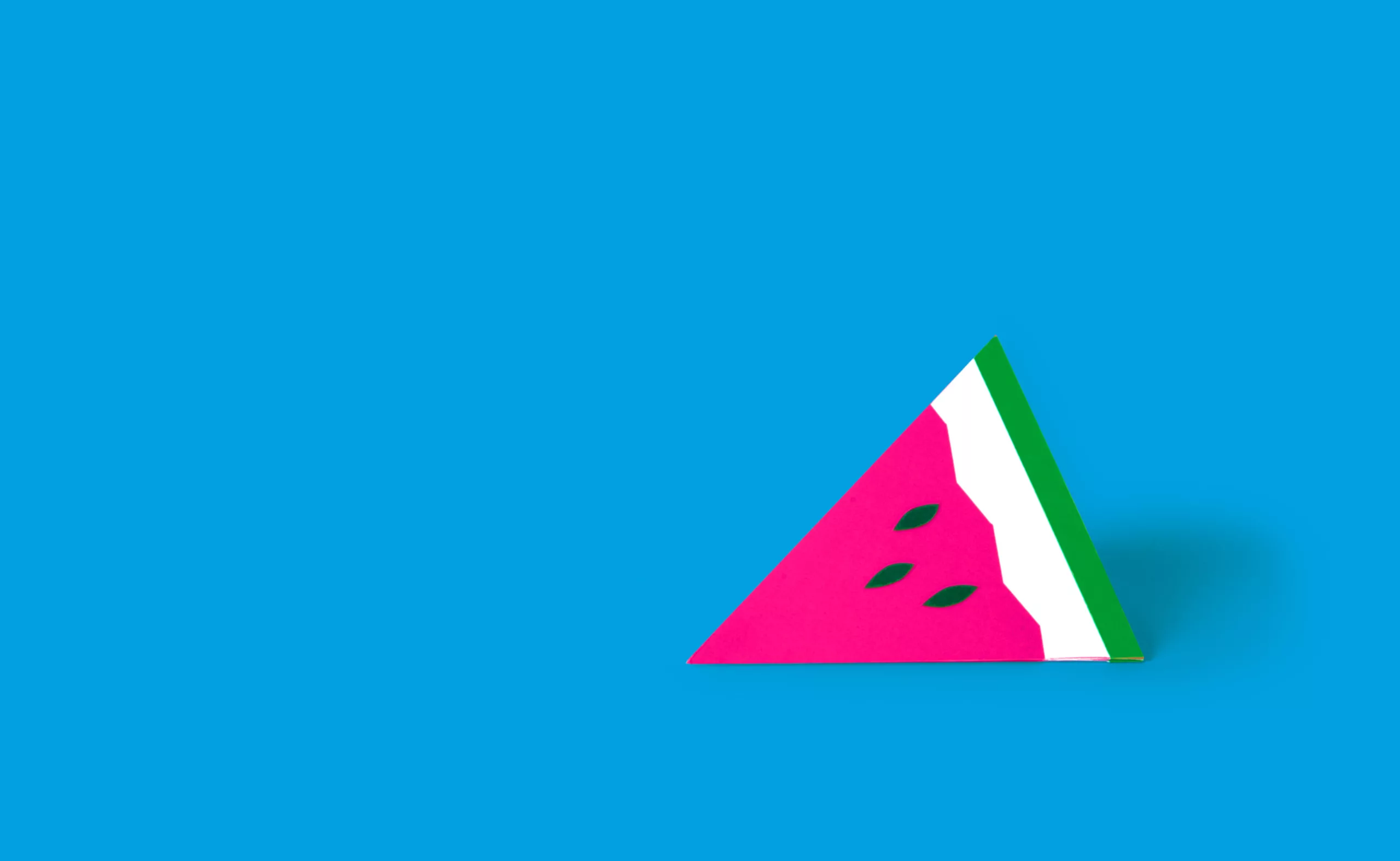
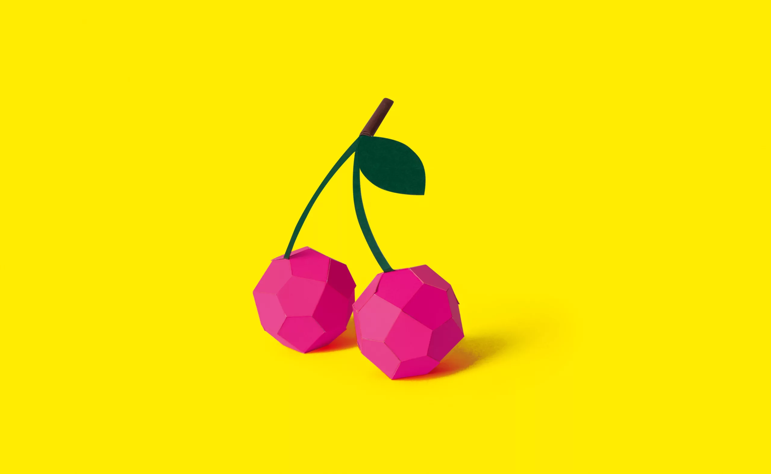
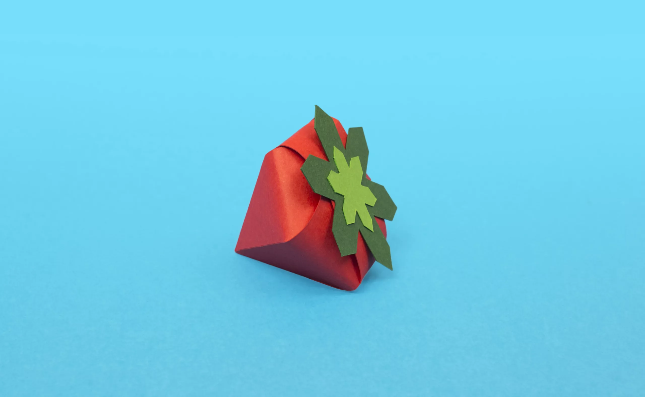
For the 2014 edition, we aimed at keeping the “minimalist and geometric” spirit of the series, without repeating the same graphic tricks. It was the occasion to leave our screens in favor of pairs of scissors in order to create a colorful paper fruit salad including the iconic poppy of the festival as an appetizing grapefruit.
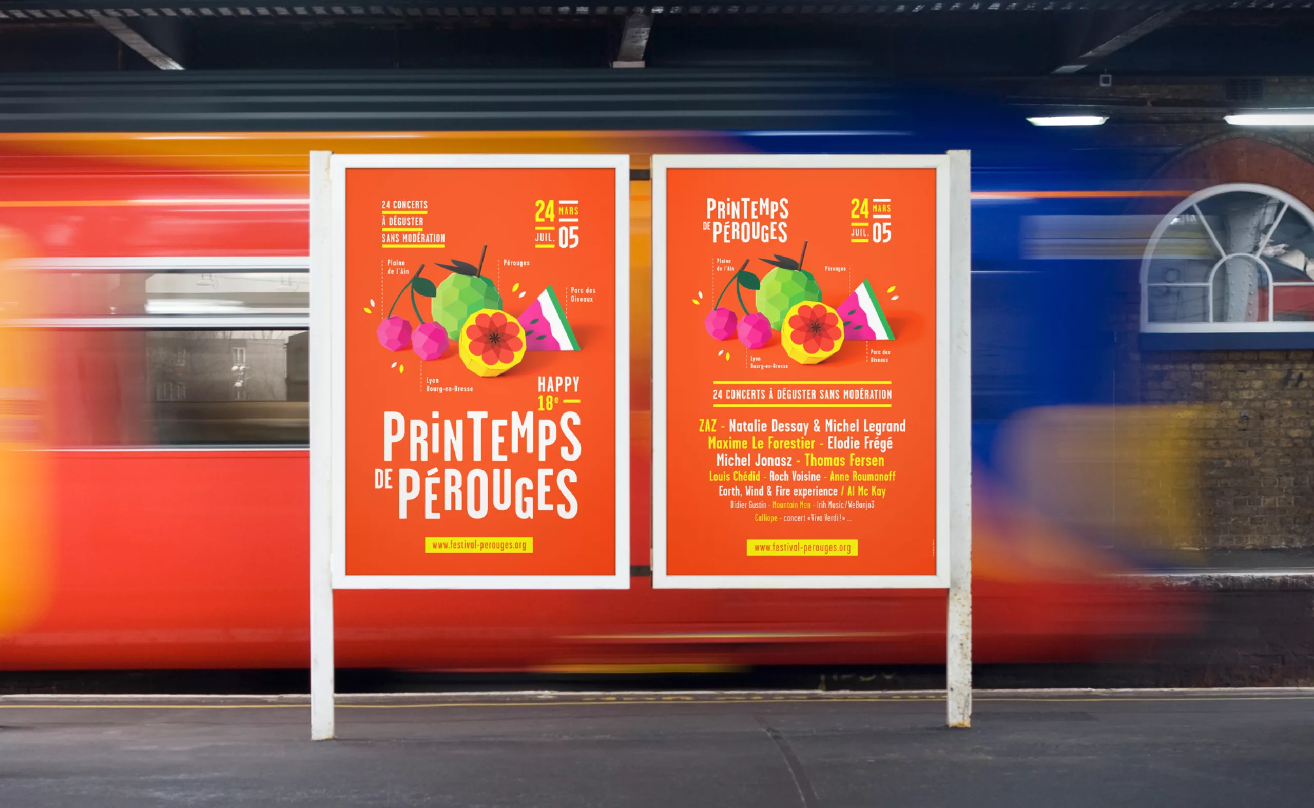
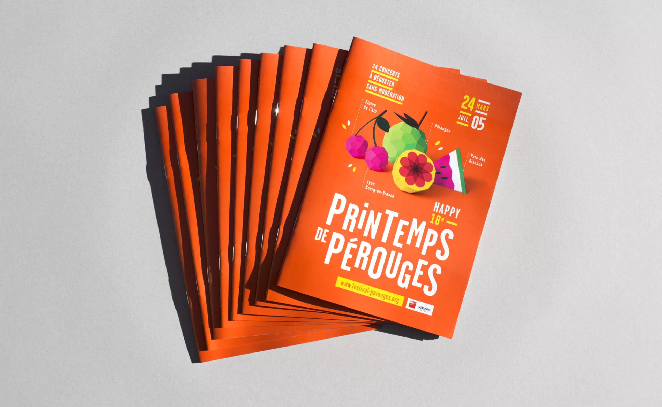
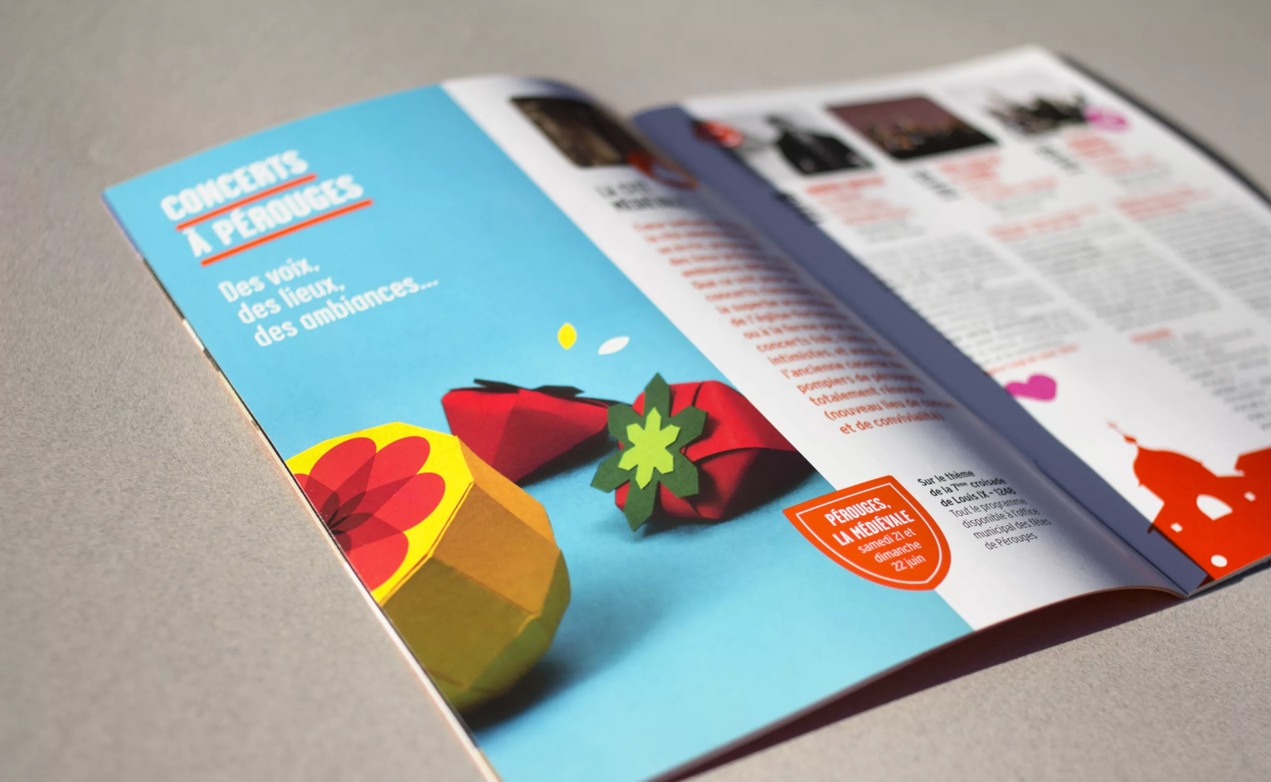
We took advantage of this “paper fruit” workshop to design a series of visuals that would serve to illustrate the festival’s identity on different media (flyer, press kit, website…). We made many pictures of the fruits, presented in different ways, to feed the communication of the festival.
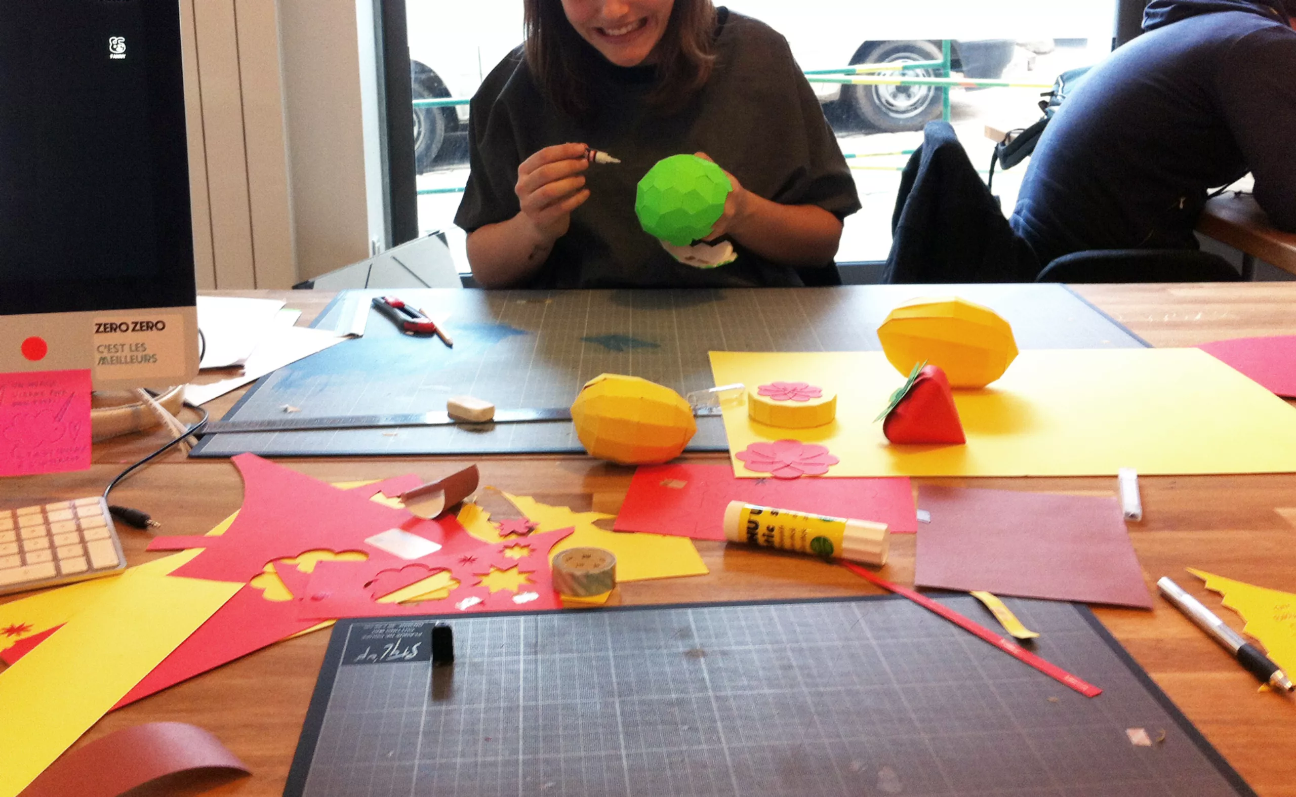
Behind the scenes right here
