200914_Hapticmedia_case-study_1

2020

Redesigning the visual identity of Hapticmedia
A new image for the agency that boosts the digitalization of luxury brands

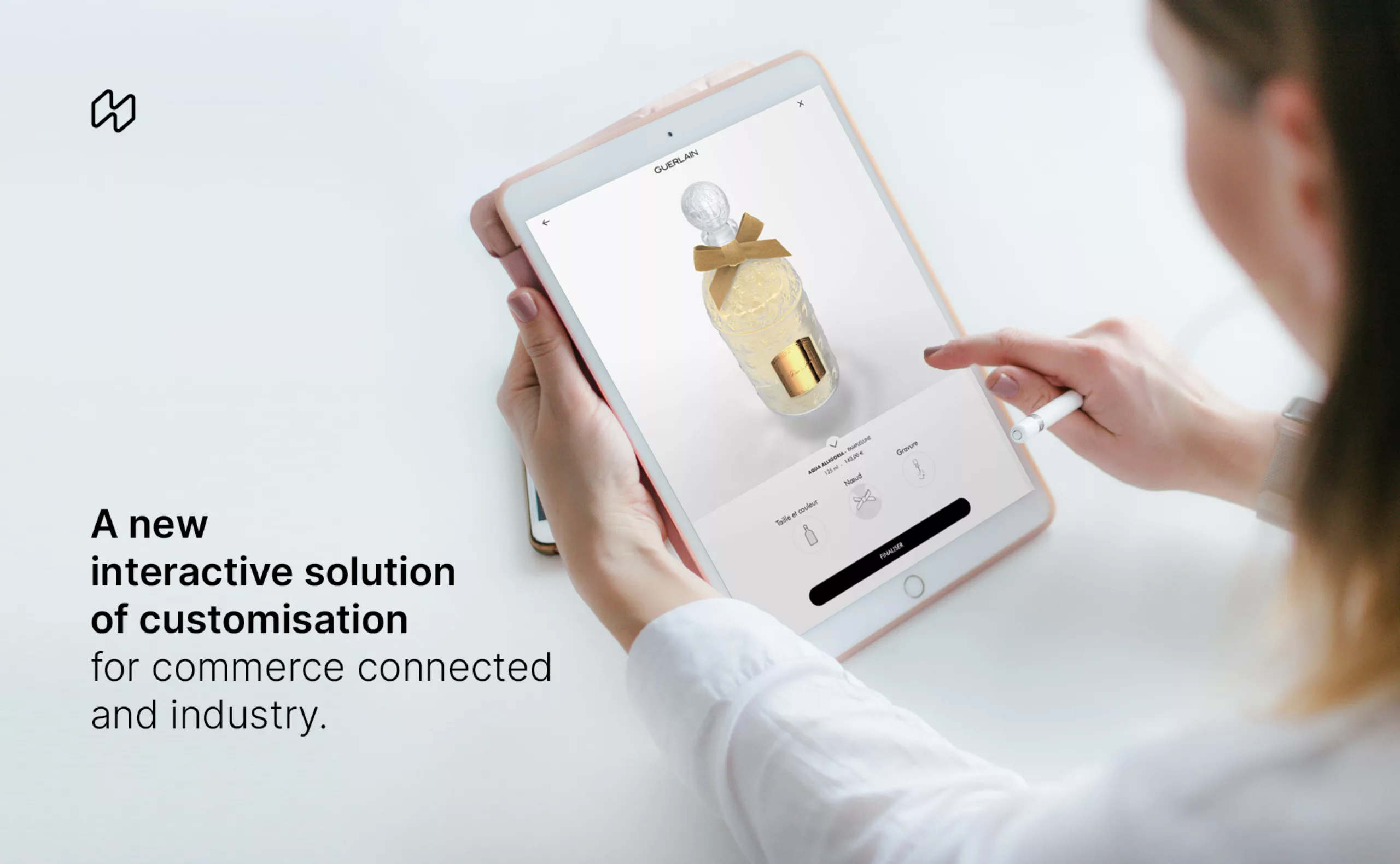
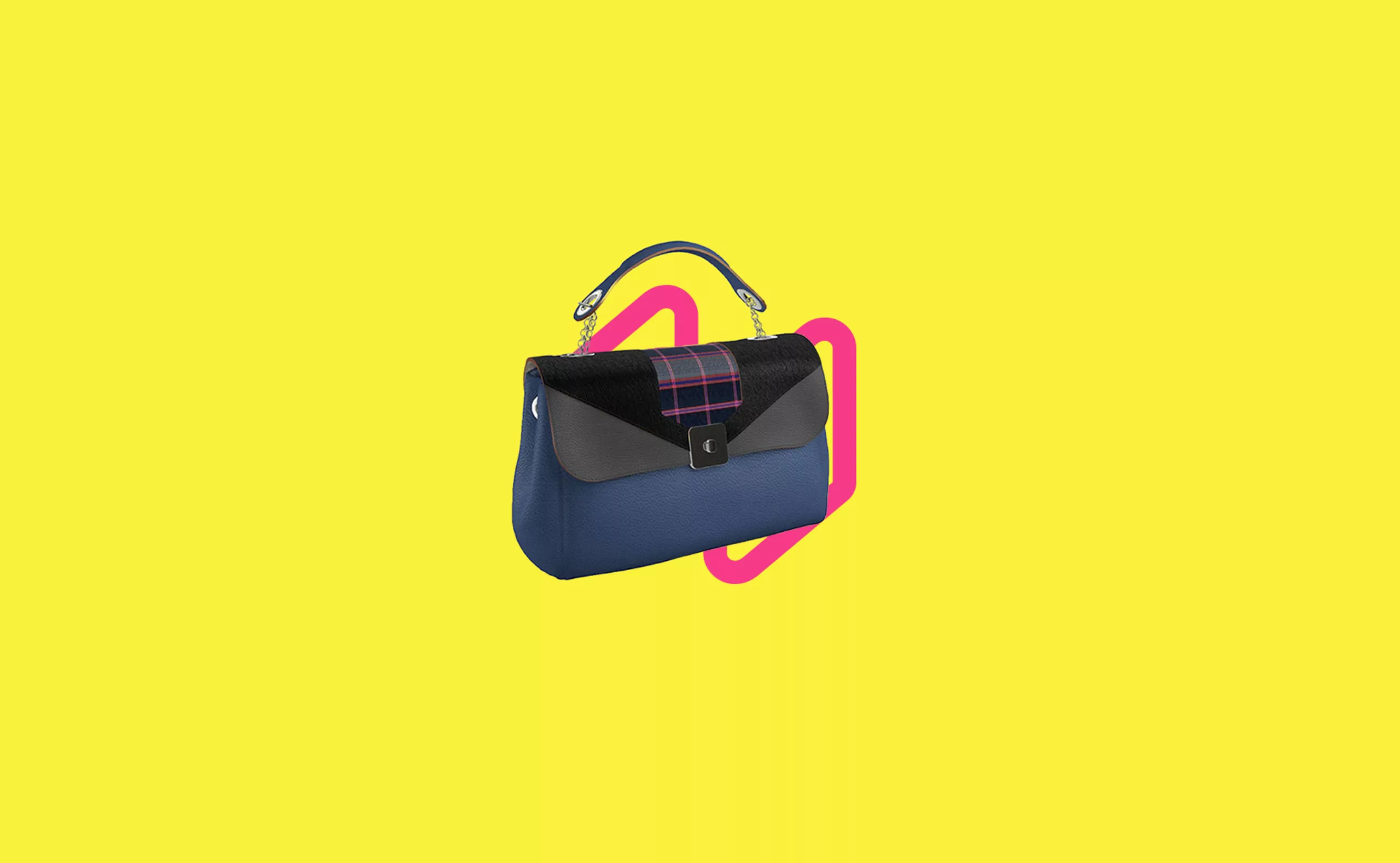
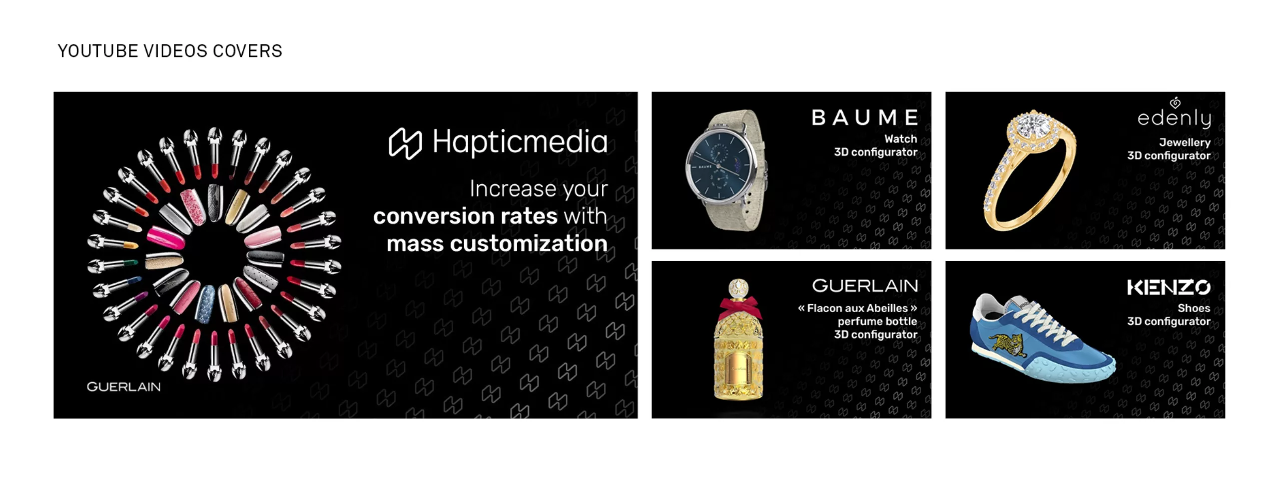
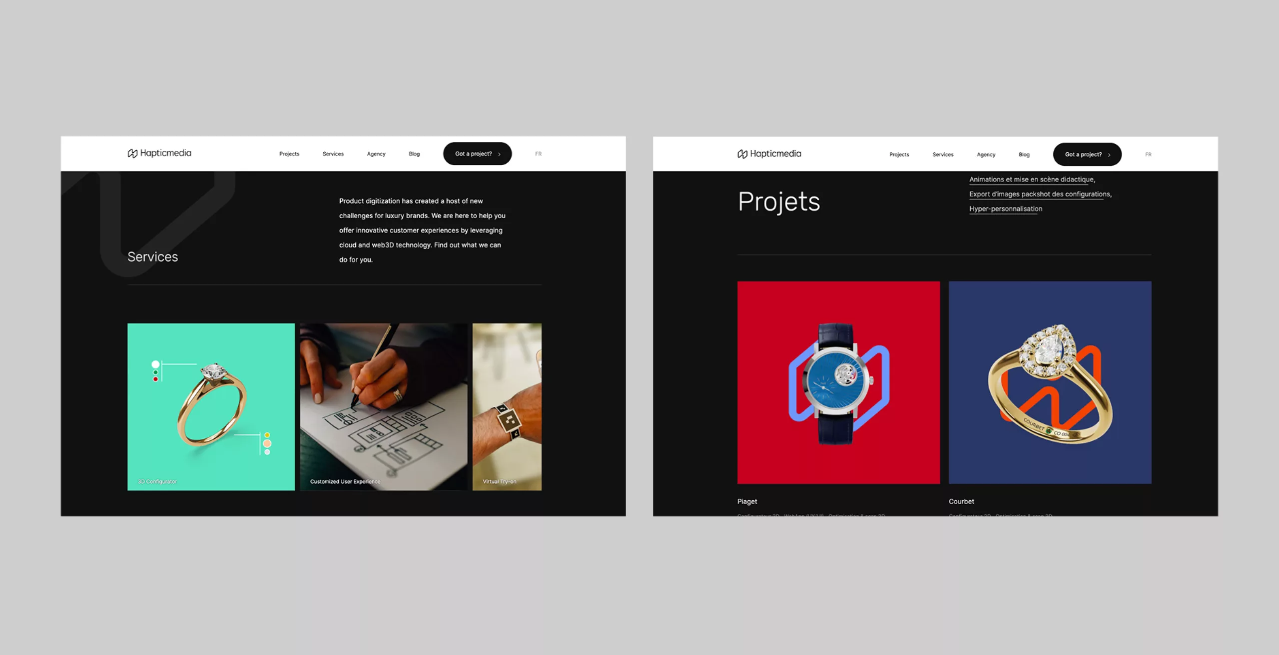
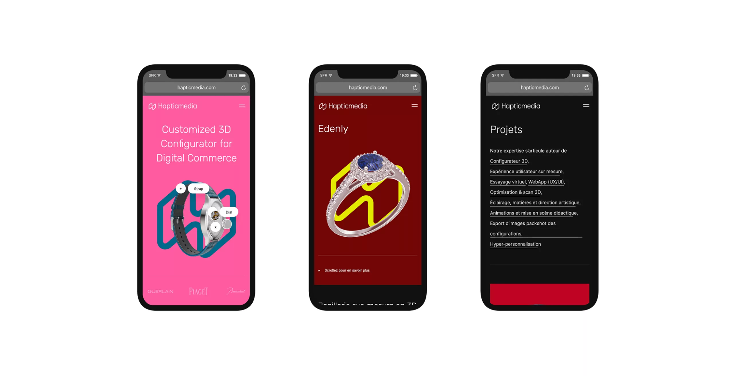
Created in 2014, Hapticmedia specializes in the creation of high-end 3D configurators for digital commerce. This new customer experience allows you to visualize, try, customize, and display product information better. Since 2018, Hapticmedia has been accelerated by the LVMH group, allowing the agency to develop a specific expertise for various watchmaking, jewelry, perfume and leather brands.

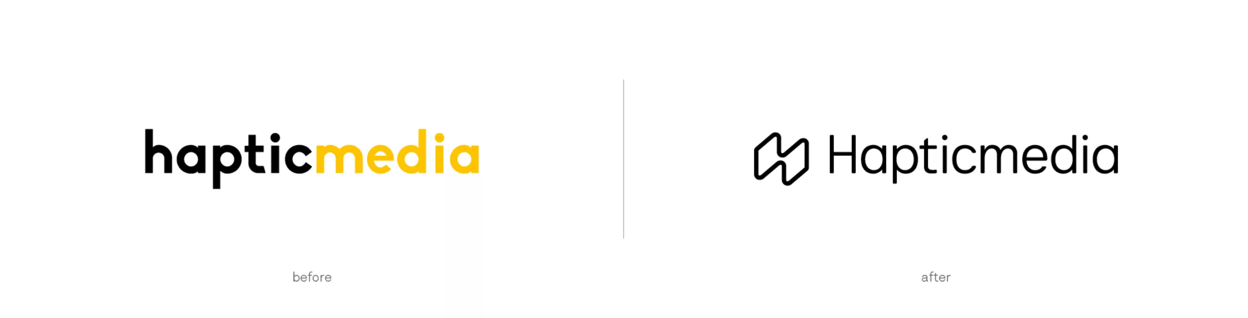
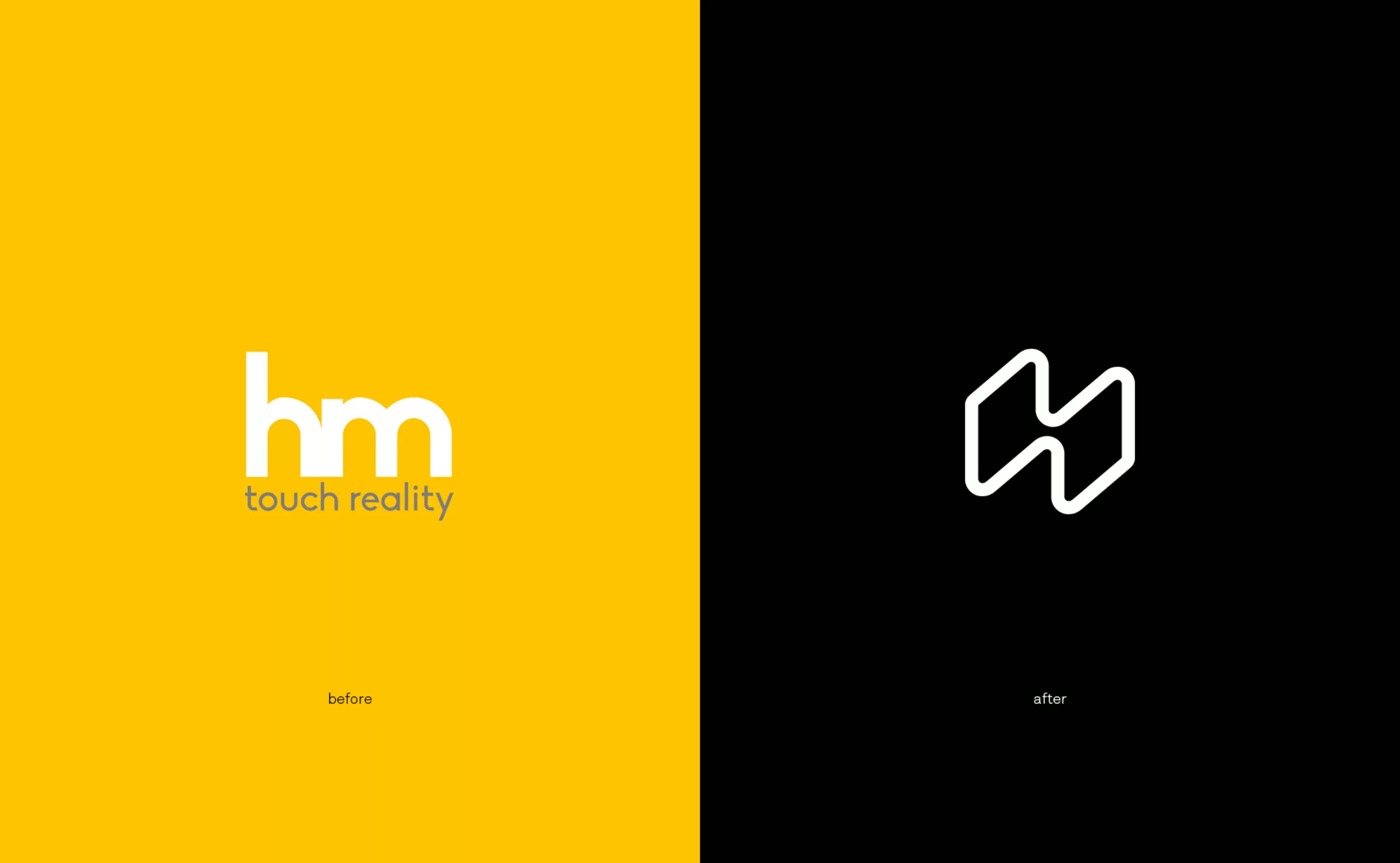
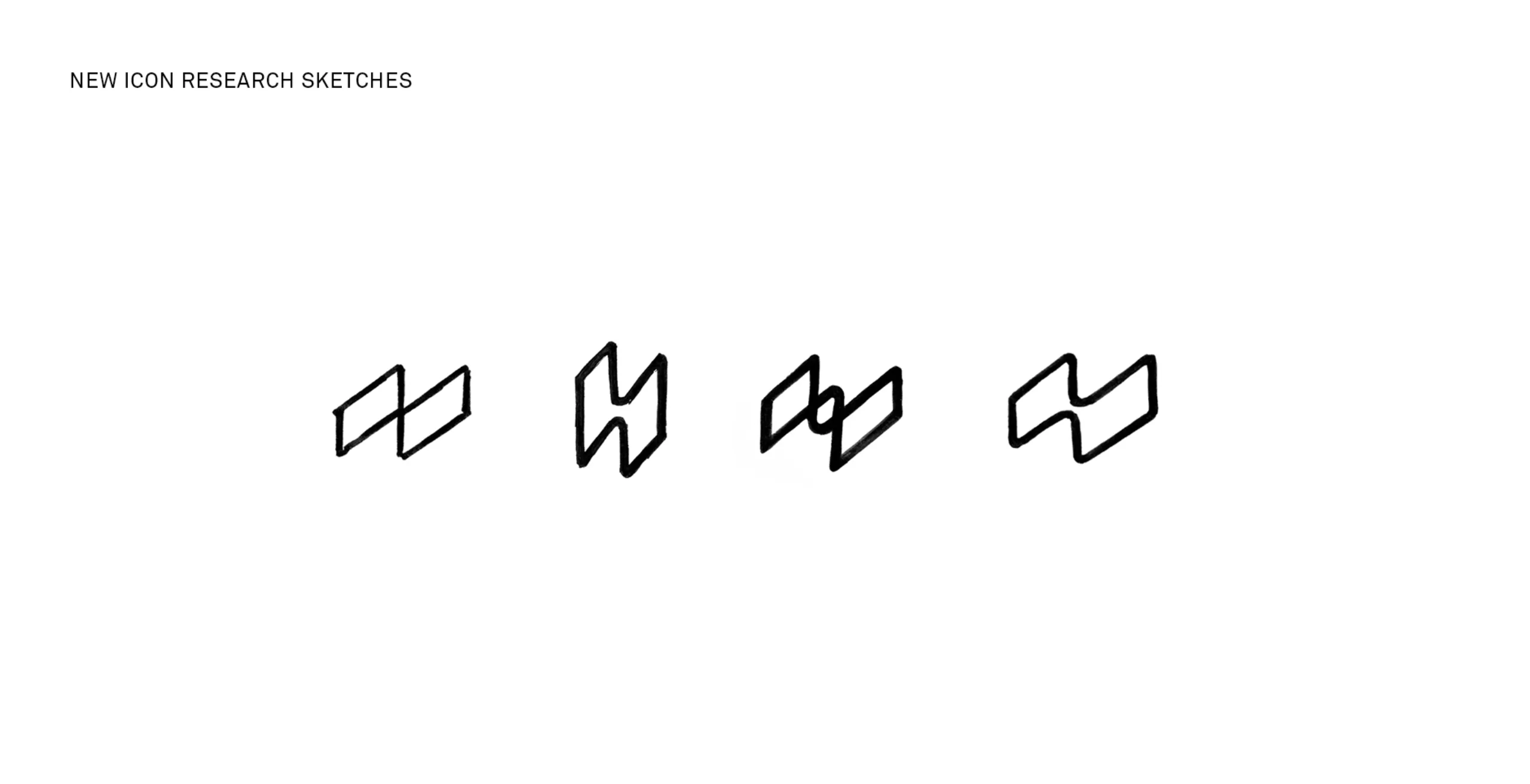
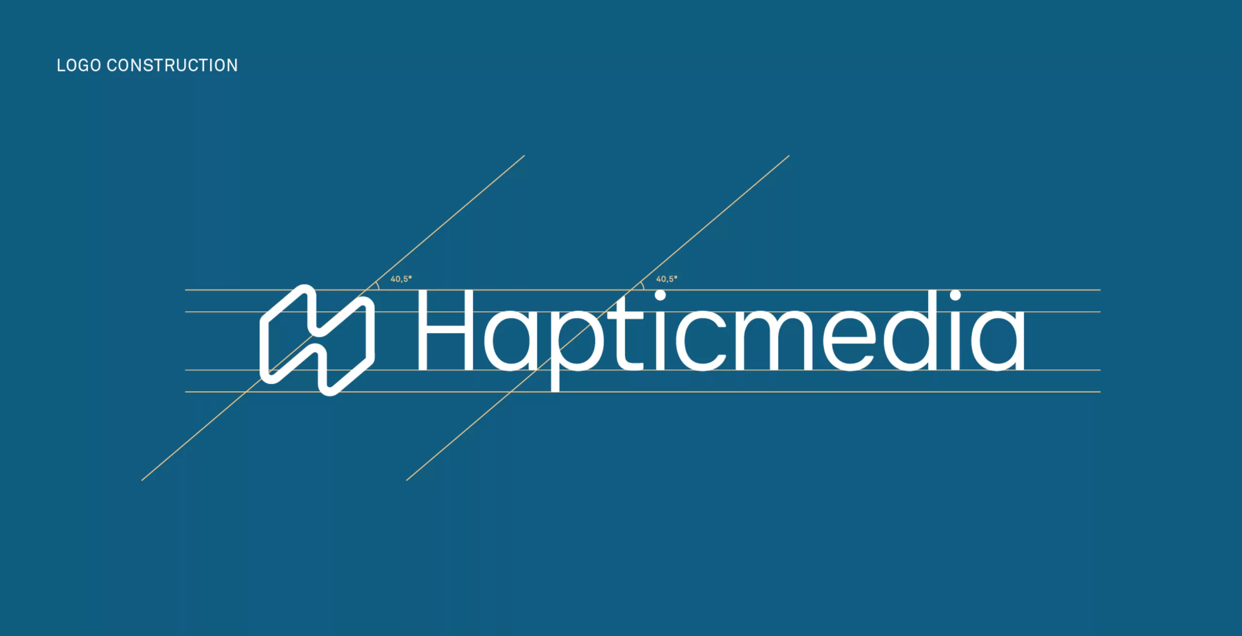
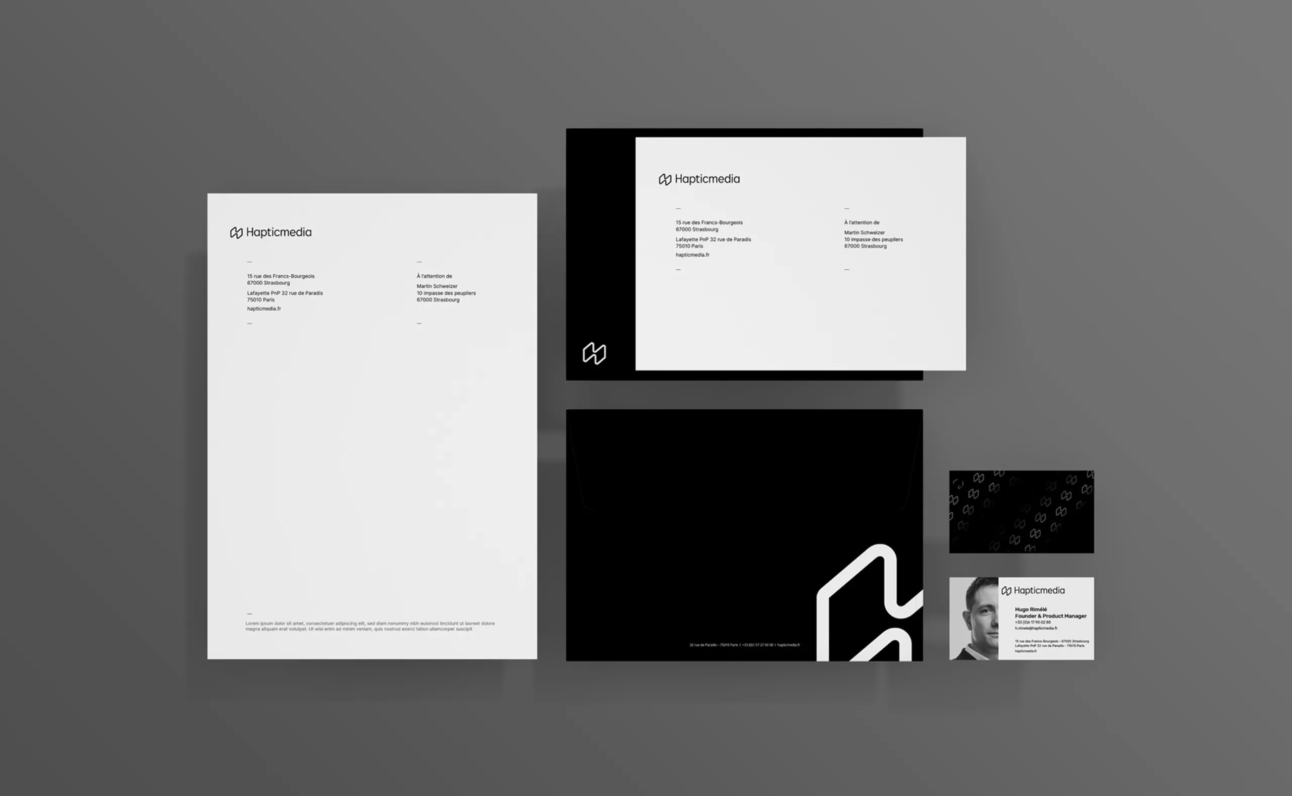
The previous brand identity was no longer representative of the market segment in which Hapticmedia wanted to position itself. Hapticmedia therefore asked Graphéine to redefine its image in order to be more easily identified as a player in the digital revolution, with its beginnings in the luxury sector and representing a balance between craftsmanship and modernity.

A new logo that merges the characteristics of luxury and "digital"

All the elements of the new Hapticmedia logo were custom-drawn to create a sober and innovative style that positions Hapticmedia as a benchmark in its sector. The design of the new word mark uses a lowercase, sans serif lettering style to align with the visual language of leading "digital" technology brands. The terminals of the letters are slightly rounded to add a tactile, ergonomic UI style to the overall wordmark.

This choice ensures visual consistency with the roundness of the new emblem. Our ambition was to to set the brand name as a short, simple word comprised of a single block. Unlike the previous logo, the first letter "H" is now capitalized to give the brand a more institutional character and to reinforce the fact that the word has only one initial.

«Merging spaces», an emblem symbolizing a new customer experience

The old emblem was a ligature of the letters "h" and "m" in lowercase. We thought it was a visual trick to represent a hand with a pointing index finger interacting with the surface of a screen. It turned out that this interpretation was only a coincidence and that there was no real intention behind this symbol. It was therefore necessary to start from scratch to build both a new storytelling and a new "icon" for the brand.

The new emblem is a fluid and moving frame that symbolizes the junction of two spaces. One is the physical space of the boutique, and the other is the virtual space of the online experience. It is also an original stylized form of the letter "H". At the intersection of 2D and 3D rendering, an abstracted representation of ‘screens’ and an object in isometric perspective, the symbol communicates the idea of manipulation from all angles. Hapticmedia's new emblem also draws on the tradition of signature monograms of the world renowned French luxury fashion houses.

The brand symbol also helps to:
- Create an identifiable sign that represents the brand
- Symbolize the semantics of the name Hapticmedia
- Extend the brand guidelines with new principles of composition
- Have a responsive logo for digital platforms and social networks where the name is too long to fit.

A brand image that enhances luxury through digital technology

Through a "phygital" experience (digital experience of a connected physical store), the new Hapticmedia image presents a universe where digital media and luxury merge in a clever, innovative and reassuring way.
Its brand territory is now turning towards a universe where product design is highlighted by a sober and refined presentation. This artistic direction confidently affirms the brand's values and positions Hapticmedia as a leading player in the fourth industrial revolution.

Context

Torn between craftsmanship and the industry of the future, luxury brands have understood that they must adapt their way of selling to remain competitive in a tumultuous market. Characterized by the usage of advanced technologies, the "Luxury 4.0" movement is revolutionizing
industrial production and reshaping the way customers explore, interact and buy.

Objective

To redesign Hapticmedia's visual identity in order that the company would be better identified in
its target market of luxury and digital commerce. List of deliverables :
- Logo
- Business Cards
- Google doc templates (documents / quotes / offers )
- Presentation Template — Google Slides
- Banner
- Website Homepage design
- Brand Guidelines document


Share this project:
Project expertise:
Logo creation, visual identity and graphic guidelines.
Type of client:
Communication agency in the start-up, digital and technology sector. High tech & IT, IT BtoB, IT BtoC: software publishers, digital services companies.

Related projects: