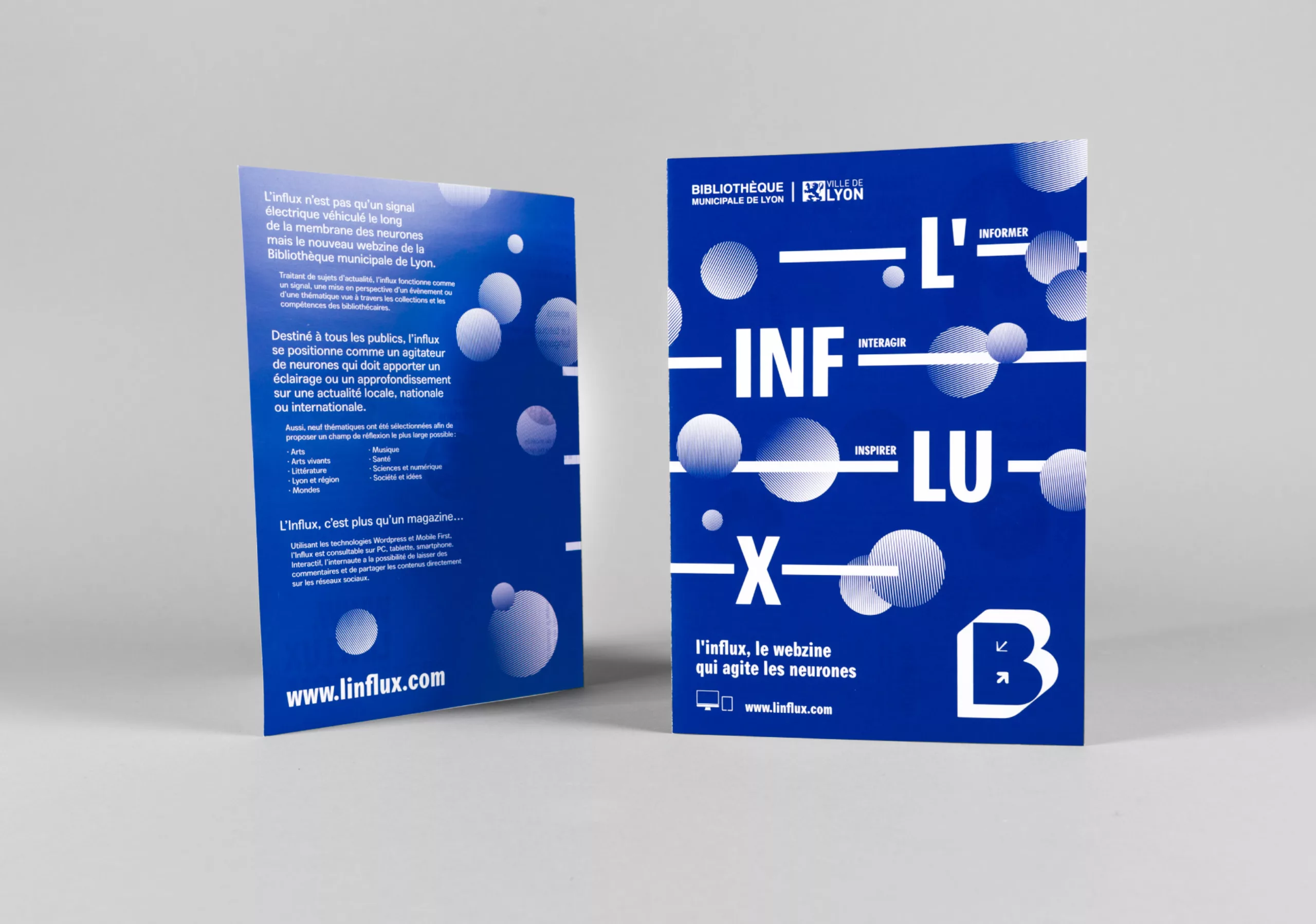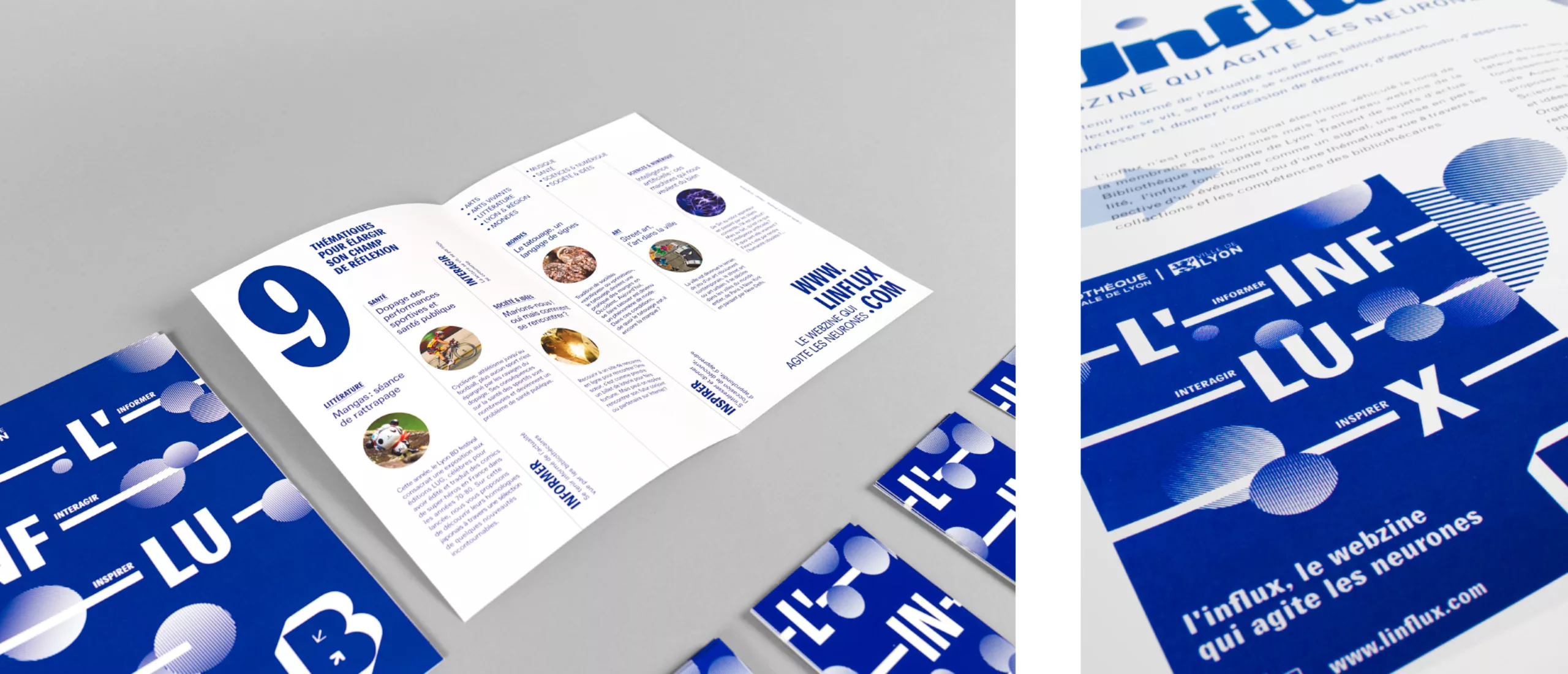
An influx is an electrical signal carried along neurons’ membrane, and also now the name of the new webzine of the municipal library of the city of Lyon, France. Dealing with current issues, L’influx puts into perspective an event or a theme through the library collections and the expertise of librarians.
Intended to all audiences, L’influx stands as a neurons agitator that sheds light and brings depth on local, national and international news.
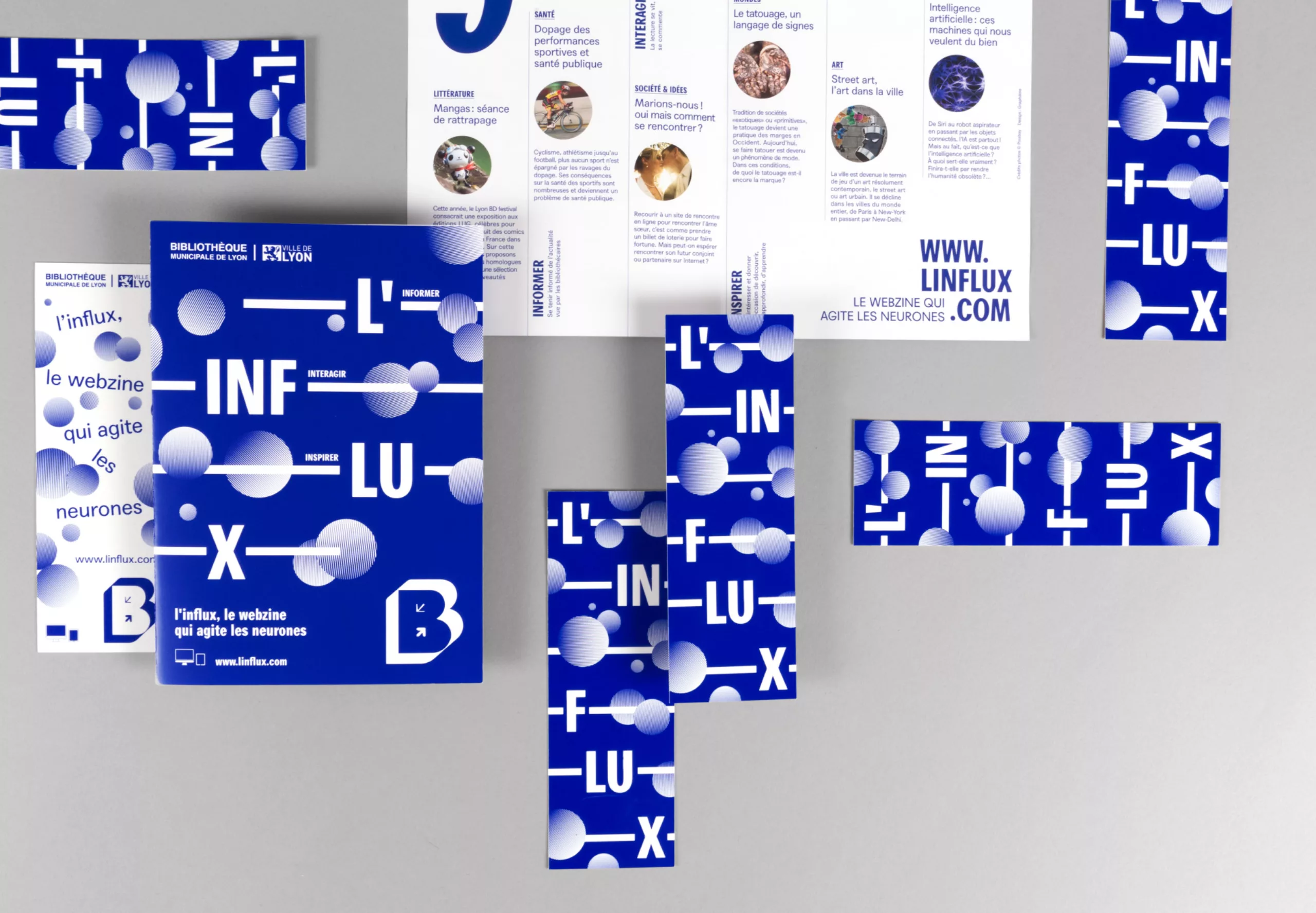
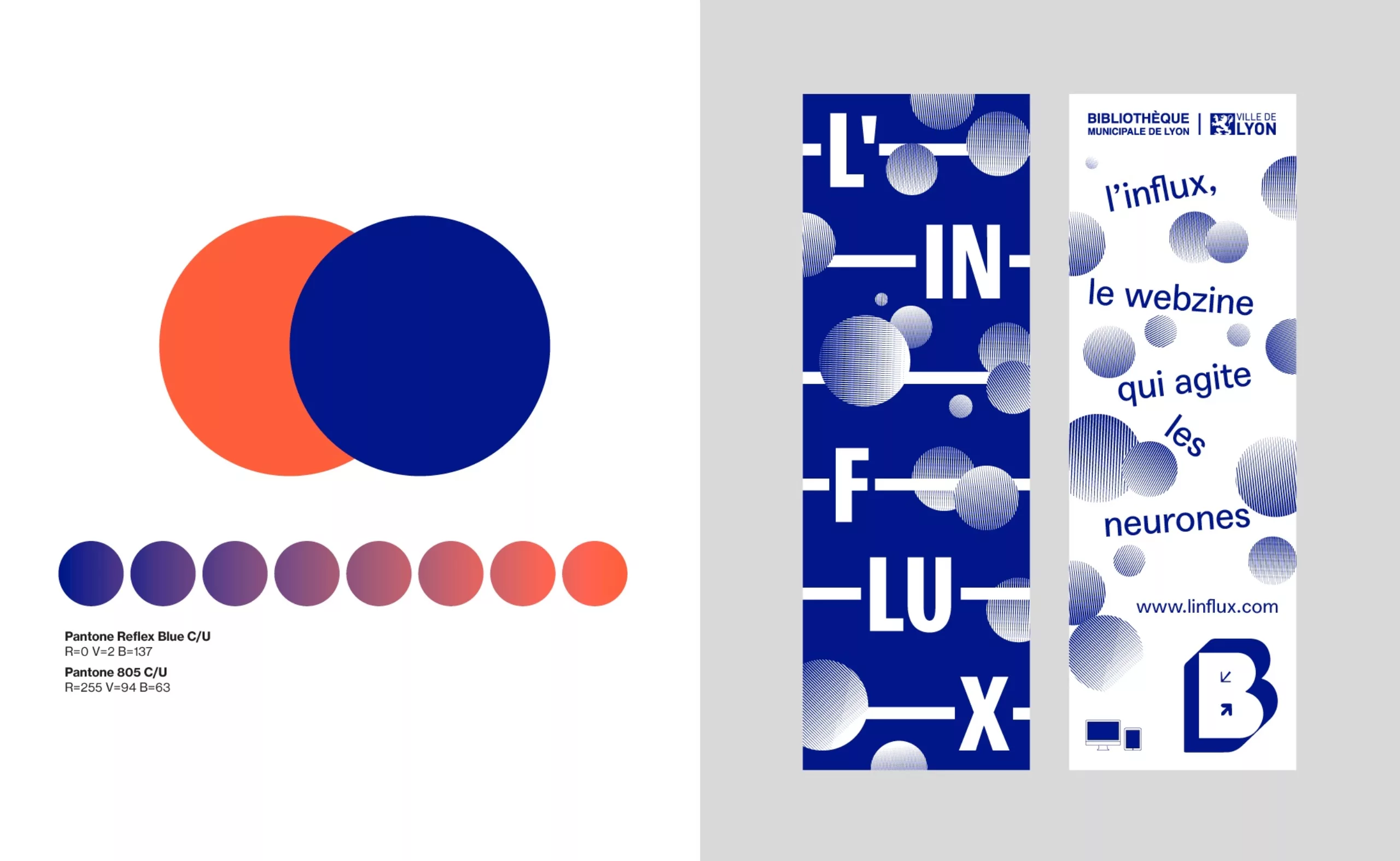
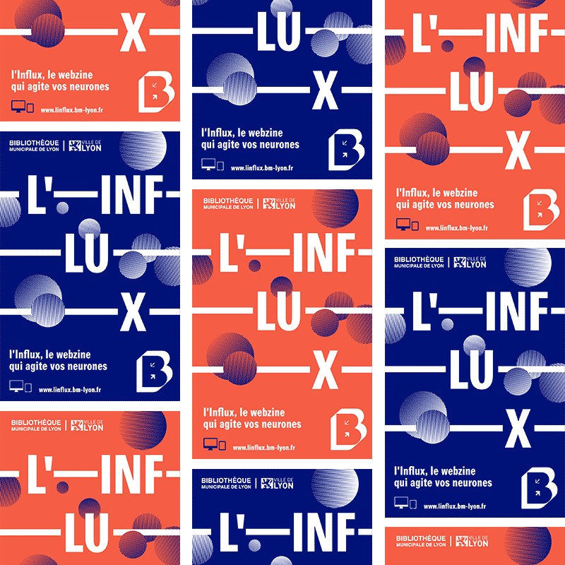
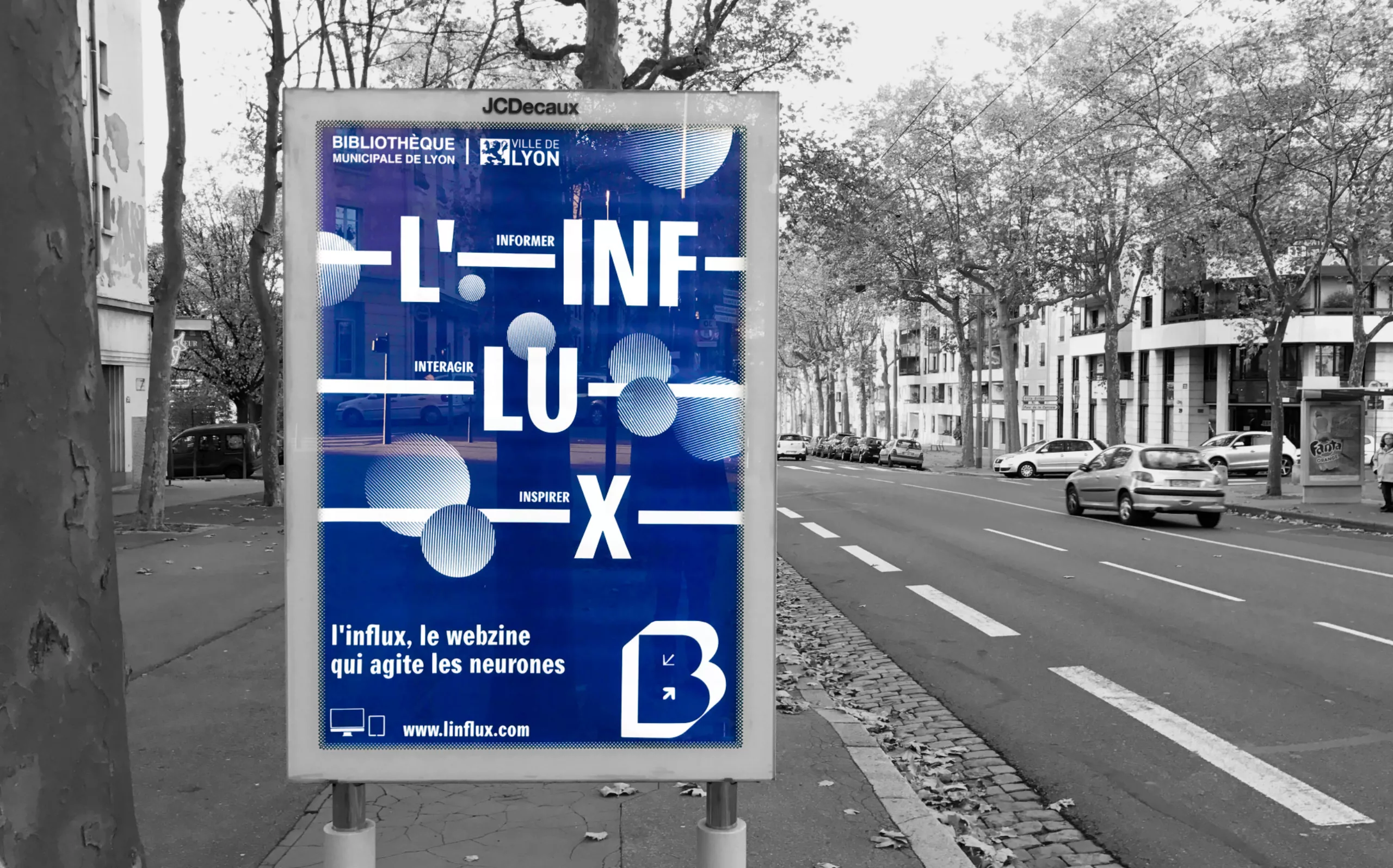
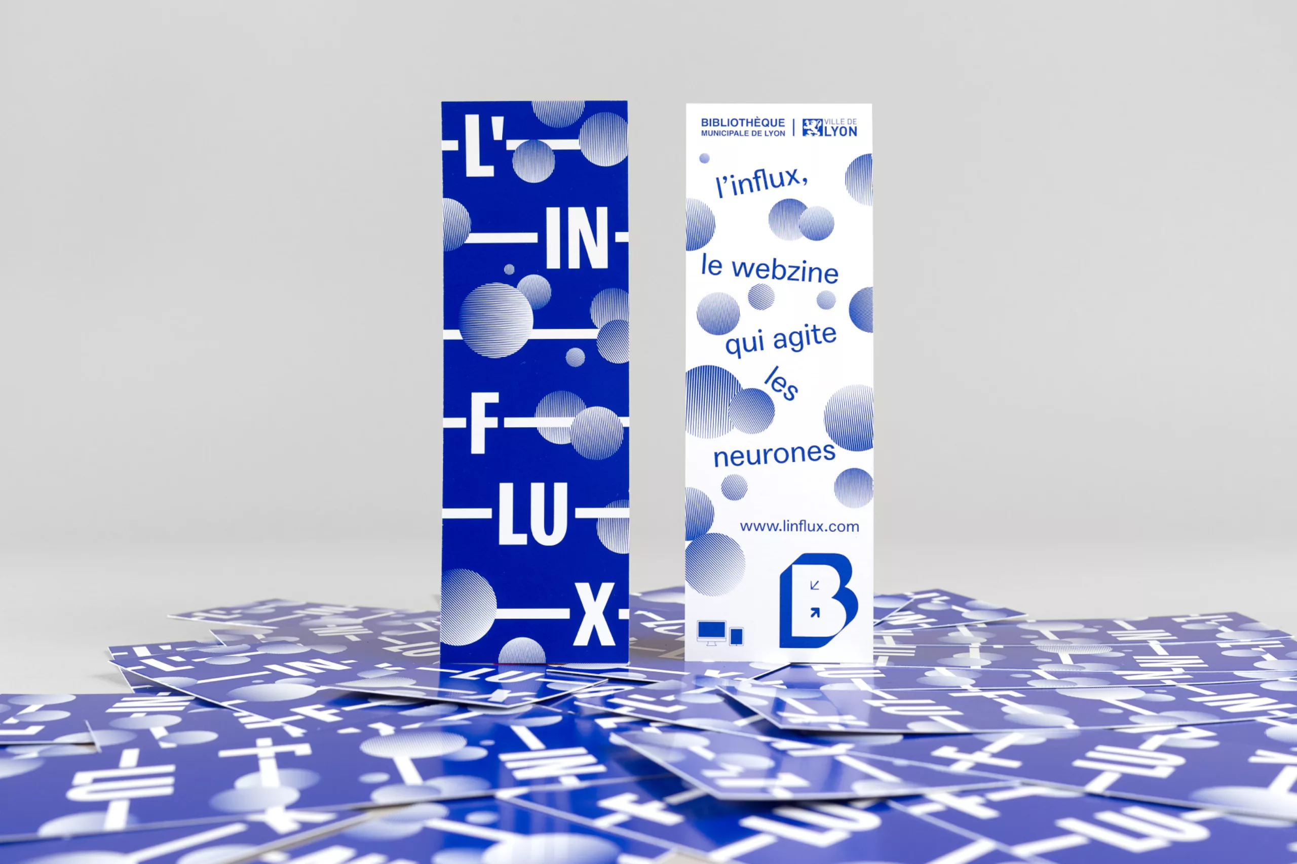
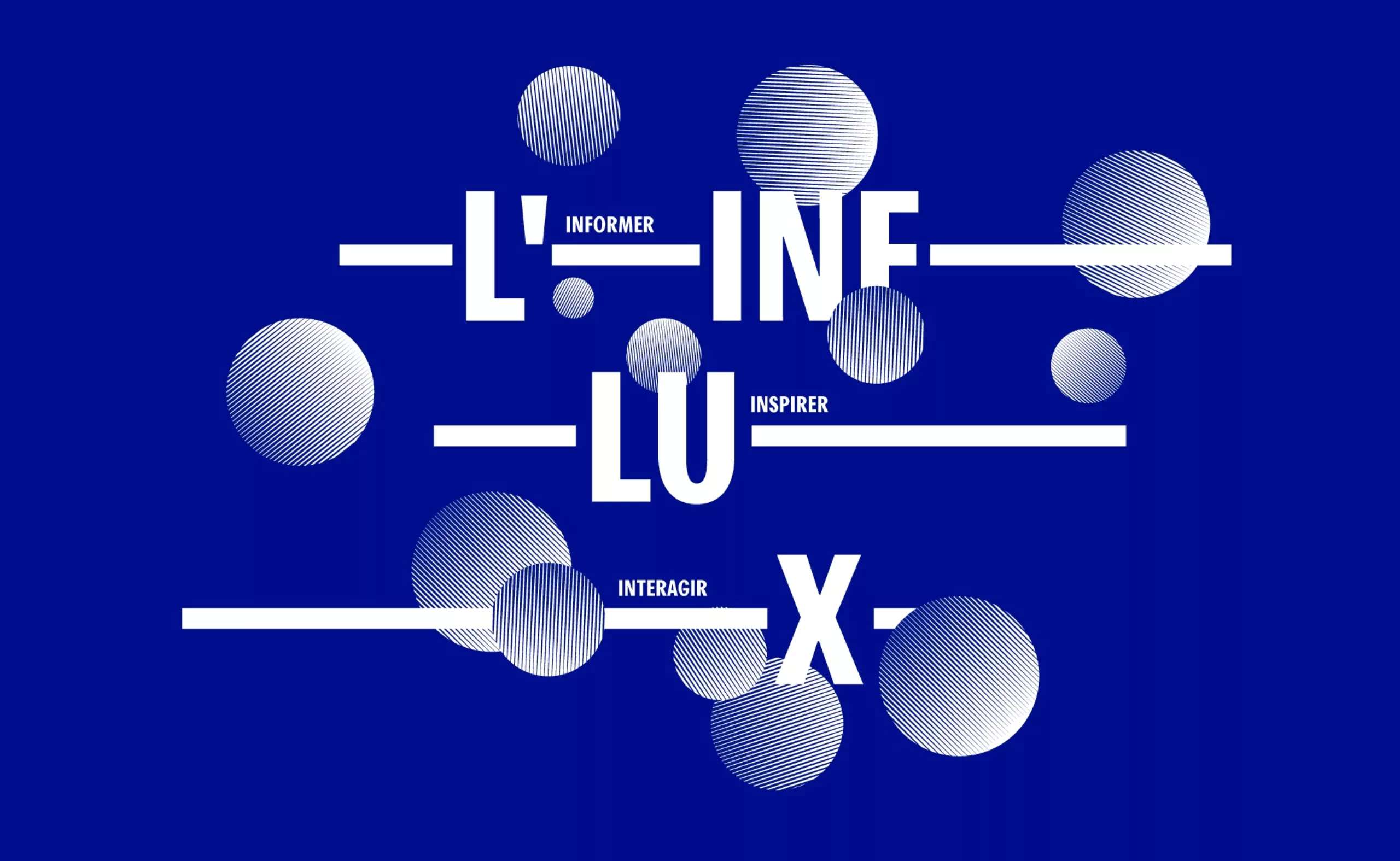
Our job was to design the identity and the communication tools of the webzine.
We aimed at designing a simple graphic system, relevant and recognizable, that would be easily adaptable on various media. We went for a lively visual identity, that mirrors the changing news posted on the site.
To know more about the design process, check out the article on our blog: