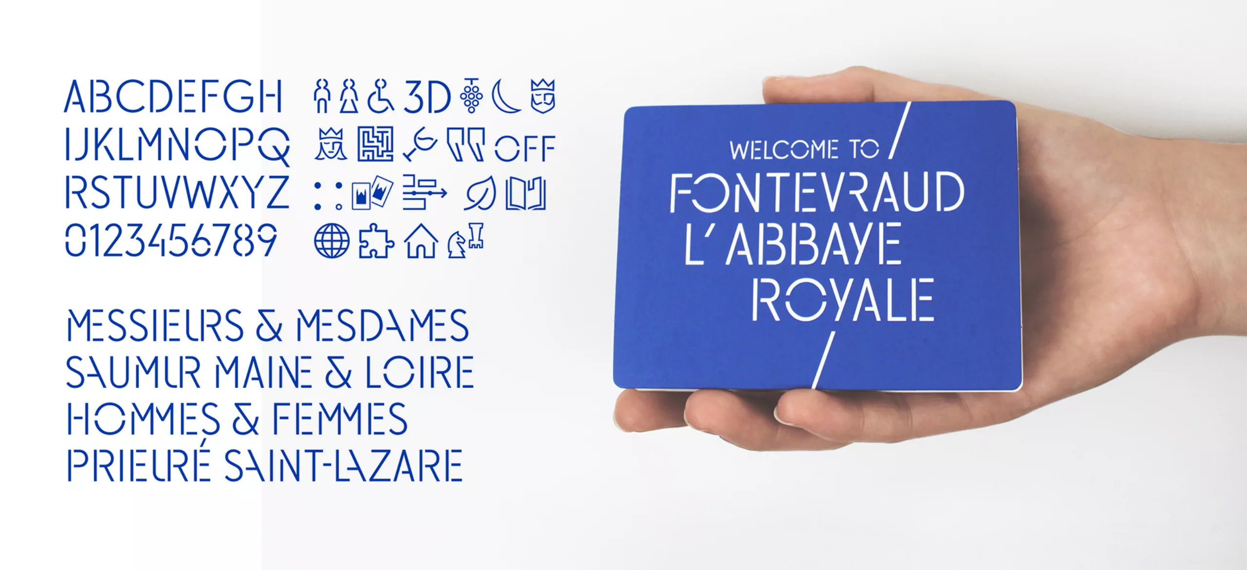
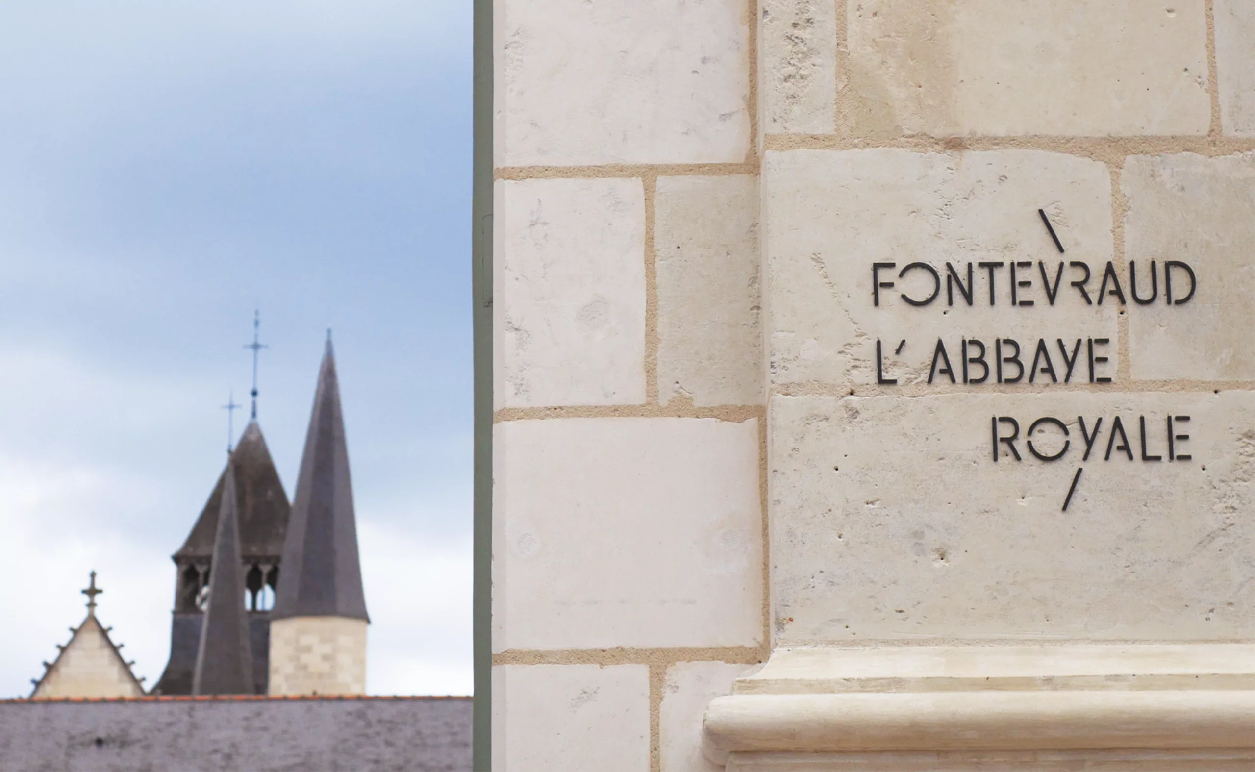
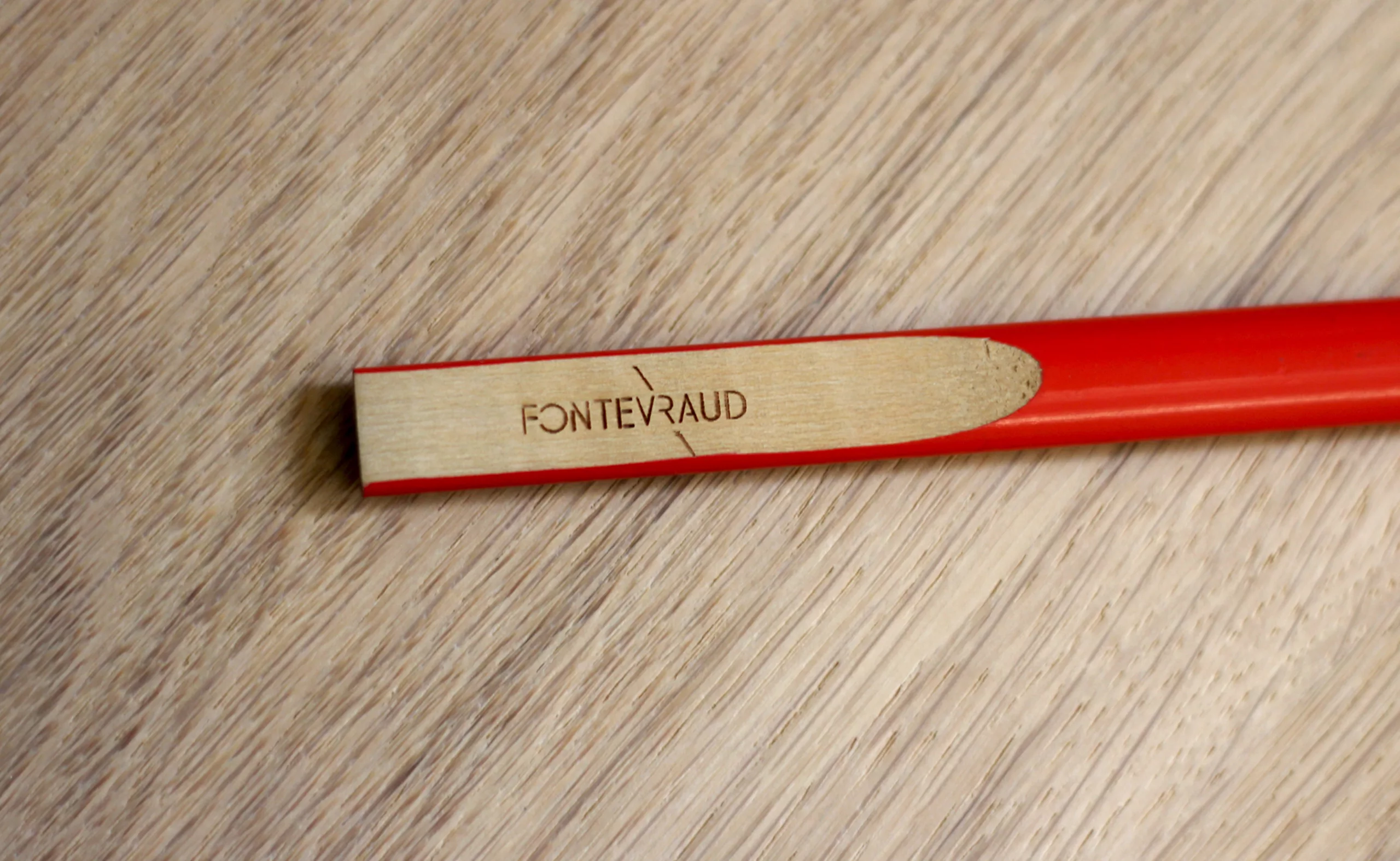
THEHE ICONOCLASTIC SLASH
Over Fontevraud’s long history, we’ve chosen to focus on the ‘Sacred / Profane’ antinomy. We’ve designed the “sacred” with the variation of a graphic element which we’ve named the “HALO”.
The “Profane” notion is represented by the an original typographical writing derived of the “SLASH” graphic element. The relation between HALO surface and SLASH graphic elements is the base of the visual identity of Fontevraud.
- The slash stands for the “iconoclastic” spirit of Fontevraud: nonconformist, nor horizontal or vertical, but oblique.
- The use of the slash also asserts a political view and puts forward a radical graphic design: aesthetics of the scratch, the scar, the overlay (prisoners left many graffitis on the walls).
- The slash also evokes the language of computer programming. It emphasizes the digital nature of the Fontevraud brand identity.
- The English word ‘slash’ probably comes from a French verb of the late 14th century, “eslachier”, a variant of “esclater” (‘burst’).
More info on the project:
grapheine.com/en/news/fontevraud-brand-identity/
www.fontevraud.fr
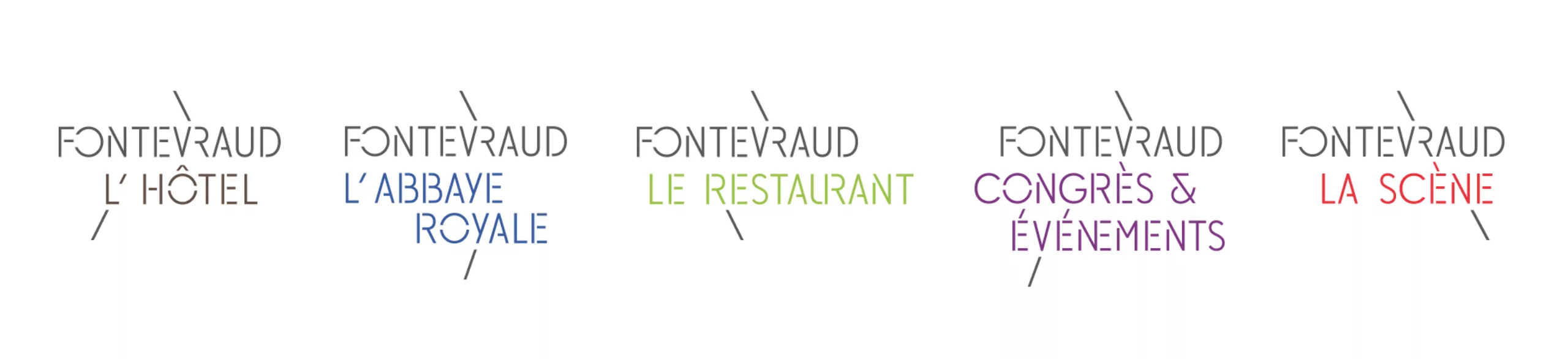
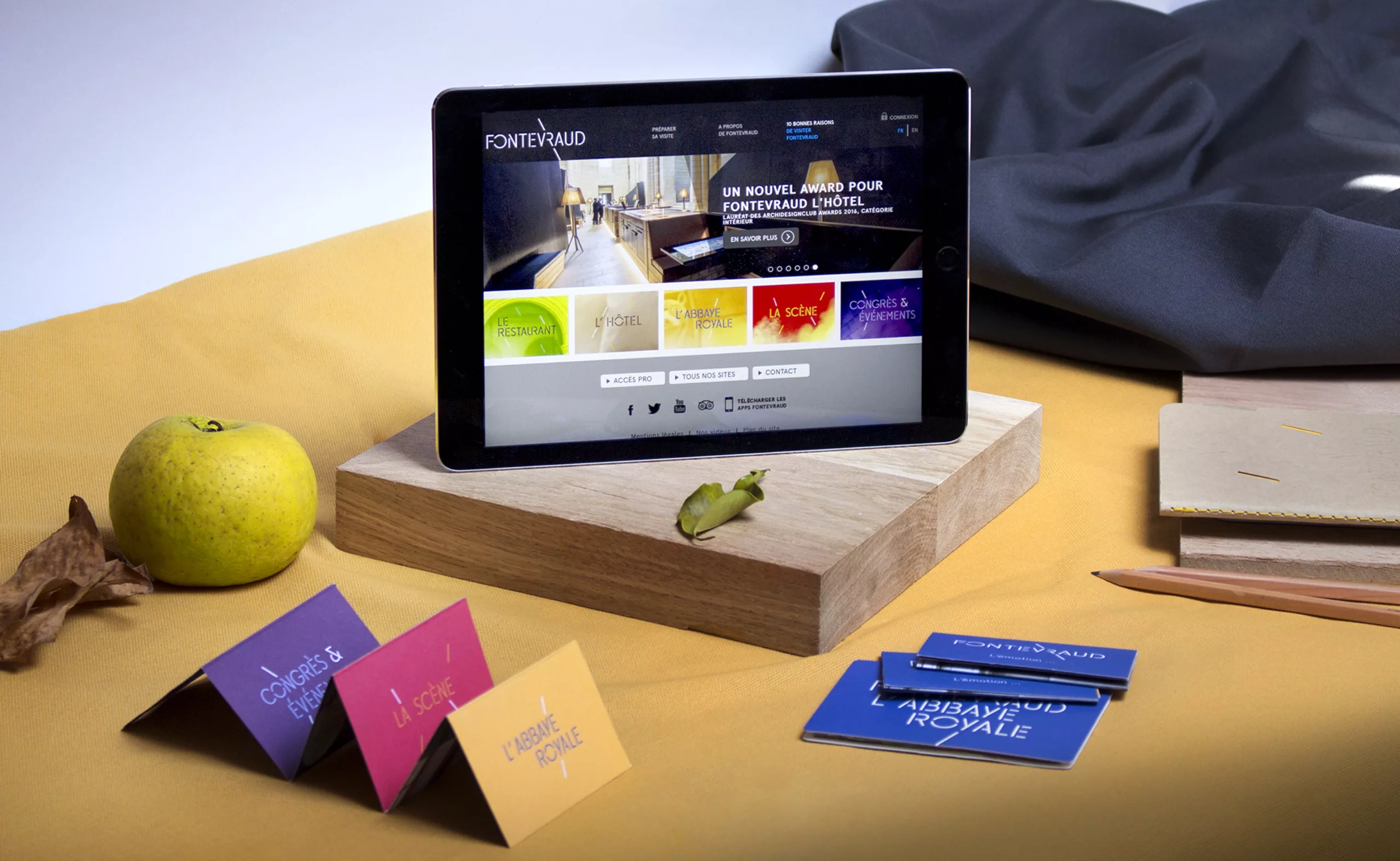
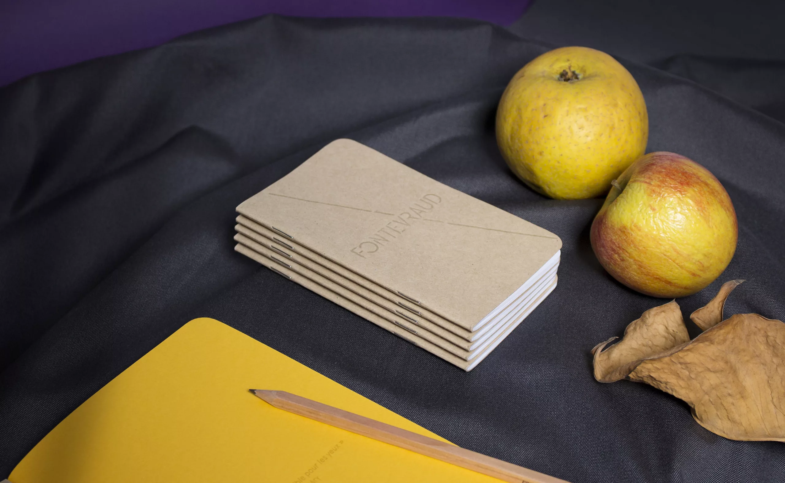
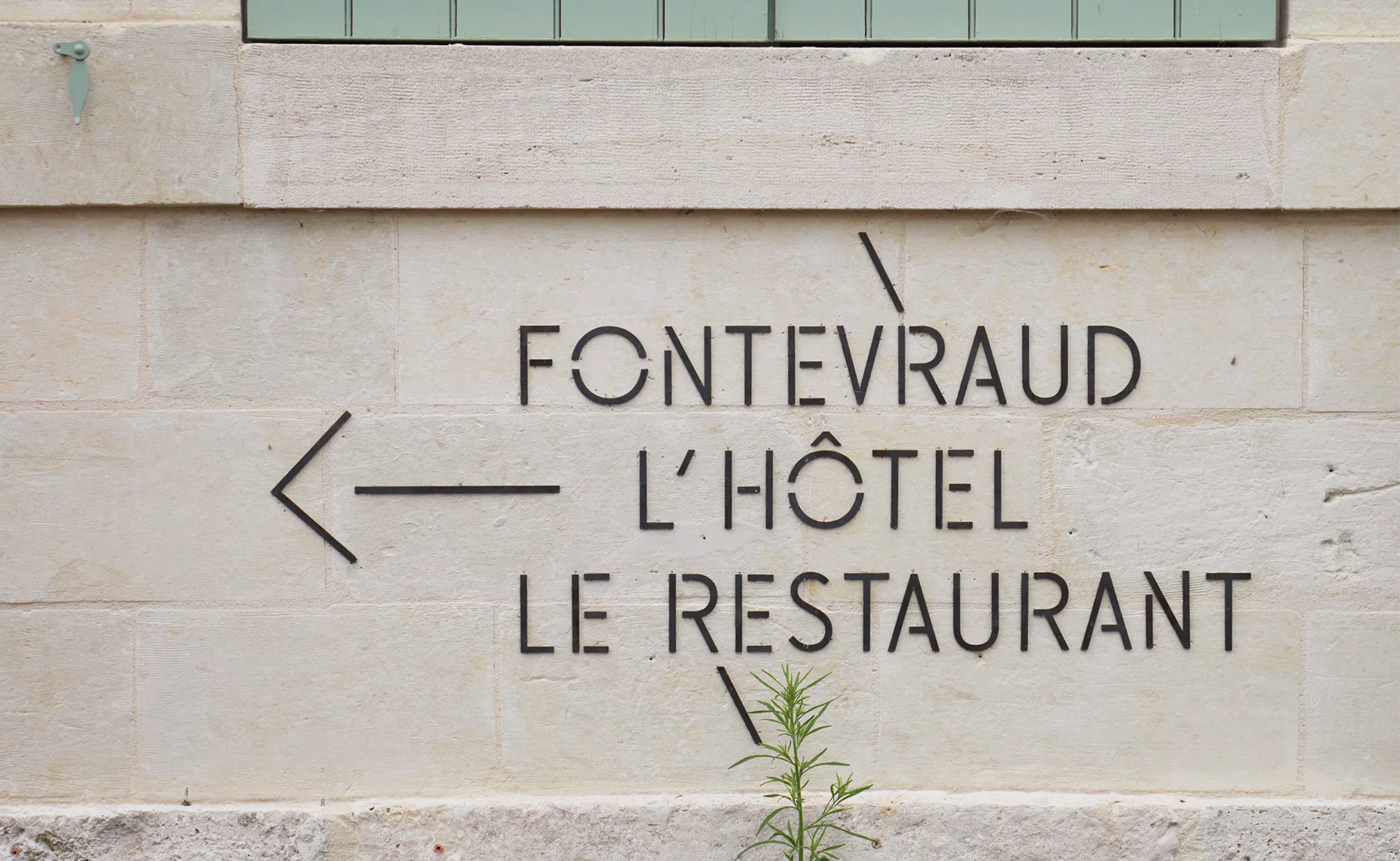
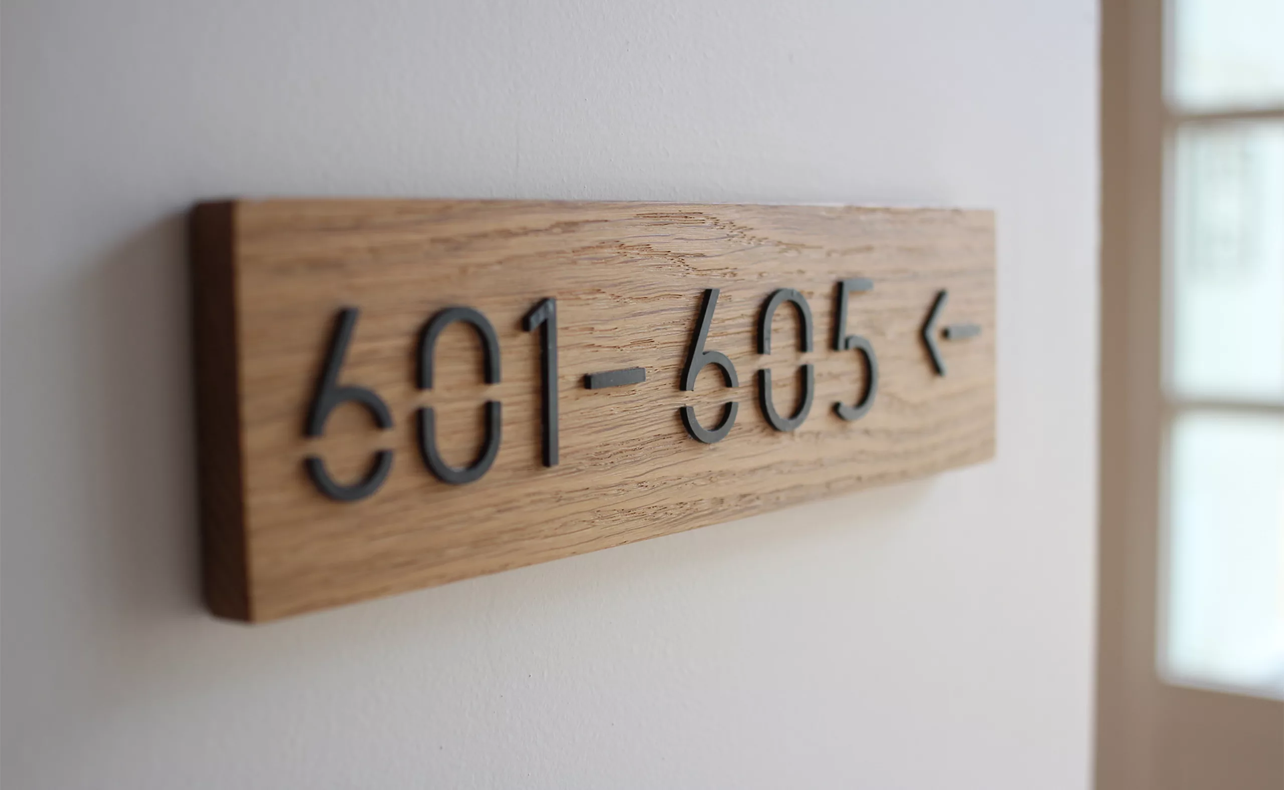
THE BRAND ARCHITECTURE AND VISUAL IDENTITY
- The logotype: The Fontevraud wordmark sets up the brand’s identity in an elegant, smooth/sober, dashing and creative manner.
- The accessible system: The brand identity’s design is meticulous and detailed but not elitist. It is made for a heterogeneous public.
- The evolutionary / expanding chart: Creating an original typography provides a great capacity of adaptation for different levels of communication. The visual system works with the same intensity on an exhibition poster as on the hotel cosmetics packaging.
- The overall coherence that values highly distinctive universes: the style of the Fontevraud visual identity is easily transferred on digital media.
- The typogaphy: The visual concept of the identity is based on an original and sharp typography.
- The contemporary vision: The graphic charter of Fontevraud reflects the contemporary vision of the project, inspired by a unique history, rooted in the present and looking to the future.
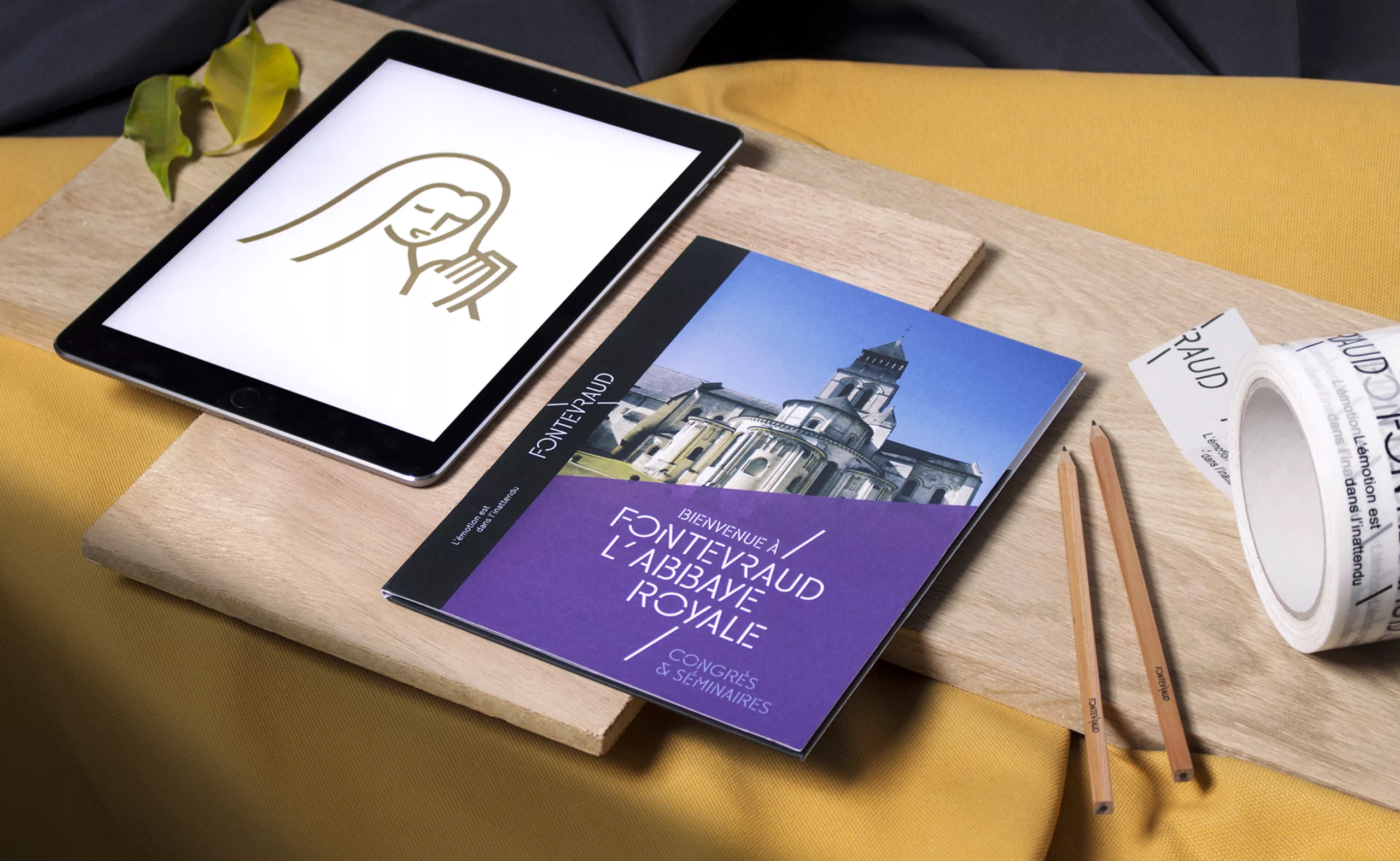
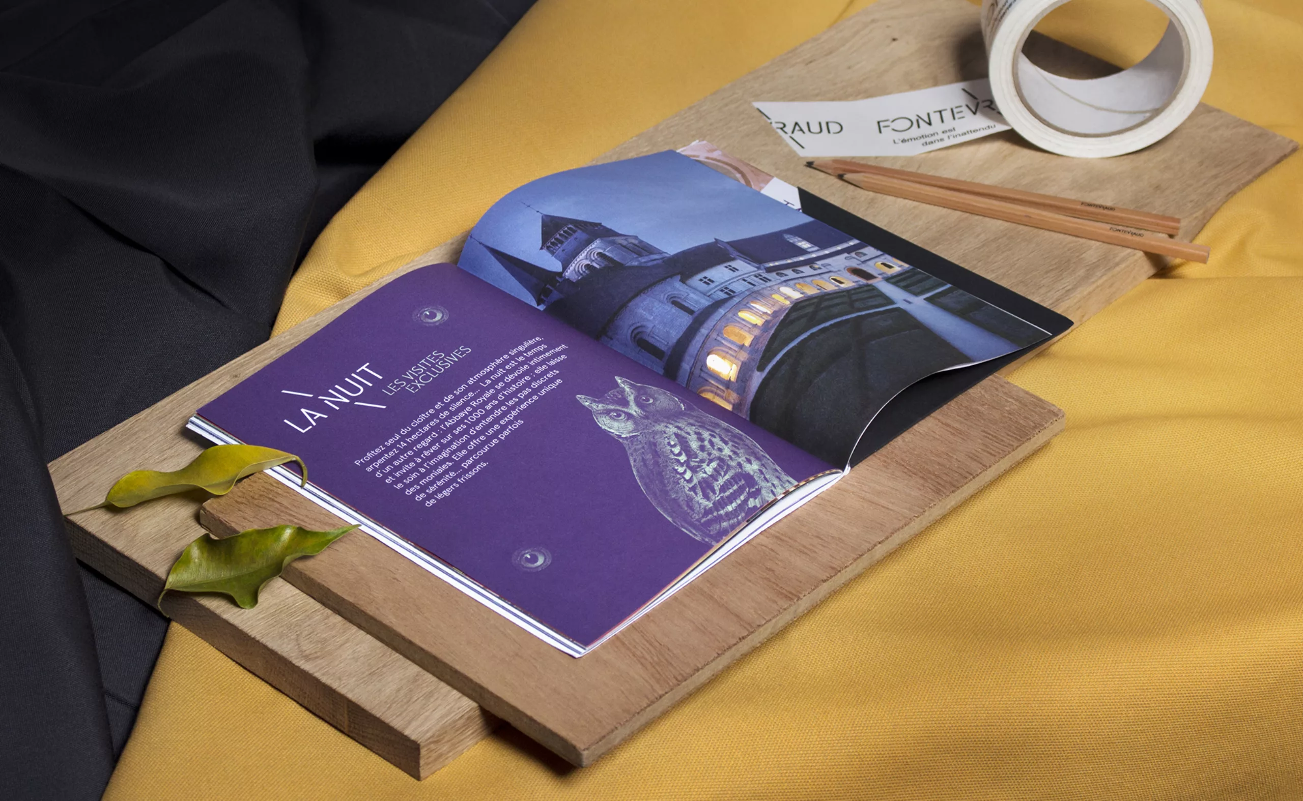
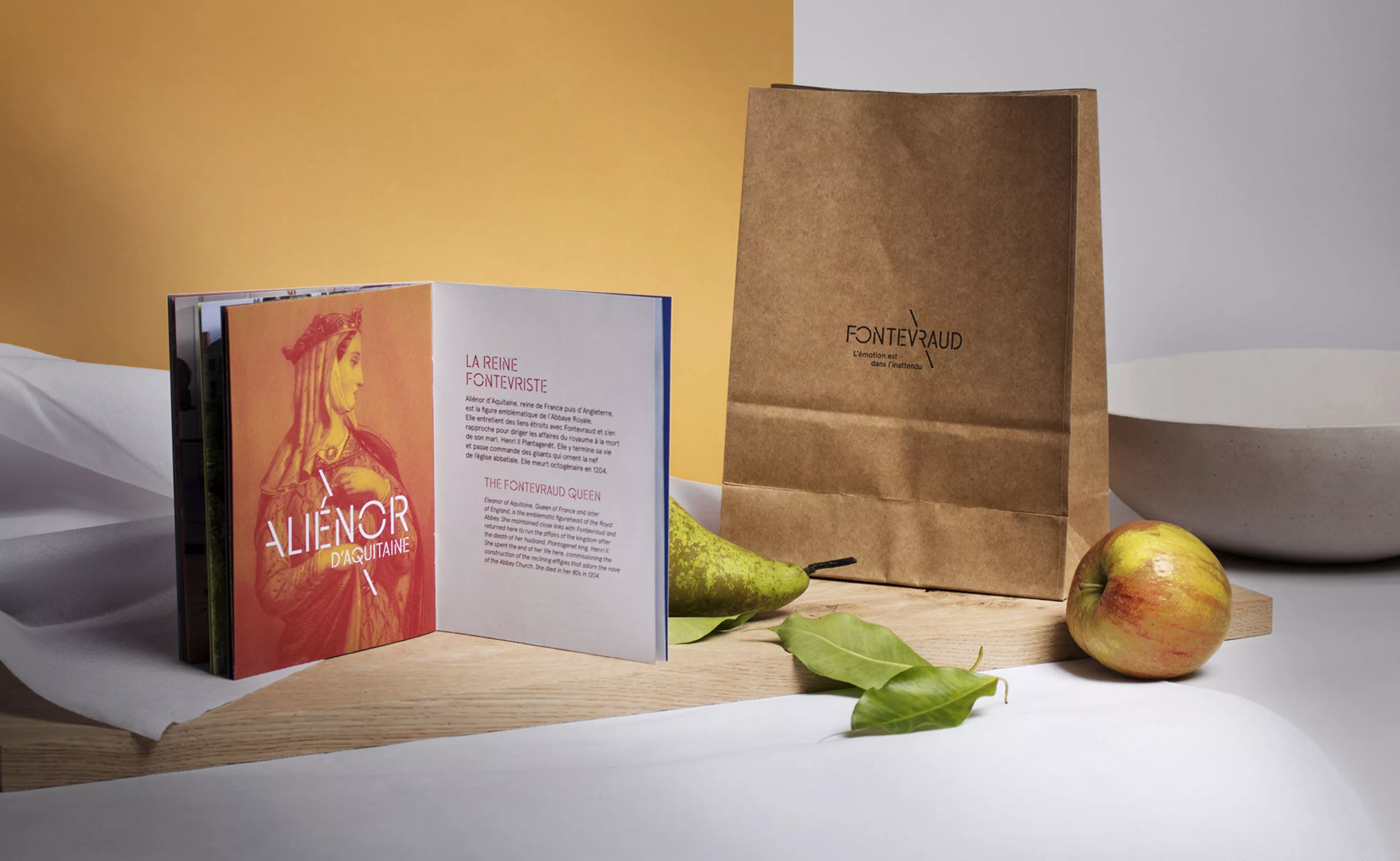
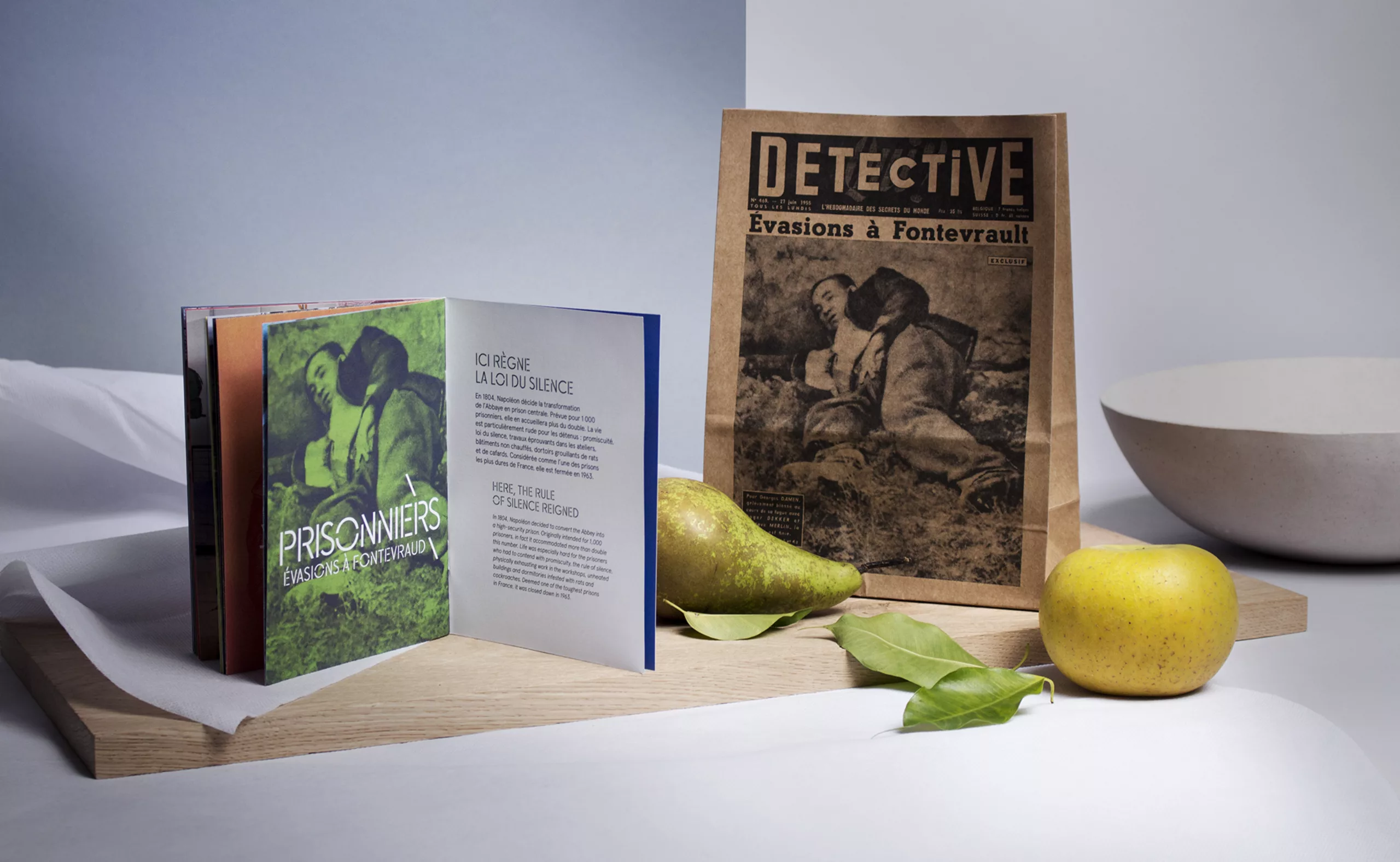
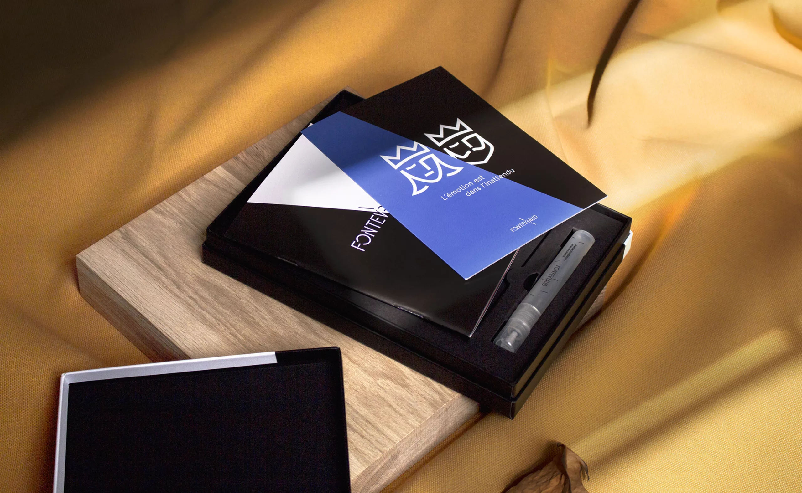
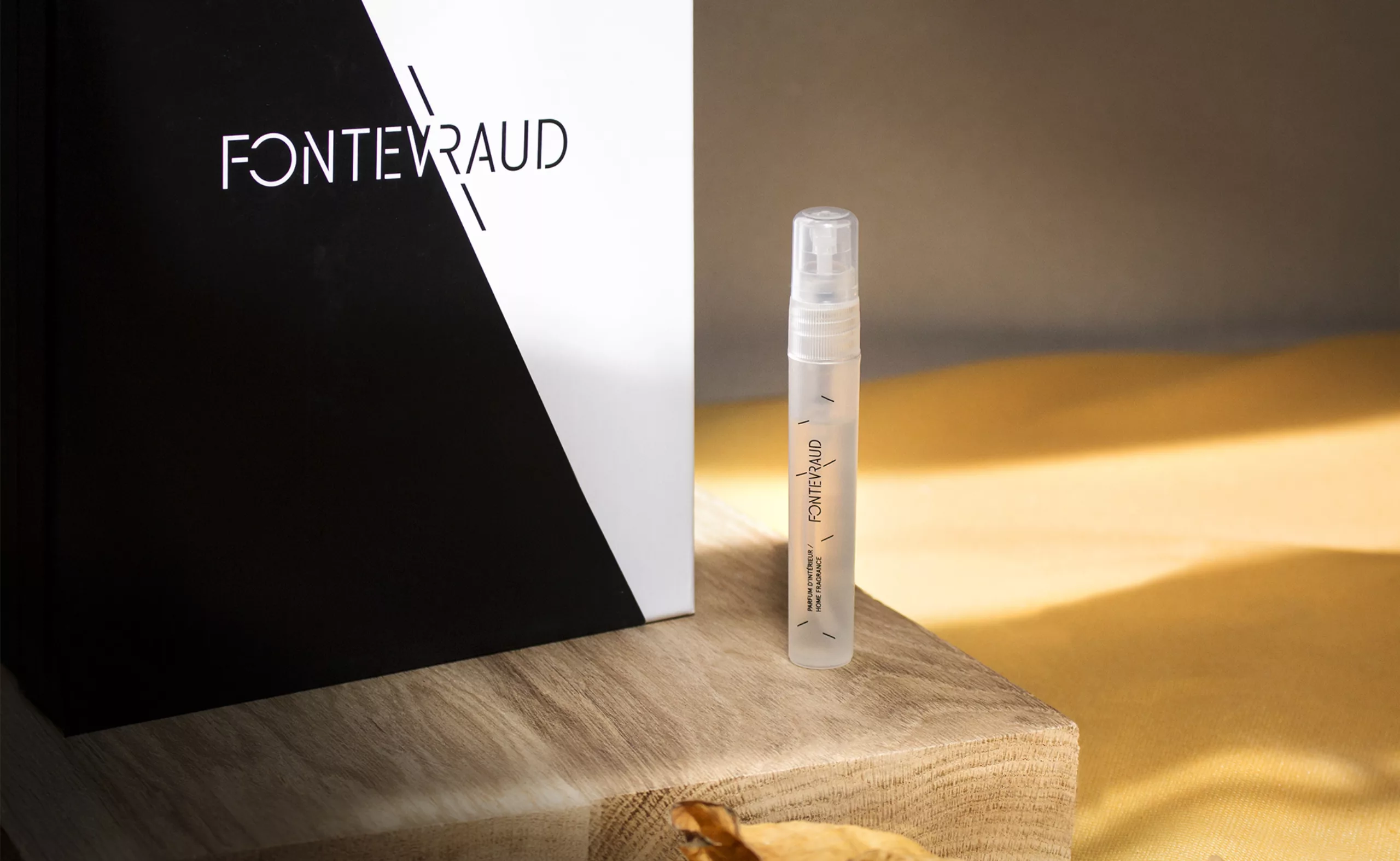
OFFERING THE FONTEVRAUD EXPERIENCE
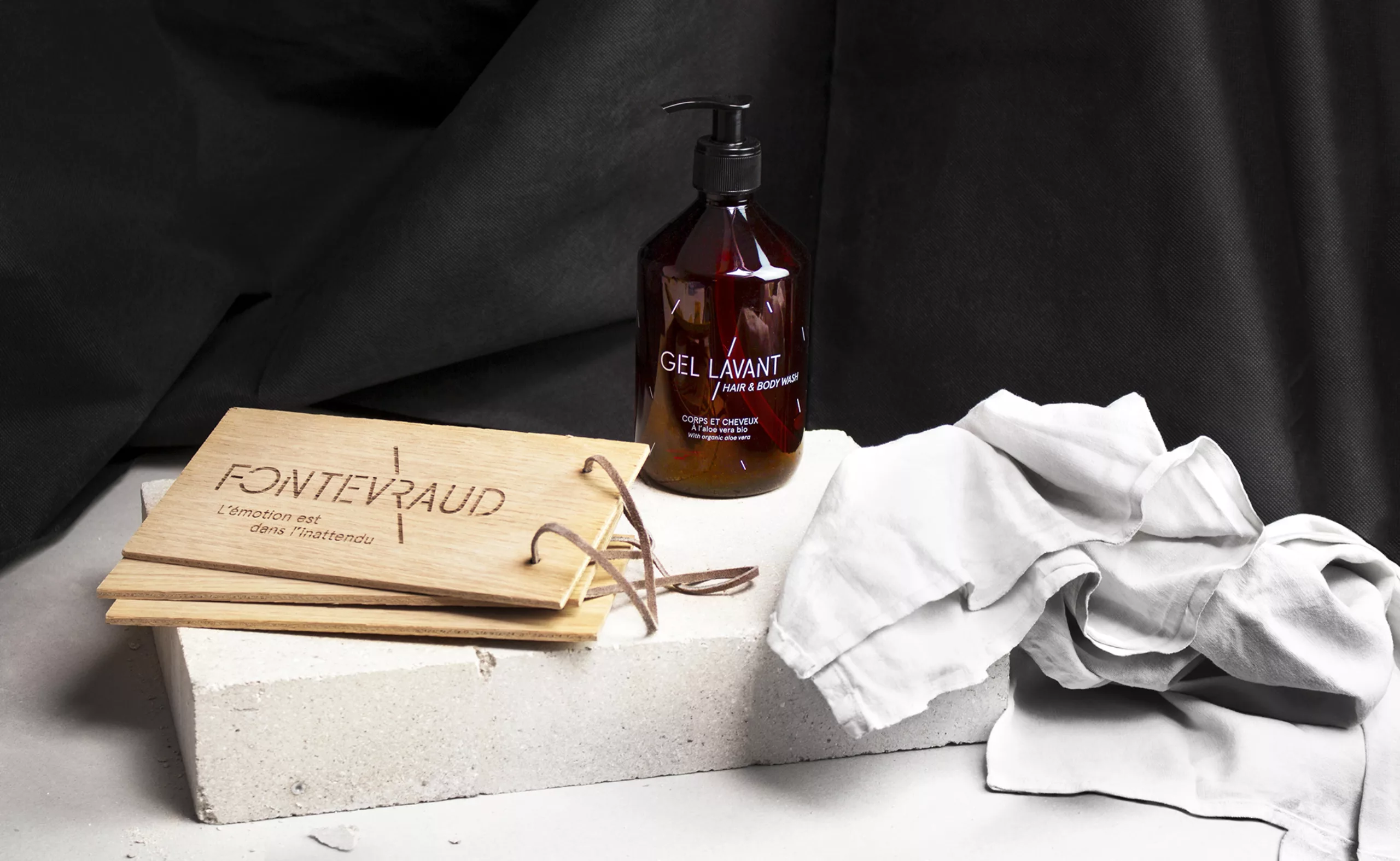
Once the new brand architecture had been defined and the graphic charter delivered, we were asked to design a gift box that would convey the Fontevraud experience. We’ve designed of a box that contains a booklet, a sample of the Fontevraud olfactory signature (realized by MAW) and a customizable gift card.
More details on the Fontevraud box:
grapheine.com/news/offrir-fontevraud-il-etait-une-fois-la-creation-dun-coffret-cadeau/
www.fontevraud.boutique/box
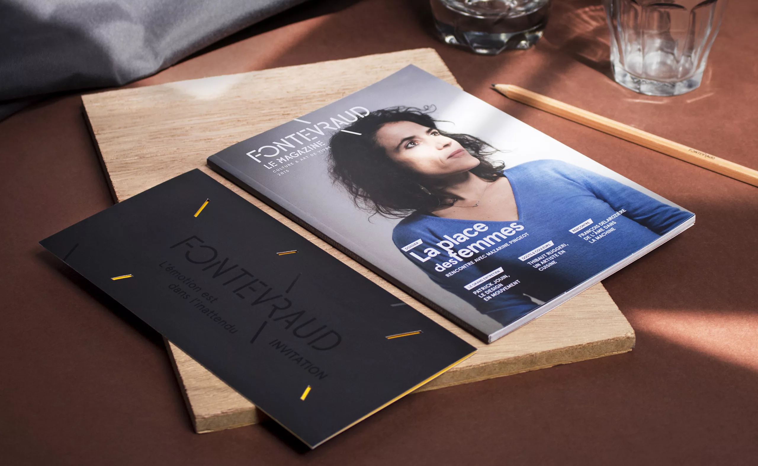
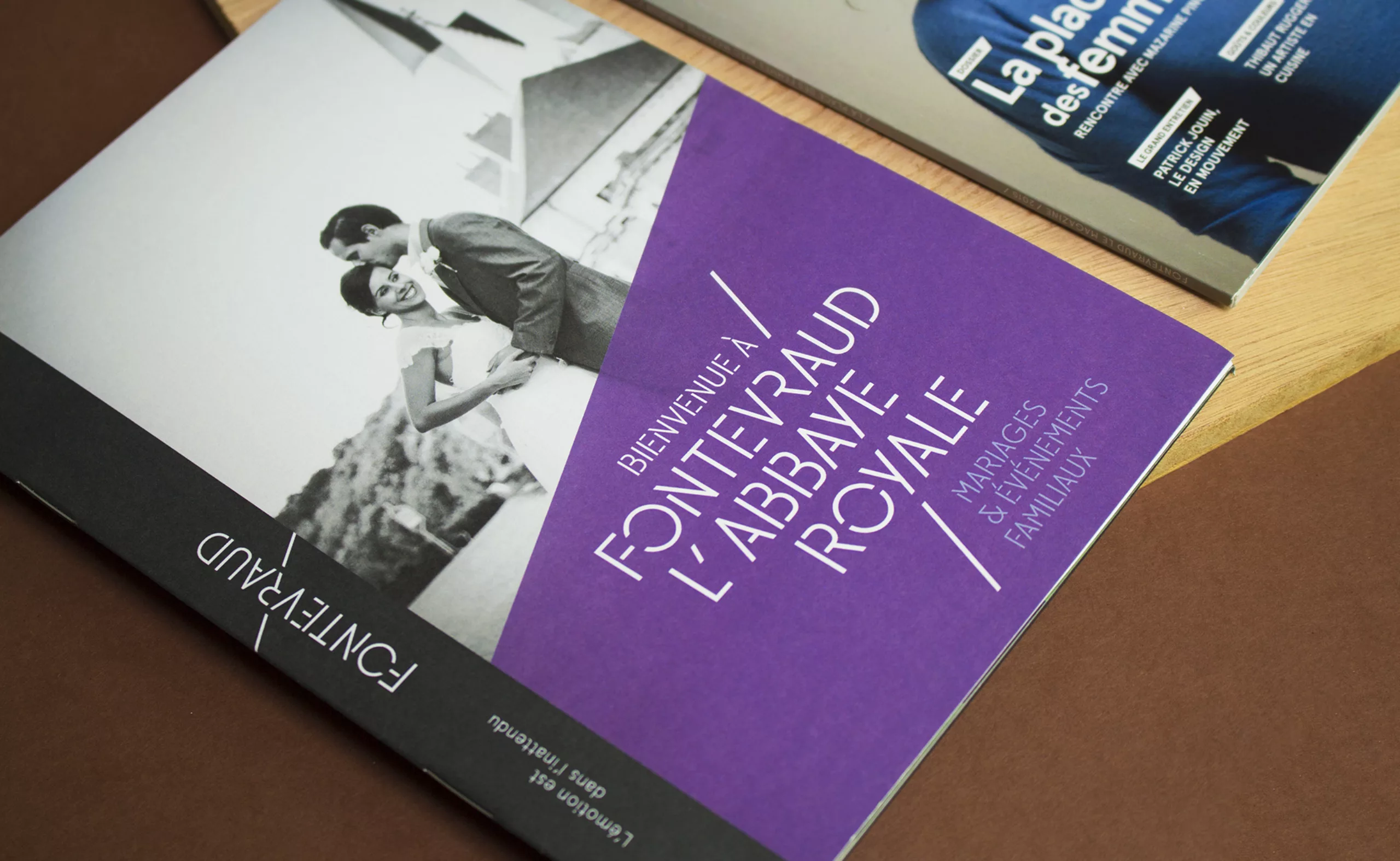
THE LIFESTYLE MAGAZINE
Another application of the Fontevraud identity is the Fontevraud magazine, true manifesto of the ‘ideal city’.
The art and editorial direction of Fontevraud magazine is far from a tourist brochure.
This ‘mook’ reflects current societal issues thought by David Martin, director of the abbey.
This biannual mook offers depth reports and interviews and showcases high standards texts, photos and illustrations.
We’ve designed the first issue of the magazine in partnership with the brand content agency Rue Prémion.
Cover art direction: Graphéine – Photography: Gabriel De La Chapelle
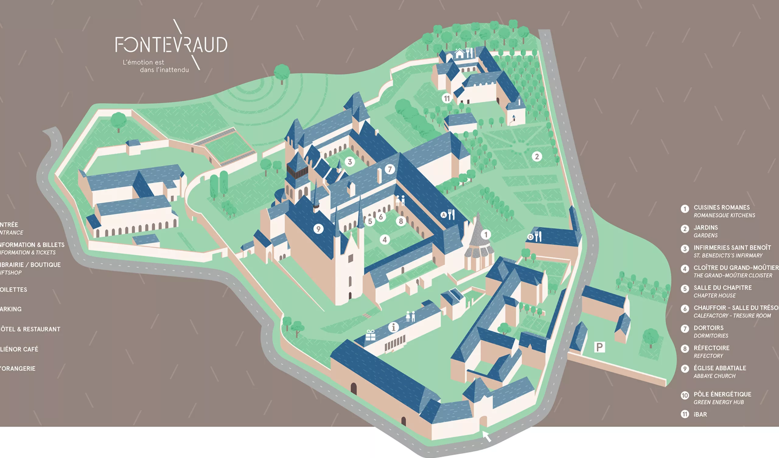
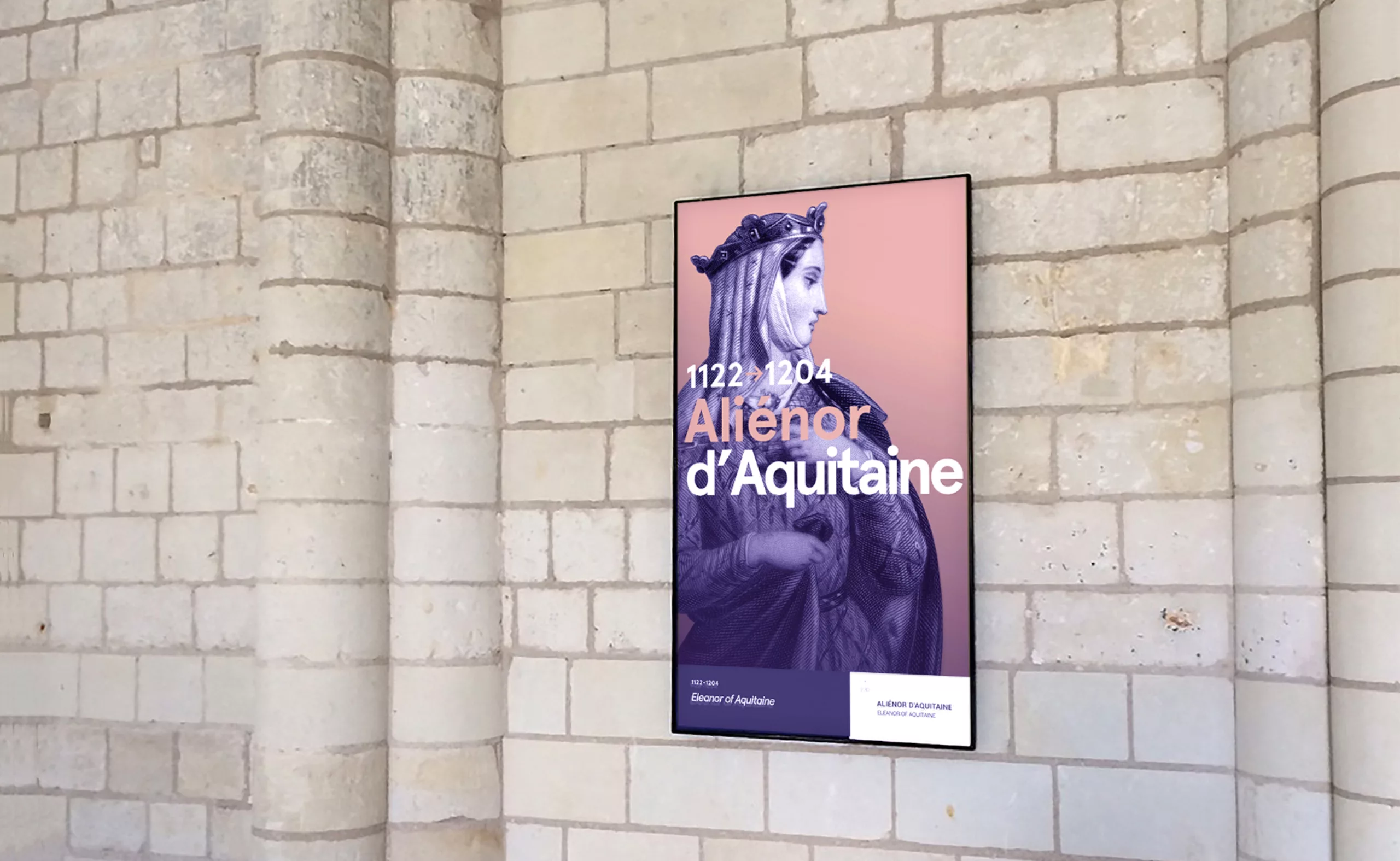
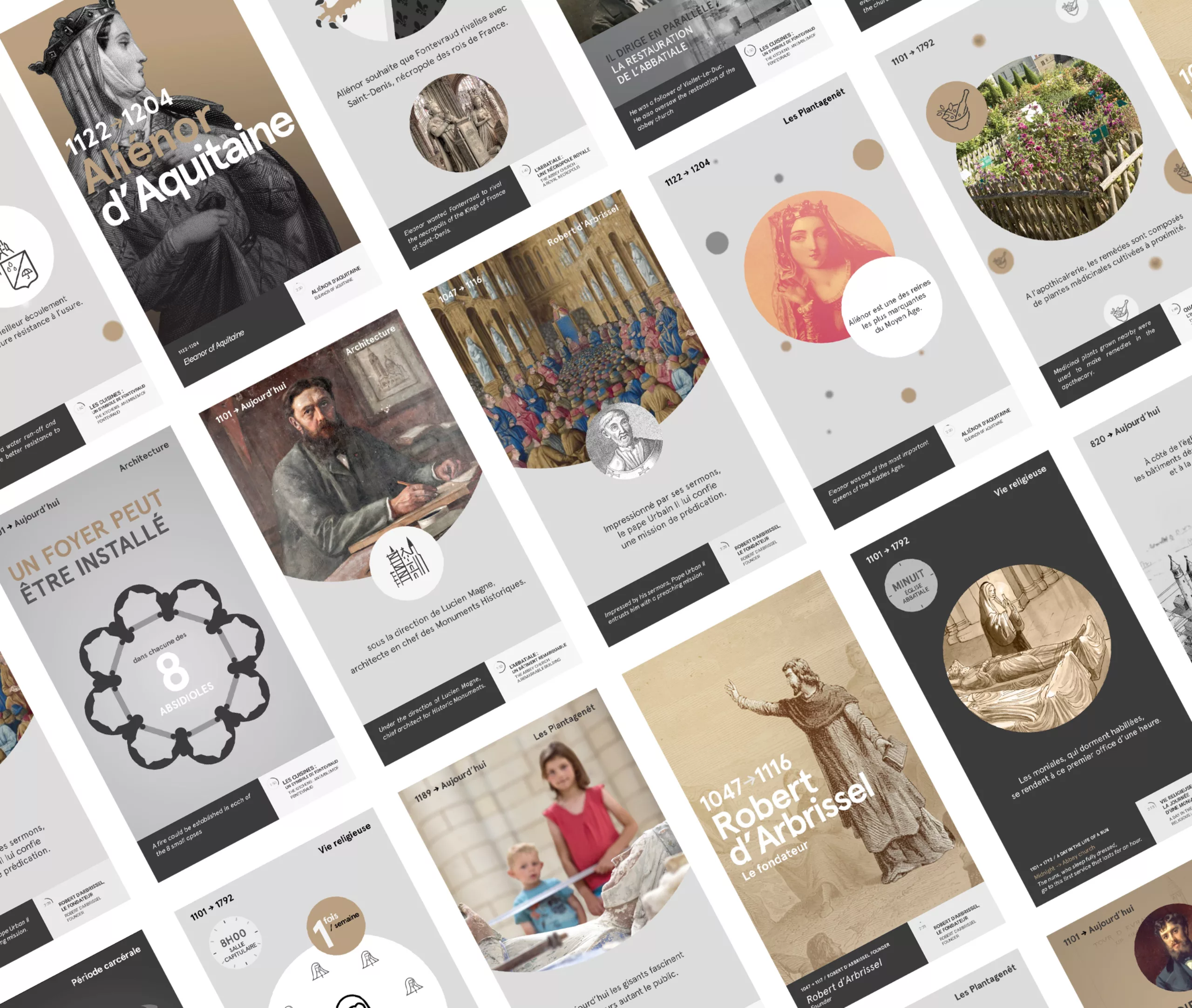
THE DIGITAL VISIT
Located in different places of the venue, vertical and horizontal screens constitute both signage and audioguide of the Fontevraud experience. Using a sober graphic design that respects the surrounding architecture, they provide key information to visitors through archive visuals, pictograms and data-visualization.
Video clips recount the great historical moments, as well as surprising stories of the people who made live Fontevraud over centuries.
By combining heritage and todays museography, Fontevraud demonstrates its commitment to innovation in the service of the public.
More info:
grapheine.com/news/fontevraud-le-parcours-de-visite-numerique/