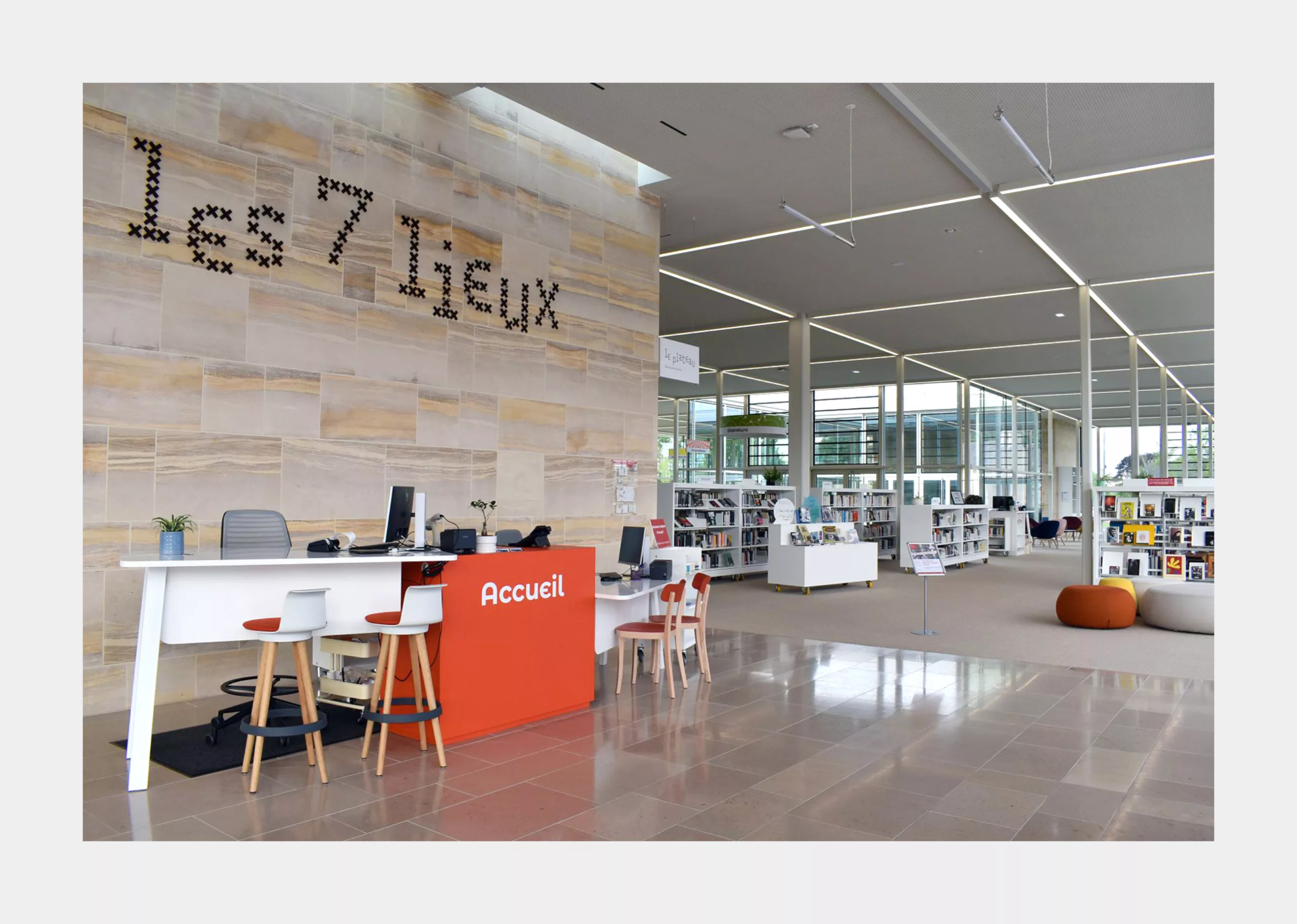
EN_L7L_case-study_201910012

2018

Les 7 Lieux
Visual Identity and signage for the new library of Bayeux

The public library of Bayeux in Normandy underwent renovations in 2018 to create a new, hybrid cultural space that was named ‘Les 7 Lieux’. The name ‘Les 7 Lieux’ is a play of words on the folkloric ‘Bottes des Sept Lieues’ (seven league boots). In French folklore, these boots allow the wearer to take strides of seven leagues per step, letting them travel great distances.
The vision of ‘Les 7 Lieux’ is to transform the former library into an institution that encourages and facilitates knowledge building as well as skill acquisition. Les 7 Lieux strives to achieve this by leveraging a culture of exchange, sharing, DIY and creativity.

Bayeux Tapestry - at the crossroads of heritage and the presen

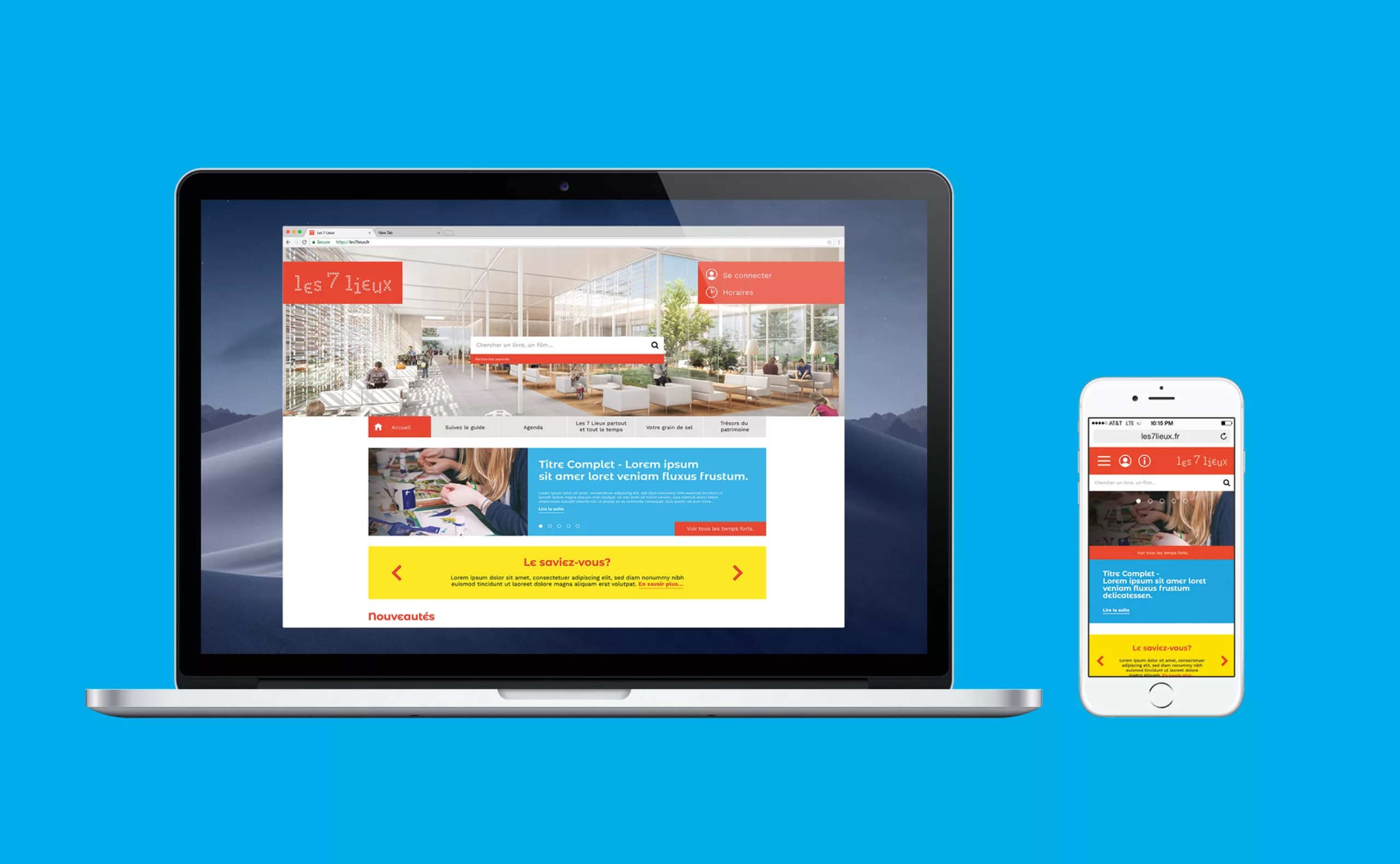
Graphéine set out to create a visual identity that would reflect this vision and the revitalized nature of the library. The project began with a thorough analysis of the visual landscape of this domain and a study of the motivations behind creating Les 7 Lieux in Bayeux.
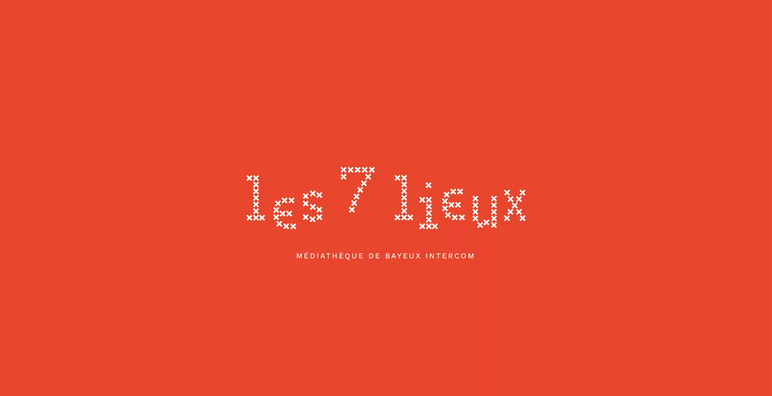
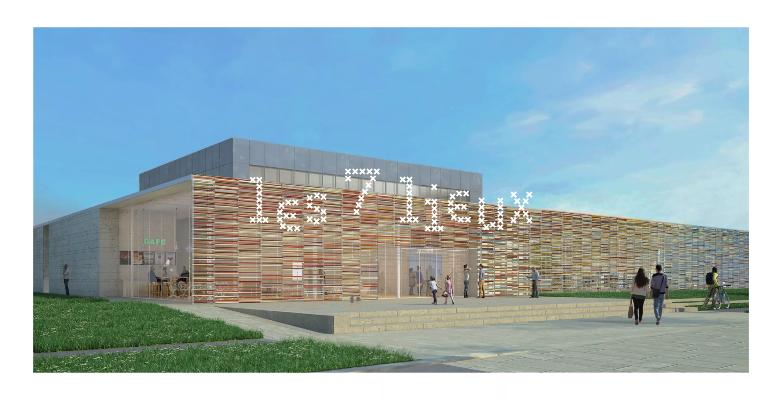
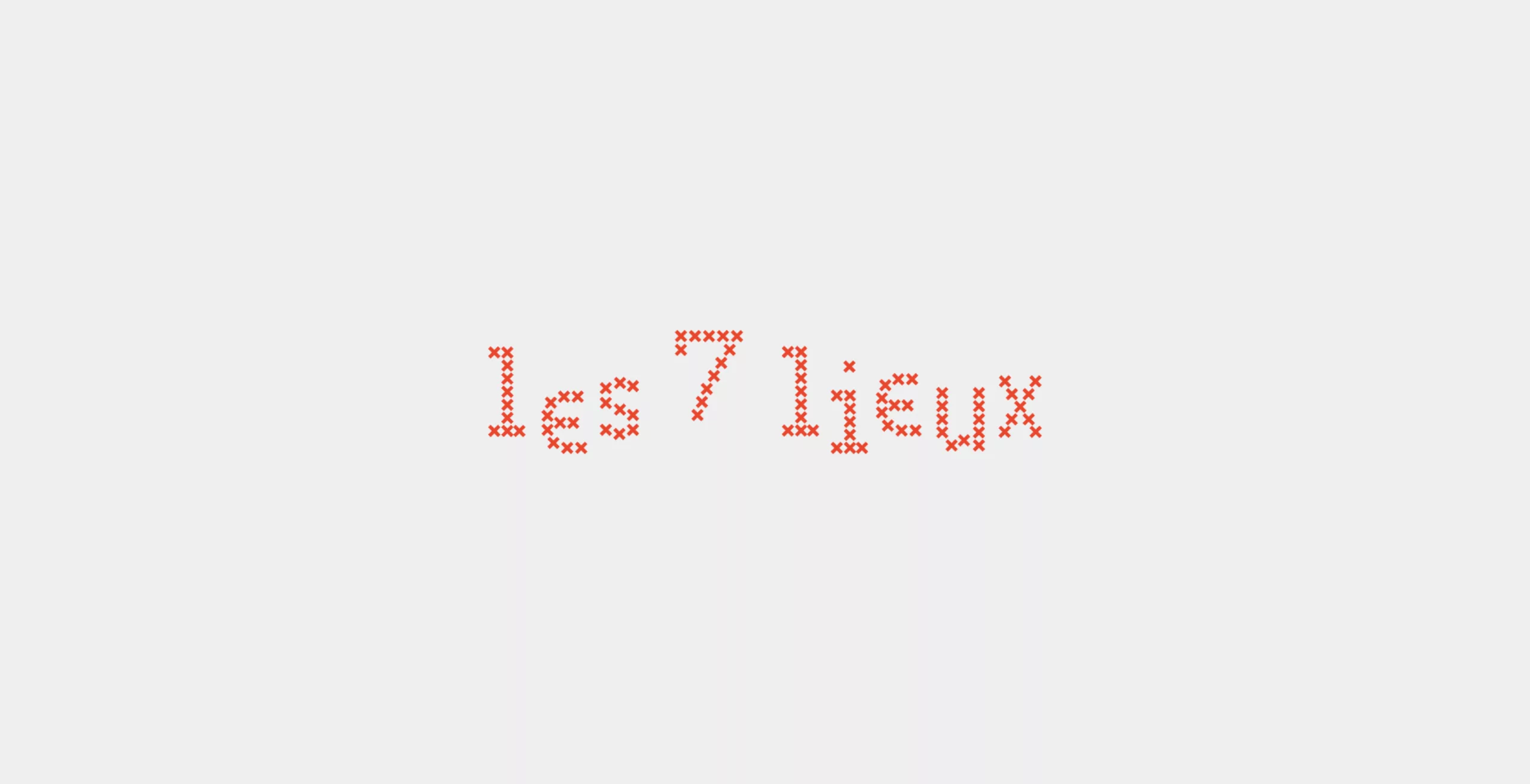
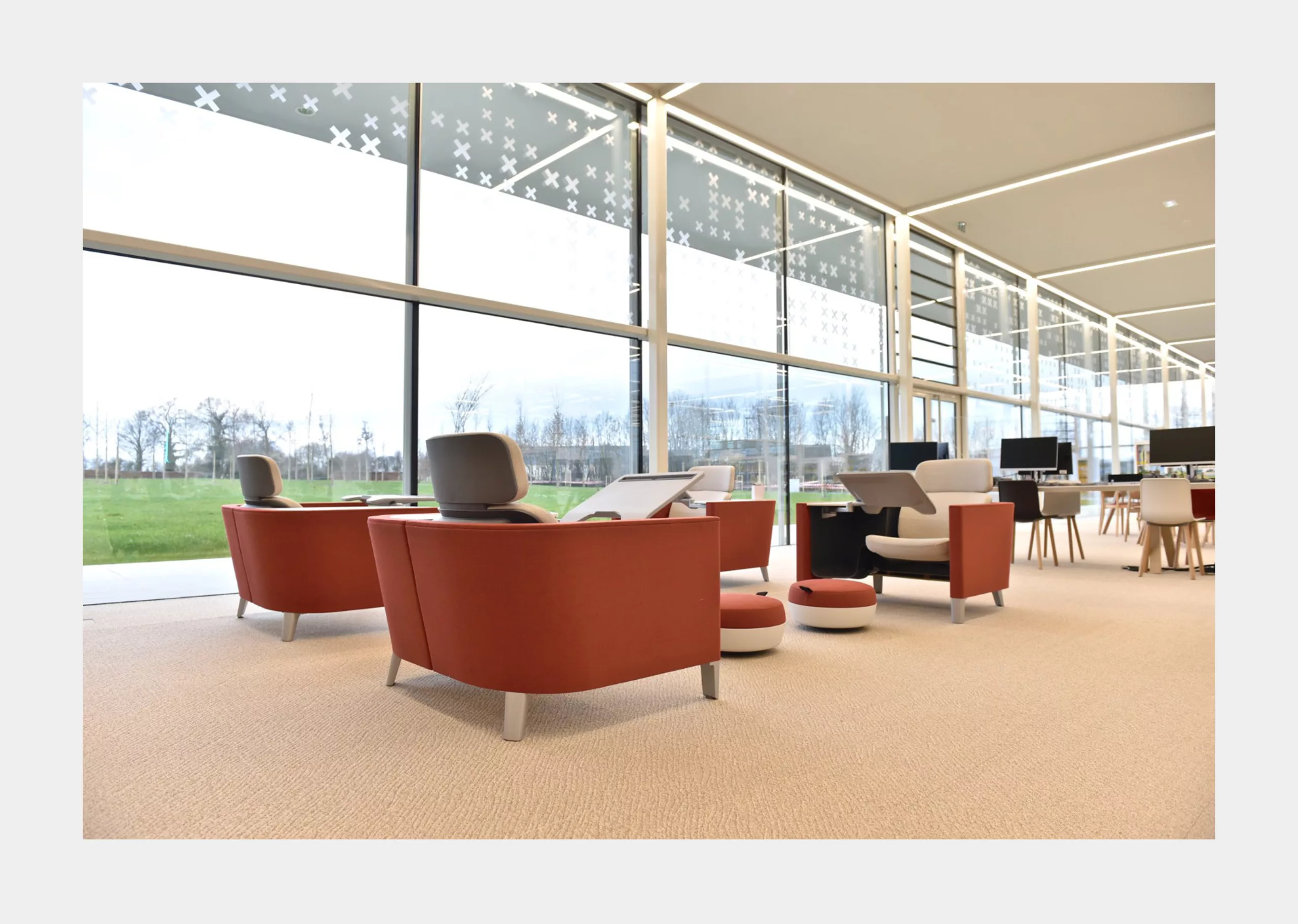
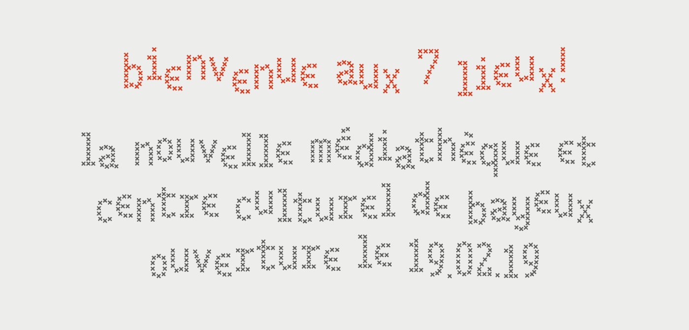
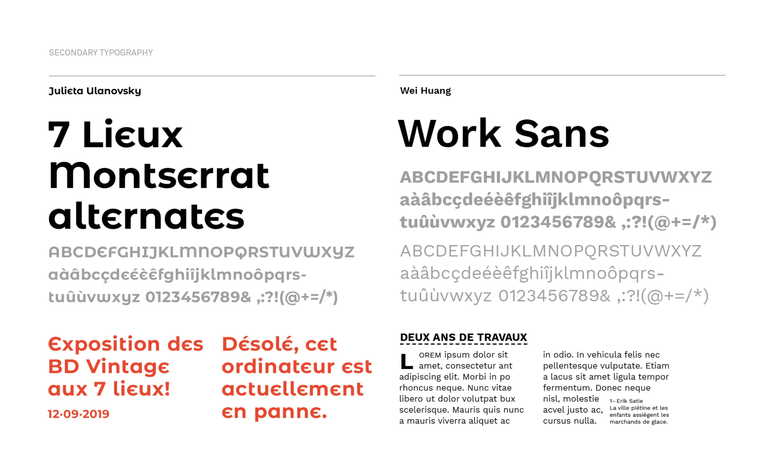
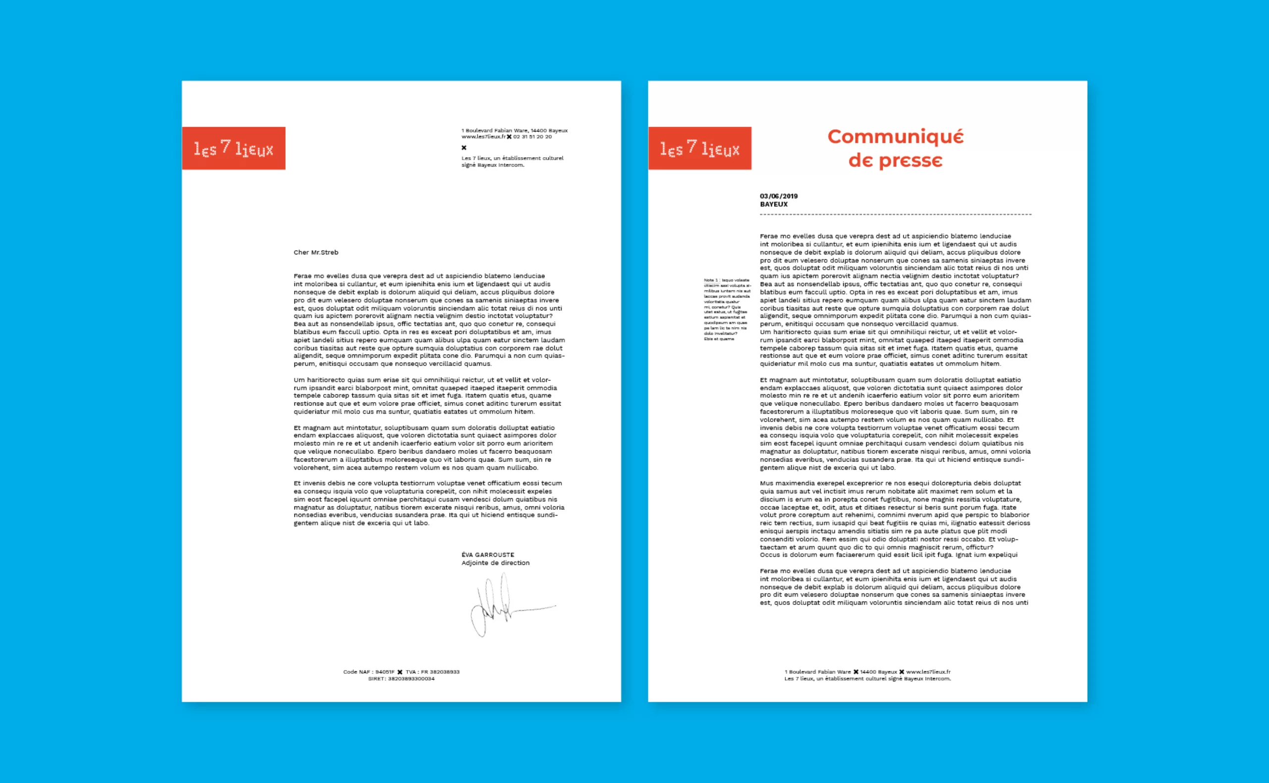
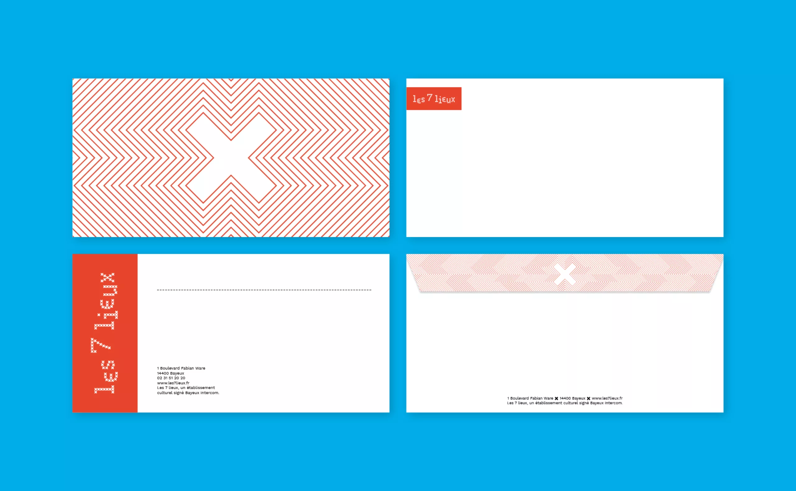
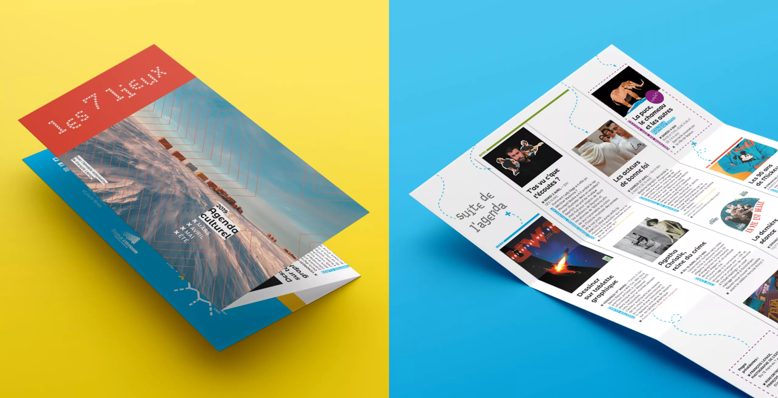
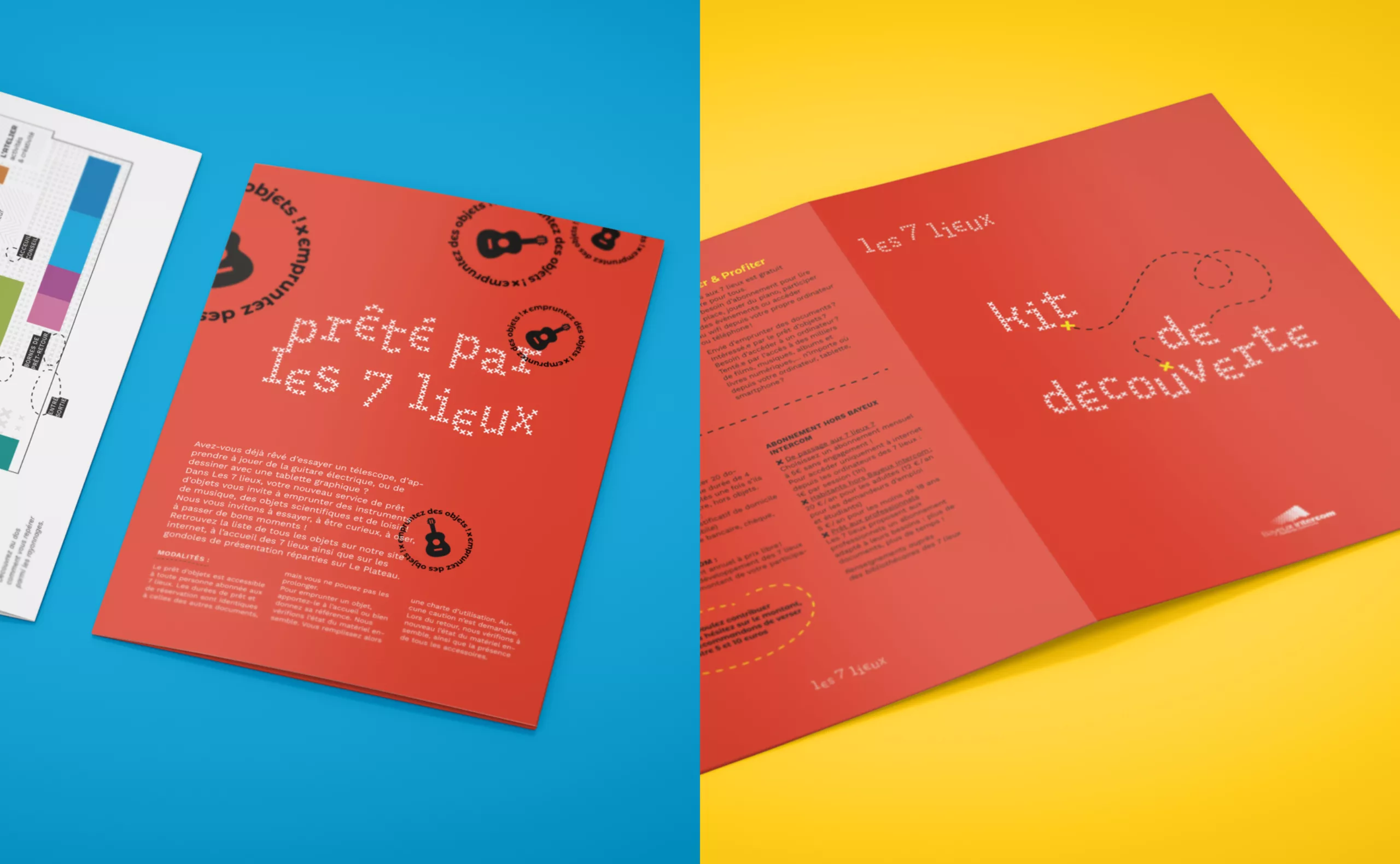
The Bayeux tapestry - a historical artefact that dates back to 1066 AD - is the most important symbol of Bayeux’s heritage and thus our principal starting point. Using this as our reference, we developed an extended graphic language that can be easily adapted to various touch points across space, print and digital media.
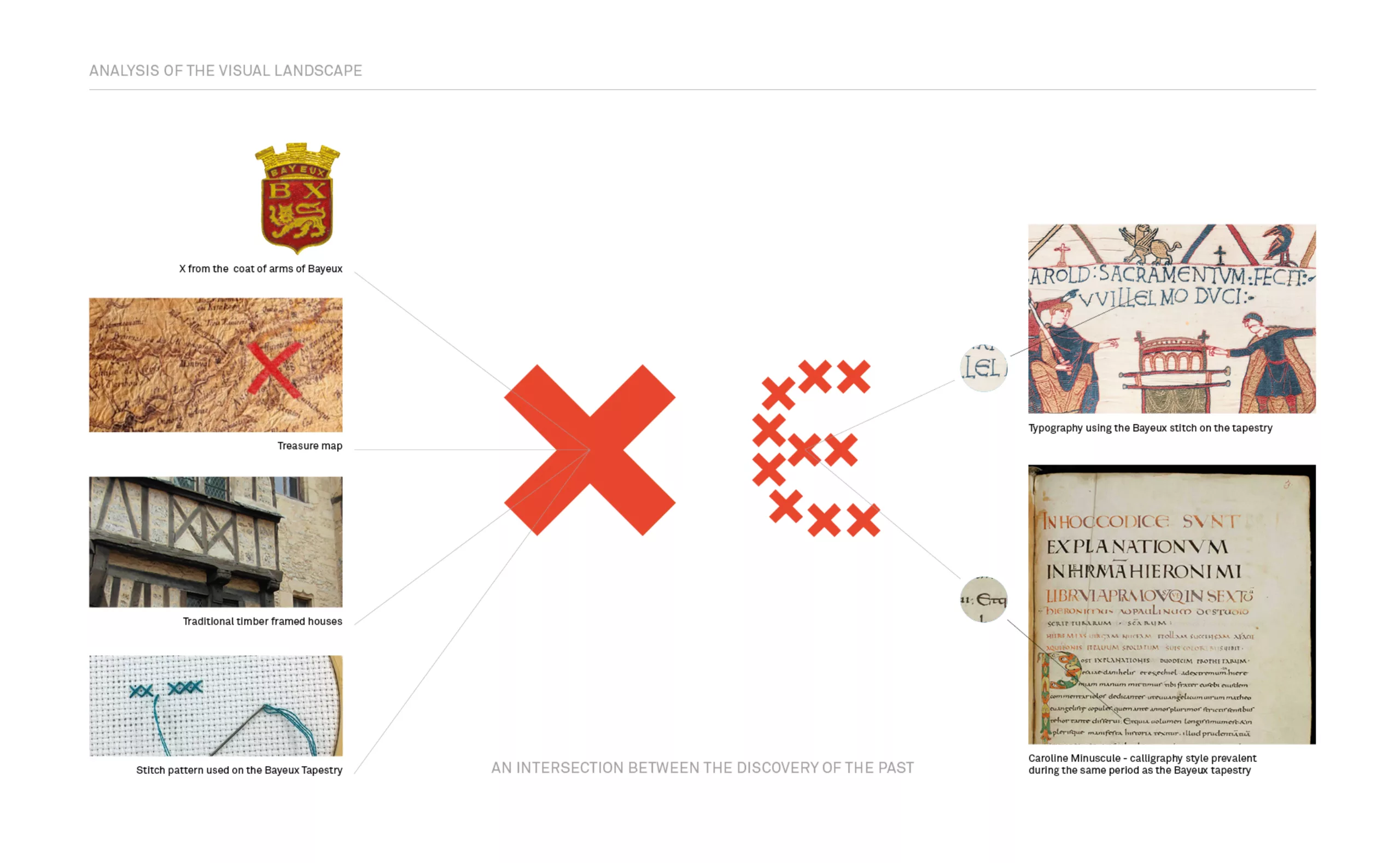
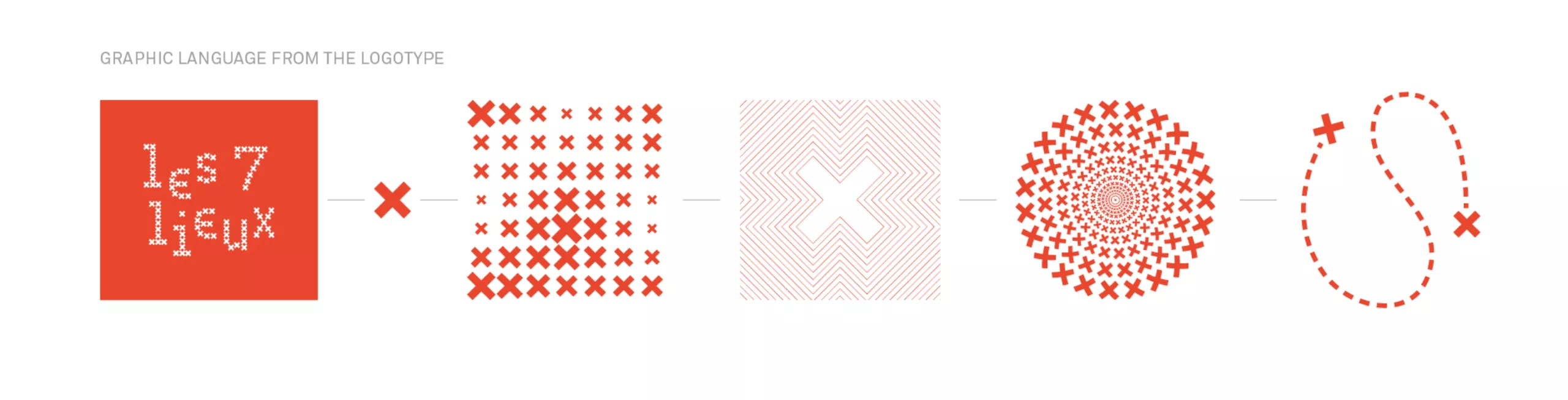
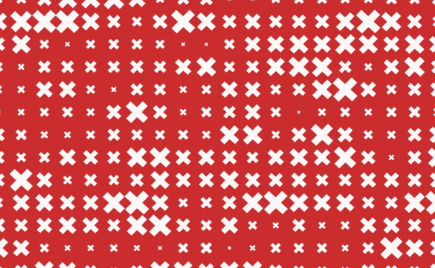
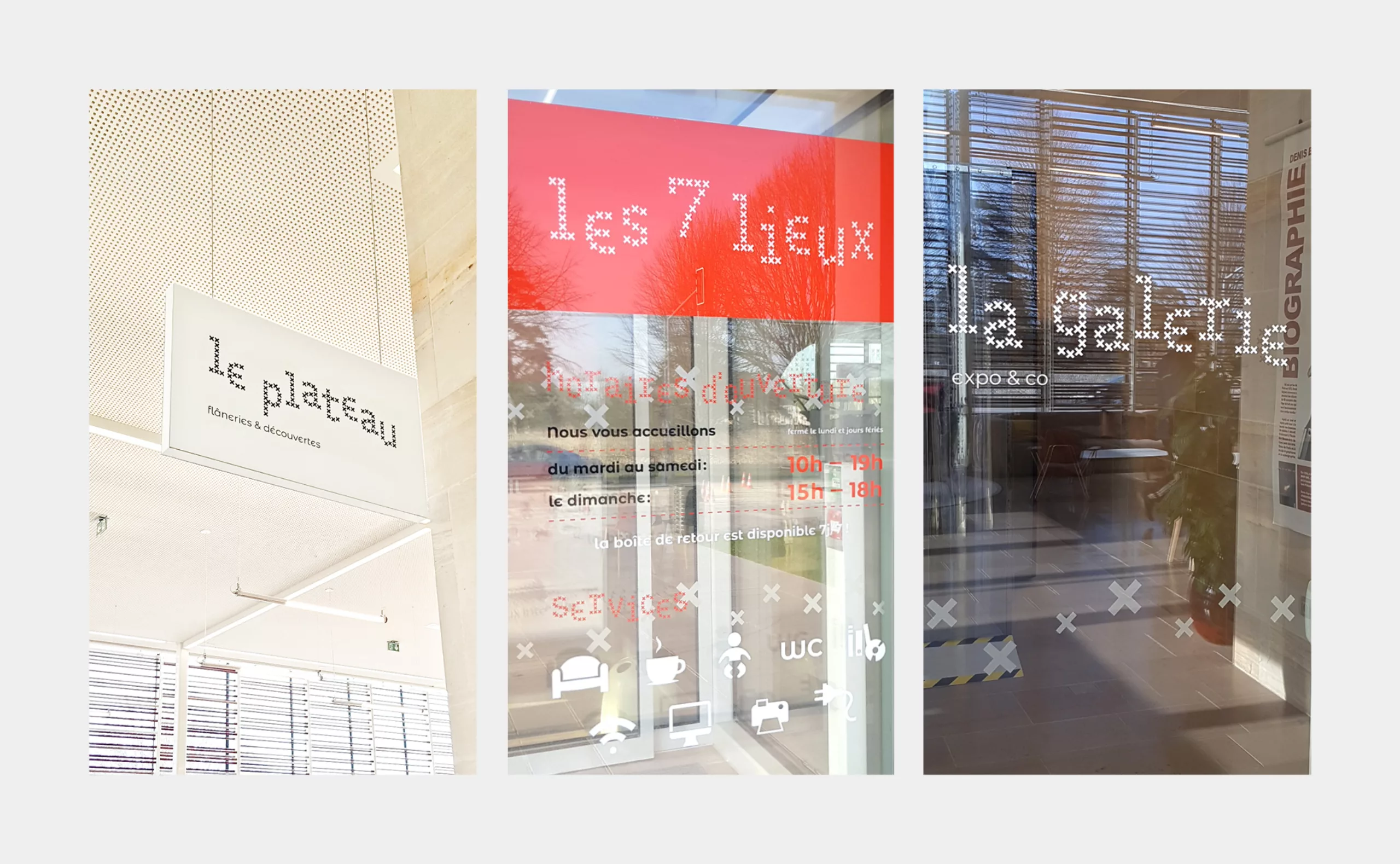
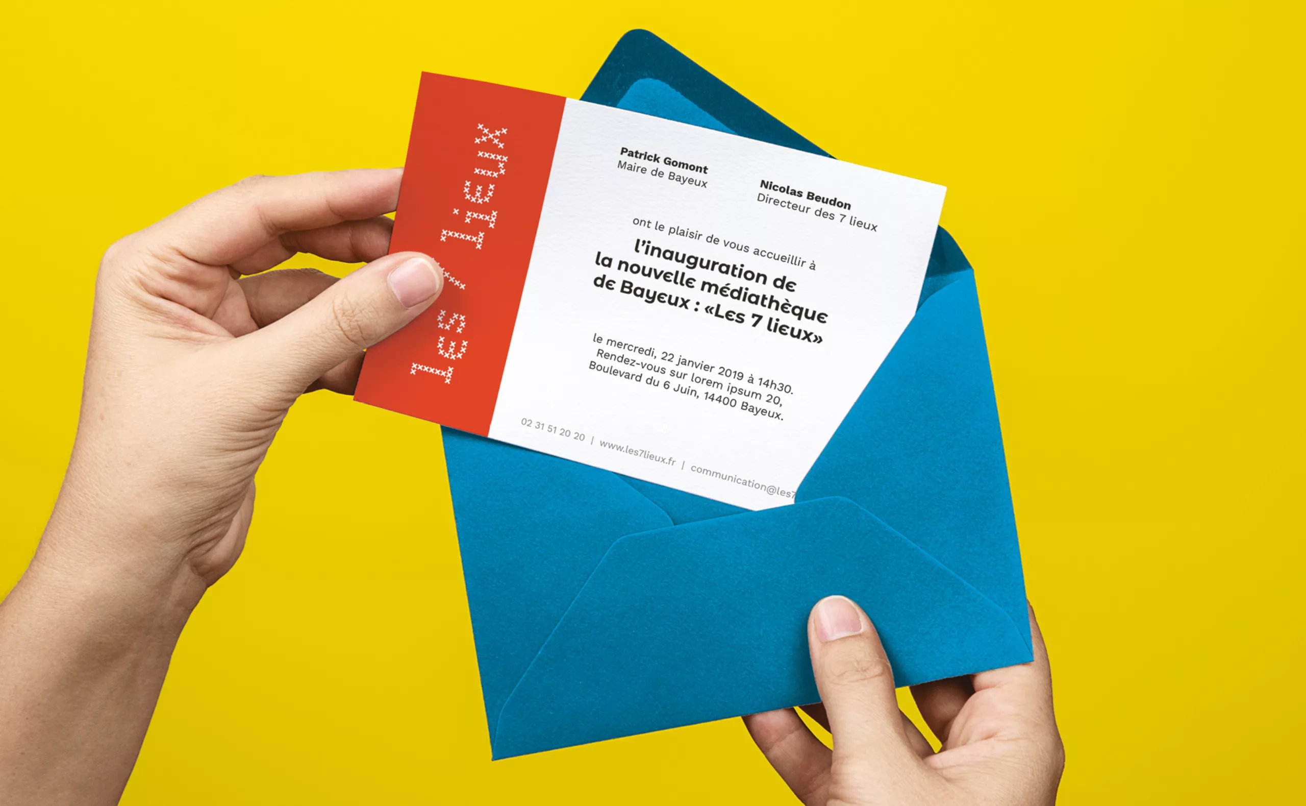
X marks the spot!

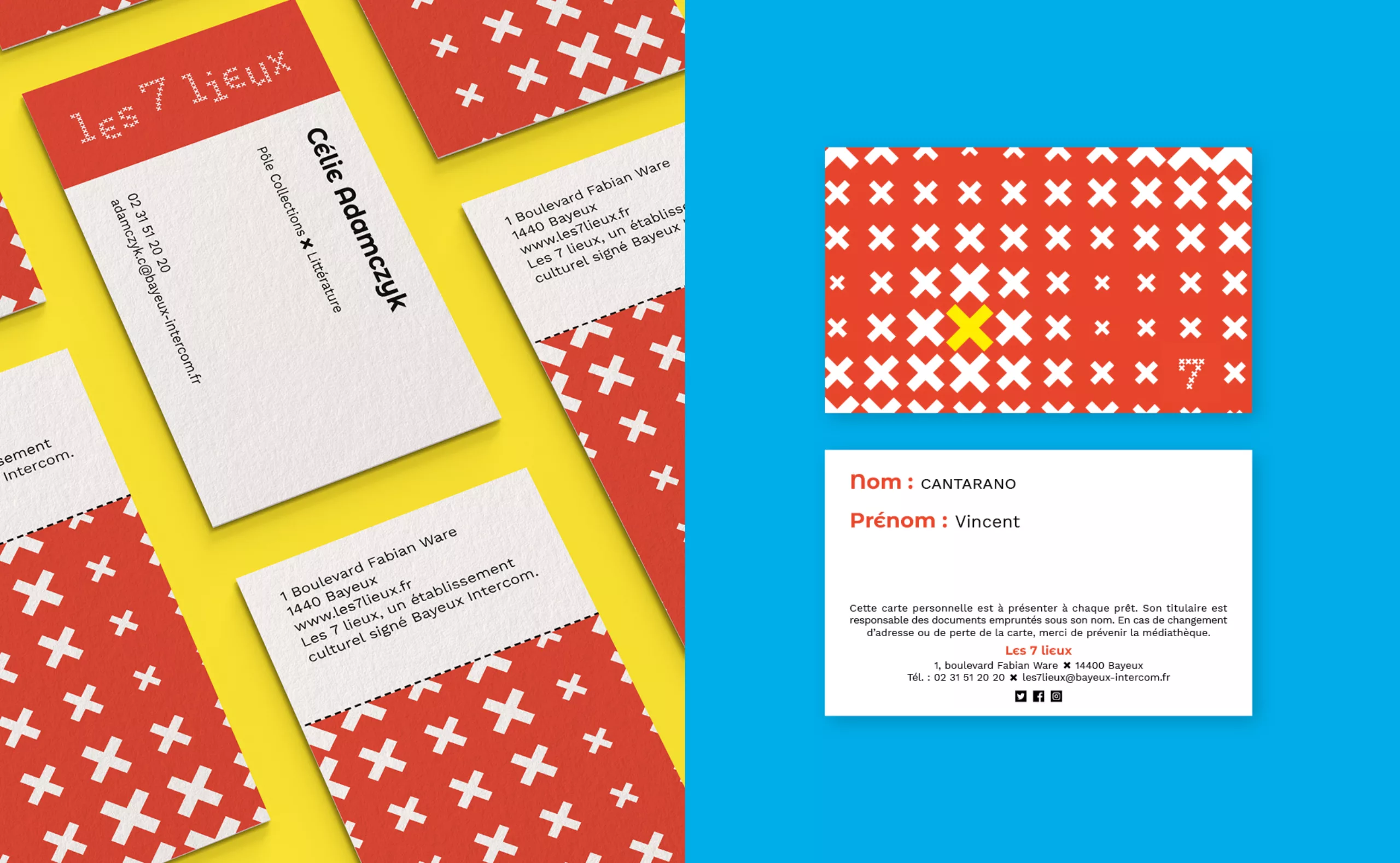
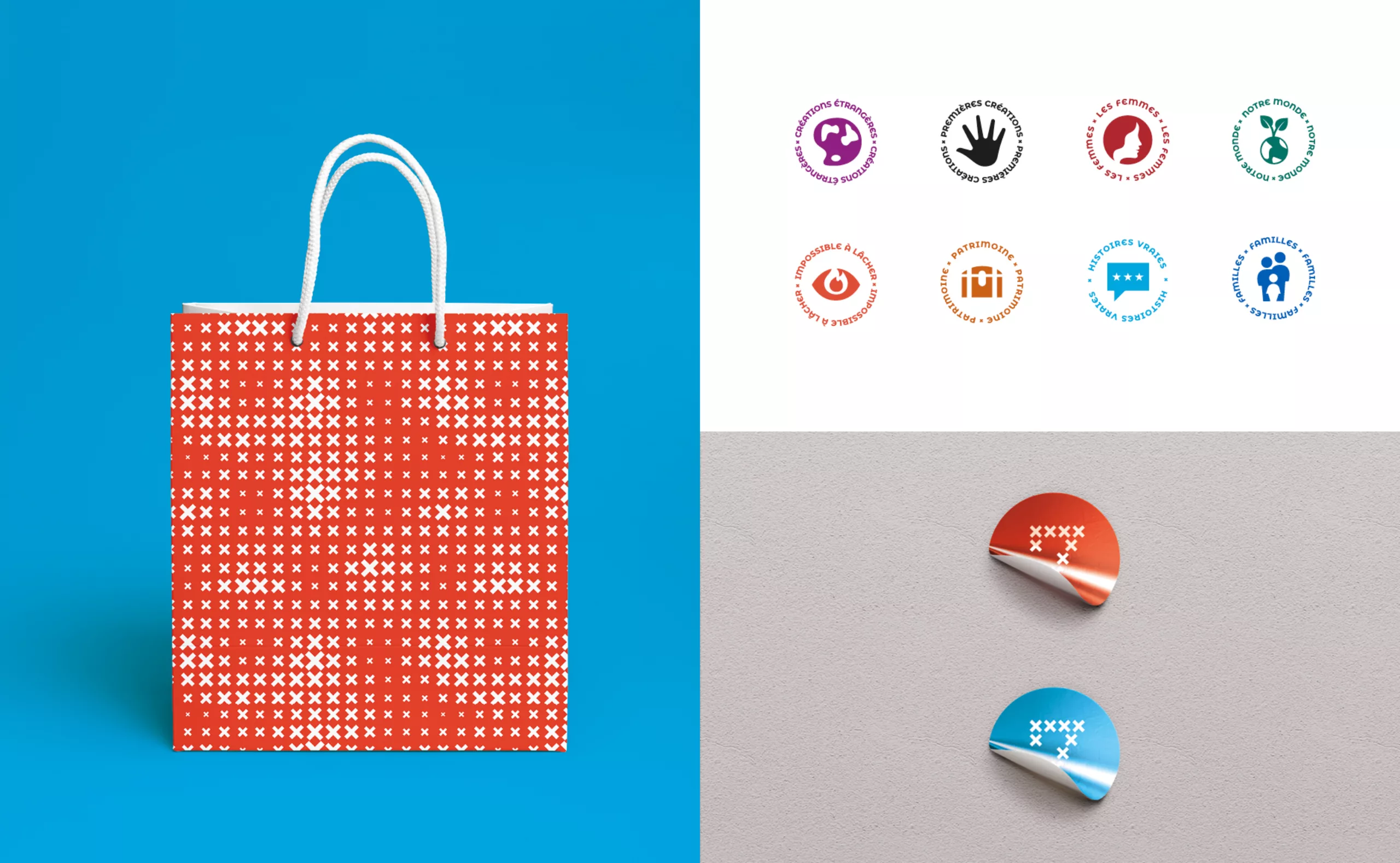
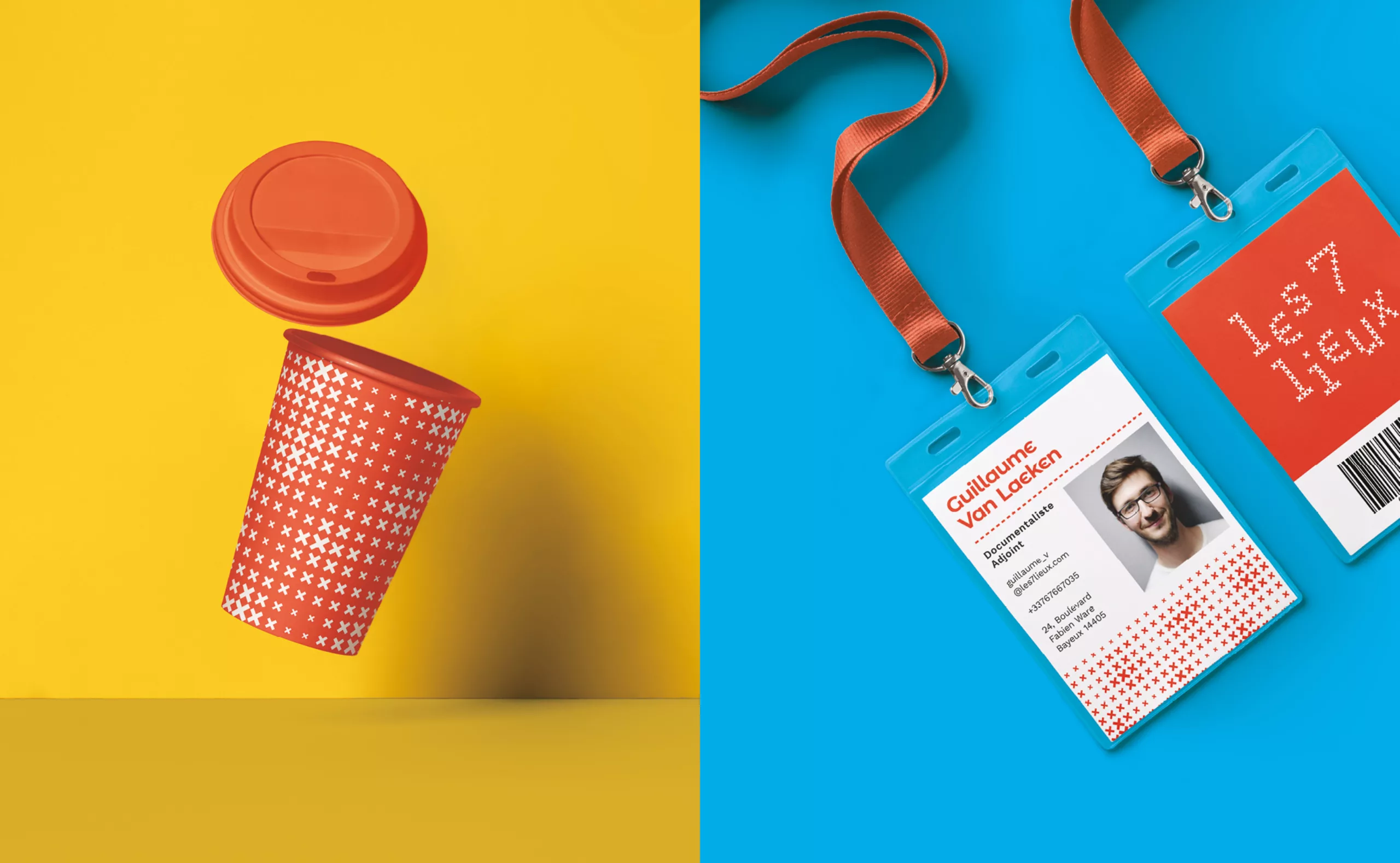
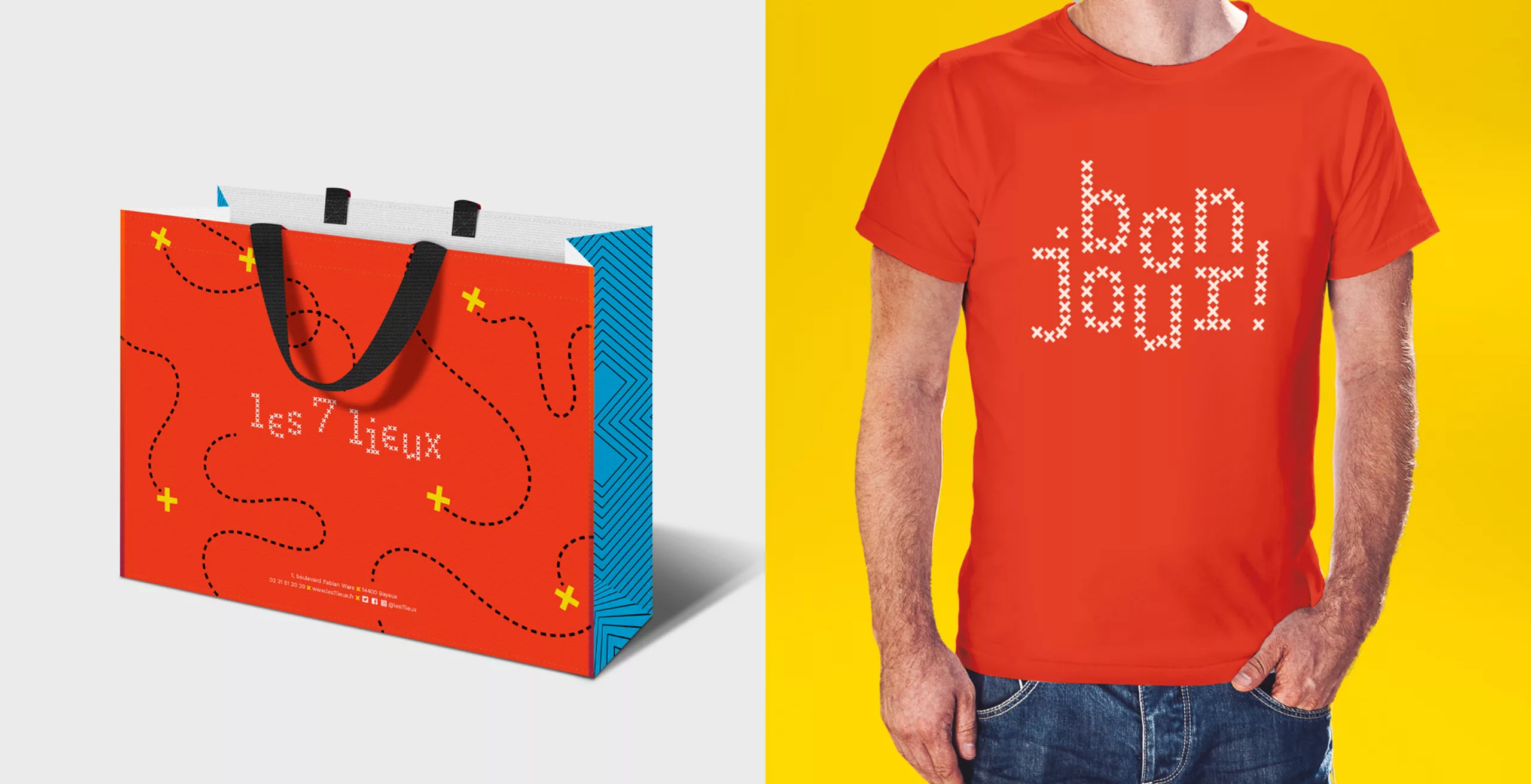
To represent the intersection of creativity, heritage, collaboration and DIY that makes up the vision of Les 7 Lieux, we chose ‘X’ as the leitmotif for the identity. The chosen symbol has several connotations in the context of the project:

Discovery - The x that marks the location of the hidden treasure on a treasure map
Meeting - An intersection of ideas, people, crossroads
Heritage - Cross-like forms in the traditional timber framed houses of Bayeux, the x in the coat of arms of Bayeux
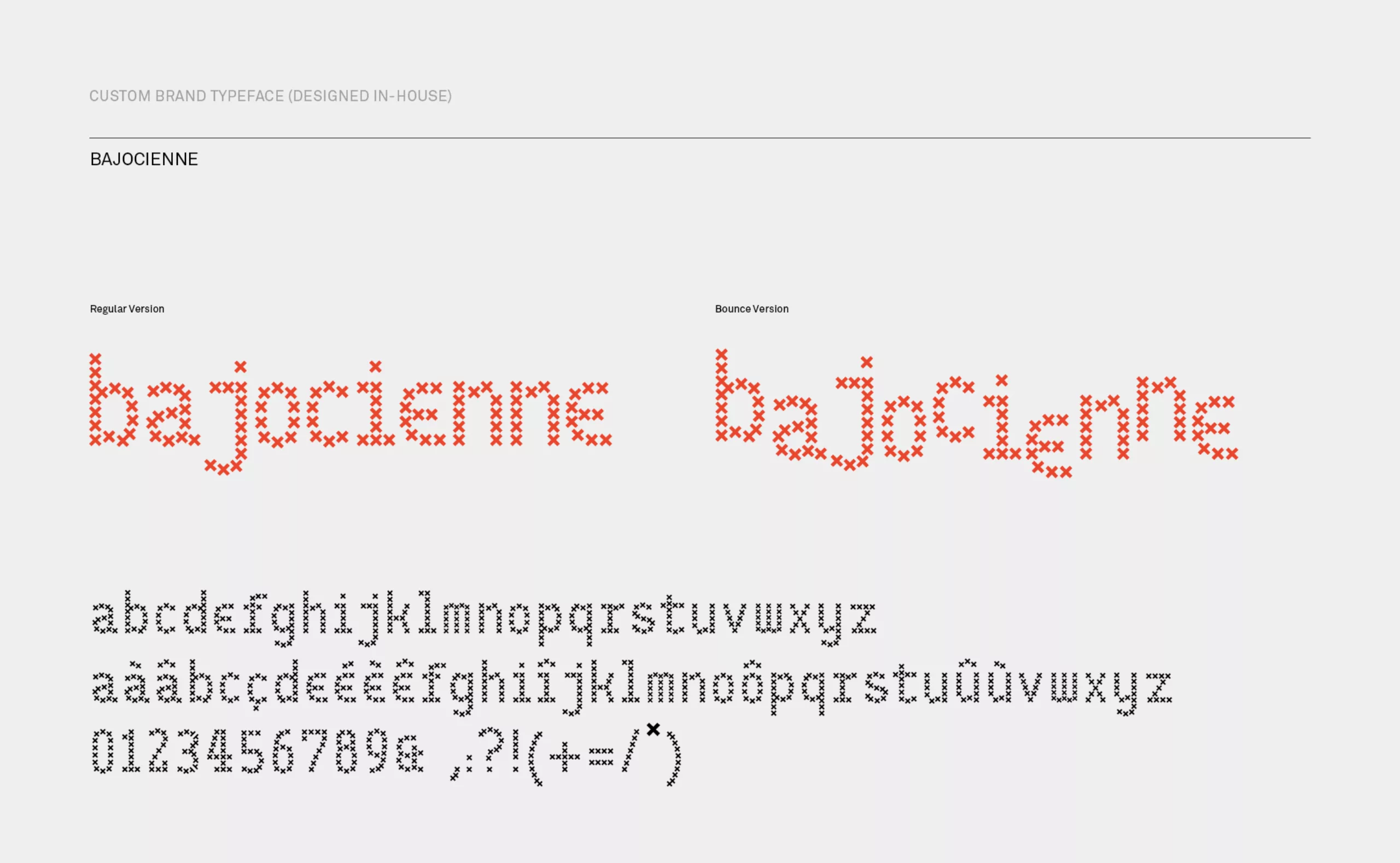
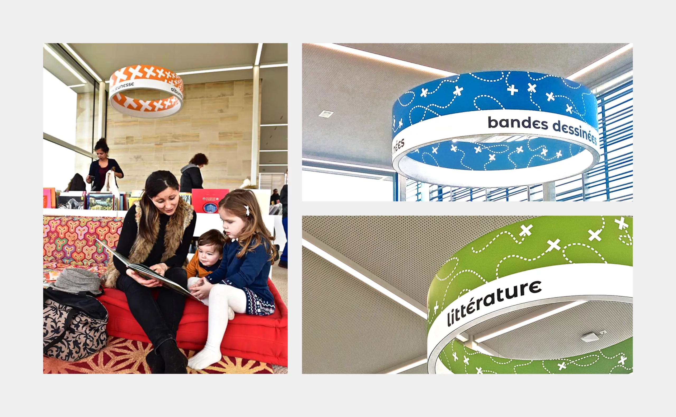
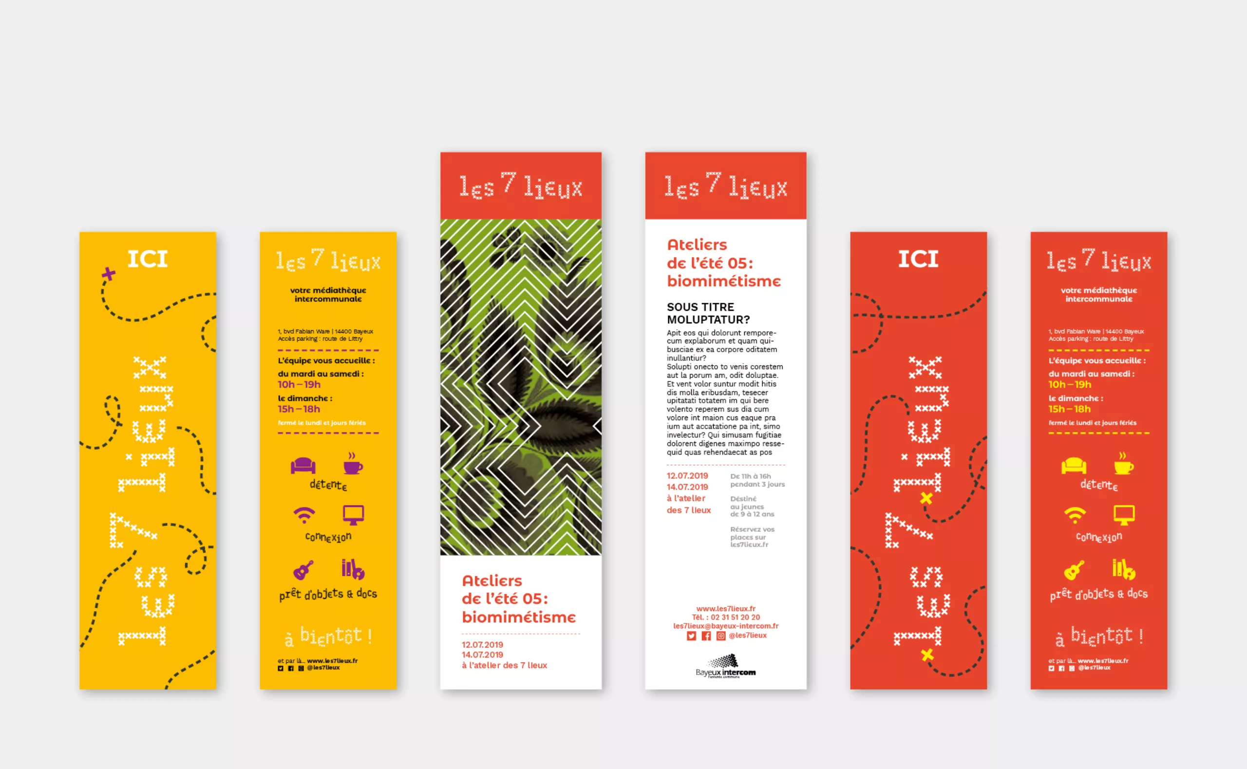
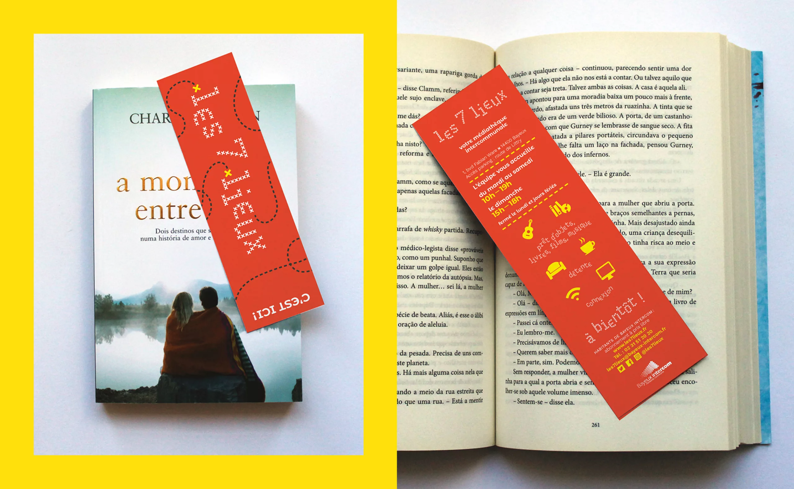
Creativity - The ‘x’ made by the Bayeux stitch pattern

This X motif is further contextualised by a dashed line which could represent, among other things, a path on a map, a stitched thread or an origami folding line. These two motifs form the base for all the playful extensions of the identity.
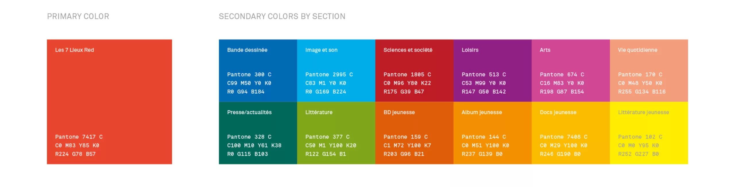
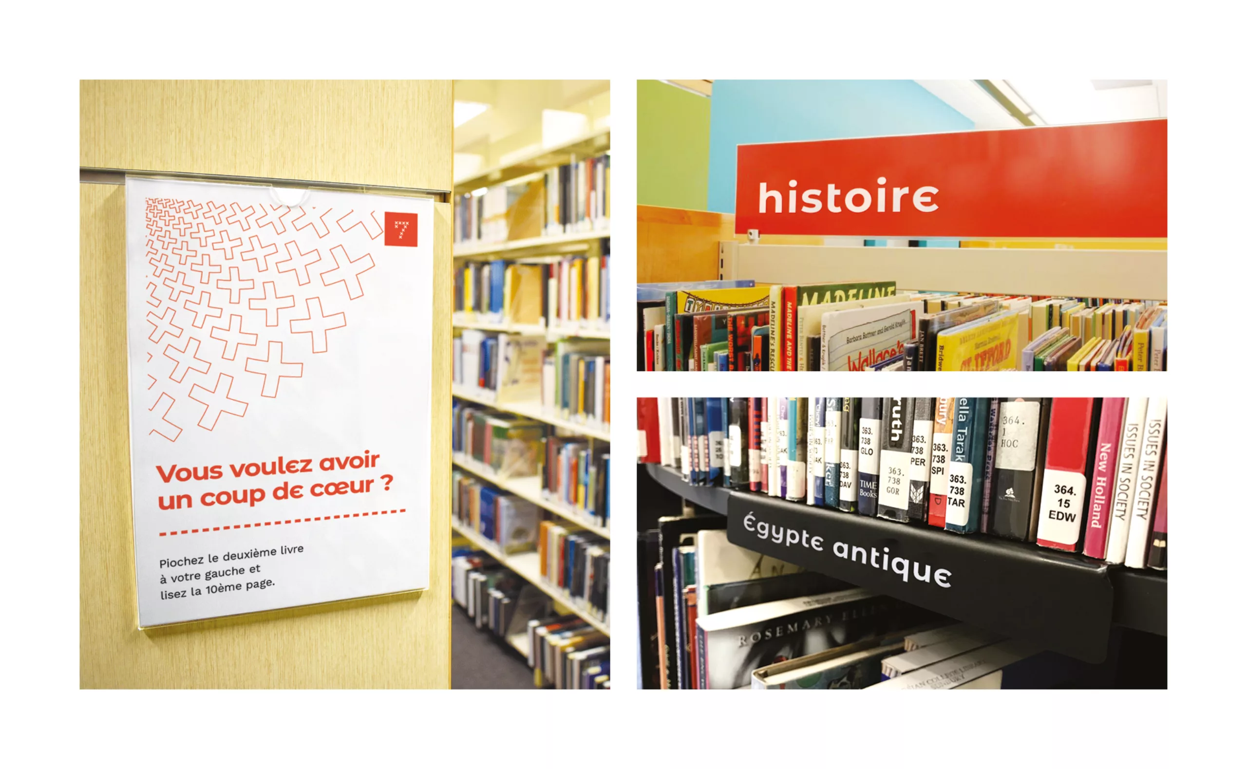
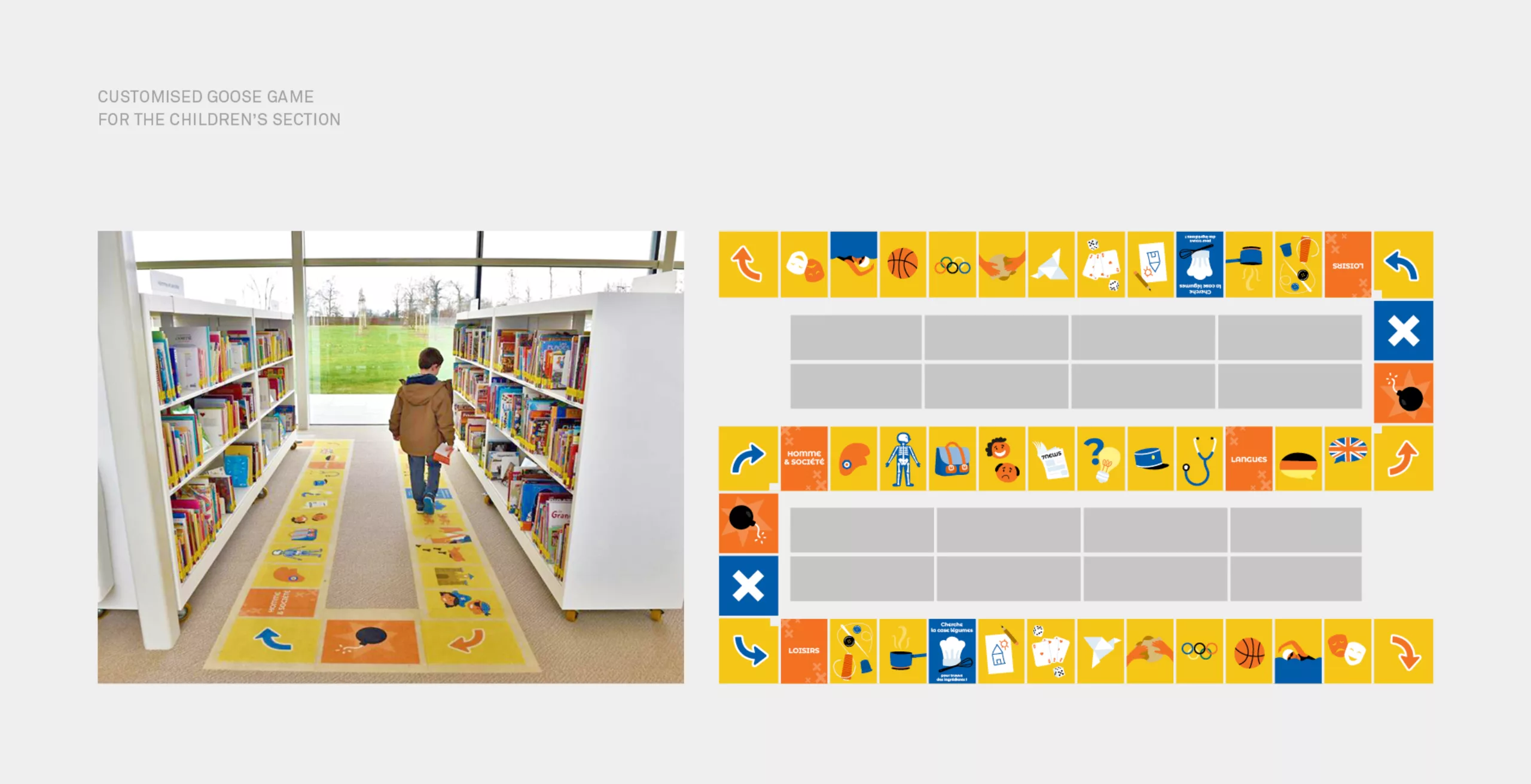
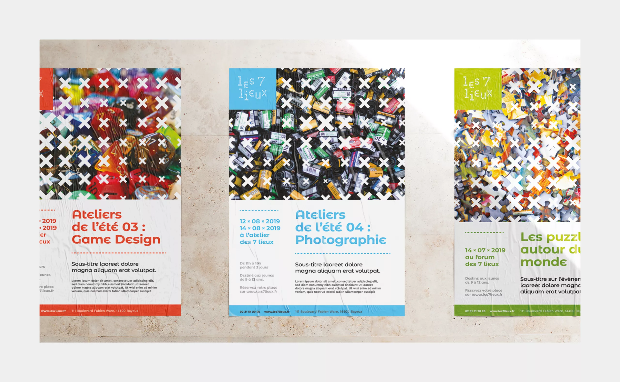
 

Brand Colors

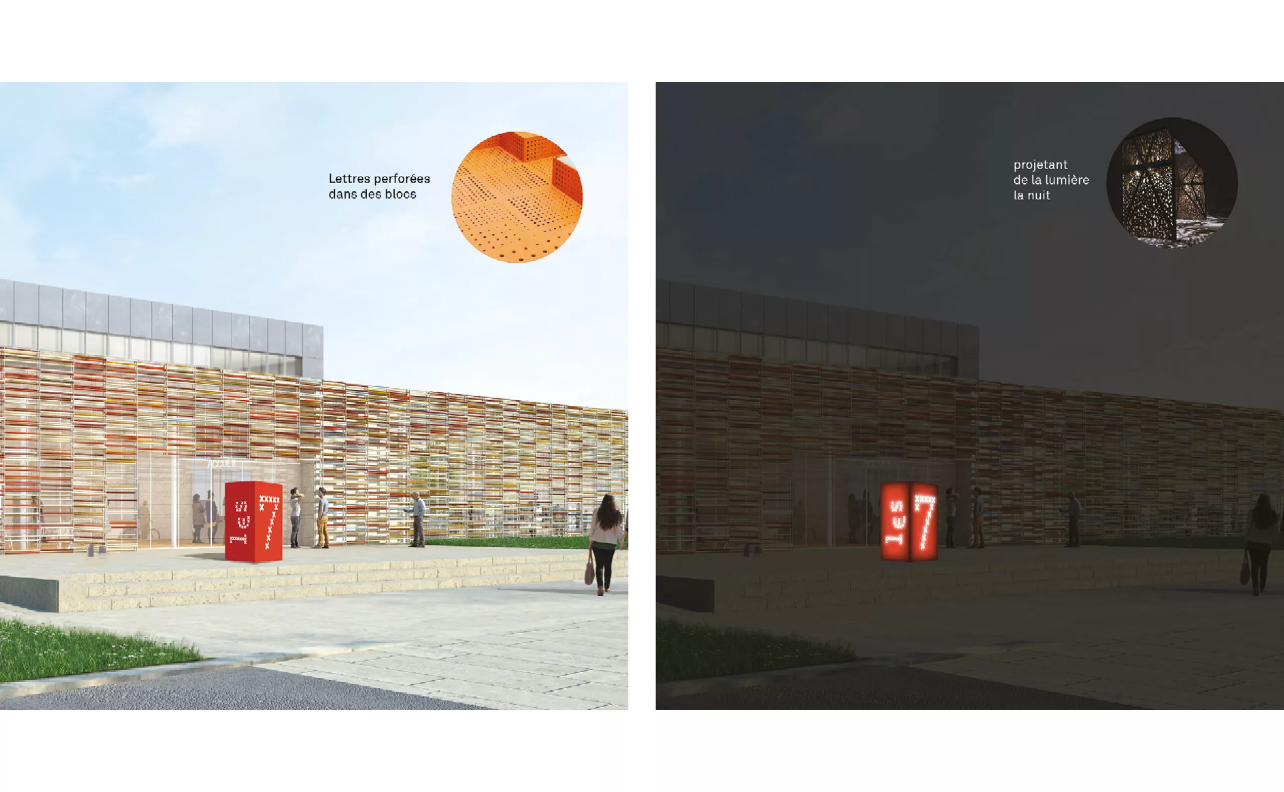
Taking inspiration from the red present in Bayeux’s coat of arms, the Bayeux tapestry and Les 7 Lieux’s facade, we chose a vermillion red as the primary color for the brand. To fulfil the need for differentiating the sections of the library, we created an extended color palette that identifies the different sections with groupings based on the proximity of the subjects. 

Bajocienne - Playful letters meet the Bayeux stitch

Extending the ‘x’ motif, we used it to design and develop a custom brand typeface- Bajocienne. The forms of the letters composed with x’s give them an embroidered texture - a reference to the tapestry. Furthermore, using Opentype variable features, we coded the font to have a normal version and a more playful ‘dancing’ version. In the latter, the font glyphs offset themselves automatically and in a random order. This adds a playful flavour to the type while also hinting at the offset letters in the main logo.

Bajocienne is designed to be used as a display typeface, mostly intended for signage and merchandise.

Type with a distinctive єdgє

To push further the uniqueness of the identity - we borrowed an alternative form of the letter ‘e’, found on the Bayeux tapestry as well as in the Caroline minuscule calligraphy style, which was prevalent around the same time.
We integrated this modified ‘e’ into the secondary typeface so as to create immediate recognizability for the brand. The modified typeface ensures the identity gets conveyed even without the logo.

Une nouvelle vision, un espace innovant

In keeping with their vision, the new library includes dedicated spaces for exhibitions, co-working and performances. It also allows its members to borrow not only books, but other media and objects such as sewing machines, cameras and musical instruments!

To respond to this innovative vision, we designed a myriad of touchpoints using the identity elements as our playground. These touchpoints included illustrations for a customised goose game in the children’s section, lettering for the café area, a totem sign on the courtyard and a variety of merchandise.

Acknowledgements

Thanks to Eva Garrouste and Nicolas Beudon, as well as to the entire Bayeux Intercom communication team for their trust throughout the project. Thanks to Serero Architects for their support. Thanks to Ajitesh Lokhande for the impressive final thesis he wrote with this project.

Context of the project:

Les 7 lieux is a hybrid space, at the same time a place for leisure and study, meeting and culture, where the memory of the past and the most up-to-date technologies intersect. The visual identity was to make it possible to create the logo of the place, as well as the signage of the seven different living spaces that the project contains.

Objectives and deliverables :

The graphic charter is a toolbox built around two strong and fun typeface choices. These are flexible elements designed to ease their reappropriation by the teams ensuring the communication of the "Les 7 Lieux".


Share this project:
Project expertise:
Logo creation, visual identity and graphic guidelines. Signage design. Typographic design.
Type of client:
Cultural communication agency for theaters, concert halls, festivals, dramatic and choreographic companies. Heritage, museums & cultural spaces.

Related projects: