Fontevraud_MAM_Case Study

2020

Visual identity of Fontevraud Museum of Modern Art - Martine & Léon Cligman Collection,
Graphéine goes back to Fontevraud

What a pleasure it is, 5 years later, to revisit the site of a project that has been a milestone in Graphéine’s history.
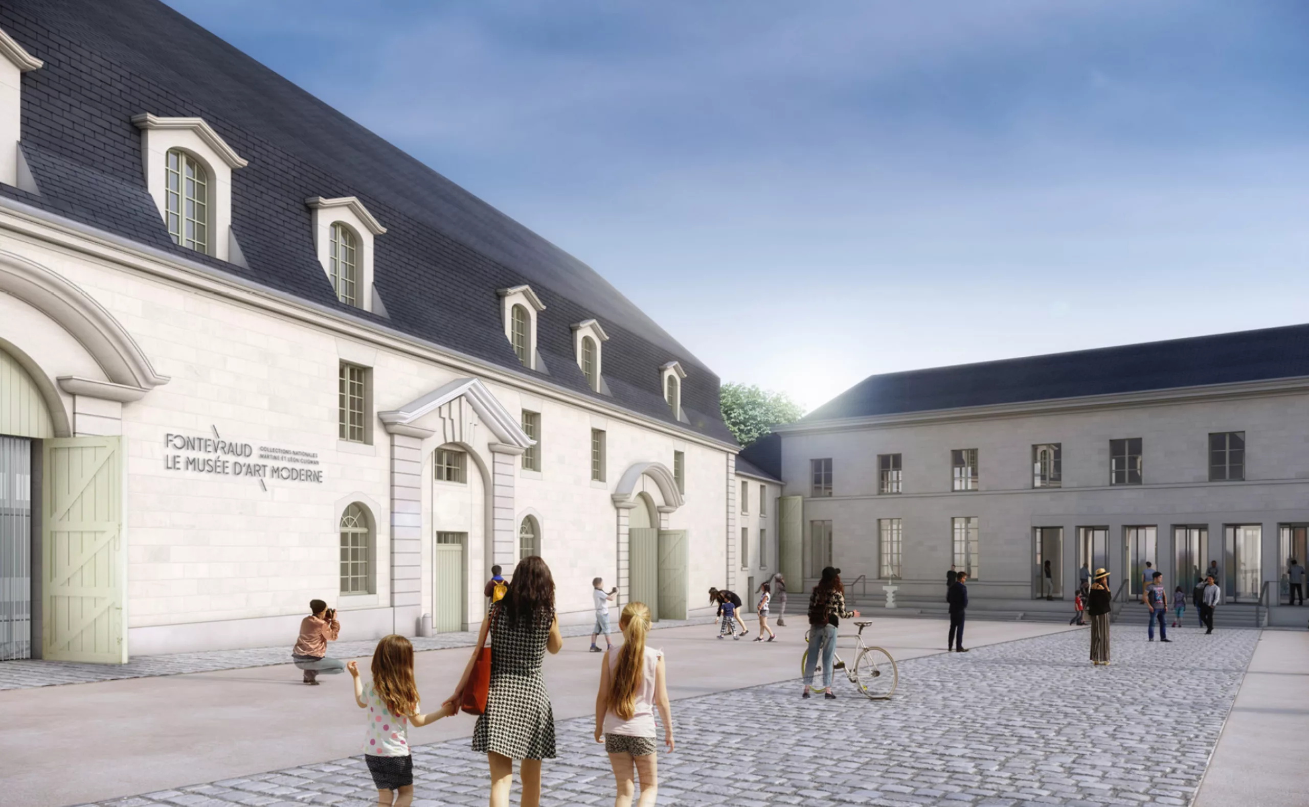
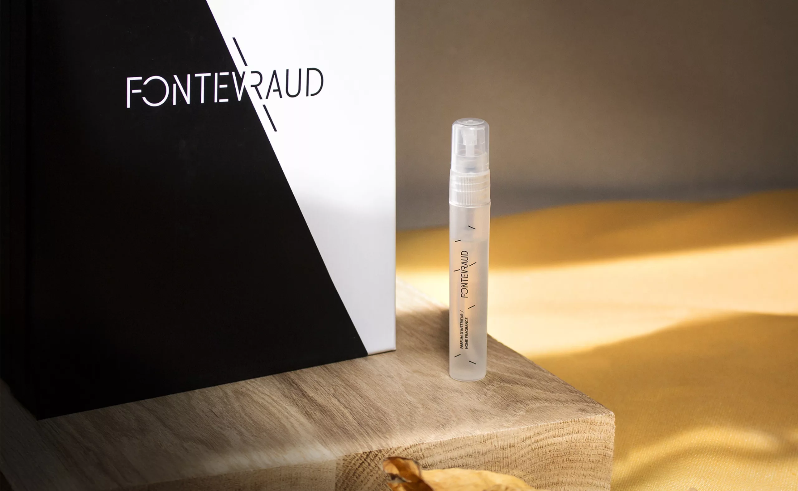
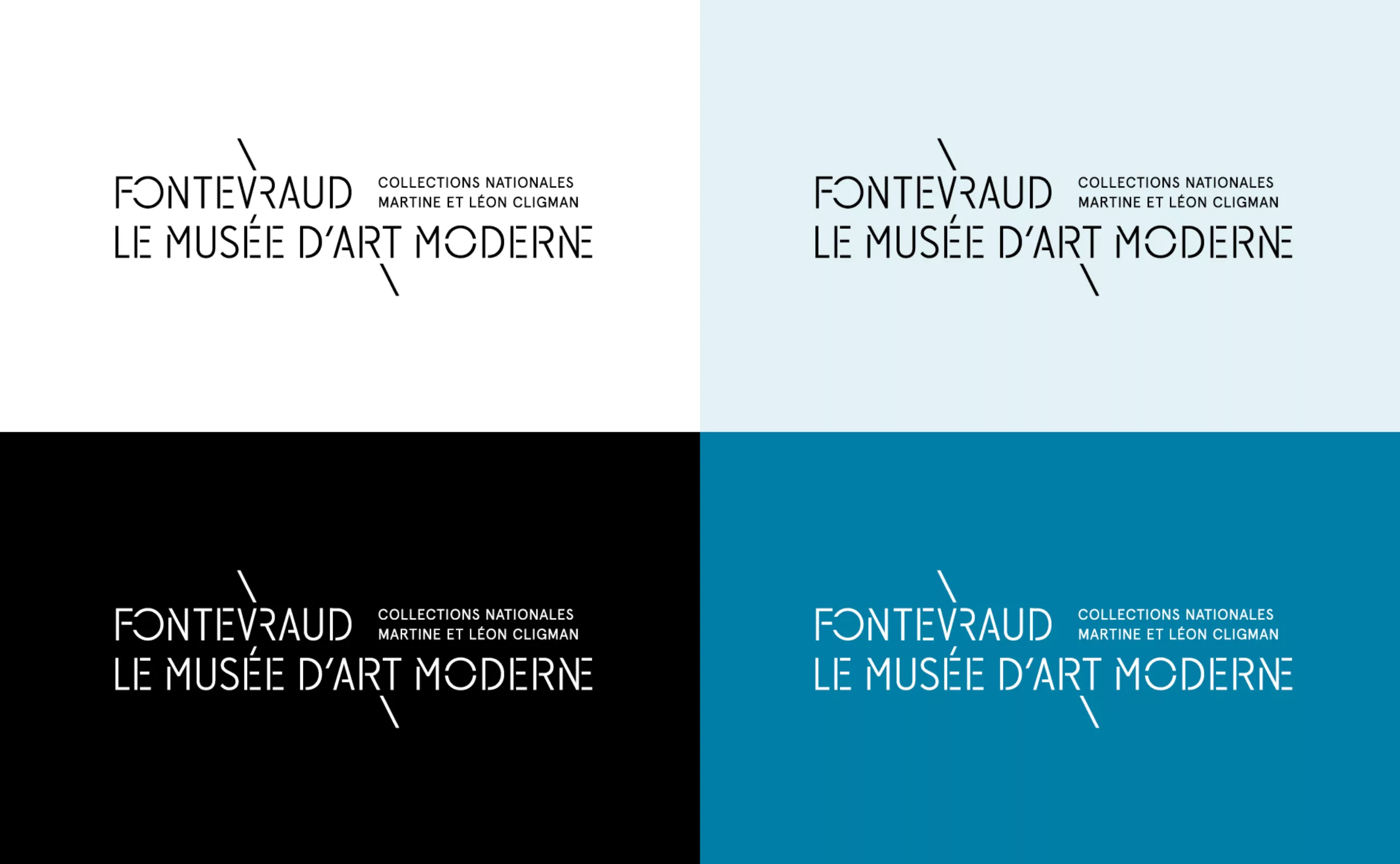
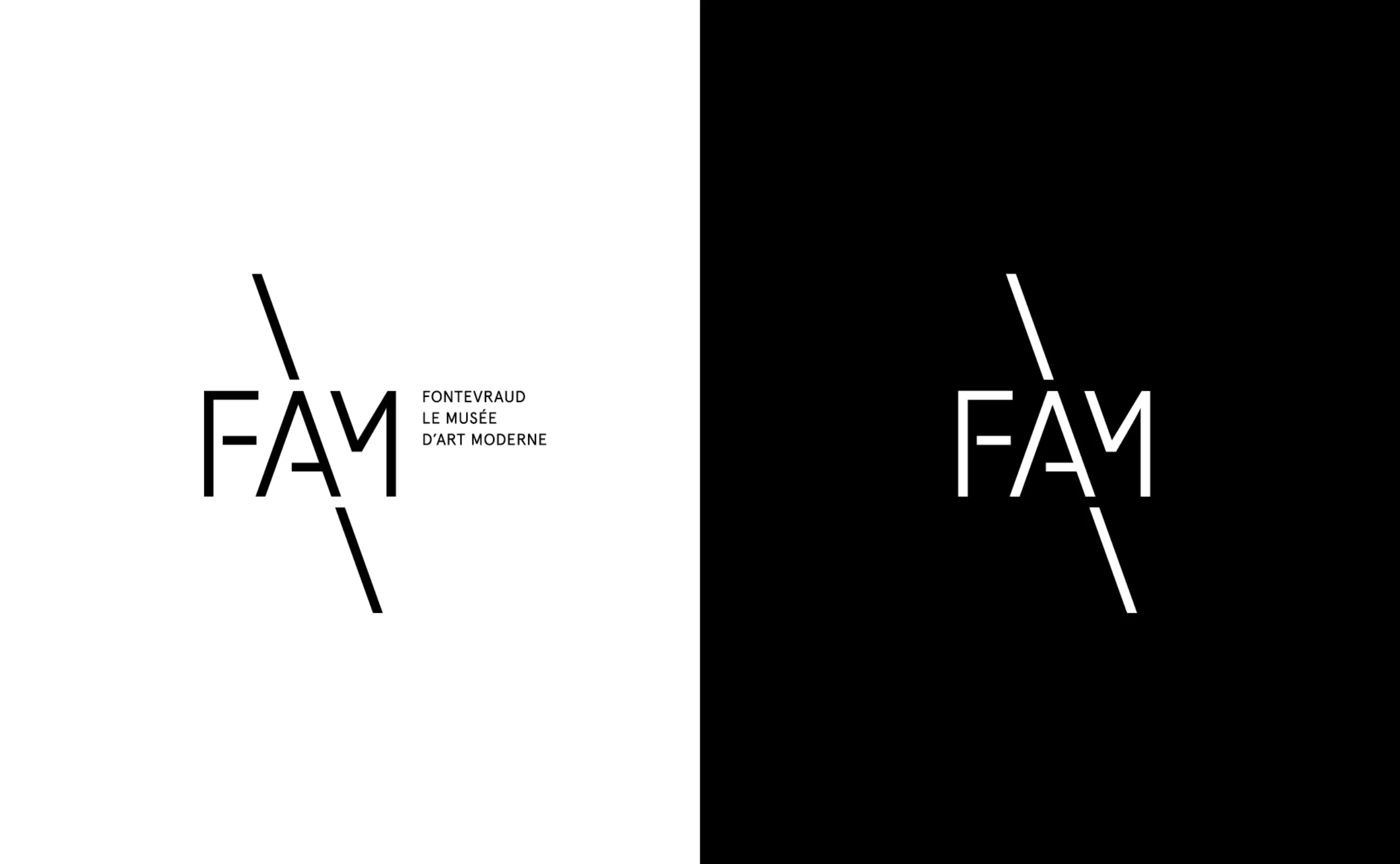
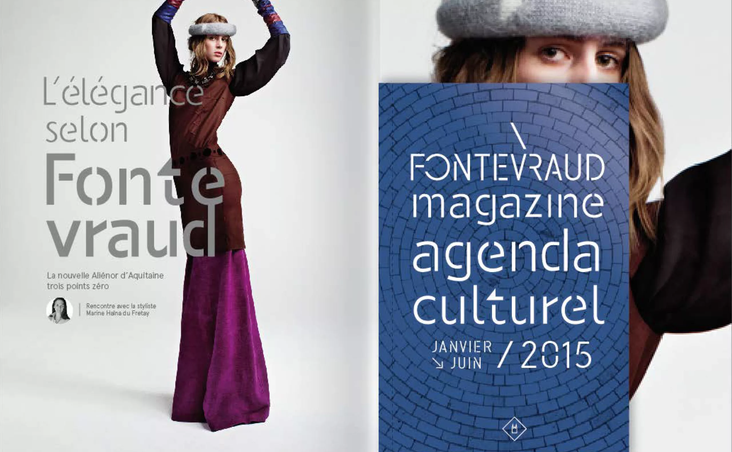
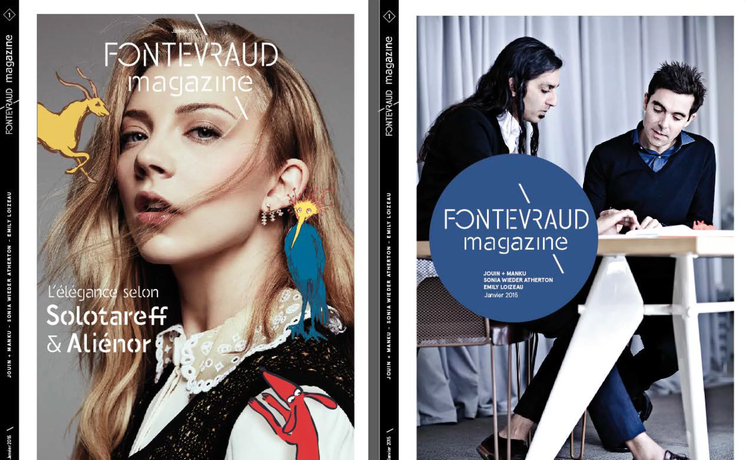
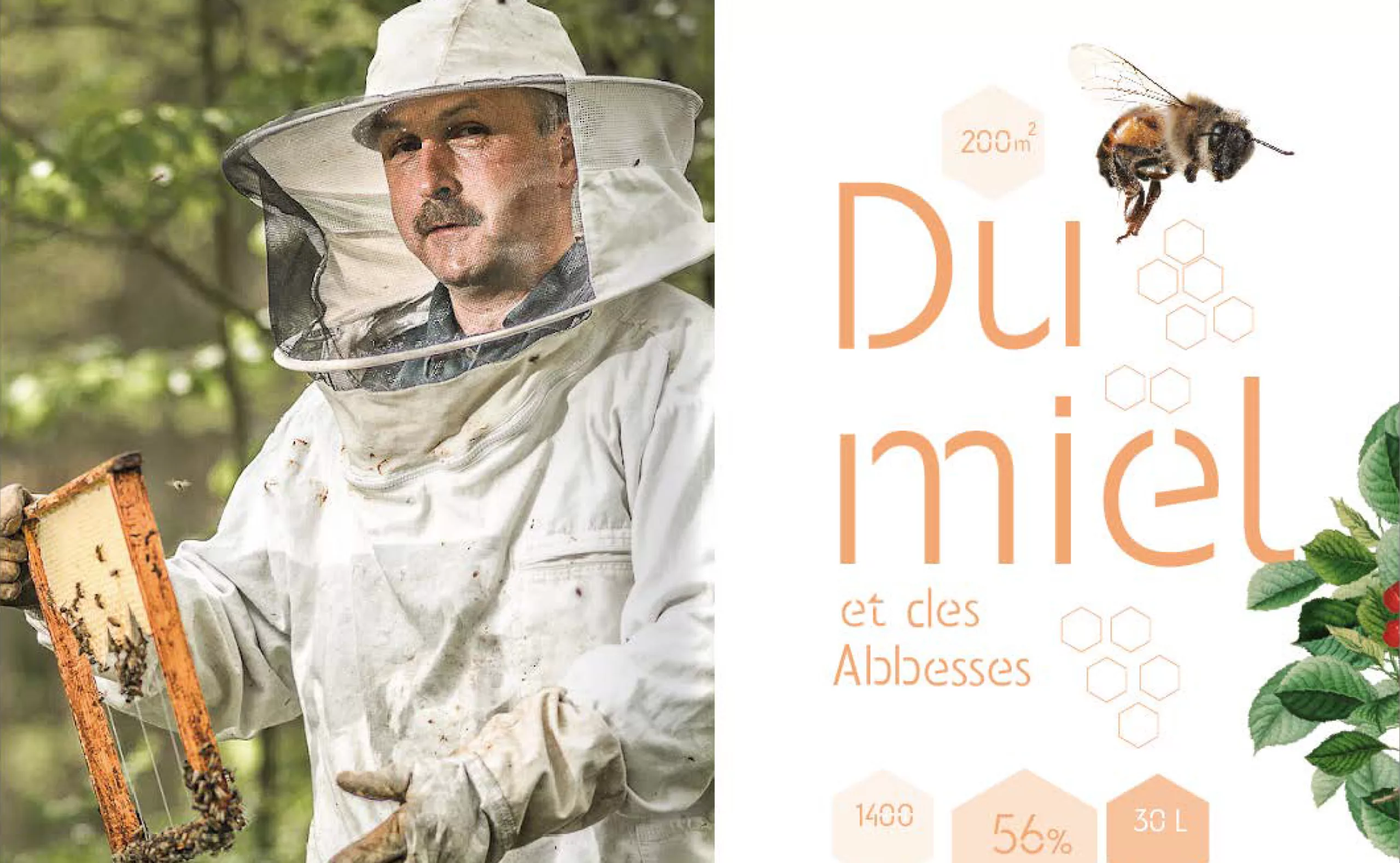
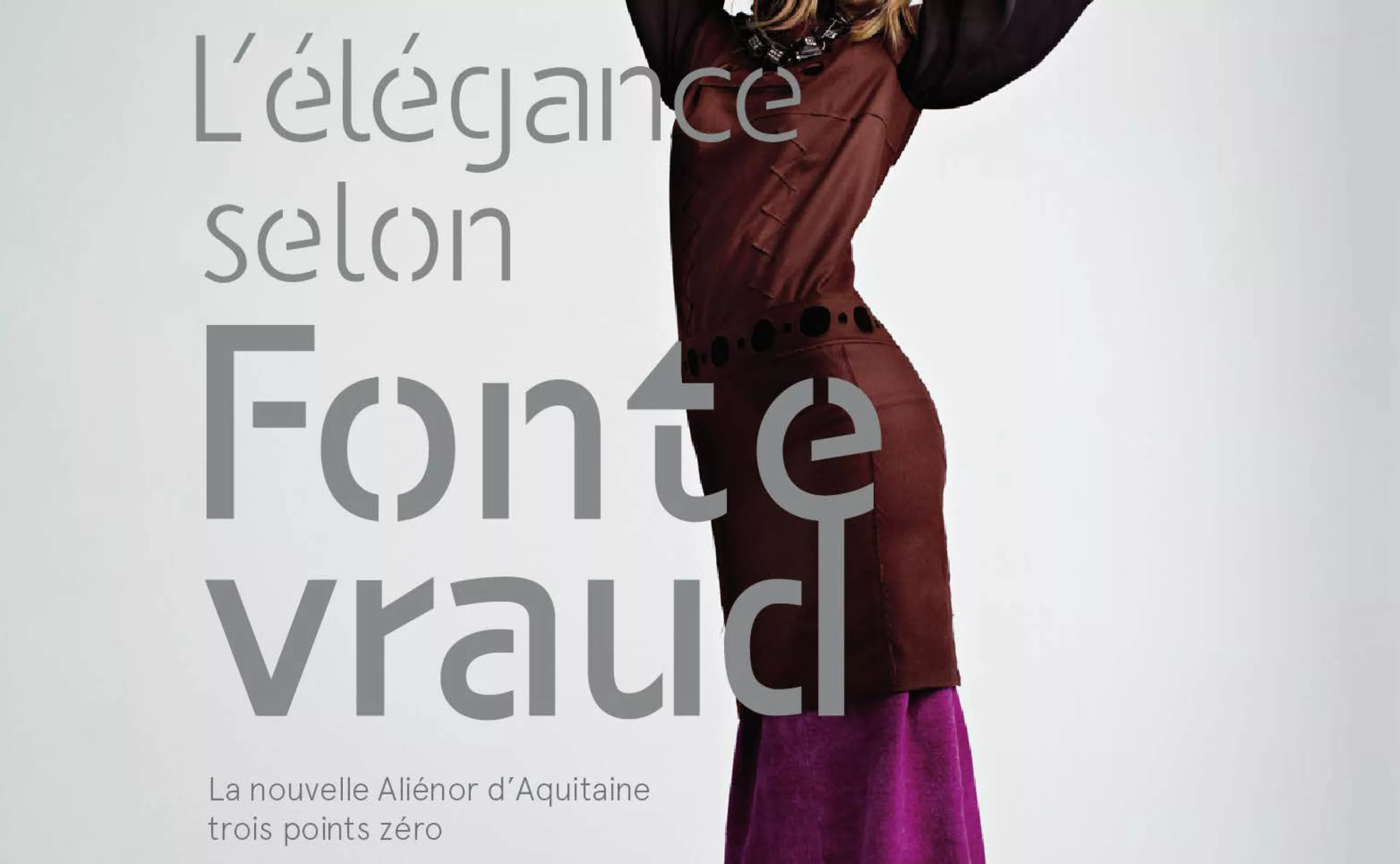
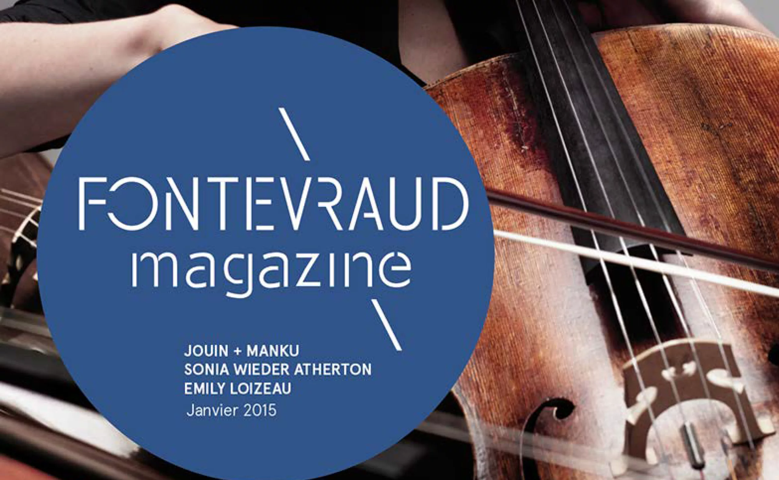
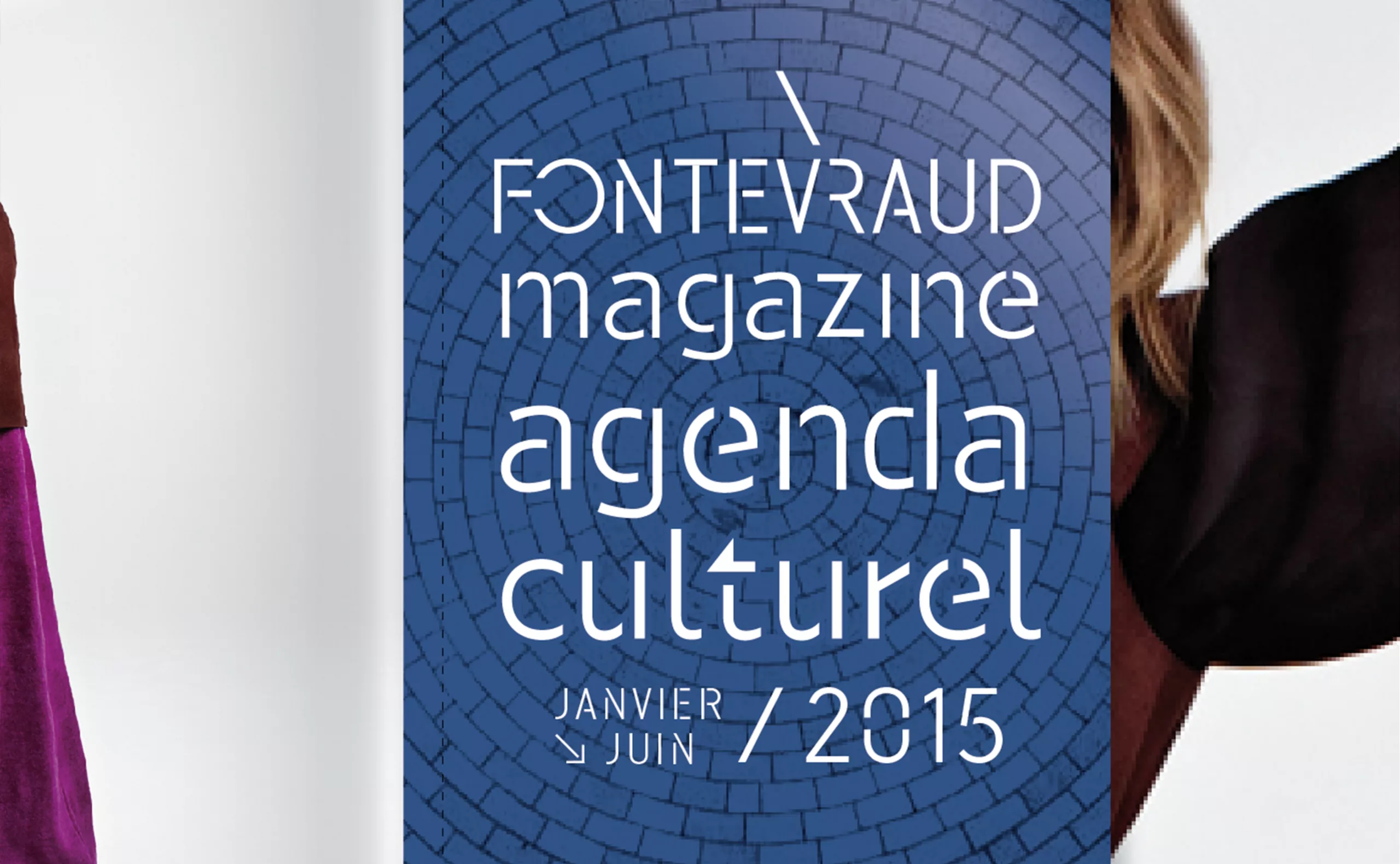
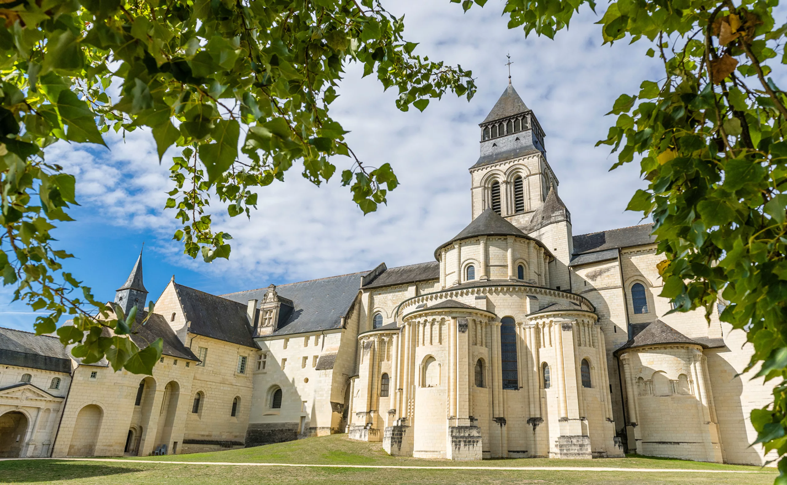
One of the largest abbeys in Europe and a holistic visual identity project, Fontevraud lies at the crossroads of history, France & England, territorial geography, artistic creation, culture and tourism.
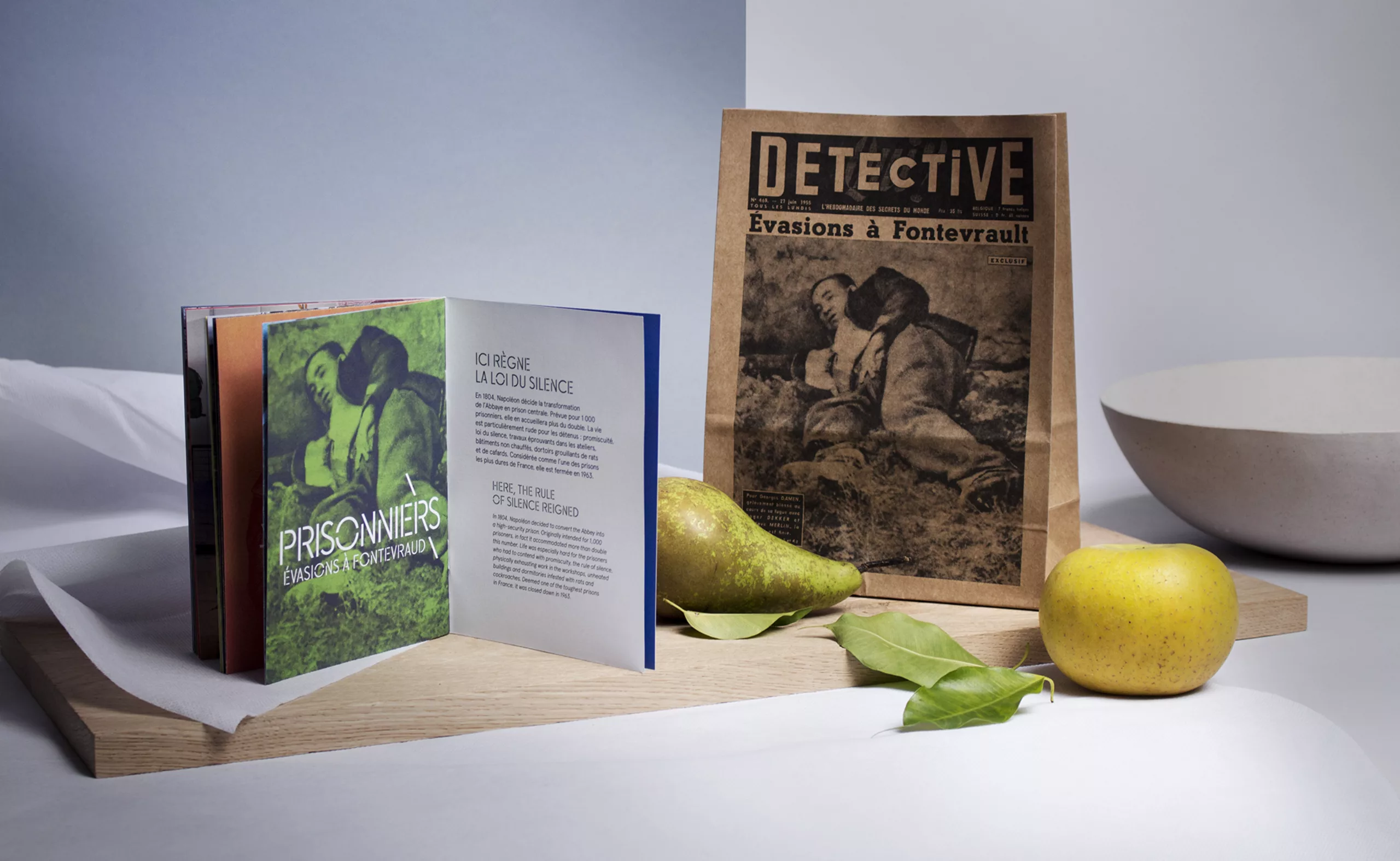
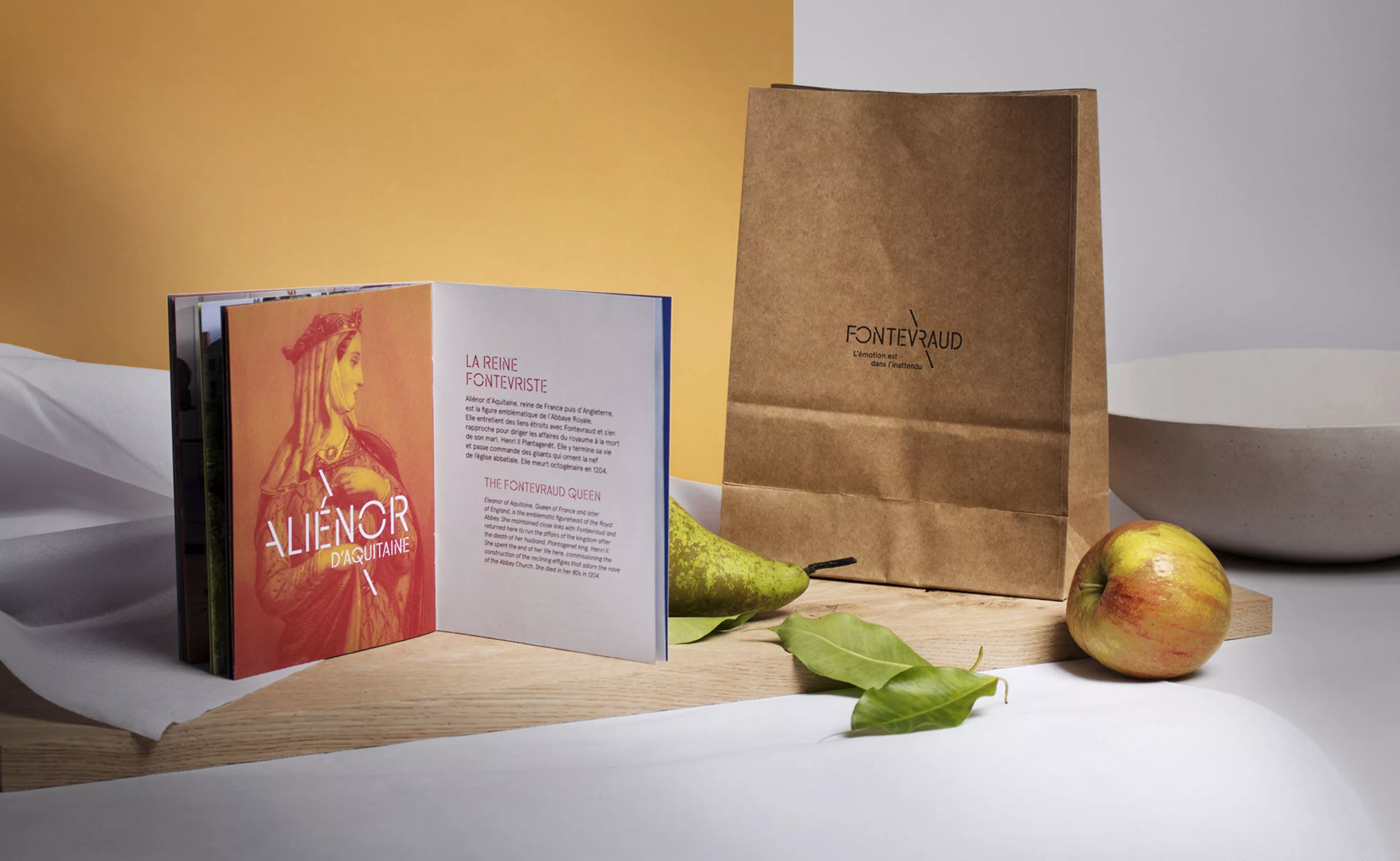
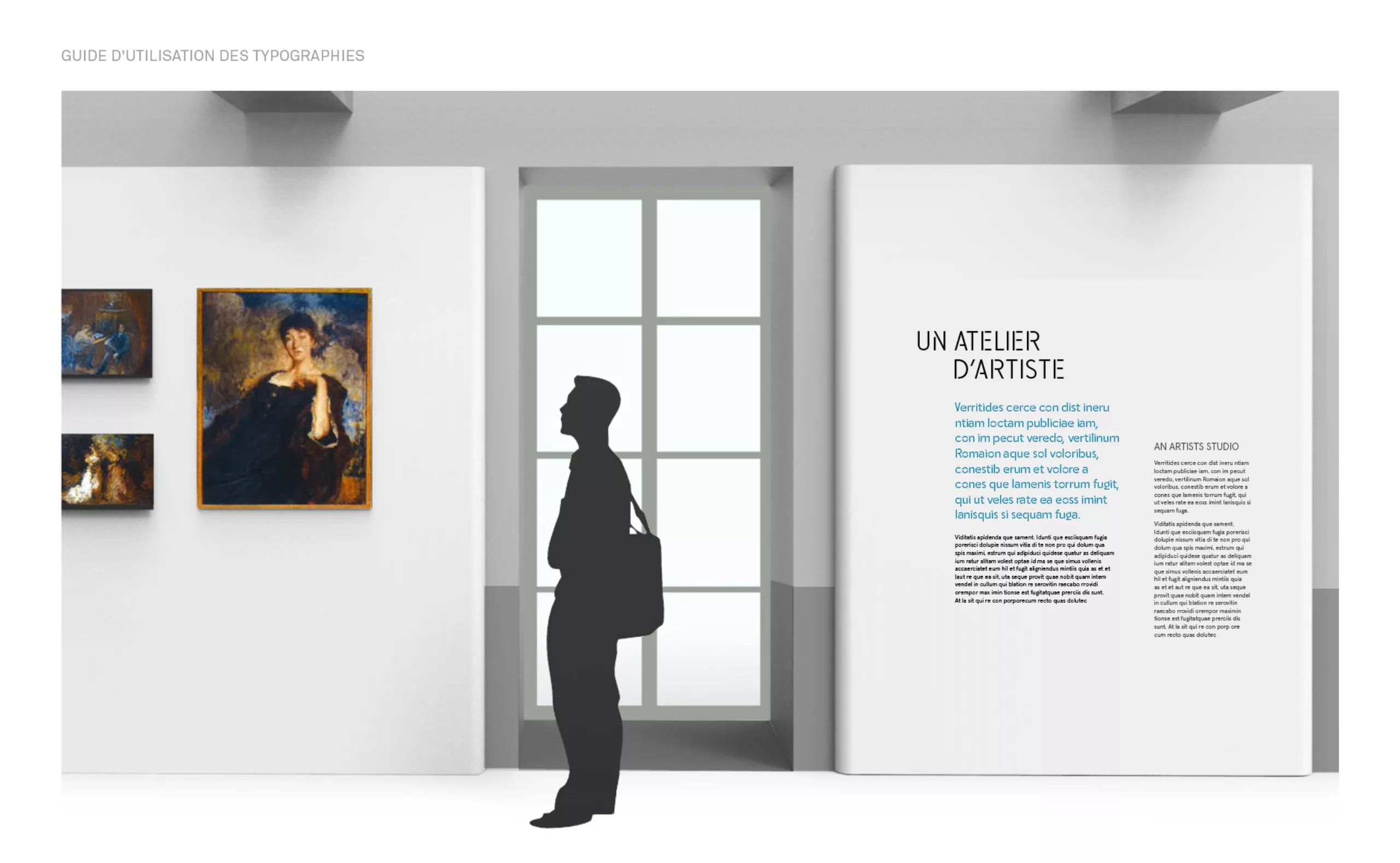
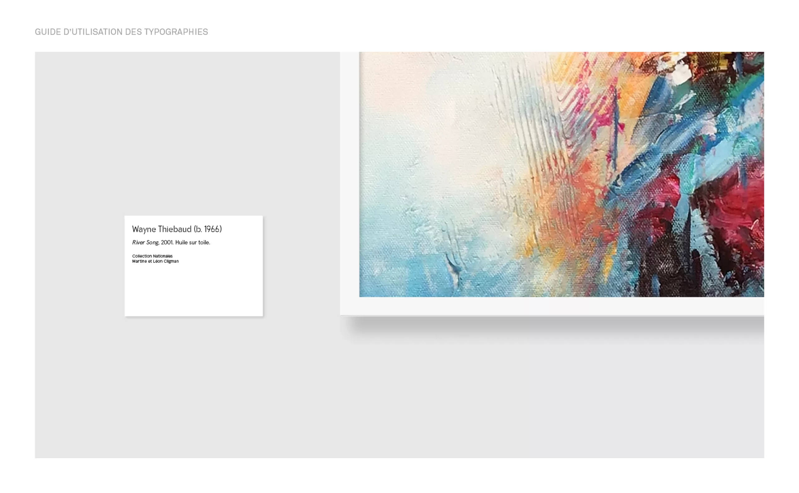
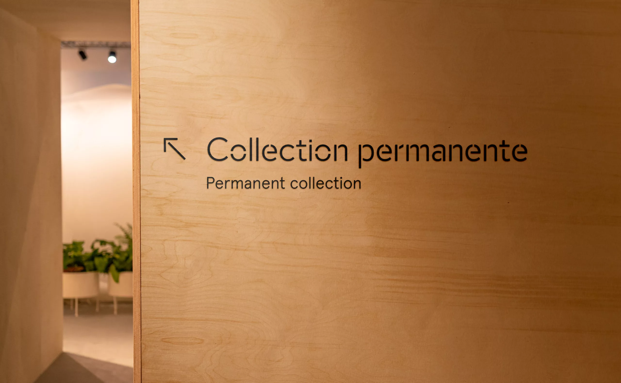
A living historical site, which is now a benchmark in heritage enhancement, visitor reception, ecology and the use of digital technology.

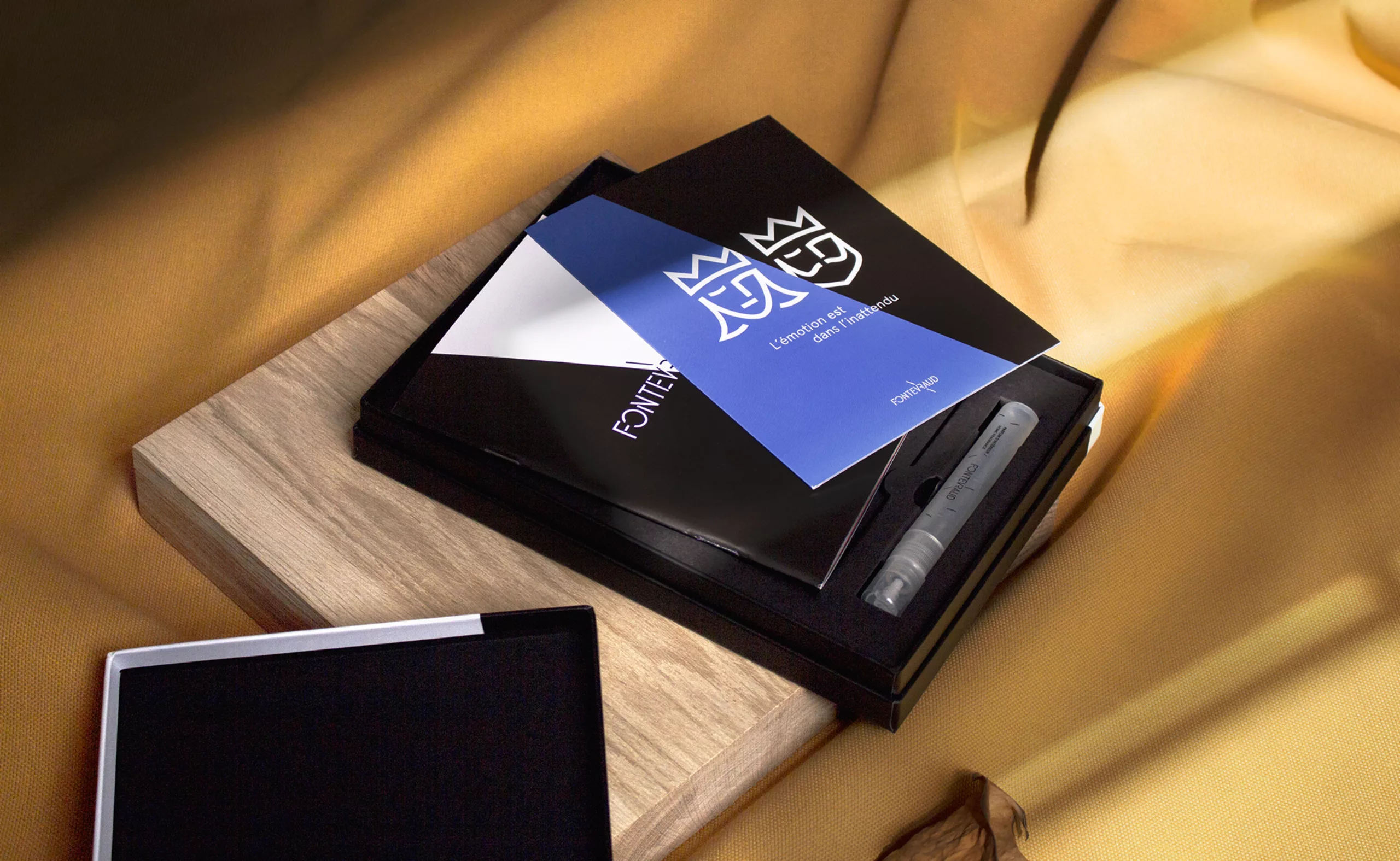
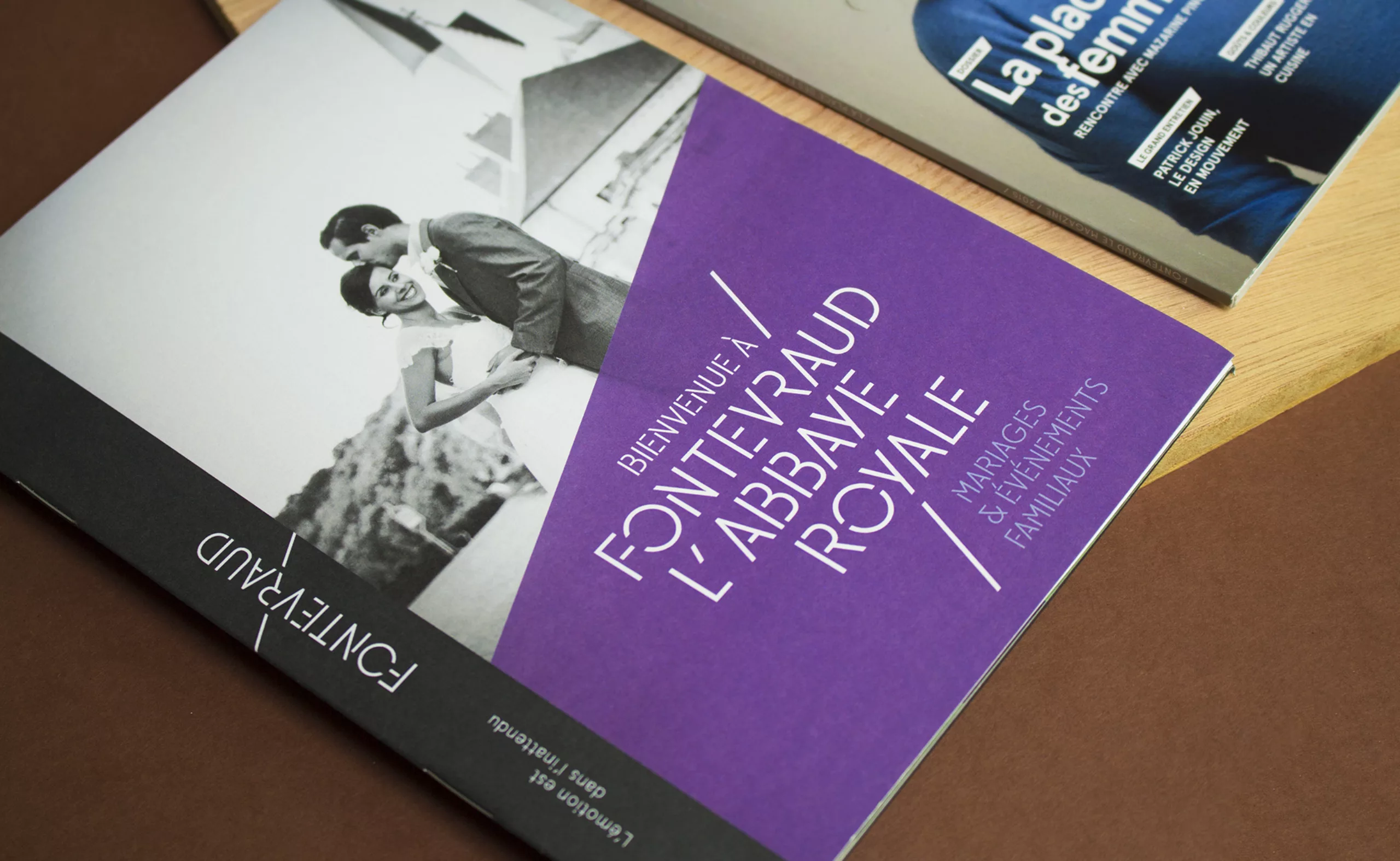
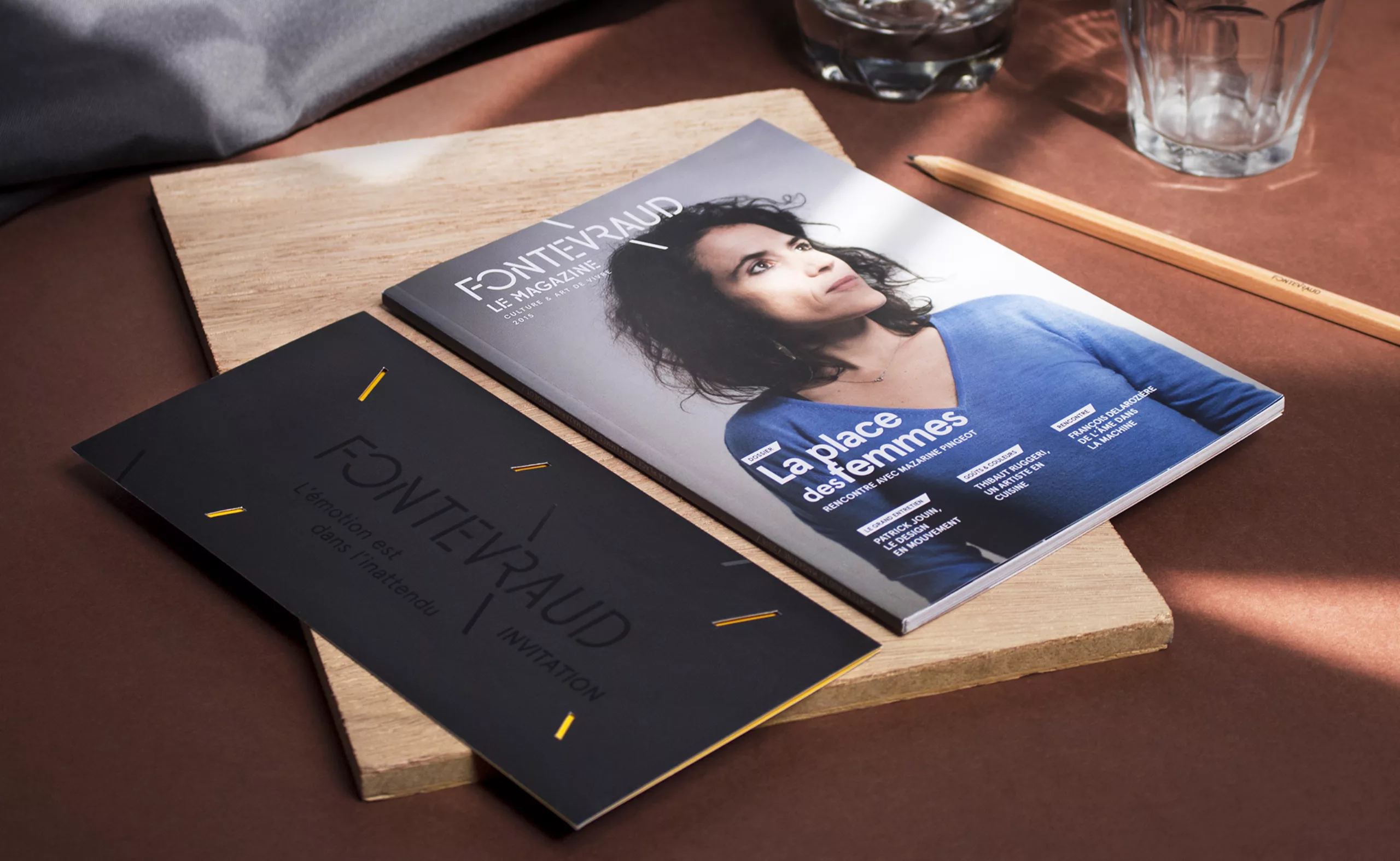
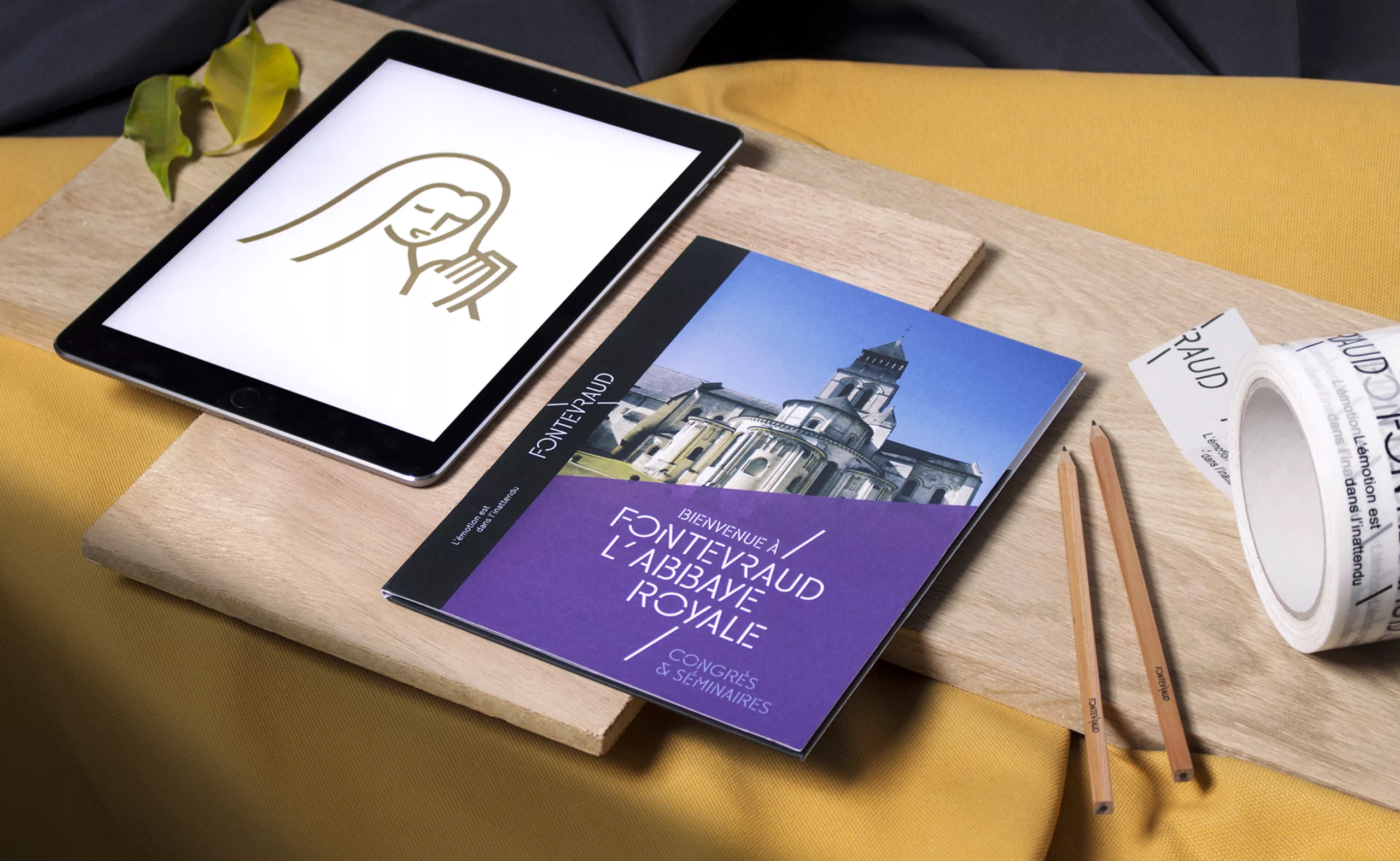
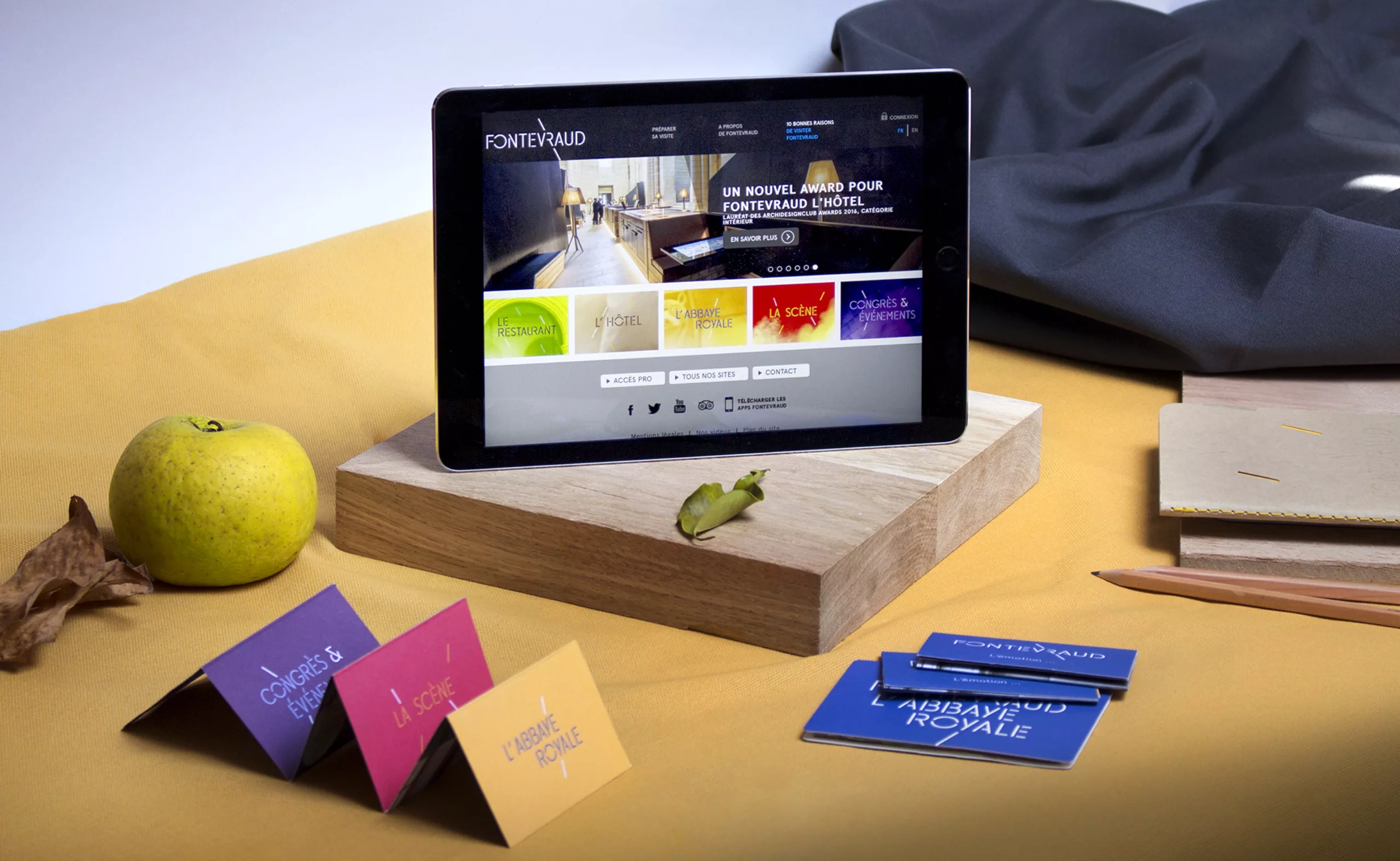
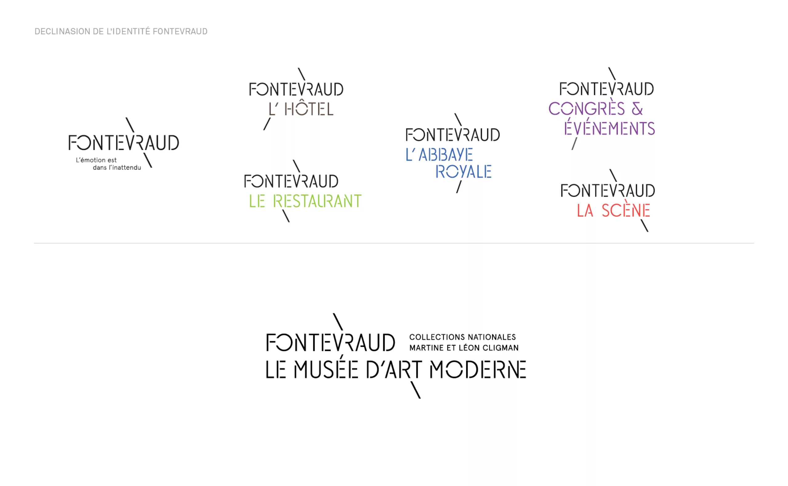
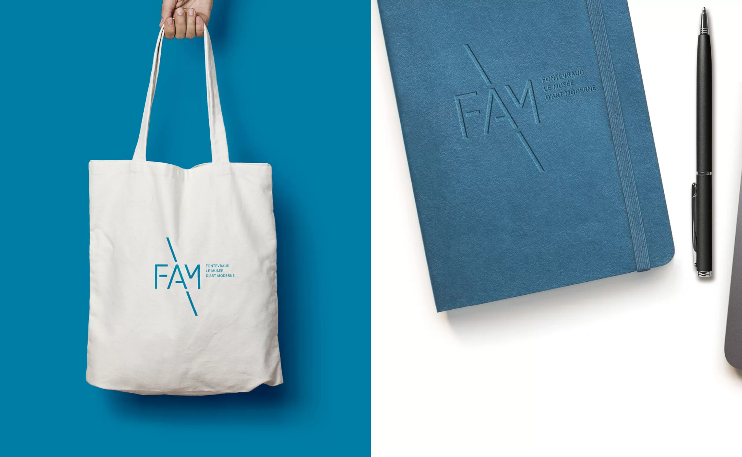
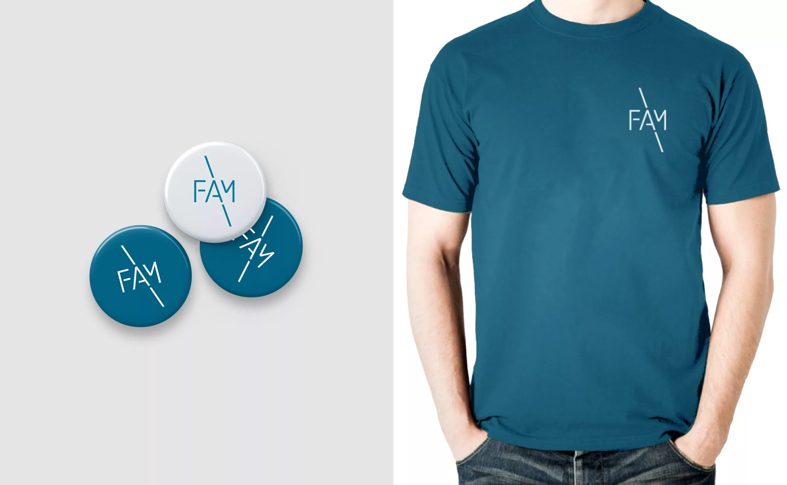
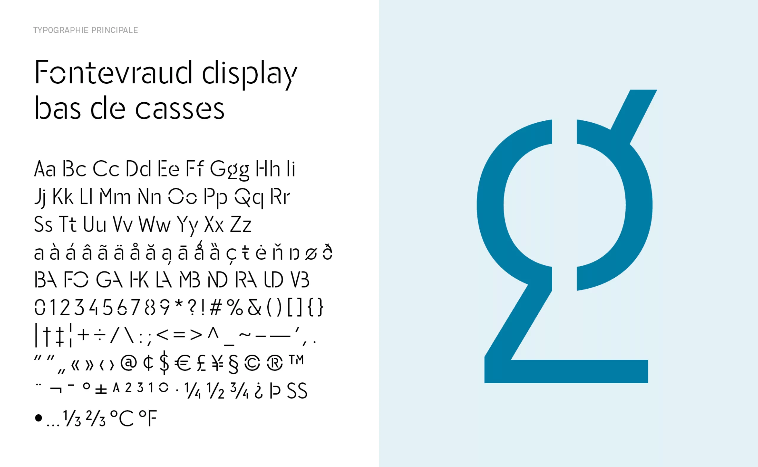
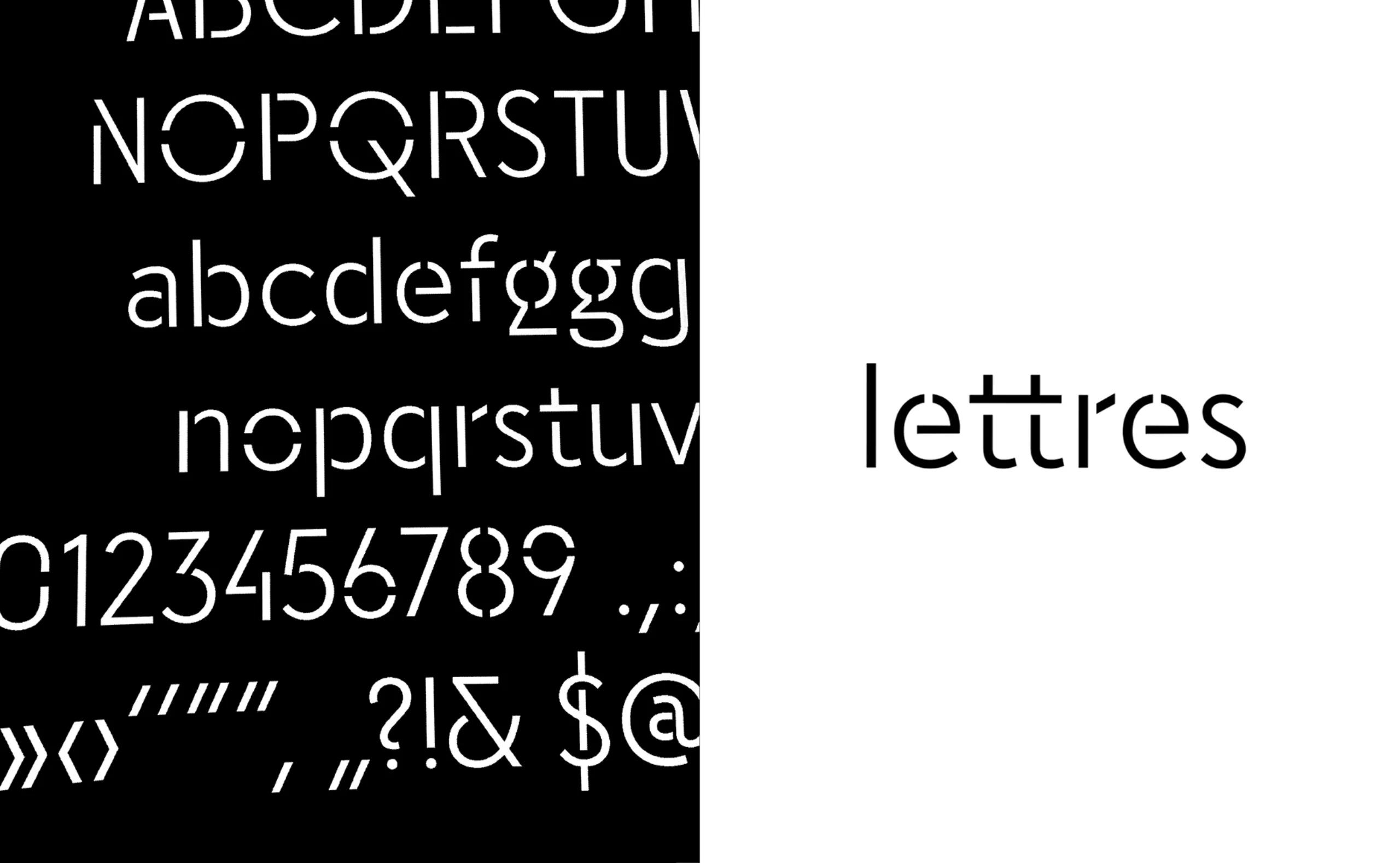
A unique opportunity for us to question the limits of branding and to conceive a flexible and scalable graphic system capable of reflecting the different facets of Fontevraud while building a relevant and durable visual response.

Five years later, emotion is still in the unexpected

What an exciting opportunity to extend a graphic response that was initiated by the creation of a custom typeface that straddles the sacred and the profane. This typeface is the keystone of the new visual identity of the Fontevraud brand.

Graphéine's collaboration with Fontevraud was intense and full of new challenges for the agency. We would thus like to express our appreciation for the high standards and confidence of David Martin, Fontevraud's director at the time of the project, as well as to Frédéric Dufau who was at the head of Fontevraud's digital division and in-house graphics studio. There couldn’t have been a better project site, nor a more ideal client.

To read more about Fontevraud's visual identity project:
www.grapheine.com/portfolio/fontevraud-lemotion-linattendu

Over the course of two years, we have had the chance to:

- Create Fontevraud’s brand architecture and brand guidelines,
- Conceptualize and produce Fontevraud the digital tour route, a series of screens installed on the estate with motion design videoclips that act as an alternative to the classic audio guide,
- Define the art direction and produce the first issue of Fontevraud le magazine, a "lifestyle" publishing project around the actors and the programming of the "ideal city",
- Conceptualize and prototype Fontevraud the gift box, a smart box that integrates the brand's olfactory signature into merchandise.

Fast forward to now: The magazine's formula has evolved. The website has been redesigned to better integrate all facets of the project with the arrival of the museum. The Fontevraud typeface has come of age and is wilting a little on the walls of the abbey, but the visual identity created in 2015 is still in place and continues to be perfectly adapted to the different communication media of the abbey.

The Martine and Léon Cligman Foundation, an exceptional donation of modern works of art

The Museum of Modern Art of Fontevraud is located in the courtyard of honor of the prestigious Royal Abbey, and more precisely in the building of the Fannerie, which has been renovated for the occasion.

It was inaugurated by the Pays de la Loire Region on December 5, 2020 and completes the cultural and heritage offering of Fontevraud with a rich collection of nearly 900 works and brings together paintings, drawings and sculptures by artists of the 19th and 20th centuries, as well as antiques and objects from outside Europe (Africa, Oceania, Asia, the Americas).

The museum's collection is largely made up of the donation of Martine and Léon Cligman's personal collection. For more than sixty years, Léon Cligman, a former major textile industrialist, and his wife, the painter and sculptor Martine Martine, have collected works of art by some of the greatest names in 19th and 20th century art. Some of the artists from the collection include Dufy, Degas, Derain, Toulouse-Lautrec and Corot.

The Fontevraud typeface in lower case : An initial missed opportunity in the art direction for the Fontevraud magazine

When we explained our vision for Fontevraud magazine, we summarized our creative intent:
"We wish to continue the work that began with the creation of the Fontevraud brand guidelines to make this magazine a true manifesto of the ideal city."

Some glimpses of the first sketches of the Fontevraud lowercase typeface:

We favoured the use of full-page iconography which was accompanied by a new typographic creation:
The FONTEVRAUD REGULAR "LOWER CASE" will complete the current FONTEVRAUD lettering created by Graphéine. It will be supported by a second variant, the FONTEVRAUD BLACK.
These two typographic creations will make it possible to compose the editorial content of the magazine in a way that’s original and unique to Fontevraud.

The aim of this typographic work is to communicate the FONTEVRAUD spirit as a "lifestyle" that is both adaptive and perfectly coherent. A spirit that takes on different aspects without ever losing its elegance.
A requirement that responds to digital innovation / environmental / artistic / touristic concerns without ever being elitist and always staying open to all audiences."

Unfortunately, the regional election calendar at the time forced us to cut back on our art direction ambitions and the typographic expansion project was left in the pipeline for a while...

The second attempt turns out to be the right one with the commissioning of the Fontevraud Museum of modern art’s visual identity

A flexible identity that works for a Royal Abbey, a restaurant, a hotel, a cultural program, and now a museum, why yes, it is possible!

So five years later, we still had a lingering desire to extend the Fontevraud typeface design, and a project to create the visual identity for the Fontevraud Museum of Modern Art was the perfect opportunity. Goes to show that sometimes all it takes is just a little patience and persistence. We wanted to offer more versatility to the typeface created in 2015, which was initially designed only with capital letters. We completed its architectural style by adding the lower-case letters and thus allowing new use cases for this typeface, especially in museographic signage (meanders, information displays, etc.).
The challenge of this work was to preserve the stencil style while drawing lower case letters to ensure the greatest possible reading comfort.

By extending the Fontevraud typeface, we have extended the range of possibilities of the Fontevraud visual identity, thus giving the project's communication teams an even more generous identity to play with.

Context

Fontevraud Abbey is home to a brand new museum of modern art centred on the personal collection of the Cligman couple, which has been transferred to Région Pays de la Loire. The museum is located in the Fannerie, one of the first buildings that visitors discover when entering the abbey.

Goal

Graphéine was commissioned by Région des Pays de la Loire to design the visual identity of Fontevraud Museum of Modern Art in order to be consistent with the visual system we had created for the Fontevraud brand in 2015.
The museum's graphic charter had to be able to meet its various needs in terms of museographic scenography and directional signage, as well as providing the potential to personalise marketable souvenir objects.


Share this project:
Project expertise:
Logo creation, visual identity and graphic guidelines. Signage design. Typographic design.
Type of client:
Cultural communication agency for theaters, concert halls, festivals, dramatic and choreographic companies. Heritage, museums & cultural spaces.

Related projects: