Located on the Champs Elysées, Wyd is a recruitment agency. Originally specialized in talent hunting for high level positions in the finance, banking, insurance, health and retail sectors, the firm has extended its ambition to human resources support within organizations. Wyd’s spectrum of intervention is across three areas: recruitment, consulting, and networking. “WYD” is a name created by the initials of the phrase “What You Deserve”. The primary objective of this rebranding project was to move away from the origin of the name “WYD” to own it as a “brand name” in itself.
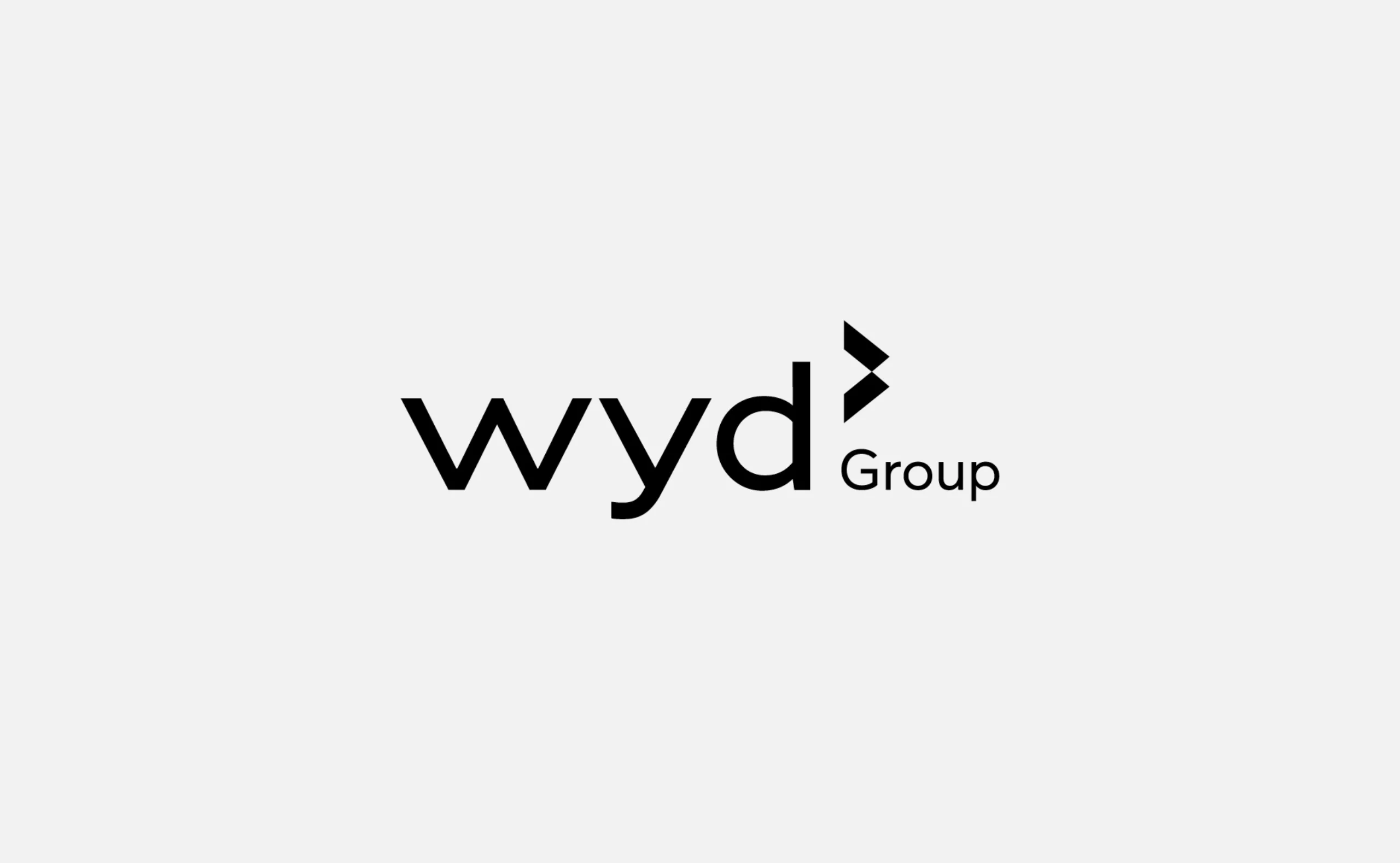
Wyd group, business partner
A « Business Partner » brand that evolves towards « Human First » perspectives


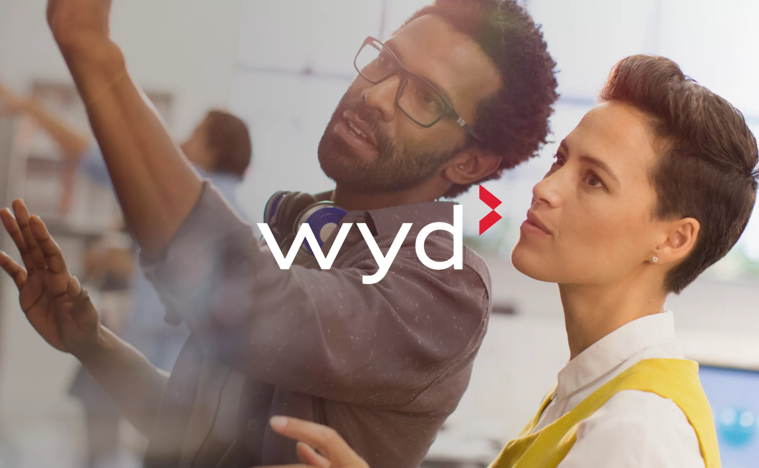
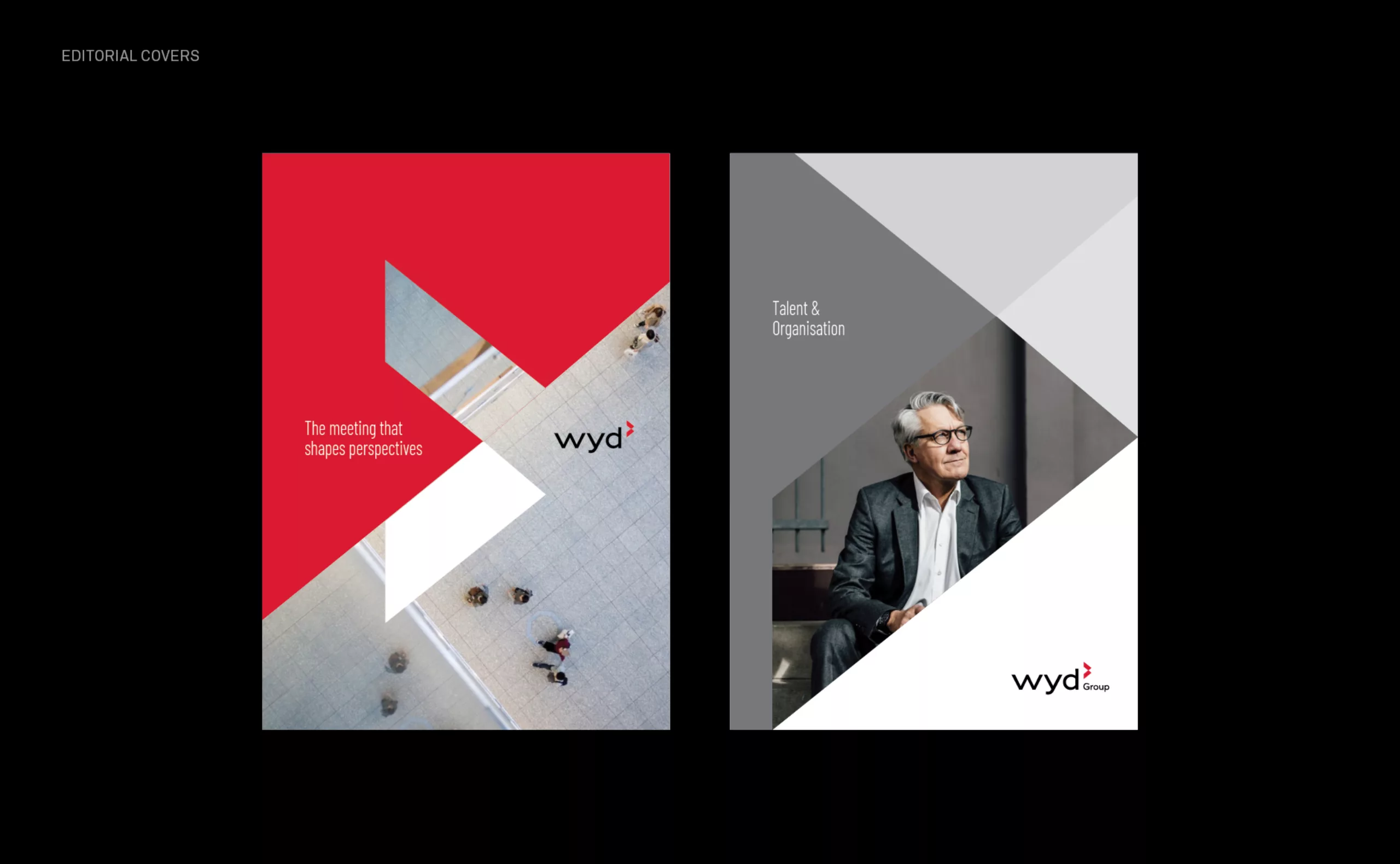
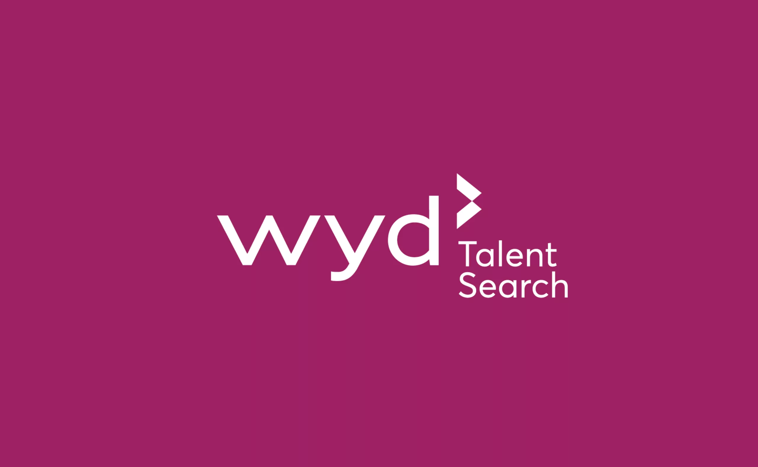
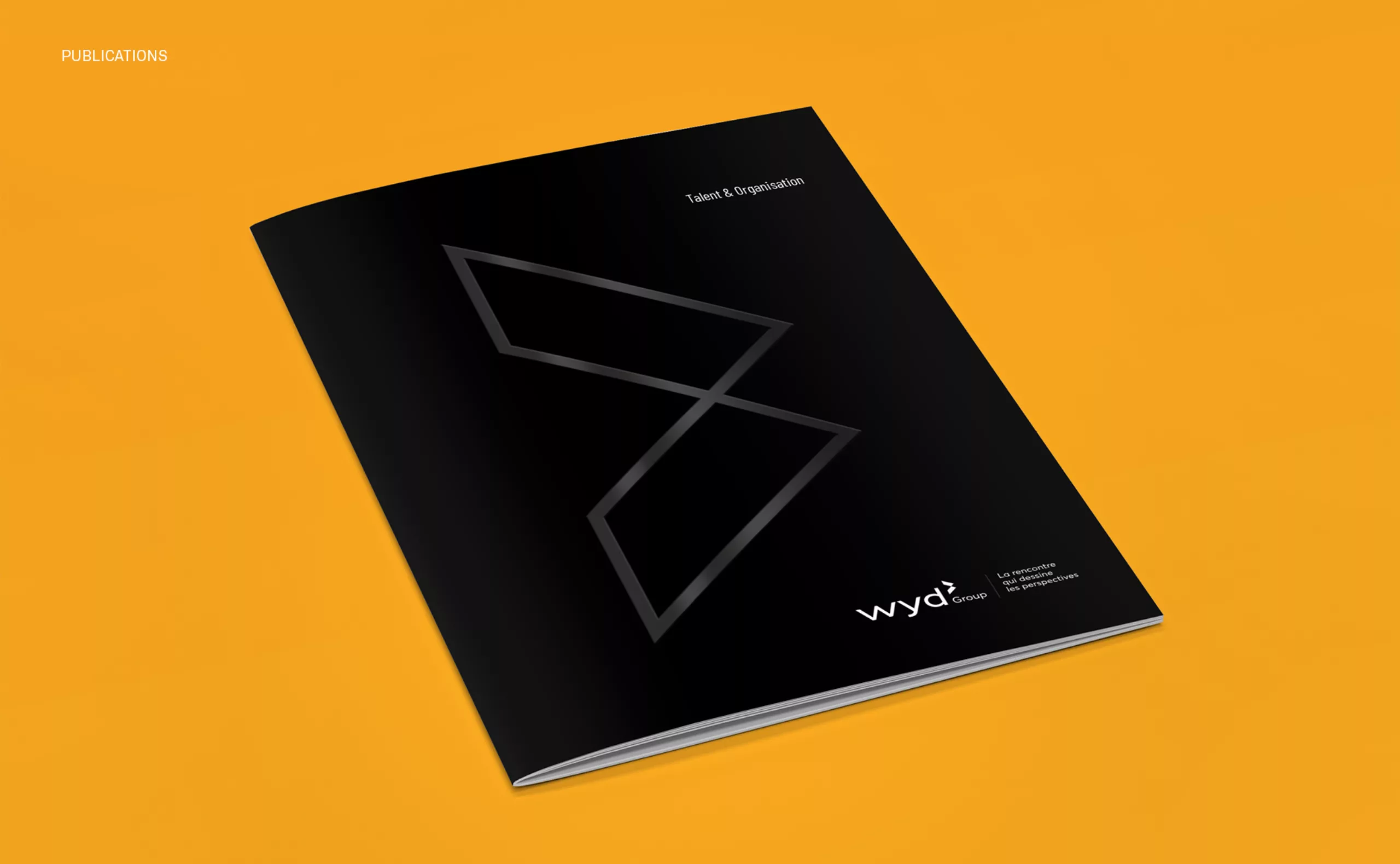
A new logotype for “a meeting that shapes perspectives”
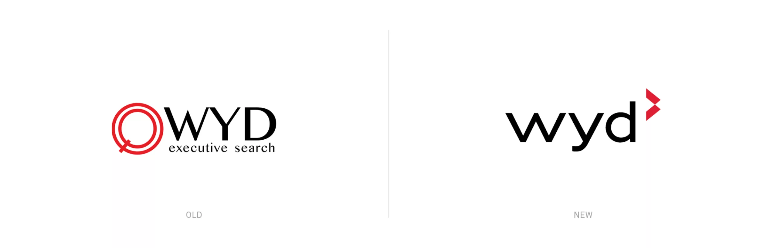
The previous logotype had been made in-house and its associated symbol was an icon that combined a magnifying glass and a target. This concept was a good illustration of Wyd’s “talent hunter” activity. But a desire to expand the company’s services meant that this emblem had become too restrictive and not dynamic enough. To accompany the firm’s expansion, it was necessary to create a new emblem that holistically reflects the wide range of human interactions initiated by Wyd. While creating Wyd’s new emblem we had in mind the personality of its founder Stéphane Baquet. One of the essential ingredients of this rebranding was a spirit of rigorous athleticism, with a strong will to “surpass oneself”.
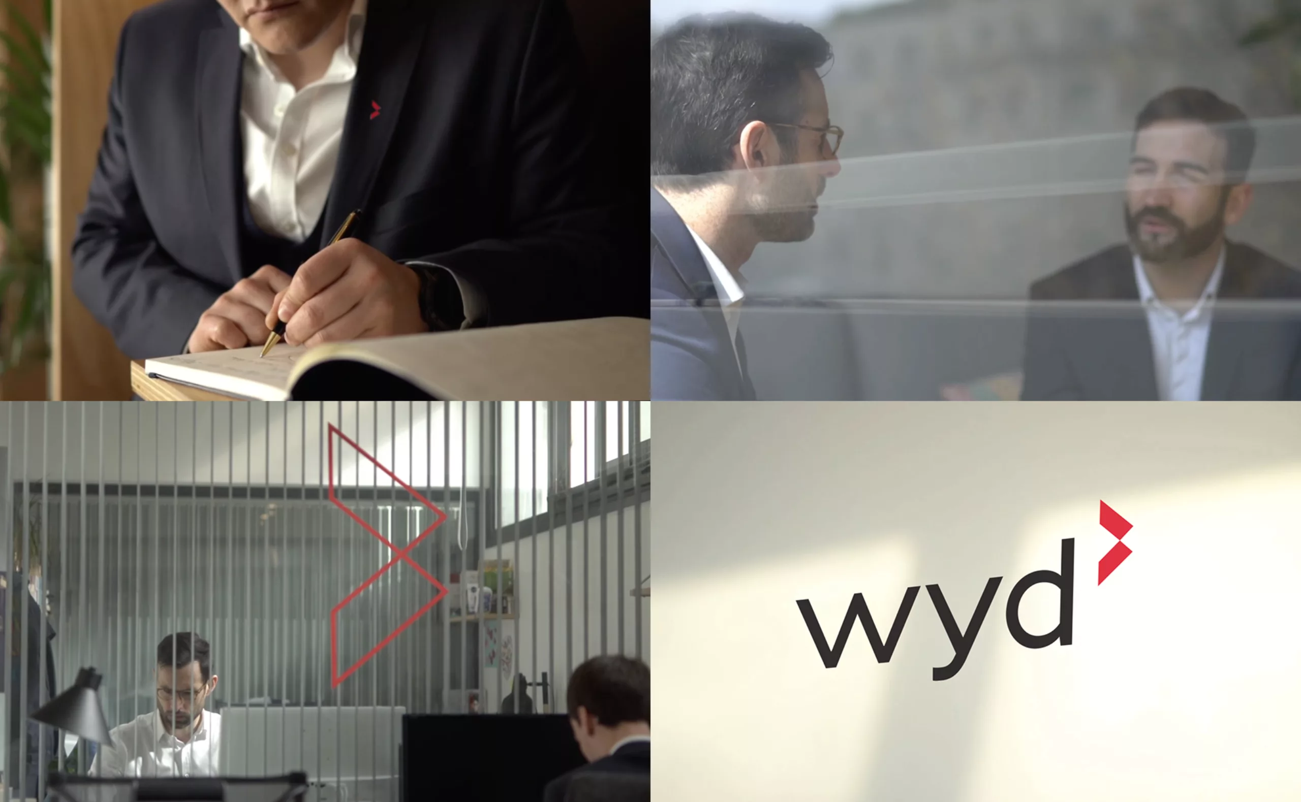
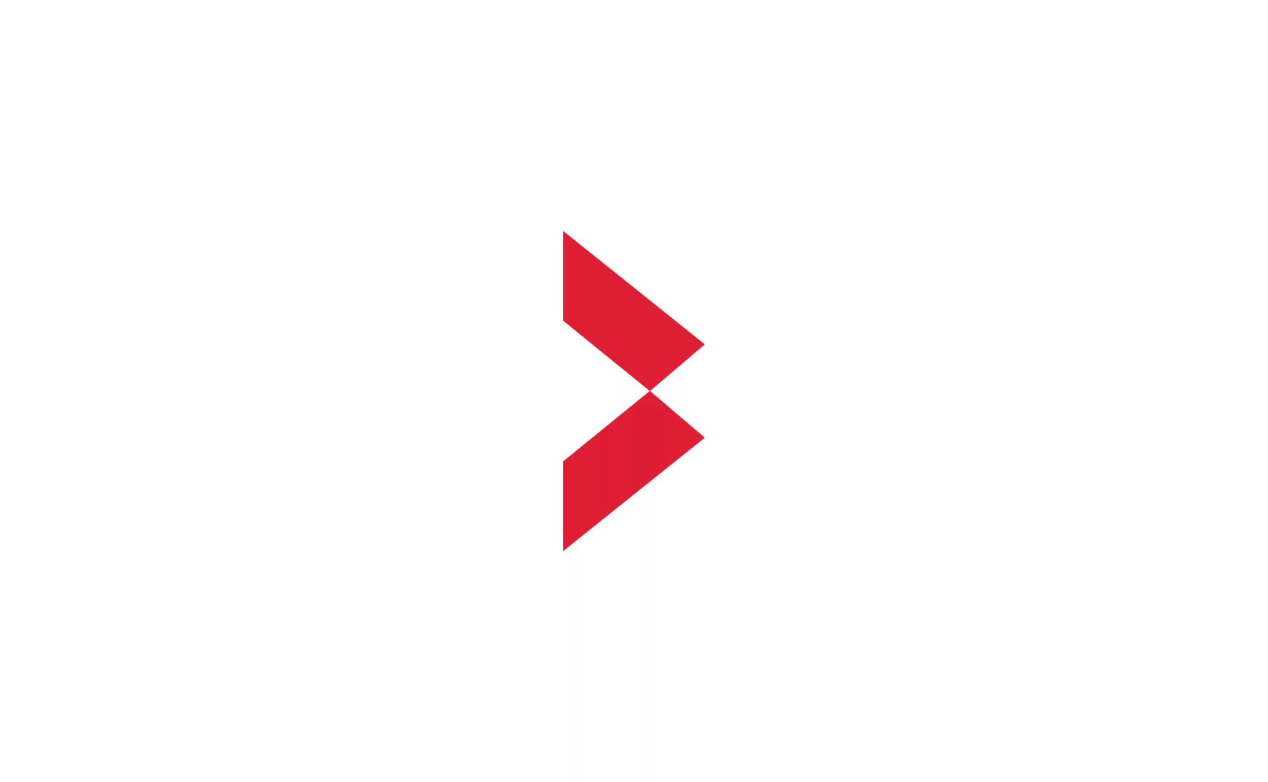
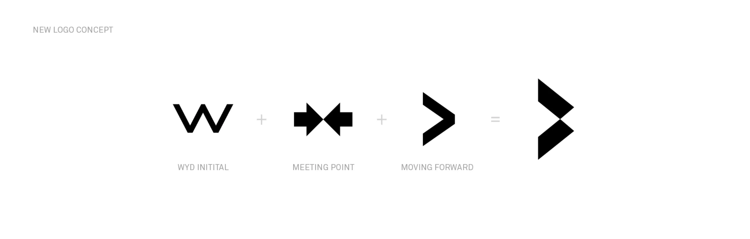
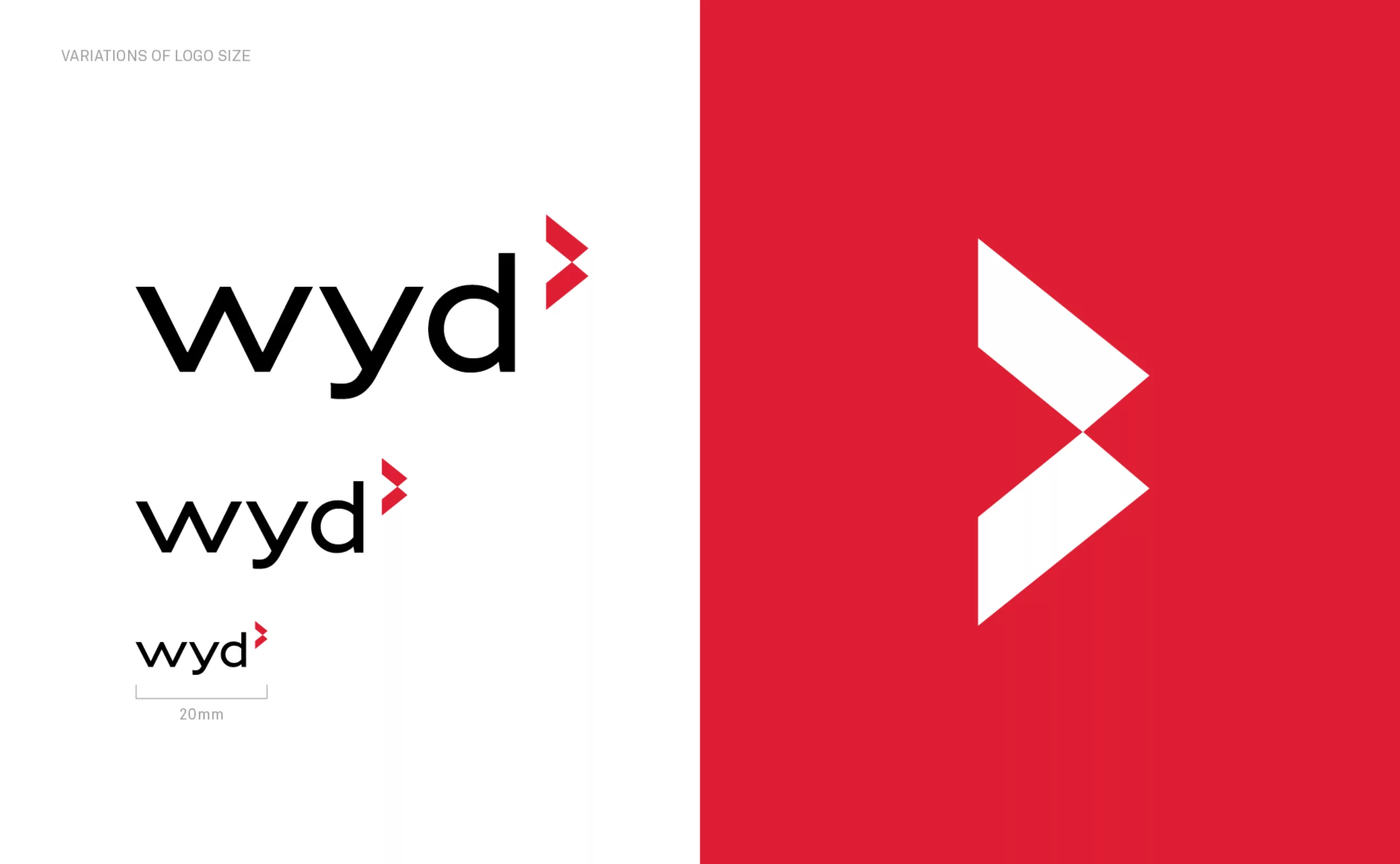
This initial reflection was combined with the need to reinforce “Wyd” as a name rather than an acronym. The letter “W” was therefore the starting point for the new design. Tilted at 90°, we get a double arrow that “moves forward”. Once this was stylized into two shapes that converge at a central point, we added the idea of ‘meeting’, which lies at the heart of Wyd’s business. This new emblem symbolizes “the meeting that shapes perspectives”. The new logotype uses lowercase letters with a geometric sans-serif aesthetic where the straight lines and the curves of the letters are designed to create visual balance.
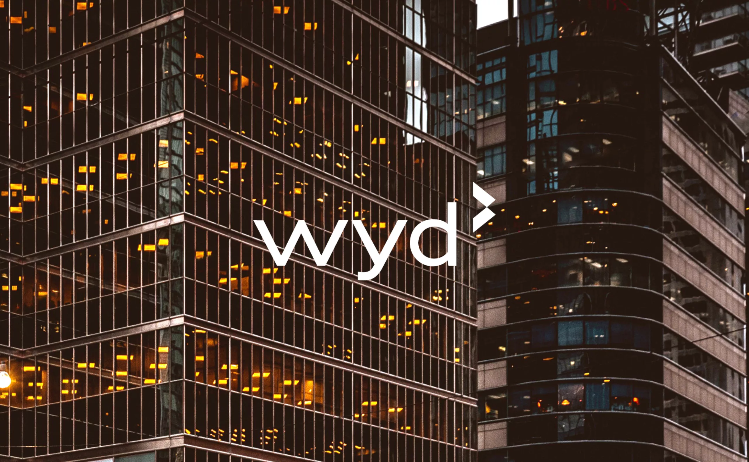
Initially the color red remained the primary color of the new identity as well as the tagline “Executive search” which still accompanied the logo. Further on we shall see how this identity redesign was expanded to better communicate a company that is diversifying its services.

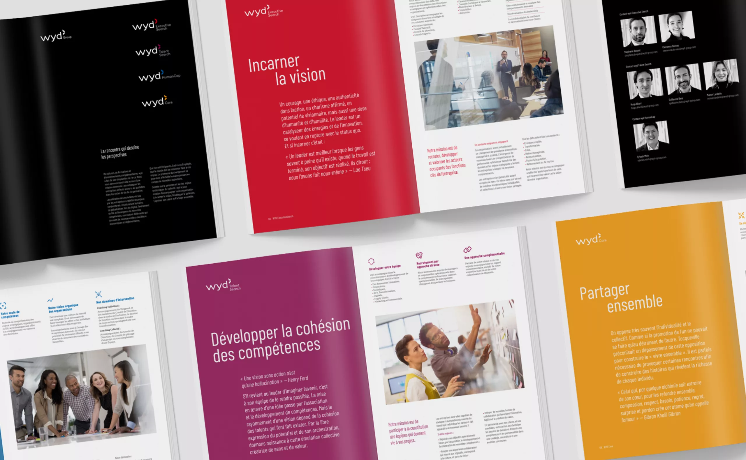
From a new logo to a new brand architecture
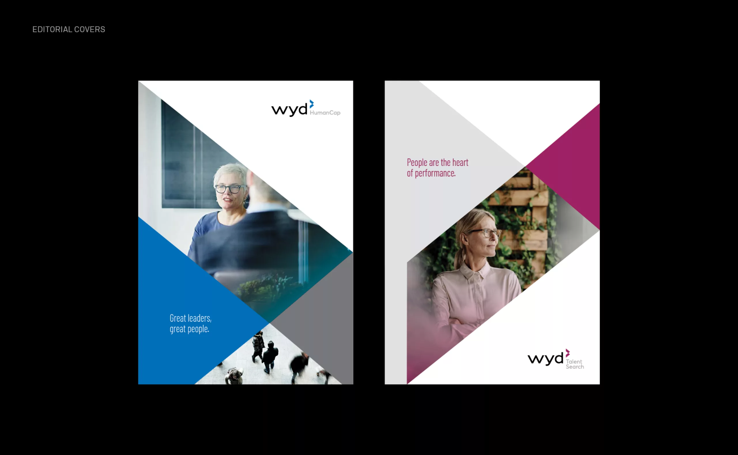
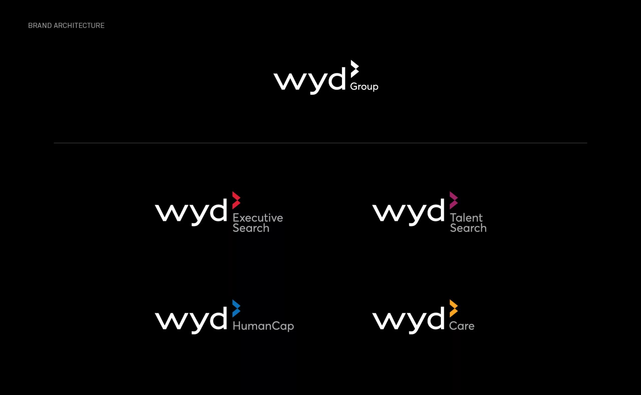
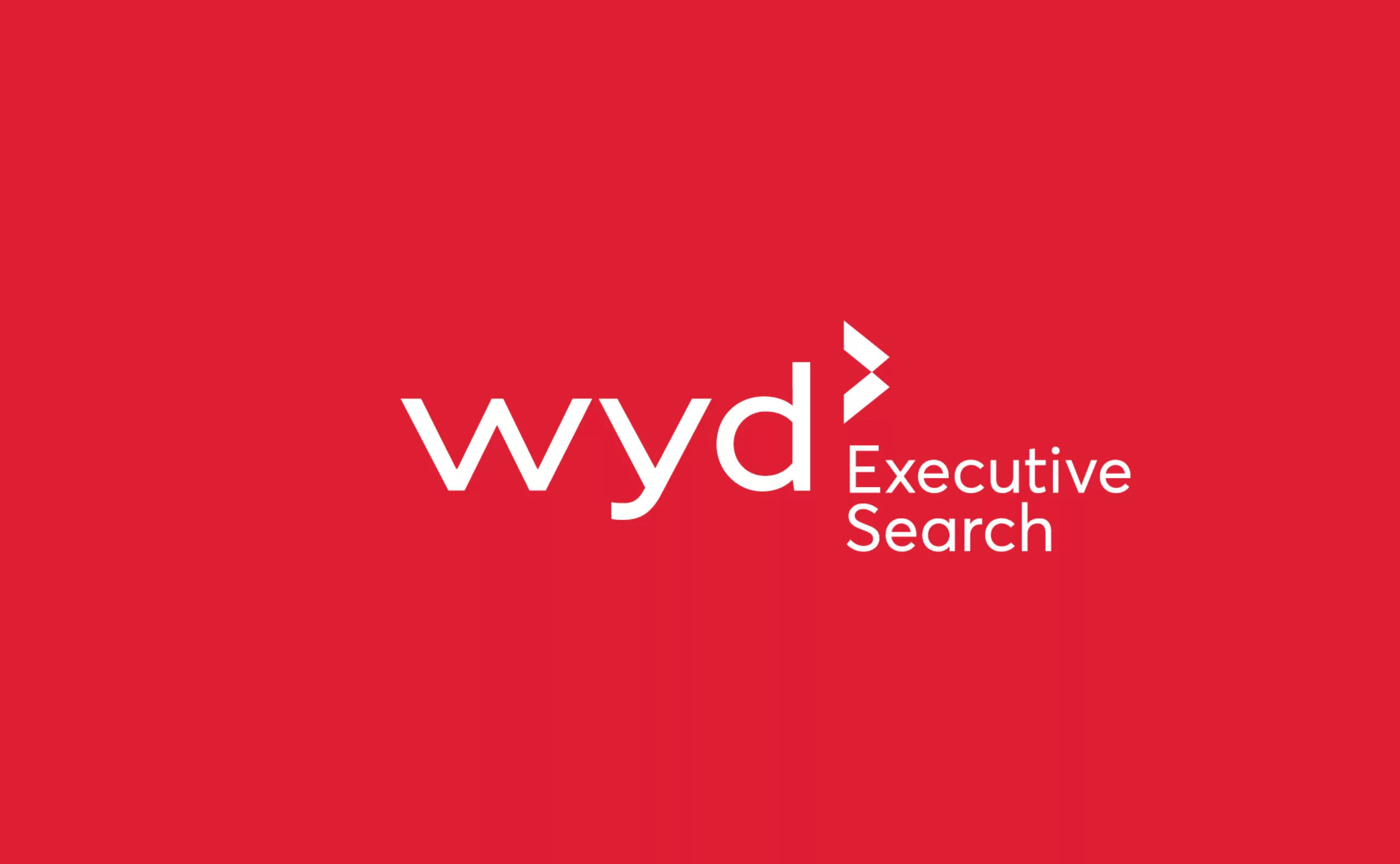
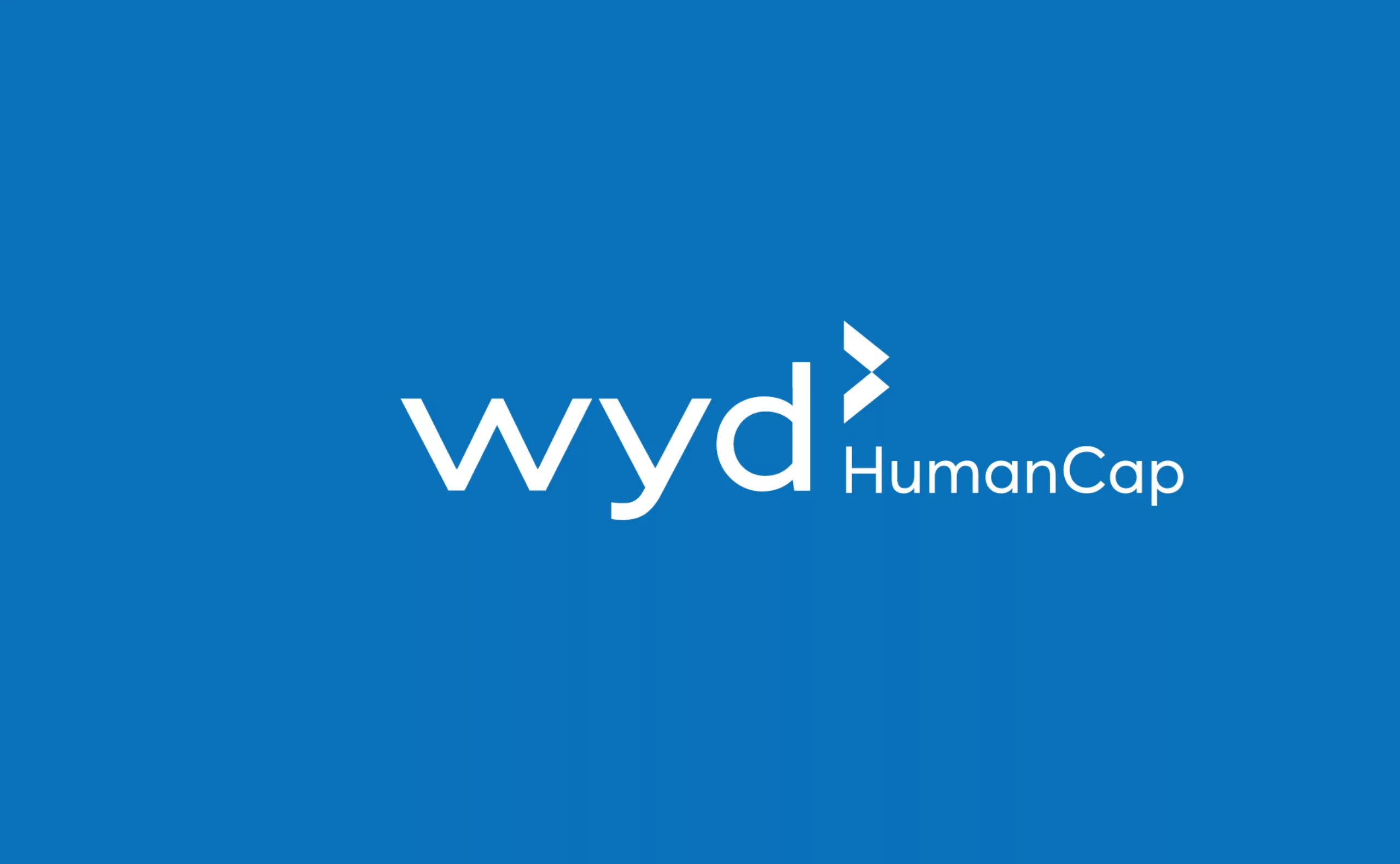
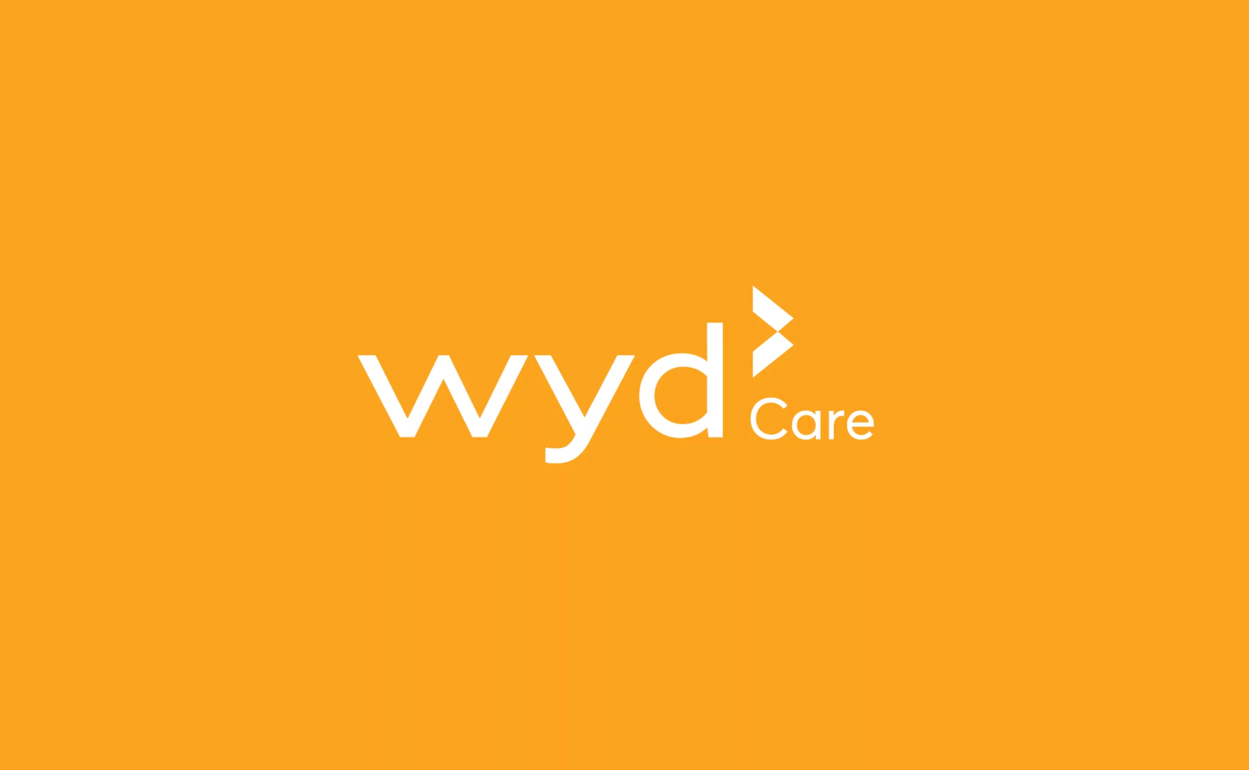
While redesigning the brochure, we came to the conclusion that a new brand architecture was needed for Wyd. Historically, their activity was focused on “executive recruitment” for large corporates. A single logo was no longer sufficient to represent the Talent search, Executive search, Human Cap and Care services of the company. Their new marketing and sales positioning had to be made legible as well.
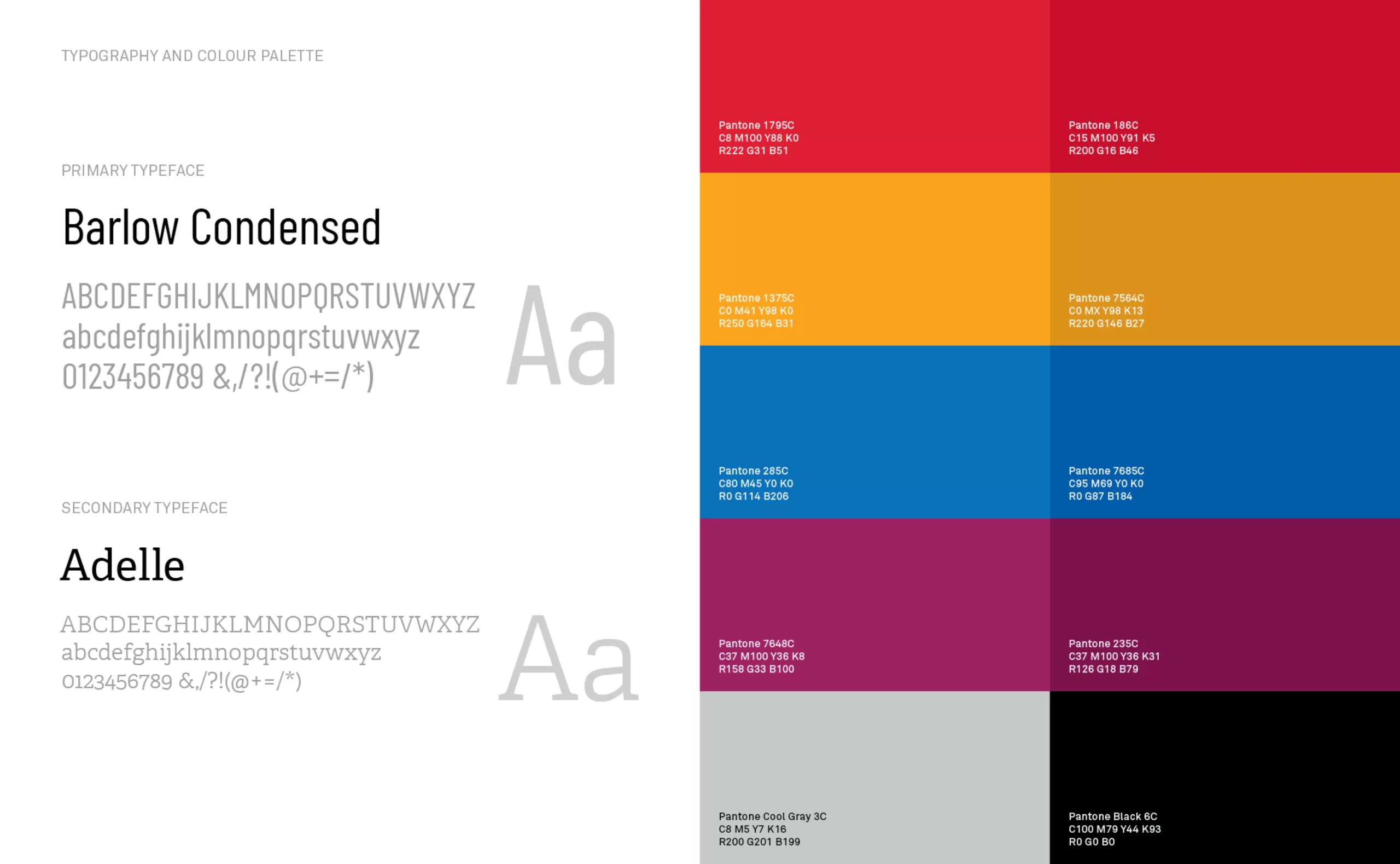
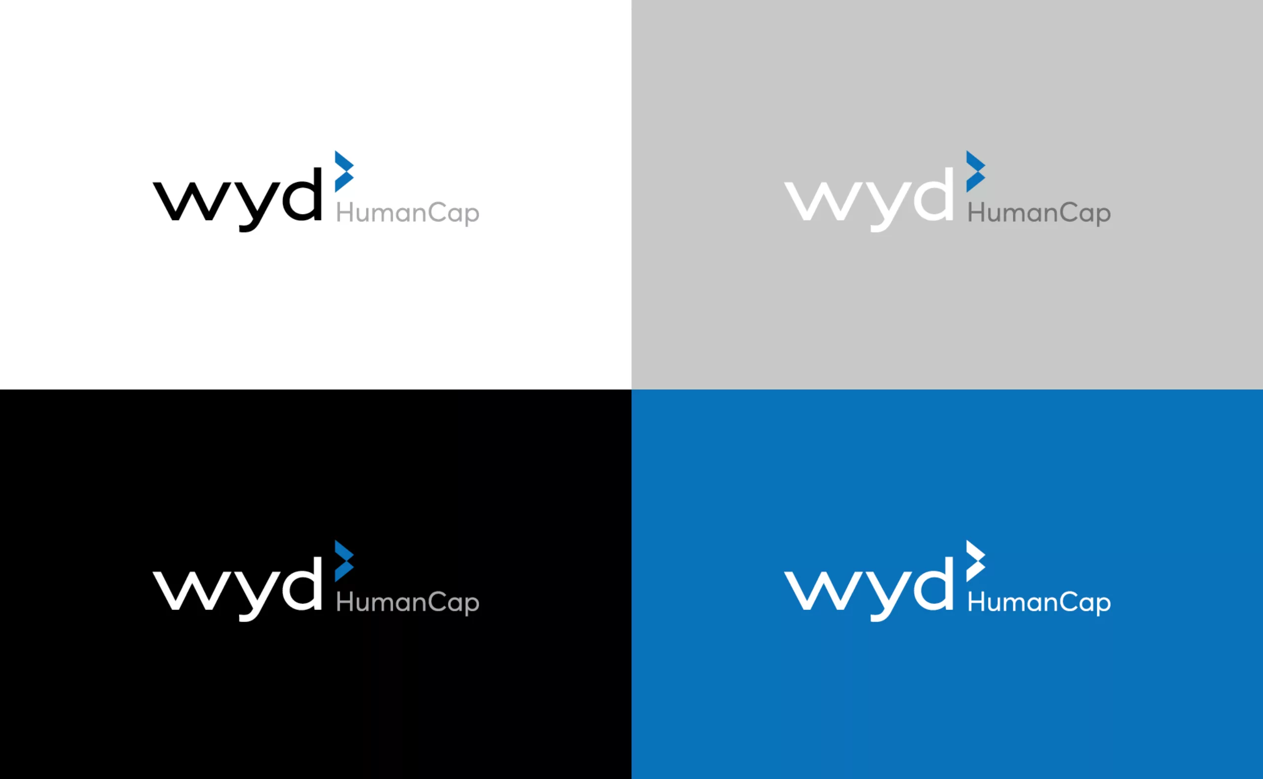
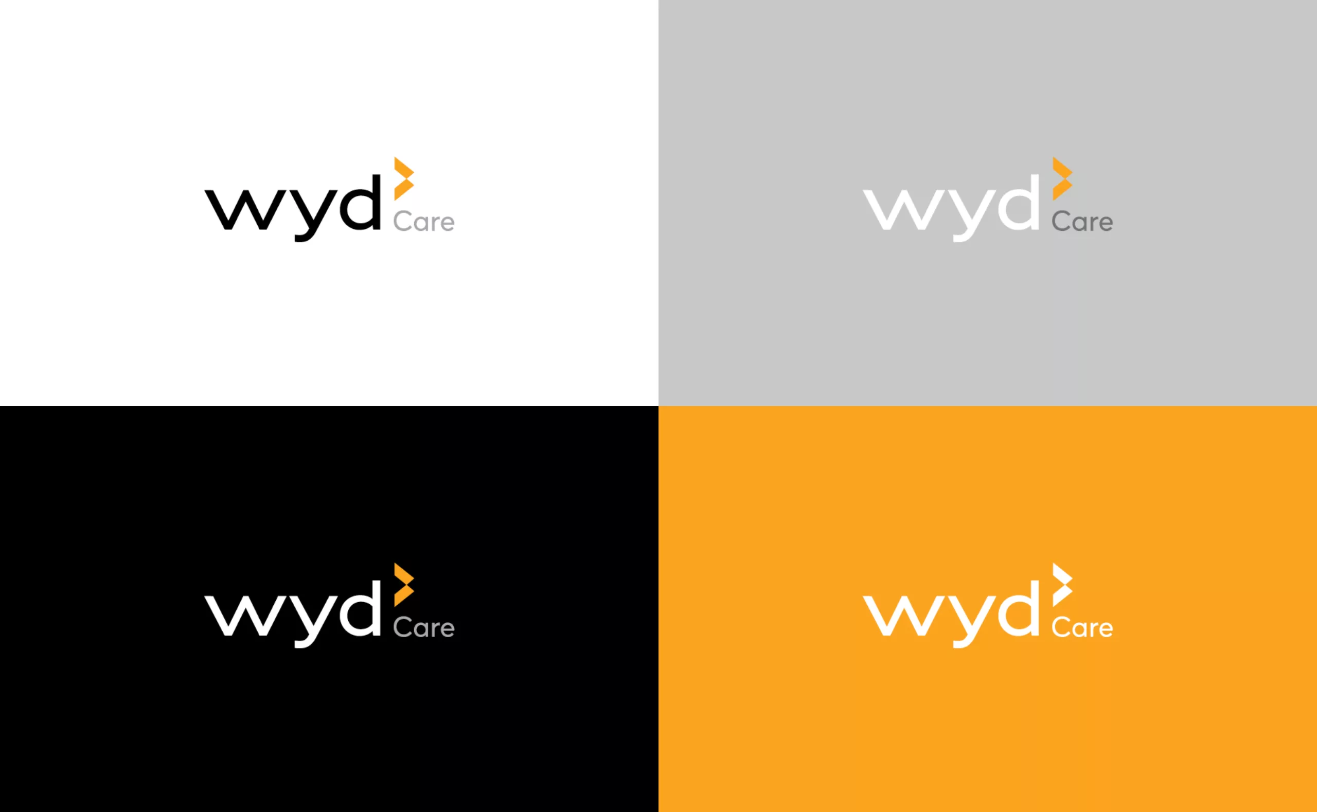
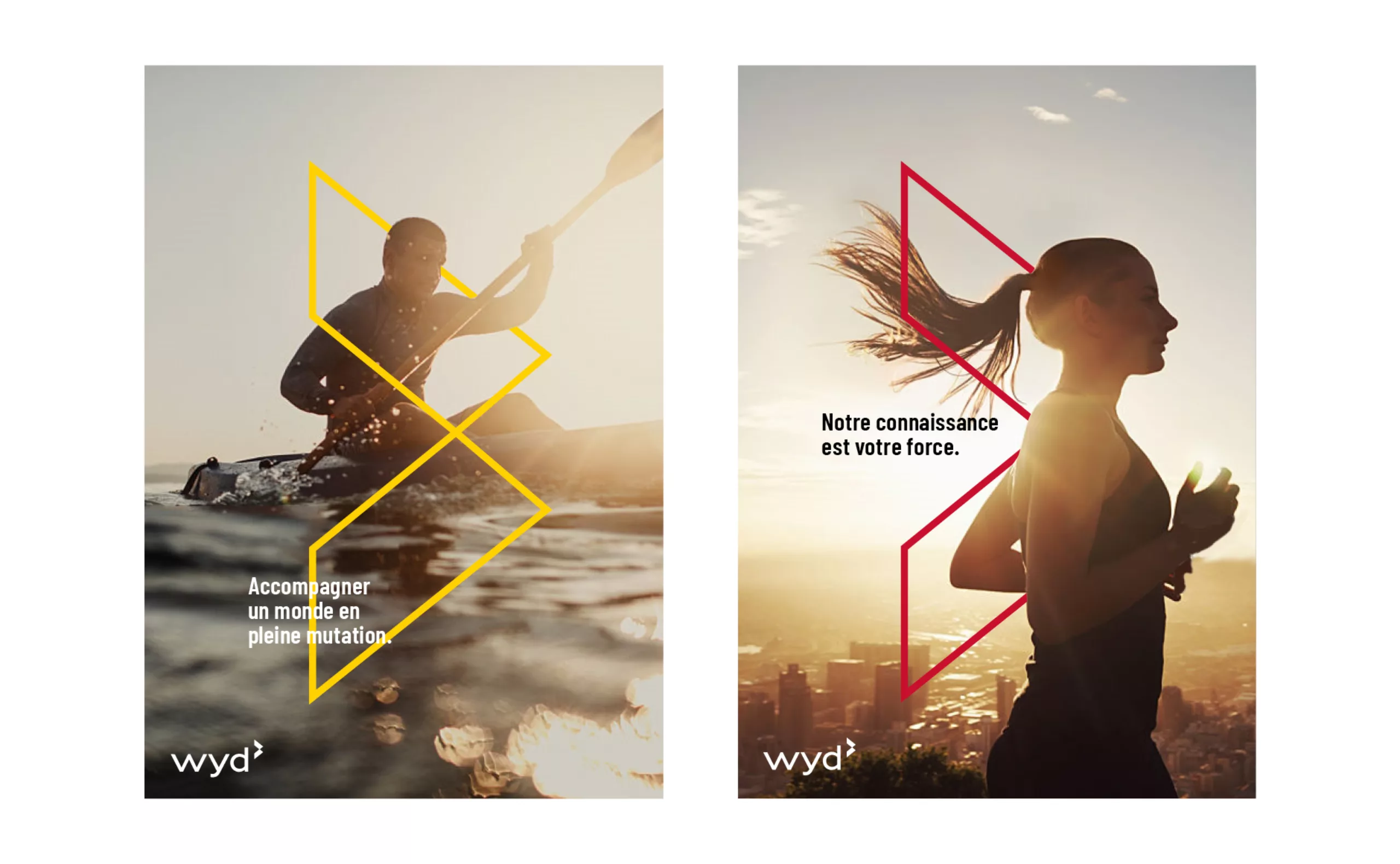
We therefore advised Wyd to relook at its brand organization and create visual identities of their “business units” as “daughter brands” and, conversely, to use “Wyd group” as the umbrella brand for the new ecosystem. Each daughter brand is derived from the new design of the logotype. The Wyd group logo is a solemn black or white, while the business logos are distinguished by their secondary headings and a new, wider range of colors. Wyd’s new visual identity embodies the idea of Anglo-Saxon elegance. A confident and distinguished brand universe for an expertise that intervenes with rigor and discretion.