2020
2020
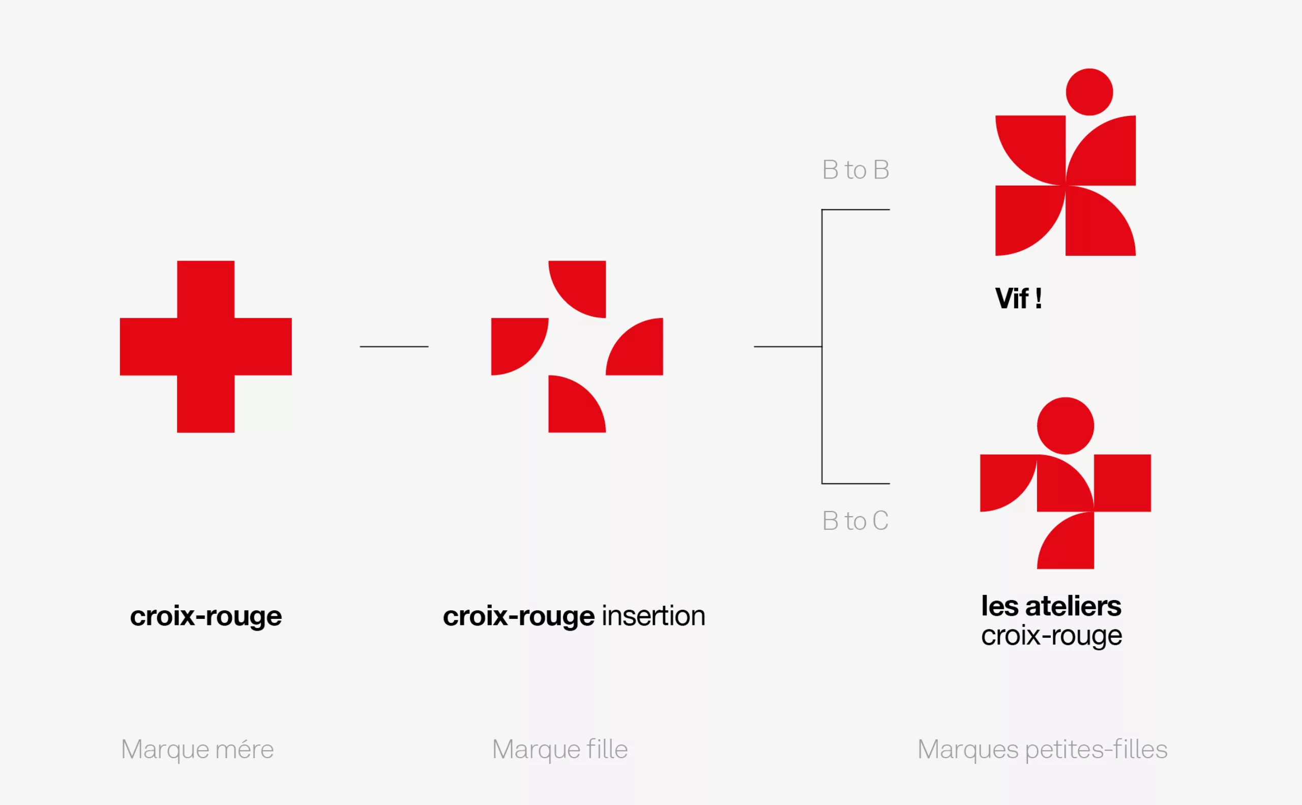
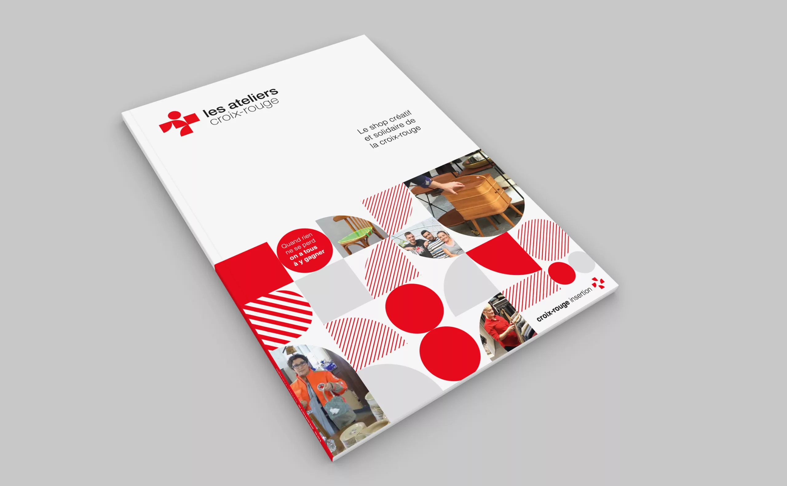
Croix-Rouge insertion has been created by the Croix-Rouge française to make the development of employment a major focus in the fight against precariousness. The association has 11 establishments working towards this mission of integration through employment. Every year, 900 people are re-acquainted with a working environment, learn to work in a team and often regain their self-confidence.
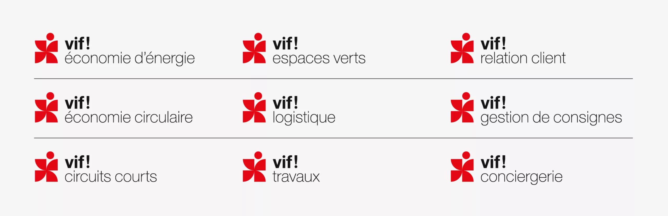
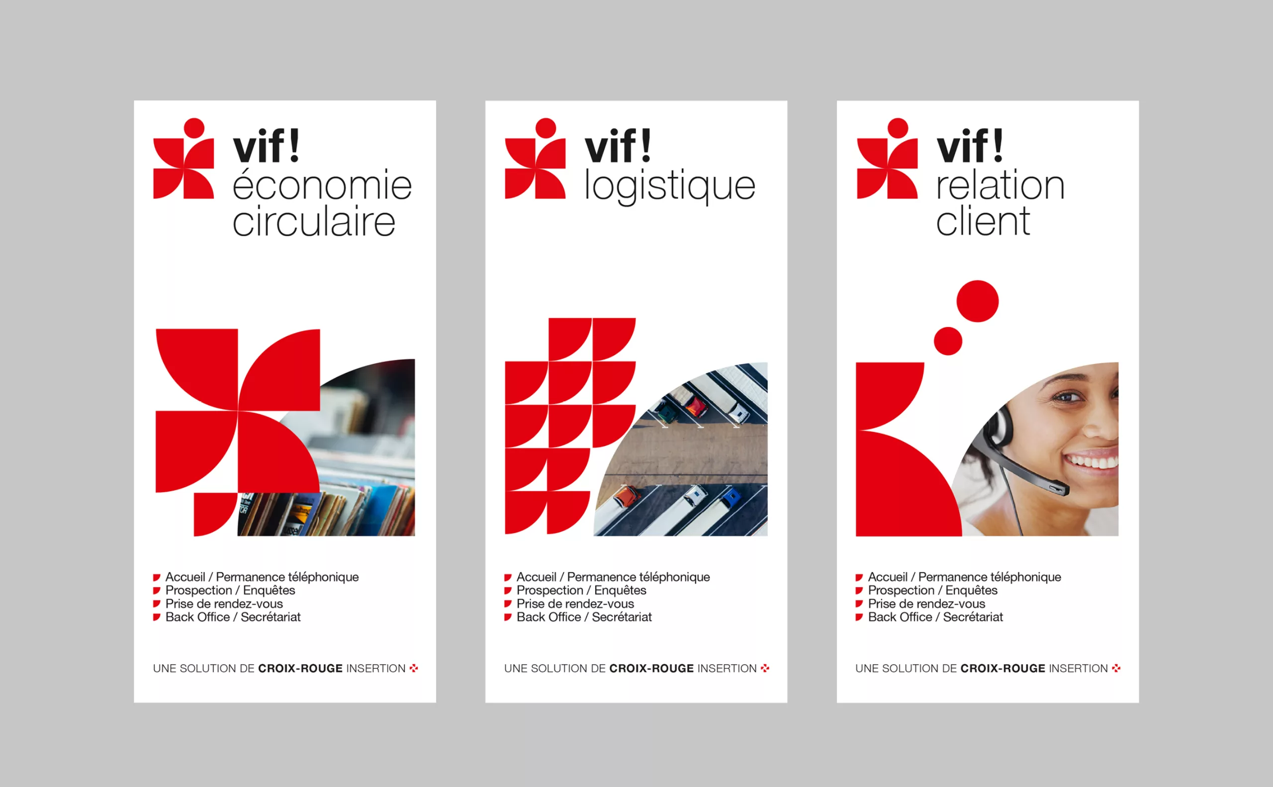
Croix-Rouge insertion (CRI) offers a wide range of services for companies and local authorities, as well as products for private individuals. Yet their commercial notoriety was very limited.
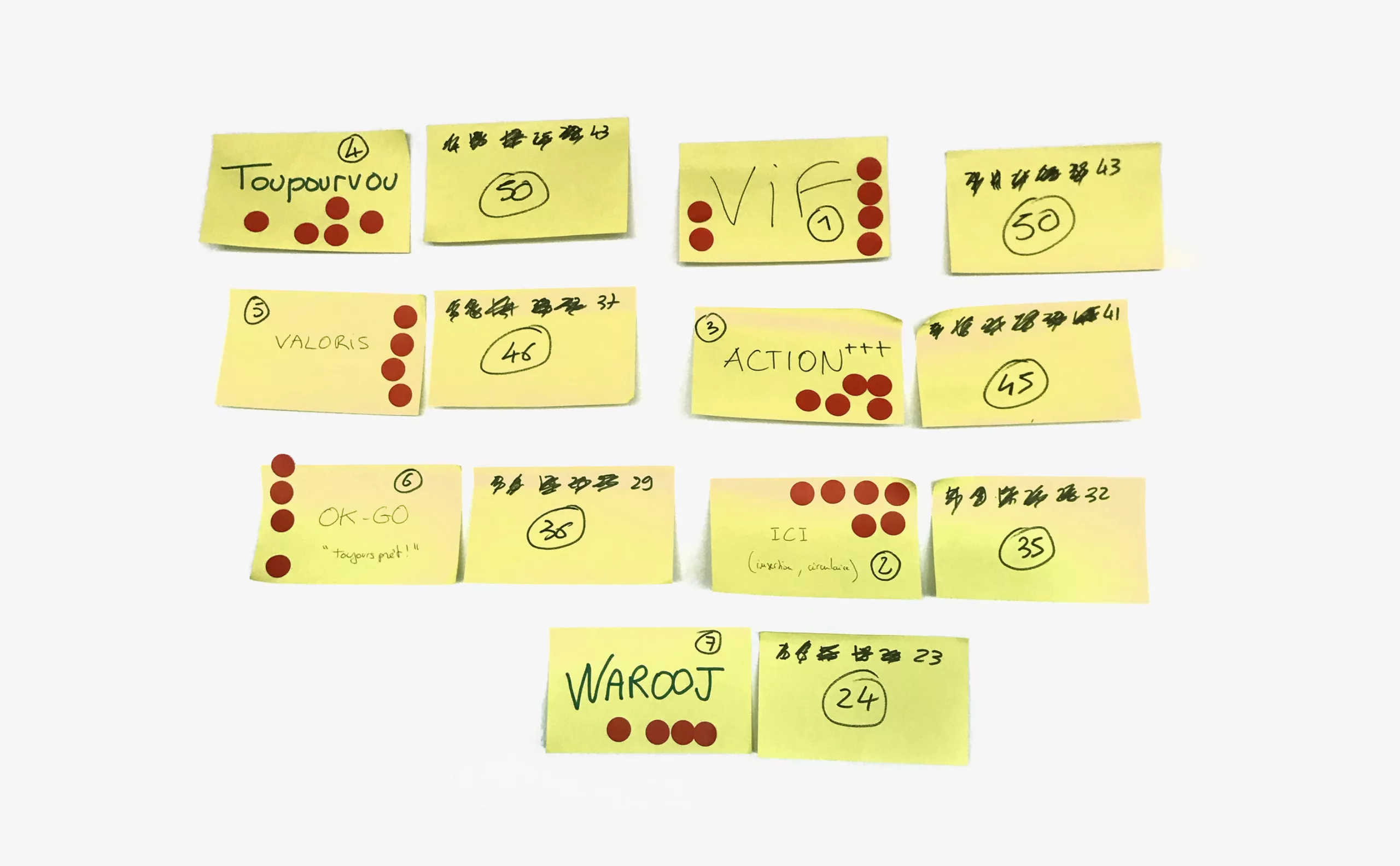
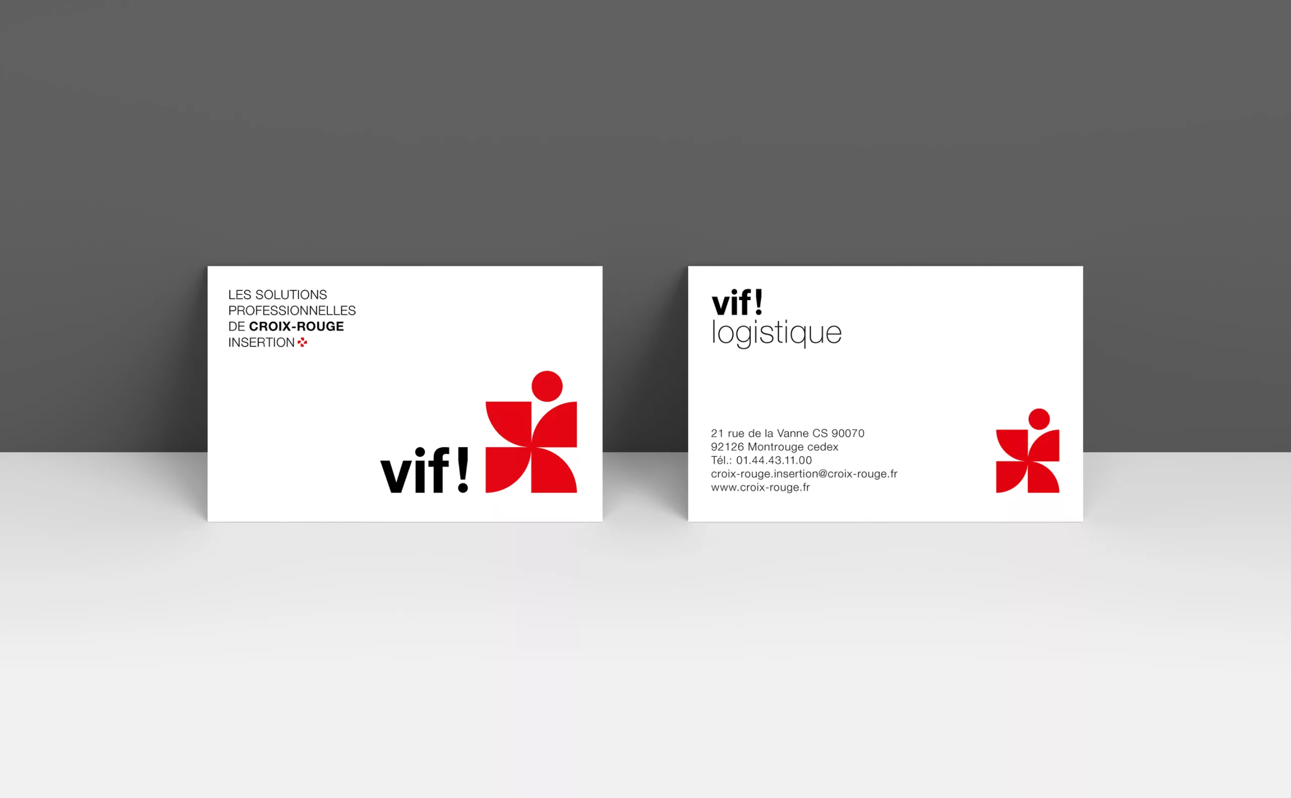
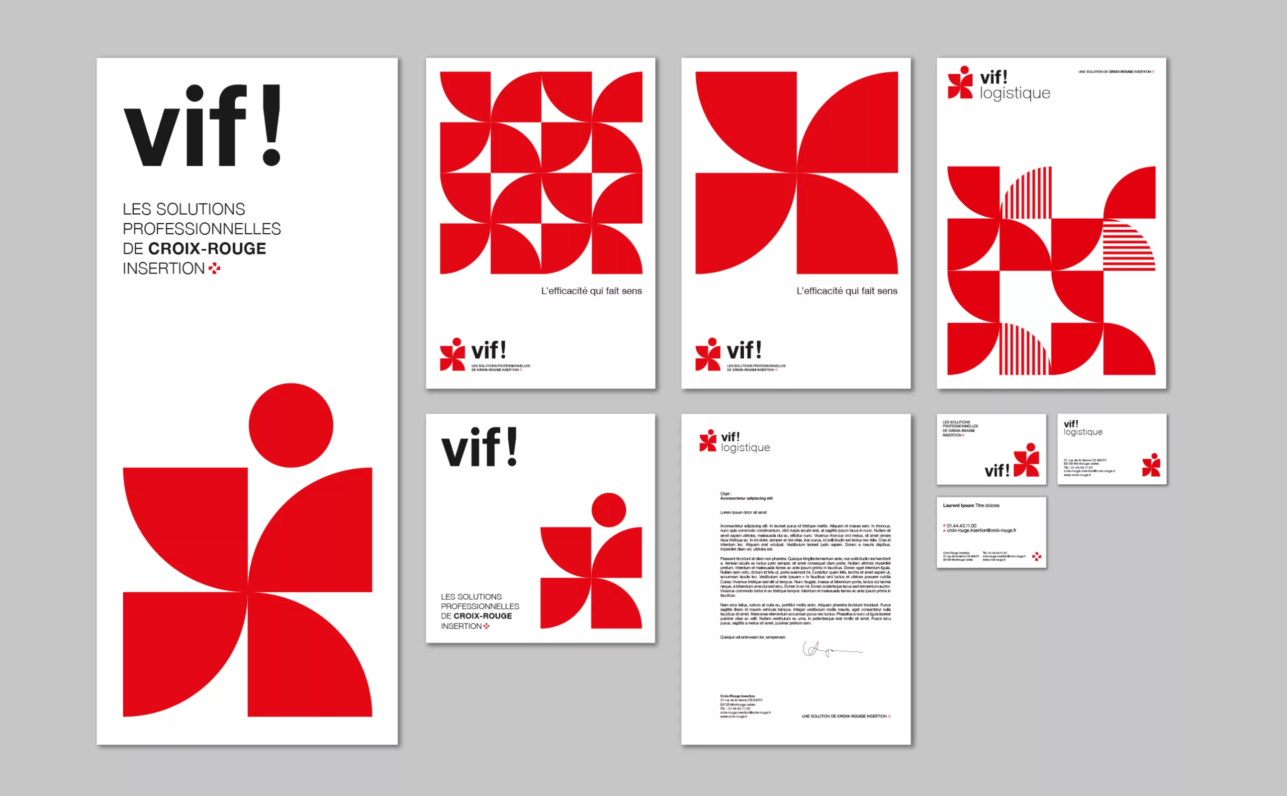
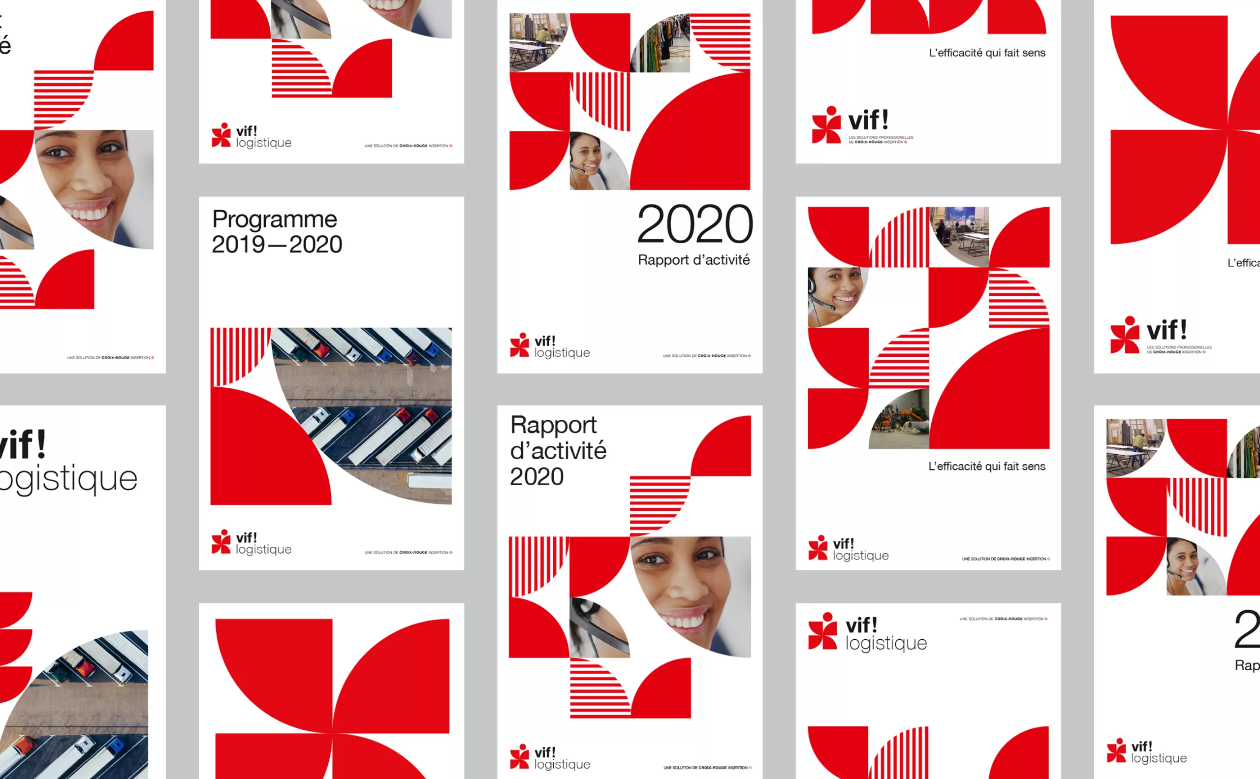
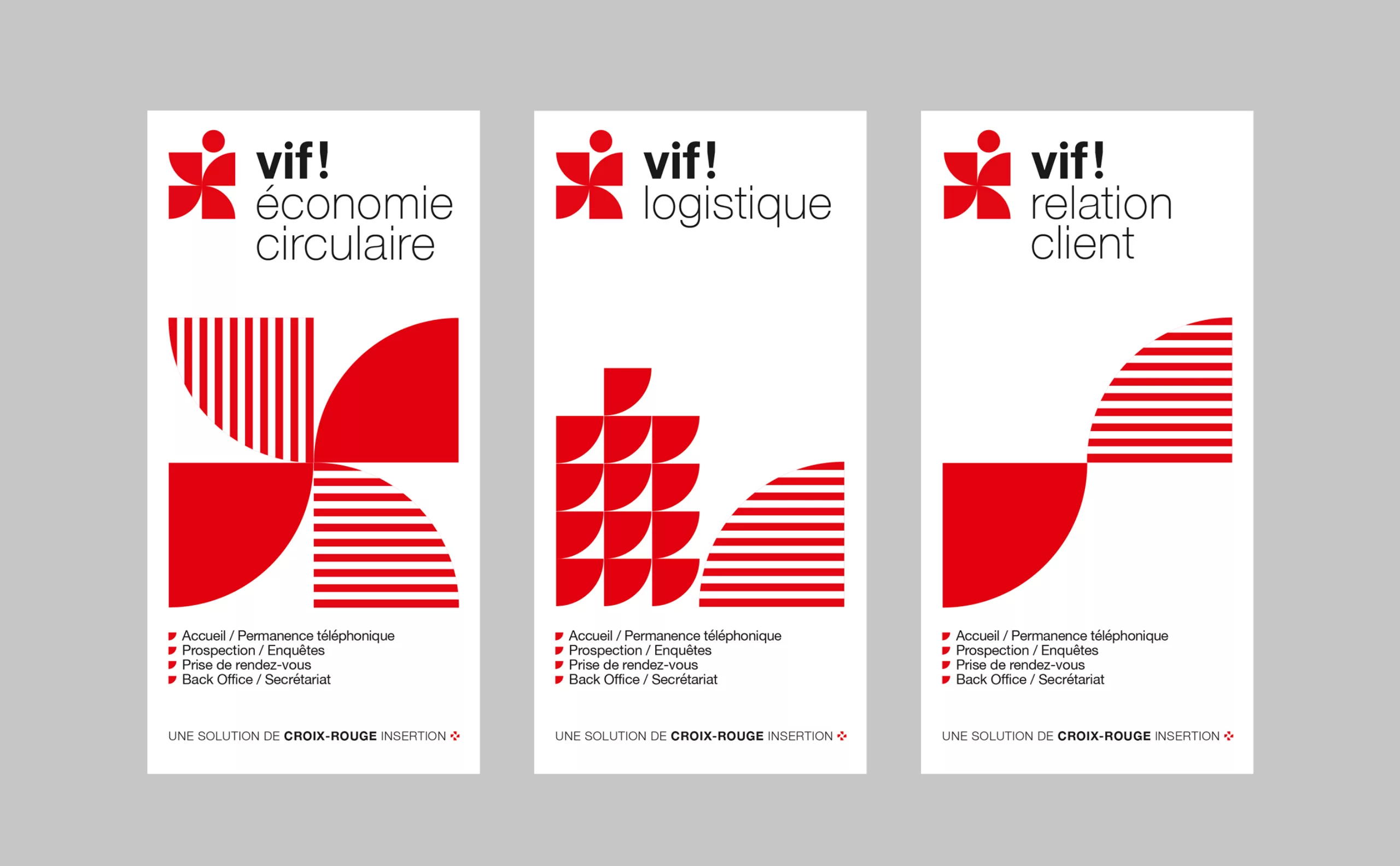
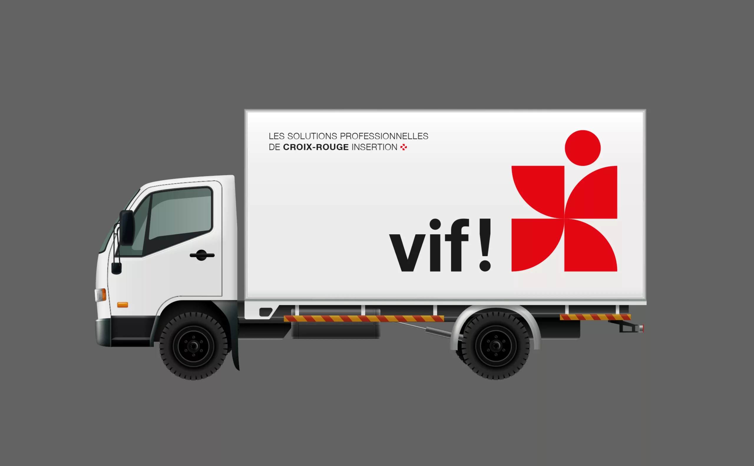
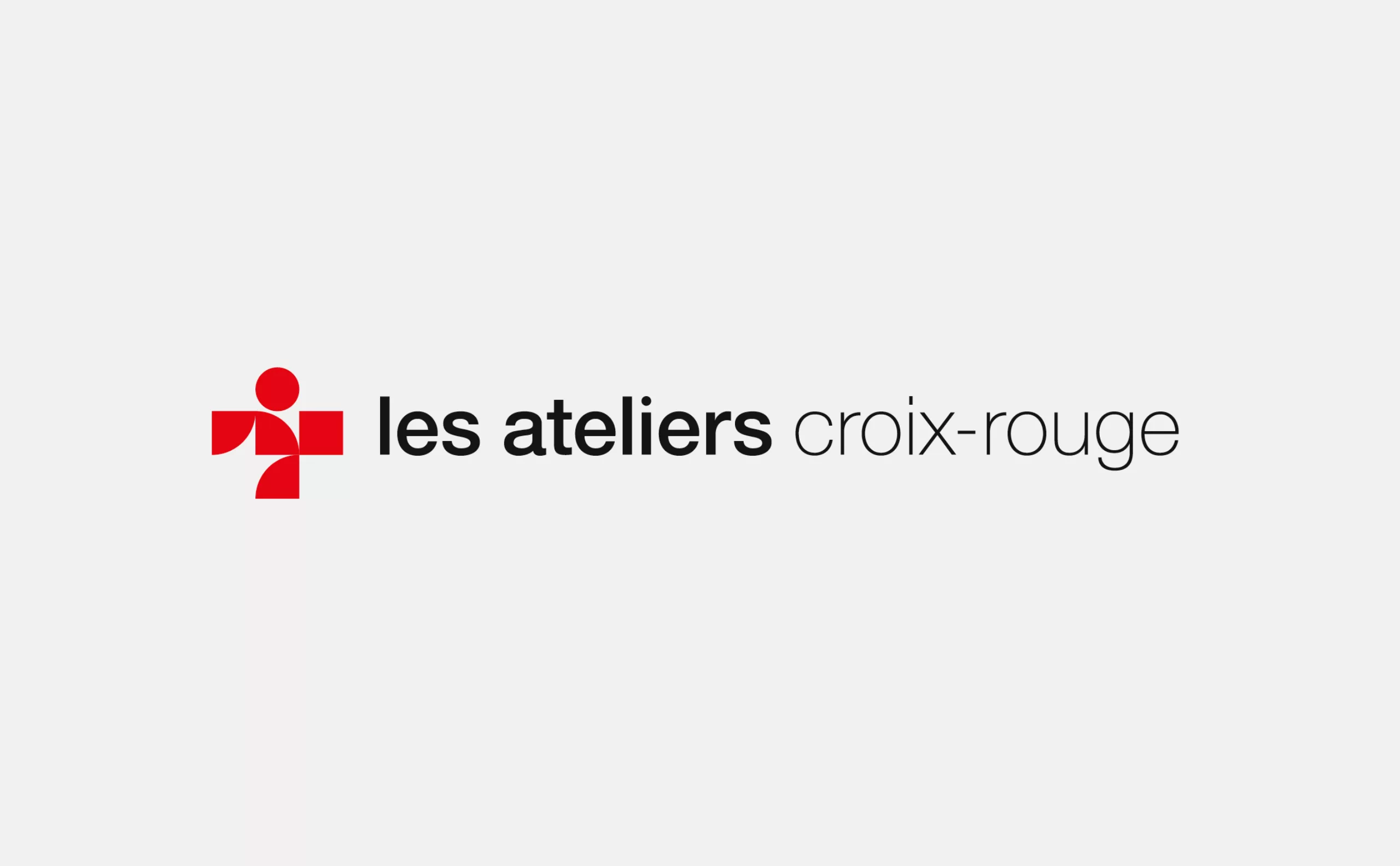
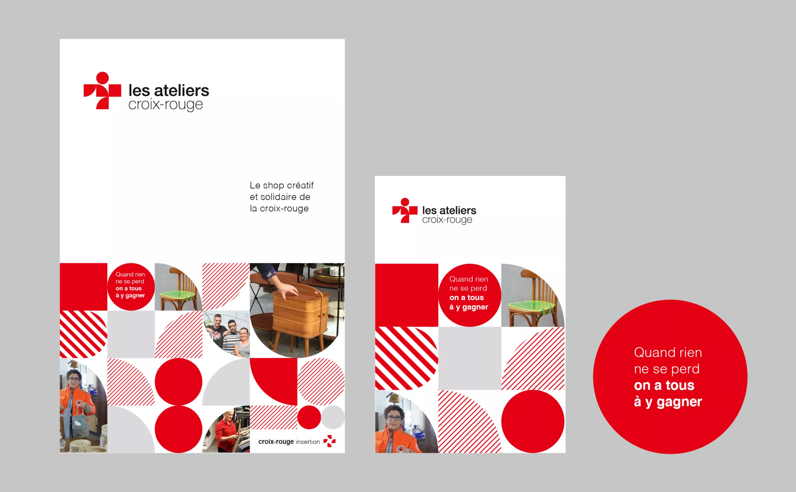
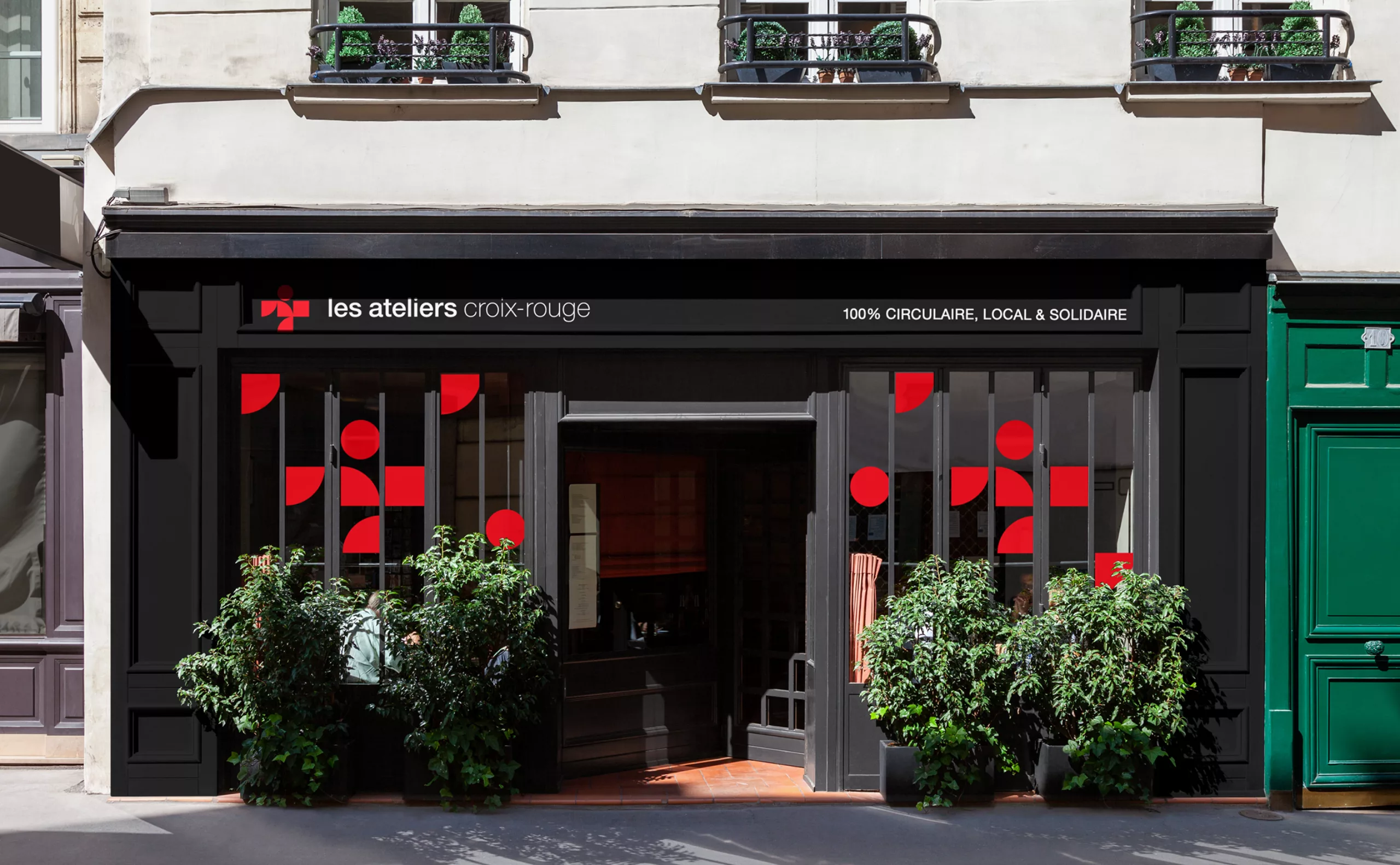
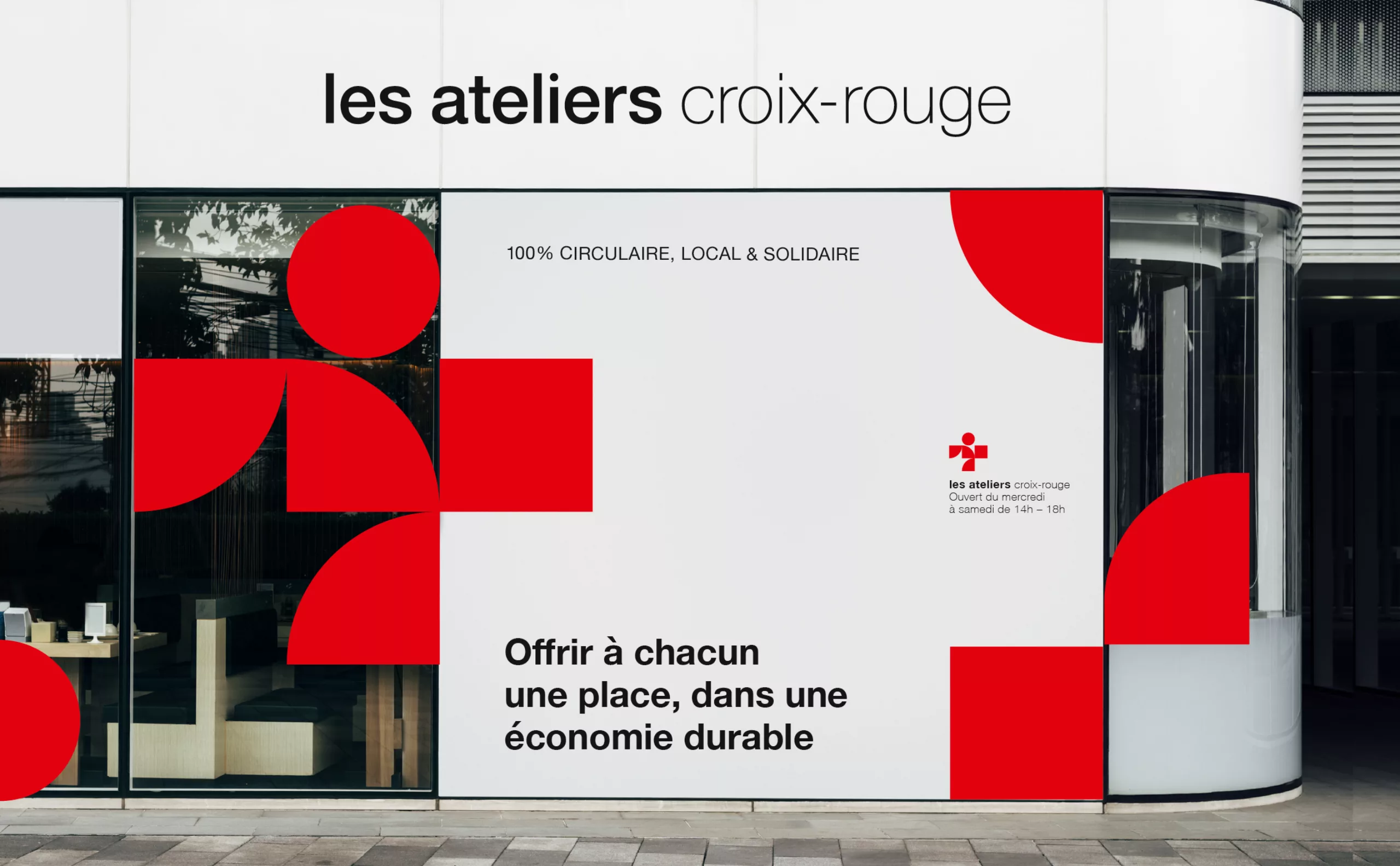
Our challenge was to create the name and visual identity of the BtoB brand (Vif!), as well as the identity of Ateliers Croix-Rouge, the BtoC brand, whose name already existed.
The issue was the following: how to appear as a successful economic player, with a name associated with "integration", and backed by a brand synonymous with voluntary work? It had to be said that professionals who know how to set up a refugee camp in 48 hours on the other side of the world are among the best logisticians on the market, and the same goes for the many professional services offered by Croix-Rouge insertion.
The objective was to find the name of the BtoB service offer in order to position them in the most serious and efficient way possible. In order to carry out this project within a limited schedule and budget, we proposed a one-week workshop in their main premises. A five-day commando operation to create a brand name and two brand identities! Here is the result of this intense and exciting work.
Our challenge was to create the name of the commercial offer, in a participative way, in one day. We gathered about ten participants around a large table, equipped with pencils and exercise books specially made by us. The methodology was intended to be simple, fun and demanding. We had one morning to collectively establish the brand platform, and the rest of the day to come up with name leads.
The aim was to move from an abstract idea to a concrete definition of the brand. It was also an opportunity to create a common language and unite the teams around the new project.
This is where collective intelligence takes on its full meaning. Around the table, all the employees of Croix-Rouge insertion took up the game. Each with their own words, images and ideas. At the end of the day, we got a list of 10 realistic names. "Vif!" got the majority of the votes. Vif! as in "Valorisation-Insertion-Formation" (Valorization-Integration-Training in English). Mission accomplished.
At this point, we had 4 days left to create two visual identities!
Motion design by Raphël Martinez.
Graphically, the challenge was to fit in the Croix-Rouge française brand architecture. The Croix-Rouge insertion logo having introduced quarter circles elements, a brilliant trick to talk about integration and synergies.
Vif! became a "human windmill", a way of celebrating the unfailing energy of the employees. A simple and lively sign!
For the second brand, Ateliers Croix-Rouge, the graphic language tells the idea of recycling and upcycling from heterogeneous materials, a red cross made up of various pieces, forming a human silhouette.
Acknowledgements:
Thanks to Sylvie, Vianney, Sang, Stéphanie and Steeve, the workshop participants.
Thanks to Chloé, Céline and Simon for their trust and involvement in this project.
Motion design by Raphaël Martinez.