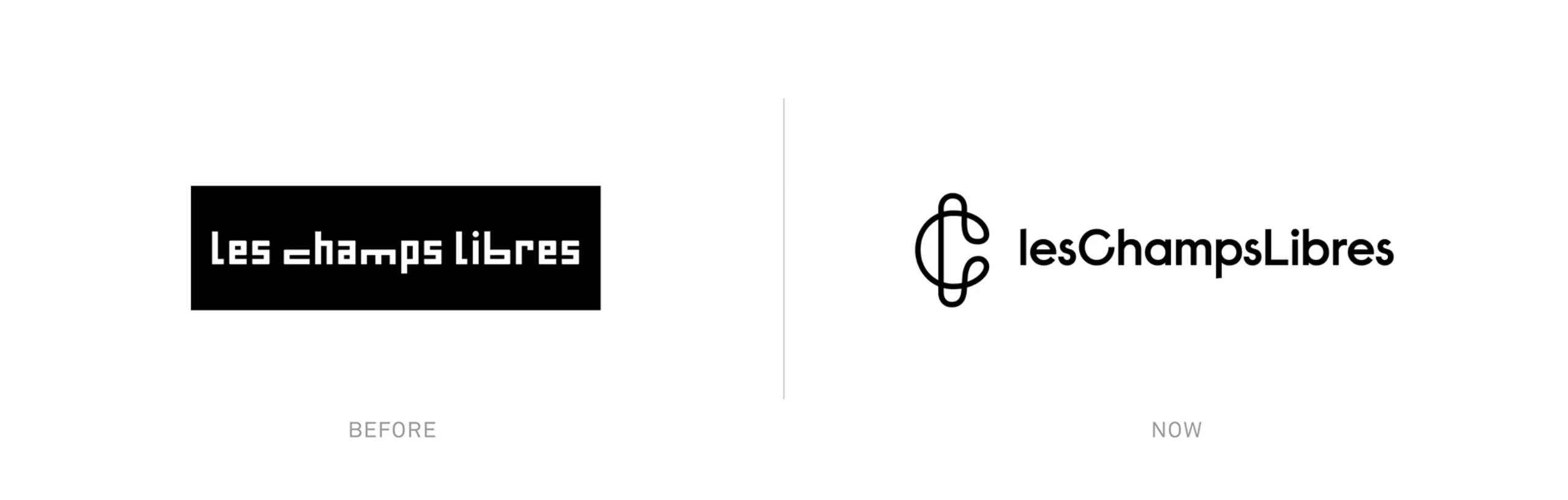
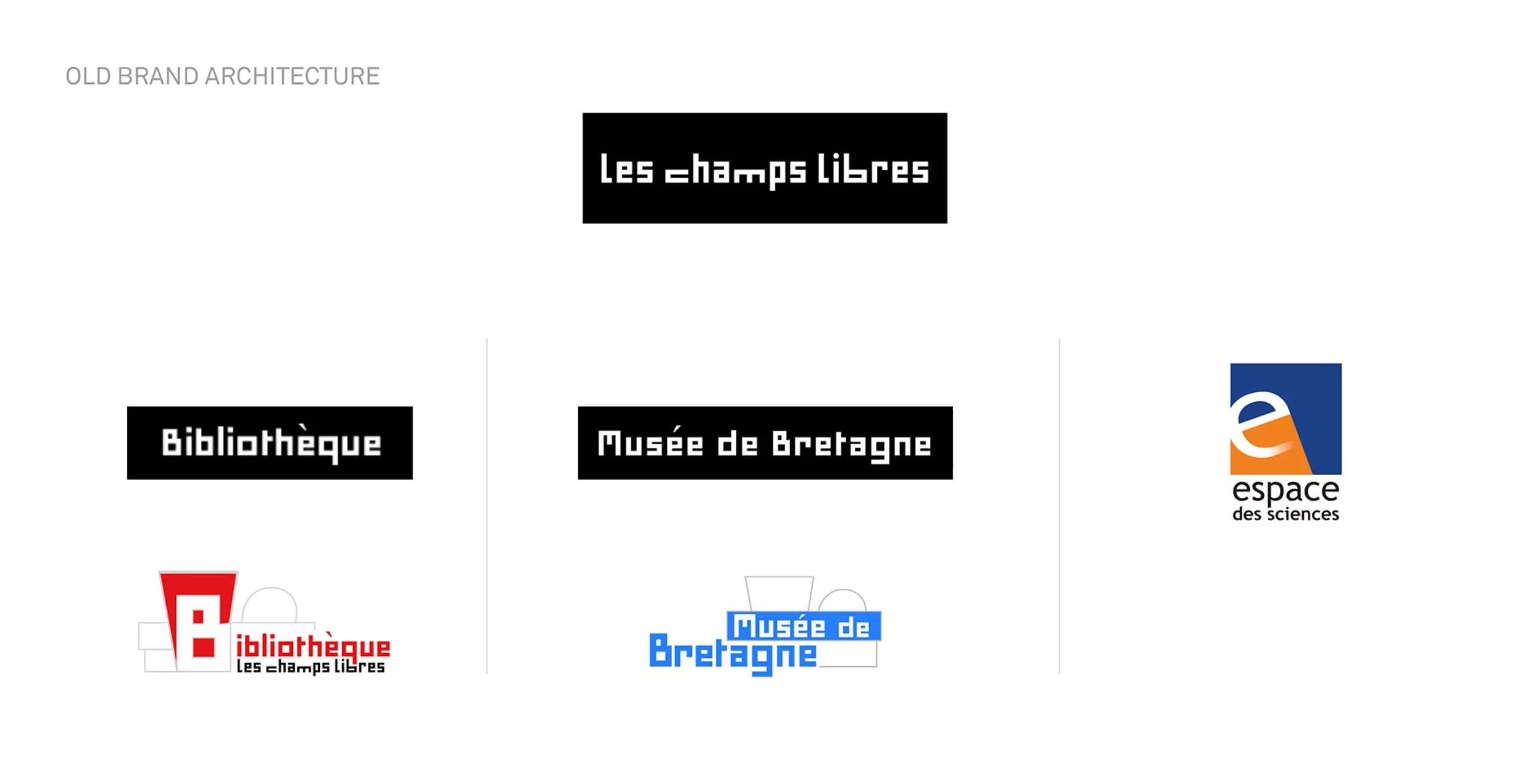
An existing logotype with a typographical choice a “Minimum” out of date
Previously, the Les Champs Libres logotype was composed using the typeface ‘Minimum’ in its Bing version, designed by Pierre di Sciullo in 2004 (the original Minimum dating back to 1986). His drawing, although hand-made, is inspired by the grids formed by the pixels of the first personal computers. Without curves, only with verticals, horizontals and sometimes 45° diagonals, the result is a highly technological-looking typeface, with a strong 90s style. A typeface that reinforced a rigid, inflexible image, ignoring the human aspect, which remains at the heart of the institution.
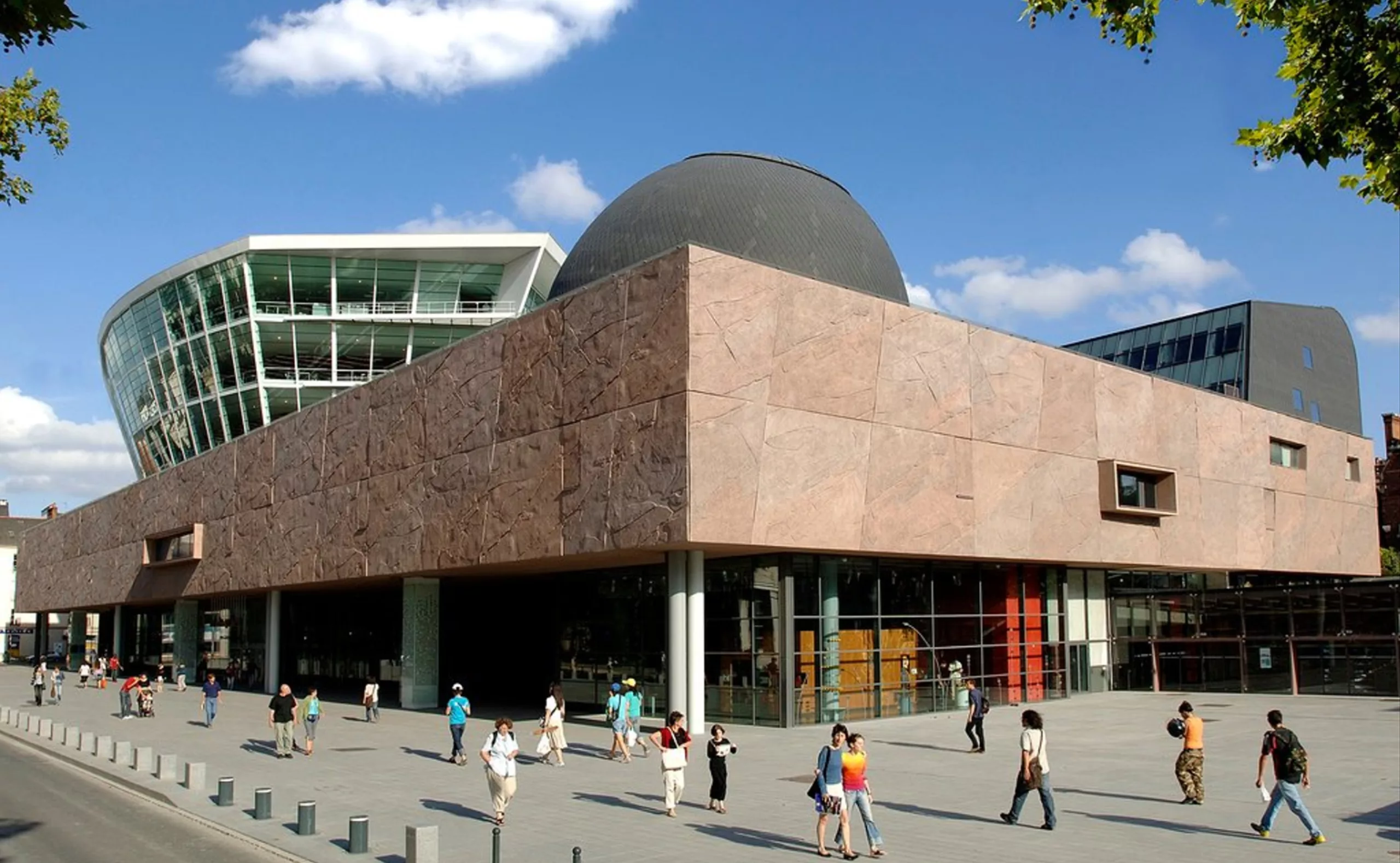
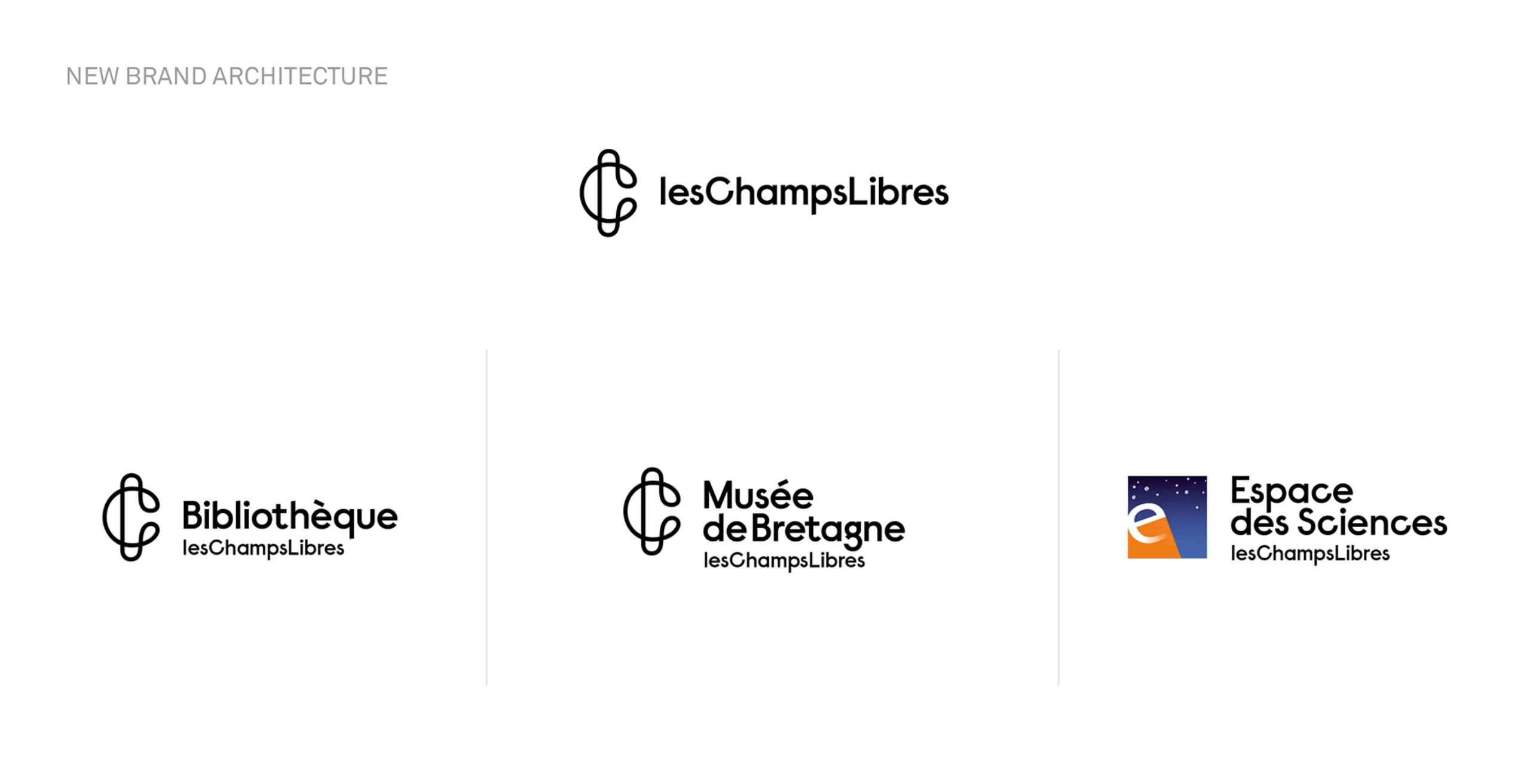
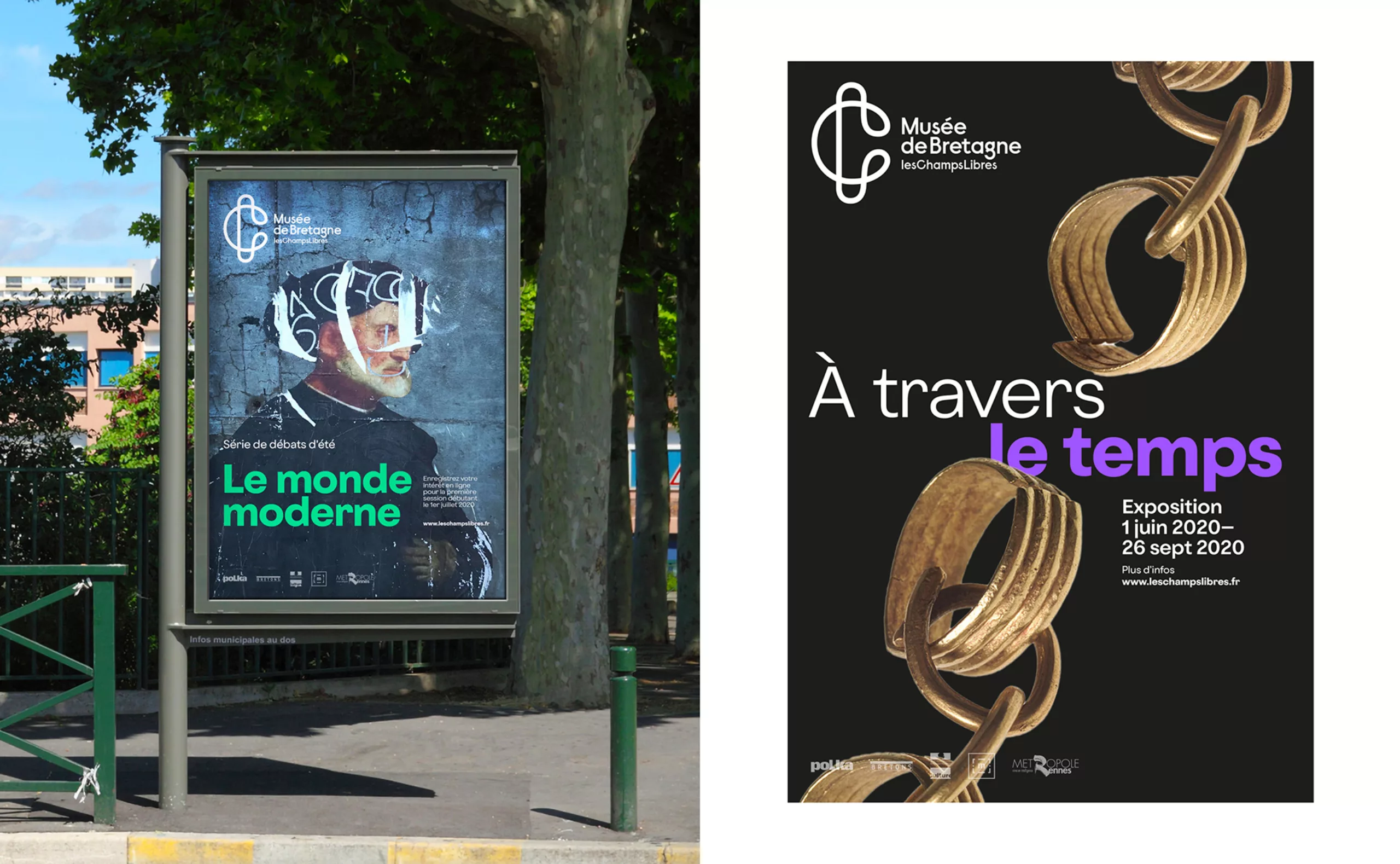
The logos of the Library and Museum of Brittany were also composed in Minimum in its original version. Only Espaces des Sciences had its own full-fledged logotype with no link to the other entities. This split hampered the recognizability of the project and made the understanding of the place more complex.
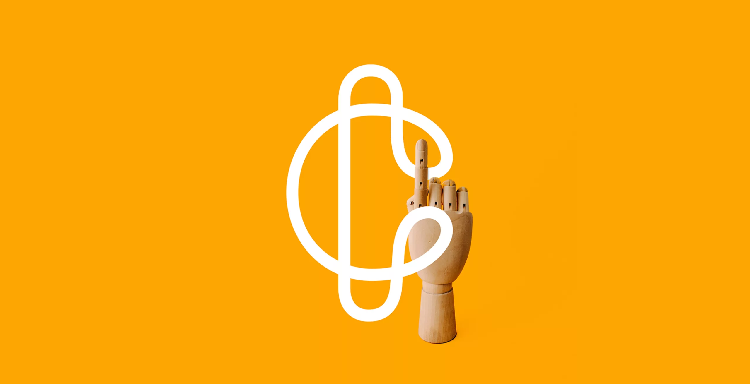
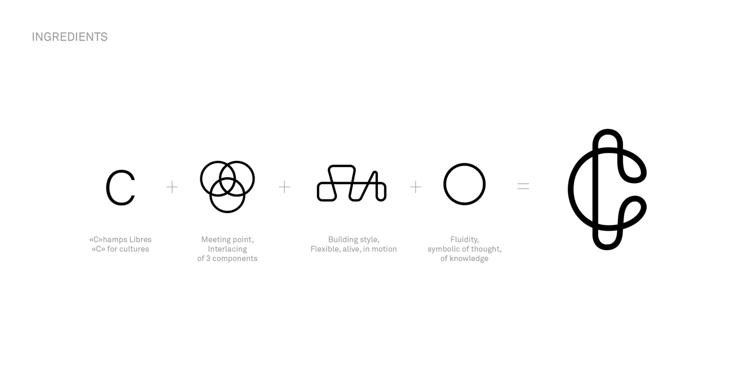
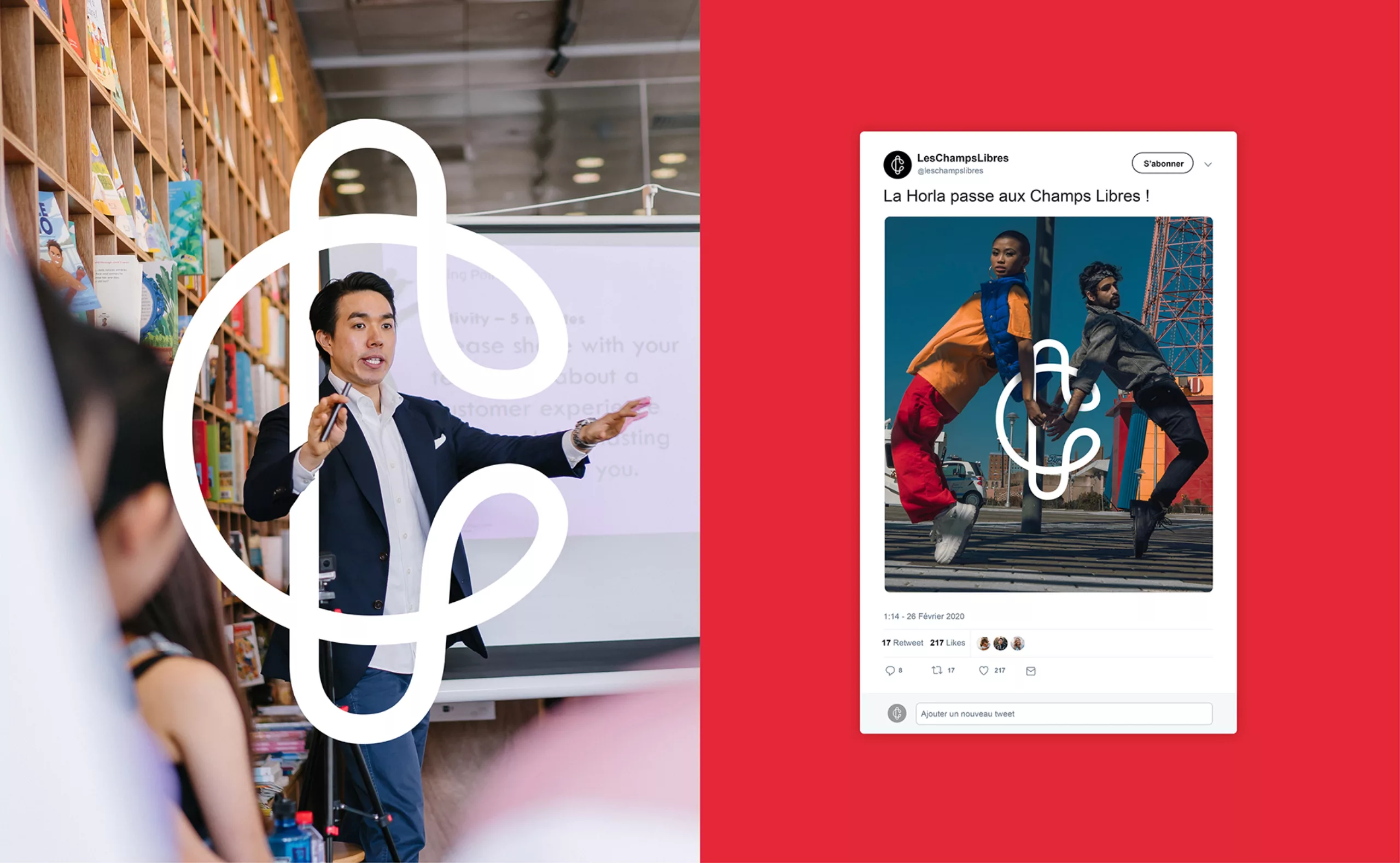
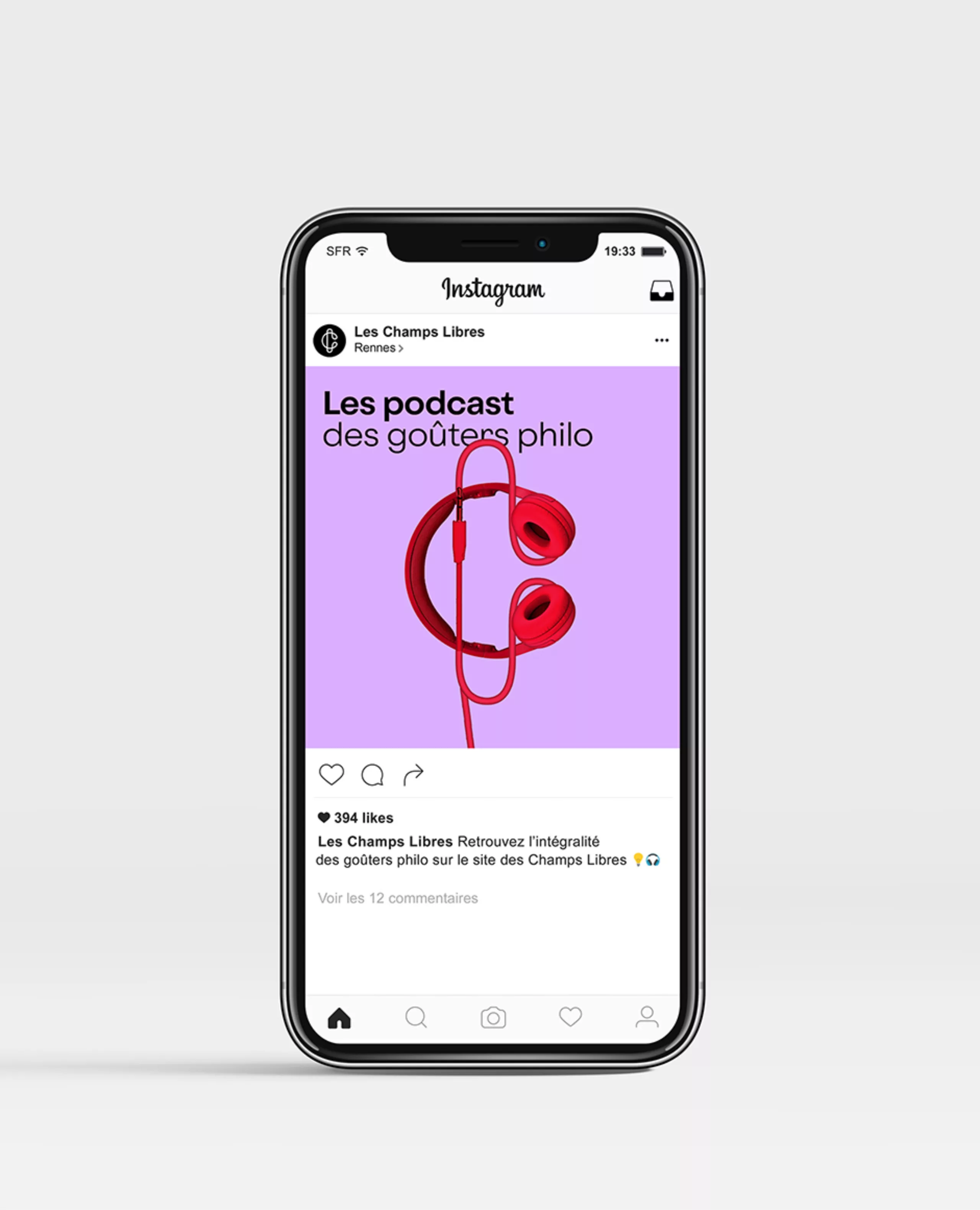
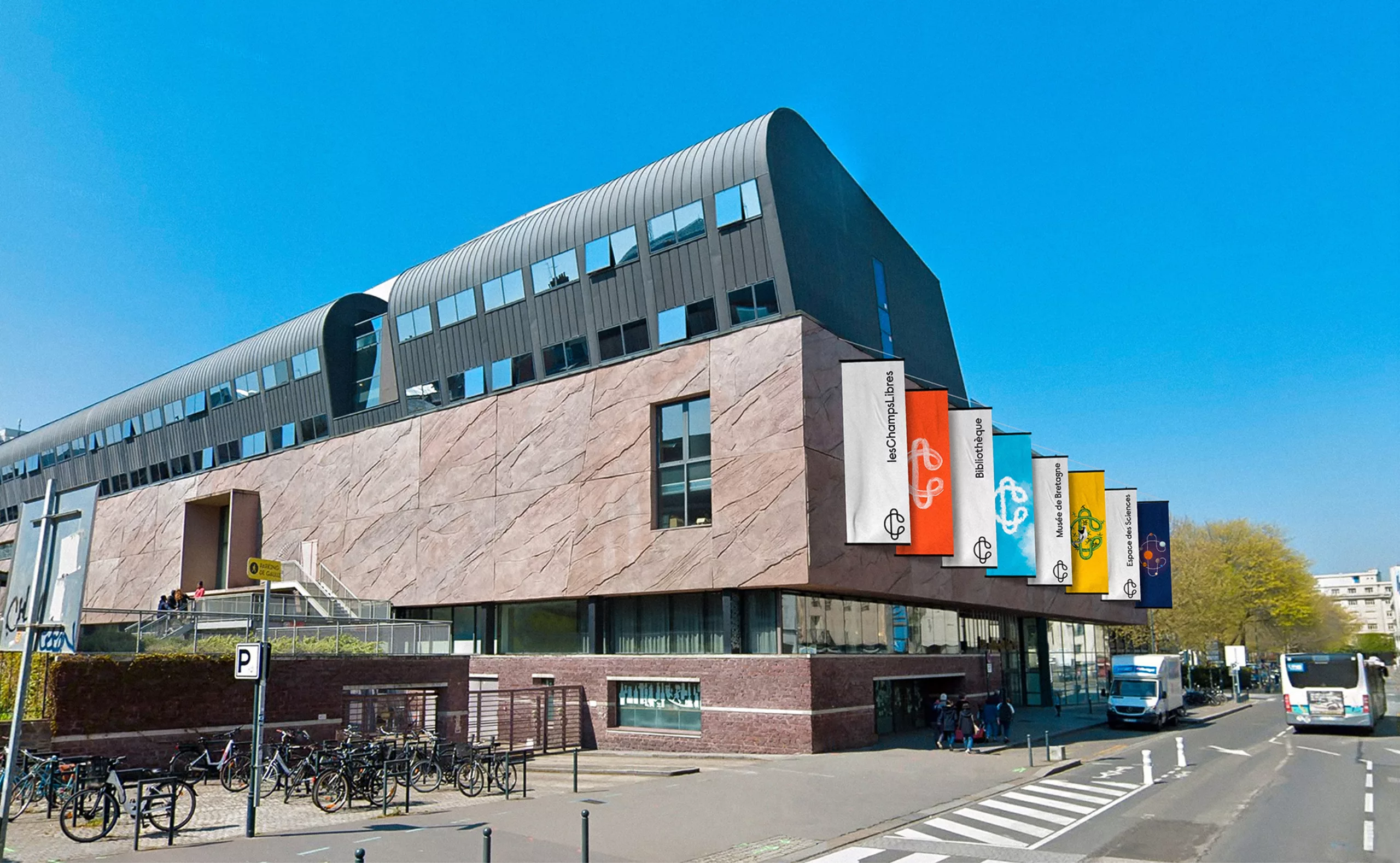
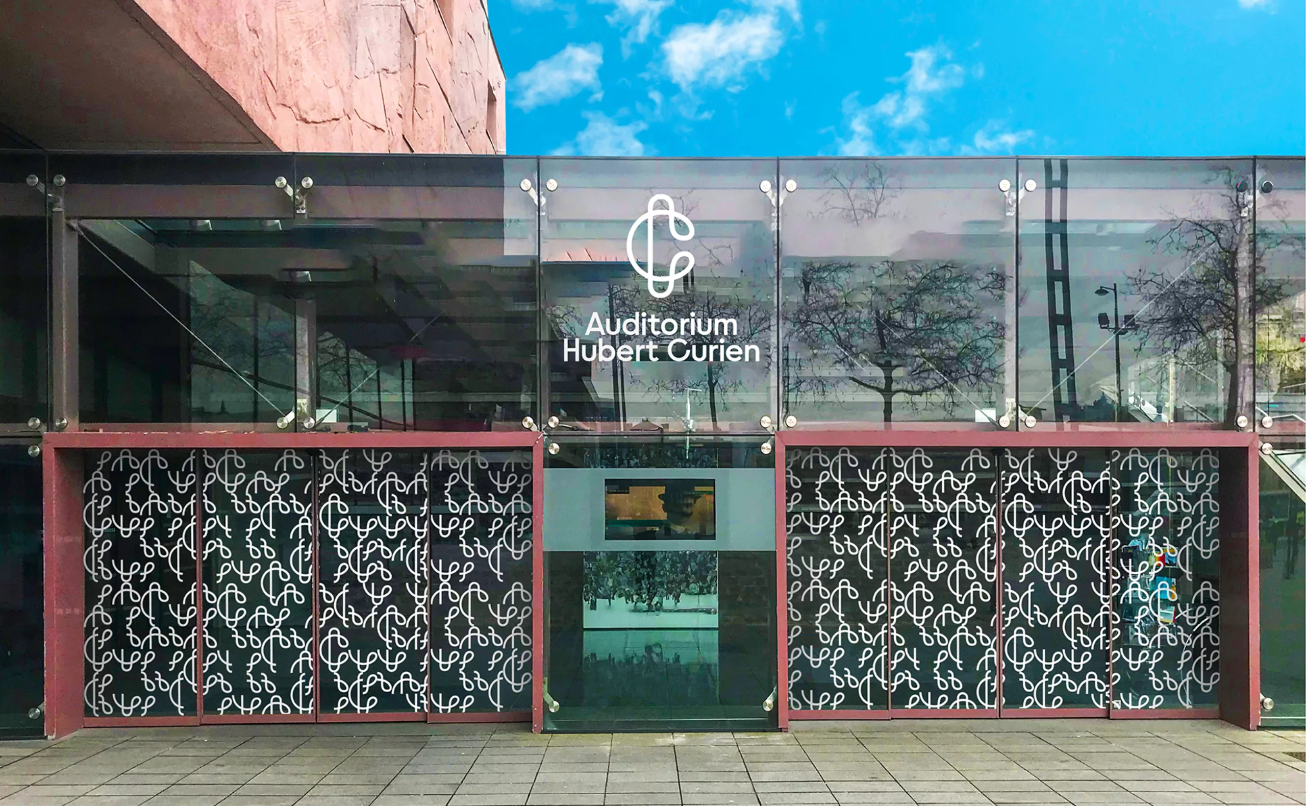
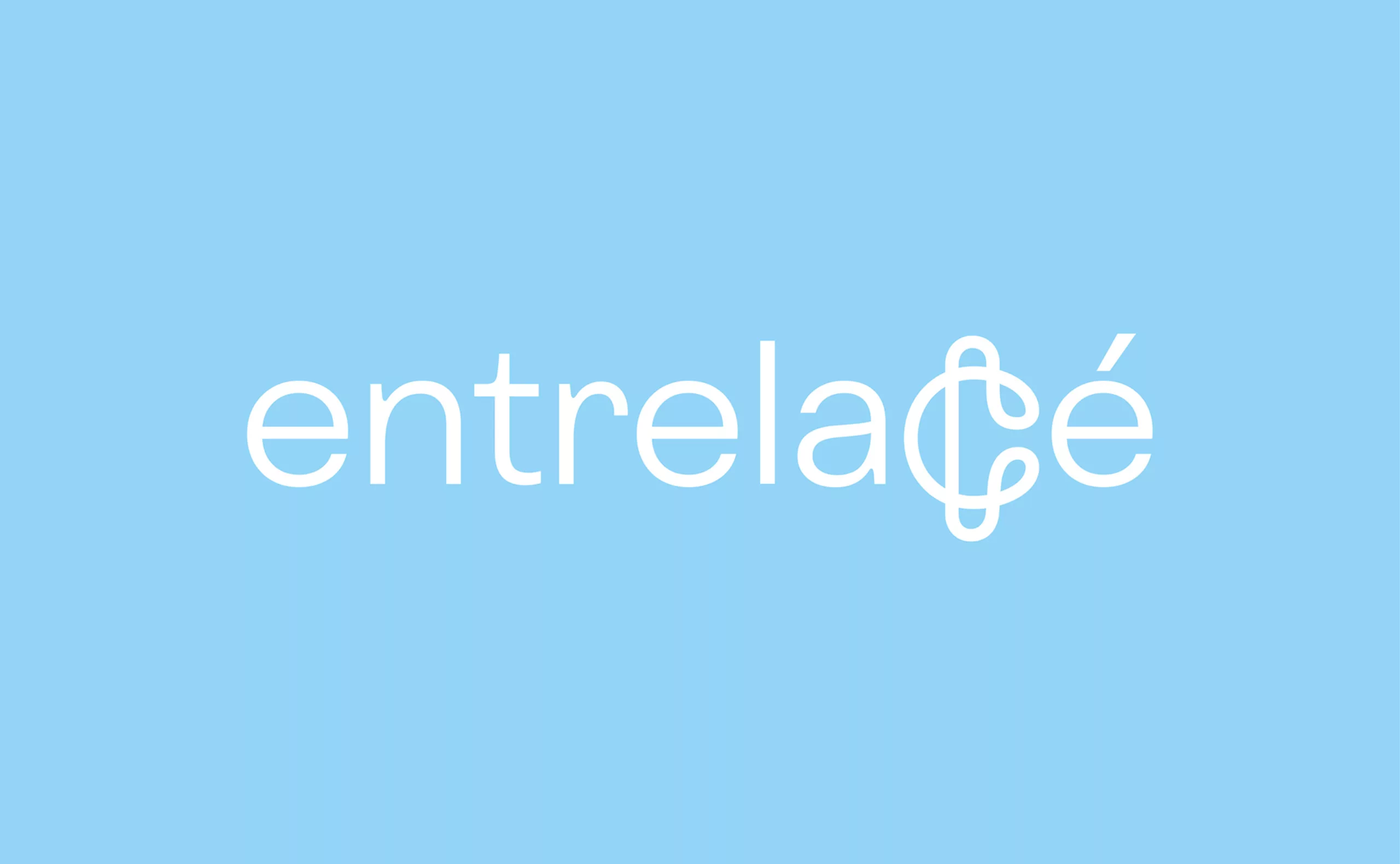
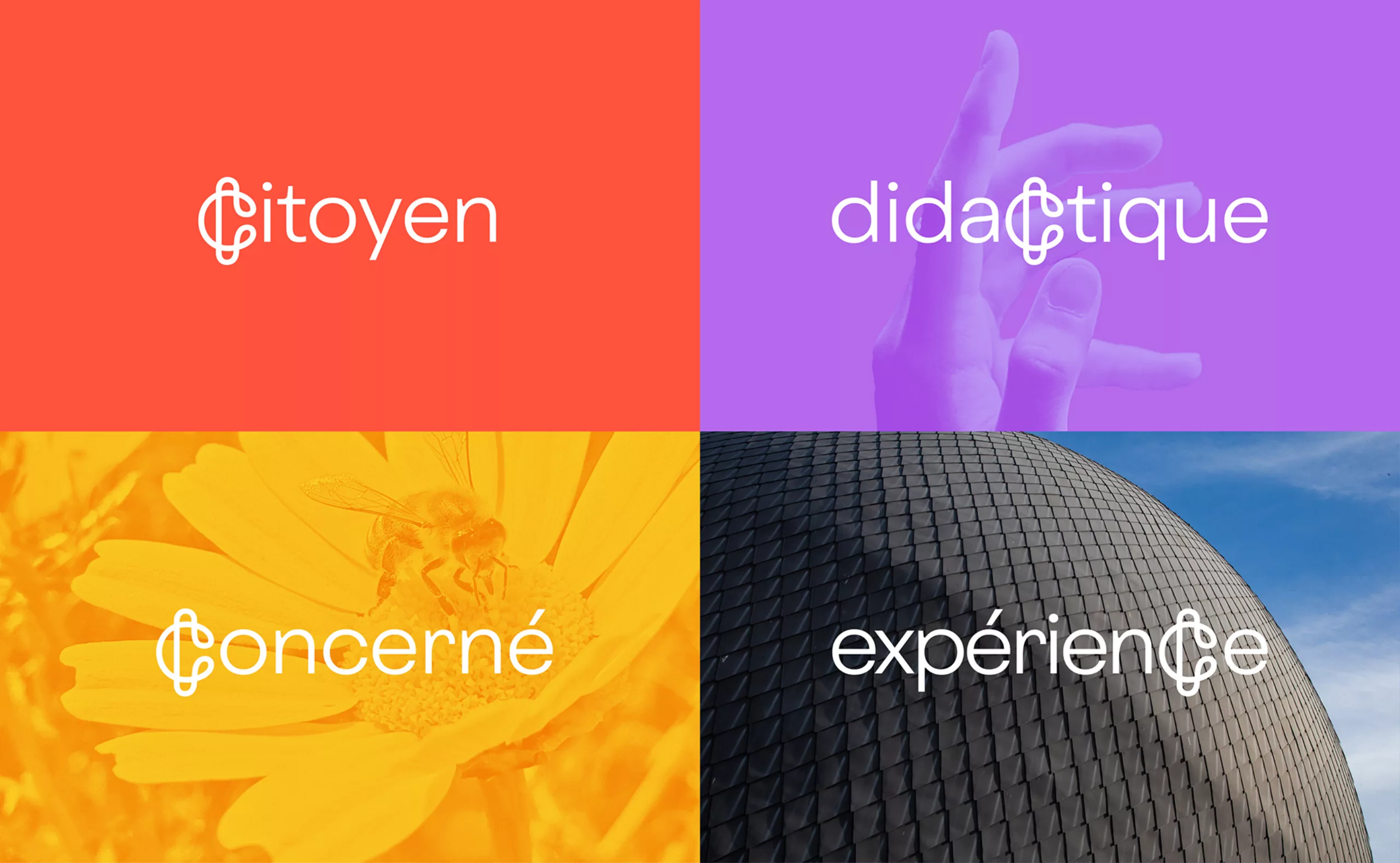
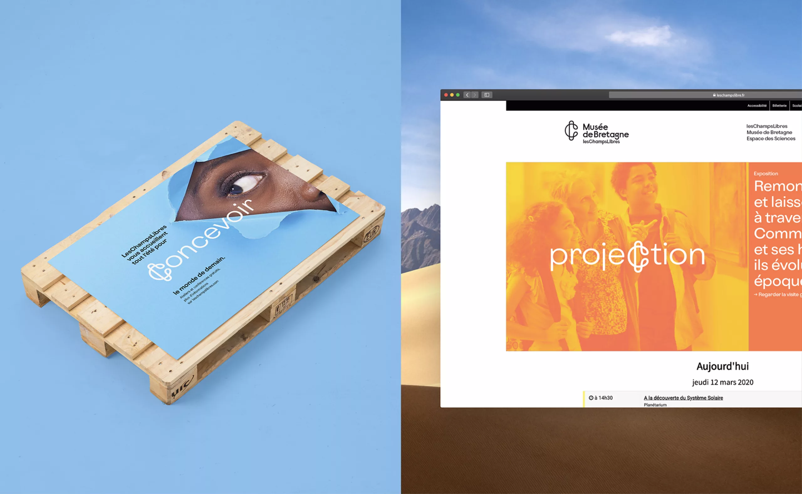
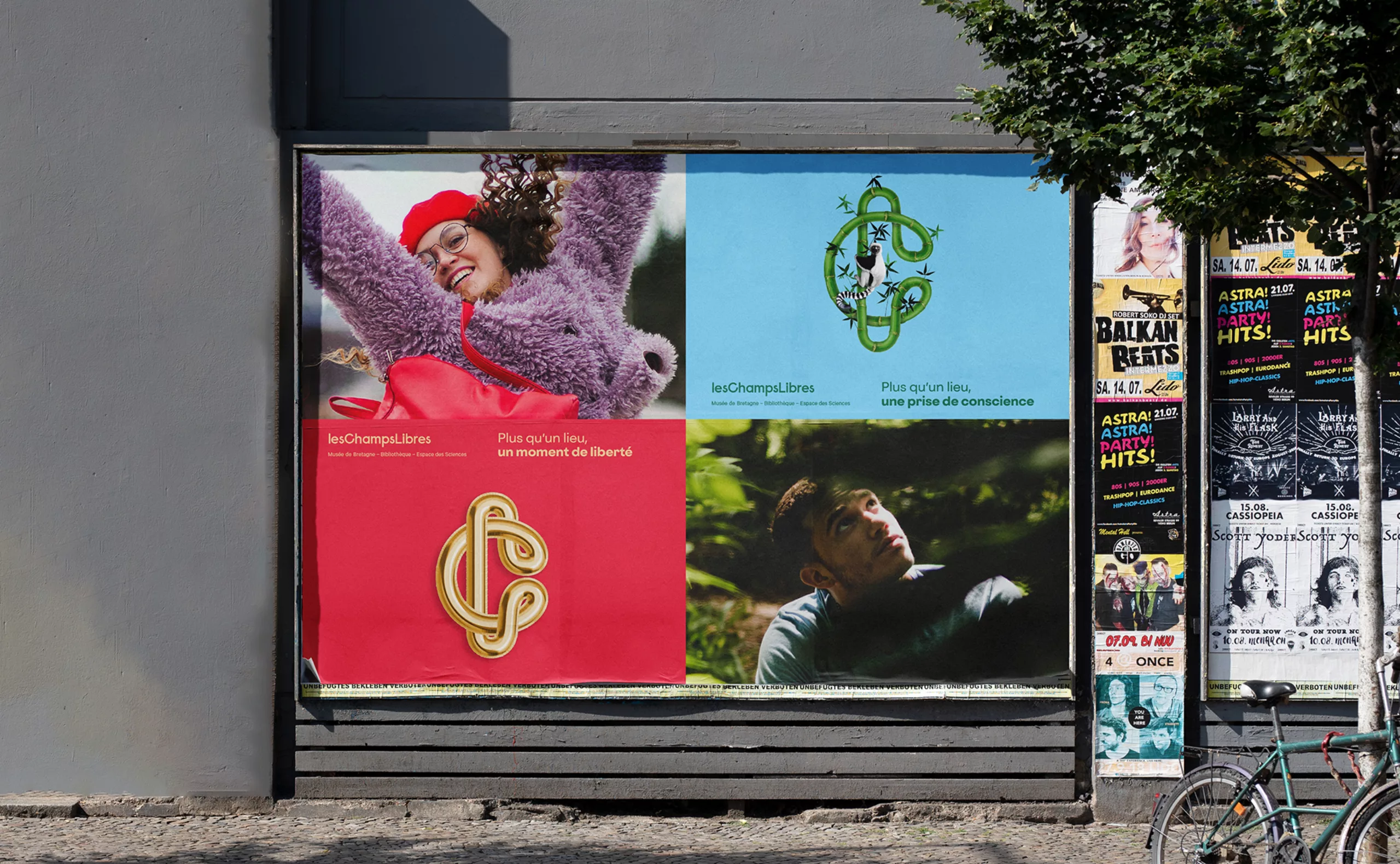
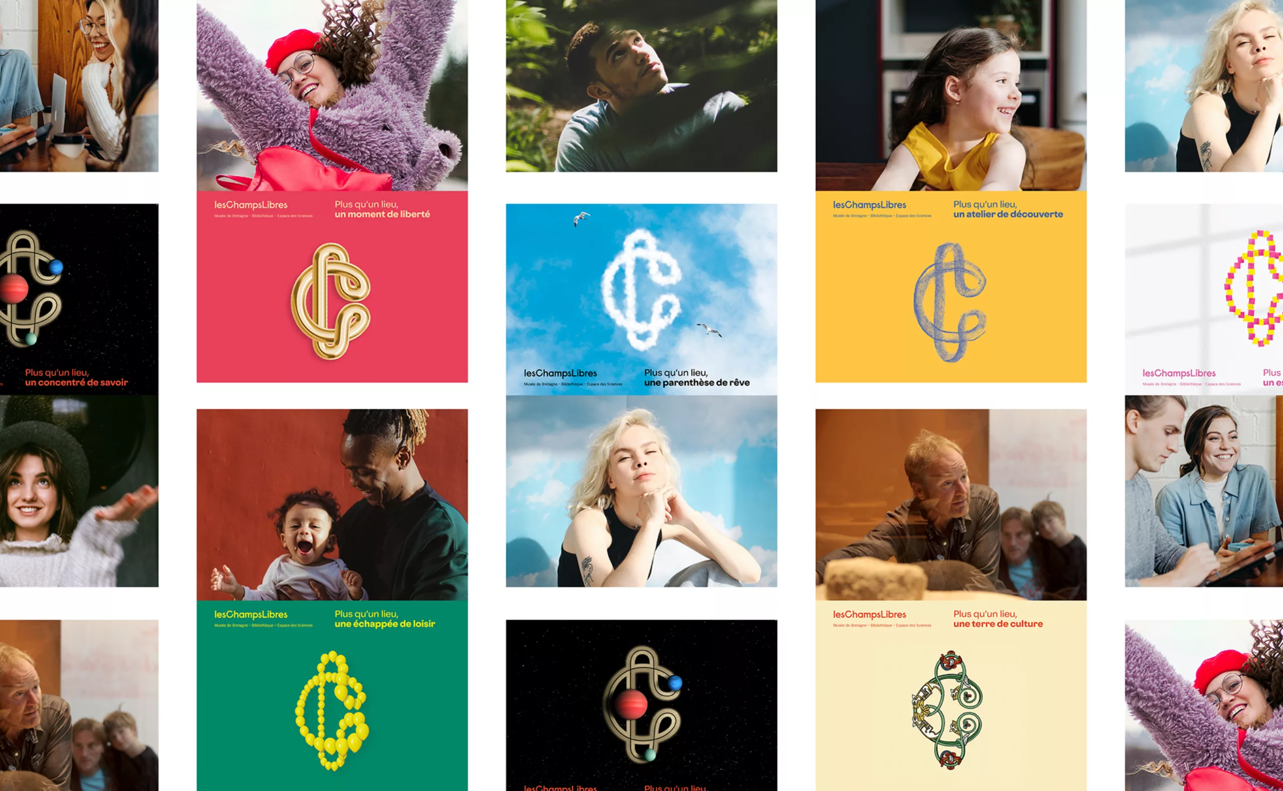
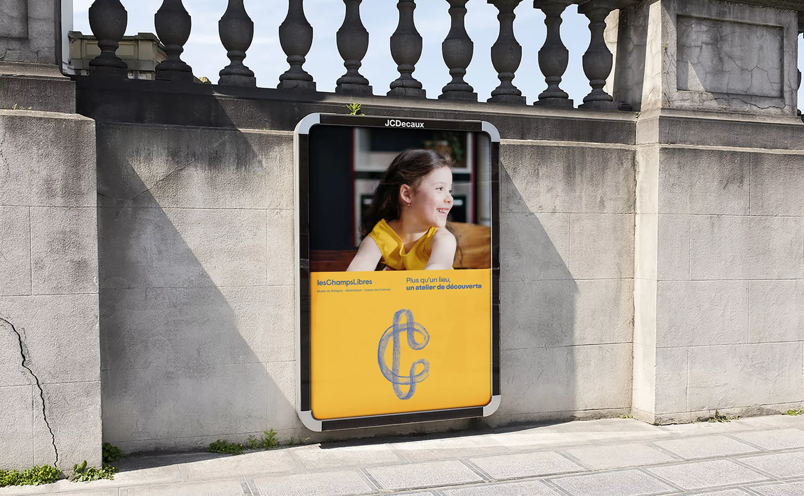
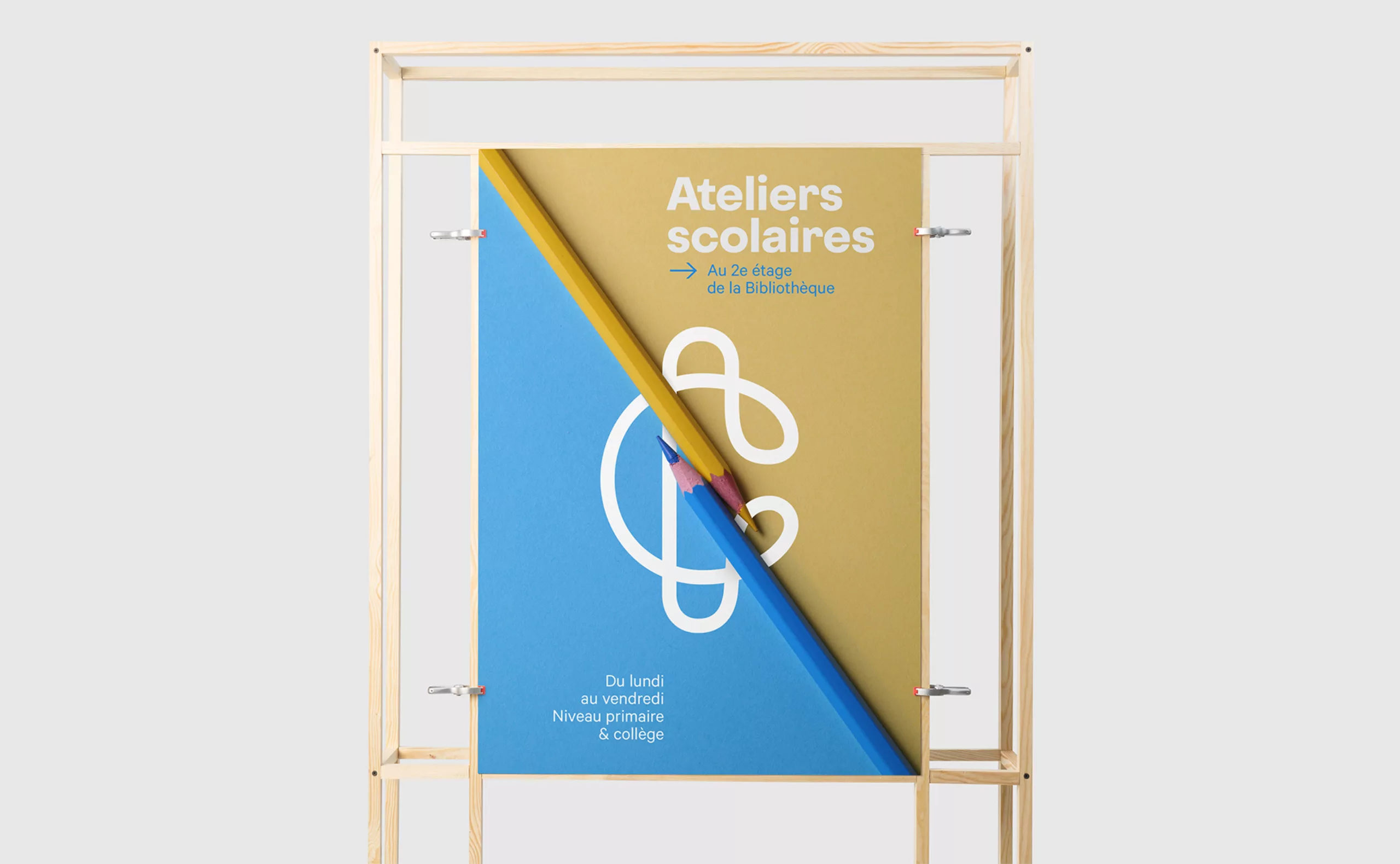
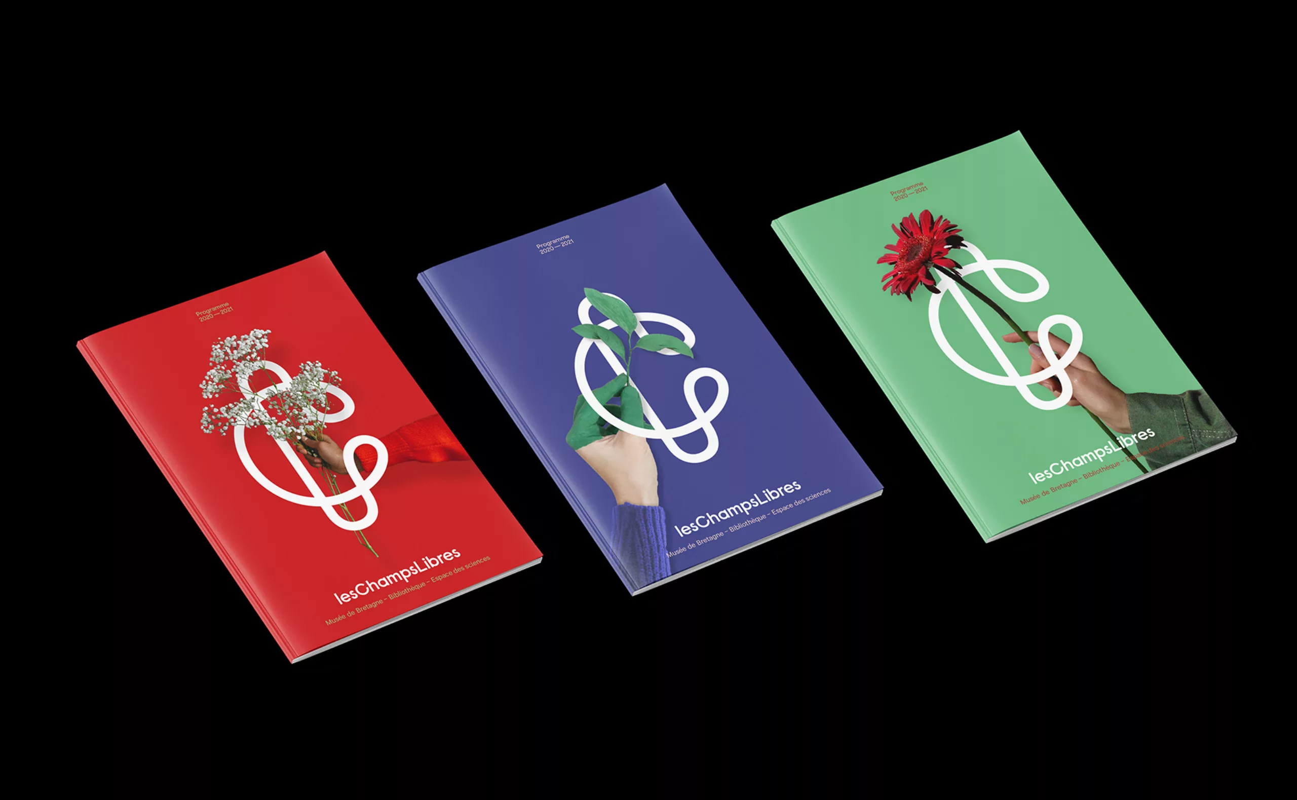
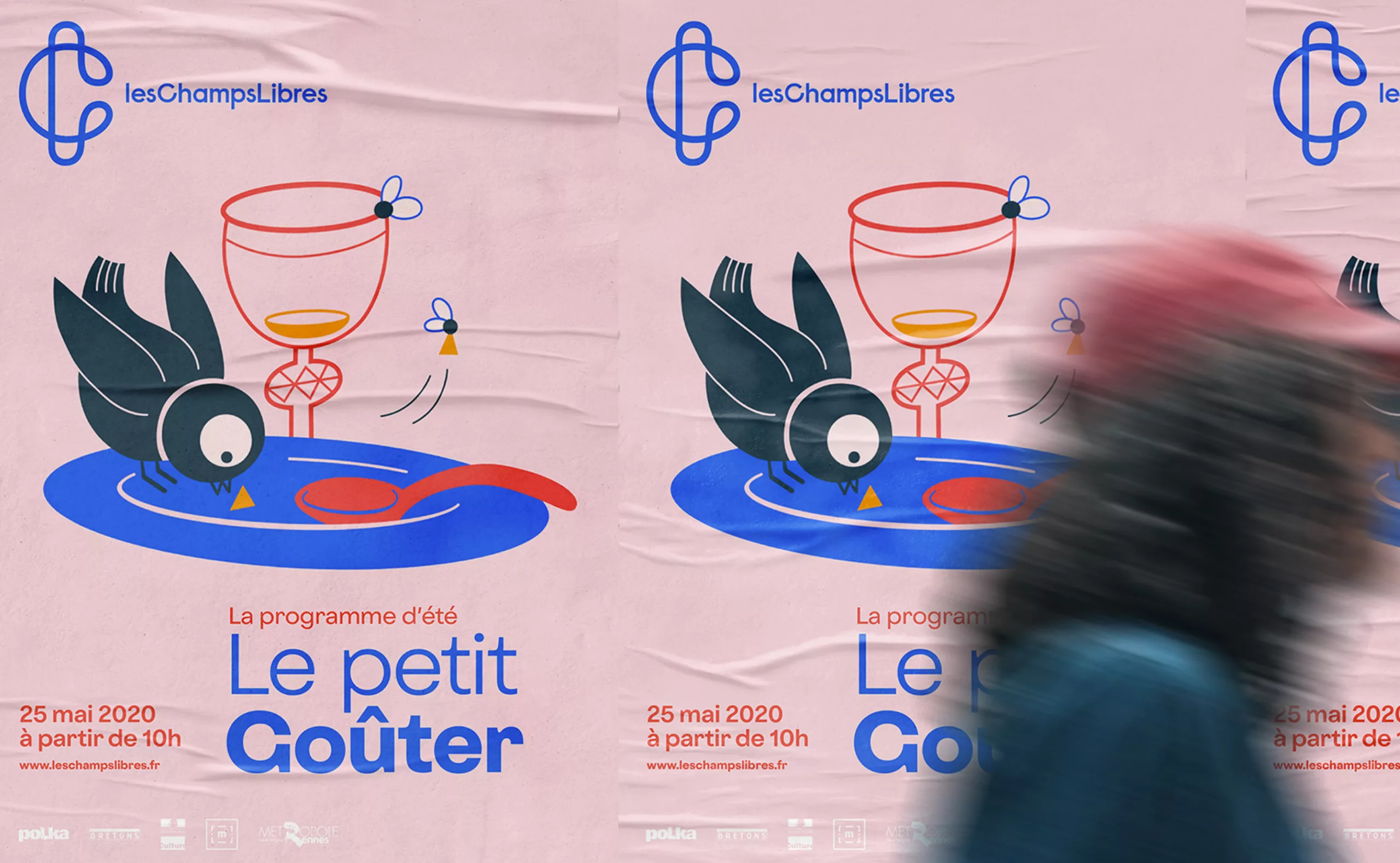
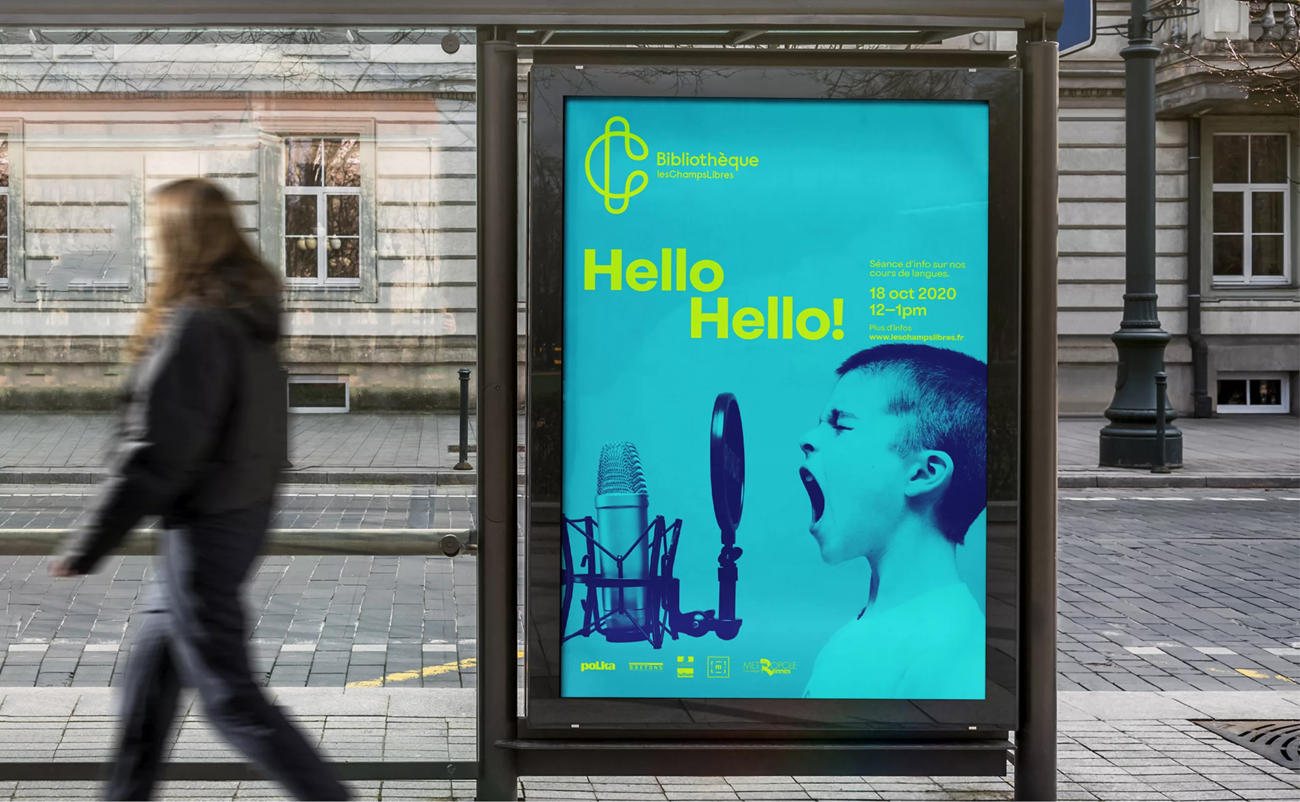
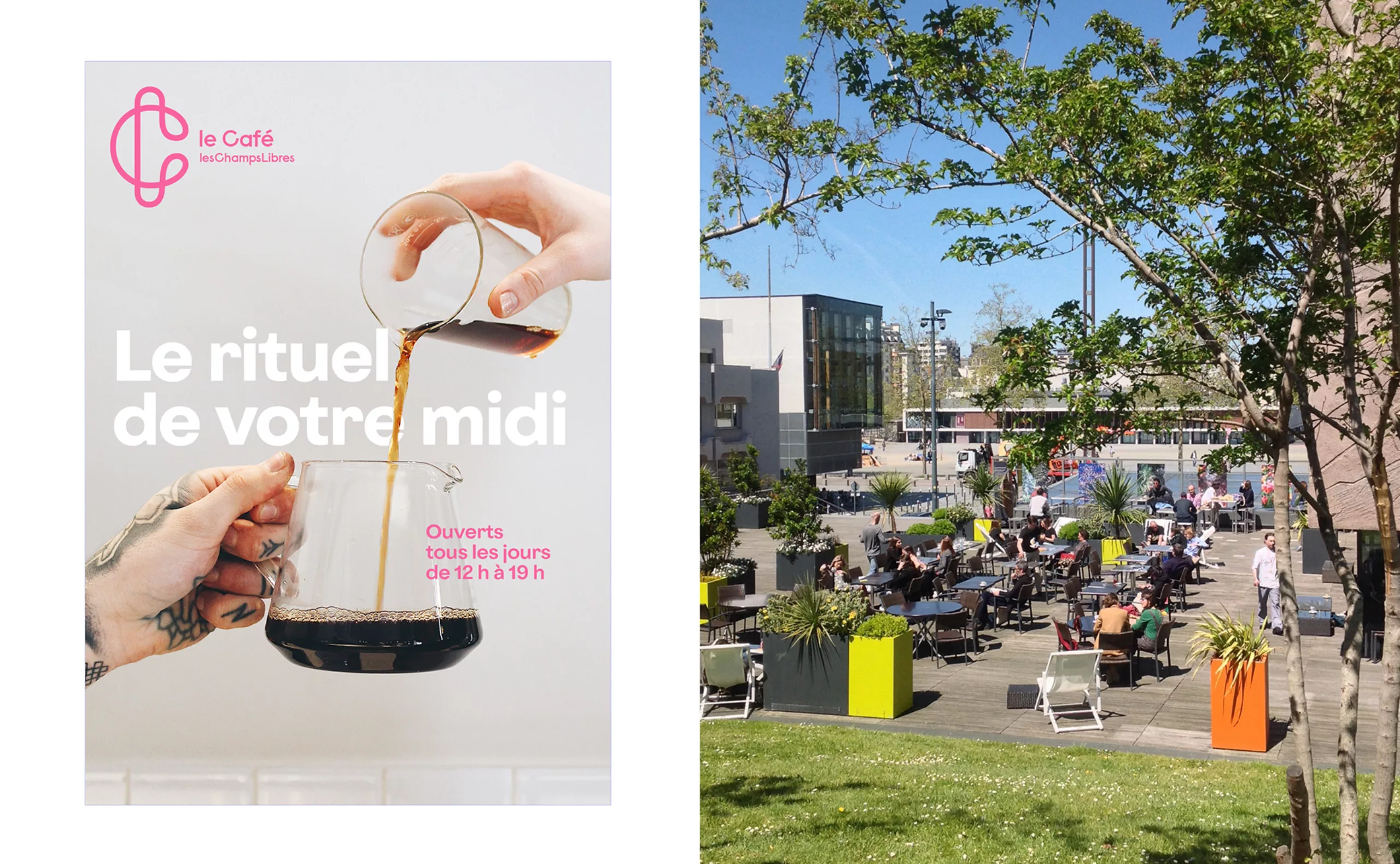
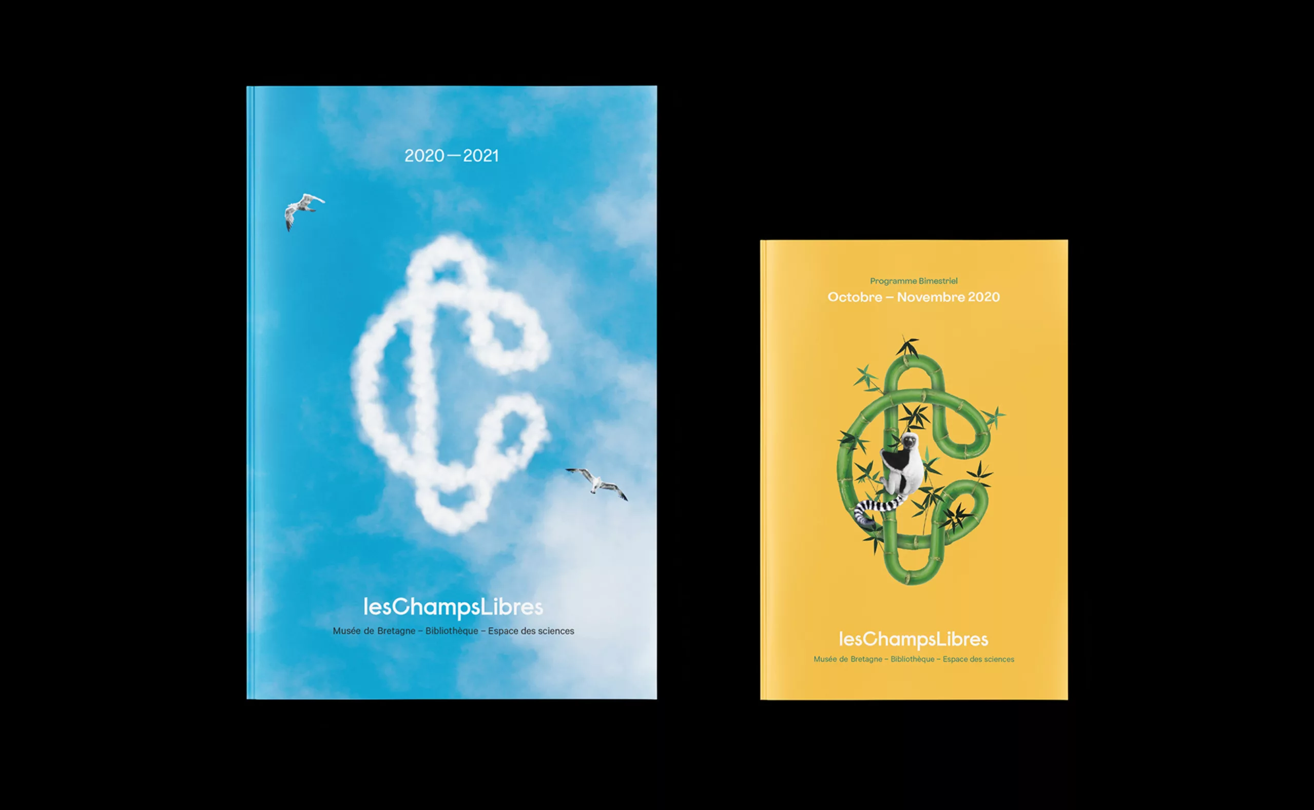
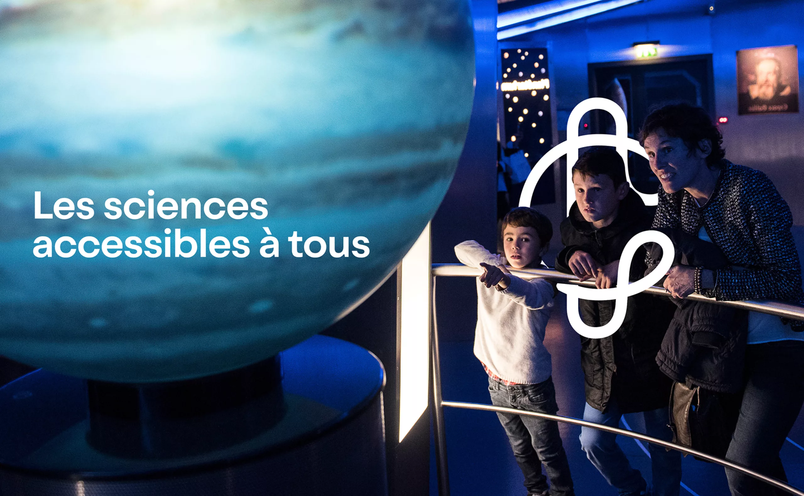
Graphéine’s mission was to create the visual identity of a place but also of an experience. We had to solve the problem of brand architecture by uniting the 3 entities under the same banner. To create a logo that reaffirms Les Champs Libres’ values of “welcoming, common, plural home” and builds public loyalty.