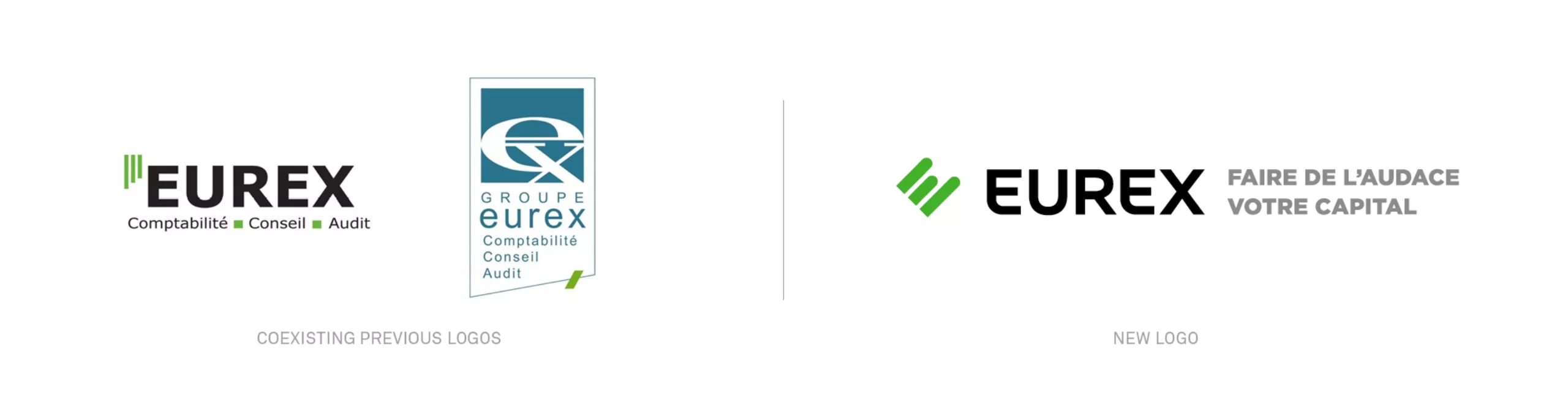
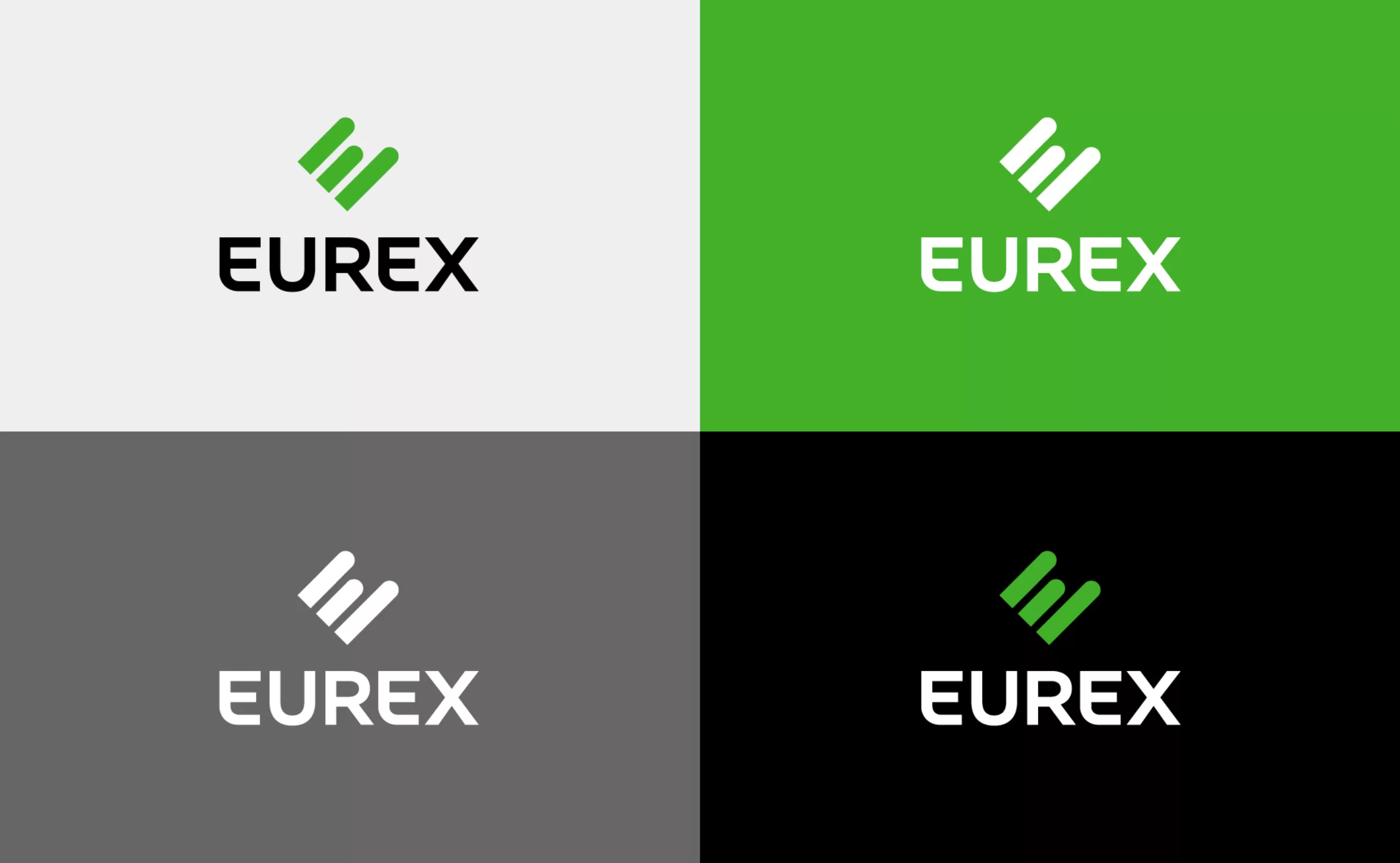
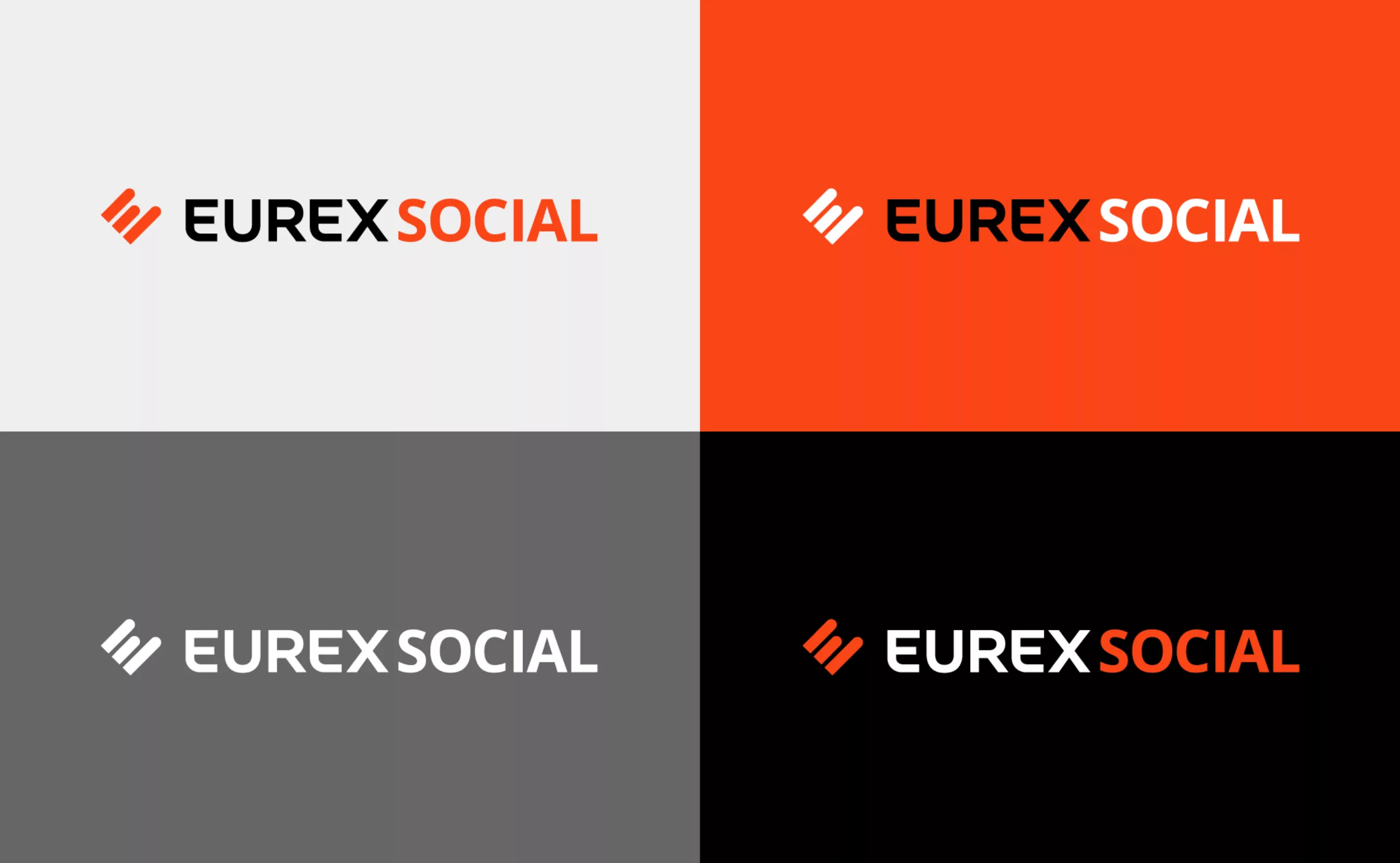
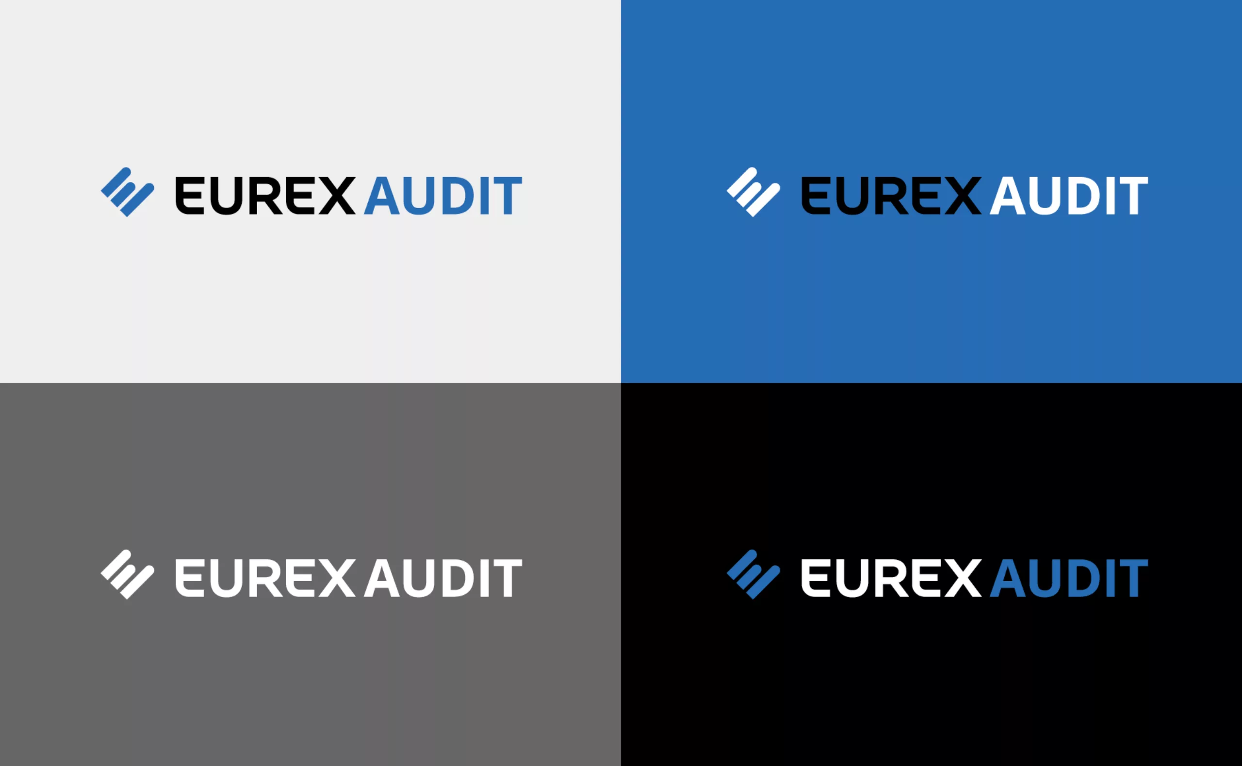
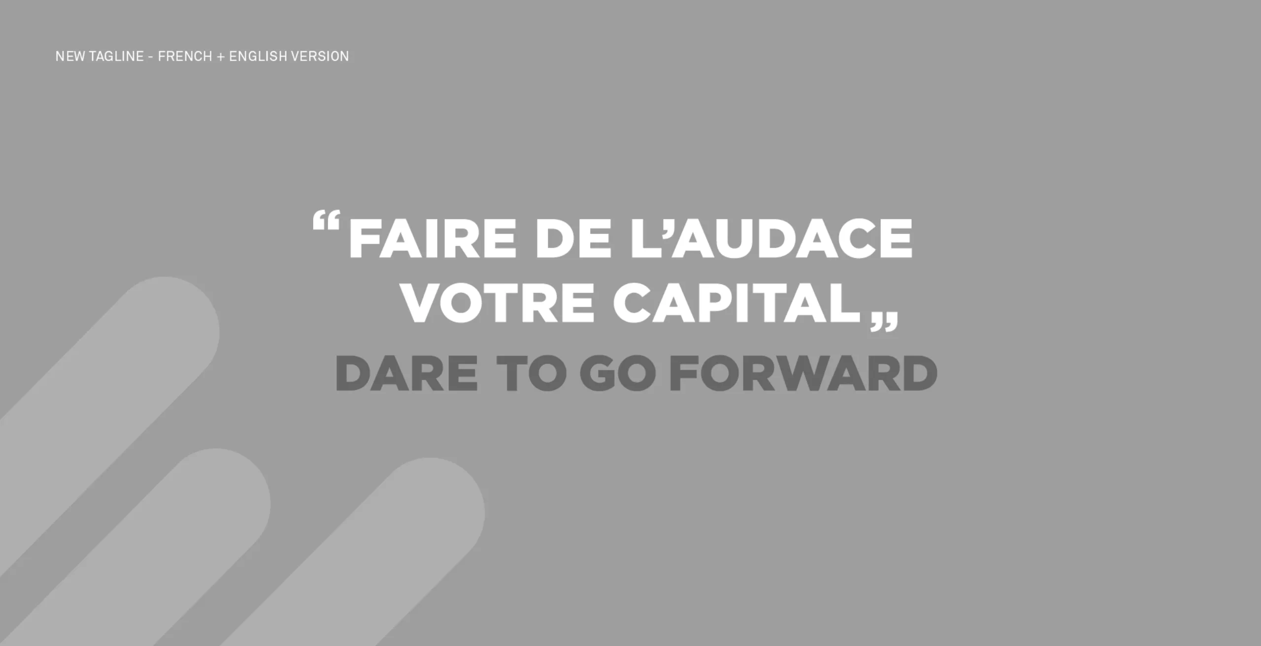
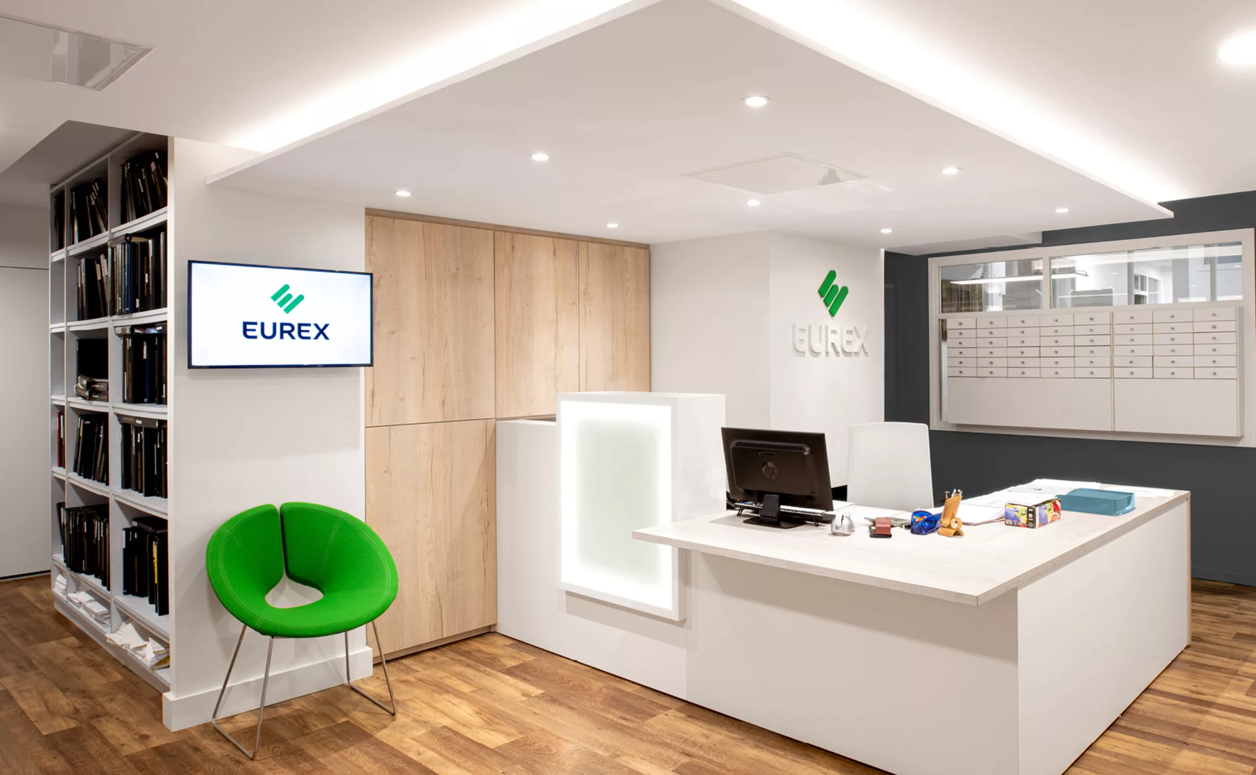
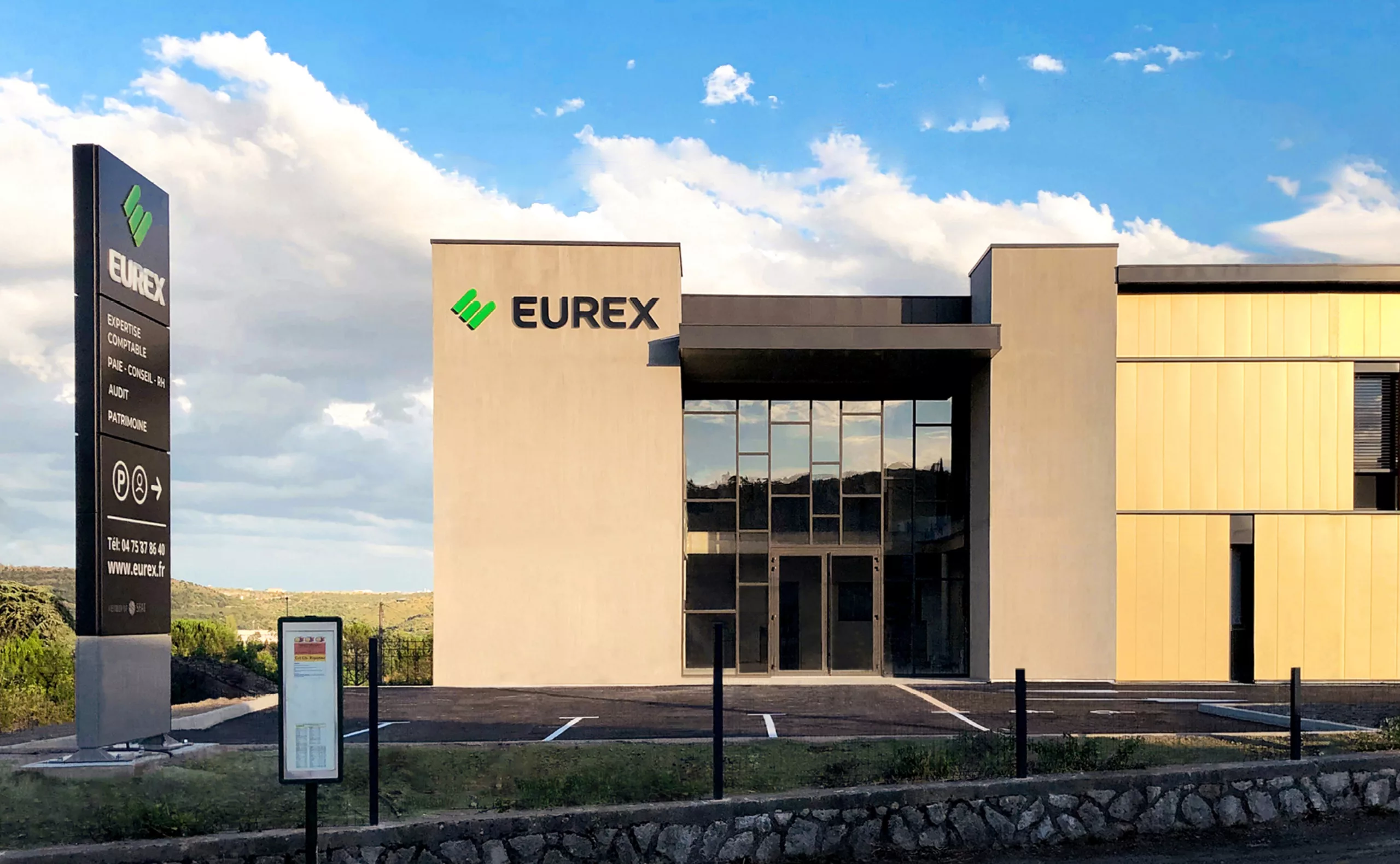
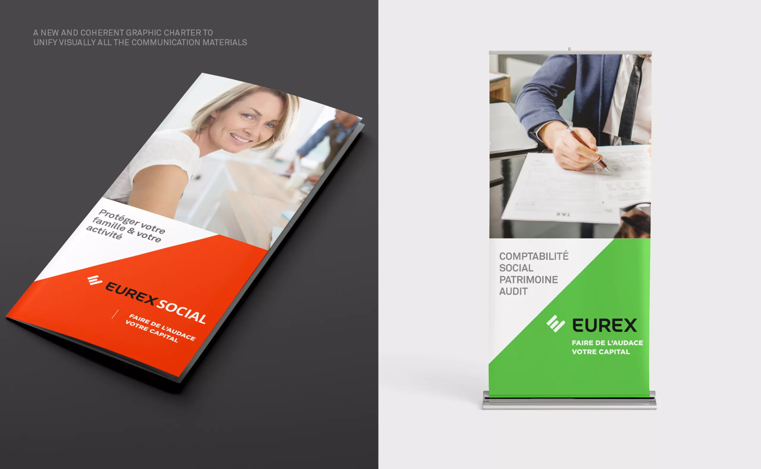
Eurex-case-study

2018

A logo symbolising balance and growth for Eurex group’s new visual identity
A brand identity that reinvents itself by capitalising on its history

In 2018 Graphéine accompanied the consulting firm Eurex in the evolution of its visual identity and brand signature. An update of its identity that reflects the evolution of the Eurex group and their progress.
With nearly 60 years of experience, Eurex is a growing accountancy, consulting and auditing group. Its 800 employees support 12,000 clients in France and internationally (Switzerland, Italy, Poland, Morocco, Tunisia) at every stage of their company's development and business management.
Since 2019, Eurex has been part of the international SFAI network. This alliance enables Eurex to support clients in their establishment and development in more than 75 countries.
The previous visual identity was outdated and suffered from consistency problems. It no longer corresponded to the dynamism of a modern, fast-growing company.

A new logo to reinforce the brand image of an international group

During our first meeting at the group's head office, we quickly noticed that two very different logos coexisted in Eurex's communication. While the website and printed materials used the logo with the "Ex" monogram, the external commercial signage used a completely different logo with three green bars.
The new logo draws on the brand's essence: the name, colours and green bars are retained. It fits perfectly into the history of the brand and reinvents its constituent elements to create a new symbol which embodies the values of Eurex.
The new, more evocative and distinctive emblem symbolises the letter E of Eurex. Its composition not only demonstrates the company's expertise in the form of a diagram, but also conveys its human dimension through rounded lines that draw a hand, a heart. This logo represents the balance and growth of Eurex.

A new tagline to better communicate Eurex’s purpose

Until recently, the brand signature was a listing of the services offered by the group: "Accounting, Consulting, Auditing". The new tagline « Dare to go forward » embodies the group's promise to accompany and believe in the talents of its clients. This english version of the tagline is intended for their international communication, an ambition that was accomplished with the integration of Eurex into the SFAI member network.

A new brand architecture to structure all of the services
offered by Eurex group

The Eurex Group is now organised into several distinct business units to enhance and highlight the range of these different services.The "Eurex Group" logo was extended to create "daughter" brands that embody the services. A specific colour distinguishes the logo and communication material of each service.

Brand guidelines to ensure the visual consistency
of Eurex brand

The new logo has been gradually adopted by all the constituent firms and used in the Group's communication tools. The implementation of a common signage system was essential to enable all the firms in the group to come together under the same banner. We developed a wayfinding system for the building that facilitates orientation and identification through the signage.
The new visual "brand" is an important vector for uniting the group's teams around common values. The new logo is therefore a central element of Eurex Group’s various incentive events.

Context

The market for accountancy, social and legal consulting is becoming more and more competitive. The entire industry is in a constant flux. It is structuring itself with multiple mergers between firms across specialisations. This inter-professionality, which was once rare, is becoming more widespread and reaching maturity. Nevertheless, the auditing sector remains a legally distinct entity. The sector is undergoing its technological transformation with a general movement towards digitization. The profession's communication habits are becoming more assertive with the arrival of authorised canvassing, and a more commercial, market oriented vision of the profession.
Business leaders underestimate the extent of the accounting firms' scope of work and equate the profession of chartered accountant to merely a "producer of legal information", rather than a partner in the management and development of their enterprise.

Goals

To create a new dynamism for the Eurex Group with a brand territory that asserts a conquering position. To create a new unifying visual identity that facilitates the management of a changing internal culture: from accounting technicians to consultants. Adopt a new tagline in keeping with the values of the Eurex Group. 
Implementing more cohesive brand guidelines and a modernised logotype to enable Eurex to be a stronger brand (to differentiate itself / to be unique). Enhance the value of Eurex's business, know-how and skills. To convey its image of a thought leader in the profession. To encourage adherence to Eurex's values and continue to unite around the name internally.


Share this project:
Project expertise:
Logo creation, visual identity and graphic guidelines.
Type of client:
Communication agency in the consulting and services sector. Strategy or management consulting, operational consulting, digital services companies (ESN) formerly SSII or SS2I, but also all services to companies, or "B to B services" (for business to business).

Related projects: